
使用 Java 在演示文稿中自定义图表轴
概述
本文介绍了如何使用 Aspose.Slides for Java 自定义图表轴。它涵盖了已计算的轴值、切换图表行列、轴可见性、类别标签和刻度间隔、日期类别及格式、标题旋转、轴定位以及显示单位。
获取图表垂直轴的最大值
创建一个演示文稿并添加一个带默认数据的面积图。 在读取已计算的轴值之前,调用validateChartLayout以确保图表布局是最新的。
读取getActualMaxValue 和getActualMinValue 以获取轴的最大最小值,读取getActualMajorUnit 和getActualMinorUnit 以获取刻度间隔。getActualMajorUnitScale 和getActualMinorUnitScale 提供时间单位的比例,适用于日期轴。 示例将这些值存储在局部变量中并保存图表。
import com.aspose.slides.*;

Presentation presentation = new Presentation();
try {
    ISlide slide = presentation.getSlides().get_Item(0);

    IChart chart = slide.getShapes().addChart(ChartType.Area, 100, 100, 500, 350);
    chart.validateChartLayout();

    double maxValue = chart.getAxes().getVerticalAxis().getActualMaxValue();
    double minValue = chart.getAxes().getVerticalAxis().getActualMinValue();

    double majorUnit = chart.getAxes().getVerticalAxis().getActualMajorUnit();
    double minorUnit = chart.getAxes().getVerticalAxis().getActualMinorUnit();

    int majorUnitScale = chart.getAxes().getVerticalAxis().getActualMajorUnitScale();
    int minorUnitScale = chart.getAxes().getVerticalAxis().getActualMinorUnitScale();

    presentation.save("AxisValues_out.pptx", SaveFormat.Pptx);
} finally {
    presentation.dispose();
}
交换轴之间的数据
使用switchRowColumn 交换系列和类别在图表数据中的角色。 每个原来的类别变为系列,每个原来的系列变为类别。 这会改变数据的分组方式,但不会交换水平和垂直轴。 示例在切换行列之前,使用setRange 将默认数据绑定到 Sheet1!A1:D5(包括标题行和类别列)。 它保存了一个包含四个系列和三个类别的图表。
import com.aspose.slides.*;

Presentation presentation = new Presentation();
try {
    ISlide slide = presentation.getSlides().get_Item(0);

    IChart chart = slide.getShapes().addChart(ChartType.ClusteredColumn, 100, 100, 400, 300);
    chart.getChartData().setRange("Sheet1!A1:D5");
    chart.getChartData().switchRowColumn();

    presentation.save("SwitchChartRowColumns_out.pptx", SaveFormat.Pptx);
} finally {
    presentation.dispose();
}
禁用折线图的垂直轴
对垂直轴调用setVisible 并传入 false 以隐藏它。 示例创建了一个带默认数据的折线图,并将其保存为隐藏垂直轴的文件。
import com.aspose.slides.*;

Presentation presentation = new Presentation();
try {
    ISlide slide = presentation.getSlides().get_Item(0);

    IChart chart = slide.getShapes().addChart(ChartType.Line, 100, 100, 400, 300);
    chart.getAxes().getVerticalAxis().setVisible(false);

    presentation.save("HiddenVerticalAxis.pptx", SaveFormat.Pptx);
} finally {
    presentation.dispose();
}
禁用折线图的水平轴
对水平轴调用setVisible 并传入 false 以隐藏它。 示例创建了一个带默认数据的折线图,并将其保存为隐藏水平轴的文件。
import com.aspose.slides.*;

Presentation presentation = new Presentation();
try {
    ISlide slide = presentation.getSlides().get_Item(0);

    IChart chart = slide.getShapes().addChart(ChartType.Line, 100, 100, 400, 300);
    chart.getAxes().getHorizontalAxis().setVisible(false);

    presentation.save("HiddenHorizontalAxis.pptx", SaveFormat.Pptx);
} finally {
    presentation.dispose();
}
更改类别轴
使用setCategoryAxisType 选择日期或文本类别轴。 此示例需要 ExistingChart.pptx,其中第一张幻灯片的第一形状是图表,类别单元格包含 Excel 数字日期值。 它将水平轴更改为日期轴。 将setAutomaticMajorUnit 设置为 false,setMajorUnit 设置为 1,并将setMajorUnitScale 设置为 TimeUnitType.Months,即可将主刻度设置为每月一次。
import com.aspose.slides.*;

Presentation presentation = new Presentation("ExistingChart.pptx");
try {
    ISlide slide = presentation.getSlides().get_Item(0);

    IChart chart = (IChart) slide.getShapes().get_Item(0);
    chart.getAxes().getHorizontalAxis().setCategoryAxisType(CategoryAxisType.Date);
    chart.getAxes().getHorizontalAxis().setAutomaticMajorUnit(false);
    chart.getAxes().getHorizontalAxis().setMajorUnit(1);
    chart.getAxes().getHorizontalAxis().setMajorUnitScale(TimeUnitType.Months);

    presentation.save("ChangeChartCategoryAxis_out.pptx", SaveFormat.Pptx);
} finally {
    presentation.dispose();
}
控制类别轴标签间隔
当图表拥有大量类别时,可在不删除类别或数据点的前提下减少可见轴标签的数量。 调用setAutomaticTickLabelSpacing 并传入 false,随后将所需的类别间隔传递给setTickLabelSpacing。 对于按正常顺序排列的文本类别,计数从第一个类别开始:
| 间隔 | 示例中显示的标签 |
|---|---|
1 |
类别 1, 类别 2, 类别 3, … 类别 24 |
2 |
类别 1, 类别 3, 类别 5, … 类别 23 |
3 |
类别 1, 类别 4, 类别 7, … 类别 22 |
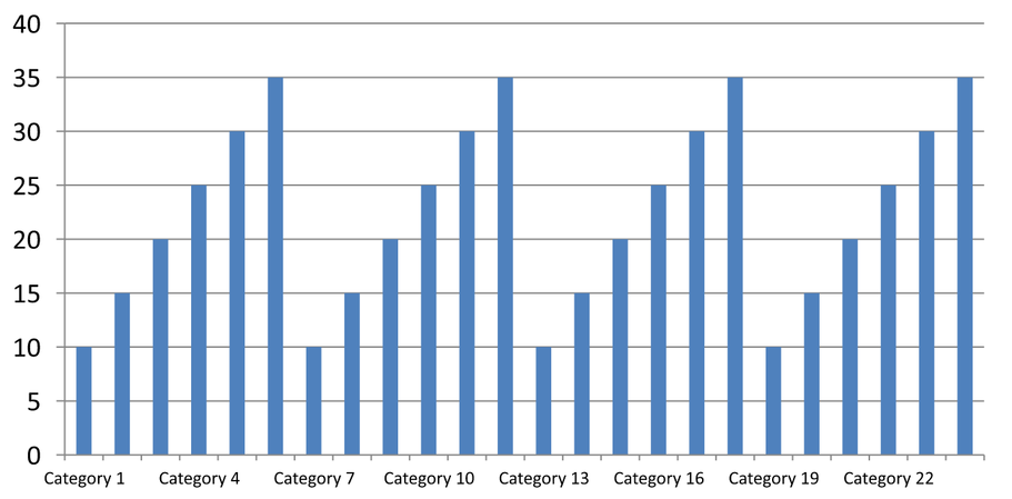
间隔为 3 时每三个标签显示一次,两个标签在显示的标签之间被隐藏。 它并不会删除相应的列。 自动间距会根据可用空间选择间隔;并不一定会显示每个标签。
刻度线有独立的控制。 调用setAutomaticTickMarksSpacing 并传入 false,然后使用setTickMarksSpacing 设置它们的间隔。 例如,1 在每个类别间隔处保持一个刻度线,而标签仅每三个类别出现一次。 使用setMajorTickMark 设置可见样式,以便查看效果。 再次将任一自动间距设为 true 即可让图表重新选择该间隔。
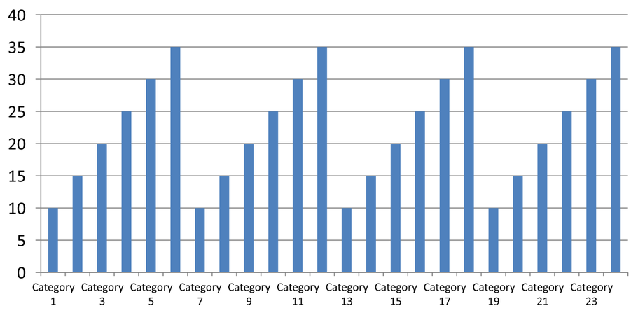
以下自包含示例创建 24 个类别和一个系列,然后在 CategoryAxisIntervals.pptx 中保存三张幻灯片:自动间距、具有独立刻度线的手动标签间距以及恢复的自动间距。 两个副本保留了原始图表数据。 不需要输入演示文稿。 水平标签文本使得密度差异一目了然。
import com.aspose.slides.*;

Presentation presentation = new Presentation();
try {
    ISlide slide = presentation.getSlides().get_Item(0);

    IChart chart = slide.getShapes().addChart(ChartType.ClusteredColumn, 30, 40, 660, 320);

    chart.setLegend(false);
    chart.getChartData().getCategories().clear();
    chart.getChartData().getSeries().clear();

    IChartDataWorkbook workbook = chart.getChartData().getChartDataWorkbook();
    workbook.clear(0);

    IChartSeries series = chart.getChartData().getSeries().add(ChartType.ClusteredColumn);
    for (int i = 0; i < 24; i++) {
        IChartDataCell categoryCell = workbook.getCell(0, i + 1, 0, "Category " + (i + 1));
        chart.getChartData().getCategories().add(categoryCell);
        IChartDataCell valueCell = workbook.getCell(0, i + 1, 1, 10 + i % 6 * 5);
        series.getDataPoints().addDataPointForBarSeries(valueCell);
    }

    IAxis axis = chart.getAxes().getHorizontalAxis();
    axis.setCategoryAxisType(CategoryAxisType.Text);
    axis.getTextFormat().getTextBlockFormat().setRotationAngle(0);
    axis.getTextFormat().getPortionFormat().setFontHeight(12);
    axis.setMajorTickMark(TickMarkType.Outside);
    axis.setAutomaticTickLabelSpacing(true);
    axis.setAutomaticTickMarksSpacing(true);

    // 幻灯片 2:显示每三个标签,但为每个类别保留刻度线。
    ISlide manualSlide = presentation.getSlides().addClone(slide);
    IChart manualChart = (IChart)manualSlide.getShapes().get_Item(0);
    IAxis manualAxis = manualChart.getAxes().getHorizontalAxis();
    manualAxis.setAutomaticTickLabelSpacing(false);
    manualAxis.setTickLabelSpacing(3);
    manualAxis.setAutomaticTickMarksSpacing(false);
    manualAxis.setTickMarksSpacing(1);

    // 幻灯片 3:让图表重新选择两个间隔。
    ISlide restoredSlide = presentation.getSlides().addClone(manualSlide);
    IChart restoredChart = (IChart)restoredSlide.getShapes().get_Item(0);
    restoredChart.getAxes().getHorizontalAxis().setAutomaticTickLabelSpacing(true);
    restoredChart.getAxes().getHorizontalAxis().setAutomaticTickMarksSpacing(true);

    presentation.save("CategoryAxisIntervals.pptx", SaveFormat.Pptx);
} finally {
    presentation.dispose();
}
自动间距(幻灯片 1): 在此渲染中,每第二个类别标签被显示并换行为两行。 自动结果可能随图表尺寸、字体和渲染器而异。
手动间距(幻灯片 2): 每第三个标签在一行上显示,而刻度线仍保持每个类别间隔。 所有 24 列(包括没有标签的列)仍保持可见且数值不变。 幻灯片 3 恢复了上图所示的自动外观。
选择正确的轴和间隔
对文本类别轴(例如柱形图、折线图、面积图或条形图的类别轴)使用此类别计数间隔。 在柱形图中,它是水平轴。 在水平条形图中,类别轴是垂直的,因此应将这些设置应用于getVerticalAxis 返回的轴。 刻度线间隔同样适用于具有系列轴的图表。
不要使用类别标签间隔来设置数值轴的数值刻度。 在数值轴上,setMajorUnit 指定数值差异:例如,主单位为 10 时,当轴从零开始时会在 0、10、20 等位置生成刻度。 类别标签间隔为 3 时仅计数类别位置,与其数据值无关。 散点图和气泡图使用数值轴而非文本类别轴。 对于日期轴,请使用更改类别轴 中描述的基于时间的主单位和比例。
设置类别轴值的日期格式
示例用四个年度值替换默认图表数据。 日期以 OLE Automation 序列号存储在第一个工作表(索引 0)中,计算方式为自 1899 年 12 月 30 日起的天数。 使用setCategoryAxisType 并传入 CategoryAxisType.Date,调用setNumberFormatLinkedToSource 并传入 false,再将 yyyy 传递给setNumberFormat,即可使类别标签独立于单元格格式显示四位数年份。
import com.aspose.slides.*;
import java.time.LocalDate;

Presentation presentation = new Presentation();
try {
    ISlide slide = presentation.getSlides().get_Item(0);

    IChart chart = slide.getShapes().addChart(ChartType.Line, 50, 50, 450, 300);

    chart.getChartData().getCategories().clear();
    chart.getChartData().getSeries().clear();

    IChartDataWorkbook workbook = chart.getChartData().getChartDataWorkbook();
    workbook.clear(0);

    LocalDate baseDate = LocalDate.of(1899, 12, 30);

    IChartSeries series = chart.getChartData().getSeries().add(ChartType.Line);
    for (int i = 0; i < 4; i++) {
        LocalDate date = LocalDate.of(2015 + i, 1, 1);
        IChartDataCell categoryCell = workbook.getCell(0, i + 1, 0, date.toEpochDay() - baseDate.toEpochDay());
        chart.getChartData().getCategories().add(categoryCell);

        IChartDataCell valueCell = workbook.getCell(0, i + 1, 1, i + 1);
        series.getDataPoints().addDataPointForLineSeries(valueCell);
    }

    chart.getAxes().getHorizontalAxis().setCategoryAxisType(CategoryAxisType.Date);
    chart.getAxes().getHorizontalAxis().setNumberFormatLinkedToSource(false);
    chart.getAxes().getHorizontalAxis().setNumberFormat("yyyy");

    presentation.save("DateAxisFormat.pptx", SaveFormat.Pptx);
} finally {
    presentation.dispose();
}
为图表轴标题设置旋转角度
对垂直轴调用setTitle 并传入 true,提供标题文本,然后使用setRotationAngle 旋转标题。 角度以度为单位;本示例将柱形图的数值轴标题旋转了 90 度并保存。
import com.aspose.slides.*;

Presentation presentation = new Presentation();
try {
    ISlide slide = presentation.getSlides().get_Item(0);

    IChart chart = slide.getShapes().addChart(ChartType.ClusteredColumn, 50, 50, 450, 300);
    chart.getAxes().getVerticalAxis().setTitle(true);
    chart.getAxes().getVerticalAxis().getTitle().addTextFrameForOverriding("Value");
    chart.getAxes().getVerticalAxis().getTitle().getTextFormat().getTextBlockFormat().setRotationAngle(90);

    presentation.save("RotatedAxisTitle.pptx", SaveFormat.Pptx);
} finally {
    presentation.dispose();
}
设置类别或数值轴上的轴位置
使用setAxisBetweenCategories 控制数值轴是跨越类别轴之间还是在类别刻度线处交叉。 此设置适用于类别轴。 示例在柱形图的水平类别轴上将其设为 true 并保存结果。
import com.aspose.slides.*;

Presentation presentation = new Presentation();
try {
    ISlide slide = presentation.getSlides().get_Item(0);

    IChart chart = slide.getShapes().addChart(ChartType.ClusteredColumn, 50, 50, 450, 300);
    chart.getAxes().getHorizontalAxis().setAxisBetweenCategories(true);

    presentation.save("AxisBetweenCategories.pptx", SaveFormat.Pptx);
} finally {
    presentation.dispose();
}
设置图表数值轴的显示单位
使用setDisplayUnit 在不更改底层数据的情况下缩放数值轴标签。 将DisplayUnitType 设置为 Millions,则 60,000,000 将显示为 60。 示例创建了一个柱形图并在其垂直轴上应用了“百万”显示单位。
import com.aspose.slides.*;

Presentation presentation = new Presentation();
try {
    ISlide slide = presentation.getSlides().get_Item(0);

    IChart chart = slide.getShapes().addChart(ChartType.ClusteredColumn, 50, 50, 450, 300);
    chart.getAxes().getVerticalAxis().setDisplayUnit(DisplayUnitType.Millions);

    presentation.save("Result.pptx", SaveFormat.Pptx);
} finally {
    presentation.dispose();
}
常见问题
如何设置一个轴交叉另一个轴的数值(轴交叉点)?
使用setCrossType 选择交叉行为。 若要指定数值交叉点,使用setCrossAt。 这些设置可让您将轴交叉点移动到合适的基准线上。
如何相对于轴定位刻度标签?
调用setTickLabelPosition 并使用TickLabelPositionType:Low、High、NextTo 或 None。 若要控制刻度线本身,使用setMajorTickMark 或setMinorTickMark;这些与标签位置是独立的。