
Java を使用したプレゼンテーションでチャート軸をカスタマイズする
概要
この記事では、Aspose.Slides for Java を使用してチャート軸をカスタマイズする方法を説明します。計算された軸の値、チャートの行と列の入れ替え、軸の表示/非表示、カテゴリラベルと目盛りの間隔、日付カテゴリと書式設定、タイトルの回転、軸の位置付け、表示単位について扱います。
縦軸の最大値を取得する
デフォルト データで面積グラフを作成するためにプレゼンテーションを作成します。計算された軸の値を取得する前に、チャートのレイアウトが最新になるようにvalidateChartLayoutを呼び出します。
軸の上限と下限を取得するにはgetActualMaxValueとgetActualMinValueを使用し、目盛り間隔はgetActualMajorUnitとgetActualMinorUnitで取得します。getActualMajorUnitScale とgetActualMinorUnitScale は時間単位のスケールを提供し、日付軸に関連します。サンプルではこれらの値をローカル変数に保存し、チャートを保存します。
import com.aspose.slides.*;

Presentation presentation = new Presentation();
try {
    ISlide slide = presentation.getSlides().get_Item(0);

    IChart chart = slide.getShapes().addChart(ChartType.Area, 100, 100, 500, 350);
    chart.validateChartLayout();

    double maxValue = chart.getAxes().getVerticalAxis().getActualMaxValue();
    double minValue = chart.getAxes().getVerticalAxis().getActualMinValue();

    double majorUnit = chart.getAxes().getVerticalAxis().getActualMajorUnit();
    double minorUnit = chart.getAxes().getVerticalAxis().getActualMinorUnit();

    int majorUnitScale = chart.getAxes().getVerticalAxis().getActualMajorUnitScale();
    int minorUnitScale = chart.getAxes().getVerticalAxis().getActualMinorUnitScale();

    presentation.save("AxisValues_out.pptx", SaveFormat.Pptx);
} finally {
    presentation.dispose();
}
軸間のデータを入れ替える
switchRowColumn を使用して、チャート データ内の系列とカテゴリの役割を入れ替えます。以前のカテゴリが系列になり、以前の系列がカテゴリになります。これはデータのグループ化方法を変更しますが、水平軸と垂直軸を入れ替えるわけではありません。サンプルではsetRange を使用してデフォルト データを Sheet1!A1:D5(ヘッダー行とカテゴリ列を含む)にバインドし、行と列を入れ替えます。結果として、4 系列と 3 カテゴリのチャートが保存されます。
import com.aspose.slides.*;

Presentation presentation = new Presentation();
try {
    ISlide slide = presentation.getSlides().get_Item(0);

    IChart chart = slide.getShapes().addChart(ChartType.ClusteredColumn, 100, 100, 400, 300);
    chart.getChartData().setRange("Sheet1!A1:D5");
    chart.getChartData().switchRowColumn();

    presentation.save("SwitchChartRowColumns_out.pptx", SaveFormat.Pptx);
} finally {
    presentation.dispose();
}
折れ線グラフの縦軸を非表示にする
垂直軸に対して false を指定してsetVisible を呼び出すことで非表示にします。サンプルはデフォルト データで折れ線グラフを作成し、縦軸を非表示にして保存します。
import com.aspose.slides.*;

Presentation presentation = new Presentation();
try {
    ISlide slide = presentation.getSlides().get_Item(0);

    IChart chart = slide.getShapes().addChart(ChartType.Line, 100, 100, 400, 300);
    chart.getAxes().getVerticalAxis().setVisible(false);

    presentation.save("HiddenVerticalAxis.pptx", SaveFormat.Pptx);
} finally {
    presentation.dispose();
}
折れ線グラフの水平軸を非表示にする
水平軸に対して false を指定してsetVisible を呼び出すことで非表示にします。サンプルはデフォルト データで折れ線グラフを作成し、水平軸を非表示にして保存します。
import com.aspose.slides.*;

Presentation presentation = new Presentation();
try {
    ISlide slide = presentation.getSlides().get_Item(0);

    IChart chart = slide.getShapes().addChart(ChartType.Line, 100, 100, 400, 300);
    chart.getAxes().getHorizontalAxis().setVisible(false);

    presentation.save("HiddenHorizontalAxis.pptx", SaveFormat.Pptx);
} finally {
    presentation.dispose();
}
カテゴリ軸を変更する
setCategoryAxisType を使用して日付軸またはテキスト軸を選択します。このサンプルは ExistingChart.pptx が必要で、最初のスライドの最初のシェイプとしてチャートが配置され、カテゴリ セルに数値としての Excel 日付が格納されています。水平軸を日付軸に変更します。false を指定してsetAutomaticMajorUnit を呼び出し、1 を渡してsetMajorUnit を設定し、TimeUnitType.Months を渡してsetMajorUnitScale を設定すると、主要な目盛りが 1 か月間隔で配置されます。
import com.aspose.slides.*;

Presentation presentation = new Presentation("ExistingChart.pptx");
try {
    ISlide slide = presentation.getSlides().get_Item(0);

    IChart chart = (IChart) slide.getShapes().get_Item(0);
    chart.getAxes().getHorizontalAxis().setCategoryAxisType(CategoryAxisType.Date);
    chart.getAxes().getHorizontalAxis().setAutomaticMajorUnit(false);
    chart.getAxes().getHorizontalAxis().setMajorUnit(1);
    chart.getAxes().getHorizontalAxis().setMajorUnitScale(TimeUnitType.Months);

    presentation.save("ChangeChartCategoryAxis_out.pptx", SaveFormat.Pptx);
} finally {
    presentation.dispose();
}
カテゴリ軸ラベル間隔を制御する
チャートに多数のカテゴリがある場合、カテゴリやデータポイントを削除せずに表示される軸ラベルの数を減らすことができます。setAutomaticTickLabelSpacing に false を渡し、希望するカテゴリ間隔を setTickLabelSpacing に渡します。テキストカテゴリが通常の順序で並んでいる場合、カウントは最初のカテゴリから開始します。
| 間隔 | 例で表示されるラベル |
|---|---|
1 |
Category 1, Category 2, Category 3, … Category 24 |
2 |
Category 1, Category 3, Category 5, … Category 23 |
3 |
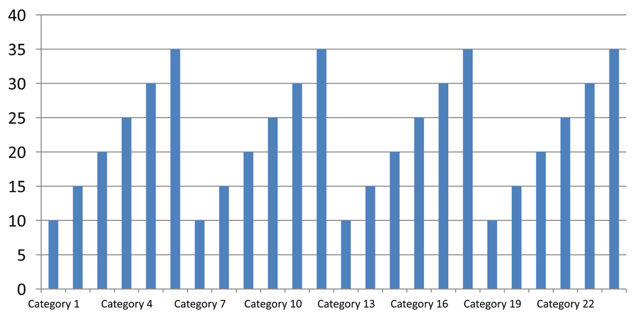
Category 1, Category 4, Category 7, … Category 22 |
3 の間隔は 3 番目ごとのラベルのみを表示し、表示されたラベルの間に 2 つのラベルが非表示になります。対応する列は削除されません。自動間隔は利用可能なスペースに基づいて間隔を決定し、必ずしもすべてのラベルを表示するわけではありません。
目盛りにも個別の設定があります。setAutomaticTickMarksSpacing に false を渡し、setTickMarksSpacing で間隔を設定します。たとえば 1 は各カテゴリ間隔に目盛りを配置し、ラベルは 3 番目ごとに表示されます。setMajorTickMark を可視スタイルで設定すると結果が確認できます。自動間隔設定に true を再度呼び出すと、チャートが自動で間隔を選択します。
次の自己完結型サンプルは 24 カテゴリと 1 系列を作成し、CategoryAxisIntervals.pptx に 3 スライドを保存します:自動間隔、ラベル間隔と独立した目盛りの手動設定、そして自動間隔に戻したものです。2 つのコピーは元のチャート データを保持します。入力プレゼンテーションは不要です。水平ラベルのテキストが密度の違いを分かりやすくします。
import com.aspose.slides.*;

Presentation presentation = new Presentation();
try {
    ISlide slide = presentation.getSlides().get_Item(0);

    IChart chart = slide.getShapes().addChart(ChartType.ClusteredColumn, 30, 40, 660, 320);

    chart.setLegend(false);
    chart.getChartData().getCategories().clear();
    chart.getChartData().getSeries().clear();

    IChartDataWorkbook workbook = chart.getChartData().getChartDataWorkbook();
    workbook.clear(0);

    IChartSeries series = chart.getChartData().getSeries().add(ChartType.ClusteredColumn);
    for (int i = 0; i < 24; i++) {
        IChartDataCell categoryCell = workbook.getCell(0, i + 1, 0, "Category " + (i + 1));
        chart.getChartData().getCategories().add(categoryCell);
        IChartDataCell valueCell = workbook.getCell(0, i + 1, 1, 10 + i % 6 * 5);
        series.getDataPoints().addDataPointForBarSeries(valueCell);
    }

    IAxis axis = chart.getAxes().getHorizontalAxis();
    axis.setCategoryAxisType(CategoryAxisType.Text);
    axis.getTextFormat().getTextBlockFormat().setRotationAngle(0);
    axis.getTextFormat().getPortionFormat().setFontHeight(12);
    axis.setMajorTickMark(TickMarkType.Outside);
    axis.setAutomaticTickLabelSpacing(true);
    axis.setAutomaticTickMarksSpacing(true);

    // Slide 2: 3 番目ごとのラベルを表示し、すべてのカテゴリに目盛りを保持します。
    ISlide manualSlide = presentation.getSlides().addClone(slide);
    IChart manualChart = (IChart)manualSlide.getShapes().get_Item(0);
    IAxis manualAxis = manualChart.getAxes().getHorizontalAxis();
    manualAxis.setAutomaticTickLabelSpacing(false);
    manualAxis.setTickLabelSpacing(3);
    manualAxis.setAutomaticTickMarksSpacing(false);
    manualAxis.setTickMarksSpacing(1);

    // Slide 3: 再びチャートに両方の間隔を選択させます。
    ISlide restoredSlide = presentation.getSlides().addClone(manualSlide);
    IChart restoredChart = (IChart)restoredSlide.getShapes().get_Item(0);
    restoredChart.getAxes().getHorizontalAxis().setAutomaticTickLabelSpacing(true);
    restoredChart.getAxes().getHorizontalAxis().setAutomaticTickMarksSpacing(true);

    presentation.save("CategoryAxisIntervals.pptx", SaveFormat.Pptx);
} finally {
    presentation.dispose();
}
Automatic spacing (slide 1): このレンダリングでは、2 番目のカテゴリラベルが表示され、2 行に折り返されます。自動結果はチャートのサイズ、フォント、レンダラにより変わります。
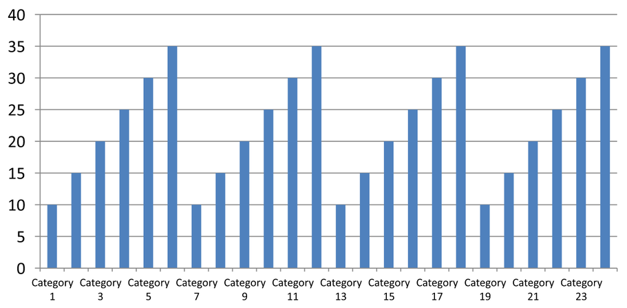
Manual spacing (slide 2): 3 番目ごとのラベルが 1 行に表示され、目盛りはすべてのカテゴリ間隔に残ります。ラベルがない列も含めて 24 列すべてが同じ値で表示されます。スライド 3 は上記の自動表示に戻します。
正しい軸と間隔を選択する
テキストカテゴリ軸(列、折れ線、面、棒グラフのカテゴリ軸など)でこのカテゴリ数間隔を使用します。列グラフの場合は水平軸です。水平棒グラフの場合、カテゴリ軸は垂直方向になるため、getVerticalAxis が返す軸に対して設定を適用します。目盛り間隔は、系列軸を持つチャートの系列軸にも適用できます。
カテゴリラベル間隔は、値軸の数値スケールを設定するために使用しないでください。値軸では、setMajorUnit が値の差を指定します。たとえば 10 の主要単位は、軸がゼロから開始する場合に 0、10、20… と目盛りを配置します。3 のカテゴリラベル間隔はデータ値に関係なくカテゴリ位置をカウントします。散布図やバブルチャートはテキストカテゴリ軸ではなく値軸を使用します。日付軸の場合は、Change a Category Axis で説明した時間ベースの主要単位とスケールを使用してください。
カテゴリ軸の値の日付形式を設定する
サンプルはデフォルトのチャート データを 4 つの年次値に置き換えます。日付は最初のワークシート(インデックス 0)に OLE Automation のシリアル番号として格納され、1899 年 12 月 30 日からの日数として計算されます。setCategoryAxisType に CategoryAxisType.Date を渡し、setNumberFormatLinkedToSource に false を指定し、yyyy を setNumberFormat に渡すことで、セルの書式設定に関係なくカテゴリラベルに 4 桁の年が表示されます。
import com.aspose.slides.*;
import java.time.LocalDate;

Presentation presentation = new Presentation();
try {
    ISlide slide = presentation.getSlides().get_Item(0);

    IChart chart = slide.getShapes().addChart(ChartType.Line, 50, 50, 450, 300);

    chart.getChartData().getCategories().clear();
    chart.getChartData().getSeries().clear();

    IChartDataWorkbook workbook = chart.getChartData().getChartDataWorkbook();
    workbook.clear(0);

    LocalDate baseDate = LocalDate.of(1899, 12, 30);

    IChartSeries series = chart.getChartData().getSeries().add(ChartType.Line);
    for (int i = 0; i < 4; i++) {
        LocalDate date = LocalDate.of(2015 + i, 1, 1);
        IChartDataCell categoryCell = workbook.getCell(0, i + 1, 0, date.toEpochDay() - baseDate.toEpochDay());
        chart.getChartData().getCategories().add(categoryCell);

        IChartDataCell valueCell = workbook.getCell(0, i + 1, 1, i + 1);
        series.getDataPoints().addDataPointForLineSeries(valueCell);
    }

    chart.getAxes().getHorizontalAxis().setCategoryAxisType(CategoryAxisType.Date);
    chart.getAxes().getHorizontalAxis().setNumberFormatLinkedToSource(false);
    chart.getAxes().getHorizontalAxis().setNumberFormat("yyyy");

    presentation.save("DateAxisFormat.pptx", SaveFormat.Pptx);
} finally {
    presentation.dispose();
}
チャート軸タイトルの回転角度を設定する
垂直軸に対して true でsetTitle を呼び出し、タイトル テキストを設定し、setRotationAngle でタイトルを回転させます。角度は度で測定されます。このサンプルは値軸タイトルを 90 度回転させた列グラフを保存します。
import com.aspose.slides.*;

Presentation presentation = new Presentation();
try {
    ISlide slide = presentation.getSlides().get_Item(0);

    IChart chart = slide.getShapes().addChart(ChartType.ClusteredColumn, 50, 50, 450, 300);
    chart.getAxes().getVerticalAxis().setTitle(true);
    chart.getAxes().getVerticalAxis().getTitle().addTextFrameForOverriding("Value");
    chart.getAxes().getVerticalAxis().getTitle().getTextFormat().getTextBlockFormat().setRotationAngle(90);

    presentation.save("RotatedAxisTitle.pptx", SaveFormat.Pptx);
} finally {
    presentation.dispose();
}
カテゴリ軸または値軸の位置を設定する
setAxisBetweenCategories を使用して、値軸がカテゴリ軸のカテゴリ間またはカテゴリ目盛り上で交差するかを制御します。この設定はカテゴリ軸に適用されます。サンプルは列グラフの水平カテゴリ軸に true を設定し、結果を保存します。
import com.aspose.slides.*;

Presentation presentation = new Presentation();
try {
    ISlide slide = presentation.getSlides().get_Item(0);

    IChart chart = slide.getShapes().addChart(ChartType.ClusteredColumn, 50, 50, 450, 300);
    chart.getAxes().getHorizontalAxis().setAxisBetweenCategories(true);

    presentation.save("AxisBetweenCategories.pptx", SaveFormat.Pptx);
} finally {
    presentation.dispose();
}
チャート値軸の表示単位を設定する
setDisplayUnit を使用して、基になるデータを変更せずに値軸のラベルをスケーリングします。DisplayUnitType を Millions に設定すると、60,000,000 の値が 60 と表示されます。サンプルは列グラフを作成し、縦軸にミリオン表示単位を適用します。
import com.aspose.slides.*;

Presentation presentation = new Presentation();
try {
    ISlide slide = presentation.getSlides().get_Item(0);

    IChart chart = slide.getShapes().addChart(ChartType.ClusteredColumn, 50, 50, 450, 300);
    chart.getAxes().getVerticalAxis().setDisplayUnit(DisplayUnitType.Millions);

    presentation.save("Result.pptx", SaveFormat.Pptx);
} finally {
    presentation.dispose();
}
FAQ
軸が交差する位置(軸交差)をどのように設定しますか?
setCrossType を使用して交差動作を選択します。数値の交差位置を指定するには、setCrossAt を使用します。これらの設定により、軸交差位置を適切な基準線に移動できます。
目盛ラベルを軸に対してどのように位置付けますか?
setTickLabelPosition を使用し、TickLabelPositionType の Low、High、NextTo、None のいずれかを指定します。目盛り自体を制御するには、setMajorTickMark または setMinorTickMark を使用します。これらはラベル位置設定とは別です。