
PowerPoint प्रस्तुति चार्ट बनाना या अपडेट करना .NET में
अवलोकन
यह लेख Aspose.Slides for .NET का उपयोग करके चार्ट बनाने और अनुकूलित करने के बारे में एक व्यापक मार्गदर्शिका प्रदान करता है। आप सीखेंगे कि प्रोग्रामेटिक रूप से स्लाइड में एक चार्ट कैसे जोड़ें, उसे डेटा से भरें, और आपके विशिष्ट डिज़ाइन आवश्यकताओं के अनुसार विभिन्न फ़ॉर्मेटिंग विकल्प कैसे लागू करें। लेख के दौरान विस्तृत कोड उदाहरण प्रत्येक चरण को दर्शाते हैं, प्रारंभिक प्रस्तुति और चार्ट ऑब्जेक्ट से लेकर सीरीज़, अक्ष और लेजेंड को कॉन्फ़िगर करने तक। इस गाइड का पालन करके आप अपने .NET अनुप्रयोगों में गतिशील चार्ट निर्माण को एकीकृत करने की ठोस समझ प्राप्त करेंगे, जिससे डेटा-आधारित प्रस्तुतियों का निर्माण आसान हो जाएगा।
चार्ट बनाएं
चार्ट लोगों को डेटा को जल्दी से दृश्य रूप में समझने और ऐसी अंतर्दृष्टि प्राप्त करने में मदद करते हैं जो तालिका या स्प्रेडशीट से तुरंत स्पष्ट नहीं होती।
चार्ट क्यों बनाएं?
चार्ट का उपयोग करके आप:
- प्रस्तुति की एक ही स्लाइड में बड़ी मात्रा में डेटा को एकत्रित, संक्षिप्त या सारांशित कर सकते हैं;
- डेटा में पैटर्न और रुझान उजागर कर सकते हैं;
- समय के साथ या किसी विशिष्ट माप इकाई के सापेक्ष डेटा की दिशा और गति समझ सकते हैं;
- अपवर्जन, विचलन, त्रुटियां और अयथार्थ डेटा की पहचान कर सकते हैं;
- जटिल डेटा को संवादित या प्रस्तुत कर सकते हैं।
PowerPoint में आप Insert फ़ंक्शन के माध्यम से विभिन्न प्रकार के चार्ट टेम्पलेट का उपयोग करके चार्ट बना सकते हैं। Aspose.Slides का उपयोग करके आप सामान्य चार्ट (लोकप्रिय चार्ट प्रकारों पर आधारित) और कस्टम चार्ट दोनों बना सकते हैं।
Note
Use the ChartType enumeration under the Aspose.Slides.Charts namespace. The values in this enumeration correspond to different chart types.क्लस्टर्ड कॉलम चार्ट बनाएं
यह उदाहरण AddChart का उपयोग करके एक क्लस्टर्ड कॉलम चार्ट बनाता है जो तीन वर्गों में दो सीरीज़ की तुलना करता है। सीरीज़ लाल और हरे फ़िल से भरते हैं, और व्यक्तिगत लेबल वर्ग नाम, सीरीज़ नाम और मान प्रदर्शित करते हैं। वर्कशीट सूचकांक 0 एम्बेडेड चार्ट वर्कबुक की पहली शीट को संदर्भित करता है।
using System.Drawing;
using Aspose.Slides;
using Aspose.Slides.Charts;
using Aspose.Slides.Export;

using var presentation = new Presentation();
var slide = presentation.Slides[0];

var chart = slide.Shapes.AddChart(ChartType.ClusteredColumn, 20, 20, 500, 300);

chart.ChartTitle.AddTextFrameForOverriding("Sample Title");
chart.ChartTitle.TextFrameForOverriding.TextFrameFormat.CenterText = NullableBool.True;
chart.ChartTitle.Height = 20;
chart.HasTitle = true;

var workbook = chart.ChartData.ChartDataWorkbook;
var worksheetIndex = 0;

chart.ChartData.Series.Clear();
chart.ChartData.Categories.Clear();

var seriesNameCell = workbook.GetCell(worksheetIndex, 0, 1, "Series 1");
chart.ChartData.Series.Add(seriesNameCell, chart.Type);
seriesNameCell = workbook.GetCell(worksheetIndex, 0, 2, "Series 2");
chart.ChartData.Series.Add(seriesNameCell, chart.Type);

var categoryCell = workbook.GetCell(worksheetIndex, 1, 0, "Category 1");
chart.ChartData.Categories.Add(categoryCell);
categoryCell = workbook.GetCell(worksheetIndex, 2, 0, "Category 2");
chart.ChartData.Categories.Add(categoryCell);
categoryCell = workbook.GetCell(worksheetIndex, 3, 0, "Category 3");
chart.ChartData.Categories.Add(categoryCell);

var series = chart.ChartData.Series[0];

var valueCell = workbook.GetCell(worksheetIndex, 1, 1, 20);
series.DataPoints.AddDataPointForBarSeries(valueCell);
valueCell = workbook.GetCell(worksheetIndex, 2, 1, 50);
series.DataPoints.AddDataPointForBarSeries(valueCell);
valueCell = workbook.GetCell(worksheetIndex, 3, 1, 30);
series.DataPoints.AddDataPointForBarSeries(valueCell);

series.Format.Fill.FillType = FillType.Solid;
series.Format.Fill.SolidFillColor.Color = Color.Red;

series = chart.ChartData.Series[1];

valueCell = workbook.GetCell(worksheetIndex, 1, 2, 30);
series.DataPoints.AddDataPointForBarSeries(valueCell);
valueCell = workbook.GetCell(worksheetIndex, 2, 2, 10);
series.DataPoints.AddDataPointForBarSeries(valueCell);
valueCell = workbook.GetCell(worksheetIndex, 3, 2, 60);
series.DataPoints.AddDataPointForBarSeries(valueCell);

series.Format.Fill.FillType = FillType.Solid;
series.Format.Fill.SolidFillColor.Color = Color.Green;

var label = series.DataPoints[0].Label;
label.DataLabelFormat.ShowCategoryName = true;

label = series.DataPoints[1].Label;
label.DataLabelFormat.ShowSeriesName = true;

label = series.DataPoints[2].Label;
label.DataLabelFormat.ShowValue = true;
label.DataLabelFormat.ShowSeriesName = true;
label.DataLabelFormat.Separator = "/";

presentation.Save("AsposeChart.pptx", SaveFormat.Pptx);
परिणाम:

स्कैटर चार्ट बनाएं
स्कैटर चार्ट (जिसे स्कैटर प्लॉट या x-y ग्राफ़ भी कहा जाता है) अक्सर दो चर के बीच पैटर्न या सहसंबंध जांचने के लिए उपयोग किए जाते हैं।
स्कैटर चार्ट का उपयोग तब करें जब:
- आपके पास युग्मित संख्यात्मक डेटा हो।
- आपके पास दो ऐसे चर हों जो अच्छी तरह से जुड़ते हों।
- आप निर्धारित करना चाहते हों कि क्या दो चर संबंधित हैं।
- आपके पास एक स्वतंत्र चर हो जिसके कई मान एक आश्रित चर के लिए हों।
यह उदाहरण दो सेट के x-y मानों को प्लॉट करता है। पहली सीरीज़ स्टार मार्कर के साथ सीधी रेखाएँ उपयोग करती है, जबकि दूसरी स्मूथ रेखाएँ सर्कल मार्कर के साथ; दोनों का Size 10 है। Symbol प्रॉपर्टी मार्कर का आकार नियंत्रित करती है।
using Aspose.Slides;
using Aspose.Slides.Charts;
using Aspose.Slides.Export;

using var presentation = new Presentation();
var slide = presentation.Slides[0];

var chart = slide.Shapes.AddChart(ChartType.ScatterWithSmoothLines, 20, 20, 500, 300);

var workbook = chart.ChartData.ChartDataWorkbook;
var worksheetIndex = 0;

chart.ChartData.Series.Clear();

var seriesNameCell = workbook.GetCell(worksheetIndex, 1, 1, "Series 1");
chart.ChartData.Series.Add(seriesNameCell, chart.Type);
seriesNameCell = workbook.GetCell(worksheetIndex, 1, 3, "Series 2");
chart.ChartData.Series.Add(seriesNameCell, chart.Type);

var series = chart.ChartData.Series[0];

var xValueCell = workbook.GetCell(worksheetIndex, 2, 1, 1);
var yValueCell = workbook.GetCell(worksheetIndex, 2, 2, 3);
series.DataPoints.AddDataPointForScatterSeries(xValueCell, yValueCell);

xValueCell = workbook.GetCell(worksheetIndex, 3, 1, 2);
yValueCell = workbook.GetCell(worksheetIndex, 3, 2, 10);
series.DataPoints.AddDataPointForScatterSeries(xValueCell, yValueCell);

series.Type = ChartType.ScatterWithStraightLinesAndMarkers;

series.Marker.Size = 10;
series.Marker.Symbol = MarkerStyleType.Star;

series = chart.ChartData.Series[1];

xValueCell = workbook.GetCell(worksheetIndex, 2, 3, 5);
yValueCell = workbook.GetCell(worksheetIndex, 2, 4, 2);
series.DataPoints.AddDataPointForScatterSeries(xValueCell, yValueCell);

xValueCell = workbook.GetCell(worksheetIndex, 3, 3, 3);
yValueCell = workbook.GetCell(worksheetIndex, 3, 4, 1);
series.DataPoints.AddDataPointForScatterSeries(xValueCell, yValueCell);

xValueCell = workbook.GetCell(worksheetIndex, 4, 3, 2);
yValueCell = workbook.GetCell(worksheetIndex, 4, 4, 2);
series.DataPoints.AddDataPointForScatterSeries(xValueCell, yValueCell);

xValueCell = workbook.GetCell(worksheetIndex, 5, 3, 5);
yValueCell = workbook.GetCell(worksheetIndex, 5, 4, 1);
series.DataPoints.AddDataPointForScatterSeries(xValueCell, yValueCell);

series.Marker.Size = 10;
series.Marker.Symbol = MarkerStyleType.Circle;

presentation.Save("AsposeChart.pptx", SaveFormat.Pptx);
परिणाम:

पाई चार्ट बनाएं
पाई चार्ट डेटा में भाग-से-सम्पूर्ण संबंध दिखाने के लिए सबसे उपयुक्त होते हैं, विशेषकर जब डेटा में श्रेणीबद्ध लेबल संख्यात्मक मानों के साथ हों। हालांकि, यदि आपके डेटा में कई भाग या लेबल हैं, तो बार चार्ट का उपयोग करने पर विचार करें।
यह उदाहरण तीन त्रैमासिक मानों के साथ एक पाई चार्ट बनाता है। प्रत्येक स्लाइस में कस्टम फ़िल और बॉर्डर है, और लेबल विभिन्न संयोजनों में मान, प्रतिशत और सीरीज़ जानकारी प्रदर्शित करते हैं। FirstSliceAngle प्रॉपर्टी पहला स्लाइस 180 डिग्री पर शुरू करती है।
using System.Drawing;
using Aspose.Slides;
using Aspose.Slides.Charts;
using Aspose.Slides.Export;

using var presentation = new Presentation();
var slide = presentation.Slides[0];

var chart = slide.Shapes.AddChart(ChartType.Pie, 20, 20, 500, 300);

chart.ChartTitle.AddTextFrameForOverriding("Sample Title");
chart.ChartTitle.TextFrameForOverriding.TextFrameFormat.CenterText = NullableBool.True;
chart.ChartTitle.Height = 20;
chart.HasTitle = true;

chart.ChartData.Series[0].Labels.DefaultDataLabelFormat.ShowValue = true;

var workbook = chart.ChartData.ChartDataWorkbook;
var worksheetIndex = 0;

chart.ChartData.Series.Clear();
chart.ChartData.Categories.Clear();

var categoryCell = workbook.GetCell(0, 1, 0, "1st Qtr");
chart.ChartData.Categories.Add(categoryCell);
categoryCell = workbook.GetCell(0, 2, 0, "2nd Qtr");
chart.ChartData.Categories.Add(categoryCell);
categoryCell = workbook.GetCell(0, 3, 0, "3rd Qtr");
chart.ChartData.Categories.Add(categoryCell);

var seriesNameCell = workbook.GetCell(0, 0, 1, "Series 1");
var series = chart.ChartData.Series.Add(seriesNameCell, chart.Type);

var valueCell = workbook.GetCell(worksheetIndex, 1, 1, 20);
series.DataPoints.AddDataPointForPieSeries(valueCell);
valueCell = workbook.GetCell(worksheetIndex, 2, 1, 50);
series.DataPoints.AddDataPointForPieSeries(valueCell);
valueCell = workbook.GetCell(worksheetIndex, 3, 1, 30);
series.DataPoints.AddDataPointForPieSeries(valueCell);

chart.ChartData.SeriesGroups[0].IsColorVaried = true;

var firstSlice = series.DataPoints[0];
firstSlice.Format.Fill.FillType = FillType.Solid;
firstSlice.Format.Fill.SolidFillColor.Color = Color.Cyan;

firstSlice.Format.Line.FillFormat.FillType = FillType.Solid;
firstSlice.Format.Line.FillFormat.SolidFillColor.Color = Color.Gray;
firstSlice.Format.Line.Width = 3.0;
firstSlice.Format.Line.Style = LineStyle.ThinThick;
firstSlice.Format.Line.DashStyle = LineDashStyle.LargeDash;

var secondSlice = series.DataPoints[1];
secondSlice.Format.Fill.FillType = FillType.Solid;
secondSlice.Format.Fill.SolidFillColor.Color = Color.Brown;

secondSlice.Format.Line.FillFormat.FillType = FillType.Solid;
secondSlice.Format.Line.FillFormat.SolidFillColor.Color = Color.Blue;
secondSlice.Format.Line.Width = 3.0;
secondSlice.Format.Line.Style = LineStyle.Single;
secondSlice.Format.Line.DashStyle = LineDashStyle.LargeDashDot;

var thirdSlice = series.DataPoints[2];
thirdSlice.Format.Fill.FillType = FillType.Solid;
thirdSlice.Format.Fill.SolidFillColor.Color = Color.Coral;

thirdSlice.Format.Line.FillFormat.FillType = FillType.Solid;
thirdSlice.Format.Line.FillFormat.SolidFillColor.Color = Color.Red;
thirdSlice.Format.Line.Width = 2.0;
thirdSlice.Format.Line.Style = LineStyle.ThinThin;
thirdSlice.Format.Line.DashStyle = LineDashStyle.LargeDashDotDot;

var firstLabel = series.DataPoints[0].Label;
firstLabel.DataLabelFormat.ShowValue = true;

var secondLabel = series.DataPoints[1].Label;
secondLabel.DataLabelFormat.ShowValue = true;
secondLabel.DataLabelFormat.ShowLegendKey = true;
secondLabel.DataLabelFormat.ShowPercentage = true;

var thirdLabel = series.DataPoints[2].Label;
thirdLabel.DataLabelFormat.ShowSeriesName = true;
thirdLabel.DataLabelFormat.ShowPercentage = true;

series.Labels.DefaultDataLabelFormat.ShowLeaderLines = true;

chart.ChartData.SeriesGroups[0].FirstSliceAngle = 180;

presentation.Save("PieChart.pptx", SaveFormat.Pptx);
परिणाम:
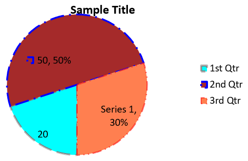
लेबल की पठनीयता बढ़ाने के लिए, देखें Format Leader Lines जिसमें लेबल को स्थित करने और लाइन के रंग, चौड़ाई, पारदर्शिता और डैश शैली को अनुकूलित करने का उदाहरण है।
लाइन चार्ट बनाएं
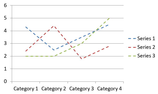
लाइन चार्ट (जिसे लाइन ग्राफ़ भी कहा जाता है) सबसे उपयुक्त तब होते हैं जब आप समय के साथ मान में परिवर्तन दिखाना चाहते हैं। लाइन चार्ट का उपयोग करके आप बड़े डेटा सेट की तुलना एक साथ कर सकते हैं, समय के साथ परिवर्तन और रुझान ट्रैक कर सकते हैं, डेटा सीरीज़ में विसंगतियों को उजागर कर सकते हैं, आदि।
यह उदाहरण AddChart का उपयोग करके डिफ़ॉल्ट सीरीज़ और वर्गों के साथ एक लाइन चार्ट बनाता है, फिर प्रस्तुति को PPTX के रूप में सहेजता है।
using Aspose.Slides;
using Aspose.Slides.Charts;
using Aspose.Slides.Export;

using var presentation = new Presentation();
var slide = presentation.Slides[0];

var lineChart = slide.Shapes.AddChart(ChartType.Line, 20, 20, 500, 300);

presentation.Save("lineChart.pptx", SaveFormat.Pptx);
डिफ़ॉल्ट रूप से, लाइन चार्ट में बिंदुओं को सीधी निरंतर रेखा से जोड़ा जाता है। यदि आप बिंदुओं को डैश से जोड़ना चाहते हैं, तो DashStyle को LineDashStyle से कोई मान सेट करें:
using Aspose.Slides;
using Aspose.Slides.Charts;

using var presentation = new Presentation();
var slide = presentation.Slides[0];

var lineChart = slide.Shapes.AddChart(ChartType.Line, 20, 20, 500, 300);

foreach (var series in lineChart.ChartData.Series)
{
    series.Format.Line.DashStyle = LineDashStyle.Dash;
}
परिणाम:
ट्री मैप चार्ट बनाएं
ट्री मैप चार्ट बिक्री डेटा के लिए सबसे उपयुक्त होते हैं जब आप डेटा वर्गों के सापेक्ष आकार दिखाना चाहते हैं और प्रत्येक वर्ग में बड़े योगदानकर्ताओं को जल्दी से उजागर करना चाहते हैं।
यह उदाहरण आठ लीफ़ को चार स्टेम और दो शाखाओं में समूहित करके एक ट्री मैप बनाता है। SetGroupingItem मेथड स्टेम को ग्रुपिंग लेवल 1 और शाखाओं को लेवल 2 पर असाइन करता है। मान प्रतिच्छेद के आकार निर्धारित करते हैं, जबकि वर्ग लेबल और ओवरलैपिंग पैरेंट लेबल पदानुक्रम को दर्शाते हैं।
using Aspose.Slides;
using Aspose.Slides.Charts;
using Aspose.Slides.Export;

using var presentation = new Presentation();
var slide = presentation.Slides[0];

var chart = slide.Shapes.AddChart(ChartType.Treemap, 20, 20, 500, 300);

chart.ChartData.Categories.Clear();
chart.ChartData.Series.Clear();

var workbook = chart.ChartData.ChartDataWorkbook;
workbook.Clear(0);

// शाखा 1
var categoryCell = workbook.GetCell(0, "C1", "Leaf1");
var leaf = chart.ChartData.Categories.Add(categoryCell);
leaf.GroupingLevels.SetGroupingItem(1, "Stem1");
leaf.GroupingLevels.SetGroupingItem(2, "Branch1");

categoryCell = workbook.GetCell(0, "C2", "Leaf2");
chart.ChartData.Categories.Add(categoryCell);

categoryCell = workbook.GetCell(0, "C3", "Leaf3");
leaf = chart.ChartData.Categories.Add(categoryCell);
leaf.GroupingLevels.SetGroupingItem(1, "Stem2");

categoryCell = workbook.GetCell(0, "C4", "Leaf4");
chart.ChartData.Categories.Add(categoryCell);

// शाखा 2
categoryCell = workbook.GetCell(0, "C5", "Leaf5");
leaf = chart.ChartData.Categories.Add(categoryCell);
leaf.GroupingLevels.SetGroupingItem(1, "Stem3");
leaf.GroupingLevels.SetGroupingItem(2, "Branch2");

categoryCell = workbook.GetCell(0, "C6", "Leaf6");
chart.ChartData.Categories.Add(categoryCell);

categoryCell = workbook.GetCell(0, "C7", "Leaf7");
leaf = chart.ChartData.Categories.Add(categoryCell);
leaf.GroupingLevels.SetGroupingItem(1, "Stem4");

categoryCell = workbook.GetCell(0, "C8", "Leaf8");
chart.ChartData.Categories.Add(categoryCell);

var series = chart.ChartData.Series.Add(ChartType.Treemap);
series.Labels.DefaultDataLabelFormat.ShowCategoryName = true;
var valueCell = workbook.GetCell(0, "D1", 4);
series.DataPoints.AddDataPointForTreemapSeries(valueCell);
valueCell = workbook.GetCell(0, "D2", 5);
series.DataPoints.AddDataPointForTreemapSeries(valueCell);
valueCell = workbook.GetCell(0, "D3", 3);
series.DataPoints.AddDataPointForTreemapSeries(valueCell);
valueCell = workbook.GetCell(0, "D4", 6);
series.DataPoints.AddDataPointForTreemapSeries(valueCell);
valueCell = workbook.GetCell(0, "D5", 9);
series.DataPoints.AddDataPointForTreemapSeries(valueCell);
valueCell = workbook.GetCell(0, "D6", 9);
series.DataPoints.AddDataPointForTreemapSeries(valueCell);
valueCell = workbook.GetCell(0, "D7", 4);
series.DataPoints.AddDataPointForTreemapSeries(valueCell);
valueCell = workbook.GetCell(0, "D8", 3);
series.DataPoints.AddDataPointForTreemapSeries(valueCell);

series.ParentLabelLayout = ParentLabelLayoutType.Overlapping;

presentation.Save("Treemap.pptx", SaveFormat.Pptx);
परिणाम:

वॉटरफ़ॉल चार्ट बनाएं
वॉटरफ़ॉल चार्ट दिखाता है कि सकारात्मक और नकारात्मक परिवर्तन अंतिम मान में कैसे योगदान देते हैं। उदाहरण के लिए, मुनाफ़ा विभाजन राजस्व से शुरू हो सकता है, लागत घटा सकता है, और अन्य आय जोड़ सकता है। परिवर्तन स्तंभ पूर्व और नई चल मानों के बीच तैरते हैं, जबकि कुल स्तंभ शून्य से संचयी मान तक विस्तारित होते हैं।
निम्न उदाहरण हजारों अमेरिकी डॉलर में राशियां उपयोग करता है:
| वर्ग | वर्कबुक मान | स्तंभ प्रकार |
|---|---|---|
| Revenue | 1000 | Increase |
| Cost of sales | -400 | Decrease |
| Gross profit | 600 | Intermediate total |
| Operating expenses | -200 | Decrease |
| Other income | 50 | Increase |
| Net profit | 450 | Final total |
किसी बिंदु को मध्यस्थ या अंतिम कुल के रूप में चिह्नित करने के लिए, उसकी SetAsTotal प्रॉपर्टी को true सेट करें। उस बिंदु की वर्कबुक सेल में वास्तविक संचयी राशि प्रदान करें: कुल लाभ के लिए 600 (1000 - 400) और शुद्ध लाभ के लिए 450 (600 - 200 + 50)। यह प्रॉपर्टी स्तंभ को कुल के रूप में चिह्नित करती है; यह सेल मान की गणना या प्रविष्टि नहीं करता। शून्य को प्लेसहोल्डर के रूप में न उपयोग करें या कुल बिंदु के लिए कोई अन्य परिवर्तन न जोड़ें। कुल स्तंभ संचयी मान को दिखाता है बिना उसे दोबारा चल मान में जोड़े।
यह पूर्ण C# उदाहरण ChartType के Waterfall सदस्य का उपयोग करके एक चार्ट बनाता है, डिफ़ॉल्ट डेटा को साफ़ करता है, और एम्बेडेड वर्कबुक को भरता है। वर्कशीट सूचकांक 0 पहली वर्कशीट चुनता है; स्तंभ A में वर्ग नाम और स्तंभ B में मान होते हैं। प्रत्येक मान सेल को AddDataPointForWaterfallSeries से जोड़ा जाता है। शून्य-आधारित बिंदु सूचकांक 2 और 5 क्रमशः मध्यस्थ और अंतिम कुल को पहचानते हैं। ShowValue को सक्षम करने से मान स्तंभों पर दिखाए जाते हैं। इनपुट प्रस्तुति या वर्कबुक की आवश्यकता नहीं है।
using Aspose.Slides;
using Aspose.Slides.Charts;
using Aspose.Slides.Export;

using var presentation = new Presentation();
var slide = presentation.Slides[0];

var chart = slide.Shapes.AddChart(ChartType.Waterfall, 20, 20, 680, 200);

chart.HasTitle = true;
chart.ChartTitle.AddTextFrameForOverriding("Profit breakdown (USD thousands)");
chart.ChartTitle.Overlay = false;
chart.HasLegend = false;

chart.ChartData.Series.Clear();
chart.ChartData.Categories.Clear();

var workbook = chart.ChartData.ChartDataWorkbook;
var worksheetIndex = 0;

workbook.Clear(worksheetIndex);

var seriesNameCell = workbook.GetCell(worksheetIndex, 0, 1, "Profit");
var series = chart.ChartData.Series.Add(seriesNameCell, ChartType.Waterfall);
var categories = new[] { "Revenue", "Cost of sales", "Gross profit", "Operating expenses", "Other income", "Net profit" };
var values = new double[] { 1000, -400, 600, -200, 50, 450 };

for (var i = 0; i < categories.Length; i++)
{
    var categoryCell = workbook.GetCell(worksheetIndex, i + 1, 0, categories[i]);
    chart.ChartData.Categories.Add(categoryCell);
    var valueCell = workbook.GetCell(worksheetIndex, i + 1, 1, values[i]);
    series.DataPoints.AddDataPointForWaterfallSeries(valueCell);
}

// तीसरा और छठा बिंदु कुल दर्शाते हैं, अतिरिक्त परिवर्तन नहीं।
series.DataPoints[2].SetAsTotal = true;
series.DataPoints[5].SetAsTotal = true;
series.ShowConnectorLines = true;
series.Labels.DefaultDataLabelFormat.ShowValue = true;

presentation.Save("WaterfallChart.pptx", SaveFormat.Pptx);
सीरीज़ स्तर पर ShowConnectorLines प्रॉपर्टी को true सेट करने से क्रमबद्ध स्तंभों को जोड़ने वाली लाइनों को दिखाया जाता है और चल मान को फॉलो करना आसान होता है। इन लाइनों को छिपाने के लिए, कोड में series.ShowConnectorLines = false; असाइनमेंट रखकर सहेजें। यह केवल लाइन की दृश्यता बदलता है, डेटा या कुल को नहीं।
सहेजी गई प्रस्तुति में 600 का कुल लाभ और 450 का शुद्ध लाभ दिखाता है, दोनों शून्य से शुरू होते हैं:

स्टॉक चार्ट बनाएं
स्टॉक चार्ट वित्तीय डेटा जैसे ओपन, हाई, लो, और क्लोज़ कीमतों को प्रदर्शित करने के लिए उपयोग होते हैं, जिससे बाजार रुझान और अस्थिरता का विश्लेषण किया जा सके। ये स्टॉक प्रदर्शन पर आवश्यक अंतर्दृष्टि प्रदान करते हैं, जिससे निवेशकों और विश्लेषकों को सूचित निर्णय लेने में मदद मिलती है।
यह उदाहरण चार क्रम में चार सीरीज़ और तीन वर्गों के साथ एक ओपन-हाई-लो-क्लोज़ चार्ट बनाता है। HasUpDownBars प्रॉपर्टी अप/डाउन बार सक्षम करती है, और HiLowLinesFormat हाई-लो लाइनों को नियंत्रित करती है जो कीमत रेंज दर्शाती हैं, जबकि व्यक्तिगत सीरीज़ लाइनों और छोटे क्षैतिज ग्रिडलाइन को छिपाया गया है।
using Aspose.Slides;
using Aspose.Slides.Charts;
using Aspose.Slides.Export;

using var presentation = new Presentation();
var slide = presentation.Slides[0];

var chart = slide.Shapes.AddChart(ChartType.OpenHighLowClose, 20, 20, 500, 300, false);

var workbook = chart.ChartData.ChartDataWorkbook;

var categoryCell = workbook.GetCell(0, 1, 0, "A");
chart.ChartData.Categories.Add(categoryCell);
categoryCell = workbook.GetCell(0, 2, 0, "B");
chart.ChartData.Categories.Add(categoryCell);
categoryCell = workbook.GetCell(0, 3, 0, "C");
chart.ChartData.Categories.Add(categoryCell);

var seriesNameCell = workbook.GetCell(0, 0, 1, "Open");
chart.ChartData.Series.Add(seriesNameCell, ChartType.OpenHighLowClose);
seriesNameCell = workbook.GetCell(0, 0, 2, "High");
chart.ChartData.Series.Add(seriesNameCell, ChartType.OpenHighLowClose);
seriesNameCell = workbook.GetCell(0, 0, 3, "Low");
chart.ChartData.Series.Add(seriesNameCell, ChartType.OpenHighLowClose);
seriesNameCell = workbook.GetCell(0, 0, 4, "Close");
chart.ChartData.Series.Add(seriesNameCell, ChartType.OpenHighLowClose);

var series = chart.ChartData.Series[0];
var valueCell = workbook.GetCell(0, 1, 1, 72);
series.DataPoints.AddDataPointForStockSeries(valueCell);
valueCell = workbook.GetCell(0, 2, 1, 25);
series.DataPoints.AddDataPointForStockSeries(valueCell);
valueCell = workbook.GetCell(0, 3, 1, 38);
series.DataPoints.AddDataPointForStockSeries(valueCell);

series = chart.ChartData.Series[1];
valueCell = workbook.GetCell(0, 1, 2, 172);
series.DataPoints.AddDataPointForStockSeries(valueCell);
valueCell = workbook.GetCell(0, 2, 2, 57);
series.DataPoints.AddDataPointForStockSeries(valueCell);
valueCell = workbook.GetCell(0, 3, 2, 57);
series.DataPoints.AddDataPointForStockSeries(valueCell);

series = chart.ChartData.Series[2];
valueCell = workbook.GetCell(0, 1, 3, 12);
series.DataPoints.AddDataPointForStockSeries(valueCell);
valueCell = workbook.GetCell(0, 2, 3, 12);
series.DataPoints.AddDataPointForStockSeries(valueCell);
valueCell = workbook.GetCell(0, 3, 3, 13);
series.DataPoints.AddDataPointForStockSeries(valueCell);

series = chart.ChartData.Series[3];
valueCell = workbook.GetCell(0, 1, 4, 25);
series.DataPoints.AddDataPointForStockSeries(valueCell);
valueCell = workbook.GetCell(0, 2, 4, 38);
series.DataPoints.AddDataPointForStockSeries(valueCell);
valueCell = workbook.GetCell(0, 3, 4, 50);
series.DataPoints.AddDataPointForStockSeries(valueCell);

chart.ChartData.SeriesGroups[0].UpDownBars.HasUpDownBars = true;
chart.ChartData.SeriesGroups[0].HiLowLinesFormat.Line.FillFormat.FillType = FillType.Solid;

foreach (var stockSeries in chart.ChartData.Series)
{
    stockSeries.Format.Line.FillFormat.FillType = FillType.NoFill;
}

chart.Axes.VerticalAxis.MinorGridLinesFormat.Line.FillFormat.FillType = FillType.NoFill;

presentation.Save("Stock-chart.pptx", SaveFormat.Pptx);
परिणाम:

बॉक्स एंड विस्कर चार्ट बनाएं
बॉक्स एंड विस्कर चार्ट डेटा के वितरण को प्रमुख सांख्यिकीय माप जैसे मध्यक, चतुर्थांश और संभावित अपवर्जन को संक्षेप में दिखाकर प्रदर्शित करते हैं। ये अन्वेषणात्मक डेटा विश्लेषण और सांख्यिकीय अध्ययन में डेटा परिवर्तनशीलता को जल्दी समझने और किसी भी विसंगति की पहचान करने में उपयोगी होते हैं।
यह उदाहरण छह मानों से एक बॉक्स एंड विस्कर चार्ट बनाता है। QuartileMethod प्रॉपर्टी अनन्य चतुर्थांश गणना चुनती है। उदाहरण में मीन्स लाइनों, मीन्स मार्करों, आंतरिक बिंदुओं और अपवर्जन बिंदुओं को भी सक्षम किया गया है।
using Aspose.Slides;
using Aspose.Slides.Charts;
using Aspose.Slides.Export;

using var presentation = new Presentation();
var slide = presentation.Slides[0];

var chart = slide.Shapes.AddChart(ChartType.BoxAndWhisker, 20, 20, 500, 300);

chart.ChartData.Categories.Clear();
chart.ChartData.Series.Clear();

var workbook = chart.ChartData.ChartDataWorkbook;
workbook.Clear(0);

var categoryCell = workbook.GetCell(0, "A1", "Category 1");
chart.ChartData.Categories.Add(categoryCell);
categoryCell = workbook.GetCell(0, "A2", "Category 2");
chart.ChartData.Categories.Add(categoryCell);
categoryCell = workbook.GetCell(0, "A3", "Category 3");
chart.ChartData.Categories.Add(categoryCell);
categoryCell = workbook.GetCell(0, "A4", "Category 4");
chart.ChartData.Categories.Add(categoryCell);
categoryCell = workbook.GetCell(0, "A5", "Category 5");
chart.ChartData.Categories.Add(categoryCell);
categoryCell = workbook.GetCell(0, "A6", "Category 6");
chart.ChartData.Categories.Add(categoryCell);

var series = chart.ChartData.Series.Add(ChartType.BoxAndWhisker);

series.QuartileMethod = QuartileMethodType.Exclusive;
series.ShowMeanLine = true;
series.ShowMeanMarkers = true;
series.ShowInnerPoints = true;
series.ShowOutlierPoints = true;

var valueCell = workbook.GetCell(0, "B1", 15);
series.DataPoints.AddDataPointForBoxAndWhiskerSeries(valueCell);
valueCell = workbook.GetCell(0, "B2", 41);
series.DataPoints.AddDataPointForBoxAndWhiskerSeries(valueCell);
valueCell = workbook.GetCell(0, "B3", 16);
series.DataPoints.AddDataPointForBoxAndWhiskerSeries(valueCell);
valueCell = workbook.GetCell(0, "B4", 10);
series.DataPoints.AddDataPointForBoxAndWhiskerSeries(valueCell);
valueCell = workbook.GetCell(0, "B5", 23);
series.DataPoints.AddDataPointForBoxAndWhiskerSeries(valueCell);
valueCell = workbook.GetCell(0, "B6", 16);
series.DataPoints.AddDataPointForBoxAndWhiskerSeries(valueCell);

presentation.Save("BoxAndWhisker.pptx", SaveFormat.Pptx);
फ़नल चार्ट बनाएं
फ़नल चार्ट क्रमिक चरणों वाली प्रक्रियाओं को दृश्य रूप में प्रस्तुत करने के लिए उपयोग होते हैं, जहाँ डेटा की मात्रा प्रत्येक चरण के साथ घटती जाती है। ये परिवर्तन दरों का विश्लेषण, बाधाओं की पहचान, और बिक्री या विपणन प्रक्रिया की दक्षता ट्रैक करने में विशेष रूप से मददगार होते हैं।
यह उदाहरण मौजूदा प्रस्तुति की पहली स्लाइड में एक फ़नल चार्ट जोड़ने के लिए AddChart का उपयोग करता है। यह डिफ़ॉल्ट डेटा को छह वर्गों और 50 से 500 तक की मानों वाले डेटा से बदलता है, फिर अपडेटेड प्रस्तुति को सहेजता है। इनपुट प्रस्तुति में कम से कम एक स्लाइड होनी चाहिए।
using Aspose.Slides;
using Aspose.Slides.Charts;
using Aspose.Slides.Export;

using var presentation = new Presentation("test.pptx");
var slide = presentation.Slides[0];

var chart = slide.Shapes.AddChart(ChartType.Funnel, 50, 50, 500, 400);

chart.ChartData.Categories.Clear();
chart.ChartData.Series.Clear();

var workbook = chart.ChartData.ChartDataWorkbook;
workbook.Clear(0);

var categoryCell = workbook.GetCell(0, "A1", "Category 1");
chart.ChartData.Categories.Add(categoryCell);
categoryCell = workbook.GetCell(0, "A2", "Category 2");
chart.ChartData.Categories.Add(categoryCell);
categoryCell = workbook.GetCell(0, "A3", "Category 3");
chart.ChartData.Categories.Add(categoryCell);
categoryCell = workbook.GetCell(0, "A4", "Category 4");
chart.ChartData.Categories.Add(categoryCell);
categoryCell = workbook.GetCell(0, "A5", "Category 5");
chart.ChartData.Categories.Add(categoryCell);
categoryCell = workbook.GetCell(0, "A6", "Category 6");
chart.ChartData.Categories.Add(categoryCell);

var series = chart.ChartData.Series.Add(ChartType.Funnel);

var valueCell = workbook.GetCell(0, "B1", 50);
series.DataPoints.AddDataPointForFunnelSeries(valueCell);
valueCell = workbook.GetCell(0, "B2", 100);
series.DataPoints.AddDataPointForFunnelSeries(valueCell);
valueCell = workbook.GetCell(0, "B3", 200);
series.DataPoints.AddDataPointForFunnelSeries(valueCell);
valueCell = workbook.GetCell(0, "B4", 300);
series.DataPoints.AddDataPointForFunnelSeries(valueCell);
valueCell = workbook.GetCell(0, "B5", 400);
series.DataPoints.AddDataPointForFunnelSeries(valueCell);
valueCell = workbook.GetCell(0, "B6", 500);
series.DataPoints.AddDataPointForFunnelSeries(valueCell);

presentation.Save("Funnel.pptx", SaveFormat.Pptx);
परिणाम:

सनबर्स्ट चार्ट बनाएं
सनबर्स्ट चार्ट पदानुक्रमित डेटा को दृश्य रूप में प्रस्तुत करते हैं, स्तरों को समानांतर रिंग्स के रूप में दिखाते हैं। ये भाग-से-सम्पूर्ण संबंध को स्पष्ट व संक्षिप्त रूप में दर्शाते हैं और नेस्टेड वर्गों एवं उपवर्गों को दर्शाने के लिए आदर्श होते हैं।
यह उदाहरण आठ लीफ़ को चार स्टेम और दो शाखाओं में समूहित करके एक सनबर्स्ट चार्ट बनाता है। SetGroupingItem मेथड स्टेम को ग्रुपिंग लेवल 1 और शाखाओं को लेवल 2 पर असाइन करता है। वर्ग लेबल खंडों की पहचान करते हैं, और मान उनके सापेक्ष आकार निर्धारित करते हैं।
using Aspose.Slides;
using Aspose.Slides.Charts;
using Aspose.Slides.Export;

using var presentation = new Presentation();
var slide = presentation.Slides[0];

var chart = slide.Shapes.AddChart(ChartType.Sunburst, 20, 20, 500, 300);

chart.ChartData.Categories.Clear();
chart.ChartData.Series.Clear();

var workbook = chart.ChartData.ChartDataWorkbook;
workbook.Clear(0);

// शाखा 1
var categoryCell = workbook.GetCell(0, "C1", "Leaf1");
var leaf = chart.ChartData.Categories.Add(categoryCell);
leaf.GroupingLevels.SetGroupingItem(1, "Stem1");
leaf.GroupingLevels.SetGroupingItem(2, "Branch1");

categoryCell = workbook.GetCell(0, "C2", "Leaf2");
chart.ChartData.Categories.Add(categoryCell);

categoryCell = workbook.GetCell(0, "C3", "Leaf3");
leaf = chart.ChartData.Categories.Add(categoryCell);
leaf.GroupingLevels.SetGroupingItem(1, "Stem2");

categoryCell = workbook.GetCell(0, "C4", "Leaf4");
chart.ChartData.Categories.Add(categoryCell);

// शाखा 2
categoryCell = workbook.GetCell(0, "C5", "Leaf5");
leaf = chart.ChartData.Categories.Add(categoryCell);
leaf.GroupingLevels.SetGroupingItem(1, "Stem3");
leaf.GroupingLevels.SetGroupingItem(2, "Branch2");

categoryCell = workbook.GetCell(0, "C6", "Leaf6");
chart.ChartData.Categories.Add(categoryCell);

categoryCell = workbook.GetCell(0, "C7", "Leaf7");
leaf = chart.ChartData.Categories.Add(categoryCell);
leaf.GroupingLevels.SetGroupingItem(1, "Stem4");

categoryCell = workbook.GetCell(0, "C8", "Leaf8");
chart.ChartData.Categories.Add(categoryCell);

var series = chart.ChartData.Series.Add(ChartType.Sunburst);
series.Labels.DefaultDataLabelFormat.ShowCategoryName = true;
var valueCell = workbook.GetCell(0, "D1", 4);
series.DataPoints.AddDataPointForSunburstSeries(valueCell);
valueCell = workbook.GetCell(0, "D2", 5);
series.DataPoints.AddDataPointForSunburstSeries(valueCell);
valueCell = workbook.GetCell(0, "D3", 3);
series.DataPoints.AddDataPointForSunburstSeries(valueCell);
valueCell = workbook.GetCell(0, "D4", 6);
series.DataPoints.AddDataPointForSunburstSeries(valueCell);
valueCell = workbook.GetCell(0, "D5", 9);
series.DataPoints.AddDataPointForSunburstSeries(valueCell);
valueCell = workbook.GetCell(0, "D6", 9);
series.DataPoints.AddDataPointForSunburstSeries(valueCell);
valueCell = workbook.GetCell(0, "D7", 4);
series.DataPoints.AddDataPointForSunburstSeries(valueCell);
valueCell = workbook.GetCell(0, "D8", 3);
series.DataPoints.AddDataPointForSunburstSeries(valueCell);

presentation.Save("Sunburst.pptx", SaveFormat.Pptx);
परिणाम:

हिस्टोग्राम चार्ट बनाएं
हिस्टोग्राम चार्ट दिखाते हैं कि संख्यात्मक मान अंतराल (बिन) में कैसे वितरित होते हैं। मासिक ऑर्डर प्रोसेसिंग समय रिपोर्टों के लिए समान बिन चौड़ाई और थ्रेशोल्ड का उपयोग करें ताकि अंतराल सुसंगत रहें और वितरण की तुलना आसान हो।
क्षैतिज अक्ष AggregationType को AxisAggregationType के किसी मोड पर सेट करें। BinWidth केवल ByBinWidth के लिये लागू होता है; NumberOfBins केवल ByNumberOfBins के लिये। Automatic का उपयोग करके चार्ट को बिन चुनने दें।
स्थिर बिन चौड़ाई का उपयोग करें
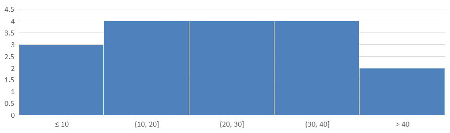
यह उदाहरण प्रोसेसिंग समय को 10 मिनट के अंतराल में समूहित करता है, जिसमें 10 मिनट या उससे कम और 40 मिनट से अधिक के लिए अलग बिन होते हैं। इन बिन को IsUnderflowBin और IsOverflowBin से सक्षम करें। स्पष्ट UnderflowBin और OverflowBin थ्रेशोल्ड प्रदान करते समय, IsAutomaticUnderflowBin और IsAutomaticOverflowBin को false सेट करें।
using Aspose.Slides;
using Aspose.Slides.Charts;
using Aspose.Slides.Export;

using var presentation = new Presentation();
var slide = presentation.Slides[0];

var chart = slide.Shapes.AddChart(ChartType.Histogram, 20, 20, 680, 200);

chart.HasLegend = false;
chart.HasTitle = false;

chart.ChartData.Categories.Clear();
chart.ChartData.Series.Clear();

var workbook = chart.ChartData.ChartDataWorkbook;
workbook.Clear(0);

var series = chart.ChartData.Series.Add(ChartType.Histogram);
double[] values = { 5, 10, 10, 11, 15, 20, 20, 21, 25, 30, 30, 31, 35, 40, 40, 41, 50 };
for (var i = 0; i < values.Length; i++)
{
    var valueCell = workbook.GetCell(0, i, 0, values[i]);
    series.DataPoints.AddDataPointForHistogramSeries(valueCell);
}

var axis = chart.Axes.HorizontalAxis;
axis.AggregationType = AxisAggregationType.ByBinWidth;
axis.BinWidth = 10;
axis.IsUnderflowBin = true;
axis.IsAutomaticUnderflowBin = false;
axis.UnderflowBin = 10;
axis.IsOverflowBin = true;
axis.IsAutomaticOverflowBin = false;
axis.OverflowBin = 40;

presentation.Save("Histogram-bin-width.pptx", SaveFormat.Pptx);
PowerPoint में प्रदर्शित प्रस्तुति में बिन गणनाएँ 3, 4, 4, 4, और 2 हैं। अंडरफ़्लो बिन में 5, 10, 10 शामिल हैं, इसलिए इसका थ्रेशोल्ड समावेशी है। ओवरफ़्लो बिन में केवल 41, 50 शामिल हैं, इसलिए इसका थ्रेशोल्ड बहिष्करणीय है; 40 मान पूर्ववर्ती अंतराल में रहता है। अंतरिक बिन में मान उनके निचले सीमा से बड़े और ऊपरी सीमा से छोटे या बराबर होते हैं।
बिन की संख्या निर्दिष्ट करें
स्थिर अंतराल की बजाय स्थिर विवरण स्तर के लिए, वही डेटा के लिए पाँच बिन का अनुरोध करें। इस उदाहरण में अंडरफ़्लो और ओवरफ़्लो बिन अक्षम हैं। चार्ट डेटा रेंज से चौड़ाई निर्धारित करता है, इसलिए सीमा रिपोर्ट के बीच बदल सकती है।
using Aspose.Slides;
using Aspose.Slides.Charts;
using Aspose.Slides.Export;

using var presentation = new Presentation();
var slide = presentation.Slides[0];

var chart = slide.Shapes.AddChart(ChartType.Histogram, 20, 20, 680, 200);

chart.HasLegend = false;
chart.HasTitle = false;

chart.ChartData.Categories.Clear();
chart.ChartData.Series.Clear();

var workbook = chart.ChartData.ChartDataWorkbook;
workbook.Clear(0);

var series = chart.ChartData.Series.Add(ChartType.Histogram);
double[] values = { 5, 10, 10, 11, 15, 20, 20, 21, 25, 30, 30, 31, 35, 40, 40, 41, 50 };
for (var i = 0; i < values.Length; i++)
{
    var valueCell = workbook.GetCell(0, i, 0, values[i]);
    series.DataPoints.AddDataPointForHistogramSeries(valueCell);
}

var axis = chart.Axes.HorizontalAxis;
axis.AggregationType = AxisAggregationType.ByNumberOfBins;
axis.NumberOfBins = 5;

presentation.Save("Histogram-bin-count.pptx", SaveFormat.Pptx);
पाँच बिन की गणनाएँ 4, 4, 4, 4, और 1 हैं। ऊपर की स्थिर-चौड़ाई परिणाम से इस वितरण की तुलना करें: इनपुट मान समान हैं, लेकिन सीमाएँ भिन्न हैं।

राडार चार्ट बनाएं
राडार चार्ट बहु-चर डेटा को दो-आयामी प्रारूप में प्रदर्शित करते हैं, जिससे कई चरों की एक साथ तुलना आसान हो जाती है। ये कई प्रदर्शन मीट्रिक या गुणों में पैटर्न, ताकत और कमजोरियों की पहचान करने के लिए विशेष रूप से उपयोगी होते हैं।
यह उदाहरण AddChart का उपयोग करके डिफ़ॉल्ट सीरीज़ और वर्गों के साथ एक राडार चार्ट बनाता है, फिर प्रस्तुति को PPTX के रूप में सहेजता है।
using Aspose.Slides;
using Aspose.Slides.Charts;
using Aspose.Slides.Export;

using var presentation = new Presentation();
var slide = presentation.Slides[0];

slide.Shapes.AddChart(ChartType.Radar, 20, 20, 500, 300);

presentation.Save("Radar-chart.pptx", SaveFormat.Pptx);
परिणाम:

मल्टी-कैटेगरी चार्ट बनाएं
मल्टी-कैटेगरी चार्ट उन डेटा को प्रदर्शित करने के लिए उपयोग होते हैं जिनमें एक से अधिक वर्गीकरण समूह होते हैं, जिससे आप कई आयामों में मानों की तुलना एक साथ कर सकते हैं। ये जटिल, बहु-स्तरीय डेटासेट में रुझान और संबंधों का विश्लेषण करने में विशेष रूप से मददगार होते हैं।
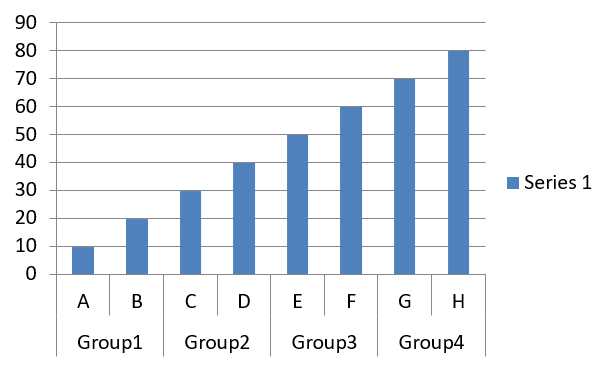
यह उदाहरण चार जोड़ों में व्यवस्थित आठ वर्गों के साथ एक क्लस्टर्ड कॉलम चार्ट बनाता है। SetGroupingItem मेथड प्रत्येक जोड़े को ग्रुपिंग लेवल 1 पर साझा लेबल देता है, जिससे वर्ग अक्ष में व्यक्तिगत और समूह लेबल दोनों प्रदर्शित होते हैं।
using Aspose.Slides;
using Aspose.Slides.Charts;
using Aspose.Slides.Export;

using var presentation = new Presentation();
var slide = presentation.Slides[0];

var chart = slide.Shapes.AddChart(ChartType.ClusteredColumn, 20, 20, 500, 300);

chart.ChartData.Series.Clear();
chart.ChartData.Categories.Clear();

var workbook = chart.ChartData.ChartDataWorkbook;
workbook.Clear(0);

var worksheetIndex = 0;

var categoryCell = workbook.GetCell(0, "c2", "A");
var category = chart.ChartData.Categories.Add(categoryCell);
category.GroupingLevels.SetGroupingItem(1, "Group1");
categoryCell = workbook.GetCell(0, "c3", "B");
category = chart.ChartData.Categories.Add(categoryCell);

categoryCell = workbook.GetCell(0, "c4", "C");
category = chart.ChartData.Categories.Add(categoryCell);
category.GroupingLevels.SetGroupingItem(1, "Group2");
categoryCell = workbook.GetCell(0, "c5", "D");
category = chart.ChartData.Categories.Add(categoryCell);

categoryCell = workbook.GetCell(0, "c6", "E");
category = chart.ChartData.Categories.Add(categoryCell);
category.GroupingLevels.SetGroupingItem(1, "Group3");
categoryCell = workbook.GetCell(0, "c7", "F");
category = chart.ChartData.Categories.Add(categoryCell);

categoryCell = workbook.GetCell(0, "c8", "G");
category = chart.ChartData.Categories.Add(categoryCell);
category.GroupingLevels.SetGroupingItem(1, "Group4");
categoryCell = workbook.GetCell(0, "c9", "H");
category = chart.ChartData.Categories.Add(categoryCell);

var seriesNameCell = workbook.GetCell(0, "D1", "Series 1");
var series = chart.ChartData.Series.Add(seriesNameCell, ChartType.ClusteredColumn);

var valueCell = workbook.GetCell(worksheetIndex, "D2", 10);
series.DataPoints.AddDataPointForBarSeries(valueCell);
valueCell = workbook.GetCell(worksheetIndex, "D3", 20);
series.DataPoints.AddDataPointForBarSeries(valueCell);
valueCell = workbook.GetCell(worksheetIndex, "D4", 30);
series.DataPoints.AddDataPointForBarSeries(valueCell);
valueCell = workbook.GetCell(worksheetIndex, "D5", 40);
series.DataPoints.AddDataPointForBarSeries(valueCell);
valueCell = workbook.GetCell(worksheetIndex, "D6", 50);
series.DataPoints.AddDataPointForBarSeries(valueCell);
valueCell = workbook.GetCell(worksheetIndex, "D7", 60);
series.DataPoints.AddDataPointForBarSeries(valueCell);
valueCell = workbook.GetCell(worksheetIndex, "D8", 70);
series.DataPoints.AddDataPointForBarSeries(valueCell);
valueCell = workbook.GetCell(worksheetIndex, "D9", 80);
series.DataPoints.AddDataPointForBarSeries(valueCell);

presentation.Save("AsposeChart.pptx", SaveFormat.Pptx);
परिणाम:
मैप चार्ट बनाएं
मैप चार्ट भौगोलिक डेटा को देशों, राज्यों या शहरों जैसी विशिष्ट स्थानों पर मैप करके दृश्य रूप में प्रस्तुत करते हैं। ये क्षेत्रीय रुझान, जनसांख्यिकीय डेटा, और स्थानिक वितरण का स्पष्ट व आकर्षक तरीके से विश्लेषण करने में विशेष रूप से उपयोगी होते हैं।
यह उदाहरण AddChart का उपयोग करके डिफ़ॉल्ट भू-स्थानिक डेटा के साथ एक मैप चार्ट बनाता है और PowerPoint में देखने हेतु सहेजता है।
using Aspose.Slides;
using Aspose.Slides.Charts;
using Aspose.Slides.Export;

using var presentation = new Presentation();
var slide = presentation.Slides[0];

var chart = slide.Shapes.AddChart(ChartType.Map, 20, 20, 500, 300);

presentation.Save("mapChart.pptx", SaveFormat.Pptx);
परिणाम:
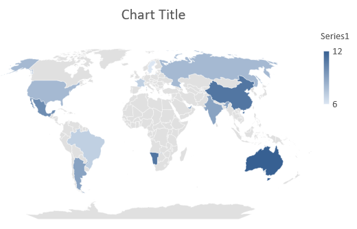
Note
The picture above shows the saved presentation opened in PowerPoint. Aspose.Slides writes the map chart and its data correctly, but it does not draw map charts itself: when a slide holding one is rendered to an image or converted to PDF or SVG, the chart area comes out blank. Other shapes on the same slide are unaffected.कॉम्बिनेशन चार्ट बनाएं
कॉम्बिनेशन चार्ट (या कॉम्बो चार्ट) एक ही ग्राफ़ में दो या अधिक चार्ट प्रकारों को संयोजित करता है। यह चार्ट दो या अधिक डेटा सेट के बीच अंतर को उजागर, तुलना या जांचने की अनुमति देता है, जिससे आप उनके बीच संबंध पहचान सकते हैं।
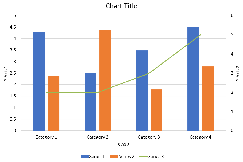
यह उदाहरण चार क्लस्टर्ड कॉलम सीरीज़ को एक लाइन सीरीज़ के साथ चार वर्गों में संयोजित करता है। कॉलम प्राथमिक लंबवत अक्ष का उपयोग करते हैं, जबकि PlotOnSecondAxis लाइन को दाएँ पर द्वितीयक लंबवत अक्ष पर रखता है। सहायक फ़ंक्शन शीर्षक, लेजेंड, अक्ष लेबल और ग्रिडलाइन को कॉन्फ़िगर करते हैं।
using System.Drawing;
using Aspose.Slides;
using Aspose.Slides.Charts;
using Aspose.Slides.Export;

CreateComboChart();

static void CreateComboChart()
{
    using var presentation = new Presentation();
    var chart = CreateChartWithFirstSeries(presentation.Slides[0]);

    AddSecondSeriesToChart(chart);
    AddThirdSeriesToChart(chart);

    SetPrimaryAxesFormat(chart);
    SetSecondaryAxesFormat(chart);

    presentation.Save("combo-chart.pptx", SaveFormat.Pptx);
}

static IChart CreateChartWithFirstSeries(ISlide slide)
{
    var chart = slide.Shapes.AddChart(ChartType.ClusteredColumn, 50, 50, 600, 400);

    chart.HasTitle = true;
    chart.ChartTitle.AddTextFrameForOverriding("Chart Title");
    chart.ChartTitle.Overlay = false;
    var portionFormat = chart.ChartTitle.TextFrameForOverriding.Paragraphs[0].ParagraphFormat.DefaultPortionFormat;
    portionFormat.FontBold = NullableBool.False;
    portionFormat.FontHeight = 18f;

    chart.Legend.Position = LegendPositionType.Bottom;
    chart.Legend.TextFormat.PortionFormat.FontHeight = 12f;

    chart.ChartData.Series.Clear();
    chart.ChartData.Categories.Clear();

    var workbook = chart.ChartData.ChartDataWorkbook;
    var worksheetIndex = 0;

    var categoryCell = workbook.GetCell(worksheetIndex, 1, 0, "Category 1");
    chart.ChartData.Categories.Add(categoryCell);
    categoryCell = workbook.GetCell(worksheetIndex, 2, 0, "Category 2");
    chart.ChartData.Categories.Add(categoryCell);
    categoryCell = workbook.GetCell(worksheetIndex, 3, 0, "Category 3");
    chart.ChartData.Categories.Add(categoryCell);
    categoryCell = workbook.GetCell(worksheetIndex, 4, 0, "Category 4");
    chart.ChartData.Categories.Add(categoryCell);

    var seriesNameCell = workbook.GetCell(worksheetIndex, 0, 1, "Series 1");
    var series = chart.ChartData.Series.Add(seriesNameCell, chart.Type);

    series.ParentSeriesGroup.Overlap = -25;
    series.ParentSeriesGroup.GapWidth = 220;

    var valueCell = workbook.GetCell(worksheetIndex, 1, 1, 4.3);
    series.DataPoints.AddDataPointForBarSeries(valueCell);
    valueCell = workbook.GetCell(worksheetIndex, 2, 1, 2.5);
    series.DataPoints.AddDataPointForBarSeries(valueCell);
    valueCell = workbook.GetCell(worksheetIndex, 3, 1, 3.5);
    series.DataPoints.AddDataPointForBarSeries(valueCell);
    valueCell = workbook.GetCell(worksheetIndex, 4, 1, 4.5);
    series.DataPoints.AddDataPointForBarSeries(valueCell);

    return chart;
}

static void AddSecondSeriesToChart(IChart chart)
{
    var workbook = chart.ChartData.ChartDataWorkbook;
    const int worksheetIndex = 0;

    var seriesNameCell = workbook.GetCell(worksheetIndex, 0, 2, "Series 2");
    var series = chart.ChartData.Series.Add(seriesNameCell, ChartType.ClusteredColumn);

    series.ParentSeriesGroup.Overlap = -25;
    series.ParentSeriesGroup.GapWidth = 220;

    var valueCell = workbook.GetCell(worksheetIndex, 1, 2, 2.4);
    series.DataPoints.AddDataPointForBarSeries(valueCell);
    valueCell = workbook.GetCell(worksheetIndex, 2, 2, 4.4);
    series.DataPoints.AddDataPointForBarSeries(valueCell);
    valueCell = workbook.GetCell(worksheetIndex, 3, 2, 1.8);
    series.DataPoints.AddDataPointForBarSeries(valueCell);
    valueCell = workbook.GetCell(worksheetIndex, 4, 2, 2.8);
    series.DataPoints.AddDataPointForBarSeries(valueCell);
}

static void AddThirdSeriesToChart(IChart chart)
{
    var workbook = chart.ChartData.ChartDataWorkbook;
    const int worksheetIndex = 0;

    var seriesNameCell = workbook.GetCell(worksheetIndex, 0, 3, "Series 3");
    var series = chart.ChartData.Series.Add(seriesNameCell, ChartType.Line);

    var valueCell = workbook.GetCell(worksheetIndex, 1, 3, 2.0);
    series.DataPoints.AddDataPointForLineSeries(valueCell);
    valueCell = workbook.GetCell(worksheetIndex, 2, 3, 2.0);
    series.DataPoints.AddDataPointForLineSeries(valueCell);
    valueCell = workbook.GetCell(worksheetIndex, 3, 3, 3.0);
    series.DataPoints.AddDataPointForLineSeries(valueCell);
    valueCell = workbook.GetCell(worksheetIndex, 4, 3, 5.0);
    series.DataPoints.AddDataPointForLineSeries(valueCell);

    series.PlotOnSecondAxis = true;
}

static void SetPrimaryAxesFormat(IChart chart)
{
    var horizontalAxis = chart.Axes.HorizontalAxis;
    horizontalAxis.TextFormat.PortionFormat.FontHeight = 12f;
    horizontalAxis.Format.Line.FillFormat.FillType = FillType.NoFill;

    SetAxisTitle(horizontalAxis, "X Axis");

    var verticalAxis = chart.Axes.VerticalAxis;
    verticalAxis.TextFormat.PortionFormat.FontHeight = 12f;
    verticalAxis.Format.Line.FillFormat.FillType = FillType.NoFill;

    SetAxisTitle(verticalAxis, "Y Axis 1");

    var majorGridLinesFormat = verticalAxis.MajorGridLinesFormat.Line.FillFormat;
    majorGridLinesFormat.FillType = FillType.Solid;
    majorGridLinesFormat.SolidFillColor.Color = Color.FromArgb(217, 217, 217);
}

static void SetSecondaryAxesFormat(IChart chart)
{
    var secondaryHorizontalAxis = chart.Axes.SecondaryHorizontalAxis;
    secondaryHorizontalAxis.Position = AxisPositionType.Bottom;
    secondaryHorizontalAxis.CrossType = CrossesType.Maximum;
    secondaryHorizontalAxis.IsVisible = false;
    secondaryHorizontalAxis.MajorGridLinesFormat.Line.FillFormat.FillType = FillType.NoFill;
    secondaryHorizontalAxis.MinorGridLinesFormat.Line.FillFormat.FillType = FillType.NoFill;

    var secondaryVerticalAxis = chart.Axes.SecondaryVerticalAxis;
    secondaryVerticalAxis.Position = AxisPositionType.Right;
    secondaryVerticalAxis.TextFormat.PortionFormat.FontHeight = 12f;
    secondaryVerticalAxis.Format.Line.FillFormat.FillType = FillType.NoFill;
    secondaryVerticalAxis.MajorGridLinesFormat.Line.FillFormat.FillType = FillType.NoFill;
    secondaryVerticalAxis.MinorGridLinesFormat.Line.FillFormat.FillType = FillType.NoFill;

    SetAxisTitle(secondaryVerticalAxis, "Y Axis 2");
}

static void SetAxisTitle(IAxis axis, string axisTitle)
{
    axis.HasTitle = true;
    axis.Title.Overlay = false;
    var titlePortionFormat = axis.Title.AddTextFrameForOverriding(axisTitle).Paragraphs[0].ParagraphFormat.DefaultPortionFormat;
    titlePortionFormat.FontBold = NullableBool.False;
    titlePortionFormat.FontHeight = 12f;
}
चार्ट अपडेट करें
Aspose.Slides for .NET आपको PowerPoint चार्ट को डेटा, फ़ॉर्मेटिंग और स्टाइलिंग संशोधित करके अपडेट करने में सक्षम बनाता है। यह सुविधा प्रस्तुतियों को गतिशील सामग्री के साथ अद्यतन रखने की प्रक्रिया को सरल बनाती है और सुनिश्चित करती है कि चार्ट वर्तमान डेटा और दृश्य मानकों को सटीक रूप से दर्शाते रहें।
यह उदाहरण मौजूदा प्रस्तुति की पहली स्लाइड पर “My chart” नामक चार्ट को अपडेट करता है। इसमें प्रत्येक में तीन डेटा पॉइंट वाले दो कॉलम सीरीज़ की आवश्यकता होती है, जहाँ वर्ग लेबल कॉलम A में और सीरीज़ नाम पहली पंक्ति में होते हैं। उदाहरण GetCell का उपयोग करके वर्कबुक सेल बदलता है, सीरीज़ मान अपडेट करता है, तृतीय सीरीज़ जोड़ता है, और Type के माध्यम से चार्ट को क्लस्टर्ड सिलेंडर में बदलता है।
using Aspose.Slides;
using Aspose.Slides.Charts;
using Aspose.Slides.Export;

const string chartName = "My chart";

using var presentation = new Presentation("ExistingChart.pptx");
var slide = presentation.Slides[0];

foreach (IShape shape in slide.Shapes)
{
    if (shape is IChart chart && chart.Name == chartName)
    {
        var worksheetIndex = 0;

        var workbook = chart.ChartData.ChartDataWorkbook;

        workbook.GetCell(worksheetIndex, 1, 0, "Modified Category 1");
        workbook.GetCell(worksheetIndex, 2, 0, "Modified Category 2");

        var series = chart.ChartData.Series[0];

        workbook.GetCell(worksheetIndex, 0, 1, "New_Series 1");
        series.DataPoints[0].Value.Data = 90;
        series.DataPoints[1].Value.Data = 123;
        series.DataPoints[2].Value.Data = 44;

        series = chart.ChartData.Series[1];

        workbook.GetCell(worksheetIndex, 0, 2, "New_Series 2");
        series.DataPoints[0].Value.Data = 23;
        series.DataPoints[1].Value.Data = 67;
        series.DataPoints[2].Value.Data = 99;

        var seriesNameCell = workbook.GetCell(worksheetIndex, 0, 3, "Series 3");
        series = chart.ChartData.Series.Add(seriesNameCell, chart.Type);

        var valueCell = workbook.GetCell(worksheetIndex, 1, 3, 20);
        series.DataPoints.AddDataPointForBarSeries(valueCell);
        valueCell = workbook.GetCell(worksheetIndex, 2, 3, 50);
        series.DataPoints.AddDataPointForBarSeries(valueCell);
        valueCell = workbook.GetCell(worksheetIndex, 3, 3, 30);
        series.DataPoints.AddDataPointForBarSeries(valueCell);

        chart.Type = ChartType.ClusteredCylinder;
    }
}

presentation.Save("AsposeChartModified.pptx", SaveFormat.Pptx);
चार्ट के लिए डेटा रेंज सेट करें
किसी मौजूदा चार्ट द्वारा पहले उपयोग की गई रेंज को देखने के लिए देखें Retrieve a Chart’s Data Range।
Aspose.Slides for .NET आपको वर्कशीट से विशिष्ट डेटा रेंज को अपने चार्ट के डेटा स्रोत के रूप में परिभाषित करने की लचीलापन प्रदान करता है। इसका अर्थ है कि आप सीधे वर्कशीट के किसी भाग को चार्ट से मैप कर सकते हैं, जिससे आप नियंत्रित कर सकते हैं कि कौन से सेल चार्ट की सीरीज़ और वर्गों में योगदान देते हैं। परिणामस्वरूप, आप अपने चार्ट को वर्कशीट में नवीनतम डेटा बदलावों के साथ आसानी से अपडेट और सिंक्रनाइज़ कर सकते हैं, यह सुनिश्चित करते हुए कि आपके PowerPoint प्रस्तुतियां वर्तमान और सटीक जानकारी को दर्शाती रहें।
यह उदाहरण SetRange का उपयोग करके मौजूदा प्रस्तुति की पहली स्लाइड पर “My chart” नामक चार्ट के डेटा स्रोत को Sheet1!A1:B4 पर सेट करता है। चार्ट वर्कबुक में वह वर्कशीट और एक भरपूर रेंज होना चाहिए, जिसमें पहली पंक्ति में सीरीज़ हेडिंग, कॉलम A में वर्ग लेबल, और कॉलम B में तीन मान हों।
using Aspose.Slides;
using Aspose.Slides.Charts;
using Aspose.Slides.Export;

const string chartName = "My chart";

using var presentation = new Presentation("ExistingChart.pptx");
var slide = presentation.Slides[0];

foreach (IShape shape in slide.Shapes)
{
    if (shape is IChart chart && chart.Name == chartName)
    {
        chart.ChartData.SetRange("Sheet1!A1:B4");
    }
}

presentation.Save("SetDataRange.pptx", SaveFormat.Pptx);
चार्ट में डिफ़ॉल्ट मार्कर उपयोग करें
जब आप चार्ट में डिफ़ॉल्ट मार्कर उपयोग करते हैं, तो प्रत्येक चार्ट सीरीज़ को स्वचालित रूप से अलग डिफ़ॉल्ट मार्कर प्रतीक मिलते हैं।
यह उदाहरण AddChart का उपयोग करके दो लाइन सीरीज़ और एक लेजेंड वाले चार्ट बनाता है। Marker सेटिंग्स स्वचालित रूप से असाइन किए गए मार्कर प्रतीकों को बरकरार रखती हैं। पहली सीरीज़ में एक नकारात्मक मान और एक गुम मान (null) है, जबकि दूसरी में प्रत्येक वर्ग के लिए मान है।
using Aspose.Slides;
using Aspose.Slides.Charts;
using Aspose.Slides.Export;

using var presentation = new Presentation();
var slide = presentation.Slides[0];

var chart = slide.Shapes.AddChart(ChartType.LineWithMarkers, 10, 10, 400, 400);

chart.ChartData.Series.Clear();
chart.ChartData.Categories.Clear();

var workbook = chart.ChartData.ChartDataWorkbook;

var seriesNameCell = workbook.GetCell(0, 0, 1, "Series 1");
var series = chart.ChartData.Series.Add(seriesNameCell, chart.Type);

var categoryCell = workbook.GetCell(0, 1, 0, "C1");
chart.ChartData.Categories.Add(categoryCell);
var valueCell = workbook.GetCell(0, 1, 1, 24);
series.DataPoints.AddDataPointForLineSeries(valueCell);

categoryCell = workbook.GetCell(0, 2, 0, "C2");
chart.ChartData.Categories.Add(categoryCell);
valueCell = workbook.GetCell(0, 2, 1, 23);
series.DataPoints.AddDataPointForLineSeries(valueCell);

categoryCell = workbook.GetCell(0, 3, 0, "C3");
chart.ChartData.Categories.Add(categoryCell);
valueCell = workbook.GetCell(0, 3, 1, -10);
series.DataPoints.AddDataPointForLineSeries(valueCell);

categoryCell = workbook.GetCell(0, 4, 0, "C4");
chart.ChartData.Categories.Add(categoryCell);
valueCell = workbook.GetCell(0, 4, 1, null);
series.DataPoints.AddDataPointForLineSeries(valueCell);

seriesNameCell = workbook.GetCell(0, 0, 2, "Series 2");
var secondSeries = chart.ChartData.Series.Add(seriesNameCell, chart.Type);

valueCell = workbook.GetCell(0, 1, 2, 30);
secondSeries.DataPoints.AddDataPointForLineSeries(valueCell);
valueCell = workbook.GetCell(0, 2, 2, 10);
secondSeries.DataPoints.AddDataPointForLineSeries(valueCell);
valueCell = workbook.GetCell(0, 3, 2, 60);
secondSeries.DataPoints.AddDataPointForLineSeries(valueCell);
valueCell = workbook.GetCell(0, 4, 2, 40);
secondSeries.DataPoints.AddDataPointForLineSeries(valueCell);

chart.HasLegend = true;
chart.Legend.Overlay = false;

presentation.Save("DefaultMarkersInChart.pptx", SaveFormat.Pptx);
FAQ
Aspose.Slides for .NET द्वारा समर्थित चार्ट प्रकार कौन‑से हैं?
Aspose.Slides for .NET बार, लाइन, पाई, एरिया, स्कैटर, हिस्टोग्राम, राडार और कई अन्य सहित व्यापक चार्ट प्रकारों को समर्थन देता है। यह लचीलापन आपको अपने डेटा विज़ुअलाइज़ेशन आवश्यकताओं के लिए सबसे उपयुक्त चार्ट प्रकार चुनने की अनुमति देता है।
मैं स्लाइड में नया चार्ट कैसे जोड़ूँ?
एक चार्ट जोड़ने के लिए, पहले आप Presentation क्लास की एक इंस्टेंस बनाते हैं, इच्छित स्लाइड को उसके सूचकांक से प्राप्त करते हैं, और फिर चार्ट जोड़ने की विधि को कॉल करते हैं, जिसमें चार्ट प्रकार और प्रारंभिक डेटा निर्दिष्ट करते हैं। यह प्रक्रिया चार्ट को सीधे आपकी प्रस्तुति में एकीकृत करती है।
मैं चार्ट में प्रदर्शित डेटा को कैसे अपडेट करूँ?
आप एक चार्ट के डेटा को उसके डेटा वर्कबुक (IChartDataWorkbook) तक पहुंचकर, किसी भी डिफ़ॉल्ट सीरीज़ और वर्गों को साफ़ करके, और फिर अपना कस्टम डेटा जोड़कर अपडेट कर सकते हैं। यह आपको प्रोग्रामेटिक रूप से चार्ट को नवीनतम डेटा के अनुसार रिफ्रेश करने की सुविधा देता है।
क्या चार्ट की उपस्थिति को कस्टमाइज़ करना संभव है?
हाँ, Aspose.Slides for .NET विस्तृत कस्टमाइज़ेशन विकल्प प्रदान करता है। आप रंग, फ़ॉन्ट, लेबल, लेजेंड और अन्य फ़ॉर्मेटिंग तत्वों को संशोधित करके चार्ट की उपस्थिति को अपने विशिष्ट डिज़ाइन आवश्यकताओं के अनुसार ढाल सकते हैं।