
在 .NET 中建立或更新 PowerPoint 簡報圖表
概觀
本文提供了使用 Aspose.Slides for .NET 建立和自訂圖表的完整指南。您將學習如何以程式方式將圖表加入投影片、填入資料,並套用各種格式選項以符合特定設計需求。整篇文章皆以詳細的程式碼範例說明每一步,從初始化簡報與圖表物件到設定序列、座標軸與圖例。遵循本指南,您將能深入了解如何在 .NET 應用程式中整合動態圖表產生,簡化建立以資料為驅動的簡報的流程。
建立圖表
圖表可協助使用者快速視覺化資料,並獲得在表格或試算表中不易立即看出的洞見。
為什麼要建立圖表?
- 在單一投影片中彙總、濃縮或摘要大量資料;
- 揭示資料中的模式與趨勢;
- 推斷資料隨時間或特定測量單位的方向與動向;
- 辨識異常值、偏差、錯誤以及不合邏輯的資料;
- 傳達或展示複雜資料。
在 PowerPoint 中,可透過 Insert 功能建立圖表,該功能提供多種圖表樣板供設計使用。使用 Aspose.Slides,您可以建立一般圖表(基於常見圖表類型)與自訂圖表。
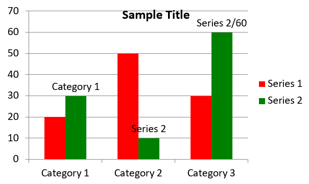
建立叢集直條圖
本節說明如何使用 Aspose.Slides for .NET 建立叢集直條圖。您將學會初始化簡報、加入圖表,並自訂如標題、資料、序列、類別與樣式等元素。請依照以下步驟,了解如何產生標準的叢集直條圖:
- 建立 Presentation 類別的實例。
- 使用索引取得投影片的參考。
- 加入含有資料的圖表,並指定
ChartType.ClusteredColumn類型。 - 為圖表新增標題。
- 存取圖表的資料工作表。
- 清除所有預設的序列與類別。
- 新增系列與類別。
- 為圖表序列加入新資料。
- 套用填色至圖表序列。
- 為圖表序列新增標籤。
- 將修改後的簡報另存為 PPTX 檔案。
using System.Drawing;
using Aspose.Slides;
using Aspose.Slides.Charts;
using Aspose.Slides.Export;

// 建立 Presentation 類別的實例。
using (Presentation presentation = new Presentation())
{
    // 取得第一張投影片。
    ISlide slide = presentation.Slides[0];

    // 新增具有預設資料的叢集直條圖。
    IChart chart = slide.Shapes.AddChart(ChartType.ClusteredColumn, 20, 20, 500, 300);

    // 設定圖表標題。
    chart.ChartTitle.AddTextFrameForOverriding("Sample Title");
    chart.ChartTitle.TextFrameForOverriding.TextFrameFormat.CenterText = NullableBool.True;
    chart.ChartTitle.Height = 20;
    chart.HasTitle = true;

    // 設定圖表資料工作表的索引。
    int worksheetIndex = 0;

    // 取得圖表資料工作簿。
    IChartDataWorkbook workbook = chart.ChartData.ChartDataWorkbook;

    // 刪除預設產生的序列與類別。
    chart.ChartData.Series.Clear();
    chart.ChartData.Categories.Clear();

    // 新增序列。
    chart.ChartData.Series.Add(workbook.GetCell(worksheetIndex, 0, 1, "Series 1"), chart.Type);
    chart.ChartData.Series.Add(workbook.GetCell(worksheetIndex, 0, 2, "Series 2"), chart.Type);

    // 新增類別。
    chart.ChartData.Categories.Add(workbook.GetCell(worksheetIndex, 1, 0, "Category 1"));
    chart.ChartData.Categories.Add(workbook.GetCell(worksheetIndex, 2, 0, "Category 2"));
    chart.ChartData.Categories.Add(workbook.GetCell(worksheetIndex, 3, 0, "Category 3"));

    // 取得第一個圖表序列。
    IChartSeries series = chart.ChartData.Series[0];

    // 填入序列資料。
    series.DataPoints.AddDataPointForBarSeries(workbook.GetCell(worksheetIndex, 1, 1, 20));
    series.DataPoints.AddDataPointForBarSeries(workbook.GetCell(worksheetIndex, 2, 1, 50));
    series.DataPoints.AddDataPointForBarSeries(workbook.GetCell(worksheetIndex, 3, 1, 30));

    // 設定序列的填色。
    series.Format.Fill.FillType = FillType.Solid;
    series.Format.Fill.SolidFillColor.Color = Color.Red;

    // 取得第二個圖表序列。
    series = chart.ChartData.Series[1];

    // 填入序列資料。
    series.DataPoints.AddDataPointForBarSeries(workbook.GetCell(worksheetIndex, 1, 2, 30));
    series.DataPoints.AddDataPointForBarSeries(workbook.GetCell(worksheetIndex, 2, 2, 10));
    series.DataPoints.AddDataPointForBarSeries(workbook.GetCell(worksheetIndex, 3, 2, 60));

    // 設定序列的填色。
    series.Format.Fill.FillType = FillType.Solid;
    series.Format.Fill.SolidFillColor.Color = Color.Green;

    // 設定第一個標籤顯示類別名稱。
    IDataLabel label = series.DataPoints[0].Label;
    label.DataLabelFormat.ShowCategoryName = true;

    label = series.DataPoints[1].Label;
    label.DataLabelFormat.ShowSeriesName = true;

    // 設定序列在第三個標籤上顯示值。
    label = series.DataPoints[2].Label;
    label.DataLabelFormat.ShowValue = true;
    label.DataLabelFormat.ShowSeriesName = true;
    label.DataLabelFormat.Separator = "/";

    // 將簡報儲存為 PPTX 檔案。
    presentation.Save("AsposeChart_out.pptx", SaveFormat.Pptx);
}
建立散佈圖
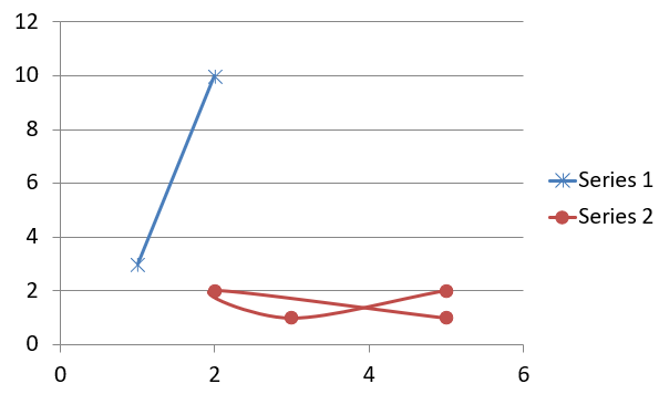
散佈圖(亦稱散點圖或 x‑y 圖)常用於檢查模式或顯示兩個變數之間的相關性。
使用散佈圖時:
- 您擁有成對的數值資料。
- 您有兩個相互配對的變數。
- 您想判斷兩個變數是否相關。
- 您有獨立變數對因變數有多個值。
using Aspose.Slides;
using Aspose.Slides.Charts;
using Aspose.Slides.Export;

// 實例化 Presentation 類別。
using (Presentation presentation = new Presentation())
{
    // 取得第一張投影片。
    ISlide slide = presentation.Slides[0];

    // 建立預設散佈圖。
    IChart chart = slide.Shapes.AddChart(ChartType.ScatterWithSmoothLines, 20, 20, 500, 300);

    // 設定圖表資料工作表的索引。
    int worksheetIndex = 0;

    // 取得圖表資料工作簿。
    IChartDataWorkbook workbook = chart.ChartData.ChartDataWorkbook;

    // 刪除預設序列。
    chart.ChartData.Series.Clear();

    // 新增序列。
    chart.ChartData.Series.Add(workbook.GetCell(worksheetIndex, 1, 1, "Series 1"), chart.Type);
    chart.ChartData.Series.Add(workbook.GetCell(worksheetIndex, 1, 3, "Series 2"), chart.Type);

    // 取得第一個圖表序列。
    IChartSeries series = chart.ChartData.Series[0];

    // 在序列中加入新點 (1:3)。
    series.DataPoints.AddDataPointForScatterSeries(workbook.GetCell(worksheetIndex, 2, 1, 1), workbook.GetCell(worksheetIndex, 2, 2, 3));

    // 加入新點 (2:10)。
    series.DataPoints.AddDataPointForScatterSeries(workbook.GetCell(worksheetIndex, 3, 1, 2), workbook.GetCell(worksheetIndex, 3, 2, 10));

    // 變更序列類型。
    series.Type = ChartType.ScatterWithStraightLinesAndMarkers;

    // 變更圖表序列的標記。
    series.Marker.Size = 10;
    series.Marker.Symbol = MarkerStyleType.Star;

    // 取得第二個圖表序列。
    series = chart.ChartData.Series[1];

    // 在圖表序列中加入新點 (5:2)。
    series.DataPoints.AddDataPointForScatterSeries(workbook.GetCell(worksheetIndex, 2, 3, 5), workbook.GetCell(worksheetIndex, 2, 4, 2));

    // 加入新點 (3:1)。
    series.DataPoints.AddDataPointForScatterSeries(workbook.GetCell(worksheetIndex, 3, 3, 3), workbook.GetCell(worksheetIndex, 3, 4, 1));

    // 加入新點 (2:2)。
    series.DataPoints.AddDataPointForScatterSeries(workbook.GetCell(worksheetIndex, 4, 3, 2), workbook.GetCell(worksheetIndex, 4, 4, 2));

    // 加入新點 (5:1)。
    series.DataPoints.AddDataPointForScatterSeries(workbook.GetCell(worksheetIndex, 5, 3, 5), workbook.GetCell(worksheetIndex, 5, 4, 1));

    // 變更圖表序列的標記。
    series.Marker.Size = 10;
    series.Marker.Symbol = MarkerStyleType.Circle;

    // 將簡報儲存為 PPTX 檔案。
    presentation.Save("AsposeChart_out.pptx", SaveFormat.Pptx);
}
建立圓形圖
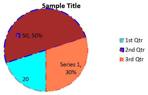
圓形圖最適合顯示資料的部分與整體關係,尤其當資料包含類別標籤及數值時。但若資料包含太多部分或標籤,建議改用長條圖。
- 建立 Presentation 類別的實例。
- 使用索引取得投影片的參考。
- 加入預設資料的圖表,並指定
ChartType.Pie類型。 - 存取圖表的資料工作簿(IChartDataWorkbook)。
- 清除預設的序列與類別。
- 新增系列與類別。
- 為圖表系列加入新資料。
- 為圖表新增點,並為圓形圖的扇區套用自訂顏色。
- 設定系列的標籤。
- 為系列標籤啟用引線。
- 設定圓形圖的旋轉角度。
- 將修改後的簡報另存為 PPTX 檔案。
using System.Drawing;
using Aspose.Slides;
using Aspose.Slides.Charts;
using Aspose.Slides.Export;

// 實例化 Presentation 類別。
using (Presentation presentation = new Presentation())
{
    // 取得第一張投影片。
    ISlide slide = presentation.Slides[0];

    // 新增圖表並使用其預設資料。
    IChart chart = slide.Shapes.AddChart(ChartType.Pie, 20, 20, 500, 300);

    // 設定圖表標題。
    chart.ChartTitle.AddTextFrameForOverriding("Sample Title");
    chart.ChartTitle.TextFrameForOverriding.TextFrameFormat.CenterText = NullableBool.True;
    chart.ChartTitle.Height = 20;
    chart.HasTitle = true;

    // 設定第一個序列顯示數值。
    chart.ChartData.Series[0].Labels.DefaultDataLabelFormat.ShowValue = true;

    // 設定圖表資料工作表的索引。
    int worksheetIndex = 0;

    // 取得圖表資料工作簿。
    IChartDataWorkbook workbook = chart.ChartData.ChartDataWorkbook;

    // 刪除預設產生的序列與類別。
    chart.ChartData.Series.Clear();
    chart.ChartData.Categories.Clear();

    // 新增類別。
    chart.ChartData.Categories.Add(workbook.GetCell(0, 1, 0, "1st Qtr"));
    chart.ChartData.Categories.Add(workbook.GetCell(0, 2, 0, "2nd Qtr"));
    chart.ChartData.Categories.Add(workbook.GetCell(0, 3, 0, "3rd Qtr"));

    // 新增序列。
    IChartSeries series = chart.ChartData.Series.Add(workbook.GetCell(0, 0, 1, "Series 1"), chart.Type);

    // 填充序列資料。
    series.DataPoints.AddDataPointForPieSeries(workbook.GetCell(worksheetIndex, 1, 1, 20));
    series.DataPoints.AddDataPointForPieSeries(workbook.GetCell(worksheetIndex, 2, 1, 50));
    series.DataPoints.AddDataPointForPieSeries(workbook.GetCell(worksheetIndex, 3, 1, 30));

    // 設定區塊顏色。
    chart.ChartData.SeriesGroups[0].IsColorVaried = true;

    IChartDataPoint point = series.DataPoints[0];
    point.Format.Fill.FillType = FillType.Solid;
    point.Format.Fill.SolidFillColor.Color = Color.Cyan;

    // 設定區塊邊框。
    point.Format.Line.FillFormat.FillType = FillType.Solid;
    point.Format.Line.FillFormat.SolidFillColor.Color = Color.Gray;
    point.Format.Line.Width = 3.0;
    point.Format.Line.Style = LineStyle.ThinThick;
    point.Format.Line.DashStyle = LineDashStyle.LargeDash;

    IChartDataPoint point1 = series.DataPoints[1];
    point1.Format.Fill.FillType = FillType.Solid;
    point1.Format.Fill.SolidFillColor.Color = Color.Brown;

    // 設定區塊邊框。
    point1.Format.Line.FillFormat.FillType = FillType.Solid;
    point1.Format.Line.FillFormat.SolidFillColor.Color = Color.Blue;
    point1.Format.Line.Width = 3.0;
    point1.Format.Line.Style = LineStyle.Single;
    point1.Format.Line.DashStyle = LineDashStyle.LargeDashDot;

    IChartDataPoint point2 = series.DataPoints[2];
    point2.Format.Fill.FillType = FillType.Solid;
    point2.Format.Fill.SolidFillColor.Color = Color.Coral;

    // 設定區塊邊框。
    point2.Format.Line.FillFormat.FillType = FillType.Solid;
    point2.Format.Line.FillFormat.SolidFillColor.Color = Color.Red;
    point2.Format.Line.Width = 2.0;
    point2.Format.Line.Style = LineStyle.ThinThin;
    point2.Format.Line.DashStyle = LineDashStyle.LargeDashDotDot;

    // 為新序列的每個類別建立自訂標籤。
    IDataLabel label1 = series.DataPoints[0].Label;

    label1.DataLabelFormat.ShowValue = true;

    IDataLabel label2 = series.DataPoints[1].Label;
    label2.DataLabelFormat.ShowValue = true;
    label2.DataLabelFormat.ShowLegendKey = true;
    label2.DataLabelFormat.ShowPercentage = true;

    IDataLabel label3 = series.DataPoints[2].Label;
    label3.DataLabelFormat.ShowSeriesName = true;
    label3.DataLabelFormat.ShowPercentage = true;

    // 設定序列在圖表中顯示引線。
    series.Labels.DefaultDataLabelFormat.ShowLeaderLines = true;

    // 設定圓形圖區塊的旋轉角度。
    chart.ChartData.SeriesGroups[0].FirstSliceAngle = 180;

    // 將簡報儲存為 PPTX 檔案。
    presentation.Save("PieChart_out.pptx", SaveFormat.Pptx);
}
建立折線圖
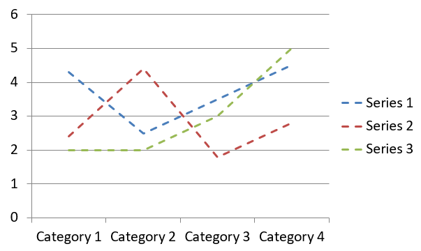
折線圖(也稱為線圖)最適合用於顯示隨時間變化的值。使用折線圖,您可以一次比較大量資料、追蹤時間趨勢、突顯資料序列中的異常等。
- 建立 Presentation 類別的實例。
- 使用索引取得投影片的參考。
- 加入預設資料的圖表,並指定
ChartType.Line類型。 - 存取圖表的資料工作簿(IChartDataWorkbook)。
- 清除預設的序列與類別。
- 新增系列與類別。
- 為圖表系列加入新資料。
- 將修改後的簡報另存為 PPTX 檔案。
using Aspose.Slides;
using Aspose.Slides.Charts;
using Aspose.Slides.Export;

using (Presentation presentation = new Presentation())
{
    IChart lineChart = presentation.Slides[0].Shapes.AddChart(ChartType.Line, 20, 20, 500, 300);

    presentation.Save("lineChart.pptx", SaveFormat.Pptx);
}
預設情況下,折線圖的點會以直線連接。若希望以虛線連接,請如下指定虛線類型:
using Aspose.Slides;
using Aspose.Slides.Charts;

using (Presentation presentation = new Presentation())
{
    IChart lineChart = presentation.Slides[0].Shapes.AddChart(ChartType.Line, 20, 20, 500, 300);

    foreach (IChartSeries series in lineChart.ChartData.Series)
    {
        series.Format.Line.DashStyle = LineDashStyle.Dash;
    }
}
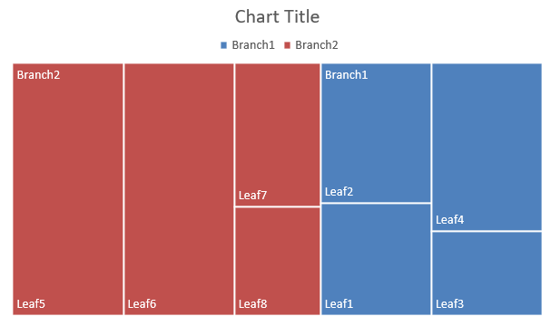
建立樹狀圖
樹狀圖最適合用於銷售資料,可顯示資料類別的相對大小,並迅速將注意力聚焦於各類別中貢獻較大的項目。
- 建立 Presentation 類別的實例。
- 使用索引取得投影片的參考。
- 加入預設資料的圖表,並指定
ChartType.Treemap類型。 - 存取圖表的資料工作簿(IChartDataWorkbook)。
- 清除預設的序列與類別。
- 新增系列與類別。
- 為圖表系列加入新資料。
- 將修改後的簡報另存為 PPTX 檔案。
using Aspose.Slides;
using Aspose.Slides.Charts;
using Aspose.Slides.Export;

using (Presentation presentation = new Presentation())
{
    IChart chart = presentation.Slides[0].Shapes.AddChart(ChartType.Treemap, 20, 20, 500, 300);
    chart.ChartData.Categories.Clear();
    chart.ChartData.Series.Clear();

    IChartDataWorkbook workbook = chart.ChartData.ChartDataWorkbook;
    workbook.Clear(0);

    // 分支 1
    IChartCategory leaf = chart.ChartData.Categories.Add(workbook.GetCell(0, "C1", "Leaf1"));
    leaf.GroupingLevels.SetGroupingItem(1, "Stem1");
    leaf.GroupingLevels.SetGroupingItem(2, "Branch1");

    chart.ChartData.Categories.Add(workbook.GetCell(0, "C2", "Leaf2"));

    leaf = chart.ChartData.Categories.Add(workbook.GetCell(0, "C3", "Leaf3"));
    leaf.GroupingLevels.SetGroupingItem(1, "Stem2");

    chart.ChartData.Categories.Add(workbook.GetCell(0, "C4", "Leaf4"));

    // 分支 2
    leaf = chart.ChartData.Categories.Add(workbook.GetCell(0, "C5", "Leaf5"));
    leaf.GroupingLevels.SetGroupingItem(1, "Stem3");
    leaf.GroupingLevels.SetGroupingItem(2, "Branch2");

    chart.ChartData.Categories.Add(workbook.GetCell(0, "C6", "Leaf6"));

    leaf = chart.ChartData.Categories.Add(workbook.GetCell(0, "C7", "Leaf7"));
    leaf.GroupingLevels.SetGroupingItem(1, "Stem4");

    chart.ChartData.Categories.Add(workbook.GetCell(0, "C8", "Leaf8"));

    IChartSeries series = chart.ChartData.Series.Add(ChartType.Treemap);
    series.Labels.DefaultDataLabelFormat.ShowCategoryName = true;
    series.DataPoints.AddDataPointForTreemapSeries(workbook.GetCell(0, "D1", 4));
    series.DataPoints.AddDataPointForTreemapSeries(workbook.GetCell(0, "D2", 5));
    series.DataPoints.AddDataPointForTreemapSeries(workbook.GetCell(0, "D3", 3));
    series.DataPoints.AddDataPointForTreemapSeries(workbook.GetCell(0, "D4", 6));
    series.DataPoints.AddDataPointForTreemapSeries(workbook.GetCell(0, "D5", 9));
    series.DataPoints.AddDataPointForTreemapSeries(workbook.GetCell(0, "D6", 9));
    series.DataPoints.AddDataPointForTreemapSeries(workbook.GetCell(0, "D7", 4));
    series.DataPoints.AddDataPointForTreemapSeries(workbook.GetCell(0, "D8", 3));

    series.ParentLabelLayout = ParentLabelLayoutType.Overlapping;

    presentation.Save("Treemap.pptx", SaveFormat.Pptx);
}
建立股票圖表
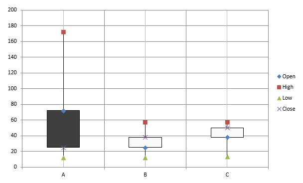
股票圖表用於顯示開盤、最高、最低、收盤等金融資料,協助分析市場趨勢與波動,提供投資人與分析師做出明智決策所需的關鍵見解。
- 建立 Presentation 類別的實例。
- 使用索引取得投影片的參考。
- 加入預設資料的圖表,並指定
ChartType.OpenHighLowClose類型。 - 存取圖表的資料工作簿(IChartDataWorkbook)。
- 清除預設的序列與類別。
- 新增系列與類別。
- 為圖表系列加入新資料。
- 指定 HiLowLines 格式。
- 將修改後的簡報另存為 PPTX 檔案。
using Aspose.Slides;
using Aspose.Slides.Charts;
using Aspose.Slides.Export;

using (Presentation presentation = new Presentation())
{
    IChart chart = presentation.Slides[0].Shapes.AddChart(ChartType.OpenHighLowClose, 20, 20, 500, 300, false);

    IChartDataWorkbook workbook = chart.ChartData.ChartDataWorkbook;

    chart.ChartData.Categories.Add(workbook.GetCell(0, 1, 0, "A"));
    chart.ChartData.Categories.Add(workbook.GetCell(0, 2, 0, "B"));
    chart.ChartData.Categories.Add(workbook.GetCell(0, 3, 0, "C"));

    chart.ChartData.Series.Add(workbook.GetCell(0, 0, 1, "Open"), chart.Type);
    chart.ChartData.Series.Add(workbook.GetCell(0, 0, 2, "High"), chart.Type);
    chart.ChartData.Series.Add(workbook.GetCell(0, 0, 3, "Low"), chart.Type);
    chart.ChartData.Series.Add(workbook.GetCell(0, 0, 4, "Close"), chart.Type);

    IChartSeries series = chart.ChartData.Series[0];
    series.DataPoints.AddDataPointForStockSeries(workbook.GetCell(0, 1, 1, 72));
    series.DataPoints.AddDataPointForStockSeries(workbook.GetCell(0, 2, 1, 25));
    series.DataPoints.AddDataPointForStockSeries(workbook.GetCell(0, 3, 1, 38));

    series = chart.ChartData.Series[1];
    series.DataPoints.AddDataPointForStockSeries(workbook.GetCell(0, 1, 2, 172));
    series.DataPoints.AddDataPointForStockSeries(workbook.GetCell(0, 2, 2, 57));
    series.DataPoints.AddDataPointForStockSeries(workbook.GetCell(0, 3, 2, 57));

    series = chart.ChartData.Series[2];
    series.DataPoints.AddDataPointForStockSeries(workbook.GetCell(0, 1, 3, 12));
    series.DataPoints.AddDataPointForStockSeries(workbook.GetCell(0, 2, 3, 12));
    series.DataPoints.AddDataPointForStockSeries(workbook.GetCell(0, 3, 3, 13));

    series = chart.ChartData.Series[3];
    series.DataPoints.AddDataPointForStockSeries(workbook.GetCell(0, 1, 4, 25));
    series.DataPoints.AddDataPointForStockSeries(workbook.GetCell(0, 2, 4, 38));
    series.DataPoints.AddDataPointForStockSeries(workbook.GetCell(0, 3, 4, 50));

    chart.ChartData.SeriesGroups[0].UpDownBars.HasUpDownBars = true;
    chart.ChartData.SeriesGroups[0].HiLowLinesFormat.Line.FillFormat.FillType = FillType.Solid;

    foreach (IChartSeries ser in chart.ChartData.Series)
    {
        ser.Format.Line.FillFormat.FillType = FillType.NoFill;
    }

    chart.Axes.VerticalAxis.MinorGridLinesFormat.Line.FillFormat.FillType = FillType.NoFill;

    presentation.Save("Stock-chart.pptx", SaveFormat.Pptx);
}
建立箱形圖與鬚圖
箱形圖與鬚圖用於以統計要點(如中位數、四分位數與可能的離群值)呈現資料分佈。它們在探索性資料分析與統計研究中特別有用,可快速了解資料變異性並辨識異常。
- 建立 Presentation 類別的實例。
- 使用索引取得投影片的參考。
- 加入預設資料的圖表,並指定
ChartType.BoxAndWhisker類型。 - 存取圖表的資料工作簿(IChartDataWorkbook)。
- 清除預設的序列與類別。
- 新增系列與類別。
- 為圖表系列加入新資料。
- 將修改後的簡報另存為 PPTX 檔案。
using Aspose.Slides;
using Aspose.Slides.Charts;
using Aspose.Slides.Export;

using (Presentation presentation = new Presentation())
{
    IChart chart = presentation.Slides[0].Shapes.AddChart(ChartType.BoxAndWhisker, 20, 20, 500, 300);
    chart.ChartData.Categories.Clear();
    chart.ChartData.Series.Clear();

    IChartDataWorkbook workbook = chart.ChartData.ChartDataWorkbook;
    workbook.Clear(0);

    chart.ChartData.Categories.Add(workbook.GetCell(0, "A1", "Category 1"));
    chart.ChartData.Categories.Add(workbook.GetCell(0, "A2", "Category 2"));
    chart.ChartData.Categories.Add(workbook.GetCell(0, "A3", "Category 3"));
    chart.ChartData.Categories.Add(workbook.GetCell(0, "A4", "Category 4"));
    chart.ChartData.Categories.Add(workbook.GetCell(0, "A5", "Category 5"));
    chart.ChartData.Categories.Add(workbook.GetCell(0, "A6", "Category 6"));

    IChartSeries series = chart.ChartData.Series.Add(ChartType.BoxAndWhisker);

    series.QuartileMethod = QuartileMethodType.Exclusive;
    series.ShowMeanLine = true;
    series.ShowMeanMarkers = true;
    series.ShowInnerPoints = true;
    series.ShowOutlierPoints = true;

    series.DataPoints.AddDataPointForBoxAndWhiskerSeries(workbook.GetCell(0, "B1", 15));
    series.DataPoints.AddDataPointForBoxAndWhiskerSeries(workbook.GetCell(0, "B2", 41));
    series.DataPoints.AddDataPointForBoxAndWhiskerSeries(workbook.GetCell(0, "B3", 16));
    series.DataPoints.AddDataPointForBoxAndWhiskerSeries(workbook.GetCell(0, "B4", 10));
    series.DataPoints.AddDataPointForBoxAndWhiskerSeries(workbook.GetCell(0, "B5", 23));
    series.DataPoints.AddDataPointForBoxAndWhiskerSeries(workbook.GetCell(0, "B6", 16));

    presentation.Save("BoxAndWhisker.pptx", SaveFormat.Pptx);
}
建立漏斗圖
漏斗圖用於視覺化具階段性的流程,隨每一步驟資料量逐漸減少,特別適合分析轉換率、找出瓶頸,及追蹤銷售或行銷流程的效率。
- 建立 Presentation 類別的實例。
- 使用索引取得投影片的參考。
- 加入預設資料的圖表,並指定
ChartType.Funnel類型。 - 將修改後的簡報另存為 PPTX 檔案。
using Aspose.Slides;
using Aspose.Slides.Charts;
using Aspose.Slides.Export;

using (Presentation presentation = new Presentation("test.pptx"))
{
    IChart chart = presentation.Slides[0].Shapes.AddChart(ChartType.Funnel, 50, 50, 500, 400);
    chart.ChartData.Categories.Clear();
    chart.ChartData.Series.Clear();

    IChartDataWorkbook workbook = chart.ChartData.ChartDataWorkbook;
    workbook.Clear(0);

    chart.ChartData.Categories.Add(workbook.GetCell(0, "A1", "Category 1"));
    chart.ChartData.Categories.Add(workbook.GetCell(0, "A2", "Category 2"));
    chart.ChartData.Categories.Add(workbook.GetCell(0, "A3", "Category 3"));
    chart.ChartData.Categories.Add(workbook.GetCell(0, "A4", "Category 4"));
    chart.ChartData.Categories.Add(workbook.GetCell(0, "A5", "Category 5"));
    chart.ChartData.Categories.Add(workbook.GetCell(0, "A6", "Category 6"));

    IChartSeries series = chart.ChartData.Series.Add(ChartType.Funnel);

    series.DataPoints.AddDataPointForFunnelSeries(workbook.GetCell(0, "B1", 50));
    series.DataPoints.AddDataPointForFunnelSeries(workbook.GetCell(0, "B2", 100));
    series.DataPoints.AddDataPointForFunnelSeries(workbook.GetCell(0, "B3", 200));
    series.DataPoints.AddDataPointForFunnelSeries(workbook.GetCell(0, "B4", 300));
    series.DataPoints.AddDataPointForFunnelSeries(workbook.GetCell(0, "B5", 400));
    series.DataPoints.AddDataPointForFunnelSeries(workbook.GetCell(0, "B6", 500));

    presentation.Save("Funnel.pptx", SaveFormat.Pptx);
}

建立旭日圖
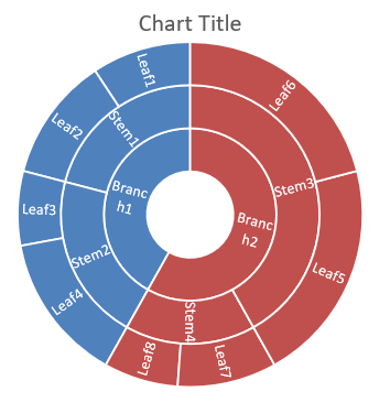
旭日圖用於視覺化階層資料,將層級以同心環方式呈現,可說明部份與整體之間的關係,且適合以緊湊的方式展示巢狀類別與子類別。
- 建立 Presentation 類別的實例。
- 使用索引取得投影片的參考。
- 加入預設資料的圖表,並指定
ChartType.Sunburst類型。 - 將修改後的簡報另存為 PPTX 檔案。
using Aspose.Slides;
using Aspose.Slides.Charts;
using Aspose.Slides.Export;

using (Presentation presentation = new Presentation())
{
    IChart chart = presentation.Slides[0].Shapes.AddChart(ChartType.Sunburst, 20, 20, 500, 300);
    chart.ChartData.Categories.Clear();
    chart.ChartData.Series.Clear();

    IChartDataWorkbook workbook = chart.ChartData.ChartDataWorkbook;
    workbook.Clear(0);

    // 分支 1
    IChartCategory leaf = chart.ChartData.Categories.Add(workbook.GetCell(0, "C1", "Leaf1"));
    leaf.GroupingLevels.SetGroupingItem(1, "Stem1");
    leaf.GroupingLevels.SetGroupingItem(2, "Branch1");

    chart.ChartData.Categories.Add(workbook.GetCell(0, "C2", "Leaf2"));

    leaf = chart.ChartData.Categories.Add(workbook.GetCell(0, "C3", "Leaf3"));
    leaf.GroupingLevels.SetGroupingItem(1, "Stem2");

    chart.ChartData.Categories.Add(workbook.GetCell(0, "C4", "Leaf4"));

    // 分支 2
    leaf = chart.ChartData.Categories.Add(workbook.GetCell(0, "C5", "Leaf5"));
    leaf.GroupingLevels.SetGroupingItem(1, "Stem3");
    leaf.GroupingLevels.SetGroupingItem(2, "Branch2");

    chart.ChartData.Categories.Add(workbook.GetCell(0, "C6", "Leaf6"));

    leaf = chart.ChartData.Categories.Add(workbook.GetCell(0, "C7", "Leaf7"));
    leaf.GroupingLevels.SetGroupingItem(1, "Stem4");

    chart.ChartData.Categories.Add(workbook.GetCell(0, "C8", "Leaf8"));

    IChartSeries series = chart.ChartData.Series.Add(ChartType.Sunburst);
    series.Labels.DefaultDataLabelFormat.ShowCategoryName = true;
    series.DataPoints.AddDataPointForSunburstSeries(workbook.GetCell(0, "D1", 4));
    series.DataPoints.AddDataPointForSunburstSeries(workbook.GetCell(0, "D2", 5));
    series.DataPoints.AddDataPointForSunburstSeries(workbook.GetCell(0, "D3", 3));
    series.DataPoints.AddDataPointForSunburstSeries(workbook.GetCell(0, "D4", 6));
    series.DataPoints.AddDataPointForSunburstSeries(workbook.GetCell(0, "D5", 9));
    series.DataPoints.AddDataPointForSunburstSeries(workbook.GetCell(0, "D6", 9));
    series.DataPoints.AddDataPointForSunburstSeries(workbook.GetCell(0, "D7", 4));
    series.DataPoints.AddDataPointForSunburstSeries(workbook.GetCell(0, "D8", 3));

    presentation.Save("Sunburst.pptx", SaveFormat.Pptx);
}
建立直方圖
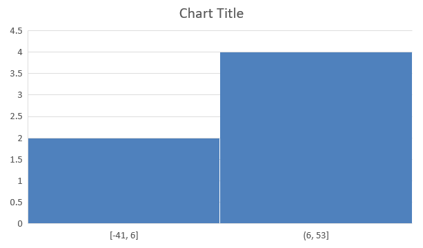
直方圖用於透過將數值分組為區間或箱子來呈現數值資料的分佈,能協助辨識頻率、偏斜、散佈等模式,並偵測資料集中的離群值。
- 建立 Presentation 類別的實例。
- 使用索引取得投影片的參考。
- 加入含有資料的圖表,並指定
ChartType.Histogram類型。 - 存取圖表資料工作簿(IChartDataWorkbook)。
- 清除預設的序列與類別。
- 新增系列與類別。
- 將修改後的簡報另存為 PPTX 檔案。
using Aspose.Slides;
using Aspose.Slides.Charts;
using Aspose.Slides.Export;

using (Presentation presentation = new Presentation())
{
    IChart chart = presentation.Slides[0].Shapes.AddChart(ChartType.Histogram, 20, 20, 500, 300);
    chart.ChartData.Categories.Clear();
    chart.ChartData.Series.Clear();

    IChartDataWorkbook workbook = chart.ChartData.ChartDataWorkbook;
    workbook.Clear(0);

    IChartSeries series = chart.ChartData.Series.Add(ChartType.Histogram);
    series.DataPoints.AddDataPointForHistogramSeries(workbook.GetCell(0, "A1", 15));
    series.DataPoints.AddDataPointForHistogramSeries(workbook.GetCell(0, "A2", -41));
    series.DataPoints.AddDataPointForHistogramSeries(workbook.GetCell(0, "A3", 16));
    series.DataPoints.AddDataPointForHistogramSeries(workbook.GetCell(0, "A4", 10));
    series.DataPoints.AddDataPointForHistogramSeries(workbook.GetCell(0, "A5", -23));
    series.DataPoints.AddDataPointForHistogramSeries(workbook.GetCell(0, "A6", 16));

    chart.Axes.HorizontalAxis.AggregationType = AxisAggregationType.Automatic;

    presentation.Save("Histogram.pptx", SaveFormat.Pptx);
}
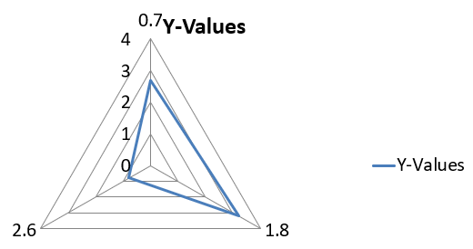
建立雷達圖
雷達圖用於在二維平面上顯示多變量資料,方便同時比較多個變數,常用於辨識多項績效指標或屬性間的模式、強項與弱項。
- 建立 Presentation 類別的實例。
- 使用索引取得投影片的參考。
- 加入含有資料的圖表,並指定
ChartType.Radar類型。 - 將修改後的簡報另存為 PPTX 檔案。
using Aspose.Slides;
using Aspose.Slides.Charts;
using Aspose.Slides.Export;

using (Presentation presentation = new Presentation())
{
    presentation.Slides[0].Shapes.AddChart(ChartType.Radar, 20, 20, 500, 300);
    presentation.Save("Radar-chart.pptx", SaveFormat.Pptx);
}
建立多類別圖表
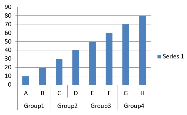
多類別圖表用於顯示涉及多個類別分組的資料,讓使用者可同時在多維度上比較值,對於分析複雜多層資料集的趨勢與關係特別有幫助。
- 建立 Presentation 類別的實例。
- 使用索引取得投影片的參考。
- 加入預設資料的圖表,並指定
ChartType.ClusteredColumn類型。 - 存取圖表的資料工作簿(IChartDataWorkbook)。
- 清除預設的序列與類別。
- 新增系列與類別。
- 為圖表系列加入新資料。
- 將修改後的簡報另存為 PPTX 檔案。
using Aspose.Slides;
using Aspose.Slides.Charts;
using Aspose.Slides.Export;

using (Presentation presentation = new Presentation())
{
    ISlide slide = presentation.Slides[0];

    IChart chart = presentation.Slides[0].Shapes.AddChart(ChartType.ClusteredColumn, 20, 20, 500, 300);
    chart.ChartData.Series.Clear();
    chart.ChartData.Categories.Clear();

    IChartDataWorkbook workbook = chart.ChartData.ChartDataWorkbook;
    workbook.Clear(0);

    int worksheetIndex = 0;

    IChartCategory category = chart.ChartData.Categories.Add(workbook.GetCell(0, "c2", "A"));
    category.GroupingLevels.SetGroupingItem(1, "Group1");
    category = chart.ChartData.Categories.Add(workbook.GetCell(0, "c3", "B"));

    category = chart.ChartData.Categories.Add(workbook.GetCell(0, "c4", "C"));
    category.GroupingLevels.SetGroupingItem(1, "Group2");
    category = chart.ChartData.Categories.Add(workbook.GetCell(0, "c5", "D"));

    category = chart.ChartData.Categories.Add(workbook.GetCell(0, "c6", "E"));
    category.GroupingLevels.SetGroupingItem(1, "Group3");
    category = chart.ChartData.Categories.Add(workbook.GetCell(0, "c7", "F"));

    category = chart.ChartData.Categories.Add(workbook.GetCell(0, "c8", "G"));
    category.GroupingLevels.SetGroupingItem(1, "Group4");
    category = chart.ChartData.Categories.Add(workbook.GetCell(0, "c9", "H"));

    // 新增序列。
    IChartSeries series = chart.ChartData.Series.Add(workbook.GetCell(0, "D1", "Series 1"), ChartType.ClusteredColumn);

    series.DataPoints.AddDataPointForBarSeries(workbook.GetCell(worksheetIndex, "D2", 10));
    series.DataPoints.AddDataPointForBarSeries(workbook.GetCell(worksheetIndex, "D3", 20));
    series.DataPoints.AddDataPointForBarSeries(workbook.GetCell(worksheetIndex, "D4", 30));
    series.DataPoints.AddDataPointForBarSeries(workbook.GetCell(worksheetIndex, "D5", 40));
    series.DataPoints.AddDataPointForBarSeries(workbook.GetCell(worksheetIndex, "D6", 50));
    series.DataPoints.AddDataPointForBarSeries(workbook.GetCell(worksheetIndex, "D7", 60));
    series.DataPoints.AddDataPointForBarSeries(workbook.GetCell(worksheetIndex, "D8", 70));
    series.DataPoints.AddDataPointForBarSeries(workbook.GetCell(worksheetIndex, "D9", 80));

    // 儲存包含圖表的簡報。
    presentation.Save("AsposeChart_out.pptx", SaveFormat.Pptx);
}
建立地圖圖表
using Aspose.Slides;
using Aspose.Slides.Charts;
using Aspose.Slides.Export;

using (Presentation presentation = new Presentation())
{
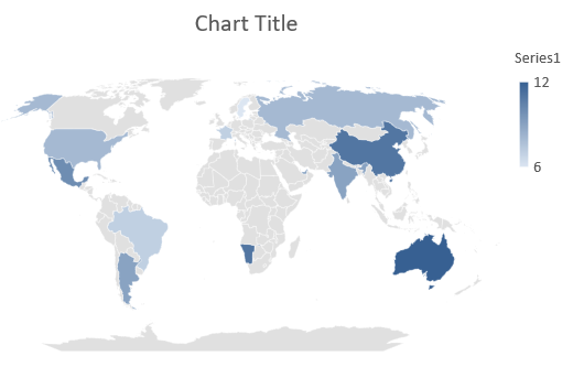
    IChart chart = presentation.Slides[0].Shapes.AddChart(ChartType.Map, 20, 20, 500, 300);
    presentation.Save("mapChart.pptx", SaveFormat.Pptx);
}
建立組合圖表
組合圖表(或稱 combo 圖表)在同一圖形中結合兩種或以上的圖表類型。此圖表可讓您突顯、比較或檢視多個資料集之間的差異,協助辨識它們之間的關係。
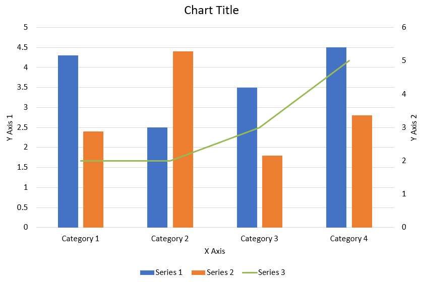
以下 C# 程式碼示範如何在 PowerPoint 簡報中建立如上所示的組合圖表:
using System.Drawing;
using Aspose.Slides;
using Aspose.Slides.Charts;
using Aspose.Slides.Export;

private static void CreateComboChart()
{
    using (Presentation presentation = new Presentation())
    {
        IChart chart = CreateChartWithFirstSeries(presentation.Slides[0]);

        AddSecondSeriesToChart(chart);
        AddThirdSeriesToChart(chart);

        SetPrimaryAxesFormat(chart);
        SetSecondaryAxesFormat(chart);

        presentation.Save("combo-chart.pptx", SaveFormat.Pptx);
    }
}

private static IChart CreateChartWithFirstSeries(ISlide slide)
{
    IChart chart = slide.Shapes.AddChart(ChartType.ClusteredColumn, 50, 50, 600, 400);

    // 設定圖表標題
    chart.HasTitle = true;
    chart.ChartTitle.AddTextFrameForOverriding("Chart Title");
    chart.ChartTitle.Overlay = false;
    IPortionFormat portionFormat =
       chart.ChartTitle.TextFrameForOverriding.Paragraphs[0].ParagraphFormat.DefaultPortionFormat;
    portionFormat.FontBold = NullableBool.False;
    portionFormat.FontHeight = 18f;

    // 設定圖表圖例
    chart.Legend.Position = LegendPositionType.Bottom;
    chart.Legend.TextFormat.PortionFormat.FontHeight = 12f;

    // 刪除預設產生的序列與類別
    chart.ChartData.Series.Clear();
    chart.ChartData.Categories.Clear();

    int worksheetIndex = 0;
    IChartDataWorkbook workbook = chart.ChartData.ChartDataWorkbook;

    // 新增類別
    chart.ChartData.Categories.Add(workbook.GetCell(worksheetIndex, 1, 0, "Category 1"));
    chart.ChartData.Categories.Add(workbook.GetCell(worksheetIndex, 2, 0, "Category 2"));
    chart.ChartData.Categories.Add(workbook.GetCell(worksheetIndex, 3, 0, "Category 3"));
    chart.ChartData.Categories.Add(workbook.GetCell(worksheetIndex, 4, 0, "Category 4"));

    // 新增第一個序列
    IChartSeries series = chart.ChartData.Series.Add(
        workbook.GetCell(worksheetIndex, 0, 1, "Series 1"), chart.Type);

    series.ParentSeriesGroup.Overlap = -25;
    series.ParentSeriesGroup.GapWidth = 220;

    series.DataPoints.AddDataPointForBarSeries(workbook.GetCell(worksheetIndex, 1, 1, 4.3));
    series.DataPoints.AddDataPointForBarSeries(workbook.GetCell(worksheetIndex, 2, 1, 2.5));
    series.DataPoints.AddDataPointForBarSeries(workbook.GetCell(worksheetIndex, 3, 1, 3.5));
    series.DataPoints.AddDataPointForBarSeries(workbook.GetCell(worksheetIndex, 4, 1, 4.5));

    return chart;
}

private static void AddSecondSeriesToChart(IChart chart)
{
    IChartDataWorkbook workbook = chart.ChartData.ChartDataWorkbook;
    const int worksheetIndex = 0;

    IChartSeries series = chart.ChartData.Series.Add(
        workbook.GetCell(worksheetIndex, 0, 2, "Series 2"), ChartType.ClusteredColumn);

    series.ParentSeriesGroup.Overlap = -25;
    series.ParentSeriesGroup.GapWidth = 220;

    series.DataPoints.AddDataPointForBarSeries(workbook.GetCell(worksheetIndex, 1, 2, 2.4));
    series.DataPoints.AddDataPointForBarSeries(workbook.GetCell(worksheetIndex, 2, 2, 4.4));
    series.DataPoints.AddDataPointForBarSeries(workbook.GetCell(worksheetIndex, 3, 2, 1.8));
    series.DataPoints.AddDataPointForBarSeries(workbook.GetCell(worksheetIndex, 4, 2, 2.8));
}

private static void AddThirdSeriesToChart(IChart chart)
{
    IChartDataWorkbook workbook = chart.ChartData.ChartDataWorkbook;
    const int worksheetIndex = 0;

    IChartSeries series = chart.ChartData.Series.Add(
        workbook.GetCell(worksheetIndex, 0, 3, "Series 3"), ChartType.Line);

    series.DataPoints.AddDataPointForLineSeries(workbook.GetCell(worksheetIndex, 1, 3, 2.0));
    series.DataPoints.AddDataPointForLineSeries(workbook.GetCell(worksheetIndex, 2, 3, 2.0));
    series.DataPoints.AddDataPointForLineSeries(workbook.GetCell(worksheetIndex, 3, 3, 3.0));
    series.DataPoints.AddDataPointForLineSeries(workbook.GetCell(worksheetIndex, 4, 3, 5.0));

    series.PlotOnSecondAxis = true;
}

private static void SetPrimaryAxesFormat(IChart chart)
{
    // 設定水平軸
    IAxis horizontalAxis = chart.Axes.HorizontalAxis;
    horizontalAxis.TextFormat.PortionFormat.FontHeight = 12f;
    horizontalAxis.Format.Line.FillFormat.FillType = FillType.NoFill;

    SetAxisTitle(horizontalAxis, "X Axis");

    // 設定垂直軸
    IAxis verticalAxis = chart.Axes.VerticalAxis;
    verticalAxis.TextFormat.PortionFormat.FontHeight = 12f;
    verticalAxis.Format.Line.FillFormat.FillType = FillType.NoFill;

    SetAxisTitle(verticalAxis, "Y Axis 1");

    // 設定垂直主要格線顏色
    ILineFillFormat majorGridLinesFormat = verticalAxis.MajorGridLinesFormat.Line.FillFormat;
    majorGridLinesFormat.FillType = FillType.Solid;
    majorGridLinesFormat.SolidFillColor.Color = Color.FromArgb(217, 217, 217);
}

private static void SetSecondaryAxesFormat(IChart chart)
{
    // 設定次要水平軸
    IAxis secondaryHorizontalAxis = chart.Axes.SecondaryHorizontalAxis;
    secondaryHorizontalAxis.Position = AxisPositionType.Bottom;
    secondaryHorizontalAxis.CrossType = CrossesType.Maximum;
    secondaryHorizontalAxis.IsVisible = false;
    secondaryHorizontalAxis.MajorGridLinesFormat.Line.FillFormat.FillType = FillType.NoFill;
    secondaryHorizontalAxis.MinorGridLinesFormat.Line.FillFormat.FillType = FillType.NoFill;

    // 設定次要垂直軸
    IAxis secondaryVerticalAxis = chart.Axes.SecondaryVerticalAxis;
    secondaryVerticalAxis.Position = AxisPositionType.Right;
    secondaryVerticalAxis.TextFormat.PortionFormat.FontHeight = 12f;
    secondaryVerticalAxis.Format.Line.FillFormat.FillType = FillType.NoFill;
    secondaryVerticalAxis.MajorGridLinesFormat.Line.FillFormat.FillType = FillType.NoFill;
    secondaryVerticalAxis.MinorGridLinesFormat.Line.FillFormat.FillType = FillType.NoFill;

    SetAxisTitle(secondaryVerticalAxis, "Y Axis 2");
}

private static void SetAxisTitle(IAxis axis, string axisTitle)
{
    axis.HasTitle = true;
    axis.Title.Overlay = false;
    IPortionFormat titlePortionFormat =
        axis.Title.AddTextFrameForOverriding(axisTitle).Paragraphs[0].ParagraphFormat.DefaultPortionFormat;
    titlePortionFormat.FontBold = NullableBool.False;
    titlePortionFormat.FontHeight = 12f;
}
更新圖表
Aspose.Slides for .NET 讓您能透過修改圖表資料、格式與樣式來更新 PowerPoint 圖表。此功能簡化了讓簡報保持動態內容的流程,並確保圖表正確反映最新資料與視覺標準。
- 實例化代表含有圖表之簡報的 Presentation 類別。
- 使用索引取得投影片的參考。
- 遍歷所有形狀以找出圖表。
- 存取圖表的資料工作表。
- 透過變更序列值來修改圖表資料系列。
- 新增系列並填入資料。
- 將修改後的簡報另存為 PPTX 檔案。
using Aspose.Slides;
using Aspose.Slides.Charts;
using Aspose.Slides.Export;

const string chartName = "My chart";

// 實例化代表 PPTX 檔案的 Presentation 類別。
using (Presentation presentation = new Presentation("ExistingChart.pptx"))
{
    // 取得第一張投影片。
    ISlide slide = presentation.Slides[0];

    foreach (IShape shape in slide.Shapes)
    {
        if (shape is IChart chart && chart.Name == chartName)
        {
            // 設定圖表資料工作表的索引。
            int worksheetIndex = 0;

            // 取得圖表資料工作簿。
            IChartDataWorkbook workbook = chart.ChartData.ChartDataWorkbook;

            // 變更圖表類別名稱。
            workbook.GetCell(worksheetIndex, 1, 0, "Modified Category 1");
            workbook.GetCell(worksheetIndex, 2, 0, "Modified Category 2");

            // 取得第一個圖表序列。
            IChartSeries series = chart.ChartData.Series[0];

            // 更新序列資料。
            workbook.GetCell(worksheetIndex, 0, 1, "New_Series 1"); // 修改系列名稱。
            series.DataPoints[0].Value.Data = 90;
            series.DataPoints[1].Value.Data = 123;
            series.DataPoints[2].Value.Data = 44;

            // 取得第二個圖表序列。
            series = chart.ChartData.Series[1];

            // 更新序列資料。
            workbook.GetCell(worksheetIndex, 0, 2, "New_Series 2"); // 修改系列名稱。
            series.DataPoints[0].Value.Data = 23;
            series.DataPoints[1].Value.Data = 67;
            series.DataPoints[2].Value.Data = 99;

            // 新增系列。
            series = chart.ChartData.Series.Add(workbook.GetCell(worksheetIndex, 0, 3, "Series 3"), chart.Type);

            // 填入系列資料。
            series.DataPoints.AddDataPointForBarSeries(workbook.GetCell(worksheetIndex, 1, 3, 20));
            series.DataPoints.AddDataPointForBarSeries(workbook.GetCell(worksheetIndex, 2, 3, 50));
            series.DataPoints.AddDataPointForBarSeries(workbook.GetCell(worksheetIndex, 3, 3, 30));

            chart.Type = ChartType.ClusteredCylinder;
        }
    }

    // 儲存包含圖表的簡報。
    presentation.Save("AsposeChartModified_out.pptx", SaveFormat.Pptx);
}
設定圖表的資料範圍
Aspose.Slides for .NET 提供彈性,可從工作表中定義特定資料範圍作為圖表資料的來源。這表示您可直接將工作表的某一部分對映至圖表,控制哪些儲存格貢獻於圖表的系列與類別。如此一來,您即可輕鬆更新並同步圖表與工作表的最新資料變更,確保 PowerPoint 簡報呈現當前且正確的資訊。
- 實例化代表含有圖表之簡報的 Presentation 類別。
- 使用索引取得投影片的參考。
- 遍歷所有形狀以找出圖表。
- 存取圖表資料並設定範圍。
- 將修改後的簡報另存為 PPTX 檔案。
using Aspose.Slides;
using Aspose.Slides.Charts;
using Aspose.Slides.Export;

const string chartName = "My chart";

// 實例化代表 PPTX 檔案的 Presentation 類別。
using (Presentation presentation = new Presentation("ExistingChart.pptx"))
{
    // 取得第一張投影片。
    ISlide slide = presentation.Slides[0];

    foreach (IShape shape in slide.Shapes)
    {
        if (shape is IChart chart && chart.Name == chartName)
        {
            chart.ChartData.SetRange("Sheet1!A1:B4");
        }
    }

    presentation.Save("SetDataRange_out.pptx", SaveFormat.Pptx);
}
在圖表中使用預設標記
在圖表中使用預設標記時,每個圖表系列會自動取得不同的預設標記符號。
using Aspose.Slides;
using Aspose.Slides.Charts;
using Aspose.Slides.Export;

using (Presentation presentation = new Presentation())
{
    ISlide slide = presentation.Slides[0];
    IChart chart = slide.Shapes.AddChart(ChartType.LineWithMarkers, 10, 10, 400, 400);

    chart.ChartData.Series.Clear();
    chart.ChartData.Categories.Clear();

    IChartDataWorkbook workbook = chart.ChartData.ChartDataWorkbook;

    IChartSeries series = chart.ChartData.Series.Add(workbook.GetCell(0, 0, 1, "Series 1"), chart.Type);

    chart.ChartData.Categories.Add(workbook.GetCell(0, 1, 0, "C1"));
    series.DataPoints.AddDataPointForLineSeries(workbook.GetCell(0, 1, 1, 24));

    chart.ChartData.Categories.Add(workbook.GetCell(0, 2, 0, "C2"));
    series.DataPoints.AddDataPointForLineSeries(workbook.GetCell(0, 2, 1, 23));

    chart.ChartData.Categories.Add(workbook.GetCell(0, 3, 0, "C3"));
    series.DataPoints.AddDataPointForLineSeries(workbook.GetCell(0, 3, 1, -10));

    chart.ChartData.Categories.Add(workbook.GetCell(0, 4, 0, "C4"));
    series.DataPoints.AddDataPointForLineSeries(workbook.GetCell(0, 4, 1, null));

    IChartSeries series2 = chart.ChartData.Series.Add(workbook.GetCell(0, 0, 2, "Series 2"), chart.Type);

    // 填入系列資料。
    series2.DataPoints.AddDataPointForLineSeries(workbook.GetCell(0, 1, 2, 30));
    series2.DataPoints.AddDataPointForLineSeries(workbook.GetCell(0, 2, 2, 10));
    series2.DataPoints.AddDataPointForLineSeries(workbook.GetCell(0, 3, 2, 60));
    series2.DataPoints.AddDataPointForLineSeries(workbook.GetCell(0, 4, 2, 40));

    chart.HasLegend = true;
    chart.Legend.Overlay = false;

    presentation.Save("DefaultMarkersInChart.pptx", SaveFormat.Pptx);
}
常見問題
Aspose.Slides for .NET 支援哪些圖表類型?
Aspose.Slides for .NET 支援廣泛的圖表類型,包括長條圖、折線圖、圓形圖、面積圖、散點圖、直方圖、雷達圖等,讓您能依資料視覺化需求選擇最適合的圖表類型。
如何在投影片中加入新圖表?
首先建立 Presentation 類別的實例,使用索引取得目標投影片,然後呼叫加入圖表的方法,並指定圖表類型與初始資料。此流程會將圖表直接整合至您的簡報中。
如何更新圖表中顯示的資料?
您可存取圖表的資料工作簿(IChartDataWorkbook),清除預設的系列與類別,接著加入自訂資料。如此即可以程式方式重新整理圖表,呈現最新資料。
是否可以自訂圖表的外觀?
是的,Aspose.Slides for .NET 提供豐富的自訂選項。您可以修改顏色、字型、標籤、圖例及其他格式元素,以符合特定的設計需求。