
Gestire le etichette dei dati del grafico nelle presentazioni su Android
Introduzione
Le etichette dei dati mostrano informazioni sulle serie del grafico e sui singoli punti dati, aiutando i lettori a identificare i valori e a comprendere il grafico. Questo articolo spiega come formattare i valori, visualizzare le percentuali, leggere il testo delle etichette, controllare le etichette oltre il massimo dell’asse, regolare la spaziatura delle etichette dell’asse delle categorie e posizionare le etichette nei grafici a torta.
Impostare la precisione dei dati nelle etichette del grafico
Usa setNumberFormatOfValues per formattare i valori delle serie. Questo esempio crea un grafico a linee con dati predefiniti, visualizza la sua tabella dei dati e abilita le etichette dei valori per la prima serie. Il formato #,##0.00 mostra un separatore delle migliaia e due decimali senza modificare i valori sottostanti.
import com.aspose.slides.*;

Presentation presentation = new Presentation();
try {
    ISlide slide = presentation.getSlides().get_Item(0);

    IChart chart = slide.getShapes().addChart(ChartType.Line, 50, 50, 450, 300);
    chart.setDataTable(true);

    IChartSeries series = chart.getChartData().getSeries().get_Item(0);
    series.setNumberFormatOfValues("#,##0.00");
    series.getLabels().getDefaultDataLabelFormat().setShowValue(true);

    presentation.save("PrecisionOfDatalabels_out.pptx", SaveFormat.Pptx);
} finally {
    presentation.dispose();
}
Visualizzare le percentuali come etichette
Per un grafico a colonne impilate, calcola ogni valore come percentuale del totale della sua categoria e assegna il testo al frame di testo restituito da getTextFrameForOverriding. Questo esempio utilizza i dati predefiniti del grafico e visualizza le percentuali con due decimali in un carattere da 8 punti. Le categorie con un totale pari a zero vengono ignorate per evitare divisioni per zero. Ricalcola il testo personalizzato dell’etichetta se i dati del grafico cambiano.
import com.aspose.slides.*;
import java.util.Locale;

Presentation presentation = new Presentation();
try {
    ISlide slide = presentation.getSlides().get_Item(0);

    IChart chart = slide.getShapes().addChart(ChartType.StackedColumn, 20, 20, 400, 400);

    double[] categoryTotals = new double[chart.getChartData().getCategories().size()];
    for (int k = 0; k < chart.getChartData().getCategories().size(); k++) {
        for (int i = 0; i < chart.getChartData().getSeries().size(); i++) {
            IChartSeries series = chart.getChartData().getSeries().get_Item(i);
            Number pointValue = (Number) series.getDataPoints().get_Item(k).getValue().getData();
            categoryTotals[k] += pointValue.doubleValue();
        }
    }

    for (int x = 0; x < chart.getChartData().getSeries().size(); x++) {
        IChartSeries series = chart.getChartData().getSeries().get_Item(x);
        series.getLabels().getDefaultDataLabelFormat().setShowLegendKey(false);

        for (int j = 0; j < series.getDataPoints().size(); j++) {
            IDataLabel label = series.getDataPoints().get_Item(j).getLabel();
            if (categoryTotals[j] == 0) {
                continue;
            }

            Number pointValue = (Number) series.getDataPoints().get_Item(j).getValue().getData();
            double dataPointPercent = (pointValue.doubleValue() / categoryTotals[j]) * 100;

            IPortion portion = new Portion();
            portion.setText(String.format(Locale.US, "%.2f %%", dataPointPercent));
            portion.getPortionFormat().setFontHeight(8f);

            label.getTextFrameForOverriding().setText("");
            IParagraph paragraph = label.getTextFrameForOverriding().getParagraphs().get_Item(0);
            paragraph.getPortions().add(portion);

            label.getDataLabelFormat().setShowValue(true);
            label.getDataLabelFormat().setShowSeriesName(false);
            label.getDataLabelFormat().setShowPercentage(false);
            label.getDataLabelFormat().setShowLegendKey(false);
            label.getDataLabelFormat().setShowCategoryName(false);
            label.getDataLabelFormat().setShowBubbleSize(false);
        }
    }

    presentation.save("DisplayPercentageAsLabels_out.pptx", SaveFormat.Pptx);
} finally {
    presentation.dispose();
}
Impostare il segno percentuale con le etichette dei dati del grafico
Quando i valori sono memorizzati come frazioni, usa setNumberFormat per visualizzare le percentuali. Passa false a setNumberFormatLinkedToSource per applicare il formato dell’etichetta indipendentemente dalle celle di origine.
Questo esempio crea un grafico a colonne impilate al 100% con serie rosse e blu su quattro categorie. Ogni coppia di valori somma a 1. Il formato dell’etichetta 0.0% visualizza 0.30 come 30.0%, mentre l’asse verticale utilizza due decimali. Entrambe le serie usano testo etichetta bianco, da 10 punti.
import com.aspose.slides.*;
import android.graphics.Color;

Presentation presentation = new Presentation();
try {
    ISlide slide = presentation.getSlides().get_Item(0);

    IChart chart = slide.getShapes().addChart(ChartType.PercentsStackedColumn, 20, 20, 500, 400);

    chart.getAxes().getVerticalAxis().setNumberFormatLinkedToSource(false);
    chart.getAxes().getVerticalAxis().setNumberFormat("0.00%");

    chart.getChartData().getSeries().clear();
    chart.getChartData().getCategories().clear();

    IChartDataWorkbook workbook = chart.getChartData().getChartDataWorkbook();
    int worksheetIndex = 0;
    for (int i = 0; i < 4; i++) {
        IChartDataCell categoryCell = workbook.getCell(worksheetIndex, i + 1, 0, "Category " + (i + 1));
        chart.getChartData().getCategories().add(categoryCell);
    }

    String[] seriesNames = { "Reds", "Blues" };
    int[] seriesColors = { Color.RED, Color.BLUE };
    double[][] values = { { 0.30, 0.50, 0.80, 0.65 }, { 0.70, 0.50, 0.20, 0.35 } };

    for (int i = 0; i < seriesNames.length; i++) {
        IChartDataCell seriesCell = workbook.getCell(worksheetIndex, 0, i + 1, seriesNames[i]);
        IChartSeries series = chart.getChartData().getSeries().add(seriesCell, chart.getType());
        for (int j = 0; j < 4; j++) {
            IChartDataCell valueCell = workbook.getCell(worksheetIndex, j + 1, i + 1, values[i][j]);
            series.getDataPoints().addDataPointForBarSeries(valueCell);
        }

        series.getFormat().getFill().setFillType(FillType.Solid);
        series.getFormat().getFill().getSolidFillColor().setColor(seriesColors[i]);

        IDataLabelFormat labelFormat = series.getLabels().getDefaultDataLabelFormat();
        labelFormat.setShowValue(true);
        labelFormat.setNumberFormatLinkedToSource(false);
        labelFormat.setNumberFormat("0.0%");
        labelFormat.getTextFormat().getPortionFormat().setFontHeight(10);
        labelFormat.getTextFormat().getPortionFormat().getFillFormat().setFillType(FillType.Solid);
        labelFormat.getTextFormat().getPortionFormat().getFillFormat().getSolidFillColor().setColor(Color.WHITE);
    }

    presentation.save("SetDataLabelsPercentageSign_out.pptx", SaveFormat.Pptx);
} finally {
    presentation.dispose();
}
Leggere il testo effettivo delle etichette dei dati
Usa getActualLabelText per recuperare il testo generato dalle impostazioni di un’etichetta dati. Questo è utile quando si estraggono etichette per report, si ricerca il contenuto di una presentazione o si convalidano i grafici generati. Nell’esempio seguente, il formato predefinito delle etichette dati combina il nome di ogni categoria, il nome della serie e il valore. Un punto formatta il suo valore come percentuale, e un altro utilizza testo personalizzato da getTextFrameForOverriding.
import com.aspose.slides.*;

Presentation presentation = new Presentation();
try {
    ISlide slide = presentation.getSlides().get_Item(0);

    IChart chart = slide.getShapes().addChart(ChartType.ClusteredColumn, 20, 20, 500, 300);

    chart.getChartData().getSeries().clear();
    chart.getChartData().getCategories().clear();

    IChartDataWorkbook workbook = chart.getChartData().getChartDataWorkbook();
    IChartDataCell firstCategoryCell = workbook.getCell(0, 1, 0, "Q1");
    chart.getChartData().getCategories().add(firstCategoryCell);
    IChartDataCell secondCategoryCell = workbook.getCell(0, 2, 0, "Q2");
    chart.getChartData().getCategories().add(secondCategoryCell);

    IChartDataCell northSeriesCell = workbook.getCell(0, 0, 1, "North");
    IChartSeries north = chart.getChartData().getSeries().add(northSeriesCell, chart.getType());
    IChartDataCell northFirstValueCell = workbook.getCell(0, 1, 1, 0.25);
    north.getDataPoints().addDataPointForBarSeries(northFirstValueCell);
    IChartDataCell northSecondValueCell = workbook.getCell(0, 2, 1, 0.75);
    north.getDataPoints().addDataPointForBarSeries(northSecondValueCell);

    IChartDataCell southSeriesCell = workbook.getCell(0, 0, 2, "South");
    IChartSeries south = chart.getChartData().getSeries().add(southSeriesCell, chart.getType());
    IChartDataCell southFirstValueCell = workbook.getCell(0, 1, 2, 0.40);
    south.getDataPoints().addDataPointForBarSeries(southFirstValueCell);
    IChartDataCell southSecondValueCell = workbook.getCell(0, 2, 2, 0.60);
    south.getDataPoints().addDataPointForBarSeries(southSecondValueCell);

    for (IChartSeries series : chart.getChartData().getSeries()) {
        IDataLabelFormat format = series.getLabels().getDefaultDataLabelFormat();
        format.setShowCategoryName(true);
        format.setShowSeriesName(true);
        format.setShowValue(true);
    }

    north.getLabels().get_Item(1).getDataLabelFormat().setNumberFormatLinkedToSource(false);
    north.getLabels().get_Item(1).getDataLabelFormat().setNumberFormat("0%");
    south.getLabels().get_Item(0).getTextFrameForOverriding().setText("Reviewed");

    for (IChartSeries series : chart.getChartData().getSeries()) {
        for (IChartDataPoint point : series.getDataPoints()) {
            IDataLabel label = point.getLabel();
            if (!label.isVisible()) {
                continue;
            }

            System.out.println("Value: " + point.getValue().getData() + "; label: " + label.getActualLabelText());
        }
    }
} finally {
    presentation.dispose();
}
Il numero memorizzato in un punto dati rimane 0.75, anche quando la sua etichetta mostra 75% insieme ai nomi della categoria e della serie. Il testo personalizzato sostituisce il testo dell’etichetta generato. getActualLabelText restituisce la stringa dell’etichetta risultante in entrambi i casi. Controlla isVisible separatamente, come mostrato sopra, quando desideri estrarre solo le etichette visibili.
Controllare le etichette dei dati oltre il massimo dell’asse
Quando limiti manualmente l’intervallo di un asse, alcuni punti dati possono superare il suo valore massimo. Usa setShowDataLabelsOverMaximum per controllare se le loro etichette dei dati vengono mostrate. Questa impostazione modifica la visibilità delle etichette; non cambia l’intervallo dell’asse né i valori sottostanti.
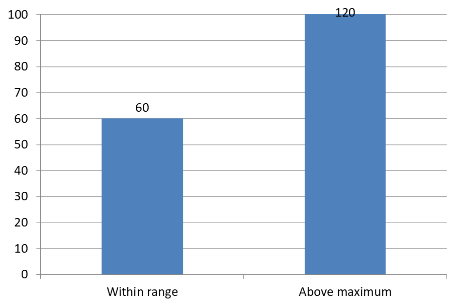
L’esempio seguente crea un grafico a colonne raggruppate 2D con valori 60 e 120. Passa false a setAutomaticMaxValue e imposta il massimo a 100 con setMaxValue sull’asse verticale. La prima diapositiva consente etichette oltre il massimo; una copia di quella diapositiva le disabilita. Entrambe le diapositive vengono salvate in DataLabelsOverMaximum.pptx.
Abilita le etichette dei valori con setShowValue. L’impostazione a livello di grafico non abilita la visualizzazione del valore da sola né sovrascrive la visualizzazione disabilitata di un’etichetta individuale. Questo esempio abilita i valori per l’intera serie e usa setPosition per posizionare le etichette all’estremità esterna di ogni colonna.
import com.aspose.slides.*;

Presentation presentation = new Presentation();
try {
    ISlide slide = presentation.getSlides().get_Item(0);

    IChart chart = slide.getShapes().addChart(ChartType.ClusteredColumn, 50, 50, 600, 400);
    chart.setLegend(false);

    chart.getChartData().getSeries().clear();
    chart.getChartData().getCategories().clear();

    IChartDataWorkbook workbook = chart.getChartData().getChartDataWorkbook();

    IChartDataCell firstCategory = workbook.getCell(0, 1, 0, "Within range");
    IChartDataCell secondCategory = workbook.getCell(0, 2, 0, "Above maximum");

    chart.getChartData().getCategories().add(firstCategory);
    chart.getChartData().getCategories().add(secondCategory);

    IChartDataCell seriesName = workbook.getCell(0, 0, 1, "Values");
    IChartSeries series = chart.getChartData().getSeries().add(seriesName, chart.getType());

    IChartDataCell firstValue = workbook.getCell(0, 1, 1, 60);
    IChartDataCell secondValue = workbook.getCell(0, 2, 1, 120);

    series.getDataPoints().addDataPointForBarSeries(firstValue);
    series.getDataPoints().addDataPointForBarSeries(secondValue);

    series.getLabels().getDefaultDataLabelFormat().setShowValue(true);
    series.getLabels().getDefaultDataLabelFormat().setPosition(LegendDataLabelPosition.OutsideEnd);

    chart.getAxes().getVerticalAxis().setAutomaticMaxValue(false);
    chart.getAxes().getVerticalAxis().setMaxValue(100);
    chart.setShowDataLabelsOverMaximum(true);

    ISlide secondSlide = presentation.getSlides().addClone(slide);
    IChart secondChart = (IChart) secondSlide.getShapes().get_Item(0);
    secondChart.setShowDataLabelsOverMaximum(false);

    presentation.save("DataLabelsOverMaximum.pptx", SaveFormat.Pptx);
} finally {
    presentation.dispose();
}
Le immagini seguenti mostrano le diapositive salvate renderizzate da Microsoft PowerPoint. Con true, l’etichetta 120 è visibile al limite superiore; con false, è nascosta. L’etichetta 60 rimane visibile, il massimo dell’asse resta a 100 e il secondo punto dati rimane 120 in entrambi i casi.
| setShowDataLabelsOverMaximum(true) | setShowDataLabelsOverMaximum(false) |
|---|---|
 |
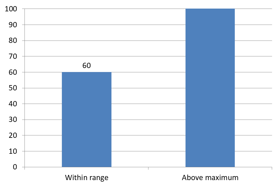 |
Chart Type
Questo esempio utilizza un grafico a colonne 2D con un asse dei valori. I grafici senza un asse dei valori, come i grafici a torta e a ciambella, non hanno un massimo dell’asse da limitare in questo modo.Impostare la distanza dell’etichetta dall’asse
Usa setLabelOffset per controllare la distanza tra le etichette dell’asse di categoria e l’asse. Il valore è una percentuale della dimensione massima del carattere delle etichette dell’asse. Questo esempio crea un grafico a colonne raggruppate e imposta lo spostamento dell’etichetta dell’asse orizzontale a 500. Questa impostazione influisce sulle etichette dell’asse di categoria piuttosto che sulle etichette associate a singoli punti dati.
import com.aspose.slides.*;

Presentation presentation = new Presentation();
try {
    ISlide slide = presentation.getSlides().get_Item(0);

    IChart chart = slide.getShapes().addChart(ChartType.ClusteredColumn, 20, 20, 500, 300);
    chart.getAxes().getHorizontalAxis().setLabelOffset(500);

    presentation.save("SetCategoryAxisLabelDistance_out.pptx", SaveFormat.Pptx);
} finally {
    presentation.dispose();
}
Regolare la posizione dell’etichetta
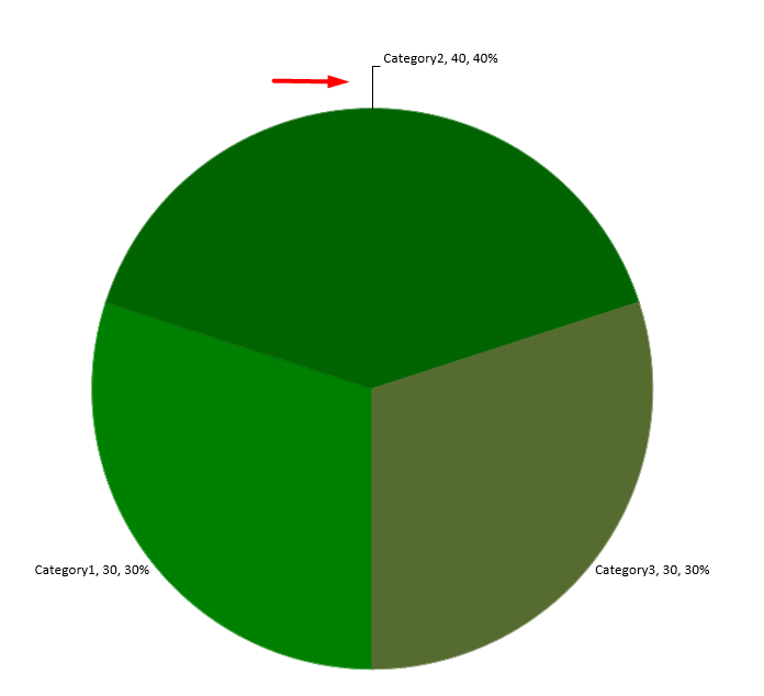
Su un grafico a torta, regola le posizioni delle etichette dei dati per migliorare la spaziatura e lasciare spazio alle linee guida.
Questo esempio visualizza il valore del primo punto dati, posiziona la sua etichetta all’esterno della fetta e regola gli spostamenti orizzontale e verticale usando setX e setY. Questi spostamenti sono relativi alla larghezza e all’altezza del grafico, rispettivamente.
import com.aspose.slides.*;

Presentation presentation = new Presentation();
try {
    ISlide slide = presentation.getSlides().get_Item(0);

    IChart chart = slide.getShapes().addChart(ChartType.Pie, 50, 50, 200, 200);
    IChartSeriesCollection series = chart.getChartData().getSeries();

    IDataLabel label = series.get_Item(0).getLabels().get_Item(0);
    label.getDataLabelFormat().setShowValue(true);
    label.getDataLabelFormat().setPosition(LegendDataLabelPosition.OutsideEnd);
    label.setX(0.71f);
    label.setY(0.04f);

    presentation.save("presentation.pptx", SaveFormat.Pptx);
} finally {
    presentation.dispose();
}
FAQ
Come posso evitare che le etichette dei dati si sovrappongano su grafici densi?
Combina il posizionamento automatico delle etichette, le linee guida e una dimensione del carattere ridotta; se necessario, nascondi alcuni campi (ad esempio la categoria) o mostra le etichette solo per valori estremi o punti chiave.
Come posso disabilitare le etichette solo per valori zero, negativi o vuoti?
Filtra i punti dati prima di abilitare le etichette e disattiva la visualizzazione per valori pari a 0, valori negativi o valori mancanti secondo una regola definita.
Come posso garantire uno stile di etichetta coerente durante l’esportazione in PDF/immagini?
Imposta esplicitamente la famiglia e la dimensione del carattere e verifica che il font sia disponibile nell’ambiente di rendering per evitare il fallback.