
Gestionar etiquetas de datos de gráficos en presentaciones en Android
Introducción
Las etiquetas de datos muestran información sobre las series del gráfico y los puntos de datos individuales, ayudando a los lectores a identificar los valores y comprender el gráfico. Este artículo explica cómo dar formato a los valores, mostrar porcentajes, leer el texto de la etiqueta, controlar las etiquetas más allá del máximo del eje, ajustar el espaciado de las etiquetas del eje de categorías y posicionar las etiquetas del gráfico circular.
Establecer la precisión de los datos en las etiquetas de gráfico
Utilice setNumberFormatOfValues para dar formato a los valores de la serie. Este ejemplo crea un gráfico de líneas con datos predeterminados, muestra su tabla de datos y habilita las etiquetas de valor para la primera serie. El formato #,##0.00 muestra un separador de miles y dos decimales sin modificar los valores subyacentes.
import com.aspose.slides.*;

Presentation presentation = new Presentation();
try {
    ISlide slide = presentation.getSlides().get_Item(0);

    IChart chart = slide.getShapes().addChart(ChartType.Line, 50, 50, 450, 300);
    chart.setDataTable(true);

    IChartSeries series = chart.getChartData().getSeries().get_Item(0);
    series.setNumberFormatOfValues("#,##0.00");
    series.getLabels().getDefaultDataLabelFormat().setShowValue(true);

    presentation.save("PrecisionOfDatalabels_out.pptx", SaveFormat.Pptx);
} finally {
    presentation.dispose();
}
Mostrar porcentajes como etiquetas
Para un gráfico de columnas apiladas, calcule cada valor como un porcentaje del total de su categoría y asigne el texto al marco de texto devuelto por getTextFrameForOverriding. Este ejemplo utiliza los datos predeterminados del gráfico y muestra los porcentajes con dos decimales en una fuente de 8 puntos. Las categorías con un total cero se omiten para evitar la división por cero. Vuelva a calcular el texto de la etiqueta personalizada si los datos del gráfico cambian.
import com.aspose.slides.*;
import java.util.Locale;

Presentation presentation = new Presentation();
try {
    ISlide slide = presentation.getSlides().get_Item(0);

    IChart chart = slide.getShapes().addChart(ChartType.StackedColumn, 20, 20, 400, 400);

    double[] categoryTotals = new double[chart.getChartData().getCategories().size()];
    for (int k = 0; k < chart.getChartData().getCategories().size(); k++) {
        for (int i = 0; i < chart.getChartData().getSeries().size(); i++) {
            IChartSeries series = chart.getChartData().getSeries().get_Item(i);
            Number pointValue = (Number) series.getDataPoints().get_Item(k).getValue().getData();
            categoryTotals[k] += pointValue.doubleValue();
        }
    }

    for (int x = 0; x < chart.getChartData().getSeries().size(); x++) {
        IChartSeries series = chart.getChartData().getSeries().get_Item(x);
        series.getLabels().getDefaultDataLabelFormat().setShowLegendKey(false);

        for (int j = 0; j < series.getDataPoints().size(); j++) {
            IDataLabel label = series.getDataPoints().get_Item(j).getLabel();
            if (categoryTotals[j] == 0) {
                continue;
            }

            Number pointValue = (Number) series.getDataPoints().get_Item(j).getValue().getData();
            double dataPointPercent = (pointValue.doubleValue() / categoryTotals[j]) * 100;

            IPortion portion = new Portion();
            portion.setText(String.format(Locale.US, "%.2f %%", dataPointPercent));
            portion.getPortionFormat().setFontHeight(8f);

            label.getTextFrameForOverriding().setText("");
            IParagraph paragraph = label.getTextFrameForOverriding().getParagraphs().get_Item(0);
            paragraph.getPortions().add(portion);

            label.getDataLabelFormat().setShowValue(true);
            label.getDataLabelFormat().setShowSeriesName(false);
            label.getDataLabelFormat().setShowPercentage(false);
            label.getDataLabelFormat().setShowLegendKey(false);
            label.getDataLabelFormat().setShowCategoryName(false);
            label.getDataLabelFormat().setShowBubbleSize(false);
        }
    }

    presentation.save("DisplayPercentageAsLabels_out.pptx", SaveFormat.Pptx);
} finally {
    presentation.dispose();
}
Establecer el signo de porcentaje con las etiquetas de datos del gráfico
Cuando los valores se almacenan como fracciones, utilice setNumberFormat para mostrar porcentajes. Pase false a setNumberFormatLinkedToSource para aplicar el formato de la etiqueta de forma independiente de las celdas origen.
Este ejemplo crea un gráfico de columnas apiladas al 100 % con series roja y azul en cuatro categorías. Cada par de valores suma 1. El formato de etiqueta 0.0% muestra 0,30 como 30,0 %, mientras que el eje vertical usa dos decimales. Ambas series utilizan texto de etiqueta blanco de 10 puntos.
import com.aspose.slides.*;
import android.graphics.Color;

Presentation presentation = new Presentation();
try {
    ISlide slide = presentation.getSlides().get_Item(0);

    IChart chart = slide.getShapes().addChart(ChartType.PercentsStackedColumn, 20, 20, 500, 400);

    chart.getAxes().getVerticalAxis().setNumberFormatLinkedToSource(false);
    chart.getAxes().getVerticalAxis().setNumberFormat("0.00%");

    chart.getChartData().getSeries().clear();
    chart.getChartData().getCategories().clear();

    IChartDataWorkbook workbook = chart.getChartData().getChartDataWorkbook();
    int worksheetIndex = 0;
    for (int i = 0; i < 4; i++) {
        IChartDataCell categoryCell = workbook.getCell(worksheetIndex, i + 1, 0, "Category " + (i + 1));
        chart.getChartData().getCategories().add(categoryCell);
    }

    String[] seriesNames = { "Reds", "Blues" };
    int[] seriesColors = { Color.RED, Color.BLUE };
    double[][] values = { { 0.30, 0.50, 0.80, 0.65 }, { 0.70, 0.50, 0.20, 0.35 } };

    for (int i = 0; i < seriesNames.length; i++) {
        IChartDataCell seriesCell = workbook.getCell(worksheetIndex, 0, i + 1, seriesNames[i]);
        IChartSeries series = chart.getChartData().getSeries().add(seriesCell, chart.getType());
        for (int j = 0; j < 4; j++) {
            IChartDataCell valueCell = workbook.getCell(worksheetIndex, j + 1, i + 1, values[i][j]);
            series.getDataPoints().addDataPointForBarSeries(valueCell);
        }

        series.getFormat().getFill().setFillType(FillType.Solid);
        series.getFormat().getFill().getSolidFillColor().setColor(seriesColors[i]);

        IDataLabelFormat labelFormat = series.getLabels().getDefaultDataLabelFormat();
        labelFormat.setShowValue(true);
        labelFormat.setNumberFormatLinkedToSource(false);
        labelFormat.setNumberFormat("0.0%");
        labelFormat.getTextFormat().getPortionFormat().setFontHeight(10);
        labelFormat.getTextFormat().getPortionFormat().getFillFormat().setFillType(FillType.Solid);
        labelFormat.getTextFormat().getPortionFormat().getFillFormat().getSolidFillColor().setColor(Color.WHITE);
    }

    presentation.save("SetDataLabelsPercentageSign_out.pptx", SaveFormat.Pptx);
} finally {
    presentation.dispose();
}
Leer el texto real de las etiquetas de datos
Utilice getActualLabelText para obtener el texto generado por la configuración de una etiqueta de datos. Esto es útil al extraer etiquetas para informes, buscar contenido de la presentación o validar gráficos generados. En el ejemplo siguiente, el formato de etiqueta de datos predeterminado combina el nombre de cada categoría, el nombre de la serie y el valor. Un punto formatea su valor como porcentaje y otro utiliza texto personalizado de getTextFrameForOverriding.
import com.aspose.slides.*;

Presentation presentation = new Presentation();
try {
    ISlide slide = presentation.getSlides().get_Item(0);

    IChart chart = slide.getShapes().addChart(ChartType.ClusteredColumn, 20, 20, 500, 300);

    chart.getChartData().getSeries().clear();
    chart.getChartData().getCategories().clear();

    IChartDataWorkbook workbook = chart.getChartData().getChartDataWorkbook();
    IChartDataCell firstCategoryCell = workbook.getCell(0, 1, 0, "Q1");
    chart.getChartData().getCategories().add(firstCategoryCell);
    IChartDataCell secondCategoryCell = workbook.getCell(0, 2, 0, "Q2");
    chart.getChartData().getCategories().add(secondCategoryCell);

    IChartDataCell northSeriesCell = workbook.getCell(0, 0, 1, "North");
    IChartSeries north = chart.getChartData().getSeries().add(northSeriesCell, chart.getType());
    IChartDataCell northFirstValueCell = workbook.getCell(0, 1, 1, 0.25);
    north.getDataPoints().addDataPointForBarSeries(northFirstValueCell);
    IChartDataCell northSecondValueCell = workbook.getCell(0, 2, 1, 0.75);
    north.getDataPoints().addDataPointForBarSeries(northSecondValueCell);

    IChartDataCell southSeriesCell = workbook.getCell(0, 0, 2, "South");
    IChartSeries south = chart.getChartData().getSeries().add(southSeriesCell, chart.getType());
    IChartDataCell southFirstValueCell = workbook.getCell(0, 1, 2, 0.40);
    south.getDataPoints().addDataPointForBarSeries(southFirstValueCell);
    IChartDataCell southSecondValueCell = workbook.getCell(0, 2, 2, 0.60);
    south.getDataPoints().addDataPointForBarSeries(southSecondValueCell);

    for (IChartSeries series : chart.getChartData().getSeries()) {
        IDataLabelFormat format = series.getLabels().getDefaultDataLabelFormat();
        format.setShowCategoryName(true);
        format.setShowSeriesName(true);
        format.setShowValue(true);
    }

    north.getLabels().get_Item(1).getDataLabelFormat().setNumberFormatLinkedToSource(false);
    north.getLabels().get_Item(1).getDataLabelFormat().setNumberFormat("0%");
    south.getLabels().get_Item(0).getTextFrameForOverriding().setText("Reviewed");

    for (IChartSeries series : chart.getChartData().getSeries()) {
        for (IChartDataPoint point : series.getDataPoints()) {
            IDataLabel label = point.getLabel();
            if (!label.isVisible()) {
                continue;
            }

            System.out.println("Value: " + point.getValue().getData() + "; label: " + label.getActualLabelText());
        }
    }
} finally {
    presentation.dispose();
}
El número almacenado en un punto de datos sigue siendo 0.75, aunque su etiqueta muestre 75 % junto con los nombres de categoría y serie. El texto personalizado sustituye al texto de etiqueta generado. getActualLabelText devuelve la cadena de etiqueta resultante en ambos casos. Verifique isVisible por separado, como se muestra arriba, cuando desee extraer solo las etiquetas visibles.
Controlar etiquetas de datos más allá del máximo del eje
Cuando limita manualmente el rango de un eje, algunos puntos de datos pueden superar su máximo. Utilice setShowDataLabelsOverMaximum para controlar si sus etiquetas de datos se muestran. Esta configuración cambia la visibilidad de la etiqueta; no modifica el rango del eje ni los valores subyacentes.
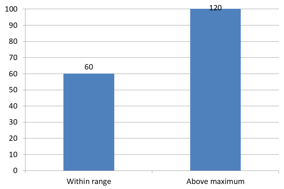
El ejemplo siguiente crea un gráfico de columnas agrupadas 2D con valores de 60 y 120. Envía false a setAutomaticMaxValue y establece el máximo en 100 con setMaxValue en el eje vertical. La primera diapositiva permite etiquetas más allá del máximo; una copia de esa diapositiva las desactiva. Ambas diapositivas se guardan en DataLabelsOverMaximum.pptx.
Active las etiquetas de valor con setShowValue. La configuración a nivel de gráfico no habilita la visualización de valores por sí sola ni anula la visualización desactivada de un valor en una etiqueta individual. Este ejemplo habilita los valores para toda la serie y usa setPosition para colocar las etiquetas en el extremo exterior de cada columna.
import com.aspose.slides.*;

Presentation presentation = new Presentation();
try {
    ISlide slide = presentation.getSlides().get_Item(0);

    IChart chart = slide.getShapes().addChart(ChartType.ClusteredColumn, 50, 50, 600, 400);
    chart.setLegend(false);

    chart.getChartData().getSeries().clear();
    chart.getChartData().getCategories().clear();

    IChartDataWorkbook workbook = chart.getChartData().getChartDataWorkbook();

    IChartDataCell firstCategory = workbook.getCell(0, 1, 0, "Within range");
    IChartDataCell secondCategory = workbook.getCell(0, 2, 0, "Above maximum");

    chart.getChartData().getCategories().add(firstCategory);
    chart.getChartData().getCategories().add(secondCategory);

    IChartDataCell seriesName = workbook.getCell(0, 0, 1, "Values");
    IChartSeries series = chart.getChartData().getSeries().add(seriesName, chart.getType());

    IChartDataCell firstValue = workbook.getCell(0, 1, 1, 60);
    IChartDataCell secondValue = workbook.getCell(0, 2, 1, 120);

    series.getDataPoints().addDataPointForBarSeries(firstValue);
    series.getDataPoints().addDataPointForBarSeries(secondValue);

    series.getLabels().getDefaultDataLabelFormat().setShowValue(true);
    series.getLabels().getDefaultDataLabelFormat().setPosition(LegendDataLabelPosition.OutsideEnd);

    chart.getAxes().getVerticalAxis().setAutomaticMaxValue(false);
    chart.getAxes().getVerticalAxis().setMaxValue(100);
    chart.setShowDataLabelsOverMaximum(true);

    ISlide secondSlide = presentation.getSlides().addClone(slide);
    IChart secondChart = (IChart) secondSlide.getShapes().get_Item(0);
    secondChart.setShowDataLabelsOverMaximum(false);

    presentation.save("DataLabelsOverMaximum.pptx", SaveFormat.Pptx);
} finally {
    presentation.dispose();
}
Las siguientes imágenes muestran las diapositivas guardadas renderizadas por Microsoft PowerPoint. Con true, la etiqueta 120 es visible en el límite superior; con false, está oculta. La etiqueta 60 permanece visible, el máximo del eje se mantiene en 100 y el segundo punto de datos sigue siendo 120 en ambos casos.
| setShowDataLabelsOverMaximum(true) | setShowDataLabelsOverMaximum(false) |
|---|---|
 |
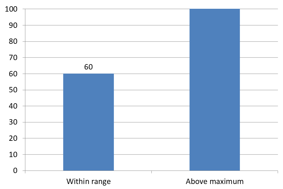 |
Chart Type
Este ejemplo utiliza un gráfico de columnas 2D con un eje de valores. Los gráficos sin eje de valores, como los gráficos circular y de anillo, no disponen de un máximo de eje que limitar de esta manera.Establecer la distancia de la etiqueta respecto a un eje
Utilice setLabelOffset para controlar la distancia entre las etiquetas del eje de categorías y el eje. El valor es un porcentaje del tamaño máximo de fuente de las etiquetas del eje. Este ejemplo crea un gráfico de columnas agrupadas y establece el desplazamiento de la etiqueta del eje horizontal en 500. Esta configuración afecta a las etiquetas del eje de categorías más que a las etiquetas vinculadas a puntos de datos individuales.
import com.aspose.slides.*;

Presentation presentation = new Presentation();
try {
    ISlide slide = presentation.getSlides().get_Item(0);

    IChart chart = slide.getShapes().addChart(ChartType.ClusteredColumn, 20, 20, 500, 300);
    chart.getAxes().getHorizontalAxis().setLabelOffset(500);

    presentation.save("SetCategoryAxisLabelDistance_out.pptx", SaveFormat.Pptx);
} finally {
    presentation.dispose();
}
Ajustar la ubicación de la etiqueta
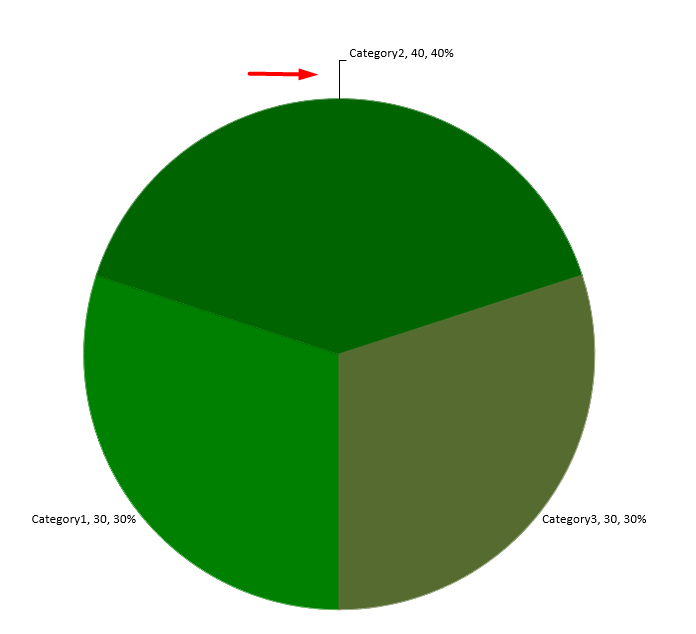
En un gráfico circular, ajuste las posiciones de las etiquetas de datos para mejorar el espaciado y dejar espacio para las líneas guía.
Este ejemplo muestra el valor del primer punto de datos, coloca su etiqueta fuera de la porción y ajusta sus desplazamientos horizontal y vertical mediante setX y setY. Estos desplazamientos son relativos al ancho y la altura del gráfico, respectivamente.
import com.aspose.slides.*;

Presentation presentation = new Presentation();
try {
    ISlide slide = presentation.getSlides().get_Item(0);

    IChart chart = slide.getShapes().addChart(ChartType.Pie, 50, 50, 200, 200);
    IChartSeriesCollection series = chart.getChartData().getSeries();

    IDataLabel label = series.get_Item(0).getLabels().get_Item(0);
    label.getDataLabelFormat().setShowValue(true);
    label.getDataLabelFormat().setPosition(LegendDataLabelPosition.OutsideEnd);
    label.setX(0.71f);
    label.setY(0.04f);

    presentation.save("presentation.pptx", SaveFormat.Pptx);
} finally {
    presentation.dispose();
}
Añadir varias filas de etiquetas de datos sobre un gráfico de columnas
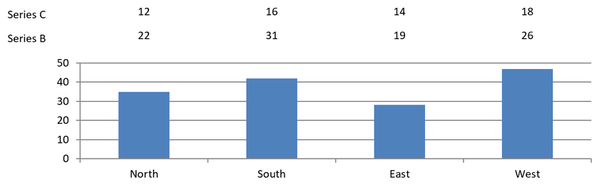
Este ejemplo crea un gráfico de columnas con dos filas de etiquetas de datos sobre el área de trazado. La Serie A muestra las columnas visibles, mientras que las Series B y C proporcionan las etiquetas adicionales. Sus columnas se ocultan eliminando el relleno y el contorno. El método ChartSeriesGroup.setOverlap alinea las tres series con los mismos centros de categoría.
Los ajustes de ChartPlotArea reservan espacio para las filas de etiquetas. Después de que Chart.validateChartLayout calcule las posiciones predeterminadas, DataLabel.setX y DataLabel.setY conservan la alineación horizontal y aplican desplazamientos verticales para organizar las etiquetas en dos filas. Los números siguen siendo etiquetas de datos vinculadas a los valores de la serie; solo los encabezados de fila son formas de texto independientes.
import com.aspose.slides.*;
import android.graphics.Color;

Presentation presentation = new Presentation();
try {
    ISlide slide = presentation.getSlides().get_Item(0);

    IChart chart = slide.getShapes().addChart(ChartType.ClusteredColumn, 40, 40, 640, 200);
    chart.setTitle(false);
    chart.setLegend(false);
    chart.getTextFormat().getPortionFormat().setFontHeight(12);

    chart.getChartData().getSeries().clear();
    chart.getChartData().getCategories().clear();

    IChartDataWorkbook workbook = chart.getChartData().getChartDataWorkbook();
    workbook.clear(0);

    String[] categories = {"North", "South", "East", "West"};
    String[] seriesNames = {"Series A", "Series B", "Series C"};
    double[][] seriesValues = {
            {35, 42, 28, 47},
            {22, 31, 19, 26},
            {12, 16, 14, 18}
    };

    for (int categoryIndex = 0; categoryIndex < categories.length; categoryIndex++) {
        IChartDataCell categoryCell = workbook.getCell(0, categoryIndex + 1, 0, categories[categoryIndex]);
        chart.getChartData().getCategories().add(categoryCell);
    }

    for (int seriesIndex = 0; seriesIndex < seriesNames.length; seriesIndex++) {
        IChartDataCell seriesCell = workbook.getCell(0, 0, seriesIndex + 1, seriesNames[seriesIndex]);
        IChartSeries series = chart.getChartData().getSeries().add(seriesCell, ChartType.ClusteredColumn);

        for (int categoryIndex = 0; categoryIndex < categories.length; categoryIndex++) {
            IChartDataCell valueCell = workbook.getCell(0, categoryIndex + 1, seriesIndex + 1, seriesValues[seriesIndex][categoryIndex]);
            series.getDataPoints().addDataPointForBarSeries(valueCell);
        }

        if (seriesIndex > 0) {
            // Ocultar las columnas de B y C, pero mantener sus etiquetas de datos.
            series.getFormat().getFill().setFillType(FillType.NoFill);
            series.getFormat().getLine().getFillFormat().setFillType(FillType.NoFill);
            series.getLabels().getDefaultDataLabelFormat().setShowValue(true);
            series.getLabels().getDefaultDataLabelFormat().getTextFormat().getPortionFormat().setFontHeight(12);
            IFillFormat labelFill = series.getLabels().getDefaultDataLabelFormat().getTextFormat().getPortionFormat().getFillFormat();
            labelFill.setFillType(FillType.Solid);
            labelFill.getSolidFillColor().setColor(Color.BLACK);
            series.getLabels().getDefaultDataLabelFormat().setPosition(LegendDataLabelPosition.InsideBase);
        }
    }

    // Alinear las tres series con los mismos centros de categoría.
    chart.getChartData().getSeries().get_Item(0).getParentSeriesGroup().setOverlap((byte) 100);

    // Usar menos líneas de cuadrícula para este ejemplo compacto.
    chart.getAxes().getVerticalAxis().setAutomaticMajorUnit(false);
    chart.getAxes().getVerticalAxis().setMajorUnit(10);

    // Reservar espacio encima del área de trazado para dos filas de etiquetas de datos.
    chart.getPlotArea().setLayoutTargetType(LayoutTargetType.Inner);
    chart.getPlotArea().setX(0.15f);
    chart.getPlotArea().setY(0.32f);
    chart.getPlotArea().setWidth(0.80f);
    chart.getPlotArea().setHeight(0.48f);
    chart.validateChartLayout();

    for (int seriesIndex = 1; seriesIndex < seriesNames.length; seriesIndex++) {
        IChartSeries series = chart.getChartData().getSeries().get_Item(seriesIndex);
        float rowTop = seriesIndex == 1 ? 0.15f : 0.03f;

        for (int categoryIndex = 0; categoryIndex < categories.length; categoryIndex++) {
            IDataLabel dataLabel = series.getDataPoints().get_Item(categoryIndex).getLabel();
            // Mantener la posición horizontal predeterminada. Y es un desplazamiento desde
            // la posición predeterminada de la etiqueta, expresado como una fracción de la altura del gráfico.
            dataLabel.setX(0);
            dataLabel.setY(rowTop - dataLabel.getActualY() / chart.getHeight());
        }

        // Solo el encabezado de fila es una forma de texto independiente.
        IAutoShape rowHeading = slide.getShapes().addAutoShape(ShapeType.Rectangle, chart.getX(), chart.getY() + rowTop * chart.getHeight(), 85, 18);
        rowHeading.getFillFormat().setFillType(FillType.NoFill);
        rowHeading.getLineFormat().getFillFormat().setFillType(FillType.NoFill);
        rowHeading.addTextFrame(seriesNames[seriesIndex]);
        rowHeading.getTextFrame().getTextFrameFormat().setMarginTop(0);
        rowHeading.getTextFrame().getTextFrameFormat().setMarginBottom(0);
        IPortionFormat headingFormat = rowHeading.getTextFrame().getParagraphs().get_Item(0).getPortions().get_Item(0).getPortionFormat();
        headingFormat.setFontHeight(12);
        headingFormat.getFillFormat().setFillType(FillType.Solid);
        headingFormat.getFillFormat().getSolidFillColor().setColor(Color.BLACK);
    }

    presentation.save("multiple-rows-of-labels.pptx", SaveFormat.Pptx);
} finally {
    presentation.dispose();
}
Preguntas frecuentes
¿Cómo puedo evitar que las etiquetas de datos se solapen en gráficos densos?
Combine la colocación automática de etiquetas, líneas guía y una reducción del tamaño de la fuente; si es necesario, oculte algunos campos (por ejemplo, la categoría) o muestre etiquetas solo para valores extremos o puntos clave.
¿Cómo puedo desactivar etiquetas solo para valores cero, negativos o vacíos?
Filtre los puntos de datos antes de habilitar las etiquetas y desactive la visualización para valores de 0, valores negativos o valores ausentes según una regla definida.
¿Cómo puedo garantizar un estilo de etiqueta coherente al exportar a PDF/imágenes?
Establezca explícitamente la familia y el tamaño de fuente y verifique que la tipografía esté disponible en el entorno de renderizado para evitar sustituciones.