
C++ を使用したプレゼンテーションでのチャート軸のカスタマイズ
概要
この記事では、Aspose.Slides for C++ を使用してグラフ軸をカスタマイズする方法を説明します。計算された軸の値、グラフの行と列の入れ替え、軸の表示/非表示、カテゴリラベルと目盛り間隔、日付カテゴリと書式設定、タイトルの回転、軸の位置設定、表示単位について解説します。
チャートの縦軸で最大値を取得する
デフォルトデータでエリア グラフを追加した Presentation を作成します。計算された軸の値を取得する前に、チャート レイアウトが最新になるように ValidateChartLayout を呼び出します。
軸の上限は get_ActualMaxValue と get_ActualMinValue で取得し、目盛り間隔は get_ActualMajorUnit と get_ActualMinorUnit で取得します。get_ActualMajorUnitScale と get_ActualMinorUnitScale は時間単位のスケールを提供し、日付軸に関連します。サンプルではこれらの値をローカル変数に保存し、グラフを保存します。
#include <DOM/Presentation.h>
#include <DOM/ISlide.h>
#include <DOM/IShapeCollection.h>
#include <DOM/IChart.h>
#include <DOM/Chart/ChartType.h>
#include <DOM/Chart/IAxesManager.h>
#include <DOM/Chart/IAxis.h>
#include <Export/SaveFormat.h>

using namespace Aspose::Slides;
using namespace Aspose::Slides::Charts;
using namespace Aspose::Slides::Export;

auto presentation = System::MakeObject<Presentation>();
auto slide = presentation->get_Slide(0);

auto chart = slide->get_Shapes()->AddChart(ChartType::Area, 100, 100, 500, 350);
chart->ValidateChartLayout();

auto maxValue = chart->get_Axes()->get_VerticalAxis()->get_ActualMaxValue();
auto minValue = chart->get_Axes()->get_VerticalAxis()->get_ActualMinValue();

auto majorUnit = chart->get_Axes()->get_VerticalAxis()->get_ActualMajorUnit();
auto minorUnit = chart->get_Axes()->get_VerticalAxis()->get_ActualMinorUnit();

auto majorUnitScale = chart->get_Axes()->get_VerticalAxis()->get_ActualMajorUnitScale();
auto minorUnitScale = chart->get_Axes()->get_VerticalAxis()->get_ActualMinorUnitScale();

presentation->Save(u"AxisValues_out.pptx", SaveFormat::Pptx);
軸間のデータを入れ替える
SwitchRowColumn を使用して、系列とカテゴリの役割を入れ替えます。元のカテゴリは系列になり、元の系列はカテゴリになります。これはデータのグループ化方法を変更しますが、水平軸と垂直軸を入れ替えるわけではありません。サンプルでは SetRange を使ってデフォルトデータを Sheet1!A1:D5(ヘッダー行とカテゴリ列を含む)にバインドし、行と列を入れ替えた後に 4 系列 3 カテゴリのグラフを保存します。
#include <DOM/Presentation.h>
#include <DOM/ISlide.h>
#include <DOM/IShapeCollection.h>
#include <DOM/IChart.h>
#include <DOM/Chart/ChartType.h>
#include <DOM/Chart/IAxesManager.h>
#include <DOM/Chart/IAxis.h>
#include <Export/SaveFormat.h>
#include <DOM/Chart/IChartData.h>

using namespace Aspose::Slides;
using namespace Aspose::Slides::Charts;
using namespace Aspose::Slides::Export;

auto presentation = System::MakeObject<Presentation>();
auto slide = presentation->get_Slide(0);

auto chart = slide->get_Shapes()->AddChart(ChartType::ClusteredColumn, 100, 100, 400, 300);

chart->get_ChartData()->SetRange(u"Sheet1!A1:D5");
chart->get_ChartData()->SwitchRowColumn();

presentation->Save(u"SwitchChartRowColumns_out.pptx", SaveFormat::Pptx);
折れ線グラフの縦軸を無効にする
垂直軸に対して false を指定して set_IsVisible を呼び出すことで非表示にします。サンプルはデフォルトデータで折れ線グラフを作成し、縦軸を非表示にした状態で保存します。
#include <DOM/Presentation.h>
#include <DOM/ISlide.h>
#include <DOM/IShapeCollection.h>
#include <DOM/IChart.h>
#include <DOM/Chart/ChartType.h>
#include <DOM/Chart/IAxesManager.h>
#include <DOM/Chart/IAxis.h>
#include <Export/SaveFormat.h>

using namespace Aspose::Slides;
using namespace Aspose::Slides::Charts;
using namespace Aspose::Slides::Export;

auto presentation = System::MakeObject<Presentation>();
auto slide = presentation->get_Slide(0);

auto chart = slide->get_Shapes()->AddChart(ChartType::Line, 100, 100, 400, 300);
chart->get_Axes()->get_VerticalAxis()->set_IsVisible(false);

presentation->Save(u"HiddenVerticalAxis.pptx", SaveFormat::Pptx);
折れ線グラフの横軸を無効にする
水平軸に対して false を指定して set_IsVisible を呼び出すことで非表示にします。サンプルはデフォルトデータで折れ線グラフを作成し、横軸を非表示にした状態で保存します。
#include <DOM/Presentation.h>
#include <DOM/ISlide.h>
#include <DOM/IShapeCollection.h>
#include <DOM/IChart.h>
#include <DOM/Chart/ChartType.h>
#include <DOM/Chart/IAxesManager.h>
#include <DOM/Chart/IAxis.h>
#include <Export/SaveFormat.h>

using namespace Aspose::Slides;
using namespace Aspose::Slides::Charts;
using namespace Aspose::Slides::Export;

auto presentation = System::MakeObject<Presentation>();
auto slide = presentation->get_Slide(0);

auto chart = slide->get_Shapes()->AddChart(ChartType::Line, 100, 100, 400, 300);
chart->get_Axes()->get_HorizontalAxis()->set_IsVisible(false);

presentation->Save(u"HiddenHorizontalAxis.pptx", SaveFormat::Pptx);
カテゴリ軸を変更する
set_CategoryAxisType を使用して日付軸またはテキスト軸を選択します。このサンプルは ExistingChart.pptx を前提とし、1 つ目のスライドの最初のシェイプにグラフがあり、カテゴリセルに数値の Excel 日付が格納されているとします。水平軸を日付軸に変更します。set_IsAutomaticMajorUnit に false、set_MajorUnit に 1、set_MajorUnitScale に月単位を指定して、主要目盛りを 1 か月間隔に設定します。
#include <DOM/Presentation.h>
#include <DOM/ISlide.h>
#include <DOM/IShapeCollection.h>
#include <DOM/IChart.h>
#include <DOM/Chart/ChartType.h>
#include <DOM/Chart/IAxesManager.h>
#include <DOM/Chart/IAxis.h>
#include <Export/SaveFormat.h>
#include <DOM/Chart/CategoryAxisType.h>
#include <DOM/Chart/TimeUnitType.h>
#include <system/object_ext.h>

using namespace Aspose::Slides;
using namespace Aspose::Slides::Charts;
using namespace Aspose::Slides::Export;

auto presentation = System::MakeObject<Presentation>(u"ExistingChart.pptx");
auto slide = presentation->get_Slide(0);

auto chart = System::ExplicitCast<IChart>(slide->get_Shape(0));
chart->get_Axes()->get_HorizontalAxis()->set_CategoryAxisType(CategoryAxisType::Date);
chart->get_Axes()->get_HorizontalAxis()->set_IsAutomaticMajorUnit(false);
chart->get_Axes()->get_HorizontalAxis()->set_MajorUnit(1);
chart->get_Axes()->get_HorizontalAxis()->set_MajorUnitScale(TimeUnitType::Months);

presentation->Save(u"ChangeChartCategoryAxis_out.pptx", SaveFormat::Pptx);
カテゴリ軸ラベル間隔を制御する
カテゴリが多数あるグラフでは、カテゴリやデータポイントを削除せずに表示される軸ラベルの数を減らすことができます。set_IsAutomaticTickLabelSpacing に false を設定し、続いて set_TickLabelSpacing に目的のカテゴリ間隔を指定します。テキストカテゴリが通常の順序で並んでいる場合、カウントは最初のカテゴリから始まります。
| 間隔 | 例で表示されるラベル |
|---|---|
1 |
Category 1, Category 2, Category 3, … Category 24 |
2 |
Category 1, Category 3, Category 5, … Category 23 |
3 |
Category 1, Category 4, Category 7, … Category 22 |
間隔 3 を指定すると、3 番目ごとのラベルが表示され、表示されたラベルの間に 2 つのラベルが非表示になります。対応する列は削除されません。自動間隔は利用可能なスペースに基づいて間隔を決定し、必ずしもすべてのラベルを表示するわけではありません。
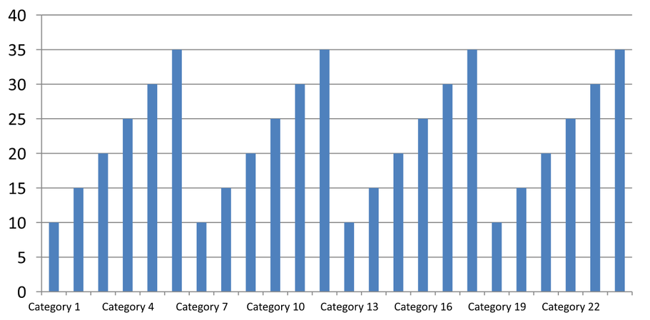
目盛りには別個の制御があります。set_IsAutomaticTickMarksSpacing に false を設定し、set_TickMarksSpacing で目盛り間隔を設定します。たとえば 1 とすれば、ラベルは 3 カテゴリごとに表示されても、目盛りはすべてのカテゴリ間隔で保持されます。set_MajorTickMark で目に見えるスタイルを設定すると結果が確認できます。自動間隔プロパティを true に戻すと、チャートが再び間隔を自動選択します。
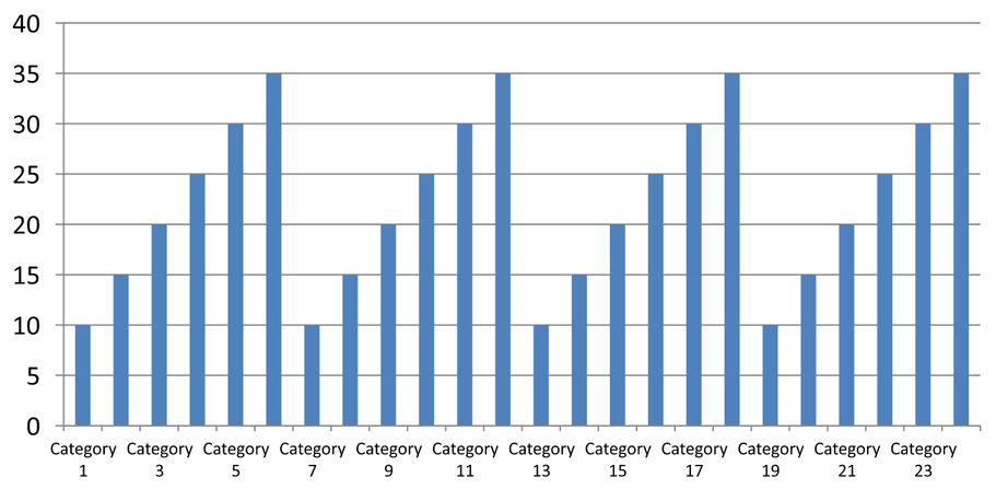
以下の自己完結型サンプルは 24 カテゴリと 1 系列を作成し、CategoryAxisIntervals.pptx に 3 スライドを保存します:自動間隔、ラベル間隔を手動で設定した上で目盛りは独立、そして自動間隔に復元したものです。2 つのコピーは元のチャートデータを保持します。入力プレゼンテーションは不要です。水平ラベルテキストにより密度の違いが分かりやすくなります。
#include <DOM/Presentation.h>
#include <DOM/ISlide.h>
#include <DOM/IShapeCollection.h>
#include <DOM/IChart.h>
#include <DOM/Chart/ChartType.h>
#include <DOM/Chart/IAxesManager.h>
#include <DOM/Chart/IAxis.h>
#include <Export/SaveFormat.h>
#include <DOM/Chart/IChartData.h>
#include <DOM/Chart/CategoryAxisType.h>
#include <DOM/Chart/TickMarkType.h>
#include <DOM/Chart/IChartTextFormat.h>
#include <DOM/Chart/IChartTextBlockFormat.h>
#include <DOM/Chart/IChartPortionFormat.h>
#include <DOM/Chart/IChartDataWorkbook.h>
#include <DOM/Chart/IChartDataCell.h>
#include <DOM/Chart/IChartCategoryCollection.h>
#include <DOM/Chart/IChartSeriesCollection.h>
#include <DOM/Chart/IChartSeries.h>
#include <DOM/Chart/IChartDataPointCollection.h>
#include <system/object_ext.h>
#include <DOM/ISlideCollection.h>

using namespace Aspose::Slides;
using namespace Aspose::Slides::Charts;
using namespace Aspose::Slides::Export;

auto presentation = System::MakeObject<Presentation>();
auto slide = presentation->get_Slide(0);

auto chart = slide->get_Shapes()->AddChart(ChartType::ClusteredColumn, 30, 40, 660, 320);

chart->set_HasLegend(false);
chart->get_ChartData()->get_Categories()->Clear();
chart->get_ChartData()->get_Series()->Clear();

auto workbook = chart->get_ChartData()->get_ChartDataWorkbook();
workbook->Clear(0);

auto series = chart->get_ChartData()->get_Series()->Add(ChartType::ClusteredColumn);
for (auto i = 0; i < 24; i++)
{
    auto categoryName = System::String::Format(u"Category {0}", i + 1);
    auto categoryCell = workbook->GetCell(0, i + 1, 0, System::ObjectExt::Box(categoryName));
    chart->get_ChartData()->get_Categories()->Add(categoryCell);
    auto valueCell = workbook->GetCell(0, i + 1, 1, System::ObjectExt::Box(10 + i % 6 * 5));
    series->get_DataPoints()->AddDataPointForBarSeries(valueCell);
}

auto axis = chart->get_Axes()->get_HorizontalAxis();
axis->set_CategoryAxisType(CategoryAxisType::Text);
axis->get_TextFormat()->get_TextBlockFormat()->set_RotationAngle(0);
axis->get_TextFormat()->get_PortionFormat()->set_FontHeight(12);
axis->set_MajorTickMark(TickMarkType::Outside);
axis->set_IsAutomaticTickLabelSpacing(true);
axis->set_IsAutomaticTickMarksSpacing(true);

// スライド 2: 3 番目ごとのラベルを表示し、各カテゴリに目盛りは保持する。
auto manualSlide = presentation->get_Slides()->AddClone(slide);
auto manualChart = System::ExplicitCast<IChart>(manualSlide->get_Shape(0));
auto manualAxis = manualChart->get_Axes()->get_HorizontalAxis();
manualAxis->set_IsAutomaticTickLabelSpacing(false);
manualAxis->set_TickLabelSpacing(3);
manualAxis->set_IsAutomaticTickMarksSpacing(false);
manualAxis->set_TickMarksSpacing(1);

// スライド 3: 再びチャートに両方の間隔を選択させる。
auto restoredSlide = presentation->get_Slides()->AddClone(manualSlide);
auto restoredChart = System::ExplicitCast<IChart>(restoredSlide->get_Shape(0));
restoredChart->get_Axes()->get_HorizontalAxis()->set_IsAutomaticTickLabelSpacing(true);
restoredChart->get_Axes()->get_HorizontalAxis()->set_IsAutomaticTickMarksSpacing(true);

presentation->Save(u"CategoryAxisIntervals.pptx", SaveFormat::Pptx);
Automatic spacing (slide 1): In this rendering, every second category label is displayed and wraps onto two lines. The automatic result can vary with chart size, fonts, and the renderer.
Manual spacing (slide 2): Every third label is displayed on one line, while tick marks remain at every category interval. All 24 columns, including those without labels, remain visible with the same values. Slide 3 restores the automatic appearance shown above.
正しい軸と間隔を選択する
テキストカテゴリ軸(列、折れ線、エリア、棒グラフなどのカテゴリ軸)でこのカテゴリ数間隔を使用します。列グラフでは水平軸、水平棒グラフではカテゴリ軸が垂直になるため、get_VerticalAxis に対して同様の設定を適用します。目盛り間隔は、系列軸を持つチャートの系列軸にも適用できます。
カテゴリラベル間隔は数値軸のスケールを設定するために使用しないでください。数値軸では set_MajorUnit が値の差を指定します(例:10 の主要単位は 0、10、20…)。カテゴリラベル間隔 3 はデータ値に関係なくカテゴリ位置をカウントします。散布図やバブルチャートはテキストカテゴリ軸ではなく数値軸を使用します。日付軸の場合は、Change a Category Axis で説明した時間ベースの主要単位とスケールを使用してください。
カテゴリ軸値の日付形式を設定する
サンプルはデフォルトのチャートデータを 4 つの年次値に置き換えます。日付は最初のワークシート(インデックス 0)に OLE Automation のシリアル番号として保存されます。set_CategoryAxisType で日付軸を選択し、set_IsNumberFormatLinkedToSource で元データと書式のリンクを解除し、set_NumberFormat に yyyy を設定して、セルの書式設定に関係なくカテゴリラベルが 4 桁の年で表示されるようにします。
#include <DOM/Presentation.h>
#include <DOM/ISlide.h>
#include <DOM/IShapeCollection.h>
#include <DOM/IChart.h>
#include <DOM/Chart/ChartType.h>
#include <DOM/Chart/IAxesManager.h>
#include <DOM/Chart/IAxis.h>
#include <Export/SaveFormat.h>
#include <DOM/Chart/IChartData.h>
#include <DOM/Chart/CategoryAxisType.h>
#include <DOM/Chart/IChartDataWorkbook.h>
#include <DOM/Chart/IChartDataCell.h>
#include <DOM/Chart/IChartCategoryCollection.h>
#include <DOM/Chart/IChartSeriesCollection.h>
#include <DOM/Chart/IChartSeries.h>
#include <DOM/Chart/IChartDataPointCollection.h>
#include <system/object_ext.h>
#include <system/date_time.h>

using namespace Aspose::Slides;
using namespace Aspose::Slides::Charts;
using namespace Aspose::Slides::Export;

auto presentation = System::MakeObject<Presentation>();
auto slide = presentation->get_Slide(0);

auto chart = slide->get_Shapes()->AddChart(ChartType::Line, 50, 50, 450, 300);

chart->get_ChartData()->get_Categories()->Clear();
chart->get_ChartData()->get_Series()->Clear();

auto workbook = chart->get_ChartData()->get_ChartDataWorkbook();
workbook->Clear(0);

auto series = chart->get_ChartData()->get_Series()->Add(ChartType::Line);
for (auto i = 0; i < 4; i++)
{
    auto date = System::DateTime(2015 + i, 1, 1);
    auto categoryCell = workbook->GetCell(0, i + 1, 0, System::ObjectExt::Box(date.ToOADate()));
    chart->get_ChartData()->get_Categories()->Add(categoryCell);

    auto valueCell = workbook->GetCell(0, i + 1, 1, System::ObjectExt::Box(i + 1));
    series->get_DataPoints()->AddDataPointForLineSeries(valueCell);
}

chart->get_Axes()->get_HorizontalAxis()->set_CategoryAxisType(CategoryAxisType::Date);
chart->get_Axes()->get_HorizontalAxis()->set_IsNumberFormatLinkedToSource(false);
chart->get_Axes()->get_HorizontalAxis()->set_NumberFormat(u"yyyy");

presentation->Save(u"DateAxisFormat.pptx", SaveFormat::Pptx);
チャート軸タイトルの回転角度を設定する
set_HasTitle で縦軸タイトルを有効にし、タイトルテキストを設定し、set_RotationAngle で回転させます。角度は度で測定され、サンプルは値軸タイトルを 90 度回転させた柱状グラフを保存します。
#include <DOM/Presentation.h>
#include <DOM/ISlide.h>
#include <DOM/IShapeCollection.h>
#include <DOM/IChart.h>
#include <DOM/Chart/ChartType.h>
#include <DOM/Chart/IAxesManager.h>
#include <DOM/Chart/IAxis.h>
#include <Export/SaveFormat.h>
#include <DOM/Chart/IChartTextFormat.h>
#include <DOM/Chart/IChartTextBlockFormat.h>
#include <DOM/Chart/IChartTitle.h>

using namespace Aspose::Slides;
using namespace Aspose::Slides::Charts;
using namespace Aspose::Slides::Export;

auto presentation = System::MakeObject<Presentation>();
auto slide = presentation->get_Slide(0);

auto chart = slide->get_Shapes()->AddChart(ChartType::ClusteredColumn, 50, 50, 450, 300);
chart->get_Axes()->get_VerticalAxis()->set_HasTitle(true);
chart->get_Axes()->get_VerticalAxis()->get_Title()->AddTextFrameForOverriding(u"Value");
chart->get_Axes()->get_VerticalAxis()->get_Title()->get_TextFormat()->get_TextBlockFormat()->set_RotationAngle(90);

presentation->Save(u"RotatedAxisTitle.pptx", SaveFormat::Pptx);
カテゴリ軸または値軸の位置を設定する
set_AxisBetweenCategories を使用して、値軸がカテゴリ軸のカテゴリ間またはカテゴリ目盛り上で交差するかを制御します。このプロパティはカテゴリ軸に適用されます。サンプルは柱状グラフの水平カテゴリ軸に true を設定し、結果を保存します。
#include <DOM/Presentation.h>
#include <DOM/ISlide.h>
#include <DOM/IShapeCollection.h>
#include <DOM/IChart.h>
#include <DOM/Chart/ChartType.h>
#include <DOM/Chart/IAxesManager.h>
#include <DOM/Chart/IAxis.h>
#include <Export/SaveFormat.h>

using namespace Aspose::Slides;
using namespace Aspose::Slides::Charts;
using namespace Aspose::Slides::Export;

auto presentation = System::MakeObject<Presentation>();
auto slide = presentation->get_Slide(0);

auto chart = slide->get_Shapes()->AddChart(ChartType::ClusteredColumn, 50, 50, 450, 300);
chart->get_Axes()->get_HorizontalAxis()->set_AxisBetweenCategories(true);

presentation->Save(u"AxisBetweenCategories.pptx", SaveFormat::Pptx);
チャートの値軸に表示単位を設定する
set_DisplayUnit を使用して、基になるデータを変更せずに値軸ラベルのスケールを調整します。DisplayUnitType を Millions に設定すると、60,000,000 が 60 と表示されます。サンプルは柱状グラフを作成し、垂直軸に百万単位の表示単位を適用します。
#include <DOM/Presentation.h>
#include <DOM/ISlide.h>
#include <DOM/IShapeCollection.h>
#include <DOM/IChart.h>
#include <DOM/Chart/ChartType.h>
#include <DOM/Chart/IAxesManager.h>
#include <DOM/Chart/IAxis.h>
#include <Export/SaveFormat.h>
#include <DOM/Chart/DisplayUnitType.h>

using namespace Aspose::Slides;
using namespace Aspose::Slides::Charts;
using namespace Aspose::Slides::Export;

auto presentation = System::MakeObject<Presentation>();
auto slide = presentation->get_Slide(0);

auto chart = slide->get_Shapes()->AddChart(ChartType::ClusteredColumn, 50, 50, 450, 300);
chart->get_Axes()->get_VerticalAxis()->set_DisplayUnit(DisplayUnitType::Millions);

presentation->Save(u"Result.pptx", SaveFormat::Pptx);
FAQ
軸が他の軸と交差する位置(軸交差)をどのように設定しますか?
set_CrossType で交差方法を選択し、数値の交差位置を指定する場合は set_CrossAt を使用します。これらの設定により、軸交差点を適切な基準線へ移動できます。
目盛りラベルを軸に対してどのように配置しますか?
set_TickLabelPosition に TickLabelPositionType の Low、High、NextTo、または None のいずれかの値を指定します。目盛り自体を制御する場合は、set_MajorTickMark または set_MinorTickMark を使用します。これらはラベル位置設定とは別です。