
PHP를 사용하여 프레젠테이션에서 차트 축 맞춤 설정
개요
이 문서에서는 Java를 통해 PHP용 Aspose.Slides로 차트 축을 사용자 지정하는 방법을 설명합니다. 계산된 축값, 차트 행과 열 전환, 축 표시 여부, 범주 레이블 및 눈금 간격, 날짜 범주 및 형식 지정, 제목 회전, 축 위치 지정 및 표시 단위 등을 다룹니다.
차트의 세로 축에서 최대 값 가져오기
기본 데이터가 포함된 영역 차트를 추가하기 위해 Presentation 을 생성합니다. 계산된 축값을 읽기 전에 차트 레이아웃을 최신 상태로 유지하기 위해 validateChartLayout 을 호출합니다.
축 한계를 얻기 위해 getActualMaxValue 및 getActualMinValue 를 읽고, 눈금 간격을 위해 getActualMajorUnit 및 getActualMinorUnit 를 읽습니다. getActualMajorUnitScale 와 getActualMinorUnitScale 은 날짜 축과 관련된 시간 단위 스케일을 제공합니다. 예제에서는 이러한 값을 로컬 변수에 저장하고 차트를 저장합니다.
use aspose\slides\ChartType;
use aspose\slides\Presentation;
use aspose\slides\SaveFormat;

$presentation = new Presentation();
try {
    $slide = $presentation->getSlides()->get_Item(0);

    $chart = $slide->getShapes()->addChart(ChartType::Area, 100, 100, 500, 350);
    $chart->validateChartLayout();

    $maxValue = $chart->getAxes()->getVerticalAxis()->getActualMaxValue();
    $minValue = $chart->getAxes()->getVerticalAxis()->getActualMinValue();

    $majorUnit = $chart->getAxes()->getVerticalAxis()->getActualMajorUnit();
    $minorUnit = $chart->getAxes()->getVerticalAxis()->getActualMinorUnit();

    $majorUnitScale = $chart->getAxes()->getVerticalAxis()->getActualMajorUnitScale();
    $minorUnitScale = $chart->getAxes()->getVerticalAxis()->getActualMinorUnitScale();

    $presentation->save("AxisValues_out.pptx", SaveFormat::Pptx);
} finally {
    $presentation->dispose();
}
축 사이의 데이터 교환
차트 데이터에서 시리즈와 범주의 역할을 교환하려면 switchRowColumn 을 사용합니다. 이전의 각 범주는 시리즈가 되고, 이전의 각 시리즈는 범주가 됩니다. 이는 데이터 그룹화 방식을 변경하지만 수평 및 수직 축을 교환하는 것은 아닙니다. 예제에서는 행과 열을 전환하기 전에 기본 데이터를 Sheet1!A1:D5 (헤더 행 및 범주 열 포함) 에 바인딩하기 위해 setRange 를 사용합니다. 네 개의 시리즈와 세 개의 범주를 가진 차트를 저장합니다.
use aspose\slides\ChartType;
use aspose\slides\Presentation;
use aspose\slides\SaveFormat;

$presentation = new Presentation();
try {
    $slide = $presentation->getSlides()->get_Item(0);

    $chart = $slide->getShapes()->addChart(ChartType::ClusteredColumn, 100, 100, 400, 300);
    $chart->getChartData()->setRange("Sheet1!A1:D5");
    $chart->getChartData()->switchRowColumn();

    $presentation->save("SwitchChartRowColumns_out.pptx", SaveFormat::Pptx);
} finally {
    $presentation->dispose();
}
라인 차트에서 세로 축 비활성화
세로 축에 false 를 전달하여 setVisible 를 호출하면 축을 숨길 수 있습니다. 예제에서는 기본 데이터가 있는 라인 차트를 생성하고 세로 축이 숨겨진 상태로 저장합니다.
use aspose\slides\ChartType;
use aspose\slides\Presentation;
use aspose\slides\SaveFormat;

$presentation = new Presentation();
try {
    $slide = $presentation->getSlides()->get_Item(0);

    $chart = $slide->getShapes()->addChart(ChartType::Line, 100, 100, 400, 300);
    $chart->getAxes()->getVerticalAxis()->setVisible(false);

    $presentation->save("HiddenVerticalAxis.pptx", SaveFormat::Pptx);
} finally {
    $presentation->dispose();
}
라인 차트에서 가로 축 비활성화
가로 축에 false 를 전달하여 setVisible 를 호출하면 축을 숨길 수 있습니다. 예제에서는 기본 데이터가 있는 라인 차트를 생성하고 가로 축이 숨겨진 상태로 저장합니다.
use aspose\slides\ChartType;
use aspose\slides\Presentation;
use aspose\slides\SaveFormat;

$presentation = new Presentation();
try {
    $slide = $presentation->getSlides()->get_Item(0);

    $chart = $slide->getShapes()->addChart(ChartType::Line, 100, 100, 400, 300);
    $chart->getAxes()->getHorizontalAxis()->setVisible(false);

    $presentation->save("HiddenHorizontalAxis.pptx", SaveFormat::Pptx);
} finally {
    $presentation->dispose();
}
범주 축 변경
setCategoryAxisType 을 사용하여 날짜 또는 텍스트 범주 축을 선택합니다. 이 예제는 첫 번째 슬라이드의 첫 번째 도형으로 차트가 포함된 ExistingChart.pptx 와 범주 셀에 숫자 형식의 Excel 날짜값이 들어 있어야 합니다. 가로 축을 날짜 축으로 변경합니다. setAutomaticMajorUnit 를 false 로, setMajorUnit 를 1 로, setMajorUnitScale 를 TimeUnitType::Months 로 호출하면 주요 눈금이 한 달 간격으로 배치됩니다.
use aspose\slides\CategoryAxisType;
use aspose\slides\Presentation;
use aspose\slides\SaveFormat;
use aspose\slides\TimeUnitType;

$presentation = new Presentation("ExistingChart.pptx");
try {
    $slide = $presentation->getSlides()->get_Item(0);

    $chart = $slide->getShapes()->get_Item(0);
    $chart->getAxes()->getHorizontalAxis()->setCategoryAxisType(CategoryAxisType::Date);
    $chart->getAxes()->getHorizontalAxis()->setAutomaticMajorUnit(false);
    $chart->getAxes()->getHorizontalAxis()->setMajorUnit(1);
    $chart->getAxes()->getHorizontalAxis()->setMajorUnitScale(TimeUnitType::Months);

    $presentation->save("ChangeChartCategoryAxis_out.pptx", SaveFormat::Pptx);
} finally {
    $presentation->dispose();
}
범주 축 레이블 간격 제어
차트에 많은 범주가 있을 때 범주나 데이터 포인트를 제거하지 않고 표시되는 축 레이블 수를 줄일 수 있습니다. setAutomaticTickLabelSpacing 를 false 로 호출한 다음 원하는 범주 간격을 setTickLabelSpacing 에 전달합니다. 일반 순서의 텍스트 범주의 경우, 첫 번째 범주부터 카운트가 시작됩니다:
| 간격 | 예제에 표시된 레이블 |
|---|---|
1 |
범주 1, 범주 2, 범주 3, … 범주 24 |
2 |
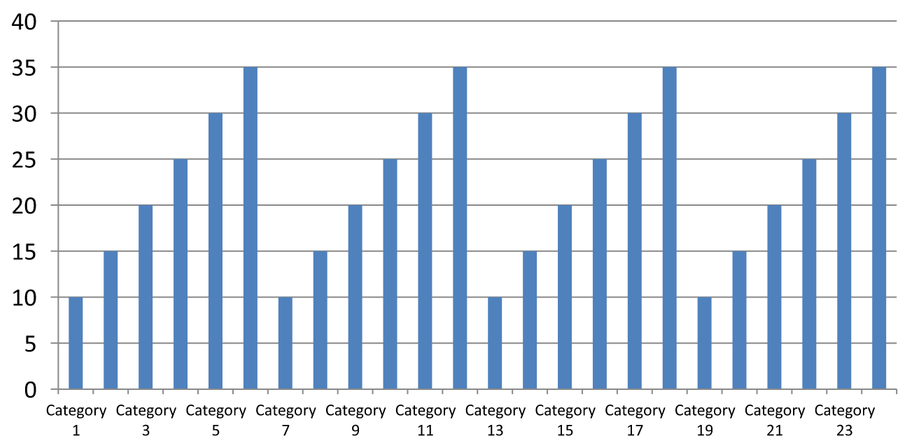
범주 1, 범주 3, 범주 5, … 범주 23 |
3 |
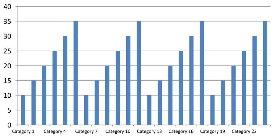
범주 1, 범주 4, 범주 7, … 범주 22 |
3 의 간격은 세 번째 레이블마다 표시하고, 표시된 레이블 사이에 두 개의 레이블을 숨깁니다. 해당 열은 제거되지 않습니다. 자동 간격은 사용 가능한 공간을 기준으로 간격을 선택하므로 반드시 모든 레이블을 표시하지는 않습니다.
눈금 표시에는 별도의 제어가 있습니다. setAutomaticTickMarksSpacing 를 false 로 호출하고 setTickMarksSpacing 로 간격을 설정합니다. 예를 들어, 1 은 각 범주 간격마다 눈금 표시를 유지하지만 레이블은 세 번째 범주마다만 표시됩니다. setMajorTickMark 를 눈에 보이는 스타일로 사용하면 결과를 확인할 수 있습니다. 자동 간격 설정자를 true 로 다시 호출하면 차트가 해당 간격을 다시 선택합니다.
다음의 독립 실행형 예제는 24개의 범주와 하나의 시리즈를 생성한 뒤 CategoryAxisIntervals.pptx 에 세 개의 슬라이드를 저장합니다: 자동 간격, 독립 눈금이 있는 수동 레이블 간격, 그리고 복원된 자동 간격. 두 복사본은 원본 차트 데이터를 유지합니다. 입력 프레젠테이션은 필요하지 않습니다. 가로 레이블 텍스트를 사용하면 밀도 차이를 쉽게 확인할 수 있습니다.
use aspose\slides\CategoryAxisType;
use aspose\slides\ChartType;
use aspose\slides\Presentation;
use aspose\slides\SaveFormat;
use aspose\slides\TickMarkType;

$presentation = new Presentation();
try {
    $slide = $presentation->getSlides()->get_Item(0);

    $chart = $slide->getShapes()->addChart(ChartType::ClusteredColumn, 30, 40, 660, 320);

    $chart->setLegend(false);
    $chart->getChartData()->getCategories()->clear();
    $chart->getChartData()->getSeries()->clear();

    $workbook = $chart->getChartData()->getChartDataWorkbook();
    $workbook->clear(0);

    $series = $chart->getChartData()->getSeries()->add(ChartType::ClusteredColumn);
    for ($i = 0; $i < 24; $i++) {
        $categoryCell = $workbook->getCell(0, $i + 1, 0, "Category " . ($i + 1));
        $chart->getChartData()->getCategories()->add($categoryCell);
        $valueCell = $workbook->getCell(0, $i + 1, 1, 10 + $i % 6 * 5);
        $series->getDataPoints()->addDataPointForBarSeries($valueCell);
    }

    $axis = $chart->getAxes()->getHorizontalAxis();
    $axis->setCategoryAxisType(CategoryAxisType::Text);
    $axis->getTextFormat()->getTextBlockFormat()->setRotationAngle(0);
    $axis->getTextFormat()->getPortionFormat()->setFontHeight(12);
    $axis->setMajorTickMark(TickMarkType::Outside);
    $axis->setAutomaticTickLabelSpacing(true);
    $axis->setAutomaticTickMarksSpacing(true);

    // 슬라이드 2: 모든 세 번째 레이블을 표시하지만 각 범주마다 눈금은 유지합니다.
    $manualSlide = $presentation->getSlides()->addClone($slide);
    $manualChart = $manualSlide->getShapes()->get_Item(0);
    $manualAxis = $manualChart->getAxes()->getHorizontalAxis();
    $manualAxis->setAutomaticTickLabelSpacing(false);
    $manualAxis->setTickLabelSpacing(3);
    $manualAxis->setAutomaticTickMarksSpacing(false);
    $manualAxis->setTickMarksSpacing(1);

    // 슬라이드 3: 차트가 두 간격을 다시 선택하도록 합니다.
    $restoredSlide = $presentation->getSlides()->addClone($manualSlide);
    $restoredChart = $restoredSlide->getShapes()->get_Item(0);
    $restoredChart->getAxes()->getHorizontalAxis()->setAutomaticTickLabelSpacing(true);
    $restoredChart->getAxes()->getHorizontalAxis()->setAutomaticTickMarksSpacing(true);

    $presentation->save("CategoryAxisIntervals.pptx", SaveFormat::Pptx);
} finally {
    $presentation->dispose();
}
자동 간격 (슬라이드 1): 이 렌더링에서는 두 번째마다 범주 레이블이 표시되고 두 줄로 줄바꿈됩니다. 자동 결과는 차트 크기, 글꼴 및 렌더러에 따라 달라질 수 있습니다.
수동 간격 (슬라이드 2): 세 번째 레이블마다 한 줄에 표시되며, 눈금은 각 범주 간격마다 유지됩니다. 레이블이 없는 열을 포함한 모든 24열이 동일한 값으로 표시됩니다. 슬라이드 3은 위에 표시된 자동 모습을 복원합니다.
올바른 축 및 간격 선택
텍스트 범주 축(예: 열, 선형, 영역 또는 막대 차트의 범주 축)에 이 범주 수 간격을 사용합니다. 열 차트에서는 가로 축이 됩니다. 가로 막대 차트에서는 범주 축이 세로이므로 getVerticalAxis 로 반환된 축에 이 설정을 적용합니다. 눈금 간격은 시리즈 축이 있는 차트에서도 적용됩니다.
범주 레이블 간격을 사용하여 값 축의 숫자 스케일을 설정하지 마십시오. 값 축에서는 setMajorUnit 이 값 차이를 지정합니다: 예를 들어, 주요 단위가 10이면 축이 0에서 시작할 때 0, 10, 20 등으로 눈금이 표시됩니다. 3 의 범주 레이블 간격은 데이터 값과 관계없이 범주 위치를 셉니다. 산점도 및 버블 차트는 텍스트 범주 축이 아닌 값 축을 사용합니다. 날짜 축의 경우 Change a Category Axis 에 설명된 대로 시간 기반 주요 단위와 스케일을 사용하십시오.
범주 축 값에 대한 날짜 형식 설정
예제는 기본 차트 데이터를 네 개의 연간 값으로 교체합니다. 날짜는 첫 번째 워크시트(인덱스 0)에 OLE Automation 일련 번호로 저장되며, 1899년 12월 30일부터 경과된 일수로 계산됩니다. setCategoryAxisType 에 CategoryAxisType::Date 를 사용하고, setNumberFormatLinkedToSource 를 false 로 호출한 뒤, setNumberFormat 에 yyyy 를 전달하여 셀 서식과 무관하게 범주 레이블이 4자리 연도로 표시되도록 합니다.
use aspose\slides\CategoryAxisType;
use aspose\slides\ChartType;
use aspose\slides\Presentation;
use aspose\slides\SaveFormat;

$presentation = new Presentation();
try {
    $slide = $presentation->getSlides()->get_Item(0);

    $chart = $slide->getShapes()->addChart(ChartType::Line, 50, 50, 450, 300);

    $chart->getChartData()->getCategories()->clear();
    $chart->getChartData()->getSeries()->clear();

    $workbook = $chart->getChartData()->getChartDataWorkbook();
    $workbook->clear(0);

    $baseDate = gmmktime(0, 0, 0, 12, 30, 1899);

    $series = $chart->getChartData()->getSeries()->add(ChartType::Line);
    for ($i = 0; $i < 4; $i++) {
        $date = gmmktime(0, 0, 0, 1, 1, 2015 + $i);
        $serialDate = ($date - $baseDate) / 86400;
        $categoryCell = $workbook->getCell(0, $i + 1, 0, $serialDate);
        $chart->getChartData()->getCategories()->add($categoryCell);

        $valueCell = $workbook->getCell(0, $i + 1, 1, $i + 1);
        $series->getDataPoints()->addDataPointForLineSeries($valueCell);
    }

    $chart->getAxes()->getHorizontalAxis()->setCategoryAxisType(CategoryAxisType::Date);
    $chart->getAxes()->getHorizontalAxis()->setNumberFormatLinkedToSource(false);
    $chart->getAxes()->getHorizontalAxis()->setNumberFormat("yyyy");

    $presentation->save("DateAxisFormat.pptx", SaveFormat::Pptx);
} finally {
    $presentation->dispose();
}
차트 축 제목에 회전 각도 설정
세로 축에 true 로 setTitle 을 호출하고 제목 텍스트를 제공한 뒤, setRotationAngle 로 제목을 회전합니다. 각도는 도 단위이며, 이 예제는 값 축 제목이 90도 회전된 열 차트를 저장합니다.
use aspose\slides\ChartType;
use aspose\slides\Presentation;
use aspose\slides\SaveFormat;

$presentation = new Presentation();
try {
    $slide = $presentation->getSlides()->get_Item(0);

    $chart = $slide->getShapes()->addChart(ChartType::ClusteredColumn, 50, 50, 450, 300);
    $chart->getAxes()->getVerticalAxis()->setTitle(true);
    $chart->getAxes()->getVerticalAxis()->getTitle()->addTextFrameForOverriding("Value");
    $chart->getAxes()->getVerticalAxis()->getTitle()->getTextFormat()->getTextBlockFormat()->setRotationAngle(90);

    $presentation->save("RotatedAxisTitle.pptx", SaveFormat::Pptx);
} finally {
    $presentation->dispose();
}
범주 축 또는 값 축에서 축 위치 설정
setAxisBetweenCategories 를 사용하여 값 축이 범주 축을 범주 사이에 교차할지 또는 범주 눈금에 교차할지 제어합니다. 이 설정은 범주 축에 적용됩니다. 예제에서는 열 차트의 가로 범주 축에 true 로 설정하고 결과를 저장합니다.
use aspose\slides\ChartType;
use aspose\slides\Presentation;
use aspose\slides\SaveFormat;

$presentation = new Presentation();
try {
    $slide = $presentation->getSlides()->get_Item(0);

    $chart = $slide->getShapes()->addChart(ChartType::ClusteredColumn, 50, 50, 450, 300);
    $chart->getAxes()->getHorizontalAxis()->setAxisBetweenCategories(true);

    $presentation->save("AxisBetweenCategories.pptx", SaveFormat::Pptx);
} finally {
    $presentation->dispose();
}
차트 값 축에 표시 단위 설정
setDisplayUnit 를 사용하면 기본 데이터를 변경하지 않고 값 축의 레이블을 스케일링할 수 있습니다. DisplayUnitType 을 Millions 로 설정하면 60,000,000 값이 60 으로 표시됩니다. 예제는 열 차트를 생성하고 세로 축에 백만 표시 단위를 적용합니다.
use aspose\slides\ChartType;
use aspose\slides\DisplayUnitType;
use aspose\slides\Presentation;
use aspose\slides\SaveFormat;

$presentation = new Presentation();
try {
    $slide = $presentation->getSlides()->get_Item(0);

    $chart = $slide->getShapes()->addChart(ChartType::ClusteredColumn, 50, 50, 450, 300);
    $chart->getAxes()->getVerticalAxis()->setDisplayUnit(DisplayUnitType::Millions);

    $presentation->save("Result.pptx", SaveFormat::Pptx);
} finally {
    $presentation->dispose();
}
FAQ
축이 다른 축과 교차하는 값을 어떻게 설정합니까(축 교차)?
setCrossType 을 사용하여 교차 동작을 선택합니다. 숫자 교차 값을 지정하려면 setCrossAt 을 사용합니다. 이러한 설정으로 축 교차점을 적절한 기준선으로 이동할 수 있습니다.
눈금 레이블을 축에 상대적으로 어떻게 위치시킬 수 있습니까?
TickLabelPositionType 의 Low, High, NextTo, None 중 하나를 사용하여 setTickLabelPosition 을 호출합니다. 눈금 자체를 제어하려면 setMajorTickMark 이나 setMinorTickMark 을 사용하십시오; 이는 레이블 위치와 별개입니다.