
PHP を使用したプレゼンテーションでのチャート軸のカスタマイズ
概要
この記事では、Aspose.Slides for PHP via Java を使用してチャート軸をカスタマイズする方法を説明します。計算された軸の値、チャートの行と列の切り替え、軸の表示/非表示、カテゴリ ラベルと目盛り間隔、日付カテゴリと書式設定、タイトルの回転、軸の位置、表示単位、対数スケーリングについて取り上げます。
チャートの縦軸の最大値を取得する
Create a Presentation and add an area chart with default data. Call validateChartLayout before reading calculated axis values so that the chart layout is up to date.
Read getActualMaxValue and getActualMinValue for the axis limits, and getActualMajorUnit and getActualMinorUnit for the tick intervals. getActualMajorUnitScale and getActualMinorUnitScale provide time-unit scales, which are relevant to date axes. The example stores these values in local variables and saves the chart.
use aspose\slides\ChartType;
use aspose\slides\Presentation;
use aspose\slides\SaveFormat;

$presentation = new Presentation();
try {
    $slide = $presentation->getSlides()->get_Item(0);

    $chart = $slide->getShapes()->addChart(ChartType::Area, 100, 100, 500, 350);
    $chart->validateChartLayout();

    $maxValue = $chart->getAxes()->getVerticalAxis()->getActualMaxValue();
    $minValue = $chart->getAxes()->getVerticalAxis()->getActualMinValue();

    $majorUnit = $chart->getAxes()->getVerticalAxis()->getActualMajorUnit();
    $minorUnit = $chart->getAxes()->getVerticalAxis()->getActualMinorUnit();

    $majorUnitScale = $chart->getAxes()->getVerticalAxis()->getActualMajorUnitScale();
    $minorUnitScale = $chart->getAxes()->getVerticalAxis()->getActualMinorUnitScale();

    $presentation->save("AxisValues_out.pptx", SaveFormat::Pptx);
} finally {
    $presentation->dispose();
}
軸間のデータを入れ替える
Use switchRowColumn to exchange the roles of series and categories in chart data. Each former category becomes a series, and each former series becomes a category. This changes how the data is grouped; it does not exchange the horizontal and vertical axes. The example uses setRange to bind the default data to Sheet1!A1:D5, including the header row and category column, before switching rows and columns. It saves a chart with four series and three categories.
use aspose\slides\ChartType;
use aspose\slides\Presentation;
use aspose\slides\SaveFormat;

$presentation = new Presentation();
try {
    $slide = $presentation->getSlides()->get_Item(0);

    $chart = $slide->getShapes()->addChart(ChartType::ClusteredColumn, 100, 100, 400, 300);
    $chart->getChartData()->setRange("Sheet1!A1:D5");
    $chart->getChartData()->switchRowColumn();

    $presentation->save("SwitchChartRowColumns_out.pptx", SaveFormat::Pptx);
} finally {
    $presentation->dispose();
}
軸のプロット順序を逆にする
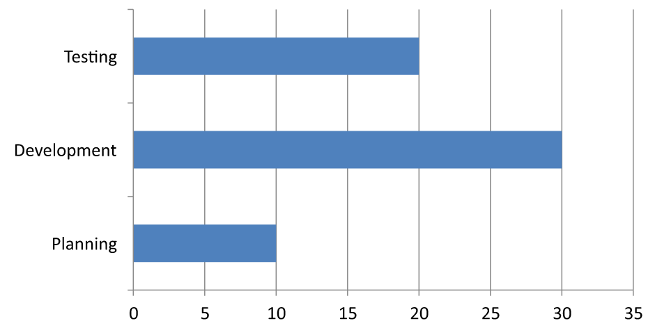
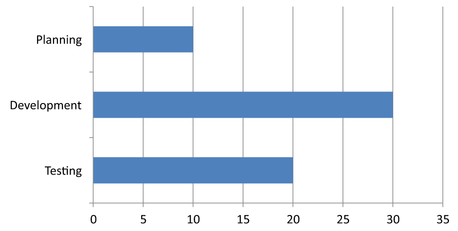
Use setPlotOrderReversed to reverse a category or value axis. For example, a horizontal bar chart can show project stages from top to bottom in the same order as the worksheet: Planning, Development, Testing. Reversing an axis changes the plotting direction; it does not sort or rearrange the workbook data. By comparison, switchRowColumn exchanges the roles of series and categories.
The following example creates a horizontal bar chart with three stages and one series. It saves a presentation with three slides: normal order, reversed categories, and reversed values. Each copy uses the same dataset, and only one axis is reversed on each copy.
use aspose\slides\ChartType;
use aspose\slides\CrossesType;
use aspose\slides\Presentation;
use aspose\slides\SaveFormat;

$presentation = new Presentation();
try {
    $slide = $presentation->getSlides()->get_Item(0);

    $chart = $slide->getShapes()->addChart(ChartType::ClusteredBar, 50, 40, 620, 320);
    $chart->setLegend(false);

    $chart->getChartData()->getCategories()->clear();
    $chart->getChartData()->getSeries()->clear();

    $workbook = $chart->getChartData()->getChartDataWorkbook();
    $workbook->clear(0);

    $series = $chart->getChartData()->getSeries()->add(ChartType::ClusteredBar);
    $stages = ["Planning", "Development", "Testing"];
    $values = [10, 30, 20];
    for ($i = 0; $i < count($stages); $i++) {
        $categoryCell = $workbook->getCell(0, $i + 1, 0, $stages[$i]);
        $chart->getChartData()->getCategories()->add($categoryCell);
        $valueCell = $workbook->getCell(0, $i + 1, 1, $values[$i]);
        $series->getDataPoints()->addDataPointForBarSeries($valueCell);
    }

    // スライド2: 最初のカテゴリを上部に表示します。
    $categorySlide = $presentation->getSlides()->addClone($slide);
    $categoryChart = $categorySlide->getShapes()->get_Item(0);
    $categoryChart->getAxes()->getVerticalAxis()->setPlotOrderReversed(true);
    // 水平値軸を下部に保ちます。
    $categoryChart->getAxes()->getVerticalAxis()->setCrossType(CrossesType::Maximum);

    // スライド3: 水平数値スケールのみを逆にします。
    $valueSlide = $presentation->getSlides()->addClone($slide);
    $valueChart = $valueSlide->getShapes()->get_Item(0);
    $valueChart->getAxes()->getHorizontalAxis()->setPlotOrderReversed(true);

    $presentation->save("ReversedAxes.pptx", SaveFormat::Pptx);
} finally {
    $presentation->dispose();
}
Reversing an axis can also move the perpendicular axis to the opposite side of the plot. setCrossType controls where the other axis crosses the axis being configured. In slide 2, calling it with CrossesType::Maximum on the reversed category axis keeps the horizontal value axis at the bottom. For a specific crossing point, use setCrossAt. Check the crossing settings when changing direction, especially if the chart already has a custom crossing point. Call setPlotOrderReversed with false to restore the normal plotting direction; crossing settings are separate.
| 通常順序 (スライド 1) | カテゴリ逆順 (スライド 2) | 値逆順 (スライド 3) |
|---|---|---|
 |
 |
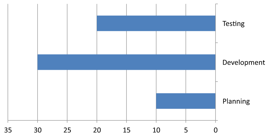 |
| カテゴリは下から上へ、値は左から右へ増加します。 | 計画、開発、テストは上から下へ。値とワークブックの行順序は変わりません。 | カテゴリは通常順序のまま、値は右から左へ増加します。カテゴリ軸は右側のゼロで交差します。 |
折れ線グラフの縦軸を無効にする
Call setVisible with false on the vertical axis to hide it. The example creates a line chart with default data and saves it with the vertical axis hidden.
use aspose\slides\ChartType;
use aspose\slides\Presentation;
use aspose\slides\SaveFormat;

$presentation = new Presentation();
try {
    $slide = $presentation->getSlides()->get_Item(0);

    $chart = $slide->getShapes()->addChart(ChartType::Line, 100, 100, 400, 300);
    $chart->getAxes()->getVerticalAxis()->setVisible(false);

    $presentation->save("HiddenVerticalAxis.pptx", SaveFormat::Pptx);
} finally {
    $presentation->dispose();
}
折れ線グラフの横軸を無効にする
Call setVisible with false on the horizontal axis to hide it. The example creates a line chart with default data and saves it with the horizontal axis hidden.
use aspose\slides\ChartType;
use aspose\slides\Presentation;
use aspose\slides\SaveFormat;

$presentation = new Presentation();
try {
    $slide = $presentation->getSlides()->get_Item(0);

    $chart = $slide->getShapes()->addChart(ChartType::Line, 100, 100, 400, 300);
    $chart->getAxes()->getHorizontalAxis()->setVisible(false);

    $presentation->save("HiddenHorizontalAxis.pptx", SaveFormat::Pptx);
} finally {
    $presentation->dispose();
}
カテゴリ軸を変更する
Use setCategoryAxisType to choose a date or text category axis. This example requires ExistingChart.pptx, with a chart as the first shape on the first slide and category cells containing numeric Excel date values. It changes the horizontal axis to a date axis. Calling setAutomaticMajorUnit with false, setMajorUnit with 1, and setMajorUnitScale with TimeUnitType::Months places major ticks at one-month intervals.
use aspose\slides\CategoryAxisType;
use aspose\slides\Presentation;
use aspose\slides\SaveFormat;
use aspose\slides\TimeUnitType;

$presentation = new Presentation("ExistingChart.pptx");
try {
    $slide = $presentation->getSlides()->get_Item(0);

    $chart = $slide->getShapes()->get_Item(0);
    $chart->getAxes()->getHorizontalAxis()->setCategoryAxisType(CategoryAxisType::Date);
    $chart->getAxes()->getHorizontalAxis()->setAutomaticMajorUnit(false);
    $chart->getAxes()->getHorizontalAxis()->setMajorUnit(1);
    $chart->getAxes()->getHorizontalAxis()->setMajorUnitScale(TimeUnitType::Months);

    $presentation->save("ChangeChartCategoryAxis_out.pptx", SaveFormat::Pptx);
} finally {
    $presentation->dispose();
}
カテゴリ軸ラベル間隔を制御する
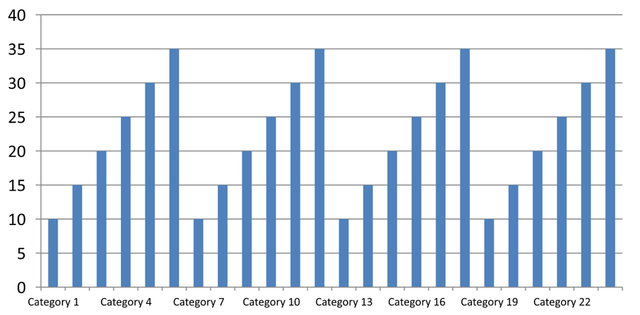
When a chart has many categories, reduce the number of visible axis labels without removing categories or data points. Call setAutomaticTickLabelSpacing with false, then pass the desired category interval to setTickLabelSpacing. For text categories in their normal order, counting starts at the first category:
| 間隔 | 例で表示されるラベル |
|---|---|
1 |
カテゴリ 1, カテゴリ 2, カテゴリ 3, … カテゴリ 24 |
2 |
カテゴリ 1, カテゴリ 3, カテゴリ 5, … カテゴリ 23 |
3 |
カテゴリ 1, カテゴリ 4, カテゴリ 7, … カテゴリ 22 |
3 の間隔は 3 番目ごとのラベルを表示し、表示されたラベル間に 2 つのラベルが非表示になります。対応する列は削除されません。自動間隔は利用可能なスペースに基づいて決定され、必ずしもすべてのラベルを表示するわけではありません。
Tick marks have separate controls. Call setAutomaticTickMarksSpacing with false and use setTickMarksSpacing to set their interval. For example, 1 keeps a tick mark at every category interval while labels appear only every third category. Use setMajorTickMark with a visible style so you can see the result. Calling either automatic-spacing setter with true again lets the chart choose that interval again.
The following self-contained example creates 24 categories and one series, then saves three slides in CategoryAxisIntervals.pptx: automatic spacing, manual label spacing with independent tick marks, and restored automatic spacing. The two copies retain the original chart data. No input presentation is required. Horizontal label text makes the difference in density easy to see.
use aspose\slides\CategoryAxisType;
use aspose\slides\ChartType;
use aspose\slides\Presentation;
use aspose\slides\SaveFormat;
use aspose\slides\TickMarkType;

$presentation = new Presentation();
try {
    $slide = $presentation->getSlides()->get_Item(0);

    $chart = $slide->getShapes()->addChart(ChartType::ClusteredColumn, 30, 40, 660, 320);

    $chart->setLegend(false);
    $chart->getChartData()->getCategories()->clear();
    $chart->getChartData()->getSeries()->clear();

    $workbook = $chart->getChartData()->getChartDataWorkbook();
    $workbook->clear(0);

    $series = $chart->getChartData()->getSeries()->add(ChartType::ClusteredColumn);
    for ($i = 0; $i < 24; $i++) {
        $categoryCell = $workbook->getCell(0, $i + 1, 0, "Category " . ($i + 1));
        $chart->getChartData()->getCategories()->add($categoryCell);
        $valueCell = $workbook->getCell(0, $i + 1, 1, 10 + $i % 6 * 5);
        $series->getDataPoints()->addDataPointForBarSeries($valueCell);
    }

    $axis = $chart->getAxes()->getHorizontalAxis();
    $axis->setCategoryAxisType(CategoryAxisType::Text);
    $axis->getTextFormat()->getTextBlockFormat()->setRotationAngle(0);
    $axis->getTextFormat()->getPortionFormat()->setFontHeight(12);
    $axis->setMajorTickMark(TickMarkType::Outside);
    $axis->setAutomaticTickLabelSpacing(true);
    $axis->setAutomaticTickMarksSpacing(true);

    // スライド2: 3番目ごとのラベルを表示しますが、各カテゴリに目盛りを残します。
    $manualSlide = $presentation->getSlides()->addClone($slide);
    $manualChart = $manualSlide->getShapes()->get_Item(0);
    $manualAxis = $manualChart->getAxes()->getHorizontalAxis();
    $manualAxis->setAutomaticTickLabelSpacing(false);
    $manualAxis->setTickLabelSpacing(3);
    $manualAxis->setAutomaticTickMarksSpacing(false);
    $manualAxis->setTickMarksSpacing(1);

    // スライド3: チャートに両方の間隔を再度選択させます。
    $restoredSlide = $presentation->getSlides()->addClone($manualSlide);
    $restoredChart = $restoredSlide->getShapes()->get_Item(0);
    $restoredChart->getAxes()->getHorizontalAxis()->setAutomaticTickLabelSpacing(true);
    $restoredChart->getAxes()->getHorizontalAxis()->setAutomaticTickMarksSpacing(true);

    $presentation->save("CategoryAxisIntervals.pptx", SaveFormat::Pptx);
} finally {
    $presentation->dispose();
}
自動間隔 (スライド 1): In this rendering, every second category label is displayed and wraps onto two lines. The automatic result can vary with chart size, fonts, and the renderer.
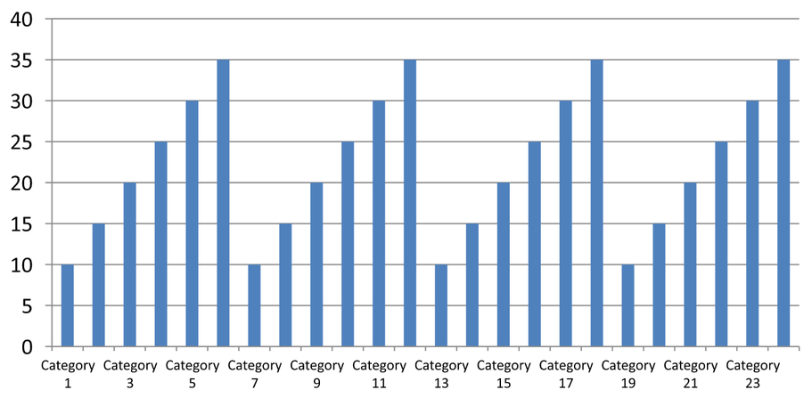
手動間隔 (スライド 2): Every third label is displayed on one line, while tick marks remain at every category interval. All 24 columns, including those without labels, remain visible with the same values. Slide 3 restores the automatic appearance shown above.
正しい軸と間隔を選択する
Use this category-count interval for a text category axis, such as the category axis of a column, line, area, or bar chart. In a column chart, it is the horizontal axis. In a horizontal bar chart, the category axis is vertical, so apply these settings to the axis returned by getVerticalAxis. Tick-mark spacing also applies to a series axis in charts that have one.
Do not use category label spacing to set the numeric scale of a value axis. On a value axis, setMajorUnit specifies a difference in values: for example, a major unit of 10 produces ticks at 0, 10, 20, and so on when the axis starts at zero. A category label interval of 3 instead counts category positions, regardless of their data values. Scatter and bubble charts use value axes rather than a text category axis. For a date axis, use time-based major units and scales as described in Change a Category Axis.
カテゴリ軸値の日付形式を設定する
The example replaces the default chart data with four annual values. Dates are stored as OLE Automation serial numbers in the first worksheet (index 0), calculated as the number of days since December 30, 1899, for these dates. Use setCategoryAxisType with CategoryAxisType::Date, call setNumberFormatLinkedToSource with false, and pass yyyy to setNumberFormat so the category labels display four-digit years independently of the cell formatting.
use aspose\slides\CategoryAxisType;
use aspose\slides\ChartType;
use aspose\slides\Presentation;
use aspose\slides\SaveFormat;

$presentation = new Presentation();
try {
    $slide = $presentation->getSlides()->get_Item(0);

    $chart = $slide->getShapes()->addChart(ChartType::Line, 50, 50, 450, 300);

    $chart->getChartData()->getCategories()->clear();
    $chart->getChartData()->getSeries()->clear();

    $workbook = $chart->getChartData()->getChartDataWorkbook();
    $workbook->clear(0);

    $baseDate = gmmktime(0, 0, 0, 12, 30, 1899);

    $series = $chart->getChartData()->getSeries()->add(ChartType::Line);
    for ($i = 0; $i < 4; $i++) {
        $date = gmmktime(0, 0, 0, 1, 1, 2015 + $i);
        $serialDate = ($date - $baseDate) / 86400;
        $categoryCell = $workbook->getCell(0, $i + 1, 0, $serialDate);
        $chart->getChartData()->getCategories()->add($categoryCell);

        $valueCell = $workbook->getCell(0, $i + 1, 1, $i + 1);
        $series->getDataPoints()->addDataPointForLineSeries($valueCell);
    }

    $chart->getAxes()->getHorizontalAxis()->setCategoryAxisType(CategoryAxisType::Date);
    $chart->getAxes()->getHorizontalAxis()->setNumberFormatLinkedToSource(false);
    $chart->getAxes()->getHorizontalAxis()->setNumberFormat("yyyy");

    $presentation->save("DateAxisFormat.pptx", SaveFormat::Pptx);
} finally {
    $presentation->dispose();
}
チャート軸タイトルの回転角度を設定する
Call setTitle with true on the vertical axis, provide title text, and use setRotationAngle to rotate the title. The angle is measured in degrees; this example saves a column chart with its value-axis title rotated by 90 degrees.
use aspose\slides\ChartType;
use aspose\slides\Presentation;
use aspose\slides\SaveFormat;

$presentation = new Presentation();
try {
    $slide = $presentation->getSlides()->get_Item(0);

    $chart = $slide->getShapes()->addChart(ChartType::ClusteredColumn, 50, 50, 450, 300);
    $chart->getAxes()->getVerticalAxis()->setTitle(true);
    $chart->getAxes()->getVerticalAxis()->getTitle()->addTextFrameForOverriding("Value");
    $chart->getAxes()->getVerticalAxis()->getTitle()->getTextFormat()->getTextBlockFormat()->setRotationAngle(90);

    $presentation->save("RotatedAxisTitle.pptx", SaveFormat::Pptx);
} finally {
    $presentation->dispose();
}
カテゴリ軸または値軸の位置を設定する
Use setAxisBetweenCategories to control whether the value axis crosses the category axis between categories or at category tick marks. This setting applies to category axes. The example sets it to true on the horizontal category axis of a column chart and saves the result.
use aspose\slides\ChartType;
use aspose\slides\Presentation;
use aspose\slides\SaveFormat;

$presentation = new Presentation();
try {
    $slide = $presentation->getSlides()->get_Item(0);

    $chart = $slide->getShapes()->addChart(ChartType::ClusteredColumn, 50, 50, 450, 300);
    $chart->getAxes()->getHorizontalAxis()->setAxisBetweenCategories(true);

    $presentation->save("AxisBetweenCategories.pptx", SaveFormat::Pptx);
} finally {
    $presentation->dispose();
}
チャート値軸の表示単位を設定する
Use setDisplayUnit to scale the labels on a value axis without changing the underlying data. With DisplayUnitType set to Millions, a value of 60,000,000 is displayed as 60. The example creates a column chart and applies the millions display unit to its vertical axis.
use aspose\slides\ChartType;
use aspose\slides\DisplayUnitType;
use aspose\slides\Presentation;
use aspose\slides\SaveFormat;

$presentation = new Presentation();
try {
    $slide = $presentation->getSlides()->get_Item(0);

    $chart = $slide->getShapes()->addChart(ChartType::ClusteredColumn, 50, 50, 450, 300);
    $chart->getAxes()->getVerticalAxis()->setDisplayUnit(DisplayUnitType::Millions);

    $presentation->save("Result.pptx", SaveFormat::Pptx);
} finally {
    $presentation->dispose();
}
対数値軸を構成する
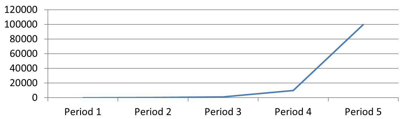
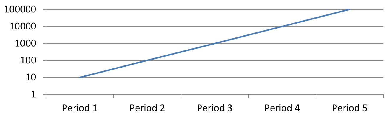
A logarithmic value axis is useful when positive values span several orders of magnitude. For example, a service might receive 10, 100, 1,000, 10,000, and 100,000 requests over five periods. On a linear scale, the smaller values appear close together near zero. A logarithmic scale makes their relative growth easier to compare: equal distances represent equal ratios rather than equal differences.
Call setLogarithmic with true on the value axis and use setLogBase to choose the base. This changes how the existing values are displayed; it does not change the data or add a logarithmic trend line. A trend line represents a fitted relationship in the data and is a separate feature.
値軸とベースを選択する
For a line or column chart, the value axis is returned by getVerticalAxis. For a horizontal bar chart, it is returned by getHorizontalAxis. Scatter and bubble charts have two value axes, so choose the horizontal axis for X values, the vertical axis for Y values, or both. Do not apply logarithmic scaling to a category axis.
The default logarithmic base is 10. For PPTX charts, use a base from 2 through 1000, inclusive; fractional bases such as 2.5 are also supported. With base 10, successive powers such as 10, 100, 1,000, and 10,000 are equally spaced.
線形と対数スケーリングを比較する
The following self-contained example creates a line chart with the five request counts on the first slide, then clones that slide and enables a base-10 logarithmic value axis on the second. Both slides retain the same data.
use aspose\slides\ChartType;
use aspose\slides\Presentation;
use aspose\slides\SaveFormat;

$presentation = new Presentation();
try {
    $slide = $presentation->getSlides()->get_Item(0);

    $chart = $slide->getShapes()->addChart(ChartType::Line, 30, 40, 660, 200);

    $chart->setLegend(false);

    $chart->getChartData()->getCategories()->clear();
    $chart->getChartData()->getSeries()->clear();

    $workbook = $chart->getChartData()->getChartDataWorkbook();
    $workbook->clear(0);

    $series = $chart->getChartData()->getSeries()->add(ChartType::Line);
    $values = [10, 100, 1000, 10000, 100000];

    for ($i = 0; $i < count($values); $i++) {
        $categoryCell = $workbook->getCell(0, $i + 1, 0, "Period " . ($i + 1));
        $chart->getChartData()->getCategories()->add($categoryCell);

        $valueCell = $workbook->getCell(0, $i + 1, 1, $values[$i]);
        $series->getDataPoints()->addDataPointForLineSeries($valueCell);
    }

    // 最初のスライドは線形のままにし、コピーの値軸スケールだけを変更します。
    $logarithmicSlide = $presentation->getSlides()->addClone($slide);
    $logarithmicChart = $logarithmicSlide->getShapes()->get_Item(0);
    $valueAxis = $logarithmicChart->getAxes()->getVerticalAxis();
    $valueAxis->setLogarithmic(true);
    $valueAxis->setLogBase(10);

    $presentation->save("LogarithmicAxis.pptx", SaveFormat::Pptx);
} finally {
    $presentation->dispose();
}
線形スケール (スライド 1): Equal vertical distances represent equal differences in request counts. The largest value dominates the chart, making the smaller values difficult to distinguish.
対数スケール (スライド 2): Equal vertical distances represent equal ratios. Each period has ten times as many requests as the previous one, so the points form a straight rising line on the base-10 scale. The axis labels still show the original request counts.
ゼロと負の値を扱う
A logarithmic scale can display only strictly positive values. Check the data before enabling it. If zero or negative values are meaningful, keep a linear scale or show them separately. If excluding those values is appropriate for the analysis, explain the omission. Do not silently replace them with small positive numbers, as this changes the meaning of the data. Any manually configured minimum or maximum for a logarithmic axis must also be positive.
FAQ
How do I set the value at which one axis crosses the other (axis crossing)?
Use setCrossType to select the crossing behavior. To specify a numeric crossing value, use setCrossAt. These settings let you move the axis crossing to a suitable baseline.
How can I position tick labels relative to the axis?
Call setTickLabelPosition using TickLabelPositionType: Low, High, NextTo, or None. To control the tick marks themselves, use setMajorTickMark or setMinorTickMark; these are separate from label positioning.