
ปรับแต่งแกนแผนภูมิในงานนำเสนอโดยใช้ PHP
ภาพรวม
บทความนี้อธิบายวิธีการปรับแต่งแกนของแผนภูมิด้วย Aspose.Slides สำหรับ PHP ผ่าน Java ซึ่งครอบคลุมค่าที่คำนวณของแกน การสลับแถวและคอลัมน์ของแผนภูมิ การแสดงหรือซ่อนแกน ระยะห่างของป้ายชื่อประเภทและเครื่องหมายติ๊ก วันที่ของประเภทและการจัดรูปแบบ การหมุนชื่อเรื่อง การกำหนดตำแหน่งแกน และหน่วยการแสดงผล
รับค่าสูงสุดบนแกนแนวตั้งของแผนภูมิ
สร้าง Presentation และเพิ่มแผนภูมิพื้นที่ด้วยข้อมูลเริ่มต้น. เรียกใช้ validateChartLayout ก่อนอ่านค่าที่คำนวณของแกนเพื่อให้การจัดวางแผนภูมิเป็นปัจจุบัน.
อ่าน getActualMaxValue และ getActualMinValue สำหรับขอบเขตของแกน, และ getActualMajorUnit และ getActualMinorUnit สำหรับระยะห่างของเครื่องหมายติ๊ก. getActualMajorUnitScale และ getActualMinorUnitScale ให้สเกลหน่วยเวลา ซึ่งเกี่ยวข้องกับแกนวันที่. ตัวอย่างจะเก็บค่าต่าง ๆ เหล่านี้ไว้ในตัวแปรท้องถิ่นและบันทึกแผนภูมิ.
use aspose\slides\ChartType;
use aspose\slides\Presentation;
use aspose\slides\SaveFormat;

$presentation = new Presentation();
try {
    $slide = $presentation->getSlides()->get_Item(0);

    $chart = $slide->getShapes()->addChart(ChartType::Area, 100, 100, 500, 350);
    $chart->validateChartLayout();

    $maxValue = $chart->getAxes()->getVerticalAxis()->getActualMaxValue();
    $minValue = $chart->getAxes()->getVerticalAxis()->getActualMinValue();

    $majorUnit = $chart->getAxes()->getVerticalAxis()->getActualMajorUnit();
    $minorUnit = $chart->getAxes()->getVerticalAxis()->getActualMinorUnit();

    $majorUnitScale = $chart->getAxes()->getVerticalAxis()->getActualMajorUnitScale();
    $minorUnitScale = $chart->getAxes()->getVerticalAxis()->getActualMinorUnitScale();

    $presentation->save("AxisValues_out.pptx", SaveFormat::Pptx);
} finally {
    $presentation->dispose();
}
สลับข้อมูลระหว่างแกน
ใช้ switchRowColumn เพื่อสลับบทบาทของชุดข้อมูลและประเภทในข้อมูลแผนภูมิ. แต่ละประเภทเดิมจะกลายเป็นชุดข้อมูล และแต่ละชุดข้อมูลเดิมจะกลายเป็นประเภท. การเปลี่ยนนี้ทำให้การจัดกลุ่มข้อมูลเปลี่ยนไป; ไม่ได้สลับแกนแนวนอนและแนวตั้ง. ตัวอย่างใช้ setRange เพื่อผูกข้อมูลเริ่มต้นกับ Sheet1!A1:D5, รวมแถวหัวตารางและคอลัมน์ประเภท, ก่อนสลับแถวและคอลัมน์. จะบันทึกแผนภูมิที่มีสี่ชุดข้อมูลและสามประเภท.
use aspose\slides\ChartType;
use aspose\slides\Presentation;
use aspose\slides\SaveFormat;

$presentation = new Presentation();
try {
    $slide = $presentation->getSlides()->get_Item(0);

    $chart = $slide->getShapes()->addChart(ChartType::ClusteredColumn, 100, 100, 400, 300);
    $chart->getChartData()->setRange("Sheet1!A1:D5");
    $chart->getChartData()->switchRowColumn();

    $presentation->save("SwitchChartRowColumns_out.pptx", SaveFormat::Pptx);
} finally {
    $presentation->dispose();
}
ปิดการแสดงแกนแนวตั้งสำหรับแผนภูมิเส้น
เรียก setVisible ด้วย false บนแกนแนวตั้งเพื่อซ่อนมัน. ตัวอย่างสร้างแผนภูมิเส้นด้วยข้อมูลเริ่มต้นและบันทึกโดยซ่อนแกนแนวตั้ง.
use aspose\slides\ChartType;
use aspose\slides\Presentation;
use aspose\slides\SaveFormat;

$presentation = new Presentation();
try {
    $slide = $presentation->getSlides()->get_Item(0);

    $chart = $slide->getShapes()->addChart(ChartType::Line, 100, 100, 400, 300);
    $chart->getAxes()->getVerticalAxis()->setVisible(false);

    $presentation->save("HiddenVerticalAxis.pptx", SaveFormat::Pptx);
} finally {
    $presentation->dispose();
}
ปิดการแสดงแกนแนวนอนสำหรับแผนภูมิเส้น
เรียก setVisible ด้วย false บนแกนแนวนอนเพื่อซ่อนมัน. ตัวอย่างสร้างแผนภูมิเส้นด้วยข้อมูลเริ่มต้นและบันทึกโดยซ่อนแกนแนวนอน.
use aspose\slides\ChartType;
use aspose\slides\Presentation;
use aspose\slides\SaveFormat;

$presentation = new Presentation();
try {
    $slide = $presentation->getSlides()->get_Item(0);

    $chart = $slide->getShapes()->addChart(ChartType::Line, 100, 100, 400, 300);
    $chart->getAxes()->getHorizontalAxis()->setVisible(false);

    $presentation->save("HiddenHorizontalAxis.pptx", SaveFormat::Pptx);
} finally {
    $presentation->dispose();
}
เปลี่ยนแกนประเภท
ใช้ setCategoryAxisType เพื่อเลือกแกนประเภทเป็นวันที่หรือข้อความ. ตัวอย่างนี้ต้องการไฟล์ ExistingChart.pptx, โดยมีแผนภูมิเป็นรูปร่างแรกบนสไลด์แรกและเซลล์ประเภทมีค่าเลขวันที่ Excel. จะเปลี่ยนแกนแนวนอนเป็นแกนวันที่. เรียก setAutomaticMajorUnit ด้วย false, setMajorUnit ด้วย 1, และ setMajorUnitScale ด้วย TimeUnitType::Months เพื่อวางเครื่องหมายใหญ่ทุกหนึ่งเดือน.
use aspose\slides\CategoryAxisType;
use aspose\slides\Presentation;
use aspose\slides\SaveFormat;
use aspose\slides\TimeUnitType;

$presentation = new Presentation("ExistingChart.pptx");
try {
    $slide = $presentation->getSlides()->get_Item(0);

    $chart = $slide->getShapes()->get_Item(0);
    $chart->getAxes()->getHorizontalAxis()->setCategoryAxisType(CategoryAxisType::Date);
    $chart->getAxes()->getHorizontalAxis()->setAutomaticMajorUnit(false);
    $chart->getAxes()->getHorizontalAxis()->setMajorUnit(1);
    $chart->getAxes()->getHorizontalAxis()->setMajorUnitScale(TimeUnitType::Months);

    $presentation->save("ChangeChartCategoryAxis_out.pptx", SaveFormat::Pptx);
} finally {
    $presentation->dispose();
}
ควบคุมช่วงป้ายชื่อแกนประเภท
เมื่อแผนภูมิมีหลายประเภท, ลดจำนวนป้ายชื่อแกนที่แสดงโดยไม่ต้องลบประเภทหรือจุดข้อมูล. เรียก setAutomaticTickLabelSpacing ด้วย false, จากนั้นส่งค่าช่วงประเภทที่ต้องการไปยัง setTickLabelSpacing. สำหรับประเภทข้อความในลำดับปกติ, การนับเริ่มที่ประเภทแรก:
| ช่วง | ป้ายที่แสดงในตัวอย่าง |
|---|---|
1 |
ประเภท 1, ประเภท 2, ประเภท 3, … ประเภท 24 |
2 |
ประเภท 1, ประเภท 3, ประเภท 5, … ประเภท 23 |
3 |
ประเภท 1, ประเภท 4, ประเภท 7, … ประเภท 22 |
ช่วง 3 จะแสดงป้ายทุก ๆ 3 ตัว, ทำให้มีสองป้ายซ่อนอยู่ระหว่างป้ายที่แสดง. ไม่ได้ลบคอลัมน์ที่สอดคล้องกัน. การจัดระยะอัตโนมัติโดยอิงจากพื้นที่ว่าง; ไม่ได้บังคับให้แสดงทุกป้าย.
เครื่องหมายติ๊กมีการควบคุมแยกกัน. เรียก setAutomaticTickMarksSpacing ด้วย false และใช้ setTickMarksSpacing เพื่อกำหนดช่วงของมัน. ตัวอย่างเช่น 1 จะรักษาเครื่องหมายติ๊กที่ทุกช่วงประเภทขณะป้ายแสดงเพียงทุก ๆ 3 ประเภท. ใช้ setMajorTickMark พร้อมสไตล์ที่มองเห็นได้เพื่อดูผลลัพธ์. การตั้งค่าอัตโนมัติใด ๆ ให้ค่า true อีกครั้งจะทำให้แผนภูมิกำหนดช่วงนั้นใหม่อีกครั้ง.
ตัวอย่างต่อไปนี้สร้าง 24 ประเภทและหนึ่งชุดข้อมูล, จากนั้นบันทึกสามสไลด์ใน CategoryAxisIntervals.pptx: การจัดระยะอัตโนมัติ, การจัดระยะด้วยตนเองพร้อมเครื่องหมายติ๊กแยกจากป้าย, และการคืนค่าการจัดระยะอัตโนมัติ. ทั้งสองสำเนาเก็บข้อมูลแผนภูมิดั้งเดิมไว้. ไม่ต้องมีการนำเสนออินพุต. ข้อความป้ายแนวนอนทำให้สังเกตความหนาแน่นได้ง่าย.
use aspose\slides\CategoryAxisType;
use aspose\slides\ChartType;
use aspose\slides\Presentation;
use aspose\slides\SaveFormat;
use aspose\slides\TickMarkType;

$presentation = new Presentation();
try {
    $slide = $presentation->getSlides()->get_Item(0);

    $chart = $slide->getShapes()->addChart(ChartType::ClusteredColumn, 30, 40, 660, 320);

    $chart->setLegend(false);
    $chart->getChartData()->getCategories()->clear();
    $chart->getChartData()->getSeries()->clear();

    $workbook = $chart->getChartData()->getChartDataWorkbook();
    $workbook->clear(0);

    $series = $chart->getChartData()->getSeries()->add(ChartType::ClusteredColumn);
    for ($i = 0; $i < 24; $i++) {
        $categoryCell = $workbook->getCell(0, $i + 1, 0, "Category " . ($i + 1));
        $chart->getChartData()->getCategories()->add($categoryCell);
        $valueCell = $workbook->getCell(0, $i + 1, 1, 10 + $i % 6 * 5);
        $series->getDataPoints()->addDataPointForBarSeries($valueCell);
    }

    $axis = $chart->getAxes()->getHorizontalAxis();
    $axis->setCategoryAxisType(CategoryAxisType::Text);
    $axis->getTextFormat()->getTextBlockFormat()->setRotationAngle(0);
    $axis->getTextFormat()->getPortionFormat()->setFontHeight(12);
    $axis->setMajorTickMark(TickMarkType::Outside);
    $axis->setAutomaticTickLabelSpacing(true);
    $axis->setAutomaticTickMarksSpacing(true);

    // สไลด์ 2: แสดงป้ายทุกที่สาม แต่คงเครื่องหมายติ๊กสำหรับทุกประเภท.
    $manualSlide = $presentation->getSlides()->addClone($slide);
    $manualChart = $manualSlide->getShapes()->get_Item(0);
    $manualAxis = $manualChart->getAxes()->getHorizontalAxis();
    $manualAxis->setAutomaticTickLabelSpacing(false);
    $manualAxis->setTickLabelSpacing(3);
    $manualAxis->setAutomaticTickMarksSpacing(false);
    $manualAxis->setTickMarksSpacing(1);

    // สไลด์ 3: ให้แผนภูมิเ�เลือกช่วงทั้งสองใหม่อีกครั้ง.
    $restoredSlide = $presentation->getSlides()->addClone($manualSlide);
    $restoredChart = $restoredSlide->getShapes()->get_Item(0);
    $restoredChart->getAxes()->getHorizontalAxis()->setAutomaticTickLabelSpacing(true);
    $restoredChart->getAxes()->getHorizontalAxis()->setAutomaticTickMarksSpacing(true);

    $presentation->save("CategoryAxisIntervals.pptx", SaveFormat::Pptx);
} finally {
    $presentation->dispose();
}
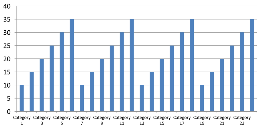
การจัดระยะอัตโนมัติ (สไลด์ 1): ในการเรนเดอร์นี้ ป้ายชื่อประเภททุกสองประเภทจะแสดงและห่อบรรทัดสองบรรทัด. ผลลัพธ์อัตโนมัติเสี่ยงตามขนาดแผนภูมิ, ฟอนต์, และเครื่องมือเรนเดอร์.
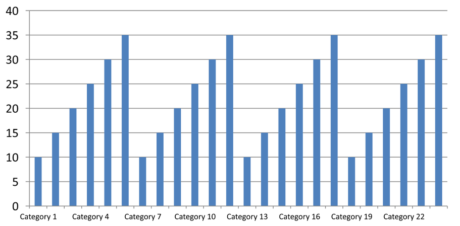
การจัดระยะด้วยตนเอง (สไลด์ 2): ป้ายชื่อทุกสามประเภทจะแสดงในบรรทัดเดียว, ในขณะที่เครื่องหมายติ๊กคงอยู่ที่ทุกช่วงประเภท. คอลัมน์ทั้งหมด 24 คอลัมน์รวมถึงคอลัมน์ที่ไม่มีป้ายยังคงมองเห็นได้ด้วยค่าเดียวกัน. สไลด์ 3 คืนค่าการแสดงอัตโนมัติที่แสดงด้านบน.
เลือกแกนและช่วงที่เหมาะสม
ใช้ช่วงจำนวนประเภทนี้สำหรับแกนประเภทข้อความ, เช่น แกนประเภทของแผนภูมิคอลัมน์, เส้น, พื้นที่ หรือแผนภูมิบาร์. ในแผนภูมิคอลัมน์, มันคือแกนแนวนอน. ในแผนภูมิบาร์แนวนอน, แกนประเภทเป็นแนวตั้ง, ดังนั้นให้ใช้การตั้งค่านี้กับแกนที่ได้จาก getVerticalAxis. การจัดระยะเครื่องหมายติ๊กยังใช้กับแกนชุดข้อมูลในแผนภูมิที่มีแกนดังกล่าวด้วย.
ไม่ควรใช้การจัดระยะป้ายประเภทเพื่อกำหนดสเกลจำนวนของแกนค่า. บนแกนค่า, setMajorUnit ระบุความต่างของค่า: ตัวอย่างเช่น หน่วยใหญ่ 10 จะสร้างเครื่องหมายที่ 0, 10, 20 ฯลฯ เมื่อแกนเริ่มที่ศูนย์. ช่วงป้ายประเภท 3 นับตำแหน่งประเภทโดยไม่คำนึงถึงค่าข้อมูล. แผนภูมิกระจายและฟองใช้แกนค่าแทนแกนประเภทข้อความ. สำหรับแกนวันที่, ใช้หน่วยเวลาและสเกลตามที่อธิบายใน Change a Category Axis.
ตั้งรูปแบบวันที่สำหรับค่าของแกนประเภท
ตัวอย่างนี้แทนที่ข้อมูลแผนภูมิเริ่มต้นด้วยค่าประจำปีสี่ค่า. วันที่จะถูกเก็บเป็นหมายเลขอนุกรม OLE Automation ในเวิร์กชีตแรก (ดัชนี 0), คำนวณจากจำนวนวันตั้งแต่ 30 ธันวาคม 1899 สำหรับวันที่เหล่านี้. ใช้ setCategoryAxisType ด้วย CategoryAxisType::Date, เรียก setNumberFormatLinkedToSource ด้วย false, และส่ง yyyy ไปยัง setNumberFormat เพื่อให้ป้ายประเภทแสดงปีสี่หลักโดยอิสระจากรูปแบบเซลล์.
use aspose\slides\CategoryAxisType;
use aspose\slides\ChartType;
use aspose\slides\Presentation;
use aspose\slides\SaveFormat;

$presentation = new Presentation();
try {
    $slide = $presentation->getSlides()->get_Item(0);

    $chart = $slide->getShapes()->addChart(ChartType::Line, 50, 50, 450, 300);

    $chart->getChartData()->getCategories()->clear();
    $chart->getChartData()->getSeries()->clear();

    $workbook = $chart->getChartData()->getChartDataWorkbook();
    $workbook->clear(0);

    $baseDate = gmmktime(0, 0, 0, 12, 30, 1899);

    $series = $chart->getChartData()->getSeries()->add(ChartType::Line);
    for ($i = 0; $i < 4; $i++) {
        $date = gmmktime(0, 0, 0, 1, 1, 2015 + $i);
        $serialDate = ($date - $baseDate) / 86400;
        $categoryCell = $workbook->getCell(0, $i + 1, 0, $serialDate);
        $chart->getChartData()->getCategories()->add($categoryCell);

        $valueCell = $workbook->getCell(0, $i + 1, 1, $i + 1);
        $series->getDataPoints()->addDataPointForLineSeries($valueCell);
    }

    $chart->getAxes()->getHorizontalAxis()->setCategoryAxisType(CategoryAxisType::Date);
    $chart->getAxes()->getHorizontalAxis()->setNumberFormatLinkedToSource(false);
    $chart->getAxes()->getHorizontalAxis()->setNumberFormat("yyyy");

    $presentation->save("DateAxisFormat.pptx", SaveFormat::Pptx);
} finally {
    $presentation->dispose();
}
ตั้งมุมการหมุนสำหรับชื่อแกนแผนภูมิ
เรียก setTitle ด้วย true บนแกนแนวตั้ง, ให้ข้อความชื่อเรื่อง, และใช้ setRotationAngle เพื่อหมุนชื่อ. มุมวัดเป็นองศา; ตัวอย่างนี้บันทึกแผนภูมิคอลัมน์ที่ชื่อแกนค่าถูกหมุน 90 องศา.
use aspose\slides\ChartType;
use aspose\slides\Presentation;
use aspose\slides\SaveFormat;

$presentation = new Presentation();
try {
    $slide = $presentation->getSlides()->get_Item(0);

    $chart = $slide->getShapes()->addChart(ChartType::ClusteredColumn, 50, 50, 450, 300);
    $chart->getAxes()->getVerticalAxis()->setTitle(true);
    $chart->getAxes()->getVerticalAxis()->getTitle()->addTextFrameForOverriding("Value");
    $chart->getAxes()->getVerticalAxis()->getTitle()->getTextFormat()->getTextBlockFormat()->setRotationAngle(90);

    $presentation->save("RotatedAxisTitle.pptx", SaveFormat::Pptx);
} finally {
    $presentation->dispose();
}
ตั้งตำแหน่งแกนบนแกนประเภทหรือค่า
ใช้ setAxisBetweenCategories เพื่อควบคุมว่าแกนค่าจะตัดกับแกนประเภทระหว่างประเภทหรือที่เครื่องหมายติ๊กของประเภท. การตั้งค่านี้ใช้กับแกนประเภท. ตัวอย่างตั้งค่าเป็น true บนแกนประเภทแนวนอนของแผนภูมิคอลัมน์และบันทึกผลลัพธ์.
use aspose\slides\ChartType;
use aspose\slides\Presentation;
use aspose\slides\SaveFormat;

$presentation = new Presentation();
try {
    $slide = $presentation->getSlides()->get_Item(0);

    $chart = $slide->getShapes()->addChart(ChartType::ClusteredColumn, 50, 50, 450, 300);
    $chart->getAxes()->getHorizontalAxis()->setAxisBetweenCategories(true);

    $presentation->save("AxisBetweenCategories.pptx", SaveFormat::Pptx);
} finally {
    $presentation->dispose();
}
ตั้งหน่วยการแสดงผลบนแกนค่าของแผนภูมิ
ใช้ setDisplayUnit เพื่อสเกลป้ายบนแกนค่าโดยไม่เปลี่ยนข้อมูลพื้นฐาน. เมื่อ DisplayUnitType ตั้งเป็น Millions, ค่า 60,000,000 จะแสดงเป็น 60. ตัวอย่างสร้างแผนภูมิคอลัมน์และใส่หน่วยแสดงผลเป็นล้านบนแกนแนวตั้ง.
use aspose\slides\ChartType;
use aspose\slides\DisplayUnitType;
use aspose\slides\Presentation;
use aspose\slides\SaveFormat;

$presentation = new Presentation();
try {
    $slide = $presentation->getSlides()->get_Item(0);

    $chart = $slide->getShapes()->addChart(ChartType::ClusteredColumn, 50, 50, 450, 300);
    $chart->getAxes()->getVerticalAxis()->setDisplayUnit(DisplayUnitType::Millions);

    $presentation->save("Result.pptx", SaveFormat::Pptx);
} finally {
    $presentation->dispose();
}
FAQ
ฉันจะตั้งค่าจุดที่แกนหนึ่งตัดกับอีกแกน (การตัดแกน) อย่างไร?
ใช้ setCrossType เพื่อเลือกพฤติกรรมการตัด. หากต้องการกำหนดค่าจากตัวเลข, ใช้ setCrossAt. การตั้งค่าเหล่านี้ให้คุณย้ายจุดตัดแกนไปยังตำแหน่งฐานที่เหมาะสม.
ฉันจะกำหนดตำแหน่งป้ายติ๊กสัมพันธ์กับแกนอย่างไร?
เรียก setTickLabelPosition โดยใช้ TickLabelPositionType: Low, High, NextTo, หรือ None. เพื่อควบคุมเครื่องหมายติ๊กเอง, ใช้ setMajorTickMark หรือ setMinorTickMark; สิ่งเหล่านี้แยกจากการกำหนดตำแหน่งป้าย.