
تخصيص محاور المخطط في العروض التقديمية باستخدام PHP
نظرة عامة
تشرح هذه المقالة كيفية تخصيص محاور المخطط باستخدام Aspose.Slides for PHP عبر Java. تشمل القيم المحسوبة للمحاور، تبديل صفوف وأعمدة المخطط، إظهار المحور أو إخفائه، فترات تسميات الفئات وعلامات الفواصل، الفئات التاريخية وتنسيقها، تدوير العنوان، موضع المحور، وحدات العرض، والتمدد اللوغاريتمي.
الحصول على القيم القصوى على المحور الرأسي في المخططات
إنشاء العرض وإضافة مخطط مناطق مع البيانات الافتراضية. استدعاء validateChartLayout قبل قراءة قيم المحور المحسوبة بحيث يكون تخطيط المخطط محدثًا.
قراءة getActualMaxValue و getActualMinValue للحصول على حدود المحور، و getActualMajorUnit و getActualMinorUnit لفواصل العلامات. توفر getActualMajorUnitScale و getActualMinorUnitScale مقاييس الوقت، وهي ذات صلة بالمحاور التاريخية. المثال يخزن هذه القيم في متغيرات محلية ويحفظ المخطط.
use aspose\slides\ChartType;
use aspose\slides\Presentation;
use aspose\slides\SaveFormat;

$presentation = new Presentation();
try {
    $slide = $presentation->getSlides()->get_Item(0);

    $chart = $slide->getShapes()->addChart(ChartType::Area, 100, 100, 500, 350);
    $chart->validateChartLayout();

    $maxValue = $chart->getAxes()->getVerticalAxis()->getActualMaxValue();
    $minValue = $chart->getAxes()->getVerticalAxis()->getActualMinValue();

    $majorUnit = $chart->getAxes()->getVerticalAxis()->getActualMajorUnit();
    $minorUnit = $chart->getAxes()->getVerticalAxis()->getActualMinorUnit();

    $majorUnitScale = $chart->getAxes()->getVerticalAxis()->getActualMajorUnitScale();
    $minorUnitScale = $chart->getAxes()->getVerticalAxis()->getActualMinorUnitScale();

    $presentation->save("AxisValues_out.pptx", SaveFormat::Pptx);
} finally {
    $presentation->dispose();
}
تبديل البيانات بين المحاور
استخدام switchRowColumn لتبادل أدوار السلاسل والفئات في بيانات المخطط. كل فئة سابقة تصبح سلسلة، وكل سلسلة سابقة تصبح فئة. هذا يغير طريقة تجميع البيانات؛ لا يتم تبادل المحاور الأفقية والرأسية. المثال يستخدم setRange لربط البيانات الافتراضية بـ Sheet1!A1:D5 بما في ذلك صف العنوان وعمود الفئة، قبل تبديل الصفوف والأعمدة. يحفظ المخطط مع أربع سلاسل وثلاث فئات.
use aspose\slides\ChartType;
use aspose\slides\Presentation;
use aspose\slides\SaveFormat;

$presentation = new Presentation();
try {
    $slide = $presentation->getSlides()->get_Item(0);

    $chart = $slide->getShapes()->addChart(ChartType::ClusteredColumn, 100, 100, 400, 300);
    $chart->getChartData()->setRange("Sheet1!A1:D5");
    $chart->getChartData()->switchRowColumn();

    $presentation->save("SwitchChartRowColumns_out.pptx", SaveFormat::Pptx);
} finally {
    $presentation->dispose();
}
عكس ترتيب رسم المحور
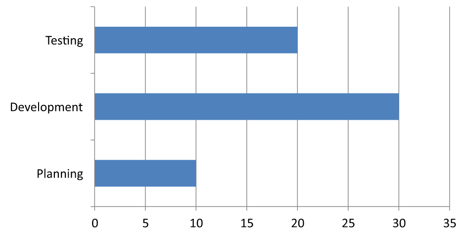
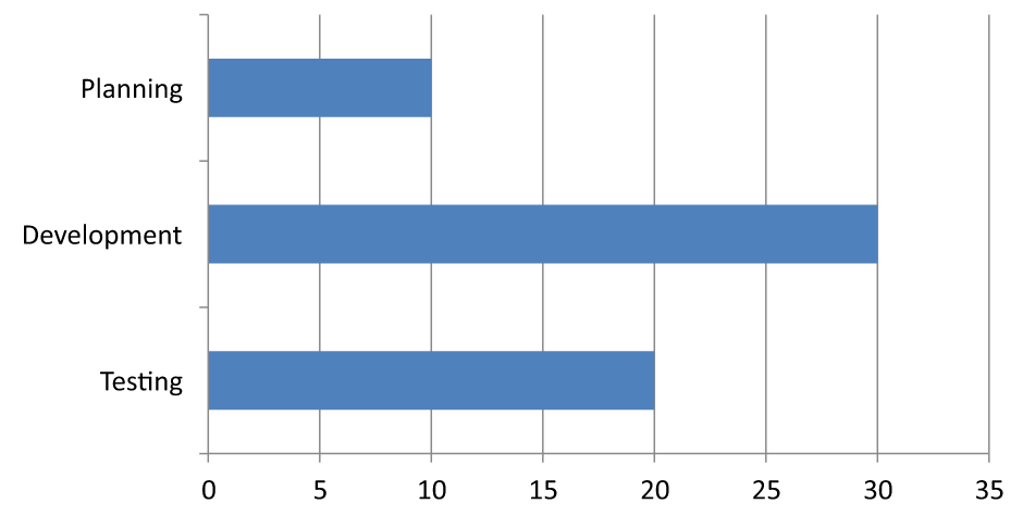
استخدام setPlotOrderReversed لعكس محور الفئة أو القيمة. على سبيل المثال، يمكن لمخطط شريطي أفقي عرض مراحل المشروع من الأعلى إلى الأسفل بنفس ترتيب ورقة العمل: التخطيط، التطوير، الاختبار. عكس المحور يغيّر اتجاه الرسم؛ لا يقوم بترتيب أو إعادة ترتيب بيانات المصنف. بالمقابل، switchRowColumn يبادل أدوار السلاسل والفئات.
المثال التالي ينشئ مخطط شريطي أفقي مع ثلاث مراحل وسلسلة واحدة. يحفظ عرضًا تقديميًا يحتوي على ثلاث شرائح: الترتيب الطبيعي، الفئات المقلوبة، والقيم المقلوبة. كل نسخة تستخدم نفس مجموعة البيانات، ويتم عكس محور واحد فقط في كل نسخة.
use aspose\slides\ChartType;
use aspose\slides\CrossesType;
use aspose\slides\Presentation;
use aspose\slides\SaveFormat;

$presentation = new Presentation();
try {
    $slide = $presentation->getSlides()->get_Item(0);

    $chart = $slide->getShapes()->addChart(ChartType::ClusteredBar, 50, 40, 620, 320);
    $chart->setLegend(false);

    $chart->getChartData()->getCategories()->clear();
    $chart->getChartData()->getSeries()->clear();

    $workbook = $chart->getChartData()->getChartDataWorkbook();
    $workbook->clear(0);

    $series = $chart->getChartData()->getSeries()->add(ChartType::ClusteredBar);
    $stages = ["Planning", "Development", "Testing"];
    $values = [10, 30, 20];
    for ($i = 0; $i < count($stages); $i++) {
        $categoryCell = $workbook->getCell(0, $i + 1, 0, $stages[$i]);
        $chart->getChartData()->getCategories()->add($categoryCell);
        $valueCell = $workbook->getCell(0, $i + 1, 1, $values[$i]);
        $series->getDataPoints()->addDataPointForBarSeries($valueCell);
    }

    // الشريحة 2: عرض الفئة الأولى في الأعلى.
    $categorySlide = $presentation->getSlides()->addClone($slide);
    $categoryChart = $categorySlide->getShapes()->get_Item(0);
    $categoryChart->getAxes()->getVerticalAxis()->setPlotOrderReversed(true);
    // إبقاء محور القيمة الأفقي في الأسفل.
    $categoryChart->getAxes()->getVerticalAxis()->setCrossType(CrossesType::Maximum);

    // الشريحة 3: عكس مقياس الأرقام الأفقي فقط.
    $valueSlide = $presentation->getSlides()->addClone($slide);
    $valueChart = $valueSlide->getShapes()->get_Item(0);
    $valueChart->getAxes()->getHorizontalAxis()->setPlotOrderReversed(true);

    $presentation->save("ReversedAxes.pptx", SaveFormat::Pptx);
} finally {
    $presentation->dispose();
}
عكس المحور يمكن أيضًا أن ينقل المحور العمودي إلى الجانب المقابل من الرسم. تتحكم setCrossType في المكان الذي يقطع فيه المحور الآخر المحور الذي يجري تكوينه. في الشريحة 2، استدعائه بـ CrossesType::Maximum على محور الفئة المقلوب يبقي محور القيمة الأفقي في الأسفل. لنقطة تقاطع معينة، استخدم setCrossAt. تحقق من إعدادات التقاطع عند تغيير الاتجاه، خاصة إذا كان المخطط يحتوي بالفعل على نقطة تقاطع مخصصة. استدعِ setPlotOrderReversed بـ false لاستعادة اتجاه الرسم الطبيعي؛ إعدادات التقاطع منفصلة.
| الترتيب العادي (الشريحة 1) | الفئات المقلوبة (الشريحة 2) | القيم المقلوبة (الشريحة 3) |
|---|---|---|
 |
 |
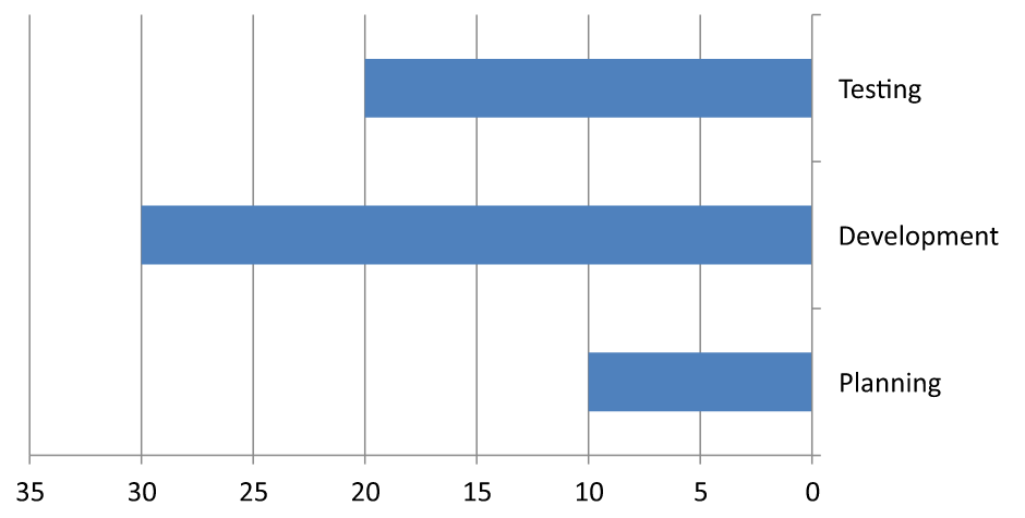 |
| الفئات تمتد من الأسفل إلى الأعلى؛ القيم تزداد من اليسار إلى اليمين. | التخطيط، التطوير، والاختبار تمتد من الأعلى إلى الأسفل. القيم وترتيب صفوف المصنف لا يتغيران. | الفئات تحتفظ بترتيبها الطبيعي؛ القيم تزداد من اليمين إلى اليسار. تقاطع محور الفئة يكون عند الصفر على اليمين. |
إخفاء المحور الرأسي للمخططات الخطية
استدعاء setVisible بـ false على المحور الرأسي لإخفائه. المثال ينشئ مخططًا خطيًا بالبيانات الافتراضية ويحفظه مع إخفاء المحور الرأسي.
use aspose\slides\ChartType;
use aspose\slides\Presentation;
use aspose\slides\SaveFormat;

$presentation = new Presentation();
try {
    $slide = $presentation->getSlides()->get_Item(0);

    $chart = $slide->getShapes()->addChart(ChartType::Line, 100, 100, 400, 300);
    $chart->getAxes()->getVerticalAxis()->setVisible(false);

    $presentation->save("HiddenVerticalAxis.pptx", SaveFormat::Pptx);
} finally {
    $presentation->dispose();
}
إخفاء المحور الأفقي للمخططات الخطية
استدعاء setVisible بـ false على المحور الأفقي لإخفائه. المثال ينشئ مخططًا خطيًا بالبيانات الافتراضية ويحفظه مع إخفاء المحور الأفقي.
use aspose\slides\ChartType;
use aspose\slides\Presentation;
use aspose\slides\SaveFormat;

$presentation = new Presentation();
try {
    $slide = $presentation->getSlides()->get_Item(0);

    $chart = $slide->getShapes()->addChart(ChartType::Line, 100, 100, 400, 300);
    $chart->getAxes()->getHorizontalAxis()->setVisible(false);

    $presentation->save("HiddenHorizontalAxis.pptx", SaveFormat::Pptx);
} finally {
    $presentation->dispose();
}
تغيير محور الفئة
استخدام setCategoryAxisType لاختيار محور فئة تاريخية أو نصية. يتطلب هذا المثال ملف ExistingChart.pptx، مع مخطط كأول شكل في الشريحة الأولى وخلايا الفئة تحتوي على قيم تاريخية رقمية من Excel. يغيّر المحور الأفقي إلى محور تاريخ. استدعاء setAutomaticMajorUnit بـ false، وsetMajorUnit بـ 1، وsetMajorUnitScale بـ TimeUnitType::Months لتحديد علامة رئيسية كل شهر.
use aspose\slides\CategoryAxisType;
use aspose\slides\Presentation;
use aspose\slides\SaveFormat;
use aspose\slides\TimeUnitType;

$presentation = new Presentation("ExistingChart.pptx");
try {
    $slide = $presentation->getSlides()->get_Item(0);

    $chart = $slide->getShapes()->get_Item(0);
    $chart->getAxes()->getHorizontalAxis()->setCategoryAxisType(CategoryAxisType::Date);
    $chart->getAxes()->getHorizontalAxis()->setAutomaticMajorUnit(false);
    $chart->getAxes()->getHorizontalAxis()->setMajorUnit(1);
    $chart->getAxes()->getHorizontalAxis()->setMajorUnitScale(TimeUnitType::Months);

    $presentation->save("ChangeChartCategoryAxis_out.pptx", SaveFormat::Pptx);
} finally {
    $presentation->dispose();
}
التحكم في فواصل تسميات محور الفئة
عندما يحتوي المخطط على العديد من الفئات، قلل عدد التسميات الظاهرة للمحور دون حذف الفئات أو نقاط البيانات. استدعِ setAutomaticTickLabelSpacing بـ false، ثم مرّر الفاصل المطلوب للفئات إلى setTickLabelSpacing. بالنسبة للفئات النصية بترتيبها الطبيعي، يبدأ العد من الفئة الأولى:
| الفاصل | التسميات المعروضة في المثال |
|---|---|
1 |
الفئة 1، الفئة 2، الفئة 3، … الفئة 24 |
2 |
الفئة 1، الفئة 3، الفئة 5، … الفئة 23 |
3 |
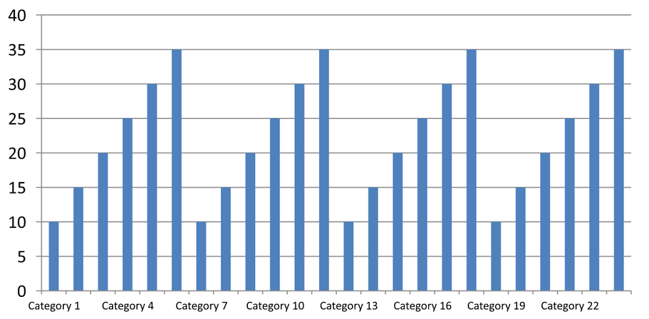
الفئة 1، الفئة 4، الفئة 7، … الفئة 22 |
الفاصل 3 يعرض كل تسمية ثالثة، مخفيًا اثنتين بين كل تسمية معروضة. لا يزيل الأعمدة المقابلة. الفواصل التلقائية تختار فاصلًا بناءً على المساحة المتاحة؛ لا تعرض بالضرورة كل تسمية.
علامات الفواصل لها تحكم منفصل. استدعِ setAutomaticTickMarksSpacing بـ false واستخدم setTickMarksSpacing لتحديد فواصلها. على سبيل المثال، 1 يضع علامة فاصل عند كل فاصل فئة بينما تظهر التسميات فقط كل فئة ثالثة. استخدم setMajorTickMark بنمط مرئي لتتمكن من رؤية النتيجة. استدعاء أي من محددات الفواصل التلقائية بـ true مرة أخرى يسمح للمخطط باختيار ذلك الفاصل مرة أخرى.
المثال المتكامل التالي ينشئ 24 فئة وسلسلة واحدة، ثم يحفظ ثلاث شرائح في CategoryAxisIntervals.pptx: الفواصل التلقائية، الفواصل اليدوية للتسمية مع علامات فواصل مستقلة، واستعادة الفواصل التلقائية. النسختان تحتفظان ببيانات المخطط الأصلية. لا يلزم عرض تقديمي مدخل. نص التسميات الأفقي يُظهر الفرق في الكثافة بوضوح.
use aspose\slides\CategoryAxisType;
use aspose\slides\ChartType;
use aspose\slides\Presentation;
use aspose\slides\SaveFormat;
use aspose\slides\TickMarkType;

$presentation = new Presentation();
try {
    $slide = $presentation->getSlides()->get_Item(0);

    $chart = $slide->getShapes()->addChart(ChartType::ClusteredColumn, 30, 40, 660, 320);

    $chart->setLegend(false);
    $chart->getChartData()->getCategories()->clear();
    $chart->getChartData()->getSeries()->clear();

    $workbook = $chart->getChartData()->getChartDataWorkbook();
    $workbook->clear(0);

    $series = $chart->getChartData()->getSeries()->add(ChartType::ClusteredColumn);
    for ($i = 0; $i < 24; $i++) {
        $categoryCell = $workbook->getCell(0, $i + 1, 0, "Category " . ($i + 1));
        $chart->getChartData()->getCategories()->add($categoryCell);
        $valueCell = $workbook->getCell(0, $i + 1, 1, 10 + $i % 6 * 5);
        $series->getDataPoints()->addDataPointForBarSeries($valueCell);
    }

    $axis = $chart->getAxes()->getHorizontalAxis();
    $axis->setCategoryAxisType(CategoryAxisType::Text);
    $axis->getTextFormat()->getTextBlockFormat()->setRotationAngle(0);
    $axis->getTextFormat()->getPortionFormat()->setFontHeight(12);
    $axis->setMajorTickMark(TickMarkType::Outside);
    $axis->setAutomaticTickLabelSpacing(true);
    $axis->setAutomaticTickMarksSpacing(true);

    // الشريحة 2: إظهار كل تسمية ثالثة، مع الحفاظ على علامة فاصل لكل فئة.
    $manualSlide = $presentation->getSlides()->addClone($slide);
    $manualChart = $manualSlide->getShapes()->get_Item(0);
    $manualAxis = $manualChart->getAxes()->getHorizontalAxis();
    $manualAxis->setAutomaticTickLabelSpacing(false);
    $manualAxis->setTickLabelSpacing(3);
    $manualAxis->setAutomaticTickMarksSpacing(false);
    $manualAxis->setTickMarksSpacing(1);

    // الشريحة 3: السماح للمخطط باختيار الفواصل مرة أخرى.
    $restoredSlide = $presentation->getSlides()->addClone($manualSlide);
    $restoredChart = $restoredSlide->getShapes()->get_Item(0);
    $restoredChart->getAxes()->getHorizontalAxis()->setAutomaticTickLabelSpacing(true);
    $restoredChart->getAxes()->getHorizontalAxis()->setAutomaticTickMarksSpacing(true);

    $presentation->save("CategoryAxisIntervals.pptx", SaveFormat::Pptx);
} finally {
    $presentation->dispose();
}
الفواصل التلقائية (الشريحة 1): في هذا العرض، تُعرض كل تسمية فئة ثانية وتلتف على سطرين. النتيجة التلقائية قد تختلف حسب حجم المخطط، الخطوط، وملف العرض.
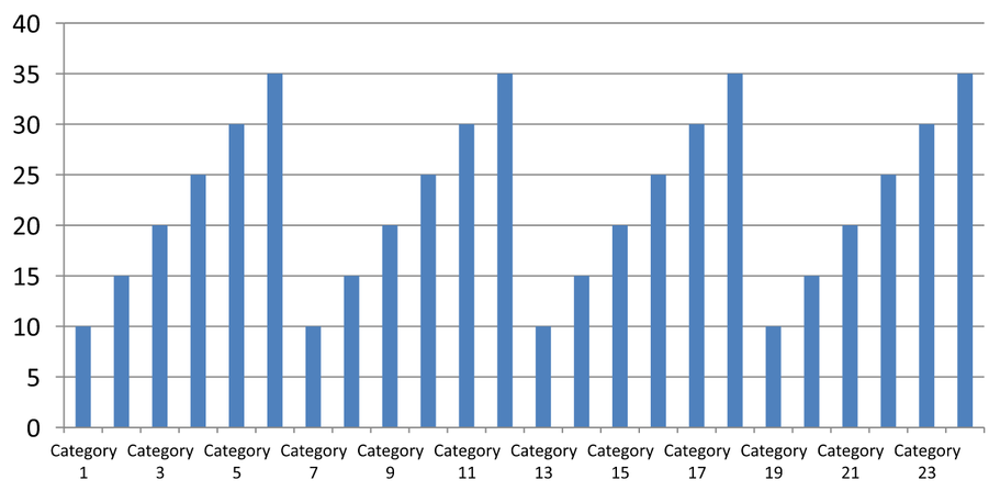
الفواصل اليدوية (الشريحة 2): كل تسمية ثالثة تُعرض على سطر واحد، بينما تظل علامات الفواصل عند كل فاصل فئة. جميع الـ 24 عمودًا، بما فيها التي لا تحمل تسميات، تظل مرئية بنفس القيم. الشريحة 3 تستعيد المظهر التلقائي الموضح أعلاه.
اختر المحور والفاصل الصحيح
استخدم هذا الفاصل للعدد الفئوي لمحور فئة نصية، مثل محور الفئة في مخطط عمودي، خطي، مساحة أو شريطي. في المخطط العمودي، هو المحور الأفقي. في المخطط الشريطي الأفقي، يكون محور الفئة عموديًا، لذا طبّق هذه الإعدادات على المحور المرجع من خلال getVerticalAxis. فواصل علامات الفاصل تنطبق أيضًا على محور سلسلة في المخططات التي تحتوي على واحد.
لا تستخدم فواصل تسميات الفئة لتحديد مقياس رقمي لمحور القيمة. على محور القيمة، يحدد setMajorUnit فرق القيم: على سبيل المثال، وحدة رئيسية 10 تنتج علامات عند 0، 10، 20، وهكذا عندما يبدأ المحور من الصفر. فاصل تسمية الفئة 3 يعد مواضع الفئات بغض النظر عن قيم البيانات. المخططات النقطية والفقاعية تستخدم محاور قيم بدلاً من محور فئة نصية. بالنسبة لمحور تاريخ، استخدم وحدات زمنية رئيسية ومقاييس كما هو موضح في تغيير محور الفئة.
تعيين تنسيق التاريخ لقيم محور الفئة
يستبدل المثال البيانات الافتراضية للمخطط بأربعة قيم سنوية. تُخزن التواريخ كأرقام تسلسلية OLE Automation في ورقة العمل الأولى (الفهرس 0)، محسوبة كعدد الأيام منذ 30 ديسمبر 1899. استخدم setCategoryAxisType مع CategoryAxisType::Date، استدعِ setNumberFormatLinkedToSource بـ false، ومرّر yyyy إلى setNumberFormat لكي تعرض تسميات الفئة سنوات رباعية الأرقام بشكل مستقل عن تنسيق الخلية.
use aspose\slides\CategoryAxisType;
use aspose\slides\ChartType;
use aspose\slides\Presentation;
use aspose\slides\SaveFormat;

$presentation = new Presentation();
try {
    $slide = $presentation->getSlides()->get_Item(0);

    $chart = $slide->getShapes()->addChart(ChartType::Line, 50, 50, 450, 300);

    $chart->getChartData()->getCategories()->clear();
    $chart->getChartData()->getSeries()->clear();

    $workbook = $chart->getChartData()->getChartDataWorkbook();
    $workbook->clear(0);

    $baseDate = gmmktime(0, 0, 0, 12, 30, 1899);

    $series = $chart->getChartData()->getSeries()->add(ChartType::Line);
    for ($i = 0; $i < 4; $i++) {
        $date = gmmktime(0, 0, 0, 1, 1, 2015 + $i);
        $serialDate = ($date - $baseDate) / 86400;
        $categoryCell = $workbook->getCell(0, $i + 1, 0, $serialDate);
        $chart->getChartData()->getCategories()->add($categoryCell);

        $valueCell = $workbook->getCell(0, $i + 1, 1, $i + 1);
        $series->getDataPoints()->addDataPointForLineSeries($valueCell);
    }

    $chart->getAxes()->getHorizontalAxis()->setCategoryAxisType(CategoryAxisType::Date);
    $chart->getAxes()->getHorizontalAxis()->setNumberFormatLinkedToSource(false);
    $chart->getAxes()->getHorizontalAxis()->setNumberFormat("yyyy");

    $presentation->save("DateAxisFormat.pptx", SaveFormat::Pptx);
} finally {
    $presentation->dispose();
}
تعيين زاوية تدوير لعنوان محور المخطط
استدعِ setTitle بـ true على المحور الرأسي، قدم نص العنوان، واستخدم setRotationAngle لتدوير العنوان. تُقاس الزاوية بالدرجات؛ يحفظ هذا المثال مخططًا عموديًا مع تدوير عنوان محور القيمة بمقدار 90 درجة.
use aspose\slides\ChartType;
use aspose\slides\Presentation;
use aspose\slides\SaveFormat;

$presentation = new Presentation();
try {
    $slide = $presentation->getSlides()->get_Item(0);

    $chart = $slide->getShapes()->addChart(ChartType::ClusteredColumn, 50, 50, 450, 300);
    $chart->getAxes()->getVerticalAxis()->setTitle(true);
    $chart->getAxes()->getVerticalAxis()->getTitle()->addTextFrameForOverriding("Value");
    $chart->getAxes()->getVerticalAxis()->getTitle()->getTextFormat()->getTextBlockFormat()->setRotationAngle(90);

    $presentation->save("RotatedAxisTitle.pptx", SaveFormat::Pptx);
} finally {
    $presentation->dispose();
}
تعيين موضع المحور على محور فئة أو قيمة
استخدام setAxisBetweenCategories للتحكم فيما إذا كان محور القيمة يقطع محور الفئة بين الفئات أو عند علامات الفواصل. هذا الإعداد يطبق على محاور الفئة. المثال يضبطه على true على محور الفئة الأفقي في مخطط عمودي ويحفظ النتيجة.
use aspose\slides\ChartType;
use aspose\slides\Presentation;
use aspose\slides\SaveFormat;

$presentation = new Presentation();
try {
    $slide = $presentation->getSlides()->get_Item(0);

    $chart = $slide->getShapes()->addChart(ChartType::ClusteredColumn, 50, 50, 450, 300);
    $chart->getAxes()->getHorizontalAxis()->setAxisBetweenCategories(true);

    $presentation->save("AxisBetweenCategories.pptx", SaveFormat::Pptx);
} finally {
    $presentation->dispose();
}
تعيين وحدة العرض على محور قيمة المخطط
استخدام setDisplayUnit لتكبير التسميات على محور القيمة دون تغيير البيانات الأساسية. مع تعيين DisplayUnitType إلى Millions، تُعرض القيمة 60 000 000 كـ 60. المثال ينشئ مخططًا عموديًا ويطبق وحدة العرض بالملايين على محوره الرأسي.
use aspose\slides\ChartType;
use aspose\slides\DisplayUnitType;
use aspose\slides\Presentation;
use aspose\slides\SaveFormat;

$presentation = new Presentation();
try {
    $slide = $presentation->getSlides()->get_Item(0);

    $chart = $slide->getShapes()->addChart(ChartType::ClusteredColumn, 50, 50, 450, 300);
    $chart->getAxes()->getVerticalAxis()->setDisplayUnit(DisplayUnitType::Millions);

    $presentation->save("Result.pptx", SaveFormat::Pptx);
} finally {
    $presentation->dispose();
}
تهيئة محور قيمة لوغاريتمي
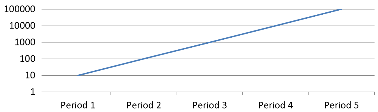
محور قيمة لوغاريتمي مفيد عندما تتراوح القيم الموجبة عبر عدة أوامر من الحجم. على سبيل المثال، قد يتلقى خدمة 10، 100، 1 000، 10 000، و100 000 طلبًا عبر خمس فترات. على مقياس خطي، تظهر القيم الصغيرة متقاربة قرب الصفر. مقياس لوغاريتمي يجعل النمو النسبي أسهل للمقارنة: المسافات المتساوية تمثل نسبًا متساوية وليس فروقًا متساوية.
استدعِ setLogarithmic بـ true على محور القيمة واستخدم setLogBase لاختيار القاعدة. هذا يغيّر طريقة عرض القيم الحالية؛ لا يغيّر البيانات ولا يضيف خط اتجاه لوغاريتمي. خط الاتجاه يمثل علاقة تم ملاءمتها على البيانات وهو ميزة منفصلة.
اختر محور القيمة والقاعدة
للمخطط الخطي أو العمودي، يُسترجع محور القيمة عبر getVerticalAxis. للمخطط الشريطي الأفقي، يُسترجع عبر getHorizontalAxis. المخططات النقطية والفقاعية لديها محوران للقيمة، لذا اختر المحور الأفقي لقيم X، والمحور الرأسي لقيم Y، أو كلاهما. لا تطبق التمدد اللوغاريتمي على محور الفئة.
القاعدة اللوغاريتمية الافتراضية هي 10. بالنسبة لمخططات PPTX، يمكن استخدام قاعدة من 2 إلى 1000 شاملة؛ القواعد الكسرية مثل 2.5 مدعومة أيضًا. بالقاعدة 10، تكون القوى المتتالية مثل 10، 100، 1 000، و10 000 متساوية المسافات.
قارن بين التمدد الخطي واللوغاريتمي
المثال المتكامل التالي ينشئ مخططًا خطيًا بخمسة تعداد طلبات في الشريحة الأولى، ثم ينسخ تلك الشريحة ويفعل محور قيمة لوغاريتمي بقاعدة 10 في الشريحة الثانية. كلا الشريحتين تحتفظان بنفس البيانات.
use aspose\slides\ChartType;
use aspose\slides\Presentation;
use aspose\slides\SaveFormat;

$presentation = new Presentation();
try {
    $slide = $presentation->getSlides()->get_Item(0);

    $chart = $slide->getShapes()->addChart(ChartType::Line, 30, 40, 660, 200);

    $chart->setLegend(false);

    $chart->getChartData()->getCategories()->clear();
    $chart->getChartData()->getSeries()->clear();

    $workbook = $chart->getChartData()->getChartDataWorkbook();
    $workbook->clear(0);

    $series = $chart->getChartData()->getSeries()->add(ChartType::Line);
    $values = [10, 100, 1000, 10000, 100000];

    for ($i = 0; $i < count($values); $i++) {
        $categoryCell = $workbook->getCell(0, $i + 1, 0, "Period " . ($i + 1));
        $chart->getChartData()->getCategories()->add($categoryCell);

        $valueCell = $workbook->getCell(0, $i + 1, 1, $values[$i]);
        $series->getDataPoints()->addDataPointForLineSeries($valueCell);
    }

    // احتفظ بالشريحة الأولى خطية وغيّر مقياس محور القيمة للنسخة فقط.
    $logarithmicSlide = $presentation->getSlides()->addClone($slide);
    $logarithmicChart = $logarithmicSlide->getShapes()->get_Item(0);
    $valueAxis = $logarithmicChart->getAxes()->getVerticalAxis();
    $valueAxis->setLogarithmic(true);
    $valueAxis->setLogBase(10);

    $presentation->save("LogarithmicAxis.pptx", SaveFormat::Pptx);
} finally {
    $presentation->dispose();
}
التمدد الخطي (الشريحة 1): المسافات الرأسية المتساوية تمثل فروقًا متساوية في عدد الطلبات. القيمة الأكبر تهيمن على المخطط، مما يجعل القيم الأصغر صعبة التمييز.
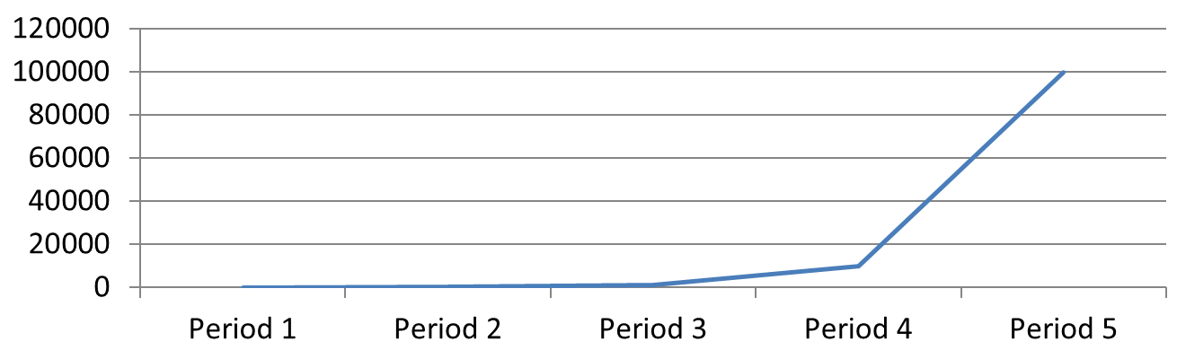
التمدد اللوغاريتمي (الشريحة 2): المسافات الرأسية المتساوية تمثل نسبًا متساوية. كل فترة لديها عشرة أضعاف الطلبات مقارنةً بالسابقة، لذا تشكل النقاط خطًا مستقيمًا صاعدًا على مقياس قاعدة 10. لا تزال تسميات المحور تظهر القيم الأصلية للطلبات.
معالجة القيم الصفرية والسالبة
لا يمكن للتمدد اللوغاريتمي عرض سوى القيم الموجبة الصارمة. تحقق من البيانات قبل تفعيله. إذا كانت القيم الصفرية أو السالبة ذات معنى، احتفظ بالتمدد الخطي أو اعرضها بشكل منفصل. إذا كان استبعاد تلك القيم مناسبًا للتحليل، فسّر الإغفال. لا تستبدلها بصمت بأرقام صغيرة موجبة، لأن ذلك يغيّر معنى البيانات. أي حد أدنى أو أقصى مُكوَّن يدويًا لمحور لوغاريتمي يجب أن يكون أيضًا إيجابيًا.
الأسئلة الشائعة
كيف يمكنني تحديد القيمة التي يقطع عندها محور أحد المحاور الآخر (تقاطع المحاور)؟
استخدم setCrossType لاختيار سلوك التقاطع. لتحديد قيمة تقاطع رقمية، استخدم setCrossAt. هذه الإعدادات تسمح لك بنقل تقاطع المحور إلى خط أساس مناسب.
كيف يمكنني موضع تسميات العلامات بالنسبة للمحور؟
استدعِ setTickLabelPosition باستخدام TickLabelPositionType: Low، High، NextTo، أو None. للتحكم في علامات الفواصل نفسها، استخدم setMajorTickMark أو setMinorTickMark; هذه منفصلة عن موضع التسميات.