
使用 PHP 在演示文稿中自定义图表坐标轴
概述
本文介绍如何使用 Aspose.Slides for PHP via Java 自定义图表坐标轴。内容包括计算坐标轴数值、交换图表行列、坐标轴可见性、类别标签和刻度间隔、日期类别及格式、标题旋转、坐标轴定位、显示单位以及对数缩放。
获取图表中垂直轴的最大值
创建一个Presentation并添加默认数据的区域图。调用validateChartLayout以确保图表布局是最新的,然后读取计算后的坐标轴数值。
读取getActualMaxValue和getActualMinValue获取坐标轴上下限,读取getActualMajorUnit和getActualMinorUnit获取刻度间隔。getActualMajorUnitScale和getActualMinorUnitScale提供时间单位尺度,适用于日期坐标轴。示例将这些值存入本地变量并保存图表。
use aspose\slides\ChartType;
use aspose\slides\Presentation;
use aspose\slides\SaveFormat;

$presentation = new Presentation();
try {
    $slide = $presentation->getSlides()->get_Item(0);

    $chart = $slide->getShapes()->addChart(ChartType::Area, 100, 100, 500, 350);
    $chart->validateChartLayout();

    $maxValue = $chart->getAxes()->getVerticalAxis()->getActualMaxValue();
    $minValue = $chart->getAxes()->getVerticalAxis()->getActualMinValue();

    $majorUnit = $chart->getAxes()->getVerticalAxis()->getActualMajorUnit();
    $minorUnit = $chart->getAxes()->getVerticalAxis()->getActualMinorUnit();

    $majorUnitScale = $chart->getAxes()->getVerticalAxis()->getActualMajorUnitScale();
    $minorUnitScale = $chart->getAxes()->getVerticalAxis()->getActualMinorUnitScale();

    $presentation->save("AxisValues_out.pptx", SaveFormat::Pptx);
} finally {
    $presentation->dispose();
}
交换坐标轴之间的数据
使用switchRowColumn交换图表数据中系列和类别的角色。之前的每个类别成为一个系列,之前的每个系列成为一个类别。这会改变数据的分组方式,但不会交换水平和垂直坐标轴。示例在切换行列之前使用setRange将默认数据绑定到Sheet1!A1:D5(包括标题行和类别列)。它保存了一个拥有四个系列和三个类别的图表。
use aspose\slides\ChartType;
use aspose\slides\Presentation;
use aspose\slides\SaveFormat;

$presentation = new Presentation();
try {
    $slide = $presentation->getSlides()->get_Item(0);

    $chart = $slide->getShapes()->addChart(ChartType::ClusteredColumn, 100, 100, 400, 300);
    $chart->getChartData()->setRange("Sheet1!A1:D5");
    $chart->getChartData()->switchRowColumn();

    $presentation->save("SwitchChartRowColumns_out.pptx", SaveFormat::Pptx);
} finally {
    $presentation->dispose();
}
为折线图禁用垂直坐标轴
在垂直坐标轴上调用setVisible并传入false以隐藏它。示例创建一个默认数据的折线图并保存后垂直坐标轴已隐藏。
use aspose\slides\ChartType;
use aspose\slides\Presentation;
use aspose\slides\SaveFormat;

$presentation = new Presentation();
try {
    $slide = $presentation->getSlides()->get_Item(0);

    $chart = $slide->getShapes()->addChart(ChartType::Line, 100, 100, 400, 300);
    $chart->getAxes()->getVerticalAxis()->setVisible(false);

    $presentation->save("HiddenVerticalAxis.pptx", SaveFormat::Pptx);
} finally {
    $presentation->dispose();
}
为折线图禁用水平坐标轴
在水平坐标轴上调用setVisible并传入false以隐藏它。示例创建一个默认数据的折线图并保存后水平坐标轴已隐藏。
use aspose\slides\ChartType;
use aspose\slides\Presentation;
use aspose\slides\SaveFormat;

$presentation = new Presentation();
try {
    $slide = $presentation->getSlides()->get_Item(0);

    $chart = $slide->getShapes()->addChart(ChartType::Line, 100, 100, 400, 300);
    $chart->getAxes()->getHorizontalAxis()->setVisible(false);

    $presentation->save("HiddenHorizontalAxis.pptx", SaveFormat::Pptx);
} finally {
    $presentation->dispose();
}
更改类别坐标轴
使用setCategoryAxisType选择日期或文本类别坐标轴。该示例需要ExistingChart.pptx,其中第一张幻灯片的第一形状是图表,类别单元格包含 Excel 数字日期值。示例将水平坐标轴改为日期坐标轴。将setAutomaticMajorUnit设为false,setMajorUnit设为1,并将setMajorUnitScale设为TimeUnitType::Months,使主刻度以一个月为间隔。
use aspose\slides\CategoryAxisType;
use aspose\slides\Presentation;
use aspose\slides\SaveFormat;
use aspose\slides\TimeUnitType;

$presentation = new Presentation("ExistingChart.pptx");
try {
    $slide = $presentation->getSlides()->get_Item(0);

    $chart = $slide->getShapes()->get_Item(0);
    $chart->getAxes()->getHorizontalAxis()->setCategoryAxisType(CategoryAxisType::Date);
    $chart->getAxes()->getHorizontalAxis()->setAutomaticMajorUnit(false);
    $chart->getAxes()->getHorizontalAxis()->setMajorUnit(1);
    $chart->getAxes()->getHorizontalAxis()->setMajorUnitScale(TimeUnitType::Months);

    $presentation->save("ChangeChartCategoryAxis_out.pptx", SaveFormat::Pptx);
} finally {
    $presentation->dispose();
}
控制类别坐标轴标签间隔
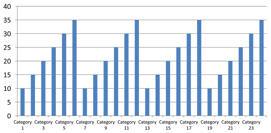
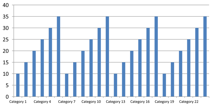
当图表类别较多时,可在不删除类别或数据点的前提下降低可见坐标轴标签的数量。调用setAutomaticTickLabelSpacing并设为false,随后使用setTickLabelSpacing传入期望的类别间隔。对于按正常顺序排列的文本类别,计数从第一个类别开始:
| 间隔 | 示例中显示的标签 |
|---|---|
1 |
Category 1, Category 2, Category 3, … Category 24 |
2 |
Category 1, Category 3, Category 5, … Category 23 |
3 |
Category 1, Category 4, Category 7, … Category 22 |
间隔为3时每三个标签显示一次,两个标签在显示的标签之间被隐藏。它不会删除相应的列。自动间隔依据可用空间选择间隔;未必会显示所有标签。
刻度线有独立的控制方式。调用setAutomaticTickMarksSpacing设为false,并使用setTickMarksSpacing设置其间隔。例如,1 会在每个类别间隔处保留刻度线,而标签仅每三个类别显示一次。使用setMajorTickMark设置可见的样式以便观察结果。再次将任一自动间隔设置器设为true,图表会重新选择该间隔。
以下独立示例创建 24 个类别和一个系列,然后在 CategoryAxisIntervals.pptx 中保存三张幻灯片:自动间隔、带独立刻度线的手动标签间隔以及恢复的自动间隔。两份复制保持原始图表数据,无需输入演示文稿。水平标签文本使密度差异一目了然。
use aspose\slides\CategoryAxisType;
use aspose\slides\ChartType;
use aspose\slides\Presentation;
use aspose\slides\SaveFormat;
use aspose\slides\TickMarkType;

$presentation = new Presentation();
try {
    $slide = $presentation->getSlides()->get_Item(0);

    $chart = $slide->getShapes()->addChart(ChartType::ClusteredColumn, 30, 40, 660, 320);

    $chart->setLegend(false);
    $chart->getChartData()->getCategories()->clear();
    $chart->getChartData()->getSeries()->clear();

    $workbook = $chart->getChartData()->getChartDataWorkbook();
    $workbook->clear(0);

    $series = $chart->getChartData()->getSeries()->add(ChartType::ClusteredColumn);
    for ($i = 0; $i < 24; $i++) {
        $categoryCell = $workbook->getCell(0, $i + 1, 0, "Category " . ($i + 1));
        $chart->getChartData()->getCategories()->add($categoryCell);
        $valueCell = $workbook->getCell(0, $i + 1, 1, 10 + $i % 6 * 5);
        $series->getDataPoints()->addDataPointForBarSeries($valueCell);
    }

    $axis = $chart->getAxes()->getHorizontalAxis();
    $axis->setCategoryAxisType(CategoryAxisType::Text);
    $axis->getTextFormat()->getTextBlockFormat()->setRotationAngle(0);
    $axis->getTextFormat()->getPortionFormat()->setFontHeight(12);
    $axis->setMajorTickMark(TickMarkType::Outside);
    $axis->setAutomaticTickLabelSpacing(true);
    $axis->setAutomaticTickMarksSpacing(true);

    // 幻灯片 2:显示每三个标签,但对每个类别保留刻度线。
    $manualSlide = $presentation->getSlides()->addClone($slide);
    $manualChart = $manualSlide->getShapes()->get_Item(0);
    $manualAxis = $manualChart->getAxes()->getHorizontalAxis();
    $manualAxis->setAutomaticTickLabelSpacing(false);
    $manualAxis->setTickLabelSpacing(3);
    $manualAxis->setAutomaticTickMarksSpacing(false);
    $manualAxis->setTickMarksSpacing(1);

    // 幻灯片 3:让图表再次选择两个间隔。
    $restoredSlide = $presentation->getSlides()->addClone($manualSlide);
    $restoredChart = $restoredSlide->getShapes()->get_Item(0);
    $restoredChart->getAxes()->getHorizontalAxis()->setAutomaticTickLabelSpacing(true);
    $restoredChart->getAxes()->getHorizontalAxis()->setAutomaticTickMarksSpacing(true);

    $presentation->save("CategoryAxisIntervals.pptx", SaveFormat::Pptx);
} finally {
    $presentation->dispose();
}
自动间隔(第 1 张幻灯片): 在此渲染中,每第二个类别标签显示并换行成两行。自动结果会随图表大小、字体和渲染器而变化。
手动间隔(第 2 张幻灯片): 每第三个标签显示在一行,刻度线仍然在每个类别间隔处。所有 24 列(包括没有标签的列)仍然可见且值保持不变。第 3 张幻灯片恢复上述自动外观。
选择正确的坐标轴和间隔
对文本类别坐标轴使用此类别计数间隔,例如柱形图、折线图、面积图或条形图的类别坐标轴。在柱形图中它是水平坐标轴;在水平条形图中,类别坐标轴是垂直的,因此请对getVerticalAxis返回的坐标轴应用这些设置。刻度间隔同样适用于具有系列坐标轴的图表。
不要使用类别标签间隔来设置数值坐标轴的数值刻度。在数值坐标轴上,setMajorUnit指定数值差异,例如 10 的主单位会在 0、10、20 等位置生成刻度。类别标签间隔 3 则是按类别位置计数,与实际数值无关。散点图和气泡图使用数值坐标轴而非文本类别坐标轴。对于日期坐标轴,请参照更改类别坐标轴中描述的基于时间的主单位和尺度。
设置类别坐标轴值的日期格式
示例用四个年度值替换默认图表数据。日期以 OLE 自动化序列号存储在第一个工作表(索引 0)中,计算方式为自 1899 年 12 月 30 日起的天数。使用setCategoryAxisType并传入CategoryAxisType::Date,调用setNumberFormatLinkedToSource设为false,并将yyyy 传给setNumberFormat,使类别标签独立于单元格格式显示四位年份。
use aspose\slides\CategoryAxisType;
use aspose\slides\ChartType;
use aspose\slides\Presentation;
use aspose\slides\SaveFormat;

$presentation = new Presentation();
try {
    $slide = $presentation->getSlides()->get_Item(0);

    $chart = $slide->getShapes()->addChart(ChartType::Line, 50, 50, 450, 300);

    $chart->getChartData()->getCategories()->clear();
    $chart->getChartData()->getSeries()->clear();

    $workbook = $chart->getChartData()->getChartDataWorkbook();
    $workbook->clear(0);

    $baseDate = gmmktime(0, 0, 0, 12, 30, 1899);

    $series = $chart->getChartData()->getSeries()->add(ChartType::Line);
    for ($i = 0; $i < 4; $i++) {
        $date = gmmktime(0, 0, 0, 1, 1, 2015 + $i);
        $serialDate = ($date - $baseDate) / 86400;
        $categoryCell = $workbook->getCell(0, $i + 1, 0, $serialDate);
        $chart->getChartData()->getCategories()->add($categoryCell);

        $valueCell = $workbook->getCell(0, $i + 1, 1, $i + 1);
        $series->getDataPoints()->addDataPointForLineSeries($valueCell);
    }

    $chart->getAxes()->getHorizontalAxis()->setCategoryAxisType(CategoryAxisType::Date);
    $chart->getAxes()->getHorizontalAxis()->setNumberFormatLinkedToSource(false);
    $chart->getAxes()->getHorizontalAxis()->setNumberFormat("yyyy");

    $presentation->save("DateAxisFormat.pptx", SaveFormat::Pptx);
} finally {
    $presentation->dispose();
}
为坐标轴标题设置旋转角度
在垂直坐标轴上调用setTitle并传入true,提供标题文本,然后使用setRotationAngle旋转标题。角度以度为单位;本示例将柱形图的数值轴标题旋转 90 度后保存。
use aspose\slides\ChartType;
use aspose\slides\Presentation;
use aspose\slides\SaveFormat;

$presentation = new Presentation();
try {
    $slide = $presentation->getSlides()->get_Item(0);

    $chart = $slide->getShapes()->addChart(ChartType::ClusteredColumn, 50, 50, 450, 300);
    $chart->getAxes()->getVerticalAxis()->setTitle(true);
    $chart->getAxes()->getVerticalAxis()->getTitle()->addTextFrameForOverriding("Value");
    $chart->getAxes()->getVerticalAxis()->getTitle()->getTextFormat()->getTextBlockFormat()->setRotationAngle(90);

    $presentation->save("RotatedAxisTitle.pptx", SaveFormat::Pptx);
} finally {
    $presentation->dispose();
}
在类别或数值坐标轴上设置坐标轴位置
使用setAxisBetweenCategories控制数值坐标轴是跨越类别之间还是在类别刻度线上与类别坐标轴相交。此设置适用于类别坐标轴。示例在柱形图的水平类别坐标轴上将其设为true并保存结果。
use aspose\slides\ChartType;
use aspose\slides\Presentation;
use aspose\slides\SaveFormat;

$presentation = new Presentation();
try {
    $slide = $presentation->getSlides()->get_Item(0);

    $chart = $slide->getShapes()->addChart(ChartType::ClusteredColumn, 50, 50, 450, 300);
    $chart->getAxes()->getHorizontalAxis()->setAxisBetweenCategories(true);

    $presentation->save("AxisBetweenCategories.pptx", SaveFormat::Pptx);
} finally {
    $presentation->dispose();
}
在图表数值坐标轴上设置显示单位
使用setDisplayUnit在不更改底层数据的情况下缩放数值坐标轴标签。将DisplayUnitType设为Millions后,60000000 将显示为 60。示例创建柱形图并将其垂直坐标轴的显示单位设置为百万。
use aspose\slides\ChartType;
use aspose\slides\DisplayUnitType;
use aspose\slides\Presentation;
use aspose\slides\SaveFormat;

$presentation = new Presentation();
try {
    $slide = $presentation->getSlides()->get_Item(0);

    $chart = $slide->getShapes()->addChart(ChartType::ClusteredColumn, 50, 50, 450, 300);
    $chart->getAxes()->getVerticalAxis()->setDisplayUnit(DisplayUnitType::Millions);

    $presentation->save("Result.pptx", SaveFormat::Pptx);
} finally {
    $presentation->dispose();
}
配置对数数值坐标轴
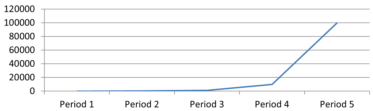
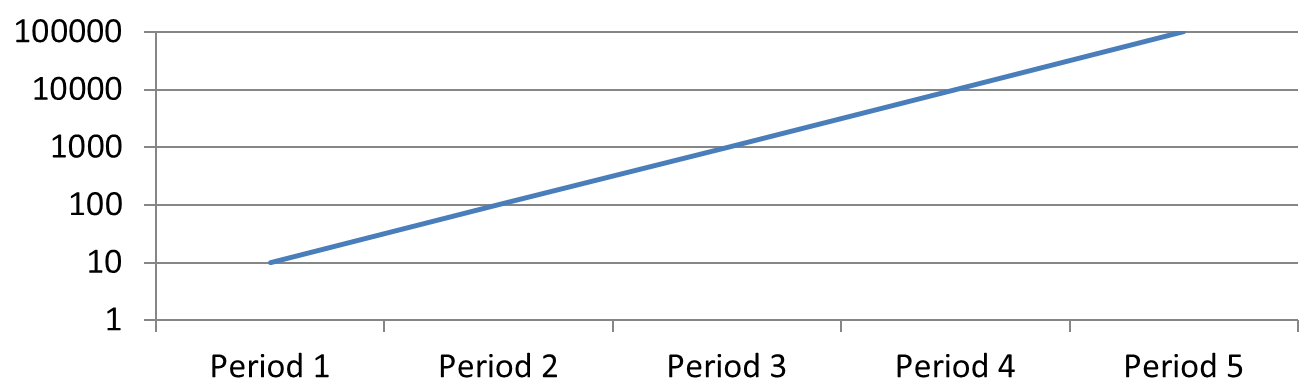
当正值跨越多个数量级时,对数数值坐标轴非常有用。例如,某服务在五个周期内分别收到 10、100、1,000、10,000 和 100,000 次请求。在线性尺度下,较小的数值会聚集在靠近零的位置。对数尺度使它们的相对增长更易比较:等距代表等比例而非等差。
在数值坐标轴上调用setLogarithmic并传入true,使用setLogBase选择基数。这会改变现有数值的显示方式,但不修改数据也不会添加对数趋势线。趋势线是对数据进行拟合的独立功能。
选择数值坐标轴和基数
对于折线图或柱形图,数值坐标轴由getVerticalAxis返回。对于水平条形图,则由getHorizontalAxis返回。散点图和气泡图有两个数值坐标轴,分别选择水平坐标轴用于 X 值,垂直坐标轴用于 Y 值,或两者皆选。不要对类别坐标轴使用对数缩放。
默认的对数基数为 10。对于 PPTX 图表,基数可取 2 到 1000(含)之间的整数,亦支持 2.5 等小数。基数为 10 时,10、100、1,000、10,000 等幂次在图表上等距分布。
对比线性和对数缩放
以下独立示例在第一张幻灯片上创建一个包含五个请求计数的折线图,然后克隆该幻灯片并在第二张上启用基数为 10 的对数数值坐标轴。两张幻灯片保留相同数据。
use aspose\slides\ChartType;
use aspose\slides\Presentation;
use aspose\slides\SaveFormat;

$presentation = new Presentation();
try {
    $slide = $presentation->getSlides()->get_Item(0);

    $chart = $slide->getShapes()->addChart(ChartType::Line, 30, 40, 660, 200);

    $chart->setLegend(false);

    $chart->getChartData()->getCategories()->clear();
    $chart->getChartData()->getSeries()->clear();

    $workbook = $chart->getChartData()->getChartDataWorkbook();
    $workbook->clear(0);

    $series = $chart->getChartData()->getSeries()->add(ChartType::Line);
    $values = [10, 100, 1000, 10000, 100000];

    for ($i = 0; $i < count($values); $i++) {
        $categoryCell = $workbook->getCell(0, $i + 1, 0, "Period " . ($i + 1));
        $chart->getChartData()->getCategories()->add($categoryCell);

        $valueCell = $workbook->getCell(0, $i + 1, 1, $values[$i]);
        $series->getDataPoints()->addDataPointForLineSeries($valueCell);
    }

    // 保持第一张幻灯片为线性,仅更改副本的数值轴比例。
    $logarithmicSlide = $presentation->getSlides()->addClone($slide);
    $logarithmicChart = $logarithmicSlide->getShapes()->get_Item(0);
    $valueAxis = $logarithmicChart->getAxes()->getVerticalAxis();
    $valueAxis->setLogarithmic(true);
    $valueAxis->setLogBase(10);

    $presentation->save("LogarithmicAxis.pptx", SaveFormat::Pptx);
} finally {
    $presentation->dispose();
}
线性尺度(第 1 张幻灯片): 等垂直距离代表请求计数的等差。最大值主导图表,使较小的值难以辨别。
对数尺度(第 2 张幻灯片): 等垂直距离代表等比例。每个周期的请求数是前一个周期的十倍,因此在基数为 10 的尺度上点形成一条直线上升线。坐标轴标签仍显示原始请求计数。
处理零值和负值
对数尺度只能显示严格正值。启用前请检查数据。如果零或负值具有意义,请保留线性尺度或单独显示它们。若在分析中排除这些值,请说明理由。不要悄悄将它们替换为小的正数,因为这会改变数据含义。对数坐标轴的任何手动最小值或最大值也必须为正。
常见问答
如何设置一个坐标轴与另一个坐标轴相交的数值(坐标轴交叉点)?
使用setCrossType选择交叉行为。若要指定数值交叉点,请使用setCrossAt。这些设置可将坐标轴交叉位置移动到合适的基准线上。
如何相对于坐标轴定位刻度标签?
调用setTickLabelPosition并使用TickLabelPositionType的 Low、High、NextTo 或 None。若要控制刻度线本身,请使用setMajorTickMark或setMinorTickMark,它们与标签位置独立。