
Tạo hoặc Cập nhật biểu đồ PowerPoint trong JavaScript
Tổng quan
Bài viết này cung cấp hướng dẫn toàn diện về cách tạo và tùy chỉnh biểu đồ bằng Aspose.Slides. Bạn sẽ học cách thêm biểu đồ vào một slide bằng mã, cung cấp dữ liệu cho nó và áp dụng các tùy chọn định dạng khác nhau để đáp ứng yêu cầu thiết kế cụ thể của bạn. Trong suốt bài viết, các ví dụ mã chi tiết minh họa từng bước, từ việc khởi tạo đối tượng Presentation và Chart cho tới cấu hình series, trục và chú giải. Khi làm theo hướng dẫn này, bạn sẽ nắm vững cách tích hợp việc tạo biểu đồ động vào ứng dụng của mình, tối ưu hoá quá trình tạo các bản thuyết trình dựa trên dữ liệu.
Tạo biểu đồ
Biểu đồ giúp mọi người nhanh chóng trực quan hoá dữ liệu và nắm bắt những hiểu biết mà có thể không ngay lập tức rõ ràng từ một bảng hoặc bảng tính.
Tại sao nên tạo biểu đồ?
- tổng hợp, cô nén hoặc tóm tắt lượng lớn dữ liệu trên một slide duy nhất trong bản thuyết trình
- hiển thị các mẫu và xu hướng trong dữ liệu
- suy ra hướng và động lực của dữ liệu theo thời gian hoặc so với một đơn vị đo cụ thể
- phát hiện các giá trị ngoại lệ, sai lệch, lệch chuẩn, lỗi, dữ liệu vô nghĩa, v.v.
- truyền đạt hoặc trình bày dữ liệu phức tạp
Trong PowerPoint, bạn có thể tạo biểu đồ qua chức năng Insert, cung cấp các mẫu để thiết kế nhiều loại biểu đồ. Sử dụng Aspose.Slides, bạn có thể tạo cả biểu đồ thường (dựa trên các loại biểu đồ phổ biến) và biểu đồ tùy chỉnh.
Note
To create charts, use the ChartType class. The fields in this class correspond to different chart types.Tạo biểu đồ cột cụm
Phần này giải thích cách tạo biểu đồ cột cụm bằng Aspose.Slides. Bạn sẽ học cách khởi tạo một presentation, thêm một biểu đồ và tùy chỉnh các thành phần như tiêu đề, dữ liệu, series, danh mục và kiểu dáng. Thực hiện các bước dưới đây để xem cách một biểu đồ cột cụm tiêu chuẩn được tạo ra:
- Tạo một thể hiện của lớp Presentation .
- Lấy tham chiếu đến một slide bằng chỉ mục của nó.
- Thêm một biểu đồ với một số dữ liệu và chỉ định kiểu
ChartType.ClusteredColumn. - Thêm tiêu đề cho biểu đồ.
- Truy cập worksheet dữ liệu của biểu đồ.
- Xóa tất cả series và danh mục mặc định.
- Thêm series và danh mục mới.
- Thêm dữ liệu biểu đồ mới cho series.
- Áp dụng màu nền cho series biểu đồ.
- Thêm nhãn cho series biểu đồ.
- Lưu presentation đã sửa thành tệp PPTX .
This C# code demonstrates how to create a clustered column chart:
var aspose = aspose || {};
aspose.slides = require("aspose.slides.via.java");
const java = require("java");

// Khởi tạo một lớp presentation đại diện cho tệp PPTX
var pres = new aspose.slides.Presentation();
try {
    // Truy cập slide đầu tiên
    var sld = pres.getSlides().get_Item(0);
    // Thêm một biểu đồ với dữ liệu mặc định của nó
    var chart = sld.getShapes().addChart(aspose.slides.ChartType.ClusteredColumn, 0, 0, 500, 500);
    // Đặt tiêu đề cho biểu đồ
    chart.setTitle(true);
    chart.getChartTitle().addTextFrameForOverriding("Sample Title");
    chart.getChartTitle().getTextFrameForOverriding().getTextFrameFormat().setCenterText(java.newByte(aspose.slides.NullableBool.True));
    chart.getChartTitle().setHeight(20);
    // Đặt series đầu tiên hiển thị giá trị
    chart.getChartData().getSeries().get_Item(0).getLabels().getDefaultDataLabelFormat().setShowValue(true);
    // Đặt chỉ mục cho sheet dữ liệu của biểu đồ
    var defaultWorksheetIndex = 0;
    // Lấy WorkSheet dữ liệu biểu đồ
    var fact = chart.getChartData().getChartDataWorkbook();
    // Xóa các series và danh mục được tạo mặc định
    chart.getChartData().getSeries().clear();
    chart.getChartData().getCategories().clear();
    var s = chart.getChartData().getSeries().size();
    s = chart.getChartData().getCategories().size();
    // Thêm series mới
    chart.getChartData().getSeries().add(fact.getCell(defaultWorksheetIndex, 0, 1, "Series 1"), chart.getType());
    chart.getChartData().getSeries().add(fact.getCell(defaultWorksheetIndex, 0, 2, "Series 2"), chart.getType());
    // Thêm danh mục mới
    chart.getChartData().getCategories().add(fact.getCell(defaultWorksheetIndex, 1, 0, "Caetegoty 1"));
    chart.getChartData().getCategories().add(fact.getCell(defaultWorksheetIndex, 2, 0, "Caetegoty 2"));
    chart.getChartData().getCategories().add(fact.getCell(defaultWorksheetIndex, 3, 0, "Caetegoty 3"));
    // Lấy series biểu đồ đầu tiên
    var series = chart.getChartData().getSeries().get_Item(0);
    // Bây giờ điền dữ liệu cho series
    series.getDataPoints().addDataPointForBarSeries(fact.getCell(defaultWorksheetIndex, 1, 1, 20));
    series.getDataPoints().addDataPointForBarSeries(fact.getCell(defaultWorksheetIndex, 2, 1, 50));
    series.getDataPoints().addDataPointForBarSeries(fact.getCell(defaultWorksheetIndex, 3, 1, 30));
    // Đặt màu nền cho series
    series.getFormat().getFill().setFillType(java.newByte(aspose.slides.FillType.Solid));
    series.getFormat().getFill().getSolidFillColor().setColor(java.getStaticFieldValue("java.awt.Color", "RED"));
    // Lấy series biểu đồ thứ hai
    series = chart.getChartData().getSeries().get_Item(1);
    // Điền dữ liệu cho series
    series.getDataPoints().addDataPointForBarSeries(fact.getCell(defaultWorksheetIndex, 1, 2, 30));
    series.getDataPoints().addDataPointForBarSeries(fact.getCell(defaultWorksheetIndex, 2, 2, 10));
    series.getDataPoints().addDataPointForBarSeries(fact.getCell(defaultWorksheetIndex, 3, 2, 60));
    // Đặt màu nền cho series
    series.getFormat().getFill().setFillType(java.newByte(aspose.slides.FillType.Solid));
    series.getFormat().getFill().getSolidFillColor().setColor(java.getStaticFieldValue("java.awt.Color", "GREEN"));
    // Tạo nhãn tùy chỉnh cho từng danh mục cho series mới
    // Đặt nhãn đầu tiên hiển thị tên danh mục
    var lbl = series.getDataPoints().get_Item(0).getLabel();
    lbl.getDataLabelFormat().setShowCategoryName(true);
    lbl = series.getDataPoints().get_Item(1).getLabel();
    lbl.getDataLabelFormat().setShowSeriesName(true);
    // Hiển thị giá trị cho nhãn thứ ba
    lbl = series.getDataPoints().get_Item(2).getLabel();
    lbl.getDataLabelFormat().setShowValue(true);
    lbl.getDataLabelFormat().setShowSeriesName(true);
    lbl.getDataLabelFormat().setSeparator("/");
    // Saves the presentation with chart
    pres.save("output.pptx", aspose.slides.SaveFormat.Pptx);
} finally {
    if (pres != null) {
        pres.dispose();
    }
}
Tạo biểu đồ phân tán
Biểu đồ scatter (cũng được gọi là biểu đồ phân tán hoặc đồ thị x-y) thường được sử dụng để kiểm tra các mẫu hoặc chứng minh mối tương quan giữa hai biến.
Use a scatter chart when:
- bạn có dữ liệu số cặp đôi
- bạn có hai biến tương thích với nhau
- bạn muốn xác định liệu hai biến có liên quan hay không
- bạn có một biến độc lập có nhiều giá trị cho một biến phụ thuộc
- Follow the steps in Create Clustered Column Charts.
- For the third step, add a chart with some data and specify your chart type as one of the following:
- ChartType.ScatterWithMarkers - Đại diện cho một biểu đồ scatter.
- ChartType.ScatterWithSmoothLinesAndMarkers - Đại diện cho một biểu đồ scatter được nối bằng các đường cong, có ký hiệu dữ liệu.
- ChartType.ScatterWithSmoothLines - Đại diện cho một biểu đồ scatter được nối bằng các đường cong, không có ký hiệu dữ liệu.
- ChartType.ScatterWithStraightLinesAndMarkers - Đại diện cho một biểu đồ scatter được nối bằng các đường thẳng, có ký hiệu dữ liệu.
- ChartType.ScatterWithStraightLines - Đại diện cho một biểu đồ scatter được nối bằng các đường thẳng, không có ký hiệu dữ liệu.
This JavaScript code shows how to create a scatter chart with different markers for each series:
var aspose = aspose || {};
aspose.slides = require("aspose.slides.via.java");

// Khởi tạo một lớp presentation đại diện cho tệp PPTX
var pres = new aspose.slides.Presentation();
try {
    // Truy cập slide đầu tiên
    var slide = pres.getSlides().get_Item(0);
    // Tạo biểu đồ mặc định
    var chart = slide.getShapes().addChart(aspose.slides.ChartType.ScatterWithSmoothLines, 0, 0, 400, 400);
    // Lấy chỉ mục worksheet dữ liệu biểu đồ mặc định
    var defaultWorksheetIndex = 0;
    // Lấy worksheet dữ liệu biểu đồ
    var fact = chart.getChartData().getChartDataWorkbook();
    // Xóa series demo
    chart.getChartData().getSeries().clear();
    // Thêm series mới
    chart.getChartData().getSeries().add(fact.getCell(defaultWorksheetIndex, 1, 1, "Series 1"), chart.getType());
    chart.getChartData().getSeries().add(fact.getCell(defaultWorksheetIndex, 1, 3, "Series 2"), chart.getType());
    // Lấy series biểu đồ đầu tiên
    var series = chart.getChartData().getSeries().get_Item(0);
    // Thêm một điểm mới (1:3) vào series
    series.getDataPoints().addDataPointForScatterSeries(fact.getCell(defaultWorksheetIndex, 2, 1, 1), fact.getCell(defaultWorksheetIndex, 2, 2, 3));
    // Thêm một điểm mới (2:10)
    series.getDataPoints().addDataPointForScatterSeries(fact.getCell(defaultWorksheetIndex, 3, 1, 2), fact.getCell(defaultWorksheetIndex, 3, 2, 10));
    // Thay đổi kiểu series
    series.setType(aspose.slides.ChartType.ScatterWithStraightLinesAndMarkers);
    // Thay đổi marker của series biểu đồ
    series.getMarker().setSize(10);
    series.getMarker().setSymbol(aspose.slides.MarkerStyleType.Star);
    // Lấy series biểu đồ thứ hai
    series = chart.getChartData().getSeries().get_Item(1);
    // Thêm một điểm mới (5:2) tại đây
    series.getDataPoints().addDataPointForScatterSeries(fact.getCell(defaultWorksheetIndex, 2, 3, 5), fact.getCell(defaultWorksheetIndex, 2, 4, 2));
    // Thêm một điểm mới (3:1)
    series.getDataPoints().addDataPointForScatterSeries(fact.getCell(defaultWorksheetIndex, 3, 3, 3), fact.getCell(defaultWorksheetIndex, 3, 4, 1));
    // Thêm một điểm mới (2:2)
    series.getDataPoints().addDataPointForScatterSeries(fact.getCell(defaultWorksheetIndex, 4, 3, 2), fact.getCell(defaultWorksheetIndex, 4, 4, 2));
    // Thêm một điểm mới (5:1)
    series.getDataPoints().addDataPointForScatterSeries(fact.getCell(defaultWorksheetIndex, 5, 3, 5), fact.getCell(defaultWorksheetIndex, 5, 4, 1));
    // Thay đổi marker của series biểu đồ
    series.getMarker().setSize(10);
    series.getMarker().setSymbol(aspose.slides.MarkerStyleType.Circle);
    pres.save("AsposeChart_out.pptx", aspose.slides.SaveFormat.Pptx);
} finally {
    if (pres != null) {
        pres.dispose();
    }
}
Tạo biểu đồ Tròn
Biểu đồ tròn được sử dụng tốt nhất để hiển thị mối quan hệ phần/tràn trong dữ liệu, đặc biệt khi dữ liệu chứa các nhãn phân loại với giá trị số. Tuy nhiên, nếu dữ liệu của bạn có nhiều phần hoặc nhãn, bạn có thể cân nhắc sử dụng biểu đồ cột thay thế.
- Tạo một thể hiện của lớp Presentation .
- Lấy tham chiếu đến một slide bằng chỉ mục của nó.
- Thêm một biểu đồ với dữ liệu mặc định và chỉ định kiểu ChartType.Pie .
- Truy cập workbook dữ liệu biểu đồ ChartDataWorkbook .
- Xóa series và danh mục mặc định.
- Thêm series và danh mục mới.
- Thêm dữ liệu biểu đồ mới cho series.
- Thêm các điểm mới cho biểu đồ và áp dụng màu tùy chỉnh cho các sector của biểu đồ tròn.
- Đặt nhãn cho series.
- Bật đường dẫn (leader lines) cho nhãn series.
- Đặt góc quay cho các sector của biểu đồ tròn.
- Lưu presentation đã chỉnh sửa thành tệp PPTX .
This JavaScript code shows how to create a pie chart:
var aspose = aspose || {};
aspose.slides = require("aspose.slides.via.java");
const java = require("java");

// Khởi tạo một lớp presentation đại diện cho tệp PPTX
var pres = new aspose.slides.Presentation();
try {
    // Truy cập slide đầu tiên
    var slides = pres.getSlides().get_Item(0);
    // Thêm một biểu đồ với dữ liệu mặc định
    var chart = slides.getShapes().addChart(aspose.slides.ChartType.Pie, 100, 100, 400, 400);
    // Đặt tiêu đề cho biểu đồ
    chart.getChartTitle().addTextFrameForOverriding("Sample Title");
    chart.getChartTitle().getTextFrameForOverriding().getTextFrameFormat().setCenterText(java.newByte(aspose.slides.NullableBool.True));
    chart.getChartTitle().setHeight(20);
    chart.setTitle(true);
    // Đặt series đầu tiên hiển thị giá trị
    chart.getChartData().getSeries().get_Item(0).getLabels().getDefaultDataLabelFormat().setShowValue(true);
    // Đặt chỉ mục cho sheet dữ liệu của biểu đồ
    var defaultWorksheetIndex = 0;
    // Lấy worksheet dữ liệu biểu đồ
    var fact = chart.getChartData().getChartDataWorkbook();
    // Xóa các series và danh mục được tạo mặc định
    chart.getChartData().getSeries().clear();
    chart.getChartData().getCategories().clear();
    // Thêm các danh mục mới
    chart.getChartData().getCategories().add(fact.getCell(0, 1, 0, "First Qtr"));
    chart.getChartData().getCategories().add(fact.getCell(0, 2, 0, "2nd Qtr"));
    chart.getChartData().getCategories().add(fact.getCell(0, 3, 0, "3rd Qtr"));
    // Thêm series mới
    var series = chart.getChartData().getSeries().add(fact.getCell(0, 0, 1, "Series 1"), chart.getType());
    // Điền dữ liệu cho series
    series.getDataPoints().addDataPointForPieSeries(fact.getCell(defaultWorksheetIndex, 1, 1, 20));
    series.getDataPoints().addDataPointForPieSeries(fact.getCell(defaultWorksheetIndex, 2, 1, 50));
    series.getDataPoints().addDataPointForPieSeries(fact.getCell(defaultWorksheetIndex, 3, 1, 30));
    // Không hoạt động trong phiên bản mới
    // Thêm các điểm mới và đặt màu cho sector
    // series.IsColorVaried = true;
    chart.getChartData().getSeriesGroups().get_Item(0).setColorVaried(true);
    var point = series.getDataPoints().get_Item(0);
    point.getFormat().getFill().setFillType(java.newByte(aspose.slides.FillType.Solid));
    point.getFormat().getFill().getSolidFillColor().setColor(java.getStaticFieldValue("java.awt.Color", "CYAN"));
    // Đặt biên giới của sector
    point.getFormat().getLine().getFillFormat().setFillType(java.newByte(aspose.slides.FillType.Solid));
    point.getFormat().getLine().getFillFormat().getSolidFillColor().setColor(java.getStaticFieldValue("java.awt.Color", "GRAY"));
    point.getFormat().getLine().setWidth(3.0);
    point.getFormat().getLine().setStyle(java.newByte(aspose.slides.LineStyle.ThinThick));
    point.getFormat().getLine().setDashStyle(java.newByte(aspose.slides.LineDashStyle.DashDot));
    var point1 = series.getDataPoints().get_Item(1);
    point1.getFormat().getFill().setFillType(java.newByte(aspose.slides.FillType.Solid));
    point1.getFormat().getFill().getSolidFillColor().setColor(java.getStaticFieldValue("java.awt.Color", "ORANGE"));
    // Đặt biên giới của sector
    point1.getFormat().getLine().getFillFormat().setFillType(java.newByte(aspose.slides.FillType.Solid));
    point1.getFormat().getLine().getFillFormat().getSolidFillColor().setColor(java.getStaticFieldValue("java.awt.Color", "BLUE"));
    point1.getFormat().getLine().setWidth(3.0);
    point1.getFormat().getLine().setStyle(java.newByte(aspose.slides.LineStyle.Single));
    point1.getFormat().getLine().setDashStyle(java.newByte(aspose.slides.LineDashStyle.LargeDashDot));
    var point2 = series.getDataPoints().get_Item(2);
    point2.getFormat().getFill().setFillType(java.newByte(aspose.slides.FillType.Solid));
    point2.getFormat().getFill().getSolidFillColor().setColor(java.getStaticFieldValue("java.awt.Color", "YELLOW"));
    // Đặt biên giới của sector
    point2.getFormat().getLine().getFillFormat().setFillType(java.newByte(aspose.slides.FillType.Solid));
    point2.getFormat().getLine().getFillFormat().getSolidFillColor().setColor(java.getStaticFieldValue("java.awt.Color", "RED"));
    point2.getFormat().getLine().setWidth(2.0);
    point2.getFormat().getLine().setStyle(java.newByte(aspose.slides.LineStyle.ThinThin));
    point2.getFormat().getLine().setDashStyle(java.newByte(aspose.slides.LineDashStyle.LargeDashDotDot));
    // Tạo nhãn tùy chỉnh cho từng danh mục cho series mới
    var lbl1 = series.getDataPoints().get_Item(0).getLabel();
    // lbl.ShowCategoryName = true;
    lbl1.getDataLabelFormat().setShowValue(true);
    var lbl2 = series.getDataPoints().get_Item(1).getLabel();
    lbl2.getDataLabelFormat().setShowValue(true);
    lbl2.getDataLabelFormat().setShowLegendKey(true);
    lbl2.getDataLabelFormat().setShowPercentage(true);
    var lbl3 = series.getDataPoints().get_Item(2).getLabel();
    lbl3.getDataLabelFormat().setShowSeriesName(true);
    lbl3.getDataLabelFormat().setShowPercentage(true);
    // Hiển thị Leader Lines cho biểu đồ
    series.getLabels().getDefaultDataLabelFormat().setShowLeaderLines(true);
    // Đặt góc quay cho các sector của biểu đồ tròn
    chart.getChartData().getSeriesGroups().get_Item(0).setFirstSliceAngle(180);
    // Lưu presentation có biểu đồ
    pres.save("PieChart_out.pptx", aspose.slides.SaveFormat.Pptx);
} finally {
    if (pres != null) {
        pres.dispose();
    }
}
Tạo biểu đồ Đường
Biểu đồ đường (còn gọi là đồ thị đường) được sử dụng tốt nhất trong các trường hợp bạn muốn minh họa sự thay đổi giá trị theo thời gian. Sử dụng biểu đồ đường, bạn có thể so sánh một lượng lớn dữ liệu cùng lúc, theo dõi thay đổi và xu hướng theo thời gian, làm nổi bật các bất thường trong series dữ liệu, và hơn thế nữa.
- Tạo một thể hiện của lớp Presentation .
- Lấy tham chiếu đến một slide bằng chỉ mục của nó.
- Thêm một biểu đồ với dữ liệu mặc định và chỉ định kiểu ChartType.Line .
- Truy cập workbook dữ liệu biểu đồ (ChartDataWorkbook).
- Xóa series và danh mục mặc định.
- Thêm series và danh mục mới.
- Thêm dữ liệu biểu đồ mới cho series.
- Lưu presentation đã chỉnh sửa thành tệp PPTX .
This JavaScript code shows how to create a line chart:
var aspose = aspose || {};
aspose.slides = require("aspose.slides.via.java");

var pres = new aspose.slides.Presentation();
try {
    var lineChart = pres.getSlides().get_Item(0).getShapes().addChart(aspose.slides.ChartType.Line, 10, 50, 600, 350);
    pres.save("lineChart.pptx", aspose.slides.SaveFormat.Pptx);
} finally {
    if (pres != null) {
        pres.dispose();
    }
}
Theo mặc định, các điểm trên biểu đồ đường được nối bằng các đường thẳng liên tục. Nếu bạn muốn các điểm được nối bằng các dấu gạch nối thay vì, bạn có thể chỉ định kiểu gạch nối ưa thích như sau:
var aspose = aspose || {};
aspose.slides = require("aspose.slides.via.java");
const java = require("java");

var pres = new aspose.slides.Presentation();
try {
    var lineChart = pres.getSlides().get_Item(0).getShapes().addChart(aspose.slides.ChartType.Line, 10, 50, 600, 350);
    for (let i = 0; i < lineChart.getChartData().getSeries().size(); i++) {
        let series = lineChart.getChartData().getSeries().get_Item(i);
        series.getFormat().getLine().setDashStyle(java.newByte(aspose.slides.LineDashStyle.Dash));
    }
    pres.save("lineChart.pptx", aspose.slides.SaveFormat.Pptx);
} finally {
    if (pres != null) {
        pres.dispose();
    }
}
Tạo biểu đồ Tree Map
Biểu đồ cây được dùng tốt nhất cho dữ liệu bán hàng khi bạn muốn hiển thị kích thước tương đối của các danh mục dữ liệu và nhanh chóng thu hút sự chú ý đến các mục có đóng góp lớn trong mỗi danh mục.
- Tạo một thể hiện của lớp Presentation .
- Lấy tham chiếu đến một slide bằng chỉ mục của nó.
- Thêm một biểu đồ với dữ liệu mặc định và chỉ định kiểu ChartType.Treemap .
- Truy cập workbook dữ liệu biểu đồ ChartDataWorkbook .
- Xóa series và danh mục mặc định.
- Thêm series và danh mục mới.
- Thêm dữ liệu biểu đồ mới cho series.
- Lưu presentation đã chỉnh sửa thành tệp PPTX .
This JavaScript code shows how to create a tree map chart:
var aspose = aspose || {};
aspose.slides = require("aspose.slides.via.java");

var pres = new aspose.slides.Presentation();
try {
    var chart = pres.getSlides().get_Item(0).getShapes().addChart(aspose.slides.ChartType.Treemap, 50, 50, 500, 400);
    chart.getChartData().getCategories().clear();
    chart.getChartData().getSeries().clear();
    var wb = chart.getChartData().getChartDataWorkbook();
    wb.clear(0);
    // nhánh 1
    var leaf = chart.getChartData().getCategories().add(wb.getCell(0, "C1", "Leaf1"));
    leaf.getGroupingLevels().setGroupingItem(1, "Stem1");
    leaf.getGroupingLevels().setGroupingItem(2, "Branch1");
    chart.getChartData().getCategories().add(wb.getCell(0, "C2", "Leaf2"));
    leaf = chart.getChartData().getCategories().add(wb.getCell(0, "C3", "Leaf3"));
    leaf.getGroupingLevels().setGroupingItem(1, "Stem2");
    chart.getChartData().getCategories().add(wb.getCell(0, "C4", "Leaf4"));
    // nhánh 2
    leaf = chart.getChartData().getCategories().add(wb.getCell(0, "C5", "Leaf5"));
    leaf.getGroupingLevels().setGroupingItem(1, "Stem3");
    leaf.getGroupingLevels().setGroupingItem(2, "Branch2");
    chart.getChartData().getCategories().add(wb.getCell(0, "C6", "Leaf6"));
    leaf = chart.getChartData().getCategories().add(wb.getCell(0, "C7", "Leaf7"));
    leaf.getGroupingLevels().setGroupingItem(1, "Stem4");
    chart.getChartData().getCategories().add(wb.getCell(0, "C8", "Leaf8"));
    var series = chart.getChartData().getSeries().add(aspose.slides.ChartType.Treemap);
    series.getLabels().getDefaultDataLabelFormat().setShowCategoryName(true);
    series.getDataPoints().addDataPointForTreemapSeries(wb.getCell(0, "D1", 4));
    series.getDataPoints().addDataPointForTreemapSeries(wb.getCell(0, "D2", 5));
    series.getDataPoints().addDataPointForTreemapSeries(wb.getCell(0, "D3", 3));
    series.getDataPoints().addDataPointForTreemapSeries(wb.getCell(0, "D4", 6));
    series.getDataPoints().addDataPointForTreemapSeries(wb.getCell(0, "D5", 9));
    series.getDataPoints().addDataPointForTreemapSeries(wb.getCell(0, "D6", 9));
    series.getDataPoints().addDataPointForTreemapSeries(wb.getCell(0, "D7", 4));
    series.getDataPoints().addDataPointForTreemapSeries(wb.getCell(0, "D8", 3));
    series.setParentLabelLayout(aspose.slides.ParentLabelLayoutType.Overlapping);
    pres.save("Treemap.pptx", aspose.slides.SaveFormat.Pptx);
} finally {
    if (pres != null) {
        pres.dispose();
    }
}
Tạo biểu đồ Cổ phiếu
- Tạo một thể hiện của lớp Presentation .
- Lấy tham chiếu đến một slide bằng chỉ mục của nó.
- Thêm một biểu đồ với dữ liệu mặc định và chỉ định kiểu ChartType.OpenHighLowClose .
- Truy cập workbook dữ liệu biểu đồ ChartDataWorkbook .
- Xóa series và danh mục mặc định.
- Thêm series và danh mục mới.
- Thêm dữ liệu biểu đồ mới cho series.
- Chỉ định định dạng các đường cao-thấp.
- Lưu presentation đã chỉnh sửa thành tệp PPTX .
This JavaScript code shows how to create a stock chart:
var aspose = aspose || {};
aspose.slides = require("aspose.slides.via.java");
const java = require("java");

var pres = new aspose.slides.Presentation();
try {
    var chart = pres.getSlides().get_Item(0).getShapes().addChart(aspose.slides.ChartType.OpenHighLowClose, 50, 50, 600, 400);

    chart.getChartData().getCategories().clear();
    chart.getChartData().getSeries().clear();
    var wb = chart.getChartData().getChartDataWorkbook();
    wb.clear(0);
    chart.getChartData().getCategories().add(wb.getCell(0, 1, 0, "A"));
    chart.getChartData().getCategories().add(wb.getCell(0, 2, 0, "B"));
    chart.getChartData().getCategories().add(wb.getCell(0, 3, 0, "C"));
    chart.getChartData().getSeries().add(wb.getCell(0, 0, 1, "Open"), chart.getType());
    chart.getChartData().getSeries().add(wb.getCell(0, 0, 2, "High"), chart.getType());
    chart.getChartData().getSeries().add(wb.getCell(0, 0, 3, "Low"), chart.getType());
    chart.getChartData().getSeries().add(wb.getCell(0, 0, 4, "Close"), chart.getType());
    var series = chart.getChartData().getSeries().get_Item(0);
    series.getDataPoints().addDataPointForStockSeries(wb.getCell(0, 1, 1, 72));
    series.getDataPoints().addDataPointForStockSeries(wb.getCell(0, 2, 1, 25));
    series.getDataPoints().addDataPointForStockSeries(wb.getCell(0, 3, 1, 38));
    series = chart.getChartData().getSeries().get_Item(1);
    series.getDataPoints().addDataPointForStockSeries(wb.getCell(0, 1, 2, 172));
    series.getDataPoints().addDataPointForStockSeries(wb.getCell(0, 2, 2, 57));
    series.getDataPoints().addDataPointForStockSeries(wb.getCell(0, 3, 2, 57));
    series = chart.getChartData().getSeries().get_Item(2);
    series.getDataPoints().addDataPointForStockSeries(wb.getCell(0, 1, 3, 12));
    series.getDataPoints().addDataPointForStockSeries(wb.getCell(0, 2, 3, 12));
    series.getDataPoints().addDataPointForStockSeries(wb.getCell(0, 3, 3, 13));
    series = chart.getChartData().getSeries().get_Item(3);
    series.getDataPoints().addDataPointForStockSeries(wb.getCell(0, 1, 4, 25));
    series.getDataPoints().addDataPointForStockSeries(wb.getCell(0, 2, 4, 38));
    series.getDataPoints().addDataPointForStockSeries(wb.getCell(0, 3, 4, 50));
    chart.getChartData().getSeriesGroups().get_Item(0).getUpDownBars().setUpDownBars(true);
    chart.getChartData().getSeriesGroups().get_Item(0).getHiLowLinesFormat().getLine().getFillFormat().setFillType(java.newByte(aspose.slides.FillType.Solid));
    for (let i = 0; i < chart.getChartData().getSeries().size(); i++) {
        let ser = chart.getChartData().getSeries().get_Item(i);
        ser.getFormat().getLine().getFillFormat().setFillType(java.newByte(aspose.slides.FillType.NoFill));
    }
    pres.save("output.pptx", aspose.slides.SaveFormat.Pptx);
} finally {
    if (pres != null) {
        pres.dispose();
    }
}
Tạo biểu đồ hộp và râu
- Tạo một thể hiện của lớp Presentation .
- Lấy tham chiếu đến một slide bằng chỉ mục của nó.
- Thêm một biểu đồ với dữ liệu mặc định và chỉ định kiểu ChartType.BoxAndWhisker .
- Truy cập workbook dữ liệu biểu đồ ChartDataWorkbook .
- Xóa series và danh mục mặc định.
- Thêm series và danh mục mới.
- Thêm dữ liệu biểu đồ mới cho series.
- Lưu presentation đã chỉnh sửa thành tệp PPTX .
This JavaScript code shows how to create a box and whisker chart:
var aspose = aspose || {};
aspose.slides = require("aspose.slides.via.java");

var pres = new aspose.slides.Presentation();
try {
    var chart = pres.getSlides().get_Item(0).getShapes().addChart(aspose.slides.ChartType.BoxAndWhisker, 50, 50, 500, 400);
    chart.getChartData().getCategories().clear();
    chart.getChartData().getSeries().clear();
    var wb = chart.getChartData().getChartDataWorkbook();
    wb.clear(0);
    chart.getChartData().getCategories().add(wb.getCell(0, "A1", "Category 1"));
    chart.getChartData().getCategories().add(wb.getCell(0, "A2", "Category 1"));
    chart.getChartData().getCategories().add(wb.getCell(0, "A3", "Category 1"));
    chart.getChartData().getCategories().add(wb.getCell(0, "A4", "Category 1"));
    chart.getChartData().getCategories().add(wb.getCell(0, "A5", "Category 1"));
    chart.getChartData().getCategories().add(wb.getCell(0, "A6", "Category 1"));
    var series = chart.getChartData().getSeries().add(aspose.slides.ChartType.BoxAndWhisker);
    series.setQuartileMethod(aspose.slides.QuartileMethodType.Exclusive);
    series.setShowMeanLine(true);
    series.setShowMeanMarkers(true);
    series.setShowInnerPoints(true);
    series.setShowOutlierPoints(true);
    series.getDataPoints().addDataPointForBoxAndWhiskerSeries(wb.getCell(0, "B1", 15));
    series.getDataPoints().addDataPointForBoxAndWhiskerSeries(wb.getCell(0, "B2", 41));
    series.getDataPoints().addDataPointForBoxAndWhiskerSeries(wb.getCell(0, "B3", 16));
    series.getDataPoints().addDataPointForBoxAndWhiskerSeries(wb.getCell(0, "B4", 10));
    series.getDataPoints().addDataPointForBoxAndWhiskerSeries(wb.getCell(0, "B5", 23));
    series.getDataPoints().addDataPointForBoxAndWhiskerSeries(wb.getCell(0, "B6", 16));
    pres.save("BoxAndWhisker.pptx", aspose.slides.SaveFormat.Pptx);
} finally {
    if (pres != null) {
        pres.dispose();
    }
}
Tạo biểu đồ Phễu
- Tạo một thể hiện của lớp Presentation .
- Lấy tham chiếu đến một slide bằng chỉ mục của nó.
- Thêm một biểu đồ với dữ liệu mặc định và chỉ định kiểu ChartType.Funnel .
- Lưu presentation đã chỉnh sửa thành tệp PPTX .
This JavaScript code shows how to create a funnel chart:
var aspose = aspose || {};
aspose.slides = require("aspose.slides.via.java");

var pres = new aspose.slides.Presentation();
try {
    var chart = pres.getSlides().get_Item(0).getShapes().addChart(aspose.slides.ChartType.Funnel, 50, 50, 500, 400);
    chart.getChartData().getCategories().clear();
    chart.getChartData().getSeries().clear();
    var wb = chart.getChartData().getChartDataWorkbook();
    wb.clear(0);
    chart.getChartData().getCategories().add(wb.getCell(0, "A1", "Category 1"));
    chart.getChartData().getCategories().add(wb.getCell(0, "A2", "Category 2"));
    chart.getChartData().getCategories().add(wb.getCell(0, "A3", "Category 3"));
    chart.getChartData().getCategories().add(wb.getCell(0, "A4", "Category 4"));
    chart.getChartData().getCategories().add(wb.getCell(0, "A5", "Category 5"));
    chart.getChartData().getCategories().add(wb.getCell(0, "A6", "Category 6"));
    var series = chart.getChartData().getSeries().add(aspose.slides.ChartType.Funnel);
    series.getDataPoints().addDataPointForFunnelSeries(wb.getCell(0, "B1", 50));
    series.getDataPoints().addDataPointForFunnelSeries(wb.getCell(0, "B2", 100));
    series.getDataPoints().addDataPointForFunnelSeries(wb.getCell(0, "B3", 200));
    series.getDataPoints().addDataPointForFunnelSeries(wb.getCell(0, "B4", 300));
    series.getDataPoints().addDataPointForFunnelSeries(wb.getCell(0, "B5", 400));
    series.getDataPoints().addDataPointForFunnelSeries(wb.getCell(0, "B6", 500));
    pres.save("Funnel.pptx", aspose.slides.SaveFormat.Pptx);
} finally {
    if (pres != null) {
        pres.dispose();
    }
}
Tạo biểu đồ Sunburst
- Tạo một thể hiện của lớp Presentation .
- Lấy tham chiếu đến một slide bằng chỉ mục của nó.
- Thêm một biểu đồ với dữ liệu mặc định và chỉ định kiểu ChartType.Sunburst .
- Lưu presentation đã chỉnh sửa thành tệp PPTX .
This JavaScript code shows how to create a sunburst chart:
var aspose = aspose || {};
aspose.slides = require("aspose.slides.via.java");

var pres = new aspose.slides.Presentation();
try {
    var chart = pres.getSlides().get_Item(0).getShapes().addChart(aspose.slides.ChartType.Sunburst, 50, 50, 500, 400);
    chart.getChartData().getCategories().clear();
    chart.getChartData().getSeries().clear();
    var wb = chart.getChartData().getChartDataWorkbook();
    wb.clear(0);
    // nhánh 1
    var leaf = chart.getChartData().getCategories().add(wb.getCell(0, "C1", "Leaf1"));
    leaf.getGroupingLevels().setGroupingItem(1, "Stem1");
    leaf.getGroupingLevels().setGroupingItem(2, "Branch1");
    chart.getChartData().getCategories().add(wb.getCell(0, "C2", "Leaf2"));
    leaf = chart.getChartData().getCategories().add(wb.getCell(0, "C3", "Leaf3"));
    leaf.getGroupingLevels().setGroupingItem(1, "Stem2");
    chart.getChartData().getCategories().add(wb.getCell(0, "C4", "Leaf4"));
    // nhánh 2
    leaf = chart.getChartData().getCategories().add(wb.getCell(0, "C5", "Leaf5"));
    leaf.getGroupingLevels().setGroupingItem(1, "Stem3");
    leaf.getGroupingLevels().setGroupingItem(2, "Branch2");
    chart.getChartData().getCategories().add(wb.getCell(0, "C6", "Leaf6"));
    leaf = chart.getChartData().getCategories().add(wb.getCell(0, "C7", "Leaf7"));
    leaf.getGroupingLevels().setGroupingItem(1, "Stem4");
    chart.getChartData().getCategories().add(wb.getCell(0, "C8", "Leaf8"));
    var series = chart.getChartData().getSeries().add(aspose.slides.ChartType.Sunburst);
    series.getLabels().getDefaultDataLabelFormat().setShowCategoryName(true);
    series.getDataPoints().addDataPointForSunburstSeries(wb.getCell(0, "D1", 4));
    series.getDataPoints().addDataPointForSunburstSeries(wb.getCell(0, "D2", 5));
    series.getDataPoints().addDataPointForSunburstSeries(wb.getCell(0, "D3", 3));
    series.getDataPoints().addDataPointForSunburstSeries(wb.getCell(0, "D4", 6));
    series.getDataPoints().addDataPointForSunburstSeries(wb.getCell(0, "D5", 9));
    series.getDataPoints().addDataPointForSunburstSeries(wb.getCell(0, "D6", 9));
    series.getDataPoints().addDataPointForSunburstSeries(wb.getCell(0, "D7", 4));
    series.getDataPoints().addDataPointForSunburstSeries(wb.getCell(0, "D8", 3));
    pres.save("Sunburst.pptx", aspose.slides.SaveFormat.Pptx);
} finally {
    if (pres != null) {
        pres.dispose();
    }
}
Tạo biểu đồ Histogram
- Tạo một thể hiện của lớp Presentation .
- Lấy tham chiếu đến một slide bằng chỉ mục của nó.
- Thêm một biểu đồ với dữ liệu mặc định và chỉ định kiểu ChartType.Histogram .
- Truy cập workbook dữ liệu biểu đồ ChartDataWorkbook .
- Xóa series và danh mục mặc định.
- Thêm series và danh mục mới.
- Lưu presentation đã chỉnh sửa thành tệp PPTX .
This JavaScript code shows how to create a histogram chart:
var aspose = aspose || {};
aspose.slides = require("aspose.slides.via.java");

var pres = new aspose.slides.Presentation();
var chart = pres.getSlides().get_Item(0).getShapes().addChart(aspose.slides.ChartType.Histogram, 50, 50, 500, 400);
chart.getChartData().getCategories().clear();
chart.getChartData().getSeries().clear();
var wb = chart.getChartData().getChartDataWorkbook();
wb.clear(0);
var series = chart.getChartData().getSeries().add(aspose.slides.ChartType.Histogram);
series.getDataPoints().addDataPointForHistogramSeries(wb.getCell(0, "A1", 15));
series.getDataPoints().addDataPointForHistogramSeries(wb.getCell(0, "A2", -41));
series.getDataPoints().addDataPointForHistogramSeries(wb.getCell(0, "A3", 16));
series.getDataPoints().addDataPointForHistogramSeries(wb.getCell(0, "A4", 10));
series.getDataPoints().addDataPointForHistogramSeries(wb.getCell(0, "A5", -23));
series.getDataPoints().addDataPointForHistogramSeries(wb.getCell(0, "A6", 16));
chart.getAxes().getHorizontalAxis().setAggregationType(aspose.slides.AxisAggregationType.Automatic);
Tạo biểu đồ Radar
- Tạo một thể hiện của lớp Presentation .
- Lấy tham chiếu đến một slide bằng chỉ mục của nó.
- Thêm một biểu đồ với một số dữ liệu và chỉ định loại biểu đồ ưa thích của bạn (ChartType.Radar trong trường hợp này).
- Lưu presentation đã chỉnh sửa thành tệp PPTX .
This JavaScript code shows how to create a radar chart:
var aspose = aspose || {};
aspose.slides = require("aspose.slides.via.java");

var pres = new aspose.slides.Presentation();
try {
    pres.getSlides().get_Item(0).getShapes().addChart(aspose.slides.ChartType.Radar, 20, 20, 400, 300);
    pres.save("Radar-chart.pptx", aspose.slides.SaveFormat.Pptx);
} finally {
    if (pres != null) {
        pres.dispose();
    }
}
Tạo biểu đồ Đa Danh mục
- Tạo một thể hiện của lớp Presentation .
- Lấy tham chiếu đến một slide bằng chỉ mục của nó.
- Thêm một biểu đồ với dữ liệu mặc định và chỉ định kiểu ChartType.ClusteredColumn .
- Truy cập workbook dữ liệu biểu đồ ChartDataWorkbook .
- Xóa series và danh mục mặc định.
- Thêm series và danh mục mới.
- Thêm dữ liệu biểu đồ mới cho series.
- Lưu presentation đã chỉnh sửa thành tệp PPTX .
This JavaScript code shows how to create a multicategory chart:
var aspose = aspose || {};
aspose.slides = require("aspose.slides.via.java");

var pres = new aspose.slides.Presentation();
try {
    var ch = pres.getSlides().get_Item(0).getShapes().addChart(aspose.slides.ChartType.ClusteredColumn, 100, 100, 600, 450);
    ch.getChartData().getSeries().clear();
    ch.getChartData().getCategories().clear();
    var fact = ch.getChartData().getChartDataWorkbook();
    fact.clear(0);
    var defaultWorksheetIndex = 0;
    var category = ch.getChartData().getCategories().add(fact.getCell(0, "c2", "A"));
    category.getGroupingLevels().setGroupingItem(1, "Group1");
    category = ch.getChartData().getCategories().add(fact.getCell(0, "c3", "B"));
    category = ch.getChartData().getCategories().add(fact.getCell(0, "c4", "C"));
    category.getGroupingLevels().setGroupingItem(1, "Group2");
    category = ch.getChartData().getCategories().add(fact.getCell(0, "c5", "D"));
    category = ch.getChartData().getCategories().add(fact.getCell(0, "c6", "E"));
    category.getGroupingLevels().setGroupingItem(1, "Group3");
    category = ch.getChartData().getCategories().add(fact.getCell(0, "c7", "F"));
    category = ch.getChartData().getCategories().add(fact.getCell(0, "c8", "G"));
    category.getGroupingLevels().setGroupingItem(1, "Group4");
    category = ch.getChartData().getCategories().add(fact.getCell(0, "c9", "H"));
    // Thêm Series
    var series = ch.getChartData().getSeries().add(fact.getCell(0, "D1", "Series 1"), aspose.slides.ChartType.ClusteredColumn);
    series.getDataPoints().addDataPointForBarSeries(fact.getCell(defaultWorksheetIndex, "D2", 10));
    series.getDataPoints().addDataPointForBarSeries(fact.getCell(defaultWorksheetIndex, "D3", 20));
    series.getDataPoints().addDataPointForBarSeries(fact.getCell(defaultWorksheetIndex, "D4", 30));
    series.getDataPoints().addDataPointForBarSeries(fact.getCell(defaultWorksheetIndex, "D5", 40));
    series.getDataPoints().addDataPointForBarSeries(fact.getCell(defaultWorksheetIndex, "D6", 50));
    series.getDataPoints().addDataPointForBarSeries(fact.getCell(defaultWorksheetIndex, "D7", 60));
    series.getDataPoints().addDataPointForBarSeries(fact.getCell(defaultWorksheetIndex, "D8", 70));
    series.getDataPoints().addDataPointForBarSeries(fact.getCell(defaultWorksheetIndex, "D9", 80));
    // Lưu presentation có biểu đồ
    pres.save("AsposeChart_out.pptx", aspose.slides.SaveFormat.Pptx);
} finally {
    if (pres != null) {
        pres.dispose();
    }
}
Tạo biểu đồ Bản đồ
Biểu đồ bản đồ hiển thị dữ liệu địa lý và giúp so sánh các giá trị giữa các khu vực.
This JavaScript code shows how to create a map chart:
var aspose = aspose || {};
aspose.slides = require("aspose.slides.via.java");

let pres = new aspose.slides.Presentation();
try {
    let chart = pres.getSlides().get_Item(0).getShapes().addChart(aspose.slides.ChartType.Map, 50, 50, 500, 400);
    pres.save("mapChart.pptx", aspose.slides.SaveFormat.Pptx);
} finally {
    if (pres != null) {
        pres.dispose();
    }
}
Tạo biểu đồ Kết hợp
Một biểu đồ kết hợp (hoặc combo chart) kết hợp hai hoặc hơn các loại biểu đồ trong một đồ thị duy nhất. Biểu đồ này cho phép bạn làm nổi bật, so sánh hoặc kiểm tra sự khác nhau giữa hai hoặc nhiều bộ dữ liệu, giúp bạn xác định mối quan hệ giữa chúng.
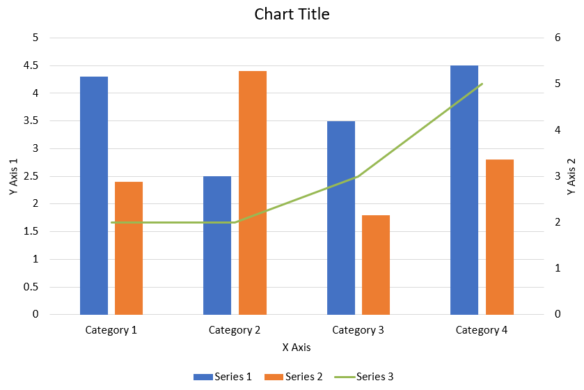
The following JavaScript code shows how to create the combination chart shown above in a PowerPoint presentation:
var aspose = aspose || {};
aspose.slides = require("aspose.slides.via.java");
const java = require("java");

function createComboChart() {
    let presentation = new aspose.slides.Presentation();
    let slide = presentation.getSlides().get_Item(0);
    try {
        let chart = createChartWithFirstSeries(slide);

        addSecondSeriesToChart(chart);
        addThirdSeriesToChart(chart);

        setPrimaryAxesFormat(chart);
        setSecondaryAxesFormat(chart);

        presentation.save("combo-chart.pptx", aspose.slides.SaveFormat.Pptx);
    } finally {
        presentation.dispose();
    }
}

function createChartWithFirstSeries(slide) {
    let chart = slide.getShapes().addChart(aspose.slides.ChartType.ClusteredColumn, 50, 50, 600, 400);

    // Đặt tiêu đề cho biểu đồ.
    chart.setTitle(true);
    chart.getChartTitle().addTextFrameForOverriding("Chart Title");
    chart.getChartTitle().setOverlay(false);
    let titleParagraph = chart.getChartTitle().getTextFrameForOverriding().getParagraphs().get_Item(0);
    let titleFormat = titleParagraph.getParagraphFormat().getDefaultPortionFormat();
    titleFormat.setFontBold(java.newByte(aspose.slides.NullableBool.False));
    titleFormat.setFontHeight(18);

    // Đặt chú giải cho biểu đồ.
    chart.getLegend().setPosition(aspose.slides.LegendPositionType.Bottom);
    chart.getLegend().getTextFormat().getPortionFormat().setFontHeight(12);

    // Xóa các series và danh mục được tạo mặc định.
    chart.getChartData().getSeries().clear();
    chart.getChartData().getCategories().clear();

    const worksheetIndex = 0;
    let workbook = chart.getChartData().getChartDataWorkbook();

    // Thêm các danh mục mới.
    chart.getChartData().getCategories().add(workbook.getCell(worksheetIndex, 1, 0, "Category 1"));
    chart.getChartData().getCategories().add(workbook.getCell(worksheetIndex, 2, 0, "Category 2"));
    chart.getChartData().getCategories().add(workbook.getCell(worksheetIndex, 3, 0, "Category 3"));
    chart.getChartData().getCategories().add(workbook.getCell(worksheetIndex, 4, 0, "Category 4"));

    // Thêm series đầu tiên.
    let seriesNameCell = workbook.getCell(worksheetIndex, 0, 1, "Series 1");
    let series = chart.getChartData().getSeries().add(seriesNameCell, chart.getType());

    series.getParentSeriesGroup().setOverlap(java.newByte(-25));
    series.getParentSeriesGroup().setGapWidth(220);

    series.getDataPoints().addDataPointForBarSeries(workbook.getCell(worksheetIndex, 1, 1, 4.3));
    series.getDataPoints().addDataPointForBarSeries(workbook.getCell(worksheetIndex, 2, 1, 2.5));
    series.getDataPoints().addDataPointForBarSeries(workbook.getCell(worksheetIndex, 3, 1, 3.5));
    series.getDataPoints().addDataPointForBarSeries(workbook.getCell(worksheetIndex, 4, 1, 4.5));

    return chart;
}

function addSecondSeriesToChart(chart) {
    let workbook = chart.getChartData().getChartDataWorkbook();
    const worksheetIndex = 0;

    let seriesNameCell = workbook.getCell(worksheetIndex, 0, 2, "Series 2");
    let series = chart.getChartData().getSeries().add(seriesNameCell, aspose.slides.ChartType.ClusteredColumn);

    series.getParentSeriesGroup().setOverlap(java.newByte(-25));
    series.getParentSeriesGroup().setGapWidth(220);

    series.getDataPoints().addDataPointForBarSeries(workbook.getCell(worksheetIndex, 1, 2, 2.4));
    series.getDataPoints().addDataPointForBarSeries(workbook.getCell(worksheetIndex, 2, 2, 4.4));
    series.getDataPoints().addDataPointForBarSeries(workbook.getCell(worksheetIndex, 3, 2, 1.8));
    series.getDataPoints().addDataPointForBarSeries(workbook.getCell(worksheetIndex, 4, 2, 2.8));
}

function addThirdSeriesToChart(chart) {
    let workbook = chart.getChartData().getChartDataWorkbook();
    const worksheetIndex = 0;

    let seriesNameCell = workbook.getCell(worksheetIndex, 0, 3, "Series 3");
    let series = chart.getChartData().getSeries().add(seriesNameCell, aspose.slides.ChartType.Line);

    series.getDataPoints().addDataPointForLineSeries(workbook.getCell(worksheetIndex, 1, 3, 2.0));
    series.getDataPoints().addDataPointForLineSeries(workbook.getCell(worksheetIndex, 2, 3, 2.0));
    series.getDataPoints().addDataPointForLineSeries(workbook.getCell(worksheetIndex, 3, 3, 3.0));
    series.getDataPoints().addDataPointForLineSeries(workbook.getCell(worksheetIndex, 4, 3, 5.0));

    series.setPlotOnSecondAxis(true);
}

function setPrimaryAxesFormat(chart) {
    // Đặt trục ngang.
    let horizontalAxis = chart.getAxes().getHorizontalAxis();
    horizontalAxis.getTextFormat().getPortionFormat().setFontHeight(12);
    horizontalAxis.getFormat().getLine().getFillFormat().setFillType(java.newByte(aspose.slides.FillType.NoFill));

    setAxisTitle(horizontalAxis, "X Axis");

    // Đặt trục dọc.
    let verticalAxis = chart.getAxes().getVerticalAxis();
    verticalAxis.getTextFormat().getPortionFormat().setFontHeight(12);
    verticalAxis.getFormat().getLine().getFillFormat().setFillType(java.newByte(aspose.slides.FillType.NoFill));

    setAxisTitle(verticalAxis, "Y Axis 1");

    // Đặt màu cho các đường lưới dọc chính.
    let majorGridLinesFormat = verticalAxis.getMajorGridLinesFormat().getLine().getFillFormat();
    majorGridLinesFormat.setFillType(java.newByte(aspose.slides.FillType.Solid));
    majorGridLinesFormat.getSolidFillColor().setColor(java.newInstanceSync("java.awt.Color", 217, 217, 217));
}

function setSecondaryAxesFormat(chart) {
    // Đặt trục ngang phụ.
    let secondaryHorizontalAxis = chart.getAxes().getSecondaryHorizontalAxis();
    secondaryHorizontalAxis.setPosition(aspose.slides.AxisPositionType.Bottom);
    secondaryHorizontalAxis.setCrossType(aspose.slides.CrossesType.Maximum);
    secondaryHorizontalAxis.setVisible(false);
    secondaryHorizontalAxis.getMajorGridLinesFormat().getLine().getFillFormat().setFillType(java.newByte(aspose.slides.FillType.NoFill));
    secondaryHorizontalAxis.getMinorGridLinesFormat().getLine().getFillFormat().setFillType(java.newByte(aspose.slides.FillType.NoFill));

    // Đặt trục dọc phụ.
    let secondaryVerticalAxis = chart.getAxes().getSecondaryVerticalAxis();
    secondaryVerticalAxis.setPosition(aspose.slides.AxisPositionType.Right);
    secondaryVerticalAxis.getTextFormat().getPortionFormat().setFontHeight(12);
    secondaryVerticalAxis.getFormat().getLine().getFillFormat().setFillType(java.newByte(aspose.slides.FillType.NoFill));
    secondaryVerticalAxis.getMajorGridLinesFormat().getLine().getFillFormat().setFillType(java.newByte(aspose.slides.FillType.NoFill));
    secondaryVerticalAxis.getMinorGridLinesFormat().getLine().getFillFormat().setFillType(java.newByte(aspose.slides.FillType.NoFill));

    setAxisTitle(secondaryVerticalAxis, "Y Axis 2");
}

function setAxisTitle(axis, axisTitle) {
    axis.setTitle(true);
    axis.getTitle().setOverlay(false);
    let titleParagraph = axis.getTitle().addTextFrameForOverriding(axisTitle).getParagraphs().get_Item(0);
    let titleFormat = titleParagraph.getParagraphFormat().getDefaultPortionFormat();
    titleFormat.setFontBold(java.newByte(aspose.slides.NullableBool.False));
    titleFormat.setFontHeight(12);
}
Cập nhật biểu đồ
- Tạo một thể hiện của lớp Presentation đại diện cho presentation chứa biểu đồ bạn muốn cập nhật.
- Lấy tham chiếu đến một slide bằng chỉ mục của nó.
- Duyệt qua tất cả các shape để tìm biểu đồ mong muốn.
- Truy cập worksheet dữ liệu của biểu đồ.
- Sửa đổi series dữ liệu biểu đồ bằng cách thay đổi giá trị series.
- Thêm một series mới và điền dữ liệu cho nó.
- Lưu presentation đã chỉnh sửa thành tệp PPTX .
This JavaScript code shows how to update a chart:
var aspose = aspose || {};
aspose.slides = require("aspose.slides.via.java");

var pres = new aspose.slides.Presentation("ExistingChart.pptx");
try {
    // Truy cập slide đầu tiên
    var sld = pres.getSlides().get_Item(0);
    // Lấy biểu đồ với dữ liệu mặc định
    var chart = sld.getShapes().get_Item(0);
    // Đặt chỉ mục cho sheet dữ liệu của biểu đồ
    var defaultWorksheetIndex = 0;
    // Lấy worksheet dữ liệu của biểu đồ
    var fact = chart.getChartData().getChartDataWorkbook();
    // Thay đổi tên danh mục của biểu đồ
    fact.getCell(defaultWorksheetIndex, 1, 0, "Modified Category 1");
    fact.getCell(defaultWorksheetIndex, 2, 0, "Modified Category 2");
    // Lấy series đầu tiên của biểu đồ
    var series = chart.getChartData().getSeries().get_Item(0);
    // Bây giờ cập nhật dữ liệu cho series
    fact.getCell(defaultWorksheetIndex, 0, 1, "New_Series1");// Sửa tên series
    series.getDataPoints().get_Item(0).getValue().setData(90);
    series.getDataPoints().get_Item(1).getValue().setData(123);
    series.getDataPoints().get_Item(2).getValue().setData(44);
    // Lấy series thứ hai của biểu đồ
    series = chart.getChartData().getSeries().get_Item(1);
    // Bây giờ cập nhật dữ liệu cho series
    fact.getCell(defaultWorksheetIndex, 0, 2, "New_Series2");// Sửa tên series
    series.getDataPoints().get_Item(0).getValue().setData(23);
    series.getDataPoints().get_Item(1).getValue().setData(67);
    series.getDataPoints().get_Item(2).getValue().setData(99);
    // Bây giờ, thêm một series mới
    chart.getChartData().getSeries().add(fact.getCell(defaultWorksheetIndex, 0, 3, "Series 3"), chart.getType());
    // Lấy series thứ ba của biểu đồ
    series = chart.getChartData().getSeries().get_Item(2);
    // Bây giờ điền dữ liệu cho series
    series.getDataPoints().addDataPointForBarSeries(fact.getCell(defaultWorksheetIndex, 1, 3, 20));
    series.getDataPoints().addDataPointForBarSeries(fact.getCell(defaultWorksheetIndex, 2, 3, 50));
    series.getDataPoints().addDataPointForBarSeries(fact.getCell(defaultWorksheetIndex, 3, 3, 30));
    chart.setType(aspose.slides.ChartType.ClusteredCylinder);
    // Lưu presentation có biểu đồ
    pres.save("AsposeChartModified_out.pptx", aspose.slides.SaveFormat.Pptx);
} finally {
    if (pres != null) {
        pres.dispose();
    }
}
Đặt phạm vi dữ liệu cho biểu đồ
Để đặt phạm vi dữ liệu cho một biểu đồ, thực hiện các bước sau:
- Tạo một thể hiện của lớp Presentation đại diện cho presentation chứa biểu đồ.
- Lấy tham chiếu đến một slide bằng chỉ mục của nó.
- Duyệt qua tất cả các shape để tìm biểu đồ mong muốn.
- Truy cập dữ liệu biểu đồ và đặt phạm vi.
- Lưu presentation đã chỉnh sửa thành tệp PPTX .
This JavaScript code shows how to set the data range for a chart:
var aspose = aspose || {};
aspose.slides = require("aspose.slides.via.java");

var pres = new aspose.slides.Presentation("ExistingChart.pptx");
try {
    var slide = pres.getSlides().get_Item(0);
    var chart = slide.getShapes().get_Item(0);
    chart.getChartData().setRange("Sheet1!A1:B4");
    pres.save("SetDataRange_out.pptx", aspose.slides.SaveFormat.Pptx);
} finally {
    if (pres != null) {
        pres.dispose();
    }
}
Sử dụng ký hiệu mặc định trong biểu đồ
Khi bạn sử dụng ký hiệu mặc định trong biểu đồ, mỗi series biểu đồ sẽ tự động nhận một ký hiệu khác nhau.
This JavaScript code shows how to set a chart series marker automatically:
var aspose = aspose || {};
aspose.slides = require("aspose.slides.via.java");

var pres = new aspose.slides.Presentation();
try {
    var slide = pres.getSlides().get_Item(0);
    var chart = slide.getShapes().addChart(aspose.slides.ChartType.LineWithMarkers, 10, 10, 400, 400);
    chart.getChartData().getSeries().clear();
    chart.getChartData().getCategories().clear();
    var fact = chart.getChartData().getChartDataWorkbook();
    chart.getChartData().getSeries().add(fact.getCell(0, 0, 1, "Series 1"), chart.getType());
    var series = chart.getChartData().getSeries().get_Item(0);
    chart.getChartData().getCategories().add(fact.getCell(0, 1, 0, "C1"));
    series.getDataPoints().addDataPointForLineSeries(fact.getCell(0, 1, 1, 24));
    chart.getChartData().getCategories().add(fact.getCell(0, 2, 0, "C2"));
    series.getDataPoints().addDataPointForLineSeries(fact.getCell(0, 2, 1, 23));
    chart.getChartData().getCategories().add(fact.getCell(0, 3, 0, "C3"));
    series.getDataPoints().addDataPointForLineSeries(fact.getCell(0, 3, 1, -10));
    chart.getChartData().getCategories().add(fact.getCell(0, 4, 0, "C4"));
    series.getDataPoints().addDataPointForLineSeries(fact.getCell(0, 4, 1, null));
    chart.getChartData().getSeries().add(fact.getCell(0, 0, 2, "Series 2"), chart.getType());
    // Lấy series thứ hai của biểu đồ
    var series2 = chart.getChartData().getSeries().get_Item(1);
    // Bây giờ điền dữ liệu cho series
    series2.getDataPoints().addDataPointForLineSeries(fact.getCell(0, 1, 2, 30));
    series2.getDataPoints().addDataPointForLineSeries(fact.getCell(0, 2, 2, 10));
    series2.getDataPoints().addDataPointForLineSeries(fact.getCell(0, 3, 2, 60));
    series2.getDataPoints().addDataPointForLineSeries(fact.getCell(0, 4, 2, 40));
    chart.setLegend(true);
    chart.getLegend().setOverlay(false);
    pres.save("DefaultMarkersInChart.pptx", aspose.slides.SaveFormat.Pptx);
} finally {
    if (pres != null) {
        pres.dispose();
    }
}
Câu hỏi thường gặp
Các loại biểu đồ nào được Aspose.Slides hỗ trợ?
Aspose.Slides hỗ trợ một loạt các chart types, bao gồm bar, line, pie, area, scatter, histogram, radar và nhiều hơn nữa. Sự linh hoạt này cho phép bạn chọn loại biểu đồ phù hợp nhất cho nhu cầu trực quan hoá dữ liệu của mình.
Làm thế nào để thêm một biểu đồ mới vào slide?
Để thêm một biểu đồ, trước tiên bạn tạo một thể hiện của lớp Presentation , lấy slide mong muốn bằng chỉ mục, sau đó gọi phương thức để thêm biểu đồ, chỉ định loại biểu đồ và dữ liệu ban đầu. Quy trình này tích hợp biểu đồ trực tiếp vào presentation của bạn.
Làm sao tôi có thể cập nhật dữ liệu hiển thị trong biểu đồ?
Bạn có thể cập nhật dữ liệu của biểu đồ bằng cách truy cập workbook dữ liệu của nó (ChartDataWorkbook), xóa bất kỳ series và danh mục mặc định nào, sau đó thêm dữ liệu tùy chỉnh của bạn. Điều này cho phép bạn lập trình làm mới biểu đồ để phản ánh dữ liệu mới nhất.
Có thể tùy chỉnh giao diện của biểu đồ không?
Có, Aspose.Slides cung cấp nhiều tùy chọn tùy chỉnh. Bạn có thể chỉnh sửa màu sắc, phông chữ, nhãn, chú giải và các formatting elements khác để điều chỉnh giao diện biểu đồ cho phù hợp với yêu cầu thiết kế cụ thể của bạn.