
JavaScript を使用してプレゼンテーションのチャート データ系列を管理する
概要
チャートはプロットされたデータをチャート データ ワークブックに保存します。 ChartSeries は関連する値のセットを表し、系列内の各 ChartDataPoint は 1 つ以上のワークブック セルを参照します。 ChartCategory オブジェクトは、系列が共有するラベルまたはグループ化値を提供します。したがって、系列名、カテゴリ、ポイント値は ChartDataCell オブジェクトに接続されており、表示テキストとしてだけ保存されません。
典型的なカテゴリ チャートでは、既定のワークブックは行 0 を系列名、列 0 をカテゴリ名、残りのセルを系列値に使用します。ChartDataWorkbook.getCell に渡すワークシート、行、列のインデックスは 0 ベースです。このレイアウトはデフォルト データでチャートを作成する際に便利ですが、すべての既存チャートがこのレイアウトを使用しているとは限りません。ロードされたプレゼンテーションの場合、ワークブックの値を変更する前に、系列、カテゴリ、データ ポイントが参照しているセルを確認してください。
チャート設定には次の 3 つのスコープがあります。
- 系列レベルの設定 (例: ChartSeries.getFormat) は、1 つの系列内のすべてのポイントのデフォルトの外観を提供します。
- データ ポイント設定 (例: ChartDataPoint.getFormat) は、1 つのポイントに対して系列の外観を上書きします。
- グループ設定は、同じ ChartSeriesGroup に属する互換系列に適用されます。重なりやギャップ幅などのオプションを設定する必要がある場合は、ChartSeries.getParentSeriesGroup を介してグループにアクセスしてください。
明示的なポイントまたは系列の塗りつぶしが設定されていない場合、チャート スタイルとテーマが自動的な外観を決定します。系列とポイントの書式設定が両方存在する場合、ポイントの書式設定がそのポイントに対して優先されます。
チャート系列の重なりを設定する
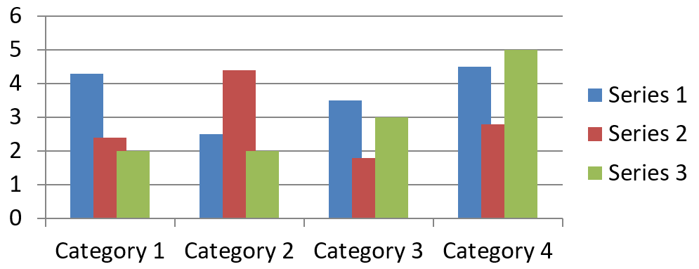
ChartSeries.getOverlap は、2D チャートでバーまたは列がどれだけ重なるかを -100 から 100 パーセンテージで報告します。これは親系列グループの設定の読み取り専用投影です。グループ内のすべての互換系列を更新するには、ChartSeriesGroup.setOverlap を使用してください。このオプションは、グループ化されたバーまたは列を表示するチャート タイプに適用され、組み合わせチャートの無関係な系列グループには影響しません。
以下の例は、最初の系列を含むグループの重なりを設定します。
const aspose = {};
aspose.slides = require("aspose.slides.via.java");
const java = require("java");

const firstSlideIndex = 0;
const firstSeriesIndex = 0;
const overlapPercent = java.newByte(30);

const presentation = new aspose.slides.Presentation();
try {
    const slide = presentation.getSlides().get_Item(firstSlideIndex);

    // 新しいチャートにはサンプル系列、カテゴリ、および値が含まれています。
    const chart = slide.getShapes().addChart(aspose.slides.ChartType.ClusteredColumn, 20, 20, 500, 200);

    const series = chart.getChartData().getSeries().get_Item(firstSeriesIndex);
    series.getParentSeriesGroup().setOverlap(overlapPercent);

    presentation.save("series_overlap.pptx", aspose.slides.SaveFormat.Pptx);
} finally {
    presentation.dispose();
}
結果:
系列の塗りつぶし色を変更する
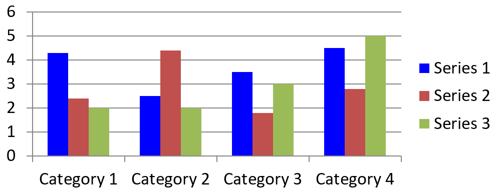
ChartSeries.getFormat を使用して、系列全体のデフォルト塗りつぶしを設定します。ポイントに明示的な塗りつぶしが既にある場合、その ChartDataPoint.getFormat 設定がそのポイントの系列塗りつぶしを上書きします。
以下の例は、最初の系列に単色の青い塗りつぶしを適用します。
const aspose = {};
aspose.slides = require("aspose.slides.via.java");
const java = require("java");

const firstSlideIndex = 0;
const firstSeriesIndex = 0;
const solidFillType = java.newByte(aspose.slides.FillType.Solid);
const blueColor = java.getStaticFieldValue("java.awt.Color", "BLUE");

const presentation = new aspose.slides.Presentation();
try {
    const slide = presentation.getSlides().get_Item(firstSlideIndex);

    const chart = slide.getShapes().addChart(aspose.slides.ChartType.ClusteredColumn, 20, 20, 500, 200);

    const series = chart.getChartData().getSeries().get_Item(firstSeriesIndex);
    series.getFormat().getFill().setFillType(solidFillType);
    series.getFormat().getFill().getSolidFillColor().setColor(blueColor);

    presentation.save("series_color.pptx", aspose.slides.SaveFormat.Pptx);
} finally {
    presentation.dispose();
}
結果:
系列名を変更する
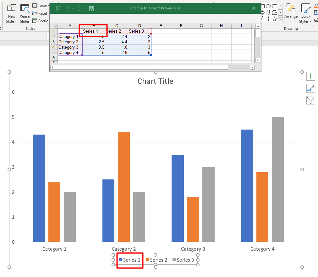
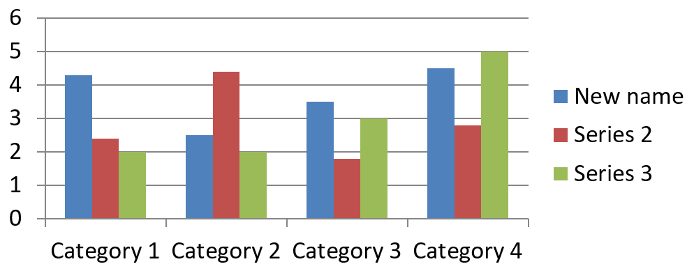
系列名はチャート データ ワークブックに保存され、通常は凡例に表示されます。クラスター化列チャート用に作成された既定のワークブックでは、セル B1 が行 0、列 1 にあり、最初の系列の名前が含まれます。以下の例の名前付き定数は、その構造を明示的に示しています。
const aspose = {};
aspose.slides = require("aspose.slides.via.java");

const firstSlideIndex = 0;
const worksheetIndex = 0;
const seriesNameRowIndex = 0;
const firstSeriesColumnIndex = 1;

const presentation = new aspose.slides.Presentation();
try {
    const slide = presentation.getSlides().get_Item(firstSlideIndex);

    const chart = slide.getShapes().addChart(aspose.slides.ChartType.ClusteredColumn, 20, 20, 500, 200);

    const workbook = chart.getChartData().getChartDataWorkbook();
    const seriesNameCell = workbook.getCell(worksheetIndex, seriesNameRowIndex, firstSeriesColumnIndex);
    seriesNameCell.setValue("Revenue");

    presentation.save("series_name.pptx", aspose.slides.SaveFormat.Pptx);
} finally {
    presentation.dispose();
}
また、ChartSeries.getName が参照しているセルを直接更新することもできます。この方法は、既存のチャートで特定の行や列を前提としないため安全です。
const aspose = {};
aspose.slides = require("aspose.slides.via.java");

const firstSlideIndex = 0;
const firstSeriesIndex = 0;
const firstNameCellIndex = 0;

const presentation = new aspose.slides.Presentation();
try {
    const slide = presentation.getSlides().get_Item(firstSlideIndex);

    const chart = slide.getShapes().addChart(aspose.slides.ChartType.ClusteredColumn, 20, 20, 500, 200);

    const series = chart.getChartData().getSeries().get_Item(firstSeriesIndex);
    const seriesNameCell = series.getName().getAsCells().get_Item(firstNameCellIndex);
    seriesNameCell.setValue("Revenue");

    presentation.save("series_name.pptx", aspose.slides.SaveFormat.Pptx);
} finally {
    presentation.dispose();
}
結果:
複数セルから名前を作成する
製品名と報告期間が別々のワークブック セルに保存されている場合、複合系列名が便利です。たとえば、セル B1 の Product A とセル C1 の 2026 を結合して、両方のソース セルにリンクされた単一の系列名にできます。
ChartDataWorkbook.getCellCollection を使用して名前範囲を取得し、そのコレクションを ChartSeriesCollection.add に渡します。skipHiddenCells 引数は非表示セルを含めるかどうかを制御します: true は除外し、false は含めます。この例では false を使用して名前範囲のすべてのセルを含めています。
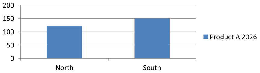
以下の例は、1 系列と 2 データ ポイントを持つプレゼンテーションを作成します。セル B1:C1 が系列名のみを供給し、A2:A3 がカテゴリ ラベル、B2:B3 が数値を供給します。
const aspose = {};
aspose.slides = require("aspose.slides.via.java");

const presentation = new aspose.slides.Presentation();
try {
    const slide = presentation.getSlides().get_Item(0);

    const chart = slide.getShapes().addChart(aspose.slides.ChartType.ClusteredColumn, 50, 50, 620, 180);

    chart.getChartData().getSeries().clear();
    chart.getChartData().getCategories().clear();
    chart.setLegend(true);

    const workbook = chart.getChartData().getChartDataWorkbook();
    workbook.clear(0);

    // これらの2つのセルが系列名を供給します。
    workbook.getCell(0, 0, 1, "Product A");
    workbook.getCell(0, 0, 2, "2026");
    const nameCells = workbook.getCellCollection("Sheet1!$B$1:$C$1", false);
    const series = chart.getChartData().getSeries().add(nameCells, aspose.slides.ChartType.ClusteredColumn);

    // 別々のセルがカテゴリと数値データポイントを供給します。
    const northCategory = workbook.getCell(0, 1, 0, "North");
    const southCategory = workbook.getCell(0, 2, 0, "South");
    chart.getChartData().getCategories().add(northCategory);
    chart.getChartData().getCategories().add(southCategory);
    const northValue = workbook.getCell(0, 1, 1, 120);
    const southValue = workbook.getCell(0, 2, 1, 150);
    series.getDataPoints().addDataPointForBarSeries(northValue);
    series.getDataPoints().addDataPointForBarSeries(southValue);

    presentation.save("composite_series_name.pptx", aspose.slides.SaveFormat.Pptx);
} finally {
    presentation.dispose();
}
結果として得られる系列名は Product A 2026 で、2 つのセル値の間にスペースが入ります。凡例はこの 2 列を 1 エントリとして表示します。以下の画像が結果を示しています。
自動系列塗りつぶし色を取得する
ChartSeries.getAutomaticSeriesColor は、系列インデックスとチャート スタイルから計算された色を返します。これは、系列の塗りつぶしが明示的に定義されていない場合に使用される色です。メソッドを呼び出すと計算された色を取得しますが、新しい塗りつぶしは割り当てられません。
以下の例は、各デフォルト系列の自動色を出力します。
const aspose = {};
aspose.slides = require("aspose.slides.via.java");

const firstSlideIndex = 0;

const presentation = new aspose.slides.Presentation();
try {
    const slide = presentation.getSlides().get_Item(firstSlideIndex);

    const chart = slide.getShapes().addChart(aspose.slides.ChartType.ClusteredColumn, 20, 20, 500, 200);

    const seriesCount = chart.getChartData().getSeries().size();
    for (let seriesIndex = 0; seriesIndex < seriesCount; seriesIndex++) {
        const series = chart.getChartData().getSeries().get_Item(seriesIndex);
        const automaticColor = series.getAutomaticSeriesColor();
        const automaticColorText = automaticColor.toString();
        console.log("Series " + seriesIndex + ": " + automaticColorText);
    }
} finally {
    presentation.dispose();
}
デフォルトのチャート スタイルの出力例:
Series 0: java.awt.Color[r=79,g=129,b=189]
Series 1: java.awt.Color[r=192,g=80,b=77]
Series 2: java.awt.Color[r=155,g=187,b=89]
正確な色はチャート スタイルとテーマによって異なります。
系列の反転塗りつぶし色を設定する
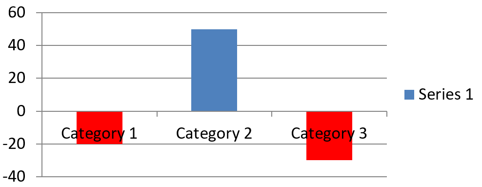
バー、列、バブル系列の場合、ChartSeries.setInvertIfNegative を使用して負の値を別の塗りつぶしで表示できます。通常の系列塗りつぶしを単色に設定し、反転を有効にし、負の値の色は ChartSeries.getInvertedSolidFillColor で割り当てます。負の数値自体はワークブック内で変更されず、表示色だけが変わります。
以下の例は、デフォルトのチャート データを 1 系列に置き換えます。ワークシートの行 0 に系列名、列 0 にカテゴリ名、列 1 に値が格納されています。
const aspose = {};
aspose.slides = require("aspose.slides.via.java");
const java = require("java");

const firstSlideIndex = 0;
const worksheetIndex = 0;
const headerRowIndex = 0;
const categoryColumnIndex = 0;
const firstSeriesColumnIndex = 1;
const firstDataRowIndex = 1;
const solidFillType = java.newByte(aspose.slides.FillType.Solid);
const redColor = java.getStaticFieldValue("java.awt.Color", "RED");

const categoryNames = ["Category 1", "Category 2", "Category 3"];
const seriesValues = [-20, 50, -30];

const presentation = new aspose.slides.Presentation();
try {
    const slide = presentation.getSlides().get_Item(firstSlideIndex);

    const chart = slide.getShapes().addChart(aspose.slides.ChartType.ClusteredColumn, 20, 20, 500, 200);
    const chartData = chart.getChartData();
    const workbook = chartData.getChartDataWorkbook();

    chartData.getSeries().clear();
    chartData.getCategories().clear();

    const seriesNameCell = workbook.getCell(worksheetIndex, headerRowIndex, firstSeriesColumnIndex, "Series 1");
    const chartType = chart.getType();
    const series = chartData.getSeries().add(seriesNameCell, chartType);

    for (let categoryIndex = 0; categoryIndex < categoryNames.length; categoryIndex++) {
        const dataRowIndex = firstDataRowIndex + categoryIndex;
        const categoryName = categoryNames[categoryIndex];
        const seriesValue = seriesValues[categoryIndex];

        const categoryCell = workbook.getCell(worksheetIndex, dataRowIndex, categoryColumnIndex, categoryName);
        chartData.getCategories().add(categoryCell);

        const valueCell = workbook.getCell(worksheetIndex, dataRowIndex, firstSeriesColumnIndex, seriesValue);
        series.getDataPoints().addDataPointForBarSeries(valueCell);
    }

    const automaticSeriesColor = series.getAutomaticSeriesColor();
    series.getFormat().getFill().setFillType(solidFillType);
    series.getFormat().getFill().getSolidFillColor().setColor(automaticSeriesColor);
    series.setInvertIfNegative(true);
    series.getInvertedSolidFillColor().setColor(redColor);

    presentation.save("inverted_solid_fill_color.pptx", aspose.slides.SaveFormat.Pptx);
} finally {
    presentation.dispose();
}
結果:
1 ポイントだけに反転を有効にするには、ChartDataPoint.setInvertIfNegative を使用します。以下の例では、系列全体の反転は無効にし、選択したポイントだけで有効にしています。そのポイントには負の値も割り当てているため、効果が確認できます。
const aspose = {};
aspose.slides = require("aspose.slides.via.java");
const java = require("java");

const firstSlideIndex = 0;
const firstSeriesIndex = 0;
const targetDataPointIndex = 2;
const negativeValue = -30;
const solidFillType = java.newByte(aspose.slides.FillType.Solid);
const redColor = java.getStaticFieldValue("java.awt.Color", "RED");

const presentation = new aspose.slides.Presentation();
try {
    const slide = presentation.getSlides().get_Item(firstSlideIndex);

    const chart = slide.getShapes().addChart(aspose.slides.ChartType.ClusteredColumn, 20, 20, 500, 200);

    const series = chart.getChartData().getSeries().get_Item(firstSeriesIndex);
    const automaticSeriesColor = series.getAutomaticSeriesColor();
    series.getFormat().getFill().setFillType(solidFillType);
    series.getFormat().getFill().getSolidFillColor().setColor(automaticSeriesColor);
    series.getInvertedSolidFillColor().setColor(redColor);
    series.setInvertIfNegative(false);

    const dataPoint = series.getDataPoints().get_Item(targetDataPointIndex);
    dataPoint.getValue().getAsCell().setValue(negativeValue);
    dataPoint.setInvertIfNegative(true);

    presentation.save("data_point_invert_color_if_negative.pptx", aspose.slides.SaveFormat.Pptx);
} finally {
    presentation.dispose();
}
特定のデータ ポイントの値をクリアする
ポイントだけを空にし、他のポイントは残すには、対応するワークブック セルを null に設定します。列チャートの場合、プロットされた値は ChartDataPoint.getValue で取得できます。データ ポイントは同じカテゴリ位置にとどまりますが、チャートは空白として扱います。
以下の例は、最初の系列の 2 番目のポイントだけをクリアします。
const aspose = {};
aspose.slides = require("aspose.slides.via.java");

const firstSlideIndex = 0;
const firstSeriesIndex = 0;
const targetDataPointIndex = 1;

const presentation = new aspose.slides.Presentation();
try {
    const slide = presentation.getSlides().get_Item(firstSlideIndex);

    const chart = slide.getShapes().addChart(aspose.slides.ChartType.ClusteredColumn, 20, 20, 500, 200);

    const series = chart.getChartData().getSeries().get_Item(firstSeriesIndex);
    const dataPoint = series.getDataPoints().get_Item(targetDataPointIndex);
    dataPoint.getValue().getAsCell().setValue(null);

    presentation.save("clear_data_point_value.pptx", aspose.slides.SaveFormat.Pptx);
} finally {
    presentation.dispose();
}
散布図は X と Y のセルが別々に、バブルチャートはサイズセルも使用します。削除したい値に対応するセルだけをクリアしてください。ポイントを残したまますべてを削除したくない場合は、ChartDataPointCollection.clear は使用しないでください。このメソッドはコレクション内のすべてのデータ ポイントを削除します。
空セルの表示を制御する
値が入っている非表示セルは、空セルとは別のケースです。非表示の行や列からデータを含めるか除外するには、Include Data from Hidden Rows and Columns を参照してください。
空のワークブック セルはデータが欠落していることを表し、0 が入っているセルは既知の数値を表します。セルを空にしたい場合は、null を渡して ChartDataCell.setValue を呼び出します。数値のゼロは空セル設定に関係なくゼロのままです。
Chart.setDisplayBlanksAs を使用して、チャートが空セルをどのように表示するかを選択します。この設定はチャート全体に適用され、空白のプロット方法を変更しますが、空セル自体にゼロや補間値が入ることはありません。
以下の自己完結型サンプルは、1 系列の折れ線グラフを作成し、Day 3 の値をクリアして、各モードで同じチャートを保存します。入力ファイルは不要です。ChartDataWorkbook はワークシート 0、列 0 にカテゴリ ラベル、列 1 に値、行 0 に系列名を使用します。最終データは 10, 20, empty, 30, 40 です。
const aspose = {};
aspose.slides = require("aspose.slides.via.java");

const presentation = new aspose.slides.Presentation();
try {
    const slide = presentation.getSlides().get_Item(0);

    const chart = slide.getShapes().addChart(aspose.slides.ChartType.LineWithMarkers, 40, 40, 640, 400);
    const chartData = chart.getChartData();
    const workbook = chartData.getChartDataWorkbook();

    chartData.getSeries().clear();
    chartData.getCategories().clear();

    const seriesNameCell = workbook.getCell(0, 0, 1, "Measurements");
    const series = chartData.getSeries().add(seriesNameCell, chart.getType());
    const values = [10, 20, 25, 30, 40];

    for (let i = 0; i < values.length; i++) {
        const categoryCell = workbook.getCell(0, i + 1, 0, "Day " + (i + 1));
        chartData.getCategories().add(categoryCell);
        const valueCell = workbook.getCell(0, i + 1, 1, values[i]);
        series.getDataPoints().addDataPointForLineSeries(valueCell);
    }

    // Day 3 を実際に空のままにし、カテゴリとデータ ポイントは保持します。
    workbook.getCell(0, 3, 1).setValue(null);

    const modes = [aspose.slides.DisplayBlanksAsType.Gap, aspose.slides.DisplayBlanksAsType.Zero, aspose.slides.DisplayBlanksAsType.Span];
    const modeNames = ["Gap", "Zero", "Span"];
    for (let i = 0; i < modes.length; i++) {
        chart.setDisplayBlanksAs(modes[i]);
        presentation.save("empty_cells_" + modeNames[i] + ".pptx", aspose.slides.SaveFormat.Pptx);
    }
} finally {
    presentation.dispose();
}
各出力ファイルは保存前に設定したモードを名前に持ちます: empty_cells_Gap.pptx、empty_cells_Zero.pptx、empty_cells_Span.pptx。1 つのバージョンだけを保存したい場合は、目的のモードを設定してプレゼンテーションを 1 回だけ保存してください。
以下の比較は 3 つのファイルで同じデータがどのように表示されるかを示しています。Day 3 はすべてのワークブックで空です。
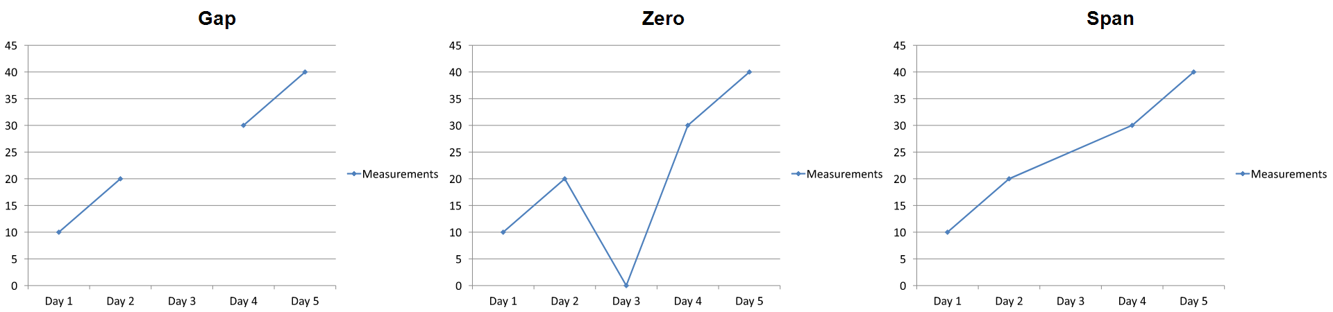
見た目の効果はチャート タイプによって異なります。折れ線グラフは 3 つのモードを比較しやすいですが、棒や列チャートは欠損カテゴリの間に線がないため、Span は上記のような接続セグメントを生成できません。欠損列とゼロ高さの列は見た目が似ていることもあります。同様に、マーカーのみの散布図は接続線がありません。すべてのチャート タイプで 3 つの明確な結果が得られるとは限らないので、使用するタイプで出力を確認してください。
系列のギャップ幅を設定する
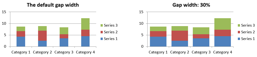
ギャップ幅は隣接するバーまたは列クラスタ間のスペースで、バーまたは列幅のパーセンテージで表されます。重なりと同様に、系列単位ではなく親系列グループに属します。グループに対して一度だけ ChartSeriesGroup.setGapWidth を呼び出してください。値が大きいほどクラスタ間の間隔が広がり、小さいほど密になります。
以下の例はギャップ幅を変更し、最終プレゼンテーションだけを保存します。
const aspose = {};
aspose.slides = require("aspose.slides.via.java");

const firstSlideIndex = 0;
const firstSeriesIndex = 0;
const gapWidthPercent = 30;

const presentation = new aspose.slides.Presentation();
try {
    const slide = presentation.getSlides().get_Item(firstSlideIndex);

    const chart = slide.getShapes().addChart(aspose.slides.ChartType.StackedColumn, 20, 20, 500, 200);

    const series = chart.getChartData().getSeries().get_Item(firstSeriesIndex);
    series.getParentSeriesGroup().setGapWidth(gapWidthPercent);

    presentation.save("gap_width_30.pptx", aspose.slides.SaveFormat.Pptx);
} finally {
    presentation.dispose();
}
結果:
FAQ
どのチャート タイプがデータ 系列をサポートしていますか?
ChartType 列挙体で表されるすべてのチャート タイプはチャート データを使用しますが、系列の値構造や設定はすべて同じではありません。たとえば、カテゴリ チャートはカテゴリと値を使用し、散布図は X と Y の値を使用し、バブルチャートはバブル サイズを追加します。系列タイプに合ったデータ ポイント作成メソッドを使用してください。重なりやギャップ幅などのオプションは、互換性のあるバーまたは列グループにのみ適用されます。
チャート 系列 グループとは何ですか?
ChartSeriesGroup は、グループレベルのプロット設定を共有する互換系列を含みます。組み合わせチャートは複数のグループを持つことができるため、ある系列を介して取得したグループを変更しても、必ずしもチャート内のすべての系列が変わるわけではありません。
新しく作成したチャートはデフォルト データを含みますか?
はい。デフォルトでは、ShapeCollection.addChart はサンプル系列、カテゴリ、値を作成します。これらのセルを編集するか、系列とカテゴリのコレクションをすべてクリアして独自のデータ セットを追加できます。オーバーロードを使用してデフォルト データなしでチャートを作成することも可能です。
チャート オブジェクトはワークブック セルとどのように接続されていますか?
系列名、カテゴリ ラベル、データ ポイント値はすべて ChartDataWorkbook のセルを参照しています。参照セルを変更すると、対応するチャート要素が更新されます。カスタム データを構築する際は、カテゴリ行と系列値行が整合するように配置し、各ポイントが意図したカテゴリの下にプロットされるようにしてください。
系列全体ではなく 1 ポイントだけをクリアするには?
該当する値セルを null に設定して、ポイントのカテゴリ位置は保持したまま空ポイントにします。シリーズ全体のポイントをすべて削除したい場合のみ、ChartDataPointCollection.clear を使用してください。カテゴリも削除する場合は、すべての系列の値がカテゴリコレクションと整合するように更新してください。
空ポイントはどのように表示されますか?
表示はチャート タイプと Chart.setDisplayBlanksAs で設定された値に依存します。サポートされているチャートは、空白をギャップ、ゼロ値、または隣接ポイントを接続する形で表示できます。プレゼンテーションの欠損データの意味に合った設定を選択してください。完全な例とビジュアル比較は 空セルの表示を制御する を参照してください。
負の値はどのように書式設定されますか?
サポートされているバー、列、バブル系列については、ChartSeries.setInvertIfNegative を呼び出し、ChartSeries.getInvertedSolidFillColor が返す色を設定します。個別のポイントについては、ChartDataPoint.setInvertIfNegative で動作を上書きできます。これらのメソッドは書式設定に影響し、数値自体は変更しません。
系列とポイントの両方が書式設定されている場合、どちらが優先されますか?
明示的なデータ ポイントの書式設定がそのポイントに対して優先されます。他のポイントは、明示的な系列書式がある場合はそれを使用し、系列書式が未定義の場合は自動的なチャート スタイルとテーマが適用されます。重なりやギャップ幅などのグループ設定はレイアウトに関するもので、ポイントレベルの書式設定の上書きにはなりません。
チャートに含められる系列数に上限はありますか?
Aspose.Slides には固定された系列数上限はありません。実際には、プレゼンテーション ファイルの制約、利用可能なメモリ、レンダリング時間、チャートの可読性が実用的な上限を決めます。
列が互いに近すぎる、または離れすぎる場合はどうすればよいですか?
適切な親系列グループに対して ChartSeriesGroup.setGapWidth を呼び出してください。値を大きくするとクラスタ間の間隔が広がり、値を小さくするとクラスタが近づきます。