
Quản lý chuỗi dữ liệu biểu đồ trong bản trình bày bằng JavaScript
Tổng quan
Biểu đồ lưu trữ dữ liệu đã vẽ trong một workbook dữ liệu biểu đồ. Một ChartSeries đại diện cho một tập hợp các giá trị có liên quan, và mỗi ChartDataPoint trong chuỗi tham chiếu đến một hoặc nhiều ô trong workbook. Các đối tượng ChartCategory cung cấp các nhãn hoặc giá trị nhóm mà các chuỗi chia sẻ. Vì vậy, tên chuỗi, danh mục và giá trị điểm được kết nối với các đối tượng ChartDataCell thay vì chỉ được lưu dưới dạng văn bản hiển thị.
Đối với một biểu đồ danh mục điển hình, workbook mặc định sử dụng hàng 0 cho tên chuỗi, cột 0 cho tên danh mục và các ô còn lại cho giá trị chuỗi. Các chỉ mục bảng tính, hàng và cột được truyền vào ChartDataWorkbook.getCell là dạng chỉ số bắt đầu từ 0. Bố cục này hữu ích khi bạn tạo biểu đồ với dữ liệu mặc định, nhưng không nên cho rằng mọi biểu đồ hiện có đều sử dụng nó. Đối với một bản trình bày đã tải, hãy kiểm tra các ô được tham chiếu bởi các chuỗi, danh mục và điểm dữ liệu trước khi thay đổi giá trị workbook.
Cài đặt biểu đồ có ba phạm vi khác nhau:
- Cài đặt mức độ chuỗi, chẳng hạn như ChartSeries.getFormat, cung cấp giao diện mặc định cho tất cả các điểm trong một chuỗi.
- Cài đặt mức độ điểm dữ liệu, chẳng hạn như ChartDataPoint.getFormat, ghi đè giao diện chuỗi cho một điểm.
- Cài đặt nhóm áp dụng cho các chuỗi tương thích thuộc cùng một ChartSeriesGroup. Truy cập nhóm qua ChartSeries.getParentSeriesGroup khi bạn cần đặt các tùy chọn như độ chồng lấn hoặc độ rộng khoảng trống.
Khi không có màu tô điểm hoặc chuỗi nào được đặt một cách rõ ràng, kiểu và chủ đề biểu đồ sẽ xác định giao diện tự động. Khi cả định dạng chuỗi và điểm đều tồn tại, định dạng điểm sẽ có ưu tiên đối với điểm đó.
Đặt Độ Chồng Lấn của Chuỗi Biểu Đồ
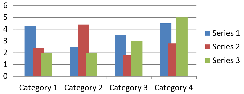
ChartSeries.getOverlap báo cáo mức độ các thanh hoặc cột chồng lên nhau trong biểu đồ 2D, từ -100 đến 100 phần trăm. Đây là một phép chiếu chỉ đọc của cài đặt trên nhóm chuỗi cha. Sử dụng ChartSeriesGroup.setOverlap để cập nhật mọi chuỗi tương thích trong nhóm đó. Tùy chọn này áp dụng cho các loại biểu đồ hiển thị các thanh hoặc cột được nhóm lại; nó không ảnh hưởng đến các nhóm chuỗi không liên quan trong biểu đồ kết hợp.
Ví dụ sau đặt độ chồng lấn cho nhóm chứa chuỗi đầu tiên:
const aspose = {};
aspose.slides = require("aspose.slides.via.java");
const java = require("java");

const firstSlideIndex = 0;
const firstSeriesIndex = 0;
const overlapPercent = java.newByte(30);

const presentation = new aspose.slides.Presentation();
try {
    const slide = presentation.getSlides().get_Item(firstSlideIndex);

    // Biểu đồ mới chứa các chuỗi mẫu, danh mục và giá trị.
    const chart = slide.getShapes().addChart(aspose.slides.ChartType.ClusteredColumn, 20, 20, 500, 200);

    const series = chart.getChartData().getSeries().get_Item(firstSeriesIndex);
    series.getParentSeriesGroup().setOverlap(overlapPercent);

    presentation.save("series_overlap.pptx", aspose.slides.SaveFormat.Pptx);
} finally {
    presentation.dispose();
}
Kết quả:
Thay Đổi Màu Độ Tô Điểm của Chuỗi
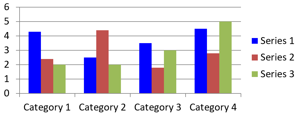
Sử dụng ChartSeries.getFormat để đặt màu độ tô mặc định cho toàn bộ một chuỗi. Nếu một điểm đã có màu độ tô rõ ràng, cài đặt ChartDataPoint.getFormat của nó sẽ ghi đè màu độ tô chuỗi cho điểm đó.
Ví dụ sau áp dụng màu xanh đậm đặc cho chuỗi đầu tiên:
const aspose = {};
aspose.slides = require("aspose.slides.via.java");
const java = require("java");

const firstSlideIndex = 0;
const firstSeriesIndex = 0;
const solidFillType = java.newByte(aspose.slides.FillType.Solid);
const blueColor = java.getStaticFieldValue("java.awt.Color", "BLUE");

const presentation = new aspose.slides.Presentation();
try {
    const slide = presentation.getSlides().get_Item(firstSlideIndex);

    const chart = slide.getShapes().addChart(aspose.slides.ChartType.ClusteredColumn, 20, 20, 500, 200);

    const series = chart.getChartData().getSeries().get_Item(firstSeriesIndex);
    series.getFormat().getFill().setFillType(solidFillType);
    series.getFormat().getFill().getSolidFillColor().setColor(blueColor);

    presentation.save("series_color.pptx", aspose.slides.SaveFormat.Pptx);
} finally {
    presentation.dispose();
}
Kết quả:
Thay Đổi Tên Chuỗi
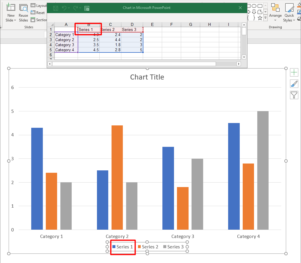
Tên chuỗi được lưu trong workbook dữ liệu biểu đồ và thường được hiển thị trong chú giải. Trong workbook mặc định được tạo cho biểu đồ cột cụm, ô B1 nằm ở hàng 0, cột 1 và chứa tên của chuỗi đầu tiên. Các hằng số có tên trong ví dụ sau làm cho cấu trúc này trở nên rõ ràng:
const aspose = {};
aspose.slides = require("aspose.slides.via.java");

const firstSlideIndex = 0;
const worksheetIndex = 0;
const seriesNameRowIndex = 0;
const firstSeriesColumnIndex = 1;

const presentation = new aspose.slides.Presentation();
try {
    const slide = presentation.getSlides().get_Item(firstSlideIndex);

    const chart = slide.getShapes().addChart(aspose.slides.ChartType.ClusteredColumn, 20, 20, 500, 200);

    const workbook = chart.getChartData().getChartDataWorkbook();
    const seriesNameCell = workbook.getCell(worksheetIndex, seriesNameRowIndex, firstSeriesColumnIndex);
    seriesNameCell.setValue("Revenue");

    presentation.save("series_name.pptx", aspose.slides.SaveFormat.Pptx);
} finally {
    presentation.dispose();
}
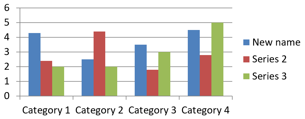
Bạn cũng có thể cập nhật ô đã được tham chiếu bởi ChartSeries.getName. Cách tiếp cận này tránh việc giả định một hàng và cột cụ thể trong biểu đồ hiện có:
const aspose = {};
aspose.slides = require("aspose.slides.via.java");

const firstSlideIndex = 0;
const firstSeriesIndex = 0;
const firstNameCellIndex = 0;

const presentation = new aspose.slides.Presentation();
try {
    const slide = presentation.getSlides().get_Item(firstSlideIndex);

    const chart = slide.getShapes().addChart(aspose.slides.ChartType.ClusteredColumn, 20, 20, 500, 200);

    const series = chart.getChartData().getSeries().get_Item(firstSeriesIndex);
    const seriesNameCell = series.getName().getAsCells().get_Item(firstNameCellIndex);
    seriesNameCell.setValue("Revenue");

    presentation.save("series_name.pptx", aspose.slides.SaveFormat.Pptx);
} finally {
    presentation.dispose();
}
Kết quả:
Tạo Một Chuỗi Có Tên Từ Nhiều Ô
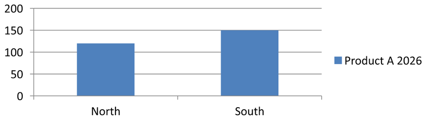
Tên chuỗi ghép hữu ích khi tên sản phẩm và kỳ báo cáo được lưu trong các ô workbook riêng biệt. Ví dụ, bạn có thể kết hợp Product A trong B1 và 2026 trong C1 thành một tên chuỗi duy nhất trong khi vẫn giữ cả hai phần liên kết với các ô nguồn của chúng.
Sử dụng ChartDataWorkbook.getCellCollection để lấy dải tên, sau đó truyền dải này cho ChartSeriesCollection.add. Tham số skipHiddenCells kiểm soát việc có bao gồm các ô ẩn hay không: true loại bỏ chúng, trong khi false bao gồm chúng. Ví dụ này sử dụng false để bao gồm mọi ô trong dải tên.
Ví dụ sau tạo một bản trình bày với một chuỗi và hai điểm dữ liệu. Các ô B1:C1 chỉ cung cấp tên chuỗi; A2:A3 cung cấp nhãn danh mục, và B2:B3 cung cấp các giá trị số.
const aspose = {};
aspose.slides = require("aspose.slides.via.java");

const presentation = new aspose.slides.Presentation();
try {
    const slide = presentation.getSlides().get_Item(0);

    const chart = slide.getShapes().addChart(aspose.slides.ChartType.ClusteredColumn, 50, 50, 620, 180);

    chart.getChartData().getSeries().clear();
    chart.getChartData().getCategories().clear();
    chart.setLegend(true);

    const workbook = chart.getChartData().getChartDataWorkbook();
    workbook.clear(0);

    // Hai ô này cung cấp tên chuỗi.
    workbook.getCell(0, 0, 1, "Product A");
    workbook.getCell(0, 0, 2, "2026");
    const nameCells = workbook.getCellCollection("Sheet1!$B$1:$C$1", false);
    const series = chart.getChartData().getSeries().add(nameCells, aspose.slides.ChartType.ClusteredColumn);

    // Các ô riêng biệt cung cấp danh mục và các điểm dữ liệu số.
    const northCategory = workbook.getCell(0, 1, 0, "North");
    const southCategory = workbook.getCell(0, 2, 0, "South");
    chart.getChartData().getCategories().add(northCategory);
    chart.getChartData().getCategories().add(southCategory);
    const northValue = workbook.getCell(0, 1, 1, 120);
    const southValue = workbook.getCell(0, 2, 1, 150);
    series.getDataPoints().addDataPointForBarSeries(northValue);
    series.getDataPoints().addDataPointForBarSeries(southValue);

    presentation.save("composite_series_name.pptx", aspose.slides.SaveFormat.Pptx);
} finally {
    presentation.dispose();
}
Tên chuỗi kết quả là Product A 2026, có một dấu cách giữa hai giá trị ô. Chú giải hiển thị điều này như một mục cho cả hai cột. Hình ảnh dưới minh họa kết quả:
Lấy Màu Độ Tô Tự Động của Chuỗi
ChartSeries.getAutomaticSeriesColor trả về màu được tính dựa trên chỉ mục chuỗi và kiểu biểu đồ. Đây là màu được sử dụng khi màu độ tô chuỗi chưa được xác định một cách rõ ràng. Gọi phương thức này chỉ đọc màu đã tính; nó không gán màu độ tô mới.
Ví dụ sau in màu tự động của mỗi chuỗi mặc định:
const aspose = {};
aspose.slides = require("aspose.slides.via.java");

const firstSlideIndex = 0;

const presentation = new aspose.slides.Presentation();
try {
    const slide = presentation.getSlides().get_Item(firstSlideIndex);

    const chart = slide.getShapes().addChart(aspose.slides.ChartType.ClusteredColumn, 20, 20, 500, 200);

    const seriesCount = chart.getChartData().getSeries().size();
    for (let seriesIndex = 0; seriesIndex < seriesCount; seriesIndex++) {
        const series = chart.getChartData().getSeries().get_Item(seriesIndex);
        const automaticColor = series.getAutomaticSeriesColor();
        const automaticColorText = automaticColor.toString();
        console.log("Series " + seriesIndex + ": " + automaticColorText);
    }
} finally {
    presentation.dispose();
}
Đầu ra mẫu cho kiểu biểu đồ mặc định:
Series 0: java.awt.Color[r=79,g=129,b=189]
Series 1: java.awt.Color[r=192,g=80,b=77]
Series 2: java.awt.Color[r=155,g=187,b=89]
Màu chính xác phụ thuộc vào kiểu và chủ đề biểu đồ.
Đặt Màu Độ Tô Đảo Ngược cho Một Chuỗi Biểu Đồ
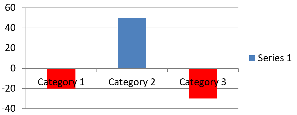
Đối với các chuỗi thanh, cột và bong bóng, ChartSeries.setInvertIfNegative có thể hiển thị các giá trị âm với màu độ tô khác. Đặt màu độ tô chuỗi thường thành màu đặc, bật tính năng đảo ngược và gán màu giá trị âm qua ChartSeries.getInvertedSolidFillColor. Các số âm không thay đổi trong workbook; chỉ màu hiển thị của chúng thay đổi.
Ví dụ sau thay thế dữ liệu biểu đồ mặc định bằng một chuỗi. Hàng 0 của worksheet chứa tên chuỗi, cột 0 chứa tên danh mục, và cột 1 chứa các giá trị:
const aspose = {};
aspose.slides = require("aspose.slides.via.java");
const java = require("java");

const firstSlideIndex = 0;
const worksheetIndex = 0;
const headerRowIndex = 0;
const categoryColumnIndex = 0;
const firstSeriesColumnIndex = 1;
const firstDataRowIndex = 1;
const solidFillType = java.newByte(aspose.slides.FillType.Solid);
const redColor = java.getStaticFieldValue("java.awt.Color", "RED");

const categoryNames = ["Category 1", "Category 2", "Category 3"];
const seriesValues = [-20, 50, -30];

const presentation = new aspose.slides.Presentation();
try {
    const slide = presentation.getSlides().get_Item(firstSlideIndex);

    const chart = slide.getShapes().addChart(aspose.slides.ChartType.ClusteredColumn, 20, 20, 500, 200);
    const chartData = chart.getChartData();
    const workbook = chartData.getChartDataWorkbook();

    chartData.getSeries().clear();
    chartData.getCategories().clear();

    const seriesNameCell = workbook.getCell(worksheetIndex, headerRowIndex, firstSeriesColumnIndex, "Series 1");
    const chartType = chart.getType();
    const series = chartData.getSeries().add(seriesNameCell, chartType);

    for (let categoryIndex = 0; categoryIndex < categoryNames.length; categoryIndex++) {
        const dataRowIndex = firstDataRowIndex + categoryIndex;
        const categoryName = categoryNames[categoryIndex];
        const seriesValue = seriesValues[categoryIndex];

        const categoryCell = workbook.getCell(worksheetIndex, dataRowIndex, categoryColumnIndex, categoryName);
        chartData.getCategories().add(categoryCell);

        const valueCell = workbook.getCell(worksheetIndex, dataRowIndex, firstSeriesColumnIndex, seriesValue);
        series.getDataPoints().addDataPointForBarSeries(valueCell);
    }

    const automaticSeriesColor = series.getAutomaticSeriesColor();
    series.getFormat().getFill().setFillType(solidFillType);
    series.getFormat().getFill().getSolidFillColor().setColor(automaticSeriesColor);
    series.setInvertIfNegative(true);
    series.getInvertedSolidFillColor().setColor(redColor);

    presentation.save("inverted_solid_fill_color.pptx", aspose.slides.SaveFormat.Pptx);
} finally {
    presentation.dispose();
}
Kết quả:
Bạn có thể bật đảo ngược cho một điểm thông qua ChartDataPoint.setInvertIfNegative. Trong ví dụ sau, đảo ngược bị tắt cho chuỗi và chỉ bật cho điểm được chọn. Điểm này cũng được gán giá trị âm để hiệu ứng hiển thị:
const aspose = {};
aspose.slides = require("aspose.slides.via.java");
const java = require("java");

const firstSlideIndex = 0;
const firstSeriesIndex = 0;
const targetDataPointIndex = 2;
const negativeValue = -30;
const solidFillType = java.newByte(aspose.slides.FillType.Solid);
const redColor = java.getStaticFieldValue("java.awt.Color", "RED");

const presentation = new aspose.slides.Presentation();
try {
    const slide = presentation.getSlides().get_Item(firstSlideIndex);

    const chart = slide.getShapes().addChart(aspose.slides.ChartType.ClusteredColumn, 20, 20, 500, 200);

    const series = chart.getChartData().getSeries().get_Item(firstSeriesIndex);
    const automaticSeriesColor = series.getAutomaticSeriesColor();
    series.getFormat().getFill().setFillType(solidFillType);
    series.getFormat().getFill().getSolidFillColor().setColor(automaticSeriesColor);
    series.getInvertedSolidFillColor().setColor(redColor);
    series.setInvertIfNegative(false);

    const dataPoint = series.getDataPoints().get_Item(targetDataPointIndex);
    dataPoint.getValue().getAsCell().setValue(negativeValue);
    dataPoint.setInvertIfNegative(true);

    presentation.save("data_point_invert_color_if_negative.pptx", aspose.slides.SaveFormat.Pptx);
} finally {
    presentation.dispose();
}
Xóa Giá Trị Điểm Dữ Liệu Cụ Thể
Để làm cho một điểm trở nên trống mà không loại bỏ các điểm khác, đặt ô workbook nền tảng của nó thành null. Đối với biểu đồ cột, giá trị đã vẽ có thể truy cập qua ChartDataPoint.getValue. Điểm dữ liệu vẫn giữ vị trí danh mục, nhưng biểu đồ sẽ coi giá trị của nó là trống tùy thuộc vào cài đặt giá trị trống của biểu đồ.
Ví dụ sau chỉ xóa điểm thứ hai trong chuỗi đầu tiên:
const aspose = {};
aspose.slides = require("aspose.slides.via.java");

const firstSlideIndex = 0;
const firstSeriesIndex = 0;
const targetDataPointIndex = 1;

const presentation = new aspose.slides.Presentation();
try {
    const slide = presentation.getSlides().get_Item(firstSlideIndex);

    const chart = slide.getShapes().addChart(aspose.slides.ChartType.ClusteredColumn, 20, 20, 500, 200);

    const series = chart.getChartData().getSeries().get_Item(firstSeriesIndex);
    const dataPoint = series.getDataPoints().get_Item(targetDataPointIndex);
    dataPoint.getValue().getAsCell().setValue(null);

    presentation.save("clear_data_point_value.pptx", aspose.slides.SaveFormat.Pptx);
} finally {
    presentation.dispose();
}
Biểu đồ phân tán sử dụng các ô X và Y riêng biệt, và biểu đồ bong bóng cũng sử dụng ô kích thước. Chỉ xóa ô đại diện cho giá trị bạn muốn loại bỏ. Đừng gọi ChartDataPointCollection.clear khi bạn muốn giữ lại các điểm khác, vì phương thức này sẽ xóa mọi điểm dữ liệu khỏi bộ sưu tập.
Kiểm Soát Hiển Thị Các Ô Trống
Các ô ẩn chứa giá trị là một trường hợp riêng so với các ô trống. Để bao gồm hoặc loại trừ dữ liệu từ các hàng và cột ẩn trong worksheet, xem Include Data from Hidden Rows and Columns.
Một ô workbook trống đại diện cho dữ liệu thiếu; một ô chứa 0 đại diện cho một giá trị số đã biết. Gọi ChartDataCell.setValue với null để làm ô trở nên trống. Số không vẫn là số không bất kể cài đặt ô trống.
Sử dụng Chart.setDisplayBlanksAs để chọn cách biểu đồ hiển thị các ô trống. Cài đặt này áp dụng cho toàn bộ biểu đồ. Nó thay đổi cách vẽ các khoảng trống, mà không điền ô workbook trống bằng số 0 hoặc giá trị nội suy.
Ví dụ tự chứa dưới đây tạo một biểu đồ đường với một chuỗi, xóa giá trị cho Ngày 3, và lưu biểu đồ cùng một lúc với từng chế độ. Không cần file đầu vào. ChartDataWorkbook sử dụng worksheet 0, cột 0 cho nhãn danh mục, và cột 1 cho các giá trị; hàng 0 giữ tên chuỗi. Dữ liệu cuối cùng là 10, 20, empty, 30, 40.
const aspose = {};
aspose.slides = require("aspose.slides.via.java");

const presentation = new aspose.slides.Presentation();
try {
    const slide = presentation.getSlides().get_Item(0);

    const chart = slide.getShapes().addChart(aspose.slides.ChartType.LineWithMarkers, 40, 40, 640, 400);
    const chartData = chart.getChartData();
    const workbook = chartData.getChartDataWorkbook();

    chartData.getSeries().clear();
    chartData.getCategories().clear();

    const seriesNameCell = workbook.getCell(0, 0, 1, "Measurements");
    const series = chartData.getSeries().add(seriesNameCell, chart.getType());
    const values = [10, 20, 25, 30, 40];

    for (let i = 0; i < values.length; i++) {
        const categoryCell = workbook.getCell(0, i + 1, 0, "Day " + (i + 1));
        chartData.getCategories().add(categoryCell);
        const valueCell = workbook.getCell(0, i + 1, 1, values[i]);
        series.getDataPoints().addDataPointForLineSeries(valueCell);
    }

    // Để Ngày 3 thực sự trống, trong khi vẫn giữ lại danh mục và điểm dữ liệu của nó.
    workbook.getCell(0, 3, 1).setValue(null);

    const modes = [aspose.slides.DisplayBlanksAsType.Gap, aspose.slides.DisplayBlanksAsType.Zero, aspose.slides.DisplayBlanksAsType.Span];
    const modeNames = ["Gap", "Zero", "Span"];
    for (let i = 0; i < modes.length; i++) {
        chart.setDisplayBlanksAs(modes[i]);
        presentation.save("empty_cells_" + modeNames[i] + ".pptx", aspose.slides.SaveFormat.Pptx);
    }
} finally {
    presentation.dispose();
}
Mỗi file đầu ra lưu chế độ được gán trước khi lưu: empty_cells_Gap.pptx, empty_cells_Zero.pptx, và empty_cells_Span.pptx. Để lưu chỉ một phiên bản, gán chế độ mong muốn và lưu bản trình bày một lần thay vì lặp qua các chế độ.
Bảng so sánh dưới đây hiển thị cùng một dữ liệu trong ba file. Ngày 3 là trống trong workbook trong mọi trường hợp:
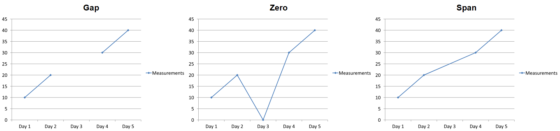
Hiệu ứng hiển thị phụ thuộc vào loại biểu đồ. Biểu đồ đường cho phép so sánh ba chế độ một cách dễ dàng. Biểu đồ thanh và cột không có đường nối qua danh mục thiếu, vì vậy Span không tạo đoạn nối như trên; một cột thiếu và một cột có chiều cao bằng 0 cũng có thể trông giống nhau. Tương tự, biểu đồ phân tán chỉ có dấu hiệu không có đường nối. Không nên mong đợi ba kết quả phân biệt cho mọi loại biểu đồ; hãy kiểm tra kết quả đối với loại bạn sử dụng.
Đặt Độ Rộng Khoảng Trống Giữa Các Chuỗi
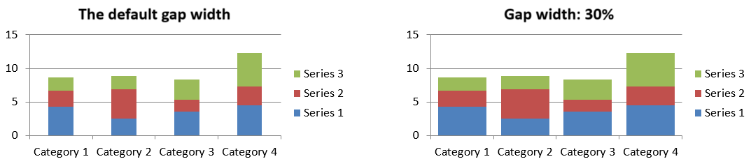
Độ rộng khoảng trống là khoảng cách giữa các cụm thanh hoặc cột liền kề, biểu thị dưới dạng phần trăm của chiều rộng thanh hoặc cột. Giống như độ chồng lấn, nó thuộc về nhóm chuỗi cha chứ không phải một chuỗi riêng lẻ. Gọi ChartSeriesGroup.setGapWidth một lần cho nhóm. Giá trị lớn hơn tạo nhiều không gian hơn giữa các cụm; giá trị nhỏ hơn làm chúng dày đặc hơn.
Ví dụ sau thay đổi độ rộng khoảng trống và chỉ lưu bản trình bày cuối cùng:
const aspose = {};
aspose.slides = require("aspose.slides.via.java");

const firstSlideIndex = 0;
const firstSeriesIndex = 0;
const gapWidthPercent = 30;

const presentation = new aspose.slides.Presentation();
try {
    const slide = presentation.getSlides().get_Item(firstSlideIndex);

    const chart = slide.getShapes().addChart(aspose.slides.ChartType.StackedColumn, 20, 20, 500, 200);

    const series = chart.getChartData().getSeries().get_Item(firstSeriesIndex);
    series.getParentSeriesGroup().setGapWidth(gapWidthPercent);

    presentation.save("gap_width_30.pptx", aspose.slides.SaveFormat.Pptx);
} finally {
    presentation.dispose();
}
Kết quả:
Câu Hỏi Thường Gặp
Loại biểu đồ nào hỗ trợ chuỗi dữ liệu?
Tất cả các loại biểu đồ được biểu diễn bằng enum ChartType đều sử dụng dữ liệu biểu đồ, nhưng các chuỗi của chúng không phải đều có cùng cấu trúc giá trị hoặc cài đặt. Ví dụ, biểu đồ danh mục sử dụng danh mục và giá trị, biểu đồ phân tán sử dụng giá trị X và Y, và biểu đồ bong bóng cộng thêm kích thước bong bóng. Sử dụng phương pháp tạo điểm dữ liệu phù hợp với loại chuỗi. Các tùy chọn như độ chồng lấn và độ rộng khoảng trống chỉ áp dụng cho các nhóm thanh hoặc cột tương thích.
Nhóm chuỗi biểu đồ là gì?
Một ChartSeriesGroup chứa các chuỗi tương thích chia sẻ các cài đặt vẽ ở mức độ nhóm. Một biểu đồ kết hợp có thể chứa hơn một nhóm, vì vậy việc thay đổi nhóm được truy cập qua một chuỗi không nhất thiết thay đổi mọi chuỗi trong biểu đồ.
Biểu đồ mới tạo có chứa dữ liệu mặc định không?
Có. Mặc định, ShapeCollection.addChart tạo các chuỗi, danh mục và giá trị mẫu. Bạn có thể chỉnh sửa các ô đó hoặc xóa cả bộ sưu tập chuỗi và danh mục trước khi thêm một bộ dữ liệu tùy chỉnh hoàn toàn. Một overload cũng có thể tạo biểu đồ không có dữ liệu mặc định.
Các đối tượng biểu đồ được kết nối với các ô workbook như thế nào?
Tên chuỗi, nhãn danh mục và giá trị điểm dữ liệu tham chiếu các ô trong một ChartDataWorkbook. Thay đổi một ô được tham chiếu sẽ cập nhật yếu tố biểu đồ tương ứng. Khi bạn xây dựng dữ liệu tùy chỉnh, hãy giữ cho các hàng danh mục và các hàng giá trị chuỗi được căn chỉnh để mỗi điểm được vẽ dưới danh mục dự định.
Làm sao để xóa một điểm thay vì toàn bộ chuỗi?
Đặt ô giá trị liên quan thành null để giữ vị trí danh mục của điểm đó như một điểm trống. Chỉ sử dụng ChartDataPointCollection.clear khi bạn muốn xóa mọi điểm trong chuỗi đó. Nếu bạn cũng xóa các danh mục, hãy cập nhật mọi chuỗi để giá trị của chúng vẫn căn chỉnh với bộ sưu tập danh mục.
Các điểm trống được hiển thị như thế nào?
Kết quả phụ thuộc vào loại biểu đồ và giá trị được cấu hình qua Chart.setDisplayBlanksAs. Các biểu đồ được hỗ trợ có thể hiển thị khoảng trống dưới dạng khoảng trống, giá trị 0, hoặc bằng cách nối các điểm liền kề. Chọn cài đặt phù hợp với ý nghĩa của dữ liệu thiếu trong bản trình bày của bạn. Xem Control the Display of Empty Cells để biết ví dụ đầy đủ và so sánh hình ảnh.
Các giá trị âm được định dạng như thế nào?
Đối với các chuỗi thanh, cột và bong bóng được hỗ trợ, gọi ChartSeries.setInvertIfNegative và đặt màu trả về bởi ChartSeries.getInvertedSolidFillColor. Bạn có thể ghi đè hành vi cho một điểm riêng lẻ bằng ChartDataPoint.setInvertIfNegative. Các phương thức này ảnh hưởng đến định dạng, không phải các giá trị số được lưu.
Định dạng nào thắng khi cả chuỗi và điểm đều được định dạng?
Định dạng điểm dữ liệu rõ ràng sẽ có ưu tiên cho điểm đó. Các điểm khác tiếp tục sử dụng định dạng chuỗi rõ ràng hoặc, khi không có định dạng chuỗi, sẽ dùng kiểu và chủ đề biểu đồ tự động. Các cài đặt nhóm như độ chồng lấn và độ rộng khoảng trống kiểm soát bố cục và không phải là sự ghi đè định dạng ở mức độ điểm.
Có giới hạn số chuỗi mà một biểu đồ có thể chứa không?
Aspose.Slides không áp đặt một giới hạn cố định riêng cho số chuỗi. Trong thực tế, các ràng buộc của file bản trình bày, bộ nhớ khả dụng, thời gian render và khả năng đọc của biểu đồ quyết định giới hạn thực tế.
Tôi nên thay đổi gì khi các cột quá gần nhau hoặc quá xa nhau?
Gọi ChartSeriesGroup.setGapWidth trên nhóm chuỗi cha thích hợp. Tăng giá trị để làm rộng khoảng cách giữa các cụm, hoặc giảm giá trị để đưa các cụm lại gần nhau hơn.