
JavaScript를 사용하여 프레젠테이션에서 차트 데이터 시리즈 관리
개요
차트는 플롯된 데이터를 차트 데이터 워크북에 저장합니다. ChartSeries는 관련 값 집합을 나타내며, 시리즈의 각 ChartDataPoint은 하나 이상의 워크북 셀을 참조합니다. ChartCategory 객체는 시리즈가 공유하는 레이블 또는 그룹화 값을 제공합니다. 따라서 시리즈 이름, 카테고리 및 포인트 값은 표시 텍스트로만 저장되지 않고 ChartDataCell 객체와 연결됩니다.
일반적인 카테고리 차트의 경우, 기본 워크북은 행 0을 시리즈 이름에, 열 0을 카테고리 이름에 사용하고 나머지 셀에 시리즈 값을 저장합니다. ChartDataWorkbook.getCell 에 전달되는 워크시트, 행, 열 인덱스는 0부터 시작합니다. 이 레이아웃은 기본 데이터로 차트를 만들 때 유용하지만, 모든 기존 차트가 이 레이아웃을 사용한다고 가정하지 마세요. 로드된 프레젠테이션에서는 워크북 값을 변경하기 전에 시리즈, 카테고리 및 데이터 포인트가 참조하는 셀을 확인하십시오.
차트 설정은 세 가지 범위가 있습니다.
- 시리즈 수준 설정은 ChartSeries.getFormat 과 같이 하나의 시리즈에 포함된 모든 포인트의 기본 모양을 제공합니다.
- 데이터 포인트 설정은 ChartDataPoint.getFormat 과 같이 한 포인트에 대한 시리즈 모양을 재정의합니다.
- 그룹 설정은 같은 ChartSeriesGroup에 속하는 호환 시리즈에 적용됩니다. ChartSeries.getParentSeriesGroup 을 통해 그룹에 접근하여 겹침(overlap)이나 간격(gap width)과 같은 옵션을 설정할 수 있습니다.
명시적인 포인트 또는 시리즈 채우기가 설정되지 않은 경우, 차트 스타일 및 테마가 자동 모양을 결정합니다. 시리즈와 포인트 포맷이 모두 존재하면 해당 포인트에 대해 포인트 포맷이 우선합니다.
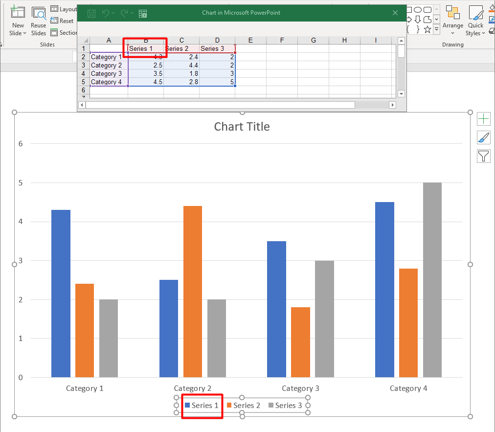
차트 시리즈 겹침 설정
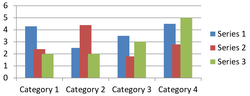
ChartSeries.getOverlap 은 2D 차트에서 막대나 열이 얼마나 겹치는지를 -100%에서 100%까지 반환합니다. 이는 상위 시리즈 그룹에 대한 설정을 읽기 전용으로 투영한 값입니다. 해당 그룹에 포함된 모든 호환 시리즈를 업데이트하려면 ChartSeriesGroup.setOverlap 을 사용하십시오. 이 옵션은 그룹화된 막대나 열을 표시하는 차트 유형에만 적용되며, 복합 차트의 다른 시리즈 그룹에는 영향을 주지 않습니다.
다음 예제는 첫 번째 시리즈가 포함된 그룹의 겹침을 설정합니다:
const aspose = {};
aspose.slides = require("aspose.slides.via.java");
const java = require("java");

const firstSlideIndex = 0;
const firstSeriesIndex = 0;
const overlapPercent = java.newByte(30);

const presentation = new aspose.slides.Presentation();
try {
    const slide = presentation.getSlides().get_Item(firstSlideIndex);

    // 새 차트에는 샘플 시리즈, 카테고리 및 값이 포함됩니다.
    const chart = slide.getShapes().addChart(aspose.slides.ChartType.ClusteredColumn, 20, 20, 500, 200);

    const series = chart.getChartData().getSeries().get_Item(firstSeriesIndex);
    series.getParentSeriesGroup().setOverlap(overlapPercent);

    presentation.save("series_overlap.pptx", aspose.slides.SaveFormat.Pptx);
} finally {
    presentation.dispose();
}
결과:
시리즈 채우기 색상 변경
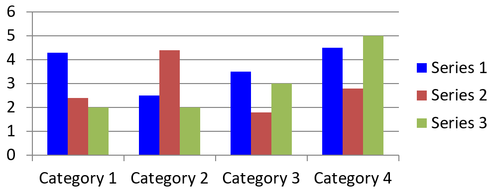
전체 시리즈에 대한 기본 채우기를 설정하려면 ChartSeries.getFormat 을 사용합니다. 포인트에 이미 명시적인 채우기가 있는 경우, 해당 포인트의 ChartDataPoint.getFormat 설정이 시리즈 채우기를 재정의합니다.
다음 예제는 첫 번째 시리즈에 단색 파란색 채우기를 적용합니다:
const aspose = {};
aspose.slides = require("aspose.slides.via.java");
const java = require("java");

const firstSlideIndex = 0;
const firstSeriesIndex = 0;
const solidFillType = java.newByte(aspose.slides.FillType.Solid);
const blueColor = java.getStaticFieldValue("java.awt.Color", "BLUE");

const presentation = new aspose.slides.Presentation();
try {
    const slide = presentation.getSlides().get_Item(firstSlideIndex);

    const chart = slide.getShapes().addChart(aspose.slides.ChartType.ClusteredColumn, 20, 20, 500, 200);

    const series = chart.getChartData().getSeries().get_Item(firstSeriesIndex);
    series.getFormat().getFill().setFillType(solidFillType);
    series.getFormat().getFill().getSolidFillColor().setColor(blueColor);

    presentation.save("series_color.pptx", aspose.slides.SaveFormat.Pptx);
} finally {
    presentation.dispose();
}
결과:
시리즈 이름 변경
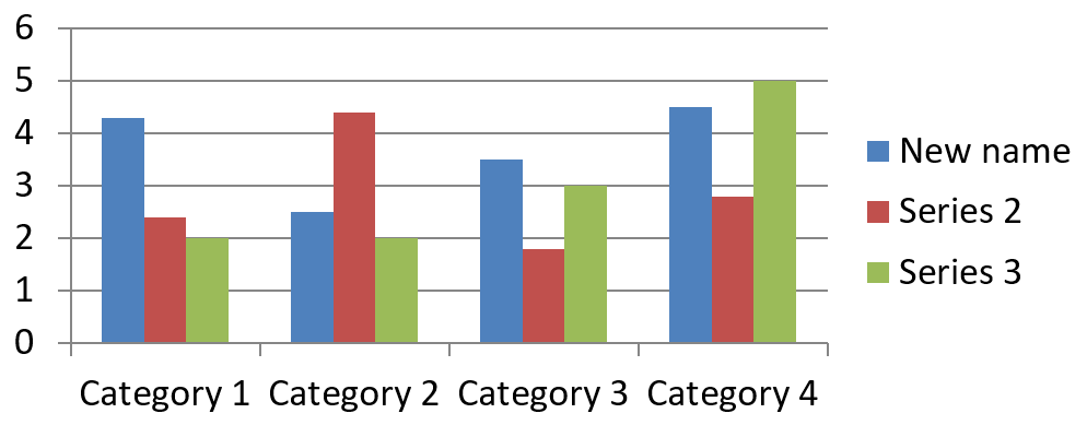
시리즈 이름은 차트 데이터 워크북에 저장되며 일반적으로 범례에 표시됩니다. 클러스터드 열 차트에 대해 기본 워크북을 만들면 셀 B1(행 0, 열 1)에 첫 번째 시리즈 이름이 들어갑니다. 다음 예제의 명명된 상수는 해당 구조를 명시적으로 나타냅니다:
const aspose = {};
aspose.slides = require("aspose.slides.via.java");

const firstSlideIndex = 0;
const worksheetIndex = 0;
const seriesNameRowIndex = 0;
const firstSeriesColumnIndex = 1;

const presentation = new aspose.slides.Presentation();
try {
    const slide = presentation.getSlides().get_Item(firstSlideIndex);

    const chart = slide.getShapes().addChart(aspose.slides.ChartType.ClusteredColumn, 20, 20, 500, 200);

    const workbook = chart.getChartData().getChartDataWorkbook();
    const seriesNameCell = workbook.getCell(worksheetIndex, seriesNameRowIndex, firstSeriesColumnIndex);
    seriesNameCell.setValue("Revenue");

    presentation.save("series_name.pptx", aspose.slides.SaveFormat.Pptx);
} finally {
    presentation.dispose();
}
또는 ChartSeries.getName 이 이미 참조하고 있는 셀을 업데이트할 수도 있습니다. 이 방법은 기존 차트에서 특정 행·열을 가정하지 않으므로 안전합니다:
const aspose = {};
aspose.slides = require("aspose.slides.via.java");

const firstSlideIndex = 0;
const firstSeriesIndex = 0;
const firstNameCellIndex = 0;

const presentation = new aspose.slides.Presentation();
try {
    const slide = presentation.getSlides().get_Item(firstSlideIndex);

    const chart = slide.getShapes().addChart(aspose.slides.ChartType.ClusteredColumn, 20, 20, 500, 200);

    const series = chart.getChartData().getSeries().get_Item(firstSeriesIndex);
    const seriesNameCell = series.getName().getAsCells().get_Item(firstNameCellIndex);
    seriesNameCell.setValue("Revenue");

    presentation.save("series_name.pptx", aspose.slides.SaveFormat.Pptx);
} finally {
    presentation.dispose();
}
결과:
여러 셀에서 이름을 가져오는 시리즈 만들기
제품 이름과 보고 기간이 별도의 워크북 셀에 저장된 경우 복합 시리즈 이름이 유용합니다. 예를 들어 B1에 Product A, C1에 2026이 있을 때 두 셀을 결합해 하나의 시리즈 이름으로 사용하면서 두 부분이 각각 원본 셀에 연결되도록 할 수 있습니다.
ChartDataWorkbook.getCellCollection 으로 이름 범위를 가져온 뒤, 해당 컬렉션을 ChartSeriesCollection.add 에 전달합니다. skipHiddenCells 매개변수는 숨겨진 셀을 포함할지 여부를 제어합니다: true이면 포함하지 않으며, false이면 포함합니다. 이 예제는 false를 사용해 이름 범위의 모든 셀을 포함합니다.
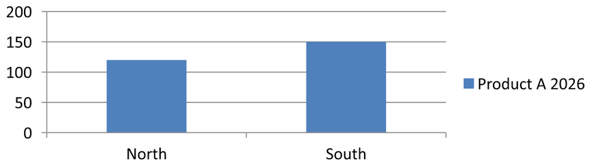
다음 예제는 하나의 시리즈와 두 데이터 포인트가 있는 프레젠테이션을 만듭니다. B1:C1은 시리즈 이름만 제공하고, A2:A3은 카테고리 레이블을, B2:B3은 숫자 값을 제공합니다.
const aspose = {};
aspose.slides = require("aspose.slides.via.java");

const presentation = new aspose.slides.Presentation();
try {
    const slide = presentation.getSlides().get_Item(0);

    const chart = slide.getShapes().addChart(aspose.slides.ChartType.ClusteredColumn, 50, 50, 620, 180);

    chart.getChartData().getSeries().clear();
    chart.getChartData().getCategories().clear();
    chart.setLegend(true);

    const workbook = chart.getChartData().getChartDataWorkbook();
    workbook.clear(0);

    // 이 두 셀은 시리즈 이름을 제공합니다.
    workbook.getCell(0, 0, 1, "Product A");
    workbook.getCell(0, 0, 2, "2026");
    const nameCells = workbook.getCellCollection("Sheet1!$B$1:$C$1", false);
    const series = chart.getChartData().getSeries().add(nameCells, aspose.slides.ChartType.ClusteredColumn);

    // 별도의 셀들이 카테고리와 숫자 데이터 포인트를 제공합니다.
    const northCategory = workbook.getCell(0, 1, 0, "North");
    const southCategory = workbook.getCell(0, 2, 0, "South");
    chart.getChartData().getCategories().add(northCategory);
    chart.getChartData().getCategories().add(southCategory);
    const northValue = workbook.getCell(0, 1, 1, 120);
    const southValue = workbook.getCell(0, 2, 1, 150);
    series.getDataPoints().addDataPointForBarSeries(northValue);
    series.getDataPoints().addDataPointForBarSeries(southValue);

    presentation.save("composite_series_name.pptx", aspose.slides.SaveFormat.Pptx);
} finally {
    presentation.dispose();
}
결과 시리즈 이름은 Product A 2026이며, 두 셀 값 사이에 공백이 삽입됩니다. 범례에는 두 열에 대한 하나의 항목으로 표시됩니다. 아래 이미지가 결과를 보여줍니다:
자동 시리즈 채우기 색상 가져오기
ChartSeries.getAutomaticSeriesColor 은 시리즈 인덱스와 차트 스타일을 기준으로 계산된 색상을 반환합니다. 이는 시리즈 채우기가 명시적으로 정의되지 않았을 때 사용되는 색상입니다. 메서드를 호출하면 계산된 색상을 읽어올 뿐, 새로운 채우기를 할당하지는 않습니다.
다음 예제는 각 기본 시리즈의 자동 색상을 출력합니다:
const aspose = {};
aspose.slides = require("aspose.slides.via.java");

const firstSlideIndex = 0;

const presentation = new aspose.slides.Presentation();
try {
    const slide = presentation.getSlides().get_Item(firstSlideIndex);

    const chart = slide.getShapes().addChart(aspose.slides.ChartType.ClusteredColumn, 20, 20, 500, 200);

    const seriesCount = chart.getChartData().getSeries().size();
    for (let seriesIndex = 0; seriesIndex < seriesCount; seriesIndex++) {
        const series = chart.getChartData().getSeries().get_Item(seriesIndex);
        const automaticColor = series.getAutomaticSeriesColor();
        const automaticColorText = automaticColor.toString();
        console.log("Series " + seriesIndex + ": " + automaticColorText);
    }
} finally {
    presentation.dispose();
}
기본 차트 스타일에 대한 예시 출력:
Series 0: java.awt.Color[r=79,g=129,b=189]
Series 1: java.awt.Color[r=192,g=80,b=77]
Series 2: java.awt.Color[r=155,g=187,b=89]
정확한 색상은 차트 스타일 및 테마에 따라 달라집니다.
차트 시리즈의 반전 채우기 색상 설정
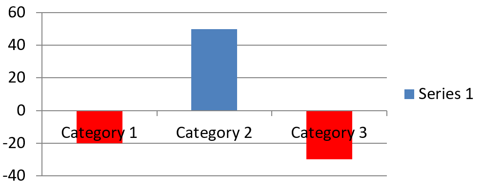
막대, 열, 버블 시리즈의 경우 ChartSeries.setInvertIfNegative 을 사용해 음수 값을 다른 채우기로 표시할 수 있습니다. 일반 시리즈 채우기를 단색으로 설정하고 반전을 활성화한 뒤, ChartSeries.getInvertedSolidFillColor 을 통해 음수 색상을 지정합니다. 워크북에 있는 음수 값 자체는 변경되지 않으며, 표시 색상만 바뀝니다.
다음 예제는 기본 차트 데이터를 하나의 시리즈로 교체합니다. 워크시트 행 0에 시리즈 이름, 열 0에 카테고리 이름, 열 1에 값을 배치합니다:
const aspose = {};
aspose.slides = require("aspose.slides.via.java");
const java = require("java");

const firstSlideIndex = 0;
const worksheetIndex = 0;
const headerRowIndex = 0;
const categoryColumnIndex = 0;
const firstSeriesColumnIndex = 1;
const firstDataRowIndex = 1;
const solidFillType = java.newByte(aspose.slides.FillType.Solid);
const redColor = java.getStaticFieldValue("java.awt.Color", "RED");

const categoryNames = ["Category 1", "Category 2", "Category 3"];
const seriesValues = [-20, 50, -30];

const presentation = new aspose.slides.Presentation();
try {
    const slide = presentation.getSlides().get_Item(firstSlideIndex);

    const chart = slide.getShapes().addChart(aspose.slides.ChartType.ClusteredColumn, 20, 20, 500, 200);
    const chartData = chart.getChartData();
    const workbook = chartData.getChartDataWorkbook();

    chartData.getSeries().clear();
    chartData.getCategories().clear();

    const seriesNameCell = workbook.getCell(worksheetIndex, headerRowIndex, firstSeriesColumnIndex, "Series 1");
    const chartType = chart.getType();
    const series = chartData.getSeries().add(seriesNameCell, chartType);

    for (let categoryIndex = 0; categoryIndex < categoryNames.length; categoryIndex++) {
        const dataRowIndex = firstDataRowIndex + categoryIndex;
        const categoryName = categoryNames[categoryIndex];
        const seriesValue = seriesValues[categoryIndex];

        const categoryCell = workbook.getCell(worksheetIndex, dataRowIndex, categoryColumnIndex, categoryName);
        chartData.getCategories().add(categoryCell);

        const valueCell = workbook.getCell(worksheetIndex, dataRowIndex, firstSeriesColumnIndex, seriesValue);
        series.getDataPoints().addDataPointForBarSeries(valueCell);
    }

    const automaticSeriesColor = series.getAutomaticSeriesColor();
    series.getFormat().getFill().setFillType(solidFillType);
    series.getFormat().getFill().getSolidFillColor().setColor(automaticSeriesColor);
    series.setInvertIfNegative(true);
    series.getInvertedSolidFillColor().setColor(redColor);

    presentation.save("inverted_solid_fill_color.pptx", aspose.slides.SaveFormat.Pptx);
} finally {
    presentation.dispose();
}
결과:
포인트 하나에만 반전을 적용하려면 ChartDataPoint.setInvertIfNegative 을 사용하십시오. 아래 예제에서는 시리즈에 대한 반전을 비활성화하고 선택한 포인트에만 활성화합니다. 해당 포인트에는 음수 값도 할당되어 효과를 볼 수 있습니다:
const aspose = {};
aspose.slides = require("aspose.slides.via.java");
const java = require("java");

const firstSlideIndex = 0;
const firstSeriesIndex = 0;
const targetDataPointIndex = 2;
const negativeValue = -30;
const solidFillType = java.newByte(aspose.slides.FillType.Solid);
const redColor = java.getStaticFieldValue("java.awt.Color", "RED");

const presentation = new aspose.slides.Presentation();
try {
    const slide = presentation.getSlides().get_Item(firstSlideIndex);

    const chart = slide.getShapes().addChart(aspose.slides.ChartType.ClusteredColumn, 20, 20, 500, 200);

    const series = chart.getChartData().getSeries().get_Item(firstSeriesIndex);
    const automaticSeriesColor = series.getAutomaticSeriesColor();
    series.getFormat().getFill().setFillType(solidFillType);
    series.getFormat().getFill().getSolidFillColor().setColor(automaticSeriesColor);
    series.getInvertedSolidFillColor().setColor(redColor);
    series.setInvertIfNegative(false);

    const dataPoint = series.getDataPoints().get_Item(targetDataPointIndex);
    dataPoint.getValue().getAsCell().setValue(negativeValue);
    dataPoint.setInvertIfNegative(true);

    presentation.save("data_point_invert_color_if_negative.pptx", aspose.slides.SaveFormat.Pptx);
} finally {
    presentation.dispose();
}
특정 데이터 포인트 값 지우기
한 포인트만 비우고 다른 포인트는 유지하려면 해당 워크북 셀을 null 로 설정합니다. 열 차트의 경우 플롯된 값은 ChartDataPoint.getValue 로 얻을 수 있습니다. 데이터 포인트는 동일한 카테고리 위치에 남아 있지만 차트는 값이 비어 있다고 간주합니다(차트의 빈값 설정에 따라).
다음 예제는 첫 번째 시리즈의 두 번째 포인트만 지웁니다:
const aspose = {};
aspose.slides = require("aspose.slides.via.java");

const firstSlideIndex = 0;
const firstSeriesIndex = 0;
const targetDataPointIndex = 1;

const presentation = new aspose.slides.Presentation();
try {
    const slide = presentation.getSlides().get_Item(firstSlideIndex);

    const chart = slide.getShapes().addChart(aspose.slides.ChartType.ClusteredColumn, 20, 20, 500, 200);

    const series = chart.getChartData().getSeries().get_Item(firstSeriesIndex);
    const dataPoint = series.getDataPoints().get_Item(targetDataPointIndex);
    dataPoint.getValue().getAsCell().setValue(null);

    presentation.save("clear_data_point_value.pptx", aspose.slides.SaveFormat.Pptx);
} finally {
    presentation.dispose();
}
산점도는 X와 Y 셀을 별도로 사용하고, 버블 차트는 크기 셀도 사용합니다. 제거하려는 값에 해당하는 셀만 비우세요. 다른 포인트를 유지하면서 전체 컬렉션을 제거하고 싶지 않다면 ChartDataPointCollection.clear 를 호출하지 마세요. 이 메서드는 컬렉션의 모든 데이터 포인트를 삭제합니다.
빈 셀 표시 제어
값이 들어 있는 숨긴 셀은 빈 셀과 별개로 취급됩니다. 숨긴 워크시트 행·열의 데이터를 포함하거나 제외하려면 Include Data from Hidden Rows and Columns 를 참조하세요.
빈 워크북 셀은 데이터가 없음을 나타내며, 0이 들어 있는 셀은 알려진 숫자 값을 나타냅니다. 셀을 비우려면 ChartDataCell.setValue 에 null 을 전달하십시오. 숫자 0은 빈셀 설정과 무관하게 0으로 유지됩니다.
Chart.setDisplayBlanksAs 를 사용해 차트가 빈 셀을 어떻게 표시할지 선택합니다. 이 설정은 차트 전체에 적용되며, 빈 셀을 0이나 보간값으로 채우지 않고 그래프에 어떻게 플롯될지를 결정합니다.
다음 자체 포함 예제는 라인 차트를 하나의 시리즈와 함께 만들고, Day 3의 값을 지우고 각 모드별로 차트를 저장합니다. 입력 파일이 필요하지 않습니다. ChartDataWorkbook 은 워크시트 0, 열 0을 카테고리 레이블, 열 1을 값으로 사용하고, 행 0에 시리즈 이름을 둡니다. 최종 데이터는 10, 20, empty, 30, 40 입니다.
const aspose = {};
aspose.slides = require("aspose.slides.via.java");

const presentation = new aspose.slides.Presentation();
try {
    const slide = presentation.getSlides().get_Item(0);

    const chart = slide.getShapes().addChart(aspose.slides.ChartType.LineWithMarkers, 40, 40, 640, 400);
    const chartData = chart.getChartData();
    const workbook = chartData.getChartDataWorkbook();

    chartData.getSeries().clear();
    chartData.getCategories().clear();

    const seriesNameCell = workbook.getCell(0, 0, 1, "Measurements");
    const series = chartData.getSeries().add(seriesNameCell, chart.getType());
    const values = [10, 20, 25, 30, 40];

    for (let i = 0; i < values.length; i++) {
        const categoryCell = workbook.getCell(0, i + 1, 0, "Day " + (i + 1));
        chartData.getCategories().add(categoryCell);
        const valueCell = workbook.getCell(0, i + 1, 1, values[i]);
        series.getDataPoints().addDataPointForLineSeries(valueCell);
    }

    // Day 3을 실제로 비워두고, 해당 카테고리와 데이터 포인트는 유지합니다.
    workbook.getCell(0, 3, 1).setValue(null);

    const modes = [aspose.slides.DisplayBlanksAsType.Gap, aspose.slides.DisplayBlanksAsType.Zero, aspose.slides.DisplayBlanksAsType.Span];
    const modeNames = ["Gap", "Zero", "Span"];
    for (let i = 0; i < modes.length; i++) {
        chart.setDisplayBlanksAs(modes[i]);
        presentation.save("empty_cells_" + modeNames[i] + ".pptx", aspose.slides.SaveFormat.Pptx);
    }
} finally {
    presentation.dispose();
}
각 출력 파일은 저장 전 지정된 모드 이름을 포함합니다: empty_cells_Gap.pptx, empty_cells_Zero.pptx, empty_cells_Span.pptx. 하나의 버전만 저장하려면 원하는 모드만 지정하고 한 번만 프레젠테이션을 저장하면 됩니다.
아래 비교는 세 파일 모두에서 동일한 데이터를 보여줍니다. Day 3은 모든 경우 워크북에서 비어 있습니다:
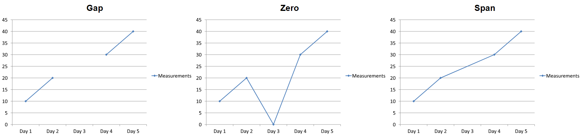
보이는 효과는 차트 유형에 따라 다릅니다. 라인 차트는 세 모드를 모두 쉽게 비교할 수 있지만, 막대·열 차트는 누락된 카테고리를 연결할 선이 없으므로 Span이 위와 같은 연결 구간을 만들 수 없습니다. 누락된 열과 0 높이 열이 비슷하게 보일 수도 있습니다. 마찬가지로 마커만 있는 산점도는 연결 선이 없습니다. 모든 차트 유형에서 세 가지 뚜렷한 결과가 나오리라 기대하지 말고, 사용 중인 차트 유형에 대한 출력을 확인하세요.
시리즈 간격 너비 설정
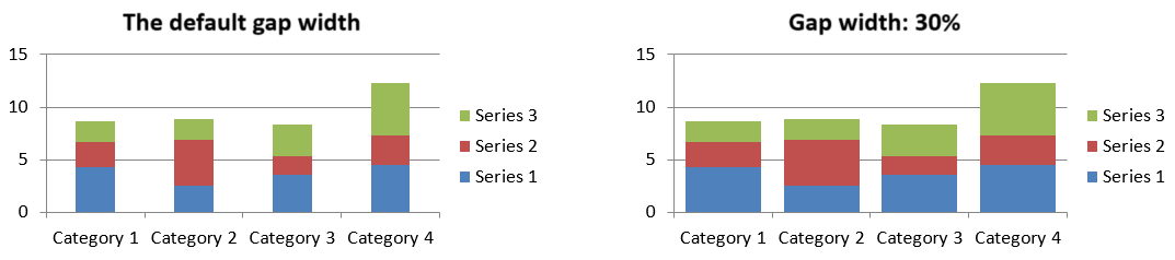
간격 너비는 인접한 막대·열 클러스터 사이의 공간을 막대·열 너비의 백분율로 나타낸 값입니다. 겹침과 마찬가지로 이는 개별 시리즈가 아닌 상위 시리즈 그룹에 속합니다. 그룹에 대해 한 번만 ChartSeriesGroup.setGapWidth 를 호출하십시오. 값이 클수록 클러스터 간 간격이 넓어지고, 작을수록 밀집됩니다.
다음 예제는 간격 너비를 변경하고 최종 프레젠테이션만 저장합니다:
const aspose = {};
aspose.slides = require("aspose.slides.via.java");

const firstSlideIndex = 0;
const firstSeriesIndex = 0;
const gapWidthPercent = 30;

const presentation = new aspose.slides.Presentation();
try {
    const slide = presentation.getSlides().get_Item(firstSlideIndex);

    const chart = slide.getShapes().addChart(aspose.slides.ChartType.StackedColumn, 20, 20, 500, 200);

    const series = chart.getChartData().getSeries().get_Item(firstSeriesIndex);
    series.getParentSeriesGroup().setGapWidth(gapWidthPercent);

    presentation.save("gap_width_30.pptx", aspose.slides.SaveFormat.Pptx);
} finally {
    presentation.dispose();
}
결과:
FAQ
어떤 차트 유형이 데이터 시리즈를 지원하나요?
ChartType 열거형에 포함된 모든 차트 유형이 차트 데이터를 사용하지만, 시리즈마다 값 구조나 설정이 다를 수 있습니다. 예를 들어 카테고리 차트는 카테고리와 값을 사용하고, 산점도는 X·Y 값을 사용하며, 버블 차트는 추가로 버블 크기를 사용합니다. 시리즈 유형에 맞는 데이터 포인트 생성 메서드를 사용하세요. 겹침·간격 너비와 같은 옵션은 호환되는 막대·열 그룹에만 적용됩니다.
차트 시리즈 그룹이란 무엇인가요?
ChartSeriesGroup 은 그룹 수준 플롯 설정을 공유하는 호환 시리즈를 포함합니다. 복합 차트는 여러 그룹을 가질 수 있으므로, 한 시리즈를 통해 접근한 그룹을 변경해도 차트의 모든 시리즈에 영향을 주지는 않습니다.
새로 만든 차트에 기본 데이터가 포함되어 있나요?
예. 기본적으로 ShapeCollection.addChart 은 샘플 시리즈, 카테고리, 값을 생성합니다. 이러한 셀을 편집하거나 시리즈·카테고리 컬렉션을 모두 지우고 완전히 사용자 정의된 데이터 세트를 추가할 수 있습니다. 오버로드를 사용하면 기본 데이터 없이 차트를 만들 수도 있습니다.
차트 객체는 워크북 셀과 어떻게 연결되나요?
시리즈 이름, 카테고리 레이블, 데이터 포인트 값은 모두 ChartDataWorkbook 의 셀을 참조합니다. 참조된 셀을 변경하면 해당 차트 요소가 자동으로 업데이트됩니다. 사용자 정의 데이터를 만들 때는 카테고리 행과 시리즈‑값 행이 정렬되어 각 포인트가 의도한 카테고리 아래에 플롯되도록 하세요.
전체 시리즈가 아니라 하나의 포인트만 지우려면 어떻게 하나요?
해당 값 셀을 null 로 설정하면 포인트의 카테고리 위치는 유지되면서 빈 포인트가 됩니다. 전체 포인트를 삭제하려는 경우에만 ChartDataPointCollection.clear 를 사용하십시오. 카테고리 자체를 삭제한다면 모든 시리즈가 카테고리 컬렉션과 정렬되도록 업데이트해야 합니다.
빈 포인트는 어떻게 표시되나요?
표시는 차트 유형과 Chart.setDisplayBlanksAs 로 구성한 값에 따라 달라집니다. 지원되는 차트는 빈값을 간격(gap), 0값, 혹은 인접 포인트 연결 방식으로 표시할 수 있습니다. 프레젠테이션에 맞는 설정을 선택하세요. 자세한 예제와 시각적 비교는 Control the Display of Empty Cells 를 참고하십시오.
음수 값은 어떻게 서식이 지정되나요?
지원되는 막대·열·버블 시리즈의 경우 ChartSeries.setInvertIfNegative 를 호출하고, ChartSeries.getInvertedSolidFillColor 로 반환되는 색상을 지정합니다. 개별 포인트에 대해서는 ChartDataPoint.setInvertIfNegative 로 동작을 재정의할 수 있습니다. 이러한 메서드는 서식에만 영향을 주며 저장된 숫자 값은 변하지 않습니다.
시리즈와 포인트가 모두 서식이 지정된 경우 어느 것이 우선인가요?
명시적인 데이터 포인트 서식이 해당 포인트에 대해 우선합니다. 다른 포인트는 명시적인 시리즈 서식이나, 시리즈 서식이 정의되지 않은 경우 자동 차트 스타일·테마를 따릅니다. 겹침·간격 너비와 같은 그룹 설정은 레이아웃을 제어하며 포인트 수준 서식 우선순위와는 별개입니다.
차트가 포함할 수 있는 시리즈 개수에 제한이 있나요?
Aspose.Slides 자체에 고정된 시리즈 수 제한은 없습니다. 실제 제한은 프레젠테이션 파일 규모, 사용 가능한 메모리, 렌더링 시간 및 차트 가독성 등에 의해 결정됩니다.
열이 너무 가깝거나 멀리 떨어져 있을 때 어떻게 조정하나요?
해당 상위 시리즈 그룹에 대해 ChartSeriesGroup.setGapWidth 를 호출하십시오. 값을 늘리면 클러스터 간 간격이 넓어지고, 값을 줄이면 클러스터가 더 가깝게 배치됩니다.