
JavaScript Kullanarak Sunumlarda Grafik Veri Serilerini Yönetme
Genel Bakış
Bir grafik, çizilen verilerini bir grafik veri çalışma kitabında saklar. Bir ChartSeries bir ilişkili değer kümesini temsil eder ve serideki her bir ChartDataPoint bir veya daha fazla çalışma kitabı hücresine başvurur. ChartCategory nesneleri, seri tarafından paylaşılan etiketleri veya gruplama değerlerini sağlar. Seri adı, kategoriler ve nokta değerleri bu nedenle yalnızca görüntü metni olarak depolanmak yerine ChartDataCell nesnelerine bağlanır.
Tipik bir kategori grafiği için, varsayılan çalışma kitabı seri adları için satır 0, kategori adları için sütun 0 ve kalan hücreler seri değerleri için kullanır. ChartDataWorkbook.getCell yöntemine geçirilen çalışma sayfası, satır ve sütun indeksleri sıfır tabanlıdır. Bu düzen, varsayılan verilerle bir grafik oluşturduğunuzda kullanışlıdır, ancak mevcut her grafiğin bunu kullandığını varsaymayın. Yüklenmiş bir sunum için, çalışma kitabı değerlerini değiştirmeden önce seriler, kategoriler ve veri noktaları tarafından başvurulan hücreleri inceleyin.
Grafik ayarlarının üç farklı kapsamı vardır:
- Seri‑seviyesi ayarları, örneğin ChartSeries.getFormat, bir serideki tüm noktalar için varsayılan görünümü sağlar.
- Veri‑nokta ayarları, örneğin ChartDataPoint.getFormat, bir nokta için seri görünümünü geçersiz kılar.
- Grup ayarları, aynı ChartSeriesGroup içinde bulunan uyumlu serilere uygulanır. Çakışma veya boşluk genişliği gibi seçenekleri ayarlamanız gerektiğinde, grup üzerinden ChartSeries.getParentSeriesGroup erişin.
Açıkça bir nokta veya seri doldurması ayarlanmamışsa, grafik stili ve teması otomatik görünümü belirler. Hem seri hem de nokta biçimlendirmesi mevcut olduğunda, nokta biçimlendirmesi o nokta için öncelik kazanır.

Grafik Serisi Çakışmasını Ayarla
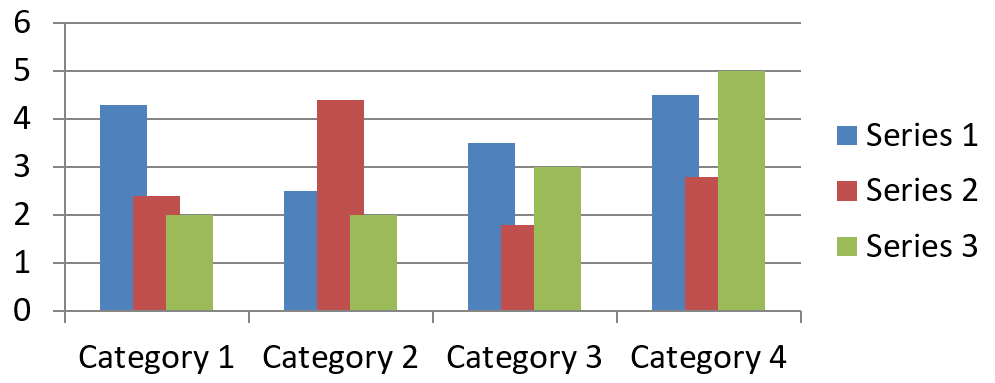
ChartSeries.getOverlap, 2D bir grafikte çubukların veya sütunların -%100 ile %100 arasında ne kadar çakıştığını rapor eder. Bu, üst grup üzerindeki ayarın salt okunur bir yansımasıdır. O gruptaki her uyumlu seriyi güncellemek için ChartSeriesGroup.setOverlap kullanın. Bu seçenek, gruplanmış çubuk veya sütun gösteren grafik türleri için geçerlidir; bir kombinasyon grafiğindeki ilgili olmayan seri gruplarını etkilemez.
Aşağıdaki örnek, ilk seriyi içeren grup için çakışmayı ayarlar:
const aspose = {};
aspose.slides = require("aspose.slides.via.java");
const java = require("java");

const firstSlideIndex = 0;
const firstSeriesIndex = 0;
const overlapPercent = java.newByte(30);

const presentation = new aspose.slides.Presentation();
try {
    const slide = presentation.getSlides().get_Item(firstSlideIndex);

    // Yeni grafik örnek seriler, kategoriler ve değerler içerir.
    const chart = slide.getShapes().addChart(aspose.slides.ChartType.ClusteredColumn, 20, 20, 500, 200);

    const series = chart.getChartData().getSeries().get_Item(firstSeriesIndex);
    series.getParentSeriesGroup().setOverlap(overlapPercent);

    presentation.save("series_overlap.pptx", aspose.slides.SaveFormat.Pptx);
} finally {
    presentation.dispose();
}
Sonuç:
Seri Dolgu Rengini Değiştir
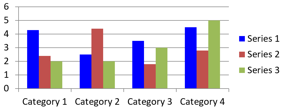
ChartSeries.getFormat kullanarak bir bütün serinin varsayılan dolgusunu ayarlayın. Bir noktanın zaten açık bir doldurması varsa, onun ChartDataPoint.getFormat ayarı, o nokta için seri dolgusunu geçersiz kılar.
Aşağıdaki örnek, ilk seriye katı mavi bir dolgu uygular:
const aspose = {};
aspose.slides = require("aspose.slides.via.java");
const java = require("java");

const firstSlideIndex = 0;
const firstSeriesIndex = 0;
const solidFillType = java.newByte(aspose.slides.FillType.Solid);
const blueColor = java.getStaticFieldValue("java.awt.Color", "BLUE");

const presentation = new aspose.slides.Presentation();
try {
    const slide = presentation.getSlides().get_Item(firstSlideIndex);

    const chart = slide.getShapes().addChart(aspose.slides.ChartType.ClusteredColumn, 20, 20, 500, 200);

    const series = chart.getChartData().getSeries().get_Item(firstSeriesIndex);
    series.getFormat().getFill().setFillType(solidFillType);
    series.getFormat().getFill().getSolidFillColor().setColor(blueColor);

    presentation.save("series_color.pptx", aspose.slides.SaveFormat.Pptx);
} finally {
    presentation.dispose();
}
Sonuç:
Seri Adını Değiştir
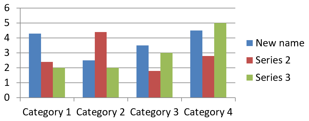
Bir seri adı, grafik veri çalışma kitabında saklanır ve genellikle lejanda görüntülenir. Küme sütun grafiği için oluşturulan varsayılan çalışma kitabında, B1 hücresi satır 0, sütun 1 konumunda bulunur ve ilk serinin adını içerir. Aşağıdaki örnekteki adlandırılmış sabitler bu yapıyı açıkça gösterir:
const aspose = {};
aspose.slides = require("aspose.slides.via.java");

const firstSlideIndex = 0;
const worksheetIndex = 0;
const seriesNameRowIndex = 0;
const firstSeriesColumnIndex = 1;

const presentation = new aspose.slides.Presentation();
try {
    const slide = presentation.getSlides().get_Item(firstSlideIndex);

    const chart = slide.getShapes().addChart(aspose.slides.ChartType.ClusteredColumn, 20, 20, 500, 200);

    const workbook = chart.getChartData().getChartDataWorkbook();
    const seriesNameCell = workbook.getCell(worksheetIndex, seriesNameRowIndex, firstSeriesColumnIndex);
    seriesNameCell.setValue("Revenue");

    presentation.save("series_name.pptx", aspose.slides.SaveFormat.Pptx);
} finally {
    presentation.dispose();
}
Ayrıca, ChartSeries.getName tarafından zaten başvurulan hücreyi güncelleyebilirsiniz. Bu yaklaşım, mevcut bir grafikte belirli bir satır ve sütun varsayımından kaçınır:
const aspose = {};
aspose.slides = require("aspose.slides.via.java");

const firstSlideIndex = 0;
const firstSeriesIndex = 0;
const firstNameCellIndex = 0;

const presentation = new aspose.slides.Presentation();
try {
    const slide = presentation.getSlides().get_Item(firstSlideIndex);

    const chart = slide.getShapes().addChart(aspose.slides.ChartType.ClusteredColumn, 20, 20, 500, 200);

    const series = chart.getChartData().getSeries().get_Item(firstSeriesIndex);
    const seriesNameCell = series.getName().getAsCells().get_Item(firstNameCellIndex);
    seriesNameCell.setValue("Revenue");

    presentation.save("series_name.pptx", aspose.slides.SaveFormat.Pptx);
} finally {
    presentation.dispose();
}
Sonuç:
Birden Çok Hücreden Adı Olan Seri Oluştur
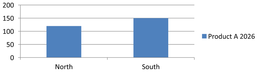
Birden fazla hücrede saklanan ürün adı ve raporlama dönemi gibi parçalar birleştirildiğinde birleşik bir seri adı yararlı olur. Örneğin, B1 hücresindeki Product A ve C1 hücresindeki 2026 değerlerini tek bir seri adı olarak birleştirip her iki parçanın da kaynak hücrelerine bağlı kalmasını sağlayabilirsiniz.
ChartDataWorkbook.getCellCollection kullanarak ad aralığını alın, ardından bu koleksiyonu ChartSeriesCollection.add metoduna geçirin. skipHiddenCells parametresi gizli hücrelerin dahil edilip edilmemesini kontrol eder: true gizler, false ekler. Bu örnek, ad aralığındaki her hücreyi eklemek için false kullanır.
Aşağıdaki örnek, bir seri ve iki veri noktasına sahip bir sunum oluşturur. B1:C1 hücreleri sadece seri adını, A2:A3 hücreleri kategori etiketlerini ve B2:B3 hücreleri sayısal değerleri sağlar.
const aspose = {};
aspose.slides = require("aspose.slides.via.java");

const presentation = new aspose.slides.Presentation();
try {
    const slide = presentation.getSlides().get_Item(0);

    const chart = slide.getShapes().addChart(aspose.slides.ChartType.ClusteredColumn, 50, 50, 620, 180);

    chart.getChartData().getSeries().clear();
    chart.getChartData().getCategories().clear();
    chart.setLegend(true);

    const workbook = chart.getChartData().getChartDataWorkbook();
    workbook.clear(0);

    // Bu iki hücre seri adını sağlar.
    workbook.getCell(0, 0, 1, "Product A");
    workbook.getCell(0, 0, 2, "2026");
    const nameCells = workbook.getCellCollection("Sheet1!$B$1:$C$1", false);
    const series = chart.getChartData().getSeries().add(nameCells, aspose.slides.ChartType.ClusteredColumn);

    // Ayrı hücreler kategorileri ve sayısal veri noktalarını sağlar.
    const northCategory = workbook.getCell(0, 1, 0, "North");
    const southCategory = workbook.getCell(0, 2, 0, "South");
    chart.getChartData().getCategories().add(northCategory);
    chart.getChartData().getCategories().add(southCategory);
    const northValue = workbook.getCell(0, 1, 1, 120);
    const southValue = workbook.getCell(0, 2, 1, 150);
    series.getDataPoints().addDataPointForBarSeries(northValue);
    series.getDataPoints().addDataPointForBarSeries(southValue);

    presentation.save("composite_series_name.pptx", aspose.slides.SaveFormat.Pptx);
} finally {
    presentation.dispose();
}
Ortaya çıkan seri adı, iki hücre değerinin arasına bir boşluk eklenerek Product A 2026 olur. Lejant bu iki sütunu tek bir giriş olarak gösterir. Aşağıdaki resim sonucu gösterir:
Otomatik Seri Dolgu Rengini Al
ChartSeries.getAutomaticSeriesColor yöntemi, seri indeksine ve grafik stiline göre hesaplanan rengi döndürür. Bu, seri dolgu açıkça tanımlanmamışsa kullanılan renktir. Yöntem, hesaplanan rengi okur; yeni bir dolgu atamaz.
Aşağıdaki örnek, her varsayılan serinin otomatik rengini yazdırır:
const aspose = {};
aspose.slides = require("aspose.slides.via.java");

const firstSlideIndex = 0;

const presentation = new aspose.slides.Presentation();
try {
    const slide = presentation.getSlides().get_Item(firstSlideIndex);

    const chart = slide.getShapes().addChart(aspose.slides.ChartType.ClusteredColumn, 20, 20, 500, 200);

    const seriesCount = chart.getChartData().getSeries().size();
    for (let seriesIndex = 0; seriesIndex < seriesCount; seriesIndex++) {
        const series = chart.getChartData().getSeries().get_Item(seriesIndex);
        const automaticColor = series.getAutomaticSeriesColor();
        const automaticColorText = automaticColor.toString();
        console.log("Series " + seriesIndex + ": " + automaticColorText);
    }
} finally {
    presentation.dispose();
}
Varsayılan grafik stili için örnek çıktı:
Series 0: java.awt.Color[r=79,g=129,b=189]
Series 1: java.awt.Color[r=192,g=80,b=77]
Series 2: java.awt.Color[r=155,g=187,b=89]
Kesin renkler, grafik stiline ve temaya bağlıdır.
Grafik Serisi için Ters Dolgu Rengini Ayarla
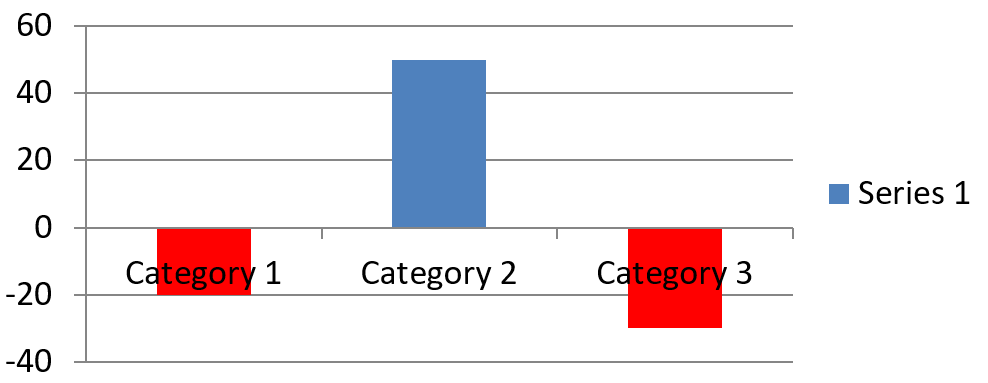
Çubuk, sütun ve balon serileri için, ChartSeries.setInvertIfNegative negatif değerleri farklı bir dolgu ile gösterebilir. Normal seri dolgusunu katı olarak ayarlayın, tersleme özelliğini etkinleştirin ve negatif değer rengini ChartSeries.getInvertedSolidFillColor üzerinden atayın. Negatif sayılar çalışma kitabında değişmeden kalır; yalnızca gösterim rengi değişir.
Aşağıdaki örnek, varsayılan grafik verisini bir seri ile değiştirir. Çalışma sayfası satır 0 seri adını, sütun 0 kategori adlarını ve sütun 1 değerleri içerir:
const aspose = {};
aspose.slides = require("aspose.slides.via.java");
const java = require("java");

const firstSlideIndex = 0;
const worksheetIndex = 0;
const headerRowIndex = 0;
const categoryColumnIndex = 0;
const firstSeriesColumnIndex = 1;
const firstDataRowIndex = 1;
const solidFillType = java.newByte(aspose.slides.FillType.Solid);
const redColor = java.getStaticFieldValue("java.awt.Color", "RED");

const categoryNames = ["Category 1", "Category 2", "Category 3"];
const seriesValues = [-20, 50, -30];

const presentation = new aspose.slides.Presentation();
try {
    const slide = presentation.getSlides().get_Item(firstSlideIndex);

    const chart = slide.getShapes().addChart(aspose.slides.ChartType.ClusteredColumn, 20, 20, 500, 200);
    const chartData = chart.getChartData();
    const workbook = chartData.getChartDataWorkbook();

    chartData.getSeries().clear();
    chartData.getCategories().clear();

    const seriesNameCell = workbook.getCell(worksheetIndex, headerRowIndex, firstSeriesColumnIndex, "Series 1");
    const chartType = chart.getType();
    const series = chartData.getSeries().add(seriesNameCell, chartType);

    for (let categoryIndex = 0; categoryIndex < categoryNames.length; categoryIndex++) {
        const dataRowIndex = firstDataRowIndex + categoryIndex;
        const categoryName = categoryNames[categoryIndex];
        const seriesValue = seriesValues[categoryIndex];

        const categoryCell = workbook.getCell(worksheetIndex, dataRowIndex, categoryColumnIndex, categoryName);
        chartData.getCategories().add(categoryCell);

        const valueCell = workbook.getCell(worksheetIndex, dataRowIndex, firstSeriesColumnIndex, seriesValue);
        series.getDataPoints().addDataPointForBarSeries(valueCell);
    }

    const automaticSeriesColor = series.getAutomaticSeriesColor();
    series.getFormat().getFill().setFillType(solidFillType);
    series.getFormat().getFill().getSolidFillColor().setColor(automaticSeriesColor);
    series.setInvertIfNegative(true);
    series.getInvertedSolidFillColor().setColor(redColor);

    presentation.save("inverted_solid_fill_color.pptx", aspose.slides.SaveFormat.Pptx);
} finally {
    presentation.dispose();
}
Sonuç:
Bir nokta için terslemeyi ChartDataPoint.setInvertIfNegative ile etkinleştirebilirsiniz. Aşağıdaki örnekte, seri için tersleme devre dışı bırakılır ve yalnızca seçili nokta için etkinleştirilir. Etkiyi görmek için nokta negatif bir değer alır:
const aspose = {};
aspose.slides = require("aspose.slides.via.java");
const java = require("java");

const firstSlideIndex = 0;
const firstSeriesIndex = 0;
const targetDataPointIndex = 2;
const negativeValue = -30;
const solidFillType = java.newByte(aspose.slides.FillType.Solid);
const redColor = java.getStaticFieldValue("java.awt.Color", "RED");

const presentation = new aspose.slides.Presentation();
try {
    const slide = presentation.getSlides().get_Item(firstSlideIndex);

    const chart = slide.getShapes().addChart(aspose.slides.ChartType.ClusteredColumn, 20, 20, 500, 200);

    const series = chart.getChartData().getSeries().get_Item(firstSeriesIndex);
    const automaticSeriesColor = series.getAutomaticSeriesColor();
    series.getFormat().getFill().setFillType(solidFillType);
    series.getFormat().getFill().getSolidFillColor().setColor(automaticSeriesColor);
    series.getInvertedSolidFillColor().setColor(redColor);
    series.setInvertIfNegative(false);

    const dataPoint = series.getDataPoints().get_Item(targetDataPointIndex);
    dataPoint.getValue().getAsCell().setValue(negativeValue);
    dataPoint.setInvertIfNegative(true);

    presentation.save("data_point_invert_color_if_negative.pptx", aspose.slides.SaveFormat.Pptx);
} finally {
    presentation.dispose();
}
Belirli Bir Veri Noktasının Değerini Temizle
Bir noktayı diğer noktaları kaldırmadan boş bırakmak için, arka plan çalışma kitabı hücresini null olarak ayarlayın. Bir sütun grafiği için, çizilen değer ChartDataPoint.getValue yöntemiyle elde edilir. Veri noktası aynı kategori konumunda kalır, ancak grafik değeri boş olarak işler ve grafik ayarlarına göre boş değer davranışı sergiler.
Aşağıdaki örnek, ilk serideki sadece ikinci noktayı temizler:
const aspose = {};
aspose.slides = require("aspose.slides.via.java");

const firstSlideIndex = 0;
const firstSeriesIndex = 0;
const targetDataPointIndex = 1;

const presentation = new aspose.slides.Presentation();
try {
    const slide = presentation.getSlides().get_Item(firstSlideIndex);

    const chart = slide.getShapes().addChart(aspose.slides.ChartType.ClusteredColumn, 20, 20, 500, 200);

    const series = chart.getChartData().getSeries().get_Item(firstSeriesIndex);
    const dataPoint = series.getDataPoints().get_Item(targetDataPointIndex);
    dataPoint.getValue().getAsCell().setValue(null);

    presentation.save("clear_data_point_value.pptx", aspose.slides.SaveFormat.Pptx);
} finally {
    presentation.dispose();
}
Dağılım grafikleri ayrı X ve Y hücreleri kullanır, balon grafikler ayrıca bir boyut hücresi kullanır. Kaldırmak istediğiniz değeri temsil eden hücreyi yalnızca temizleyin. Diğer noktaları korumak istiyorsanız, ChartDataPointCollection.clear metodunu çağırmayın; bu yöntem koleksiyondaki tüm veri noktalarını kaldırır.
Boş Hücrelerin Görüntülenmesini Kontrol Et
Değer içeren gizli hücreler, boş hücrelerden ayrı bir durumdur. Gizli çalışma sayfası satırları ve sütunlarından veri eklemek veya çıkarmak için Gizli Satır ve Sütunlardan Veri Dahil Et bölümüne bakın.
Boş bir çalışma kitabı hücresi eksik veriyi temsil eder; 0 içeren bir hücre bilinen sayısal bir değeri temsil eder. Bir hücreyi boş yapmak için null ile ChartDataCell.setValue yöntemini çağırın. Sayısal sıfır, boş hücre ayarından bağımsız olarak sıfır olarak kalır.
Boş hücrelerin grafik içinde nasıl görüntüleneceğini seçmek için Chart.setDisplayBlanksAs kullanın. Bu ayar tüm grafik için geçerlidir. Boşlukların nasıl çizileceğini değiştirir, boş çalışma kitabı hücresini sıfır ya da interpolasyonla doldurmaz.
Aşağıdaki bağımsız örnek, bir satır grafiği oluşturur, 3. Gün değerini temizler ve her modu ayrı bir dosyaya kaydeder. Girdi dosyasına ihtiyaç yoktur. ChartDataWorkbook çalışma sayfası 0, kategori etiketleri için sütun 0, değerler için sütun 1; satır 0 seri adını tutar. Son veri 10, 20, empty, 30, 40.
const aspose = {};
aspose.slides = require("aspose.slides.via.java");

const presentation = new aspose.slides.Presentation();
try {
    const slide = presentation.getSlides().get_Item(0);

    const chart = slide.getShapes().addChart(aspose.slides.ChartType.LineWithMarkers, 40, 40, 640, 400);
    const chartData = chart.getChartData();
    const workbook = chartData.getChartDataWorkbook();

    chartData.getSeries().clear();
    chartData.getCategories().clear();

    const seriesNameCell = workbook.getCell(0, 0, 1, "Measurements");
    const series = chartData.getSeries().add(seriesNameCell, chart.getType());
    const values = [10, 20, 25, 30, 40];

    for (let i = 0; i < values.length; i++) {
        const categoryCell = workbook.getCell(0, i + 1, 0, "Day " + (i + 1));
        chartData.getCategories().add(categoryCell);
        const valueCell = workbook.getCell(0, i + 1, 1, values[i]);
        series.getDataPoints().addDataPointForLineSeries(valueCell);
    }

    // Gün 3'ü gerçekten boş bırak, ancak kategori ve veri noktasını koru.
    workbook.getCell(0, 3, 1).setValue(null);

    const modes = [aspose.slides.DisplayBlanksAsType.Gap, aspose.slides.DisplayBlanksAsType.Zero, aspose.slides.DisplayBlanksAsType.Span];
    const modeNames = ["Gap", "Zero", "Span"];
    for (let i = 0; i < modes.length; i++) {
        chart.setDisplayBlanksAs(modes[i]);
        presentation.save("empty_cells_" + modeNames[i] + ".pptx", aspose.slides.SaveFormat.Pptx);
    }
} finally {
    presentation.dispose();
}
Her çıktı dosyası, kaydetmeden önce atanan modu içerir: empty_cells_Gap.pptx, empty_cells_Zero.pptx ve empty_cells_Span.pptx. Tek bir sürüm kaydetmek isterseniz, istenen modu atayın ve sunumu bir kez kaydedin.
Aşağıdaki karşılaştırma aynı veriyi üç dosyada gösterir. 3. Gün her durumda çalışma kitabında boştur:
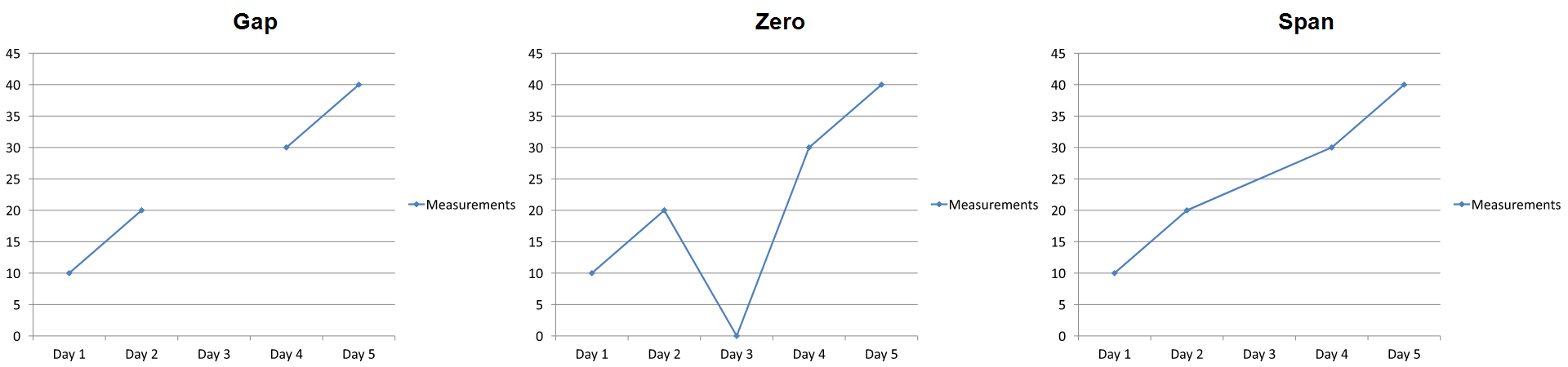
Görünür etki grafik türüne bağlıdır. Çizgi grafiği, üç modu karşılaştırmayı kolaylaştırır. Çubuk ve sütun grafiklerinde eksik bir kategori için bağlayacak bir çizgi olmadığı için Span yukarıdaki gibi bir bağlayıcı segment oluşturamaz; eksik bir sütun ve sıfır yüksekliğinde bir sütun da benzer görünebilir. Benzer şekilde, yalnızca işaretleyicileri olan dağılım grafiği de bağlayıcı çizgi içermez. Her grafik türü için üç ayrı sonuç beklemeyin; kullandığınız türün çıktısını kontrol edin.
Seri Boşluk Genişliğini Ayarla
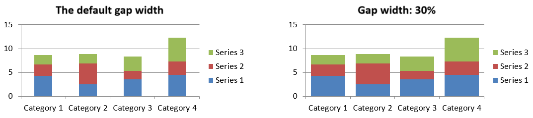
Boşluk genişliği, yan yana çubuk veya sütun kümeleri arasındaki boşluk olup, çubuk veya sütun genişliğinin yüzdesi olarak ifade edilir. Çakışma gibi, bu da tek bir seriye değil üst seriler grubuna aittir. Grup için bir kez ChartSeriesGroup.setGapWidth çağırın. Daha büyük bir değer kümeler arasındaki boşluğu artırır; daha küçük bir değer ise kümeleri daha sıklaştırır.
Aşağıdaki örnek boşluk genişliğini değiştirir ve yalnızca son sunumu kaydeder:
const aspose = {};
aspose.slides = require("aspose.slides.via.java");

const firstSlideIndex = 0;
const firstSeriesIndex = 0;
const gapWidthPercent = 30;

const presentation = new aspose.slides.Presentation();
try {
    const slide = presentation.getSlides().get_Item(firstSlideIndex);

    const chart = slide.getShapes().addChart(aspose.slides.ChartType.StackedColumn, 20, 20, 500, 200);

    const series = chart.getChartData().getSeries().get_Item(firstSeriesIndex);
    series.getParentSeriesGroup().setGapWidth(gapWidthPercent);

    presentation.save("gap_width_30.pptx", aspose.slides.SaveFormat.Pptx);
} finally {
    presentation.dispose();
}
Sonuç:
SSS
Hangi grafik türleri veri serilerini destekler?
ChartType enum’u tarafından temsil edilen tüm grafik türleri veri kullanır, ancak serilerinin değer yapısı ve ayarları aynı değildir. Örneğin, kategori grafikleri kategori ve değer kullanır, dağılım grafikleri X ve Y değerleri, balon grafikleri ise balon boyutları ekler. Seri türüne uygun veri‑nokta oluşturma yöntemini kullanın. Çakışma ve boşluk genişliği gibi seçenekler yalnızca uyumlu çubuk veya sütun gruplarına uygulanır.
Bir grafik seri grubu nedir?
ChartSeriesGroup aynı grup‑seviyesi çizim ayarlarını paylaşan uyumlu serileri içerir. Birleştirilmiş bir grafik birden çok grup içerebilir; bu nedenle bir seriden erişilen grup üzerindeki değişiklik, grafikteki tüm serileri mutlaka etkilemez.
Yeni oluşturulan bir grafik varsayılan veri içerir mi?
Evet. Varsayılan olarak, ShapeCollection.addChart örnek seriler, kategoriler ve değerler oluşturur. Bu hücreleri düzenleyebilir veya tamamen özelleştirilmiş bir veri kümesi eklemeden önce serileri ve kategori koleksiyonlarını temizleyebilirsiniz. Bir aşırı yükleme, varsayılan veri olmadan bir grafik oluşturma seçeneği de sunar.
Grafik nesneleri çalışma kitabı hücrelerine nasıl bağlanır?
Seri adları, kategori etiketleri ve veri‑nokta değerleri bir ChartDataWorkbook içindeki hücrelere başvurur. Başvurulan bir hücre değiştirildiğinde ilgili grafik öğesi güncellenir. Özelleştirilmiş veri oluştururken, her noktanın amaçlanan kategori altında çizileceğinden emin olmak için kategori satırları ve seri‑değer satırlarını hizalı tutun.
Bir serinin tamamı yerine tek bir noktayı nasıl temizlerim?
İlgili değer hücresini null olarak ayarlayın; böylece noktanın kategori konumu boş bir nokta olarak kalır. ChartDataPointCollection.clear metodunu yalnızca serideki tüm noktaları kaldırmak istediğinizde kullanın. Kategorileri de kaldırırsanız, değerlerin kategori koleksiyonuyla hizalı kalması için her seriyi güncelleyin.
Boş noktalar nasıl görüntülenir?
Sonuç, grafik türüne ve Chart.setDisplayBlanksAs ile yapılandırılan değere bağlıdır. Desteklenen grafikler, boşlukları kesik, sıfır değer olarak veya komşu noktaları bağlayarak gösterebilir. Sunumunuzdaki eksik verinin anlamına en uygun ayarı seçin. Tam bir örnek ve görsel karşılaştırma için Boş Hücrelerin Görüntülenmesini Kontrol Et bölümüne bakın.
Negatif değerler nasıl biçimlendirilir?
Desteklenen çubuk, sütun ve balon serileri için, ChartSeries.setInvertIfNegative çağırın ve ChartSeries.getInvertedSolidFillColor ile dönen rengi ayarlayın. Bireysel bir nokta için davranışı ChartDataPoint.setInvertIfNegative ile geçersiz kılabilirsiniz. Bu yöntemler yalnızca biçimlendirmeyi etkiler, saklanan sayısal değerleri değiştirmez.
Hem seri hem de nokta biçimlendirilmişse hangisi kazanır?
Açık veri‑nokta biçimlendirmesi o nokta için öncelik alır. Diğer noktalar, açık bir seri formatı varsa onu, yoksa otomatik grafik stilini ve temayı kullanır. Çakışma ve boşluk genişliği gibi grup ayarları, düzeni kontrol eder ve nokta‑seviyesi biçimlendirme geçersiz kılmaları değildir.
Bir grafikte kaç seri bulunabilir?
Aspose.Slides, ayrı bir sabit seri sayısı sınırı uygulamaz. Pratikte, sunum dosyası kısıtlamaları, mevcut bellek, render süresi ve grafiğin okunabilirliği kullanılabilir bir sınırı belirler.
Sütunlar çok yakın veya çok uzağa olduğunda ne yapmalıyım?
Uygun üst seri grubu üzerinde ChartSeriesGroup.setGapWidth yöntemini çağırın. Değeri artırarak kümeler arasındaki boşluğu genişletin, azaltarak kümeleri birbirine yaklaştırın.