
จัดการข้อมูลซีรีส์ของแผนภูมิในงานนำเสนอด้วย JavaScript
ภาพรวม
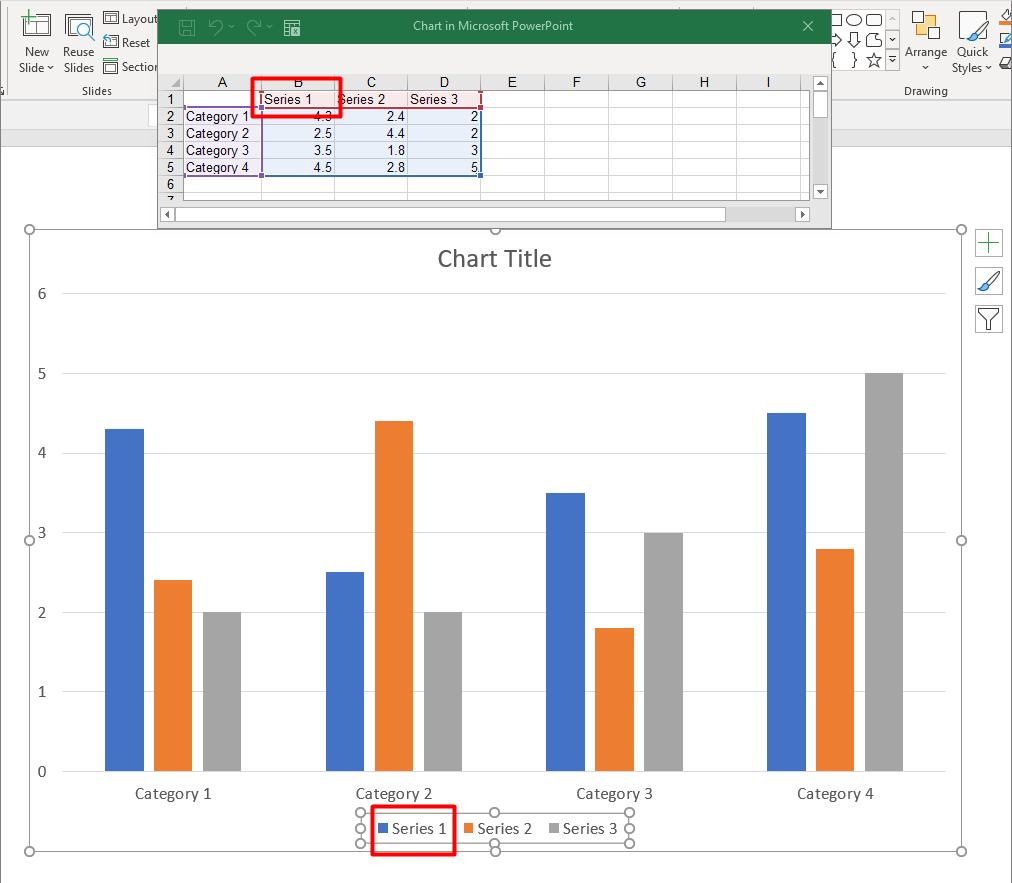
แผนภูมิจะเก็บข้อมูลที่ทำการพล็อตไว้ในสมุดงานข้อมูลแผนภูมิ. A ChartSeries represents one set of related values, and each ChartDataPoint in the series refers to one or more workbook cells. ChartCategory objects provide the labels or grouping values shared by the series. The series name, categories, and point values are therefore connected to ChartDataCell objects rather than stored only as display text.
สำหรับแผนภูมิประเภทหมวดหมู่ทั่วไป, สมุดงานเริ่มต้นจะใช้แถว 0 สำหรับชื่อซีรีส์, คอลัมน์ 0 สำหรับชื่อหมวดหมู่, และเซลล์ที่เหลือสำหรับค่าของซีรีส์. ดัชนี worksheet, แถว, และคอลัมน์ที่ส่งไปยัง ChartDataWorkbook.getCell จะเป็นเลขศูนย์. การจัดวางนี้มีประโยชน์เมื่อคุณสร้างแผนภูมิกับข้อมูลเริ่มต้น, แต่ไม่ควรสันนิษฐานว่าทุกแผนภูมิที่มีอยู่ใช้วิธีนี้. สำหรับงานนำเสนอที่โหลดแล้ว, ให้ตรวจสอบเซลล์ที่อ้างอิงโดยซีรีส์, หมวดหมู่, และจุดข้อมูลก่อนที่จะเปลี่ยนค่าของสมุดงาน.
Chart settings have three different scopes:
- Series-level settings, such as ChartSeries.getFormat, provide the default appearance for all points in one series.
- Data-point settings, such as ChartDataPoint.getFormat, override the series appearance for one point.
- Group settings apply to compatible series that belong to the same ChartSeriesGroup. Access the group through ChartSeries.getParentSeriesGroup when you need to set options such as overlap or gap width.
เมื่อไม่มีการกำหนดการเติมสีของจุดหรือซีรีส์แบบชัดเจน, สไตล์และธีมของแผนภูมิจะกำหนดรูปลักษณ์อัตโนมัติ. เมื่อมีการฟอร์แมตของซีรีส์และจุดพร้อมกัน, การฟอร์แมตของจุดจะมีลำดับความสำคัญสำหรับจุดนั้น.
ตั้งค่าการทับของซีรีส์แผนภูมิ
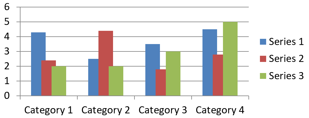
ChartSeries.getOverlap reports how much bars or columns overlap in a 2D chart, from -100 through 100 percent. It is a read-only projection of the setting on the parent series group. Use ChartSeriesGroup.setOverlap to update every compatible series in that group. This option applies to chart types that display grouped bars or columns; it does not affect unrelated series groups in a combination chart.
ตัวอย่างต่อไปนี้ตั้งค่าการทับสำหรับกลุ่มที่ประกอบด้วยซีรีส์แรก:
const aspose = {};
aspose.slides = require("aspose.slides.via.java");
const java = require("java");

const firstSlideIndex = 0;
const firstSeriesIndex = 0;
const overlapPercent = java.newByte(30);

const presentation = new aspose.slides.Presentation();
try {
    const slide = presentation.getSlides().get_Item(firstSlideIndex);

    // แผนภูมิใหม่มีซีรีส์ตัวอย่าง, หมวดหมู่, และค่า.
    const chart = slide.getShapes().addChart(aspose.slides.ChartType.ClusteredColumn, 20, 20, 500, 200);

    const series = chart.getChartData().getSeries().get_Item(firstSeriesIndex);
    series.getParentSeriesGroup().setOverlap(overlapPercent);

    presentation.save("series_overlap.pptx", aspose.slides.SaveFormat.Pptx);
} finally {
    presentation.dispose();
}
ผลลัพธ์:
เปลี่ยนสีเติมของซีรีส์
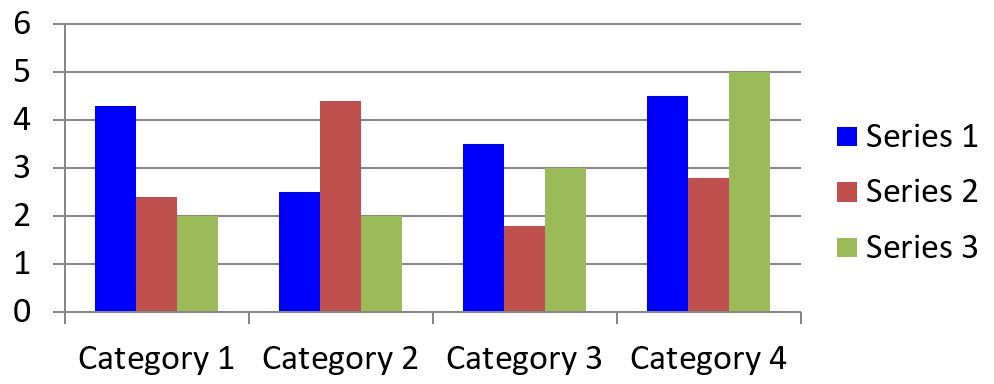
Use ChartSeries.getFormat to set the default fill for an entire series. If a point already has an explicit fill, its ChartDataPoint.getFormat setting overrides the series fill for that point.
ตัวอย่างต่อไปนี้ใช้การเติมสีน้ำเงินทึบกับซีรีส์แรก:
const aspose = {};
aspose.slides = require("aspose.slides.via.java");
const java = require("java");

const firstSlideIndex = 0;
const firstSeriesIndex = 0;
const solidFillType = java.newByte(aspose.slides.FillType.Solid);
const blueColor = java.getStaticFieldValue("java.awt.Color", "BLUE");

const presentation = new aspose.slides.Presentation();
try {
    const slide = presentation.getSlides().get_Item(firstSlideIndex);

    const chart = slide.getShapes().addChart(aspose.slides.ChartType.ClusteredColumn, 20, 20, 500, 200);

    const series = chart.getChartData().getSeries().get_Item(firstSeriesIndex);
    series.getFormat().getFill().setFillType(solidFillType);
    series.getFormat().getFill().getSolidFillColor().setColor(blueColor);

    presentation.save("series_color.pptx", aspose.slides.SaveFormat.Pptx);
} finally {
    presentation.dispose();
}
ผลลัพธ์:
เปลี่ยนชื่อซีรีส์
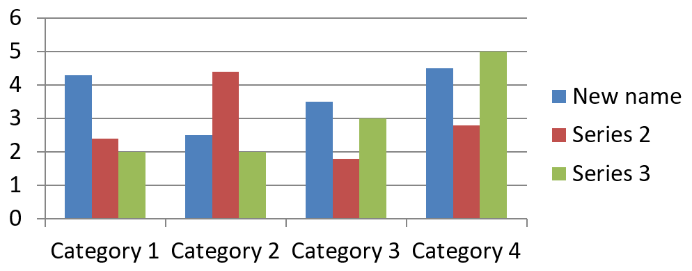
A series name is stored in the chart data workbook and is normally displayed in the legend. In the default workbook created for a clustered column chart, cell B1 is at row 0, column 1 and contains the name of the first series. The named constants in the following example make that structure explicit:
const aspose = {};
aspose.slides = require("aspose.slides.via.java");

const firstSlideIndex = 0;
const worksheetIndex = 0;
const seriesNameRowIndex = 0;
const firstSeriesColumnIndex = 1;

const presentation = new aspose.slides.Presentation();
try {
    const slide = presentation.getSlides().get_Item(firstSlideIndex);

    const chart = slide.getShapes().addChart(aspose.slides.ChartType.ClusteredColumn, 20, 20, 500, 200);

    const workbook = chart.getChartData().getChartDataWorkbook();
    const seriesNameCell = workbook.getCell(worksheetIndex, seriesNameRowIndex, firstSeriesColumnIndex);
    seriesNameCell.setValue("Revenue");

    presentation.save("series_name.pptx", aspose.slides.SaveFormat.Pptx);
} finally {
    presentation.dispose();
}
คุณสามารถอัปเดตเซลล์ที่อ้างอิงโดย ChartSeries.getName ได้เช่นกัน. วิธีนี้ช่วยหลีกเลี่ยงการสันนิษฐานแถวและคอลัมน์เฉพาะในแผนภูมิที่มีอยู่:
const aspose = {};
aspose.slides = require("aspose.slides.via.java");

const firstSlideIndex = 0;
const firstSeriesIndex = 0;
const firstNameCellIndex = 0;

const presentation = new aspose.slides.Presentation();
try {
    const slide = presentation.getSlides().get_Item(firstSlideIndex);

    const chart = slide.getShapes().addChart(aspose.slides.ChartType.ClusteredColumn, 20, 20, 500, 200);

    const series = chart.getChartData().getSeries().get_Item(firstSeriesIndex);
    const seriesNameCell = series.getName().getAsCells().get_Item(firstNameCellIndex);
    seriesNameCell.setValue("Revenue");

    presentation.save("series_name.pptx", aspose.slides.SaveFormat.Pptx);
} finally {
    presentation.dispose();
}
ผลลัพธ์:
สร้างซีรีส์ด้วยชื่อจากหลายเซลล์
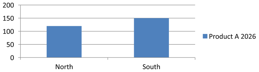
A composite series name is useful when a product name and a reporting period are stored in separate workbook cells. For example, you can combine Product A in B1 and 2026 in C1 into a single series name while keeping both parts linked to their source cells.
Use ChartDataWorkbook.getCellCollection to retrieve the name range, then pass that collection to ChartSeriesCollection.add. The skipHiddenCells argument controls whether hidden cells are included: true excludes them, while false includes them. This example uses false to include every cell in the name range.
ตัวอย่างต่อไปนี้สร้างงานนำเสนอที่มีซีรีส์หนึ่งและจุดข้อมูลสองจุด. เซลล์ B1:C1 มีเฉพาะชื่อซีรีส์; A2:A3 มีป้ายหมวดหมู่, และ B2:B3 มีค่าตัวเลข.
const aspose = {};
aspose.slides = require("aspose.slides.via.java");

const presentation = new aspose.slides.Presentation();
try {
    const slide = presentation.getSlides().get_Item(0);

    const chart = slide.getShapes().addChart(aspose.slides.ChartType.ClusteredColumn, 50, 50, 620, 180);

    chart.getChartData().getSeries().clear();
    chart.getChartData().getCategories().clear();
    chart.setLegend(true);

    const workbook = chart.getChartData().getChartDataWorkbook();
    workbook.clear(0);

    // เซลล์สองเซลล์นี้ให้ชื่อซีรีส์.
    workbook.getCell(0, 0, 1, "Product A");
    workbook.getCell(0, 0, 2, "2026");
    const nameCells = workbook.getCellCollection("Sheet1!$B$1:$C$1", false);
    const series = chart.getChartData().getSeries().add(nameCells, aspose.slides.ChartType.ClusteredColumn);

    // เซลล์แยกต่างหากให้หมวดหมู่และจุดข้อมูลเชิงตัวเลข.
    const northCategory = workbook.getCell(0, 1, 0, "North");
    const southCategory = workbook.getCell(0, 2, 0, "South");
    chart.getChartData().getCategories().add(northCategory);
    chart.getChartData().getCategories().add(southCategory);
    const northValue = workbook.getCell(0, 1, 1, 120);
    const southValue = workbook.getCell(0, 2, 1, 150);
    series.getDataPoints().addDataPointForBarSeries(northValue);
    series.getDataPoints().addDataPointForBarSeries(southValue);

    presentation.save("composite_series_name.pptx", aspose.slides.SaveFormat.Pptx);
} finally {
    presentation.dispose();
}
ชื่อซีรีส์ที่ได้คือ Product A 2026 โดยมีช่องว่างระหว่างค่าสองเซลล์. คำอธิบายจะแสดงเป็นรายการเดียวสำหรับทั้งสองคอลัมน์. รูปด้านล่างแสดงผลลัพธ์:
รับสีเติมอัตโนมัติของซีรีส์
ChartSeries.getAutomaticSeriesColor returns the color calculated from the series index and the chart style. This is the color used when the series fill has not been explicitly defined. Calling the method reads the calculated color; it does not assign a new fill.
ตัวอย่างต่อไปนี้พิมพ์สีอัตโนมัติของแต่ละซีรีส์เริ่มต้น:
const aspose = {};
aspose.slides = require("aspose.slides.via.java");

const firstSlideIndex = 0;

const presentation = new aspose.slides.Presentation();
try {
    const slide = presentation.getSlides().get_Item(firstSlideIndex);

    const chart = slide.getShapes().addChart(aspose.slides.ChartType.ClusteredColumn, 20, 20, 500, 200);

    const seriesCount = chart.getChartData().getSeries().size();
    for (let seriesIndex = 0; seriesIndex < seriesCount; seriesIndex++) {
        const series = chart.getChartData().getSeries().get_Item(seriesIndex);
        const automaticColor = series.getAutomaticSeriesColor();
        const automaticColorText = automaticColor.toString();
        console.log("Series " + seriesIndex + ": " + automaticColorText);
    }
} finally {
    presentation.dispose();
}
ผลลัพธ์ตัวอย่างสำหรับสไตล์แผนภูมิเบื้องต้น:
Series 0: java.awt.Color[r=79,g=129,b=189]
Series 1: java.awt.Color[r=192,g=80,b=77]
Series 2: java.awt.Color[r=155,g=187,b=89]
สีที่ได้จะขึ้นอยู่กับสไตล์และธีมของแผนภูมิ.
ตั้งค่าสีเติมกลับด้านสำหรับซีรีส์แผนภูมิ
For bar, column, and bubble series, ChartSeries.setInvertIfNegative can display negative values with a different fill. Set the regular series fill to solid, enable inversion, and assign the negative-value color through ChartSeries.getInvertedSolidFillColor. Negative numbers remain unchanged in the workbook; only their display color changes.
ตัวอย่างต่อไปนี้แทนที่ข้อมูลแผนภูมิเบื้องต้นด้วยซีรีส์หนึ่ง. แถว worksheet 0 มีชื่อซีรีส์, คอลัมน์ 0 มีชื่อหมวดหมู่, และคอลัมน์ 1 มีค่าต่าง ๆ:
const aspose = {};
aspose.slides = require("aspose.slides.via.java");
const java = require("java");

const firstSlideIndex = 0;
const worksheetIndex = 0;
const headerRowIndex = 0;
const categoryColumnIndex = 0;
const firstSeriesColumnIndex = 1;
const firstDataRowIndex = 1;
const solidFillType = java.newByte(aspose.slides.FillType.Solid);
const redColor = java.getStaticFieldValue("java.awt.Color", "RED");

const categoryNames = ["Category 1", "Category 2", "Category 3"];
const seriesValues = [-20, 50, -30];

const presentation = new aspose.slides.Presentation();
try {
    const slide = presentation.getSlides().get_Item(firstSlideIndex);

    const chart = slide.getShapes().addChart(aspose.slides.ChartType.ClusteredColumn, 20, 20, 500, 200);
    const chartData = chart.getChartData();
    const workbook = chartData.getChartDataWorkbook();

    chartData.getSeries().clear();
    chartData.getCategories().clear();

    const seriesNameCell = workbook.getCell(worksheetIndex, headerRowIndex, firstSeriesColumnIndex, "Series 1");
    const chartType = chart.getType();
    const series = chartData.getSeries().add(seriesNameCell, chartType);

    for (let categoryIndex = 0; categoryIndex < categoryNames.length; categoryIndex++) {
        const dataRowIndex = firstDataRowIndex + categoryIndex;
        const categoryName = categoryNames[categoryIndex];
        const seriesValue = seriesValues[categoryIndex];

        const categoryCell = workbook.getCell(worksheetIndex, dataRowIndex, categoryColumnIndex, categoryName);
        chartData.getCategories().add(categoryCell);

        const valueCell = workbook.getCell(worksheetIndex, dataRowIndex, firstSeriesColumnIndex, seriesValue);
        series.getDataPoints().addDataPointForBarSeries(valueCell);
    }

    const automaticSeriesColor = series.getAutomaticSeriesColor();
    series.getFormat().getFill().setFillType(solidFillType);
    series.getFormat().getFill().getSolidFillColor().setColor(automaticSeriesColor);
    series.setInvertIfNegative(true);
    series.getInvertedSolidFillColor().setColor(redColor);

    presentation.save("inverted_solid_fill_color.pptx", aspose.slides.SaveFormat.Pptx);
} finally {
    presentation.dispose();
}
ผลลัพธ์:

คุณสามารถเปิดการกลับด้านสำหรับจุดเดียวผ่าน ChartDataPoint.setInvertIfNegative. ในตัวอย่างต่อไปนี้ การกลับด้านถูกปิดสำหรับซีรีส์และเปิดเฉพาะสำหรับจุดที่เลือก. จุดนั้นยังได้รับมูลค่าติดลบเพื่อให้เห็นผล:
const aspose = {};
aspose.slides = require("aspose.slides.via.java");
const java = require("java");

const firstSlideIndex = 0;
const firstSeriesIndex = 0;
const targetDataPointIndex = 2;
const negativeValue = -30;
const solidFillType = java.newByte(aspose.slides.FillType.Solid);
const redColor = java.getStaticFieldValue("java.awt.Color", "RED");

const presentation = new aspose.slides.Presentation();
try {
    const slide = presentation.getSlides().get_Item(firstSlideIndex);

    const chart = slide.getShapes().addChart(aspose.slides.ChartType.ClusteredColumn, 20, 20, 500, 200);

    const series = chart.getChartData().getSeries().get_Item(firstSeriesIndex);
    const automaticSeriesColor = series.getAutomaticSeriesColor();
    series.getFormat().getFill().setFillType(solidFillType);
    series.getFormat().getFill().getSolidFillColor().setColor(automaticSeriesColor);
    series.getInvertedSolidFillColor().setColor(redColor);
    series.setInvertIfNegative(false);

    const dataPoint = series.getDataPoints().get_Item(targetDataPointIndex);
    dataPoint.getValue().getAsCell().setValue(negativeValue);
    dataPoint.setInvertIfNegative(true);

    presentation.save("data_point_invert_color_if_negative.pptx", aspose.slides.SaveFormat.Pptx);
} finally {
    presentation.dispose();
}
ลบค่าจุดข้อมูลเฉพาะ
To make one point empty without removing the other points, set its backing workbook cell to null. For a column chart, the plotted value is available through ChartDataPoint.getValue. The data point stays at the same category position, but the chart treats its value as blank according to the chart’s blank-value settings.
ตัวอย่างต่อไปนี้ลบเฉพาะจุดที่สองในซีรีส์แรก:
const aspose = {};
aspose.slides = require("aspose.slides.via.java");

const firstSlideIndex = 0;
const firstSeriesIndex = 0;
const targetDataPointIndex = 1;

const presentation = new aspose.slides.Presentation();
try {
    const slide = presentation.getSlides().get_Item(firstSlideIndex);

    const chart = slide.getShapes().addChart(aspose.slides.ChartType.ClusteredColumn, 20, 20, 500, 200);

    const series = chart.getChartData().getSeries().get_Item(firstSeriesIndex);
    const dataPoint = series.getDataPoints().get_Item(targetDataPointIndex);
    dataPoint.getValue().getAsCell().setValue(null);

    presentation.save("clear_data_point_value.pptx", aspose.slides.SaveFormat.Pptx);
} finally {
    presentation.dispose();
}
Scatter charts use separate X and Y cells, and bubble charts also use a size cell. Clear only the cell that represents the value you intend to remove. Do not call ChartDataPointCollection.clear when you want to keep the other points, because that method removes every data point from the collection.
ควบคุมการแสดงผลของเซลล์ว่าง
Hidden cells that contain values are a separate case from empty cells. To include or exclude data from hidden worksheet rows and columns, see รวมข้อมูลจากแถวและคอลัมน์ที่ซ่อนอยู่.
เซลล์สมุดงานที่ว่างเปล่าจะแทนข้อมูลที่หายไป; เซลล์ที่มี 0 แทนค่าตัวเลขที่ทราบ. เรียก ChartDataCell.setValue ด้วย null เพื่อทำให้เซลล์ว่าง. ศูนย์ตัวเลขยังคงเป็นศูนย์ไม่ว่าการตั้งค่าเซลล์ว่างจะเป็นอย่างไร.
Use Chart.setDisplayBlanksAs to choose how the chart displays empty cells. This setting applies to the whole chart. It changes how blanks are plotted, without filling the empty workbook cell with zero or an interpolated value.
ตัวอย่างต่อไปนี้สร้างแผนภูมิเส้นที่มีซีรีส์หนึ่ง, ลบค่าของวัน 3, และบันทึกแผนภูมิเดียวกันในแต่ละโหมด. ไม่ต้องใช้ไฟล์อินพุต. ChartDataWorkbook ใช้ worksheet 0, คอลัมน์ 0 สำหรับป้ายหมวดหมู่, และคอลัมน์ 1 สำหรับค่า; แถว 0 เก็บชื่อซีรีส์. ข้อมูลสุดท้ายคือ 10, 20, empty, 30, 40.
const aspose = {};
aspose.slides = require("aspose.slides.via.java");

const presentation = new aspose.slides.Presentation();
try {
    const slide = presentation.getSlides().get_Item(0);

    const chart = slide.getShapes().addChart(aspose.slides.ChartType.LineWithMarkers, 40, 40, 640, 400);
    const chartData = chart.getChartData();
    const workbook = chartData.getChartDataWorkbook();

    chartData.getSeries().clear();
    chartData.getCategories().clear();

    const seriesNameCell = workbook.getCell(0, 0, 1, "Measurements");
    const series = chartData.getSeries().add(seriesNameCell, chart.getType());
    const values = [10, 20, 25, 30, 40];

    for (let i = 0; i < values.length; i++) {
        const categoryCell = workbook.getCell(0, i + 1, 0, "Day " + (i + 1));
        chartData.getCategories().add(categoryCell);
        const valueCell = workbook.getCell(0, i + 1, 1, values[i]);
        series.getDataPoints().addDataPointForLineSeries(valueCell);
    }

    // ปล่อยให้วันที่ 3 เป็นค่าว่างจริง ๆ โดยยังคงหมวดหมู่และจุดข้อมูลของมันไว้
    workbook.getCell(0, 3, 1).setValue(null);

    const modes = [aspose.slides.DisplayBlanksAsType.Gap, aspose.slides.DisplayBlanksAsType.Zero, aspose.slides.DisplayBlanksAsType.Span];
    const modeNames = ["Gap", "Zero", "Span"];
    for (let i = 0; i < modes.length; i++) {
        chart.setDisplayBlanksAs(modes[i]);
        presentation.save("empty_cells_" + modeNames[i] + ".pptx", aspose.slides.SaveFormat.Pptx);
    }
} finally {
    presentation.dispose();
}
ไฟล์ผลลัพธ์แต่ละไฟล์เก็บโหมดที่ตั้งก่อนบันทึก: empty_cells_Gap.pptx, empty_cells_Zero.pptx, และ empty_cells_Span.pptx. หากต้องการบันทึกเพียงเวอร์ชันเดียว, ตั้งค่าโหมดที่ต้องการและบันทึกงานนำเสนอครั้งเดียวแทนการทำซ้ำหลายโหมด.
การเปรียบเทียบด้านล่างแสดงข้อมูลเดียวกันในทั้งสามไฟล์. วันที่ 3 เป็นเซลล์ว่างในสมุดงานทุกกรณี:
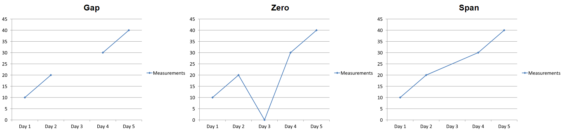
เอฟเฟกต์ที่มองเห็นขึ้นอยู่กับประเภทของแผนภูมิ. แผนภูมิเส้นทำให้เปรียบเทียบทั้งสามโหมดได้ง่าย. แผนภูมิบาร์และคอลัมน์ไม่มีเส้นเชื่อมต่อข้ามหมวดหมู่ที่หายไป, ดังนั้น Span ไม่สามารถสร้างส่วนเชื่อมต่อที่แสดงในภาพด้านบน; คอลัมน์ที่หายไปและคอลัมน์ที่สูงศูนย์อาจดูคล้ายกัน. เช่นเดียวกับแผนภูมิสเกตเตอร์ที่มีเพียงเครื่องหมาย, จะไม่มีเส้นเชื่อมต่อ. อย่าคาดหวังผลลัพธ์ที่แตกต่างกันสามแบบสำหรับทุกประเภทแผนภูมิ; ตรวจสอบผลลัพธ์สำหรับประเภทที่คุณใช้.
ตั้งค่าความกว้างของช่องว่างระหว่างซีรีส์
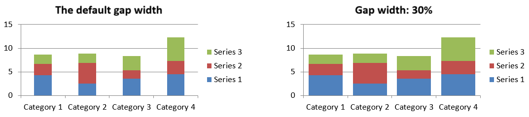
Gap width is the space between adjacent bar or column clusters, expressed as a percentage of the bar or column width. Like overlap, it belongs to the parent series group rather than to one series. Call ChartSeriesGroup.setGapWidth once for the group. A larger value creates more space between clusters; a smaller value makes them denser.
ตัวอย่างต่อไปนี้เปลี่ยนความกว้างของช่องว่างและบันทึกงานนำเสนอสุดท้ายเท่านั้น:
const aspose = {};
aspose.slides = require("aspose.slides.via.java");

const firstSlideIndex = 0;
const firstSeriesIndex = 0;
const gapWidthPercent = 30;

const presentation = new aspose.slides.Presentation();
try {
    const slide = presentation.getSlides().get_Item(firstSlideIndex);

    const chart = slide.getShapes().addChart(aspose.slides.ChartType.StackedColumn, 20, 20, 500, 200);

    const series = chart.getChartData().getSeries().get_Item(firstSeriesIndex);
    series.getParentSeriesGroup().setGapWidth(gapWidthPercent);

    presentation.save("gap_width_30.pptx", aspose.slides.SaveFormat.Pptx);
} finally {
    presentation.dispose();
}
ผลลัพธ์:
FAQ
Which chart types support data series?
All chart types represented by the ChartType enumeration use chart data, but their series do not all have the same value structure or settings. For example, category charts use categories and values, scatter charts use X and Y values, and bubble charts add bubble sizes. Use the data-point creation method that matches the series type. Options such as overlap and gap width apply only to compatible bar or column groups.
What is a chart series group?
A ChartSeriesGroup contains compatible series that share group-level plotting settings. A combination chart can contain more than one group, so changing the group reached through one series does not necessarily change every series in the chart.
Does a newly created chart contain default data?
Yes. By default, ShapeCollection.addChart creates sample series, categories, and values. You can edit those cells or clear both the series and category collections before adding a completely custom data set. An overload can also create a chart without default data.
How are chart objects connected to workbook cells?
Series names, category labels, and data-point values reference cells in a ChartDataWorkbook. Changing a referenced cell updates the corresponding chart element. When you build custom data, keep category rows and series-value rows aligned so that each point is plotted under the intended category.
How do I clear one point instead of the whole series?
Set the relevant value cell to null to retain the point’s category position as an empty point. Use ChartDataPointCollection.clear only when you intend to remove all points from that series. If you also remove categories, update every series so their values remain aligned with the category collection.
How are empty points displayed?
The result depends on the chart type and the value configured through Chart.setDisplayBlanksAs. Supported charts can display blanks as gaps, as zero values, or by connecting neighboring points. Choose the setting that matches the meaning of missing data in your presentation. See Control the Display of Empty Cells for a complete example and visual comparison.
How are negative values formatted?
For supported bar, column, and bubble series, call ChartSeries.setInvertIfNegative and set the color returned by ChartSeries.getInvertedSolidFillColor. You can override the behavior for an individual point with ChartDataPoint.setInvertIfNegative. These methods affect formatting, not the stored numeric values.
Which formatting wins when both a series and a point are formatted?
Explicit data-point formatting takes precedence for that point. Other points continue to use the explicit series format or, when the series format is not defined, the automatic chart style and theme. Group settings such as overlap and gap width control layout and are not point-level formatting overrides.
Is there a limit to how many series a chart can contain?
Aspose.Slides does not impose a separate fixed series-count limit. In practice, presentation file constraints, available memory, rendering time, and chart readability determine a useful limit.
What should I change when columns are too close together or too far apart?
Call ChartSeriesGroup.setGapWidth on the appropriate parent series group. Increase the value to widen the space between clusters, or decrease it to bring the clusters closer together.