
使用 JavaScript 在演示文稿中管理图表数据系列
概述
A chart stores its plotted data in a chart data workbook. A ChartSeries represents one set of related values, and each ChartDataPoint in the series refers to one or more workbook cells. ChartCategory objects provide the labels or grouping values shared by the series. The series name, categories, and point values are therefore connected to ChartDataCell objects rather than stored only as display text.
对于典型的类别图,默认工作簿使用第0行存放系列名称,第0列存放类别名称,其余单元格用于系列值。传递给 ChartDataWorkbook.getCell 的工作表、行和列索引是从零开始的。此布局在使用默认数据创建图表时很有用,但不要假设每个现有图表都使用它。对于已加载的演示文稿,在更改工作簿值之前,请检查系列、类别和数据点引用的单元格。
图表设置有三种不同的范围:
- 系列级设置,例如 ChartSeries.getFormat,为单个系列中的所有点提供默认外观。
- 数据点级设置,例如 ChartDataPoint.getFormat,覆盖单个点的系列外观。
- 组设置适用于属于同一 ChartSeriesGroup 的兼容系列。当需要设置重叠或间隙宽度等选项时,可通过 ChartSeries.getParentSeriesGroup 访问该组。
当未设置显式的点或系列填充时,图表样式和主题决定自动外观。当系列和点的格式都存在时,点的格式在该点上具有优先权。
设置图表系列重叠
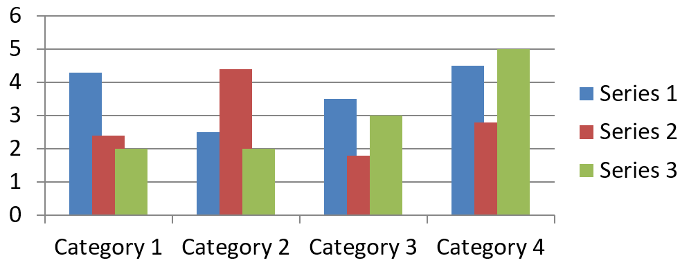
ChartSeries.getOverlap reports how much bars or columns overlap in a 2D chart, from -100 through 100 percent. It is a read-only projection of the setting on the parent series group. Use ChartSeriesGroup.setOverlap to update every compatible series in that group. This option applies to chart types that display grouped bars or columns; it does not affect unrelated series groups in a combination chart.
以下示例设置包含第一个系列的组的重叠:
const aspose = {};
aspose.slides = require("aspose.slides.via.java");
const java = require("java");

const firstSlideIndex = 0;
const firstSeriesIndex = 0;
const overlapPercent = java.newByte(30);

const presentation = new aspose.slides.Presentation();
try {
    const slide = presentation.getSlides().get_Item(firstSlideIndex);

    // 新的图表包含示例系列、类别和数值。
    const chart = slide.getShapes().addChart(aspose.slides.ChartType.ClusteredColumn, 20, 20, 500, 200);

    const series = chart.getChartData().getSeries().get_Item(firstSeriesIndex);
    series.getParentSeriesGroup().setOverlap(overlapPercent);

    presentation.save("series_overlap.pptx", aspose.slides.SaveFormat.Pptx);
} finally {
    presentation.dispose();
}
结果:
更改系列填充颜色
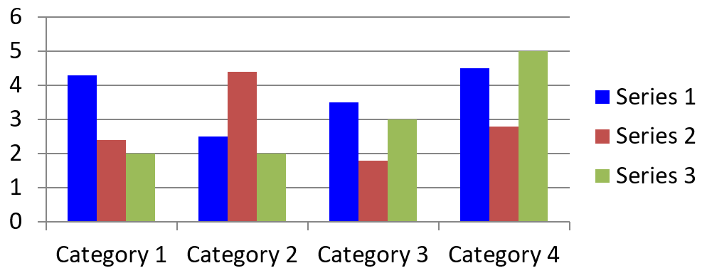
Use ChartSeries.getFormat to set the default fill for an entire series. If a point already has an explicit fill, its ChartDataPoint.getFormat setting overrides the series fill for that point.
以下示例对第一个系列应用实心蓝色填充:
const aspose = {};
aspose.slides = require("aspose.slides.via.java");
const java = require("java");

const firstSlideIndex = 0;
const firstSeriesIndex = 0;
const solidFillType = java.newByte(aspose.slides.FillType.Solid);
const blueColor = java.getStaticFieldValue("java.awt.Color", "BLUE");

const presentation = new aspose.slides.Presentation();
try {
    const slide = presentation.getSlides().get_Item(firstSlideIndex);

    const chart = slide.getShapes().addChart(aspose.slides.ChartType.ClusteredColumn, 20, 20, 500, 200);

    const series = chart.getChartData().getSeries().get_Item(firstSeriesIndex);
    series.getFormat().getFill().setFillType(solidFillType);
    series.getFormat().getFill().getSolidFillColor().setColor(blueColor);

    presentation.save("series_color.pptx", aspose.slides.SaveFormat.Pptx);
} finally {
    presentation.dispose();
}
结果:
更改系列名称
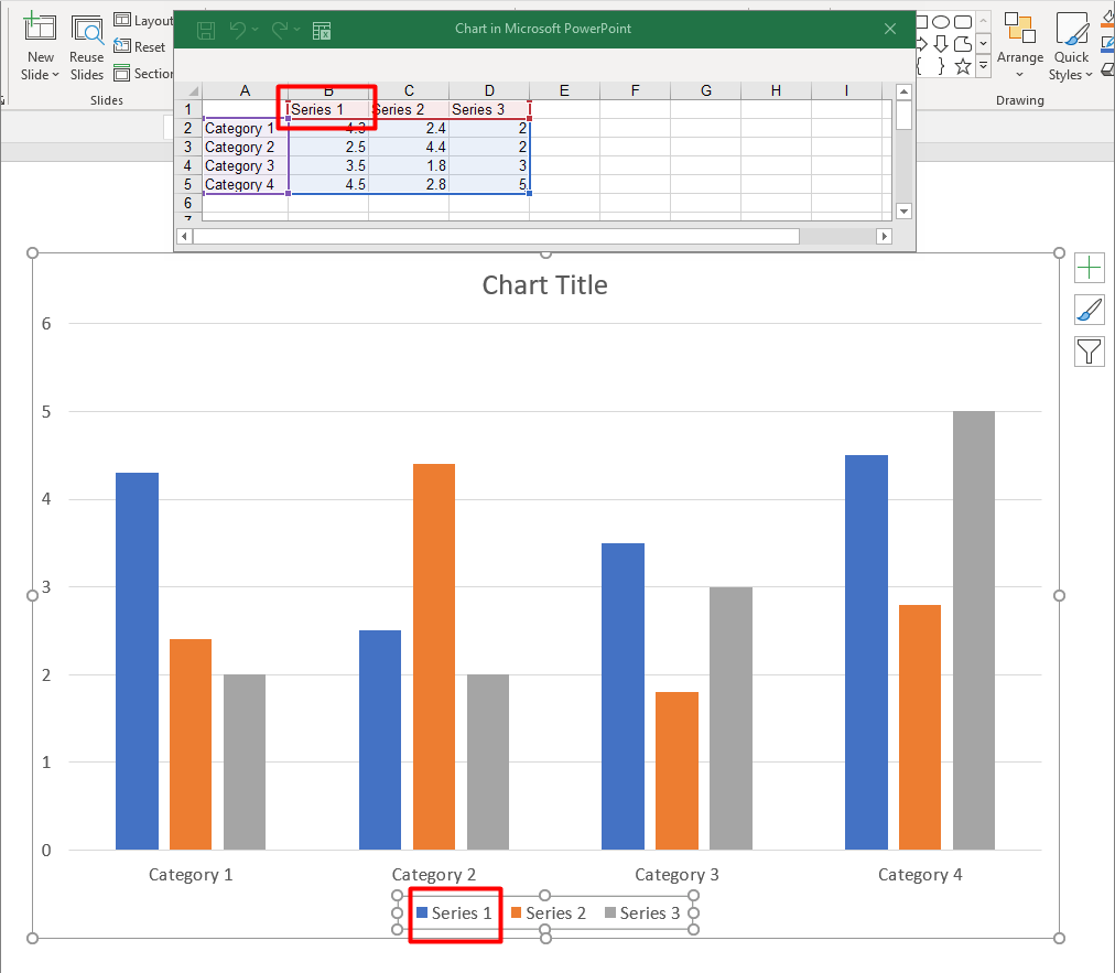
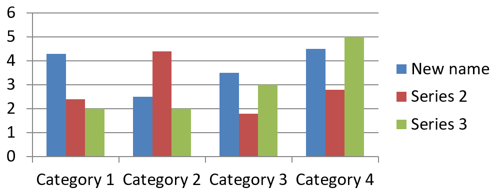
A series name is stored in the chart data workbook and is normally displayed in the legend. In the default workbook created for a clustered column chart, cell B1 is at row 0, column 1 and contains the name of the first series. The named constants in the following example make that structure explicit:
const aspose = {};
aspose.slides = require("aspose.slides.via.java");

const firstSlideIndex = 0;
const worksheetIndex = 0;
const seriesNameRowIndex = 0;
const firstSeriesColumnIndex = 1;

const presentation = new aspose.slides.Presentation();
try {
    const slide = presentation.getSlides().get_Item(firstSlideIndex);

    const chart = slide.getShapes().addChart(aspose.slides.ChartType.ClusteredColumn, 20, 20, 500, 200);

    const workbook = chart.getChartData().getChartDataWorkbook();
    const seriesNameCell = workbook.getCell(worksheetIndex, seriesNameRowIndex, firstSeriesColumnIndex);
    seriesNameCell.setValue("Revenue");

    presentation.save("series_name.pptx", aspose.slides.SaveFormat.Pptx);
} finally {
    presentation.dispose();
}
You can also update the cell already referenced by ChartSeries.getName. This approach avoids assuming a particular row and column in an existing chart:
const aspose = {};
aspose.slides = require("aspose.slides.via.java");

const firstSlideIndex = 0;
const firstSeriesIndex = 0;
const firstNameCellIndex = 0;

const presentation = new aspose.slides.Presentation();
try {
    const slide = presentation.getSlides().get_Item(firstSlideIndex);

    const chart = slide.getShapes().addChart(aspose.slides.ChartType.ClusteredColumn, 20, 20, 500, 200);

    const series = chart.getChartData().getSeries().get_Item(firstSeriesIndex);
    const seriesNameCell = series.getName().getAsCells().get_Item(firstNameCellIndex);
    seriesNameCell.setValue("Revenue");

    presentation.save("series_name.pptx", aspose.slides.SaveFormat.Pptx);
} finally {
    presentation.dispose();
}
结果:
从多个单元格创建具有名称的系列
A composite series name is useful when a product name and a reporting period are stored in separate workbook cells. For example, you can combine Product A in B1 and 2026 in C1 into a single series name while keeping both parts linked to their source cells.
Use ChartDataWorkbook.getCellCollection to retrieve the name range, then pass that collection to ChartSeriesCollection.add. The skipHiddenCells argument controls whether hidden cells are included: true excludes them, while false includes them. This example uses false to include every cell in the name range.
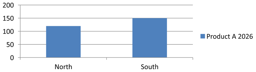
以下示例创建一个包含一个系列和两个数据点的演示文稿。单元格 B1:C1 仅提供系列名称;A2:A3 提供类别标签,B2:B3 提供数值。
const aspose = {};
aspose.slides = require("aspose.slides.via.java");

const presentation = new aspose.slides.Presentation();
try {
    const slide = presentation.getSlides().get_Item(0);

    const chart = slide.getShapes().addChart(aspose.slides.ChartType.ClusteredColumn, 50, 50, 620, 180);

    chart.getChartData().getSeries().clear();
    chart.getChartData().getCategories().clear();
    chart.setLegend(true);

    const workbook = chart.getChartData().getChartDataWorkbook();
    workbook.clear(0);

    // 这两个单元格提供系列名称。
    workbook.getCell(0, 0, 1, "Product A");
    workbook.getCell(0, 0, 2, "2026");
    const nameCells = workbook.getCellCollection("Sheet1!$B$1:$C$1", false);
    const series = chart.getChartData().getSeries().add(nameCells, aspose.slides.ChartType.ClusteredColumn);

    // 单独的单元格提供类别和数值数据点。
    const northCategory = workbook.getCell(0, 1, 0, "North");
    const southCategory = workbook.getCell(0, 2, 0, "South");
    chart.getChartData().getCategories().add(northCategory);
    chart.getChartData().getCategories().add(southCategory);
    const northValue = workbook.getCell(0, 1, 1, 120);
    const southValue = workbook.getCell(0, 2, 1, 150);
    series.getDataPoints().addDataPointForBarSeries(northValue);
    series.getDataPoints().addDataPointForBarSeries(southValue);

    presentation.save("composite_series_name.pptx", aspose.slides.SaveFormat.Pptx);
} finally {
    presentation.dispose();
}
生成的系列名称为 Product A 2026,两个单元格值之间有一个空格。图例将其显示为两个列的单一条目。下图展示了结果:
获取自动系列填充颜色
ChartSeries.getAutomaticSeriesColor returns the color calculated from the series index and the chart style. This is the color used when the series fill has not been explicitly defined. Calling the method reads the calculated color; it does not assign a new fill.
以下示例打印每个默认系列的自动颜色:
const aspose = {};
aspose.slides = require("aspose.slides.via.java");

const firstSlideIndex = 0;

const presentation = new aspose.slides.Presentation();
try {
    const slide = presentation.getSlides().get_Item(firstSlideIndex);

    const chart = slide.getShapes().addChart(aspose.slides.ChartType.ClusteredColumn, 20, 20, 500, 200);

    const seriesCount = chart.getChartData().getSeries().size();
    for (let seriesIndex = 0; seriesIndex < seriesCount; seriesIndex++) {
        const series = chart.getChartData().getSeries().get_Item(seriesIndex);
        const automaticColor = series.getAutomaticSeriesColor();
        const automaticColorText = automaticColor.toString();
        console.log("Series " + seriesIndex + ": " + automaticColorText);
    }
} finally {
    presentation.dispose();
}
默认图表样式的示例输出:
Series 0: java.awt.Color[r=79,g=129,b=189]
Series 1: java.awt.Color[r=192,g=80,b=77]
Series 2: java.awt.Color[r=155,g=187,b=89]
确切的颜色取决于图表样式和主题。
为图表系列设置反转填充颜色
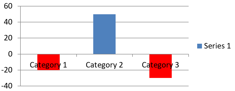
For bar, column, and bubble series, ChartSeries.setInvertIfNegative can display negative values with a different fill. Set the regular series fill to solid, enable inversion, and assign the negative-value color through ChartSeries.getInvertedSolidFillColor. Negative numbers remain unchanged in the workbook; only their display color changes.
以下示例用一个系列替换默认图表数据。工作表第0行包含系列名称,列0包含类别名称,列1包含数值:
const aspose = {};
aspose.slides = require("aspose.slides.via.java");
const java = require("java");

const firstSlideIndex = 0;
const worksheetIndex = 0;
const headerRowIndex = 0;
const categoryColumnIndex = 0;
const firstSeriesColumnIndex = 1;
const firstDataRowIndex = 1;
const solidFillType = java.newByte(aspose.slides.FillType.Solid);
const redColor = java.getStaticFieldValue("java.awt.Color", "RED");

const categoryNames = ["Category 1", "Category 2", "Category 3"];
const seriesValues = [-20, 50, -30];

const presentation = new aspose.slides.Presentation();
try {
    const slide = presentation.getSlides().get_Item(firstSlideIndex);

    const chart = slide.getShapes().addChart(aspose.slides.ChartType.ClusteredColumn, 20, 20, 500, 200);
    const chartData = chart.getChartData();
    const workbook = chartData.getChartDataWorkbook();

    chartData.getSeries().clear();
    chartData.getCategories().clear();

    const seriesNameCell = workbook.getCell(worksheetIndex, headerRowIndex, firstSeriesColumnIndex, "Series 1");
    const chartType = chart.getType();
    const series = chartData.getSeries().add(seriesNameCell, chartType);

    for (let categoryIndex = 0; categoryIndex < categoryNames.length; categoryIndex++) {
        const dataRowIndex = firstDataRowIndex + categoryIndex;
        const categoryName = categoryNames[categoryIndex];
        const seriesValue = seriesValues[categoryIndex];

        const categoryCell = workbook.getCell(worksheetIndex, dataRowIndex, categoryColumnIndex, categoryName);
        chartData.getCategories().add(categoryCell);

        const valueCell = workbook.getCell(worksheetIndex, dataRowIndex, firstSeriesColumnIndex, seriesValue);
        series.getDataPoints().addDataPointForBarSeries(valueCell);
    }

    const automaticSeriesColor = series.getAutomaticSeriesColor();
    series.getFormat().getFill().setFillType(solidFillType);
    series.getFormat().getFill().getSolidFillColor().setColor(automaticSeriesColor);
    series.setInvertIfNegative(true);
    series.getInvertedSolidFillColor().setColor(redColor);

    presentation.save("inverted_solid_fill_color.pptx", aspose.slides.SaveFormat.Pptx);
} finally {
    presentation.dispose();
}
结果:
You can enable inversion for one point through ChartDataPoint.setInvertIfNegative. In the following example, inversion is disabled for the series and enabled only for the selected point. The point is also assigned a negative value so that the effect is visible:
const aspose = {};
aspose.slides = require("aspose.slides.via.java");
const java = require("java");

const firstSlideIndex = 0;
const firstSeriesIndex = 0;
const targetDataPointIndex = 2;
const negativeValue = -30;
const solidFillType = java.newByte(aspose.slides.FillType.Solid);
const redColor = java.getStaticFieldValue("java.awt.Color", "RED");

const presentation = new aspose.slides.Presentation();
try {
    const slide = presentation.getSlides().get_Item(firstSlideIndex);

    const chart = slide.getShapes().addChart(aspose.slides.ChartType.ClusteredColumn, 20, 20, 500, 200);

    const series = chart.getChartData().getSeries().get_Item(firstSeriesIndex);
    const automaticSeriesColor = series.getAutomaticSeriesColor();
    series.getFormat().getFill().setFillType(solidFillType);
    series.getFormat().getFill().getSolidFillColor().setColor(automaticSeriesColor);
    series.getInvertedSolidFillColor().setColor(redColor);
    series.setInvertIfNegative(false);

    const dataPoint = series.getDataPoints().get_Item(targetDataPointIndex);
    dataPoint.getValue().getAsCell().setValue(negativeValue);
    dataPoint.setInvertIfNegative(true);

    presentation.save("data_point_invert_color_if_negative.pptx", aspose.slides.SaveFormat.Pptx);
} finally {
    presentation.dispose();
}
清除特定数据点值
To make one point empty without removing the other points, set its backing workbook cell to null. For a column chart, the plotted value is available through ChartDataPoint.getValue. The data point stays at the same category position, but the chart treats its value as blank according to the chart’s blank-value settings.
以下示例仅清除第一系列中的第二个点:
const aspose = {};
aspose.slides = require("aspose.slides.via.java");

const firstSlideIndex = 0;
const firstSeriesIndex = 0;
const targetDataPointIndex = 1;

const presentation = new aspose.slides.Presentation();
try {
    const slide = presentation.getSlides().get_Item(firstSlideIndex);

    const chart = slide.getShapes().addChart(aspose.slides.ChartType.ClusteredColumn, 20, 20, 500, 200);

    const series = chart.getChartData().getSeries().get_Item(firstSeriesIndex);
    const dataPoint = series.getDataPoints().get_Item(targetDataPointIndex);
    dataPoint.getValue().getAsCell().setValue(null);

    presentation.save("clear_data_point_value.pptx", aspose.slides.SaveFormat.Pptx);
} finally {
    presentation.dispose();
}
Scatter charts use separate X and Y cells, and bubble charts also use a size cell. Clear only the cell that represents the value you intend to remove. Do not call ChartDataPointCollection.clear when you want to keep the other points, because that method removes every data point from the collection.
控制空单元格的显示
Hidden cells that contain values are a separate case from empty cells. To include or exclude data from hidden worksheet rows and columns, see Include Data from Hidden Rows and Columns.
An empty workbook cell represents missing data; a cell containing 0 represents a known numeric value. Call ChartDataCell.setValue with null to make a cell empty. A numeric zero remains a zero regardless of the blank-cell setting.
Use Chart.setDisplayBlanksAs to choose how the chart displays empty cells. This setting applies to the whole chart. It changes how blanks are plotted, without filling the empty workbook cell with zero or an interpolated value.
The following self-contained example creates a line chart with one series, clears the value for Day 3, and saves the same chart with each mode. No input file is required. The ChartDataWorkbook uses worksheet 0, column 0 for category labels, and column 1 for values; row 0 holds the series name. The final data is 10, 20, empty, 30, 40.
const aspose = {};
aspose.slides = require("aspose.slides.via.java");

const presentation = new aspose.slides.Presentation();
try {
    const slide = presentation.getSlides().get_Item(0);

    const chart = slide.getShapes().addChart(aspose.slides.ChartType.LineWithMarkers, 40, 40, 640, 400);
    const chartData = chart.getChartData();
    const workbook = chartData.getChartDataWorkbook();

    chartData.getSeries().clear();
    chartData.getCategories().clear();

    const seriesNameCell = workbook.getCell(0, 0, 1, "Measurements");
    const series = chartData.getSeries().add(seriesNameCell, chart.getType());
    const values = [10, 20, 25, 30, 40];

    for (let i = 0; i < values.length; i++) {
        const categoryCell = workbook.getCell(0, i + 1, 0, "Day " + (i + 1));
        chartData.getCategories().add(categoryCell);
        const valueCell = workbook.getCell(0, i + 1, 1, values[i]);
        series.getDataPoints().addDataPointForLineSeries(valueCell);
    }

    // 保留其类别和数据点的同时,真正将第3天留为空。
    workbook.getCell(0, 3, 1).setValue(null);

    const modes = [aspose.slides.DisplayBlanksAsType.Gap, aspose.slides.DisplayBlanksAsType.Zero, aspose.slides.DisplayBlanksAsType.Span];
    const modeNames = ["Gap", "Zero", "Span"];
    for (let i = 0; i < modes.length; i++) {
        chart.setDisplayBlanksAs(modes[i]);
        presentation.save("empty_cells_" + modeNames[i] + ".pptx", aspose.slides.SaveFormat.Pptx);
    }
} finally {
    presentation.dispose();
}
Each output file stores the mode assigned before saving: empty_cells_Gap.pptx, empty_cells_Zero.pptx, and empty_cells_Span.pptx. To save only one version, assign the desired mode and save the presentation once instead of iterating over the modes.
The comparison below shows the same data in all three files. Day 3 is empty in the workbook in every case:
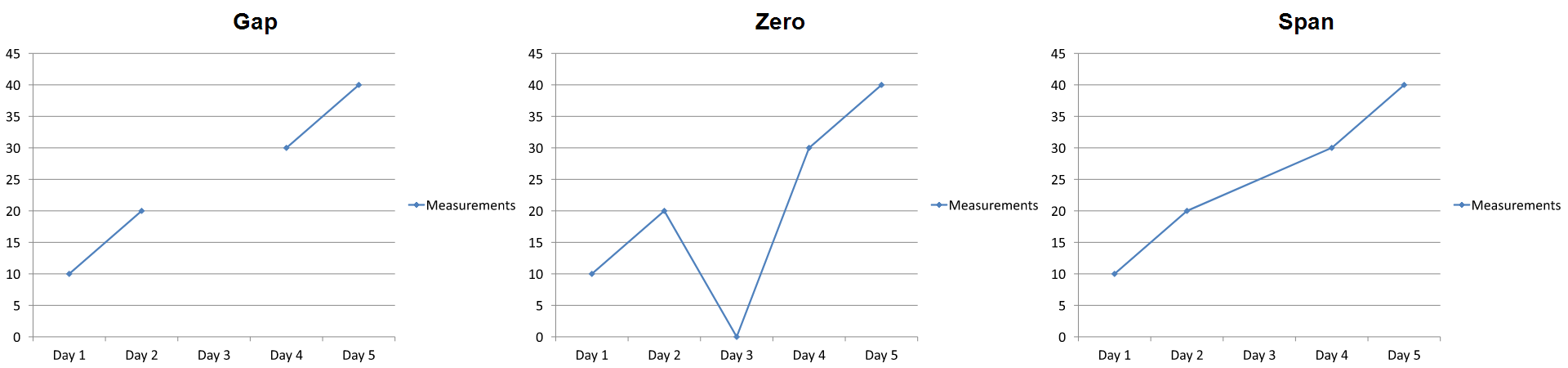
The visible effect depends on the chart type. A line chart makes all three modes easy to compare. Bar and column charts have no line to connect across a missing category, so Span cannot produce the connecting segment shown above; a missing column and a zero-height column can also look alike. Similarly, a scatter chart with markers only has no connecting line. Do not expect three distinct results for every chart type; check the output for the type you use.
设置系列间隙宽度
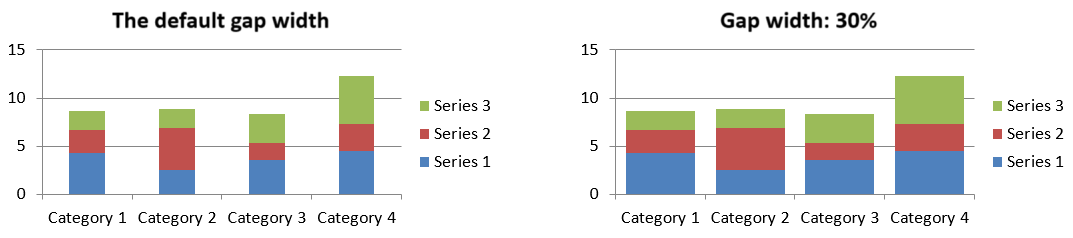
Gap width is the space between adjacent bar or column clusters, expressed as a percentage of the bar or column width. Like overlap, it belongs to the parent series group rather than to one series. Call ChartSeriesGroup.setGapWidth once for the group. A larger value creates more space between clusters; a smaller value makes them denser.
The following example changes the gap width and saves only the final presentation:
const aspose = {};
aspose.slides = require("aspose.slides.via.java");

const firstSlideIndex = 0;
const firstSeriesIndex = 0;
const gapWidthPercent = 30;

const presentation = new aspose.slides.Presentation();
try {
    const slide = presentation.getSlides().get_Item(firstSlideIndex);

    const chart = slide.getShapes().addChart(aspose.slides.ChartType.StackedColumn, 20, 20, 500, 200);

    const series = chart.getChartData().getSeries().get_Item(firstSeriesIndex);
    series.getParentSeriesGroup().setGapWidth(gapWidthPercent);

    presentation.save("gap_width_30.pptx", aspose.slides.SaveFormat.Pptx);
} finally {
    presentation.dispose();
}
Result:
常见问题
哪些图表类型支持数据系列?
All chart types represented by the ChartType enumeration use chart data, but their series do not all have the same value structure or settings. For example, category charts use categories and values, scatter charts use X and Y values, and bubble charts add bubble sizes. Use the data-point creation method that matches the series type. Options such as overlap and gap width apply only to compatible bar or column groups.
什么是图表系列组?
A ChartSeriesGroup contains compatible series that share group-level plotting settings. A combination chart can contain more than one group, so changing the group reached through one series does not necessarily change every series in the chart.
新创建的图表是否包含默认数据?
Yes. By default, ShapeCollection.addChart creates sample series, categories, and values. You can edit those cells or clear both the series and category collections before adding a completely custom data set. An overload can also create a chart without default data.
图表对象如何与工作簿单元格关联?
Series names, category labels, and data-point values reference cells in a ChartDataWorkbook. Changing a referenced cell updates the corresponding chart element. When you build custom data, keep category rows and series-value rows aligned so that each point is plotted under the intended category.
如何只清除一个点而不是整个系列?
Set the relevant value cell to null to retain the point’s category position as an empty point. Use ChartDataPointCollection.clear only when you intend to remove all points from that series. If you also remove categories, update every series so their values remain aligned with the category collection.
空点如何显示?
The result depends on the chart type and the value configured through Chart.setDisplayBlanksAs. Supported charts can display blanks as gaps, as zero values, or by connecting neighboring points. Choose the setting that matches the meaning of missing data in your presentation. See Control the Display of Empty Cells for a complete example and visual comparison.
负值如何格式化?
For supported bar, column, and bubble series, call ChartSeries.setInvertIfNegative and set the color returned by ChartSeries.getInvertedSolidFillColor. You can override the behavior for an individual point with ChartDataPoint.setInvertIfNegative. These methods affect formatting, not the stored numeric values.
当系列和点都被格式化时,哪种格式生效?
Explicit data-point formatting takes precedence for that point. Other points continue to use the explicit series format or, when the series format is not defined, the automatic chart style and theme. Group settings such as overlap and gap width control layout and are not point-level formatting overrides.
图表可以包含的系列数量是否有限制?
Aspose.Slides does not impose a separate fixed series-count limit. In practice, presentation file constraints, available memory, rendering time, and chart readability determine a useful limit.
当列之间太紧或太远时应该更改什么?
Call ChartSeriesGroup.setGapWidth on the appropriate parent series group. Increase the value to widen the space between clusters, or decrease it to bring the clusters closer together.