
Customize Chart Legends in Presentations Using Python
Overview
Aspose.Slides for Python via Java provides options for customizing chart legends in PowerPoint presentations. This article shows how to position and size a legend, set the font size for the whole legend, format an individual legend entry, and hide or restore selected entries.
The FAQ covers related behaviors, including reserving space for the legend, displaying multiline labels, and inheriting formatting from the presentation theme.
Legend Positioning
Use the legend’s setX, setY, setWidth, and setHeight methods to specify its position and size as fractions of the chart’s dimensions.
This example creates a presentation and adds a clustered column chart with default data to the first slide. Dividing the desired legend offsets and dimensions by the chart’s width and height converts them to relative values: the legend is offset by 50 points from the chart’s top-left corner and sized to 100 by 100 points.
import jpype
import asposeslides

if not jpype.isJVMStarted():
    jpype.startJVM()

from asposeslides.api import ChartType, Presentation, SaveFormat

presentation = Presentation()
try:
    slide = presentation.getSlides().get_Item(0)

    chart = slide.getShapes().addChart(ChartType.ClusteredColumn, 50, 50, 500, 500)

    # Express the legend's position and size relative to the chart.
    chart.getLegend().setX(50 / chart.getWidth())
    chart.getLegend().setY(50 / chart.getHeight())
    chart.getLegend().setWidth(100 / chart.getWidth())
    chart.getLegend().setHeight(100 / chart.getHeight())

    presentation.save("legend_position.pptx", SaveFormat.Pptx)
finally:
    presentation.dispose()
Set the Font Size of a Legend
Use the legend’s getTextFormat to access its text formatting and use setFontHeight to set the font size in points.
This example creates a chart with default data and sets the legend text to 20 points. It also disables automatic bounds for the vertical axis and sets its range to -5 through 10.
import jpype
import asposeslides

if not jpype.isJVMStarted():
    jpype.startJVM()

from asposeslides.api import ChartType, Presentation, SaveFormat

presentation = Presentation()
try:
    slide = presentation.getSlides().get_Item(0)

    chart = slide.getShapes().addChart(ChartType.ClusteredColumn, 50, 50, 600, 400)

    chart.getLegend().getTextFormat().getPortionFormat().setFontHeight(20)
    chart.getAxes().getVerticalAxis().setAutomaticMinValue(False)
    chart.getAxes().getVerticalAxis().setMinValue(-5)
    chart.getAxes().getVerticalAxis().setAutomaticMaxValue(False)
    chart.getAxes().getVerticalAxis().setMaxValue(10)

    presentation.save("legend_font_size.pptx", SaveFormat.Pptx)
finally:
    presentation.dispose()
Set the Font Size of an Individual Legend Entry
Use the collection returned by the legend’s getEntries method to access formatting for a specific entry. Entry indices are zero-based, so index 1 refers to the second entry.
This example creates a clustered column chart whose default data includes at least two series. It formats the second legend entry with bold, italic, and 20-point blue text.
import jpype
import asposeslides

if not jpype.isJVMStarted():
    jpype.startJVM()

from asposeslides.api import ChartType, FillType, NullableBool, Presentation, SaveFormat

Color = jpype.JClass("java.awt.Color")

presentation = Presentation()
try:
    slide = presentation.getSlides().get_Item(0)

    chart = slide.getShapes().addChart(ChartType.ClusteredColumn, 50, 50, 600, 400)
    text_format = chart.getLegend().getEntries().get_Item(1).getTextFormat()

    text_format.getPortionFormat().setFontBold(NullableBool.True_)
    text_format.getPortionFormat().setFontHeight(20)
    text_format.getPortionFormat().setFontItalic(NullableBool.True_)
    text_format.getPortionFormat().getFillFormat().setFillType(FillType.Solid)
    text_format.getPortionFormat().getFillFormat().getSolidFillColor().setColor(Color.BLUE)

    presentation.save("legend_entry_format.pptx", SaveFormat.Pptx)
finally:
    presentation.dispose()
Hide Individual Legend Entries
To exclude an auxiliary series from the legend while keeping its data visible, call LegendEntryProperties.setHide with True through ChartSeries.getRelatedLegendEntry. This hides only the selected legend entry; it does not remove the series or its data points. Calling Chart.setLegend with False, in contrast, hides the entire legend.
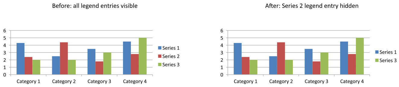
The example below creates a clustered column chart with multiple series using default data. It hides the second series' legend entry (index 1) and saves the presentation. It then restores the entry by calling setHide with False and saves a second copy. The columns remain visible in both files.
import jpype
import asposeslides

if not jpype.isJVMStarted():
    jpype.startJVM()

from asposeslides.api import ChartType, Presentation, SaveFormat

presentation = Presentation()
try:
    slide = presentation.getSlides().get_Item(0)

    chart = slide.getShapes().addChart(ChartType.ClusteredColumn, 50, 50, 600, 400)
    chart.setLegend(True)

    legend_entry = chart.getChartData().getSeries().get_Item(1).getRelatedLegendEntry()

    legend_entry.setHide(True)
    presentation.save("hidden_legend_entry.pptx", SaveFormat.Pptx)

    # Restore the same entry without changing the chart data.
    legend_entry.setHide(False)
    presentation.save("restored_legend_entry.pptx", SaveFormat.Pptx)
finally:
    presentation.dispose()
The comparison below shows the same chart with all entries visible and with the second entry hidden. The second series' columns remain unchanged.
In column, bar, and line charts, legend entries identify series. For pie charts, they identify individual data points (slices), so use ChartDataPoint.getRelatedLegendEntry on the selected slice instead. The API documents this data-point method for the Pie, Pie3D, ExplodedPie, ExplodedPie3D, PieOfPie, and BarOfPie chart types. Do not assume it applies to doughnut charts, which are not included in that list.
FAQ
Can I make the chart allocate space for the legend instead of overlaying it?
Yes. Call setOverlay with False to reserve space for the legend instead of allowing it to overlap the plot area.
Can I make multiline legend labels?
Yes. Long labels can wrap when the available width is insufficient. You can also use newline characters in series names to request line breaks.
How do I make the legend follow the presentation theme’s color scheme?
Leave the legend’s colors, fills, and fonts unset so that it can inherit theme formatting. Explicit formatting overrides the corresponding theme settings.