
Manage Chart Data Labels in Presentations Using Python
Introduction
Data labels display information about chart series and individual data points, helping readers identify values and understand the chart. This article explains how to format values, display percentages, read label text, control labels beyond the axis maximum, adjust category axis label spacing, and position pie chart labels.
Set Data Precision in Chart Data Labels
Use setNumberFormatOfValues to format series values. This example creates a line chart with default data, displays its data table, and enables value labels for the first series. The format #,##0.00 displays a thousands separator and two decimal places without changing the underlying values.
import jpype
import asposeslides

if not jpype.isJVMStarted():
    jpype.startJVM()

from asposeslides.api import ChartType, Presentation, SaveFormat

presentation = Presentation()
try:
    slide = presentation.getSlides().get_Item(0)

    chart = slide.getShapes().addChart(ChartType.Line, 50, 50, 450, 300)
    chart.setDataTable(True)

    series = chart.getChartData().getSeries().get_Item(0)
    series.setNumberFormatOfValues("#,##0.00")
    series.getLabels().getDefaultDataLabelFormat().setShowValue(True)

    presentation.save("PrecisionOfDatalabels_out.pptx", SaveFormat.Pptx)
finally:
    presentation.dispose()
Display Percentage as Labels
For a stacked column chart, calculate each value as a percentage of its category total and assign the text to the text frame returned by getTextFrameForOverriding. This example uses the default chart data and displays percentages with two decimal places in an 8-point font. Categories with a total of zero are skipped to avoid division by zero. Recalculate the custom label text if the chart data changes.
import jpype
import asposeslides

if not jpype.isJVMStarted():
    jpype.startJVM()

from asposeslides.api import ChartType, Portion, Presentation, SaveFormat

presentation = Presentation()
try:
    slide = presentation.getSlides().get_Item(0)

    chart = slide.getShapes().addChart(ChartType.StackedColumn, 20, 20, 400, 400)

    chart_series = chart.getChartData().getSeries()
    category_totals = [0.0] * chart.getChartData().getCategories().size()
    for category_index in range(len(category_totals)):
        for series_index in range(chart_series.size()):
            data_point = chart_series.get_Item(series_index).getDataPoints().get_Item(category_index)
            category_totals[category_index] += float(data_point.getValue().getData())

    for series_index in range(chart_series.size()):
        series = chart_series.get_Item(series_index)
        series.getLabels().getDefaultDataLabelFormat().setShowLegendKey(False)

        for point_index in range(series.getDataPoints().size()):
            data_point = series.getDataPoints().get_Item(point_index)
            label = data_point.getLabel()
            if category_totals[point_index] == 0:
                print(f"Cannot calculate a percentage for category {point_index}: the total is zero.")
                continue
            point_percentage = float(data_point.getValue().getData()) / category_totals[point_index] * 100

            portion = Portion()
            portion.setText(f"{point_percentage:.2f} %")
            portion.getPortionFormat().setFontHeight(8)
            label.getTextFrameForOverriding().setText("")
            paragraph = label.getTextFrameForOverriding().getParagraphs().get_Item(0)
            paragraph.getPortions().add(portion)

            label_format = label.getDataLabelFormat()
            label_format.setShowValue(True)
            label_format.setShowSeriesName(False)
            label_format.setShowPercentage(False)
            label_format.setShowLegendKey(False)
            label_format.setShowCategoryName(False)
            label_format.setShowBubbleSize(False)

    presentation.save("DisplayPercentageAsLabels_out.pptx", SaveFormat.Pptx)
finally:
    presentation.dispose()
Set Percentage Sign with Chart Data Labels
When values are stored as fractions, use setNumberFormat to display percentages. Pass False to setNumberFormatLinkedToSource to apply the label format independently of the source cells.
This example creates a 100% stacked column chart with red and blue series across four categories. Each pair of values adds up to 1. The label format 0.0% displays 0.30 as 30.0%, while the vertical axis uses two decimal places. Both series use white, 10-point label text.
import jpype
import asposeslides

if not jpype.isJVMStarted():
    jpype.startJVM()

from asposeslides.api import ChartType, FillType, Presentation, SaveFormat

Color = jpype.JClass("java.awt.Color")

presentation = Presentation()
try:
    slide = presentation.getSlides().get_Item(0)

    chart = slide.getShapes().addChart(ChartType.PercentsStackedColumn, 20, 20, 500, 400)

    chart.getAxes().getVerticalAxis().setNumberFormatLinkedToSource(False)
    chart.getAxes().getVerticalAxis().setNumberFormat("0.00%")

    chart.getChartData().getSeries().clear()
    chart.getChartData().getCategories().clear()

    workbook = chart.getChartData().getChartDataWorkbook()
    worksheet_index = 0
    for i in range(4):
        category_cell = workbook.getCell(worksheet_index, i + 1, 0, f"Category {i + 1}")
        chart.getChartData().getCategories().add(category_cell)

    series_names = ["Reds", "Blues"]
    series_colors = [Color.RED, Color.BLUE]
    values = [[0.30, 0.50, 0.80, 0.65], [0.70, 0.50, 0.20, 0.35]]

    for i, series_name in enumerate(series_names):
        series_cell = workbook.getCell(worksheet_index, 0, i + 1, series_name)
        series = chart.getChartData().getSeries().add(series_cell, chart.getType())
        for j, value in enumerate(values[i]):
            value_cell = workbook.getCell(worksheet_index, j + 1, i + 1, jpype.JDouble(value))
            series.getDataPoints().addDataPointForBarSeries(value_cell)

        series.getFormat().getFill().setFillType(FillType.Solid)
        series.getFormat().getFill().getSolidFillColor().setColor(series_colors[i])

        label_format = series.getLabels().getDefaultDataLabelFormat()
        label_format.setShowValue(True)
        label_format.setNumberFormatLinkedToSource(False)
        label_format.setNumberFormat("0.0%")
        portion_format = label_format.getTextFormat().getPortionFormat()
        portion_format.setFontHeight(10)
        portion_format.getFillFormat().setFillType(FillType.Solid)
        portion_format.getFillFormat().getSolidFillColor().setColor(Color.WHITE)

    presentation.save("SetDataLabelsPercentageSign_out.pptx", SaveFormat.Pptx)
finally:
    presentation.dispose()
Read the Actual Text of Data Labels
Use getActualLabelText to retrieve the text produced by a data label’s settings. This is useful when extracting labels for reports, searching presentation content, or validating generated charts. In the example below, the default data label format combines each category name, series name, and value. One point formats its value as a percentage, and another uses custom text from getTextFrameForOverriding.
import jpype
import asposeslides

if not jpype.isJVMStarted():
    jpype.startJVM()

from asposeslides.api import ChartType, Presentation

presentation = Presentation()
try:
    slide = presentation.getSlides().get_Item(0)

    chart = slide.getShapes().addChart(ChartType.ClusteredColumn, 20, 20, 500, 300)

    chart.getChartData().getSeries().clear()
    chart.getChartData().getCategories().clear()

    workbook = chart.getChartData().getChartDataWorkbook()
    first_category_cell = workbook.getCell(0, 1, 0, "Q1")
    chart.getChartData().getCategories().add(first_category_cell)
    second_category_cell = workbook.getCell(0, 2, 0, "Q2")
    chart.getChartData().getCategories().add(second_category_cell)

    north_series_cell = workbook.getCell(0, 0, 1, "North")
    north = chart.getChartData().getSeries().add(north_series_cell, chart.getType())
    north_first_value_cell = workbook.getCell(0, 1, 1, jpype.JDouble(0.25))
    north.getDataPoints().addDataPointForBarSeries(north_first_value_cell)
    north_second_value_cell = workbook.getCell(0, 2, 1, jpype.JDouble(0.75))
    north.getDataPoints().addDataPointForBarSeries(north_second_value_cell)

    south_series_cell = workbook.getCell(0, 0, 2, "South")
    south = chart.getChartData().getSeries().add(south_series_cell, chart.getType())
    south_first_value_cell = workbook.getCell(0, 1, 2, jpype.JDouble(0.40))
    south.getDataPoints().addDataPointForBarSeries(south_first_value_cell)
    south_second_value_cell = workbook.getCell(0, 2, 2, jpype.JDouble(0.60))
    south.getDataPoints().addDataPointForBarSeries(south_second_value_cell)

    for series in chart.getChartData().getSeries():
        label_format = series.getLabels().getDefaultDataLabelFormat()
        label_format.setShowCategoryName(True)
        label_format.setShowSeriesName(True)
        label_format.setShowValue(True)

    north.getLabels().get_Item(1).getDataLabelFormat().setNumberFormatLinkedToSource(False)
    north.getLabels().get_Item(1).getDataLabelFormat().setNumberFormat("0%")
    south.getLabels().get_Item(0).getTextFrameForOverriding().setText("Reviewed")

    for series in chart.getChartData().getSeries():
        for point in series.getDataPoints():
            label = point.getLabel()
            if not label.isVisible():
                continue

            print(f"Value: {point.getValue().getData()}; label: {label.getActualLabelText()}")
finally:
    presentation.dispose()
The number stored in a data point remains 0.75, even when its label shows 75% along with the category and series names. Custom text replaces the generated label text. getActualLabelText returns the resulting label string in either case. Check isVisible separately, as shown above, when you want to extract only visible labels.
Control Data Labels Beyond the Axis Maximum
When you limit an axis range manually, some data points may exceed its maximum. Use setShowDataLabelsOverMaximum to control whether their data labels are shown. This setting changes label visibility; it does not change the axis range or the underlying data values.
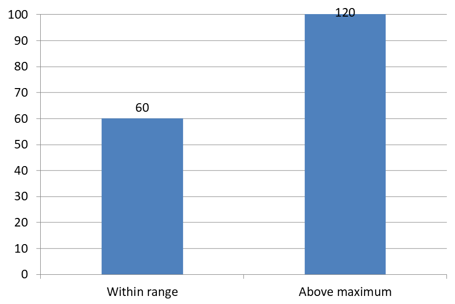
The example below creates a 2D clustered column chart with values of 60 and 120. It passes False to setAutomaticMaxValue and sets the maximum to 100 with setMaxValue on the vertical axis. The first slide allows labels beyond the maximum; a copy of that slide disables them. Both slides are saved in DataLabelsOverMaximum.pptx.
Enable value labels with setShowValue. The chart-level setting does not enable value display by itself or override an individual label’s disabled value display. This example enables values for the entire series and uses setPosition to place labels at the outside end of each column.
import jpype
import asposeslides

if not jpype.isJVMStarted():
    jpype.startJVM()

from asposeslides.api import ChartType, LegendDataLabelPosition, Presentation, SaveFormat

presentation = Presentation()
try:
    slide = presentation.getSlides().get_Item(0)

    chart = slide.getShapes().addChart(ChartType.ClusteredColumn, 50, 50, 600, 400)
    chart.setLegend(False)

    chart.getChartData().getSeries().clear()
    chart.getChartData().getCategories().clear()

    workbook = chart.getChartData().getChartDataWorkbook()

    first_category = workbook.getCell(0, 1, 0, "Within range")
    second_category = workbook.getCell(0, 2, 0, "Above maximum")

    chart.getChartData().getCategories().add(first_category)
    chart.getChartData().getCategories().add(second_category)

    series_name = workbook.getCell(0, 0, 1, "Values")
    series = chart.getChartData().getSeries().add(series_name, chart.getType())

    first_value = workbook.getCell(0, 1, 1, jpype.JDouble(60))
    second_value = workbook.getCell(0, 2, 1, jpype.JDouble(120))

    series.getDataPoints().addDataPointForBarSeries(first_value)
    series.getDataPoints().addDataPointForBarSeries(second_value)

    series.getLabels().getDefaultDataLabelFormat().setShowValue(True)
    series.getLabels().getDefaultDataLabelFormat().setPosition(LegendDataLabelPosition.OutsideEnd)

    chart.getAxes().getVerticalAxis().setAutomaticMaxValue(False)
    chart.getAxes().getVerticalAxis().setMaxValue(100)
    chart.setShowDataLabelsOverMaximum(True)

    second_slide = presentation.getSlides().addClone(slide)
    second_chart = second_slide.getShapes().get_Item(0)
    second_chart.setShowDataLabelsOverMaximum(False)

    presentation.save("DataLabelsOverMaximum.pptx", SaveFormat.Pptx)
finally:
    presentation.dispose()
The following images show the saved slides rendered by Microsoft PowerPoint. With True, the label 120 is visible at the upper boundary; with False, it is hidden. The label 60 remains visible, the axis maximum stays at 100, and the second data point remains 120 in both cases.
| setShowDataLabelsOverMaximum(True) | setShowDataLabelsOverMaximum(False) |
|---|---|
 |
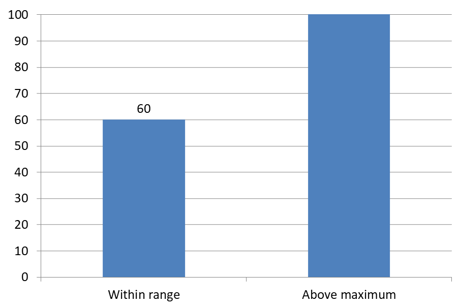 |
Chart Type
This example uses a 2D column chart with a value axis. Charts without a value axis, such as pie and doughnut charts, do not have an axis maximum to limit in this way.Set Label Distance from an Axis
Use setLabelOffset to control the distance between category axis labels and the axis. The value is a percentage of the maximum font size of the axis labels. This example creates a clustered column chart and sets the horizontal axis label offset to 500. This setting affects category axis labels rather than labels attached to individual data points.
import jpype
import asposeslides

if not jpype.isJVMStarted():
    jpype.startJVM()

from asposeslides.api import ChartType, Presentation, SaveFormat

presentation = Presentation()
try:
    slide = presentation.getSlides().get_Item(0)

    chart = slide.getShapes().addChart(ChartType.ClusteredColumn, 20, 20, 500, 300)
    chart.getAxes().getHorizontalAxis().setLabelOffset(500)

    presentation.save("SetCategoryAxisLabelDistance_out.pptx", SaveFormat.Pptx)
finally:
    presentation.dispose()
Adjust Label Location
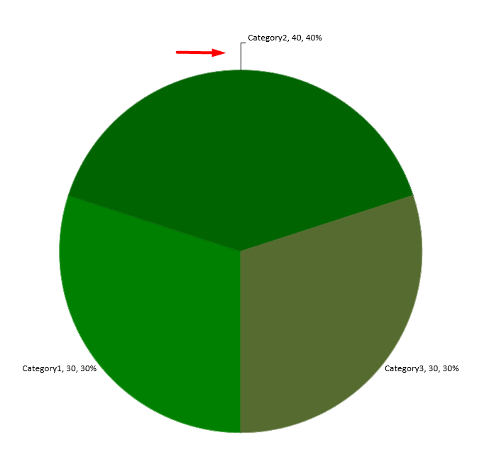
On a pie chart, adjust data label positions to improve spacing and make room for leader lines.
This example displays the value of the first data point, places its label outside the slice, and adjusts its horizontal and vertical offsets using setX and setY. These offsets are relative to the chart width and height, respectively.
import jpype
import asposeslides

if not jpype.isJVMStarted():
    jpype.startJVM()

from asposeslides.api import ChartType, LegendDataLabelPosition, Presentation, SaveFormat

presentation = Presentation()
try:
    slide = presentation.getSlides().get_Item(0)

    chart = slide.getShapes().addChart(ChartType.Pie, 50, 50, 200, 200)
    series = chart.getChartData().getSeries()

    label = series.get_Item(0).getLabels().get_Item(0)
    label.getDataLabelFormat().setShowValue(True)
    label.getDataLabelFormat().setPosition(LegendDataLabelPosition.OutsideEnd)
    label.setX(0.71)
    label.setY(0.04)

    presentation.save("presentation.pptx", SaveFormat.Pptx)
finally:
    presentation.dispose()
FAQ
How can I prevent data labels from overlapping on dense charts?
Combine automatic label placement, leader lines, and reduced font size; if necessary, hide some fields (for example, the category) or show labels only for extreme values or key points.
How can I disable labels only for zero, negative, or empty values?
Filter data points before enabling labels and turn off display for values of 0, negative values, or missing values according to a defined rule.
How can I ensure a consistent label style when exporting to PDF/images?
Explicitly set the font family and size and verify that the font is available in the rendering environment to avoid fallback.