
Create or Update PowerPoint Presentation Charts in Python
Overview
This article provides a comprehensive guide on how to create and customize charts using Aspose.Slides. You will learn how to programmatically add a chart to a slide, populate it with data, and apply various formatting options to match your specific design requirements. Throughout the article, detailed code examples illustrate each step, from initializing the presentation and chart object to configuring series, axes, and legends. By following this guide, you’ll gain a solid understanding of how to integrate dynamic chart generation into your applications, streamlining the process of creating data-driven presentations.
Create a Chart
Charts help people quickly visualize data and gain insights that may not be immediately obvious from a table or spreadsheet.
Why Create Charts?
Using charts, you can:
- aggregate, condense, or summarize large amounts of data on a single slide in a presentation
- expose patterns and trends in data
- deduce the direction and momentum of data over time or with respect to a specific unit of measurement
- spot outliers, aberrations, deviations, errors, nonsensical data, etc.
- communicate or present complex data
In PowerPoint, you can create charts through the Insert function, which provides templates for designing many types of charts. Using Aspose.Slides, you can create both regular charts (based on popular chart types) and custom charts.
Note
To create charts, use the ChartType class. The fields in this class correspond to different chart types.Create Clustered Column Charts
This section explains how to create clustered column charts using Aspose.Slides. You’ll learn to initialize a presentation, add a chart, and customize its elements such as title, data, series, categories, and styling. Follow the steps below to see how a standard clustered column chart is generated:
- Create an instance of the Presentation class.
- Get a reference to a slide using its index.
- Add a chart with some data and specify the
ChartType.ClusteredColumntype. - Add a title to the chart.
- Access the chart’s data worksheet.
- Clear all the default series and categories.
- Add new series and categories.
- Add new chart data for the chart series.
- Apply a fill color to the chart series.
- Add labels to the chart series.
- Save the modified presentation as a PPTX file.
This C# code demonstrates how to create a clustered column chart:
import jpype
import asposeslides

if not jpype.isJVMStarted():
    jpype.startJVM()

from asposeslides.api import ChartType, FillType, NullableBool, Presentation, SaveFormat

Color = jpype.JClass("java.awt.Color")

# Instantiates a presentation class that represents a PPTX file.
presentation = Presentation()
try:
    # Accesses the first slide
    slide = presentation.getSlides().get_Item(0)

    # Adds a chart with its default data
    chart = slide.getShapes().addChart(ChartType.ClusteredColumn, 0, 0, 500, 500)

    # Sets the chart Title
    chart.getChartTitle().addTextFrameForOverriding("Sample Title")
    chart.getChartTitle().getTextFrameForOverriding().getTextFrameFormat().setCenterText(NullableBool.True_)
    chart.getChartTitle().setHeight(20)
    chart.setTitle(True)

    # Sets the index for the chart data sheet
    default_worksheet_index = 0

    # Gets the chart data WorkSheet
    workbook = chart.getChartData().getChartDataWorkbook()

    # Deletes the default generated series and categories
    chart.getChartData().getSeries().clear()
    chart.getChartData().getCategories().clear()

    # Adds new series
    cell = workbook.getCell(default_worksheet_index, 0, 1, "Series 1")
    chart.getChartData().getSeries().add(cell,chart.getType())
    cell = workbook.getCell(default_worksheet_index, 0, 2, "Series 2")
    chart.getChartData().getSeries().add(cell,chart.getType())

    # Adds new categories
    cell = workbook.getCell(default_worksheet_index, 1, 0, "Category 1")
    chart.getChartData().getCategories().add(cell)
    cell = workbook.getCell(default_worksheet_index, 2, 0, "Category 2")
    chart.getChartData().getCategories().add(cell)
    cell = workbook.getCell(default_worksheet_index, 3, 0, "Category 3")
    chart.getChartData().getCategories().add(cell)

    # Takes the first chart series
    series = chart.getChartData().getSeries().get_Item(0)

    # Now populates the series data
    cell = workbook.getCell(default_worksheet_index, 1, 1, 20)
    series.getDataPoints().addDataPointForBarSeries(cell)
    cell = workbook.getCell(default_worksheet_index, 2, 1, 50)
    series.getDataPoints().addDataPointForBarSeries(cell)
    cell = workbook.getCell(default_worksheet_index, 3, 1, 30)
    series.getDataPoints().addDataPointForBarSeries(cell)

    # Sets the fill color for series
    series.getFormat().getFill().setFillType(FillType.Solid)
    series.getFormat().getFill().getSolidFillColor().setColor(Color.RED)

    # Takes the second chart series
    series = chart.getChartData().getSeries().get_Item(1)

    # Populates series data
    cell = workbook.getCell(default_worksheet_index, 1, 2, 30)
    series.getDataPoints().addDataPointForBarSeries(cell)
    cell = workbook.getCell(default_worksheet_index, 2, 2, 10)
    series.getDataPoints().addDataPointForBarSeries(cell)
    cell = workbook.getCell(default_worksheet_index, 3, 2, 60)
    series.getDataPoints().addDataPointForBarSeries(cell)

    # Sets the fill color for the series
    series.getFormat().getFill().setFillType(FillType.Solid)
    series.getFormat().getFill().getSolidFillColor().setColor(Color.GREEN)

    #Create custom labels for each categories for the new series
    # Sets the first label to show Category name
    label = series.getDataPoints().get_Item(0).getLabel()
    label.getDataLabelFormat().setShowCategoryName(True)

    label = series.getDataPoints().get_Item(1).getLabel()
    label.getDataLabelFormat().setShowSeriesName(True)

    # Shows value for the third label
    label = series.getDataPoints().get_Item(2).getLabel()
    label.getDataLabelFormat().setShowValue(True)
    label.getDataLabelFormat().setShowSeriesName(True)
    label.getDataLabelFormat().setSeparator("/")

    # Saves the presentation with chart
    presentation.save("output.pptx", SaveFormat.Pptx)
finally:
    presentation.dispose()
Create Scatter Charts
Scatter charts (also known as scatter plots or x-y graphs) are often used to check for patterns or demonstrate correlations between two variables.
Use a scatter chart when:
- you have paired numerical data
- you have two variables that pair well together
- you want to determine whether two variables are related
- you have an independent variable that has multiple values for a dependent variable
- Follow the steps in Create Clustered Column Charts.
- For the third step, add a chart with some data and specify your chart type as one of the following:
- ChartType.ScatterWithMarkers - Represents a scatter chart.
- ChartType.ScatterWithSmoothLinesAndMarkers - Represents a scatter chart connected by curves, with data markers.
- ChartType.ScatterWithSmoothLines - Represents a scatter chart connected by curves, without data markers.
- ChartType.ScatterWithStraightLinesAndMarkers - Represents a scatter chart connected by lines, with data markers.
- ChartType.ScatterWithStraightLines - Represents a scatter chart connected by lines, without data markers.
This Python code shows how to create a scatter chart with different markers for each series:
import jpype
import asposeslides

if not jpype.isJVMStarted():
    jpype.startJVM()

from asposeslides.api import ChartType, MarkerStyleType, Presentation, SaveFormat

# Instantiates a presentation class that represents a PPTX file.
presentation = Presentation()
try:
    # Accesses the first slide
    slide = presentation.getSlides().get_Item(0)

    # Creates the default chart
    chart = slide.getShapes().addChart(ChartType.ScatterWithSmoothLines, 0, 0, 400, 400)

    # Gets the default chart data worksheet index
    default_worksheet_index = 0

    # Gets the chart data worksheet
    workbook = chart.getChartData().getChartDataWorkbook()

    # Deletes the demo series
    chart.getChartData().getSeries().clear()

    # Adds new series
    cell = workbook.getCell(default_worksheet_index, 1, 1, "Series 1")
    chart.getChartData().getSeries().add(cell, chart.getType())
    cell = workbook.getCell(default_worksheet_index, 1, 3, "Series 2")
    chart.getChartData().getSeries().add(cell, chart.getType())

    # Takes first chart series
    series = chart.getChartData().getSeries().get_Item(0)

    # Adds a new point (1:3) to the series
    x_cell = workbook.getCell(default_worksheet_index, 2, 1, 1)
    y_cell = workbook.getCell(default_worksheet_index, 2, 2, 3)
    series.getDataPoints().addDataPointForScatterSeries(x_cell, y_cell)

    # Adds a new point (2:10)
    x_cell = workbook.getCell(default_worksheet_index, 3, 1, 2)
    y_cell = workbook.getCell(default_worksheet_index, 3, 2, 10)
    series.getDataPoints().addDataPointForScatterSeries(x_cell, y_cell)

    # Changes the series type
    series.setType(ChartType.ScatterWithStraightLinesAndMarkers)

    # Changes the chart series marker
    series.getMarker().setSize(10)
    series.getMarker().setSymbol(MarkerStyleType.Star)

    # Takes the second chart series
    series = chart.getChartData().getSeries().get_Item(1)

    # Adds a new point (5:2) there
    x_cell = workbook.getCell(default_worksheet_index, 2, 3, 5)
    y_cell = workbook.getCell(default_worksheet_index, 2, 4, 2)
    series.getDataPoints().addDataPointForScatterSeries(x_cell, y_cell)

    # Adds a new point (3:1)
    x_cell = workbook.getCell(default_worksheet_index, 3, 3, 3)
    y_cell = workbook.getCell(default_worksheet_index, 3, 4, 1)
    series.getDataPoints().addDataPointForScatterSeries(x_cell, y_cell)

    # Adds a new point (2:2)
    x_cell = workbook.getCell(default_worksheet_index, 4, 3, 2)
    y_cell = workbook.getCell(default_worksheet_index, 4, 4, 2)
    series.getDataPoints().addDataPointForScatterSeries(x_cell, y_cell)

    # Adds a new point (5:1)
    x_cell = workbook.getCell(default_worksheet_index, 5, 3, 5)
    y_cell = workbook.getCell(default_worksheet_index, 5, 4, 1)
    series.getDataPoints().addDataPointForScatterSeries(x_cell, y_cell)

    # Changes the chart series marker
    series.getMarker().setSize(10)
    series.getMarker().setSymbol(MarkerStyleType.Circle)

    presentation.save("AsposeChart_out.pptx", SaveFormat.Pptx)
finally:
    presentation.dispose()
Create Pie Charts
Pie charts are best used to show the part-to-whole relationship in data, especially when the data contains categorical labels with numeric values. However, if your data contains many parts or labels, you may want to consider using a bar chart instead.
- Create an instance of the Presentation class.
- Get a reference to a slide using its index.
- Add a chart with default data and specify the ChartType.Pie type.
- Access the chart data workbook ChartDataWorkbook.
- Clear the default series and categories.
- Add new series and categories.
- Add new chart data for the chart series.
- Add new points for the chart and apply custom colors for the pie chart’s sectors.
- Set labels for the series.
- Enable leader lines for the series labels.
- Set the rotation angle for pie chart sectors.
- Save the modified presentation as a PPTX file.
This Python code shows how to create a pie chart:
import jpype
import asposeslides

if not jpype.isJVMStarted():
    jpype.startJVM()

from asposeslides.api import ChartType, FillType, LineDashStyle, LineStyle, NullableBool, Presentation, SaveFormat

Color = jpype.JClass("java.awt.Color")

# Instantiates a presentation class that represents a PPTX file.
presentation = Presentation()
try:
    # Accesses the first slide
    slide = presentation.getSlides().get_Item(0)

    # Adds a chart with default data
    chart = slide.getShapes().addChart(ChartType.Pie, 100, 100, 400, 400)

    # Sets the chart Title
    chart.getChartTitle().addTextFrameForOverriding("Sample Title")
    chart.getChartTitle().getTextFrameForOverriding().getTextFrameFormat().setCenterText(NullableBool.True_)
    chart.getChartTitle().setHeight(20)
    chart.setTitle(True)

    # Sets the index for the chart data sheet
    default_worksheet_index = 0

    # Gets the chart data worksheet
    workbook = chart.getChartData().getChartDataWorkbook()

    # Deletes the default generated series and categories
    chart.getChartData().getSeries().clear()
    chart.getChartData().getCategories().clear()

    # Adds new categories
    cell = workbook.getCell(0, 1, 0, "First Qtr")
    chart.getChartData().getCategories().add(cell)
    cell = workbook.getCell(0, 2, 0, "2nd Qtr")
    chart.getChartData().getCategories().add(cell)
    cell = workbook.getCell(0, 3, 0, "3rd Qtr")
    chart.getChartData().getCategories().add(cell)

    # Adds new series
    cell = workbook.getCell(0, 0, 1, "Series 1")
    series = chart.getChartData().getSeries().add(cell, chart.getType())

    #Populates the series data
    cell = workbook.getCell(default_worksheet_index, 1, 1, 20)
    series.getDataPoints().addDataPointForPieSeries(cell)
    cell = workbook.getCell(default_worksheet_index, 2, 1, 50)
    series.getDataPoints().addDataPointForPieSeries(cell)
    cell = workbook.getCell(default_worksheet_index, 3, 1, 30)
    series.getDataPoints().addDataPointForPieSeries(cell)

    # Adding new points and setting sector color
    chart.getChartData().getSeriesGroups().get_Item(0).setColorVaried(True)

    point = series.getDataPoints().get_Item(0)
    point.getFormat().getFill().setFillType(FillType.Solid)
    point.getFormat().getFill().getSolidFillColor().setColor(Color.CYAN)

    # Sets the Sector border
    point.getFormat().getLine().getFillFormat().setFillType(FillType.Solid)
    point.getFormat().getLine().getFillFormat().getSolidFillColor().setColor(Color.GRAY)
    point.getFormat().getLine().setWidth(3.0)
    point.getFormat().getLine().setStyle(LineStyle.ThinThick)
    point.getFormat().getLine().setDashStyle(LineDashStyle.DashDot)

    second_point = series.getDataPoints().get_Item(1)
    second_point.getFormat().getFill().setFillType(FillType.Solid)
    second_point.getFormat().getFill().getSolidFillColor().setColor(Color.ORANGE)

    # Sets the Sector border
    second_point.getFormat().getLine().getFillFormat().setFillType(FillType.Solid)
    second_point.getFormat().getLine().getFillFormat().getSolidFillColor().setColor(Color.BLUE)
    second_point.getFormat().getLine().setWidth(3.0)
    second_point.getFormat().getLine().setStyle(LineStyle.Single)
    second_point.getFormat().getLine().setDashStyle(LineDashStyle.LargeDashDot)

    third_point = series.getDataPoints().get_Item(2)
    third_point.getFormat().getFill().setFillType(FillType.Solid)
    third_point.getFormat().getFill().getSolidFillColor().setColor(Color.YELLOW)

    # Sets the Sector border
    third_point.getFormat().getLine().getFillFormat().setFillType(FillType.Solid)
    third_point.getFormat().getLine().getFillFormat().getSolidFillColor().setColor(Color.RED)
    third_point.getFormat().getLine().setWidth(2.0)
    third_point.getFormat().getLine().setStyle(LineStyle.ThinThin)
    third_point.getFormat().getLine().setDashStyle(LineDashStyle.LargeDashDotDot)

    # Creates custom labels for each of categories for new series
    first_label = series.getDataPoints().get_Item(0).getLabel()

    first_label.getDataLabelFormat().setShowValue(True)

    second_label = series.getDataPoints().get_Item(1).getLabel()
    second_label.getDataLabelFormat().setShowValue(True)
    second_label.getDataLabelFormat().setShowLegendKey(True)
    second_label.getDataLabelFormat().setShowPercentage(True)

    third_label = series.getDataPoints().get_Item(2).getLabel()
    third_label.getDataLabelFormat().setShowSeriesName(True)
    third_label.getDataLabelFormat().setShowPercentage(True)

    # Shows Leader Lines for Chart
    series.getLabels().getDefaultDataLabelFormat().setShowLeaderLines(True)

    # Sets the Rotation Angle for Pie Chart Sectors
    chart.getChartData().getSeriesGroups().get_Item(0).setFirstSliceAngle(180)

    # Saves the presentation with a chart
    presentation.save("PieChart_out.pptx", SaveFormat.Pptx)
finally:
    presentation.dispose()
Create Line Charts
Line charts (also known as line graphs) are best used in situations where you want to demonstrate changes in value over time. Using a line chart, you can compare a large amount of data at once, track changes and trends over time, highlight anomalies in data series, and more.
- Create an instance of the Presentation class.
- Get a reference to a slide using its index.
- Add a chart with default data and specify the ChartType.Line type.
- Save the modified presentation as a PPTX file.
This Python code shows how to create a line chart:
import jpype
import asposeslides

if not jpype.isJVMStarted():
    jpype.startJVM()

from asposeslides.api import ChartType, Presentation, SaveFormat

presentation = Presentation()
try:
    line_chart = presentation.getSlides().get_Item(0).getShapes().addChart(ChartType.Line, 10, 50, 600, 350)

    presentation.save("line_chart.pptx", SaveFormat.Pptx)
finally:
    presentation.dispose()
By default, points on a line chart are joined by straight continuous lines. If you want the points to be joined by dashes instead, you can specify your preferred dash type as follows:
import jpype
import asposeslides

if not jpype.isJVMStarted():
    jpype.startJVM()

from asposeslides.api import ChartType, LineDashStyle, Presentation, SaveFormat

presentation = Presentation()
try:
    line_chart = presentation.getSlides().get_Item(0).getShapes().addChart(ChartType.Line, 10, 50, 600, 350)

    for series in line_chart.getChartData().getSeries():
        series.getFormat().getLine().setDashStyle(LineDashStyle.Dash)

    presentation.save("line_chart.pptx", SaveFormat.Pptx)
finally:
    presentation.dispose()
Create Tree Map Charts
Tree map charts are best used for sales data when you want to show the relative size of data categories and quickly draw attention to items that are large contributors within each category.
- Create an instance of the Presentation class.
- Get a reference to a slide using its index.
- Add a chart with default data and specify the ChartType.Treemap type.
- Access the chart data workbook ChartDataWorkbook.
- Clear the default series and categories.
- Add new series and categories.
- Add new chart data for the chart series.
- Save the modified presentation as a PPTX file.
This Python code shows how to create a tree map chart:
import jpype
import asposeslides

if not jpype.isJVMStarted():
    jpype.startJVM()

from asposeslides.api import ChartType, ParentLabelLayoutType, Presentation, SaveFormat

presentation = Presentation()
try:
    chart = presentation.getSlides().get_Item(0).getShapes().addChart(ChartType.Treemap, 50, 50, 500, 400)
    chart.getChartData().getCategories().clear()
    chart.getChartData().getSeries().clear()

    workbook = chart.getChartData().getChartDataWorkbook()
    workbook.clear(0)

    #branch 1
    cell = workbook.getCell(0, "C1", "Leaf1")
    leaf = chart.getChartData().getCategories().add(cell)
    leaf.getGroupingLevels().setGroupingItem(1, "Stem1")
    leaf.getGroupingLevels().setGroupingItem(2, "Branch1")

    cell = workbook.getCell(0, "C2", "Leaf2")
    chart.getChartData().getCategories().add(cell)

    cell = workbook.getCell(0, "C3", "Leaf3")
    leaf = chart.getChartData().getCategories().add(cell)
    leaf.getGroupingLevels().setGroupingItem(1, "Stem2")

    cell = workbook.getCell(0, "C4", "Leaf4")
    chart.getChartData().getCategories().add(cell)

    #branch 2
    cell = workbook.getCell(0, "C5", "Leaf5")
    leaf = chart.getChartData().getCategories().add(cell)
    leaf.getGroupingLevels().setGroupingItem(1, "Stem3")
    leaf.getGroupingLevels().setGroupingItem(2, "Branch2")

    cell = workbook.getCell(0, "C6", "Leaf6")
    chart.getChartData().getCategories().add(cell)

    cell = workbook.getCell(0, "C7", "Leaf7")
    leaf = chart.getChartData().getCategories().add(cell)
    leaf.getGroupingLevels().setGroupingItem(1, "Stem4")

    cell = workbook.getCell(0, "C8", "Leaf8")
    chart.getChartData().getCategories().add(cell)

    series = chart.getChartData().getSeries().add(ChartType.Treemap)
    series.getLabels().getDefaultDataLabelFormat().setShowCategoryName(True)
    cell = workbook.getCell(0, "D1", 4)
    series.getDataPoints().addDataPointForTreemapSeries(cell)
    cell = workbook.getCell(0, "D2", 5)
    series.getDataPoints().addDataPointForTreemapSeries(cell)
    cell = workbook.getCell(0, "D3", 3)
    series.getDataPoints().addDataPointForTreemapSeries(cell)
    cell = workbook.getCell(0, "D4", 6)
    series.getDataPoints().addDataPointForTreemapSeries(cell)
    cell = workbook.getCell(0, "D5", 9)
    series.getDataPoints().addDataPointForTreemapSeries(cell)
    cell = workbook.getCell(0, "D6", 9)
    series.getDataPoints().addDataPointForTreemapSeries(cell)
    cell = workbook.getCell(0, "D7", 4)
    series.getDataPoints().addDataPointForTreemapSeries(cell)
    cell = workbook.getCell(0, "D8", 3)
    series.getDataPoints().addDataPointForTreemapSeries(cell)

    series.setParentLabelLayout(ParentLabelLayoutType.Overlapping)

    presentation.save("Treemap.pptx", SaveFormat.Pptx)
finally:
    presentation.dispose()
Create Stock Charts
- Create an instance of the Presentation class.
- Get a reference to a slide using its index.
- Add a chart with default data and specify the ChartType.OpenHighLowClose type.
- Access the chart data workbook ChartDataWorkbook.
- Clear the default series and categories.
- Add new series and categories.
- Add new chart data for the chart series.
- Specify the high-low lines format.
- Save the modified presentation as a PPTX file.
This Python code shows how to create a stock chart:
import jpype
import asposeslides

if not jpype.isJVMStarted():
    jpype.startJVM()

from asposeslides.api import ChartType, FillType, Presentation, SaveFormat

presentation = Presentation()
try:
    chart = presentation.getSlides().get_Item(0).getShapes().addChart(ChartType.OpenHighLowClose, 50, 50, 600, 400, False)

    chart.getChartData().getSeries().clear()
    chart.getChartData().getCategories().clear()

    workbook = chart.getChartData().getChartDataWorkbook()

    cell = workbook.getCell(0, 1, 0, "A")
    chart.getChartData().getCategories().add(cell)
    cell = workbook.getCell(0, 2, 0, "B")
    chart.getChartData().getCategories().add(cell)
    cell = workbook.getCell(0, 3, 0, "C")
    chart.getChartData().getCategories().add(cell)

    cell = workbook.getCell(0, 0, 1, "Open")
    chart.getChartData().getSeries().add(cell, chart.getType())
    cell = workbook.getCell(0, 0, 2, "High")
    chart.getChartData().getSeries().add(cell, chart.getType())
    cell = workbook.getCell(0, 0, 3, "Low")
    chart.getChartData().getSeries().add(cell, chart.getType())
    cell = workbook.getCell(0, 0, 4, "Close")
    chart.getChartData().getSeries().add(cell, chart.getType())

    series = chart.getChartData().getSeries().get_Item(0)

    cell = workbook.getCell(0, 1, 1, 72)
    series.getDataPoints().addDataPointForStockSeries(cell)
    cell = workbook.getCell(0, 2, 1, 25)
    series.getDataPoints().addDataPointForStockSeries(cell)
    cell = workbook.getCell(0, 3, 1, 38)
    series.getDataPoints().addDataPointForStockSeries(cell)

    series = chart.getChartData().getSeries().get_Item(1)
    cell = workbook.getCell(0, 1, 2, 172)
    series.getDataPoints().addDataPointForStockSeries(cell)
    cell = workbook.getCell(0, 2, 2, 57)
    series.getDataPoints().addDataPointForStockSeries(cell)
    cell = workbook.getCell(0, 3, 2, 57)
    series.getDataPoints().addDataPointForStockSeries(cell)

    series = chart.getChartData().getSeries().get_Item(2)
    cell = workbook.getCell(0, 1, 3, 12)
    series.getDataPoints().addDataPointForStockSeries(cell)
    cell = workbook.getCell(0, 2, 3, 12)
    series.getDataPoints().addDataPointForStockSeries(cell)
    cell = workbook.getCell(0, 3, 3, 13)
    series.getDataPoints().addDataPointForStockSeries(cell)

    series = chart.getChartData().getSeries().get_Item(3)
    cell = workbook.getCell(0, 1, 4, 25)
    series.getDataPoints().addDataPointForStockSeries(cell)
    cell = workbook.getCell(0, 2, 4, 38)
    series.getDataPoints().addDataPointForStockSeries(cell)
    cell = workbook.getCell(0, 3, 4, 50)
    series.getDataPoints().addDataPointForStockSeries(cell)

    chart.getChartData().getSeriesGroups().get_Item(0).getUpDownBars().setUpDownBars(True)
    chart.getChartData().getSeriesGroups().get_Item(0).getHiLowLinesFormat().getLine().getFillFormat().setFillType(FillType.Solid)

    for series in chart.getChartData().getSeries():
        series.getFormat().getLine().getFillFormat().setFillType(FillType.NoFill)

    presentation.save("output.pptx", SaveFormat.Pptx)
finally:
    presentation.dispose()
Create Box and Whisker Charts
- Create an instance of the Presentation class.
- Get a reference to a slide using its index.
- Add a chart with default data and specify the ChartType.BoxAndWhisker type.
- Access the chart data workbook ChartDataWorkbook.
- Clear the default series and categories.
- Add new series and categories.
- Add new chart data for the chart series.
- Save the modified presentation as a PPTX file.
This Python code shows how to create a box and whisker chart:
import jpype
import asposeslides

if not jpype.isJVMStarted():
    jpype.startJVM()

from asposeslides.api import ChartType, Presentation, QuartileMethodType, SaveFormat

presentation = Presentation()
try:
    chart = presentation.getSlides().get_Item(0).getShapes().addChart(ChartType.BoxAndWhisker, 50, 50, 500, 400)
    chart.getChartData().getCategories().clear()
    chart.getChartData().getSeries().clear()

    workbook = chart.getChartData().getChartDataWorkbook()
    workbook.clear(0)

    cell = workbook.getCell(0, "A1", "Category 1")
    chart.getChartData().getCategories().add(cell)
    cell = workbook.getCell(0, "A2", "Category 1")
    chart.getChartData().getCategories().add(cell)
    cell = workbook.getCell(0, "A3", "Category 1")
    chart.getChartData().getCategories().add(cell)
    cell = workbook.getCell(0, "A4", "Category 1")
    chart.getChartData().getCategories().add(cell)
    cell = workbook.getCell(0, "A5", "Category 1")
    chart.getChartData().getCategories().add(cell)
    cell = workbook.getCell(0, "A6", "Category 1")
    chart.getChartData().getCategories().add(cell)

    series = chart.getChartData().getSeries().add(ChartType.BoxAndWhisker)

    series.setQuartileMethod(QuartileMethodType.Exclusive)
    series.setShowMeanLine(True)
    series.setShowMeanMarkers(True)
    series.setShowInnerPoints(True)
    series.setShowOutlierPoints(True)

    cell = workbook.getCell(0, "B1", 15)
    series.getDataPoints().addDataPointForBoxAndWhiskerSeries(cell)
    cell = workbook.getCell(0, "B2", 41)
    series.getDataPoints().addDataPointForBoxAndWhiskerSeries(cell)
    cell = workbook.getCell(0, "B3", 16)
    series.getDataPoints().addDataPointForBoxAndWhiskerSeries(cell)
    cell = workbook.getCell(0, "B4", 10)
    series.getDataPoints().addDataPointForBoxAndWhiskerSeries(cell)
    cell = workbook.getCell(0, "B5", 23)
    series.getDataPoints().addDataPointForBoxAndWhiskerSeries(cell)
    cell = workbook.getCell(0, "B6", 16)
    series.getDataPoints().addDataPointForBoxAndWhiskerSeries(cell)

    presentation.save("BoxAndWhisker.pptx", SaveFormat.Pptx)
finally:
    presentation.dispose()
Create Funnel Charts
- Create an instance of the Presentation class.
- Get a reference to a slide using its index.
- Add a chart with default data and specify the ChartType.Funnel type.
- Save the modified presentation as a PPTX file.
This Python code shows how to create a funnel chart:
import jpype
import asposeslides

if not jpype.isJVMStarted():
    jpype.startJVM()

from asposeslides.api import ChartType, Presentation, SaveFormat

presentation = Presentation()
try:
    chart = presentation.getSlides().get_Item(0).getShapes().addChart(ChartType.Funnel, 50, 50, 500, 400)
    chart.getChartData().getCategories().clear()
    chart.getChartData().getSeries().clear()

    workbook = chart.getChartData().getChartDataWorkbook()

    workbook.clear(0)

    cell = workbook.getCell(0, "A1", "Category 1")
    chart.getChartData().getCategories().add(cell)
    cell = workbook.getCell(0, "A2", "Category 2")
    chart.getChartData().getCategories().add(cell)
    cell = workbook.getCell(0, "A3", "Category 3")
    chart.getChartData().getCategories().add(cell)
    cell = workbook.getCell(0, "A4", "Category 4")
    chart.getChartData().getCategories().add(cell)
    cell = workbook.getCell(0, "A5", "Category 5")
    chart.getChartData().getCategories().add(cell)
    cell = workbook.getCell(0, "A6", "Category 6")
    chart.getChartData().getCategories().add(cell)

    series = chart.getChartData().getSeries().add(ChartType.Funnel)

    cell = workbook.getCell(0, "B1", 50)
    series.getDataPoints().addDataPointForFunnelSeries(cell)
    cell = workbook.getCell(0, "B2", 100)
    series.getDataPoints().addDataPointForFunnelSeries(cell)
    cell = workbook.getCell(0, "B3", 200)
    series.getDataPoints().addDataPointForFunnelSeries(cell)
    cell = workbook.getCell(0, "B4", 300)
    series.getDataPoints().addDataPointForFunnelSeries(cell)
    cell = workbook.getCell(0, "B5", 400)
    series.getDataPoints().addDataPointForFunnelSeries(cell)
    cell = workbook.getCell(0, "B6", 500)
    series.getDataPoints().addDataPointForFunnelSeries(cell)

    presentation.save("Funnel.pptx", SaveFormat.Pptx)
finally:
    presentation.dispose()
Create Sunburst Charts
- Create an instance of the Presentation class.
- Get a reference to a slide using its index.
- Add a chart with default data and specify the ChartType.Sunburst type.
- Save the modified presentation as a PPTX file.
This Python code shows how to create a sunburst chart:
import jpype
import asposeslides

if not jpype.isJVMStarted():
    jpype.startJVM()

from asposeslides.api import ChartType, Presentation, SaveFormat

presentation = Presentation()
try:
    chart = presentation.getSlides().get_Item(0).getShapes().addChart(ChartType.Sunburst, 50, 50, 500, 400)
    chart.getChartData().getCategories().clear()
    chart.getChartData().getSeries().clear()

    workbook = chart.getChartData().getChartDataWorkbook()
    workbook.clear(0)

    #branch 1
    cell = workbook.getCell(0, "C1", "Leaf1")
    leaf = chart.getChartData().getCategories().add(cell)
    leaf.getGroupingLevels().setGroupingItem(1, "Stem1")
    leaf.getGroupingLevels().setGroupingItem(2, "Branch1")

    cell = workbook.getCell(0, "C2", "Leaf2")
    chart.getChartData().getCategories().add(cell)

    cell = workbook.getCell(0, "C3", "Leaf3")
    leaf = chart.getChartData().getCategories().add(cell)
    leaf.getGroupingLevels().setGroupingItem(1, "Stem2")

    cell = workbook.getCell(0, "C4", "Leaf4")
    chart.getChartData().getCategories().add(cell)

    #branch 2
    cell = workbook.getCell(0, "C5", "Leaf5")
    leaf = chart.getChartData().getCategories().add(cell)
    leaf.getGroupingLevels().setGroupingItem(1, "Stem3")
    leaf.getGroupingLevels().setGroupingItem(2, "Branch2")

    cell = workbook.getCell(0, "C6", "Leaf6")
    chart.getChartData().getCategories().add(cell)

    cell = workbook.getCell(0, "C7", "Leaf7")
    leaf = chart.getChartData().getCategories().add(cell)
    leaf.getGroupingLevels().setGroupingItem(1, "Stem4")

    cell = workbook.getCell(0, "C8", "Leaf8")
    chart.getChartData().getCategories().add(cell)

    series = chart.getChartData().getSeries().add(ChartType.Sunburst)
    series.getLabels().getDefaultDataLabelFormat().setShowCategoryName(True)
    cell = workbook.getCell(0, "D1", 4)
    series.getDataPoints().addDataPointForSunburstSeries(cell)
    cell = workbook.getCell(0, "D2", 5)
    series.getDataPoints().addDataPointForSunburstSeries(cell)
    cell = workbook.getCell(0, "D3", 3)
    series.getDataPoints().addDataPointForSunburstSeries(cell)
    cell = workbook.getCell(0, "D4", 6)
    series.getDataPoints().addDataPointForSunburstSeries(cell)
    cell = workbook.getCell(0, "D5", 9)
    series.getDataPoints().addDataPointForSunburstSeries(cell)
    cell = workbook.getCell(0, "D6", 9)
    series.getDataPoints().addDataPointForSunburstSeries(cell)
    cell = workbook.getCell(0, "D7", 4)
    series.getDataPoints().addDataPointForSunburstSeries(cell)
    cell = workbook.getCell(0, "D8", 3)
    series.getDataPoints().addDataPointForSunburstSeries(cell)

    presentation.save("Sunburst.pptx", SaveFormat.Pptx)
finally:
    presentation.dispose()
Create Histogram Charts
- Create an instance of the Presentation class.
- Get a reference to a slide using its index.
- Add a chart with default data and specify the ChartType.Histogram type.
- Access the chart data workbook ChartDataWorkbook.
- Clear the default series and categories.
- Add new series and categories.
- Save the modified presentation as a PPTX file.
This Python code shows how to create a histogram chart:
import jpype
import asposeslides

if not jpype.isJVMStarted():
    jpype.startJVM()

from asposeslides.api import AxisAggregationType, ChartType, Presentation, SaveFormat

presentation = Presentation()
try:
    chart = presentation.getSlides().get_Item(0).getShapes().addChart(ChartType.Histogram, 50, 50, 500, 400)
    chart.getChartData().getCategories().clear()
    chart.getChartData().getSeries().clear()

    workbook = chart.getChartData().getChartDataWorkbook()
    workbook.clear(0)

    series = chart.getChartData().getSeries().add(ChartType.Histogram)
    cell = workbook.getCell(0, "A1", 15)
    series.getDataPoints().addDataPointForHistogramSeries(cell)
    cell = workbook.getCell(0, "A2", -41)
    series.getDataPoints().addDataPointForHistogramSeries(cell)
    cell = workbook.getCell(0, "A3", 16)
    series.getDataPoints().addDataPointForHistogramSeries(cell)
    cell = workbook.getCell(0, "A4", 10)
    series.getDataPoints().addDataPointForHistogramSeries(cell)
    cell = workbook.getCell(0, "A5", -23)
    series.getDataPoints().addDataPointForHistogramSeries(cell)
    cell = workbook.getCell(0, "A6", 16)
    series.getDataPoints().addDataPointForHistogramSeries(cell)

    chart.getAxes().getHorizontalAxis().setAggregationType(AxisAggregationType.Automatic)

    presentation.save("Histogram.pptx", SaveFormat.Pptx)
finally:
    presentation.dispose()
Create Radar Charts
- Create an instance of the Presentation class.
- Get a reference to a slide using its index.
- Add a chart with some data and specify your preferred chart type (ChartType.Radar in this case).
- Save the modified presentation as a PPTX file.
This Python code shows how to create a radar chart:
import jpype
import asposeslides

if not jpype.isJVMStarted():
    jpype.startJVM()

from asposeslides.api import ChartType, Presentation, SaveFormat

presentation = Presentation()
try:
    presentation.getSlides().get_Item(0).getShapes().addChart(ChartType.Radar, 20, 20, 400, 300)
    presentation.save("Radar-chart.pptx", SaveFormat.Pptx)
finally:
    presentation.dispose()
Create Multi-Category Charts
- Create an instance of the Presentation class.
- Get a reference to a slide using its index.
- Add a chart with default data and specify the ChartType.ClusteredColumn type.
- Access the chart data workbook ChartDataWorkbook.
- Clear the default series and categories.
- Add new series and categories.
- Add new chart data for the chart series.
- Save the modified presentation as a PPTX file.
This Python code shows how to create a multicategory chart:
import jpype
import asposeslides

if not jpype.isJVMStarted():
    jpype.startJVM()

from asposeslides.api import ChartType, Presentation, SaveFormat

presentation = Presentation()
try:
    chart = presentation.getSlides().get_Item(0).getShapes().addChart(ChartType.ClusteredColumn, 100, 100, 600, 450)
    chart.getChartData().getSeries().clear()
    chart.getChartData().getCategories().clear()

    workbook = chart.getChartData().getChartDataWorkbook()
    workbook.clear(0)
    default_worksheet_index = 0

    cell = workbook.getCell(0, "c2", "A")
    category = chart.getChartData().getCategories().add(cell)
    category.getGroupingLevels().setGroupingItem(1, "Group1")
    cell = workbook.getCell(0, "c3", "B")
    category = chart.getChartData().getCategories().add(cell)

    cell = workbook.getCell(0, "c4", "C")
    category = chart.getChartData().getCategories().add(cell)
    category.getGroupingLevels().setGroupingItem(1, "Group2")
    cell = workbook.getCell(0, "c5", "D")
    category = chart.getChartData().getCategories().add(cell)

    cell = workbook.getCell(0, "c6", "E")
    category = chart.getChartData().getCategories().add(cell)
    category.getGroupingLevels().setGroupingItem(1, "Group3")
    cell = workbook.getCell(0, "c7", "F")
    category = chart.getChartData().getCategories().add(cell)

    cell = workbook.getCell(0, "c8", "G")
    category = chart.getChartData().getCategories().add(cell)
    category.getGroupingLevels().setGroupingItem(1, "Group4")
    cell = workbook.getCell(0, "c9", "H")
    category = chart.getChartData().getCategories().add(cell)

    # Adding Series
    cell = workbook.getCell(0, "D1", "Series 1")
    series = chart.getChartData().getSeries().add(cell, ChartType.ClusteredColumn)

    cell = workbook.getCell(default_worksheet_index, "D2", 10)
    series.getDataPoints().addDataPointForBarSeries(cell)
    cell = workbook.getCell(default_worksheet_index, "D3", 20)
    series.getDataPoints().addDataPointForBarSeries(cell)
    cell = workbook.getCell(default_worksheet_index, "D4", 30)
    series.getDataPoints().addDataPointForBarSeries(cell)
    cell = workbook.getCell(default_worksheet_index, "D5", 40)
    series.getDataPoints().addDataPointForBarSeries(cell)
    cell = workbook.getCell(default_worksheet_index, "D6", 50)
    series.getDataPoints().addDataPointForBarSeries(cell)
    cell = workbook.getCell(default_worksheet_index, "D7", 60)
    series.getDataPoints().addDataPointForBarSeries(cell)
    cell = workbook.getCell(default_worksheet_index, "D8", 70)
    series.getDataPoints().addDataPointForBarSeries(cell)
    cell = workbook.getCell(default_worksheet_index, "D9", 80)
    series.getDataPoints().addDataPointForBarSeries(cell)

    # Save presentation with chart
    presentation.save("AsposeChart_out.pptx", SaveFormat.Pptx)
finally:
    presentation.dispose()
Create Map Charts
Map charts visualize geographical data and help compare values across regions.
This Python code shows how to create a map chart:
import jpype
import asposeslides

if not jpype.isJVMStarted():
    jpype.startJVM()

from asposeslides.api import ChartType, Presentation, SaveFormat

presentation = Presentation()
try:
    chart = presentation.getSlides().get_Item(0).getShapes().addChart(ChartType.Map, 50, 50, 500, 400)
    presentation.save("mapChart.pptx", SaveFormat.Pptx)
finally:
    presentation.dispose()
Create Combination Charts
A combination chart (or combo chart) combines two or more chart types in a single graph. This chart lets you highlight, compare, or examine differences between two or more data sets, helping you identify relationships between them.
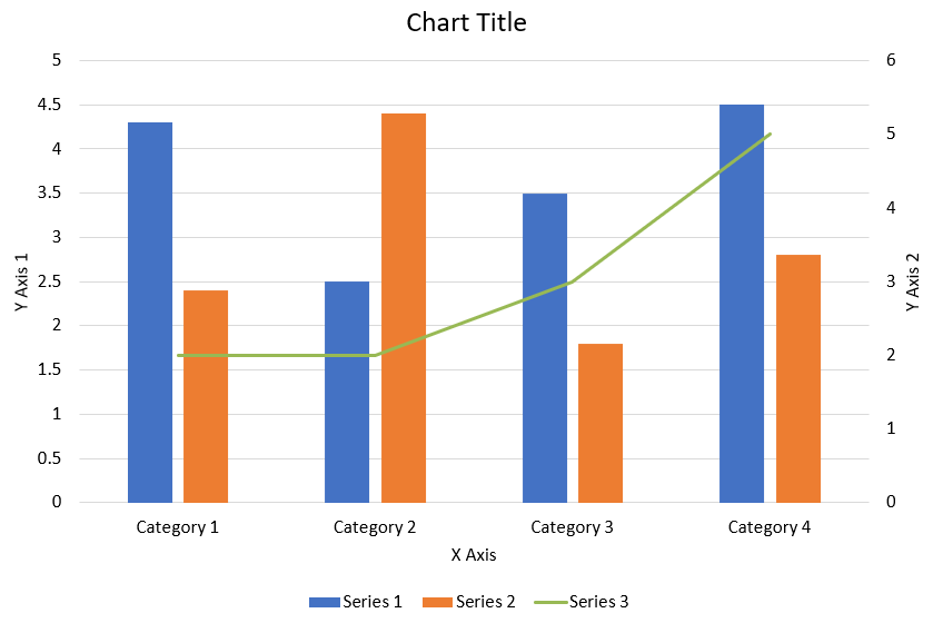
The following Python code shows how to create the combination chart shown above in a PowerPoint presentation:
import jpype
import asposeslides

if not jpype.isJVMStarted():
    jpype.startJVM()

from asposeslides.api import AxisPositionType, ChartType, CrossesType, FillType, LegendPositionType, NullableBool, Presentation, SaveFormat

Color = jpype.JClass("java.awt.Color")

def create_combo_chart():
    presentation = Presentation()
    slide = presentation.getSlides().get_Item(0)
    try:
        chart = create_chart_with_first_series(slide)

        add_second_series_to_chart(chart)
        add_third_series_to_chart(chart)

        set_primary_axes_format(chart)
        set_secondary_axes_format(chart)

        presentation.save("combo-chart.pptx", SaveFormat.Pptx)
    finally:
        presentation.dispose()

def create_chart_with_first_series(slide):
    chart = slide.getShapes().addChart(ChartType.ClusteredColumn, 50, 50, 600, 400)

    # Set the chart title.
    chart.setTitle(True)
    chart.getChartTitle().addTextFrameForOverriding("Chart Title")
    chart.getChartTitle().setOverlay(False)
    title_paragraph = chart.getChartTitle().getTextFrameForOverriding().getParagraphs().get_Item(0)
    title_format = title_paragraph.getParagraphFormat().getDefaultPortionFormat()
    title_format.setFontBold(NullableBool.False_)
    title_format.setFontHeight(18.0)

    # Set the chart legend.
    chart.getLegend().setPosition(LegendPositionType.Bottom)
    chart.getLegend().getTextFormat().getPortionFormat().setFontHeight(12.0)

    # Delete the default generated series and categories.
    chart.getChartData().getSeries().clear()
    chart.getChartData().getCategories().clear()

    worksheet_index = 0
    workbook = chart.getChartData().getChartDataWorkbook()

    # Add new categories.
    cell = workbook.getCell(worksheet_index, 1, 0, "Category 1")
    chart.getChartData().getCategories().add(cell)
    cell = workbook.getCell(worksheet_index, 2, 0, "Category 2")
    chart.getChartData().getCategories().add(cell)
    cell = workbook.getCell(worksheet_index, 3, 0, "Category 3")
    chart.getChartData().getCategories().add(cell)
    cell = workbook.getCell(worksheet_index, 4, 0, "Category 4")
    chart.getChartData().getCategories().add(cell)

    # Add the first series.
    series_name_cell = workbook.getCell(worksheet_index, 0, 1, "Series 1")
    series = chart.getChartData().getSeries().add(series_name_cell, chart.getType())

    series.getParentSeriesGroup().setOverlap(jpype.JByte(-25))
    series.getParentSeriesGroup().setGapWidth(220)

    cell = workbook.getCell(worksheet_index, 1, 1, 4.3)
    series.getDataPoints().addDataPointForBarSeries(cell)
    cell = workbook.getCell(worksheet_index, 2, 1, 2.5)
    series.getDataPoints().addDataPointForBarSeries(cell)
    cell = workbook.getCell(worksheet_index, 3, 1, 3.5)
    series.getDataPoints().addDataPointForBarSeries(cell)
    cell = workbook.getCell(worksheet_index, 4, 1, 4.5)
    series.getDataPoints().addDataPointForBarSeries(cell)

    return chart

def add_second_series_to_chart(chart):
    workbook = chart.getChartData().getChartDataWorkbook()
    worksheet_index = 0

    series_name_cell = workbook.getCell(worksheet_index, 0, 2, "Series 2")
    series = chart.getChartData().getSeries().add(series_name_cell, ChartType.ClusteredColumn)

    series.getParentSeriesGroup().setOverlap(jpype.JByte(-25))
    series.getParentSeriesGroup().setGapWidth(220)

    cell = workbook.getCell(worksheet_index, 1, 2, 2.4)
    series.getDataPoints().addDataPointForBarSeries(cell)
    cell = workbook.getCell(worksheet_index, 2, 2, 4.4)
    series.getDataPoints().addDataPointForBarSeries(cell)
    cell = workbook.getCell(worksheet_index, 3, 2, 1.8)
    series.getDataPoints().addDataPointForBarSeries(cell)
    cell = workbook.getCell(worksheet_index, 4, 2, 2.8)
    series.getDataPoints().addDataPointForBarSeries(cell)

def add_third_series_to_chart(chart):
    workbook = chart.getChartData().getChartDataWorkbook()
    worksheet_index = 0

    series_name_cell = workbook.getCell(worksheet_index, 0, 3, "Series 3")
    series = chart.getChartData().getSeries().add(series_name_cell, ChartType.Line)

    cell = workbook.getCell(worksheet_index, 1, 3, 2.0)
    series.getDataPoints().addDataPointForLineSeries(cell)
    cell = workbook.getCell(worksheet_index, 2, 3, 2.0)
    series.getDataPoints().addDataPointForLineSeries(cell)
    cell = workbook.getCell(worksheet_index, 3, 3, 3.0)
    series.getDataPoints().addDataPointForLineSeries(cell)
    cell = workbook.getCell(worksheet_index, 4, 3, 5.0)
    series.getDataPoints().addDataPointForLineSeries(cell)

    series.setPlotOnSecondAxis(True)

def set_primary_axes_format(chart):
    # Set the horizontal axis.
    horizontal_axis = chart.getAxes().getHorizontalAxis()
    horizontal_axis.getTextFormat().getPortionFormat().setFontHeight(12.0)
    horizontal_axis.getFormat().getLine().getFillFormat().setFillType(FillType.NoFill)

    set_axis_title(horizontal_axis, "X Axis")

    # Set the vertical axis.
    vertical_axis = chart.getAxes().getVerticalAxis()
    vertical_axis.getTextFormat().getPortionFormat().setFontHeight(12.0)
    vertical_axis.getFormat().getLine().getFillFormat().setFillType(FillType.NoFill)

    set_axis_title(vertical_axis, "Y Axis 1")

    # Set the vertical major gridlines color.
    major_grid_lines_format = vertical_axis.getMajorGridLinesFormat().getLine().getFillFormat()
    major_grid_lines_format.setFillType(FillType.Solid)
    color = Color(217, 217, 217)
    major_grid_lines_format.getSolidFillColor().setColor(color)

def set_secondary_axes_format(chart):
    # Set the secondary horizontal axis.
    secondary_horizontal_axis = chart.getAxes().getSecondaryHorizontalAxis()
    secondary_horizontal_axis.setPosition(AxisPositionType.Bottom)
    secondary_horizontal_axis.setCrossType(CrossesType.Maximum)
    secondary_horizontal_axis.setVisible(False)
    secondary_horizontal_axis.getMajorGridLinesFormat().getLine().getFillFormat().setFillType(FillType.NoFill)
    secondary_horizontal_axis.getMinorGridLinesFormat().getLine().getFillFormat().setFillType(FillType.NoFill)

    # Set the secondary vertical axis.
    secondary_vertical_axis = chart.getAxes().getSecondaryVerticalAxis()
    secondary_vertical_axis.setPosition(AxisPositionType.Right)
    secondary_vertical_axis.getTextFormat().getPortionFormat().setFontHeight(12.0)
    secondary_vertical_axis.getFormat().getLine().getFillFormat().setFillType(FillType.NoFill)
    secondary_vertical_axis.getMajorGridLinesFormat().getLine().getFillFormat().setFillType(FillType.NoFill)
    secondary_vertical_axis.getMinorGridLinesFormat().getLine().getFillFormat().setFillType(FillType.NoFill)

    set_axis_title(secondary_vertical_axis, "Y Axis 2")

def set_axis_title(axis, axis_title):
    axis.setTitle(True)
    axis.getTitle().setOverlay(False)
    title_paragraph = axis.getTitle().addTextFrameForOverriding(axis_title).getParagraphs().get_Item(0)
    title_format = title_paragraph.getParagraphFormat().getDefaultPortionFormat()
    title_format.setFontBold(NullableBool.False_)
    title_format.setFontHeight(12.0)

create_combo_chart()
Update Charts
- Create an instance of the Presentation class that represents the presentation containing the chart you want to update.
- Get a reference to a slide using its index.
- Traverse through all shapes to find the desired chart.
- Access the chart data worksheet.
- Modify the chart data series by changing the series values.
- Add a new series and populate its data.
- Save the modified presentation as a PPTX file.
This Python code shows how to update a chart:
import jpype
import asposeslides

if not jpype.isJVMStarted():
    jpype.startJVM()

from asposeslides.api import ChartType, Presentation, SaveFormat

# Opens the presentation that contains the chart to update
presentation = Presentation("ExistingChart.pptx")
try:
    # Access first slide
    slide = presentation.getSlides().get_Item(0)

    # Get the chart from the slide
    chart = slide.getShapes().get_Item(0)

    # Setting the index of chart data sheet
    default_worksheet_index = 0

    # Getting the chart data worksheet
    workbook = chart.getChartData().getChartDataWorkbook()

    # Changing chart Category Name
    workbook.getCell(default_worksheet_index, 1, 0, "Modified Category 1")
    workbook.getCell(default_worksheet_index, 2, 0, "Modified Category 2")

    # Take first chart series
    series = chart.getChartData().getSeries().get_Item(0)

    # Now updating series data
    workbook.getCell(default_worksheet_index, 0, 1, "New_Series1")# Modifying series name
    series.getDataPoints().get_Item(0).getValue().setData(90)
    series.getDataPoints().get_Item(1).getValue().setData(123)
    series.getDataPoints().get_Item(2).getValue().setData(44)

    # Take Second chart series
    series = chart.getChartData().getSeries().get_Item(1)

    # Now updating series data
    workbook.getCell(default_worksheet_index, 0, 2, "New_Series2")# Modifying series name
    series.getDataPoints().get_Item(0).getValue().setData(23)
    series.getDataPoints().get_Item(1).getValue().setData(67)
    series.getDataPoints().get_Item(2).getValue().setData(99)

    # Now, Adding a new series
    cell = workbook.getCell(default_worksheet_index, 0, 3, "Series 3")
    chart.getChartData().getSeries().add(cell, chart.getType())

    # Take 3rd chart series
    series = chart.getChartData().getSeries().get_Item(2)

    # Now populating series data
    cell = workbook.getCell(default_worksheet_index, 1, 3, 20)
    series.getDataPoints().addDataPointForBarSeries(cell)
    cell = workbook.getCell(default_worksheet_index, 2, 3, 50)
    series.getDataPoints().addDataPointForBarSeries(cell)
    cell = workbook.getCell(default_worksheet_index, 3, 3, 30)
    series.getDataPoints().addDataPointForBarSeries(cell)

    chart.setType(ChartType.ClusteredCylinder)

    # Save presentation with chart
    presentation.save("AsposeChartModified_out.pptx", SaveFormat.Pptx)
finally:
    presentation.dispose()
Set Data Range for a Chart
To set the data range for a chart, do this:
- Create an instance of the Presentation class that represents the presentation containing the chart.
- Get a reference to a slide using its index.
- Traverse through all shapes to find the desired chart.
- Access the chart data and set the range.
- Save the modified presentation as a PPTX file.
This Python code shows how to set the data range for a chart:
import jpype
import asposeslides

if not jpype.isJVMStarted():
    jpype.startJVM()

from asposeslides.api import Presentation, SaveFormat

# Opens the presentation that contains the chart
presentation = Presentation("ExistingChart.pptx")
try:
    slide = presentation.getSlides().get_Item(0)
    chart = slide.getShapes().get_Item(0)

    chart.getChartData().setRange("Sheet1!A1:B4")

    presentation.save("SetDataRange_out.pptx", SaveFormat.Pptx)
finally:
    presentation.dispose()
Use Default Markers in Charts
When you use default markers in charts, each chart series automatically gets a different marker symbol.
This Python code shows how to set a chart series marker automatically:
import jpype
import asposeslides

if not jpype.isJVMStarted():
    jpype.startJVM()

from asposeslides.api import ChartType, Presentation, SaveFormat

presentation = Presentation()
try:
    slide = presentation.getSlides().get_Item(0)
    chart = slide.getShapes().addChart(ChartType.LineWithMarkers, 10, 10, 400, 400)

    chart.getChartData().getSeries().clear()
    chart.getChartData().getCategories().clear()

    workbook = chart.getChartData().getChartDataWorkbook()
    cell = workbook.getCell(0, 0, 1, "Series 1")
    chart.getChartData().getSeries().add(cell, chart.getType())
    series = chart.getChartData().getSeries().get_Item(0)

    cell = workbook.getCell(0, 1, 0, "C1")
    chart.getChartData().getCategories().add(cell)
    cell = workbook.getCell(0, 1, 1, 24)
    series.getDataPoints().addDataPointForLineSeries(cell)
    cell = workbook.getCell(0, 2, 0, "C2")
    chart.getChartData().getCategories().add(cell)
    cell = workbook.getCell(0, 2, 1, 23)
    series.getDataPoints().addDataPointForLineSeries(cell)
    cell = workbook.getCell(0, 3, 0, "C3")
    chart.getChartData().getCategories().add(cell)
    cell = workbook.getCell(0, 3, 1, -10)
    series.getDataPoints().addDataPointForLineSeries(cell)
    cell = workbook.getCell(0, 4, 0, "C4")
    chart.getChartData().getCategories().add(cell)
    cell = workbook.getCell(0, 4, 1, None)
    series.getDataPoints().addDataPointForLineSeries(cell)

    cell = workbook.getCell(0, 0, 2, "Series 2")
    chart.getChartData().getSeries().add(cell, chart.getType())
    #Take second chart series
    second_series = chart.getChartData().getSeries().get_Item(1)

    #Now populating series data
    cell = workbook.getCell(0, 1, 2, 30)
    second_series.getDataPoints().addDataPointForLineSeries(cell)
    cell = workbook.getCell(0, 2, 2, 10)
    second_series.getDataPoints().addDataPointForLineSeries(cell)
    cell = workbook.getCell(0, 3, 2, 60)
    second_series.getDataPoints().addDataPointForLineSeries(cell)
    cell = workbook.getCell(0, 4, 2, 40)
    second_series.getDataPoints().addDataPointForLineSeries(cell)

    chart.setLegend(True)
    chart.getLegend().setOverlay(False)

    presentation.save("DefaultMarkersInChart.pptx", SaveFormat.Pptx)
finally:
    presentation.dispose()
FAQ
What chart types are supported by Aspose.Slides?
Aspose.Slides supports a wide range of chart types, including bar, line, pie, area, scatter, histogram, radar, and many more. This flexibility allows you to choose the most appropriate chart type for your data visualization needs.
How do I add a new chart to a slide?
To add a chart, you first create an instance of the Presentation class, retrieve the desired slide using its index, and then call the method to add a chart, specifying the chart type and initial data. This process integrates the chart directly into your presentation.
How can I update the data displayed in a chart?
You can update a chart’s data by accessing its data workbook (ChartDataWorkbook), clearing any default series and categories, and then adding your custom data. This allows you to refresh the chart to reflect the latest data.
Is it possible to customize the appearance of the chart?
Yes, Aspose.Slides provides extensive customization options. You can modify colors, fonts, labels, legends, and other formatting elements to tailor the chart’s appearance to your specific design requirements.