Manage Chart Data Labels in Presentations in .NET
Introduction
Data labels on a chart show details about the chart data series or individual data points. They allow readers to quickly identify data series and they also make charts easier to understand.
Set Data Precision in Chart Data Labels
This C# code shows you how to set the data precision in a chart data label:
using (Presentation pres = new Presentation())
{
	IChart chart = pres.Slides[0].Shapes.AddChart(ChartType.Line, 50, 50, 450, 300);
	chart.HasDataTable = true;
	chart.ChartData.Series[0].NumberFormatOfValues = "#,##0.00";

	pres.Save("PrecisionOfDatalabels_out.pptx", SaveFormat.Pptx);
}
Display Percentage as Labels
Aspose.Slides for .NET allows you to set percentage labels on displayed charts. This C# code demonstrates the operation:
// Creates an instance of the Presentation class
Presentation presentation = new Presentation();

ISlide slide = presentation.Slides[0];
IChart chart = slide.Shapes.AddChart(ChartType.StackedColumn, 20, 20, 400, 400);
IChartSeries series = chart.ChartData.Series[0];
IChartCategory cat;
double[] total_for_Cat = new double[chart.ChartData.Categories.Count];
for (int k = 0; k < chart.ChartData.Categories.Count; k++)
{
    cat = chart.ChartData.Categories[k];

    for (int i = 0; i < chart.ChartData.Series.Count; i++)
    {
        total_for_Cat[k] = total_for_Cat[k] + Convert.ToDouble(chart.ChartData.Series[i].DataPoints[k].Value.Data);
    }
}

double dataPontPercent = 0f;

for (int x = 0; x < chart.ChartData.Series.Count; x++)
{
    series = chart.ChartData.Series[x];
    series.Labels.DefaultDataLabelFormat.ShowLegendKey = false;

    for (int j = 0; j < series.DataPoints.Count; j++)
    {
        IDataLabel lbl = series.DataPoints[j].Label;
        dataPontPercent = (Convert.ToDouble(series.DataPoints[j].Value.Data) / total_for_Cat[j]) * 100;

        IPortion port = new Portion();
        port.Text = String.Format("{0:F2} %", dataPontPercent);
        port.PortionFormat.FontHeight = 8f;
        lbl.TextFrameForOverriding.Text = "";
        IParagraph para = lbl.TextFrameForOverriding.Paragraphs[0];
        para.Portions.Add(port);

        lbl.DataLabelFormat.ShowSeriesName = false;
        lbl.DataLabelFormat.ShowPercentage = false;
        lbl.DataLabelFormat.ShowLegendKey = false;
        lbl.DataLabelFormat.ShowCategoryName = false;
        lbl.DataLabelFormat.ShowBubbleSize = false;
    }
}

// Saves the presentation containing the chart
presentation.Save("DisplayPercentageAsLabels_out.pptx", SaveFormat.Pptx);
Set Percentage Sign with Chart Data Labels
This C# code shows you to set the percentage sign for a chart data label:
// Creates an instance of the Presentation class
Presentation presentation = new Presentation();

// Gets a slide's reference through its index
ISlide slide = presentation.Slides[0];

// Creates the PercentsStackedColumn chart on a slide
IChart chart = slide.Shapes.AddChart(ChartType.PercentsStackedColumn, 20, 20, 500, 400);

// Sets the NumberFormatLinkedToSource to false
chart.Axes.VerticalAxis.IsNumberFormatLinkedToSource = false;
chart.Axes.VerticalAxis.NumberFormat = "0.00%";

chart.ChartData.Series.Clear();
int defaultWorksheetIndex = 0;

// Gets the chart data worksheet
IChartDataWorkbook workbook = chart.ChartData.ChartDataWorkbook;

// Adds new series
IChartSeries series = chart.ChartData.Series.Add(workbook.GetCell(defaultWorksheetIndex, 0, 1, "Reds"), chart.Type);
series.DataPoints.AddDataPointForBarSeries(workbook.GetCell(defaultWorksheetIndex, 1, 1, 0.30));
series.DataPoints.AddDataPointForBarSeries(workbook.GetCell(defaultWorksheetIndex, 2, 1, 0.50));
series.DataPoints.AddDataPointForBarSeries(workbook.GetCell(defaultWorksheetIndex, 3, 1, 0.80));
series.DataPoints.AddDataPointForBarSeries(workbook.GetCell(defaultWorksheetIndex, 4, 1, 0.65));

// Sets the fill color of series
series.Format.Fill.FillType = FillType.Solid;
series.Format.Fill.SolidFillColor.Color = Color.Red;

// Sets the LabelFormat properties
series.Labels.DefaultDataLabelFormat.ShowValue = true;
series.Labels.DefaultDataLabelFormat.IsNumberFormatLinkedToSource = false;
series.Labels.DefaultDataLabelFormat.NumberFormat = "0.0%";
series.Labels.DefaultDataLabelFormat.TextFormat.PortionFormat.FontHeight = 10;
series.Labels.DefaultDataLabelFormat.TextFormat.PortionFormat.FillFormat.FillType = FillType.Solid;
series.Labels.DefaultDataLabelFormat.TextFormat.PortionFormat.FillFormat.SolidFillColor.Color = Color.White;
series.Labels.DefaultDataLabelFormat.ShowValue = true;

// Adds new series
IChartSeries series2 = chart.ChartData.Series.Add(workbook.GetCell(defaultWorksheetIndex, 0, 2, "Blues"), chart.Type);
series2.DataPoints.AddDataPointForBarSeries(workbook.GetCell(defaultWorksheetIndex, 1, 2, 0.70));
series2.DataPoints.AddDataPointForBarSeries(workbook.GetCell(defaultWorksheetIndex, 2, 2, 0.50));
series2.DataPoints.AddDataPointForBarSeries(workbook.GetCell(defaultWorksheetIndex, 3, 2, 0.20));
series2.DataPoints.AddDataPointForBarSeries(workbook.GetCell(defaultWorksheetIndex, 4, 2, 0.35));

// Sets Fill type and color
series2.Format.Fill.FillType = FillType.Solid;
series2.Format.Fill.SolidFillColor.Color = Color.Blue;
series2.Labels.DefaultDataLabelFormat.ShowValue = true;
series2.Labels.DefaultDataLabelFormat.IsNumberFormatLinkedToSource = false;
series2.Labels.DefaultDataLabelFormat.NumberFormat = "0.0%";
series2.Labels.DefaultDataLabelFormat.TextFormat.PortionFormat.FontHeight = 10;
series2.Labels.DefaultDataLabelFormat.TextFormat.PortionFormat.FillFormat.FillType = FillType.Solid;
series2.Labels.DefaultDataLabelFormat.TextFormat.PortionFormat.FillFormat.SolidFillColor.Color = Color.White;

// Writes the presentation to disk
presentation.Save("SetDataLabelsPercentageSign_out.pptx", SaveFormat.Pptx);
Set Label Distance from an Axis
This C# code shows you how to set the label distance from a category axis when you are dealing with a chart plotted from axes:
// Creates an instance of the Presentation class
Presentation presentation = new Presentation();

// Gets a slide's reference
ISlide sld = presentation.Slides[0];

// Creates a chart on the slide
IChart ch = sld.Shapes.AddChart(ChartType.ClusteredColumn, 20, 20, 500, 300);

// Sets the label distance from an axis
ch.Axes.HorizontalAxis.LabelOffset = 500;

// Writes the presentation to disk
presentation.Save("SetCategoryAxisLabelDistance_out.pptx", SaveFormat.Pptx);
Adjust Label Location
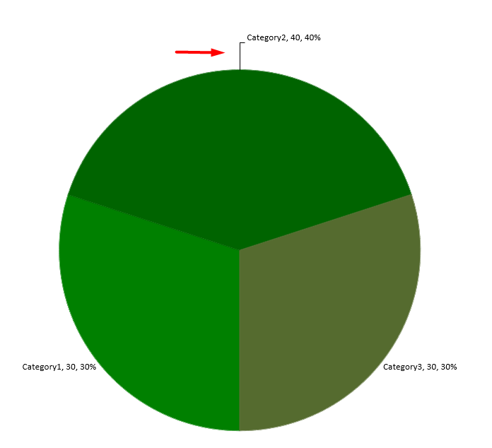
When you create a chart that does not rely on any axis such as a pie chart, the chart’s data labels may end up being too close to its edge. In such a case, you have to adjust the location of the data label so that the leader lines get displayed clearly.
This C# code shows you how to adjust the label location on a pie chart:
using (Presentation pres = new Presentation())
{
    IChart chart = pres.Slides[0].Shapes.AddChart(ChartType.Pie, 50, 50, 200, 200);

    IChartSeriesCollection series = chart.ChartData.Series;
    IDataLabel label = series[0].Labels[0];

    label.DataLabelFormat.ShowValue = true;
    label.DataLabelFormat.Position = LegendDataLabelPosition.OutsideEnd;
    label.X = 0.71f;
    label.Y = 0.04f;

    pres.Save("pres.pptx", SaveFormat.Pptx);
}
FAQ
How can I prevent data labels from overlapping on dense charts?
Combine automatic label placement, leader lines, and reduced font size; if necessary, hide some fields (for example, the category) or show labels only for extreme/key points.
How can I disable labels only for zero, negative, or empty values?
Filter data points before enabling labels and turn off display for values of 0, negative values, or missing values according to a defined rule.
How can I ensure a consistent label style when exporting to PDF/images?
Explicitly set fonts (family, size) and verify that the font is available on the rendering side to avoid fallback.