
Criar ou atualizar gráficos de apresentações PowerPoint no Android
Visão geral
Este artigo fornece um guia abrangente sobre como criar e personalizar gráficos usando Aspose.Slides. Você aprenderá a adicionar programaticamente um gráfico a um slide, preenchê‑lo com dados e aplicar várias opções de formatação para atender aos seus requisitos de design específicos. Ao longo do artigo, exemplos de código detalhados ilustram cada etapa, desde a inicialização da apresentação e do objeto gráfico até a configuração de séries, eixos e legendas. Seguindo este guia, você obterá um entendimento sólido de como integrar a geração dinâmica de gráficos em suas aplicações, simplificando o processo de criação de apresentações orientadas a dados.
Criar um gráfico
Os gráficos ajudam as pessoas a visualizar rapidamente os dados e a obter insights que podem não ser imediatamente óbvios em uma tabela ou planilha.
Por que criar gráficos?
Usando gráficos, você pode:
- agregar, condensar ou resumir grandes quantidades de dados em um único slide de uma apresentação
- expor padrões e tendências nos dados
- deduzir a direção e o impulso dos dados ao longo do tempo ou em relação a uma unidade de medida específica
- identificar valores atípicos, anomalias, desvios, erros, dados sem sentido etc.
- comunicar ou apresentar dados complexos
No PowerPoint, você pode criar gráficos através da função Inserir, que oferece modelos para projetar diversos tipos de gráficos. Usando Aspose.Slides, você pode criar tanto gráficos regulares (baseados em tipos de gráficos populares) quanto gráficos personalizados.
Note
Para criar gráficos, use a classe ChartType. Os campos desta classe correspondem a diferentes tipos de gráficos.Criar gráficos de colunas agrupadas
Esta seção explica como criar gráficos de colunas agrupadas usando Aspose.Slides. Você aprenderá a inicializar uma apresentação, adicionar um gráfico e personalizar seus elementos, como título, dados, séries, categorias e estilo. Siga os passos abaixo para ver como um gráfico de colunas agrupadas padrão é gerado:
- Crie uma instância da classe Presentation.
- Obtenha uma referência a um slide usando seu índice.
- Adicione um gráfico com alguns dados e especifique o tipo
ChartType.ClusteredColumn. - Adicione um título ao gráfico.
- Acesse a planilha de dados do gráfico.
- Limpe todas as séries e categorias padrão.
- Adicione novas séries e categorias.
- Adicione novos dados ao gráfico para as séries.
- Aplique uma cor de preenchimento às séries do gráfico.
- Adicione rótulos às séries do gráfico.
- Salve a apresentação modificada como um arquivo PPTX.
Este código C# demonstra como criar um gráfico de colunas agrupadas:
import com.aspose.slides.*;
import java.awt.Color;

// Instancia uma classe de apresentação que representa um arquivo PPTX
Presentation pres = new Presentation();
try {
    // Acessa o primeiro slide
    ISlide sld = pres.getSlides().get_Item(0);

    // Adiciona um gráfico com seus dados padrão
    IChart chart = sld.getShapes().addChart(ChartType.ClusteredColumn, 0, 0, 500, 500);

    // Define o título do gráfico
    chart.getChartTitle().addTextFrameForOverriding("Sample Title");
    chart.getChartTitle().getTextFrameForOverriding().getTextFrameFormat().setCenterText(NullableBool.True);
    chart.getChartTitle().setHeight(20);
    chart.setTitle(true);

    // Define o índice para a planilha de dados do gráfico
    int defaultWorksheetIndex = 0;

    // Obtém a planilha de dados do gráfico
    IChartDataWorkbook fact = chart.getChartData().getChartDataWorkbook();

    // Exclui as séries e categorias geradas por padrão
    chart.getChartData().getSeries().clear();
    chart.getChartData().getCategories().clear();
    int s = chart.getChartData().getSeries().size();
    s = chart.getChartData().getCategories().size();

    // Adiciona novas séries
    chart.getChartData().getSeries().add(fact.getCell(defaultWorksheetIndex, 0, 1, "Series 1"),chart.getType());
    chart.getChartData().getSeries().add(fact.getCell(defaultWorksheetIndex, 0, 2, "Series 2"),chart.getType());

    // Adiciona novas categorias
    chart.getChartData().getCategories().add(fact.getCell(defaultWorksheetIndex, 1, 0, "Caetegoty 1"));
    chart.getChartData().getCategories().add(fact.getCell(defaultWorksheetIndex, 2, 0, "Caetegoty 2"));
    chart.getChartData().getCategories().add(fact.getCell(defaultWorksheetIndex, 3, 0, "Caetegoty 3"));

    // Obtém a primeira série do gráfico
    IChartSeries series = chart.getChartData().getSeries().get_Item(0);

    // Agora preenche os dados da série
    series.getDataPoints().addDataPointForBarSeries(fact.getCell(defaultWorksheetIndex, 1, 1, 20));
    series.getDataPoints().addDataPointForBarSeries(fact.getCell(defaultWorksheetIndex, 2, 1, 50));
    series.getDataPoints().addDataPointForBarSeries(fact.getCell(defaultWorksheetIndex, 3, 1, 30));

    // Define a cor de preenchimento para a série
    series.getFormat().getFill().setFillType(FillType.Solid);
    series.getFormat().getFill().getSolidFillColor().setColor(Color.RED);

    // Obtém a segunda série do gráfico
    series = chart.getChartData().getSeries().get_Item(1);

    // Preenche os dados da série
    series.getDataPoints().addDataPointForBarSeries(fact.getCell(defaultWorksheetIndex, 1, 2, 30));
    series.getDataPoints().addDataPointForBarSeries(fact.getCell(defaultWorksheetIndex, 2, 2, 10));
    series.getDataPoints().addDataPointForBarSeries(fact.getCell(defaultWorksheetIndex, 3, 2, 60));

    // Define a cor de preenchimento para a série
    series.getFormat().getFill().setFillType(FillType.Solid);
    series.getFormat().getFill().getSolidFillColor().setColor(Color.GREEN);

    // Cria rótulos personalizados para cada categoria da nova série
    // Define o primeiro rótulo para mostrar o nome da categoria
    IDataLabel lbl = series.getDataPoints().get_Item(0).getLabel();
    lbl.getDataLabelFormat().setShowCategoryName(true);

    lbl = series.getDataPoints().get_Item(1).getLabel();
    lbl.getDataLabelFormat().setShowSeriesName(true);

    // Mostra o valor para o terceiro rótulo
    lbl = series.getDataPoints().get_Item(2).getLabel();
    lbl.getDataLabelFormat().setShowValue(true);
    lbl.getDataLabelFormat().setShowSeriesName(true);
    lbl.getDataLabelFormat().setSeparator("/");

    // Salva a apresentação com o gráfico
    pres.save("output.pptx", SaveFormat.Pptx);
} finally {
    if (pres != null) pres.dispose();
}
Criar gráficos de dispersão
Gráficos de dispersão (também conhecidos como diagramas de dispersão ou gráficos x‑y) são frequentemente usados para verificar padrões ou demonstrar correlações entre duas variáveis.
Use um gráfico de dispersão quando:
- você tem dados numéricos emparelhados
- você tem duas variáveis que combinam bem entre si
- você deseja determinar se duas variáveis estão relacionadas
- você tem uma variável independente que possui múltiplos valores para uma variável dependente
- Siga os passos em Criar gráficos de colunas agrupadas.
- No terceiro passo, adicione um gráfico com alguns dados e especifique seu tipo de gráfico como um dos seguintes:
- ChartType.ScatterWithMarkers - Representa um gráfico de dispersão.
- ChartType.ScatterWithSmoothLinesAndMarkers - Representa um gráfico de dispersão conectado por curvas, com marcadores de dados.
- ChartType.ScatterWithSmoothLines - Representa um gráfico de dispersão conectado por curvas, sem marcadores de dados.
- ChartType.ScatterWithStraightLinesAndMarkers - Representa um gráfico de dispersão conectado por linhas, com marcadores de dados.
- ChartType.ScatterWithStraightLines - Representa um gráfico de dispersão conectado por linhas, sem marcadores de dados.
Este código Java mostra como criar um gráfico de dispersão com marcadores diferentes para cada série:
import com.aspose.slides.*;

// Instancia uma classe de apresentação que representa um arquivo PPTX
Presentation pres = new Presentation();
try {
    // Acessa o primeiro slide
    ISlide slide = pres.getSlides().get_Item(0);

    // Cria o gráfico padrão
    IChart chart = slide.getShapes().addChart(ChartType.ScatterWithSmoothLines, 0, 0, 400, 400);

    // Obtém o índice da planilha de dados do gráfico padrão
    int defaultWorksheetIndex = 0;

    // Obtém a planilha de dados do gráfico
    IChartDataWorkbook fact = chart.getChartData().getChartDataWorkbook();

    // Exclui as séries de demonstração
    chart.getChartData().getSeries().clear();

    // Adiciona novas séries
    chart.getChartData().getSeries().add(fact.getCell(defaultWorksheetIndex, 1, 1, "Series 1"), chart.getType());
    chart.getChartData().getSeries().add(fact.getCell(defaultWorksheetIndex, 1, 3, "Series 2"), chart.getType());

    // Obtém a primeira série do gráfico
    IChartSeries series = chart.getChartData().getSeries().get_Item(0);

    // Adiciona um novo ponto (1:3) à série
    series.getDataPoints().addDataPointForScatterSeries(fact.getCell(defaultWorksheetIndex, 2, 1, 1), fact.getCell(defaultWorksheetIndex, 2, 2, 3));

    // Adiciona um novo ponto (2:10)
    series.getDataPoints().addDataPointForScatterSeries(fact.getCell(defaultWorksheetIndex, 3, 1, 2), fact.getCell(defaultWorksheetIndex, 3, 2, 10));

    // Altera o tipo da série
    series.setType(ChartType.ScatterWithStraightLinesAndMarkers);

    // Altera o marcador da série do gráfico
    series.getMarker().setSize(10);
    series.getMarker().setSymbol(MarkerStyleType.Star);

    // Obtém a segunda série do gráfico
    series = chart.getChartData().getSeries().get_Item(1);

    // Adiciona um novo ponto (5:2) lá
    series.getDataPoints().addDataPointForScatterSeries(fact.getCell(defaultWorksheetIndex, 2, 3, 5), fact.getCell(defaultWorksheetIndex, 2, 4, 2));

    // Adiciona um novo ponto (3:1)
    series.getDataPoints().addDataPointForScatterSeries(fact.getCell(defaultWorksheetIndex, 3, 3, 3), fact.getCell(defaultWorksheetIndex, 3, 4, 1));

    // Adiciona um novo ponto (2:2)
    series.getDataPoints().addDataPointForScatterSeries(fact.getCell(defaultWorksheetIndex, 4, 3, 2), fact.getCell(defaultWorksheetIndex, 4, 4, 2));

    // Adiciona um novo ponto (5:1)
    series.getDataPoints().addDataPointForScatterSeries(fact.getCell(defaultWorksheetIndex, 5, 3, 5), fact.getCell(defaultWorksheetIndex, 5, 4, 1));

    // Altera o marcador da série do gráfico
    series.getMarker().setSize(10);
    series.getMarker().setSymbol(MarkerStyleType.Circle);

    pres.save("AsposeChart_out.pptx", SaveFormat.Pptx);
} finally {
    if (pres != null) pres.dispose();
}
Criar gráficos de pizza
Gráficos de pizza são mais adequados para mostrar a relação parte‑todo nos dados, especialmente quando os dados contêm rótulos categóricos com valores numéricos. No entanto, se seus dados contiverem muitas partes ou rótulos, pode ser melhor considerar o uso de um gráfico de barras.
- Crie uma instância da classe Presentation .
- Obtenha uma referência a um slide usando seu índice.
- Adicione um gráfico com dados padrão e especifique o tipo ChartType.Pie .
- Acesse a planilha de dados do gráfico IChartDataWorkbook .
- Limpe as séries e categorias padrão.
- Adicione novas séries e categorias.
- Adicione novos dados ao gráfico para as séries.
- Adicione novos pontos ao gráfico e aplique cores personalizadas para os setores do gráfico de pizza.
- Defina rótulos para as séries.
- Ative linhas de conexão para os rótulos das séries.
- Defina o ângulo de rotação para os setores do gráfico de pizza.
- Salve a apresentação modificada como um arquivo PPTX.
Este código Java mostra como criar um gráfico de pizza:
import com.aspose.slides.*;
import java.awt.Color;

// Instancia uma classe de apresentação que representa um arquivo PPTX
Presentation pres = new Presentation();
try {
    // Acessa o primeiro slide
    ISlide slides = pres.getSlides().get_Item(0);

    // Adiciona um gráfico com dados padrão
    IChart chart = slides.getShapes().addChart(ChartType.Pie, 100, 100, 400, 400);

    // Define o título do gráfico
    chart.getChartTitle().addTextFrameForOverriding("Sample Title");
    chart.getChartTitle().getTextFrameForOverriding().getTextFrameFormat().setCenterText(NullableBool.True);
    chart.getChartTitle().setHeight(20);
    chart.setTitle(true);

    // Define o índice da planilha de dados do gráfico
    int defaultWorksheetIndex = 0;

    // Obtém a planilha de dados do gráfico
    IChartDataWorkbook fact = chart.getChartData().getChartDataWorkbook();

    // Exclui as séries e categorias geradas por padrão
    chart.getChartData().getSeries().clear();
    chart.getChartData().getCategories().clear();

    // Adiciona novas categorias
    chart.getChartData().getCategories().add(fact.getCell(0, 1, 0, "First Qtr"));
    chart.getChartData().getCategories().add(fact.getCell(0, 2, 0, "2nd Qtr"));
    chart.getChartData().getCategories().add(fact.getCell(0, 3, 0, "3rd Qtr"));

    // Adiciona novas séries
    IChartSeries series = chart.getChartData().getSeries().add(fact.getCell(0, 0, 1, "Series 1"), chart.getType());

    //Popula os dados da série
    series.getDataPoints().addDataPointForPieSeries(fact.getCell(defaultWorksheetIndex, 1, 1, 20));
    series.getDataPoints().addDataPointForPieSeries(fact.getCell(defaultWorksheetIndex, 2, 1, 50));
    series.getDataPoints().addDataPointForPieSeries(fact.getCell(defaultWorksheetIndex, 3, 1, 30));

    // Não funciona na nova versão
    // Adicionando novos pontos e definindo a cor do setor
    // series.IsColorVaried = true;
    chart.getChartData().getSeriesGroups().get_Item(0).setColorVaried(true);

    IChartDataPoint point = series.getDataPoints().get_Item(0);
    point.getFormat().getFill().setFillType(FillType.Solid);
    point.getFormat().getFill().getSolidFillColor().setColor(Color.CYAN);

    // Define a borda do setor
    point.getFormat().getLine().getFillFormat().setFillType(FillType.Solid);
    point.getFormat().getLine().getFillFormat().getSolidFillColor().setColor(Color.GRAY);
    point.getFormat().getLine().setWidth(3.0);
    point.getFormat().getLine().setStyle(LineStyle.ThinThick);
    point.getFormat().getLine().setDashStyle(LineDashStyle.DashDot);

    IChartDataPoint point1 = series.getDataPoints().get_Item(1);
    point1.getFormat().getFill().setFillType(FillType.Solid);
    point1.getFormat().getFill().getSolidFillColor().setColor(Color.ORANGE);

    // Define a borda do setor
    point1.getFormat().getLine().getFillFormat().setFillType(FillType.Solid);
    point1.getFormat().getLine().getFillFormat().getSolidFillColor().setColor(Color.BLUE);
    point1.getFormat().getLine().setWidth(3.0);
    point1.getFormat().getLine().setStyle(LineStyle.Single);
    point1.getFormat().getLine().setDashStyle(LineDashStyle.LargeDashDot);

    IChartDataPoint point2 = series.getDataPoints().get_Item(2);
    point2.getFormat().getFill().setFillType(FillType.Solid);
    point2.getFormat().getFill().getSolidFillColor().setColor(Color.YELLOW);

    // Define a borda do setor
    point2.getFormat().getLine().getFillFormat().setFillType(FillType.Solid);
    point2.getFormat().getLine().getFillFormat().getSolidFillColor().setColor(Color.RED);
    point2.getFormat().getLine().setWidth(2.0);
    point2.getFormat().getLine().setStyle(LineStyle.ThinThin);
    point2.getFormat().getLine().setDashStyle(LineDashStyle.LargeDashDotDot);

    // Cria rótulos personalizados para cada categoria da nova série
    IDataLabel lbl1 = series.getDataPoints().get_Item(0).getLabel();

    // lbl.ShowCategoryName = true;
    lbl1.getDataLabelFormat().setShowValue(true);

    IDataLabel lbl2 = series.getDataPoints().get_Item(1).getLabel();
    lbl2.getDataLabelFormat().setShowValue(true);
    lbl2.getDataLabelFormat().setShowLegendKey(true);
    lbl2.getDataLabelFormat().setShowPercentage(true);

    IDataLabel lbl3 = series.getDataPoints().get_Item(2).getLabel();
    lbl3.getDataLabelFormat().setShowSeriesName(true);
    lbl3.getDataLabelFormat().setShowPercentage(true);

    // Exibe linhas de ligação para o gráfico
    series.getLabels().getDefaultDataLabelFormat().setShowLeaderLines(true);

    // Define o ângulo de rotação para os setores do gráfico de pizza
    chart.getChartData().getSeriesGroups().get_Item(0).setFirstSliceAngle(180);

    // Salva a apresentação com um gráfico
    pres.save("PieChart_out.pptx", SaveFormat.Pptx);
} finally {
    if (pres != null) pres.dispose();
}
Criar gráficos de linhas
Gráficos de linhas (também conhecidos como diagramas de linhas) são mais adequados em situações em que você deseja demonstrar mudanças de valor ao longo do tempo. Usando um gráfico de linhas, você pode comparar uma grande quantidade de dados de uma só vez, rastrear mudanças e tendências ao longo do tempo, destacar anomalias em séries de dados e muito mais.
- Crie uma instância da classe Presentation .
- Obtenha uma referência a um slide usando seu índice.
- Adicione um gráfico com dados padrão e especifique o tipo ChartType.Line .
- Salve a apresentação modificada como um arquivo PPTX.
Este código Java mostra como criar um gráfico de linhas:
import com.aspose.slides.*;

Presentation pres = new Presentation();
try {
    IChart lineChart = pres.getSlides().get_Item(0).getShapes().addChart(ChartType.Line, 10, 50, 600, 350);

    pres.save("lineChart.pptx", SaveFormat.Pptx);
} finally {
    if (pres != null) pres.dispose();
}
Por padrão, os pontos em um gráfico de linhas são unidos por linhas retas contínuas. Se desejar que os pontos sejam unidos por traços, você pode especificar o tipo de traço desejado da seguinte forma:
import com.aspose.slides.*;

Presentation pres = new Presentation();
try {
    IChart lineChart = pres.getSlides().get_Item(0).getShapes().addChart(ChartType.Line, 10, 50, 600, 350);

    for (IChartSeries series : lineChart.getChartData().getSeries())
    {
        series.getFormat().getLine().setDashStyle(LineDashStyle.Dash);
    }
} finally {
    if (pres != null) pres.dispose();
}
Criar gráficos de mapa de árvore
Gráficos de mapa de árvore são mais adequados para dados de vendas quando você deseja mostrar o tamanho relativo das categorias de dados e chamar rapidamente a atenção para itens que são grandes contribuintes dentro de cada categoria.
- Crie uma instância da classe Presentation .
- Obtenha uma referência a um slide usando seu índice.
- Adicione um gráfico com dados padrão e especifique o tipo ChartType.Treemap .
- Acesse a planilha de dados do gráfico IChartDataWorkbook .
- Limpe as séries e categorias padrão.
- Adicione novas séries e categorias.
- Adicione novos dados ao gráfico para as séries.
- Salve a apresentação modificada como um arquivo PPTX.
Este código Java mostra como criar um gráfico de mapa de árvore:
import com.aspose.slides.*;

Presentation pres = new Presentation();
try {
    IChart chart = pres.getSlides().get_Item(0).getShapes().addChart(ChartType.Treemap, 50, 50, 500, 400);
    chart.getChartData().getCategories().clear();
    chart.getChartData().getSeries().clear();

    IChartDataWorkbook wb = chart.getChartData().getChartDataWorkbook();
    wb.clear(0);

    //ramo 1
    IChartCategory leaf = chart.getChartData().getCategories().add(wb.getCell(0, "C1", "Leaf1"));
    leaf.getGroupingLevels().setGroupingItem(1, "Stem1");
    leaf.getGroupingLevels().setGroupingItem(2, "Branch1");

    chart.getChartData().getCategories().add(wb.getCell(0, "C2", "Leaf2"));

    leaf = chart.getChartData().getCategories().add(wb.getCell(0, "C3", "Leaf3"));
    leaf.getGroupingLevels().setGroupingItem(1, "Stem2");

    chart.getChartData().getCategories().add(wb.getCell(0, "C4", "Leaf4"));

    //ramo 2
    leaf = chart.getChartData().getCategories().add(wb.getCell(0, "C5", "Leaf5"));
    leaf.getGroupingLevels().setGroupingItem(1, "Stem3");
    leaf.getGroupingLevels().setGroupingItem(2, "Branch2");

    chart.getChartData().getCategories().add(wb.getCell(0, "C6", "Leaf6"));

    leaf = chart.getChartData().getCategories().add(wb.getCell(0, "C7", "Leaf7"));
    leaf.getGroupingLevels().setGroupingItem(1, "Stem4");

    chart.getChartData().getCategories().add(wb.getCell(0, "C8", "Leaf8"));

    IChartSeries series = chart.getChartData().getSeries().add(ChartType.Treemap);
    series.getLabels().getDefaultDataLabelFormat().setShowCategoryName(true);
    series.getDataPoints().addDataPointForTreemapSeries(wb.getCell(0, "D1", 4));
    series.getDataPoints().addDataPointForTreemapSeries(wb.getCell(0, "D2", 5));
    series.getDataPoints().addDataPointForTreemapSeries(wb.getCell(0, "D3", 3));
    series.getDataPoints().addDataPointForTreemapSeries(wb.getCell(0, "D4", 6));
    series.getDataPoints().addDataPointForTreemapSeries(wb.getCell(0, "D5", 9));
    series.getDataPoints().addDataPointForTreemapSeries(wb.getCell(0, "D6", 9));
    series.getDataPoints().addDataPointForTreemapSeries(wb.getCell(0, "D7", 4));
    series.getDataPoints().addDataPointForTreemapSeries(wb.getCell(0, "D8", 3));

    series.setParentLabelLayout(ParentLabelLayoutType.Overlapping);

    pres.save("Treemap.pptx", SaveFormat.Pptx);
} finally {
    if (pres != null) pres.dispose();
}
Criar gráficos de ações
- Crie uma instância da classe Presentation .
- Obtenha uma referência a um slide usando seu índice.
- Adicione um gráfico com dados padrão e especifique o tipo ChartType.OpenHighLowClose .
- Acesse a planilha de dados do gráfico IChartDataWorkbook .
- Limpe as séries e categorias padrão.
- Adicione novas séries e categorias.
- Adicione novos dados ao gráfico para as séries.
- Especifique o formato das linhas alta‑baixa.
- Salve a apresentação modificada como um arquivo PPTX.
Este código Java mostra como criar um gráfico de ações:
import com.aspose.slides.*;

Presentation pres = new Presentation();
try {
    IChart chart = pres.getSlides().get_Item(0).getShapes().addChart(ChartType.OpenHighLowClose, 50, 50, 600, 400, false);

    chart.getChartData().getSeries().clear();
    chart.getChartData().getCategories().clear();

    IChartDataWorkbook wb = chart.getChartData().getChartDataWorkbook();

    chart.getChartData().getCategories().add(wb.getCell(0, 1, 0, "A"));
    chart.getChartData().getCategories().add(wb.getCell(0, 2, 0, "B"));
    chart.getChartData().getCategories().add(wb.getCell(0, 3, 0, "C"));

    chart.getChartData().getSeries().add(wb.getCell(0, 0, 1, "Open"), chart.getType());
    chart.getChartData().getSeries().add(wb.getCell(0, 0, 2, "High"), chart.getType());
    chart.getChartData().getSeries().add(wb.getCell(0, 0, 3, "Low"), chart.getType());
    chart.getChartData().getSeries().add(wb.getCell(0, 0, 4, "Close"), chart.getType());

    IChartSeries series = chart.getChartData().getSeries().get_Item(0);

    series.getDataPoints().addDataPointForStockSeries(wb.getCell(0, 1, 1, 72));
    series.getDataPoints().addDataPointForStockSeries(wb.getCell(0, 2, 1, 25));
    series.getDataPoints().addDataPointForStockSeries(wb.getCell(0, 3, 1, 38));

    series = chart.getChartData().getSeries().get_Item(1);
    series.getDataPoints().addDataPointForStockSeries(wb.getCell(0, 1, 2, 172));
    series.getDataPoints().addDataPointForStockSeries(wb.getCell(0, 2, 2, 57));
    series.getDataPoints().addDataPointForStockSeries(wb.getCell(0, 3, 2, 57));

    series = chart.getChartData().getSeries().get_Item(2);
    series.getDataPoints().addDataPointForStockSeries(wb.getCell(0, 1, 3, 12));
    series.getDataPoints().addDataPointForStockSeries(wb.getCell(0, 2, 3, 12));
    series.getDataPoints().addDataPointForStockSeries(wb.getCell(0, 3, 3, 13));

    series = chart.getChartData().getSeries().get_Item(3);
    series.getDataPoints().addDataPointForStockSeries(wb.getCell(0, 1, 4, 25));
    series.getDataPoints().addDataPointForStockSeries(wb.getCell(0, 2, 4, 38));
    series.getDataPoints().addDataPointForStockSeries(wb.getCell(0, 3, 4, 50));

    chart.getChartData().getSeriesGroups().get_Item(0).getUpDownBars().setUpDownBars(true);
    chart.getChartData().getSeriesGroups().get_Item(0).getHiLowLinesFormat().getLine().getFillFormat().setFillType(FillType.Solid);

    for (IChartSeries ser : chart.getChartData().getSeries())
    {
        ser.getFormat().getLine().getFillFormat().setFillType(FillType.NoFill);
    }

    pres.save("output.pptx", SaveFormat.Pptx);
} finally {
    if (pres != null) pres.dispose();
}
Criar gráficos de caixa e bigodes
- Crie uma instância da classe Presentation .
- Obtenha uma referência a um slide usando seu índice.
- Adicione um gráfico com dados padrão e especifique o tipo ChartType.BoxAndWhisker .
- Acesse a planilha de dados do gráfico IChartDataWorkbook .
- Limpe as séries e categorias padrão.
- Adicione novas séries e categorias.
- Adicione novos dados ao gráfico para as séries.
- Salve a apresentação modificada como um arquivo PPTX.
Este código Java mostra como criar um gráfico de caixa e bigodes:
import com.aspose.slides.*;

Presentation pres = new Presentation();
try {
    IChart chart = pres.getSlides().get_Item(0).getShapes().addChart(ChartType.BoxAndWhisker, 50, 50, 500, 400);
    chart.getChartData().getCategories().clear();
    chart.getChartData().getSeries().clear();

    IChartDataWorkbook wb = chart.getChartData().getChartDataWorkbook();
    wb.clear(0);

    chart.getChartData().getCategories().add(wb.getCell(0, "A1", "Category 1"));
    chart.getChartData().getCategories().add(wb.getCell(0, "A2", "Category 1"));
    chart.getChartData().getCategories().add(wb.getCell(0, "A3", "Category 1"));
    chart.getChartData().getCategories().add(wb.getCell(0, "A4", "Category 1"));
    chart.getChartData().getCategories().add(wb.getCell(0, "A5", "Category 1"));
    chart.getChartData().getCategories().add(wb.getCell(0, "A6", "Category 1"));

    IChartSeries series = chart.getChartData().getSeries().add(ChartType.BoxAndWhisker);

    series.setQuartileMethod(QuartileMethodType.Exclusive);
    series.setShowMeanLine(true);
    series.setShowMeanMarkers(true);
    series.setShowInnerPoints(true);
    series.setShowOutlierPoints(true);

    series.getDataPoints().addDataPointForBoxAndWhiskerSeries(wb.getCell(0, "B1", 15));
    series.getDataPoints().addDataPointForBoxAndWhiskerSeries(wb.getCell(0, "B2", 41));
    series.getDataPoints().addDataPointForBoxAndWhiskerSeries(wb.getCell(0, "B3", 16));
    series.getDataPoints().addDataPointForBoxAndWhiskerSeries(wb.getCell(0, "B4", 10));
    series.getDataPoints().addDataPointForBoxAndWhiskerSeries(wb.getCell(0, "B5", 23));
    series.getDataPoints().addDataPointForBoxAndWhiskerSeries(wb.getCell(0, "B6", 16));

    pres.save("BoxAndWhisker.pptx", SaveFormat.Pptx);
} finally {
    if (pres != null) pres.dispose();
}
Criar gráficos de funil
- Crie uma instância da classe Presentation .
- Obtenha uma referência a um slide usando seu índice.
- Adicione um gráfico com dados padrão e especifique o tipo ChartType.Funnel .
- Salve a apresentação modificada como um arquivo PPTX.
Este código Java mostra como criar um gráfico de funil:
import com.aspose.slides.*;

Presentation pres = new Presentation();
try {
    IChart chart = pres.getSlides().get_Item(0).getShapes().addChart(ChartType.Funnel, 50, 50, 500, 400);
    chart.getChartData().getCategories().clear();
    chart.getChartData().getSeries().clear();

    IChartDataWorkbook wb = chart.getChartData().getChartDataWorkbook();

    wb.clear(0);

    chart.getChartData().getCategories().add(wb.getCell(0, "A1", "Category 1"));
    chart.getChartData().getCategories().add(wb.getCell(0, "A2", "Category 2"));
    chart.getChartData().getCategories().add(wb.getCell(0, "A3", "Category 3"));
    chart.getChartData().getCategories().add(wb.getCell(0, "A4", "Category 4"));
    chart.getChartData().getCategories().add(wb.getCell(0, "A5", "Category 5"));
    chart.getChartData().getCategories().add(wb.getCell(0, "A6", "Category 6"));

    IChartSeries series = chart.getChartData().getSeries().add(ChartType.Funnel);

    series.getDataPoints().addDataPointForFunnelSeries(wb.getCell(0, "B1", 50));
    series.getDataPoints().addDataPointForFunnelSeries(wb.getCell(0, "B2", 100));
    series.getDataPoints().addDataPointForFunnelSeries(wb.getCell(0, "B3", 200));
    series.getDataPoints().addDataPointForFunnelSeries(wb.getCell(0, "B4", 300));
    series.getDataPoints().addDataPointForFunnelSeries(wb.getCell(0, "B5", 400));
    series.getDataPoints().addDataPointForFunnelSeries(wb.getCell(0, "B6", 500));

    pres.save("Funnel.pptx", SaveFormat.Pptx);
} finally {
    if (pres != null) pres.dispose();
}
Criar gráficos de radiação
- Crie uma instância da classe Presentation .
- Obtenha uma referência a um slide usando seu índice.
- Adicione um gráfico com dados padrão e especifique o tipo ChartType.Sunburst .
- Salve a apresentação modificada como um arquivo PPTX.
Este código Java mostra como criar um gráfico de radiação:
import com.aspose.slides.*;

Presentation pres = new Presentation();
try {
    IChart chart = pres.getSlides().get_Item(0).getShapes().addChart(ChartType.Sunburst, 50, 50, 500, 400);
    chart.getChartData().getCategories().clear();
    chart.getChartData().getSeries().clear();

    IChartDataWorkbook wb = chart.getChartData().getChartDataWorkbook();
    wb.clear(0);

    //ramo 1
    IChartCategory leaf = chart.getChartData().getCategories().add(wb.getCell(0, "C1", "Leaf1"));
    leaf.getGroupingLevels().setGroupingItem(1, "Stem1");
    leaf.getGroupingLevels().setGroupingItem(2, "Branch1");

    chart.getChartData().getCategories().add(wb.getCell(0, "C2", "Leaf2"));

    leaf = chart.getChartData().getCategories().add(wb.getCell(0, "C3", "Leaf3"));
    leaf.getGroupingLevels().setGroupingItem(1, "Stem2");

    chart.getChartData().getCategories().add(wb.getCell(0, "C4", "Leaf4"));

    //ramo 2
    leaf = chart.getChartData().getCategories().add(wb.getCell(0, "C5", "Leaf5"));
    leaf.getGroupingLevels().setGroupingItem(1, "Stem3");
    leaf.getGroupingLevels().setGroupingItem(2, "Branch2");

    chart.getChartData().getCategories().add(wb.getCell(0, "C6", "Leaf6"));

    leaf = chart.getChartData().getCategories().add(wb.getCell(0, "C7", "Leaf7"));
    leaf.getGroupingLevels().setGroupingItem(1, "Stem4");

    chart.getChartData().getCategories().add(wb.getCell(0, "C8", "Leaf8"));

    IChartSeries series = chart.getChartData().getSeries().add(ChartType.Sunburst);
    series.getLabels().getDefaultDataLabelFormat().setShowCategoryName(true);
    series.getDataPoints().addDataPointForSunburstSeries(wb.getCell(0, "D1", 4));
    series.getDataPoints().addDataPointForSunburstSeries(wb.getCell(0, "D2", 5));
    series.getDataPoints().addDataPointForSunburstSeries(wb.getCell(0, "D3", 3));
    series.getDataPoints().addDataPointForSunburstSeries(wb.getCell(0, "D4", 6));
    series.getDataPoints().addDataPointForSunburstSeries(wb.getCell(0, "D5", 9));
    series.getDataPoints().addDataPointForSunburstSeries(wb.getCell(0, "D6", 9));
    series.getDataPoints().addDataPointForSunburstSeries(wb.getCell(0, "D7", 4));
    series.getDataPoints().addDataPointForSunburstSeries(wb.getCell(0, "D8", 3));

    pres.save("Sunburst.pptx", SaveFormat.Pptx);
} finally {
    if (pres != null) pres.dispose();
}
Criar gráficos de histograma
- Crie uma instância da classe Presentation .
- Obtenha uma referência a um slide usando seu índice.
- Adicione um gráfico com dados padrão e especifique o tipo ChartType.Histogram .
- Acesse a planilha de dados do gráfico IChartDataWorkbook .
- Limpe as séries e categorias padrão.
- Adicione novas séries e categorias.
- Salve a apresentação modificada como um arquivo PPTX.
Este código Java mostra como criar um gráfico de histograma:
import com.aspose.slides.*;

Presentation pres = new Presentation();
try {
    IChart chart = pres.getSlides().get_Item(0).getShapes().addChart(ChartType.Histogram, 50, 50, 500, 400);
    chart.getChartData().getCategories().clear();
    chart.getChartData().getSeries().clear();

    IChartDataWorkbook wb = chart.getChartData().getChartDataWorkbook();
    wb.clear(0);

    IChartSeries series = chart.getChartData().getSeries().add(ChartType.Histogram);
    series.getDataPoints().addDataPointForHistogramSeries(wb.getCell(0, "A1", 15));
    series.getDataPoints().addDataPointForHistogramSeries(wb.getCell(0, "A2", -41));
    series.getDataPoints().addDataPointForHistogramSeries(wb.getCell(0, "A3", 16));
    series.getDataPoints().addDataPointForHistogramSeries(wb.getCell(0, "A4", 10));
    series.getDataPoints().addDataPointForHistogramSeries(wb.getCell(0, "A5", -23));
    series.getDataPoints().addDataPointForHistogramSeries(wb.getCell(0, "A6", 16));

    chart.getAxes().getHorizontalAxis().setAggregationType(AxisAggregationType.Automatic);

    pres.save("Histogram.pptx", SaveFormat.Pptx);
} finally {
    if (pres != null) pres.dispose();
}
Criar gráficos de radar
- Crie uma instância da classe Presentation .
- Obtenha uma referência a um slide usando seu índice.
- Adicione um gráfico com alguns dados e especifique seu tipo de gráfico preferido (ChartType.Radar neste caso).
- Salve a apresentação modificada como um arquivo PPTX.
Este código Java mostra como criar um gráfico de radar:
import com.aspose.slides.*;

Presentation pres = new Presentation();
try {
    pres.getSlides().get_Item(0).getShapes().addChart(ChartType.Radar, 20, 20, 400, 300);
    pres.save("Radar-chart.pptx", SaveFormat.Pptx);
} finally {
    if (pres != null) pres.dispose();
}
Criar gráficos de múltiplas categorias
- Crie uma instância da classe Presentation .
- Obtenha uma referência a um slide usando seu índice.
- Adicione um gráfico com dados padrão e especifique o tipo ChartType.ClusteredColumn .
- Acesse a planilha de dados do gráfico IChartDataWorkbook .
- Limpe as séries e categorias padrão.
- Adicione novas séries e categorias.
- Adicione novos dados ao gráfico para as séries.
- Salve a apresentação modificada como um arquivo PPTX.
Este código Java mostra como criar um gráfico de múltiplas categorias:
import com.aspose.slides.*;

Presentation pres = new Presentation();
try {
    IChart ch = pres.getSlides().get_Item(0).getShapes().addChart(ChartType.ClusteredColumn, 100, 100, 600, 450);
    ch.getChartData().getSeries().clear();
    ch.getChartData().getCategories().clear();

    IChartDataWorkbook fact = ch.getChartData().getChartDataWorkbook();
    fact.clear(0);
    int defaultWorksheetIndex = 0;

    IChartCategory category = ch.getChartData().getCategories().add(fact.getCell(0, "c2", "A"));
    category.getGroupingLevels().setGroupingItem(1, "Group1");
    category = ch.getChartData().getCategories().add(fact.getCell(0, "c3", "B"));

    category = ch.getChartData().getCategories().add(fact.getCell(0, "c4", "C"));
    category.getGroupingLevels().setGroupingItem(1, "Group2");
    category = ch.getChartData().getCategories().add(fact.getCell(0, "c5", "D"));

    category = ch.getChartData().getCategories().add(fact.getCell(0, "c6", "E"));
    category.getGroupingLevels().setGroupingItem(1, "Group3");
    category = ch.getChartData().getCategories().add(fact.getCell(0, "c7", "F"));

    category = ch.getChartData().getCategories().add(fact.getCell(0, "c8", "G"));
    category.getGroupingLevels().setGroupingItem(1, "Group4");
    category = ch.getChartData().getCategories().add(fact.getCell(0, "c9", "H"));

    // Adicionando séries
    IChartSeries series = ch.getChartData().getSeries().add(fact.getCell(0, "D1", "Series 1"),
            ChartType.ClusteredColumn);

    series.getDataPoints().addDataPointForBarSeries(fact.getCell(defaultWorksheetIndex, "D2", 10));
    series.getDataPoints().addDataPointForBarSeries(fact.getCell(defaultWorksheetIndex, "D3", 20));
    series.getDataPoints().addDataPointForBarSeries(fact.getCell(defaultWorksheetIndex, "D4", 30));
    series.getDataPoints().addDataPointForBarSeries(fact.getCell(defaultWorksheetIndex, "D5", 40));
    series.getDataPoints().addDataPointForBarSeries(fact.getCell(defaultWorksheetIndex, "D6", 50));
    series.getDataPoints().addDataPointForBarSeries(fact.getCell(defaultWorksheetIndex, "D7", 60));
    series.getDataPoints().addDataPointForBarSeries(fact.getCell(defaultWorksheetIndex, "D8", 70));
    series.getDataPoints().addDataPointForBarSeries(fact.getCell(defaultWorksheetIndex, "D9", 80));

    // Salvar apresentação com gráfico
    pres.save("AsposeChart_out.pptx", SaveFormat.Pptx);
} finally {
    if (pres != null) pres.dispose();
}
Criar gráficos de mapa
Gráficos de mapa visualizam dados geográficos e ajudam a comparar valores entre regiões.
Este código Java mostra como criar um gráfico de mapa:
import com.aspose.slides.*;

Presentation pres = new Presentation();
try {
    IChart chart = pres.getSlides().get_Item(0).getShapes().addChart(ChartType.Map, 50, 50, 500, 400);
    pres.save("mapChart.pptx", SaveFormat.Pptx);
} finally {
    if (pres != null) pres.dispose();
}
Criar gráficos combinados
Um gráfico combinado (ou combo) combina dois ou mais tipos de gráficos em um único diagrama. Este gráfico permite que você destaque, compare ou examine diferenças entre dois ou mais conjuntos de dados, ajudando a identificar relações entre eles.
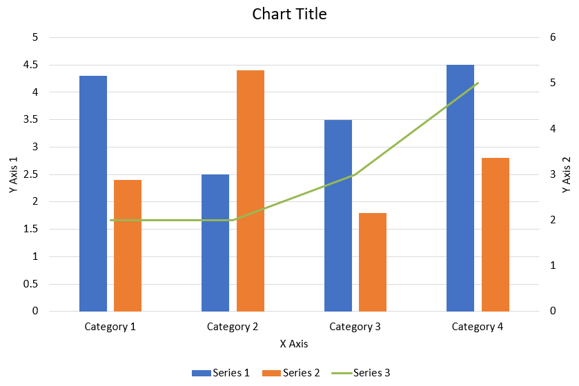
O código Java a seguir mostra como criar o gráfico combinado mostrado acima em uma apresentação do PowerPoint:
import com.aspose.slides.*;
import java.awt.Color;

static void createComboChart() {
    Presentation presentation = new Presentation();
    ISlide slide = presentation.getSlides().get_Item(0);
    try {
        IChart chart = createChartWithFirstSeries(slide);

        addSecondSeriesToChart(chart);
        addThirdSeriesToChart(chart);

        setPrimaryAxesFormat(chart);
        setSecondaryAxesFormat(chart);

        presentation.save("combo-chart.pptx", SaveFormat.Pptx);
    } finally {
        presentation.dispose();
    }
}

static IChart createChartWithFirstSeries(ISlide slide) {
    IChart chart = slide.getShapes().addChart(ChartType.ClusteredColumn, 50, 50, 600, 400);

    // Definir o título do gráfico.
    chart.setTitle(true);
    chart.getChartTitle().addTextFrameForOverriding("Chart Title");
    chart.getChartTitle().setOverlay(false);
    IParagraph titleParagraph = chart.getChartTitle().getTextFrameForOverriding().getParagraphs().get_Item(0);
    IPortionFormat titleFormat = titleParagraph.getParagraphFormat().getDefaultPortionFormat();
    titleFormat.setFontBold(NullableBool.False);
    titleFormat.setFontHeight(18f);

    // Definir a legenda do gráfico.
    chart.getLegend().setPosition(LegendPositionType.Bottom);
    chart.getLegend().getTextFormat().getPortionFormat().setFontHeight(12f);

    // Excluir as séries e categorias geradas por padrão.
    chart.getChartData().getSeries().clear();
    chart.getChartData().getCategories().clear();

    int worksheetIndex = 0;
    IChartDataWorkbook workbook = chart.getChartData().getChartDataWorkbook();

    // Adicionar novas categorias.
    chart.getChartData().getCategories().add(workbook.getCell(worksheetIndex, 1, 0, "Category 1"));
    chart.getChartData().getCategories().add(workbook.getCell(worksheetIndex, 2, 0, "Category 2"));
    chart.getChartData().getCategories().add(workbook.getCell(worksheetIndex, 3, 0, "Category 3"));
    chart.getChartData().getCategories().add(workbook.getCell(worksheetIndex, 4, 0, "Category 4"));

    // Adicionar a primeira série.
    IChartDataCell seriesNameCell = workbook.getCell(worksheetIndex, 0, 1, "Series 1");
    IChartSeries series = chart.getChartData().getSeries().add(seriesNameCell, chart.getType());

    series.getParentSeriesGroup().setOverlap((byte)-25);
    series.getParentSeriesGroup().setGapWidth(220);

    series.getDataPoints().addDataPointForBarSeries(workbook.getCell(worksheetIndex, 1, 1, 4.3));
    series.getDataPoints().addDataPointForBarSeries(workbook.getCell(worksheetIndex, 2, 1, 2.5));
    series.getDataPoints().addDataPointForBarSeries(workbook.getCell(worksheetIndex, 3, 1, 3.5));
    series.getDataPoints().addDataPointForBarSeries(workbook.getCell(worksheetIndex, 4, 1, 4.5));

    return chart;
}

static void addSecondSeriesToChart(IChart chart) {
    IChartDataWorkbook workbook = chart.getChartData().getChartDataWorkbook();
    final int worksheetIndex = 0;

    IChartDataCell seriesNameCell = workbook.getCell(worksheetIndex, 0, 2, "Series 2");
    IChartSeries series = chart.getChartData().getSeries().add(seriesNameCell, ChartType.ClusteredColumn);

    series.getParentSeriesGroup().setOverlap((byte)-25);
    series.getParentSeriesGroup().setGapWidth(220);

    series.getDataPoints().addDataPointForBarSeries(workbook.getCell(worksheetIndex, 1, 2, 2.4));
    series.getDataPoints().addDataPointForBarSeries(workbook.getCell(worksheetIndex, 2, 2, 4.4));
    series.getDataPoints().addDataPointForBarSeries(workbook.getCell(worksheetIndex, 3, 2, 1.8));
    series.getDataPoints().addDataPointForBarSeries(workbook.getCell(worksheetIndex, 4, 2, 2.8));
}

static void addThirdSeriesToChart(IChart chart) {
    IChartDataWorkbook workbook = chart.getChartData().getChartDataWorkbook();
    final int worksheetIndex = 0;

    IChartDataCell seriesNameCell = workbook.getCell(worksheetIndex, 0, 3, "Series 3");
    IChartSeries series = chart.getChartData().getSeries().add(seriesNameCell, ChartType.Line);

    series.getDataPoints().addDataPointForLineSeries(workbook.getCell(worksheetIndex, 1, 3, 2.0));
    series.getDataPoints().addDataPointForLineSeries(workbook.getCell(worksheetIndex, 2, 3, 2.0));
    series.getDataPoints().addDataPointForLineSeries(workbook.getCell(worksheetIndex, 3, 3, 3.0));
    series.getDataPoints().addDataPointForLineSeries(workbook.getCell(worksheetIndex, 4, 3, 5.0));

    series.setPlotOnSecondAxis(true);
}

static void setPrimaryAxesFormat(IChart chart) {
    // Definir o eixo horizontal.
    IAxis horizontalAxis = chart.getAxes().getHorizontalAxis();
    horizontalAxis.getTextFormat().getPortionFormat().setFontHeight(12f);
    horizontalAxis.getFormat().getLine().getFillFormat().setFillType(FillType.NoFill);

    setAxisTitle(horizontalAxis, "X Axis");

    // Definir o eixo vertical.
    IAxis verticalAxis = chart.getAxes().getVerticalAxis();
    verticalAxis.getTextFormat().getPortionFormat().setFontHeight(12f);
    verticalAxis.getFormat().getLine().setFillType(FillType.NoFill);

    setAxisTitle(verticalAxis, "Y Axis 1");

    // Definir a cor das linhas de grade principais verticais.
    ILineFillFormat majorGridLinesFormat = verticalAxis.getMajorGridLinesFormat().getLine().getFillFormat();
    majorGridLinesFormat.setFillType(FillType.Solid);
    majorGridLinesFormat.getSolidFillColor().setColor(new Color(217, 217, 217));
}

static void setSecondaryAxesFormat(IChart chart) {
    // Definir o eixo horizontal secundário.
    IAxis secondaryHorizontalAxis = chart.getAxes().getSecondaryHorizontalAxis();
    secondaryHorizontalAxis.setPosition(AxisPositionType.Bottom);
    secondaryHorizontalAxis.setCrossType(CrossesType.Maximum);
    secondaryHorizontalAxis.setVisible(false);
    secondaryHorizontalAxis.getMajorGridLinesFormat().getLine().getFillFormat().setFillType(FillType.NoFill);
    secondaryHorizontalAxis.getMinorGridLinesFormat().getLine().getFillFormat().setFillType(FillType.NoFill);

    // Definir o eixo vertical secundário.
    IAxis secondaryVerticalAxis = chart.getAxes().getSecondaryVerticalAxis();
    secondaryVerticalAxis.setPosition(AxisPositionType.Right);
    secondaryVerticalAxis.getTextFormat().getPortionFormat().setFontHeight(12f);
    secondaryVerticalAxis.getFormat().getLine().getFillFormat().setFillType(FillType.NoFill);
    secondaryVerticalAxis.getMajorGridLinesFormat().getLine().getFillFormat().setFillType(FillType.NoFill);
    secondaryVerticalAxis.getMinorGridLinesFormat().getLine().getFillFormat().setFillType(FillType.NoFill);

    setAxisTitle(secondaryVerticalAxis, "Y Axis 2");
}

static void setAxisTitle(IAxis axis, String axisTitle) {
    axis.setTitle(true);
    axis.getTitle().setOverlay(false);
    IParagraph titleParagraph = axis.getTitle().addTextFrameForOverriding(axisTitle).getParagraphs().get_Item(0);
    IPortionFormat titleFormat = titleParagraph.getParagraphFormat().getDefaultPortionFormat();
    titleFormat.setFontBold(NullableBool.False);
    titleFormat.setFontHeight(12f);
}
Atualizar gráficos
- Crie uma instância da classe Presentation que representa a apresentação contendo o gráfico que você deseja atualizar.
- Obtenha uma referência a um slide usando seu índice.
- Percorra todas as formas para encontrar o gráfico desejado.
- Acesse a planilha de dados do gráfico.
- Modifique as séries de dados do gráfico alterando os valores das séries.
- Adicione uma nova série e preencha seus dados.
- Salve a apresentação modificada como um arquivo PPTX.
Este código Java mostra como atualizar um gráfico:
import com.aspose.slides.*;

// Abre a apresentação que contém o gráfico a ser atualizado
Presentation pres = new Presentation("ExistingChart.pptx");
try {
    // Acessa o primeiro slide
    ISlide sld = pres.getSlides().get_Item(0);

    // Obtém o gráfico do slide
    IChart chart = (IChart)sld.getShapes().get_Item(0);

    // Definindo o índice da planilha de dados do gráfico
    int defaultWorksheetIndex = 0;

    // Obtendo a planilha de dados do gráfico
    IChartDataWorkbook fact = chart.getChartData().getChartDataWorkbook();

    // Alterando o nome da categoria do gráfico
    fact.getCell(defaultWorksheetIndex, 1, 0, "Modified Category 1");
    fact.getCell(defaultWorksheetIndex, 2, 0, "Modified Category 2");

    // Obtém a primeira série do gráfico
    IChartSeries series = chart.getChartData().getSeries().get_Item(0);

    // Agora atualizando os dados da série
    fact.getCell(defaultWorksheetIndex, 0, 1, "New_Series1"); // Modificando o nome da série
    series.getDataPoints().get_Item(0).getValue().setData(90);
    series.getDataPoints().get_Item(1).getValue().setData(123);
    series.getDataPoints().get_Item(2).getValue().setData(44);

    // Obtém a segunda série do gráfico
    series = chart.getChartData().getSeries().get_Item(1);

    // Agora atualizando os dados da série
    fact.getCell(defaultWorksheetIndex, 0, 2, "New_Series2"); // Modificando o nome da série
    series.getDataPoints().get_Item(0).getValue().setData(23);
    series.getDataPoints().get_Item(1).getValue().setData(67);
    series.getDataPoints().get_Item(2).getValue().setData(99);

    // Agora, adicionando uma nova série
    chart.getChartData().getSeries().add(fact.getCell(defaultWorksheetIndex, 0, 3, "Series 3"), chart.getType());

    // Obtém a terceira série do gráfico
    series = chart.getChartData().getSeries().get_Item(2);

    // Agora populando os dados da série
    series.getDataPoints().addDataPointForBarSeries(fact.getCell(defaultWorksheetIndex, 1, 3, 20));
    series.getDataPoints().addDataPointForBarSeries(fact.getCell(defaultWorksheetIndex, 2, 3, 50));
    series.getDataPoints().addDataPointForBarSeries(fact.getCell(defaultWorksheetIndex, 3, 3, 30));

    chart.setType(ChartType.ClusteredCylinder);

    // Salva a apresentação com o gráfico
    pres.save("AsposeChartModified_out.pptx", SaveFormat.Pptx);
} finally {
    if (pres != null) pres.dispose();
}
Definir intervalo de dados para um gráfico
Para definir o intervalo de dados para um gráfico, faça o seguinte:
- Crie uma instância da classe Presentation que representa a apresentação contendo o gráfico.
- Obtenha uma referência a um slide usando seu índice.
- Percorra todas as formas para encontrar o gráfico desejado.
- Acesse os dados do gráfico e defina o intervalo.
- Salve a apresentação modificada como um arquivo PPTX.
Este código Java mostra como definir o intervalo de dados para um gráfico:
import com.aspose.slides.*;

// Abre a apresentação que contém o gráfico
Presentation pres = new Presentation("ExistingChart.pptx");
try {
    ISlide slide = pres.getSlides().get_Item(0);
    IChart chart = (IChart)slide.getShapes().get_Item(0);

    chart.getChartData().setRange("Sheet1!A1:B4");

    pres.save("SetDataRange_out.pptx", SaveFormat.Pptx);
} finally {
    if (pres != null) pres.dispose();
}
Usar marcadores padrão em gráficos
Ao usar marcadores padrão em gráficos, cada série de gráfico recebe automaticamente um símbolo de marcador diferente.
Este código Java mostra como definir automaticamente um marcador de série de gráfico:
import com.aspose.slides.*;

Presentation pres = new Presentation();
try {
    ISlide slide = pres.getSlides().get_Item(0);
    IChart chart = slide.getShapes().addChart(ChartType.LineWithMarkers, 10, 10, 400, 400);

    chart.getChartData().getSeries().clear();
    chart.getChartData().getCategories().clear();

    IChartDataWorkbook fact = chart.getChartData().getChartDataWorkbook();
    chart.getChartData().getSeries().add(fact.getCell(0, 0, 1, "Series 1"), chart.getType());
    IChartSeries series = chart.getChartData().getSeries().get_Item(0);

    chart.getChartData().getCategories().add(fact.getCell(0, 1, 0, "C1"));
    series.getDataPoints().addDataPointForLineSeries(fact.getCell(0, 1, 1, 24));
    chart.getChartData().getCategories().add(fact.getCell(0, 2, 0, "C2"));
    series.getDataPoints().addDataPointForLineSeries(fact.getCell(0, 2, 1, 23));
    chart.getChartData().getCategories().add(fact.getCell(0, 3, 0, "C3"));
    series.getDataPoints().addDataPointForLineSeries(fact.getCell(0, 3, 1, -10));
    chart.getChartData().getCategories().add(fact.getCell(0, 4, 0, "C4"));
    series.getDataPoints().addDataPointForLineSeries(fact.getCell(0, 4, 1, null));

    chart.getChartData().getSeries().add(fact.getCell(0, 0, 2, "Series 2"), chart.getType());
    // Obtém a segunda série do gráfico
    IChartSeries series2 = chart.getChartData().getSeries().get_Item(1);

    // Agora preenchendo os dados da série
    series2.getDataPoints().addDataPointForLineSeries(fact.getCell(0, 1, 2, 30));
    series2.getDataPoints().addDataPointForLineSeries(fact.getCell(0, 2, 2, 10));
    series2.getDataPoints().addDataPointForLineSeries(fact.getCell(0, 3, 2, 60));
    series2.getDataPoints().addDataPointForLineSeries(fact.getCell(0, 4, 2, 40));

    chart.setLegend(true);
    chart.getLegend().setOverlay(false);

    pres.save("DefaultMarkersInChart.pptx", SaveFormat.Pptx);
} finally {
    if (pres != null) pres.dispose();
}
Perguntas frequentes
Quais tipos de gráfico são suportados pelo Aspose.Slides?
Aspose.Slides suporta uma ampla variedade de tipos de gráfico, incluindo barra, linha, pizza, área, dispersão, histograma, radar e muitos outros. Essa flexibilidade permite que você escolha o tipo de gráfico mais adequado às necessidades de visualização dos seus dados.
Como adiciono um novo gráfico a um slide?
Para adicionar um gráfico, primeiro crie uma instância da classe Presentation , recupere o slide desejado usando seu índice e, em seguida, chame o método para adicionar um gráfico, especificando o tipo de gráfico e os dados iniciais. Esse processo integra o gráfico diretamente na sua apresentação.
Como posso atualizar os dados exibidos em um gráfico?
Você pode atualizar os dados de um gráfico acessando sua planilha de dados (IChartDataWorkbook), limpando quaisquer séries e categorias padrão e, em seguida, adicionando seus dados personalizados. Isso permite que você recarregue o gráfico para refletir os dados mais recentes.
É possível personalizar a aparência do gráfico?
Sim, o Aspose.Slides oferece amplas opções de personalização. Você pode modificar cores, fontes, rótulos, legendas e outros elementos de formatação para adaptar a aparência do gráfico aos seus requisitos de design específicos.