
在 Android 上的簡報中自訂圖表座標軸
概觀
本文說明如何透過 Java 在 Aspose.Slides for Android 中自訂圖表座標軸。它涵蓋計算後的座標軸值、交換圖表的列與欄、座標軸可見性、類別標籤與刻度間隔、日期類別與格式設定、標題旋轉、座標軸位置與顯示單位。
取得圖表垂直座標軸的最大值
建立一個Presentation 並新增一個使用預設資料的區域圖表。於讀取計算後的座標軸值之前,先呼叫validateChartLayout 以確保圖表版面配置為最新狀態。
讀取getActualMaxValue 與getActualMinValue 取得座標軸的上、下限,並讀取getActualMajorUnit 與getActualMinorUnit 取得刻度間隔。getActualMajorUnitScale 與getActualMinorUnitScale 提供時間單位的比例,這與日期座標軸相關。範例將這些值存入本機變數,並儲存圖表。
import com.aspose.slides.*;

Presentation presentation = new Presentation();
try {
    ISlide slide = presentation.getSlides().get_Item(0);

    IChart chart = slide.getShapes().addChart(ChartType.Area, 100, 100, 500, 350);
    chart.validateChartLayout();

    double maxValue = chart.getAxes().getVerticalAxis().getActualMaxValue();
    double minValue = chart.getAxes().getVerticalAxis().getActualMinValue();

    double majorUnit = chart.getAxes().getVerticalAxis().getActualMajorUnit();
    double minorUnit = chart.getAxes().getVerticalAxis().getActualMinorUnit();

    int majorUnitScale = chart.getAxes().getVerticalAxis().getActualMajorUnitScale();
    int minorUnitScale = chart.getAxes().getVerticalAxis().getActualMinorUnitScale();

    presentation.save("AxisValues_out.pptx", SaveFormat.Pptx);
} finally {
    presentation.dispose();
}
交換座標軸之間的資料
使用switchRowColumn 交換圖表資料中系列與類別的角色。每個原先的類別會變成系列,而每個原先的系列會變成類別。這會改變資料的分組方式;不會交換水平與垂直座標軸。範例使用setRange 將預設資料綁定至 Sheet1!A1:D5(包括標題列與類別欄),然後交換列與欄。它會儲存一個包含四個系列與三個類別的圖表。
import com.aspose.slides.*;

Presentation presentation = new Presentation();
try {
    ISlide slide = presentation.getSlides().get_Item(0);

    IChart chart = slide.getShapes().addChart(ChartType.ClusteredColumn, 100, 100, 400, 300);
    chart.getChartData().setRange("Sheet1!A1:D5");
    chart.getChartData().switchRowColumn();

    presentation.save("SwitchChartRowColumns_out.pptx", SaveFormat.Pptx);
} finally {
    presentation.dispose();
}
停用折線圖的垂直座標軸
對垂直座標軸呼叫setVisible 並傳入 false 即可隱藏。範例建立一個使用預設資料的折線圖,並將垂直座標軸隱藏後儲存。
import com.aspose.slides.*;

Presentation presentation = new Presentation();
try {
    ISlide slide = presentation.getSlides().get_Item(0);

    IChart chart = slide.getShapes().addChart(ChartType.Line, 100, 100, 400, 300);
    chart.getAxes().getVerticalAxis().setVisible(false);

    presentation.save("HiddenVerticalAxis.pptx", SaveFormat.Pptx);
} finally {
    presentation.dispose();
}
停用折線圖的水平座標軸
對水平座標軸呼叫setVisible 並傳入 false 即可隱藏。範例建立一個使用預設資料的折線圖,並將水平座標軸隱藏後儲存。
import com.aspose.slides.*;

Presentation presentation = new Presentation();
try {
    ISlide slide = presentation.getSlides().get_Item(0);

    IChart chart = slide.getShapes().addChart(ChartType.Line, 100, 100, 400, 300);
    chart.getAxes().getHorizontalAxis().setVisible(false);

    presentation.save("HiddenHorizontalAxis.pptx", SaveFormat.Pptx);
} finally {
    presentation.dispose();
}
變更類別座標軸
使用setCategoryAxisType 以選擇日期或文字類別座標軸。此範例需要 ExistingChart.pptx,其中第一張投影片的第一個圖形為圖表,類別儲存格包含 Excel 數值日期。它會將水平座標軸變更為日期座標軸。呼叫setAutomaticMajorUnit 並傳入 false、setMajorUnit 傳入 1,以及setMajorUnitScale 傳入 TimeUnitType.Months,即可將主要刻度設為每月一次。
import com.aspose.slides.*;

Presentation presentation = new Presentation("ExistingChart.pptx");
try {
    ISlide slide = presentation.getSlides().get_Item(0);

    IChart chart = (IChart) slide.getShapes().get_Item(0);
    chart.getAxes().getHorizontalAxis().setCategoryAxisType(CategoryAxisType.Date);
    chart.getAxes().getHorizontalAxis().setAutomaticMajorUnit(false);
    chart.getAxes().getHorizontalAxis().setMajorUnit(1);
    chart.getAxes().getHorizontalAxis().setMajorUnitScale(TimeUnitType.Months);

    presentation.save("ChangeChartCategoryAxis_out.pptx", SaveFormat.Pptx);
} finally {
    presentation.dispose();
}
控制類別座標軸標籤間隔
當圖表擁有許多類別時,可在不移除類別或資料點的前提下減少可見的座標軸標籤數量。先以false 呼叫setAutomaticTickLabelSpacing,再將欲使用的類別間隔傳遞給setTickLabelSpacing。對於正常順序的文字類別,計數從第一個類別開始:
| 間隔 | 範例中顯示的標籤 |
|---|---|
1 |
類別 1, 類別 2, 類別 3, … 類別 24 |
2 |
類別 1, 類別 3, 類別 5, … 類別 23 |
3 |
類別 1, 類別 4, 類別 7, … 類別 22 |
間隔為 3 時會每三個標籤顯示一次,兩個標籤則隱藏。這不會移除相對應的欄。自動間距會根據可用空間選擇間隔,未必會顯示每個標籤。
刻度線有獨立的控制項。以 false 呼叫setAutomaticTickMarksSpacing,並使用setTickMarksSpacing 設定其間隔。例如,1 會在每個類別間隔保留刻度線,而標籤僅每三個類別顯示一次。使用setMajorTickMark 加上可見樣式,以便觀察結果。再次以 true 呼叫任一自動間距 setter,可讓圖表重新自行選擇間隔。
以下獨立範例會建立 24 個類別與一個系列,接著在 CategoryAxisIntervals.pptx 中儲存三張投影片:自動間距、手動標籤間距(刻度線獨立)以及恢復自動間距。兩個副本保留原始圖表資料。此範例不需要輸入投影片。水平標籤文字讓密度差異一目了然。
import com.aspose.slides.*;

Presentation presentation = new Presentation();
try {
    ISlide slide = presentation.getSlides().get_Item(0);

    IChart chart = slide.getShapes().addChart(ChartType.ClusteredColumn, 30, 40, 660, 320);

    chart.setLegend(false);
    chart.getChartData().getCategories().clear();
    chart.getChartData().getSeries().clear();

    IChartDataWorkbook workbook = chart.getChartData().getChartDataWorkbook();
    workbook.clear(0);

    IChartSeries series = chart.getChartData().getSeries().add(ChartType.ClusteredColumn);
    for (int i = 0; i < 24; i++) {
        IChartDataCell categoryCell = workbook.getCell(0, i + 1, 0, "Category " + (i + 1));
        chart.getChartData().getCategories().add(categoryCell);
        IChartDataCell valueCell = workbook.getCell(0, i + 1, 1, 10 + i % 6 * 5);
        series.getDataPoints().addDataPointForBarSeries(valueCell);
    }

    IAxis axis = chart.getAxes().getHorizontalAxis();
    axis.setCategoryAxisType(CategoryAxisType.Text);
    axis.getTextFormat().getTextBlockFormat().setRotationAngle(0);
    axis.getTextFormat().getPortionFormat().setFontHeight(12);
    axis.setMajorTickMark(TickMarkType.Outside);
    axis.setAutomaticTickLabelSpacing(true);
    axis.setAutomaticTickMarksSpacing(true);

    // 投影片 2:顯示每三個標籤,但保留每個類別的刻度線。
    ISlide manualSlide = presentation.getSlides().addClone(slide);
    IChart manualChart = (IChart)manualSlide.getShapes().get_Item(0);
    IAxis manualAxis = manualChart.getAxes().getHorizontalAxis();
    manualAxis.setAutomaticTickLabelSpacing(false);
    manualAxis.setTickLabelSpacing(3);
    manualAxis.setAutomaticTickMarksSpacing(false);
    manualAxis.setTickMarksSpacing(1);

    // 投影片 3:讓圖表再次自行選擇兩個間隔。
    ISlide restoredSlide = presentation.getSlides().addClone(manualSlide);
    IChart restoredChart = (IChart)restoredSlide.getShapes().get_Item(0);
    restoredChart.getAxes().getHorizontalAxis().setAutomaticTickLabelSpacing(true);
    restoredChart.getAxes().getHorizontalAxis().setAutomaticTickMarksSpacing(true);

    presentation.save("CategoryAxisIntervals.pptx", SaveFormat.Pptx);
} finally {
    presentation.dispose();
}
自動間距(投影片 1): 在此渲染中,每第二個類別標籤會顯示,且會換行成兩行。自動結果會因圖表大小、字型與渲染器而異。
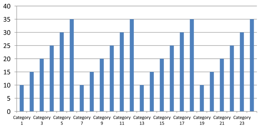
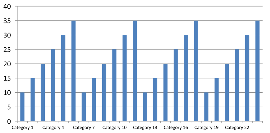
手動間距(投影片 2): 每第三個標籤顯示在單行,且刻度線仍保持在每個類別間隔。所有 24 個欄位(包括未顯示標籤的欄位)仍保持可見且值相同。投影片 3 會恢復上述的自動外觀。
選擇正確的座標軸與間隔
在文字類別座標軸(例如直欄圖、折線圖、區域圖或長條圖的類別座標軸)使用此類別計數間隔。於直欄圖中,它是水平座標軸;於水平長條圖中,類別座標軸為垂直方向,請對由getVerticalAxis 回傳的座標軸套用相同設定。刻度間隔亦適用於具有系列座標軸的圖表。
不要使用類別標籤間隔來設定值座標軸的數值刻度。於值座標軸上,setMajorUnit 會指定值的差距,例如 10 會在 0、10、20… 等位置產生刻度。類別標籤間隔 3 則是以類別位置計算,與實際資料值無關。散佈圖與氣泡圖使用值座標軸而非文字類別座標軸。若為日期座標軸,請依照變更類別座標軸 中所述使用基於時間的主要單位與比例。
設定類別座標軸值的日期格式
此範例以四個年度值取代預設圖表資料。日期以 OLE Automation 序號儲存在第一個工作表(索引 0)中,計算方式為自 1899 年 12 月 30 日起的天數。兩個曆法皆使用 UTC,且在設定日期前會先清除,以免夏令時間與當前時間影響計算。使用setCategoryAxisType 並傳入 CategoryAxisType.Date,再以setNumberFormatLinkedToSource 傳入 false,最後將 yyyy 傳遞給setNumberFormat ,即可讓類別標籤顯示四位數年份,且不受儲存格格式影響。
import com.aspose.slides.*;
import java.util.Calendar;
import java.util.GregorianCalendar;
import java.util.TimeZone;

Presentation presentation = new Presentation();
try {
    ISlide slide = presentation.getSlides().get_Item(0);

    IChart chart = slide.getShapes().addChart(ChartType.Line, 50, 50, 450, 300);

    chart.getChartData().getCategories().clear();
    chart.getChartData().getSeries().clear();

    IChartDataWorkbook workbook = chart.getChartData().getChartDataWorkbook();
    workbook.clear(0);

    TimeZone timeZone = TimeZone.getTimeZone("UTC");
    Calendar baseDate = new GregorianCalendar(timeZone);
    baseDate.clear();
    baseDate.set(1899, Calendar.DECEMBER, 30);

    IChartSeries series = chart.getChartData().getSeries().add(ChartType.Line);
    for (int i = 0; i < 4; i++) {
        Calendar date = new GregorianCalendar(timeZone);
        date.clear();
        date.set(2015 + i, Calendar.JANUARY, 1);
        double serialDate = (date.getTimeInMillis() - baseDate.getTimeInMillis()) / 86400000.0;
        IChartDataCell categoryCell = workbook.getCell(0, i + 1, 0, serialDate);
        chart.getChartData().getCategories().add(categoryCell);

        IChartDataCell valueCell = workbook.getCell(0, i + 1, 1, i + 1);
        series.getDataPoints().addDataPointForLineSeries(valueCell);
    }

    chart.getAxes().getHorizontalAxis().setCategoryAxisType(CategoryAxisType.Date);
    chart.getAxes().getHorizontalAxis().setNumberFormatLinkedToSource(false);
    chart.getAxes().getHorizontalAxis().setNumberFormat("yyyy");

    presentation.save("DateAxisFormat.pptx", SaveFormat.Pptx);
} finally {
    presentation.dispose();
}
為圖表座標軸標題設定旋轉角度
對垂直座標軸呼叫setTitle 並傳入 true,提供標題文字,接著使用setRotationAngle 旋轉標題。角度以度數計算;此範例會儲存一個直欄圖,將其值座標軸標題旋轉 90 度。
import com.aspose.slides.*;

Presentation presentation = new Presentation();
try {
    ISlide slide = presentation.getSlides().get_Item(0);

    IChart chart = slide.getShapes().addChart(ChartType.ClusteredColumn, 50, 50, 450, 300);
    chart.getAxes().getVerticalAxis().setTitle(true);
    chart.getAxes().getVerticalAxis().getTitle().addTextFrameForOverriding("Value");
    chart.getAxes().getVerticalAxis().getTitle().getTextFormat().getTextBlockFormat().setRotationAngle(90);

    presentation.save("RotatedAxisTitle.pptx", SaveFormat.Pptx);
} finally {
    presentation.dispose();
}
在類別或值座標軸上設定座標軸位置
使用setAxisBetweenCategories 來控制值座標軸是穿越類別座標軸之間的間隔還是穿越類別刻度標記。此設定適用於類別座標軸。範例在直欄圖的水平類別座標軸上將其設定為 true,並儲存結果。
import com.aspose.slides.*;

Presentation presentation = new Presentation();
try {
    ISlide slide = presentation.getSlides().get_Item(0);

    IChart chart = slide.getShapes().addChart(ChartType.ClusteredColumn, 50, 50, 450, 300);
    chart.getAxes().getHorizontalAxis().setAxisBetweenCategories(true);

    presentation.save("AxisBetweenCategories.pptx", SaveFormat.Pptx);
} finally {
    presentation.dispose();
}
在圖表值座標軸上設定顯示單位
使用setDisplayUnit 可在不改變底層資料的前提下縮放值座標軸的標籤。將DisplayUnitType 設為 Millions 後,60,000,000 會顯示為 60。範例建立一個直欄圖,並將其垂直座標軸的顯示單位設定為百萬。
import com.aspose.slides.*;

Presentation presentation = new Presentation();
try {
    ISlide slide = presentation.getSlides().get_Item(0);

    IChart chart = slide.getShapes().addChart(ChartType.ClusteredColumn, 50, 50, 450, 300);
    chart.getAxes().getVerticalAxis().setDisplayUnit(DisplayUnitType.Millions);

    presentation.save("Result.pptx", SaveFormat.Pptx);
} finally {
    presentation.dispose();
}
常見問題
如何設定一個座標軸與另一個座標軸交叉的數值(座標軸交叉)?
使用setCrossType 來選擇交叉行為。若要指定數值交叉點,使用setCrossAt。這些設定可讓您將座標軸交叉點移動至適當的基準線。
如何相對於座標軸定位刻度標籤?
呼叫setTickLabelPosition,並使用TickLabelPositionType:Low、High、NextTo 或 None。若要控制刻度線本身,使用setMajorTickMark 或setMinorTickMark;這與標籤定位是分開的。