
Tùy chỉnh trục biểu đồ trong các bản trình chiếu bằng Python
Tổng quan
Bài viết này giải thích cách tùy chỉnh trục biểu đồ với Aspose.Slides cho Python thông qua Java. Nó đề cập tới các giá trị trục được tính toán, chuyển đổi hàng và cột biểu đồ, hiển thị trục, khoảng cách nhãn danh mục và dấu tick, danh mục ngày và định dạng, xoay tiêu đề, vị trí trục và đơn vị hiển thị.
Lấy Giá Trị Tối Đa Trên Trục Dọc Của Biểu Đồ
Tạo một Presentation và thêm một biểu đồ khu vực với dữ liệu mặc định. Gọi validateChartLayout trước khi đọc các giá trị trục đã tính toán để bố cục biểu đồ được cập nhật.
Đọc getActualMaxValue và getActualMinValue để lấy giới hạn của trục, và getActualMajorUnit và getActualMinorUnit để lấy khoảng cách dấu tick. getActualMajorUnitScale và getActualMinorUnitScale cung cấp các thang thời gian, có liên quan đến trục ngày. Ví dụ lưu các giá trị này vào các biến cục bộ và lưu biểu đồ.
import jpype
import asposeslides

if not jpype.isJVMStarted():
    jpype.startJVM()

from asposeslides.api import Presentation, ChartType, SaveFormat

presentation = Presentation()
try:
    slide = presentation.getSlides().get_Item(0)

    chart = slide.getShapes().addChart(ChartType.Area, 100, 100, 500, 350)
    chart.validateChartLayout()

    max_value = chart.getAxes().getVerticalAxis().getActualMaxValue()
    min_value = chart.getAxes().getVerticalAxis().getActualMinValue()

    major_unit = chart.getAxes().getVerticalAxis().getActualMajorUnit()
    minor_unit = chart.getAxes().getVerticalAxis().getActualMinorUnit()

    major_unit_scale = chart.getAxes().getVerticalAxis().getActualMajorUnitScale()
    minor_unit_scale = chart.getAxes().getVerticalAxis().getActualMinorUnitScale()

    presentation.save("AxisValues_out.pptx", SaveFormat.Pptx)
finally:
    presentation.dispose()
Hoán Đổi Dữ Liệu Giữa Các Trục
Sử dụng switchRowColumn để đổi vai trò giữa series và category trong dữ liệu biểu đồ. Mỗi category cũ trở thành một series, và mỗi series cũ trở thành một category. Điều này thay đổi cách nhóm dữ liệu; nó không đổi chỗ các trục ngang và dọc. Ví dụ sử dụng setRange để gắn dữ liệu mặc định vào Sheet1!A1:D5, bao gồm hàng tiêu đề và cột category, trước khi hoán đổi hàng và cột. Nó lưu một biểu đồ với bốn series và ba category.
import jpype
import asposeslides

if not jpype.isJVMStarted():
    jpype.startJVM()

from asposeslides.api import Presentation, ChartType, SaveFormat

presentation = Presentation()
try:
    slide = presentation.getSlides().get_Item(0)

    chart = slide.getShapes().addChart(ChartType.ClusteredColumn, 100, 100, 400, 300)
    chart.getChartData().setRange("Sheet1!A1:D5")
    chart.getChartData().switchRowColumn()

    presentation.save("SwitchChartRowColumns_out.pptx", SaveFormat.Pptx)
finally:
    presentation.dispose()
Ẩn Trục Dọc Cho Biểu Đồ Đường
Gọi setVisible với False trên trục dọc để ẩn nó. Ví dụ tạo một biểu đồ đường với dữ liệu mặc định và lưu với trục dọc bị ẩn.
import jpype
import asposeslides

if not jpype.isJVMStarted():
    jpype.startJVM()

from asposeslides.api import Presentation, ChartType, SaveFormat

presentation = Presentation()
try:
    slide = presentation.getSlides().get_Item(0)

    chart = slide.getShapes().addChart(ChartType.Line, 100, 100, 400, 300)
    chart.getAxes().getVerticalAxis().setVisible(False)

    presentation.save("HiddenVerticalAxis.pptx", SaveFormat.Pptx)
finally:
    presentation.dispose()
Ẩn Trục Ngang Cho Biểu Đồ Đường
Gọi setVisible với False trên trục ngang để ẩn nó. Ví dụ tạo một biểu đồ đường với dữ liệu mặc định và lưu với trục ngang bị ẩn.
import jpype
import asposeslides

if not jpype.isJVMStarted():
    jpype.startJVM()

from asposeslides.api import Presentation, ChartType, SaveFormat

presentation = Presentation()
try:
    slide = presentation.getSlides().get_Item(0)

    chart = slide.getShapes().addChart(ChartType.Line, 100, 100, 400, 300)
    chart.getAxes().getHorizontalAxis().setVisible(False)

    presentation.save("HiddenHorizontalAxis.pptx", SaveFormat.Pptx)
finally:
    presentation.dispose()
Thay Đổi Trục Category
Sử dụng setCategoryAxisType để chọn trục category dạng ngày hoặc văn bản. Ví dụ này yêu cầu ExistingChart.pptx, với một biểu đồ là hình dạng đầu tiên trên slide đầu và các ô category chứa giá trị ngày Excel dạng số. Nó thay đổi trục ngang thành trục ngày. Gọi setAutomaticMajorUnit với False, setMajorUnit với 1, và setMajorUnitScale với TimeUnitType.Months để đặt các dấu tick chính ở khoảng một tháng.
import jpype
import asposeslides

if not jpype.isJVMStarted():
    jpype.startJVM()

from asposeslides.api import Presentation, SaveFormat, CategoryAxisType, TimeUnitType

presentation = Presentation("ExistingChart.pptx")
try:
    slide = presentation.getSlides().get_Item(0)

    chart = slide.getShapes().get_Item(0)
    chart.getAxes().getHorizontalAxis().setCategoryAxisType(CategoryAxisType.Date)
    chart.getAxes().getHorizontalAxis().setAutomaticMajorUnit(False)
    chart.getAxes().getHorizontalAxis().setMajorUnit(1)
    chart.getAxes().getHorizontalAxis().setMajorUnitScale(TimeUnitType.Months)

    presentation.save("ChangeChartCategoryAxis_out.pptx", SaveFormat.Pptx)
finally:
    presentation.dispose()
Điều Khiển Khoảng Cách Nhãn Trục Category
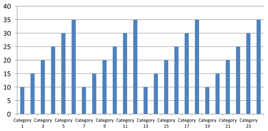
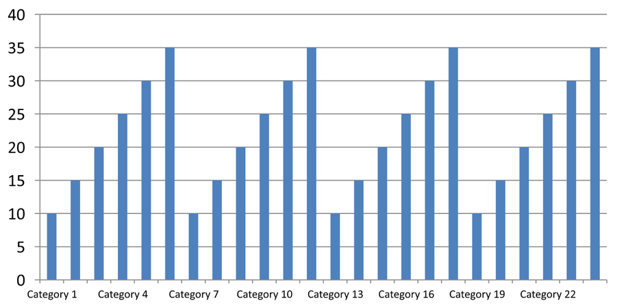
Khi một biểu đồ có nhiều category, giảm số lượng nhãn trục hiển thị mà không loại bỏ các category hay điểm dữ liệu. Gọi setAutomaticTickLabelSpacing với False, sau đó truyền khoảng cách category mong muốn vào setTickLabelSpacing. Đối với category dạng văn bản theo thứ tự bình thường, việc đếm bắt đầu từ category đầu tiên:
| Khoảng | Nhãn hiển thị trong ví dụ |
|---|---|
1 |
Category 1, Category 2, Category 3, … Category 24 |
2 |
Category 1, Category 3, Category 5, … Category 23 |
3 |
Category 1, Category 4, Category 7, … Category 22 |
Khoảng 3 hiển thị mỗi nhãn thứ ba, để hai nhãn ẩn giữa các nhãn được hiển thị. Nó không loại bỏ các cột tương ứng. Khoảng cách tự động chọn một khoảng dựa trên không gian có sẵn; nó không nhất thiết hiển thị mọi nhãn.
Dấu tick có các điều khiển riêng. Gọi setAutomaticTickMarksSpacing với False và sử dụng setTickMarksSpacing để đặt khoảng của chúng. Ví dụ, 1 giữ một dấu tick ở mỗi khoảng category trong khi nhãn chỉ xuất hiện mỗi ba category. Sử dụng setMajorTickMark với kiểu hiển thị để bạn có thể thấy kết quả. Gọi bất kỳ setter khoảng cách tự động nào với True một lần nữa sẽ cho phép biểu đồ chọn lại khoảng đó.
Ví dụ tự chứa dưới đây tạo 24 category và một series, rồi lưu ba slide trong CategoryAxisIntervals.pptx: khoảng cách tự động, khoảng cách nhãn thủ công với dấu tick độc lập, và khôi phục khoảng cách tự động. Hai bản sao giữ nguyên dữ liệu biểu đồ gốc. Không cần bản trình chiếu đầu vào. Văn bản nhãn ngang làm cho sự khác nhau về mật độ dễ nhận thấy.
import jpype
import asposeslides

if not jpype.isJVMStarted():
    jpype.startJVM()

from asposeslides.api import Presentation, ChartType, SaveFormat, CategoryAxisType, TickMarkType

presentation = Presentation()
try:
    slide = presentation.getSlides().get_Item(0)

    chart = slide.getShapes().addChart(ChartType.ClusteredColumn, 30, 40, 660, 320)

    chart.setLegend(False)
    chart.getChartData().getCategories().clear()
    chart.getChartData().getSeries().clear()

    workbook = chart.getChartData().getChartDataWorkbook()
    workbook.clear(0)

    series = chart.getChartData().getSeries().add(ChartType.ClusteredColumn)
    for i in range(24):
        category_cell = workbook.getCell(0, i + 1, 0, f"Category {i + 1}")
        chart.getChartData().getCategories().add(category_cell)
        value_cell = workbook.getCell(0, i + 1, 1, float(10 + i % 6 * 5))
        series.getDataPoints().addDataPointForBarSeries(value_cell)

    axis = chart.getAxes().getHorizontalAxis()
    axis.setCategoryAxisType(CategoryAxisType.Text)
    axis.getTextFormat().getTextBlockFormat().setRotationAngle(0)
    axis.getTextFormat().getPortionFormat().setFontHeight(12)
    axis.setMajorTickMark(TickMarkType.Outside)
    axis.setAutomaticTickLabelSpacing(True)
    axis.setAutomaticTickMarksSpacing(True)

    # Slide 2: hiển thị mỗi nhãn thứ ba, nhưng giữ dấu tick cho mỗi danh mục.
    manual_slide = presentation.getSlides().addClone(slide)
    manual_chart = manual_slide.getShapes().get_Item(0)
    manual_axis = manual_chart.getAxes().getHorizontalAxis()
    manual_axis.setAutomaticTickLabelSpacing(False)
    manual_axis.setTickLabelSpacing(3)
    manual_axis.setAutomaticTickMarksSpacing(False)
    manual_axis.setTickMarksSpacing(1)

    # Slide 3: cho phép biểu đồ chọn lại cả hai khoảng cách.
    restored_slide = presentation.getSlides().addClone(manual_slide)
    restored_chart = restored_slide.getShapes().get_Item(0)
    restored_chart.getAxes().getHorizontalAxis().setAutomaticTickLabelSpacing(True)
    restored_chart.getAxes().getHorizontalAxis().setAutomaticTickMarksSpacing(True)

    presentation.save("CategoryAxisIntervals.pptx", SaveFormat.Pptx)
finally:
    presentation.dispose()
Khoảng cách tự động (slide 1): Trong bản render này, mỗi nhãn category thứ hai được hiển thị và xuống dòng thành hai dòng. Kết quả tự động có thể thay đổi tùy theo kích thước biểu đồ, phông chữ và bộ render.
Khoảng cách thủ công (slide 2): Mỗi nhãn thứ ba được hiển thị trên một dòng, trong khi dấu tick vẫn ở mỗi khoảng category. Tất cả 24 cột, bao gồm những cột không có nhãn, vẫn hiển thị với cùng giá trị. Slide 3 khôi phục lại giao diện tự động như trên.
Chọn Trục và Khoảng Đúng
Sử dụng khoảng đếm category này cho trục category dạng văn bản, chẳng hạn trục category của biểu đồ cột, đường, khu vực, hoặc thanh. Trong biểu đồ cột, nó là trục ngang. Trong biểu đồ thanh ngang, trục category nằm dọc, vì vậy áp dụng các cài đặt này cho trục trả về bởi getVerticalAxis. Khoảng cách dấu tick cũng áp dụng cho trục series trong các biểu đồ có trục này.
Không sử dụng khoảng cách nhãn category để đặt thang số của trục giá trị. Trên trục giá trị, setMajorUnit chỉ ra sự khác biệt về giá trị: ví dụ, một đơn vị chính 10 tạo các dấu tick tại 0, 10, 20, … khi trục bắt đầu từ zero. Khoảng nhãn category 3 thay vào đó đếm vị trí category, bất kể giá trị dữ liệu của chúng. Biểu đồ scatter và bubble sử dụng trục giá trị thay vì trục category dạng văn bản. Đối với trục ngày, hãy sử dụng các đơn vị và thang thời gian như mô tả trong Thay Đổi Trục Category.
Đặt Định Dạng Ngày Cho Giá Trị Trục Category
Ví dụ thay thế dữ liệu biểu đồ mặc định bằng bốn giá trị hàng năm. Ngày được lưu dưới dạng số sê-ri OLE Automation trong trang tính đầu tiên (chỉ mục 0), tính bằng số ngày kể từ ngày 30 tháng 12 năm 1899. Sử dụng setCategoryAxisType với CategoryAxisType.Date, gọi setNumberFormatLinkedToSource với False, và truyền yyyy vào setNumberFormat để nhãn category hiển thị năm bốn chữ số độc lập với định dạng ô.
from datetime import date

import jpype
import asposeslides

if not jpype.isJVMStarted():
    jpype.startJVM()

from asposeslides.api import Presentation, ChartType, SaveFormat, CategoryAxisType

presentation = Presentation()
try:
    slide = presentation.getSlides().get_Item(0)

    chart = slide.getShapes().addChart(ChartType.Line, 50, 50, 450, 300)

    chart.getChartData().getCategories().clear()
    chart.getChartData().getSeries().clear()

    workbook = chart.getChartData().getChartDataWorkbook()
    workbook.clear(0)

    base_date = date(1899, 12, 30)

    series = chart.getChartData().getSeries().add(ChartType.Line)
    for i in range(4):
        category_date = date(2015 + i, 1, 1)
        category_value = float((category_date - base_date).days)
        category_cell = workbook.getCell(0, i + 1, 0, category_value)
        chart.getChartData().getCategories().add(category_cell)

        value_cell = workbook.getCell(0, i + 1, 1, float(i + 1))
        series.getDataPoints().addDataPointForLineSeries(value_cell)

    chart.getAxes().getHorizontalAxis().setCategoryAxisType(CategoryAxisType.Date)
    chart.getAxes().getHorizontalAxis().setNumberFormatLinkedToSource(False)
    chart.getAxes().getHorizontalAxis().setNumberFormat("yyyy")

    presentation.save("DateAxisFormat.pptx", SaveFormat.Pptx)
finally:
    presentation.dispose()
Đặt Góc Xoay Cho Tiêu Đề Trục Biểu Đồ
Gọi setTitle với True trên trục dọc, cung cấp văn bản tiêu đề, và đặt góc xoay trong định dạng khối văn bản của tiêu đề. Góc được đo bằng độ; ví dụ này lưu một biểu đồ cột với tiêu đề trục giá trị được xoay 90 độ.
import jpype
import asposeslides

if not jpype.isJVMStarted():
    jpype.startJVM()

from asposeslides.api import Presentation, ChartType, SaveFormat

presentation = Presentation()
try:
    slide = presentation.getSlides().get_Item(0)

    chart = slide.getShapes().addChart(ChartType.ClusteredColumn, 50, 50, 450, 300)
    chart.getAxes().getVerticalAxis().setTitle(True)
    chart.getAxes().getVerticalAxis().getTitle().addTextFrameForOverriding("Value")
    chart.getAxes().getVerticalAxis().getTitle().getTextFormat().getTextBlockFormat().setRotationAngle(90)

    presentation.save("RotatedAxisTitle.pptx", SaveFormat.Pptx)
finally:
    presentation.dispose()
Đặt Vị Trí Trục Trên Trục Category Hoặc Giá Trị
Sử dụng setAxisBetweenCategories để kiểm soát việc trục giá trị cắt qua trục category giữa các category hay tại các dấu tick của category. Cài đặt này áp dụng cho trục category. Ví dụ đặt nó thành True trên trục category ngang của biểu đồ cột và lưu kết quả.
import jpype
import asposeslides

if not jpype.isJVMStarted():
    jpype.startJVM()

from asposeslides.api import Presentation, ChartType, SaveFormat

presentation = Presentation()
try:
    slide = presentation.getSlides().get_Item(0)

    chart = slide.getShapes().addChart(ChartType.ClusteredColumn, 50, 50, 450, 300)
    chart.getAxes().getHorizontalAxis().setAxisBetweenCategories(True)

    presentation.save("AxisBetweenCategories.pptx", SaveFormat.Pptx)
finally:
    presentation.dispose()
Đặt Đơn Vị Hiển Thị Trên Trục Giá Trị Của Biểu Đồ
Sử dụng setDisplayUnit để thay đổi thang nhãn trên trục giá trị mà không thay đổi dữ liệu cơ bản. Với DisplayUnitType đặt thành Millions, một giá trị 60,000,000 sẽ hiển thị là 60. Ví dụ tạo một biểu đồ cột và áp dụng đơn vị hiển thị triệu cho trục dọc của nó.
import jpype
import asposeslides

if not jpype.isJVMStarted():
    jpype.startJVM()

from asposeslides.api import Presentation, ChartType, SaveFormat, DisplayUnitType

presentation = Presentation()
try:
    slide = presentation.getSlides().get_Item(0)

    chart = slide.getShapes().addChart(ChartType.ClusteredColumn, 50, 50, 450, 300)
    chart.getAxes().getVerticalAxis().setDisplayUnit(DisplayUnitType.Millions)

    presentation.save("Result.pptx", SaveFormat.Pptx)
finally:
    presentation.dispose()
Câu hỏi thường gặp
Làm thế nào để đặt giá trị mà tại đó một trục cắt qua trục kia (axis crossing)?
Sử dụng setCrossType để chọn hành vi cắt. Để chỉ định một giá trị cắt số, dùng setCrossAt. Các cài đặt này cho phép bạn di chuyển điểm cắt trục tới một mức cơ sở phù hợp.
Làm sao tôi có thể định vị nhãn tick so với trục?
Gọi setTickLabelPosition sử dụng TickLabelPositionType: Low, High, NextTo, hoặc None. Để điều khiển các dấu tick riêng biệt, dùng setMajorTickMark hoặc setMinorTickMark; chúng tách biệt với vị trí nhãn.