
Python を使用したプレゼンテーションのチャート軸のカスタマイズ
概要
この記事では、Aspose.Slides for Python via Java を使用してチャート軸をカスタマイズする方法を説明します。計算された軸値、チャートの行と列の入れ替え、軸の表示/非表示、カテゴリ ラベルと目盛り間隔、日付カテゴリと書式設定、タイトルの回転、軸の位置設定、表示単位について解説します。
チャートの縦軸の最大値を取得する
デフォルト データでエリア チャートを追加した プレゼンテーション を作成します。計算された軸値を取得する前に validateChartLayout を呼び出して、チャートのレイアウトを最新の状態にします。
軸の上限を取得するには getActualMaxValue と getActualMinValue を読み取り、目盛り間隔には getActualMajorUnit と getActualMinorUnit を使用します。getActualMajorUnitScale と getActualMinorUnitScale は時間単位のスケールを提供し、日付軸に関連します。例ではこれらの値をローカル変数に格納し、チャートを保存します。
import jpype
import asposeslides

if not jpype.isJVMStarted():
    jpype.startJVM()

from asposeslides.api import Presentation, ChartType, SaveFormat

presentation = Presentation()
try:
    slide = presentation.getSlides().get_Item(0)

    chart = slide.getShapes().addChart(ChartType.Area, 100, 100, 500, 350)
    chart.validateChartLayout()

    max_value = chart.getAxes().getVerticalAxis().getActualMaxValue()
    min_value = chart.getAxes().getVerticalAxis().getActualMinValue()

    major_unit = chart.getAxes().getVerticalAxis().getActualMajorUnit()
    minor_unit = chart.getAxes().getVerticalAxis().getActualMinorUnit()

    major_unit_scale = chart.getAxes().getVerticalAxis().getActualMajorUnitScale()
    minor_unit_scale = chart.getAxes().getVerticalAxis().getActualMinorUnitScale()

    presentation.save("AxisValues_out.pptx", SaveFormat.Pptx)
finally:
    presentation.dispose()
軸間のデータを入れ替える
チャート データで系列とカテゴリの役割を入れ替えるには switchRowColumn を使用します。元のカテゴリは系列になり、元の系列はカテゴリになります。これはデータのグループ化方法を変更しますが、水平軸と垂直軸を入れ替えるものではありません。例では setRange を使用してデフォルト データを Sheet1!A1:D5 にバインドし、ヘッダー行とカテゴリ列を含めた上で行と列を入れ替えます。4 系列と 3 カテゴリを持つチャートを保存します。
import jpype
import asposeslides

if not jpype.isJVMStarted():
    jpype.startJVM()

from asposeslides.api import Presentation, ChartType, SaveFormat

presentation = Presentation()
try:
    slide = presentation.getSlides().get_Item(0)

    chart = slide.getShapes().addChart(ChartType.ClusteredColumn, 100, 100, 400, 300)
    chart.getChartData().setRange("Sheet1!A1:D5")
    chart.getChartData().switchRowColumn()

    presentation.save("SwitchChartRowColumns_out.pptx", SaveFormat.Pptx)
finally:
    presentation.dispose()
折れ線グラフの縦軸を無効にする
縦軸を非表示にするには、setVisible を False で呼び出します。例ではデフォルト データの折れ線グラフを作成し、縦軸を非表示にして保存します。
import jpype
import asposeslides

if not jpype.isJVMStarted():
    jpype.startJVM()

from asposeslides.api import Presentation, ChartType, SaveFormat

presentation = Presentation()
try:
    slide = presentation.getSlides().get_Item(0)

    chart = slide.getShapes().addChart(ChartType.Line, 100, 100, 400, 300)
    chart.getAxes().getVerticalAxis().setVisible(False)

    presentation.save("HiddenVerticalAxis.pptx", SaveFormat.Pptx)
finally:
    presentation.dispose()
折れ線グラフの横軸を無効にする
横軸を非表示にするには、setVisible を False で呼び出します。例ではデフォルト データの折れ線グラフを作成し、横軸を非表示にして保存します。
import jpype
import asposeslides

if not jpype.isJVMStarted():
    jpype.startJVM()

from asposeslides.api import Presentation, ChartType, SaveFormat

presentation = Presentation()
try:
    slide = presentation.getSlides().get_Item(0)

    chart = slide.getShapes().addChart(ChartType.Line, 100, 100, 400, 300)
    chart.getAxes().getHorizontalAxis().setVisible(False)

    presentation.save("HiddenHorizontalAxis.pptx", SaveFormat.Pptx)
finally:
    presentation.dispose()
カテゴリ軸を変更する
日付カテゴリ軸またはテキストカテゴリ軸を選択するには setCategoryAxisType を使用します。この例では ExistingChart.pptx が必要で、最初のスライドの最初のシェイプとしてチャートがあり、カテゴリセルには数値の Excel 日付が格納されています。水平軸を日付軸に変更します。setAutomaticMajorUnit を False、setMajorUnit を 1、setMajorUnitScale に TimeUnitType.Months を指定すると、主要目盛りが 1 ヶ月間隔で配置されます。
import jpype
import asposeslides

if not jpype.isJVMStarted():
    jpype.startJVM()

from asposeslides.api import Presentation, SaveFormat, CategoryAxisType, TimeUnitType

presentation = Presentation("ExistingChart.pptx")
try:
    slide = presentation.getSlides().get_Item(0)

    chart = slide.getShapes().get_Item(0)
    chart.getAxes().getHorizontalAxis().setCategoryAxisType(CategoryAxisType.Date)
    chart.getAxes().getHorizontalAxis().setAutomaticMajorUnit(False)
    chart.getAxes().getHorizontalAxis().setMajorUnit(1)
    chart.getAxes().getHorizontalAxis().setMajorUnitScale(TimeUnitType.Months)

    presentation.save("ChangeChartCategoryAxis_out.pptx", SaveFormat.Pptx)
finally:
    presentation.dispose()
カテゴリ軸ラベル間隔を制御する
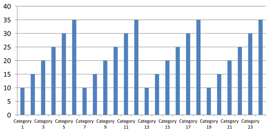
チャートに多数のカテゴリがある場合、カテゴリやデータポイントを削除せずに表示される軸ラベルの数を減らすことができます。setAutomaticTickLabelSpacing を False に設定してから、希望するカテゴリ間隔を setTickLabelSpacing に渡します。テキストカテゴリが通常順に並んでいる場合、カウントは最初のカテゴリから始まります:
| 間隔 | 例で表示されるラベル |
|---|---|
1 |
カテゴリ 1, カテゴリ 2, カテゴリ 3, … カテゴリ 24 |
2 |
カテゴリ 1, カテゴリ 3, カテゴリ 5, … カテゴリ 23 |
3 |
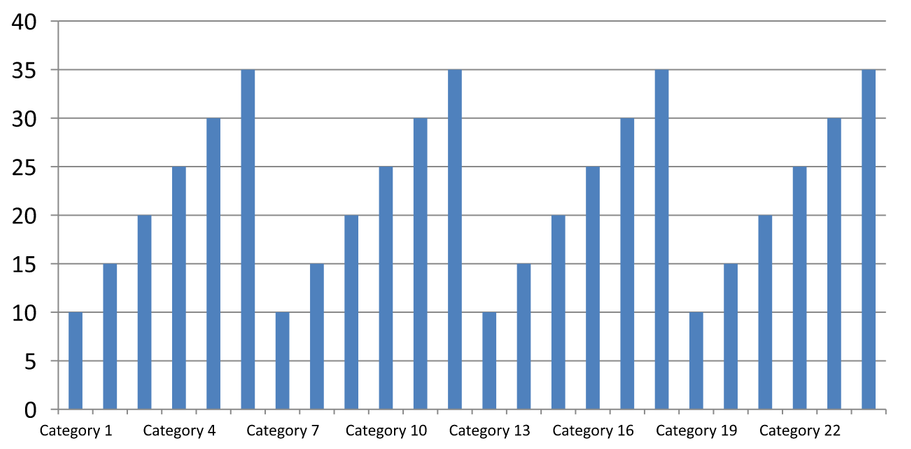
カテゴリ 1, カテゴリ 4, カテゴリ 7, … カテゴリ 22 |
間隔 3 は 3 番目ごとのラベルを表示し、表示されたラベルの間に 2 つのラベルが非表示になります。対応する列は削除されません。自動間隔は利用可能なスペースに基づいて間隔を選択し、必ずしもすべてのラベルが表示されるわけではありません。
目盛りには別個の制御があります。setAutomaticTickMarksSpacing を False に設定し、setTickMarksSpacing で間隔を設定します。たとえば 1 は各カテゴリ間隔に目盛りを残し、ラベルは 3 番目のカテゴリごとに表示されます。setMajorTickMark を可視スタイルに設定して結果を確認できます。自動間隔設定子を True に戻すと、チャートは再び自動的に間隔を選択します。
以下の自己完結型例は 24 個のカテゴリと 1 系列を作成し、CategoryAxisIntervals.pptx に 3 スライドを保存します:自動間隔、ラベル間隔を手動で設定し目盛りを独立させたもの、そして自動間隔に復元したものです。2 つのコピーは元のチャート データを保持します。入力プレゼンテーションは不要です。水平ラベル テキストにより密度の違いが見やすくなります。
import jpype
import asposeslides

if not jpype.isJVMStarted():
    jpype.startJVM()

from asposeslides.api import Presentation, ChartType, SaveFormat, CategoryAxisType, TickMarkType

presentation = Presentation()
try:
    slide = presentation.getSlides().get_Item(0)

    chart = slide.getShapes().addChart(ChartType.ClusteredColumn, 30, 40, 660, 320)

    chart.setLegend(False)
    chart.getChartData().getCategories().clear()
    chart.getChartData().getSeries().clear()

    workbook = chart.getChartData().getChartDataWorkbook()
    workbook.clear(0)

    series = chart.getChartData().getSeries().add(ChartType.ClusteredColumn)
    for i in range(24):
        category_cell = workbook.getCell(0, i + 1, 0, f"Category {i + 1}")
        chart.getChartData().getCategories().add(category_cell)
        value_cell = workbook.getCell(0, i + 1, 1, float(10 + i % 6 * 5))
        series.getDataPoints().addDataPointForBarSeries(value_cell)

    axis = chart.getAxes().getHorizontalAxis()
    axis.setCategoryAxisType(CategoryAxisType.Text)
    axis.getTextFormat().getTextBlockFormat().setRotationAngle(0)
    axis.getTextFormat().getPortionFormat().setFontHeight(12)
    axis.setMajorTickMark(TickMarkType.Outside)
    axis.setAutomaticTickLabelSpacing(True)
    axis.setAutomaticTickMarksSpacing(True)

    # スライド 2: 3 番目ごとのラベルのみ表示し、各カテゴリに目盛りを残す。
    manual_slide = presentation.getSlides().addClone(slide)
    manual_chart = manual_slide.getShapes().get_Item(0)
    manual_axis = manual_chart.getAxes().getHorizontalAxis()
    manual_axis.setAutomaticTickLabelSpacing(False)
    manual_axis.setTickLabelSpacing(3)
    manual_axis.setAutomaticTickMarksSpacing(False)
    manual_axis.setTickMarksSpacing(1)

    # スライド 3: チャートに両方の間隔を再度自動選択させる。
    restored_slide = presentation.getSlides().addClone(manual_slide)
    restored_chart = restored_slide.getShapes().get_Item(0)
    restored_chart.getAxes().getHorizontalAxis().setAutomaticTickLabelSpacing(True)
    restored_chart.getAxes().getHorizontalAxis().setAutomaticTickMarksSpacing(True)

    presentation.save("CategoryAxisIntervals.pptx", SaveFormat.Pptx)
finally:
    presentation.dispose()
自動間隔 (スライド 1): この描画では、2 番目ごとのカテゴリ ラベルが表示され、2 行に折り返されます。自動結果はチャートのサイズ、フォント、レンダラーにより変わる可能性があります。
手動間隔 (スライド 2): 3 番目ごとのラベルが1 行に表示され、目盛りはすべてのカテゴリ間隔に残ります。ラベルがない列も含め、24 列すべてが同じ値で表示されます。スライド 3 は上記の自動外観を復元します。
正しい軸と間隔を選択する
テキストカテゴリ軸(例:縦棒、折れ線、エリア、横棒チャートのカテゴリ軸)にこのカテゴリ数間隔を使用します。縦棒チャートでは水平軸がカテゴリ軸です。横棒チャートではカテゴリ軸が垂直になるため、getVerticalAxis が返す軸にこれらの設定を適用します。目盛り間隔は系列軸があるチャートにも適用できます。
カテゴリ ラベル間隔を使用して数値軸の数値スケールを設定しないでください。数値軸では setMajorUnit が値の差を指定します。たとえば、主要単位を 10 に設定すると、軸が 0 から始まる場合に 0、10、20… の目盛りが生成されます。カテゴリ ラベル間隔 3 はデータ値に関係なくカテゴリ位置をカウントします。散布図やバブルチャートはテキストカテゴリ軸ではなく数値軸を使用します。日付軸の場合は、Change a Category Axis で説明したように、時間ベースの主要単位とスケールを使用してください。
カテゴリ軸値の日時形式を設定する
例ではデフォルトのチャート データを 4 つの年次値に置き換えます。日付は最初のワークシート(インデックス 0)に OLE Automation のシリアル番号として格納され、1899 年 12 月 30 日からの経過日数です。setCategoryAxisType に CategoryAxisType.Date を指定し、setNumberFormatLinkedToSource を False で呼び出し、yyyy を setNumberFormat に渡すことで、セルの書式設定に関係なくカテゴリ ラベルが 4 桁の年として表示されます。
from datetime import date

import jpype
import asposeslides

if not jpype.isJVMStarted():
    jpype.startJVM()

from asposeslides.api import Presentation, ChartType, SaveFormat, CategoryAxisType

presentation = Presentation()
try:
    slide = presentation.getSlides().get_Item(0)

    chart = slide.getShapes().addChart(ChartType.Line, 50, 50, 450, 300)

    chart.getChartData().getCategories().clear()
    chart.getChartData().getSeries().clear()

    workbook = chart.getChartData().getChartDataWorkbook()
    workbook.clear(0)

    base_date = date(1899, 12, 30)

    series = chart.getChartData().getSeries().add(ChartType.Line)
    for i in range(4):
        category_date = date(2015 + i, 1, 1)
        category_value = float((category_date - base_date).days)
        category_cell = workbook.getCell(0, i + 1, 0, category_value)
        chart.getChartData().getCategories().add(category_cell)

        value_cell = workbook.getCell(0, i + 1, 1, float(i + 1))
        series.getDataPoints().addDataPointForLineSeries(value_cell)

    chart.getAxes().getHorizontalAxis().setCategoryAxisType(CategoryAxisType.Date)
    chart.getAxes().getHorizontalAxis().setNumberFormatLinkedToSource(False)
    chart.getAxes().getHorizontalAxis().setNumberFormat("yyyy")

    presentation.save("DateAxisFormat.pptx", SaveFormat.Pptx)
finally:
    presentation.dispose()
チャート軸タイトルの回転角度を設定する
縦軸に対して setTitle を True で呼び出し、タイトル テキストを設定し、タイトルのテキスト ブロック書式で回転角度を指定します。角度は度で測定されます。この例では、値軸タイトルを 90 度回転させた縦棒チャートを保存します。
import jpype
import asposeslides

if not jpype.isJVMStarted():
    jpype.startJVM()

from asposeslides.api import Presentation, ChartType, SaveFormat

presentation = Presentation()
try:
    slide = presentation.getSlides().get_Item(0)

    chart = slide.getShapes().addChart(ChartType.ClusteredColumn, 50, 50, 450, 300)
    chart.getAxes().getVerticalAxis().setTitle(True)
    chart.getAxes().getVerticalAxis().getTitle().addTextFrameForOverriding("Value")
    chart.getAxes().getVerticalAxis().getTitle().getTextFormat().getTextBlockFormat().setRotationAngle(90)

    presentation.save("RotatedAxisTitle.pptx", SaveFormat.Pptx)
finally:
    presentation.dispose()
カテゴリまたは値軸の軸位置を設定する
setAxisBetweenCategories を使用して、値軸がカテゴリ軸をカテゴリ間またはカテゴリ目盛り位置で交差するかを制御します。この設定はカテゴリ軸に適用されます。例では縦棒チャートの水平カテゴリ軸に対して True に設定し、結果を保存します。
import jpype
import asposeslides

if not jpype.isJVMStarted():
    jpype.startJVM()

from asposeslides.api import Presentation, ChartType, SaveFormat

presentation = Presentation()
try:
    slide = presentation.getSlides().get_Item(0)

    chart = slide.getShapes().addChart(ChartType.ClusteredColumn, 50, 50, 450, 300)
    chart.getAxes().getHorizontalAxis().setAxisBetweenCategories(True)

    presentation.save("AxisBetweenCategories.pptx", SaveFormat.Pptx)
finally:
    presentation.dispose()
チャートの値軸に表示単位を設定する
setDisplayUnit を使用して、基になるデータを変更せずに値軸のラベルをスケーリングします。DisplayUnitType を Millions に設定すると、60,000,000 の値が 60 と表示されます。例では縦棒チャートを作成し、垂直軸にミリオン表示単位を適用します。
import jpype
import asposeslides

if not jpype.isJVMStarted():
    jpype.startJVM()

from asposeslides.api import Presentation, ChartType, SaveFormat, DisplayUnitType

presentation = Presentation()
try:
    slide = presentation.getSlides().get_Item(0)

    chart = slide.getShapes().addChart(ChartType.ClusteredColumn, 50, 50, 450, 300)
    chart.getAxes().getVerticalAxis().setDisplayUnit(DisplayUnitType.Millions)

    presentation.save("Result.pptx", SaveFormat.Pptx)
finally:
    presentation.dispose()
FAQ
軸が他方と交差する位置(軸交差点)をどのように設定しますか?
setCrossType を使用して交差動作を選択します。数値の交差位置を指定するには setCrossAt を使用します。これらの設定により、軸交差点を適切な基準線に移動できます。
目盛りラベルを軸に対してどのように配置しますか?
setTickLabelPosition を TickLabelPositionType(Low、High、NextTo、None のいずれか)で呼び出します。目盛り自体を制御するには、setMajorTickMark または setMinorTickMark を使用します。これらはラベル位置設定とは別です。