
ปรับแต่งแกนแผนภูมิในงานนำเสนอด้วย Python
ภาพรวม
บทความนี้อธิบายวิธีการปรับแต่งแกนของแผนภูมิด้วย Aspose.Slides สำหรับ Python ผ่าน Java โดยครอบคลุมค่าที่คำนวณของแกน การสลับแถวและคอลัมน์ของแผนภูมิ การมองเห็นแกน ช่วงเวลาของป้ายชื่อประเภทและเครื่องหมายหลัก จัดรูปแบบหมวดวันที่ การหมุนหัวเรื่อง การกำหนดตำแหน่งแกน และหน่วยการแสดงผล
รับค่าสูงสุดบนแกนแนวดิ่งของแผนภูมิ
สร้าง Presentation และเพิ่มแผนภูมิพื้นที่ด้วยข้อมูลเริ่มต้น เรียกใช้ validateChartLayout ก่อนอ่านค่าที่คำนวณของแกนเพื่อให้การจัดวางแผนภูมิล่าสุด
อ่าน getActualMaxValue และ getActualMinValue เพื่อรับขอบเขตแกน และ getActualMajorUnit กับ getActualMinorUnit เพื่อรับช่วงเวลาของเครื่องหมายหลักและรอง getActualMajorUnitScale และ getActualMinorUnitScale ให้สเกลหน่วยเวลา ซึ่งเกี่ยวข้องกับแกนวันที่ ตัวอย่างเก็บค่าต่าง ๆ ไว้ในตัวแปรท้องถิ่นและบันทึกแผนภูมิ
import jpype
import asposeslides

if not jpype.isJVMStarted():
    jpype.startJVM()

from asposeslides.api import Presentation, ChartType, SaveFormat

presentation = Presentation()
try:
    slide = presentation.getSlides().get_Item(0)

    chart = slide.getShapes().addChart(ChartType.Area, 100, 100, 500, 350)
    chart.validateChartLayout()

    max_value = chart.getAxes().getVerticalAxis().getActualMaxValue()
    min_value = chart.getAxes().getVerticalAxis().getActualMinValue()

    major_unit = chart.getAxes().getVerticalAxis().getActualMajorUnit()
    minor_unit = chart.getAxes().getVerticalAxis().getActualMinorUnit()

    major_unit_scale = chart.getAxes().getVerticalAxis().getActualMajorUnitScale()
    minor_unit_scale = chart.getAxes().getVerticalAxis().getActualMinorUnitScale()

    presentation.save("AxisValues_out.pptx", SaveFormat.Pptx)
finally:
    presentation.dispose()
สลับข้อมูลระหว่างแกน
ใช้ switchRowColumn เพื่อสลับบทบาทของซีรีส์และประเภทในข้อมูลแผนภูมิ แต่ละประเภทเดิมจะกลายเป็นซีรีส์และแต่ละซีรีส์เดิมจะกลายเป็นประเภท การเปลี่ยนแปลงนี้ทำให้การจัดกลุ่มข้อมูลเปลี่ยนไป แต่ไม่ได้สลับแกนแนวนอนและแนวดิ่ง ตัวอย่างใช้ setRange เพื่อผูกข้อมูลเริ่มต้นกับ Sheet1!A1:D5 รวมถึงแถวหัวและคอลัมน์ประเภท ก่อนสลับแถวและคอลัมน์ แล้วบันทึกแผนภูมิที่มีสี่ซีรีส์และสามประเภท
import jpype
import asposeslides

if not jpype.isJVMStarted():
    jpype.startJVM()

from asposeslides.api import Presentation, ChartType, SaveFormat

presentation = Presentation()
try:
    slide = presentation.getSlides().get_Item(0)

    chart = slide.getShapes().addChart(ChartType.ClusteredColumn, 100, 100, 400, 300)
    chart.getChartData().setRange("Sheet1!A1:D5")
    chart.getChartData().switchRowColumn()

    presentation.save("SwitchChartRowColumns_out.pptx", SaveFormat.Pptx)
finally:
    presentation.dispose()
ปิดการใช้งานแกนแนวตั้งสำหรับแผนภูมิเส้น
เรียกใช้ setVisible ด้วย False บนแกนแนวตั้งเพื่อซ่อนมัน ตัวอย่างสร้างแผนภูมิเส้นด้วยข้อมูลเริ่มต้นและบันทึกโดยที่แกนแนวตั้งซ่อนอยู่
import jpype
import asposeslides

if not jpype.isJVMStarted():
    jpype.startJVM()

from asposeslides.api import Presentation, ChartType, SaveFormat

presentation = Presentation()
try:
    slide = presentation.getSlides().get_Item(0)

    chart = slide.getShapes().addChart(ChartType.Line, 100, 100, 400, 300)
    chart.getAxes().getVerticalAxis().setVisible(False)

    presentation.save("HiddenVerticalAxis.pptx", SaveFormat.Pptx)
finally:
    presentation.dispose()
ปิดการใช้งานแกนแนวนอนสำหรับแผนภูมิเส้น
เรียกใช้ setVisible ด้วย False บนแกนแนวนอนเพื่อซ่อนมัน ตัวอย่างสร้างแผนภูมิเส้นด้วยข้อมูลเริ่มต้นและบันทึกโดยที่แกนแนวนอนซ่อนอยู่
import jpype
import asposeslides

if not jpype.isJVMStarted():
    jpype.startJVM()

from asposeslides.api import Presentation, ChartType, SaveFormat

presentation = Presentation()
try:
    slide = presentation.getSlides().get_Item(0)

    chart = slide.getShapes().addChart(ChartType.Line, 100, 100, 400, 300)
    chart.getAxes().getHorizontalAxis().setVisible(False)

    presentation.save("HiddenHorizontalAxis.pptx", SaveFormat.Pptx)
finally:
    presentation.dispose()
เปลี่ยนแกนประเภท
ใช้ setCategoryAxisType เพื่อเลือกแกนประเภทเป็นวันที่หรือข้อความ ตัวอย่างนี้ต้องใช้ ExistingChart.pptx ซึ่งมีแผนภูมิเป็นรูปร่างแรกบนสไลด์แรกและเซลล์ประเภทมีค่าตัวเลขวันที่ของ Excel มันเปลี่ยนแกนแนวนอนเป็นแกนวันที่ การเรียก setAutomaticMajorUnit ด้วย False , setMajorUnit ด้วย 1 และ setMajorUnitScale ด้วย TimeUnitType.Months จะวางเครื่องหมายหลักที่ช่วงหนึ่งเดือน
import jpype
import asposeslides

if not jpype.isJVMStarted():
    jpype.startJVM()

from asposeslides.api import Presentation, SaveFormat, CategoryAxisType, TimeUnitType

presentation = Presentation("ExistingChart.pptx")
try:
    slide = presentation.getSlides().get_Item(0)

    chart = slide.getShapes().get_Item(0)
    chart.getAxes().getHorizontalAxis().setCategoryAxisType(CategoryAxisType.Date)
    chart.getAxes().getHorizontalAxis().setAutomaticMajorUnit(False)
    chart.getAxes().getHorizontalAxis().setMajorUnit(1)
    chart.getAxes().getHorizontalAxis().setMajorUnitScale(TimeUnitType.Months)

    presentation.save("ChangeChartCategoryAxis_out.pptx", SaveFormat.Pptx)
finally:
    presentation.dispose()
ควบคุมช่วงเวลาของป้ายชื่อแกนประเภท
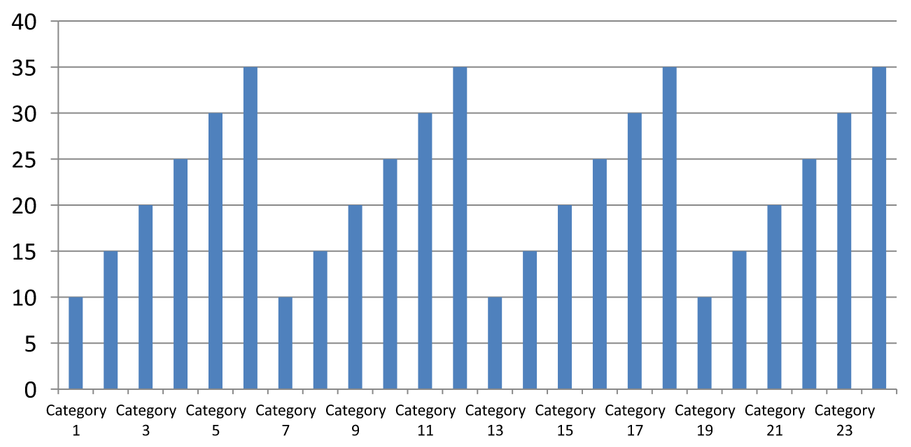
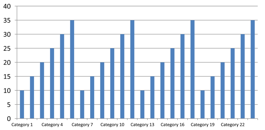
เมื่อแผนภูมิมีหลายประเภท ให้ลดจำนวนป้ายชื่อแกนที่มองเห็นได้โดยไม่ต้องลบประเภทหรือจุดข้อมูลเรียก setAutomaticTickLabelSpacing ด้วย False จากนั้นส่งช่วงเวลาประเภทที่ต้องการไปที่ setTickLabelSpacing สำหรับประเภทข้อความตามลำดับปกติ การนับเริ่มจากประเภทแรก:
| ช่วงเวลา | ป้ายชื่อที่แสดงในตัวอย่าง |
|---|---|
1 |
Category 1, Category 2, Category 3, … Category 24 |
2 |
Category 1, Category 3, Category 5, … Category 23 |
3 |
Category 1, Category 4, Category 7, … Category 22 |
ช่วงเวลา 3 จะแสดงป้ายชื่อทุก ๆ ที่สาม โดยมีสองป้ายซ่อนระหว่างป้ายที่แสดง ไม่ได้ลบคอลัมน์ที่สอดคล้องกัน การจัดระยะอัตโนมัติกำหนดช่วงเวลาตามพื้นที่ที่ใช้ได้; ไม่ได้บังคับให้แสดงทุกป้าย
เครื่องหมายหลักมีการควบคุมแยกกัน เรียก setAutomaticTickMarksSpacing ด้วย False และใช้ setTickMarksSpacing เพื่อตั้งช่วงเวลา ตัวอย่างเช่น 1 จะมีเครื่องหมายหลักที่ทุกช่วงประเภทในขณะที่ป้ายชื่อแสดงเพียงทุก ๆ ที่สาม ใช้ setMajorTickMark พร้อมสไตล์ที่มองเห็นได้เพื่อดูผล การตั้งค่าอัตโนมัติใด ๆ อีกครั้งด้วย True จะให้แผนภูมิเพื่อเลือกช่วงเวลานั้นอีกครั้ง
ตัวอย่างที่เป็นอิสระต่อเนื่องนี้สร้าง 24 ประเภทและหนึ่งซีรีส์แล้วบันทึกสามสไลด์ใน CategoryAxisIntervals.pptx: การจัดระยะอัตโนมัติ, การจัดระยะด้วยตนเองพร้อมเครื่องหมายหลักอิสระ, และการคืนค่าการจัดระยะอัตโนมัติ ทั้งสองสำเนายังคงข้อมูลแผนภูมิดั้งเดิม ไม่จำเป็นต้องมีพรีเซนเทชันต้นทาง ข้อความป้ายระดับแนวนอนทำให้เห็นความหนาแน่นได้ง่าย
import jpype
import asposeslides

if not jpype.isJVMStarted():
    jpype.startJVM()

from asposeslides.api import Presentation, ChartType, SaveFormat, CategoryAxisType, TickMarkType

presentation = Presentation()
try:
    slide = presentation.getSlides().get_Item(0)

    chart = slide.getShapes().addChart(ChartType.ClusteredColumn, 30, 40, 660, 320)

    chart.setLegend(False)
    chart.getChartData().getCategories().clear()
    chart.getChartData().getSeries().clear()

    workbook = chart.getChartData().getChartDataWorkbook()
    workbook.clear(0)

    series = chart.getChartData().getSeries().add(ChartType.ClusteredColumn)
    for i in range(24):
        category_cell = workbook.getCell(0, i + 1, 0, f"Category {i + 1}")
        chart.getChartData().getCategories().add(category_cell)
        value_cell = workbook.getCell(0, i + 1, 1, float(10 + i % 6 * 5))
        series.getDataPoints().addDataPointForBarSeries(value_cell)

    axis = chart.getAxes().getHorizontalAxis()
    axis.setCategoryAxisType(CategoryAxisType.Text)
    axis.getTextFormat().getTextBlockFormat().setRotationAngle(0)
    axis.getTextFormat().getPortionFormat().setFontHeight(12)
    axis.setMajorTickMark(TickMarkType.Outside)
    axis.setAutomaticTickLabelSpacing(True)
    axis.setAutomaticTickMarksSpacing(True)

    # สไลด์ 2: แสดงป้ายชื่อทุกที่สาม แต่ยังคงมีเครื่องหมายหลักสำหรับทุกประเภท.
    manual_slide = presentation.getSlides().addClone(slide)
    manual_chart = manual_slide.getShapes().get_Item(0)
    manual_axis = manual_chart.getAxes().getHorizontalAxis()
    manual_axis.setAutomaticTickLabelSpacing(False)
    manual_axis.setTickLabelSpacing(3)
    manual_axis.setAutomaticTickMarksSpacing(False)
    manual_axis.setTickMarksSpacing(1)

    # สไลด์ 3: ให้แผนภูมิเลือกช่วงเวลาทั้งสองใหม่อีกครั้ง.
    restored_slide = presentation.getSlides().addClone(manual_slide)
    restored_chart = restored_slide.getShapes().get_Item(0)
    restored_chart.getAxes().getHorizontalAxis().setAutomaticTickLabelSpacing(True)
    restored_chart.getAxes().getHorizontalAxis().setAutomaticTickMarksSpacing(True)

    presentation.save("CategoryAxisIntervals.pptx", SaveFormat.Pptx)
finally:
    presentation.dispose()
การจัดระยะอัตโนมัติ (สไลด์ 1): ในการแสดงผลนี้ ป้ายชื่อประเภทที่สองจะแสดงและตัดบรรทัดเป็นสองบรรทัด ผลลัพธ์อัตโนมัติอาจแตกต่างตามขนาดแผนภูมิ ฟอนต์ และเรนเดอร์
การจัดระยะด้วยตนเอง (สไลด์ 2): ป้ายชื่อที่สามจะแสดงบนบรรทัดเดียวในขณะที่เครื่องหมายหลักยังคงอยู่ที่ทุกช่วงประเภท คอลัมน์ทั้งหมด 24 คอลัมน์รวมถึงที่ไม่มีป้ายชื่อยังคงมองเห็นได้ด้วยค่าเดียวกัน สไลด์ 3 คืนค่าการแสดงผลอัตโนมัติที่แสดงด้านบน
เลือกแกนและช่วงเวลาที่ถูกต้อง
ใช้ช่วงเวลานับประเภทนี้สำหรับแกนประเภทข้อความ เช่น แกนประเภทของแผนภูมิคอลัมน์, เส้น, พื้นที่ หรือแท่ง ในแผนภูมิคอลัมน์จะเป็นแกนแนวนอน ในแผนภูมิแท่งแนวนอนแกนประเภทจะเป็นแนวตั้ง ดังนั้นให้ใช้การตั้งค่าเหล่านี้กับแกนที่ส่งกลับโดย getVerticalAxis การจัดระยะเครื่องหมายหลักยังใช้ได้กับแกนซีรีส์ในแผนภูมิที่มี
อย่าใช้การจัดระยะป้ายชื่อประเภทเพื่อกำหนดสเกลเชิงตัวเลขของแกนค่า บนแกนค่า setMajorUnit ระบุความแตกต่างในค่าตัวอย่างเช่น หน่วยหลัก 10 จะสร้างเครื่องหมายที่ 0, 10, 20 เป็นต้นเมื่อแกนเริ่มจากศูนย์ ช่วงเวลาป้ายชื่อประเภท 3 นับตำแหน่งประเภทโดยไม่คำนึงถึงค่าข้อมูล แผนภูมิกระจายและฟองอากาศใช้แกนค่าแทนแกนประเภทข้อความ สำหรับแกนวันที่ ให้ใช้หน่วยหลักและสเกลตามเวลาตามที่อธิบายใน เปลี่ยนแกนประเภท
ตั้งรูปแบบวันที่สำหรับค่าของแกนประเภท
ตัวอย่างแทนค่าข้อมูลเริ่มต้นของแผนภูมิโดยใช้ค่าปีละสี่ค่า วันที่ถูกเก็บเป็นเลขอนุกรม OLE Automation ในแผ่นงานแรก (ดัชนี 0) คำนวณเป็นจำนวนวันตั้งแต่ 30 ธันวาคม 1899 สำหรับวันที่เหล่านี้ ใช้ setCategoryAxisType กับ CategoryAxisType.Date เรียก setNumberFormatLinkedToSource ด้วย False และส่ง yyyy ไปที่ setNumberFormat เพื่อให้ป้ายชื่อประเภทแสดงปีสี่หลักโดยอิสระจากการจัดรูปแบบเซลล์
from datetime import date

import jpype
import asposeslides

if not jpype.isJVMStarted():
    jpype.startJVM()

from asposeslides.api import Presentation, ChartType, SaveFormat, CategoryAxisType

presentation = Presentation()
try:
    slide = presentation.getSlides().get_Item(0)

    chart = slide.getShapes().addChart(ChartType.Line, 50, 50, 450, 300)

    chart.getChartData().getCategories().clear()
    chart.getChartData().getSeries().clear()

    workbook = chart.getChartData().getChartDataWorkbook()
    workbook.clear(0)

    base_date = date(1899, 12, 30)

    series = chart.getChartData().getSeries().add(ChartType.Line)
    for i in range(4):
        category_date = date(2015 + i, 1, 1)
        category_value = float((category_date - base_date).days)
        category_cell = workbook.getCell(0, i + 1, 0, category_value)
        chart.getChartData().getCategories().add(category_cell)

        value_cell = workbook.getCell(0, i + 1, 1, float(i + 1))
        series.getDataPoints().addDataPointForLineSeries(value_cell)

    chart.getAxes().getHorizontalAxis().setCategoryAxisType(CategoryAxisType.Date)
    chart.getAxes().getHorizontalAxis().setNumberFormatLinkedToSource(False)
    chart.getAxes().getHorizontalAxis().setNumberFormat("yyyy")

    presentation.save("DateAxisFormat.pptx", SaveFormat.Pptx)
finally:
    presentation.dispose()
ตั้งมุมการหมุนสำหรับหัวเรื่องแกนแผนภูมิ
เรียก setTitle ด้วย True บนแกนแนวตั้ง ให้ข้อความหัวเรื่องและตั้งมุมการหมุนในรูปแบบบล็อกข้อความของหัวเรื่อง มุมวัดเป็นองศา; ตัวอย่างนี้บันทึกแผนภูมิคอลัมน์โดยหัวเรื่องแกนค่าถูกหมุน 90 องศา
import jpype
import asposeslides

if not jpype.isJVMStarted():
    jpype.startJVM()

from asposeslides.api import Presentation, ChartType, SaveFormat

presentation = Presentation()
try:
    slide = presentation.getSlides().get_Item(0)

    chart = slide.getShapes().addChart(ChartType.ClusteredColumn, 50, 50, 450, 300)
    chart.getAxes().getVerticalAxis().setTitle(True)
    chart.getAxes().getVerticalAxis().getTitle().addTextFrameForOverriding("Value")
    chart.getAxes().getVerticalAxis().getTitle().getTextFormat().getTextBlockFormat().setRotationAngle(90)

    presentation.save("RotatedAxisTitle.pptx", SaveFormat.Pptx)
finally:
    presentation.dispose()
ตั้งตำแหน่งแกนบนแกนประเภทหรือค่า
ใช้ setAxisBetweenCategories เพื่อควบคุมว่าแกนค่าตัดแกนประเภทระหว่างประเภทหรือที่เครื่องหมายหลักของประเภท การตั้งค่านี้ใช้กับแกนประเภท ตัวอย่างตั้งค่าเป็น True บนแกนประเภทแนวนอนของแผนภูมิคอลัมน์และบันทึกผลลัพธ์
import jpype
import asposeslides

if not jpype.isJVMStarted():
    jpype.startJVM()

from asposeslides.api import Presentation, ChartType, SaveFormat

presentation = Presentation()
try:
    slide = presentation.getSlides().get_Item(0)

    chart = slide.getShapes().addChart(ChartType.ClusteredColumn, 50, 50, 450, 300)
    chart.getAxes().getHorizontalAxis().setAxisBetweenCategories(True)

    presentation.save("AxisBetweenCategories.pptx", SaveFormat.Pptx)
finally:
    presentation.dispose()
ตั้งหน่วยการแสดงผลบนแกนค่าของแผนภูมิ
ใช้ setDisplayUnit เพื่อปรับสเกลป้ายบนแกนค่าโดยไม่เปลี่ยนข้อมูลพื้นฐาน ด้วย DisplayUnitType ตั้งค่าเป็น Millions ค่า 60,000,000 จะปรากฏเป็น 60 ตัวอย่างสร้างแผนภูมิคอลัมน์และใช้หน่วยการแสดงผลเป็นล้านบนแกนแนวดิ่ง
import jpype
import asposeslides

if not jpype.isJVMStarted():
    jpype.startJVM()

from asposeslides.api import Presentation, ChartType, SaveFormat, DisplayUnitType

presentation = Presentation()
try:
    slide = presentation.getSlides().get_Item(0)

    chart = slide.getShapes().addChart(ChartType.ClusteredColumn, 50, 50, 450, 300)
    chart.getAxes().getVerticalAxis().setDisplayUnit(DisplayUnitType.Millions)

    presentation.save("Result.pptx", SaveFormat.Pptx)
finally:
    presentation.dispose()
คำถามที่พบบ่อย
ฉันจะตั้งค่าตำแหน่งที่แกนหนึ่งตัดแกนอีก (การตัดแกน) อย่างไร?
ใช้ setCrossType เพื่อเลือกพฤติกรรมการตัด แนะนำค่าเชิงตัวเลขของการตัดโดยใช้ setCrossAt การตั้งค่าเหล่านี้ช่วยให้คุณย้ายจุดตัดแกนไปยังเส้นฐานที่เหมาะสม
ฉันจะกำหนดตำแหน่งป้ายเครื่องหมายหลักสัมพันธ์กับแกนได้อย่างไร?
เรียก setTickLabelPosition ด้วย TickLabelPositionType: Low, High, NextTo, หรือ None เพื่อควบคุมตำแหน่งป้ายเครื่องหมายหลัก หากต้องการควบคุมเครื่องหมายหลักเอง ใช้ setMajorTickMark หรือ setMinorTickMark ซึ่งแยกจากการกำหนดตำแหน่งป้าย**