
Python을 사용하여 프레젠테이션에서 차트 축을 사용자 지정
개요
이 문서에서는 Aspose.Slides for Python via Java를 사용하여 차트 축을 사용자 지정하는 방법을 설명합니다. 여기에는 계산된 축 값, 차트 행 및 열 전환, 축 표시 여부, 범주 레이블 및 눈금 간격, 날짜 범주 및 형식, 제목 회전, 축 위치 지정 및 표시 단위가 포함됩니다.
차트의 수직 축에서 최대값 가져오기
Create a Presentation and add an area chart with default data. Call validateChartLayout before reading calculated axis values so that the chart layout is up to date.
Read getActualMaxValue and getActualMinValue for the axis limits, and getActualMajorUnit and getActualMinorUnit for the tick intervals. getActualMajorUnitScale and getActualMinorUnitScale provide time-unit scales, which are relevant to date axes. The example stores these values in local variables and saves the chart.
import jpype
import asposeslides

if not jpype.isJVMStarted():
    jpype.startJVM()

from asposeslides.api import Presentation, ChartType, SaveFormat

presentation = Presentation()
try:
    slide = presentation.getSlides().get_Item(0)

    chart = slide.getShapes().addChart(ChartType.Area, 100, 100, 500, 350)
    chart.validateChartLayout()

    max_value = chart.getAxes().getVerticalAxis().getActualMaxValue()
    min_value = chart.getAxes().getVerticalAxis().getActualMinValue()

    major_unit = chart.getAxes().getVerticalAxis().getActualMajorUnit()
    minor_unit = chart.getAxes().getVerticalAxis().getActualMinorUnit()

    major_unit_scale = chart.getAxes().getVerticalAxis().getActualMajorUnitScale()
    minor_unit_scale = chart.getAxes().getVerticalAxis().getActualMinorUnitScale()

    presentation.save("AxisValues_out.pptx", SaveFormat.Pptx)
finally:
    presentation.dispose()
축 사이의 데이터 교환
Use switchRowColumn to exchange the roles of series and categories in chart data. Each former category becomes a series, and each former series becomes a category. This changes how the data is grouped; it does not exchange the horizontal and vertical axes. The example uses setRange to bind the default data to Sheet1!A1:D5, including the header row and category column, before switching rows and columns. It saves a chart with four series and three categories.
import jpype
import asposeslides

if not jpype.isJVMStarted():
    jpype.startJVM()

from asposeslides.api import Presentation, ChartType, SaveFormat

presentation = Presentation()
try:
    slide = presentation.getSlides().get_Item(0)

    chart = slide.getShapes().addChart(ChartType.ClusteredColumn, 100, 100, 400, 300)
    chart.getChartData().setRange("Sheet1!A1:D5")
    chart.getChartData().switchRowColumn()

    presentation.save("SwitchChartRowColumns_out.pptx", SaveFormat.Pptx)
finally:
    presentation.dispose()
라인 차트의 수직 축 비활성화
Call setVisible with False on the vertical axis to hide it. The example creates a line chart with default data and saves it with the vertical axis hidden.
import jpype
import asposeslides

if not jpype.isJVMStarted():
    jpype.startJVM()

from asposeslides.api import Presentation, ChartType, SaveFormat

presentation = Presentation()
try:
    slide = presentation.getSlides().get_Item(0)

    chart = slide.getShapes().addChart(ChartType.Line, 100, 100, 400, 300)
    chart.getAxes().getVerticalAxis().setVisible(False)

    presentation.save("HiddenVerticalAxis.pptx", SaveFormat.Pptx)
finally:
    presentation.dispose()
라인 차트의 수평 축 비활성화
Call setVisible with False on the horizontal axis to hide it. The example creates a line chart with default data and saves it with the horizontal axis hidden.
import jpype
import asposeslides

if not jpype.isJVMStarted():
    jpype.startJVM()

from asposeslides.api import Presentation, ChartType, SaveFormat

presentation = Presentation()
try:
    slide = presentation.getSlides().get_Item(0)

    chart = slide.getShapes().addChart(ChartType.Line, 100, 100, 400, 300)
    chart.getAxes().getHorizontalAxis().setVisible(False)

    presentation.save("HiddenHorizontalAxis.pptx", SaveFormat.Pptx)
finally:
    presentation.dispose()
범주 축 변경
Use setCategoryAxisType to choose a date or text category axis. This example requires ExistingChart.pptx, with a chart as the first shape on the first slide and category cells containing numeric Excel date values. It changes the horizontal axis to a date axis. Calling setAutomaticMajorUnit with False, setMajorUnit with 1, and setMajorUnitScale with TimeUnitType.Months places major ticks at one-month intervals.
import jpype
import asposeslides

if not jpype.isJVMStarted():
    jpype.startJVM()

from asposeslides.api import Presentation, SaveFormat, CategoryAxisType, TimeUnitType

presentation = Presentation("ExistingChart.pptx")
try:
    slide = presentation.getSlides().get_Item(0)

    chart = slide.getShapes().get_Item(0)
    chart.getAxes().getHorizontalAxis().setCategoryAxisType(CategoryAxisType.Date)
    chart.getAxes().getHorizontalAxis().setAutomaticMajorUnit(False)
    chart.getAxes().getHorizontalAxis().setMajorUnit(1)
    chart.getAxes().getHorizontalAxis().setMajorUnitScale(TimeUnitType.Months)

    presentation.save("ChangeChartCategoryAxis_out.pptx", SaveFormat.Pptx)
finally:
    presentation.dispose()
범주 축 레이블 간격 제어
When a chart has many categories, reduce the number of visible axis labels without removing categories or data points. Call setAutomaticTickLabelSpacing with False, then pass the desired category interval to setTickLabelSpacing. For text categories in their normal order, counting starts at the first category:
| 간격 | 예제에 표시된 레이블 |
|---|---|
1 |
Category 1, Category 2, Category 3, … Category 24 |
2 |
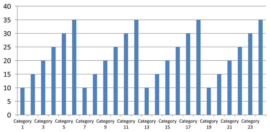
Category 1, Category 3, Category 5, … Category 23 |
3 |
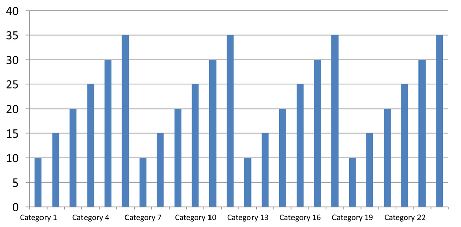
Category 1, Category 4, Category 7, … Category 22 |
An interval of 3 displays every third label, leaving two labels hidden between displayed labels. It does not remove the corresponding columns. Automatic spacing chooses an interval based on the available space; it does not necessarily display every label.
Tick marks have separate controls. Call setAutomaticTickMarksSpacing with False and use setTickMarksSpacing to set their interval. For example, 1 keeps a tick mark at every category interval while labels appear only every third category. Use setMajorTickMark with a visible style so you can see the result. Calling either automatic-spacing setter with True again lets the chart choose that interval again.
The following self-contained example creates 24 categories and one series, then saves three slides in CategoryAxisIntervals.pptx: automatic spacing, manual label spacing with independent tick marks, and restored automatic spacing. The two copies retain the original chart data. No input presentation is required. Horizontal label text makes the difference in density easy to see.
import jpype
import asposeslides

if not jpype.isJVMStarted():
    jpype.startJVM()

from asposeslides.api import Presentation, ChartType, SaveFormat, CategoryAxisType, TickMarkType

presentation = Presentation()
try:
    slide = presentation.getSlides().get_Item(0)

    chart = slide.getShapes().addChart(ChartType.ClusteredColumn, 30, 40, 660, 320)

    chart.setLegend(False)
    chart.getChartData().getCategories().clear()
    chart.getChartData().getSeries().clear()

    workbook = chart.getChartData().getChartDataWorkbook()
    workbook.clear(0)

    series = chart.getChartData().getSeries().add(ChartType.ClusteredColumn)
    for i in range(24):
        category_cell = workbook.getCell(0, i + 1, 0, f"Category {i + 1}")
        chart.getChartData().getCategories().add(category_cell)
        value_cell = workbook.getCell(0, i + 1, 1, float(10 + i % 6 * 5))
        series.getDataPoints().addDataPointForBarSeries(value_cell)

    axis = chart.getAxes().getHorizontalAxis()
    axis.setCategoryAxisType(CategoryAxisType.Text)
    axis.getTextFormat().getTextBlockFormat().setRotationAngle(0)
    axis.getTextFormat().getPortionFormat().setFontHeight(12)
    axis.setMajorTickMark(TickMarkType.Outside)
    axis.setAutomaticTickLabelSpacing(True)
    axis.setAutomaticTickMarksSpacing(True)

    # 슬라이드 2: 세 번째 레이블마다 표시하고, 각 범주마다 눈금은 유지합니다.
    manual_slide = presentation.getSlides().addClone(slide)
    manual_chart = manual_slide.getShapes().get_Item(0)
    manual_axis = manual_chart.getAxes().getHorizontalAxis()
    manual_axis.setAutomaticTickLabelSpacing(False)
    manual_axis.setTickLabelSpacing(3)
    manual_axis.setAutomaticTickMarksSpacing(False)
    manual_axis.setTickMarksSpacing(1)

    # 슬라이드 3: 차트가 레이블 간격과 눈금 간격을 다시 자동으로 선택하도록 합니다.
    restored_slide = presentation.getSlides().addClone(manual_slide)
    restored_chart = restored_slide.getShapes().get_Item(0)
    restored_chart.getAxes().getHorizontalAxis().setAutomaticTickLabelSpacing(True)
    restored_chart.getAxes().getHorizontalAxis().setAutomaticTickMarksSpacing(True)

    presentation.save("CategoryAxisIntervals.pptx", SaveFormat.Pptx)
finally:
    presentation.dispose()
Automatic spacing (slide 1): In this rendering, every second category label is displayed and wraps onto two lines. The automatic result can vary with chart size, fonts, and the renderer.
Manual spacing (slide 2): Every third label is displayed on one line, while tick marks remain at every category interval. All 24 columns, including those without labels, remain visible with the same values. Slide 3 restores the automatic appearance shown above.
올바른 축 및 간격 선택
Use this category-count interval for a text category axis, such as the category axis of a column, line, area, or bar chart. In a column chart, it is the horizontal axis. In a horizontal bar chart, the category axis is vertical, so apply these settings to the axis returned by getVerticalAxis. Tick-mark spacing also applies to a series axis in charts that have one.
Do not use category label spacing to set the numeric scale of a value axis. On a value axis, setMajorUnit specifies a difference in values: for example, a major unit of 10 produces ticks at 0, 10, 20, and so on when the axis starts at zero. A category label interval of 3 instead counts category positions, regardless of their data values. Scatter and bubble charts use value axes rather than a text category axis. For a date axis, use time-based major units and scales as described in 범주 축 변경.
범주 축 값의 날짜 형식 설정
The example replaces the default chart data with four annual values. Dates are stored as OLE Automation serial numbers in the first worksheet (index 0), calculated as the number of days since December 30, 1899, for these dates. Use setCategoryAxisType with CategoryAxisType.Date, call setNumberFormatLinkedToSource with False, and pass yyyy to setNumberFormat so the category labels display four-digit years independently of the cell formatting.
from datetime import date

import jpype
import asposeslides

if not jpype.isJVMStarted():
    jpype.startJVM()

from asposeslides.api import Presentation, ChartType, SaveFormat, CategoryAxisType

presentation = Presentation()
try:
    slide = presentation.getSlides().get_Item(0)

    chart = slide.getShapes().addChart(ChartType.Line, 50, 50, 450, 300)

    chart.getChartData().getCategories().clear()
    chart.getChartData().getSeries().clear()

    workbook = chart.getChartData().getChartDataWorkbook()
    workbook.clear(0)

    base_date = date(1899, 12, 30)

    series = chart.getChartData().getSeries().add(ChartType.Line)
    for i in range(4):
        category_date = date(2015 + i, 1, 1)
        category_value = float((category_date - base_date).days)
        category_cell = workbook.getCell(0, i + 1, 0, category_value)
        chart.getChartData().getCategories().add(category_cell)

        value_cell = workbook.getCell(0, i + 1, 1, float(i + 1))
        series.getDataPoints().addDataPointForLineSeries(value_cell)

    chart.getAxes().getHorizontalAxis().setCategoryAxisType(CategoryAxisType.Date)
    chart.getAxes().getHorizontalAxis().setNumberFormatLinkedToSource(False)
    chart.getAxes().getHorizontalAxis().setNumberFormat("yyyy")

    presentation.save("DateAxisFormat.pptx", SaveFormat.Pptx)
finally:
    presentation.dispose()
차트 축 제목 회전 각도 설정
Call setTitle with True on the vertical axis, provide title text, and set the rotation angle in the title’s text block formatting. The angle is measured in degrees; this example saves a column chart with its value-axis title rotated by 90 degrees.
import jpype
import asposeslides

if not jpype.isJVMStarted():
    jpype.startJVM()

from asposeslides.api import Presentation, ChartType, SaveFormat

presentation = Presentation()
try:
    slide = presentation.getSlides().get_Item(0)

    chart = slide.getShapes().addChart(ChartType.ClusteredColumn, 50, 50, 450, 300)
    chart.getAxes().getVerticalAxis().setTitle(True)
    chart.getAxes().getVerticalAxis().getTitle().addTextFrameForOverriding("Value")
    chart.getAxes().getVerticalAxis().getTitle().getTextFormat().getTextBlockFormat().setRotationAngle(90)

    presentation.save("RotatedAxisTitle.pptx", SaveFormat.Pptx)
finally:
    presentation.dispose()
범주 축 또는 값 축에 대한 축 위치 설정
Use setAxisBetweenCategories to control whether the value axis crosses the category axis between categories or at category tick marks. This setting applies to category axes. The example sets it to True on the horizontal category axis of a column chart and saves the result.
import jpype
import asposeslides

if not jpype.isJVMStarted():
    jpype.startJVM()

from asposeslides.api import Presentation, ChartType, SaveFormat

presentation = Presentation()
try:
    slide = presentation.getSlides().get_Item(0)

    chart = slide.getShapes().addChart(ChartType.ClusteredColumn, 50, 50, 450, 300)
    chart.getAxes().getHorizontalAxis().setAxisBetweenCategories(True)

    presentation.save("AxisBetweenCategories.pptx", SaveFormat.Pptx)
finally:
    presentation.dispose()
차트 값 축에 표시 단위 설정
Use setDisplayUnit to scale the labels on a value axis without changing the underlying data. With DisplayUnitType set to Millions, a value of 60,000,000 is displayed as 60. The example creates a column chart and applies the millions display unit to its vertical axis.
import jpype
import asposeslides

if not jpype.isJVMStarted():
    jpype.startJVM()

from asposeslides.api import Presentation, ChartType, SaveFormat, DisplayUnitType

presentation = Presentation()
try:
    slide = presentation.getSlides().get_Item(0)

    chart = slide.getShapes().addChart(ChartType.ClusteredColumn, 50, 50, 450, 300)
    chart.getAxes().getVerticalAxis().setDisplayUnit(DisplayUnitType.Millions)

    presentation.save("Result.pptx", SaveFormat.Pptx)
finally:
    presentation.dispose()
자주 묻는 질문
한 축이 다른 축을 교차하는 위치(축 교차점)를 어떻게 설정합니까?
Use setCrossType to select the crossing behavior. To specify a numeric crossing value, use setCrossAt. These settings let you move the axis crossing to a suitable baseline.
눈금 레이블을 축에 상대적으로 어떻게 배치합니까?
Call setTickLabelPosition using TickLabelPositionType: Low, High, NextTo, or None. To control the tick marks themselves, use setMajorTickMark or setMinorTickMark; these are separate from label positioning.