
使用 Python 在簡報中自訂圖表座標軸
概覽
本文說明如何使用 Aspose.Slides for Python via Java 來自訂圖表座標軸。內容涵蓋計算的座標軸值、切換圖表行列、座標軸可見性、類別標籤與刻度間隔、日期類別與格式設定、標題旋轉、座標軸位置以及顯示單位。
取得圖表垂直座標軸的最大值
建立一個Presentation,並加入預設資料的區域圖。在讀取計算後的座標軸值之前,呼叫validateChartLayout以確保圖表版面配置為最新。
讀取getActualMaxValue與getActualMinValue以取得座標軸上限與下限,並讀取getActualMajorUnit與getActualMinorUnit以取得刻度間隔。getActualMajorUnitScale與getActualMinorUnitScale提供時間單位比例,與日期座標軸相關。範例將這些值存入本機變數,並儲存圖表。
import jpype
import asposeslides

if not jpype.isJVMStarted():
    jpype.startJVM()

from asposeslides.api import Presentation, ChartType, SaveFormat

presentation = Presentation()
try:
    slide = presentation.getSlides().get_Item(0)

    chart = slide.getShapes().addChart(ChartType.Area, 100, 100, 500, 350)
    chart.validateChartLayout()

    max_value = chart.getAxes().getVerticalAxis().getActualMaxValue()
    min_value = chart.getAxes().getVerticalAxis().getActualMinValue()

    major_unit = chart.getAxes().getVerticalAxis().getActualMajorUnit()
    minor_unit = chart.getAxes().getVerticalAxis().getActualMinorUnit()

    major_unit_scale = chart.getAxes().getVerticalAxis().getActualMajorUnitScale()
    minor_unit_scale = chart.getAxes().getVerticalAxis().getActualMinorUnitScale()

    presentation.save("AxisValues_out.pptx", SaveFormat.Pptx)
finally:
    presentation.dispose()
交換座標軸之間的資料
使用switchRowColumn交換圖表資料中系列與類別的角色。先前的每個類別會變成系列,先前的每個系列會變成類別。此操作會變更資料的分組方式;不會交換水平與垂直座標軸。範例在切換行列之前,使用setRange將預設資料繫結至 Sheet1!A1:D5(包含標題列與類別欄)。最後儲存含四個系列與三個類別的圖表。
import jpype
import asposeslides

if not jpype.isJVMStarted():
    jpype.startJVM()

from asposeslides.api import Presentation, ChartType, SaveFormat

presentation = Presentation()
try:
    slide = presentation.getSlides().get_Item(0)

    chart = slide.getShapes().addChart(ChartType.ClusteredColumn, 100, 100, 400, 300)
    chart.getChartData().setRange("Sheet1!A1:D5")
    chart.getChartData().switchRowColumn()

    presentation.save("SwitchChartRowColumns_out.pptx", SaveFormat.Pptx)
finally:
    presentation.dispose()
為折線圖停用垂直座標軸
在垂直座標軸上呼叫setVisible並傳入 False 以隱藏它。範例建立具有預設資料的折線圖,並以隱藏垂直座標軸的方式儲存。
import jpype
import asposeslides

if not jpype.isJVMStarted():
    jpype.startJVM()

from asposeslides.api import Presentation, ChartType, SaveFormat

presentation = Presentation()
try:
    slide = presentation.getSlides().get_Item(0)

    chart = slide.getShapes().addChart(ChartType.Line, 100, 100, 400, 300)
    chart.getAxes().getVerticalAxis().setVisible(False)

    presentation.save("HiddenVerticalAxis.pptx", SaveFormat.Pptx)
finally:
    presentation.dispose()
為折線圖停用水平座標軸
在水平座標軸上呼叫setVisible並傳入 False 以隱藏它。範例建立具有預設資料的折線圖,並以隱藏水平座標軸的方式儲存。
import jpype
import asposeslides

if not jpype.isJVMStarted():
    jpype.startJVM()

from asposeslides.api import Presentation, ChartType, SaveFormat

presentation = Presentation()
try:
    slide = presentation.getSlides().get_Item(0)

    chart = slide.getShapes().addChart(ChartType.Line, 100, 100, 400, 300)
    chart.getAxes().getHorizontalAxis().setVisible(False)

    presentation.save("HiddenHorizontalAxis.pptx", SaveFormat.Pptx)
finally:
    presentation.dispose()
變更類別座標軸
使用setCategoryAxisType選擇日期或文字類別座標軸。本範例需要 ExistingChart.pptx,其第一張投影片的第一個圖形為圖表,且類別儲存格包含數值型 Excel 日期。範例將水平座標軸改為日期座標軸。呼叫setAutomaticMajorUnit並傳入 False,接著以1 呼叫setMajorUnit,再以TimeUnitType.Months 呼叫setMajorUnitScale,即可將主要刻度設定為每月一次。
import jpype
import asposeslides

if not jpype.isJVMStarted():
    jpype.startJVM()

from asposeslides.api import Presentation, SaveFormat, CategoryAxisType, TimeUnitType

presentation = Presentation("ExistingChart.pptx")
try:
    slide = presentation.getSlides().get_Item(0)

    chart = slide.getShapes().get_Item(0)
    chart.getAxes().getHorizontalAxis().setCategoryAxisType(CategoryAxisType.Date)
    chart.getAxes().getHorizontalAxis().setAutomaticMajorUnit(False)
    chart.getAxes().getHorizontalAxis().setMajorUnit(1)
    chart.getAxes().getHorizontalAxis().setMajorUnitScale(TimeUnitType.Months)

    presentation.save("ChangeChartCategoryAxis_out.pptx", SaveFormat.Pptx)
finally:
    presentation.dispose()
控制類別座標軸標籤間隔
當圖表的類別過多時,可減少顯示的座標軸標籤數量,而不移除類別或資料點。先以 False 呼叫setAutomaticTickLabelSpacing,再將欲使用的類別間隔傳入setTickLabelSpacing。對於正常順序的文字類別,計數從第一個類別開始:
| 間隔 | 範例中顯示的標籤 |
|---|---|
1 |
類別 1, 類別 2, 類別 3, … 類別 24 |
2 |
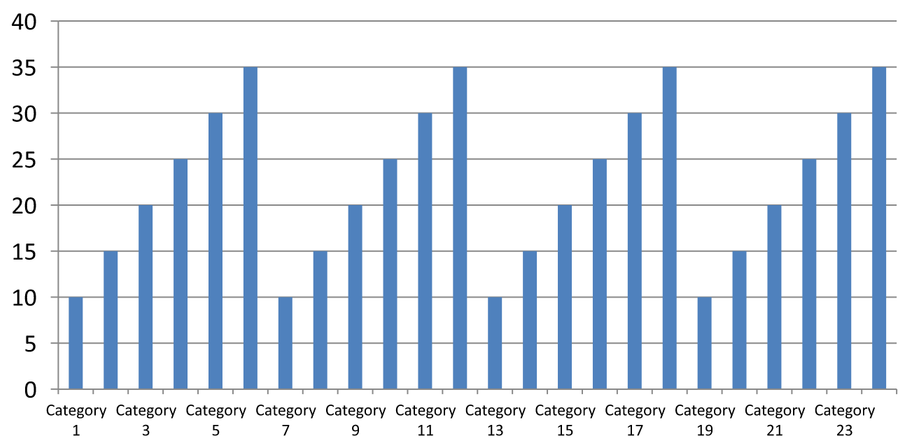
類別 1, 類別 3, 類別 5, … 類別 23 |
3 |
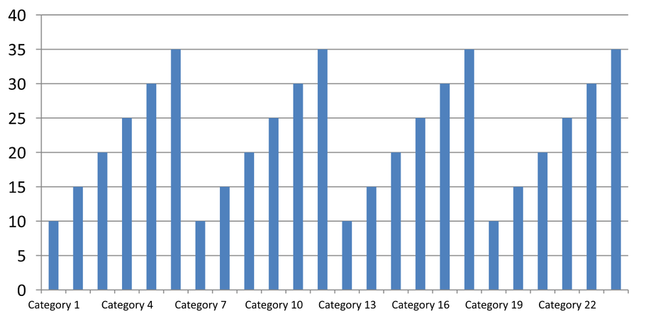
類別 1, 類別 4, 類別 7, … 類別 22 |
間隔為 3 時,會每三個標籤顯示一次,兩個標籤會被隱藏。這不會移除相對應的欄位。自動間隔會根據可用空間選擇間隔;不一定會顯示所有標籤。
刻度線有獨立的控制。以 False 呼叫setAutomaticTickMarksSpacing,再使用setTickMarksSpacing 設定其間隔。例如,1 會在每個類別間隔保留刻度線,而標籤僅每三個類別顯示一次。使用setMajorTickMark並設定為可見樣式,以便看到結果。再次以 True 呼叫任一自動間隔設定,圖表會重新自動選擇間隔。
以下的獨立範例會建立 24 個類別與一個系列,然後在 CategoryAxisIntervals.pptx 中儲存三張投影片:自動間隔、手動標籤間隔(搭配獨立刻度線)以及恢復自動間隔。兩個副本保留原始圖表資料。無需輸入投影片。水平標籤文字能讓密度差異一目了然。
import jpype
import asposeslides

if not jpype.isJVMStarted():
    jpype.startJVM()

from asposeslides.api import Presentation, ChartType, SaveFormat, CategoryAxisType, TickMarkType

presentation = Presentation()
try:
    slide = presentation.getSlides().get_Item(0)

    chart = slide.getShapes().addChart(ChartType.ClusteredColumn, 30, 40, 660, 320)

    chart.setLegend(False)
    chart.getChartData().getCategories().clear()
    chart.getChartData().getSeries().clear()

    workbook = chart.getChartData().getChartDataWorkbook()
    workbook.clear(0)

    series = chart.getChartData().getSeries().add(ChartType.ClusteredColumn)
    for i in range(24):
        category_cell = workbook.getCell(0, i + 1, 0, f"Category {i + 1}")
        chart.getChartData().getCategories().add(category_cell)
        value_cell = workbook.getCell(0, i + 1, 1, float(10 + i % 6 * 5))
        series.getDataPoints().addDataPointForBarSeries(value_cell)

    axis = chart.getAxes().getHorizontalAxis()
    axis.setCategoryAxisType(CategoryAxisType.Text)
    axis.getTextFormat().getTextBlockFormat().setRotationAngle(0)
    axis.getTextFormat().getPortionFormat().setFontHeight(12)
    axis.setMajorTickMark(TickMarkType.Outside)
    axis.setAutomaticTickLabelSpacing(True)
    axis.setAutomaticTickMarksSpacing(True)

    # 第 2 張投影片:顯示每三個標籤,但保留每個類別的刻度線。
    manual_slide = presentation.getSlides().addClone(slide)
    manual_chart = manual_slide.getShapes().get_Item(0)
    manual_axis = manual_chart.getAxes().getHorizontalAxis()
    manual_axis.setAutomaticTickLabelSpacing(False)
    manual_axis.setTickLabelSpacing(3)
    manual_axis.setAutomaticTickMarksSpacing(False)
    manual_axis.setTickMarksSpacing(1)

    # 第 3 張投影片:讓圖表再次自行選擇兩個間隔。
    restored_slide = presentation.getSlides().addClone(manual_slide)
    restored_chart = restored_slide.getShapes().get_Item(0)
    restored_chart.getAxes().getHorizontalAxis().setAutomaticTickLabelSpacing(True)
    restored_chart.getAxes().getHorizontalAxis().setAutomaticTickMarksSpacing(True)

    presentation.save("CategoryAxisIntervals.pptx", SaveFormat.Pptx)
finally:
    presentation.dispose()
自動間隔(投影片 1): 在此呈現中,每兩個類別標籤會顯示一次,且會換行成兩行。自動結果會因圖表大小、字型與渲染器而異。
手動間隔(投影片 2): 每三個標籤顯示於一行,同時刻度線仍保留在每個類別間隔。所有 24 欄(即使沒有標籤)仍以相同數值顯示。投影片 3 會恢復上述的自動外觀。
選擇正確的座標軸與間隔
針對文字類別座標軸(例如柱狀圖、折線圖、面積圖或條形圖的類別座標軸),請使用此類別計數間隔。在柱狀圖中,它是水平座標軸;在水平條形圖中,類別座標軸為垂直方向,因此請將此設定套用於getVerticalAxis回傳的座標軸。刻度間隔同樣適用於具有系列座標軸的圖表。
不要使用類別標籤間隔來設定值座標軸的數值刻度。在值座標軸上,setMajorUnit 指定數值差距:例如,主要單位為 10 時,若座標軸從 0 開始,則會在 0、10、20 等處產生刻度。而類別標籤間隔 3 則是計算類別位置,與其資料值無關。散佈圖與氣泡圖使用值座標軸,而非文字類別座標軸。對於日期座標軸,請使用基於時間的主要單位與比例,如Change a Category Axis中所述。
設定類別座標軸值的日期格式
此範例以四個年度值取代預設圖表資料。日期以 OLE Automation 序號儲存在第一個工作表(索引為 0)中,計算方式為自 1899 年 12 月 30 日起的天數。使用setCategoryAxisType搭配CategoryAxisType.Date,呼叫setNumberFormatLinkedToSource並傳入 False,再將 yyyy 傳給setNumberFormat,使類別標籤顯示四位數年份,且不受儲存格格式影響。
from datetime import date

import jpype
import asposeslides

if not jpype.isJVMStarted():
    jpype.startJVM()

from asposeslides.api import Presentation, ChartType, SaveFormat, CategoryAxisType

presentation = Presentation()
try:
    slide = presentation.getSlides().get_Item(0)

    chart = slide.getShapes().addChart(ChartType.Line, 50, 50, 450, 300)

    chart.getChartData().getCategories().clear()
    chart.getChartData().getSeries().clear()

    workbook = chart.getChartData().getChartDataWorkbook()
    workbook.clear(0)

    base_date = date(1899, 12, 30)

    series = chart.getChartData().getSeries().add(ChartType.Line)
    for i in range(4):
        category_date = date(2015 + i, 1, 1)
        category_value = float((category_date - base_date).days)
        category_cell = workbook.getCell(0, i + 1, 0, category_value)
        chart.getChartData().getCategories().add(category_cell)

        value_cell = workbook.getCell(0, i + 1, 1, float(i + 1))
        series.getDataPoints().addDataPointForLineSeries(value_cell)

    chart.getAxes().getHorizontalAxis().setCategoryAxisType(CategoryAxisType.Date)
    chart.getAxes().getHorizontalAxis().setNumberFormatLinkedToSource(False)
    chart.getAxes().getHorizontalAxis().setNumberFormat("yyyy")

    presentation.save("DateAxisFormat.pptx", SaveFormat.Pptx)
finally:
    presentation.dispose()
設定圖表座標軸標題的旋轉角度
在垂直座標軸上以 True 呼叫setTitle,提供標題文字,並在標題的文字方塊格式中設定旋轉角度。角度以度為單位;此範例將柱狀圖的值軸標題旋轉 90 度後儲存。
import jpype
import asposeslides

if not jpype.isJVMStarted():
    jpype.startJVM()

from asposeslides.api import Presentation, ChartType, SaveFormat

presentation = Presentation()
try:
    slide = presentation.getSlides().get_Item(0)

    chart = slide.getShapes().addChart(ChartType.ClusteredColumn, 50, 50, 450, 300)
    chart.getAxes().getVerticalAxis().setTitle(True)
    chart.getAxes().getVerticalAxis().getTitle().addTextFrameForOverriding("Value")
    chart.getAxes().getVerticalAxis().getTitle().getTextFormat().getTextBlockFormat().setRotationAngle(90)

    presentation.save("RotatedAxisTitle.pptx", SaveFormat.Pptx)
finally:
    presentation.dispose()
設定類別或值座標軸的位置
使用setAxisBetweenCategories以控制值座標軸是穿過類別座標軸於類別之間,還是於類別刻度處。此設定套用於類別座標軸。範例將其在柱狀圖的水平類別座標軸上設為 True,並儲存結果。
import jpype
import asposeslides

if not jpype.isJVMStarted():
    jpype.startJVM()

from asposeslides.api import Presentation, ChartType, SaveFormat

presentation = Presentation()
try:
    slide = presentation.getSlides().get_Item(0)

    chart = slide.getShapes().addChart(ChartType.ClusteredColumn, 50, 50, 450, 300)
    chart.getAxes().getHorizontalAxis().setAxisBetweenCategories(True)

    presentation.save("AxisBetweenCategories.pptx", SaveFormat.Pptx)
finally:
    presentation.dispose()
設定圖表值座標軸的顯示單位
使用setDisplayUnit可在不更改底層資料的情況下,縮放值座標軸的標籤。將DisplayUnitType 設為 Millions 後,60,000,000 會顯示為 60。範例建立柱狀圖,並將百萬顯示單位套用於其垂直座標軸。
import jpype
import asposeslides

if not jpype.isJVMStarted():
    jpype.startJVM()

from asposeslides.api import Presentation, ChartType, SaveFormat, DisplayUnitType

presentation = Presentation()
try:
    slide = presentation.getSlides().get_Item(0)

    chart = slide.getShapes().addChart(ChartType.ClusteredColumn, 50, 50, 450, 300)
    chart.getAxes().getVerticalAxis().setDisplayUnit(DisplayUnitType.Millions)

    presentation.save("Result.pptx", SaveFormat.Pptx)
finally:
    presentation.dispose()
常見問題
如何設定座標軸交叉的數值(軸交叉)?
使用setCrossType以選擇交叉行為。若要指定數值型交叉點,請使用setCrossAt。這些設定可讓您將座標軸交叉點移至適當的基線。
如何相對於座標軸定位刻度標籤?
呼叫setTickLabelPosition,使用TickLabelPositionType: Low、High、NextTo 或 None。若要控制刻度線本身,請使用setMajorTickMark 或 setMinorTickMark;這與標籤位置是分開的設定。