
Personalizza gli assi del grafico nelle presentazioni usando Python
Panoramica
Questo articolo spiega come personalizzare gli assi del grafico con Aspose.Slides per Python via Java. Copre valori degli assi calcolati, lo scambio di righe e colonne del grafico, la visibilità degli assi, gli intervalli delle etichette di categoria e dei segni di divisione, le categorie di data e la formattazione, la rotazione del titolo, il posizionamento degli assi e le unità di visualizzazione.
Ottieni i valori massimi sull’asse verticale di un grafico
Crea una Presentation e aggiungi un grafico a area con dati predefiniti. Chiama validateChartLayout prima di leggere i valori degli assi calcolati in modo che il layout del grafico sia aggiornato.
Leggi getActualMaxValue e getActualMinValue per i limiti dell’asse, e getActualMajorUnit e getActualMinorUnit per gli intervalli dei segni di divisione. getActualMajorUnitScale e getActualMinorUnitScale forniscono scale di unità temporali, rilevanti per gli assi di data. L’esempio memorizza questi valori in variabili locali e salva il grafico.
import jpype
import asposeslides

if not jpype.isJVMStarted():
    jpype.startJVM()

from asposeslides.api import Presentation, ChartType, SaveFormat

presentation = Presentation()
try:
    slide = presentation.getSlides().get_Item(0)

    chart = slide.getShapes().addChart(ChartType.Area, 100, 100, 500, 350)
    chart.validateChartLayout()

    max_value = chart.getAxes().getVerticalAxis().getActualMaxValue()
    min_value = chart.getAxes().getVerticalAxis().getActualMinValue()

    major_unit = chart.getAxes().getVerticalAxis().getActualMajorUnit()
    minor_unit = chart.getAxes().getVerticalAxis().getActualMinorUnit()

    major_unit_scale = chart.getAxes().getVerticalAxis().getActualMajorUnitScale()
    minor_unit_scale = chart.getAxes().getVerticalAxis().getActualMinorUnitScale()

    presentation.save("AxisValues_out.pptx", SaveFormat.Pptx)
finally:
    presentation.dispose()
Scambia i dati tra gli assi
Usa switchRowColumn per scambiare i ruoli di serie e categorie nei dati del grafico. Ogni precedente categoria diventa una serie e ogni precedente serie diventa una categoria. Questo modifica il modo in cui i dati sono raggruppati; non scambia gli assi orizzontale e verticale. L’esempio utilizza setRange per associare i dati predefiniti a Sheet1!A1:D5, includendo la riga di intestazione e la colonna delle categorie, prima di scambiare righe e colonne. Salva un grafico con quattro serie e tre categorie.
import jpype
import asposeslides

if not jpype.isJVMStarted():
    jpype.startJVM()

from asposeslides.api import Presentation, ChartType, SaveFormat

presentation = Presentation()
try:
    slide = presentation.getSlides().get_Item(0)

    chart = slide.getShapes().addChart(ChartType.ClusteredColumn, 100, 100, 400, 300)
    chart.getChartData().setRange("Sheet1!A1:D5")
    chart.getChartData().switchRowColumn()

    presentation.save("SwitchChartRowColumns_out.pptx", SaveFormat.Pptx)
finally:
    presentation.dispose()
Disabilita l’asse verticale per i grafici a linee
Chiama setVisible con False sull’asse verticale per nasconderlo. L’esempio crea un grafico a linee con dati predefiniti e lo salva con l’asse verticale nascosto.
import jpype
import asposeslides

if not jpype.isJVMStarted():
    jpype.startJVM()

from asposeslides.api import Presentation, ChartType, SaveFormat

presentation = Presentation()
try:
    slide = presentation.getSlides().get_Item(0)

    chart = slide.getShapes().addChart(ChartType.Line, 100, 100, 400, 300)
    chart.getAxes().getVerticalAxis().setVisible(False)

    presentation.save("HiddenVerticalAxis.pptx", SaveFormat.Pptx)
finally:
    presentation.dispose()
Disabilita l’asse orizzontale per i grafici a linee
Chiama setVisible con False sull’asse orizzontale per nasconderlo. L’esempio crea un grafico a linee con dati predefiniti e lo salva con l’asse orizzontale nascosto.
import jpype
import asposeslides

if not jpype.isJVMStarted():
    jpype.startJVM()

from asposeslides.api import Presentation, ChartType, SaveFormat

presentation = Presentation()
try:
    slide = presentation.getSlides().get_Item(0)

    chart = slide.getShapes().addChart(ChartType.Line, 100, 100, 400, 300)
    chart.getAxes().getHorizontalAxis().setVisible(False)

    presentation.save("HiddenHorizontalAxis.pptx", SaveFormat.Pptx)
finally:
    presentation.dispose()
Modifica un asse di categoria
Usa setCategoryAxisType per scegliere un asse di categoria di tipo data o testo. Questo esempio richiede ExistingChart.pptx, con un grafico come prima forma nella prima diapositiva e celle di categoria contenenti valori di data numerici di Excel. Cambia l’asse orizzontale in un asse di data. Chiamando setAutomaticMajorUnit con False, setMajorUnit con 1 e setMajorUnitScale con TimeUnitType.Months, si posizionano i segni maggiori a intervalli di un mese.
import jpype
import asposeslides

if not jpype.isJVMStarted():
    jpype.startJVM()

from asposeslides.api import Presentation, SaveFormat, CategoryAxisType, TimeUnitType

presentation = Presentation("ExistingChart.pptx")
try:
    slide = presentation.getSlides().get_Item(0)

    chart = slide.getShapes().get_Item(0)
    chart.getAxes().getHorizontalAxis().setCategoryAxisType(CategoryAxisType.Date)
    chart.getAxes().getHorizontalAxis().setAutomaticMajorUnit(False)
    chart.getAxes().getHorizontalAxis().setMajorUnit(1)
    chart.getAxes().getHorizontalAxis().setMajorUnitScale(TimeUnitType.Months)

    presentation.save("ChangeChartCategoryAxis_out.pptx", SaveFormat.Pptx)
finally:
    presentation.dispose()
Controlla gli intervalli delle etichette dell’asse di categoria
Quando un grafico ha molte categorie, riduci il numero di etichette dell’asse visibili senza rimuovere categorie o punti dati. Chiama setAutomaticTickLabelSpacing con False, quindi passa l’intervallo di categoria desiderato a setTickLabelSpacing. Per le categorie di testo nel loro ordine normale, il conteggio inizia dalla prima categoria:
| Intervallo | Etichette visualizzate nell’esempio |
|---|---|
1 |
Category 1, Category 2, Category 3, … Category 24 |
2 |
Category 1, Category 3, Category 5, … Category 23 |
3 |
Category 1, Category 4, Category 7, … Category 22 |
Un intervallo di 3 visualizza ogni terza etichetta, lasciando nascoste due etichette tra quelle visualizzate. Non rimuove le colonne corrispondenti. La spaziatura automatica sceglie un intervallo in base allo spazio disponibile; non visualizza necessariamente ogni etichetta.
I segni di divisione hanno controlli separati. Chiama setAutomaticTickMarksSpacing con False e usa setTickMarksSpacing per impostare il loro intervallo. Ad esempio, 1 mantiene un segno di divisione ad ogni intervallo di categoria mentre le etichette appaiono solo ogni terza categoria. Usa setMajorTickMark con uno stile visibile così da vedere il risultato. Richiamare uno dei setter di spaziatura automatica con True nuovamente consente al grafico di scegliere nuovamente quell’intervallo.
Il seguente esempio autonomo crea 24 categorie e una serie, quindi salva tre diapositive in CategoryAxisIntervals.pptx: spaziatura automatica, spaziatura manuale delle etichette con segni di divisione indipendenti e ripristino della spaziatura automatica. Le due copie conservano i dati originali del grafico. Non è necessaria alcuna presentazione di input. Il testo delle etichette orizzontali rende la differenza di densità facilmente visibile.
import jpype
import asposeslides

if not jpype.isJVMStarted():
    jpype.startJVM()

from asposeslides.api import Presentation, ChartType, SaveFormat, CategoryAxisType, TickMarkType

presentation = Presentation()
try:
    slide = presentation.getSlides().get_Item(0)

    chart = slide.getShapes().addChart(ChartType.ClusteredColumn, 30, 40, 660, 320)

    chart.setLegend(False)
    chart.getChartData().getCategories().clear()
    chart.getChartData().getSeries().clear()

    workbook = chart.getChartData().getChartDataWorkbook()
    workbook.clear(0)

    series = chart.getChartData().getSeries().add(ChartType.ClusteredColumn)
    for i in range(24):
        category_cell = workbook.getCell(0, i + 1, 0, f"Category {i + 1}")
        chart.getChartData().getCategories().add(category_cell)
        value_cell = workbook.getCell(0, i + 1, 1, float(10 + i % 6 * 5))
        series.getDataPoints().addDataPointForBarSeries(value_cell)

    axis = chart.getAxes().getHorizontalAxis()
    axis.setCategoryAxisType(CategoryAxisType.Text)
    axis.getTextFormat().getTextBlockFormat().setRotationAngle(0)
    axis.getTextFormat().getPortionFormat().setFontHeight(12)
    axis.setMajorTickMark(TickMarkType.Outside)
    axis.setAutomaticTickLabelSpacing(True)
    axis.setAutomaticTickMarksSpacing(True)

    # Diapositiva 2: mostra ogni terza etichetta, ma mantieni un segno di divisione per ogni categoria.
    manual_slide = presentation.getSlides().addClone(slide)
    manual_chart = manual_slide.getShapes().get_Item(0)
    manual_axis = manual_chart.getAxes().getHorizontalAxis()
    manual_axis.setAutomaticTickLabelSpacing(False)
    manual_axis.setTickLabelSpacing(3)
    manual_axis.setAutomaticTickMarksSpacing(False)
    manual_axis.setTickMarksSpacing(1)

    # Diapositiva 3: consenti al grafico di scegliere nuovamente entrambi gli intervalli.
    restored_slide = presentation.getSlides().addClone(manual_slide)
    restored_chart = restored_slide.getShapes().get_Item(0)
    restored_chart.getAxes().getHorizontalAxis().setAutomaticTickLabelSpacing(True)
    restored_chart.getAxes().getHorizontalAxis().setAutomaticTickMarksSpacing(True)

    presentation.save("CategoryAxisIntervals.pptx", SaveFormat.Pptx)
finally:
    presentation.dispose()
Spaziatura automatica (diapositiva 1): In questa visualizzazione, ogni seconda etichetta di categoria è visualizzata e si avvolge su due righe. Il risultato automatico può variare con la dimensione del grafico, i caratteri e il renderer.
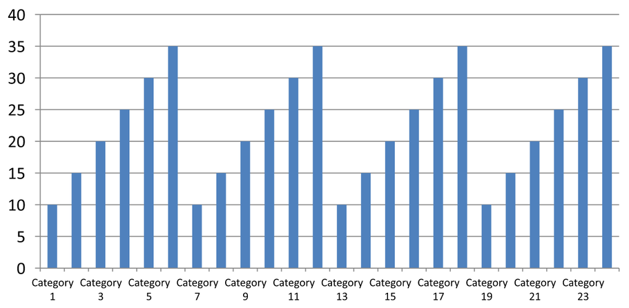
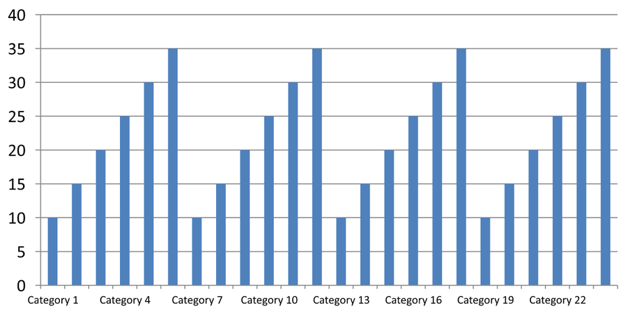
Spaziatura manuale (diapositiva 2): Ogni terza etichetta è visualizzata su una riga, mentre i segni di divisione rimangono ad ogni intervallo di categoria. Tutte le 24 colonne, incluse quelle senza etichette, rimangono visibili con gli stessi valori. La diapositiva 3 ripristina l’aspetto automatico mostrato sopra.
Scegli l’asse e l’intervallo corretti
Usa questo intervallo di conteggio delle categorie per un asse di categoria di tipo testo, come l’asse di categoria di un grafico a colonne, linee, area o barre. In un grafico a colonne, è l’asse orizzontale. In un grafico a barre orizzontali, l’asse di categoria è verticale, quindi applica queste impostazioni all’asse restituito da getVerticalAxis. La spaziatura dei segni di divisione si applica anche a un asse di serie nei grafici che ne hanno uno.
Non usare la spaziatura delle etichette di categoria per impostare la scala numerica di un asse di valore. Su un asse di valore, setMajorUnit specifica una differenza di valori: ad esempio, un’unità maggiore di 10 produce segni a 0, 10, 20, ecc. quando l’asse inizia da zero. Un intervallo di etichette di categoria di 3 invece conta le posizioni delle categorie, indipendentemente dai loro valori dati. I grafici a dispersione e a bolle usano assi di valore anziché un asse di categoria di testo. Per un asse di data, usa unità maggiori e scale basate sul tempo come descritto in Change a Category Axis.
Imposta il formato data per i valori dell’asse di categoria
L’esempio sostituisce i dati predefiniti del grafico con quattro valori annuali. Le date sono memorizzate come numeri seriali OLE Automation nel primo foglio di lavoro (indice 0), calcolati come il numero di giorni dal 30 dicembre 1899 per queste date. Usa setCategoryAxisType con CategoryAxisType.Date, chiama setNumberFormatLinkedToSource con False e passa yyyy a setNumberFormat in modo che le etichette di categoria mostrino gli anni a quattro cifre indipendentemente dalla formattazione della cella.
from datetime import date

import jpype
import asposeslides

if not jpype.isJVMStarted():
    jpype.startJVM()

from asposeslides.api import Presentation, ChartType, SaveFormat, CategoryAxisType

presentation = Presentation()
try:
    slide = presentation.getSlides().get_Item(0)

    chart = slide.getShapes().addChart(ChartType.Line, 50, 50, 450, 300)

    chart.getChartData().getCategories().clear()
    chart.getChartData().getSeries().clear()

    workbook = chart.getChartData().getChartDataWorkbook()
    workbook.clear(0)

    base_date = date(1899, 12, 30)

    series = chart.getChartData().getSeries().add(ChartType.Line)
    for i in range(4):
        category_date = date(2015 + i, 1, 1)
        category_value = float((category_date - base_date).days)
        category_cell = workbook.getCell(0, i + 1, 0, category_value)
        chart.getChartData().getCategories().add(category_cell)

        value_cell = workbook.getCell(0, i + 1, 1, float(i + 1))
        series.getDataPoints().addDataPointForLineSeries(value_cell)

    chart.getAxes().getHorizontalAxis().setCategoryAxisType(CategoryAxisType.Date)
    chart.getAxes().getHorizontalAxis().setNumberFormatLinkedToSource(False)
    chart.getAxes().getHorizontalAxis().setNumberFormat("yyyy")

    presentation.save("DateAxisFormat.pptx", SaveFormat.Pptx)
finally:
    presentation.dispose()
Imposta un angolo di rotazione per il titolo dell’asse del grafico
Chiama setTitle con True sull’asse verticale, fornisci il testo del titolo e imposta l’angolo di rotazione nella formattazione del blocco di testo del titolo. L’angolo è misurato in gradi; questo esempio salva un grafico a colonne con il titolo dell’asse dei valori ruotato di 90 gradi.
import jpype
import asposeslides

if not jpype.isJVMStarted():
    jpype.startJVM()

from asposeslides.api import Presentation, ChartType, SaveFormat

presentation = Presentation()
try:
    slide = presentation.getSlides().get_Item(0)

    chart = slide.getShapes().addChart(ChartType.ClusteredColumn, 50, 50, 450, 300)
    chart.getAxes().getVerticalAxis().setTitle(True)
    chart.getAxes().getVerticalAxis().getTitle().addTextFrameForOverriding("Value")
    chart.getAxes().getVerticalAxis().getTitle().getTextFormat().getTextBlockFormat().setRotationAngle(90)

    presentation.save("RotatedAxisTitle.pptx", SaveFormat.Pptx)
finally:
    presentation.dispose()
Imposta la posizione dell’asse su un asse di categoria o di valore
Usa setAxisBetweenCategories per controllare se l’asse dei valori attraversa l’asse di categoria tra le categorie o sui segni di divisione della categoria. Questa impostazione si applica agli assi di categoria. L’esempio lo imposta su True sull’asse di categoria orizzontale di un grafico a colonne e salva il risultato.
import jpype
import asposeslides

if not jpype.isJVMStarted():
    jpype.startJVM()

from asposeslides.api import Presentation, ChartType, SaveFormat

presentation = Presentation()
try:
    slide = presentation.getSlides().get_Item(0)

    chart = slide.getShapes().addChart(ChartType.ClusteredColumn, 50, 50, 450, 300)
    chart.getAxes().getHorizontalAxis().setAxisBetweenCategories(True)

    presentation.save("AxisBetweenCategories.pptx", SaveFormat.Pptx)
finally:
    presentation.dispose()
Imposta l’unità di visualizzazione su un asse di valore del grafico
Usa setDisplayUnit per scalare le etichette su un asse di valore senza modificare i dati sottostanti. Con DisplayUnitType impostato su Millions, un valore di 60.000.000 viene visualizzato come 60. L’esempio crea un grafico a colonne e applica l’unità di visualizzazione milioni al suo asse verticale.
import jpype
import asposeslides

if not jpype.isJVMStarted():
    jpype.startJVM()

from asposeslides.api import Presentation, ChartType, SaveFormat, DisplayUnitType

presentation = Presentation()
try:
    slide = presentation.getSlides().get_Item(0)

    chart = slide.getShapes().addChart(ChartType.ClusteredColumn, 50, 50, 450, 300)
    chart.getAxes().getVerticalAxis().setDisplayUnit(DisplayUnitType.Millions)

    presentation.save("Result.pptx", SaveFormat.Pptx)
finally:
    presentation.dispose()
FAQ
Come imposto il valore a cui un asse incrocia l’altro (incrocio degli assi)?
Usa setCrossType per selezionare il comportamento di incrocio. Per specificare un valore numerico di incrocio, usa setCrossAt. Queste impostazioni ti consentono di spostare l’incrocio dell’asse su una linea di base appropriata.
Come posso posizionare le etichette dei segni rispetto all’asse?
Chiama setTickLabelPosition usando TickLabelPositionType: Low, High, NextTo o None. Per controllare i segni di divisione stessi, usa setMajorTickMark o setMinorTickMark; sono separati dal posizionamento delle etichette.