
Sesuaikan Sumbu Diagram dalam Presentasi Menggunakan Python
Ikhtisar
Artikel ini menjelaskan cara menyesuaikan sumbu diagram dengan Aspose.Slides untuk Python via Java. Ini mencakup nilai sumbu yang dihitung, penukaran baris dan kolom diagram, visibilitas sumbu, interval label kategori dan tanda centang, kategori tanggal dan pemformatannya, rotasi judul, penempatan sumbu, dan satuan tampilan.
Dapatkan Nilai Maksimum pada Sumbu Vertikal Grafik
Buat sebuah Presentation dan tambahkan diagram area dengan data default. Panggil validateChartLayout sebelum membaca nilai sumbu yang dihitung sehingga tata letak diagram terbaru.
Baca getActualMaxValue dan getActualMinValue untuk batas sumbu, serta getActualMajorUnit dan getActualMinorUnit untuk interval tanda. getActualMajorUnitScale dan getActualMinorUnitScale menyediakan skala satuan waktu, yang relevan untuk sumbu tanggal. Contoh ini menyimpan nilai-nilai tersebut dalam variabel lokal dan menyimpan diagram.
import jpype
import asposeslides

if not jpype.isJVMStarted():
    jpype.startJVM()

from asposeslides.api import Presentation, ChartType, SaveFormat

presentation = Presentation()
try:
    slide = presentation.getSlides().get_Item(0)

    chart = slide.getShapes().addChart(ChartType.Area, 100, 100, 500, 350)
    chart.validateChartLayout()

    max_value = chart.getAxes().getVerticalAxis().getActualMaxValue()
    min_value = chart.getAxes().getVerticalAxis().getActualMinValue()

    major_unit = chart.getAxes().getVerticalAxis().getActualMajorUnit()
    minor_unit = chart.getAxes().getVerticalAxis().getActualMinorUnit()

    major_unit_scale = chart.getAxes().getVerticalAxis().getActualMajorUnitScale()
    minor_unit_scale = chart.getAxes().getVerticalAxis().getActualMinorUnitScale()

    presentation.save("AxisValues_out.pptx", SaveFormat.Pptx)
finally:
    presentation.dispose()
Tukar Data antara Sumbu
Gunakan switchRowColumn untuk menukar peran seri dan kategori dalam data diagram. Setiap kategori sebelumnya menjadi seri, dan setiap seri sebelumnya menjadi kategori. Ini mengubah cara data dikelompokkan; tidak menukar sumbu horizontal dan vertikal. Contoh ini menggunakan setRange untuk mengaitkan data default ke Sheet1!A1:D5, termasuk baris header dan kolom kategori, sebelum menukar baris dan kolom. Ia menyimpan diagram dengan empat seri dan tiga kategori.
import jpype
import asposeslides

if not jpype.isJVMStarted():
    jpype.startJVM()

from asposeslides.api import Presentation, ChartType, SaveFormat

presentation = Presentation()
try:
    slide = presentation.getSlides().get_Item(0)

    chart = slide.getShapes().addChart(ChartType.ClusteredColumn, 100, 100, 400, 300)
    chart.getChartData().setRange("Sheet1!A1:D5")
    chart.getChartData().switchRowColumn()

    presentation.save("SwitchChartRowColumns_out.pptx", SaveFormat.Pptx)
finally:
    presentation.dispose()
Nonaktifkan Sumbu Vertikal untuk Diagram Garis
Panggil setVisible dengan False pada sumbu vertikal untuk menyembunyikannya. Contoh ini membuat diagram garis dengan data default dan menyimpannya dengan sumbu vertikal tersembunyi.
import jpype
import asposeslides

if not jpype.isJVMStarted():
    jpype.startJVM()

from asposeslides.api import Presentation, ChartType, SaveFormat

presentation = Presentation()
try:
    slide = presentation.getSlides().get_Item(0)

    chart = slide.getShapes().addChart(ChartType.Line, 100, 100, 400, 300)
    chart.getAxes().getVerticalAxis().setVisible(False)

    presentation.save("HiddenVerticalAxis.pptx", SaveFormat.Pptx)
finally:
    presentation.dispose()
Nonaktifkan Sumbu Horizontal untuk Diagram Garis
Panggil setVisible dengan False pada sumbu horizontal untuk menyembunyikannya. Contoh ini membuat diagram garis dengan data default dan menyimpannya dengan sumbu horizontal tersembunyi.
import jpype
import asposeslides

if not jpype.isJVMStarted():
    jpype.startJVM()

from asposeslides.api import Presentation, ChartType, SaveFormat

presentation = Presentation()
try:
    slide = presentation.getSlides().get_Item(0)

    chart = slide.getShapes().addChart(ChartType.Line, 100, 100, 400, 300)
    chart.getAxes().getHorizontalAxis().setVisible(False)

    presentation.save("HiddenHorizontalAxis.pptx", SaveFormat.Pptx)
finally:
    presentation.dispose()
Ubah Sumbu Kategori
Gunakan setCategoryAxisType untuk memilih sumbu kategori tanggal atau teks. Contoh ini memerlukan ExistingChart.pptx, dengan diagram sebagai bentuk pertama pada slide pertama dan sel kategori berisi nilai tanggal Excel numerik. Itu mengubah sumbu horizontal menjadi sumbu tanggal. Memanggil setAutomaticMajorUnit dengan False, setMajorUnit dengan 1, dan setMajorUnitScale dengan TimeUnitType.Months menempatkan tanda utama pada interval satu bulan.
import jpype
import asposeslides

if not jpype.isJVMStarted():
    jpype.startJVM()

from asposeslides.api import Presentation, SaveFormat, CategoryAxisType, TimeUnitType

presentation = Presentation("ExistingChart.pptx")
try:
    slide = presentation.getSlides().get_Item(0)

    chart = slide.getShapes().get_Item(0)
    chart.getAxes().getHorizontalAxis().setCategoryAxisType(CategoryAxisType.Date)
    chart.getAxes().getHorizontalAxis().setAutomaticMajorUnit(False)
    chart.getAxes().getHorizontalAxis().setMajorUnit(1)
    chart.getAxes().getHorizontalAxis().setMajorUnitScale(TimeUnitType.Months)

    presentation.save("ChangeChartCategoryAxis_out.pptx", SaveFormat.Pptx)
finally:
    presentation.dispose()
Kontrol Interval Label Sumbu Kategori
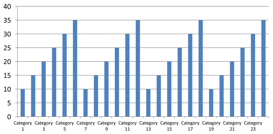
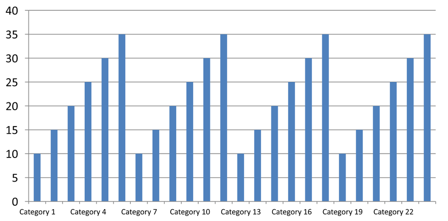
Ketika sebuah diagram memiliki banyak kategori, kurangi jumlah label sumbu yang terlihat tanpa menghapus kategori atau titik data. Panggil setAutomaticTickLabelSpacing dengan False, lalu berikan interval kategori yang diinginkan ke setTickLabelSpacing. Untuk kategori teks dalam urutan normal, penghitungan dimulai dari kategori pertama:
| Interval | Label yang ditampilkan dalam contoh |
|---|---|
1 |
Category 1, Category 2, Category 3, … Category 24 |
2 |
Category 1, Category 3, Category 5, … Category 23 |
3 |
Category 1, Category 4, Category 7, … Category 22 |
Interval 3 menampilkan setiap label ketiga, meninggalkan dua label tersembunyi di antara label yang ditampilkan. Ini tidak menghapus kolom yang bersangkutan. Jarak otomatis memilih interval berdasarkan ruang yang tersedia; tidak selalu menampilkan setiap label.
Tanda centang memiliki kontrol terpisah. Panggil setAutomaticTickMarksSpacing dengan False dan gunakan setTickMarksSpacing untuk mengatur intervalnya. Misalnya, 1 mempertahankan tanda centang pada setiap interval kategori sementara label muncul hanya setiap kategori ketiga. Gunakan setMajorTickMark dengan gaya yang terlihat agar Anda dapat melihat hasilnya. Memanggil salah satu pengatur jarak otomatis dengan True lagi memungkinkan diagram memilih interval tersebut kembali.
Contoh mandiri berikut membuat 24 kategori dan satu seri, kemudian menyimpan tiga slide dalam CategoryAxisIntervals.pptx: jarak otomatis, jarak label manual dengan tanda centang independen, dan pemulihan jarak otomatis. Kedua salinan mempertahankan data diagram asli. Tidak diperlukan presentasi masukan. Teks label horizontal memudahkan melihat perbedaan kepadatan.
import jpype
import asposeslides

if not jpype.isJVMStarted():
    jpype.startJVM()

from asposeslides.api import Presentation, ChartType, SaveFormat, CategoryAxisType, TickMarkType

presentation = Presentation()
try:
    slide = presentation.getSlides().get_Item(0)

    chart = slide.getShapes().addChart(ChartType.ClusteredColumn, 30, 40, 660, 320)

    chart.setLegend(False)
    chart.getChartData().getCategories().clear()
    chart.getChartData().getSeries().clear()

    workbook = chart.getChartData().getChartDataWorkbook()
    workbook.clear(0)

    series = chart.getChartData().getSeries().add(ChartType.ClusteredColumn)
    for i in range(24):
        category_cell = workbook.getCell(0, i + 1, 0, f"Category {i + 1}")
        chart.getChartData().getCategories().add(category_cell)
        value_cell = workbook.getCell(0, i + 1, 1, float(10 + i % 6 * 5))
        series.getDataPoints().addDataPointForBarSeries(value_cell)

    axis = chart.getAxes().getHorizontalAxis()
    axis.setCategoryAxisType(CategoryAxisType.Text)
    axis.getTextFormat().getTextBlockFormat().setRotationAngle(0)
    axis.getTextFormat().getPortionFormat().setFontHeight(12)
    axis.setMajorTickMark(TickMarkType.Outside)
    axis.setAutomaticTickLabelSpacing(True)
    axis.setAutomaticTickMarksSpacing(True)

    # Slide 2: tampilkan setiap label ketiga, tetapi pertahankan tanda centang untuk setiap kategori.
    manual_slide = presentation.getSlides().addClone(slide)
    manual_chart = manual_slide.getShapes().get_Item(0)
    manual_axis = manual_chart.getAxes().getHorizontalAxis()
    manual_axis.setAutomaticTickLabelSpacing(False)
    manual_axis.setTickLabelSpacing(3)
    manual_axis.setAutomaticTickMarksSpacing(False)
    manual_axis.setTickMarksSpacing(1)

    # Slide 3: biarkan diagram memilih kedua interval lagi.
    restored_slide = presentation.getSlides().addClone(manual_slide)
    restored_chart = restored_slide.getShapes().get_Item(0)
    restored_chart.getAxes().getHorizontalAxis().setAutomaticTickLabelSpacing(True)
    restored_chart.getAxes().getHorizontalAxis().setAutomaticTickMarksSpacing(True)

    presentation.save("CategoryAxisIntervals.pptx", SaveFormat.Pptx)
finally:
    presentation.dispose()
Jarak otomatis (slide 1): Pada tampilan ini, setiap label kategori kedua ditampilkan dan dibungkus menjadi dua baris. Hasil otomatis dapat bervariasi tergantung pada ukuran diagram, font, dan renderer.
Jarak manual (slide 2): Setiap label ketiga ditampilkan dalam satu baris, sementara tanda centang tetap pada setiap interval kategori. Semua 24 kolom, termasuk yang tanpa label, tetap terlihat dengan nilai yang sama. Slide 3 mengembalikan tampilan otomatis yang ditunjukkan di atas.
Pilih Sumbu dan Interval yang Tepat
Gunakan interval hitungan kategori ini untuk sumbu kategori teks, seperti sumbu kategori pada diagram kolom, garis, area, atau batang. Pada diagram kolom, itu adalah sumbu horizontal. Pada diagram batang horizontal, sumbu kategori berada secara vertikal, sehingga terapkan pengaturan ini pada sumbu yang diperoleh dari getVerticalAxis. Jarak tanda centang juga berlaku pada sumbu seri di diagram yang memilikinya.
Jangan gunakan jarak label kategori untuk mengatur skala numerik pada sumbu nilai. Pada sumbu nilai, setMajorUnit menentukan perbedaan nilai: misalnya, satuan utama 10 menghasilkan tanda pada 0, 10, 20, dan seterusnya ketika sumbu dimulai dari nol. Interval label kategori 3 menghitung posisi kategori, terlepas dari nilai data mereka. Diagram sebar dan gelembung menggunakan sumbu nilai bukan sumbu kategori teks. Untuk sumbu tanggal, gunakan satuan utama berbasis waktu dan skala seperti yang dijelaskan dalam Ubah Sumbu Kategori.
Atur Format Tanggal untuk Nilai Sumbu Kategori
Contoh ini menggantikan data diagram default dengan empat nilai tahunan. Tanggal disimpan sebagai nomor seri OLE Automation di lembar kerja pertama (indeks 0), dihitung sebagai jumlah hari sejak 30 Desember 1899 untuk tanggal tersebut. Gunakan setCategoryAxisType dengan CategoryAxisType.Date, panggil setNumberFormatLinkedToSource dengan False, dan berikan yyyy ke setNumberFormat sehingga label kategori menampilkan tahun empat digit secara terpisah dari pemformatan sel.
from datetime import date

import jpype
import asposeslides

if not jpype.isJVMStarted():
    jpype.startJVM()

from asposeslides.api import Presentation, ChartType, SaveFormat, CategoryAxisType

presentation = Presentation()
try:
    slide = presentation.getSlides().get_Item(0)

    chart = slide.getShapes().addChart(ChartType.Line, 50, 50, 450, 300)

    chart.getChartData().getCategories().clear()
    chart.getChartData().getSeries().clear()

    workbook = chart.getChartData().getChartDataWorkbook()
    workbook.clear(0)

    base_date = date(1899, 12, 30)

    series = chart.getChartData().getSeries().add(ChartType.Line)
    for i in range(4):
        category_date = date(2015 + i, 1, 1)
        category_value = float((category_date - base_date).days)
        category_cell = workbook.getCell(0, i + 1, 0, category_value)
        chart.getChartData().getCategories().add(category_cell)

        value_cell = workbook.getCell(0, i + 1, 1, float(i + 1))
        series.getDataPoints().addDataPointForLineSeries(value_cell)

    chart.getAxes().getHorizontalAxis().setCategoryAxisType(CategoryAxisType.Date)
    chart.getAxes().getHorizontalAxis().setNumberFormatLinkedToSource(False)
    chart.getAxes().getHorizontalAxis().setNumberFormat("yyyy")

    presentation.save("DateAxisFormat.pptx", SaveFormat.Pptx)
finally:
    presentation.dispose()
Atur Sudut Rotasi untuk Judul Sumbu Diagram
Panggil setTitle dengan True pada sumbu vertikal, berikan teks judul, dan atur sudut rotasi dalam pemformatan blok teks judul. Sudut diukur dalam derajat; contoh ini menyimpan diagram kolom dengan judul sumbu nilai diputar 90 derajat.
import jpype
import asposeslides

if not jpype.isJVMStarted():
    jpype.startJVM()

from asposeslides.api import Presentation, ChartType, SaveFormat

presentation = Presentation()
try:
    slide = presentation.getSlides().get_Item(0)

    chart = slide.getShapes().addChart(ChartType.ClusteredColumn, 50, 50, 450, 300)
    chart.getAxes().getVerticalAxis().setTitle(True)
    chart.getAxes().getVerticalAxis().getTitle().addTextFrameForOverriding("Value")
    chart.getAxes().getVerticalAxis().getTitle().getTextFormat().getTextBlockFormat().setRotationAngle(90)

    presentation.save("RotatedAxisTitle.pptx", SaveFormat.Pptx)
finally:
    presentation.dispose()
Atur Posisi Sumbu pada Sumbu Kategori atau Nilai
Gunakan setAxisBetweenCategories untuk mengontrol apakah sumbu nilai menyeberang sumbu kategori di antara kategori atau pada tanda centang kategori. Pengaturan ini berlaku untuk sumbu kategori. Contoh ini mengaturnya ke True pada sumbu kategori horizontal diagram kolom dan menyimpan hasilnya.
import jpype
import asposeslides

if not jpype.isJVMStarted():
    jpype.startJVM()

from asposeslides.api import Presentation, ChartType, SaveFormat

presentation = Presentation()
try:
    slide = presentation.getSlides().get_Item(0)

    chart = slide.getShapes().addChart(ChartType.ClusteredColumn, 50, 50, 450, 300)
    chart.getAxes().getHorizontalAxis().setAxisBetweenCategories(True)

    presentation.save("AxisBetweenCategories.pptx", SaveFormat.Pptx)
finally:
    presentation.dispose()
Atur Unit Tampilan pada Sumbu Nilai Diagram
Gunakan setDisplayUnit untuk menskalakan label pada sumbu nilai tanpa mengubah data dasar. Dengan DisplayUnitType yang diatur ke Millions, nilai 60.000.000 ditampilkan sebagai 60. Contoh ini membuat diagram kolom dan menerapkan unit tampilan jutaan pada sumbu vertikalnya.
import jpype
import asposeslides

if not jpype.isJVMStarted():
    jpype.startJVM()

from asposeslides.api import Presentation, ChartType, SaveFormat, DisplayUnitType

presentation = Presentation()
try:
    slide = presentation.getSlides().get_Item(0)

    chart = slide.getShapes().addChart(ChartType.ClusteredColumn, 50, 50, 450, 300)
    chart.getAxes().getVerticalAxis().setDisplayUnit(DisplayUnitType.Millions)

    presentation.save("Result.pptx", SaveFormat.Pptx)
finally:
    presentation.dispose()
FAQ
Bagaimana cara mengatur nilai di mana satu sumbu memotong sumbu lainnya (penyilangan sumbu)?
Gunakan setCrossType untuk memilih perilaku penyilangan. Untuk menentukan nilai penyilangan numerik, gunakan setCrossAt. Pengaturan ini memungkinkan Anda memindahkan penyilangan sumbu ke garis dasar yang sesuai.
Bagaimana saya dapat menempatkan label tick relatif terhadap sumbu?
Panggil setTickLabelPosition menggunakan TickLabelPositionType: Low, High, NextTo, atau None. Untuk mengontrol tanda centang itu sendiri, gunakan setMajorTickMark atau setMinorTickMark; ini terpisah dari penempatan label.