Analyzing your prompt, please hold on...
An error occurred while retrieving the results. Please refresh the page and try again.
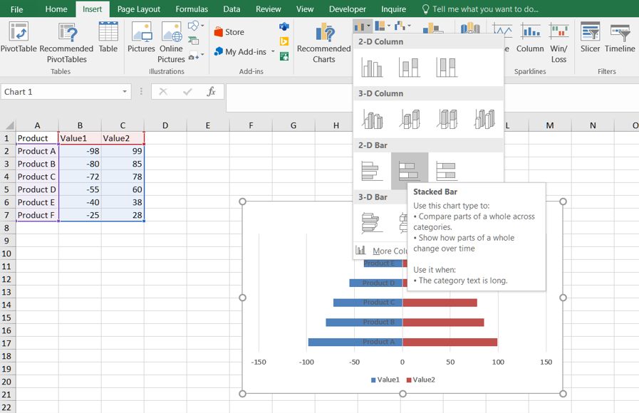
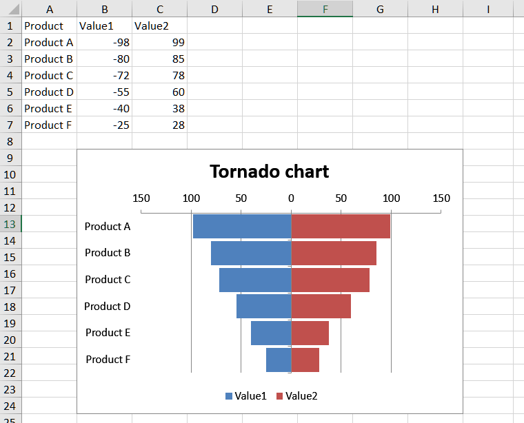
A tornado chart, also known as a tornado diagram or tornado graph, is a type of data visualization that is often used for sensitivity analysis in Excel. It helps you understand the impact of changing variables on a particular outcome or result.
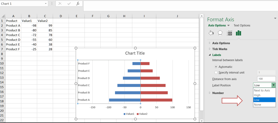
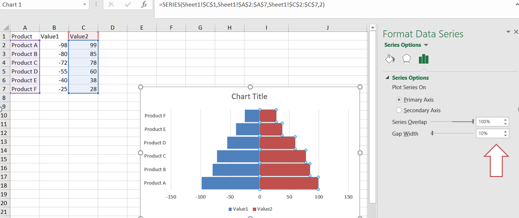
You can create a tornado chart in Excel by following these steps:
###0,###0. Click Add.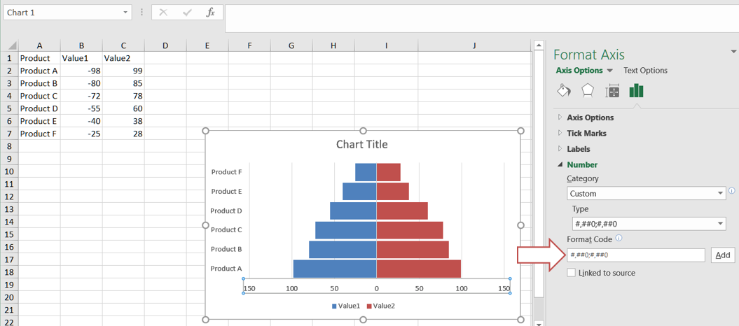
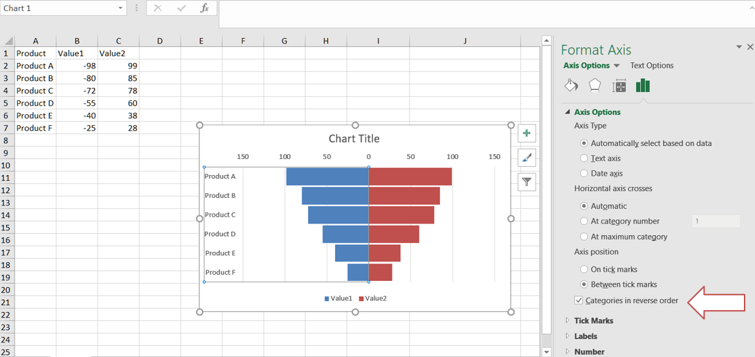
Please see the following sample code. It loads the sample Excel file that contains some sample data. It then creates the stacked bar chart based on the initial data and sets relevant properties. Finally, it saves the workbook to output XLSX format. The following screenshot shows the tornado chart created by Aspose.Cells in the output Excel file.
Analyzing your prompt, please hold on...
An error occurred while retrieving the results. Please refresh the page and try again.