
Python を使用したプレゼンテーションのチャート軸のカスタマイズ
概要
この記事では、Aspose.Slides for Python via .NET を使用してチャートの軸をカスタマイズする方法を説明します。計算済み軸値、チャートの行と列の切り替え、軸の表示/非表示、カテゴリラベルと目盛り間隔、日付カテゴリと書式設定、タイトルの回転、軸の位置設定、表示単位について扱います。
チャートの縦軸の最大値を取得する
Create a プレゼンテーション and add an area chart with default data. Call validate_chart_layout before reading calculated axis values so that the chart layout is up to date.
Read actual_max_value and actual_min_value for the axis limits, and actual_major_unit and actual_minor_unit for the tick intervals. actual_major_unit_scale and actual_minor_unit_scale provide time-unit scales, which are relevant to date axes. The example stores these values in local variables and saves the chart.
import aspose.slides as slides
import aspose.slides.charts as charts

with slides.Presentation() as presentation:
    slide = presentation.slides[0]

    chart = slide.shapes.add_chart(charts.ChartType.AREA, 100, 100, 500, 350)
    chart.validate_chart_layout()

    max_value = chart.axes.vertical_axis.actual_max_value
    min_value = chart.axes.vertical_axis.actual_min_value

    major_unit = chart.axes.vertical_axis.actual_major_unit
    minor_unit = chart.axes.vertical_axis.actual_minor_unit

    major_unit_scale = chart.axes.vertical_axis.actual_major_unit_scale
    minor_unit_scale = chart.axes.vertical_axis.actual_minor_unit_scale

    presentation.save("AxisValues_out.pptx", slides.export.SaveFormat.PPTX)
軸間のデータを入れ替える
Use switch_row_column to exchange the roles of series and categories in chart data. Each former category becomes a series, and each former series becomes a category. This changes how the data is grouped; it does not exchange the horizontal and vertical axes. The example uses set_range to bind the default data to Sheet1!A1:D5, including the header row and category column, before switching rows and columns. It saves a chart with four series and three categories.
import aspose.slides as slides
import aspose.slides.charts as charts

with slides.Presentation() as presentation:
    slide = presentation.slides[0]

    chart = slide.shapes.add_chart(charts.ChartType.CLUSTERED_COLUMN, 100, 100, 400, 300)

    chart.chart_data.set_range("Sheet1!A1:D5")
    chart.chart_data.switch_row_column()

    presentation.save("SwitchChartRowColumns_out.pptx", slides.export.SaveFormat.PPTX)
折れ線グラフの縦軸を非表示にする
Set is_visible to False on the vertical axis to hide it. The example creates a line chart with default data and saves it with the vertical axis hidden.
import aspose.slides as slides
import aspose.slides.charts as charts

with slides.Presentation() as presentation:
    slide = presentation.slides[0]

    chart = slide.shapes.add_chart(charts.ChartType.LINE, 100, 100, 400, 300)
    chart.axes.vertical_axis.is_visible = False

    presentation.save("HiddenVerticalAxis.pptx", slides.export.SaveFormat.PPTX)
折れ線グラフの水平軸を非表示にする
Set is_visible to False on the horizontal axis to hide it. The example creates a line chart with default data and saves it with the horizontal axis hidden.
import aspose.slides as slides
import aspose.slides.charts as charts

with slides.Presentation() as presentation:
    slide = presentation.slides[0]

    chart = slide.shapes.add_chart(charts.ChartType.LINE, 100, 100, 400, 300)
    chart.axes.horizontal_axis.is_visible = False

    presentation.save("HiddenHorizontalAxis.pptx", slides.export.SaveFormat.PPTX)
カテゴリ軸を変更する
Set category_axis_type to choose a date or text category axis. This example requires ExistingChart.pptx, with a chart as the first shape on the first slide and category cells containing numeric Excel date values. It changes the horizontal axis to a date axis. Setting is_automatic_major_unit to False, major_unit to 1, and major_unit_scale to months places major ticks at one-month intervals.
import aspose.slides as slides
import aspose.slides.charts as charts

with slides.Presentation("ExistingChart.pptx") as presentation:
    slide = presentation.slides[0]

    chart = slide.shapes[0]
    chart.axes.horizontal_axis.category_axis_type = charts.CategoryAxisType.DATE
    chart.axes.horizontal_axis.is_automatic_major_unit = False
    chart.axes.horizontal_axis.major_unit = 1
    chart.axes.horizontal_axis.major_unit_scale = charts.TimeUnitType.MONTHS

    presentation.save("ChangeChartCategoryAxis_out.pptx", slides.export.SaveFormat.PPTX)
カテゴリ軸ラベル間隔を制御する
When a chart has many categories, reduce the number of visible axis labels without removing categories or data points. Set is_automatic_tick_label_spacing to False, then set tick_label_spacing to the desired category interval. For text categories in their normal order, counting starts at the first category:
| 間隔 | 例で表示されるラベル |
|---|---|
1 |
カテゴリ 1, カテゴリ 2, カテゴリ 3, … カテゴリ 24 |
2 |
カテゴリ 1, カテゴリ 3, カテゴリ 5, … カテゴリ 23 |
3 |
カテゴリ 1, カテゴリ 4, カテゴリ 7, … カテゴリ 22 |
間隔 3 は3番目ごとのラベルを表示し、表示されたラベルの間に2つのラベルが非表示になります。対応する列は削除されません。自動間隔は利用可能なスペースに基づいて間隔を選択し、必ずしもすべてのラベルを表示するわけではありません。
Tick marks have separate controls. Set is_automatic_tick_marks_spacing to False and use tick_marks_spacing to set their interval. For example, 1 keeps a tick mark at every category interval while labels appear only every third category. Set major_tick_mark to a visible style so you can see the result. Setting either automatic-spacing property back to True lets the chart choose that interval again.
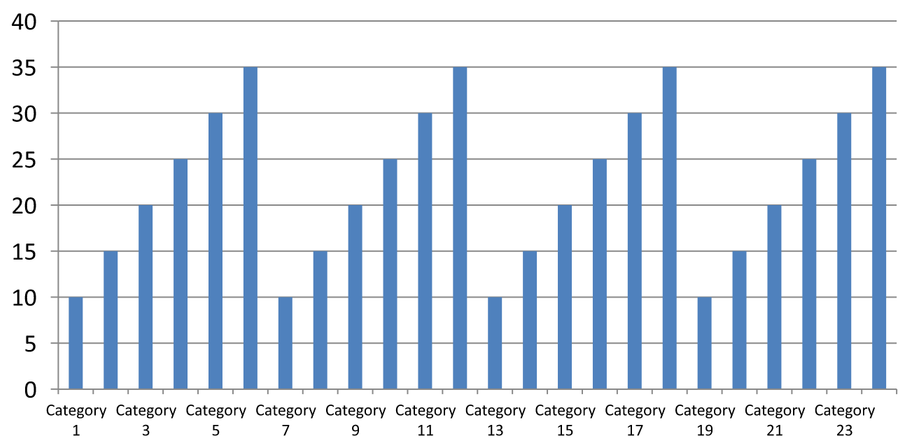
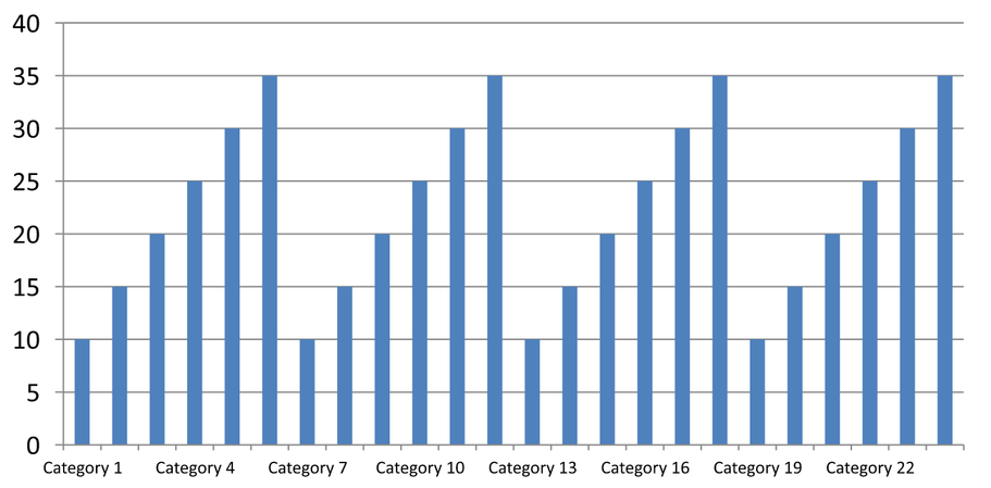
以下の独立した例は 24 個のカテゴリと 1 つのシリーズを作成し、CategoryAxisIntervals.pptx に 3 枚のスライドを保存します:自動間隔、目盛りが独立した手動ラベル間隔、そして自動間隔に復元されたものです。2 つのコピーは元のチャートデータを保持します。入力プレゼンテーションは不要です。水平ラベルのテキストにより密度の違いが分かりやすくなります。
import aspose.slides as slides
import aspose.slides.charts as charts

with slides.Presentation() as presentation:
    slide = presentation.slides[0]

    chart = slide.shapes.add_chart(charts.ChartType.CLUSTERED_COLUMN, 30, 40, 660, 320)

    chart.has_legend = False
    chart.chart_data.categories.clear()
    chart.chart_data.series.clear()

    workbook = chart.chart_data.chart_data_workbook
    workbook.clear(0)

    series = chart.chart_data.series.add(charts.ChartType.CLUSTERED_COLUMN)
    for i in range(24):
        category_cell = workbook.get_cell(0, i + 1, 0, f"Category {i + 1}")
        chart.chart_data.categories.add(category_cell)
        value_cell = workbook.get_cell(0, i + 1, 1, 10 + i % 6 * 5)
        series.data_points.add_data_point_for_bar_series(value_cell)

    axis = chart.axes.horizontal_axis
    axis.category_axis_type = charts.CategoryAxisType.TEXT
    axis.text_format.text_block_format.rotation_angle = 0
    axis.text_format.portion_format.font_height = 12
    axis.major_tick_mark = charts.TickMarkType.OUTSIDE
    axis.is_automatic_tick_label_spacing = True
    axis.is_automatic_tick_marks_spacing = True

    # スライド 2: 3番目ごとのラベルを表示し、各カテゴリに目盛りを残す。
    manual_slide = presentation.slides.add_clone(slide)
    manual_chart = manual_slide.shapes[0]
    manual_axis = manual_chart.axes.horizontal_axis
    manual_axis.is_automatic_tick_label_spacing = False
    manual_axis.tick_label_spacing = 3
    manual_axis.is_automatic_tick_marks_spacing = False
    manual_axis.tick_marks_spacing = 1

    # スライド 3: チャートに両方の間隔を再度自動選択させる。
    restored_slide = presentation.slides.add_clone(manual_slide)
    restored_chart = restored_slide.shapes[0]
    restored_chart.axes.horizontal_axis.is_automatic_tick_label_spacing = True
    restored_chart.axes.horizontal_axis.is_automatic_tick_marks_spacing = True

    presentation.save("CategoryAxisIntervals.pptx", slides.export.SaveFormat.PPTX)
自動間隔 (スライド 1): In this rendering, every second category label is displayed and wraps onto two lines. The automatic result can vary with chart size, fonts, and the renderer.
手動間隔 (スライド 2): Every third label is displayed on one line, while tick marks remain at every category interval. All 24 columns, including those without labels, remain visible with the same values. Slide 3 restores the automatic appearance shown above.
正しい軸と間隔を選択する
Use this category-count interval for a text category axis, such as the category axis of a column, line, area, or bar chart. In a column chart, it is the horizontal axis. In a horizontal bar chart, the category axis is vertical, so apply these settings to vertical_axis. Tick-mark spacing also applies to a series axis in charts that have one.
Do not use category label spacing to set the numeric scale of a value axis. On a value axis, major_unit specifies a difference in values: for example, a major unit of 10 produces ticks at 0, 10, 20, and so on when the axis starts at zero. A category label interval of 3 instead counts category positions, regardless of their data values. Scatter and bubble charts use value axes rather than a text category axis. For a date axis, use time-based major units and scales as described in カテゴリ軸を変更する.
カテゴリ軸値の日時形式を設定する
The example replaces the default chart data with four annual values. Dates are stored as OLE Automation serial numbers in the first worksheet (index 0). Set category_axis_type to a date axis, disable is_number_format_linked_to_source, and assign yyyy to number_format so the category labels display four-digit years independently of the cell formatting.
from datetime import date

import aspose.slides as slides
import aspose.slides.charts as charts

with slides.Presentation() as presentation:
    slide = presentation.slides[0]

    chart = slide.shapes.add_chart(charts.ChartType.LINE, 50, 50, 450, 300)

    chart.chart_data.categories.clear()
    chart.chart_data.series.clear()

    workbook = chart.chart_data.chart_data_workbook
    workbook.clear(0)

    series = chart.chart_data.series.add(charts.ChartType.LINE)
    for i in range(4):
        category_date = date(2015 + i, 1, 1)
        serial_date = (category_date - date(1899, 12, 30)).days
        category_cell = workbook.get_cell(0, i + 1, 0, serial_date)
        chart.chart_data.categories.add(category_cell)

        value_cell = workbook.get_cell(0, i + 1, 1, i + 1)
        series.data_points.add_data_point_for_line_series(value_cell)

    chart.axes.horizontal_axis.category_axis_type = charts.CategoryAxisType.DATE
    chart.axes.horizontal_axis.is_number_format_linked_to_source = False
    chart.axes.horizontal_axis.number_format = "yyyy"

    presentation.save("DateAxisFormat.pptx", slides.export.SaveFormat.PPTX)
チャート軸タイトルの回転角度を設定する
Enable has_title on the vertical axis, provide title text, and set rotation_angle to rotate the title. The angle is measured in degrees; this example saves a column chart with its value-axis title rotated by 90 degrees.
import aspose.slides as slides
import aspose.slides.charts as charts

with slides.Presentation() as presentation:
    slide = presentation.slides[0]

    chart = slide.shapes.add_chart(charts.ChartType.CLUSTERED_COLUMN, 50, 50, 450, 300)
    chart.axes.vertical_axis.has_title = True
    chart.axes.vertical_axis.title.add_text_frame_for_overriding("Value")
    chart.axes.vertical_axis.title.text_format.text_block_format.rotation_angle = 90

    presentation.save("RotatedAxisTitle.pptx", slides.export.SaveFormat.PPTX)
カテゴリ軸または値軸の軸位置を設定する
Use axis_between_categories to control whether the value axis crosses the category axis between categories or at category tick marks. This property applies to category axes. The example sets it to True on the horizontal category axis of a column chart and saves the result.
import aspose.slides as slides
import aspose.slides.charts as charts

with slides.Presentation() as presentation:
    slide = presentation.slides[0]

    chart = slide.shapes.add_chart(charts.ChartType.CLUSTERED_COLUMN, 50, 50, 450, 300)
    chart.axes.horizontal_axis.axis_between_categories = True

    presentation.save("AxisBetweenCategories.pptx", slides.export.SaveFormat.PPTX)
チャート値軸の表示単位を設定する
Set display_unit to scale the labels on a value axis without changing the underlying data. With DisplayUnitType set to MILLIONS, a value of 60,000,000 is displayed as 60. The example creates a column chart and applies the millions display unit to its vertical axis.
import aspose.slides as slides
import aspose.slides.charts as charts

with slides.Presentation() as presentation:
    slide = presentation.slides[0]

    chart = slide.shapes.add_chart(charts.ChartType.CLUSTERED_COLUMN, 50, 50, 450, 300)
    chart.axes.vertical_axis.display_unit = charts.DisplayUnitType.MILLIONS

    presentation.save("Result.pptx", slides.export.SaveFormat.PPTX)
よくある質問
軸が交差する値(軸交差)を設定するにはどうすればよいですか?
Use cross_type to select the crossing behavior. To specify a numeric crossing value, set cross_at. These settings let you move the axis crossing to a suitable baseline.
目盛りラベルを軸に対してどのように配置できますか?
Set tick_label_position using TickLabelPositionType: LOW, HIGH, NEXT_TO, or NONE. To control the tick marks themselves, use major_tick_mark or minor_tick_mark; these are separate from label positioning.