
ปรับแต่งแกนแผนภูมิในงานนำเสนอด้วย Python
ภาพรวม
บทความนี้อธิบายวิธีปรับแต่งแกนของแผนภูมิด้วย Aspose.Slides for Python via .NET โดยครอบคลุมค่าที่คำนวณได้ของแกน การสลับแถวและคอลัมน์ของแผนภูมิ การแสดงหรือซ่อนแกน ช่วงป้ายกำกับและเครื่องหมายบรรทัดของหมวดหมู่ วันที่และการจัดรูปแบบ แกนหัวเรื่อง การหมุนหัวเรื่อง การกำหนดตำแหน่งแกน และหน่วยการแสดงผล
รับค่ามากสุดบนแกนแนวตั้งในแผนภูมิ
สร้าง Presentation และเพิ่มแผนภูมิพื้นที่พร้อมข้อมูลเริ่มต้น เรียกใช้ validate_chart_layout ก่อนอ่านค่าที่คำนวณของแกนเพื่อให้การจัดวางแผนภูมิมีความเป็นปัจจุบัน
อ่าน actual_max_value และ actual_min_value เพื่อหาขอบเขตของแกน และ actual_major_unit กับ actual_minor_unit เพื่อหาช่วงเครื่องหมายบรรทัด actual_major_unit_scale และ actual_minor_unit_scale ให้สเกลหน่วยเวลา ซึ่งเกี่ยวกับแกนวันที่ ตัวอย่างนี้เก็บค่าต่าง ๆ ไว้ในตัวแปรท้องถิ่นและบันทึกแผนภูมิ
import aspose.slides as slides
import aspose.slides.charts as charts

with slides.Presentation() as presentation:
    slide = presentation.slides[0]

    chart = slide.shapes.add_chart(charts.ChartType.AREA, 100, 100, 500, 350)
    chart.validate_chart_layout()

    max_value = chart.axes.vertical_axis.actual_max_value
    min_value = chart.axes.vertical_axis.actual_min_value

    major_unit = chart.axes.vertical_axis.actual_major_unit
    minor_unit = chart.axes.vertical_axis.actual_minor_unit

    major_unit_scale = chart.axes.vertical_axis.actual_major_unit_scale
    minor_unit_scale = chart.axes.vertical_axis.actual_minor_unit_scale

    presentation.save("AxisValues_out.pptx", slides.export.SaveFormat.PPTX)
สลับข้อมูลระหว่างแกน
ใช้ switch_row_column เพื่อสลับบทบาทของชุดข้อมูลและหมวดหมู่ในข้อมูลแผนภูมิ หมวดหมู่เดิมแต่ละรายการจะกลายเป็นชุดข้อมูล และชุดข้อมูลเดิมแต่ละรายการจะกลายเป็นหมวดหมู่ สิ่งนี้เปลี่ยนวิธีการจัดกลุ่มข้อมูล แต่ไม่ได้สลับแกนแนวนอนและแนวตั้ง ตัวอย่างใช้ set_range เพื่อผูกข้อมูลเริ่มต้นกับ Sheet1!A1:D5 รวมทั้งแถวหัวและคอลัมน์หมวดหมู่ ก่อนสลับแถวและคอลัมน์ จากนั้นบันทึกแผนภูมิที่มีสี่ชุดข้อมูลและสามหมวดหมู่
import aspose.slides as slides
import aspose.slides.charts as charts

with slides.Presentation() as presentation:
    slide = presentation.slides[0]

    chart = slide.shapes.add_chart(charts.ChartType.CLUSTERED_COLUMN, 100, 100, 400, 300)

    chart.chart_data.set_range("Sheet1!A1:D5")
    chart.chart_data.switch_row_column()

    presentation.save("SwitchChartRowColumns_out.pptx", slides.export.SaveFormat.PPTX)
ปิดการแสดงแกนแนวตั้งสำหรับแผนภูมิเส้น
ตั้งค่า is_visible เป็น False บนแกนแนวตั้งเพื่อซ่อนมัน ตัวอย่างสร้างแผนภูมิเส้นพร้อมข้อมูลเริ่มต้นและบันทึกแผนภูมิที่ซ่อนแกนแนวตั้ง
import aspose.slides as slides
import aspose.slides.charts as charts

with slides.Presentation() as presentation:
    slide = presentation.slides[0]

    chart = slide.shapes.add_chart(charts.ChartType.LINE, 100, 100, 400, 300)
    chart.axes.vertical_axis.is_visible = False

    presentation.save("HiddenVerticalAxis.pptx", slides.export.SaveFormat.PPTX)
ปิดการแสดงแกนแนวนอนสำหรับแผนภูมิเส้น
ตั้งค่า is_visible เป็น False บนแกนแนวนอนเพื่อซ่อนมัน ตัวอย่างสร้างแผนภูมิเส้นพร้อมข้อมูลเริ่มต้นและบันทึกแผนภูมิที่ซ่อนแกนแนวนอน
import aspose.slides as slides
import aspose.slides.charts as charts

with slides.Presentation() as presentation:
    slide = presentation.slides[0]

    chart = slide.shapes.add_chart(charts.ChartType.LINE, 100, 100, 400, 300)
    chart.axes.horizontal_axis.is_visible = False

    presentation.save("HiddenHorizontalAxis.pptx", slides.export.SaveFormat.PPTX)
เปลี่ยนแกนประเภท
ตั้งค่า category_axis_type เพื่อเลือกแกนประเภทเป็นวันที่หรือข้อความ ตัวอย่างนี้ต้องใช้ ExistingChart.pptx ซึ่งมีแผนภูมิเป็นรูปแบบแรกบนสไลด์แรกและเซลล์หมวดหมู่มีค่าตำแหน่งวันที่ของ Excel ตัวอย่างจะเปลี่ยนแกนแนวนอนเป็นแกนวันที่ การตั้งค่า is_automatic_major_unit เป็น False , major_unit เป็น 1 และ major_unit_scale เป็น months จะทำให้เครื่องหมายบรรทัดหลักอยู่ที่ช่วงหนึ่งเดือน
import aspose.slides as slides
import aspose.slides.charts as charts

with slides.Presentation("ExistingChart.pptx") as presentation:
    slide = presentation.slides[0]

    chart = slide.shapes[0]
    chart.axes.horizontal_axis.category_axis_type = charts.CategoryAxisType.DATE
    chart.axes.horizontal_axis.is_automatic_major_unit = False
    chart.axes.horizontal_axis.major_unit = 1
    chart.axes.horizontal_axis.major_unit_scale = charts.TimeUnitType.MONTHS

    presentation.save("ChangeChartCategoryAxis_out.pptx", slides.export.SaveFormat.PPTX)
ควบคุมช่วงป้ายกำกับของแกนประเภท
เมื่อแผนภูมิมีหมวดหมู่จำนวนมาก ให้ลดจำนวนป้ายกำกับที่มองเห็นได้บนแกนโดยไม่ต้องลบหมวดหมู่หรือจุดข้อมูล ตั้งค่า is_automatic_tick_label_spacing เป็น False แล้วตั้งค่า tick_label_spacing เป็นช่วงหมวดหมู่ที่ต้องการ สำหรับหมวดหมู่ข้อความในลำดับปกติ การนับเริ่มจากหมวดหมู่แรก:
| ช่วง | ป้ายกำกับที่แสดงในตัวอย่าง |
|---|---|
1 |
Category 1, Category 2, Category 3, … Category 24 |
2 |
Category 1, Category 3, Category 5, … Category 23 |
3 |
Category 1, Category 4, Category 7, … Category 22 |
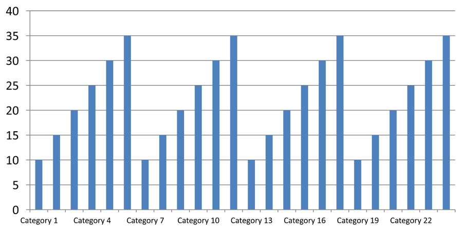
ช่วง 3 จะแสดงป้ายกำกับทุกสามรายการและซ่อนสองรายการระหว่างป้ายที่แสดง ซึ่งไม่ลบคอลัมน์ที่สอดคล้องกัน การจัดช่องอัตโนมัติจะเลือกช่วงตามพื้นที่ที่มีอยู่ ไม่ได้บังคับให้แสดงทุกป้าย
เครื่องหมายบรรทัดมีการควบคุมแยกกัน ตั้งค่า is_automatic_tick_marks_spacing เป็น False และใช้ tick_marks_spacing เพื่อกำหนดช่วงของเครื่องหมายบรรทัด ตัวอย่างเช่น 1 จะรักษาเครื่องหมายบรรทัดที่ทุกช่วงหมวดหมู่ในขณะที่ป้ายกำกับแสดงทุกสามหมวดหมู่ ตั้งค่า major_tick_mark ให้เป็นรูปแบบที่มองเห็นได้เพื่อดูผลลัพธ์ การตั้งค่าคุณสมบัติเชิงอัตโนมัติใด ๆ กลับเป็น True จะให้แผนภูมิกำหนดช่วงนั้นใหม่อีกครั้ง
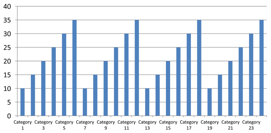
ตัวอย่างต่อไปเป็นตัวอย่างที่ทำงานอิสระซึ่งสร้าง 24 หมวดหมู่และหนึ่งชุดข้อมูล จากนั้นบันทึกสไลด์สามสไลด์ใน CategoryAxisIntervals.pptx: การจัดช่องอัตโนมัติ, การจัดช่องป้ายกำกับด้วยเครื่องหมายบรรทัดอิสระ, และการคืนค่าการจัดช่องอัตโนมัติ ทั้งสองสำเนารักษาข้อมูลแผนภูมิดั้งเดิม ไม่จำเป็นต้องมีการนำเสนออินพุต ข้อความป้ายกำกับแนวนอนทำให้ความหนาแน่นที่แตกต่างกันเห็นได้ง่าย
import aspose.slides as slides
import aspose.slides.charts as charts

with slides.Presentation() as presentation:
    slide = presentation.slides[0]

    chart = slide.shapes.add_chart(charts.ChartType.CLUSTERED_COLUMN, 30, 40, 660, 320)

    chart.has_legend = False
    chart.chart_data.categories.clear()
    chart.chart_data.series.clear()

    workbook = chart.chart_data.chart_data_workbook
    workbook.clear(0)

    series = chart.chart_data.series.add(charts.ChartType.CLUSTERED_COLUMN)
    for i in range(24):
        category_cell = workbook.get_cell(0, i + 1, 0, f"Category {i + 1}")
        chart.chart_data.categories.add(category_cell)
        value_cell = workbook.get_cell(0, i + 1, 1, 10 + i % 6 * 5)
        series.data_points.add_data_point_for_bar_series(value_cell)

    axis = chart.axes.horizontal_axis
    axis.category_axis_type = charts.CategoryAxisType.TEXT
    axis.text_format.text_block_format.rotation_angle = 0
    axis.text_format.portion_format.font_height = 12
    axis.major_tick_mark = charts.TickMarkType.OUTSIDE
    axis.is_automatic_tick_label_spacing = True
    axis.is_automatic_tick_marks_spacing = True

    # Slide 2: แสดงทุกป้ายกำกับที่สาม แต่ยังคงเครื่องหมายบรรทัดสำหรับทุกหมวดหมู่.
    manual_slide = presentation.slides.add_clone(slide)
    manual_chart = manual_slide.shapes[0]
    manual_axis = manual_chart.axes.horizontal_axis
    manual_axis.is_automatic_tick_label_spacing = False
    manual_axis.tick_label_spacing = 3
    manual_axis.is_automatic_tick_marks_spacing = False
    manual_axis.tick_marks_spacing = 1

    # Slide 3: ให้แผนภูมิกำหนดช่วงทั้งสองใหม่อีกครั้ง.
    restored_slide = presentation.slides.add_clone(manual_slide)
    restored_chart = restored_slide.shapes[0]
    restored_chart.axes.horizontal_axis.is_automatic_tick_label_spacing = True
    restored_chart.axes.horizontal_axis.is_automatic_tick_marks_spacing = True

    presentation.save("CategoryAxisIntervals.pptx", slides.export.SaveFormat.PPTX)
การจัดช่องอัตโนมัติ (สไลด์ 1): ในการแสดงผลนี้ ป้ายกำกับทุกสองหมวดหมู่จะแสดงและหักลงเป็นสองบรรทัด ผลลัพธ์อัตโนมัติอาจแตกต่างกันตามขนาดแผนภูมิ ฟอนต์ และตัวเรนเดอร์
การจัดช่องแบบมือ (สไลด์ 2): ป้ายกำกับทุกสามรายการจะแสดงบนบรรทัดเดียว ในขณะที่เครื่องหมายบรรทัดยังคงอยู่ที่ทุกช่วงหมวดหมู่ ทั้ง 24 คอลัมน์รวมถึงคอลัมน์ที่ไม่มีป้ายกำกับยังคงมองเห็นได้พร้อมค่าที่เหมือนกัน สไลด์ 3 จะคืนค่าการจัดช่องอัตโนมัติที่แสดงด้านบน
เลือกแกนและช่วงที่ถูกต้อง
ใช้ช่วงจำนวนหมวดหมู่นี้สำหรับแกนประเภทข้อความ เช่น แกนประเภทของแผนภูมิคอลัมน์, เส้น, พื้นที่ หรือแท่ง ในแผนภูมิคอลัมน์ จะเป็นแกนแนวนอน ในแผนภูมิแท่งแนวนอน แกนประเภทจะเป็นแนวตั้ง ดังนั้นจึงต้องใช้การตั้งค่าเหล่านี้กับ vertical_axis. การจัดช่องเครื่องหมายบรรทัดยังใช้กับแกนชุดข้อมูลในแผนภูมิที่มีแกนชุดข้อมูลด้วย
ไม่ควรใช้การจัดช่องป้ายกำกับเพื่อกำหนดสเกลเชิงตัวเลขของแกนค่า บนแกนค่า major_unit ระบุความต่างของค่า เช่น หน่วยหลัก 10 จะสร้างเครื่องหมายบรรทัดที่ 0, 10, 20 เป็นต้นเมื่อแกนเริ่มที่ศูนย์ ช่วงป้ายกำกับประเภท 3 จะนับตำแหน่งหมวดหมู่โดยไม่คำนึงถึงค่าข้อมูล แผนภูมิกระจายและฟองอากาศใช้แกนค่าแทนแกนประเภทข้อความ สำหรับแกนวันที่ ให้ใช้หน่วยหลักและสเกลตามเวลาตามที่อธิบายใน Change a Category Axis
ตั้งรูปแบบวันที่สำหรับค่าของแกนประเภท
ตัวอย่างนี้แทนที่ข้อมูลแผนภูมิเริ่มต้นด้วยค่าประจำปีสี่ค่า วันที่ถูกเก็บเป็นจำนวนเลขอนุกรม OLE Automation ในเวิร์กชีตแรก (ดัชนี 0) ตั้งค่า category_axis_type เป็นแกนวันที่ ปิดการเชื่อมโยงรูปแบบตัวเลขกับแหล่งข้อมูลโดยตั้งค่า is_number_format_linked_to_source แล้วกำหนด yyyy ให้กับ number_format เพื่อให้ป้ายกำกับประเภทแสดงปีสี่หลักโดยอิสระจากรูปแบบเซลล์
from datetime import date

import aspose.slides as slides
import aspose.slides.charts as charts

with slides.Presentation() as presentation:
    slide = presentation.slides[0]

    chart = slide.shapes.add_chart(charts.ChartType.LINE, 50, 50, 450, 300)

    chart.chart_data.categories.clear()
    chart.chart_data.series.clear()

    workbook = chart.chart_data.chart_data_workbook
    workbook.clear(0)

    series = chart.chart_data.series.add(charts.ChartType.LINE)
    for i in range(4):
        category_date = date(2015 + i, 1, 1)
        serial_date = (category_date - date(1899, 12, 30)).days
        category_cell = workbook.get_cell(0, i + 1, 0, serial_date)
        chart.chart_data.categories.add(category_cell)

        value_cell = workbook.get_cell(0, i + 1, 1, i + 1)
        series.data_points.add_data_point_for_line_series(value_cell)

    chart.axes.horizontal_axis.category_axis_type = charts.CategoryAxisType.DATE
    chart.axes.horizontal_axis.is_number_format_linked_to_source = False
    chart.axes.horizontal_axis.number_format = "yyyy"

    presentation.save("DateAxisFormat.pptx", slides.export.SaveFormat.PPTX)
ตั้งมุมการหมุนสำหรับชื่อแกนของแผนภูมิ
เปิดใช้งาน has_title บนแกนแนวตั้ง ให้หัวเรื่องและตั้งค่า rotation_angle เพื่อหมุนหัวเรื่อง มุมจะวัดเป็นองศา ตัวอย่างนี้บันทึกแผนภูมิคอลัมน์ที่หัวเรื่องแกนค่าถูกหมุน 90 องศา
import aspose.slides as slides
import aspose.slides.charts as charts

with slides.Presentation() as presentation:
    slide = presentation.slides[0]

    chart = slide.shapes.add_chart(charts.ChartType.CLUSTERED_COLUMN, 50, 50, 450, 300)
    chart.axes.vertical_axis.has_title = True
    chart.axes.vertical_axis.title.add_text_frame_for_overriding("Value")
    chart.axes.vertical_axis.title.text_format.text_block_format.rotation_angle = 90

    presentation.save("RotatedAxisTitle.pptx", slides.export.SaveFormat.PPTX)
ตั้งตำแหน่งแกนบนแกนประเภทหรือแกนค่า
ใช้ axis_between_categories เพื่อควบคุมว่าแกนค่าจะตัดแกนประเภทระหว่างหมวดหมู่หรือที่เครื่องหมายบรรทัดของหมวดหมู่ คุณสมบัตินี้ใช้กับแกนประเภท ตัวอย่างตั้งค่าเป็น True บนแกนประเภทแนวนอนของแผนภูมิคอลัมน์และบันทึกผลลัพธ์
import aspose.slides as slides
import aspose.slides.charts as charts

with slides.Presentation() as presentation:
    slide = presentation.slides[0]

    chart = slide.shapes.add_chart(charts.ChartType.CLUSTERED_COLUMN, 50, 50, 450, 300)
    chart.axes.horizontal_axis.axis_between_categories = True

    presentation.save("AxisBetweenCategories.pptx", slides.export.SaveFormat.PPTX)
ตั้งหน่วยการแสดงผลบนแกนค่าของแผนภูมิ
ตั้งค่า display_unit เพื่อสเกลป้ายกำกับบนแกนค่าโดยไม่ต้องเปลี่ยนข้อมูลพื้นฐาน ด้วย DisplayUnitType ที่ตั้งเป็น MILLIONS ค่าที่ 60,000,000 จะปรากฏเป็น 60 ตัวอย่างสร้างแผนภูมิคอลัมน์และใช้หน่วยการแสดงผลเป็นล้านบนแกนแนวตั้ง
import aspose.slides as slides
import aspose.slides.charts as charts

with slides.Presentation() as presentation:
    slide = presentation.slides[0]

    chart = slide.shapes.add_chart(charts.ChartType.CLUSTERED_COLUMN, 50, 50, 450, 300)
    chart.axes.vertical_axis.display_unit = charts.DisplayUnitType.MILLIONS

    presentation.save("Result.pptx", slides.export.SaveFormat.PPTX)
คำถามที่พบบ่อย
ฉันจะตั้งค่าจุดที่แกนหนึ่งตัดแกนอีก (การตัดแกน) อย่างไร?
ใช้ cross_type เพื่อเลือกพฤติกรรมการตัด หากต้องการระบุค่าตัวเลขของจุดตัด ให้ตั้งค่า cross_at. การตั้งค่านี้ทำให้คุณสามารถย้ายจุดตัดของแกนไปยังฐานที่เหมาะสม
ฉันจะกำหนดตำแหน่งป้ายกำกับเครื่องหมายบรรทัดสัมพันธ์กับแกนอย่างไร?
ตั้งค่า tick_label_position ด้วย TickLabelPositionType: LOW, HIGH, NEXT_TO, หรือ NONE. เพื่อควบคุมเครื่องหมายบรรทัดเอง ให้ใช้ major_tick_mark หรือ minor_tick_mark; สิ่งเหล่านี้แยกจากการกำหนดตำแหน่งป้ายกำกับ