
ایجاد یا بهروزرسانی نمودارهای ارائهٔ PowerPoint در Python
بررسی کلی
این مقاله راهنمای جامعی برای ایجاد و سفارشیسازی نمودارها با استفاده از Aspose.Slides ارائه میدهد. شما یاد خواهید گرفت که چگونه بهصورت برنامهنویسی یک نمودار را به اسلاید اضافه کنید، دادهها را به آن منتقل کنید و گزینههای فرمتبندی مختلف را برای مطابقت با نیازهای طراحی خاص خود اعمال کنید. در تمام طول مقاله، مثالهای کد مفصل هر مرحله را از مقداردهی اولیهٔ ارائه و شیء نمودار تا پیکربندی سریها، محورها و افسانهها نشان میدهند. با دنبال کردن این راهنما، درک جامعی از نحوهٔ ادغام تولید دینامیک نمودار در برنامههای خود بهدست میآورید و فرایند ایجاد ارائههای مبتنی بر داده را ساده میکنید.
ایجاد یک نمودار
نمودارها به افراد کمک میکند دادهها را بهسرعت تجسم کنند و بینشهایی بهدست آورند که شاید از یک جدول یا صفحهگشتار بهسرعت واضح نباشد.
چرا نمودارها را ایجاد کنیم؟
با استفاده از نمودارها میتوانید:
- مقادیر بزرگ دادهها را در یک اسلاید از ارائه جمعآوری، فشرده یا خلاصه کنید
- الگوها و روندهای داده را آشکار کنید
- جهت و سرعت تغییر دادهها را در طول زمان یا نسبت به یک واحد اندازهگیری خاص استنتاج کنید
- نقاط رئیسی، انحرافات، خطاها، دادههای نامعقول و غیره را شناسایی کنید
- دادههای پیچیده را ارتباطی یا نمایشی کنید
در PowerPoint میتوانید نمودارها را از طریق عملکرد Insert ایجاد کنید که قالبهای متنوعی برای طراحی انواع مختلف نمودارها فراهم میآورد. با استفاده از Aspose.Slides میتوانید هر دو نوع نمودارهای معمولی (بر پایهٔ انواع رایج نمودار) و نمودارهای سفارشی را ایجاد کنید.
Note
برای ایجاد نمودارها، از کلاس ChartType استفاده کنید. فیلدهای این کلاس به انواع مختلف نمودارها مربوط میشوند.ایجاد نمودارهای ستونی خوشهای
این بخش توضیح میدهد چگونه نمودارهای ستونی خوشهای را با Aspose.Slides ایجاد کنید. شما یاد میگیرید یک ارائه را مقداردهی کنید، یک نمودار اضافه کنید و عناصر آن مانند عنوان، دادهها، سریها، دستهها و استایل را سفارشی کنید. مراحل زیر را دنبال کنید تا ببینید یک نمودار ستونی خوشهای استاندارد چگونه تولید میشود:
- یک نمونه از کلاس Presentation ایجاد کنید.
- با استفاده از اندیس، به اسلاید موردنظر ارجاع پیدا کنید.
- یک نمودار با برخی دادهها اضافه کنید و نوع
ChartType.ClusteredColumnرا مشخص کنید. - یک عنوان به نمودار اضافه کنید.
- به کاربرگ دادههای نمودار دسترسی پیدا کنید.
- تمام سریها و دستههای پیشفرض را پاک کنید.
- سریها و دستههای جدید اضافه کنید.
- دادههای جدید برای سریهای نمودار اضافه کنید.
- یک رنگ پر برای سریهای نمودار اعمال کنید.
- برچسبها را به سریهای نمودار اضافه کنید.
- ارائهٔ تغییر یافته را بهصورت فایل PPTX ذخیره کنید.
این کد C# نشان میدهد چگونه یک نمودار ستونی خوشهای ایجاد شود:
import jpype
import asposeslides
if not jpype.isJVMStarted():
jpype.startJVM()
from asposeslides.api import ChartType, FillType, NullableBool, Presentation, SaveFormat
Color = jpype.JClass("java.awt.Color")
# یک شیء از کلاس ارائه ایجاد میکند که نمایانگر فایل PPTX است.
presentation = Presentation()
try:
# دسترسی به اولین اسلاید
slide = presentation.getSlides().get_Item(0)
# یک نمودار با دادههای پیشفرض اضافه میکند
chart = slide.getShapes().addChart(ChartType.ClusteredColumn, 0, 0, 500, 500)
# عنوان نمودار را تنظیم میکند
chart.getChartTitle().addTextFrameForOverriding("Sample Title")
chart.getChartTitle().getTextFrameForOverriding().getTextFrameFormat().setCenterText(NullableBool.True_)
chart.getChartTitle().setHeight(20)
chart.setTitle(True)
# اندیس شیت دادههای نمودار را تنظیم میکند
default_worksheet_index = 0
# کاربرگ دادههای نمودار را دریافت میکند
workbook = chart.getChartData().getChartDataWorkbook()
# سریها و دستههای پیشفرض تولید شده را حذف میکند
chart.getChartData().getSeries().clear()
chart.getChartData().getCategories().clear()
# سریهای جدید اضافه میکند
cell = workbook.getCell(default_worksheet_index, 0, 1, "Series 1")
chart.getChartData().getSeries().add(cell,chart.getType())
cell = workbook.getCell(default_worksheet_index, 0, 2, "Series 2")
chart.getChartData().getSeries().add(cell,chart.getType())
# دستههای جدید اضافه میکند
cell = workbook.getCell(default_worksheet_index, 1, 0, "Category 1")
chart.getChartData().getCategories().add(cell)
cell = workbook.getCell(default_worksheet_index, 2, 0, "Category 2")
chart.getChartData().getCategories().add(cell)
cell = workbook.getCell(default_worksheet_index, 3, 0, "Category 3")
chart.getChartData().getCategories().add(cell)
# سری اول نمودار را میگیرد
series = chart.getChartData().getSeries().get_Item(0)
# اکنون دادههای سری را پر میکند
cell = workbook.getCell(default_worksheet_index, 1, 1, 20)
series.getDataPoints().addDataPointForBarSeries(cell)
cell = workbook.getCell(default_worksheet_index, 2, 1, 50)
series.getDataPoints().addDataPointForBarSeries(cell)
cell = workbook.getCell(default_worksheet_index, 3, 1, 30)
series.getDataPoints().addDataPointForBarSeries(cell)
# رنگ پر را برای سری تنظیم میکند
series.getFormat().getFill().setFillType(FillType.Solid)
series.getFormat().getFill().getSolidFillColor().setColor(Color.RED)
# سری دوم نمودار را میگیرد
series = chart.getChartData().getSeries().get_Item(1)
# دادههای سری را پر میکند
cell = workbook.getCell(default_worksheet_index, 1, 2, 30)
series.getDataPoints().addDataPointForBarSeries(cell)
cell = workbook.getCell(default_worksheet_index, 2, 2, 10)
series.getDataPoints().addDataPointForBarSeries(cell)
cell = workbook.getCell(default_worksheet_index, 3, 2, 60)
series.getDataPoints().addDataPointForBarSeries(cell)
# رنگ پر را برای سری تنظیم میکند
series.getFormat().getFill().setFillType(FillType.Solid)
series.getFormat().getFill().getSolidFillColor().setColor(Color.GREEN)
#برچسبهای سفارشی برای هر دسته برای سری جدید ایجاد میکند
# برچسب اول را تنظیم میکند تا نام دسته را نمایش دهد
label = series.getDataPoints().get_Item(0).getLabel()
label.getDataLabelFormat().setShowCategoryName(True)
label = series.getDataPoints().get_Item(1).getLabel()
label.getDataLabelFormat().setShowSeriesName(True)
# مقدار را برای برچسب سوم نمایش میدهد
label = series.getDataPoints().get_Item(2).getLabel()
label.getDataLabelFormat().setShowValue(True)
label.getDataLabelFormat().setShowSeriesName(True)
label.getDataLabelFormat().setSeparator("/")
# ارائه را همراه با نمودار ذخیره میکند
presentation.save("output.pptx", SaveFormat.Pptx)
finally:
presentation.dispose()
ایجاد نمودارهای پراکندگی
نمودارهای پراکندگی (که بهعنوان scatter plots یا نمودارهای x‑y نیز شناخته میشوند) معمولاً برای بررسی الگوها یا نشان دادن همبستگی بین دو متغیر استفاده میشوند.
از نمودار پراکندگی استفاده کنید وقتی:
- دادههای عددی جفتشده دارید
- دو متغیر دارید که بهخوبی با هم جفت میشوند
- میخواهید تعیین کنید آیا دو متغیر به هم مرتبط هستند یا نه
- متغیر مستقل دارای مقادیر متعدد برای یک متغیر وابسته است
- مراحل موجود در ایجاد نمودارهای ستونی خوشهای را دنبال کنید.
- در گام سوم، یک نمودار با برخی دادهها اضافه کنید و نوع نمودار خود را یکی از موارد زیر انتخاب کنید:
- ChartType.ScatterWithMarkers - نمودار پراکندگی با نشانگرها.
- ChartType.ScatterWithSmoothLinesAndMarkers - نمودار پراکندگی متصل بهصورت منحنی با نشانگرهای داده.
- ChartType.ScatterWithSmoothLines - نمودار پراکندگی متصل بهصورت منحنی بدون نشانگرهای داده.
- ChartType.ScatterWithStraightLinesAndMarkers - نمودار پراکندگی متصل بهصورت خطوط صاف با نشانگرهای داده.
- ChartType.ScatterWithStraightLines - نمودار پراکندگی متصل بهصورت خطوط صاف بدون نشانگرهای داده.
این کد Python نشان میدهد چگونه یک نمودار پراکندگی با نشانگرهای متفاوت برای هر سری ایجاد شود:
import jpype
import asposeslides
if not jpype.isJVMStarted():
jpype.startJVM()
from asposeslides.api import ChartType, MarkerStyleType, Presentation, SaveFormat
# یک شیء ارائه ایجاد میکند که نمایانگر فایل PPTX است.
presentation = Presentation()
try:
# به اولین اسلاید دسترسی پیدا میکند
slide = presentation.getSlides().get_Item(0)
# نمودار پیشفرض را ایجاد میکند
chart = slide.getShapes().addChart(ChartType.ScatterWithSmoothLines, 0, 0, 400, 400)
# اندیس کاربرگ دادههای پیشفرض نمودار را دریافت میکند
default_worksheet_index = 0
# کاربرگ دادههای نمودار را دریافت میکند
workbook = chart.getChartData().getChartDataWorkbook()
# سریهای نمایشی را حذف میکند
chart.getChartData().getSeries().clear()
# سریهای جدید اضافه میکند
cell = workbook.getCell(default_worksheet_index, 1, 1, "Series 1")
chart.getChartData().getSeries().add(cell, chart.getType())
cell = workbook.getCell(default_worksheet_index, 1, 3, "Series 2")
chart.getChartData().getSeries().add(cell, chart.getType())
# سری اول نمودار را میگیرد
series = chart.getChartData().getSeries().get_Item(0)
# یک نقطه جدید (1:3) به سری اضافه میکند
x_cell = workbook.getCell(default_worksheet_index, 2, 1, 1)
y_cell = workbook.getCell(default_worksheet_index, 2, 2, 3)
series.getDataPoints().addDataPointForScatterSeries(x_cell, y_cell)
# یک نقطه جدید (2:10) اضافه میکند
x_cell = workbook.getCell(default_worksheet_index, 3, 1, 2)
y_cell = workbook.getCell(default_worksheet_index, 3, 2, 10)
series.getDataPoints().addDataPointForScatterSeries(x_cell, y_cell)
# نوع سری را تغییر میدهد
series.setType(ChartType.ScatterWithStraightLinesAndMarkers)
# نشانگر سری نمودار را تغییر میدهد
series.getMarker().setSize(10)
series.getMarker().setSymbol(MarkerStyleType.Star)
# سری دوم نمودار را میگیرد
series = chart.getChartData().getSeries().get_Item(1)
# یک نقطه جدید (5:2) آنجا اضافه میکند
x_cell = workbook.getCell(default_worksheet_index, 2, 3, 5)
y_cell = workbook.getCell(default_worksheet_index, 2, 4, 2)
series.getDataPoints().addDataPointForScatterSeries(x_cell, y_cell)
# یک نقطه جدید (3:1) اضافه میکند
x_cell = workbook.getCell(default_worksheet_index, 3, 3, 3)
y_cell = workbook.getCell(default_worksheet_index, 3, 4, 1)
series.getDataPoints().addDataPointForScatterSeries(x_cell, y_cell)
# یک نقطه جدید (2:2) اضافه میکند
x_cell = workbook.getCell(default_worksheet_index, 4, 3, 2)
y_cell = workbook.getCell(default_worksheet_index, 4, 4, 2)
series.getDataPoints().addDataPointForScatterSeries(x_cell, y_cell)
# یک نقطه جدید (5:1) اضافه میکند
x_cell = workbook.getCell(default_worksheet_index, 5, 3, 5)
y_cell = workbook.getCell(default_worksheet_index, 5, 4, 1)
series.getDataPoints().addDataPointForScatterSeries(x_cell, y_cell)
# نشانگر سری نمودار را تغییر میدهد
series.getMarker().setSize(10)
series.getMarker().setSymbol(MarkerStyleType.Circle)
presentation.save("AsposeChart_out.pptx", SaveFormat.Pptx)
finally:
presentation.dispose()
ایجاد نمودارهای دایرهای
نمودارهای دایرهای بهترین گزینه برای نشان دادن رابطهٔ بخش‑به‑کل در دادهها هستند، بهویژه زمانی که دادهها دارای برچسبهای دستهای با مقادیر عددی باشند. اما اگر دادههای شما شامل بخشها یا برچسبهای زیادی باشد، بهتر است بهجای آن از نمودار میلهای استفاده کنید.
- یک نمونه از کلاس Presentation ایجاد کنید.
- با استفاده از اندیس، به اسلاید ارجاع پیدا کنید.
- یک نمودار با دادههای پیشفرض اضافه کنید و نوع ChartType.Pie را مشخص کنید.
- به کاربرگ دادههای نمودار ChartDataWorkbook دسترسی پیدا کنید.
- سریها و دستههای پیشفرض را پاک کنید.
- سریها و دستههای جدید اضافه کنید.
- دادههای جدید برای سریهای نمودار اضافه کنید.
- نقاط جدید برای نمودار اضافه کنید و برای بخشهای نمودار دایرهای رنگهای سفارشی اعمال کنید.
- برچسبها را برای سریها تنظیم کنید.
- خطوط راهنما را برای برچسبهای سری فعال کنید.
- زاویهٔ چرخش برای بخشهای نمودار دایرهای تنظیم کنید.
- ارائهٔ تغییر یافته را بهصورت فایل PPTX ذخیره کنید.
این کد Python نشان میدهد چگونه یک نمودار دایرهای ایجاد شود:
import jpype
import asposeslides
if not jpype.isJVMStarted():
jpype.startJVM()
from asposeslides.api import ChartType, FillType, LineDashStyle, LineStyle, NullableBool, Presentation, SaveFormat
Color = jpype.JClass("java.awt.Color")
# یک شیء از کلاس ارائه ایجاد میکند که نمایانگر فایل PPTX است.
presentation = Presentation()
try:
# به اولین اسلاید دسترسی پیدا میکند
slide = presentation.getSlides().get_Item(0)
# یک نمودار با دادههای پیشفرض اضافه میکند
chart = slide.getShapes().addChart(ChartType.Pie, 100, 100, 400, 400)
# عنوان نمودار را تنظیم میکند
chart.getChartTitle().addTextFrameForOverriding("Sample Title")
chart.getChartTitle().getTextFrameForOverriding().getTextFrameFormat().setCenterText(NullableBool.True_)
chart.getChartTitle().setHeight(20)
chart.setTitle(True)
# اندیس شیت دادههای نمودار را تنظیم میکند
default_worksheet_index = 0
# کاربرگ دادههای نمودار را دریافت میکند
workbook = chart.getChartData().getChartDataWorkbook()
# سریها و دستههای پیشفرض تولید شده را حذف میکند
chart.getChartData().getSeries().clear()
chart.getChartData().getCategories().clear()
# دستههای جدید اضافه میکند
cell = workbook.getCell(0, 1, 0, "First Qtr")
chart.getChartData().getCategories().add(cell)
cell = workbook.getCell(0, 2, 0, "2nd Qtr")
chart.getChartData().getCategories().add(cell)
cell = workbook.getCell(0, 3, 0, "3rd Qtr")
chart.getChartData().getCategories().add(cell)
# سریهای جدید اضافه میکند
cell = workbook.getCell(0, 0, 1, "Series 1")
series = chart.getChartData().getSeries().add(cell, chart.getType())
#دادههای سری را پر میکند
cell = workbook.getCell(default_worksheet_index, 1, 1, 20)
series.getDataPoints().addDataPointForPieSeries(cell)
cell = workbook.getCell(default_worksheet_index, 2, 1, 50)
series.getDataPoints().addDataPointForPieSeries(cell)
cell = workbook.getCell(default_worksheet_index, 3, 1, 30)
series.getDataPoints().addDataPointForPieSeries(cell)
# اضافه کردن نقاط جدید و تنظیم رنگ بخش
chart.getChartData().getSeriesGroups().get_Item(0).setColorVaried(True)
point = series.getDataPoints().get_Item(0)
point.getFormat().getFill().setFillType(FillType.Solid)
point.getFormat().getFill().getSolidFillColor().setColor(Color.CYAN)
# حاشیهٔ بخش را تنظیم میکند
point.getFormat().getLine().getFillFormat().setFillType(FillType.Solid)
point.getFormat().getLine().getFillFormat().getSolidFillColor().setColor(Color.GRAY)
point.getFormat().getLine().setWidth(3.0)
point.getFormat().getLine().setStyle(LineStyle.ThinThick)
point.getFormat().getLine().setDashStyle(LineDashStyle.DashDot)
second_point = series.getDataPoints().get_Item(1)
second_point.getFormat().getFill().setFillType(FillType.Solid)
second_point.getFormat().getFill().getSolidFillColor().setColor(Color.ORANGE)
# حاشیهٔ بخش را تنظیم میکند
second_point.getFormat().getLine().getFillFormat().setFillType(FillType.Solid)
second_point.getFormat().getLine().getFillFormat().getSolidFillColor().setColor(Color.BLUE)
second_point.getFormat().getLine().setWidth(3.0)
second_point.getFormat().getLine().setStyle(LineStyle.Single)
second_point.getFormat().getLine().setDashStyle(LineDashStyle.LargeDashDot)
third_point = series.getDataPoints().get_Item(2)
third_point.getFormat().getFill().setFillType(FillType.Solid)
third_point.getFormat().getFill().getSolidFillColor().setColor(Color.YELLOW)
# حاشیهٔ بخش را تنظیم میکند
third_point.getFormat().getLine().getFillFormat().setFillType(FillType.Solid)
third_point.getFormat().getLine().getFillFormat().getSolidFillColor().setColor(Color.RED)
third_point.getFormat().getLine().setWidth(2.0)
third_point.getFormat().getLine().setStyle(LineStyle.ThinThin)
third_point.getFormat().getLine().setDashStyle(LineDashStyle.LargeDashDotDot)
# برچسبهای سفارشی برای هر دسته از سری جدید ایجاد میکند
first_label = series.getDataPoints().get_Item(0).getLabel()
first_label.getDataLabelFormat().setShowValue(True)
second_label = series.getDataPoints().get_Item(1).getLabel()
second_label.getDataLabelFormat().setShowValue(True)
second_label.getDataLabelFormat().setShowLegendKey(True)
second_label.getDataLabelFormat().setShowPercentage(True)
third_label = series.getDataPoints().get_Item(2).getLabel()
third_label.getDataLabelFormat().setShowSeriesName(True)
third_label.getDataLabelFormat().setShowPercentage(True)
# خطوط راهنما را برای نمودار نمایش میدهد
series.getLabels().getDefaultDataLabelFormat().setShowLeaderLines(True)
# زاویهٔ چرخش بخشهای نمودار دایرهای را تنظیم میکند
chart.getChartData().getSeriesGroups().get_Item(0).setFirstSliceAngle(180)
# ارائه را همراه با نمودار ذخیره میکند
presentation.save("PieChart_out.pptx", SaveFormat.Pptx)
finally:
presentation.dispose()
ایجاد نمودارهای خطی
نمودارهای خطی (که بهعنوان line graphs نیز شناخته میشوند) بهترین استفاده را در مواردی دارند که میخواهید تغییرات مقدار را در طول زمان نشان دهید. با استفاده از نمودار خطی میتوانید مقدار زیادی داده را بهصورت همزمان مقایسه کنید، تغییرات و روندها را در طول زمان ردیابی کنید، ناهنجاریها را در سریهای داده برجسته کنید و غیره.
- یک نمونه از کلاس Presentation ایجاد کنید.
- با استفاده از اندیس، به اسلاید ارجاع پیدا کنید.
- یک نمودار با دادههای پیشفرض اضافه کنید و نوع ChartType.Line را مشخص کنید.
- ارائهٔ تغییر یافته را بهصورت فایل PPTX ذخیره کنید.
این کد Python نشان میدهد چگونه یک نمودار خطی ایجاد شود:
import jpype
import asposeslides

if not jpype.isJVMStarted():
    jpype.startJVM()

from asposeslides.api import ChartType, Presentation, SaveFormat

presentation = Presentation()
try:
    line_chart = presentation.getSlides().get_Item(0).getShapes().addChart(ChartType.Line, 10, 50, 600, 350)

    presentation.save("line_chart.pptx", SaveFormat.Pptx)
finally:
    presentation.dispose()
بهصورت پیشفرض، نقاط در یک نمودار خطی با خطوط مستقیم پیوسته به هم متصل میشوند. اگر میخواهید نقاط بهصورت خط تیره به هم متصل شوند، میتوانید نوع dash دلخواه خود را بهصورت زیر مشخص کنید:
import jpype
import asposeslides

if not jpype.isJVMStarted():
    jpype.startJVM()

from asposeslides.api import ChartType, LineDashStyle, Presentation, SaveFormat

presentation = Presentation()
try:
    line_chart = presentation.getSlides().get_Item(0).getShapes().addChart(ChartType.Line, 10, 50, 600, 350)

    for series in line_chart.getChartData().getSeries():
        series.getFormat().getLine().setDashStyle(LineDashStyle.Dash)

    presentation.save("line_chart.pptx", SaveFormat.Pptx)
finally:
    presentation.dispose()
ایجاد نمودارهای نقشهٔ درختی
نمودارهای نقشهٔ درختی بهترین استفاده را برای دادههای فروش دارند هنگامی که میخواهید اندازه نسبی دستههای داده را نشان دهید و بهسرعت توجه را به آیتمهای بزرگ‑مساهم هر دسته جلب کنید.
- یک نمونه از کلاس Presentation ایجاد کنید.
- با استفاده از اندیس، به اسلاید ارجاع پیدا کنید.
- یک نمودار با دادههای پیشفرض اضافه کنید و نوع ChartType.Treemap را مشخص کنید.
- به کاربرگ دادههای نمودار ChartDataWorkbook دسترسی پیدا کنید.
- سریها و دستههای پیشفرض را پاک کنید.
- سریها و دستههای جدید اضافه کنید.
- دادههای جدید برای سریهای نمودار اضافه کنید.
- ارائهٔ تغییر یافته را بهصورت فایل PPTX ذخیره کنید.
این کد Python نشان میدهد چگونه یک نمودار نقشهٔ درختی ایجاد شود:
import jpype
import asposeslides

if not jpype.isJVMStarted():
    jpype.startJVM()

from asposeslides.api import ChartType, ParentLabelLayoutType, Presentation, SaveFormat

presentation = Presentation()
try:
    chart = presentation.getSlides().get_Item(0).getShapes().addChart(ChartType.Treemap, 50, 50, 500, 400)
    chart.getChartData().getCategories().clear()
    chart.getChartData().getSeries().clear()

    workbook = chart.getChartData().getChartDataWorkbook()
    workbook.clear(0)

    #شاخه 1
    cell = workbook.getCell(0, "C1", "Leaf1")
    leaf = chart.getChartData().getCategories().add(cell)
    leaf.getGroupingLevels().setGroupingItem(1, "Stem1")
    leaf.getGroupingLevels().setGroupingItem(2, "Branch1")

    cell = workbook.getCell(0, "C2", "Leaf2")
    chart.getChartData().getCategories().add(cell)

    cell = workbook.getCell(0, "C3", "Leaf3")
    leaf = chart.getChartData().getCategories().add(cell)
    leaf.getGroupingLevels().setGroupingItem(1, "Stem2")

    cell = workbook.getCell(0, "C4", "Leaf4")
    chart.getChartData().getCategories().add(cell)

    #شاخه 2
    cell = workbook.getCell(0, "C5", "Leaf5")
    leaf = chart.getChartData().getCategories().add(cell)
    leaf.getGroupingLevels().setGroupingItem(1, "Stem3")
    leaf.getGroupingLevels().setGroupingItem(2, "Branch2")

    cell = workbook.getCell(0, "C6", "Leaf6")
    chart.getChartData().getCategories().add(cell)

    cell = workbook.getCell(0, "C7", "Leaf7")
    leaf = chart.getChartData().getCategories().add(cell)
    leaf.getGroupingLevels().setGroupingItem(1, "Stem4")

    cell = workbook.getCell(0, "C8", "Leaf8")
    chart.getChartData().getCategories().add(cell)

    series = chart.getChartData().getSeries().add(ChartType.Treemap)
    series.getLabels().getDefaultDataLabelFormat().setShowCategoryName(True)
    cell = workbook.getCell(0, "D1", 4)
    series.getDataPoints().addDataPointForTreemapSeries(cell)
    cell = workbook.getCell(0, "D2", 5)
    series.getDataPoints().addDataPointForTreemapSeries(cell)
    cell = workbook.getCell(0, "D3", 3)
    series.getDataPoints().addDataPointForTreemapSeries(cell)
    cell = workbook.getCell(0, "D4", 6)
    series.getDataPoints().addDataPointForTreemapSeries(cell)
    cell = workbook.getCell(0, "D5", 9)
    series.getDataPoints().addDataPointForTreemapSeries(cell)
    cell = workbook.getCell(0, "D6", 9)
    series.getDataPoints().addDataPointForTreemapSeries(cell)
    cell = workbook.getCell(0, "D7", 4)
    series.getDataPoints().addDataPointForTreemapSeries(cell)
    cell = workbook.getCell(0, "D8", 3)
    series.getDataPoints().addDataPointForTreemapSeries(cell)

    series.setParentLabelLayout(ParentLabelLayoutType.Overlapping)

    presentation.save("Treemap.pptx", SaveFormat.Pptx)
finally:
    presentation.dispose()
ایجاد نمودارهای سهام
- یک نمونه از کلاس Presentation ایجاد کنید.
- با استفاده از اندیس، به اسلاید ارجاع پیدا کنید.
- یک نمودار با دادههای پیشفرض اضافه کنید و نوع ChartType.OpenHighLowClose را مشخص کنید.
- به کاربرگ دادههای نمودار ChartDataWorkbook دسترسی پیدا کنید.
- سریها و دستههای پیشفرض را پاک کنید.
- سریها و دستههای جدید اضافه کنید.
- دادههای جدید برای سریهای نمودار اضافه کنید.
- فرمت خطوط high‑low را مشخص کنید.
- ارائهٔ تغییر یافته را بهصورت فایل PPTX ذخیره کنید.
این کد Python نشان میدهد چگونه یک نمودار سهام ایجاد شود:
import jpype
import asposeslides

if not jpype.isJVMStarted():
    jpype.startJVM()

from asposeslides.api import ChartType, FillType, Presentation, SaveFormat

presentation = Presentation()
try:
    chart = presentation.getSlides().get_Item(0).getShapes().addChart(ChartType.OpenHighLowClose, 50, 50, 600, 400, False)

    chart.getChartData().getSeries().clear()
    chart.getChartData().getCategories().clear()

    workbook = chart.getChartData().getChartDataWorkbook()

    cell = workbook.getCell(0, 1, 0, "A")
    chart.getChartData().getCategories().add(cell)
    cell = workbook.getCell(0, 2, 0, "B")
    chart.getChartData().getCategories().add(cell)
    cell = workbook.getCell(0, 3, 0, "C")
    chart.getChartData().getCategories().add(cell)

    cell = workbook.getCell(0, 0, 1, "Open")
    chart.getChartData().getSeries().add(cell, chart.getType())
    cell = workbook.getCell(0, 0, 2, "High")
    chart.getChartData().getSeries().add(cell, chart.getType())
    cell = workbook.getCell(0, 0, 3, "Low")
    chart.getChartData().getSeries().add(cell, chart.getType())
    cell = workbook.getCell(0, 0, 4, "Close")
    chart.getChartData().getSeries().add(cell, chart.getType())

    series = chart.getChartData().getSeries().get_Item(0)

    cell = workbook.getCell(0, 1, 1, 72)
    series.getDataPoints().addDataPointForStockSeries(cell)
    cell = workbook.getCell(0, 2, 1, 25)
    series.getDataPoints().addDataPointForStockSeries(cell)
    cell = workbook.getCell(0, 3, 1, 38)
    series.getDataPoints().addDataPointForStockSeries(cell)

    series = chart.getChartData().getSeries().get_Item(1)
    cell = workbook.getCell(0, 1, 2, 172)
    series.getDataPoints().addDataPointForStockSeries(cell)
    cell = workbook.getCell(0, 2, 2, 57)
    series.getDataPoints().addDataPointForStockSeries(cell)
    cell = workbook.getCell(0, 3, 2, 57)
    series.getDataPoints().addDataPointForStockSeries(cell)

    series = chart.getChartData().getSeries().get_Item(2)
    cell = workbook.getCell(0, 1, 3, 12)
    series.getDataPoints().addDataPointForStockSeries(cell)
    cell = workbook.getCell(0, 2, 3, 12)
    series.getDataPoints().addDataPointForStockSeries(cell)
    cell = workbook.getCell(0, 3, 3, 13)
    series.getDataPoints().addDataPointForStockSeries(cell)

    series = chart.getChartData().getSeries().get_Item(3)
    cell = workbook.getCell(0, 1, 4, 25)
    series.getDataPoints().addDataPointForStockSeries(cell)
    cell = workbook.getCell(0, 2, 4, 38)
    series.getDataPoints().addDataPointForStockSeries(cell)
    cell = workbook.getCell(0, 3, 4, 50)
    series.getDataPoints().addDataPointForStockSeries(cell)

    chart.getChartData().getSeriesGroups().get_Item(0).getUpDownBars().setUpDownBars(True)
    chart.getChartData().getSeriesGroups().get_Item(0).getHiLowLinesFormat().getLine().getFillFormat().setFillType(FillType.Solid)

    for series in chart.getChartData().getSeries():
        series.getFormat().getLine().getFillFormat().setFillType(FillType.NoFill)

    presentation.save("output.pptx", SaveFormat.Pptx)
finally:
    presentation.dispose()
ایجاد نمودارهای جعبهای و ویسکری
- یک نمونه از کلاس Presentation ایجاد کنید.
- با استفاده از اندیس، به اسلاید ارجاع پیدا کنید.
- یک نمودار با دادههای پیشفرض اضافه کنید و نوع ChartType.BoxAndWhisker را مشخص کنید.
- به کاربرگ دادههای نمودار ChartDataWorkbook دسترسی پیدا کنید.
- سریها و دستههای پیشفرض را پاک کنید.
- سریها و دستههای جدید اضافه کنید.
- دادههای جدید برای سریهای نمودار اضافه کنید.
- ارائهٔ تغییر یافته را بهصورت فایل PPTX ذخیره کنید.
این کد Python نشان میدهد چگونه یک نمودار جعبهای و ویسکری ایجاد شود:
import jpype
import asposeslides

if not jpype.isJVMStarted():
    jpype.startJVM()

from asposeslides.api import ChartType, Presentation, QuartileMethodType, SaveFormat

presentation = Presentation()
try:
    chart = presentation.getSlides().get_Item(0).getShapes().addChart(ChartType.BoxAndWhisker, 50, 50, 500, 400)
    chart.getChartData().getCategories().clear()
    chart.getChartData().getSeries().clear()

    workbook = chart.getChartData().getChartDataWorkbook()
    workbook.clear(0)

    cell = workbook.getCell(0, "A1", "Category 1")
    chart.getChartData().getCategories().add(cell)
    cell = workbook.getCell(0, "A2", "Category 1")
    chart.getChartData().getCategories().add(cell)
    cell = workbook.getCell(0, "A3", "Category 1")
    chart.getChartData().getCategories().add(cell)
    cell = workbook.getCell(0, "A4", "Category 1")
    chart.getChartData().getCategories().add(cell)
    cell = workbook.getCell(0, "A5", "Category 1")
    chart.getChartData().getCategories().add(cell)
    cell = workbook.getCell(0, "A6", "Category 1")
    chart.getChartData().getCategories().add(cell)

    series = chart.getChartData().getSeries().add(ChartType.BoxAndWhisker)

    series.setQuartileMethod(QuartileMethodType.Exclusive)
    series.setShowMeanLine(True)
    series.setShowMeanMarkers(True)
    series.setShowInnerPoints(True)
    series.setShowOutlierPoints(True)

    cell = workbook.getCell(0, "B1", 15)
    series.getDataPoints().addDataPointForBoxAndWhiskerSeries(cell)
    cell = workbook.getCell(0, "B2", 41)
    series.getDataPoints().addDataPointForBoxAndWhiskerSeries(cell)
    cell = workbook.getCell(0, "B3", 16)
    series.getDataPoints().addDataPointForBoxAndWhiskerSeries(cell)
    cell = workbook.getCell(0, "B4", 10)
    series.getDataPoints().addDataPointForBoxAndWhiskerSeries(cell)
    cell = workbook.getCell(0, "B5", 23)
    series.getDataPoints().addDataPointForBoxAndWhiskerSeries(cell)
    cell = workbook.getCell(0, "B6", 16)
    series.getDataPoints().addDataPointForBoxAndWhiskerSeries(cell)

    presentation.save("BoxAndWhisker.pptx", SaveFormat.Pptx)
finally:
    presentation.dispose()
ایجاد نمودارهای قیفی
- یک نمونه از کلاس Presentation ایجاد کنید.
- با استفاده از اندیس، به اسلاید ارجاع پیدا کنید.
- یک نمودار با دادههای پیشفرض اضافه کنید و نوع ChartType.Funnel را مشخص کنید.
- ارائهٔ تغییر یافته را بهصورت فایل PPTX ذخیره کنید.
این کد Python نشان میدهد چگونه یک نمودار قیفی ایجاد شود:
import jpype
import asposeslides

if not jpype.isJVMStarted():
    jpype.startJVM()

from asposeslides.api import ChartType, Presentation, SaveFormat

presentation = Presentation()
try:
    chart = presentation.getSlides().get_Item(0).getShapes().addChart(ChartType.Funnel, 50, 50, 500, 400)
    chart.getChartData().getCategories().clear()
    chart.getChartData().getSeries().clear()

    workbook = chart.getChartData().getChartDataWorkbook()

    workbook.clear(0)

    cell = workbook.getCell(0, "A1", "Category 1")
    chart.getChartData().getCategories().add(cell)
    cell = workbook.getCell(0, "A2", "Category 2")
    chart.getChartData().getCategories().add(cell)
    cell = workbook.getCell(0, "A3", "Category 3")
    chart.getChartData().getCategories().add(cell)
    cell = workbook.getCell(0, "A4", "Category 4")
    chart.getChartData().getCategories().add(cell)
    cell = workbook.getCell(0, "A5", "Category 5")
    chart.getChartData().getCategories().add(cell)
    cell = workbook.getCell(0, "A6", "Category 6")
    chart.getChartData().getCategories().add(cell)

    series = chart.getChartData().getSeries().add(ChartType.Funnel)

    cell = workbook.getCell(0, "B1", 50)
    series.getDataPoints().addDataPointForFunnelSeries(cell)
    cell = workbook.getCell(0, "B2", 100)
    series.getDataPoints().addDataPointForFunnelSeries(cell)
    cell = workbook.getCell(0, "B3", 200)
    series.getDataPoints().addDataPointForFunnelSeries(cell)
    cell = workbook.getCell(0, "B4", 300)
    series.getDataPoints().addDataPointForFunnelSeries(cell)
    cell = workbook.getCell(0, "B5", 400)
    series.getDataPoints().addDataPointForFunnelSeries(cell)
    cell = workbook.getCell(0, "B6", 500)
    series.getDataPoints().addDataPointForFunnelSeries(cell)

    presentation.save("Funnel.pptx", SaveFormat.Pptx)
finally:
    presentation.dispose()
ایجاد نمودارهای خورشیدی
- یک نمونه از کلاس Presentation ایجاد کنید.
- با استفاده از اندیس، به اسلاید ارجاع پیدا کنید.
- یک نمودار با دادههای پیشفرض اضافه کنید و نوع ChartType.Sunburst را مشخص کنید.
- ارائهٔ تغییر یافته را بهصورت فایل PPTX ذخیره کنید.
این کد Python نشان میدهد چگونه یک نمودار خورشیدی ایجاد شود:
import jpype
import asposeslides

if not jpype.isJVMStarted():
    jpype.startJVM()

from asposeslides.api import ChartType, Presentation, SaveFormat

presentation = Presentation()
try:
    chart = presentation.getSlides().get_Item(0).getShapes().addChart(ChartType.Sunburst, 50, 50, 500, 400)
    chart.getChartData().getCategories().clear()
    chart.getChartData().getSeries().clear()

    workbook = chart.getChartData().getChartDataWorkbook()
    workbook.clear(0)

    #شاخه 1
    cell = workbook.getCell(0, "C1", "Leaf1")
    leaf = chart.getChartData().getCategories().add(cell)
    leaf.getGroupingLevels().setGroupingItem(1, "Stem1")
    leaf.getGroupingLevels().setGroupingItem(2, "Branch1")

    cell = workbook.getCell(0, "C2", "Leaf2")
    chart.getChartData().getCategories().add(cell)

    cell = workbook.getCell(0, "C3", "Leaf3")
    leaf = chart.getChartData().getCategories().add(cell)
    leaf.getGroupingLevels().setGroupingItem(1, "Stem2")

    cell = workbook.getCell(0, "C4", "Leaf4")
    chart.getChartData().getCategories().add(cell)

    #شاخه 2
    cell = workbook.getCell(0, "C5", "Leaf5")
    leaf = chart.getChartData().getCategories().add(cell)
    leaf.getGroupingLevels().setGroupingItem(1, "Stem3")
    leaf.getGroupingLevels().setGroupingItem(2, "Branch2")

    cell = workbook.getCell(0, "C6", "Leaf6")
    chart.getChartData().getCategories().add(cell)

    cell = workbook.getCell(0, "C7", "Leaf7")
    leaf = chart.getChartData().getCategories().add(cell)
    leaf.getGroupingLevels().setGroupingItem(1, "Stem4")

    cell = workbook.getCell(0, "C8", "Leaf8")
    chart.getChartData().getCategories().add(cell)

    series = chart.getChartData().getSeries().add(ChartType.Sunburst)
    series.getLabels().getDefaultDataLabelFormat().setShowCategoryName(True)
    cell = workbook.getCell(0, "D1", 4)
    series.getDataPoints().addDataPointForSunburstSeries(cell)
    cell = workbook.getCell(0, "D2", 5)
    series.getDataPoints().addDataPointForSunburstSeries(cell)
    cell = workbook.getCell(0, "D3", 3)
    series.getDataPoints().addDataPointForSunburstSeries(cell)
    cell = workbook.getCell(0, "D4", 6)
    series.getDataPoints().addDataPointForSunburstSeries(cell)
    cell = workbook.getCell(0, "D5", 9)
    series.getDataPoints().addDataPointForSunburstSeries(cell)
    cell = workbook.getCell(0, "D6", 9)
    series.getDataPoints().addDataPointForSunburstSeries(cell)
    cell = workbook.getCell(0, "D7", 4)
    series.getDataPoints().addDataPointForSunburstSeries(cell)
    cell = workbook.getCell(0, "D8", 3)
    series.getDataPoints().addDataPointForSunburstSeries(cell)

    presentation.save("Sunburst.pptx", SaveFormat.Pptx)
finally:
    presentation.dispose()
ایجاد نمودارهای هیستوگرام
- یک نمونه از کلاس Presentation ایجاد کنید.
- با استفاده از اندیس، به اسلاید ارجاع پیدا کنید.
- یک نمودار با دادههای پیشفرض اضافه کنید و نوع ChartType.Histogram را مشخص کنید.
- به کاربرگ دادههای نمودار ChartDataWorkbook دسترسی پیدا کنید.
- سریها و دستههای پیشفرض را پاک کنید.
- سریها و دستههای جدید اضافه کنید.
- ارائهٔ تغییر یافته را بهصورت فایل PPTX ذخیره کنید.
این کد Python نشان میدهد چگونه یک نمودار هیستوگرام ایجاد شود:
import jpype
import asposeslides

if not jpype.isJVMStarted():
    jpype.startJVM()

from asposeslides.api import AxisAggregationType, ChartType, Presentation, SaveFormat

presentation = Presentation()
try:
    chart = presentation.getSlides().get_Item(0).getShapes().addChart(ChartType.Histogram, 50, 50, 500, 400)
    chart.getChartData().getCategories().clear()
    chart.getChartData().getSeries().clear()

    workbook = chart.getChartData().getChartDataWorkbook()
    workbook.clear(0)

    series = chart.getChartData().getSeries().add(ChartType.Histogram)
    cell = workbook.getCell(0, "A1", 15)
    series.getDataPoints().addDataPointForHistogramSeries(cell)
    cell = workbook.getCell(0, "A2", -41)
    series.getDataPoints().addDataPointForHistogramSeries(cell)
    cell = workbook.getCell(0, "A3", 16)
    series.getDataPoints().addDataPointForHistogramSeries(cell)
    cell = workbook.getCell(0, "A4", 10)
    series.getDataPoints().addDataPointForHistogramSeries(cell)
    cell = workbook.getCell(0, "A5", -23)
    series.getDataPoints().addDataPointForHistogramSeries(cell)
    cell = workbook.getCell(0, "A6", 16)
    series.getDataPoints().addDataPointForHistogramSeries(cell)

    chart.getAxes().getHorizontalAxis().setAggregationType(AxisAggregationType.Automatic)

    presentation.save("Histogram.pptx", SaveFormat.Pptx)
finally:
    presentation.dispose()
ایجاد نمودارهای راداری
- یک نمونه از کلاس Presentation ایجاد کنید.
- با استفاده از اندیس، به اسلاید ارجاع پیدا کنید.
- یک نمودار با برخی دادهها اضافه کنید و نوع نمودار دلخواه خود را (در اینجا ChartType.Radar) مشخص کنید.
- ارائهٔ تغییر یافته را بهصورت فایل PPTX ذخیره کنید.
این کد Python نشان میدهد چگونه یک نمودار راداری ایجاد شود:
import jpype
import asposeslides

if not jpype.isJVMStarted():
    jpype.startJVM()

from asposeslides.api import ChartType, Presentation, SaveFormat

presentation = Presentation()
try:
    presentation.getSlides().get_Item(0).getShapes().addChart(ChartType.Radar, 20, 20, 400, 300)
    presentation.save("Radar-chart.pptx", SaveFormat.Pptx)
finally:
    presentation.dispose()
ایجاد نمودارهای چنددستهای
- یک نمونه از کلاس Presentation ایجاد کنید.
- با استفاده از اندیس، به اسلاید ارجاع پیدا کنید.
- یک نمودار با دادههای پیشفرض اضافه کنید و نوع ChartType.ClusteredColumn را مشخص کنید.
- به کاربرگ دادههای نمودار ChartDataWorkbook دسترسی پیدا کنید.
- سریها و دستههای پیشفرض را پاک کنید.
- سریها و دستههای جدید اضافه کنید.
- دادههای جدید برای سریهای نمودار اضافه کنید.
- ارائهٔ تغییر یافته را بهصورت فایل PPTX ذخیره کنید.
این کد Python نشان میدهد چگونه یک نمودار چنددستهای ایجاد شود:
import jpype
import asposeslides
if not jpype.isJVMStarted():
jpype.startJVM()
from asposeslides.api import ChartType, Presentation, SaveFormat
presentation = Presentation()
try:
chart = presentation.getSlides().get_Item(0).getShapes().addChart(ChartType.ClusteredColumn, 100, 100, 600, 450)
chart.getChartData().getSeries().clear()
chart.getChartData().getCategories().clear()
workbook = chart.getChartData().getChartDataWorkbook()
workbook.clear(0)
default_worksheet_index = 0
cell = workbook.getCell(0, "c2", "A")
category = chart.getChartData().getCategories().add(cell)
category.getGroupingLevels().setGroupingItem(1, "Group1")
cell = workbook.getCell(0, "c3", "B")
category = chart.getChartData().getCategories().add(cell)
cell = workbook.getCell(0, "c4", "C")
category = chart.getChartData().getCategories().add(cell)
category.getGroupingLevels().setGroupingItem(1, "Group2")
cell = workbook.getCell(0, "c5", "D")
category = chart.getChartData().getCategories().add(cell)
cell = workbook.getCell(0, "c6", "E")
category = chart.getChartData().getCategories().add(cell)
category.getGroupingLevels().setGroupingItem(1, "Group3")
cell = workbook.getCell(0, "c7", "F")
category = chart.getChartData().getCategories().add(cell)
cell = workbook.getCell(0, "c8", "G")
category = chart.getChartData().getCategories().add(cell)
category.getGroupingLevels().setGroupingItem(1, "Group4")
cell = workbook.getCell(0, "c9", "H")
category = chart.getChartData().getCategories().add(cell)
# افزودن سریها
cell = workbook.getCell(0, "D1", "Series 1")
series = chart.getChartData().getSeries().add(cell, ChartType.ClusteredColumn)
cell = workbook.getCell(default_worksheet_index, "D2", 10)
series.getDataPoints().addDataPointForBarSeries(cell)
cell = workbook.getCell(default_worksheet_index, "D3", 20)
series.getDataPoints().addDataPointForBarSeries(cell)
cell = workbook.getCell(default_worksheet_index, "D4", 30)
series.getDataPoints().addDataPointForBarSeries(cell)
cell = workbook.getCell(default_worksheet_index, "D5", 40)
series.getDataPoints().addDataPointForBarSeries(cell)
cell = workbook.getCell(default_worksheet_index, "D6", 50)
series.getDataPoints().addDataPointForBarSeries(cell)
cell = workbook.getCell(default_worksheet_index, "D7", 60)
series.getDataPoints().addDataPointForBarSeries(cell)
cell = workbook.getCell(default_worksheet_index, "D8", 70)
series.getDataPoints().addDataPointForBarSeries(cell)
cell = workbook.getCell(default_worksheet_index, "D9", 80)
series.getDataPoints().addDataPointForBarSeries(cell)
# ذخیرهٔ ارائه با نمودار
presentation.save("AsposeChart_out.pptx", SaveFormat.Pptx)
finally:
presentation.dispose()
ایجاد نمودارهای نقشهای
نمودارهای نقشهای دادههای جغرافیایی را تجسم میکنند و به مقایسهٔ مقادیر در مناطق مختلف کمک مینمایند.
این کد Python نشان میدهد چگونه یک نمودار نقشهای ایجاد شود:
import jpype
import asposeslides

if not jpype.isJVMStarted():
    jpype.startJVM()

from asposeslides.api import ChartType, Presentation, SaveFormat

presentation = Presentation()
try:
    chart = presentation.getSlides().get_Item(0).getShapes().addChart(ChartType.Map, 50, 50, 500, 400)
    presentation.save("mapChart.pptx", SaveFormat.Pptx)
finally:
    presentation.dispose()
ایجاد نمودارهای ترکیبی
نمودار ترکیبی (یا combo chart) دو یا چند نوع نمودار را در یک گراف ترکیب میکند. این نمودار به شما اجازه میدهد تا تفاوتها یا شباهتهای بین دو یا چند مجموعه داده را برجسته، مقایسه یا بررسی کنید و روابط بین آنها را شناسایی نمایید.
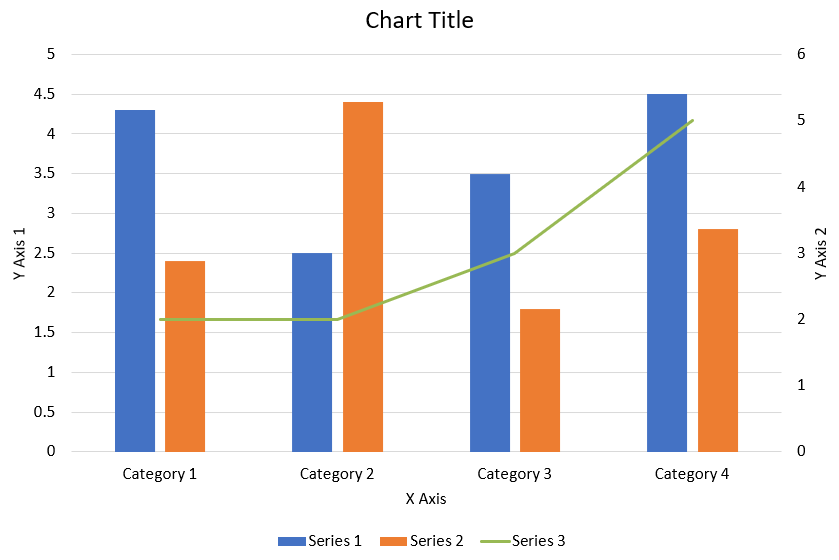
کد Python زیر نشان میدهد چگونه نمودار ترکیبی نشاندادهشده در بالا را در یک ارائهٔ PowerPoint ایجاد کنید:
import jpype
import asposeslides
if not jpype.isJVMStarted():
jpype.startJVM()
from asposeslides.api import AxisPositionType, ChartType, CrossesType, FillType, LegendPositionType, NullableBool, Presentation, SaveFormat
Color = jpype.JClass("java.awt.Color")
def create_combo_chart():
presentation = Presentation()
slide = presentation.getSlides().get_Item(0)
try:
chart = create_chart_with_first_series(slide)
add_second_series_to_chart(chart)
add_third_series_to_chart(chart)
set_primary_axes_format(chart)
set_secondary_axes_format(chart)
presentation.save("combo-chart.pptx", SaveFormat.Pptx)
finally:
presentation.dispose()
def create_chart_with_first_series(slide):
chart = slide.getShapes().addChart(ChartType.ClusteredColumn, 50, 50, 600, 400)
# عنوان نمودار را تنظیم کنید.
chart.setTitle(True)
chart.getChartTitle().addTextFrameForOverriding("Chart Title")
chart.getChartTitle().setOverlay(False)
title_paragraph = chart.getChartTitle().getTextFrameForOverriding().getParagraphs().get_Item(0)
title_format = title_paragraph.getParagraphFormat().getDefaultPortionFormat()
title_format.setFontBold(NullableBool.False_)
title_format.setFontHeight(18.0)
# افسانهٔ نمودار را تنظیم کنید.
chart.getLegend().setPosition(LegendPositionType.Bottom)
chart.getLegend().getTextFormat().getPortionFormat().setFontHeight(12.0)
# سریها و دستههای پیشفرض تولید شده را حذف کنید.
chart.getChartData().getSeries().clear()
chart.getChartData().getCategories().clear()
worksheet_index = 0
workbook = chart.getChartData().getChartDataWorkbook()
# دستههای جدید اضافه کنید.
cell = workbook.getCell(worksheet_index, 1, 0, "Category 1")
chart.getChartData().getCategories().add(cell)
cell = workbook.getCell(worksheet_index, 2, 0, "Category 2")
chart.getChartData().getCategories().add(cell)
cell = workbook.getCell(worksheet_index, 3, 0, "Category 3")
chart.getChartData().getCategories().add(cell)
cell = workbook.getCell(worksheet_index, 4, 0, "Category 4")
chart.getChartData().getCategories().add(cell)
# سری اول را اضافه کنید.
series_name_cell = workbook.getCell(worksheet_index, 0, 1, "Series 1")
series = chart.getChartData().getSeries().add(series_name_cell, chart.getType())
series.getParentSeriesGroup().setOverlap(jpype.JByte(-25))
series.getParentSeriesGroup().setGapWidth(220)
cell = workbook.getCell(worksheet_index, 1, 1, 4.3)
series.getDataPoints().addDataPointForBarSeries(cell)
cell = workbook.getCell(worksheet_index, 2, 1, 2.5)
series.getDataPoints().addDataPointForBarSeries(cell)
cell = workbook.getCell(worksheet_index, 3, 1, 3.5)
series.getDataPoints().addDataPointForBarSeries(cell)
cell = workbook.getCell(worksheet_index, 4, 1, 4.5)
series.getDataPoints().addDataPointForBarSeries(cell)
return chart
def add_second_series_to_chart(chart):
workbook = chart.getChartData().getChartDataWorkbook()
worksheet_index = 0
series_name_cell = workbook.getCell(worksheet_index, 0, 2, "Series 2")
series = chart.getChartData().getSeries().add(series_name_cell, ChartType.ClusteredColumn)
series.getParentSeriesGroup().setOverlap(jpype.JByte(-25))
series.getParentSeriesGroup().setGapWidth(220)
cell = workbook.getCell(worksheet_index, 1, 2, 2.4)
series.getDataPoints().addDataPointForBarSeries(cell)
cell = workbook.getCell(worksheet_index, 2, 2, 4.4)
series.getDataPoints().addDataPointForBarSeries(cell)
cell = workbook.getCell(worksheet_index, 3, 2, 1.8)
series.getDataPoints().addDataPointForBarSeries(cell)
cell = workbook.getCell(worksheet_index, 4, 2, 2.8)
series.getDataPoints().addDataPointForBarSeries(cell)
def add_third_series_to_chart(chart):
workbook = chart.getChartData().getChartDataWorkbook()
worksheet_index = 0
series_name_cell = workbook.getCell(worksheet_index, 0, 3, "Series 3")
series = chart.getChartData().getSeries().add(series_name_cell, ChartType.Line)
cell = workbook.getCell(worksheet_index, 1, 3, 2.0)
series.getDataPoints().addDataPointForLineSeries(cell)
cell = workbook.getCell(worksheet_index, 2, 3, 2.0)
series.getDataPoints().addDataPointForLineSeries(cell)
cell = workbook.getCell(worksheet_index, 3, 3, 3.0)
series.getDataPoints().addDataPointForLineSeries(cell)
cell = workbook.getCell(worksheet_index, 4, 3, 5.0)
series.getDataPoints().addDataPointForLineSeries(cell)
series.setPlotOnSecondAxis(True)
def set_primary_axes_format(chart):
# محور افقی را تنظیم کنید.
horizontal_axis = chart.getAxes().getHorizontalAxis()
horizontal_axis.getTextFormat().getPortionFormat().setFontHeight(12.0)
horizontal_axis.getFormat().getLine().getFillFormat().setFillType(FillType.NoFill)
set_axis_title(horizontal_axis, "X Axis")
# محور عمودی را تنظیم کنید.
vertical_axis = chart.getAxes().getVerticalAxis()
vertical_axis.getTextFormat().getPortionFormat().setFontHeight(12.0)
vertical_axis.getFormat().getLine().getFillFormat().setFillType(FillType.NoFill)
set_axis_title(vertical_axis, "Y Axis 1")
# رنگ خطوط شبکهٔ اصلی عمودی را تنظیم کنید.
major_grid_lines_format = vertical_axis.getMajorGridLinesFormat().getLine().getFillFormat()
major_grid_lines_format.setFillType(FillType.Solid)
color = Color(217, 217, 217)
major_grid_lines_format.getSolidFillColor().setColor(color)
def set_secondary_axes_format(chart):
# محور افقی ثانویه را تنظیم کنید.
secondary_horizontal_axis = chart.getAxes().getSecondaryHorizontalAxis()
secondary_horizontal_axis.setPosition(AxisPositionType.Bottom)
secondary_horizontal_axis.setCrossType(CrossesType.Maximum)
secondary_horizontal_axis.setVisible(False)
secondary_horizontal_axis.getMajorGridLinesFormat().getLine().getFillFormat().setFillType(FillType.NoFill)
secondary_horizontal_axis.getMinorGridLinesFormat().getLine().getFillFormat().setFillType(FillType.NoFill)
# محور عمودی ثانویه را تنظیم کنید.
secondary_vertical_axis = chart.getAxes().getSecondaryVerticalAxis()
secondary_vertical_axis.setPosition(AxisPositionType.Right)
secondary_vertical_axis.getTextFormat().getPortionFormat().setFontHeight(12.0)
secondary_vertical_axis.getFormat().getLine().getFillFormat().setFillType(FillType.NoFill)
secondary_vertical_axis.getMajorGridLinesFormat().getLine().getFillFormat().setFillType(FillType.NoFill)
secondary_vertical_axis.getMinorGridLinesFormat().getLine().getFillFormat().setFillType(FillType.NoFill)
set_axis_title(secondary_vertical_axis, "Y Axis 2")
def set_axis_title(axis, axis_title):
axis.setTitle(True)
axis.getTitle().setOverlay(False)
title_paragraph = axis.getTitle().addTextFrameForOverriding(axis_title).getParagraphs().get_Item(0)
title_format = title_paragraph.getParagraphFormat().getDefaultPortionFormat()
title_format.setFontBold(NullableBool.False_)
title_format.setFontHeight(12.0)
create_combo_chart()
بهروزرسانی نمودارها
- یک نمونه از کلاس Presentation که حاوی نمودار موردنظر برای بهروزرسانی است، ایجاد کنید.
- با استفاده از اندیس، به اسلاید ارجاع پیدا کنید.
- تمام اشکال را مرور کنید تا نمودار دلخواه را پیدا کنید.
- به کاربرگ دادههای نمودار دسترسی پیدا کنید.
- سری دادههای نمودار را با تغییر مقادیر سریها اصلاح کنید.
- یک سری جدید اضافه کنید و دادههای آن را مقداردهی کنید.
- ارائهٔ تغییر یافته را بهصورت فایل PPTX ذخیره کنید.
این کد Python نشان میدهد چگونه یک نمودار را بهروزرسانی کنید:
import jpype
import asposeslides
if not jpype.isJVMStarted():
jpype.startJVM()
from asposeslides.api import ChartType, Presentation, SaveFormat
# ارائهای که شامل نمودار است را باز میکند برای بهروزرسانی
presentation = Presentation("ExistingChart.pptx")
try:
# دسترسی به اولین اسلاید
slide = presentation.getSlides().get_Item(0)
# دریافت نمودار از اسلاید
chart = slide.getShapes().get_Item(0)
# تنظیم اندیس شیت دادههای نمودار
default_worksheet_index = 0
# دریافت کاربرگ دادههای نمودار
workbook = chart.getChartData().getChartDataWorkbook()
# تغییر نام دستهٔ نمودار
workbook.getCell(default_worksheet_index, 1, 0, "Modified Category 1")
workbook.getCell(default_worksheet_index, 2, 0, "Modified Category 2")
# دریافت سری اول نمودار
series = chart.getChartData().getSeries().get_Item(0)
# اکنون در حال بهروزرسانی دادههای سری است
workbook.getCell(default_worksheet_index, 0, 1, "New_Series1") # اصلاح نام سری
series.getDataPoints().get_Item(0).getValue().setData(90)
series.getDataPoints().get_Item(1).getValue().setData(123)
series.getDataPoints().get_Item(2).getValue().setData(44)
# دریافت سری دوم نمودار
series = chart.getChartData().getSeries().get_Item(1)
# اکنون در حال بهروزرسانی دادههای سری است
workbook.getCell(default_worksheet_index, 0, 2, "New_Series2") # اصلاح نام سری
series.getDataPoints().get_Item(0).getValue().setData(23)
series.getDataPoints().get_Item(1).getValue().setData(67)
series.getDataPoints().get_Item(2).getValue().setData(99)
# اکنون اضافه کردن یک سری جدید
cell = workbook.getCell(default_worksheet_index, 0, 3, "Series 3")
chart.getChartData().getSeries().add(cell, chart.getType())
# دریافت سری سوم نمودار
series = chart.getChartData().getSeries().get_Item(2)
# اکنون پر کردن دادههای سری
cell = workbook.getCell(default_worksheet_index, 1, 3, 20)
series.getDataPoints().addDataPointForBarSeries(cell)
cell = workbook.getCell(default_worksheet_index, 2, 3, 50)
series.getDataPoints().addDataPointForBarSeries(cell)
cell = workbook.getCell(default_worksheet_index, 3, 3, 30)
series.getDataPoints().addDataPointForBarSeries(cell)
chart.setType(ChartType.ClusteredCylinder)
# ذخیرهٔ ارائه با نمودار
presentation.save("AsposeChartModified_out.pptx", SaveFormat.Pptx)
finally:
presentation.dispose()
تنظیم محدودهٔ داده برای یک نمودار
برای تنظیم محدودهٔ داده برای یک نمودار، این مراحل را انجام دهید:
- یک نمونه از کلاس Presentation که حاوی نمودار است، ایجاد کنید.
- با استفاده از اندیس، به اسلاید ارجاع پیدا کنید.
- تمام اشکال را مرور کنید تا نمودار دلخواه را پیدا کنید.
- به دادههای نمودار دسترسی پیدا کنید و محدوده را تنظیم کنید.
- ارائهٔ تغییر یافته را بهصورت فایل PPTX ذخیره کنید.
این کد Python نشان میدهد چگونه محدودهٔ داده برای یک نمودار تنظیم شود:
import jpype
import asposeslides
if not jpype.isJVMStarted():
jpype.startJVM()
from asposeslides.api import Presentation, SaveFormat
# ارائهای که شامل نمودار است را باز میکند
presentation = Presentation("ExistingChart.pptx")
try:
slide = presentation.getSlides().get_Item(0)
chart = slide.getShapes().get_Item(0)
chart.getChartData().setRange("Sheet1!A1:B4")
presentation.save("SetDataRange_out.pptx", SaveFormat.Pptx)
finally:
presentation.dispose()
استفاده از نشانگرهای پیشفرض در نمودارها
زمانی که از نشانگرهای پیشفرض در نمودارها استفاده میکنید، هر سری نمودار بهصورت خودکار نماد نشانگر متفاوتی دریافت میکند.
این کد Python نشان میدهد چگونه نشانگرهای سری نمودار بهصورت خودکار تنظیم شوند:
import jpype
import asposeslides
if not jpype.isJVMStarted():
jpype.startJVM()
from asposeslides.api import ChartType, Presentation, SaveFormat
presentation = Presentation()
try:
slide = presentation.getSlides().get_Item(0)
chart = slide.getShapes().addChart(ChartType.LineWithMarkers, 10, 10, 400, 400)
chart.getChartData().getSeries().clear()
chart.getChartData().getCategories().clear()
workbook = chart.getChartData().getChartDataWorkbook()
cell = workbook.getCell(0, 0, 1, "Series 1")
chart.getChartData().getSeries().add(cell, chart.getType())
series = chart.getChartData().getSeries().get_Item(0)
cell = workbook.getCell(0, 1, 0, "C1")
chart.getChartData().getCategories().add(cell)
cell = workbook.getCell(0, 1, 1, 24)
series.getDataPoints().addDataPointForLineSeries(cell)
cell = workbook.getCell(0, 2, 0, "C2")
chart.getChartData().getCategories().add(cell)
cell = workbook.getCell(0, 2, 1, 23)
series.getDataPoints().addDataPointForLineSeries(cell)
cell = workbook.getCell(0, 3, 0, "C3")
chart.getChartData().getCategories().add(cell)
cell = workbook.getCell(0, 3, 1, -10)
series.getDataPoints().addDataPointForLineSeries(cell)
cell = workbook.getCell(0, 4, 0, "C4")
chart.getChartData().getCategories().add(cell)
cell = workbook.getCell(0, 4, 1, None)
series.getDataPoints().addDataPointForLineSeries(cell)
cell = workbook.getCell(0, 0, 2, "Series 2")
chart.getChartData().getSeries().add(cell, chart.getType())
# دریافت سری دوم نمودار
second_series = chart.getChartData().getSeries().get_Item(1)
# اکنون دادههای سری را پر میکند
cell = workbook.getCell(0, 1, 2, 30)
second_series.getDataPoints().addDataPointForLineSeries(cell)
cell = workbook.getCell(0, 2, 2, 10)
second_series.getDataPoints().addDataPointForLineSeries(cell)
cell = workbook.getCell(0, 3, 2, 60)
second_series.getDataPoints().addDataPointForLineSeries(cell)
cell = workbook.getCell(0, 4, 2, 40)
second_series.getDataPoints().addDataPointForLineSeries(cell)
chart.setLegend(True)
chart.getLegend().setOverlay(False)
presentation.save("DefaultMarkersInChart.pptx", SaveFormat.Pptx)
finally:
presentation.dispose()
سؤالات متداول
کدام انواع نمودارها توسط Aspose.Slides پشتیبانی میشوند؟
Aspose.Slides طیف وسیعی از انواع نمودارها را پشتیبانی میکند، از جمله میلهای، خطی، دایرهای، ناحیهای، پراکندگی، هیستوگرام، رادار و موارد دیگر. این انعطافپذیری به شما اجازه میدهد تا مناسبترین نوع نمودار را برای نیازهای تجسم دادهٔ خود انتخاب کنید.
چگونه یک نمودار جدید به اسلاید اضافه کنم؟
برای افزودن نمودار، ابتدا یک نمونه از کلاس Presentation ایجاد کنید، اسلاید موردنظر را با استفاده از اندیس دریافت کنید و سپس متد افزودن نمودار را صدا بزنید، نوع نمودار و دادههای اولیه را مشخص کنید. این فرآیند نمودار را مستقیماً در ارائهٔ شما ادغام میکند.
چگونه میتوان دادههای نمایشدادهشده در یک نمودار را بهروزرسانی کرد؟
میتوانید دادههای یک نمودار را با دسترسی به کتاب کار دادهها (ChartDataWorkbook)، پاک کردن سریها و دستههای پیشفرض و افزودن دادههای سفارشی خود بهروز کنید. این امکان بهروزرسانی نمودار را برای انعکاس جدیدترین دادهها فراهم میکند.
آیا امکان سفارشیسازی ظاهر نمودار وجود دارد؟
بله، Aspose.Slides گزینههای سفارشیسازی گستردهای ارائه میدهد. میتوانید رنگها، قلمها، برچسبها، افسانهها و سایر عناصر فرمتبندی را تغییر دهید تا ظاهر نمودار را بر اساس نیازهای طراحی خاص خود تنظیم کنید.