
Crea o Aggiorna Grafici nelle Presentazioni PowerPoint in Python
Panoramica
Questo articolo fornisce una guida completa su come creare e personalizzare i grafici utilizzando Aspose.Slides. Imparerai come aggiungere programmaticamente un grafico a una diapositiva, popolarlo con dati e applicare varie opzioni di formattazione per soddisfare i requisiti di design specifici. Nell’articolo, esempi di codice dettagliati illustrano ogni passaggio, dall’inizializzazione della presentazione e dell’oggetto grafico alla configurazione di serie, assi e legende. Seguendo questa guida, otterrai una solida comprensione di come integrare la generazione dinamica di grafici nelle tue applicazioni, semplificando il processo di creazione di presentazioni basate sui dati.
Creare un grafico
I grafici aiutano le persone a visualizzare rapidamente i dati e a ottenere intuizioni che potrebbero non essere immediatamente evidenti da una tabella o un foglio di calcolo.
Perché creare grafici?
Utilizzando i grafici, è possibile:
- aggregare, condensare o riassumere grandi quantità di dati in un’unica diapositiva di una presentazione
- evidenziare modelli e tendenze nei dati
- dedurre la direzione e lo slancio dei dati nel tempo o rispetto a una specifica unità di misura
- individuare valori anomali, aberrazioni, deviazioni, errori, dati insensati, ecc.
- comunicare o presentare dati complessi
In PowerPoint, è possibile creare grafici tramite la funzione Inserisci, che fornisce modelli per la progettazione di molti tipi di grafici. Utilizzando Aspose.Slides, è possibile creare sia grafici regolari (basati su tipi di grafico popolari) sia grafici personalizzati.
Note
Per creare grafici, utilizzare la classe ChartType. I campi di questa classe corrispondono a diversi tipi di grafico.Creare grafici a colonne raggruppate
Questa sezione spiega come creare grafici a colonne raggruppate utilizzando Aspose.Slides. Imparerai a inizializzare una presentazione, aggiungere un grafico e personalizzare i suoi elementi come titolo, dati, serie, categorie e stile. Segui i passaggi qui sotto per vedere come viene generato un grafico a colonne raggruppate standard:
- Creare un’istanza della classe Presentation .
- Ottenere un riferimento a una diapositiva usando il suo indice.
- Aggiungere un grafico con alcuni dati e specificare il tipo
ChartType.ClusteredColumn. - Aggiungere un titolo al grafico.
- Accedere al foglio di lavoro dei dati del grafico.
- Cancellare tutte le serie e categorie predefinite.
- Aggiungere nuove serie e categorie.
- Aggiungere nuovi dati al grafico per le serie.
- Applicare un colore di riempimento alle serie del grafico.
- Aggiungere etichette alle serie del grafico.
- Salvare la presentazione modificata come file PPTX.
Questo codice C# dimostra come creare un grafico a colonne raggruppate:
import jpype
import asposeslides

if not jpype.isJVMStarted():
    jpype.startJVM()

from asposeslides.api import ChartType, FillType, NullableBool, Presentation, SaveFormat

Color = jpype.JClass("java.awt.Color")

# Istanzia una classe di presentazione che rappresenta un file PPTX.
presentation = Presentation()
try:
    # Accede alla prima diapositiva
    slide = presentation.getSlides().get_Item(0)

    # Aggiunge un grafico con i dati predefiniti
    chart = slide.getShapes().addChart(ChartType.ClusteredColumn, 0, 0, 500, 500)

    # Imposta il titolo del grafico
    chart.getChartTitle().addTextFrameForOverriding("Sample Title")
    chart.getChartTitle().getTextFrameForOverriding().getTextFrameFormat().setCenterText(NullableBool.True_)
    chart.getChartTitle().setHeight(20)
    chart.setTitle(True)

    # Imposta l'indice per il foglio dati del grafico
    default_worksheet_index = 0

    # Ottiene il foglio di lavoro dei dati del grafico
    workbook = chart.getChartData().getChartDataWorkbook()

    # Elimina le serie e le categorie generate di default
    chart.getChartData().getSeries().clear()
    chart.getChartData().getCategories().clear()

    # Aggiunge nuove serie
    cell = workbook.getCell(default_worksheet_index, 0, 1, "Series 1")
    chart.getChartData().getSeries().add(cell,chart.getType())
    cell = workbook.getCell(default_worksheet_index, 0, 2, "Series 2")
    chart.getChartData().getSeries().add(cell,chart.getType())

    # Aggiunge nuove categorie
    cell = workbook.getCell(default_worksheet_index, 1, 0, "Category 1")
    chart.getChartData().getCategories().add(cell)
    cell = workbook.getCell(default_worksheet_index, 2, 0, "Category 2")
    chart.getChartData().getCategories().add(cell)
    cell = workbook.getCell(default_worksheet_index, 3, 0, "Category 3")
    chart.getChartData().getCategories().add(cell)

    # Prende la prima serie del grafico
    series = chart.getChartData().getSeries().get_Item(0)

    # Ora popola i dati della serie
    cell = workbook.getCell(default_worksheet_index, 1, 1, 20)
    series.getDataPoints().addDataPointForBarSeries(cell)
    cell = workbook.getCell(default_worksheet_index, 2, 1, 50)
    series.getDataPoints().addDataPointForBarSeries(cell)
    cell = workbook.getCell(default_worksheet_index, 3, 1, 30)
    series.getDataPoints().addDataPointForBarSeries(cell)

    # Imposta il colore di riempimento per la serie
    series.getFormat().getFill().setFillType(FillType.Solid)
    series.getFormat().getFill().getSolidFillColor().setColor(Color.RED)

    # Prende la seconda serie del grafico
    series = chart.getChartData().getSeries().get_Item(1)

    # Popola i dati della serie
    cell = workbook.getCell(default_worksheet_index, 1, 2, 30)
    series.getDataPoints().addDataPointForBarSeries(cell)
    cell = workbook.getCell(default_worksheet_index, 2, 2, 10)
    series.getDataPoints().addDataPointForBarSeries(cell)
    cell = workbook.getCell(default_worksheet_index, 3, 2, 60)
    series.getDataPoints().addDataPointForBarSeries(cell)

    # Imposta il colore di riempimento per la serie
    series.getFormat().getFill().setFillType(FillType.Solid)
    series.getFormat().getFill().getSolidFillColor().setColor(Color.GREEN)

    #Crea etichette personalizzate per ogni categoria per la nuova serie
    # Imposta la prima etichetta per mostrare il nome della categoria
    label = series.getDataPoints().get_Item(0).getLabel()
    label.getDataLabelFormat().setShowCategoryName(True)

    label = series.getDataPoints().get_Item(1).getLabel()
    label.getDataLabelFormat().setShowSeriesName(True)

    # Mostra il valore per la terza etichetta
    label = series.getDataPoints().get_Item(2).getLabel()
    label.getDataLabelFormat().setShowValue(True)
    label.getDataLabelFormat().setShowSeriesName(True)
    label.getDataLabelFormat().setSeparator("/")

    # Salva la presentazione con il grafico
    presentation.save("output.pptx", SaveFormat.Pptx)
finally:
    presentation.dispose()
Creare grafici a dispersione
I grafici a dispersione (noti anche come scatter plot o grafici x‑y) sono spesso usati per verificare la presenza di modelli o per dimostrare correlazioni tra due variabili.
Usa un grafico a dispersione quando:
- disponi di dati numerici accoppiati
- hai due variabili che si abbinano bene tra loro
- vuoi determinare se due variabili sono correlate
- hai una variabile indipendente che ha più valori per una variabile dipendente
- Segui i passaggi in Create Clustered Column Charts.
- Per il terzo passaggio, aggiungi un grafico con alcuni dati e specifica il tipo di grafico come uno dei seguenti:
- ChartType.ScatterWithMarkers - Rappresenta un grafico a dispersione.
- ChartType.ScatterWithSmoothLinesAndMarkers - Rappresenta un grafico a dispersione connesso da curve, con marcatori dati.
- ChartType.ScatterWithSmoothLines - Rappresenta un grafico a dispersione connesso da curve, senza marcatori dati.
- ChartType.ScatterWithStraightLinesAndMarkers - Rappresenta un grafico a dispersione connesso da linee, con marcatori dati.
- ChartType.ScatterWithStraightLines - Rappresenta un grafico a dispersione connesso da linee, senza marcatori dati.
Questo codice Python mostra come creare un grafico a dispersione con marcatori diversi per ciascuna serie:
import jpype
import asposeslides

if not jpype.isJVMStarted():
    jpype.startJVM()

from asposeslides.api import ChartType, MarkerStyleType, Presentation, SaveFormat

# Istanzia una classe di presentazione che rappresenta un file PPTX.
presentation = Presentation()
try:
    # Accede alla prima diapositiva
    slide = presentation.getSlides().get_Item(0)

    # Crea il grafico predefinito
    chart = slide.getShapes().addChart(ChartType.ScatterWithSmoothLines, 0, 0, 400, 400)

    # Ottiene l'indice del foglio dati predefinito del grafico
    default_worksheet_index = 0

    # Ottiene il foglio dati del grafico
    workbook = chart.getChartData().getChartDataWorkbook()

    # Elimina le serie demo
    chart.getChartData().getSeries().clear()

    # Aggiunge nuove serie
    cell = workbook.getCell(default_worksheet_index, 1, 1, "Series 1")
    chart.getChartData().getSeries().add(cell, chart.getType())
    cell = workbook.getCell(default_worksheet_index, 1, 3, "Series 2")
    chart.getChartData().getSeries().add(cell, chart.getType())

    # Prende la prima serie del grafico
    series = chart.getChartData().getSeries().get_Item(0)

    # Aggiunge un nuovo punto (1:3) alla serie
    x_cell = workbook.getCell(default_worksheet_index, 2, 1, 1)
    y_cell = workbook.getCell(default_worksheet_index, 2, 2, 3)
    series.getDataPoints().addDataPointForScatterSeries(x_cell, y_cell)

    # Aggiunge un nuovo punto (2:10)
    x_cell = workbook.getCell(default_worksheet_index, 3, 1, 2)
    y_cell = workbook.getCell(default_worksheet_index, 3, 2, 10)
    series.getDataPoints().addDataPointForScatterSeries(x_cell, y_cell)

    # Modifica il tipo della serie
    series.setType(ChartType.ScatterWithStraightLinesAndMarkers)

    # Modifica il marcatore della serie del grafico
    series.getMarker().setSize(10)
    series.getMarker().setSymbol(MarkerStyleType.Star)

    # Prende la seconda serie del grafico
    series = chart.getChartData().getSeries().get_Item(1)

    # Aggiunge un nuovo punto (5:2) lì
    x_cell = workbook.getCell(default_worksheet_index, 2, 3, 5)
    y_cell = workbook.getCell(default_worksheet_index, 2, 4, 2)
    series.getDataPoints().addDataPointForScatterSeries(x_cell, y_cell)

    # Aggiunge un nuovo punto (3:1)
    x_cell = workbook.getCell(default_worksheet_index, 3, 3, 3)
    y_cell = workbook.getCell(default_worksheet_index, 3, 4, 1)
    series.getDataPoints().addDataPointForScatterSeries(x_cell, y_cell)

    # Aggiunge un nuovo punto (2:2)
    x_cell = workbook.getCell(default_worksheet_index, 4, 3, 2)
    y_cell = workbook.getCell(default_worksheet_index, 4, 4, 2)
    series.getDataPoints().addDataPointForScatterSeries(x_cell, y_cell)

    # Aggiunge un nuovo punto (5:1)
    x_cell = workbook.getCell(default_worksheet_index, 5, 3, 5)
    y_cell = workbook.getCell(default_worksheet_index, 5, 4, 1)
    series.getDataPoints().addDataPointForScatterSeries(x_cell, y_cell)

    # Modifica il marcatore della serie del grafico
    series.getMarker().setSize(10)
    series.getMarker().setSymbol(MarkerStyleType.Circle)

    presentation.save("AsposeChart_out.pptx", SaveFormat.Pptx)
finally:
    presentation.dispose()
Creare grafici a torta
I grafici a torta sono più indicati per mostrare la relazione parte‑totale nei dati, specialmente quando i dati contengono etichette categoriche con valori numerici. Tuttavia, se i dati contengono molte parti o etichette, potresti considerare l’uso di un grafico a barre.
- Creare un’istanza della classe Presentation .
- Ottenere un riferimento a una diapositiva usando il suo indice.
- Aggiungere un grafico con dati predefiniti e specificare il tipo ChartType.Pie .
- Accedere al workbook dei dati del grafico ChartDataWorkbook .
- Cancellare le serie e le categorie predefinite.
- Aggiungere nuove serie e categorie.
- Aggiungere nuovi dati al grafico per le serie.
- Aggiungere nuovi punti al grafico e applicare colori personalizzati per i settori del grafico a torta.
- Impostare le etichette per le serie.
- Abilitare le linee guida per le etichette delle serie.
- Impostare l’angolo di rotazione per i settori del grafico a torta.
- Salvare la presentazione modificata come file PPTX.
Questo codice Python mostra come creare un grafico a torta:
import jpype
import asposeslides

if not jpype.isJVMStarted():
    jpype.startJVM()

from asposeslides.api import ChartType, FillType, LineDashStyle, LineStyle, NullableBool, Presentation, SaveFormat

Color = jpype.JClass("java.awt.Color")

# Istanzia una classe di presentazione che rappresenta un file PPTX.
presentation = Presentation()
try:
    # Accede alla prima diapositiva
    slide = presentation.getSlides().get_Item(0)

    # Aggiunge un grafico con i dati predefiniti
    chart = slide.getShapes().addChart(ChartType.Pie, 100, 100, 400, 400)

    # Imposta il titolo del grafico
    chart.getChartTitle().addTextFrameForOverriding("Sample Title")
    chart.getChartTitle().getTextFrameForOverriding().getTextFrameFormat().setCenterText(NullableBool.True_)
    chart.getChartTitle().setHeight(20)
    chart.setTitle(True)

    # Imposta l'indice per il foglio dati del grafico
    default_worksheet_index = 0

    # Ottiene il foglio dati del grafico
    workbook = chart.getChartData().getChartDataWorkbook()

    # Elimina le serie e le categorie generate di default
    chart.getChartData().getSeries().clear()
    chart.getChartData().getCategories().clear()

    # Aggiunge nuove categorie
    cell = workbook.getCell(0, 1, 0, "First Qtr")
    chart.getChartData().getCategories().add(cell)
    cell = workbook.getCell(0, 2, 0, "2nd Qtr")
    chart.getChartData().getCategories().add(cell)
    cell = workbook.getCell(0, 3, 0, "3rd Qtr")
    chart.getChartData().getCategories().add(cell)

    # Aggiunge nuove serie
    cell = workbook.getCell(0, 0, 1, "Series 1")
    series = chart.getChartData().getSeries().add(cell, chart.getType())

    #Popola i dati della serie
    cell = workbook.getCell(default_worksheet_index, 1, 1, 20)
    series.getDataPoints().addDataPointForPieSeries(cell)
    cell = workbook.getCell(default_worksheet_index, 2, 1, 50)
    series.getDataPoints().addDataPointForPieSeries(cell)
    cell = workbook.getCell(default_worksheet_index, 3, 1, 30)
    series.getDataPoints().addDataPointForPieSeries(cell)

    # Aggiunge nuovi punti e imposta il colore del settore
    chart.getChartData().getSeriesGroups().get_Item(0).setColorVaried(True)

    point = series.getDataPoints().get_Item(0)
    point.getFormat().getFill().setFillType(FillType.Solid)
    point.getFormat().getFill().getSolidFillColor().setColor(Color.CYAN)

    # Imposta il bordo del settore
    point.getFormat().getLine().getFillFormat().setFillType(FillType.Solid)
    point.getFormat().getLine().getFillFormat().getSolidFillColor().setColor(Color.GRAY)
    point.getFormat().getLine().setWidth(3.0)
    point.getFormat().getLine().setStyle(LineStyle.ThinThick)
    point.getFormat().getLine().setDashStyle(LineDashStyle.DashDot)

    second_point = series.getDataPoints().get_Item(1)
    second_point.getFormat().getFill().setFillType(FillType.Solid)
    second_point.getFormat().getFill().getSolidFillColor().setColor(Color.ORANGE)

    # Imposta il bordo del settore
    second_point.getFormat().getLine().getFillFormat().setFillType(FillType.Solid)
    second_point.getFormat().getLine().getFillFormat().getSolidFillColor().setColor(Color.BLUE)
    second_point.getFormat().getLine().setWidth(3.0)
    second_point.getFormat().getLine().setStyle(LineStyle.Single)
    second_point.getFormat().getLine().setDashStyle(LineDashStyle.LargeDashDot)

    third_point = series.getDataPoints().get_Item(2)
    third_point.getFormat().getFill().setFillType(FillType.Solid)
    third_point.getFormat().getFill().getSolidFillColor().setColor(Color.YELLOW)

    # Imposta il bordo del settore
    third_point.getFormat().getLine().getFillFormat().setFillType(FillType.Solid)
    third_point.getFormat().getLine().getFillFormat().getSolidFillColor().setColor(Color.RED)
    third_point.getFormat().getLine().setWidth(2.0)
    third_point.getFormat().getLine().setStyle(LineStyle.ThinThin)
    third_point.getFormat().getLine().setDashStyle(LineDashStyle.LargeDashDotDot)

    # Crea etichette personalizzate per ciascuna categoria per la nuova serie
    first_label = series.getDataPoints().get_Item(0).getLabel()
    first_label.getDataLabelFormat().setShowValue(True)

    second_label = series.getDataPoints().get_Item(1).getLabel()
    second_label.getDataLabelFormat().setShowValue(True)
    second_label.getDataLabelFormat().setShowLegendKey(True)
    second_label.getDataLabelFormat().setShowPercentage(True)

    third_label = series.getDataPoints().get_Item(2).getLabel()
    third_label.getDataLabelFormat().setShowSeriesName(True)
    third_label.getDataLabelFormat().setShowPercentage(True)

    # Mostra le linee guida per il grafico
    series.getLabels().getDefaultDataLabelFormat().setShowLeaderLines(True)

    # Imposta l'angolo di rotazione per i settori del grafico a torta
    chart.getChartData().getSeriesGroups().get_Item(0).setFirstSliceAngle(180)

    # Salva la presentazione con un grafico
    presentation.save("PieChart_out.pptx", SaveFormat.Pptx)
finally:
    presentation.dispose()
Creare grafici a linee
I grafici a linee (noti anche come grafici lineari) sono più indicati in situazioni in cui vuoi dimostrare cambiamenti di valore nel tempo. Con un grafico a linee, puoi confrontare una grande quantità di dati simultaneamente, monitorare variazioni e tendenze nel tempo, evidenziare anomalie nelle serie di dati e altro ancora.
- Creare un’istanza della classe Presentation .
- Ottenere un riferimento a una diapositiva usando il suo indice.
- Aggiungere un grafico con dati predefiniti e specificare il tipo ChartType.Line .
- Salvare la presentazione modificata come file PPTX.
Questo codice Python mostra come creare un grafico a linee:
import jpype
import asposeslides

if not jpype.isJVMStarted():
    jpype.startJVM()

from asposeslides.api import ChartType, Presentation, SaveFormat

presentation = Presentation()
try:
    line_chart = presentation.getSlides().get_Item(0).getShapes().addChart(ChartType.Line, 10, 50, 600, 350)

    presentation.save("line_chart.pptx", SaveFormat.Pptx)
finally:
    presentation.dispose()
Per impostazione predefinita, i punti di un grafico a linee sono collegati da linee continue dritte. Se desideri che i punti siano collegati da linee tratteggiate, puoi specificare il tipo di tratto preferito come segue:
import jpype
import asposeslides

if not jpype.isJVMStarted():
    jpype.startJVM()

from asposeslides.api import ChartType, LineDashStyle, Presentation, SaveFormat

presentation = Presentation()
try:
    line_chart = presentation.getSlides().get_Item(0).getShapes().addChart(ChartType.Line, 10, 50, 600, 350)

    for series in line_chart.getChartData().getSeries():
        series.getFormat().getLine().setDashStyle(LineDashStyle.Dash)

    presentation.save("line_chart.pptx", SaveFormat.Pptx)
finally:
    presentation.dispose()
Creare grafici a mappa ad albero
I grafici a mappa ad albero sono più indicati per dati di vendita quando vuoi mostrare la dimensione relativa delle categorie di dati e attirare rapidamente l’attenzione sugli elementi che contribuiscono maggiormente all’interno di ciascuna categoria.
- Creare un’istanza della classe Presentation .
- Ottenere un riferimento a una diapositiva usando il suo indice.
- Aggiungere un grafico con dati predefiniti e specificare il tipo ChartType.Treemap .
- Accedere al workbook dei dati del grafico ChartDataWorkbook .
- Cancellare le serie e le categorie predefinite.
- Aggiungere nuove serie e categorie.
- Aggiungere nuovi dati al grafico per le serie.
- Salvare la presentazione modificata come file PPTX.
Questo codice Python mostra come creare un grafico a mappa ad albero:
import jpype
import asposeslides

if not jpype.isJVMStarted():
    jpype.startJVM()

from asposeslides.api import ChartType, ParentLabelLayoutType, Presentation, SaveFormat

presentation = Presentation()
try:
    chart = presentation.getSlides().get_Item(0).getShapes().addChart(ChartType.Treemap, 50, 50, 500, 400)
    chart.getChartData().getCategories().clear()
    chart.getChartData().getSeries().clear()

    workbook = chart.getChartData().getChartDataWorkbook()
    workbook.clear(0)

    #ramo 1
    cell = workbook.getCell(0, "C1", "Leaf1")
    leaf = chart.getChartData().getCategories().add(cell)
    leaf.getGroupingLevels().setGroupingItem(1, "Stem1")
    leaf.getGroupingLevels().setGroupingItem(2, "Branch1")

    cell = workbook.getCell(0, "C2", "Leaf2")
    chart.getChartData().getCategories().add(cell)

    cell = workbook.getCell(0, "C3", "Leaf3")
    leaf = chart.getChartData().getCategories().add(cell)
    leaf.getGroupingLevels().setGroupingItem(1, "Stem2")

    cell = workbook.getCell(0, "C4", "Leaf4")
    chart.getChartData().getCategories().add(cell)

    #ramo 2
    cell = workbook.getCell(0, "C5", "Leaf5")
    leaf = chart.getChartData().getCategories().add(cell)
    leaf.getGroupingLevels().setGroupingItem(1, "Stem3")
    leaf.getGroupingLevels().setGroupingItem(2, "Branch2")

    cell = workbook.getCell(0, "C6", "Leaf6")
    chart.getChartData().getCategories().add(cell)

    cell = workbook.getCell(0, "C7", "Leaf7")
    leaf = chart.getChartData().getCategories().add(cell)
    leaf.getGroupingLevels().setGroupingItem(1, "Stem4")

    cell = workbook.getCell(0, "C8", "Leaf8")
    chart.getChartData().getCategories().add(cell)

    series = chart.getChartData().getSeries().add(ChartType.Treemap)
    series.getLabels().getDefaultDataLabelFormat().setShowCategoryName(True)
    cell = workbook.getCell(0, "D1", 4)
    series.getDataPoints().addDataPointForTreemapSeries(cell)
    cell = workbook.getCell(0, "D2", 5)
    series.getDataPoints().addDataPointForTreemapSeries(cell)
    cell = workbook.getCell(0, "D3", 3)
    series.getDataPoints().addDataPointForTreemapSeries(cell)
    cell = workbook.getCell(0, "D4", 6)
    series.getDataPoints().addDataPointForTreemapSeries(cell)
    cell = workbook.getCell(0, "D5", 9)
    series.getDataPoints().addDataPointForTreemapSeries(cell)
    cell = workbook.getCell(0, "D6", 9)
    series.getDataPoints().addDataPointForTreemapSeries(cell)
    cell = workbook.getCell(0, "D7", 4)
    series.getDataPoints().addDataPointForTreemapSeries(cell)
    cell = workbook.getCell(0, "D8", 3)
    series.getDataPoints().addDataPointForTreemapSeries(cell)

    series.setParentLabelLayout(ParentLabelLayoutType.Overlapping)

    presentation.save("Treemap.pptx", SaveFormat.Pptx)
finally:
    presentation.dispose()
Creare grafici finanziari (stock)
- Creare un’istanza della classe Presentation .
- Ottenere un riferimento a una diapositiva usando il suo indice.
- Aggiungere un grafico con dati predefiniti e specificare il tipo ChartType.OpenHighLowClose .
- Accedere al workbook dei dati del grafico ChartDataWorkbook .
- Cancellare le serie e le categorie predefinite.
- Aggiungere nuove serie e categorie.
- Aggiungere nuovi dati al grafico per le serie.
- Specificare il formato delle linee high‑low.
- Salvare la presentazione modificata come file PPTX.
Questo codice Python mostra come creare un grafico finanziario:
import jpype
import asposeslides

if not jpype.isJVMStarted():
    jpype.startJVM()

from asposeslides.api import ChartType, FillType, Presentation, SaveFormat

presentation = Presentation()
try:
    chart = presentation.getSlides().get_Item(0).getShapes().addChart(ChartType.OpenHighLowClose, 50, 50, 600, 400, False)

    chart.getChartData().getSeries().clear()
    chart.getChartData().getCategories().clear()

    workbook = chart.getChartData().getChartDataWorkbook()

    cell = workbook.getCell(0, 1, 0, "A")
    chart.getChartData().getCategories().add(cell)
    cell = workbook.getCell(0, 2, 0, "B")
    chart.getChartData().getCategories().add(cell)
    cell = workbook.getCell(0, 3, 0, "C")
    chart.getChartData().getCategories().add(cell)

    cell = workbook.getCell(0, 0, 1, "Open")
    chart.getChartData().getSeries().add(cell, chart.getType())
    cell = workbook.getCell(0, 0, 2, "High")
    chart.getChartData().getSeries().add(cell, chart.getType())
    cell = workbook.getCell(0, 0, 3, "Low")
    chart.getChartData().getSeries().add(cell, chart.getType())
    cell = workbook.getCell(0, 0, 4, "Close")
    chart.getChartData().getSeries().add(cell, chart.getType())

    series = chart.getChartData().getSeries().get_Item(0)

    cell = workbook.getCell(0, 1, 1, 72)
    series.getDataPoints().addDataPointForStockSeries(cell)
    cell = workbook.getCell(0, 2, 1, 25)
    series.getDataPoints().addDataPointForStockSeries(cell)
    cell = workbook.getCell(0, 3, 1, 38)
    series.getDataPoints().addDataPointForStockSeries(cell)

    series = chart.getChartData().getSeries().get_Item(1)
    cell = workbook.getCell(0, 1, 2, 172)
    series.getDataPoints().addDataPointForStockSeries(cell)
    cell = workbook.getCell(0, 2, 2, 57)
    series.getDataPoints().addDataPointForStockSeries(cell)
    cell = workbook.getCell(0, 3, 2, 57)
    series.getDataPoints().addDataPointForStockSeries(cell)

    series = chart.getChartData().getSeries().get_Item(2)
    cell = workbook.getCell(0, 1, 3, 12)
    series.getDataPoints().addDataPointForStockSeries(cell)
    cell = workbook.getCell(0, 2, 3, 12)
    series.getDataPoints().addDataPointForStockSeries(cell)
    cell = workbook.getCell(0, 3, 3, 13)
    series.getDataPoints().addDataPointForStockSeries(cell)

    series = chart.getChartData().getSeries().get_Item(3)
    cell = workbook.getCell(0, 1, 4, 25)
    series.getDataPoints().addDataPointForStockSeries(cell)
    cell = workbook.getCell(0, 2, 4, 38)
    series.getDataPoints().addDataPointForStockSeries(cell)
    cell = workbook.getCell(0, 3, 4, 50)
    series.getDataPoints().addDataPointForStockSeries(cell)

    chart.getChartData().getSeriesGroups().get_Item(0).getUpDownBars().setUpDownBars(True)
    chart.getChartData().getSeriesGroups().get_Item(0).getHiLowLinesFormat().getLine().getFillFormat().setFillType(FillType.Solid)

    for series in chart.getChartData().getSeries():
        series.getFormat().getLine().getFillFormat().setFillType(FillType.NoFill)

    presentation.save("output.pptx", SaveFormat.Pptx)
finally:
    presentation.dispose()
Creare grafici a scatola e baffi (box and whisker)
- Creare un’istanza della classe Presentation .
- Ottenere un riferimento a una diapositiva usando il suo indice.
- Aggiungere un grafico con dati predefiniti e specificare il tipo ChartType.BoxAndWhisker .
- Accedere al workbook dei dati del grafico ChartDataWorkbook .
- Cancellare le serie e le categorie predefinite.
- Aggiungere nuove serie e categorie.
- Aggiungere nuovi dati al grafico per le serie.
- Salvare la presentazione modificata come file PPTX.
Questo codice Python mostra come creare un grafico a scatola e baffi:
import jpype
import asposeslides

if not jpype.isJVMStarted():
    jpype.startJVM()

from asposeslides.api import ChartType, Presentation, QuartileMethodType, SaveFormat

presentation = Presentation()
try:
    chart = presentation.getSlides().get_Item(0).getShapes().addChart(ChartType.BoxAndWhisker, 50, 50, 500, 400)
    chart.getChartData().getCategories().clear()
    chart.getChartData().getSeries().clear()

    workbook = chart.getChartData().getChartDataWorkbook()
    workbook.clear(0)

    cell = workbook.getCell(0, "A1", "Category 1")
    chart.getChartData().getCategories().add(cell)
    cell = workbook.getCell(0, "A2", "Category 1")
    chart.getChartData().getCategories().add(cell)
    cell = workbook.getCell(0, "A3", "Category 1")
    chart.getChartData().getCategories().add(cell)
    cell = workbook.getCell(0, "A4", "Category 1")
    chart.getChartData().getCategories().add(cell)
    cell = workbook.getCell(0, "A5", "Category 1")
    chart.getChartData().getCategories().add(cell)
    cell = workbook.getCell(0, "A6", "Category 1")
    chart.getChartData().getCategories().add(cell)

    series = chart.getChartData().getSeries().add(ChartType.BoxAndWhisker)

    series.setQuartileMethod(QuartileMethodType.Exclusive)
    series.setShowMeanLine(True)
    series.setShowMeanMarkers(True)
    series.setShowInnerPoints(True)
    series.setShowOutlierPoints(True)

    cell = workbook.getCell(0, "B1", 15)
    series.getDataPoints().addDataPointForBoxAndWhiskerSeries(cell)
    cell = workbook.getCell(0, "B2", 41)
    series.getDataPoints().addDataPointForBoxAndWhiskerSeries(cell)
    cell = workbook.getCell(0, "B3", 16)
    series.getDataPoints().addDataPointForBoxAndWhiskerSeries(cell)
    cell = workbook.getCell(0, "B4", 10)
    series.getDataPoints().addDataPointForBoxAndWhiskerSeries(cell)
    cell = workbook.getCell(0, "B5", 23)
    series.getDataPoints().addDataPointForBoxAndWhiskerSeries(cell)
    cell = workbook.getCell(0, "B6", 16)
    series.getDataPoints().addDataPointForBoxAndWhiskerSeries(cell)

    presentation.save("BoxAndWhisker.pptx", SaveFormat.Pptx)
finally:
    presentation.dispose()
Creare grafici a imbuto (funnel)
- Creare un’istanza della classe Presentation .
- Ottenere un riferimento a una diapositiva usando il suo indice.
- Aggiungere un grafico con dati predefiniti e specificare il tipo ChartType.Funnel .
- Salvare la presentazione modificata come file PPTX.
Questo codice Python mostra come creare un grafico a imbuto:
import jpype
import asposeslides

if not jpype.isJVMStarted():
    jpype.startJVM()

from asposeslides.api import ChartType, Presentation, SaveFormat

presentation = Presentation()
try:
    chart = presentation.getSlides().get_Item(0).getShapes().addChart(ChartType.Funnel, 50, 50, 500, 400)
    chart.getChartData().getCategories().clear()
    chart.getChartData().getSeries().clear()

    workbook = chart.getChartData().getChartDataWorkbook()

    workbook.clear(0)

    cell = workbook.getCell(0, "A1", "Category 1")
    chart.getChartData().getCategories().add(cell)
    cell = workbook.getCell(0, "A2", "Category 2")
    chart.getChartData().getCategories().add(cell)
    cell = workbook.getCell(0, "A3", "Category 3")
    chart.getChartData().getCategories().add(cell)
    cell = workbook.getCell(0, "A4", "Category 4")
    chart.getChartData().getCategories().add(cell)
    cell = workbook.getCell(0, "A5", "Category 5")
    chart.getChartData().getCategories().add(cell)
    cell = workbook.getCell(0, "A6", "Category 6")
    chart.getChartData().getCategories().add(cell)

    series = chart.getChartData().getSeries().add(ChartType.Funnel)

    cell = workbook.getCell(0, "B1", 50)
    series.getDataPoints().addDataPointForFunnelSeries(cell)
    cell = workbook.getCell(0, "B2", 100)
    series.getDataPoints().addDataPointForFunnelSeries(cell)
    cell = workbook.getCell(0, "B3", 200)
    series.getDataPoints().addDataPointForFunnelSeries(cell)
    cell = workbook.getCell(0, "B4", 300)
    series.getDataPoints().addDataPointForFunnelSeries(cell)
    cell = workbook.getCell(0, "B5", 400)
    series.getDataPoints().addDataPointForFunnelSeries(cell)
    cell = workbook.getCell(0, "B6", 500)
    series.getDataPoints().addDataPointForFunnelSeries(cell)

    presentation.save("Funnel.pptx", SaveFormat.Pptx)
finally:
    presentation.dispose()
Creare grafici a irradiazione (sunburst)
- Creare un’istanza della classe Presentation .
- Ottenere un riferimento a una diapositiva usando il suo indice.
- Aggiungere un grafico con dati predefiniti e specificare il tipo ChartType.Sunburst .
- Salvare la presentazione modificata come file PPTX.
Questo codice Python mostra come creare un grafico a irradiazione:
import jpype
import asposeslides

if not jpype.isJVMStarted():
    jpype.startJVM()

from asposeslides.api import ChartType, Presentation, SaveFormat

presentation = Presentation()
try:
    chart = presentation.getSlides().get_Item(0).getShapes().addChart(ChartType.Sunburst, 50, 50, 500, 400)
    chart.getChartData().getCategories().clear()
    chart.getChartData().getSeries().clear()

    workbook = chart.getChartData().getChartDataWorkbook()
    workbook.clear(0)

    #ramo 1
    cell = workbook.getCell(0, "C1", "Leaf1")
    leaf = chart.getChartData().getCategories().add(cell)
    leaf.getGroupingLevels().setGroupingItem(1, "Stem1")
    leaf.getGroupingLevels().setGroupingItem(2, "Branch1")

    cell = workbook.getCell(0, "C2", "Leaf2")
    chart.getChartData().getCategories().add(cell)

    cell = workbook.getCell(0, "C3", "Leaf3")
    leaf = chart.getChartData().getCategories().add(cell)
    leaf.getGroupingLevels().setGroupingItem(1, "Stem2")

    cell = workbook.getCell(0, "C4", "Leaf4")
    chart.getChartData().getCategories().add(cell)

    #ramo 2
    cell = workbook.getCell(0, "C5", "Leaf5")
    leaf = chart.getChartData().getCategories().add(cell)
    leaf.getGroupingLevels().setGroupingItem(1, "Stem3")
    leaf.getGroupingLevels().setGroupingItem(2, "Branch2")

    cell = workbook.getCell(0, "C6", "Leaf6")
    chart.getChartData().getCategories().add(cell)

    cell = workbook.getCell(0, "C7", "Leaf7")
    leaf = chart.getChartData().getCategories().add(cell)
    leaf.getGroupingLevels().setGroupingItem(1, "Stem4")

    cell = workbook.getCell(0, "C8", "Leaf8")
    chart.getChartData().getCategories().add(cell)

    series = chart.getChartData().getSeries().add(ChartType.Sunburst)
    series.getLabels().getDefaultDataLabelFormat().setShowCategoryName(True)
    cell = workbook.getCell(0, "D1", 4)
    series.getDataPoints().addDataPointForSunburstSeries(cell)
    cell = workbook.getCell(0, "D2", 5)
    series.getDataPoints().addDataPointForSunburstSeries(cell)
    cell = workbook.getCell(0, "D3", 3)
    series.getDataPoints().addDataPointForSunburstSeries(cell)
    cell = workbook.getCell(0, "D4", 6)
    series.getDataPoints().addDataPointForSunburstSeries(cell)
    cell = workbook.getCell(0, "D5", 9)
    series.getDataPoints().addDataPointForSunburstSeries(cell)
    cell = workbook.getCell(0, "D6", 9)
    series.getDataPoints().addDataPointForSunburstSeries(cell)
    cell = workbook.getCell(0, "D7", 4)
    series.getDataPoints().addDataPointForSunburstSeries(cell)
    cell = workbook.getCell(0, "D8", 3)
    series.getDataPoints().addDataPointForSunburstSeries(cell)

    presentation.save("Sunburst.pptx", SaveFormat.Pptx)
finally:
    presentation.dispose()
Creare istogrammi
- Creare un’istanza della classe Presentation .
- Ottenere un riferimento a una diapositiva usando il suo indice.
- Aggiungere un grafico con dati predefiniti e specificare il tipo ChartType.Histogram .
- Accedere al workbook dei dati del grafico ChartDataWorkbook .
- Cancellare le serie e le categorie predefinite.
- Aggiungere nuove serie e categorie.
- Salvare la presentazione modificata come file PPTX.
Questo codice Python mostra come creare un istogramma:
import jpype
import asposeslides

if not jpype.isJVMStarted():
    jpype.startJVM()

from asposeslides.api import AxisAggregationType, ChartType, Presentation, SaveFormat

presentation = Presentation()
try:
    chart = presentation.getSlides().get_Item(0).getShapes().addChart(ChartType.Histogram, 50, 50, 500, 400)
    chart.getChartData().getCategories().clear()
    chart.getChartData().getSeries().clear()

    workbook = chart.getChartData().getChartDataWorkbook()
    workbook.clear(0)

    series = chart.getChartData().getSeries().add(ChartType.Histogram)
    cell = workbook.getCell(0, "A1", 15)
    series.getDataPoints().addDataPointForHistogramSeries(cell)
    cell = workbook.getCell(0, "A2", -41)
    series.getDataPoints().addDataPointForHistogramSeries(cell)
    cell = workbook.getCell(0, "A3", 16)
    series.getDataPoints().addDataPointForHistogramSeries(cell)
    cell = workbook.getCell(0, "A4", 10)
    series.getDataPoints().addDataPointForHistogramSeries(cell)
    cell = workbook.getCell(0, "A5", -23)
    series.getDataPoints().addDataPointForHistogramSeries(cell)
    cell = workbook.getCell(0, "A6", 16)
    series.getDataPoints().addDataPointForHistogramSeries(cell)

    chart.getAxes().getHorizontalAxis().setAggregationType(AxisAggregationType.Automatic)

    presentation.save("Histogram.pptx", SaveFormat.Pptx)
finally:
    presentation.dispose()
Creare grafici radar
- Creare un’istanza della classe Presentation .
- Ottenere un riferimento a una diapositiva usando il suo indice.
- Aggiungere un grafico con alcuni dati e specificare il tipo di grafico preferito (ChartType.Radar in questo caso).
- Salvare la presentazione modificata come file PPTX.
Questo codice Python mostra come creare un grafico radar:
import jpype
import asposeslides

if not jpype.isJVMStarted():
    jpype.startJVM()

from asposeslides.api import ChartType, Presentation, SaveFormat

presentation = Presentation()
try:
    presentation.getSlides().get_Item(0).getShapes().addChart(ChartType.Radar, 20, 20, 400, 300)
    presentation.save("Radar-chart.pptx", SaveFormat.Pptx)
finally:
    presentation.dispose()
Creare grafici a più categorie
- Creare un’istanza della classe Presentation .
- Ottenere un riferimento a una diapositiva usando il suo indice.
- Aggiungere un grafico con dati predefiniti e specificare il tipo ChartType.ClusteredColumn .
- Accedere al workbook dei dati del grafico ChartDataWorkbook .
- Cancellare le serie e le categorie predefinite.
- Aggiungere nuove serie e categorie.
- Aggiungere nuovi dati al grafico per le serie.
- Salvare la presentazione modificata come file PPTX.
Questo codice Python mostra come creare un grafico a più categorie:
import jpype
import asposeslides

if not jpype.isJVMStarted():
    jpype.startJVM()

from asposeslides.api import ChartType, Presentation, SaveFormat

presentation = Presentation()
try:
    chart = presentation.getSlides().get_Item(0).getShapes().addChart(ChartType.ClusteredColumn, 100, 100, 600, 450)
    chart.getChartData().getSeries().clear()
    chart.getChartData().getCategories().clear()

    workbook = chart.getChartData().getChartDataWorkbook()
    workbook.clear(0)
    default_worksheet_index = 0

    cell = workbook.getCell(0, "c2", "A")
    category = chart.getChartData().getCategories().add(cell)
    category.getGroupingLevels().setGroupingItem(1, "Group1")
    cell = workbook.getCell(0, "c3", "B")
    category = chart.getChartData().getCategories().add(cell)

    cell = workbook.getCell(0, "c4", "C")
    category = chart.getChartData().getCategories().add(cell)
    category.getGroupingLevels().setGroupingItem(1, "Group2")
    cell = workbook.getCell(0, "c5", "D")
    category = chart.getChartData().getCategories().add(cell)

    cell = workbook.getCell(0, "c6", "E")
    category = chart.getChartData().getCategories().add(cell)
    category.getGroupingLevels().setGroupingItem(1, "Group3")
    cell = workbook.getCell(0, "c7", "F")
    category = chart.getChartData().getCategories().add(cell)

    cell = workbook.getCell(0, "c8", "G")
    category = chart.getChartData().getCategories().add(cell)
    category.getGroupingLevels().setGroupingItem(1, "Group4")
    cell = workbook.getCell(0, "c9", "H")
    category = chart.getChartData().getCategories().add(cell)

    # Aggiunta delle serie
    cell = workbook.getCell(0, "D1", "Series 1")
    series = chart.getChartData().getSeries().add(cell, ChartType.ClusteredColumn)

    cell = workbook.getCell(default_worksheet_index, "D2", 10)
    series.getDataPoints().addDataPointForBarSeries(cell)
    cell = workbook.getCell(default_worksheet_index, "D3", 20)
    series.getDataPoints().addDataPointForBarSeries(cell)
    cell = workbook.getCell(default_worksheet_index, "D4", 30)
    series.getDataPoints().addDataPointForBarSeries(cell)
    cell = workbook.getCell(default_worksheet_index, "D5", 40)
    series.getDataPoints().addDataPointForBarSeries(cell)
    cell = workbook.getCell(default_worksheet_index, "D6", 50)
    series.getDataPoints().addDataPointForBarSeries(cell)
    cell = workbook.getCell(default_worksheet_index, "D7", 60)
    series.getDataPoints().addDataPointForBarSeries(cell)
    cell = workbook.getCell(default_worksheet_index, "D8", 70)
    series.getDataPoints().addDataPointForBarSeries(cell)
    cell = workbook.getCell(default_worksheet_index, "D9", 80)
    series.getDataPoints().addDataPointForBarSeries(cell)

    # Salva la presentazione con il grafico
    presentation.save("AsposeChart_out.pptx", SaveFormat.Pptx)
finally:
    presentation.dispose()
Creare grafici cartografici (map)
I grafici cartografici visualizzano dati geografici e aiutano a confrontare valori tra regioni.
Questo codice Python mostra come creare un grafico cartografico:
import jpype
import asposeslides

if not jpype.isJVMStarted():
    jpype.startJVM()

from asposeslides.api import ChartType, Presentation, SaveFormat

presentation = Presentation()
try:
    chart = presentation.getSlides().get_Item(0).getShapes().addChart(ChartType.Map, 50, 50, 500, 400)
    presentation.save("mapChart.pptx", SaveFormat.Pptx)
finally:
    presentation.dispose()
Creare grafici combinati
Un grafico combinato (o combo chart) combina due o più tipi di grafico in un unico diagramma. Questo grafico consente di evidenziare, confrontare o esaminare differenze tra due o più set di dati, aiutandoti a identificare le relazioni tra essi.
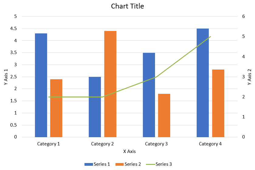
Il seguente codice Python mostra come creare il grafico combinato mostrato sopra in una presentazione PowerPoint:
import jpype
import asposeslides

if not jpype.isJVMStarted():
    jpype.startJVM()

from asposeslides.api import AxisPositionType, ChartType, CrossesType, FillType, LegendPositionType, NullableBool, Presentation, SaveFormat

Color = jpype.JClass("java.awt.Color")

def create_combo_chart():
    presentation = Presentation()
    slide = presentation.getSlides().get_Item(0)
    try:
        chart = create_chart_with_first_series(slide)

        add_second_series_to_chart(chart)
        add_third_series_to_chart(chart)

        set_primary_axes_format(chart)
        set_secondary_axes_format(chart)

        presentation.save("combo-chart.pptx", SaveFormat.Pptx)
    finally:
        presentation.dispose()

def create_chart_with_first_series(slide):
    chart = slide.getShapes().addChart(ChartType.ClusteredColumn, 50, 50, 600, 400)

    # Imposta il titolo del grafico.
    chart.setTitle(True)
    chart.getChartTitle().addTextFrameForOverriding("Chart Title")
    chart.getChartTitle().setOverlay(False)
    title_paragraph = chart.getChartTitle().getTextFrameForOverriding().getParagraphs().get_Item(0)
    title_format = title_paragraph.getParagraphFormat().getDefaultPortionFormat()
    title_format.setFontBold(NullableBool.False_)
    title_format.setFontHeight(18.0)

    # Imposta la legenda del grafico.
    chart.getLegend().setPosition(LegendPositionType.Bottom)
    chart.getLegend().getTextFormat().getPortionFormat().setFontHeight(12.0)

    # Elimina le serie e le categorie generate di default.
    chart.getChartData().getSeries().clear()
    chart.getChartData().getCategories().clear()

    worksheet_index = 0
    workbook = chart.getChartData().getChartDataWorkbook()

    # Aggiungi nuove categorie.
    cell = workbook.getCell(worksheet_index, 1, 0, "Category 1")
    chart.getChartData().getCategories().add(cell)
    cell = workbook.getCell(worksheet_index, 2, 0, "Category 2")
    chart.getChartData().getCategories().add(cell)
    cell = workbook.getCell(worksheet_index, 3, 0, "Category 3")
    chart.getChartData().getCategories().add(cell)
    cell = workbook.getCell(worksheet_index, 4, 0, "Category 4")
    chart.getChartData().getCategories().add(cell)

    # Aggiungi la prima serie.
    series_name_cell = workbook.getCell(worksheet_index, 0, 1, "Series 1")
    series = chart.getChartData().getSeries().add(series_name_cell, chart.getType())

    series.getParentSeriesGroup().setOverlap(jpype.JByte(-25))
    series.getParentSeriesGroup().setGapWidth(220)

    cell = workbook.getCell(worksheet_index, 1, 1, 4.3)
    series.getDataPoints().addDataPointForBarSeries(cell)
    cell = workbook.getCell(worksheet_index, 2, 1, 2.5)
    series.getDataPoints().addDataPointForBarSeries(cell)
    cell = workbook.getCell(worksheet_index, 3, 1, 3.5)
    series.getDataPoints().addDataPointForBarSeries(cell)
    cell = workbook.getCell(worksheet_index, 4, 1, 4.5)
    series.getDataPoints().addDataPointForBarSeries(cell)

    return chart

def add_second_series_to_chart(chart):
    workbook = chart.getChartData().getChartDataWorkbook()
    worksheet_index = 0

    series_name_cell = workbook.getCell(worksheet_index, 0, 2, "Series 2")
    series = chart.getChartData().getSeries().add(series_name_cell, ChartType.ClusteredColumn)

    series.getParentSeriesGroup().setOverlap(jpype.JByte(-25))
    series.getParentSeriesGroup().setGapWidth(220)

    cell = workbook.getCell(worksheet_index, 1, 2, 2.4)
    series.getDataPoints().addDataPointForBarSeries(cell)
    cell = workbook.getCell(worksheet_index, 2, 2, 4.4)
    series.getDataPoints().addDataPointForBarSeries(cell)
    cell = workbook.getCell(worksheet_index, 3, 2, 1.8)
    series.getDataPoints().addDataPointForBarSeries(cell)
    cell = workbook.getCell(worksheet_index, 4, 2, 2.8)
    series.getDataPoints().addDataPointForBarSeries(cell)

def add_third_series_to_chart(chart):
    workbook = chart.getChartData().getChartDataWorkbook()
    worksheet_index = 0

    series_name_cell = workbook.getCell(worksheet_index, 0, 3, "Series 3")
    series = chart.getChartData().getSeries().add(series_name_cell, ChartType.Line)

    cell = workbook.getCell(worksheet_index, 1, 3, 2.0)
    series.getDataPoints().addDataPointForLineSeries(cell)
    cell = workbook.getCell(worksheet_index, 2, 3, 2.0)
    series.getDataPoints().addDataPointForLineSeries(cell)
    cell = workbook.getCell(worksheet_index, 3, 3, 3.0)
    series.getDataPoints().addDataPointForLineSeries(cell)
    cell = workbook.getCell(worksheet_index, 4, 3, 5.0)
    series.getDataPoints().addDataPointForLineSeries(cell)

    series.setPlotOnSecondAxis(True)

def set_primary_axes_format(chart):
    # Imposta l'asse orizzontale.
    horizontal_axis = chart.getAxes().getHorizontalAxis()
    horizontal_axis.getTextFormat().getPortionFormat().setFontHeight(12.0)
    horizontal_axis.getFormat().getLine().getFillFormat().setFillType(FillType.NoFill)

    set_axis_title(horizontal_axis, "X Axis")

    # Imposta l'asse verticale.
    vertical_axis = chart.getAxes().getVerticalAxis()
    vertical_axis.getTextFormat().getPortionFormat().setFontHeight(12.0)
    vertical_axis.getFormat().getLine().getFillFormat().setFillType(FillType.NoFill)

    set_axis_title(vertical_axis, "Y Axis 1")

    # Imposta il colore delle linee della griglia principale verticale.
    major_grid_lines_format = vertical_axis.getMajorGridLinesFormat().getLine().getFillFormat()
    major_grid_lines_format.setFillType(FillType.Solid)
    color = Color(217, 217, 217)
    major_grid_lines_format.getSolidFillColor().setColor(color)

def set_secondary_axes_format(chart):
    # Imposta l'asse orizzontale secondario.
    secondary_horizontal_axis = chart.getAxes().getSecondaryHorizontalAxis()
    secondary_horizontal_axis.setPosition(AxisPositionType.Bottom)
    secondary_horizontal_axis.setCrossType(CrossesType.Maximum)
    secondary_horizontal_axis.setVisible(False)
    secondary_horizontal_axis.getMajorGridLinesFormat().getLine().getFillFormat().setFillType(FillType.NoFill)
    secondary_horizontal_axis.getMinorGridLinesFormat().getLine().getFillFormat().setFillType(FillType.NoFill)

    # Imposta l'asse verticale secondario.
    secondary_vertical_axis = chart.getAxes().getSecondaryVerticalAxis()
    secondary_vertical_axis.setPosition(AxisPositionType.Right)
    secondary_vertical_axis.getTextFormat().getPortionFormat().setFontHeight(12.0)
    secondary_vertical_axis.getFormat().getLine().getFillFormat().setFillType(FillType.NoFill)
    secondary_vertical_axis.getMajorGridLinesFormat().getLine().getFillFormat().setFillType(FillType.NoFill)
    secondary_vertical_axis.getMinorGridLinesFormat().getLine().getFillFormat().setFillType(FillType.NoFill)

    set_axis_title(secondary_vertical_axis, "Y Axis 2")

def set_axis_title(axis, axis_title):
    axis.setTitle(True)
    axis.getTitle().setOverlay(False)
    title_paragraph = axis.getTitle().addTextFrameForOverriding(axis_title).getParagraphs().get_Item(0)
    title_format = title_paragraph.getParagraphFormat().getDefaultPortionFormat()
    title_format.setFontBold(NullableBool.False_)
    title_format.setFontHeight(12.0)

create_combo_chart()
Aggiornare i grafici
- Creare un’istanza della classe Presentation che rappresenta la presentazione contenente il grafico da aggiornare.
- Ottenere un riferimento a una diapositiva usando il suo indice.
- Scorrere tutte le forme per trovare il grafico desiderato.
- Accedere al foglio di lavoro dei dati del grafico.
- Modificare le serie di dati del grafico cambiando i valori delle serie.
- Aggiungere una nuova serie e popolarne i dati.
- Salvare la presentazione modificata come file PPTX.
Questo codice Python mostra come aggiornare un grafico:
import jpype
import asposeslides

if not jpype.isJVMStarted():
    jpype.startJVM()

from asposeslides.api import ChartType, Presentation, SaveFormat

# Apre la presentazione che contiene il grafico da aggiornare
presentation = Presentation("ExistingChart.pptx")
try:
    # Accede alla prima diapositiva
    slide = presentation.getSlides().get_Item(0)

    # Ottiene il grafico dalla diapositiva
    chart = slide.getShapes().get_Item(0)

    # Imposta l'indice del foglio dati del grafico
    default_worksheet_index = 0

    # Ottiene il foglio di lavoro dei dati del grafico
    workbook = chart.getChartData().getChartDataWorkbook()

    # Modifica il nome della categoria del grafico
    workbook.getCell(default_worksheet_index, 1, 0, "Modified Category 1")
    workbook.getCell(default_worksheet_index, 2, 0, "Modified Category 2")

    # Prende la prima serie del grafico
    series = chart.getChartData().getSeries().get_Item(0)

    # Ora aggiorna i dati della serie
    workbook.getCell(default_worksheet_index, 0, 1, "New_Series1")# Modificando il nome della serie
    series.getDataPoints().get_Item(0).getValue().setData(90)
    series.getDataPoints().get_Item(1).getValue().setData(123)
    series.getDataPoints().get_Item(2).getValue().setData(44)

    # Prende la seconda serie del grafico
    series = chart.getChartData().getSeries().get_Item(1)

    # Ora aggiorna i dati della serie
    workbook.getCell(default_worksheet_index, 0, 2, "New_Series2")# Modificando il nome della serie
    series.getDataPoints().get_Item(0).getValue().setData(23)
    series.getDataPoints().get_Item(1).getValue().setData(67)
    series.getDataPoints().get_Item(2).getValue().setData(99)

    # Ora, aggiungendo una nuova serie
    cell = workbook.getCell(default_worksheet_index, 0, 3, "Series 3")
    chart.getChartData().getSeries().add(cell, chart.getType())

    # Prende la terza serie del grafico
    series = chart.getChartData().getSeries().get_Item(2)

    # Ora popolando i dati della serie
    cell = workbook.getCell(default_worksheet_index, 1, 3, 20)
    series.getDataPoints().addDataPointForBarSeries(cell)
    cell = workbook.getCell(default_worksheet_index, 2, 3, 50)
    series.getDataPoints().addDataPointForBarSeries(cell)
    cell = workbook.getCell(default_worksheet_index, 3, 3, 30)
    series.getDataPoints().addDataPointForBarSeries(cell)

    chart.setType(ChartType.ClusteredCylinder)

    # Salva la presentazione con il grafico
    presentation.save("AsposeChartModified_out.pptx", SaveFormat.Pptx)
finally:
    presentation.dispose()
Impostare l’intervallo dati per un grafico
Per impostare l’intervallo dati per un grafico, procedi così:
- Creare un’istanza della classe Presentation che rappresenta la presentazione contenente il grafico.
- Ottenere un riferimento a una diapositiva usando il suo indice.
- Scorrere tutte le forme per trovare il grafico desiderato.
- Accedere ai dati del grafico e impostare l’intervallo.
- Salvare la presentazione modificata come file PPTX.
Questo codice Python mostra come impostare l’intervallo dati per un grafico:
import jpype
import asposeslides

if not jpype.isJVMStarted():
    jpype.startJVM()

from asposeslides.api import Presentation, SaveFormat

# Apre la presentazione che contiene il grafico
presentation = Presentation("ExistingChart.pptx")
try:
    slide = presentation.getSlides().get_Item(0)
    chart = slide.getShapes().get_Item(0)

    chart.getChartData().setRange("Sheet1!A1:B4")

    presentation.save("SetDataRange_out.pptx", SaveFormat.Pptx)
finally:
    presentation.dispose()
Utilizzare marcatori predefiniti nei grafici
Quando utilizzi marcatori predefiniti nei grafici, ogni serie del grafico ottiene automaticamente un simbolo di marcatore diverso.
Questo codice Python mostra come impostare automaticamente un marcatore per una serie di grafico:
import jpype
import asposeslides

if not jpype.isJVMStarted():
    jpype.startJVM()

from asposeslides.api import ChartType, Presentation, SaveFormat

presentation = Presentation()
try:
    slide = presentation.getSlides().get_Item(0)
    chart = slide.getShapes().addChart(ChartType.LineWithMarkers, 10, 10, 400, 400)

    chart.getChartData().getSeries().clear()
    chart.getChartData().getCategories().clear()

    workbook = chart.getChartData().getChartDataWorkbook()
    cell = workbook.getCell(0, 0, 1, "Series 1")
    chart.getChartData().getSeries().add(cell, chart.getType())
    series = chart.getChartData().getSeries().get_Item(0)

    cell = workbook.getCell(0, 1, 0, "C1")
    chart.getChartData().getCategories().add(cell)
    cell = workbook.getCell(0, 1, 1, 24)
    series.getDataPoints().addDataPointForLineSeries(cell)
    cell = workbook.getCell(0, 2, 0, "C2")
    chart.getChartData().getCategories().add(cell)
    cell = workbook.getCell(0, 2, 1, 23)
    series.getDataPoints().addDataPointForLineSeries(cell)
    cell = workbook.getCell(0, 3, 0, "C3")
    chart.getChartData().getCategories().add(cell)
    cell = workbook.getCell(0, 3, 1, -10)
    series.getDataPoints().addDataPointForLineSeries(cell)
    cell = workbook.getCell(0, 4, 0, "C4")
    chart.getChartData().getCategories().add(cell)
    cell = workbook.getCell(0, 4, 1, None)
    series.getDataPoints().addDataPointForLineSeries(cell)

    cell = workbook.getCell(0, 0, 2, "Series 2")
    chart.getChartData().getSeries().add(cell, chart.getType())
    # Prendi la seconda serie del grafico
    second_series = chart.getChartData().getSeries().get_Item(1)

    # Ora popolando i dati della serie
    cell = workbook.getCell(0, 1, 2, 30)
    second_series.getDataPoints().addDataPointForLineSeries(cell)
    cell = workbook.getCell(0, 2, 2, 10)
    second_series.getDataPoints().addDataPointForLineSeries(cell)
    cell = workbook.getCell(0, 3, 2, 60)
    second_series.getDataPoints().addDataPointForLineSeries(cell)
    cell = workbook.getCell(0, 4, 2, 40)
    second_series.getDataPoints().addDataPointForLineSeries(cell)

    chart.setLegend(True)
    chart.getLegend().setOverlay(False)

    presentation.save("DefaultMarkersInChart.pptx", SaveFormat.Pptx)
finally:
    presentation.dispose()
FAQ
Quali tipi di grafico sono supportati da Aspose.Slides?
Aspose.Slides supporta una vasta gamma di tipi di grafico, tra cui barre, linee, torte, aree, dispersione, istogrammi, radar e molti altri. Questa flessibilità consente di scegliere il tipo di grafico più appropriato per le proprie esigenze di visualizzazione dei dati.
Come aggiungo un nuovo grafico a una diapositiva?
Per aggiungere un grafico, crea prima un’istanza della classe Presentation , recupera la diapositiva desiderata usando il suo indice e poi chiama il metodo per aggiungere un grafico, specificando il tipo di grafico e i dati iniziali. Questo processo integra il grafico direttamente nella tua presentazione.
Come posso aggiornare i dati visualizzati in un grafico?
Puoi aggiornare i dati di un grafico accedendo al suo workbook dei dati (ChartDataWorkbook), cancellando eventuali serie e categorie predefinite e aggiungendo i tuoi dati personalizzati. Questo ti consente di aggiornare il grafico per riflettere i dati più recenti.
È possibile personalizzare l’aspetto del grafico?
Sì, Aspose.Slides offre ampie opzioni di personalizzazione. È possibile modificare colori, caratteri, etichette, legende e altri elementi di formattazione per adattare l’aspetto del grafico ai requisiti di design specifici.