
สร้างหรืออัปเดตแผนภูมิการนำเสนอ PowerPoint ใน Python
ภาพรวม
บทความนี้ให้คำแนะนำอย่างละเอียดเกี่ยวกับวิธีสร้างและปรับแต่งแผนภูมิด้วย Aspose.Slides คุณจะได้เรียนรู้วิธีเพิ่มแผนภูมิลงในสไลด์แบบโปรแกรมเมติก เติมข้อมูลลงในแผนภูมิ และใช้ตัวเลือกการจัดรูปแบบต่าง ๆ เพื่อให้ตรงกับข้อกำหนดการออกแบบของคุณ ตลอดบทความ มีตัวอย่างโค้ดที่อธิบายขั้นตอนแต่ละขั้นตอน ตั้งแต่การเริ่มต้น Presentation และออบเจกต์แผนภูมิ ไปจนถึงการกำหนด Series, Axes และ Legends ด้วยการทำตามคำแนะนำนี้ คุณจะเข้าใจการผสานการสร้างแผนภูมิแบบไดนามิกเข้าในแอปพลิเคชันของคุณได้อย่างมั่นคง ทำให้กระบวนการสร้างการนำเสนอที่ขับเคลื่อนด้วยข้อมูลเป็นเรื่องง่ายขึ้น
สร้างแผนภูมิ
แผนภูมิช่วยให้ผู้ใช้มองเห็นข้อมูลได้อย่างรวดเร็วและได้รับข้อมูลเชิงลึกที่อาจไม่ชัดเจนจากตารางหรือสเปรดชีต
ทำไมต้องสร้างแผนภูมิ?
การใช้แผนภูมิคุณสามารถ:
- รวบรวม, ย่อหรือสรุปข้อมูลจำนวนมากลงในสไลด์เดียวของการนำเสนอ
- เปิดเผยรูปแบบและแนวโน้มของข้อมูล
- สรุปทิศทางและแรงขับเคลื่อนของข้อมูลตามเวลา หรือเมื่อเทียบกับหน่วยการวัดเฉพาะ
- ค้นหาค่าผิดปกติ, ความเบี่ยงเบน, ความผิดพลาด, ข้อมูลที่ไม่มีความหมาย ฯลฯ
- สื่อสารหรือแสดงข้อมูลที่ซับซ้อน
ใน PowerPoint คุณสามารถสร้างแผนภูมิผ่านฟังก์ชัน Insert ซึ่งให้เทมเพลตสำหรับออกแบบแผนภูมิหลายประเภท ใช้ Aspose.Slides คุณสามารถสร้างแผนภูมิทั่วไป (อิงประเภทแผนภูมิที่นิยม) และแผนภูมิแบบกำหนดเองได้
Note
To create charts, use the ChartType class. The fields in this class correspond to different chart types.สร้างแผนภูมิคอลัมน์แบบกลุ่ม
ส่วนนี้อธิบายวิธีสร้างแผนภูมิคอลัมน์แบบกลุ่มโดยใช้ Aspose.Slides คุณจะได้เรียนรู้การเริ่มต้น Presentation, เพิ่มแผนภูมิ, และปรับแต่งส่วนต่าง ๆ เช่น ชื่อ, ข้อมูล, Series, Categories และสไตล์ ตามขั้นตอนด้านล่างเพื่อดูว่าการสร้างแผนภูมิคอลัมน์แบบกลุ่มมาตรฐานเป็นอย่างไร:
- สร้างอินสแตนซ์ของคลาส Presentation .
- รับอ้างอิงไปยังสไลด์โดยใช้ดัชนีของมัน .
- เพิ่มแผนภูมิพร้อมข้อมูลบางส่วนและระบุประเภท
ChartType.ClusteredColumn. - เพิ่มชื่อให้กับแผนภูมิ .
- เข้าถึง worksheet ของข้อมูลแผนภูมิ .
- ล้าง Series และ Categories เริ่มต้นทั้งหมด .
- เพิ่ม Series และ Categories ใหม่ .
- เพิ่มข้อมูลแผนภูมิใหม่สำหรับ Series ของแผนภูมิ .
- กำหนดสีเติมให้กับ Series ของแผนภูมิ .
- เพิ่มป้ายกำกับให้กับ Series ของแผนภูมิ .
- บันทึก Presentation ที่แก้ไขเป็นไฟล์ PPTX .
This C# code demonstrates how to create a clustered column chart:
import jpype
import asposeslides

if not jpype.isJVMStarted():
    jpype.startJVM()

from asposeslides.api import ChartType, FillType, NullableBool, Presentation, SaveFormat

Color = jpype.JClass("java.awt.Color")

    # สร้างอินสแตนซ์ของคลาสการนำเสนอที่แสดงไฟล์ PPTX
    presentation = Presentation()
    try:
        # เข้าถึงสไลด์แรก
        slide = presentation.getSlides().get_Item(0)

        # เพิ่มแผนภูมิพร้อมข้อมูลเริ่มต้น
        chart = slide.getShapes().addChart(ChartType.ClusteredColumn, 0, 0, 500, 500)

        # ตั้งค่าชื่อแผนภูมิ
        chart.getChartTitle().addTextFrameForOverriding("Sample Title")
        chart.getChartTitle().getTextFrameForOverriding().getTextFrameFormat().setCenterText(NullableBool.True_)
        chart.getChartTitle().setHeight(20)
        chart.setTitle(True)

        # ตั้งดัชนีสำหรับแผ่นข้อมูลแผนภูมิ
        default_worksheet_index = 0

        # ดึงเวิร์กชีตข้อมูลแผนภูมิ
        workbook = chart.getChartData().getChartDataWorkbook()

        # ลบซีรีส์และหมวดหมู่ที่สร้างโดยค่าเริ่มต้น
        chart.getChartData().getSeries().clear()
        chart.getChartData().getCategories().clear()

        # เพิ่มซีรีส์ใหม่
        cell = workbook.getCell(default_worksheet_index, 0, 1, "Series 1")
        chart.getChartData().getSeries().add(cell,chart.getType())
        cell = workbook.getCell(default_worksheet_index, 0, 2, "Series 2")
        chart.getChartData().getSeries().add(cell,chart.getType())

        # เพิ่มหมวดหมู่ใหม่
        cell = workbook.getCell(default_worksheet_index, 1, 0, "Category 1")
        chart.getChartData().getCategories().add(cell)
        cell = workbook.getCell(default_worksheet_index, 2, 0, "Category 2")
        chart.getChartData().getCategories().add(cell)
        cell = workbook.getCell(default_worksheet_index, 3, 0, "Category 3")
        chart.getChartData().getCategories().add(cell)

        # ดึงซีรีส์แผนภูมิแรก
        series = chart.getChartData().getSeries().get_Item(0)

        # ตอนนี้ใส่ข้อมูลให้ซีรีส์
        cell = workbook.getCell(default_worksheet_index, 1, 1, 20)
        series.getDataPoints().addDataPointForBarSeries(cell)
        cell = workbook.getCell(default_worksheet_index, 2, 1, 50)
        series.getDataPoints().addDataPointForBarSeries(cell)
        cell = workbook.getCell(default_worksheet_index, 3, 1, 30)
        series.getDataPoints().addDataPointForBarSeries(cell)

        # ตั้งค่าสีเติมสำหรับซีรีส์
        series.getFormat().getFill().setFillType(FillType.Solid)
        series.getFormat().getFill().getSolidFillColor().setColor(Color.RED)

        # ดึงซีรีส์แผนภูมิที่สอง
        series = chart.getChartData().getSeries().get_Item(1)

        # ใส่ข้อมูลให้ซีรีส์
        cell = workbook.getCell(default_worksheet_index, 1, 2, 30)
        series.getDataPoints().addDataPointForBarSeries(cell)
        cell = workbook.getCell(default_worksheet_index, 2, 2, 10)
        series.getDataPoints().addDataPointForBarSeries(cell)
        cell = workbook.getCell(default_worksheet_index, 3, 2, 60)
        series.getDataPoints().addDataPointForBarSeries(cell)

        # ตั้งค่าสีเติมสำหรับซีรีส์
        series.getFormat().getFill().setFillType(FillType.Solid)
        series.getFormat().getFill().getSolidFillColor().setColor(Color.GREEN)

        #สร้างป้ายกำหนดแบบกำหนดเองสำหรับแต่ละหมวดหมู่ของซีรีส์ใหม่
        # ตั้งค่าป้ายแรกให้แสดงชื่อหมวดหมู่
        label = series.getDataPoints().get_Item(0).getLabel()
        label.getDataLabelFormat().setShowCategoryName(True)

        label = series.getDataPoints().get_Item(1).getLabel()
        label.getDataLabelFormat().setShowSeriesName(True)

        # แสดงค่าสำหรับป้ายที่สาม
        label = series.getDataPoints().get_Item(2).getLabel()
        label.getDataLabelFormat().setShowValue(True)
        label.getDataLabelFormat().setShowSeriesName(True)
        label.getDataLabelFormat().setSeparator("/")

        # บันทึกงานนำเสนอพร้อมแผนภูมิ
        presentation.save("output.pptx", SaveFormat.Pptx)
    finally:
        presentation.dispose()
สร้างแผนภูมิกระจาย
แผนภูมิกระจาย (หรือที่เรียกว่า scatter plot หรือ กราฟ x‑y) มักใช้เพื่อตรวจสอบรูปแบบหรือแสดงความสัมพันธ์ระหว่างสองตัวแปร
ใช้แผนภูมิกระจายเมื่อ:
- คุณมีข้อมูลตัวเลขเป็นคู่
- คุณมีสองตัวแปรที่จับคู่กันได้ดี
- คุณต้องการตรวจสอบว่าตัวแปรสองตัวมีความเกี่ยวข้องหรือไม่
- คุณมีตัวแปรอิสระที่มีค่าหลายค่า สำหรับตัวแปรตาม
- ทำตามขั้นตอนใน Create Clustered Column Charts .
- สำหรับขั้นตอนที่สาม เพิ่มแผนภูมิพร้อมข้อมูลบางส่วนและระบุประเภทแผนภูมิตามต่อไปนี้:
- ChartType.ScatterWithMarkers - แสดงแผนภูมิกระจาย.
- ChartType.ScatterWithSmoothLinesAndMarkers - แสดงแผนภูมิกระจายที่เชื่อมต่อด้วยเส้นโค้งพร้อมเครื่องหมายข้อมูล.
- ChartType.ScatterWithSmoothLines - แสดงแผนภูมิกระจายที่เชื่อมต่อด้วยเส้นโค้งโดยไม่มีเครื่องหมายข้อมูล.
- ChartType.ScatterWithStraightLinesAndMarkers - แสดงแผนภูมิกระจายที่เชื่อมต่อด้วยเส้นตรงพร้อมเครื่องหมายข้อมูล.
- ChartType.ScatterWithStraightLines - แสดงแผนภูมิกระจายที่เชื่อมต่อด้วยเส้นตรงโดยไม่มีเครื่องหมายข้อมูล.
โค้ด Python นี้แสดงวิธีสร้างแผนภูมิกระจายพร้อมเครื่องหมายที่แตกต่างกันสำหรับแต่ละ Series:
import jpype
import asposeslides

if not jpype.isJVMStarted():
    jpype.startJVM()

from asposeslides.api import ChartType, MarkerStyleType, Presentation, SaveFormat

# สร้างอินสแตนซ์ของคลาสการนำเสนอที่แสดงไฟล์ PPTX.
presentation = Presentation()
try:
    # เข้าถึงสไลด์แรก
    slide = presentation.getSlides().get_Item(0)

    # สร้างแผนภูมิเริ่มต้น
    chart = slide.getShapes().addChart(ChartType.ScatterWithSmoothLines, 0, 0, 400, 400)

    # ดึงดัชนีเวิร์กชีตข้อมูลแผนภูมิเริ่มต้น
    default_worksheet_index = 0

    # ดึงเวิร์กชีตข้อมูลแผนภูมิ
    workbook = chart.getChartData().getChartDataWorkbook()

    # ลบซีรีส์ตัวอย่าง
    chart.getChartData().getSeries().clear()

    # เพิ่มซีรีส์ใหม่
    cell = workbook.getCell(default_worksheet_index, 1, 1, "Series 1")
    chart.getChartData().getSeries().add(cell, chart.getType())
    cell = workbook.getCell(default_worksheet_index, 1, 3, "Series 2")
    chart.getChartData().getSeries().add(cell, chart.getType())

    # ดึงซีรีส์แผนภูมิแรก
    series = chart.getChartData().getSeries().get_Item(0)

    # เพิ่มจุดใหม่ (1:3) ให้กับซีรีส์
    x_cell = workbook.getCell(default_worksheet_index, 2, 1, 1)
    y_cell = workbook.getCell(default_worksheet_index, 2, 2, 3)
    series.getDataPoints().addDataPointForScatterSeries(x_cell, y_cell)

    # เพิ่มจุดใหม่ (2:10)
    x_cell = workbook.getCell(default_worksheet_index, 3, 1, 2)
    y_cell = workbook.getCell(default_worksheet_index, 3, 2, 10)
    series.getDataPoints().addDataPointForScatterSeries(x_cell, y_cell)

    # เปลี่ยนประเภทของซีรีส์
    series.setType(ChartType.ScatterWithStraightLinesAndMarkers)

    # เปลี่ยนเครื่องหมายของซีรีส์แผนภูมิ
    series.getMarker().setSize(10)
    series.getMarker().setSymbol(MarkerStyleType.Star)

    # ดึงซีรีส์แผนภูมิที่สอง
    series = chart.getChartData().getSeries().get_Item(1)

    # เพิ่มจุดใหม่ (5:2) ที่นี่
    x_cell = workbook.getCell(default_worksheet_index, 2, 3, 5)
    y_cell = workbook.getCell(default_worksheet_index, 2, 4, 2)
    series.getDataPoints().addDataPointForScatterSeries(x_cell, y_cell)

    # เพิ่มจุดใหม่ (3:1)
    x_cell = workbook.getCell(default_worksheet_index, 3, 3, 3)
    y_cell = workbook.getCell(default_worksheet_index, 3, 4, 1)
    series.getDataPoints().addDataPointForScatterSeries(x_cell, y_cell)

    # เพิ่มจุดใหม่ (2:2)
    x_cell = workbook.getCell(default_worksheet_index, 4, 3, 2)
    y_cell = workbook.getCell(default_worksheet_index, 4, 4, 2)
    series.getDataPoints().addDataPointForScatterSeries(x_cell, y_cell)

    # เพิ่มจุดใหม่ (5:1)
    x_cell = workbook.getCell(default_worksheet_index, 5, 3, 5)
    y_cell = workbook.getCell(default_worksheet_index, 5, 4, 1)
    series.getDataPoints().addDataPointForScatterSeries(x_cell, y_cell)

    # เปลี่ยนเครื่องหมายของซีรีส์แผนภูมิ
    series.getMarker().setSize(10)
    series.getMarker().setSymbol(MarkerStyleType.Circle)

    presentation.save("AsposeChart_out.pptx", SaveFormat.Pptx)
finally:
    presentation.dispose()
สร้างแผนภูมิวงกลม
แผนภูมวงกลมเหมาะสำหรับแสดงความสัมพันธ์ส่วนต่อส่วนของข้อมูล โดยเฉพาะเมื่อข้อมูลมีป้ายประเภทพร้อมค่าตัวเลข อย่างไรก็ตาม หากข้อมูลของคุณมีหลายส่วนหรือหลายป้าย ควรพิจารณาใช้แผนภูมิบาร์แทน
- สร้างอินสแตนซ์ของคลาส Presentation .
- รับอ้างอิงไปยังสไลด์โดยใช้ดัชนีของมัน .
- เพิ่มแผนภูมิด้วยข้อมูลเริ่มต้นและระบุประเภท ChartType.Pie .
- เข้าถึง workbook ของข้อมูลแผนภูมิ ChartDataWorkbook .
- ล้าง Series และ Categories เริ่มต้น .
- เพิ่ม Series และ Categories ใหม่ .
- เพิ่มข้อมูลแผนภูมิใหม่สำหรับ Series ของแผนภูมิ .
- เพิ่มจุดใหม่สำหรับแผนภูมิและกำหนดสีกำหนดเองให้กับส่วนของแผนภูมวงกลม .
- ตั้งค่าป้ายกำกับสำหรับ Series .
- เปิดใช้งานเส้นนำสำหรับป้ายกำกับ Series .
- ตั้งค่ามุมการหมุนสำหรับส่วนของแผนภูมวงกลม .
- บันทึก Presentation ที่แก้ไขเป็นไฟล์ PPTX .
โค้ด Python นี้แสดงวิธีสร้างแผนภูมวงกลม:
import jpype
import asposeslides

if not jpype.isJVMStarted():
    jpype.startJVM()

from asposeslides.api import ChartType, FillType, LineDashStyle, LineStyle, NullableBool, Presentation, SaveFormat

Color = jpype.JClass("java.awt.Color")

# สร้างอินสแตนซ์ของคลาสการนำเสนอที่แสดงไฟล์ PPTX.
presentation = Presentation()
try:
    # เข้าถึงสไลด์แรก
    slide = presentation.getSlides().get_Item(0)

    # เพิ่มแผนภูมิพร้อมข้อมูลเริ่มต้น
    chart = slide.getShapes().addChart(ChartType.Pie, 100, 100, 400, 400)

    # ตั้งค่าชื่อแผนภูมิ
    chart.getChartTitle().addTextFrameForOverriding("Sample Title")
    chart.getChartTitle().getTextFrameForOverriding().getTextFrameFormat().setCenterText(NullableBool.True_)
    chart.getChartTitle().setHeight(20)
    chart.setTitle(True)

    # ตั้งดัชนีสำหรับแผ่นข้อมูลแผนภูมิ
    default_worksheet_index = 0

    # ดึงเวิร์กชีตข้อมูลแผนภูมิ
    workbook = chart.getChartData().getChartDataWorkbook()

    # ลบซีรีส์และหมวดหมู่ที่สร้างโดยค่าเริ่มต้น
    chart.getChartData().getSeries().clear()
    chart.getChartData().getCategories().clear()

    # เพิ่มหมวดหมู่ใหม่
    cell = workbook.getCell(0, 1, 0, "First Qtr")
    chart.getChartData().getCategories().add(cell)
    cell = workbook.getCell(0, 2, 0, "2nd Qtr")
    chart.getChartData().getCategories().add(cell)
    cell = workbook.getCell(0, 3, 0, "3rd Qtr")
    chart.getChartData().getCategories().add(cell)

    # เพิ่มซีรีส์ใหม่
    cell = workbook.getCell(0, 0, 1, "Series 1")
    series = chart.getChartData().getSeries().add(cell, chart.getType())

    #เติมข้อมูลให้ซีรีส์
    cell = workbook.getCell(default_worksheet_index, 1, 1, 20)
    series.getDataPoints().addDataPointForPieSeries(cell)
    cell = workbook.getCell(default_worksheet_index, 2, 1, 50)
    series.getDataPoints().addDataPointForPieSeries(cell)
    cell = workbook.getCell(default_worksheet_index, 3, 1, 30)
    series.getDataPoints().addDataPointForPieSeries(cell)

    # เพิ่มจุดใหม่และกำหนดสีส่วน
    chart.getChartData().getSeriesGroups().get_Item(0).setColorVaried(True)

    point = series.getDataPoints().get_Item(0)
    point.getFormat().getFill().setFillType(FillType.Solid)
    point.getFormat().getFill().getSolidFillColor().setColor(Color.CYAN)

    # ตั้งค่าเส้นขอบของส่วน
    point.getFormat().getLine().getFillFormat().setFillType(FillType.Solid)
    point.getFormat().getLine().getFillFormat().getSolidFillColor().setColor(Color.GRAY)
    point.getFormat().getLine().setWidth(3.0)
    point.getFormat().getLine().setStyle(LineStyle.ThinThick)
    point.getFormat().getLine().setDashStyle(LineDashStyle.DashDot)

    second_point = series.getDataPoints().get_Item(1)
    second_point.getFormat().getFill().setFillType(FillType.Solid)
    second_point.getFormat().getFill().getSolidFillColor().setColor(Color.ORANGE)

    # ตั้งค่าเส้นขอบของส่วน
    second_point.getFormat().getLine().getFillFormat().setFillType(FillType.Solid)
    second_point.getFormat().getLine().getFillFormat().getSolidFillColor().setColor(Color.BLUE)
    second_point.getFormat().getLine().setWidth(3.0)
    second_point.getFormat().getLine().setStyle(LineStyle.Single)
    second_point.getFormat().getLine().setDashStyle(LineDashStyle.LargeDashDot)

    third_point = series.getDataPoints().get_Item(2)
    third_point.getFormat().getFill().setFillType(FillType.Solid)
    third_point.getFormat().getFill().getSolidFillColor().setColor(Color.YELLOW)

    # ตั้งค่าเส้นขอบของส่วน
    third_point.getFormat().getLine().getFillFormat().setFillType(FillType.Solid)
    third_point.getFormat().getLine().getFillFormat().getSolidFillColor().setColor(Color.RED)
    third_point.getFormat().getLine().setWidth(2.0)
    third_point.getFormat().getLine().setStyle(LineStyle.ThinThin)
    third_point.getFormat().getLine().setDashStyle(LineDashStyle.LargeDashDotDot)

    # สร้างป้ายกำหนดแบบกำหนดเองสำหรับแต่ละหมวดหมู่ของซีรีส์ใหม่
    first_label = series.getDataPoints().get_Item(0).getLabel()
    first_label.getDataLabelFormat().setShowValue(True)

    second_label = series.getDataPoints().get_Item(1).getLabel()
    second_label.getDataLabelFormat().setShowValue(True)
    second_label.getDataLabelFormat().setShowLegendKey(True)
    second_label.getDataLabelFormat().setShowPercentage(True)

    third_label = series.getDataPoints().get_Item(2).getLabel()
    third_label.getDataLabelFormat().setShowSeriesName(True)
    third_label.getDataLabelFormat().setShowPercentage(True)

    # แสดงเส้นนำสำหรับแผนภูมิ
    series.getLabels().getDefaultDataLabelFormat().setShowLeaderLines(True)

    # ตั้งค่ามุมการหมุนสำหรับส่วนของแผนภูมิวงกลม
    chart.getChartData().getSeriesGroups().get_Item(0).setFirstSliceAngle(180)

    # บันทึกงานนำเสนอพร้อมแผนภูมิ
    presentation.save("PieChart_out.pptx", SaveFormat.Pptx)
finally:
    presentation.dispose()
สร้างแผนภูมิเส้น
แผนภูมิเส้น (หรือที่เรียกว่า line graph) เหมาะสำหรับแสดงการเปลี่ยนแปลงของค่าตามเวลา ใช้แผนภูมิเส้นคุณสามารถเปรียบเทียบข้อมูลขนาดใหญ่ในครั้งเดียว ติดตามการเปลี่ยนแปลงและแนวโน้มตามเวลา เน้นความผิดปกติใน Series และอื่น ๆ
- สร้างอินสแตนซ์ของคลาส Presentation .
- รับอ้างอิงไปยังสไลด์โดยใช้ดัชนีของมัน .
- เพิ่มแผนภูมิด้วยข้อมูลเริ่มต้นและระบุประเภท ChartType.Line .
- บันทึก Presentation ที่แก้ไขเป็นไฟล์ PPTX .
โค้ด Python นี้แสดงวิธีสร้างแผนภูมิเส้น:
import jpype
import asposeslides

if not jpype.isJVMStarted():
    jpype.startJVM()

from asposeslides.api import ChartType, Presentation, SaveFormat

presentation = Presentation()
try:
    line_chart = presentation.getSlides().get_Item(0).getShapes().addChart(ChartType.Line, 10, 50, 600, 350)

    presentation.save("line_chart.pptx", SaveFormat.Pptx)
finally:
    presentation.dispose()
โดยค่าเริ่มต้น จุดบนแผนภูมิเส้นจะเชื่อมต่อด้วยเส้นตรงต่อเนื่อง หากต้องการให้จุดเชื่อมต่อด้วยเส้นประ สามารถระบุประเภทเส้นประตามต้องการดังนี้:
import jpype
import asposeslides

if not jpype.isJVMStarted():
    jpype.startJVM()

from asposeslides.api import ChartType, LineDashStyle, Presentation, SaveFormat

presentation = Presentation()
try:
    line_chart = presentation.getSlides().get_Item(0).getShapes().addChart(ChartType.Line, 10, 50, 600, 350)

    for series in line_chart.getChartData().getSeries():
        series.getFormat().getLine().setDashStyle(LineDashStyle.Dash)

    presentation.save("line_chart.pptx", SaveFormat.Pptx)
finally:
    presentation.dispose()
สร้างแผนภูมิแผนที่ต้นไม้
แผนภูมิแผนที่ต้นไม้เหมาะสำหรับข้อมูลการขายเมื่อคุณต้องการแสดงขนาดสัมพัทธ์ของหมวดหมู่ข้อมูลและดึงดูดความสนใจไปยังรายการที่เป็นผู้ร่วมให้ผลมากในแต่ละหมวดหมู่
- สร้างอินสแตนซ์ของคลาส Presentation .
- รับอ้างอิงไปยังสไลด์โดยใช้ดัชนีของมัน .
- เพิ่มแผนภูมิด้วยข้อมูลเริ่มต้นและระบุประเภท ChartType.Treemap .
- เข้าถึง workbook ของข้อมูลแผนภูมิ ChartDataWorkbook .
- ล้าง Series และ Categories เริ่มต้น .
- เพิ่ม Series และ Categories ใหม่ .
- เพิ่มข้อมูลแผนภูมิใหม่สำหรับ Series ของแผนภูมิ .
- บันทึก Presentation ที่แก้ไขเป็นไฟล์ PPTX .
โค้ด Python นี้แสดงวิธีสร้างแผนภูมิเกาแผนที่ต้นไม้:
import jpype
import asposeslides

if not jpype.isJVMStarted():
    jpype.startJVM()

from asposeslides.api import ChartType, ParentLabelLayoutType, Presentation, SaveFormat

presentation = Presentation()
try:
    chart = presentation.getSlides().get_Item(0).getShapes().addChart(ChartType.Treemap, 50, 50, 500, 400)
    chart.getChartData().getCategories().clear()
    chart.getChartData().getSeries().clear()

    workbook = chart.getChartData().getChartDataWorkbook()
    workbook.clear(0)

    #สาขา 1
    cell = workbook.getCell(0, "C1", "Leaf1")
    leaf = chart.getChartData().getCategories().add(cell)
    leaf.getGroupingLevels().setGroupingItem(1, "Stem1")
    leaf.getGroupingLevels().setGroupingItem(2, "Branch1")

    cell = workbook.getCell(0, "C2", "Leaf2")
    chart.getChartData().getCategories().add(cell)

    cell = workbook.getCell(0, "C3", "Leaf3")
    leaf = chart.getChartData().getCategories().add(cell)
    leaf.getGroupingLevels().setGroupingItem(1, "Stem2")

    cell = workbook.getCell(0, "C4", "Leaf4")
    chart.getChartData().getCategories().add(cell)

    #สาขา 2
    cell = workbook.getCell(0, "C5", "Leaf5")
    leaf = chart.getChartData().getCategories().add(cell)
    leaf.getGroupingLevels().setGroupingItem(1, "Stem3")
    leaf.getGroupingLevels().setGroupingItem(2, "Branch2")

    cell = workbook.getCell(0, "C6", "Leaf6")
    chart.getChartData().getCategories().add(cell)

    cell = workbook.getCell(0, "C7", "Leaf7")
    leaf = chart.getChartData().getCategories().add(cell)
    leaf.getGroupingLevels().setGroupingItem(1, "Stem4")

    cell = workbook.getCell(0, "C8", "Leaf8")
    chart.getChartData().getCategories().add(cell)

    series = chart.getChartData().getSeries().add(ChartType.Treemap)
    series.getLabels().getDefaultDataLabelFormat().setShowCategoryName(True)
    cell = workbook.getCell(0, "D1", 4)
    series.getDataPoints().addDataPointForTreemapSeries(cell)
    cell = workbook.getCell(0, "D2", 5)
    series.getDataPoints().addDataPointForTreemapSeries(cell)
    cell = workbook.getCell(0, "D3", 3)
    series.getDataPoints().addDataPointForTreemapSeries(cell)
    cell = workbook.getCell(0, "D4", 6)
    series.getDataPoints().addDataPointForTreemapSeries(cell)
    cell = workbook.getCell(0, "D5", 9)
    series.getDataPoints().addDataPointForTreemapSeries(cell)
    cell = workbook.getCell(0, "D6", 9)
    series.getDataPoints().addDataPointForTreemapSeries(cell)
    cell = workbook.getCell(0, "D7", 4)
    series.getDataPoints().addDataPointForTreemapSeries(cell)
    cell = workbook.getCell(0, "D8", 3)
    series.getDataPoints().addDataPointForTreemapSeries(cell)

    series.setParentLabelLayout(ParentLabelLayoutType.Overlapping)

    presentation.save("Treemap.pptx", SaveFormat.Pptx)
finally:
    presentation.dispose()
สร้างแผนภูมิหุ้น
- สร้างอินสแตนซ์ของคลาส Presentation .
- รับอ้างอิงไปยังสไลด์โดยใช้ดัชนีของมัน .
- เพิ่มแผนภูมิด้วยข้อมูลเริ่มต้นและระบุประเภท ChartType.OpenHighLowClose .
- เข้าถึง workbook ของข้อมูลแผนภูมิ ChartDataWorkbook .
- ล้าง Series และ Categories เริ่มต้น .
- เพิ่ม Series และ Categories ใหม่ .
- เพิ่มข้อมูลแผนภูมิใหม่สำหรับ Series ของแผนภูมิ .
- ระบุรูปแบบเส้นสูง‑ต่ำ .
- บันทึก Presentation ที่แก้ไขเป็นไฟล์ PPTX .
โค้ด Python นี้แสดงวิธีสร้างแผนภูมิหุ้น:
import jpype
import asposeslides

if not jpype.isJVMStarted():
    jpype.startJVM()

from asposeslides.api import ChartType, FillType, Presentation, SaveFormat

presentation = Presentation()
try:
    chart = presentation.getSlides().get_Item(0).getShapes().addChart(ChartType.OpenHighLowClose, 50, 50, 600, 400, False)

    chart.getChartData().getSeries().clear()
    chart.getChartData().getCategories().clear()

    workbook = chart.getChartData().getChartDataWorkbook()

    cell = workbook.getCell(0, 1, 0, "A")
    chart.getChartData().getCategories().add(cell)
    cell = workbook.getCell(0, 2, 0, "B")
    chart.getChartData().getCategories().add(cell)
    cell = workbook.getCell(0, 3, 0, "C")
    chart.getChartData().getCategories().add(cell)

    cell = workbook.getCell(0, 0, 1, "Open")
    chart.getChartData().getSeries().add(cell, chart.getType())
    cell = workbook.getCell(0, 0, 2, "High")
    chart.getChartData().getSeries().add(cell, chart.getType())
    cell = workbook.getCell(0, 0, 3, "Low")
    chart.getChartData().getSeries().add(cell, chart.getType())
    cell = workbook.getCell(0, 0, 4, "Close")
    chart.getChartData().getSeries().add(cell, chart.getType())

    series = chart.getChartData().getSeries().get_Item(0)

    cell = workbook.getCell(0, 1, 1, 72)
    series.getDataPoints().addDataPointForStockSeries(cell)
    cell = workbook.getCell(0, 2, 1, 25)
    series.getDataPoints().addDataPointForStockSeries(cell)
    cell = workbook.getCell(0, 3, 1, 38)
    series.getDataPoints().addDataPointForStockSeries(cell)

    series = chart.getChartData().getSeries().get_Item(1)
    cell = workbook.getCell(0, 1, 2, 172)
    series.getDataPoints().addDataPointForStockSeries(cell)
    cell = workbook.getCell(0, 2, 2, 57)
    series.getDataPoints().addDataPointForStockSeries(cell)
    cell = workbook.getCell(0, 3, 2, 57)
    series.getDataPoints().addDataPointForStockSeries(cell)

    series = chart.getChartData().getSeries().get_Item(2)
    cell = workbook.getCell(0, 1, 3, 12)
    series.getDataPoints().addDataPointForStockSeries(cell)
    cell = workbook.getCell(0, 2, 3, 12)
    series.getDataPoints().addDataPointForStockSeries(cell)
    cell = workbook.getCell(0, 3, 3, 13)
    series.getDataPoints().addDataPointForStockSeries(cell)

    series = chart.getChartData().getSeries().get_Item(3)
    cell = workbook.getCell(0, 1, 4, 25)
    series.getDataPoints().addDataPointForStockSeries(cell)
    cell = workbook.getCell(0, 2, 4, 38)
    series.getDataPoints().addDataPointForStockSeries(cell)
    cell = workbook.getCell(0, 3, 4, 50)
    series.getDataPoints().addDataPointForStockSeries(cell)

    chart.getChartData().getSeriesGroups().get_Item(0).getUpDownBars().setUpDownBars(True)
    chart.getChartData().getSeriesGroups().get_Item(0).getHiLowLinesFormat().getLine().getFillFormat().setFillType(FillType.Solid)

    for series in chart.getChartData().getSeries():
        series.getFormat().getLine().getFillFormat().setFillType(FillType.NoFill)

    presentation.save("output.pptx", SaveFormat.Pptx)
finally:
    presentation.dispose()
สร้างแผนภูมิกล่องและขนัด
- สร้างอินสแตนซ์ของคลาส Presentation .
- รับอ้างอิงไปยังสไลด์โดยใช้ดัชนีของมัน .
- เพิ่มแผนภูมิด้วยข้อมูลเริ่มต้นและระบุประเภท ChartType.BoxAndWhisker .
- เข้าถึง workbook ของข้อมูลแผนภูมิ ChartDataWorkbook .
- ล้าง Series และ Categories เริ่มต้น .
- เพิ่ม Series และ Categories ใหม่ .
- เพิ่มข้อมูลแผนภูมิใหม่สำหรับ Series ของแผนภูมิ .
- บันทึก Presentation ที่แก้ไขเป็นไฟล์ PPTX .
โค้ด Python นี้แสดงวิธีสร้างแผนภูมิกล่องและขนัด:
import jpype
import asposeslides

if not jpype.isJVMStarted():
    jpype.startJVM()

from asposeslides.api import ChartType, Presentation, QuartileMethodType, SaveFormat

presentation = Presentation()
try:
    chart = presentation.getSlides().get_Item(0).getShapes().addChart(ChartType.BoxAndWhisker, 50, 50, 500, 400)
    chart.getChartData().getCategories().clear()
    chart.getChartData().getSeries().clear()

    workbook = chart.getChartData().getChartDataWorkbook()
    workbook.clear(0)

    cell = workbook.getCell(0, "A1", "Category 1")
    chart.getChartData().getCategories().add(cell)
    cell = workbook.getCell(0, "A2", "Category 1")
    chart.getChartData().getCategories().add(cell)
    cell = workbook.getCell(0, "A3", "Category 1")
    chart.getChartData().getCategories().add(cell)
    cell = workbook.getCell(0, "A4", "Category 1")
    chart.getChartData().getCategories().add(cell)
    cell = workbook.getCell(0, "A5", "Category 1")
    chart.getChartData().getCategories().add(cell)
    cell = workbook.getCell(0, "A6", "Category 1")
    chart.getChartData().getCategories().add(cell)

    series = chart.getChartData().getSeries().add(ChartType.BoxAndWhisker)

    series.setQuartileMethod(QuartileMethodType.Exclusive)
    series.setShowMeanLine(True)
    series.setShowMeanMarkers(True)
    series.setShowInnerPoints(True)
    series.setShowOutlierPoints(True)

    cell = workbook.getCell(0, "B1", 15)
    series.getDataPoints().addDataPointForBoxAndWhiskerSeries(cell)
    cell = workbook.getCell(0, "B2", 41)
    series.getDataPoints().addDataPointForBoxAndWhiskerSeries(cell)
    cell = workbook.getCell(0, "B3", 16)
    series.getDataPoints().addDataPointForBoxAndWhiskerSeries(cell)
    cell = workbook.getCell(0, "B4", 10)
    series.getDataPoints().addDataPointForBoxAndWhiskerSeries(cell)
    cell = workbook.getCell(0, "B5", 23)
    series.getDataPoints().addDataPointForBoxAndWhiskerSeries(cell)
    cell = workbook.getCell(0, "B6", 16)
    series.getDataPoints().addDataPointForBoxAndWhiskerSeries(cell)

    presentation.save("BoxAndWhisker.pptx", SaveFormat.Pptx)
finally:
    presentation.dispose()
สร้างแผนภูมุกระบอก
- สร้างอินสแตนซ์ของคลาส Presentation .
- รับอ้างอิงไปยังสไลด์โดยใช้ดัชนีของมัน .
- เพิ่มแผนภูมิด้วยข้อมูลเริ่มต้นและระบุประเภท ChartType.Funnel .
- บันทึก Presentation ที่แก้ไขเป็นไฟล์ PPTX .
โค้ด Python นี้แสดงวิธีสร้างแผนภูมุกระบอก:
import jpype
import asposeslides

if not jpype.isJVMStarted():
    jpype.startJVM()

from asposeslides.api import ChartType, Presentation, SaveFormat

presentation = Presentation()
try:
    chart = presentation.getSlides().get_Item(0).getShapes().addChart(ChartType.Funnel, 50, 50, 500, 400)
    chart.getChartData().getCategories().clear()
    chart.getChartData().getSeries().clear()

    workbook = chart.getChartData().getChartDataWorkbook()

    workbook.clear(0)

    cell = workbook.getCell(0, "A1", "Category 1")
    chart.getChartData().getCategories().add(cell)
    cell = workbook.getCell(0, "A2", "Category 2")
    chart.getChartData().getCategories().add(cell)
    cell = workbook.getCell(0, "A3", "Category 3")
    chart.getChartData().getCategories().add(cell)
    cell = workbook.getCell(0, "A4", "Category 4")
    chart.getChartData().getCategories().add(cell)
    cell = workbook.getCell(0, "A5", "Category 5")
    chart.getChartData().getCategories().add(cell)
    cell = workbook.getCell(0, "A6", "Category 6")
    chart.getChartData().getCategories().add(cell)

    series = chart.getChartData().getSeries().add(ChartType.Funnel)

    cell = workbook.getCell(0, "B1", 50)
    series.getDataPoints().addDataPointForFunnelSeries(cell)
    cell = workbook.getCell(0, "B2", 100)
    series.getDataPoints().addDataPointForFunnelSeries(cell)
    cell = workbook.getCell(0, "B3", 200)
    series.getDataPoints().addDataPointForFunnelSeries(cell)
    cell = workbook.getCell(0, "B4", 300)
    series.getDataPoints().addDataPointForFunnelSeries(cell)
    cell = workbook.getCell(0, "B5", 400)
    series.getDataPoints().addDataPointForFunnelSeries(cell)
    cell = workbook.getCell(0, "B6", 500)
    series.getDataPoints().addDataPointForFunnelSeries(cell)

    presentation.save("Funnel.pptx", SaveFormat.Pptx)
finally:
    presentation.dispose()
สร้างแผนภูมิดาวสว่าง
- สร้างอินสแตนซ์ของคลาส Presentation .
- รับอ้างอิงไปยังสไลด์โดยใช้ดัชนีของมัน .
- เพิ่มแผนภูมิด้วยข้อมูลเริ่มต้นและระบุประเภท ChartType.Sunburst .
- บันทึก Presentation ที่แก้ไขเป็นไฟล์ PPTX .
โค้ด Python นี้แสดงวิธีสร้างแผนภูมิดาวสว่าง:
import jpype
import asposeslides

if not jpype.isJVMStarted():
    jpype.startJVM()

from asposeslides.api import ChartType, Presentation, SaveFormat

presentation = Presentation()
try:
    chart = presentation.getSlides().get_Item(0).getShapes().addChart(ChartType.Sunburst, 50, 50, 500, 400)
    chart.getChartData().getCategories().clear()
    chart.getChartData().getSeries().clear()

    workbook = chart.getChartData().getChartDataWorkbook()
    workbook.clear(0)

    #สาขา 1
    cell = workbook.getCell(0, "C1", "Leaf1")
    leaf = chart.getChartData().getCategories().add(cell)
    leaf.getGroupingLevels().setGroupingItem(1, "Stem1")
    leaf.getGroupingLevels().setGroupingItem(2, "Branch1")

    cell = workbook.getCell(0, "C2", "Leaf2")
    chart.getChartData().getCategories().add(cell)

    cell = workbook.getCell(0, "C3", "Leaf3")
    leaf = chart.getChartData().getCategories().add(cell)
    leaf.getGroupingLevels().setGroupingItem(1, "Stem2")

    cell = workbook.getCell(0, "C4", "Leaf4")
    chart.getChartData().getCategories().add(cell)

    #สาขา 2
    cell = workbook.getCell(0, "C5", "Leaf5")
    leaf = chart.getChartData().getCategories().add(cell)
    leaf.getGroupingLevels().setGroupingItem(1, "Stem3")
    leaf.getGroupingLevels().setGroupingItem(2, "Branch2")

    cell = workbook.getCell(0, "C6", "Leaf6")
    chart.getChartData().getCategories().add(cell)

    cell = workbook.getCell(0, "C7", "Leaf7")
    leaf = chart.getChartData().getCategories().add(cell)
    leaf.getGroupingLevels().setGroupingItem(1, "Stem4")

    cell = workbook.getCell(0, "C8", "Leaf8")
    chart.getChartData().getCategories().add(cell)

    series = chart.getChartData().getSeries().add(ChartType.Sunburst)
    series.getLabels().getDefaultDataLabelFormat().setShowCategoryName(True)
    cell = workbook.getCell(0, "D1", 4)
    series.getDataPoints().addDataPointForSunburstSeries(cell)
    cell = workbook.getCell(0, "D2", 5)
    series.getDataPoints().addDataPointForSunburstSeries(cell)
    cell = workbook.getCell(0, "D3", 3)
    series.getDataPoints().addDataPointForSunburstSeries(cell)
    cell = workbook.getCell(0, "D4", 6)
    series.getDataPoints().addDataPointForSunburstSeries(cell)
    cell = workbook.getCell(0, "D5", 9)
    series.getDataPoints().addDataPointForSunburstSeries(cell)
    cell = workbook.getCell(0, "D6", 9)
    series.getDataPoints().addDataPointForSunburstSeries(cell)
    cell = workbook.getCell(0, "D7", 4)
    series.getDataPoints().addDataPointForSunburstSeries(cell)
    cell = workbook.getCell(0, "D8", 3)
    series.getDataPoints().addDataPointForSunburstSeries(cell)

    presentation.save("Sunburst.pptx", SaveFormat.Pptx)
finally:
    presentation.dispose()
สร้างแผนภูมิเส้นกำกับ
- สร้างอินสแตนซ์ของคลาส Presentation .
- รับอ้างอิงไปยังสไลด์โดยใช้ดัชนีของมัน .
- เพิ่มแผนภูมิด้วยข้อมูลเริ่มต้นและระบุประเภท ChartType.Histogram .
- เข้าถึง workbook ของข้อมูลแผนภูมิ ChartDataWorkbook .
- ล้าง Series และ Categories เริ่มต้น .
- เพิ่ม Series และ Categories ใหม่ .
- บันทึก Presentation ที่แก้ไขเป็นไฟล์ PPTX .
โค้ด Python นี้แสดงวิธีสร้างแผนภูมิเส้นกำกับ:
import jpype
import asposeslides

if not jpype.isJVMStarted():
    jpype.startJVM()

from asposeslides.api import AxisAggregationType, ChartType, Presentation, SaveFormat

presentation = Presentation()
try:
    chart = presentation.getSlides().get_Item(0).getShapes().addChart(ChartType.Histogram, 50, 50, 500, 400)
    chart.getChartData().getCategories().clear()
    chart.getChartData().getSeries().clear()

    workbook = chart.getChartData().getChartDataWorkbook()
    workbook.clear(0)

    series = chart.getChartData().getSeries().add(ChartType.Histogram)
    cell = workbook.getCell(0, "A1", 15)
    series.getDataPoints().addDataPointForHistogramSeries(cell)
    cell = workbook.getCell(0, "A2", -41)
    series.getDataPoints().addDataPointForHistogramSeries(cell)
    cell = workbook.getCell(0, "A3", 16)
    series.getDataPoints().addDataPointForHistogramSeries(cell)
    cell = workbook.getCell(0, "A4", 10)
    series.getDataPoints().addDataPointForHistogramSeries(cell)
    cell = workbook.getCell(0, "A5", -23)
    series.getDataPoints().addDataPointForHistogramSeries(cell)
    cell = workbook.getCell(0, "A6", 16)
    series.getDataPoints().addDataPointForHistogramSeries(cell)

    chart.getAxes().getHorizontalAxis().setAggregationType(AxisAggregationType.Automatic)

    presentation.save("Histogram.pptx", SaveFormat.Pptx)
finally:
    presentation.dispose()
สร้างแผนภูมิเรดาร์
- สร้างอินสแตนซ์ของคลาส Presentation .
- รับอ้างอิงไปยังสไลด์โดยใช้ดัชนีของมัน .
- เพิ่มแผนภูมิพร้อมข้อมูลและระบุประเภทแผนภูมิที่ต้องการ (ChartType.Radar ในกรณีนี้) .
- บันทึก Presentation ที่แก้ไขเป็นไฟล์ PPTX .
โค้ด Python นี้แสดงวิธีสร้างแผนภูมเรดาร์:
import jpype
import asposeslides

if not jpype.isJVMStarted():
    jpype.startJVM()

from asposeslides.api import ChartType, Presentation, SaveFormat

presentation = Presentation()
try:
    presentation.getSlides().get_Item(0).getShapes().addChart(ChartType.Radar, 20, 20, 400, 300)
    presentation.save("Radar-chart.pptx", SaveFormat.Pptx)
finally:
    presentation.dispose()
สร้างแผนภูมิหลายหมวดหมู่
- สร้างอินสแตนซ์ของคลาส Presentation .
- รับอ้างอิงไปยังสไลด์โดยใช้ดัชนีของมัน .
- เพิ่มแผนภูมิด้วยข้อมูลเริ่มต้นและระบุประเภท ChartType.ClusteredColumn .
- เข้าถึง workbook ของข้อมูลแผนภูมิ ChartDataWorkbook .
- ล้าง Series และ Categories เริ่มต้น .
- เพิ่ม Series และ Categories ใหม่ .
- เพิ่มข้อมูลแผนภูมิใหม่สำหรับ Series ของแผนภูมิ .
- บันทึก Presentation ที่แก้ไขเป็นไฟล์ PPTX .
โค้ด Python นี้แสดงวิธีสร้างแผนภูมิหลายหมวดหมู่:
import jpype
import asposeslides

if not jpype.isJVMStarted():
    jpype.startJVM()

from asposeslides.api import ChartType, Presentation, SaveFormat

presentation = Presentation()
try:
    chart = presentation.getSlides().get_Item(0).getShapes().addChart(ChartType.ClusteredColumn, 100, 100, 600, 450)
    chart.getChartData().getSeries().clear()
    chart.getChartData().getCategories().clear()

    workbook = chart.getChartData().getChartDataWorkbook()
    workbook.clear(0)
    default_worksheet_index = 0

    cell = workbook.getCell(0, "c2", "A")
    category = chart.getChartData().getCategories().add(cell)
    category.getGroupingLevels().setGroupingItem(1, "Group1")
    cell = workbook.getCell(0, "c3", "B")
    category = chart.getChartData().getCategories().add(cell)

    cell = workbook.getCell(0, "c4", "C")
    category = chart.getChartData().getCategories().add(cell)
    category.getGroupingLevels().setGroupingItem(1, "Group2")
    cell = workbook.getCell(0, "c5", "D")
    category = chart.getChartData().getCategories().add(cell)

    cell = workbook.getCell(0, "c6", "E")
    category = chart.getChartData().getCategories().add(cell)
    category.getGroupingLevels().setGroupingItem(1, "Group3")
    cell = workbook.getCell(0, "c7", "F")
    category = chart.getChartData().getCategories().add(cell)

    cell = workbook.getCell(0, "c8", "G")
    category = chart.getChartData().getCategories().add(cell)
    category.getGroupingLevels().setGroupingItem(1, "Group4")
    cell = workbook.getCell(0, "c9", "H")
    category = chart.getChartData().getCategories().add(cell)

    # เพิ่มซีรีส์
    cell = workbook.getCell(0, "D1", "Series 1")
    series = chart.getChartData().getSeries().add(cell, ChartType.ClusteredColumn)

    cell = workbook.getCell(default_worksheet_index, "D2", 10)
    series.getDataPoints().addDataPointForBarSeries(cell)
    cell = workbook.getCell(default_worksheet_index, "D3", 20)
    series.getDataPoints().addDataPointForBarSeries(cell)
    cell = workbook.getCell(default_worksheet_index, "D4", 30)
    series.getDataPoints().addDataPointForBarSeries(cell)
    cell = workbook.getCell(default_worksheet_index, "D5", 40)
    series.getDataPoints().addDataPointForBarSeries(cell)
    cell = workbook.getCell(default_worksheet_index, "D6", 50)
    series.getDataPoints().addDataPointForBarSeries(cell)
    cell = workbook.getCell(default_worksheet_index, "D7", 60)
    series.getDataPoints().addDataPointForBarSeries(cell)
    cell = workbook.getCell(default_worksheet_index, "D8", 70)
    series.getDataPoints().addDataPointForBarSeries(cell)
    cell = workbook.getCell(default_worksheet_index, "D9", 80)
    series.getDataPoints().addDataPointForBarSeries(cell)

    # บันทึกงานนำเสนอพร้อมแผนภูมิ
    presentation.save("AsposeChart_out.pptx", SaveFormat.Pptx)
finally:
    presentation.dispose()
สร้างแผนภูมิกระดาน
แผนภูมิกระดานช่วยแสดงข้อมูลเชิงภูมิศาสตร์และช่วยเปรียบเทียบค่าต่าง ๆ ตามภูมิภาค
โค้ด Python นี้แสดงวิธีสร้างแผนภูมิกระดาน:
import jpype
import asposeslides

if not jpype.isJVMStarted():
    jpype.startJVM()

from asposeslides.api import ChartType, Presentation, SaveFormat

presentation = Presentation()
try:
    chart = presentation.getSlides().get_Item(0).getShapes().addChart(ChartType.Map, 50, 50, 500, 400)
    presentation.save("mapChart.pptx", SaveFormat.Pptx)
finally:
    presentation.dispose()
สร้างแผนภูมิผสม
แผนภูมิผสม (หรือ combo chart) รวมประเภทแผนภูมิสองประเภทหรือมากกว่าบนกราฟเดียว โดยช่วยให้คุณเน้น, เปรียบเทียบ หรือวิเคราะห์ความแตกต่างระหว่างชุดข้อมูลหลายชุด เพื่อทำให้เห็นความสัมพันธ์ระหว่างข้อมูล
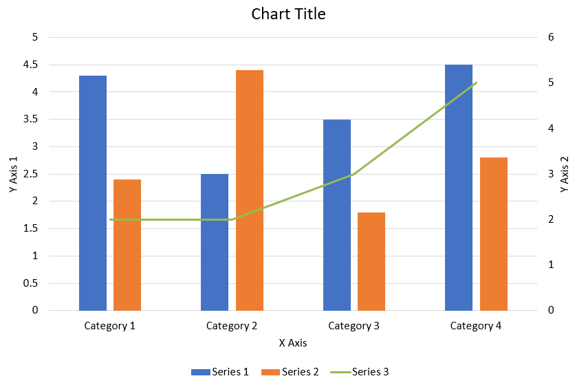
โค้ด Python ต่อไปนี้แสดงวิธีสร้างแผนภูมิเผสมตามที่แสดงด้านบนในงานนำเสนอ PowerPoint:
import jpype
import asposeslides

if not jpype.isJVMStarted():
    jpype.startJVM()

from asposeslides.api import AxisPositionType, ChartType, CrossesType, FillType, LegendPositionType, NullableBool, Presentation, SaveFormat

Color = jpype.JClass("java.awt.Color")

def create_combo_chart():
    presentation = Presentation()
    slide = presentation.getSlides().get_Item(0)
    try:
        chart = create_chart_with_first_series(slide)

        add_second_series_to_chart(chart)
        add_third_series_to_chart(chart)

        set_primary_axes_format(chart)
        set_secondary_axes_format(chart)

        presentation.save("combo-chart.pptx", SaveFormat.Pptx)
    finally:
        presentation.dispose()

def create_chart_with_first_series(slide):
    chart = slide.getShapes().addChart(ChartType.ClusteredColumn, 50, 50, 600, 400)

    # ตั้งค่าชื่อแผนภูมิ.
    chart.setTitle(True)
    chart.getChartTitle().addTextFrameForOverriding("Chart Title")
    chart.getChartTitle().setOverlay(False)
    title_paragraph = chart.getChartTitle().getTextFrameForOverriding().getParagraphs().get_Item(0)
    title_format = title_paragraph.getParagraphFormat().getDefaultPortionFormat()
    title_format.setFontBold(NullableBool.False_)
    title_format.setFontHeight(18.0)

    # ตั้งค่าตำนานแผนภูมิ.
    chart.getLegend().setPosition(LegendPositionType.Bottom)
    chart.getLegend().getTextFormat().getPortionFormat().setFontHeight(12.0)

    # ลบซีรีส์และหมวดหมู่ที่สร้างโดยค่าเริ่มต้น.
    chart.getChartData().getSeries().clear()
    chart.getChartData().getCategories().clear()

    worksheet_index = 0
    workbook = chart.getChartData().getChartDataWorkbook()

    # เพิ่มหมวดหมู่ใหม่.
    cell = workbook.getCell(worksheet_index, 1, 0, "Category 1")
    chart.getChartData().getCategories().add(cell)
    cell = workbook.getCell(worksheet_index, 2, 0, "Category 2")
    chart.getChartData().getCategories().add(cell)
    cell = workbook.getCell(worksheet_index, 3, 0, "Category 3")
    chart.getChartData().getCategories().add(cell)
    cell = workbook.getCell(worksheet_index, 4, 0, "Category 4")
    chart.getChartData().getCategories().add(cell)

    # เพิ่มซีรีส์แรก.
    series_name_cell = workbook.getCell(worksheet_index, 0, 1, "Series 1")
    series = chart.getChartData().getSeries().add(series_name_cell, chart.getType())

    series.getParentSeriesGroup().setOverlap(jpype.JByte(-25))
    series.getParentSeriesGroup().setGapWidth(220)

    cell = workbook.getCell(worksheet_index, 1, 1, 4.3)
    series.getDataPoints().addDataPointForBarSeries(cell)
    cell = workbook.getCell(worksheet_index, 2, 1, 2.5)
    series.getDataPoints().addDataPointForBarSeries(cell)
    cell = workbook.getCell(worksheet_index, 3, 1, 3.5)
    series.getDataPoints().addDataPointForBarSeries(cell)
    cell = workbook.getCell(worksheet_index, 4, 1, 4.5)
    series.getDataPoints().addDataPointForBarSeries(cell)

    return chart

def add_second_series_to_chart(chart):
    workbook = chart.getChartData().getChartDataWorkbook()
    worksheet_index = 0

    series_name_cell = workbook.getCell(worksheet_index, 0, 2, "Series 2")
    series = chart.getChartData().getSeries().add(series_name_cell, ChartType.ClusteredColumn)

    series.getParentSeriesGroup().setOverlap(jpype.JByte(-25))
    series.getParentSeriesGroup().setGapWidth(220)

    cell = workbook.getCell(worksheet_index, 1, 2, 2.4)
    series.getDataPoints().addDataPointForBarSeries(cell)
    cell = workbook.getCell(worksheet_index, 2, 2, 4.4)
    series.getDataPoints().addDataPointForBarSeries(cell)
    cell = workbook.getCell(worksheet_index, 3, 2, 1.8)
    series.getDataPoints().addDataPointForBarSeries(cell)
    cell = workbook.getCell(worksheet_index, 4, 2, 2.8)
    series.getDataPoints().addDataPointForBarSeries(cell)

def add_third_series_to_chart(chart):
    workbook = chart.getChartData().getChartDataWorkbook()
    worksheet_index = 0

    series_name_cell = workbook.getCell(worksheet_index, 0, 3, "Series 3")
    series = chart.getChartData().getSeries().add(series_name_cell, ChartType.Line)

    cell = workbook.getCell(worksheet_index, 1, 3, 2.0)
    series.getDataPoints().addDataPointForLineSeries(cell)
    cell = workbook.getCell(worksheet_index, 2, 3, 2.0)
    series.getDataPoints().addDataPointForLineSeries(cell)
    cell = workbook.getCell(worksheet_index, 3, 3, 3.0)
    series.getDataPoints().addDataPointForLineSeries(cell)
    cell = workbook.getCell(worksheet_index, 4, 3, 5.0)
    series.getDataPoints().addDataPointForLineSeries(cell)

    series.setPlotOnSecondAxis(True)

def set_primary_axes_format(chart):
    # ตั้งค่าแกนแนวนอน.
    horizontal_axis = chart.getAxes().getHorizontalAxis()
    horizontal_axis.getTextFormat().getPortionFormat().setFontHeight(12.0)
    horizontal_axis.getFormat().getLine().getFillFormat().setFillType(FillType.NoFill)

    set_axis_title(horizontal_axis, "X Axis")

    # ตั้งค่าแกนแนวตั้ง.
    vertical_axis = chart.getAxes().getVerticalAxis()
    vertical_axis.getTextFormat().getPortionFormat().setFontHeight(12.0)
    vertical_axis.getFormat().getLine().getFillFormat().setFillType(FillType.NoFill)

    set_axis_title(vertical_axis, "Y Axis 1")

    # ตั้งค่าสีเส้นกริดหลักแนวตั้ง.
    major_grid_lines_format = vertical_axis.getMajorGridLinesFormat().getLine().getFillFormat()
    major_grid_lines_format.setFillType(FillType.Solid)
    color = Color(217, 217, 217)
    major_grid_lines_format.getSolidFillColor().setColor(color)

def set_secondary_axes_format(chart):
    # ตั้งค่าแกนแนวนอนรอง.
    secondary_horizontal_axis = chart.getAxes().getSecondaryHorizontalAxis()
    secondary_horizontal_axis.setPosition(AxisPositionType.Bottom)
    secondary_horizontal_axis.setCrossType(CrossesType.Maximum)
    secondary_horizontal_axis.setVisible(False)
    secondary_horizontal_axis.getMajorGridLinesFormat().getLine().getFillFormat().setFillType(FillType.NoFill)
    secondary_horizontal_axis.getMinorGridLinesFormat().getLine().getFillFormat().setFillType(FillType.NoFill)

    # ตั้งค่าแกนแนวตั้งรอง.
    secondary_vertical_axis = chart.getAxes().getSecondaryVerticalAxis()
    secondary_vertical_axis.setPosition(AxisPositionType.Right)
    secondary_vertical_axis.getTextFormat().getPortionFormat().setFontHeight(12.0)
    secondary_vertical_axis.getFormat().getLine().getFillFormat().setFillType(FillType.NoFill)
    secondary_vertical_axis.getMajorGridLinesFormat().getLine().getFillFormat().setFillType(FillType.NoFill)
    secondary_vertical_axis.getMinorGridLinesFormat().getLine().getFillFormat().setFillType(FillType.NoFill)

    set_axis_title(secondary_vertical_axis, "Y Axis 2")

def set_axis_title(axis, axis_title):
    axis.setTitle(True)
    axis.getTitle().setOverlay(False)
    title_paragraph = axis.getTitle().addTextFrameForOverriding(axis_title).getParagraphs().get_Item(0)
    title_format = title_paragraph.getParagraphFormat().getDefaultPortionFormat()
    title_format.setFontBold(NullableBool.False_)
    title_format.setFontHeight(12.0)

create_combo_chart()
อัปเดตแผนภูมิ
- สร้างอินสแตนซ์ของคลาส Presentation ที่เป็นตัวแทนของงานนำเสนอที่มีแผนภูมิที่ต้องการอัปเดต .
- รับอ้างอิงไปยังสไลด์โดยใช้ดัชนีของมัน .
- เดินทางผ่านรูปทรงทั้งหมดเพื่อค้นหาแผนภูมิที่ต้องการ .
- เข้าถึง worksheet ของข้อมูลแผนภูมิ .
- แก้ไข Series ของแผนภูมิโดยเปลี่ยนค่าของ Series .
- เพิ่ม Series ใหม่และเติมข้อมูลของมัน .
- บันทึก Presentation ที่แก้ไขเป็นไฟล์ PPTX .
โค้ด Python นี้แสดงวิธีอัปเดตแผนภูมิ:
import jpype
import asposeslides

if not jpype.isJVMStarted():
    jpype.startJVM()

from asposeslides.api import ChartType, Presentation, SaveFormat

# เปิดไฟล์งานนำเสนอที่มีแผนภูมิที่ต้องการอัปเดต
presentation = Presentation("ExistingChart.pptx")
try:
    # เข้าถึงสไลด์แรก
    slide = presentation.getSlides().get_Item(0)

    # ดึงแผนภูมิจากสไลด์
    chart = slide.getShapes().get_Item(0)

    # ตั้งค่าดัชนีของแผ่นข้อมูลแผนภูมิ
    default_worksheet_index = 0

    # ดึง worksheet ของข้อมูลแผนภูมิ
    workbook = chart.getChartData().getChartDataWorkbook()

    # เปลี่ยนชื่อหมวดหมู่ของแผนภูมิ
    workbook.getCell(default_worksheet_index, 1, 0, "Modified Category 1")
    workbook.getCell(default_worksheet_index, 2, 0, "Modified Category 2")

    # ดึงซีรีส์แรกของแผนภูมิ
    series = chart.getChartData().getSeries().get_Item(0)

    # อัปเดตข้อมูลซีรีส์ตอนนี้
    workbook.getCell(default_worksheet_index, 0, 1, "New_Series1")# แก้ไขชื่อซีรีส์
    series.getDataPoints().get_Item(0).getValue().setData(90)
    series.getDataPoints().get_Item(1).getValue().setData(123)
    series.getDataPoints().get_Item(2).getValue().setData(44)

    # ดึงซีรีส์ที่สองของแผนภูมิ
    series = chart.getChartData().getSeries().get_Item(1)

    # อัปเดตข้อมูลซีรีส์ตอนนี้
    workbook.getCell(default_worksheet_index, 0, 2, "New_Series2")# แก้ไขชื่อซีรีส์
    series.getDataPoints().get_Item(0).getValue().setData(23)
    series.getDataPoints().get_Item(1).getValue().setData(67)
    series.getDataPoints().get_Item(2).getValue().setData(99)

    # ตอนนี้กำลังเพิ่มซีรีส์ใหม่
    cell = workbook.getCell(default_worksheet_index, 0, 3, "Series 3")
    chart.getChartData().getSeries().add(cell, chart.getType())

    # ดึงซีรีส์ที่สามของแผนภูมิ
    series = chart.getChartData().getSeries().get_Item(2)

    # กำลังเติมข้อมูลให้ซีรีส์
    cell = workbook.getCell(default_worksheet_index, 1, 3, 20)
    series.getDataPoints().addDataPointForBarSeries(cell)
    cell = workbook.getCell(default_worksheet_index, 2, 3, 50)
    series.getDataPoints().addDataPointForBarSeries(cell)
    cell = workbook.getCell(default_worksheet_index, 3, 3, 30)
    series.getDataPoints().addDataPointForBarSeries(cell)

    chart.setType(ChartType.ClusteredCylinder)

    # บันทึกงานนำเสนอพร้อมแผนภูมิ
    presentation.save("AsposeChartModified_out.pptx", SaveFormat.Pptx)
finally:
    presentation.dispose()
กำหนดช่วงข้อมูลสำหรับแผนภูมิ
เพื่อกำหนดช่วงข้อมูลสำหรับแผนภูมิ ทำตามขั้นตอนต่อไปนี้:
- สร้างอินสแตนซ์ของคลาส Presentation ที่เป็นตัวแทนของงานนำเสนอที่มีแผนภูมิ .
- รับอ้างอิงไปยังสไลด์โดยใช้ดัชนีของมัน .
- เดินทางผ่านรูปทรงทั้งหมดเพื่อค้นหาแผนภูมิที่ต้องการ .
- เข้าถึงข้อมูลแผนภูมิและตั้งค่าช่วง .
- บันทึก Presentation ที่แก้ไขเป็นไฟล์ PPTX .
โค้ด Python นี้แสดงวิธีกำหนดช่วงข้อมูลสำหรับแผนภูมิ:
import jpype
import asposeslides

if not jpype.isJVMStarted():
    jpype.startJVM()

from asposeslides.api import Presentation, SaveFormat

# เปิดไฟล์งานนำเสนอที่มีแผนภูมิ
presentation = Presentation("ExistingChart.pptx")
try:
    slide = presentation.getSlides().get_Item(0)
    chart = slide.getShapes().get_Item(0)

    chart.getChartData().setRange("Sheet1!A1:B4")

    presentation.save("SetDataRange_out.pptx", SaveFormat.Pptx)
finally:
    presentation.dispose()
ใช้เครื่องหมายเริ่มต้นในแผนภูมิ
เมื่อคุณใช้เครื่องหมายเริ่มต้นในแผนภูมิแต่ละ Series จะได้รับสัญลักษณ์เครื่องหมายที่แตกต่างกันโดยอัตโนมัติ
โค้ด Python นี้แสดงวิธีตั้งค่าเครื่องหมาย Series ของแผนภูมิโดยอัตโนมัติ:
import jpype
import asposeslides

if not jpype.isJVMStarted():
    jpype.startJVM()

from asposeslides.api import ChartType, Presentation, SaveFormat

presentation = Presentation()
try:
    slide = presentation.getSlides().get_Item(0)
    chart = slide.getShapes().addChart(ChartType.LineWithMarkers, 10, 10, 400, 400)

    chart.getChartData().getSeries().clear()
    chart.getChartData().getCategories().clear()

    workbook = chart.getChartData().getChartDataWorkbook()
    cell = workbook.getCell(0, 0, 1, "Series 1")
    chart.getChartData().getSeries().add(cell, chart.getType())
    series = chart.getChartData().getSeries().get_Item(0)

    cell = workbook.getCell(0, 1, 0, "C1")
    chart.getChartData().getCategories().add(cell)
    cell = workbook.getCell(0, 1, 1, 24)
    series.getDataPoints().addDataPointForLineSeries(cell)
    cell = workbook.getCell(0, 2, 0, "C2")
    chart.getChartData().getCategories().add(cell)
    cell = workbook.getCell(0, 2, 1, 23)
    series.getDataPoints().addDataPointForLineSeries(cell)
    cell = workbook.getCell(0, 3, 0, "C3")
    chart.getChartData().getCategories().add(cell)
    cell = workbook.getCell(0, 3, 1, -10)
    series.getDataPoints().addDataPointForLineSeries(cell)
    cell = workbook.getCell(0, 4, 0, "C4")
    chart.getChartData().getCategories().add(cell)
    cell = workbook.getCell(0, 4, 1, None)
    series.getDataPoints().addDataPointForLineSeries(cell)

    cell = workbook.getCell(0, 0, 2, "Series 2")
    chart.getChartData().getSeries().add(cell, chart.getType())
    # ดึงซีรีส์ที่สองของแผนภูมิ
    second_series = chart.getChartData().getSeries().get_Item(1)

    # กำลังเติมข้อมูลให้ซีรีส์
    cell = workbook.getCell(0, 1, 2, 30)
    second_series.getDataPoints().addDataPointForLineSeries(cell)
    cell = workbook.getCell(0, 2, 2, 10)
    second_series.getDataPoints().addDataPointForLineSeries(cell)
    cell = workbook.getCell(0, 3, 2, 60)
    second_series.getDataPoints().addDataPointForLineSeries(cell)
    cell = workbook.getCell(0, 4, 2, 40)
    second_series.getDataPoints().addDataPointForLineSeries(cell)

    chart.setLegend(True)
    chart.getLegend().setOverlay(False)

    presentation.save("DefaultMarkersInChart.pptx", SaveFormat.Pptx)
finally:
    presentation.dispose()
คำถามที่พบบ่อย
ประเภทแผนภูมิใดบ้างที่ Aspose.Slides รองรับ?
Aspose.Slides รองรับแหล่งข้อมูลประเภท chart types มากมาย รวมถึงบาร์, เส้น, วงกลม, พื้นที่, กระจาย, เส้นกำกับ, เรเดียร์ และอื่น ๆ อีกหลายประเภท ความยืดหยุ่นนี้ช่วยให้คุณเลือกประเภทแผนภูมิที่เหมาะสมที่สุดสำหรับการแสดงผลข้อมูลของคุณ
ฉันจะเพิ่มแผนภูมิใหม่ลงในสไลด์อย่างไร?
เพื่อเพิ่มแผนภูมิ คุณต้องสร้างอินสแตนซ์ของคลาส Presentation จากนั้นดึงสไลด์ที่ต้องการโดยใช้ดัชนีและเรียกเมธอดเพิ่มแผนภูมิ โดยระบุประเภทแผนภูมิและข้อมูลเริ่มต้น กระบวนการนี้จะรวมแผนภูมิเข้าในงานนำเสนอของคุณโดยตรง
ฉันจะอัปเดตข้อมูลที่แสดงในแผนภูมิได้อย่างไร?
คุณสามารถอัปเดตข้อมูลของแผนภูมิได้โดยเข้าถึง workbook ของข้อมูลแผนภูมิ (ChartDataWorkbook) ล้าง Series และ Categories เริ่มต้น แล้วเพิ่มข้อมูลที่กำหนดเองของคุณ วิธีนี้ช่วยให้คุณรีเฟรชแผนภูมิเพื่อแสดงข้อมูลล่าสุดได้
สามารถปรับแต่งรูปลักษณ์ของแผนภูมิได้หรือไม่?
ได้ Aspose.Slides มีตัวเลือกการปรับแต่งที่ครอบคลุม คุณสามารถแก้ไขสี, ฟอนต์, ป้ายกำกับ, ตำนาน, และองค์ประกอบการจัดรูปแบบอื่น ๆ [/slides/th/python-java/chart-entities/] เพื่อให้แผนภูมิตรงตามข้อกำหนดการออกแบบของคุณ.