
Crear o actualizar gráficos de presentaciones PowerPoint en Python
Visión general
Este artículo ofrece una guía completa sobre cómo crear y personalizar gráficos con Aspose.Slides. Aprenderá a añadir programáticamente un gráfico a una diapositiva, poblarlo con datos y aplicar diversas opciones de formato para adaptarlo a sus requisitos de diseño específicos. A lo largo del artículo, ejemplos de código detallados ilustran cada paso, desde la inicialización de la presentación y del objeto gráfico hasta la configuración de series, ejes y leyendas. Siguiendo esta guía, obtendrá una comprensión sólida de cómo integrar la generación dinámica de gráficos en sus aplicaciones, simplificando el proceso de crear presentaciones basadas en datos.
Crear un gráfico
Los gráficos ayudan a las personas a visualizar rápidamente los datos y a obtener ideas que pueden no ser evidentes a simple vista en una tabla o hoja de cálculo.
¿Por qué crear gráficos?
Con los gráficos puede:
- agregar, condensar o resumir grandes cantidades de datos en una única diapositiva de una presentación
- revelar patrones y tendencias en los datos
- deducir la dirección y el impulso de los datos a lo largo del tiempo o respecto a una unidad de medida específica
- detectar valores atípicos, aberraciones, desviaciones, errores, datos sin sentido, etc.
- comunicar o presentar datos complejos
En PowerPoint, puede crear gráficos mediante la función Insertar, que ofrece plantillas para diseñar muchos tipos de gráficos. Con Aspose.Slides, puede crear tanto gráficos habituales (basados en tipos de gráficos populares) como gráficos personalizados.
Nota
Para crear gráficos, utilice la clase ChartType. Los campos de esta clase corresponden a diferentes tipos de gráficos.Crear gráficos de columnas agrupadas
Esta sección explica cómo crear gráficos de columnas agrupadas con Aspose.Slides. Aprenderá a inicializar una presentación, añadir un gráfico y personalizar sus elementos, como el título, los datos, las series, las categorías y el estilo. Siga los pasos a continuación para ver cómo se genera un gráfico de columnas agrupadas estándar:
- Crear una instancia de la clase Presentation.
- Obtener una referencia a una diapositiva mediante su índice.
- Añadir un gráfico con algunos datos y especificar el tipo
ChartType.ClusteredColumn. - Añadir un título al gráfico.
- Acceder a la hoja de datos del gráfico.
- Eliminar todas las series y categorías predeterminadas.
- Añadir nuevas series y categorías.
- Añadir nuevos datos de gráfico para las series.
- Aplicar un color de relleno a las series del gráfico.
- Añadir etiquetas a las series del gráfico.
- Guardar la presentación modificada como archivo PPTX.
Este código C# muestra cómo crear un gráfico de columnas agrupadas:
import jpype
import asposeslides

if not jpype.isJVMStarted():
    jpype.startJVM()

from asposeslides.api import ChartType, FillType, NullableBool, Presentation, SaveFormat

Color = jpype.JClass("java.awt.Color")

# Instancia una clase de presentación que representa un archivo PPTX.
presentation = Presentation()
try:
    # Accede a la primera diapositiva
    slide = presentation.getSlides().get_Item(0)

    # Añade un gráfico con sus datos predeterminados
    chart = slide.getShapes().addChart(ChartType.ClusteredColumn, 0, 0, 500, 500)

    # Establece el título del gráfico
    chart.getChartTitle().addTextFrameForOverriding("Sample Title")
    chart.getChartTitle().getTextFrameForOverriding().getTextFrameFormat().setCenterText(NullableBool.True_)
    chart.getChartTitle().setHeight(20)
    chart.setTitle(True)

    # Establece el índice de la hoja de datos del gráfico
    default_worksheet_index = 0

    # Obtiene la hoja de datos del gráfico
    workbook = chart.getChartData().getChartDataWorkbook()

    # Elimina las series y categorías generadas por defecto
    chart.getChartData().getSeries().clear()
    chart.getChartData().getCategories().clear()

    # Añade nuevas series
    cell = workbook.getCell(default_worksheet_index, 0, 1, "Series 1")
    chart.getChartData().getSeries().add(cell,chart.getType())
    cell = workbook.getCell(default_worksheet_index, 0, 2, "Series 2")
    chart.getChartData().getSeries().add(cell,chart.getType())

    # Añade nuevas categorías
    cell = workbook.getCell(default_worksheet_index, 1, 0, "Category 1")
    chart.getChartData().getCategories().add(cell)
    cell = workbook.getCell(default_worksheet_index, 2, 0, "Category 2")
    chart.getChartData().getCategories().add(cell)
    cell = workbook.getCell(default_worksheet_index, 3, 0, "Category 3")
    chart.getChartData().getCategories().add(cell)

    # Obtiene la primera serie del gráfico
    series = chart.getChartData().getSeries().get_Item(0)

    # Ahora rellena los datos de la serie
    cell = workbook.getCell(default_worksheet_index, 1, 1, 20)
    series.getDataPoints().addDataPointForBarSeries(cell)
    cell = workbook.getCell(default_worksheet_index, 2, 1, 50)
    series.getDataPoints().addDataPointForBarSeries(cell)
    cell = workbook.getCell(default_worksheet_index, 3, 1, 30)
    series.getDataPoints().addDataPointForBarSeries(cell)

    # Establece el color de relleno para la serie
    series.getFormat().getFill().setFillType(FillType.Solid)
    series.getFormat().getFill().getSolidFillColor().setColor(Color.RED)

    # Obtiene la segunda serie del gráfico
    series = chart.getChartData().getSeries().get_Item(1)

    # Rellena los datos de la serie
    cell = workbook.getCell(default_worksheet_index, 1, 2, 30)
    series.getDataPoints().addDataPointForBarSeries(cell)
    cell = workbook.getCell(default_worksheet_index, 2, 2, 10)
    series.getDataPoints().addDataPointForBarSeries(cell)
    cell = workbook.getCell(default_worksheet_index, 3, 2, 60)
    series.getDataPoints().addDataPointForBarSeries(cell)

    # Establece el color de relleno para la serie
    series.getFormat().getFill().setFillType(FillType.Solid)
    series.getFormat().getFill().getSolidFillColor().setColor(Color.GREEN)

    #Crear etiquetas personalizadas para cada categoría de la nueva serie
    # Establece la primera etiqueta para mostrar el nombre de la categoría
    label = series.getDataPoints().get_Item(0).getLabel()
    label.getDataLabelFormat().setShowCategoryName(True)

    label = series.getDataPoints().get_Item(1).getLabel()
    label.getDataLabelFormat().setShowSeriesName(True)

    # Muestra el valor para la tercera etiqueta
    label = series.getDataPoints().get_Item(2).getLabel()
    label.getDataLabelFormat().setShowValue(True)
    label.getDataLabelFormat().setShowSeriesName(True)
    label.getDataLabelFormat().setSeparator("/")

    # Guarda la presentación con el gráfico
    presentation.save("output.pptx", SaveFormat.Pptx)
finally:
    presentation.dispose()
Crear gráficos de dispersión
Los gráficos de dispersión (también conocidos como diagramas de dispersión o gráficos x‑y) se utilizan a menudo para comprobar patrones o demostrar correlaciones entre dos variables.
Utilice un gráfico de dispersión cuando:
- dispone de datos numéricos emparejados
- tiene dos variables que se relacionan bien entre sí
- desea determinar si dos variables están relacionadas
- cuenta con una variable independiente que tiene varios valores para una variable dependiente
- Siga los pasos de Crear gráficos de columnas agrupadas.
- En el tercer paso, añada un gráfico con algunos datos y especifique su tipo de gráfico como uno de los siguientes:
- ChartType.ScatterWithMarkers - Representa un gráfico de dispersión.
- ChartType.ScatterWithSmoothLinesAndMarkers - Representa un gráfico de dispersión conectado por curvas, con marcadores de datos.
- ChartType.ScatterWithSmoothLines - Representa un gráfico de dispersión conectado por curvas, sin marcadores de datos.
- ChartType.ScatterWithStraightLinesAndMarkers - Representa un gráfico de dispersión conectado por líneas, con marcadores de datos.
- ChartType.ScatterWithStraightLines - Representa un gráfico de dispersión conectado por líneas, sin marcadores de datos.
Este código Python muestra cómo crear un gráfico de dispersión con diferentes marcadores para cada serie:
import jpype
import asposeslides

if not jpype.isJVMStarted():
    jpype.startJVM()

from asposeslides.api import ChartType, MarkerStyleType, Presentation, SaveFormat

# Instancia una clase de presentación que representa un archivo PPTX.
presentation = Presentation()
try:
    # Accede a la primera diapositiva
    slide = presentation.getSlides().get_Item(0)

    # Crea el gráfico predeterminado
    chart = slide.getShapes().addChart(ChartType.ScatterWithSmoothLines, 0, 0, 400, 400)

    # Obtiene el índice de la hoja de datos del gráfico predeterminado
    default_worksheet_index = 0

    # Obtiene la hoja de datos del gráfico
    workbook = chart.getChartData().getChartDataWorkbook()

    # Elimina la serie de demostración
    chart.getChartData().getSeries().clear()

    # Añade nuevas series
    cell = workbook.getCell(default_worksheet_index, 1, 1, "Series 1")
    chart.getChartData().getSeries().add(cell, chart.getType())
    cell = workbook.getCell(default_worksheet_index, 1, 3, "Series 2")
    chart.getChartData().getSeries().add(cell, chart.getType())

    # Obtiene la primera serie del gráfico
    series = chart.getChartData().getSeries().get_Item(0)

    # Añade un nuevo punto (1:3) a la serie
    x_cell = workbook.getCell(default_worksheet_index, 2, 1, 1)
    y_cell = workbook.getCell(default_worksheet_index, 2, 2, 3)
    series.getDataPoints().addDataPointForScatterSeries(x_cell, y_cell)

    # Añade un nuevo punto (2:10)
    x_cell = workbook.getCell(default_worksheet_index, 3, 1, 2)
    y_cell = workbook.getCell(default_worksheet_index, 3, 2, 10)
    series.getDataPoints().addDataPointForScatterSeries(x_cell, y_cell)

    # Cambia el tipo de la serie
    series.setType(ChartType.ScatterWithStraightLinesAndMarkers)

    # Cambia el marcador de la serie del gráfico
    series.getMarker().setSize(10)
    series.getMarker().setSymbol(MarkerStyleType.Star)

    # Obtiene la segunda serie del gráfico
    series = chart.getChartData().getSeries().get_Item(1)

    # Añade un nuevo punto (5:2) allí
    x_cell = workbook.getCell(default_worksheet_index, 2, 3, 5)
    y_cell = workbook.getCell(default_worksheet_index, 2, 4, 2)
    series.getDataPoints().addDataPointForScatterSeries(x_cell, y_cell)

    # Añade un nuevo punto (3:1)
    x_cell = workbook.getCell(default_worksheet_index, 3, 3, 3)
    y_cell = workbook.getCell(default_worksheet_index, 3, 4, 1)
    series.getDataPoints().addDataPointForScatterSeries(x_cell, y_cell)

    # Añade un nuevo punto (2:2)
    x_cell = workbook.getCell(default_worksheet_index, 4, 3, 2)
    y_cell = workbook.getCell(default_worksheet_index, 4, 4, 2)
    series.getDataPoints().addDataPointForScatterSeries(x_cell, y_cell)

    # Añade un nuevo punto (5:1)
    x_cell = workbook.getCell(default_worksheet_index, 5, 3, 5)
    y_cell = workbook.getCell(default_worksheet_index, 5, 4, 1)
    series.getDataPoints().addDataPointForScatterSeries(x_cell, y_cell)

    # Cambia el marcador de la serie del gráfico
    series.getMarker().setSize(10)
    series.getMarker().setSymbol(MarkerStyleType.Circle)

    presentation.save("AsposeChart_out.pptx", SaveFormat.Pptx)
finally:
    presentation.dispose()
Crear gráficos de pastel
Los gráficos de pastel son ideales para mostrar la relación parte‑todo en los datos, especialmente cuando los datos contienen etiquetas categóricas con valores numéricos. Sin embargo, si sus datos contienen muchas partes o etiquetas, quizá prefiera utilizar un gráfico de barras.
- Crear una instancia de la clase Presentation.
- Obtener una referencia a una diapositiva mediante su índice.
- Añadir un gráfico con datos predeterminados y especificar el tipo ChartType.Pie.
- Acceder al libro de datos del gráfico ChartDataWorkbook.
- Eliminar las series y categorías predeterminadas.
- Añadir nuevas series y categorías.
- Añadir nuevos datos de gráfico para las series.
- Añadir nuevos puntos al gráfico y aplicar colores personalizados a los sectores del pastel.
- Establecer etiquetas para las series.
- Activar líneas de guía para las etiquetas de las series.
- Definir el ángulo de rotación de los sectores del pastel.
- Guardar la presentación modificada como archivo PPTX.
Este código Python muestra cómo crear un gráfico de pastel:
import jpype
import asposeslides

if not jpype.isJVMStarted():
    jpype.startJVM()

from asposeslides.api import ChartType, FillType, LineDashStyle, LineStyle, NullableBool, Presentation, SaveFormat

Color = jpype.JClass("java.awt.Color")

# Instancia una clase de presentación que representa un archivo PPTX.
presentation = Presentation()
try:
    # Accede a la primera diapositiva
    slide = presentation.getSlides().get_Item(0)

    # Añade un gráfico con datos predeterminados
    chart = slide.getShapes().addChart(ChartType.Pie, 100, 100, 400, 400)

    # Establece el título del gráfico
    chart.getChartTitle().addTextFrameForOverriding("Sample Title")
    chart.getChartTitle().getTextFrameForOverriding().getTextFrameFormat().setCenterText(NullableBool.True_)
    chart.getChartTitle().setHeight(20)
    chart.setTitle(True)

    # Establece el índice de la hoja de datos del gráfico
    default_worksheet_index = 0

    # Obtiene la hoja de datos del gráfico
    workbook = chart.getChartData().getChartDataWorkbook()

    # Elimina las series y categorías generadas por defecto
    chart.getChartData().getSeries().clear()
    chart.getChartData().getCategories().clear()

    # Añade nuevas categorías
    cell = workbook.getCell(0, 1, 0, "First Qtr")
    chart.getChartData().getCategories().add(cell)
    cell = workbook.getCell(0, 2, 0, "2nd Qtr")
    chart.getChartData().getCategories().add(cell)
    cell = workbook.getCell(0, 3, 0, "3rd Qtr")
    chart.getChartData().getCategories().add(cell)

    # Añade nuevas series
    cell = workbook.getCell(0, 0, 1, "Series 1")
    series = chart.getChartData().getSeries().add(cell, chart.getType())

    #Rellena los datos de la serie
    cell = workbook.getCell(default_worksheet_index, 1, 1, 20)
    series.getDataPoints().addDataPointForPieSeries(cell)
    cell = workbook.getCell(default_worksheet_index, 2, 1, 50)
    series.getDataPoints().addDataPointForPieSeries(cell)
    cell = workbook.getCell(default_worksheet_index, 3, 1, 30)
    series.getDataPoints().addDataPointForPieSeries(cell)

    # Añadiendo nuevos puntos y estableciendo el color del sector
    chart.getChartData().getSeriesGroups().get_Item(0).setColorVaried(True)

    point = series.getDataPoints().get_Item(0)
    point.getFormat().getFill().setFillType(FillType.Solid)
    point.getFormat().getFill().getSolidFillColor().setColor(Color.CYAN)

    # Establece el borde del sector
    point.getFormat().getLine().getFillFormat().setFillType(FillType.Solid)
    point.getFormat().getLine().getFillFormat().getSolidFillColor().setColor(Color.GRAY)
    point.getFormat().getLine().setWidth(3.0)
    point.getFormat().getLine().setStyle(LineStyle.ThinThick)
    point.getFormat().getLine().setDashStyle(LineDashStyle.DashDot)

    second_point = series.getDataPoints().get_Item(1)
    second_point.getFormat().getFill().setFillType(FillType.Solid)
    second_point.getFormat().getFill().getSolidFillColor().setColor(Color.ORANGE)

    # Establece el borde del sector
    second_point.getFormat().getLine().getFillFormat().setFillType(FillType.Solid)
    second_point.getFormat().getLine().getFillFormat().getSolidFillColor().setColor(Color.BLUE)
    second_point.getFormat().getLine().setWidth(3.0)
    second_point.getFormat().getLine().setStyle(LineStyle.Single)
    second_point.getFormat().getLine().setDashStyle(LineDashStyle.LargeDashDot)

    third_point = series.getDataPoints().get_Item(2)
    third_point.getFormat().getFill().setFillType(FillType.Solid)
    third_point.getFormat().getFill().getSolidFillColor().setColor(Color.YELLOW)

    # Establece el borde del sector
    third_point.getFormat().getLine().getFillFormat().setFillType(FillType.Solid)
    third_point.getFormat().getLine().getFillFormat().getSolidFillColor().setColor(Color.RED)
    third_point.getFormat().getLine().setWidth(2.0)
    third_point.getFormat().getLine().setStyle(LineStyle.ThinThin)
    third_point.getFormat().getLine().setDashStyle(LineDashStyle.LargeDashDotDot)

    # Crea etiquetas personalizadas para cada categoría de la nueva serie
    first_label = series.getDataPoints().get_Item(0).getLabel()

    first_label.getDataLabelFormat().setShowValue(True)

    second_label = series.getDataPoints().get_Item(1).getLabel()
    second_label.getDataLabelFormat().setShowValue(True)
    second_label.getDataLabelFormat().setShowLegendKey(True)
    second_label.getDataLabelFormat().setShowPercentage(True)

    third_label = series.getDataPoints().get_Item(2).getLabel()
    third_label.getDataLabelFormat().setShowSeriesName(True)
    third_label.getDataLabelFormat().setShowPercentage(True)

    # Muestra líneas guía para el gráfico
    series.getLabels().getDefaultDataLabelFormat().setShowLeaderLines(True)

    # Establece el ángulo de rotación de los sectores del gráfico de pastel
    chart.getChartData().getSeriesGroups().get_Item(0).setFirstSliceAngle(180)

    # Guarda la presentación con un gráfico
    presentation.save("PieChart_out.pptx", SaveFormat.Pptx)
finally:
    presentation.dispose()
Crear gráficos de líneas
Los gráficos de líneas (también conocidos como diagramas de líneas) son ideales cuando desea demostrar cambios de valor a lo largo del tiempo. Con un gráfico de líneas, puede comparar una gran cantidad de datos a la vez, seguir cambios y tendencias a lo largo del tiempo, resaltar anomalías en series de datos y mucho más.
- Crear una instancia de la clase Presentation.
- Obtener una referencia a una diapositiva mediante su índice.
- Añadir un gráfico con datos predeterminados y especificar el tipo ChartType.Line.
- Guardar la presentación modificada como archivo PPTX.
Este código Python muestra cómo crear un gráfico de líneas:
import jpype
import asposeslides

if not jpype.isJVMStarted():
    jpype.startJVM()

from asposeslides.api import ChartType, Presentation, SaveFormat

presentation = Presentation()
try:
    line_chart = presentation.getSlides().get_Item(0).getShapes().addChart(ChartType.Line, 10, 50, 600, 350)

    presentation.save("line_chart.pptx", SaveFormat.Pptx)
finally:
    presentation.dispose()
Por defecto, los puntos de un gráfico de líneas se unen mediante líneas rectas continuas. Si desea que los puntos se unan mediante guiones, puede especificar el tipo de guión preferido de la siguiente manera:
import jpype
import asposeslides

if not jpype.isJVMStarted():
    jpype.startJVM()

from asposeslides.api import ChartType, LineDashStyle, Presentation, SaveFormat

presentation = Presentation()
try:
    line_chart = presentation.getSlides().get_Item(0).getShapes().addChart(ChartType.Line, 10, 50, 600, 350)

    for series in line_chart.getChartData().getSeries():
        series.getFormat().getLine().setDashStyle(LineDashStyle.Dash)

    presentation.save("line_chart.pptx", SaveFormat.Pptx)
finally:
    presentation.dispose()
Crear gráficos de mapa de árbol
Los gráficos de mapa de árbol son ideales para datos de ventas cuando desea mostrar el tamaño relativo de categorías de datos y atraer rápidamente la atención a los elementos que son grandes contribuyentes dentro de cada categoría.
- Crear una instancia de la clase Presentation.
- Obtener una referencia a una diapositiva mediante su índice.
- Añadir un gráfico con datos predeterminados y especificar el tipo ChartType.Treemap.
- Acceder al libro de datos del gráfico ChartDataWorkbook.
- Eliminar las series y categorías predeterminadas.
- Añadir nuevas series y categorías.
- Añadir nuevos datos de gráfico para las series.
- Guardar la presentación modificada como archivo PPTX.
Este código Python muestra cómo crear un gráfico de mapa de árbol:
import jpype
import asposeslides

if not jpype.isJVMStarted():
    jpype.startJVM()

from asposeslides.api import ChartType, ParentLabelLayoutType, Presentation, SaveFormat

presentation = Presentation()
try:
    chart = presentation.getSlides().get_Item(0).getShapes().addChart(ChartType.Treemap, 50, 50, 500, 400)
    chart.getChartData().getCategories().clear()
    chart.getChartData().getSeries().clear()

    workbook = chart.getChartData().getChartDataWorkbook()
    workbook.clear(0)

    #rama 1
    cell = workbook.getCell(0, "C1", "Leaf1")
    leaf = chart.getChartData().getCategories().add(cell)
    leaf.getGroupingLevels().setGroupingItem(1, "Stem1")
    leaf.getGroupingLevels().setGroupingItem(2, "Branch1")

    cell = workbook.getCell(0, "C2", "Leaf2")
    chart.getChartData().getCategories().add(cell)

    cell = workbook.getCell(0, "C3", "Leaf3")
    leaf = chart.getChartData().getCategories().add(cell)
    leaf.getGroupingLevels().setGroupingItem(1, "Stem2")

    cell = workbook.getCell(0, "C4", "Leaf4")
    chart.getChartData().getCategories().add(cell)

    #rama 2
    cell = workbook.getCell(0, "C5", "Leaf5")
    leaf = chart.getChartData().getCategories().add(cell)
    leaf.getGroupingLevels().setGroupingItem(1, "Stem3")
    leaf.getGroupingLevels().setGroupingItem(2, "Branch2")

    cell = workbook.getCell(0, "C6", "Leaf6")
    chart.getChartData().getCategories().add(cell)

    cell = workbook.getCell(0, "C7", "Leaf7")
    leaf = chart.getChartData().getCategories().add(cell)
    leaf.getGroupingLevels().setGroupingItem(1, "Stem4")

    cell = workbook.getCell(0, "C8", "Leaf8")
    chart.getChartData().getCategories().add(cell)

    series = chart.getChartData().getSeries().add(ChartType.Treemap)
    series.getLabels().getDefaultDataLabelFormat().setShowCategoryName(True)
    cell = workbook.getCell(0, "D1", 4)
    series.getDataPoints().addDataPointForTreemapSeries(cell)
    cell = workbook.getCell(0, "D2", 5)
    series.getDataPoints().addDataPointForTreemapSeries(cell)
    cell = workbook.getCell(0, "D3", 3)
    series.getDataPoints().addDataPointForTreemapSeries(cell)
    cell = workbook.getCell(0, "D4", 6)
    series.getDataPoints().addDataPointForTreemapSeries(cell)
    cell = workbook.getCell(0, "D5", 9)
    series.getDataPoints().addDataPointForTreemapSeries(cell)
    cell = workbook.getCell(0, "D6", 9)
    series.getDataPoints().addDataPointForTreemapSeries(cell)
    cell = workbook.getCell(0, "D7", 4)
    series.getDataPoints().addDataPointForTreemapSeries(cell)
    cell = workbook.getCell(0, "D8", 3)
    series.getDataPoints().addDataPointForTreemapSeries(cell)

    series.setParentLabelLayout(ParentLabelLayoutType.Overlapping)

    presentation.save("Treemap.pptx", SaveFormat.Pptx)
finally:
    presentation.dispose()
Crear gráficos de bolsa
- Crear una instancia de la clase Presentation.
- Obtener una referencia a una diapositiva mediante su índice.
- Añadir un gráfico con datos predeterminados y especificar el tipo ChartType.OpenHighLowClose.
- Acceder al libro de datos del gráfico ChartDataWorkbook.
- Eliminar las series y categorías predeterminadas.
- Añadir nuevas series y categorías.
- Añadir nuevos datos de gráfico para las series.
- Especificar el formato de las líneas alto‑bajo.
- Guardar la presentación modificada como archivo PPTX.
Este código Python muestra cómo crear un gráfico de bolsa:
import jpype
import asposeslides

if not jpype.isJVMStarted():
    jpype.startJVM()

from asposeslides.api import ChartType, FillType, Presentation, SaveFormat

presentation = Presentation()
try:
    chart = presentation.getSlides().get_Item(0).getShapes().addChart(ChartType.OpenHighLowClose, 50, 50, 600, 400, False)

    chart.getChartData().getSeries().clear()
    chart.getChartData().getCategories().clear()

    workbook = chart.getChartData().getChartDataWorkbook()

    cell = workbook.getCell(0, 1, 0, "A")
    chart.getChartData().getCategories().add(cell)
    cell = workbook.getCell(0, 2, 0, "B")
    chart.getChartData().getCategories().add(cell)
    cell = workbook.getCell(0, 3, 0, "C")
    chart.getChartData().getCategories().add(cell)

    cell = workbook.getCell(0, 0, 1, "Open")
    chart.getChartData().getSeries().add(cell, chart.getType())
    cell = workbook.getCell(0, 0, 2, "High")
    chart.getChartData().getSeries().add(cell, chart.getType())
    cell = workbook.getCell(0, 0, 3, "Low")
    chart.getChartData().getSeries().add(cell, chart.getType())
    cell = workbook.getCell(0, 0, 4, "Close")
    chart.getChartData().getSeries().add(cell, chart.getType())

    series = chart.getChartData().getSeries().get_Item(0)

    cell = workbook.getCell(0, 1, 1, 72)
    series.getDataPoints().addDataPointForStockSeries(cell)
    cell = workbook.getCell(0, 2, 1, 25)
    series.getDataPoints().addDataPointForStockSeries(cell)
    cell = workbook.getCell(0, 3, 1, 38)
    series.getDataPoints().addDataPointForStockSeries(cell)

    series = chart.getChartData().getSeries().get_Item(1)
    cell = workbook.getCell(0, 1, 2, 172)
    series.getDataPoints().addDataPointForStockSeries(cell)
    cell = workbook.getCell(0, 2, 2, 57)
    series.getDataPoints().addDataPointForStockSeries(cell)
    cell = workbook.getCell(0, 3, 2, 57)
    series.getDataPoints().addDataPointForStockSeries(cell)

    series = chart.getChartData().getSeries().get_Item(2)
    cell = workbook.getCell(0, 1, 3, 12)
    series.getDataPoints().addDataPointForStockSeries(cell)
    cell = workbook.getCell(0, 2, 3, 12)
    series.getDataPoints().addDataPointForStockSeries(cell)
    cell = workbook.getCell(0, 3, 3, 13)
    series.getDataPoints().addDataPointForStockSeries(cell)

    series = chart.getChartData().getSeries().get_Item(3)
    cell = workbook.getCell(0, 1, 4, 25)
    series.getDataPoints().addDataPointForStockSeries(cell)
    cell = workbook.getCell(0, 2, 4, 38)
    series.getDataPoints().addDataPointForStockSeries(cell)
    cell = workbook.getCell(0, 3, 4, 50)
    series.getDataPoints().addDataPointForStockSeries(cell)

    chart.getChartData().getSeriesGroups().get_Item(0).getUpDownBars().setUpDownBars(True)
    chart.getChartData().getSeriesGroups().get_Item(0).getHiLowLinesFormat().getLine().getFillFormat().setFillType(FillType.Solid)

    for series in chart.getChartData().getSeries():
        series.getFormat().getLine().getFillFormat().setFillType(FillType.NoFill)

    presentation.save("output.pptx", SaveFormat.Pptx)
finally:
    presentation.dispose()
Crear gráficos de caja y bigotes
- Crear una instancia de la clase Presentation.
- Obtener una referencia a una diapositiva mediante su índice.
- Añadir un gráfico con datos predeterminados y especificar el tipo ChartType.BoxAndWhisker.
- Acceder al libro de datos del gráfico ChartDataWorkbook.
- Eliminar las series y categorías predeterminadas.
- Añadir nuevas series y categorías.
- Añadir nuevos datos de gráfico para las series.
- Guardar la presentación modificada como archivo PPTX.
Este código Python muestra cómo crear un gráfico de caja y bigotes:
import jpype
import asposeslides

if not jpype.isJVMStarted():
    jpype.startJVM()

from asposeslides.api import ChartType, Presentation, QuartileMethodType, SaveFormat

presentation = Presentation()
try:
    chart = presentation.getSlides().get_Item(0).getShapes().addChart(ChartType.BoxAndWhisker, 50, 50, 500, 400)
    chart.getChartData().getCategories().clear()
    chart.getChartData().getSeries().clear()

    workbook = chart.getChartData().getChartDataWorkbook()
    workbook.clear(0)

    cell = workbook.getCell(0, "A1", "Category 1")
    chart.getChartData().getCategories().add(cell)
    cell = workbook.getCell(0, "A2", "Category 1")
    chart.getChartData().getCategories().add(cell)
    cell = workbook.getCell(0, "A3", "Category 1")
    chart.getChartData().getCategories().add(cell)
    cell = workbook.getCell(0, "A4", "Category 1")
    chart.getChartData().getCategories().add(cell)
    cell = workbook.getCell(0, "A5", "Category 1")
    chart.getChartData().getCategories().add(cell)
    cell = workbook.getCell(0, "A6", "Category 1")
    chart.getChartData().getCategories().add(cell)

    series = chart.getChartData().getSeries().add(ChartType.BoxAndWhisker)

    series.setQuartileMethod(QuartileMethodType.Exclusive)
    series.setShowMeanLine(True)
    series.setShowMeanMarkers(True)
    series.setShowInnerPoints(True)
    series.setShowOutlierPoints(True)

    cell = workbook.getCell(0, "B1", 15)
    series.getDataPoints().addDataPointForBoxAndWhiskerSeries(cell)
    cell = workbook.getCell(0, "B2", 41)
    series.getDataPoints().addDataPointForBoxAndWhiskerSeries(cell)
    cell = workbook.getCell(0, "B3", 16)
    series.getDataPoints().addDataPointForBoxAndWhiskerSeries(cell)
    cell = workbook.getCell(0, "B4", 10)
    series.getDataPoints().addDataPointForBoxAndWhiskerSeries(cell)
    cell = workbook.getCell(0, "B5", 23)
    series.getDataPoints().addDataPointForBoxAndWhiskerSeries(cell)
    cell = workbook.getCell(0, "B6", 16)
    series.getDataPoints().addDataPointForBoxAndWhiskerSeries(cell)

    presentation.save("BoxAndWhisker.pptx", SaveFormat.Pptx)
finally:
    presentation.dispose()
Crear gráficos de embudo
- Crear una instancia de la clase Presentation.
- Obtener una referencia a una diapositiva mediante su índice.
- Añadir un gráfico con datos predeterminados y especificar el tipo ChartType.Funnel.
- Guardar la presentación modificada como archivo PPTX.
Este código Python muestra cómo crear un gráfico de embudo:
import jpype
import asposeslides

if not jpype.isJVMStarted():
    jpype.startJVM()

from asposeslides.api import ChartType, Presentation, SaveFormat

presentation = Presentation()
try:
    chart = presentation.getSlides().get_Item(0).getShapes().addChart(ChartType.Funnel, 50, 50, 500, 400)
    chart.getChartData().getCategories().clear()
    chart.getChartData().getSeries().clear()

    workbook = chart.getChartData().getChartDataWorkbook()

    workbook.clear(0)

    cell = workbook.getCell(0, "A1", "Category 1")
    chart.getChartData().getCategories().add(cell)
    cell = workbook.getCell(0, "A2", "Category 2")
    chart.getChartData().getCategories().add(cell)
    cell = workbook.getCell(0, "A3", "Category 3")
    chart.getChartData().getCategories().add(cell)
    cell = workbook.getCell(0, "A4", "Category 4")
    chart.getChartData().getCategories().add(cell)
    cell = workbook.getCell(0, "A5", "Category 5")
    chart.getChartData().getCategories().add(cell)
    cell = workbook.getCell(0, "A6", "Category 6")
    chart.getChartData().getCategories().add(cell)

    series = chart.getChartData().getSeries().add(ChartType.Funnel)

    cell = workbook.getCell(0, "B1", 50)
    series.getDataPoints().addDataPointForFunnelSeries(cell)
    cell = workbook.getCell(0, "B2", 100)
    series.getDataPoints().addDataPointForFunnelSeries(cell)
    cell = workbook.getCell(0, "B3", 200)
    series.getDataPoints().addDataPointForFunnelSeries(cell)
    cell = workbook.getCell(0, "B4", 300)
    series.getDataPoints().addDataPointForFunnelSeries(cell)
    cell = workbook.getCell(0, "B5", 400)
    series.getDataPoints().addDataPointForFunnelSeries(cell)
    cell = workbook.getCell(0, "B6", 500)
    series.getDataPoints().addDataPointForFunnelSeries(cell)

    presentation.save("Funnel.pptx", SaveFormat.Pptx)
finally:
    presentation.dispose()
Crear gráficos radiales
- Crear una instancia de la clase Presentation.
- Obtener una referencia a una diapositiva mediante su índice.
- Añadir un gráfico con datos predeterminados y especificar el tipo ChartType.Sunburst.
- Guardar la presentación modificada como archivo PPTX.
Este código Python muestra cómo crear un gráfico radial:
import jpype
import asposeslides

if not jpype.isJVMStarted():
    jpype.startJVM()

from asposeslides.api import ChartType, Presentation, SaveFormat

presentation = Presentation()
try:
    chart = presentation.getSlides().get_Item(0).getShapes().addChart(ChartType.Sunburst, 50, 50, 500, 400)
    chart.getChartData().getCategories().clear()
    chart.getChartData().getSeries().clear()

    workbook = chart.getChartData().getChartDataWorkbook()
    workbook.clear(0)

    #rama 1
    cell = workbook.getCell(0, "C1", "Leaf1")
    leaf = chart.getChartData().getCategories().add(cell)
    leaf.getGroupingLevels().setGroupingItem(1, "Stem1")
    leaf.getGroupingLevels().setGroupingItem(2, "Branch1")

    cell = workbook.getCell(0, "C2", "Leaf2")
    chart.getChartData().getCategories().add(cell)

    cell = workbook.getCell(0, "C3", "Leaf3")
    leaf = chart.getChartData().getCategories().add(cell)
    leaf.getGroupingLevels().setGroupingItem(1, "Stem2")

    cell = workbook.getCell(0, "C4", "Leaf4")
    chart.getChartData().getCategories().add(cell)

    #rama 2
    cell = workbook.getCell(0, "C5", "Leaf5")
    leaf = chart.getChartData().getCategories().add(cell)
    leaf.getGroupingLevels().setGroupingItem(1, "Stem3")
    leaf.getGroupingLevels().setGroupingItem(2, "Branch2")

    cell = workbook.getCell(0, "C6", "Leaf6")
    chart.getChartData().getCategories().add(cell)

    cell = workbook.getCell(0, "C7", "Leaf7")
    leaf = chart.getChartData().getCategories().add(cell)
    leaf.getGroupingLevels().setGroupingItem(1, "Stem4")

    cell = workbook.getCell(0, "C8", "Leaf8")
    chart.getChartData().getCategories().add(cell)

    series = chart.getChartData().getSeries().add(ChartType.Sunburst)
    series.getLabels().getDefaultDataLabelFormat().setShowCategoryName(True)
    cell = workbook.getCell(0, "D1", 4)
    series.getDataPoints().addDataPointForSunburstSeries(cell)
    cell = workbook.getCell(0, "D2", 5)
    series.getDataPoints().addDataPointForSunburstSeries(cell)
    cell = workbook.getCell(0, "D3", 3)
    series.getDataPoints().addDataPointForSunburstSeries(cell)
    cell = workbook.getCell(0, "D4", 6)
    series.getDataPoints().addDataPointForSunburstSeries(cell)
    cell = workbook.getCell(0, "D5", 9)
    series.getDataPoints().addDataPointForSunburstSeries(cell)
    cell = workbook.getCell(0, "D6", 9)
    series.getDataPoints().addDataPointForSunburstSeries(cell)
    cell = workbook.getCell(0, "D7", 4)
    series.getDataPoints().addDataPointForSunburstSeries(cell)
    cell = workbook.getCell(0, "D8", 3)
    series.getDataPoints().addDataPointForSunburstSeries(cell)

    presentation.save("Sunburst.pptx", SaveFormat.Pptx)
finally:
    presentation.dispose()
Crear gráficos de histograma
- Crear una instancia de la clase Presentation.
- Obtener una referencia a una diapositiva mediante su índice.
- Añadir un gráfico con datos predeterminados y especificar el tipo ChartType.Histogram.
- Acceder al libro de datos del gráfico ChartDataWorkbook.
- Eliminar las series y categorías predeterminadas.
- Añadir nuevas series y categorías.
- Guardar la presentación modificada como archivo PPTX.
Este código Python muestra cómo crear un gráfico de histograma:
import jpype
import asposeslides

if not jpype.isJVMStarted():
    jpype.startJVM()

from asposeslides.api import AxisAggregationType, ChartType, Presentation, SaveFormat

presentation = Presentation()
try:
    chart = presentation.getSlides().get_Item(0).getShapes().addChart(ChartType.Histogram, 50, 50, 500, 400)
    chart.getChartData().getCategories().clear()
    chart.getChartData().getSeries().clear()

    workbook = chart.getChartData().getChartDataWorkbook()
    workbook.clear(0)

    series = chart.getChartData().getSeries().add(ChartType.Histogram)
    cell = workbook.getCell(0, "A1", 15)
    series.getDataPoints().addDataPointForHistogramSeries(cell)
    cell = workbook.getCell(0, "A2", -41)
    series.getDataPoints().addDataPointForHistogramSeries(cell)
    cell = workbook.getCell(0, "A3", 16)
    series.getDataPoints().addDataPointForHistogramSeries(cell)
    cell = workbook.getCell(0, "A4", 10)
    series.getDataPoints().addDataPointForHistogramSeries(cell)
    cell = workbook.getCell(0, "A5", -23)
    series.getDataPoints().addDataPointForHistogramSeries(cell)
    cell = workbook.getCell(0, "A6", 16)
    series.getDataPoints().addDataPointForHistogramSeries(cell)

    chart.getAxes().getHorizontalAxis().setAggregationType(AxisAggregationType.Automatic)

    presentation.save("Histogram.pptx", SaveFormat.Pptx)
finally:
    presentation.dispose()
Crear gráficos de radar
- Crear una instancia de la clase Presentation.
- Obtener una referencia a una diapositiva mediante su índice.
- Añadir un gráfico con algunos datos y especificar su tipo de gráfico preferido (ChartType.Radar en este caso).
- Guardar la presentación modificada como archivo PPTX.
Este código Python muestra cómo crear un gráfico de radar:
import jpype
import asposeslides

if not jpype.isJVMStarted():
    jpype.startJVM()

from asposeslides.api import ChartType, Presentation, SaveFormat

presentation = Presentation()
try:
    presentation.getSlides().get_Item(0).getShapes().addChart(ChartType.Radar, 20, 20, 400, 300)
    presentation.save("Radar-chart.pptx", SaveFormat.Pptx)
finally:
    presentation.dispose()
Crear gráficos multicat egoría
- Crear una instancia de la clase Presentation.
- Obtener una referencia a una diapositiva mediante su índice.
- Añadir un gráfico con datos predeterminados y especificar el tipo ChartType.ClusteredColumn.
- Acceder al libro de datos del gráfico ChartDataWorkbook.
- Eliminar las series y categorías predeterminadas.
- Añadir nuevas series y categorías.
- Añadir nuevos datos de gráfico para las series.
- Guardar la presentación modificada como archivo PPTX.
Este código Python muestra cómo crear un gráfico multicategoría:
import jpype
import asposeslides

if not jpype.isJVMStarted():
    jpype.startJVM()

from asposeslides.api import ChartType, Presentation, SaveFormat

presentation = Presentation()
try:
    chart = presentation.getSlides().get_Item(0).getShapes().addChart(ChartType.ClusteredColumn, 100, 100, 600, 450)
    chart.getChartData().getSeries().clear()
    chart.getChartData().getCategories().clear()

    workbook = chart.getChartData().getChartDataWorkbook()
    workbook.clear(0)
    default_worksheet_index = 0

    cell = workbook.getCell(0, "c2", "A")
    category = chart.getChartData().getCategories().add(cell)
    category.getGroupingLevels().setGroupingItem(1, "Group1")
    cell = workbook.getCell(0, "c3", "B")
    category = chart.getChartData().getCategories().add(cell)

    cell = workbook.getCell(0, "c4", "C")
    category = chart.getChartData().getCategories().add(cell)
    category.getGroupingLevels().setGroupingItem(1, "Group2")
    cell = workbook.getCell(0, "c5", "D")
    category = chart.getChartData().getCategories().add(cell)

    cell = workbook.getCell(0, "c6", "E")
    category = chart.getChartData().getCategories().add(cell)
    category.getGroupingLevels().setGroupingItem(1, "Group3")
    cell = workbook.getCell(0, "c7", "F")
    category = chart.getChartData().getCategories().add(cell)

    cell = workbook.getCell(0, "c8", "G")
    category = chart.getChartData().getCategories().add(cell)
    category.getGroupingLevels().setGroupingItem(1, "Group4")
    cell = workbook.getCell(0, "c9", "H")
    category = chart.getChartData().getCategories().add(cell)

    # Añadiendo series
    cell = workbook.getCell(0, "D1", "Series 1")
    series = chart.getChartData().getSeries().add(cell, ChartType.ClusteredColumn)

    cell = workbook.getCell(default_worksheet_index, "D2", 10)
    series.getDataPoints().addDataPointForBarSeries(cell)
    cell = workbook.getCell(default_worksheet_index, "D3", 20)
    series.getDataPoints().addDataPointForBarSeries(cell)
    cell = workbook.getCell(default_worksheet_index, "D4", 30)
    series.getDataPoints().addDataPointForBarSeries(cell)
    cell = workbook.getCell(default_worksheet_index, "D5", 40)
    series.getDataPoints().addDataPointForBarSeries(cell)
    cell = workbook.getCell(default_worksheet_index, "D6", 50)
    series.getDataPoints().addDataPointForBarSeries(cell)
    cell = workbook.getCell(default_worksheet_index, "D7", 60)
    series.getDataPoints().addDataPointForBarSeries(cell)
    cell = workbook.getCell(default_worksheet_index, "D8", 70)
    series.getDataPoints().addDataPointForBarSeries(cell)
    cell = workbook.getCell(default_worksheet_index, "D9", 80)
    series.getDataPoints().addDataPointForBarSeries(cell)

    # Guardar presentación con gráfico
    presentation.save("AsposeChart_out.pptx", SaveFormat.Pptx)
finally:
    presentation.dispose()
Crear gráficos de mapa
Los gráficos de mapa visualizan datos geográficos y ayudan a comparar valores entre regiones.
Este código Python muestra cómo crear un gráfico de mapa:
import jpype
import asposeslides

if not jpype.isJVMStarted():
    jpype.startJVM()

from asposeslides.api import ChartType, Presentation, SaveFormat

presentation = Presentation()
try:
    chart = presentation.getSlides().get_Item(0).getShapes().addChart(ChartType.Map, 50, 50, 500, 400)
    presentation.save("mapChart.pptx", SaveFormat.Pptx)
finally:
    presentation.dispose()
Crear gráficos combinados
Un gráfico combinado (o combo) combina dos o más tipos de gráficos en un solo diagrama. Este gráfico le permite destacar, comparar o examinar diferencias entre dos o más conjuntos de datos, ayudándole a identificar relaciones entre ellos.
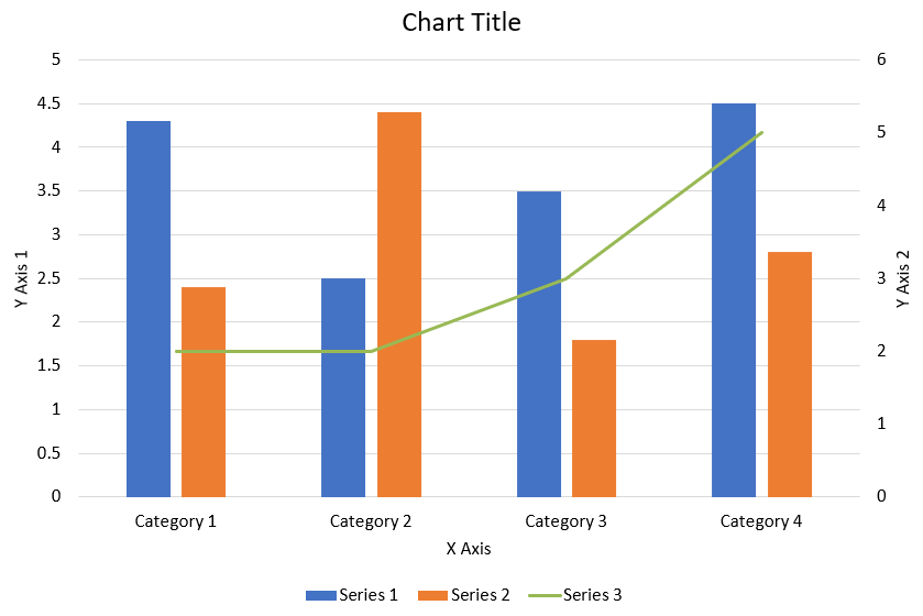
El siguiente código Python muestra cómo crear el gráfico combinado que aparece arriba en una presentación de PowerPoint:
import jpype
import asposeslides

if not jpype.isJVMStarted():
    jpype.startJVM()

from asposeslides.api import AxisPositionType, ChartType, CrossesType, FillType, LegendPositionType, NullableBool, Presentation, SaveFormat

Color = jpype.JClass("java.awt.Color")

def create_combo_chart():
    presentation = Presentation()
    slide = presentation.getSlides().get_Item(0)
    try:
        chart = create_chart_with_first_series(slide)

        add_second_series_to_chart(chart)
        add_third_series_to_chart(chart)

        set_primary_axes_format(chart)
        set_secondary_axes_format(chart)

        presentation.save("combo-chart.pptx", SaveFormat.Pptx)
    finally:
        presentation.dispose()

def create_chart_with_first_series(slide):
    chart = slide.getShapes().addChart(ChartType.ClusteredColumn, 50, 50, 600, 400)

    # Establecer el título del gráfico.
    chart.setTitle(True)
    chart.getChartTitle().addTextFrameForOverriding("Chart Title")
    chart.getChartTitle().setOverlay(False)
    title_paragraph = chart.getChartTitle().getTextFrameForOverriding().getParagraphs().get_Item(0)
    title_format = title_paragraph.getParagraphFormat().getDefaultPortionFormat()
    title_format.setFontBold(NullableBool.False_)
    title_format.setFontHeight(18.0)

    # Establecer la leyenda del gráfico.
    chart.getLegend().setPosition(LegendPositionType.Bottom)
    chart.getLegend().getTextFormat().getPortionFormat().setFontHeight(12.0)

    # Eliminar las series y categorías generadas por defecto.
    chart.getChartData().getSeries().clear()
    chart.getChartData().getCategories().clear()

    worksheet_index = 0
    workbook = chart.getChartData().getChartDataWorkbook()

    # Añadir nuevas categorías.
    cell = workbook.getCell(worksheet_index, 1, 0, "Category 1")
    chart.getChartData().getCategories().add(cell)
    cell = workbook.getCell(worksheet_index, 2, 0, "Category 2")
    chart.getChartData().getCategories().add(cell)
    cell = workbook.getCell(worksheet_index, 3, 0, "Category 3")
    chart.getChartData().getCategories().add(cell)
    cell = workbook.getCell(worksheet_index, 4, 0, "Category 4")
    chart.getChartData().getCategories().add(cell)

    # Añadir la primera serie.
    series_name_cell = workbook.getCell(worksheet_index, 0, 1, "Series 1")
    series = chart.getChartData().getSeries().add(series_name_cell, chart.getType())

    series.getParentSeriesGroup().setOverlap(jpype.JByte(-25))
    series.getParentSeriesGroup().setGapWidth(220)

    cell = workbook.getCell(worksheet_index, 1, 1, 4.3)
    series.getDataPoints().addDataPointForBarSeries(cell)
    cell = workbook.getCell(worksheet_index, 2, 1, 2.5)
    series.getDataPoints().addDataPointForBarSeries(cell)
    cell = workbook.getCell(worksheet_index, 3, 1, 3.5)
    series.getDataPoints().addDataPointForBarSeries(cell)
    cell = workbook.getCell(worksheet_index, 4, 1, 4.5)
    series.getDataPoints().addDataPointForBarSeries(cell)

    return chart

def add_second_series_to_chart(chart):
    workbook = chart.getChartData().getChartDataWorkbook()
    worksheet_index = 0

    series_name_cell = workbook.getCell(worksheet_index, 0, 2, "Series 2")
    series = chart.getChartData().getSeries().add(series_name_cell, ChartType.ClusteredColumn)

    series.getParentSeriesGroup().setOverlap(jpype.JByte(-25))
    series.getParentSeriesGroup().setGapWidth(220)

    cell = workbook.getCell(worksheet_index, 1, 2, 2.4)
    series.getDataPoints().addDataPointForBarSeries(cell)
    cell = workbook.getCell(worksheet_index, 2, 2, 4.4)
    series.getDataPoints().addDataPointForBarSeries(cell)
    cell = workbook.getCell(worksheet_index, 3, 2, 1.8)
    series.getDataPoints().addDataPointForBarSeries(cell)
    cell = workbook.getCell(worksheet_index, 4, 2, 2.8)
    series.getDataPoints().addDataPointForBarSeries(cell)

def add_third_series_to_chart(chart):
    workbook = chart.getChartData().getChartDataWorkbook()
    worksheet_index = 0

    series_name_cell = workbook.getCell(worksheet_index, 0, 3, "Series 3")
    series = chart.getChartData().getSeries().add(series_name_cell, ChartType.Line)

    cell = workbook.getCell(worksheet_index, 1, 3, 2.0)
    series.getDataPoints().addDataPointForLineSeries(cell)
    cell = workbook.getCell(worksheet_index, 2, 3, 2.0)
    series.getDataPoints().addDataPointForLineSeries(cell)
    cell = workbook.getCell(worksheet_index, 3, 3, 3.0)
    series.getDataPoints().addDataPointForLineSeries(cell)
    cell = workbook.getCell(worksheet_index, 4, 3, 5.0)
    series.getDataPoints().addDataPointForLineSeries(cell)

    series.setPlotOnSecondAxis(True)

def set_primary_axes_format(chart):
    # Establecer el eje horizontal.
    horizontal_axis = chart.getAxes().getHorizontalAxis()
    horizontal_axis.getTextFormat().getPortionFormat().setFontHeight(12.0)
    horizontal_axis.getFormat().getLine().getFillFormat().setFillType(FillType.NoFill)

    set_axis_title(horizontal_axis, "X Axis")

    # Establecer el eje vertical.
    vertical_axis = chart.getAxes().getVerticalAxis()
    vertical_axis.getTextFormat().getPortionFormat().setFontHeight(12.0)
    vertical_axis.getFormat().getLine().getFillFormat().setFillType(FillType.NoFill)

    set_axis_title(vertical_axis, "Y Axis 1")

    # Establecer el color de las líneas de cuadrícula mayores verticales.
    major_grid_lines_format = vertical_axis.getMajorGridLinesFormat().getLine().getFillFormat()
    major_grid_lines_format.setFillType(FillType.Solid)
    color = Color(217, 217, 217)
    major_grid_lines_format.getSolidFillColor().setColor(color)

def set_secondary_axes_format(chart):
    # Establecer el eje horizontal secundario.
    secondary_horizontal_axis = chart.getAxes().getSecondaryHorizontalAxis()
    secondary_horizontal_axis.setPosition(AxisPositionType.Bottom)
    secondary_horizontal_axis.setCrossType(CrossesType.Maximum)
    secondary_horizontal_axis.setVisible(False)
    secondary_horizontal_axis.getMajorGridLinesFormat().getLine().getFillFormat().setFillType(FillType.NoFill)
    secondary_horizontal_axis.getMinorGridLinesFormat().getLine().getFillFormat().setFillType(FillType.NoFill)

    # Establecer el eje vertical secundario.
    secondary_vertical_axis = chart.getAxes().getSecondaryVerticalAxis()
    secondary_vertical_axis.setPosition(AxisPositionType.Right)
    secondary_vertical_axis.getTextFormat().getPortionFormat().setFontHeight(12.0)
    secondary_vertical_axis.getFormat().getLine().getFillFormat().setFillType(FillType.NoFill)
    secondary_vertical_axis.getMajorGridLinesFormat().getLine().getFillFormat().setFillType(FillType.NoFill)
    secondary_vertical_axis.getMinorGridLinesFormat().getLine().getFillFormat().setFillType(FillType.NoFill)

    set_axis_title(secondary_vertical_axis, "Y Axis 2")

def set_axis_title(axis, axis_title):
    axis.setTitle(True)
    axis.getTitle().setOverlay(False)
    title_paragraph = axis.getTitle().addTextFrameForOverriding(axis_title).getParagraphs().get_Item(0)
    title_format = title_paragraph.getParagraphFormat().getDefaultPortionFormat()
    title_format.setFontBold(NullableBool.False_)
    title_format.setFontHeight(12.0)

create_combo_chart()
Actualizar gráficos
- Crear una instancia de la clase Presentation que representa la presentación que contiene el gráfico que desea actualizar.
- Obtener una referencia a una diapositiva mediante su índice.
- Recorrer todas las formas para encontrar el gráfico deseado.
- Acceder a la hoja de datos del gráfico.
- Modificar la serie de datos del gráfico cambiando los valores de la serie.
- Añadir una nueva serie y rellenar sus datos.
- Guardar la presentación modificada como archivo PPTX.
Este código Python muestra cómo actualizar un gráfico:
import jpype
import asposeslides

if not jpype.isJVMStarted():
    jpype.startJVM()

from asposeslides.api import ChartType, Presentation, SaveFormat

# Abre la presentación que contiene el gráfico a actualizar
presentation = Presentation("ExistingChart.pptx")
try:
    # Accede a la primera diapositiva
    slide = presentation.getSlides().get_Item(0)

    # Obtén el gráfico de la diapositiva
    chart = slide.getShapes().get_Item(0)

    # Establece el índice de la hoja de datos del gráfico
    default_worksheet_index = 0

    # Obtén la hoja de datos del gráfico
    workbook = chart.getChartData().getChartDataWorkbook()

    # Cambia el nombre de la categoría del gráfico
    workbook.getCell(default_worksheet_index, 1, 0, "Modified Category 1")
    workbook.getCell(default_worksheet_index, 2, 0, "Modified Category 2")

    # Toma la primera serie del gráfico
    series = chart.getChartData().getSeries().get_Item(0)

    # Ahora actualizando los datos de la serie
    workbook.getCell(default_worksheet_index, 0, 1, "New_Series1")# Modificando nombre de serie
    series.getDataPoints().get_Item(0).getValue().setData(90)
    series.getDataPoints().get_Item(1).getValue().setData(123)
    series.getDataPoints().get_Item(2).getValue().setData(44)

    # Toma la segunda serie del gráfico
    series = chart.getChartData().getSeries().get_Item(1)

    # Ahora actualizando los datos de la serie
    workbook.getCell(default_worksheet_index, 0, 2, "New_Series2")# Modificando nombre de serie
    series.getDataPoints().get_Item(0).getValue().setData(23)
    series.getDataPoints().get_Item(1).getValue().setData(67)
    series.getDataPoints().get_Item(2).getValue().setData(99)

    # Ahora, añadiendo una nueva serie
    cell = workbook.getCell(default_worksheet_index, 0, 3, "Series 3")
    chart.getChartData().getSeries().add(cell, chart.getType())

    # Toma la tercera serie del gráfico
    series = chart.getChartData().getSeries().get_Item(2)

    # Ahora rellenando los datos de la serie
    cell = workbook.getCell(default_worksheet_index, 1, 3, 20)
    series.getDataPoints().addDataPointForBarSeries(cell)
    cell = workbook.getCell(default_worksheet_index, 2, 3, 50)
    series.getDataPoints().addDataPointForBarSeries(cell)
    cell = workbook.getCell(default_worksheet_index, 3, 3, 30)
    series.getDataPoints().addDataPointForBarSeries(cell)

    chart.setType(ChartType.ClusteredCylinder)

    # Guarda la presentación con el gráfico
    presentation.save("AsposeChartModified_out.pptx", SaveFormat.Pptx)
finally:
    presentation.dispose()
Establecer rango de datos para un gráfico
Para establecer el rango de datos de un gráfico, haga lo siguiente:
- Crear una instancia de la clase Presentation que representa la presentación que contiene el gráfico.
- Obtener una referencia a una diapositiva mediante su índice.
- Recorrer todas las formas para encontrar el gráfico deseado.
- Acceder a los datos del gráfico y establecer el rango.
- Guardar la presentación modificada como archivo PPTX.
Este código Python muestra cómo establecer el rango de datos para un gráfico:
import jpype
import asposeslides

if not jpype.isJVMStarted():
    jpype.startJVM()

from asposeslides.api import Presentation, SaveFormat

# Abre la presentación que contiene el gráfico
presentation = Presentation("ExistingChart.pptx")
try:
    slide = presentation.getSlides().get_Item(0)
    chart = slide.getShapes().get_Item(0)

    chart.getChartData().setRange("Sheet1!A1:B4")

    presentation.save("SetDataRange_out.pptx", SaveFormat.Pptx)
finally:
    presentation.dispose()
Usar marcadores predeterminados en los gráficos
Cuando usa marcadores predeterminados en los gráficos, cada serie del gráfico recibe automáticamente un símbolo de marcador distinto.
Este código Python muestra cómo establecer automáticamente un marcador de serie de gráfico:
import jpype
import asposeslides

if not jpype.isJVMStarted():
    jpype.startJVM()

from asposeslides.api import ChartType, Presentation, SaveFormat

presentation = Presentation()
try:
    slide = presentation.getSlides().get_Item(0)
    chart = slide.getShapes().addChart(ChartType.LineWithMarkers, 10, 10, 400, 400)

    chart.getChartData().getSeries().clear()
    chart.getChartData().getCategories().clear()

    workbook = chart.getChartData().getChartDataWorkbook()
    cell = workbook.getCell(0, 0, 1, "Series 1")
    chart.getChartData().getSeries().add(cell, chart.getType())
    series = chart.getChartData().getSeries().get_Item(0)

    cell = workbook.getCell(0, 1, 0, "C1")
    chart.getChartData().getCategories().add(cell)
    cell = workbook.getCell(0, 1, 1, 24)
    series.getDataPoints().addDataPointForLineSeries(cell)
    cell = workbook.getCell(0, 2, 0, "C2")
    chart.getChartData().getCategories().add(cell)
    cell = workbook.getCell(0, 2, 1, 23)
    series.getDataPoints().addDataPointForLineSeries(cell)
    cell = workbook.getCell(0, 3, 0, "C3")
    chart.getChartData().getCategories().add(cell)
    cell = workbook.getCell(0, 3, 1, -10)
    series.getDataPoints().addDataPointForLineSeries(cell)
    cell = workbook.getCell(0, 4, 0, "C4")
    chart.getChartData().getCategories().add(cell)
    cell = workbook.getCell(0, 4, 1, None)
    series.getDataPoints().addDataPointForLineSeries(cell)

    cell = workbook.getCell(0, 0, 2, "Series 2")
    chart.getChartData().getSeries().add(cell, chart.getType())
    # Toma la segunda serie del gráfico
    second_series = chart.getChartData().getSeries().get_Item(1)

    # Ahora rellenando los datos de la serie
    cell = workbook.getCell(0, 1, 2, 30)
    second_series.getDataPoints().addDataPointForLineSeries(cell)
    cell = workbook.getCell(0, 2, 2, 10)
    second_series.getDataPoints().addDataPointForLineSeries(cell)
    cell = workbook.getCell(0, 3, 2, 60)
    second_series.getDataPoints().addDataPointForLineSeries(cell)
    cell = workbook.getCell(0, 4, 2, 40)
    second_series.getDataPoints().addDataPointForLineSeries(cell)

    chart.setLegend(True)
    chart.getLegend().setOverlay(False)

    presentation.save("DefaultMarkersInChart.pptx", SaveFormat.Pptx)
finally:
    presentation.dispose()
Preguntas frecuentes
¿Qué tipos de gráficos admite Aspose.Slides?
Aspose.Slides admite una amplia variedad de tipos de gráficos, incluidos de barras, líneas, pastel, áreas, dispersión, histograma, radar y muchos más. Esta flexibilidad le permite elegir el tipo de gráfico más adecuado para sus necesidades de visualización de datos.
¿Cómo añado un nuevo gráfico a una diapositiva?
Para añadir un gráfico, primero crea una instancia de la clase Presentation, recupera la diapositiva deseada mediante su índice y luego llama al método para añadir un gráfico, especificando el tipo de gráfico y los datos iniciales. Este proceso integra el gráfico directamente en su presentación.
¿Cómo puedo actualizar los datos mostrados en un gráfico?
Puede actualizar los datos de un gráfico accediendo a su libro de datos (ChartDataWorkbook), eliminando cualquier serie y categoría predeterminada y, a continuación, añadiendo sus datos personalizados. Esto le permite refrescar el gráfico para reflejar los datos más recientes.
¿Es posible personalizar la apariencia del gráfico?
Sí, Aspose.Slides ofrece amplias opciones de personalización. Puede modificar colores, fuentes, etiquetas, leyendas y otros elementos de formato para adaptar la apariencia del gráfico a sus requisitos de diseño específicos.