
Vytvořit nebo aktualizovat grafy PowerPoint prezentací v Pythonu
Přehled
Tento článek poskytuje komplexní průvodce, jak vytvářet a přizpůsobovat grafy pomocí Aspose.Slides. Naučíte se, jak programově přidat graf do snímku, naplnit jej daty a použít různé možnosti formátování, aby odpovídal vašim konkrétním požadavkům na design. V celém článku podrobné příklady kódu ilustrují každý krok, od inicializace prezentace a objektu grafu až po konfiguraci řad, os a legend. Dodržením tohoto průvodce získáte solidní pochopení, jak integrovat dynamické generování grafů do aplikací a zjednodušit proces tvorby datově řízených prezentací.
Vytvoření grafu
Grafy pomáhají lidem rychle vizualizovat data a získat postřehy, které nemusí být okamžitě zřejmé z tabulky nebo tabulkového listu.
Proč vytvářet grafy?
Pomocí grafů můžete:
- agregovat, zhušťovat nebo shrnout velké množství dat na jediném snímku v prezentaci
- odhalit vzory a trendy v datech
- odvodit směr a dynamiku dat v čase nebo vzhledem k určité jednotce měření
- zaznamenat odlehlé hodnoty, odchylky, chyby, nesmyslná data atd.
- komunikovat nebo prezentovat složitá data
V PowerPointu můžete vytvářet grafy přes funkci Insert, která nabízí šablony pro návrh mnoha typů grafů. Pomocí Aspose.Slides můžete vytvářet jak běžné grafy (na základě populárních typů), tak vlastní grafy.
Poznámka
Pro vytvoření grafů použijte třídu ChartType. Pole v této třídě odpovídají různým typům grafů.Vytvoření seskupených sloupcových grafů
Tato sekce vysvětluje, jak vytvořit seskupené sloupcové grafy pomocí Aspose.Slides. Naučíte se inicializovat prezentaci, přidat graf a přizpůsobit jeho prvky, jako je název, data, řady, kategorie a stylování. Postupujte podle níže uvedených kroků a uvidíte, jak se vygeneruje standardní seskupený sloupcový graf:
- Vytvořte instanci třídy Presentation.
- Získejte odkaz na snímek podle jeho indexu.
- Přidejte graf s některými daty a určete typ
ChartType.ClusteredColumn. - Přidejte název grafu.
- Přistupte k datovému listu grafu.
- Vymažte všechny výchozí řady a kategorie.
- Přidejte nové řady a kategorie.
- Přidejte nová data grafu pro řady.
- Použijte výplňovou barvu na řady grafu.
- Přidejte popisky k řadám.
- Uložte upravenou prezentaci jako soubor PPTX.
Tento C# kód ukazuje, jak vytvořit seskupený sloupcový graf:
import jpype
import asposeslides

if not jpype.isJVMStarted():
    jpype.startJVM()

from asposeslides.api import ChartType, FillType, NullableBool, Presentation, SaveFormat

Color = jpype.JClass("java.awt.Color")

# Vytvoří instanci třídy prezentace, která představuje soubor PPTX.
presentation = Presentation()
try:
    # Přistupuje k prvnímu snímku
    slide = presentation.getSlides().get_Item(0)

    # Přidá graf s výchozími daty
    chart = slide.getShapes().addChart(ChartType.ClusteredColumn, 0, 0, 500, 500)

    # Nastaví název grafu
    chart.getChartTitle().addTextFrameForOverriding("Sample Title")
    chart.getChartTitle().getTextFrameForOverriding().getTextFrameFormat().setCenterText(NullableBool.True_)
    chart.getChartTitle().setHeight(20)
    chart.setTitle(True)

    # Nastaví index pro list dat grafu
    default_worksheet_index = 0

    # Získá pracovní list dat grafu
    workbook = chart.getChartData().getChartDataWorkbook()

    # Odstraní výchozí generované řady a kategorie
    chart.getChartData().getSeries().clear()
    chart.getChartData().getCategories().clear()

    # Přidá nové řady
    cell = workbook.getCell(default_worksheet_index, 0, 1, "Series 1")
    chart.getChartData().getSeries().add(cell,chart.getType())
    cell = workbook.getCell(default_worksheet_index, 0, 2, "Series 2")
    chart.getChartData().getSeries().add(cell,chart.getType())

    # Přidá nové kategorie
    cell = workbook.getCell(default_worksheet_index, 1, 0, "Category 1")
    chart.getChartData().getCategories().add(cell)
    cell = workbook.getCell(default_worksheet_index, 2, 0, "Category 2")
    chart.getChartData().getCategories().add(cell)
    cell = workbook.getCell(default_worksheet_index, 3, 0, "Category 3")
    chart.getChartData().getCategories().add(cell)

    # Vezme první řadu grafu
    series = chart.getChartData().getSeries().get_Item(0)

    # Nyní naplní data řady
    cell = workbook.getCell(default_worksheet_index, 1, 1, 20)
    series.getDataPoints().addDataPointForBarSeries(cell)
    cell = workbook.getCell(default_worksheet_index, 2, 1, 50)
    series.getDataPoints().addDataPointForBarSeries(cell)
    cell = workbook.getCell(default_worksheet_index, 3, 1, 30)
    series.getDataPoints().addDataPointForBarSeries(cell)

    # Nastaví barvu výplně pro řadu
    series.getFormat().getFill().setFillType(FillType.Solid)
    series.getFormat().getFill().getSolidFillColor().setColor(Color.RED)

    # Vezme druhou řadu grafu
    series = chart.getChartData().getSeries().get_Item(1)

    # Naplní data řady
    cell = workbook.getCell(default_worksheet_index, 1, 2, 30)
    series.getDataPoints().addDataPointForBarSeries(cell)
    cell = workbook.getCell(default_worksheet_index, 2, 2, 10)
    series.getDataPoints().addDataPointForBarSeries(cell)
    cell = workbook.getCell(default_worksheet_index, 3, 2, 60)
    series.getDataPoints().addDataPointForBarSeries(cell)

    # Nastaví barvu výplně pro řadu
    series.getFormat().getFill().setFillType(FillType.Solid)
    series.getFormat().getFill().getSolidFillColor().setColor(Color.GREEN)

    #Vytvoří vlastní popisky pro každou kategorii pro novou řadu
    # Nastaví první popisek, aby zobrazoval název kategorie
    label = series.getDataPoints().get_Item(0).getLabel()
    label.getDataLabelFormat().setShowCategoryName(True)

    label = series.getDataPoints().get_Item(1).getLabel()
    label.getDataLabelFormat().setShowSeriesName(True)

    # Zobrazí hodnotu pro třetí popisek
    label = series.getDataPoints().get_Item(2).getLabel()
    label.getDataLabelFormat().setShowValue(True)
    label.getDataLabelFormat().setShowSeriesName(True)
    label.getDataLabelFormat().setSeparator("/")

    # Uloží prezentaci s grafem
    presentation.save("output.pptx", SaveFormat.Pptx)
finally:
    presentation.dispose()
Vytvoření rozptylových grafů
Rozptylové grafy (také známé jako scatter ploty nebo x‑y grafy) se často používají k vyhledání vzorů nebo demonstraci korelací mezi dvěma proměnnými.
Použijte rozptylový graf, když:
- máte spárovaná číselná data
- máte dvě proměnné, které dobře spolu korespondují
- chcete zjistit, zda jsou dvě proměnné navzájem související
- máte nezávislou proměnnou s více hodnotami pro závislou proměnnou
- Postupujte podle kroků v sekci Create Clustered Column Charts.
- Ve třetím kroku přidejte graf s některými daty a určete typ grafu jako jeden z následujících:
- ChartType.ScatterWithMarkers - Representuje rozptylový graf s markery.
- ChartType.ScatterWithSmoothLinesAndMarkers - Representuje rozptylový graf spojený křivkami s markery.
- ChartType.ScatterWithSmoothLines - Representuje rozptylový graf spojený křivkami bez markerů.
- ChartType.ScatterWithStraightLinesAndMarkers - Representuje rozptylový graf spojený přímkami s markery.
- ChartType.ScatterWithStraightLines - Representuje rozptylový graf spojený přímkami bez markerů.
Tento Python kód ukazuje, jak vytvořit rozptylový graf s různými markery pro každou řadu:
import jpype
import asposeslides

if not jpype.isJVMStarted():
    jpype.startJVM()

from asposeslides.api import ChartType, MarkerStyleType, Presentation, SaveFormat

# Vytvoří instanci třídy prezentace, která představuje soubor PPTX.
presentation = Presentation()
try:
    # Přistupuje k prvnímu snímku
    slide = presentation.getSlides().get_Item(0)

    # Vytvoří výchozí graf
    chart = slide.getShapes().addChart(ChartType.ScatterWithSmoothLines, 0, 0, 400, 400)

    # Získá index výchozího listu dat grafu
    default_worksheet_index = 0

    # Získá list dat grafu
    workbook = chart.getChartData().getChartDataWorkbook()

    # Odstraní demo řadu
    chart.getChartData().getSeries().clear()

    # Přidá nové řady
    cell = workbook.getCell(default_worksheet_index, 1, 1, "Series 1")
    chart.getChartData().getSeries().add(cell, chart.getType())
    cell = workbook.getCell(default_worksheet_index, 1, 3, "Series 2")
    chart.getChartData().getSeries().add(cell, chart.getType())

    # Vezme první řadu grafu
    series = chart.getChartData().getSeries().get_Item(0)

    # Přidá nový bod (1:3) do řady
    x_cell = workbook.getCell(default_worksheet_index, 2, 1, 1)
    y_cell = workbook.getCell(default_worksheet_index, 2, 2, 3)
    series.getDataPoints().addDataPointForScatterSeries(x_cell, y_cell)

    # Přidá nový bod (2:10)
    x_cell = workbook.getCell(default_worksheet_index, 3, 1, 2)
    y_cell = workbook.getCell(default_worksheet_index, 3, 2, 10)
    series.getDataPoints().addDataPointForScatterSeries(x_cell, y_cell)

    # Změní typ řady
    series.setType(ChartType.ScatterWithStraightLinesAndMarkers)

    # Změní označovač řady grafu
    series.getMarker().setSize(10)
    series.getMarker().setSymbol(MarkerStyleType.Star)

    # Vezme druhou řadu grafu
    series = chart.getChartData().getSeries().get_Item(1)

    # Přidá nový bod (5:2) tam
    x_cell = workbook.getCell(default_worksheet_index, 2, 3, 5)
    y_cell = workbook.getCell(default_worksheet_index, 2, 4, 2)
    series.getDataPoints().addDataPointForScatterSeries(x_cell, y_cell)

    # Přidá nový bod (3:1)
    x_cell = workbook.getCell(default_worksheet_index, 3, 3, 3)
    y_cell = workbook.getCell(default_worksheet_index, 3, 4, 1)
    series.getDataPoints().addDataPointForScatterSeries(x_cell, y_cell)

    # Přidá nový bod (2:2)
    x_cell = workbook.getCell(default_worksheet_index, 4, 3, 2)
    y_cell = workbook.getCell(default_worksheet_index, 4, 4, 2)
    series.getDataPoints().addDataPointForScatterSeries(x_cell, y_cell)

    # Přidá nový bod (5:1)
    x_cell = workbook.getCell(default_worksheet_index, 5, 3, 5)
    y_cell = workbook.getCell(default_worksheet_index, 5, 4, 1)
    series.getDataPoints().addDataPointForScatterSeries(x_cell, y_cell)

    # Změní označovač řady grafu
    series.getMarker().setSize(10)
    series.getMarker().setSymbol(MarkerStyleType.Circle)

    presentation.save("AsposeChart_out.pptx", SaveFormat.Pptx)
finally:
    presentation.dispose()
Vytvoření koláčových grafů
Koláčové grafy jsou nejvhodnější pro zobrazení vztahu část‑celku v datech, zejména když data obsahují kategorie s číselnými hodnotami. Pokud však vaše data obsahují mnoho částí nebo štítků, zvažte místo toho sloupcový graf.
- Vytvořte instanci třídy Presentation.
- Získejte odkaz na snímek podle jeho indexu.
- Přidejte graf s výchozími daty a určete typ ChartType.Pie.
- Přistupte k sešitu dat grafu ChartDataWorkbook.
- Vymažte výchozí řady a kategorie.
- Přidejte nové řady a kategorie.
- Přidejte nová data grafu pro řady.
- Přidejte nové body pro graf a použijte vlastní barvy pro sektory koláčového grafu.
- Nastavte popisky pro řady.
- Povolení čar spojujících popisky řad.
- Nastavte úhlovou rotaci sektorů koláčového grafu.
- Uložte upravenou prezentaci jako soubor PPTX.
Tento Python kód ukazuje, jak vytvořit koláčový graf:
import jpype
import asposeslides

if not jpype.isJVMStarted():
    jpype.startJVM()

from asposeslides.api import ChartType, FillType, LineDashStyle, LineStyle, NullableBool, Presentation, SaveFormat

Color = jpype.JClass("java.awt.Color")

    # Vytvoří instanci třídy prezentace, která představuje soubor PPTX.
presentation = Presentation()
try:
    # Přistupuje k prvnímu snímku
    slide = presentation.getSlides().get_Item(0)

    # Přidá graf s výchozími daty
    chart = slide.getShapes().addChart(ChartType.Pie, 100, 100, 400, 400)

    # Nastaví název grafu
    chart.getChartTitle().addTextFrameForOverriding("Sample Title")
    chart.getChartTitle().getTextFrameForOverriding().getTextFrameFormat().setCenterText(NullableBool.True_)
    chart.getChartTitle().setHeight(20)
    chart.setTitle(True)

    # Nastaví index listu dat grafu
    default_worksheet_index = 0

    # Získá list dat grafu
    workbook = chart.getChartData().getChartDataWorkbook()

    # Odstraní výchozí vygenerované řady a kategorie
    chart.getChartData().getSeries().clear()
    chart.getChartData().getCategories().clear()

    # Přidá nové kategorie
    cell = workbook.getCell(0, 1, 0, "First Qtr")
    chart.getChartData().getCategories().add(cell)
    cell = workbook.getCell(0, 2, 0, "2nd Qtr")
    chart.getChartData().getCategories().add(cell)
    cell = workbook.getCell(0, 3, 0, "3rd Qtr")
    chart.getChartData().getCategories().add(cell)

    # Přidá nové řady
    cell = workbook.getCell(0, 0, 1, "Series 1")
    series = chart.getChartData().getSeries().add(cell, chart.getType())

    #Naplní data řady
    cell = workbook.getCell(default_worksheet_index, 1, 1, 20)
    series.getDataPoints().addDataPointForPieSeries(cell)
    cell = workbook.getCell(default_worksheet_index, 2, 1, 50)
    series.getDataPoints().addDataPointForPieSeries(cell)
    cell = workbook.getCell(default_worksheet_index, 3, 1, 30)
    series.getDataPoints().addDataPointForPieSeries(cell)

    # Přidává nové body a nastavuje barvu sektoru
    chart.getChartData().getSeriesGroups().get_Item(0).setColorVaried(True)

    point = series.getDataPoints().get_Item(0)
    point.getFormat().getFill().setFillType(FillType.Solid)
    point.getFormat().getFill().getSolidFillColor().setColor(Color.CYAN)

    # Nastaví okraj sektoru
    point.getFormat().getLine().getFillFormat().setFillType(FillType.Solid)
    point.getFormat().getLine().getFillFormat().getSolidFillColor().setColor(Color.GRAY)
    point.getFormat().getLine().setWidth(3.0)
    point.getFormat().getLine().setStyle(LineStyle.ThinThick)
    point.getFormat().getLine().setDashStyle(LineDashStyle.DashDot)

    second_point = series.getDataPoints().get_Item(1)
    second_point.getFormat().getFill().setFillType(FillType.Solid)
    second_point.getFormat().getFill().getSolidFillColor().setColor(Color.ORANGE)

    # Nastaví okraj sektoru
    second_point.getFormat().getLine().getFillFormat().setFillType(FillType.Solid)
    second_point.getFormat().getLine().getFillFormat().getSolidFillColor().setColor(Color.BLUE)
    second_point.getFormat().getLine().setWidth(3.0)
    second_point.getFormat().getLine().setStyle(LineStyle.Single)
    second_point.getFormat().getLine().setDashStyle(LineDashStyle.LargeDashDot)

    third_point = series.getDataPoints().get_Item(2)
    third_point.getFormat().getFill().setFillType(FillType.Solid)
    third_point.getFormat().getFill().getSolidFillColor().setColor(Color.YELLOW)

    # Nastaví okraj sektoru
    third_point.getFormat().getLine().getFillFormat().setFillType(FillType.Solid)
    third_point.getFormat().getLine().getFillFormat().getSolidFillColor().setColor(Color.RED)
    third_point.getFormat().getLine().setWidth(2.0)
    third_point.getFormat().getLine().setStyle(LineStyle.ThinThin)
    third_point.getFormat().getLine().setDashStyle(LineDashStyle.LargeDashDotDot)

    # Vytvoří vlastní popisky pro každou kategorii pro novou řadu
    first_label = series.getDataPoints().get_Item(0).getLabel()

    first_label.getDataLabelFormat().setShowValue(True)

    second_label = series.getDataPoints().get_Item(1).getLabel()
    second_label.getDataLabelFormat().setShowValue(True)
    second_label.getDataLabelFormat().setShowLegendKey(True)
    second_label.getDataLabelFormat().setShowPercentage(True)

    third_label = series.getDataPoints().get_Item(2).getLabel()
    third_label.getDataLabelFormat().setShowSeriesName(True)
    third_label.getDataLabelFormat().setShowPercentage(True)

    # Zobrazí spojnice (leader lines) pro graf
    series.getLabels().getDefaultDataLabelFormat().setShowLeaderLines(True)

    # Nastaví úhel otočení sektorů koláčového grafu
    chart.getChartData().getSeriesGroups().get_Item(0).setFirstSliceAngle(180)

    # Uloží prezentaci s grafem
    presentation.save("PieChart_out.pptx", SaveFormat.Pptx)
finally:
    presentation.dispose()
Vytvoření čárových grafů
Čárové grafy (také známé jako line grafy) jsou nejvhodnější v situacích, kdy chcete ukázat změny hodnot v čase. Pomocí čárového grafu můžete najednou porovnávat velké množství dat, sledovat změny a trendy v průběhu času, zvýraznit anomálie v řadách a další.
- Vytvořte instanci třídy Presentation.
- Získejte odkaz na snímek podle jeho indexu.
- Přidejte graf s výchozími daty a určete typ ChartType.Line.
- Uložte upravenou prezentaci jako soubor PPTX.
Tento Python kód ukazuje, jak vytvořit čárový graf:
import jpype
import asposeslides

if not jpype.isJVMStarted():
    jpype.startJVM()

from asposeslides.api import ChartType, Presentation, SaveFormat

presentation = Presentation()
try:
    line_chart = presentation.getSlides().get_Item(0).getShapes().addChart(ChartType.Line, 10, 50, 600, 350)

    presentation.save("line_chart.pptx", SaveFormat.Pptx)
finally:
    presentation.dispose()
Ve výchozím nastavení jsou body na čárovém grafu spojeny přímými souvislými čarami. Pokud chcete, aby byly body spojeny čárkami, můžete určit požadovaný typ čáry následovně:
import jpype
import asposeslides

if not jpype.isJVMStarted():
    jpype.startJVM()

from asposeslides.api import ChartType, LineDashStyle, Presentation, SaveFormat

presentation = Presentation()
try:
    line_chart = presentation.getSlides().get_Item(0).getShapes().addChart(ChartType.Line, 10, 50, 600, 350)

    for series in line_chart.getChartData().getSeries():
        series.getFormat().getLine().setDashStyle(LineDashStyle.Dash)

    presentation.save("line_chart.pptx", SaveFormat.Pptx)
finally:
    presentation.dispose()
Vytvoření stromových map
Stromové mapy jsou nejvhodnější pro prodejní data, kdy chcete zobrazit relativní velikost kategorií a rychle upozornit na položky, které jsou v rámci každé kategorie velkými přispěvateli.
- Vytvořte instanci třídy Presentation.
- Získejte odkaz na snímek podle jeho indexu.
- Přidejte graf s výchozími daty a určete typ ChartType.Treemap.
- Přistupte k sešitu dat grafu ChartDataWorkbook.
- Vymažte výchozí řady a kategorie.
- Přidejte nové řady a kategorie.
- Přidejte nová data grafu pro řady.
- Uložte upravenou prezentaci jako soubor PPTX.
Tento Python kód ukazuje, jak vytvořit stromovou mapu:
import jpype
import asposeslides

if not jpype.isJVMStarted():
    jpype.startJVM()

from asposeslides.api import ChartType, ParentLabelLayoutType, Presentation, SaveFormat

presentation = Presentation()
try:
    chart = presentation.getSlides().get_Item(0).getShapes().addChart(ChartType.Treemap, 50, 50, 500, 400)
    chart.getChartData().getCategories().clear()
    chart.getChartData().getSeries().clear()

    workbook = chart.getChartData().getChartDataWorkbook()
    workbook.clear(0)

    #větev 1
    cell = workbook.getCell(0, "C1", "Leaf1")
    leaf = chart.getChartData().getCategories().add(cell)
    leaf.getGroupingLevels().setGroupingItem(1, "Stem1")
    leaf.getGroupingLevels().setGroupingItem(2, "Branch1")

    cell = workbook.getCell(0, "C2", "Leaf2")
    chart.getChartData().getCategories().add(cell)

    cell = workbook.getCell(0, "C3", "Leaf3")
    leaf = chart.getChartData().getCategories().add(cell)
    leaf.getGroupingLevels().setGroupingItem(1, "Stem2")

    cell = workbook.getCell(0, "C4", "Leaf4")
    chart.getChartData().getCategories().add(cell)

    #větev 2
    cell = workbook.getCell(0, "C5", "Leaf5")
    leaf = chart.getChartData().getCategories().add(cell)
    leaf.getGroupingLevels().setGroupingItem(1, "Stem3")
    leaf.getGroupingLevels().setGroupingItem(2, "Branch2")

    cell = workbook.getCell(0, "C6", "Leaf6")
    chart.getChartData().getCategories().add(cell)

    cell = workbook.getCell(0, "C7", "Leaf7")
    leaf = chart.getChartData().getCategories().add(cell)
    leaf.getGroupingLevels().setGroupingItem(1, "Stem4")

    cell = workbook.getCell(0, "C8", "Leaf8")
    chart.getChartData().getCategories().add(cell)

    series = chart.getChartData().getSeries().add(ChartType.Treemap)
    series.getLabels().getDefaultDataLabelFormat().setShowCategoryName(True)
    cell = workbook.getCell(0, "D1", 4)
    series.getDataPoints().addDataPointForTreemapSeries(cell)
    cell = workbook.getCell(0, "D2", 5)
    series.getDataPoints().addDataPointForTreemapSeries(cell)
    cell = workbook.getCell(0, "D3", 3)
    series.getDataPoints().addDataPointForTreemapSeries(cell)
    cell = workbook.getCell(0, "D4", 6)
    series.getDataPoints().addDataPointForTreemapSeries(cell)
    cell = workbook.getCell(0, "D5", 9)
    series.getDataPoints().addDataPointForTreemapSeries(cell)
    cell = workbook.getCell(0, "D6", 9)
    series.getDataPoints().addDataPointForTreemapSeries(cell)
    cell = workbook.getCell(0, "D7", 4)
    series.getDataPoints().addDataPointForTreemapSeries(cell)
    cell = workbook.getCell(0, "D8", 3)
    series.getDataPoints().addDataPointForTreemapSeries(cell)

    series.setParentLabelLayout(ParentLabelLayoutType.Overlapping)

    presentation.save("Treemap.pptx", SaveFormat.Pptx)
finally:
    presentation.dispose()
Vytvoření akciových grafů
- Vytvořte instanci třídy Presentation.
- Získejte odkaz na snímek podle jeho indexu.
- Přidejte graf s výchozími daty a určete typ ChartType.OpenHighLowClose.
- Přistupte k sešitu dat grafu ChartDataWorkbook.
- Vymažte výchozí řady a kategorie.
- Přidejte nové řady a kategorie.
- Přidejte nová data grafu pro řady.
- Určete formát vysokých a nízkých čar.
- Uložte upravenou prezentaci jako soubor PPTX.
Tento Python kód ukazuje, jak vytvořit akciový graf:
import jpype
import asposeslides

if not jpype.isJVMStarted():
    jpype.startJVM()

from asposeslides.api import ChartType, FillType, Presentation, SaveFormat

presentation = Presentation()
try:
    chart = presentation.getSlides().get_Item(0).getShapes().addChart(ChartType.OpenHighLowClose, 50, 50, 600, 400, False)

    chart.getChartData().getSeries().clear()
    chart.getChartData().getCategories().clear()

    workbook = chart.getChartData().getChartDataWorkbook()

    cell = workbook.getCell(0, 1, 0, "A")
    chart.getChartData().getCategories().add(cell)
    cell = workbook.getCell(0, 2, 0, "B")
    chart.getChartData().getCategories().add(cell)
    cell = workbook.getCell(0, 3, 0, "C")
    chart.getChartData().getCategories().add(cell)

    cell = workbook.getCell(0, 0, 1, "Open")
    chart.getChartData().getSeries().add(cell, chart.getType())
    cell = workbook.getCell(0, 0, 2, "High")
    chart.getChartData().getSeries().add(cell, chart.getType())
    cell = workbook.getCell(0, 0, 3, "Low")
    chart.getChartData().getSeries().add(cell, chart.getType())
    cell = workbook.getCell(0, 0, 4, "Close")
    chart.getChartData().getSeries().add(cell, chart.getType())

    series = chart.getChartData().getSeries().get_Item(0)

    cell = workbook.getCell(0, 1, 1, 72)
    series.getDataPoints().addDataPointForStockSeries(cell)
    cell = workbook.getCell(0, 2, 1, 25)
    series.getDataPoints().addDataPointForStockSeries(cell)
    cell = workbook.getCell(0, 3, 1, 38)
    series.getDataPoints().addDataPointForStockSeries(cell)

    series = chart.getChartData().getSeries().get_Item(1)
    cell = workbook.getCell(0, 1, 2, 172)
    series.getDataPoints().addDataPointForStockSeries(cell)
    cell = workbook.getCell(0, 2, 2, 57)
    series.getDataPoints().addDataPointForStockSeries(cell)
    cell = workbook.getCell(0, 3, 2, 57)
    series.getDataPoints().addDataPointForStockSeries(cell)

    series = chart.getChartData().getSeries().get_Item(2)
    cell = workbook.getCell(0, 1, 3, 12)
    series.getDataPoints().addDataPointForStockSeries(cell)
    cell = workbook.getCell(0, 2, 3, 12)
    series.getDataPoints().addDataPointForStockSeries(cell)
    cell = workbook.getCell(0, 3, 3, 13)
    series.getDataPoints().addDataPointForStockSeries(cell)

    series = chart.getChartData().getSeries().get_Item(3)
    cell = workbook.getCell(0, 1, 4, 25)
    series.getDataPoints().addDataPointForStockSeries(cell)
    cell = workbook.getCell(0, 2, 4, 38)
    series.getDataPoints().addDataPointForStockSeries(cell)
    cell = workbook.getCell(0, 3, 4, 50)
    series.getDataPoints().addDataPointForStockSeries(cell)

    chart.getChartData().getSeriesGroups().get_Item(0).getUpDownBars().setUpDownBars(True)
    chart.getChartData().getSeriesGroups().get_Item(0).getHiLowLinesFormat().getLine().getFillFormat().setFillType(FillType.Solid)

    for series in chart.getChartData().getSeries():
        series.getFormat().getLine().getFillFormat().setFillType(FillType.NoFill)

    presentation.save("output.pptx", SaveFormat.Pptx)
finally:
    presentation.dispose()
Vytvoření box‑whisker grafů
- Vytvořte instanci třídy Presentation.
- Získejte odkaz na snímek podle jeho indexu.
- Přidejte graf s výchozími daty a určete typ ChartType.BoxAndWhisker.
- Přistupte k sešitu dat grafu ChartDataWorkbook.
- Vymažte výchozí řady a kategorie.
- Přidejte nové řady a kategorie.
- Přidejte nová data grafu pro řady.
- Uložte upravenou prezentaci jako soubor PPTX.
Tento Python kód ukazuje, jak vytvořit box‑whisker graf:
import jpype
import asposeslides

if not jpype.isJVMStarted():
    jpype.startJVM()

from asposeslides.api import ChartType, Presentation, QuartileMethodType, SaveFormat

presentation = Presentation()
try:
    chart = presentation.getSlides().get_Item(0).getShapes().addChart(ChartType.BoxAndWhisker, 50, 50, 500, 400)
    chart.getChartData().getCategories().clear()
    chart.getChartData().getSeries().clear()

    workbook = chart.getChartData().getChartDataWorkbook()
    workbook.clear(0)

    cell = workbook.getCell(0, "A1", "Category 1")
    chart.getChartData().getCategories().add(cell)
    cell = workbook.getCell(0, "A2", "Category 1")
    chart.getChartData().getCategories().add(cell)
    cell = workbook.getCell(0, "A3", "Category 1")
    chart.getChartData().getCategories().add(cell)
    cell = workbook.getCell(0, "A4", "Category 1")
    chart.getChartData().getCategories().add(cell)
    cell = workbook.getCell(0, "A5", "Category 1")
    chart.getChartData().getCategories().add(cell)
    cell = workbook.getCell(0, "A6", "Category 1")
    chart.getChartData().getCategories().add(cell)

    series = chart.getChartData().getSeries().add(ChartType.BoxAndWhisker)

    series.setQuartileMethod(QuartileMethodType.Exclusive)
    series.setShowMeanLine(True)
    series.setShowMeanMarkers(True)
    series.setShowInnerPoints(True)
    series.setShowOutlierPoints(True)

    cell = workbook.getCell(0, "B1", 15)
    series.getDataPoints().addDataPointForBoxAndWhiskerSeries(cell)
    cell = workbook.getCell(0, "B2", 41)
    series.getDataPoints().addDataPointForBoxAndWhiskerSeries(cell)
    cell = workbook.getCell(0, "B3", 16)
    series.getDataPoints().addDataPointForBoxAndWhiskerSeries(cell)
    cell = workbook.getCell(0, "B4", 10)
    series.getDataPoints().addDataPointForBoxAndWhiskerSeries(cell)
    cell = workbook.getCell(0, "B5", 23)
    series.getDataPoints().addDataPointForBoxAndWhiskerSeries(cell)
    cell = workbook.getCell(0, "B6", 16)
    series.getDataPoints().addDataPointForBoxAndWhiskerSeries(cell)

    presentation.save("BoxAndWhisker.pptx", SaveFormat.Pptx)
finally:
    presentation.dispose()
Vytvoření trychtýřových grafů
- Vytvořte instanci třídy Presentation.
- Získejte odkaz na snímek podle jeho indexu.
- Přidejte graf s výchozími daty a určete typ ChartType.Funnel.
- Uložte upravenou prezentaci jako soubor PPTX.
Tento Python kód ukazuje, jak vytvořit trychtýřový graf:
import jpype
import asposeslides

if not jpype.isJVMStarted():
    jpype.startJVM()

from asposeslides.api import ChartType, Presentation, SaveFormat

presentation = Presentation()
try:
    chart = presentation.getSlides().get_Item(0).getShapes().addChart(ChartType.Funnel, 50, 50, 500, 400)
    chart.getChartData().getCategories().clear()
    chart.getChartData().getSeries().clear()

    workbook = chart.getChartData().getChartDataWorkbook()

    workbook.clear(0)

    cell = workbook.getCell(0, "A1", "Category 1")
    chart.getChartData().getCategories().add(cell)
    cell = workbook.getCell(0, "A2", "Category 2")
    chart.getChartData().getCategories().add(cell)
    cell = workbook.getCell(0, "A3", "Category 3")
    chart.getChartData().getCategories().add(cell)
    cell = workbook.getCell(0, "A4", "Category 4")
    chart.getChartData().getCategories().add(cell)
    cell = workbook.getCell(0, "A5", "Category 5")
    chart.getChartData().getCategories().add(cell)
    cell = workbook.getCell(0, "A6", "Category 6")
    chart.getChartData().getCategories().add(cell)

    series = chart.getChartData().getSeries().add(ChartType.Funnel)

    cell = workbook.getCell(0, "B1", 50)
    series.getDataPoints().addDataPointForFunnelSeries(cell)
    cell = workbook.getCell(0, "B2", 100)
    series.getDataPoints().addDataPointForFunnelSeries(cell)
    cell = workbook.getCell(0, "B3", 200)
    series.getDataPoints().addDataPointForFunnelSeries(cell)
    cell = workbook.getCell(0, "B4", 300)
    series.getDataPoints().addDataPointForFunnelSeries(cell)
    cell = workbook.getCell(0, "B5", 400)
    series.getDataPoints().addDataPointForFunnelSeries(cell)
    cell = workbook.getCell(0, "B6", 500)
    series.getDataPoints().addDataPointForFunnelSeries(cell)

    presentation.save("Funnel.pptx", SaveFormat.Pptx)
finally:
    presentation.dispose()
Vytvoření sunburst grafů
- Vytvořte instanci třídy Presentation.
- Získejte odkaz na snímek podle jeho indexu.
- Přidejte graf s výchozími daty a určete typ ChartType.Sunburst.
- Uložte upravenou prezentaci jako soubor PPTX.
Tento Python kód ukazuje, jak vytvořit sunburst graf:
import jpype
import asposeslides

if not jpype.isJVMStarted():
    jpype.startJVM()

from asposeslides.api import ChartType, Presentation, SaveFormat

presentation = Presentation()
try:
    chart = presentation.getSlides().get_Item(0).getShapes().addChart(ChartType.Sunburst, 50, 50, 500, 400)
    chart.getChartData().getCategories().clear()
    chart.getChartData().getSeries().clear()

    workbook = chart.getChartData().getChartDataWorkbook()
    workbook.clear(0)

    #větev 1
    cell = workbook.getCell(0, "C1", "Leaf1")
    leaf = chart.getChartData().getCategories().add(cell)
    leaf.getGroupingLevels().setGroupingItem(1, "Stem1")
    leaf.getGroupingLevels().setGroupingItem(2, "Branch1")

    cell = workbook.getCell(0, "C2", "Leaf2")
    chart.getChartData().getCategories().add(cell)

    cell = workbook.getCell(0, "C3", "Leaf3")
    leaf = chart.getChartData().getCategories().add(cell)
    leaf.getGroupingLevels().setGroupingItem(1, "Stem2")

    cell = workbook.getCell(0, "C4", "Leaf4")
    chart.getChartData().getCategories().add(cell)

    #větev 2
    cell = workbook.getCell(0, "C5", "Leaf5")
    leaf = chart.getChartData().getCategories().add(cell)
    leaf.getGroupingLevels().setGroupingItem(1, "Stem3")
    leaf.getGroupingLevels().setGroupingItem(2, "Branch2")

    cell = workbook.getCell(0, "C6", "Leaf6")
    chart.getChartData().getCategories().add(cell)

    cell = workbook.getCell(0, "C7", "Leaf7")
    leaf = chart.getChartData().getCategories().add(cell)
    leaf.getGroupingLevels().setGroupingItem(1, "Stem4")

    cell = workbook.getCell(0, "C8", "Leaf8")
    chart.getChartData().getCategories().add(cell)

    series = chart.getChartData().getSeries().add(ChartType.Sunburst)
    series.getLabels().getDefaultDataLabelFormat().setShowCategoryName(True)
    cell = workbook.getCell(0, "D1", 4)
    series.getDataPoints().addDataPointForSunburstSeries(cell)
    cell = workbook.getCell(0, "D2", 5)
    series.getDataPoints().addDataPointForSunburstSeries(cell)
    cell = workbook.getCell(0, "D3", 3)
    series.getDataPoints().addDataPointForSunburstSeries(cell)
    cell = workbook.getCell(0, "D4", 6)
    series.getDataPoints().addDataPointForSunburstSeries(cell)
    cell = workbook.getCell(0, "D5", 9)
    series.getDataPoints().addDataPointForSunburstSeries(cell)
    cell = workbook.getCell(0, "D6", 9)
    series.getDataPoints().addDataPointForSunburstSeries(cell)
    cell = workbook.getCell(0, "D7", 4)
    series.getDataPoints().addDataPointForSunburstSeries(cell)
    cell = workbook.getCell(0, "D8", 3)
    series.getDataPoints().addDataPointForSunburstSeries(cell)

    presentation.save("Sunburst.pptx", SaveFormat.Pptx)
finally:
    presentation.dispose()
Vytvoření histogramových grafů
- Vytvořte instanci třídy Presentation.
- Získejte odkaz na snímek podle jeho indexu.
- Přidejte graf s výchozími daty a určete typ ChartType.Histogram.
- Přistupte k sešitu dat grafu ChartDataWorkbook.
- Vymažte výchozí řady a kategorie.
- Přidejte nové řady a kategorie.
- Uložte upravenou prezentaci jako soubor PPTX.
Tento Python kód ukazuje, jak vytvořit histogramový graf:
import jpype
import asposeslides

if not jpype.isJVMStarted():
    jpype.startJVM()

from asposeslides.api import AxisAggregationType, ChartType, Presentation, SaveFormat

presentation = Presentation()
try:
    chart = presentation.getSlides().get_Item(0).getShapes().addChart(ChartType.Histogram, 50, 50, 500, 400)
    chart.getChartData().getCategories().clear()
    chart.getChartData().getSeries().clear()

    workbook = chart.getChartData().getChartDataWorkbook()
    workbook.clear(0)

    series = chart.getChartData().getSeries().add(ChartType.Histogram)
    cell = workbook.getCell(0, "A1", 15)
    series.getDataPoints().addDataPointForHistogramSeries(cell)
    cell = workbook.getCell(0, "A2", -41)
    series.getDataPoints().addDataPointForHistogramSeries(cell)
    cell = workbook.getCell(0, "A3", 16)
    series.getDataPoints().addDataPointForHistogramSeries(cell)
    cell = workbook.getCell(0, "A4", 10)
    series.getDataPoints().addDataPointForHistogramSeries(cell)
    cell = workbook.getCell(0, "A5", -23)
    series.getDataPoints().addDataPointForHistogramSeries(cell)
    cell = workbook.getCell(0, "A6", 16)
    series.getDataPoints().addDataPointForHistogramSeries(cell)

    chart.getAxes().getHorizontalAxis().setAggregationType(AxisAggregationType.Automatic)

    presentation.save("Histogram.pptx", SaveFormat.Pptx)
finally:
    presentation.dispose()
Vytvoření radarových grafů
- Vytvořte instanci třídy Presentation.
- Získejte odkaz na snímek podle jeho indexu.
- Přidejte graf s některými daty a určete požadovaný typ grafu (ChartType.Radar v tomto případě).
- Uložte upravenou prezentaci jako soubor PPTX.
Tento Python kód ukazuje, jak vytvořit radarový graf:
import jpype
import asposeslides

if not jpype.isJVMStarted():
    jpype.startJVM()

from asposeslides.api import ChartType, Presentation, SaveFormat

presentation = Presentation()
try:
    presentation.getSlides().get_Item(0).getShapes().addChart(ChartType.Radar, 20, 20, 400, 300)
    presentation.save("Radar-chart.pptx", SaveFormat.Pptx)
finally:
    presentation.dispose()
Vytvoření více kategoriových grafů
- Vytvořte instanci třídy Presentation.
- Získejte odkaz na snímek podle jeho indexu.
- Přidejte graf s výchozími daty a určete typ ChartType.ClusteredColumn.
- Přistupte k sešitu dat grafu ChartDataWorkbook.
- Vymažte výchozí řady a kategorie.
- Přidejte nové řady a kategorie.
- Přidejte nová data grafu pro řady.
- Uložte upravenou prezentaci jako soubor PPTX.
Tento Python kód ukazuje, jak vytvořit vícekategoriový graf:
import jpype
import asposeslides

if not jpype.isJVMStarted():
    jpype.startJVM()

from asposeslides.api import ChartType, Presentation, SaveFormat

presentation = Presentation()
try:
    chart = presentation.getSlides().get_Item(0).getShapes().addChart(ChartType.ClusteredColumn, 100, 100, 600, 450)
    chart.getChartData().getSeries().clear()
    chart.getChartData().getCategories().clear()

    workbook = chart.getChartData().getChartDataWorkbook()
    workbook.clear(0)
    default_worksheet_index = 0

    cell = workbook.getCell(0, "c2", "A")
    category = chart.getChartData().getCategories().add(cell)
    category.getGroupingLevels().setGroupingItem(1, "Group1")
    cell = workbook.getCell(0, "c3", "B")
    category = chart.getChartData().getCategories().add(cell)

    cell = workbook.getCell(0, "c4", "C")
    category = chart.getChartData().getCategories().add(cell)
    category.getGroupingLevels().setGroupingItem(1, "Group2")
    cell = workbook.getCell(0, "c5", "D")
    category = chart.getChartData().getCategories().add(cell)

    cell = workbook.getCell(0, "c6", "E")
    category = chart.getChartData().getCategories().add(cell)
    category.getGroupingLevels().setGroupingItem(1, "Group3")
    cell = workbook.getCell(0, "c7", "F")
    category = chart.getChartData().getCategories().add(cell)

    cell = workbook.getCell(0, "c8", "G")
    category = chart.getChartData().getCategories().add(cell)
    category.getGroupingLevels().setGroupingItem(1, "Group4")
    cell = workbook.getCell(0, "c9", "H")
    category = chart.getChartData().getCategories().add(cell)

    # Přidání řady
    cell = workbook.getCell(0, "D1", "Series 1")
    series = chart.getChartData().getSeries().add(cell, ChartType.ClusteredColumn)

    cell = workbook.getCell(default_worksheet_index, "D2", 10)
    series.getDataPoints().addDataPointForBarSeries(cell)
    cell = workbook.getCell(default_worksheet_index, "D3", 20)
    series.getDataPoints().addDataPointForBarSeries(cell)
    cell = workbook.getCell(default_worksheet_index, "D4", 30)
    series.getDataPoints().addDataPointForBarSeries(cell)
    cell = workbook.getCell(default_worksheet_index, "D5", 40)
    series.getDataPoints().addDataPointForBarSeries(cell)
    cell = workbook.getCell(default_worksheet_index, "D6", 50)
    series.getDataPoints().addDataPointForBarSeries(cell)
    cell = workbook.getCell(default_worksheet_index, "D7", 60)
    series.getDataPoints().addDataPointForBarSeries(cell)
    cell = workbook.getCell(default_worksheet_index, "D8", 70)
    series.getDataPoints().addDataPointForBarSeries(cell)
    cell = workbook.getCell(default_worksheet_index, "D9", 80)
    series.getDataPoints().addDataPointForBarSeries(cell)

    # Uložit prezentaci s grafem
    presentation.save("AsposeChart_out.pptx", SaveFormat.Pptx)
finally:
    presentation.dispose()
Vytvoření mapových grafů
Mapové grafy vizualizují geografická data a pomáhají porovnávat hodnoty napříč regiony.
Tento Python kód ukazuje, jak vytvořit mapový graf:
import jpype
import asposeslides

if not jpype.isJVMStarted():
    jpype.startJVM()

from asposeslides.api import ChartType, Presentation, SaveFormat

presentation = Presentation()
try:
    chart = presentation.getSlides().get_Item(0).getShapes().addChart(ChartType.Map, 50, 50, 500, 400)
    presentation.save("mapChart.pptx", SaveFormat.Pptx)
finally:
    presentation.dispose()
Vytvoření kombinovaných grafů
Kombinovaný graf (nebo combo graf) spojuje dva nebo více typů grafů v jednom diagramu. Tento graf vám umožňuje zvýraznit, porovnat nebo zkoumat rozdíly mezi dvěma nebo více datovými sadami a pomáhá identifikovat vztahy mezi nimi.
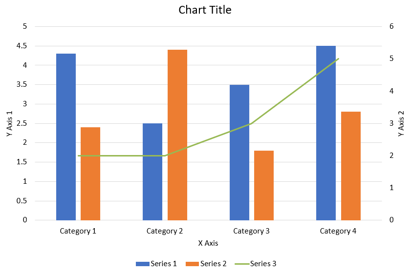
Následující Python kód ukazuje, jak vytvořit kombinovaný graf zobrazený výše v prezentaci PowerPoint:
import jpype
import asposeslides

if not jpype.isJVMStarted():
    jpype.startJVM()

from asposeslides.api import AxisPositionType, ChartType, CrossesType, FillType, LegendPositionType, NullableBool, Presentation, SaveFormat

Color = jpype.JClass("java.awt.Color")

def create_combo_chart():
    presentation = Presentation()
    slide = presentation.getSlides().get_Item(0)
    try:
        chart = create_chart_with_first_series(slide)

        add_second_series_to_chart(chart)
        add_third_series_to_chart(chart)

        set_primary_axes_format(chart)
        set_secondary_axes_format(chart)

        presentation.save("combo-chart.pptx", SaveFormat.Pptx)
    finally:
        presentation.dispose()

def create_chart_with_first_series(slide):
    chart = slide.getShapes().addChart(ChartType.ClusteredColumn, 50, 50, 600, 400)

    # Nastavte název grafu.
    chart.setTitle(True)
    chart.getChartTitle().addTextFrameForOverriding("Chart Title")
    chart.getChartTitle().setOverlay(False)
    title_paragraph = chart.getChartTitle().getTextFrameForOverriding().getParagraphs().get_Item(0)
    title_format = title_paragraph.getParagraphFormat().getDefaultPortionFormat()
    title_format.setFontBold(NullableBool.False_)
    title_format.setFontHeight(18.0)

    # Nastavte legendu grafu.
    chart.getLegend().setPosition(LegendPositionType.Bottom)
    chart.getLegend().getTextFormat().getPortionFormat().setFontHeight(12.0)

    # Odstraňte výchozí vygenerované řady a kategorie.
    chart.getChartData().getSeries().clear()
    chart.getChartData().getCategories().clear()

    worksheet_index = 0
    workbook = chart.getChartData().getChartDataWorkbook()

    # Přidejte nové kategorie.
    cell = workbook.getCell(worksheet_index, 1, 0, "Category 1")
    chart.getChartData().getCategories().add(cell)
    cell = workbook.getCell(worksheet_index, 2, 0, "Category 2")
    chart.getChartData().getCategories().add(cell)
    cell = workbook.getCell(worksheet_index, 3, 0, "Category 3")
    chart.getChartData().getCategories().add(cell)
    cell = workbook.getCell(worksheet_index, 4, 0, "Category 4")
    chart.getChartData().getCategories().add(cell)

    # Přidejte první řadu.
    series_name_cell = workbook.getCell(worksheet_index, 0, 1, "Series 1")
    series = chart.getChartData().getSeries().add(series_name_cell, chart.getType())

    series.getParentSeriesGroup().setOverlap(jpype.JByte(-25))
    series.getParentSeriesGroup().setGapWidth(220)

    cell = workbook.getCell(worksheet_index, 1, 1, 4.3)
    series.getDataPoints().addDataPointForBarSeries(cell)
    cell = workbook.getCell(worksheet_index, 2, 1, 2.5)
    series.getDataPoints().addDataPointForBarSeries(cell)
    cell = workbook.getCell(worksheet_index, 3, 1, 3.5)
    series.getDataPoints().addDataPointForBarSeries(cell)
    cell = workbook.getCell(worksheet_index, 4, 1, 4.5)
    series.getDataPoints().addDataPointForBarSeries(cell)

    return chart

def add_second_series_to_chart(chart):
    workbook = chart.getChartData().getChartDataWorkbook()
    worksheet_index = 0

    series_name_cell = workbook.getCell(worksheet_index, 0, 2, "Series 2")
    series = chart.getChartData().getSeries().add(series_name_cell, ChartType.ClusteredColumn)

    series.getParentSeriesGroup().setOverlap(jpype.JByte(-25))
    series.getParentSeriesGroup().setGapWidth(220)

    cell = workbook.getCell(worksheet_index, 1, 2, 2.4)
    series.getDataPoints().addDataPointForBarSeries(cell)
    cell = workbook.getCell(worksheet_index, 2, 2, 4.4)
    series.getDataPoints().addDataPointForBarSeries(cell)
    cell = workbook.getCell(worksheet_index, 3, 2, 1.8)
    series.getDataPoints().addDataPointForBarSeries(cell)
    cell = workbook.getCell(worksheet_index, 4, 2, 2.8)
    series.getDataPoints().addDataPointForBarSeries(cell)

def add_third_series_to_chart(chart):
    workbook = chart.getChartData().getChartDataWorkbook()
    worksheet_index = 0

    series_name_cell = workbook.getCell(worksheet_index, 0, 3, "Series 3")
    series = chart.getChartData().getSeries().add(series_name_cell, ChartType.Line)

    cell = workbook.getCell(worksheet_index, 1, 3, 2.0)
    series.getDataPoints().addDataPointForLineSeries(cell)
    cell = workbook.getCell(worksheet_index, 2, 3, 2.0)
    series.getDataPoints().addDataPointForLineSeries(cell)
    cell = workbook.getCell(worksheet_index, 3, 3, 3.0)
    series.getDataPoints().addDataPointForLineSeries(cell)
    cell = workbook.getCell(worksheet_index, 4, 3, 5.0)
    series.getDataPoints().addDataPointForLineSeries(cell)

    series.setPlotOnSecondAxis(True)

def set_primary_axes_format(chart):
    # Nastavte vodorovnou osu.
    horizontal_axis = chart.getAxes().getHorizontalAxis()
    horizontal_axis.getTextFormat().getPortionFormat().setFontHeight(12.0)
    horizontal_axis.getFormat().getLine().getFillFormat().setFillType(FillType.NoFill)

    set_axis_title(horizontal_axis, "X Axis")

    # Nastavte svislou osu.
    vertical_axis = chart.getAxes().getVerticalAxis()
    vertical_axis.getTextFormat().getPortionFormat().setFontHeight(12.0)
    vertical_axis.getFormat().getLine().getFillFormat().setFillType(FillType.NoFill)

    set_axis_title(vertical_axis, "Y Axis 1")

    # Nastavte barvu hlavních mřížkových čar svislé osy.
    major_grid_lines_format = vertical_axis.getMajorGridLinesFormat().getLine().getFillFormat()
    major_grid_lines_format.setFillType(FillType.Solid)
    color = Color(217, 217, 217)
    major_grid_lines_format.getSolidFillColor().setColor(color)

def set_secondary_axes_format(chart):
    # Nastavte sekundární vodorovnou osu.
    secondary_horizontal_axis = chart.getAxes().getSecondaryHorizontalAxis()
    secondary_horizontal_axis.setPosition(AxisPositionType.Bottom)
    secondary_horizontal_axis.setCrossType(CrossesType.Maximum)
    secondary_horizontal_axis.setVisible(False)
    secondary_horizontal_axis.getMajorGridLinesFormat().getLine().getFillFormat().setFillType(FillType.NoFill)
    secondary_horizontal_axis.getMinorGridLinesFormat().getLine().getFillFormat().setFillType(FillType.NoFill)

    # Nastavte sekundární svislou osu.
    secondary_vertical_axis = chart.getAxes().getSecondaryVerticalAxis()
    secondary_vertical_axis.setPosition(AxisPositionType.Right)
    secondary_vertical_axis.getTextFormat().getPortionFormat().setFontHeight(12.0)
    secondary_vertical_axis.getFormat().getLine().getFillFormat().setFillType(FillType.NoFill)
    secondary_vertical_axis.getMajorGridLinesFormat().getLine().getFillFormat().setFillType(FillType.NoFill)
    secondary_vertical_axis.getMinorGridLinesFormat().getLine().getFillFormat().setFillType(FillType.NoFill)

    set_axis_title(secondary_vertical_axis, "Y Axis 2")

def set_axis_title(axis, axis_title):
    axis.setTitle(True)
    axis.getTitle().setOverlay(False)
    title_paragraph = axis.getTitle().addTextFrameForOverriding(axis_title).getParagraphs().get_Item(0)
    title_format = title_paragraph.getParagraphFormat().getDefaultPortionFormat()
    title_format.setFontBold(NullableBool.False_)
    title_format.setFontHeight(12.0)

create_combo_chart()
Aktualizace grafů
- Vytvořte instanci třídy Presentation představující prezentaci obsahující graf, který chcete aktualizovat.
- Získejte odkaz na snímek podle jeho indexu.
- Projděte všechny tvary, abyste našli požadovaný graf.
- Přistupte k datovému listu grafu.
- Upravit řadu dat grafu změnou hodnot řady.
- Přidejte novou řadu a naplňte ji daty.
- Uložte upravenou prezentaci jako soubor PPTX.
Tento Python kód ukazuje, jak aktualizovat graf:
import jpype
import asposeslides

if not jpype.isJVMStarted():
    jpype.startJVM()

from asposeslides.api import ChartType, Presentation, SaveFormat

# Otevře prezentaci, která obsahuje graf k aktualizaci
presentation = Presentation("ExistingChart.pptx")
try:
    # Přístup k prvnímu snímku
    slide = presentation.getSlides().get_Item(0)

    # Získá graf ze snímku
    chart = slide.getShapes().get_Item(0)

    # Nastavení indexu listu dat grafu
    default_worksheet_index = 0

    # Získání pracovního listu dat grafu
    workbook = chart.getChartData().getChartDataWorkbook()

    # Změna názvu kategorie grafu
    workbook.getCell(default_worksheet_index, 1, 0, "Modified Category 1")
    workbook.getCell(default_worksheet_index, 2, 0, "Modified Category 2")

    # Vezme první řadu grafu
    series = chart.getChartData().getSeries().get_Item(0)

    # Nyní aktualizuje data řady
    workbook.getCell(default_worksheet_index, 0, 1, "New_Series1")# Upravení názvu řady
    series.getDataPoints().get_Item(0).getValue().setData(90)
    series.getDataPoints().get_Item(1).getValue().setData(123)
    series.getDataPoints().get_Item(2).getValue().setData(44)

    # Vezme druhou řadu grafu
    series = chart.getChartData().getSeries().get_Item(1)

    # Nyní aktualizuje data řady
    workbook.getCell(default_worksheet_index, 0, 2, "New_Series2")# Upravení názvu řady
    series.getDataPoints().get_Item(0).getValue().setData(23)
    series.getDataPoints().get_Item(1).getValue().setData(67)
    series.getDataPoints().get_Item(2).getValue().setData(99)

    # Nyní přidává novou řadu
    cell = workbook.getCell(default_worksheet_index, 0, 3, "Series 3")
    chart.getChartData().getSeries().add(cell, chart.getType())

    # Vezme třetí řadu grafu
    series = chart.getChartData().getSeries().get_Item(2)

    # Nyní naplňuje data řady
    cell = workbook.getCell(default_worksheet_index, 1, 3, 20)
    series.getDataPoints().addDataPointForBarSeries(cell)
    cell = workbook.getCell(default_worksheet_index, 2, 3, 50)
    series.getDataPoints().addDataPointForBarSeries(cell)
    cell = workbook.getCell(default_worksheet_index, 3, 3, 30)
    series.getDataPoints().addDataPointForBarSeries(cell)

    chart.setType(ChartType.ClusteredCylinder)

    # Uloží prezentaci s grafem
    presentation.save("AsposeChartModified_out.pptx", SaveFormat.Pptx)
finally:
    presentation.dispose()
Nastavení rozsahu dat pro graf
Pro nastavení rozsahu dat pro graf postupujte takto:
- Vytvořte instanci třídy Presentation představující prezentaci obsahující graf.
- Získejte odkaz na snímek podle jeho indexu.
- Projděte všechny tvary, abyste našli požadovaný graf.
- Přistupte k datům grafu a nastavte rozsah.
- Uložte upravenou prezentaci jako soubor PPTX.
Tento Python kód ukazuje, jak nastavit rozsah dat pro graf:
import jpype
import asposeslides

if not jpype.isJVMStarted():
    jpype.startJVM()

from asposeslides.api import Presentation, SaveFormat

# Otevře prezentaci, která obsahuje graf
presentation = Presentation("ExistingChart.pptx")
try:
    slide = presentation.getSlides().get_Item(0)
    chart = slide.getShapes().get_Item(0)

    chart.getChartData().setRange("Sheet1!A1:B4")

    presentation.save("SetDataRange_out.pptx", SaveFormat.Pptx)
finally:
    presentation.dispose()
Použití výchozích markerů v grafech
Když používáte výchozí markery v grafech, každá řada grafu automaticky získá odlišný symbol markeru.
Tento Python kód ukazuje, jak automaticky nastavit marker řady grafu:
import jpype
import asposeslides

if not jpype.isJVMStarted():
    jpype.startJVM()

from asposeslides.api import ChartType, Presentation, SaveFormat

presentation = Presentation()
try:
    slide = presentation.getSlides().get_Item(0)
    chart = slide.getShapes().addChart(ChartType.LineWithMarkers, 10, 10, 400, 400)

    chart.getChartData().getSeries().clear()
    chart.getChartData().getCategories().clear()

    workbook = chart.getChartData().getChartDataWorkbook()
    cell = workbook.getCell(0, 0, 1, "Series 1")
    chart.getChartData().getSeries().add(cell, chart.getType())
    series = chart.getChartData().getSeries().get_Item(0)

    cell = workbook.getCell(0, 1, 0, "C1")
    chart.getChartData().getCategories().add(cell)
    cell = workbook.getCell(0, 1, 1, 24)
    series.getDataPoints().addDataPointForLineSeries(cell)
    cell = workbook.getCell(0, 2, 0, "C2")
    chart.getChartData().getCategories().add(cell)
    cell = workbook.getCell(0, 2, 1, 23)
    series.getDataPoints().addDataPointForLineSeries(cell)
    cell = workbook.getCell(0, 3, 0, "C3")
    chart.getChartData().getCategories().add(cell)
    cell = workbook.getCell(0, 3, 1, -10)
    series.getDataPoints().addDataPointForLineSeries(cell)
    cell = workbook.getCell(0, 4, 0, "C4")
    chart.getChartData().getCategories().add(cell)
    cell = workbook.getCell(0, 4, 1, None)
    series.getDataPoints().addDataPointForLineSeries(cell)

    cell = workbook.getCell(0, 0, 2, "Series 2")
    chart.getChartData().getSeries().add(cell, chart.getType())
    #Vezměte druhou řadu grafu
    second_series = chart.getChartData().getSeries().get_Item(1)

    #Nyní naplňuji data řady
    cell = workbook.getCell(0, 1, 2, 30)
    second_series.getDataPoints().addDataPointForLineSeries(cell)
    cell = workbook.getCell(0, 2, 2, 10)
    second_series.getDataPoints().addDataPointForLineSeries(cell)
    cell = workbook.getCell(0, 3, 2, 60)
    second_series.getDataPoints().addDataPointForLineSeries(cell)
    cell = workbook.getCell(0, 4, 2, 40)
    second_series.getDataPoints().addDataPointForLineSeries(cell)

    chart.setLegend(True)
    chart.getLegend().setOverlay(False)

    presentation.save("DefaultMarkersInChart.pptx", SaveFormat.Pptx)
finally:
    presentation.dispose()
Často kladené otázky
Jaké typy grafů jsou podporovány v Aspose.Slides?
Aspose.Slides podporuje širokou škálu chart types, včetně sloupcových, čárových, koláčových, plošných, rozptylových, histogramových, radarových a mnoha dalších. Tato flexibilita vám umožňuje vybrat nejvhodnější typ grafu pro vaše potřeby vizualizace dat.
Jak přidám nový graf do snímku?
Pro přidání grafu nejprve vytvoříte instanci třídy Presentation, získáte požadovaný snímek podle jeho indexu a poté zavoláte metodu pro přidání grafu, přičemž určíte typ grafu a počáteční data. Tento proces integruje graf přímo do vaší prezentace.
Jak mohu aktualizovat data zobrazovaná v grafu?
Data grafu můžete aktualizovat tak, že získáte přístup k jeho sešitu dat (ChartDataWorkbook), vymažete výchozí řady a kategorie a následně přidáte vlastní data. To vám umožní obnovit graf tak, aby odrážel nejnovější data.
Je možné přizpůsobit vzhled grafu?
Ano, Aspose.Slides poskytuje rozsáhlé možnosti přizpůsobení. Můžete měnit barvy, písma, popisky, legendy a další formatting elements, abyste přizpůsobili vzhled grafu vašim konkrétním požadavkům na design.