
Python을 사용하여 PowerPoint 프레젠테이션 차트 만들기 또는 업데이트
개요
이 문서는 Aspose.Slides를 사용하여 차트를 만들고 사용자 정의하는 방법에 대한 포괄적인 가이드를 제공합니다. 슬라이드에 차트를 프로그래밍 방식으로 추가하고 데이터를 채우며, 특정 디자인 요구 사항에 맞게 다양한 서식 옵션을 적용하는 방법을 배우게 됩니다. 문서 전체에 걸쳐 자세한 코드 예제가 각 단계—프레젠테이션 및 차트 객체 초기화부터 시리즈, 축, 범례 구성까지—를 설명합니다. 이 가이드를 따르면 동적 차트 생성을 애플리케이션에 통합하는 방법을 확실히 이해하게 되어 데이터 기반 프레젠테이션을 만드는 과정을 효율화할 수 있습니다.
차트 만들기
차트는 데이터를 빠르게 시각화하고 표나 스프레드시트에서 바로 눈에 띄지 않을 수 있는 통찰을 얻는 데 도움이 됩니다.
차트를 만드는 이유
차트를 사용하면 다음을 수행할 수 있습니다:
- 프레젠테이션의 단일 슬라이드에 대량의 데이터를 집계, 압축 또는 요약
- 데이터의 패턴 및 추세 노출
- 시간 경과 또는 특정 측정 단위에 따른 데이터의 방향 및 모멘텀 추론
- 이상값, 변칙, 편차, 오류, 비논리적 데이터 등 식별
- 복잡한 데이터 전달 또는 발표
PowerPoint에서는 Insert 기능을 통해 다양한 차트 템플릿을 사용해 차트를 만들 수 있습니다. Aspose.Slides를 사용하면 일반 차트(일반적인 차트 유형 기반)와 사용자 정의 차트를 모두 만들 수 있습니다.
Note
차트를 만들려면 ChartType 클래스를 사용하십시오. 이 클래스의 필드는 다양한 차트 유형에 해당합니다.클러스터형 막대 차트 만들기
본 섹션에서는 Aspose.Slides를 사용하여 클러스터형 막대 차트를 만드는 방법을 설명합니다. 프레젠테이션을 초기화하고 차트를 추가한 뒤 제목, 데이터, 시리즈, 범주 및 스타일을 사용자 정의하는 방법을 배웁니다. 아래 단계를 따라 표준 클러스터형 막대 차트가 생성되는 과정을 확인하십시오:
- Presentation 클래스의 인스턴스를 생성합니다.
- 인덱스를 사용해 슬라이드에 대한 참조를 가져옵니다.
- 일부 데이터를 포함한 차트를 추가하고
ChartType.ClusteredColumn유형을 지정합니다. - 차트에 제목을 추가합니다.
- 차트의 데이터 워크시트에 액세스합니다.
- 기본 시리즈와 범주를 모두 삭제합니다.
- 새로운 시리즈와 범주를 추가합니다.
- 차트 시리즈에 새로운 차트 데이터를 추가합니다.
- 차트 시리즈에 채우기 색상을 적용합니다.
- 차트 시리즈에 레이블을 추가합니다.
- 수정된 프레젠테이션을 PPTX 파일로 저장합니다.
다음 C# 코드가 클러스터형 막대 차트를 만드는 방법을 보여줍니다:
import jpype
import asposeslides

if not jpype.isJVMStarted():
    jpype.startJVM()

from asposeslides.api import ChartType, FillType, NullableBool, Presentation, SaveFormat

Color = jpype.JClass("java.awt.Color")

# PPTX 파일을 나타내는 프레젠테이션 클래스를 인스턴스화합니다.
presentation = Presentation()
try:
    # 첫 번째 슬라이드에 접근합니다.
    slide = presentation.getSlides().get_Item(0)

    # 기본 데이터가 포함된 차트를 추가합니다.
    chart = slide.getShapes().addChart(ChartType.ClusteredColumn, 0, 0, 500, 500)

    # 차트 제목을 설정합니다.
    chart.getChartTitle().addTextFrameForOverriding("Sample Title")
    chart.getChartTitle().getTextFrameForOverriding().getTextFrameFormat().setCenterText(NullableBool.True_)
    chart.getChartTitle().setHeight(20)
    chart.setTitle(True)

    # 차트 데이터 시트의 인덱스를 설정합니다.
    default_worksheet_index = 0

    # 차트 데이터 워크시트를 가져옵니다.
    workbook = chart.getChartData().getChartDataWorkbook()

    # 기본 생성된 시리즈와 범주를 삭제합니다.
    chart.getChartData().getSeries().clear()
    chart.getChartData().getCategories().clear()

    # 새 시리즈를 추가합니다.
    cell = workbook.getCell(default_worksheet_index, 0, 1, "Series 1")
    chart.getChartData().getSeries().add(cell,chart.getType())
    cell = workbook.getCell(default_worksheet_index, 0, 2, "Series 2")
    chart.getChartData().getSeries().add(cell,chart.getType())

    # 새 범주를 추가합니다.
    cell = workbook.getCell(default_worksheet_index, 1, 0, "Category 1")
    chart.getChartData().getCategories().add(cell)
    cell = workbook.getCell(default_worksheet_index, 2, 0, "Category 2")
    chart.getChartData().getCategories().add(cell)
    cell = workbook.getCell(default_worksheet_index, 3, 0, "Category 3")
    chart.getChartData().getCategories().add(cell)

    # 첫 번째 차트 시리즈를 가져옵니다.
    series = chart.getChartData().getSeries().get_Item(0)

    # 이제 시리즈 데이터를 채웁니다.
    cell = workbook.getCell(default_worksheet_index, 1, 1, 20)
    series.getDataPoints().addDataPointForBarSeries(cell)
    cell = workbook.getCell(default_worksheet_index, 2, 1, 50)
    series.getDataPoints().addDataPointForBarSeries(cell)
    cell = workbook.getCell(default_worksheet_index, 3, 1, 30)
    series.getDataPoints().addDataPointForBarSeries(cell)

    # 시리즈의 채우기 색상을 설정합니다.
    series.getFormat().getFill().setFillType(FillType.Solid)
    series.getFormat().getFill().getSolidFillColor().setColor(Color.RED)

    # 두 번째 차트 시리즈를 가져옵니다.
    series = chart.getChartData().getSeries().get_Item(1)

    # 시리즈 데이터를 채웁니다.
    cell = workbook.getCell(default_worksheet_index, 1, 2, 30)
    series.getDataPoints().addDataPointForBarSeries(cell)
    cell = workbook.getCell(default_worksheet_index, 2, 2, 10)
    series.getDataPoints().addDataPointForBarSeries(cell)
    cell = workbook.getCell(default_worksheet_index, 3, 2, 60)
    series.getDataPoints().addDataPointForBarSeries(cell)

    # 시리즈의 채우기 색상을 설정합니다.
    series.getFormat().getFill().setFillType(FillType.Solid)
    series.getFormat().getFill().getSolidFillColor().setColor(Color.GREEN)

    #새 시리즈의 각 카테고리에 대한 사용자 정의 레이블을 생성합니다
    # 첫 번째 레이블에 카테고리 이름을 표시하도록 설정합니다.
    label = series.getDataPoints().get_Item(0).getLabel()
    label.getDataLabelFormat().setShowCategoryName(True)

    label = series.getDataPoints().get_Item(1).getLabel()
    label.getDataLabelFormat().setShowSeriesName(True)

    # 세 번째 레이블에 값을 표시합니다.
    label = series.getDataPoints().get_Item(2).getLabel()
    label.getDataLabelFormat().setShowValue(True)
    label.getDataLabelFormat().setShowSeriesName(True)
    label.getDataLabelFormat().setSeparator("/")

    # 차트가 포함된 프레젠테이션을 저장합니다.
    presentation.save("output.pptx", SaveFormat.Pptx)
finally:
    presentation.dispose()
산점도 차트 만들기
산점도 차트(또는 x‑y 그래프)는 두 변수 사이의 패턴을 확인하거나 상관관계를 보여줄 때 자주 사용됩니다.
산점도 차트는 다음 상황에 적합합니다:
- 쌍으로 된 수치 데이터가 있는 경우
- 서로 잘 맞는 두 변수가 있는 경우
- 두 변수 간의 관계 여부를 판단하고자 할 때
- 종속 변수에 대해 여러 값을 갖는 독립 변수가 있는 경우
- 클러스터형 막대 차트 만들기 절의 단계를 따릅니다.
- 세 번째 단계에서 차트를 추가하고 차트 유형을 다음 중 하나로 지정합니다:
- ChartType.ScatterWithMarkers - 산점도 차트(마커 포함)
- ChartType.ScatterWithSmoothLinesAndMarkers - 곡선으로 연결된 마커가 있는 산점도 차트
- ChartType.ScatterWithSmoothLines - 곡선으로 연결된 마커 없는 산점도 차트
- ChartType.ScatterWithStraightLinesAndMarkers - 직선으로 연결된 마커가 있는 산점도 차트
- ChartType.ScatterWithStraightLines - 직선으로 연결된 마커 없는 산점도 차트
다음 Python 코드가 각 시리즈마다 다른 마커를 사용해 산점도 차트를 만드는 방법을 보여줍니다:
import jpype
import asposeslides

if not jpype.isJVMStarted():
    jpype.startJVM()

from asposeslides.api import ChartType, MarkerStyleType, Presentation, SaveFormat

# PPTX 파일을 나타내는 프레젠테이션 클래스를 인스턴스화합니다.
presentation = Presentation()
try:
    # 첫 번째 슬라이드에 접근합니다.
    slide = presentation.getSlides().get_Item(0)

    # 기본 차트를 생성합니다.
    chart = slide.getShapes().addChart(ChartType.ScatterWithSmoothLines, 0, 0, 400, 400)

    # 기본 차트 데이터 워크시트 인덱스를 가져옵니다.
    default_worksheet_index = 0

    # 차트 데이터 워크시트를 가져옵니다.
    workbook = chart.getChartData().getChartDataWorkbook()

    # 데모 시리즈를 삭제합니다.
    chart.getChartData().getSeries().clear()

    # 새 시리즈를 추가합니다.
    cell = workbook.getCell(default_worksheet_index, 1, 1, "Series 1")
    chart.getChartData().getSeries().add(cell, chart.getType())
    cell = workbook.getCell(default_worksheet_index, 1, 3, "Series 2")
    chart.getChartData().getSeries().add(cell, chart.getType())

    # 첫 번째 차트 시리즈를 가져옵니다.
    series = chart.getChartData().getSeries().get_Item(0)

    # 시리즈에 새로운 점 (1:3)을 추가합니다.
    x_cell = workbook.getCell(default_worksheet_index, 2, 1, 1)
    y_cell = workbook.getCell(default_worksheet_index, 2, 2, 3)
    series.getDataPoints().addDataPointForScatterSeries(x_cell, y_cell)

    # 새로운 점 (2:10)을 추가합니다.
    x_cell = workbook.getCell(default_worksheet_index, 3, 1, 2)
    y_cell = workbook.getCell(default_worksheet_index, 3, 2, 10)
    series.getDataPoints().addDataPointForScatterSeries(x_cell, y_cell)

    # 시리즈 유형을 변경합니다.
    series.setType(ChartType.ScatterWithStraightLinesAndMarkers)

    # 차트 시리즈 마커를 변경합니다.
    series.getMarker().setSize(10)
    series.getMarker().setSymbol(MarkerStyleType.Star)

    # 두 번째 차트 시리즈를 가져옵니다.
    series = chart.getChartData().getSeries().get_Item(1)

    # 그곳에 새로운 점 (5:2)을 추가합니다.
    x_cell = workbook.getCell(default_worksheet_index, 2, 3, 5)
    y_cell = workbook.getCell(default_worksheet_index, 2, 4, 2)
    series.getDataPoints().addDataPointForScatterSeries(x_cell, y_cell)

    # 새로운 점 (3:1)을 추가합니다.
    x_cell = workbook.getCell(default_worksheet_index, 3, 3, 3)
    y_cell = workbook.getCell(default_worksheet_index, 3, 4, 1)
    series.getDataPoints().addDataPointForScatterSeries(x_cell, y_cell)

    # 새로운 점 (2:2)을 추가합니다.
    x_cell = workbook.getCell(default_worksheet_index, 4, 3, 2)
    y_cell = workbook.getCell(default_worksheet_index, 4, 4, 2)
    series.getDataPoints().addDataPointForScatterSeries(x_cell, y_cell)

    # 새로운 점 (5:1)을 추가합니다.
    x_cell = workbook.getCell(default_worksheet_index, 5, 3, 5)
    y_cell = workbook.getCell(default_worksheet_index, 5, 4, 1)
    series.getDataPoints().addDataPointForScatterSeries(x_cell, y_cell)

    # 차트 시리즈 마커를 변경합니다.
    series.getMarker().setSize(10)
    series.getMarker().setSymbol(MarkerStyleType.Circle)

    presentation.save("AsposeChart_out.pptx", SaveFormat.Pptx)
finally:
    presentation.dispose()
원형 차트 만들기
원형 차트는 특히 범주형 레이블에 숫자 값이 있는 데이터를 전체 대비 부분 관계로 보여줄 때 가장 적합합니다. 그러나 데이터에 많은 부분이나 레이블이 포함된 경우에는 막대 차트를 고려하는 것이 좋습니다.
- Presentation 클래스의 인스턴스를 생성합니다.
- 인덱스를 사용해 슬라이드에 대한 참조를 가져옵니다.
- 기본 데이터를 가진 차트를 추가하고 ChartType.Pie 유형을 지정합니다.
- 차트 데이터 워크북인 ChartDataWorkbook에 액세스합니다.
- 기본 시리즈와 범주를 삭제합니다.
- 새로운 시리즈와 범주를 추가합니다.
- 차트 시리즈에 새로운 차트 데이터를 추가합니다.
- 원형 차트 섹터에 사용자 정의 색상을 적용하면서 새 포인트를 추가합니다.
- 시리즈에 레이블을 설정합니다.
- 시리즈 레이블에 리더 라인을 활성화합니다.
- 원형 차트 섹터의 회전 각도를 설정합니다.
- 수정된 프레젠테이션을 PPTX 파일로 저장합니다.
다음 Python 코드가 원형 차트를 만드는 방법을 보여줍니다:
import jpype
import asposeslides

if not jpype.isJVMStarted():
    jpype.startJVM()

from asposeslides.api import ChartType, FillType, LineDashStyle, LineStyle, NullableBool, Presentation, SaveFormat

Color = jpype.JClass("java.awt.Color")

# PPTX 파일을 나타내는 프레젠테이션 클래스를 인스턴스화합니다.
presentation = Presentation()
try:
    # 첫 번째 슬라이드에 접근합니다.
    slide = presentation.getSlides().get_Item(0)

    # 기본 데이터가 포함된 차트를 추가합니다.
    chart = slide.getShapes().addChart(ChartType.Pie, 100, 100, 400, 400)

    # 차트 제목을 설정합니다.
    chart.getChartTitle().addTextFrameForOverriding("Sample Title")
    chart.getChartTitle().getTextFrameForOverriding().getTextFrameFormat().setCenterText(NullableBool.True_)
    chart.getChartTitle().setHeight(20)
    chart.setTitle(True)

    # 차트 데이터 시트의 인덱스를 설정합니다.
    default_worksheet_index = 0

    # 차트 데이터 워크시트를 가져옵니다.
    workbook = chart.getChartData().getChartDataWorkbook()

    # 기본 생성된 시리즈와 범주를 삭제합니다.
    chart.getChartData().getSeries().clear()
    chart.getChartData().getCategories().clear()

    # 새 범주를 추가합니다.
    cell = workbook.getCell(0, 1, 0, "First Qtr")
    chart.getChartData().getCategories().add(cell)
    cell = workbook.getCell(0, 2, 0, "2nd Qtr")
    chart.getChartData().getCategories().add(cell)
    cell = workbook.getCell(0, 3, 0, "3rd Qtr")
    chart.getChartData().getCategories().add(cell)

    # 새 시리즈를 추가합니다.
    cell = workbook.getCell(0, 0, 1, "Series 1")
    series = chart.getChartData().getSeries().add(cell, chart.getType())

    #시리즈 데이터를 채웁니다.
    cell = workbook.getCell(default_worksheet_index, 1, 1, 20)
    series.getDataPoints().addDataPointForPieSeries(cell)
    cell = workbook.getCell(default_worksheet_index, 2, 1, 50)
    series.getDataPoints().addDataPointForPieSeries(cell)
    cell = workbook.getCell(default_worksheet_index, 3, 1, 30)
    series.getDataPoints().addDataPointForPieSeries(cell)

    # 새 포인트를 추가하고 섹터 색상을 설정합니다.
    chart.getChartData().getSeriesGroups().get_Item(0).setColorVaried(True)

    point = series.getDataPoints().get_Item(0)
    point.getFormat().getFill().setFillType(FillType.Solid)
    point.getFormat().getFill().getSolidFillColor().setColor(Color.CYAN)

    # 섹터 테두리를 설정합니다.
    point.getFormat().getLine().getFillFormat().setFillType(FillType.Solid)
    point.getFormat().getLine().getFillFormat().getSolidFillColor().setColor(Color.GRAY)
    point.getFormat().getLine().setWidth(3.0)
    point.getFormat().getLine().setStyle(LineStyle.ThinThick)
    point.getFormat().getLine().setDashStyle(LineDashStyle.DashDot)

    second_point = series.getDataPoints().get_Item(1)
    second_point.getFormat().getFill().setFillType(FillType.Solid)
    second_point.getFormat().getFill().getSolidFillColor().setColor(Color.ORANGE)

    # 섹터 테두리를 설정합니다.
    second_point.getFormat().getLine().getFillFormat().setFillType(FillType.Solid)
    second_point.getFormat().getLine().getFillFormat().getSolidFillColor().setColor(Color.BLUE)
    second_point.getFormat().getLine().setWidth(3.0)
    second_point.getFormat().getLine().setStyle(LineStyle.Single)
    second_point.getFormat().getLine().setDashStyle(LineDashStyle.LargeDashDot)

    third_point = series.getDataPoints().get_Item(2)
    third_point.getFormat().getFill().setFillType(FillType.Solid)
    third_point.getFormat().getFill().getSolidFillColor().setColor(Color.YELLOW)

    # 섹터 테두리를 설정합니다.
    third_point.getFormat().getLine().getFillFormat().setFillType(FillType.Solid)
    third_point.getFormat().getLine().getFillFormat().getSolidFillColor().setColor(Color.RED)
    third_point.getFormat().getLine().setWidth(2.0)
    third_point.getFormat().getLine().setStyle(LineStyle.ThinThin)
    third_point.getFormat().getLine().setDashStyle(LineDashStyle.LargeDashDotDot)

    # 새 시리즈의 각 카테고리에 대한 사용자 정의 레이블을 생성합니다.
    first_label = series.getDataPoints().get_Item(0).getLabel()

    first_label.getDataLabelFormat().setShowValue(True)

    second_label = series.getDataPoints().get_Item(1).getLabel()
    second_label.getDataLabelFormat().setShowValue(True)
    second_label.getDataLabelFormat().setShowLegendKey(True)
    second_label.getDataLabelFormat().setShowPercentage(True)

    third_label = series.getDataPoints().get_Item(2).getLabel()
    third_label.getDataLabelFormat().setShowSeriesName(True)
    third_label.getDataLabelFormat().setShowPercentage(True)

    # 차트에 리더 라인을 표시합니다.
    series.getLabels().getDefaultDataLabelFormat().setShowLeaderLines(True)

    # 원형 차트 섹터의 회전 각도를 설정합니다.
    chart.getChartData().getSeriesGroups().get_Item(0).setFirstSliceAngle(180)

    # 차트가 포함된 프레젠테이션을 저장합니다.
    presentation.save("PieChart_out.pptx", SaveFormat.Pptx)
finally:
    presentation.dispose()
꺾은선 차트 만들기
꺾은선 차트(또는 라인 그래프)는 시간에 따른 값 변화를 시연하고자 할 때 가장 적합합니다. 꺾은선 차트를 사용하면 대량의 데이터를 한 번에 비교하고, 시간에 따른 변화와 추세를 추적하며, 데이터 시리즈의 이상치를 강조하는 등 다양한 작업을 할 수 있습니다.
- Presentation 클래스의 인스턴스를 생성합니다.
- 인덱스를 사용해 슬라이드에 대한 참조를 가져옵니다.
- 기본 데이터를 가진 차트를 추가하고 ChartType.Line 유형을 지정합니다.
- 수정된 프레젠테이션을 PPTX 파일로 저장합니다.
다음 Python 코드가 꺾은선 차트를 만드는 방법을 보여줍니다:
import jpype
import asposeslides

if not jpype.isJVMStarted():
    jpype.startJVM()

from asposeslides.api import ChartType, Presentation, SaveFormat

presentation = Presentation()
try:
    line_chart = presentation.getSlides().get_Item(0).getShapes().addChart(ChartType.Line, 10, 50, 600, 350)

    presentation.save("line_chart.pptx", SaveFormat.Pptx)
finally:
    presentation.dispose()
기본적으로 꺾은선 차트의 포인트는 직선으로 연결됩니다. 포인트를 점선으로 연결하려면 다음과 같이 원하는 대시 유형을 지정하면 됩니다:
import jpype
import asposeslides

if not jpype.isJVMStarted():
    jpype.startJVM()

from asposeslides.api import ChartType, LineDashStyle, Presentation, SaveFormat

presentation = Presentation()
try:
    line_chart = presentation.getSlides().get_Item(0).getShapes().addChart(ChartType.Line, 10, 50, 600, 350)

    for series in line_chart.getChartData().getSeries():
        series.getFormat().getLine().setDashStyle(LineDashStyle.Dash)

    presentation.save("line_chart.pptx", SaveFormat.Pptx)
finally:
    presentation.dispose()
트리맵 차트 만들기
트리맵 차트는 각 카테고리 내에서 큰 기여자를 빠르게 강조하고 데이터 카테고리의 상대적 크기를 보여줄 때 판매 데이터에 가장 적합합니다.
- Presentation 클래스의 인스턴스를 생성합니다.
- 인덱스를 사용해 슬라이드에 대한 참조를 가져옵니다.
- 기본 데이터를 가진 차트를 추가하고 ChartType.Treemap 유형을 지정합니다.
- 차트 데이터 워크북인 ChartDataWorkbook에 액세스합니다.
- 기본 시리즈와 범주를 삭제합니다.
- 새로운 시리즈와 범주를 추가합니다.
- 차트 시리즈에 새로운 차트 데이터를 추가합니다.
- 수정된 프레젠테이션을 PPTX 파일로 저장합니다.
다음 Python 코드가 트리맵 차트를 만드는 방법을 보여줍니다:
import jpype
import asposeslides

if not jpype.isJVMStarted():
    jpype.startJVM()

from asposeslides.api import ChartType, ParentLabelLayoutType, Presentation, SaveFormat

presentation = Presentation()
try:
    chart = presentation.getSlides().get_Item(0).getShapes().addChart(ChartType.Treemap, 50, 50, 500, 400)
    chart.getChartData().getCategories().clear()
    chart.getChartData().getSeries().clear()

    workbook = chart.getChartData().getChartDataWorkbook()
    workbook.clear(0)

    #브랜치 1
    cell = workbook.getCell(0, "C1", "Leaf1")
    leaf = chart.getChartData().getCategories().add(cell)
    leaf.getGroupingLevels().setGroupingItem(1, "Stem1")
    leaf.getGroupingLevels().setGroupingItem(2, "Branch1")

    cell = workbook.getCell(0, "C2", "Leaf2")
    chart.getChartData().getCategories().add(cell)

    cell = workbook.getCell(0, "C3", "Leaf3")
    leaf = chart.getChartData().getCategories().add(cell)
    leaf.getGroupingLevels().setGroupingItem(1, "Stem2")

    cell = workbook.getCell(0, "C4", "Leaf4")
    chart.getChartData().getCategories().add(cell)

    #브랜치 2
    cell = workbook.getCell(0, "C5", "Leaf5")
    leaf = chart.getChartData().getCategories().add(cell)
    leaf.getGroupingLevels().setGroupingItem(1, "Stem3")
    leaf.getGroupingLevels().setGroupingItem(2, "Branch2")

    cell = workbook.getCell(0, "C6", "Leaf6")
    chart.getChartData().getCategories().add(cell)

    cell = workbook.getCell(0, "C7", "Leaf7")
    leaf = chart.getChartData().getCategories().add(cell)
    leaf.getGroupingLevels().setGroupingItem(1, "Stem4")

    cell = workbook.getCell(0, "C8", "Leaf8")
    chart.getChartData().getCategories().add(cell)

    series = chart.getChartData().getSeries().add(ChartType.Treemap)
    series.getLabels().getDefaultDataLabelFormat().setShowCategoryName(True)
    cell = workbook.getCell(0, "D1", 4)
    series.getDataPoints().addDataPointForTreemapSeries(cell)
    cell = workbook.getCell(0, "D2", 5)
    series.getDataPoints().addDataPointForTreemapSeries(cell)
    cell = workbook.getCell(0, "D3", 3)
    series.getDataPoints().addDataPointForTreemapSeries(cell)
    cell = workbook.getCell(0, "D4", 6)
    series.getDataPoints().addDataPointForTreemapSeries(cell)
    cell = workbook.getCell(0, "D5", 9)
    series.getDataPoints().addDataPointForTreemapSeries(cell)
    cell = workbook.getCell(0, "D6", 9)
    series.getDataPoints().addDataPointForTreemapSeries(cell)
    cell = workbook.getCell(0, "D7", 4)
    series.getDataPoints().addDataPointForTreemapSeries(cell)
    cell = workbook.getCell(0, "D8", 3)
    series.getDataPoints().addDataPointForTreemapSeries(cell)

    series.setParentLabelLayout(ParentLabelLayoutType.Overlapping)

    presentation.save("Treemap.pptx", SaveFormat.Pptx)
finally:
    presentation.dispose()
주식 차트 만들기
- Presentation 클래스의 인스턴스를 생성합니다.
- 인덱스를 사용해 슬라이드에 대한 참조를 가져옵니다.
- 기본 데이터를 가진 차트를 추가하고 ChartType.OpenHighLowClose 유형을 지정합니다.
- 차트 데이터 워크북인 ChartDataWorkbook에 액세스합니다.
- 기본 시리즈와 범주를 삭제합니다.
- 새로운 시리즈와 범주를 추가합니다.
- 차트 시리즈에 새로운 차트 데이터를 추가합니다.
- 고·저선 형식을 지정합니다.
- 수정된 프레젠테이션을 PPTX 파일로 저장합니다.
다음 Python 코드가 주식 차트를 만드는 방법을 보여줍니다:
import jpype
import asposeslides

if not jpype.isJVMStarted():
    jpype.startJVM()

from asposeslides.api import ChartType, FillType, Presentation, SaveFormat

presentation = Presentation()
try:
    chart = presentation.getSlides().get_Item(0).getShapes().addChart(ChartType.OpenHighLowClose, 50, 50, 600, 400, False)

    chart.getChartData().getSeries().clear()
    chart.getChartData().getCategories().clear()

    workbook = chart.getChartData().getChartDataWorkbook()

    cell = workbook.getCell(0, 1, 0, "A")
    chart.getChartData().getCategories().add(cell)
    cell = workbook.getCell(0, 2, 0, "B")
    chart.getChartData().getCategories().add(cell)
    cell = workbook.getCell(0, 3, 0, "C")
    chart.getChartData().getCategories().add(cell)

    cell = workbook.getCell(0, 0, 1, "Open")
    chart.getChartData().getSeries().add(cell, chart.getType())
    cell = workbook.getCell(0, 0, 2, "High")
    chart.getChartData().getSeries().add(cell, chart.getType())
    cell = workbook.getCell(0, 0, 3, "Low")
    chart.getChartData().getSeries().add(cell, chart.getType())
    cell = workbook.getCell(0, 0, 4, "Close")
    chart.getChartData().getSeries().add(cell, chart.getType())

    series = chart.getChartData().getSeries().get_Item(0)

    cell = workbook.getCell(0, 1, 1, 72)
    series.getDataPoints().addDataPointForStockSeries(cell)
    cell = workbook.getCell(0, 2, 1, 25)
    series.getDataPoints().addDataPointForStockSeries(cell)
    cell = workbook.getCell(0, 3, 1, 38)
    series.getDataPoints().addDataPointForStockSeries(cell)

    series = chart.getChartData().getSeries().get_Item(1)
    cell = workbook.getCell(0, 1, 2, 172)
    series.getDataPoints().addDataPointForStockSeries(cell)
    cell = workbook.getCell(0, 2, 2, 57)
    series.getDataPoints().addDataPointForStockSeries(cell)
    cell = workbook.getCell(0, 3, 2, 57)
    series.getDataPoints().addDataPointForStockSeries(cell)

    series = chart.getChartData().getSeries().get_Item(2)
    cell = workbook.getCell(0, 1, 3, 12)
    series.getDataPoints().addDataPointForStockSeries(cell)
    cell = workbook.getCell(0, 2, 3, 12)
    series.getDataPoints().addDataPointForStockSeries(cell)
    cell = workbook.getCell(0, 3, 3, 13)
    series.getDataPoints().addDataPointForStockSeries(cell)

    series = chart.getChartData().getSeries().get_Item(3)
    cell = workbook.getCell(0, 1, 4, 25)
    series.getDataPoints().addDataPointForStockSeries(cell)
    cell = workbook.getCell(0, 2, 4, 38)
    series.getDataPoints().addDataPointForStockSeries(cell)
    cell = workbook.getCell(0, 3, 4, 50)
    series.getDataPoints().addDataPointForStockSeries(cell)

    chart.getChartData().getSeriesGroups().get_Item(0).getUpDownBars().setUpDownBars(True)
    chart.getChartData().getSeriesGroups().get_Item(0).getHiLowLinesFormat().getLine().getFillFormat().setFillType(FillType.Solid)

    for series in chart.getChartData().getSeries():
        series.getFormat().getLine().getFillFormat().setFillType(FillType.NoFill)

    presentation.save("output.pptx", SaveFormat.Pptx)
finally:
    presentation.dispose()
상자·수염 차트 만들기
- Presentation 클래스의 인스턴스를 생성합니다.
- 인덱스를 사용해 슬라이드에 대한 참조를 가져옵니다.
- 기본 데이터를 가진 차트를 추가하고 ChartType.BoxAndWhisker 유형을 지정합니다.
- 차트 데이터 워크북인 ChartDataWorkbook에 액세스합니다.
- 기본 시리즈와 범주를 삭제합니다.
- 새로운 시리즈와 범주를 추가합니다.
- 차트 시리즈에 새로운 차트 데이터를 추가합니다.
- 수정된 프레젠테이션을 PPTX 파일로 저장합니다.
다음 Python 코드가 상자·수염 차트를 만드는 방법을 보여줍니다:
import jpype
import asposeslides

if not jpype.isJVMStarted():
    jpype.startJVM()

from asposeslides.api import ChartType, Presentation, QuartileMethodType, SaveFormat

presentation = Presentation()
try:
    chart = presentation.getSlides().get_Item(0).getShapes().addChart(ChartType.BoxAndWhisker, 50, 50, 500, 400)
    chart.getChartData().getCategories().clear()
    chart.getChartData().getSeries().clear()

    workbook = chart.getChartData().getChartDataWorkbook()
    workbook.clear(0)

    cell = workbook.getCell(0, "A1", "Category 1")
    chart.getChartData().getCategories().add(cell)
    cell = workbook.getCell(0, "A2", "Category 1")
    chart.getChartData().getCategories().add(cell)
    cell = workbook.getCell(0, "A3", "Category 1")
    chart.getChartData().getCategories().add(cell)
    cell = workbook.getCell(0, "A4", "Category 1")
    chart.getChartData().getCategories().add(cell)
    cell = workbook.getCell(0, "A5", "Category 1")
    chart.getChartData().getCategories().add(cell)
    cell = workbook.getCell(0, "A6", "Category 1")
    chart.getChartData().getCategories().add(cell)

    series = chart.getChartData().getSeries().add(ChartType.BoxAndWhisker)

    series.setQuartileMethod(QuartileMethodType.Exclusive)
    series.setShowMeanLine(True)
    series.setShowMeanMarkers(True)
    series.setShowInnerPoints(True)
    series.setShowOutlierPoints(True)

    cell = workbook.getCell(0, "B1", 15)
    series.getDataPoints().addDataPointForBoxAndWhiskerSeries(cell)
    cell = workbook.getCell(0, "B2", 41)
    series.getDataPoints().addDataPointForBoxAndWhiskerSeries(cell)
    cell = workbook.getCell(0, "B3", 16)
    series.getDataPoints().addDataPointForBoxAndWhiskerSeries(cell)
    cell = workbook.getCell(0, "B4", 10)
    series.getDataPoints().addDataPointForBoxAndWhiskerSeries(cell)
    cell = workbook.getCell(0, "B5", 23)
    series.getDataPoints().addDataPointForBoxAndWhiskerSeries(cell)
    cell = workbook.getCell(0, "B6", 16)
    series.getDataPoints().addDataPointForBoxAndWhiskerSeries(cell)

    presentation.save("BoxAndWhisker.pptx", SaveFormat.Pptx)
finally:
    presentation.dispose()
퍼널 차트 만들기
- Presentation 클래스의 인스턴스를 생성합니다.
- 인덱스를 사용해 슬라이드에 대한 참조를 가져옵니다.
- 기본 데이터를 가진 차트를 추가하고 ChartType.Funnel 유형을 지정합니다.
- 수정된 프레젠테이션을 PPTX 파일로 저장합니다.
다음 Python 코드가 퍼널 차트를 만드는 방법을 보여줍니다:
import jpype
import asposeslides

if not jpype.isJVMStarted():
    jpype.startJVM()

from asposeslides.api import ChartType, Presentation, SaveFormat

presentation = Presentation()
try:
    chart = presentation.getSlides().get_Item(0).getShapes().addChart(ChartType.Funnel, 50, 50, 500, 400)
    chart.getChartData().getCategories().clear()
    chart.getChartData().getSeries().clear()

    workbook = chart.getChartData().getChartDataWorkbook()

    workbook.clear(0)

    cell = workbook.getCell(0, "A1", "Category 1")
    chart.getChartData().getCategories().add(cell)
    cell = workbook.getCell(0, "A2", "Category 2")
    chart.getChartData().getCategories().add(cell)
    cell = workbook.getCell(0, "A3", "Category 3")
    chart.getChartData().getCategories().add(cell)
    cell = workbook.getCell(0, "A4", "Category 4")
    chart.getChartData().getCategories().add(cell)
    cell = workbook.getCell(0, "A5", "Category 5")
    chart.getChartData().getCategories().add(cell)
    cell = workbook.getCell(0, "A6", "Category 6")
    chart.getChartData().getCategories().add(cell)

    series = chart.getChartData().getSeries().add(ChartType.Funnel)

    cell = workbook.getCell(0, "B1", 50)
    series.getDataPoints().addDataPointForFunnelSeries(cell)
    cell = workbook.getCell(0, "B2", 100)
    series.getDataPoints().addDataPointForFunnelSeries(cell)
    cell = workbook.getCell(0, "B3", 200)
    series.getDataPoints().addDataPointForFunnelSeries(cell)
    cell = workbook.getCell(0, "B4", 300)
    series.getDataPoints().addDataPointForFunnelSeries(cell)
    cell = workbook.getCell(0, "B5", 400)
    series.getDataPoints().addDataPointForFunnelSeries(cell)
    cell = workbook.getCell(0, "B6", 500)
    series.getDataPoints().addDataPointForFunnelSeries(cell)

    presentation.save("Funnel.pptx", SaveFormat.Pptx)
finally:
    presentation.dispose()
써니버스트 차트 만들기
- Presentation 클래스의 인스턴스를 생성합니다.
- 인덱스를 사용해 슬라이드에 대한 참조를 가져옵니다.
- 기본 데이터를 가진 차트를 추가하고 ChartType.Sunburst 유형을 지정합니다.
- 수정된 프레젠테이션을 PPTX 파일로 저장합니다.
다음 Python 코드가 써니버스트 차트를 만드는 방법을 보여줍니다:
import jpype
import asposeslides

if not jpype.isJVMStarted():
    jpype.startJVM()

from asposeslides.api import ChartType, Presentation, SaveFormat

presentation = Presentation()
try:
    chart = presentation.getSlides().get_Item(0).getShapes().addChart(ChartType.Sunburst, 50, 50, 500, 400)
    chart.getChartData().getCategories().clear()
    chart.getChartData().getSeries().clear()

    workbook = chart.getChartData().getChartDataWorkbook()
    workbook.clear(0)

    #브랜치 1
    cell = workbook.getCell(0, "C1", "Leaf1")
    leaf = chart.getChartData().getCategories().add(cell)
    leaf.getGroupingLevels().setGroupingItem(1, "Stem1")
    leaf.getGroupingLevels().setGroupingItem(2, "Branch1")

    cell = workbook.getCell(0, "C2", "Leaf2")
    chart.getChartData().getCategories().add(cell)

    cell = workbook.getCell(0, "C3", "Leaf3")
    leaf = chart.getChartData().getCategories().add(cell)
    leaf.getGroupingLevels().setGroupingItem(1, "Stem2")

    cell = workbook.getCell(0, "C4", "Leaf4")
    chart.getChartData().getCategories().add(cell)

    #브랜치 2
    cell = workbook.getCell(0, "C5", "Leaf5")
    leaf = chart.getChartData().getCategories().add(cell)
    leaf.getGroupingLevels().setGroupingItem(1, "Stem3")
    leaf.getGroupingLevels().setGroupingItem(2, "Branch2")

    cell = workbook.getCell(0, "C6", "Leaf6")
    chart.getChartData().getCategories().add(cell)

    cell = workbook.getCell(0, "C7", "Leaf7")
    leaf = chart.getChartData().getCategories().add(cell)
    leaf.getGroupingLevels().setGroupingItem(1, "Stem4")

    cell = workbook.getCell(0, "C8", "Leaf8")
    chart.getChartData().getCategories().add(cell)

    series = chart.getChartData().getSeries().add(ChartType.Sunburst)
    series.getLabels().getDefaultDataLabelFormat().setShowCategoryName(True)
    cell = workbook.getCell(0, "D1", 4)
    series.getDataPoints().addDataPointForSunburstSeries(cell)
    cell = workbook.getCell(0, "D2", 5)
    series.getDataPoints().addDataPointForSunburstSeries(cell)
    cell = workbook.getCell(0, "D3", 3)
    series.getDataPoints().addDataPointForSunburstSeries(cell)
    cell = workbook.getCell(0, "D4", 6)
    series.getDataPoints().addDataPointForSunburstSeries(cell)
    cell = workbook.getCell(0, "D5", 9)
    series.getDataPoints().addDataPointForSunburstSeries(cell)
    cell = workbook.getCell(0, "D6", 9)
    series.getDataPoints().addDataPointForSunburstSeries(cell)
    cell = workbook.getCell(0, "D7", 4)
    series.getDataPoints().addDataPointForSunburstSeries(cell)
    cell = workbook.getCell(0, "D8", 3)
    series.getDataPoints().addDataPointForSunburstSeries(cell)

    presentation.save("Sunburst.pptx", SaveFormat.Pptx)
finally:
    presentation.dispose()
히스토그램 차트 만들기
- Presentation 클래스의 인스턴스를 생성합니다.
- 인덱스를 사용해 슬라이드에 대한 참조를 가져옵니다.
- 기본 데이터를 가진 차트를 추가하고 ChartType.Histogram 유형을 지정합니다.
- 차트 데이터 워크북인 ChartDataWorkbook에 액세스합니다.
- 기본 시리즈와 범주를 삭제합니다.
- 새로운 시리즈와 범주를 추가합니다.
- 수정된 프레젠테이션을 PPTX 파일로 저장합니다.
다음 Python 코드가 히스토그램 차트를 만드는 방법을 보여줍니다:
import jpype
import asposeslides

if not jpype.isJVMStarted():
    jpype.startJVM()

from asposeslides.api import AxisAggregationType, ChartType, Presentation, SaveFormat

presentation = Presentation()
try:
    chart = presentation.getSlides().get_Item(0).getShapes().addChart(ChartType.Histogram, 50, 50, 500, 400)
    chart.getChartData().getCategories().clear()
    chart.getChartData().getSeries().clear()

    workbook = chart.getChartData().getChartDataWorkbook()
    workbook.clear(0)

    series = chart.getChartData().getSeries().add(ChartType.Histogram)
    cell = workbook.getCell(0, "A1", 15)
    series.getDataPoints().addDataPointForHistogramSeries(cell)
    cell = workbook.getCell(0, "A2", -41)
    series.getDataPoints().addDataPointForHistogramSeries(cell)
    cell = workbook.getCell(0, "A3", 16)
    series.getDataPoints().addDataPointForHistogramSeries(cell)
    cell = workbook.getCell(0, "A4", 10)
    series.getDataPoints().addDataPointForHistogramSeries(cell)
    cell = workbook.getCell(0, "A5", -23)
    series.getDataPoints().addDataPointForHistogramSeries(cell)
    cell = workbook.getCell(0, "A6", 16)
    series.getDataPoints().addDataPointForHistogramSeries(cell)

    chart.getAxes().getHorizontalAxis().setAggregationType(AxisAggregationType.Automatic)

    presentation.save("Histogram.pptx", SaveFormat.Pptx)
finally:
    presentation.dispose()
레이더 차트 만들기
- Presentation 클래스의 인스턴스를 생성합니다.
- 인덱스를 사용해 슬라이드에 대한 참조를 가져옵니다.
- 일부 데이터를 가진 차트를 추가하고 원하는 차트 유형(ChartType.Radar)을 지정합니다.
- 수정된 프레젠테이션을 PPTX 파일로 저장합니다.
다음 Python 코드가 레이더 차트를 만드는 방법을 보여줍니다:
import jpype
import asposeslides

if not jpype.isJVMStarted():
    jpype.startJVM()

from asposeslides.api import ChartType, Presentation, SaveFormat

presentation = Presentation()
try:
    presentation.getSlides().get_Item(0).getShapes().addChart(ChartType.Radar, 20, 20, 400, 300)
    presentation.save("Radar-chart.pptx", SaveFormat.Pptx)
finally:
    presentation.dispose()
다중 카테고리 차트 만들기
- Presentation 클래스의 인스턴스를 생성합니다.
- 인덱스를 사용해 슬라이드에 대한 참조를 가져옵니다.
- 기본 데이터를 가진 차트를 추가하고 ChartType.ClusteredColumn 유형을 지정합니다.
- 차트 데이터 워크북인 ChartDataWorkbook에 액세스합니다.
- 기본 시리즈와 범주를 삭제합니다.
- 새로운 시리즈와 범주를 추가합니다.
- 차트 시리즈에 새로운 차트 데이터를 추가합니다.
- 수정된 프레젠테이션을 PPTX 파일로 저장합니다.
다음 Python 코드가 다중 카테고리 차트를 만드는 방법을 보여줍니다:
import jpype
import asposeslides

if not jpype.isJVMStarted():
    jpype.startJVM()

from asposeslides.api import ChartType, Presentation, SaveFormat

presentation = Presentation()
try:
    chart = presentation.getSlides().get_Item(0).getShapes().addChart(ChartType.ClusteredColumn, 100, 100, 600, 450)
    chart.getChartData().getSeries().clear()
    chart.getChartData().getCategories().clear()

    workbook = chart.getChartData().getChartDataWorkbook()
    workbook.clear(0)
    default_worksheet_index = 0

    cell = workbook.getCell(0, "c2", "A")
    category = chart.getChartData().getCategories().add(cell)
    category.getGroupingLevels().setGroupingItem(1, "Group1")
    cell = workbook.getCell(0, "c3", "B")
    category = chart.getChartData().getCategories().add(cell)

    cell = workbook.getCell(0, "c4", "C")
    category = chart.getChartData().getCategories().add(cell)
    category.getGroupingLevels().setGroupingItem(1, "Group2")
    cell = workbook.getCell(0, "c5", "D")
    category = chart.getChartData().getCategories().add(cell)

    cell = workbook.getCell(0, "c6", "E")
    category = chart.getChartData().getCategories().add(cell)
    category.getGroupingLevels().setGroupingItem(1, "Group3")
    cell = workbook.getCell(0, "c7", "F")
    category = chart.getChartData().getCategories().add(cell)

    cell = workbook.getCell(0, "c8", "G")
    category = chart.getChartData().getCategories().add(cell)
    category.getGroupingLevels().setGroupingItem(1, "Group4")
    cell = workbook.getCell(0, "c9", "H")
    category = chart.getChartData().getCategories().add(cell)

    # 시리즈 추가
    cell = workbook.getCell(0, "D1", "Series 1")
    series = chart.getChartData().getSeries().add(cell, ChartType.ClusteredColumn)

    cell = workbook.getCell(default_worksheet_index, "D2", 10)
    series.getDataPoints().addDataPointForBarSeries(cell)
    cell = workbook.getCell(default_worksheet_index, "D3", 20)
    series.getDataPoints().addDataPointForBarSeries(cell)
    cell = workbook.getCell(default_worksheet_index, "D4", 30)
    series.getDataPoints().addDataPointForBarSeries(cell)
    cell = workbook.getCell(default_worksheet_index, "D5", 40)
    series.getDataPoints().addDataPointForBarSeries(cell)
    cell = workbook.getCell(default_worksheet_index, "D6", 50)
    series.getDataPoints().addDataPointForBarSeries(cell)
    cell = workbook.getCell(default_worksheet_index, "D7", 60)
    series.getDataPoints().addDataPointForBarSeries(cell)
    cell = workbook.getCell(default_worksheet_index, "D8", 70)
    series.getDataPoints().addDataPointForBarSeries(cell)
    cell = workbook.getCell(default_worksheet_index, "D9", 80)
    series.getDataPoints().addDataPointForBarSeries(cell)

    # 차트가 포함된 프레젠테이션 저장
    presentation.save("AsposeChart_out.pptx", SaveFormat.Pptx)
finally:
    presentation.dispose()
맵 차트 만들기
맵 차트는 지리 데이터를 시각화하고 지역별 값을 비교하는 데 사용됩니다.
다음 Python 코드가 맵 차트를 만드는 방법을 보여줍니다:
import jpype
import asposeslides

if not jpype.isJVMStarted():
    jpype.startJVM()

from asposeslides.api import ChartType, Presentation, SaveFormat

presentation = Presentation()
try:
    chart = presentation.getSlides().get_Item(0).getShapes().addChart(ChartType.Map, 50, 50, 500, 400)
    presentation.save("mapChart.pptx", SaveFormat.Pptx)
finally:
    presentation.dispose()
복합 차트 만들기
복합 차트(또는 콤보 차트)는 하나의 그래프에 두 개 이상의 차트 유형을 결합합니다. 이 차트를 사용하면 두 개 이상의 데이터 세트를 강조, 비교 또는 차이를 분석하여 데이터 간 관계를 파악할 수 있습니다.
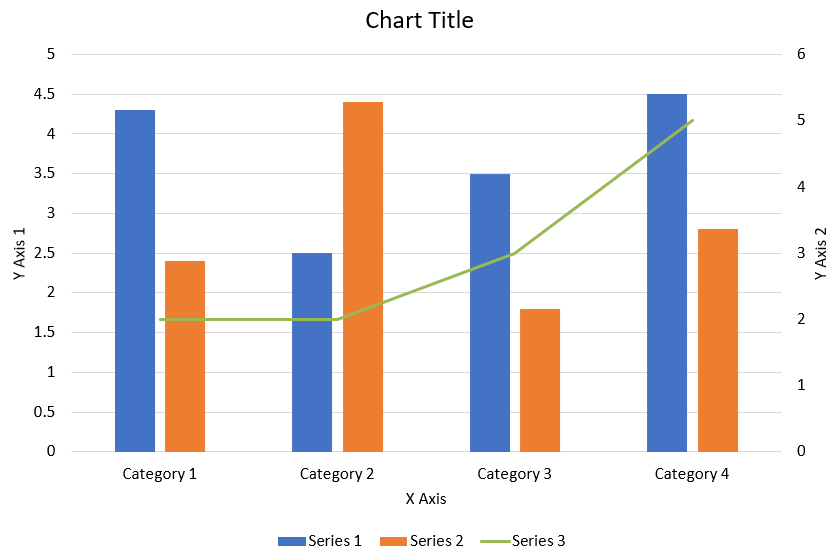
다음 Python 코드가 위에 표시된 복합 차트를 PowerPoint 프레젠테이션에 만드는 방법을 보여줍니다:
import jpype
import asposeslides

if not jpype.isJVMStarted():
    jpype.startJVM()

from asposeslides.api import AxisPositionType, ChartType, CrossesType, FillType, LegendPositionType, NullableBool, Presentation, SaveFormat

Color = jpype.JClass("java.awt.Color")

def create_combo_chart():
    presentation = Presentation()
    slide = presentation.getSlides().get_Item(0)
    try:
        chart = create_chart_with_first_series(slide)

        add_second_series_to_chart(chart)
        add_third_series_to_chart(chart)

        set_primary_axes_format(chart)
        set_secondary_axes_format(chart)

        presentation.save("combo-chart.pptx", SaveFormat.Pptx)
    finally:
        presentation.dispose()

def create_chart_with_first_series(slide):
    chart = slide.getShapes().addChart(ChartType.ClusteredColumn, 50, 50, 600, 400)

    # 차트 제목을 설정합니다.
    chart.setTitle(True)
    chart.getChartTitle().addTextFrameForOverriding("Chart Title")
    chart.getChartTitle().setOverlay(False)
    title_paragraph = chart.getChartTitle().getTextFrameForOverriding().getParagraphs().get_Item(0)
    title_format = title_paragraph.getParagraphFormat().getDefaultPortionFormat()
    title_format.setFontBold(NullableBool.False_)
    title_format.setFontHeight(18.0)

    # 차트 범례를 설정합니다.
    chart.getLegend().setPosition(LegendPositionType.Bottom)
    chart.getLegend().getTextFormat().getPortionFormat().setFontHeight(12.0)

    # 기본 생성된 시리즈와 범주를 삭제합니다.
    chart.getChartData().getSeries().clear()
    chart.getChartData().getCategories().clear()

    worksheet_index = 0
    workbook = chart.getChartData().getChartDataWorkbook()

    # 새 범주를 추가합니다.
    cell = workbook.getCell(worksheet_index, 1, 0, "Category 1")
    chart.getChartData().getCategories().add(cell)
    cell = workbook.getCell(worksheet_index, 2, 0, "Category 2")
    chart.getChartData().getCategories().add(cell)
    cell = workbook.getCell(worksheet_index, 3, 0, "Category 3")
    chart.getChartData().getCategories().add(cell)
    cell = workbook.getCell(worksheet_index, 4, 0, "Category 4")
    chart.getChartData().getCategories().add(cell)

    # 첫 번째 시리즈를 추가합니다.
    series_name_cell = workbook.getCell(worksheet_index, 0, 1, "Series 1")
    series = chart.getChartData().getSeries().add(series_name_cell, chart.getType())

    series.getParentSeriesGroup().setOverlap(jpype.JByte(-25))
    series.getParentSeriesGroup().setGapWidth(220)

    cell = workbook.getCell(worksheet_index, 1, 1, 4.3)
    series.getDataPoints().addDataPointForBarSeries(cell)
    cell = workbook.getCell(worksheet_index, 2, 1, 2.5)
    series.getDataPoints().addDataPointForBarSeries(cell)
    cell = workbook.getCell(worksheet_index, 3, 1, 3.5)
    series.getDataPoints().addDataPointForBarSeries(cell)
    cell = workbook.getCell(worksheet_index, 4, 1, 4.5)
    series.getDataPoints().addDataPointForBarSeries(cell)

    return chart

def add_second_series_to_chart(chart):
    workbook = chart.getChartData().getChartDataWorkbook()
    worksheet_index = 0

    series_name_cell = workbook.getCell(worksheet_index, 0, 2, "Series 2")
    series = chart.getChartData().getSeries().add(series_name_cell, ChartType.ClusteredColumn)

    series.getParentSeriesGroup().setOverlap(jpype.JByte(-25))
    series.getParentSeriesGroup().setGapWidth(220)

    cell = workbook.getCell(worksheet_index, 1, 2, 2.4)
    series.getDataPoints().addDataPointForBarSeries(cell)
    cell = workbook.getCell(worksheet_index, 2, 2, 4.4)
    series.getDataPoints().addDataPointForBarSeries(cell)
    cell = workbook.getCell(worksheet_index, 3, 2, 1.8)
    series.getDataPoints().addDataPointForBarSeries(cell)
    cell = workbook.getCell(worksheet_index, 4, 2, 2.8)
    series.getDataPoints().addDataPointForBarSeries(cell)

def add_third_series_to_chart(chart):
    workbook = chart.getChartData().getChartDataWorkbook()
    worksheet_index = 0

    series_name_cell = workbook.getCell(worksheet_index, 0, 3, "Series 3")
    series = chart.getChartData().getSeries().add(series_name_cell, ChartType.Line)

    cell = workbook.getCell(worksheet_index, 1, 3, 2.0)
    series.getDataPoints().addDataPointForLineSeries(cell)
    cell = workbook.getCell(worksheet_index, 2, 3, 2.0)
    series.getDataPoints().addDataPointForLineSeries(cell)
    cell = workbook.getCell(worksheet_index, 3, 3, 3.0)
    series.getDataPoints().addDataPointForLineSeries(cell)
    cell = workbook.getCell(worksheet_index, 4, 3, 5.0)
    series.getDataPoints().addDataPointForLineSeries(cell)

    series.setPlotOnSecondAxis(True)

def set_primary_axes_format(chart):
    # 수평축을 설정합니다.
    horizontal_axis = chart.getAxes().getHorizontalAxis()
    horizontal_axis.getTextFormat().getPortionFormat().setFontHeight(12.0)
    horizontal_axis.getFormat().getLine().getFillFormat().setFillType(FillType.NoFill)

    set_axis_title(horizontal_axis, "X Axis")

    # 수직축을 설정합니다.
    vertical_axis = chart.getAxes().getVerticalAxis()
    vertical_axis.getTextFormat().getPortionFormat().setFontHeight(12.0)
    vertical_axis.getFormat().getLine().getFillFormat().setFillType(FillType.NoFill)

    set_axis_title(vertical_axis, "Y Axis 1")

    # 수직축 주요 눈금선 색상을 설정합니다.
    major_grid_lines_format = vertical_axis.getMajorGridLinesFormat().getLine().getFillFormat()
    major_grid_lines_format.setFillType(FillType.Solid)
    color = Color(217, 217, 217)
    major_grid_lines_format.getSolidFillColor().setColor(color)

def set_secondary_axes_format(chart):
    # 보조 수평축을 설정합니다.
    secondary_horizontal_axis = chart.getAxes().getSecondaryHorizontalAxis()
    secondary_horizontal_axis.setPosition(AxisPositionType.Bottom)
    secondary_horizontal_axis.setCrossType(CrossesType.Maximum)
    secondary_horizontal_axis.setVisible(False)
    secondary_horizontal_axis.getMajorGridLinesFormat().getLine().getFillFormat().setFillType(FillType.NoFill)
    secondary_horizontal_axis.getMinorGridLinesFormat().getLine().getFillFormat().setFillType(FillType.NoFill)

    # 보조 수직축을 설정합니다.
    secondary_vertical_axis = chart.getAxes().getSecondaryVerticalAxis()
    secondary_vertical_axis.setPosition(AxisPositionType.Right)
    secondary_vertical_axis.getTextFormat().getPortionFormat().setFontHeight(12.0)
    secondary_vertical_axis.getFormat().getLine().getFillFormat().setFillType(FillType.NoFill)
    secondary_vertical_axis.getMajorGridLinesFormat().getLine().getFillFormat().setFillType(FillType.NoFill)
    secondary_vertical_axis.getMinorGridLinesFormat().getLine().getFillFormat().setFillType(FillType.NoFill)

    set_axis_title(secondary_vertical_axis, "Y Axis 2")

def set_axis_title(axis, axis_title):
    axis.setTitle(True)
    axis.getTitle().setOverlay(False)
    title_paragraph = axis.getTitle().addTextFrameForOverriding(axis_title).getParagraphs().get_Item(0)
    title_format = title_paragraph.getParagraphFormat().getDefaultPortionFormat()
    title_format.setFontBold(NullableBool.False_)
    title_format.setFontHeight(12.0)

create_combo_chart()
차트 업데이트
- 차트를 업데이트하려는 프레젠테이션을 나타내는 Presentation 클래스의 인스턴스를 생성합니다.
- 인덱스를 사용해 슬라이드에 대한 참조를 가져옵니다.
- 모든 모양을 순회하여 원하는 차트를 찾습니다.
- 차트 데이터 워크시트에 액세스합니다.
- 시리즈 값을 변경하여 차트 데이터 시리즈를 수정합니다.
- 새 시리즈를 추가하고 데이터를 채웁니다.
- 수정된 프레젠테이션을 PPTX 파일로 저장합니다.
다음 Python 코드가 차트를 업데이트하는 방법을 보여줍니다:
import jpype
import asposeslides

if not jpype.isJVMStarted():
    jpype.startJVM()

from asposeslides.api import ChartType, Presentation, SaveFormat

# 차트를 업데이트할 프레젠테이션을 엽니다
presentation = Presentation("ExistingChart.pptx")
try:
    # 첫 번째 슬라이드에 접근합니다
    slide = presentation.getSlides().get_Item(0)

    # 슬라이드에서 차트를 가져옵니다
    chart = slide.getShapes().get_Item(0)

    # 차트 데이터 시트의 인덱스를 설정합니다
    default_worksheet_index = 0

    # 차트 데이터 워크시트를 가져옵니다
    workbook = chart.getChartData().getChartDataWorkbook()

    # 차트 카테고리 이름을 변경합니다
    workbook.getCell(default_worksheet_index, 1, 0, "Modified Category 1")
    workbook.getCell(default_worksheet_index, 2, 0, "Modified Category 2")

    # 첫 번째 차트 시리즈를 가져옵니다
    series = chart.getChartData().getSeries().get_Item(0)

    # 이제 시리즈 데이터를 업데이트합니다
    workbook.getCell(default_worksheet_index, 0, 1, "New_Series1")# 시리즈 이름을 수정합니다
    series.getDataPoints().get_Item(0).getValue().setData(90)
    series.getDataPoints().get_Item(1).getValue().setData(123)
    series.getDataPoints().get_Item(2).getValue().setData(44)

    # 두 번째 차트 시리즈를 가져옵니다
    series = chart.getChartData().getSeries().get_Item(1)

    # 이제 시리즈 데이터를 업데이트합니다
    workbook.getCell(default_worksheet_index, 0, 2, "New_Series2")# 시리즈 이름을 수정합니다
    series.getDataPoints().get_Item(0).getValue().setData(23)
    series.getDataPoints().get_Item(1).getValue().setData(67)
    series.getDataPoints().get_Item(2).getValue().setData(99)

    # 이제 새로운 시리즈를 추가합니다
    cell = workbook.getCell(default_worksheet_index, 0, 3, "Series 3")
    chart.getChartData().getSeries().add(cell, chart.getType())

    # 세 번째 차트 시리즈를 가져옵니다
    series = chart.getChartData().getSeries().get_Item(2)

    # 이제 시리즈 데이터를 채웁니다
    cell = workbook.getCell(default_worksheet_index, 1, 3, 20)
    series.getDataPoints().addDataPointForBarSeries(cell)
    cell = workbook.getCell(default_worksheet_index, 2, 3, 50)
    series.getDataPoints().addDataPointForBarSeries(cell)
    cell = workbook.getCell(default_worksheet_index, 3, 3, 30)
    series.getDataPoints().addDataPointForBarSeries(cell)

    chart.setType(ChartType.ClusteredCylinder)

    # 차트가 포함된 프레젠테이션을 저장합니다
    presentation.save("AsposeChartModified_out.pptx", SaveFormat.Pptx)
finally:
    presentation.dispose()
차트 데이터 범위 설정
차트의 데이터 범위를 설정하려면 다음을 수행합니다:
- 차트를 포함하는 프레젠테이션을 나타내는 Presentation 클래스의 인스턴스를 생성합니다.
- 인덱스를 사용해 슬라이드에 대한 참조를 가져옵니다.
- 모든 모양을 순회하여 원하는 차트를 찾습니다.
- 차트 데이터에 액세스하고 범위를 설정합니다.
- 수정된 프레젠테이션을 PPTX 파일로 저장합니다.
다음 Python 코드가 차트의 데이터 범위를 설정하는 방법을 보여줍니다:
import jpype
import asposeslides

if not jpype.isJVMStarted():
    jpype.startJVM()

from asposeslides.api import Presentation, SaveFormat

# 차트를 포함하는 프레젠테이션을 엽니다
presentation = Presentation("ExistingChart.pptx")
try:
    slide = presentation.getSlides().get_Item(0)
    chart = slide.getShapes().get_Item(0)

    chart.getChartData().setRange("Sheet1!A1:B4")

    presentation.save("SetDataRange_out.pptx", SaveFormat.Pptx)
finally:
    presentation.dispose()
차트에 기본 마커 사용
차트에 기본 마커를 사용하면 각 차트 시리즈에 자동으로 서로 다른 마커 기호가 적용됩니다.
다음 Python 코드가 차트 시리즈 마커를 자동으로 설정하는 방법을 보여줍니다:
import jpype
import asposeslides

if not jpype.isJVMStarted():
    jpype.startJVM()

from asposeslides.api import ChartType, Presentation, SaveFormat

presentation = Presentation()
try:
    slide = presentation.getSlides().get_Item(0)
    chart = slide.getShapes().addChart(ChartType.LineWithMarkers, 10, 10, 400, 400)

    chart.getChartData().getSeries().clear()
    chart.getChartData().getCategories().clear()

    workbook = chart.getChartData().getChartDataWorkbook()
    cell = workbook.getCell(0, 0, 1, "Series 1")
    chart.getChartData().getSeries().add(cell, chart.getType())
    series = chart.getChartData().getSeries().get_Item(0)

    cell = workbook.getCell(0, 1, 0, "C1")
    chart.getChartData().getCategories().add(cell)
    cell = workbook.getCell(0, 1, 1, 24)
    series.getDataPoints().addDataPointForLineSeries(cell)
    cell = workbook.getCell(0, 2, 0, "C2")
    chart.getChartData().getCategories().add(cell)
    cell = workbook.getCell(0, 2, 1, 23)
    series.getDataPoints().addDataPointForLineSeries(cell)
    cell = workbook.getCell(0, 3, 0, "C3")
    chart.getChartData().getCategories().add(cell)
    cell = workbook.getCell(0, 3, 1, -10)
    series.getDataPoints().addDataPointForLineSeries(cell)
    cell = workbook.getCell(0, 4, 0, "C4")
    chart.getChartData().getCategories().add(cell)
    cell = workbook.getCell(0, 4, 1, None)
    series.getDataPoints().addDataPointForLineSeries(cell)

    cell = workbook.getCell(0, 0, 2, "Series 2")
    chart.getChartData().getSeries().add(cell, chart.getType())
    #두 번째 차트 시리즈를 가져옵니다
    second_series = chart.getChartData().getSeries().get_Item(1)

    #이제 시리즈 데이터를 채웁니다
    cell = workbook.getCell(0, 1, 2, 30)
    second_series.getDataPoints().addDataPointForLineSeries(cell)
    cell = workbook.getCell(0, 2, 2, 10)
    second_series.getDataPoints().addDataPointForLineSeries(cell)
    cell = workbook.getCell(0, 3, 2, 60)
    second_series.getDataPoints().addDataPointForLineSeries(cell)
    cell = workbook.getCell(0, 4, 2, 40)
    second_series.getDataPoints().addDataPointForLineSeries(cell)

    chart.setLegend(True)
    chart.getLegend().setOverlay(False)

    presentation.save("DefaultMarkersInChart.pptx", SaveFormat.Pptx)
finally:
    presentation.dispose()
FAQ
Aspose.Slides에서 지원하는 차트 유형은 무엇입니까?
Aspose.Slides는 막대, 선, 원형, 영역, 산점도, 히스토그램, 레이더 등 다양한 차트 유형을 지원합니다. 이를 통해 데이터 시각화 요구에 가장 적합한 차트 유형을 선택할 수 있습니다.
슬라이드에 새 차트를 어떻게 추가합니까?
차트를 추가하려면 먼저 Presentation 클래스의 인스턴스를 만들고, 인덱스를 사용해 원하는 슬라이드를 가져온 다음, 차트 유형과 초기 데이터를 지정하여 차트를 추가하는 메서드를 호출합니다. 이 과정으로 차트가 프레젠테이션에 직접 삽입됩니다.
차트에 표시되는 데이터를 어떻게 업데이트합니까?
차트 데이터를 업데이트하려면 차트의 데이터 워크북(ChartDataWorkbook)에 접근하고, 기본 시리즈와 범주를 삭제한 뒤 사용자 정의 데이터를 추가합니다. 이를 통해 최신 데이터를 반영하도록 차트를 새로 고칠 수 있습니다.
차트 모양을 사용자 정의할 수 있습니까?
예, Aspose.Slides는 폭넓은 사용자 정의 옵션을 제공합니다. 색상, 글꼴, 레이블, 범례 및 기타 서식 요소를 수정하여 차트 모양을 특정 디자인 요구에 맞게 조정할 수 있습니다.