
在 Python 中建立或更新 PowerPoint 簡報圖表
概觀
本文提供了使用 Aspose.Slides 建立與自訂圖表的完整指南。您將學習如何以程式方式將圖表新增至投影片、填入資料,並套用各種格式選項以符合特定設計需求。整篇文章透過詳細的程式碼範例示範每一步,從初始化簡報與圖表物件,到設定系列、座標軸與圖例。依循本指南,您將能深入了解如何在應用程式中整合動態圖表產生,簡化建立以資料為導向的簡報流程。
建立圖表的原因
圖表可協助使用者快速視覺化資料,並獲得從表格或試算表中不易立即發現的見解。
為何建立圖表?
- 在單一投影片上彙總、濃縮或摘要大量資料
- 顯示資料中的模式與趨勢
- 推斷資料隨時間或特定測量單位的方向與勢頭
- 發現異常值、偏差、錯誤、無意義的資料等
- 傳達或呈現複雜資料
在 PowerPoint 中,您可以透過 Insert 功能建立圖表,該功能提供多種圖表樣板。使用 Aspose.Slides,您可以建立一般圖表(基於常見圖表類型)和自訂圖表。
Note
To create charts, use the ChartType class. The fields in this class correspond to different chart types.建立群組柱狀圖
本節說明如何使用 Aspose.Slides 建立群組柱狀圖。您將學會初始化簡報、加入圖表,並自訂標題、資料、系列、類別與樣式等元素。依照以下步驟,您可以看到如何產生標準的群組柱狀圖:
- 建立 Presentation 類別的實例。
- 使用索引取得投影片的參考。
- 加入含有資料的圖表,並指定
ChartType.ClusteredColumn類型。 - 為圖表加入標題。
- 存取圖表的資料工作表。
- 清除所有預設的系列與類別。
- 新增系列與類別。
- 為圖表系列新增資料。
- 對圖表系列套用填色。
- 為圖表系列新增標籤。
- 將修改後的簡報儲存為 PPTX 檔案。
import jpype
import asposeslides

if not jpype.isJVMStarted():
    jpype.startJVM()

from asposeslides.api import ChartType, FillType, NullableBool, Presentation, SaveFormat

Color = jpype.JClass("java.awt.Color")

# 實例化一個代表 PPTX 檔案的簡報類別。
presentation = Presentation()
try:
    # 取得第一張投影片
    slide = presentation.getSlides().get_Item(0)

    # 新增一個帶有預設資料的圖表
    chart = slide.getShapes().addChart(ChartType.ClusteredColumn, 0, 0, 500, 500)

    # 設定圖表標題
    chart.getChartTitle().addTextFrameForOverriding("Sample Title")
    chart.getChartTitle().getTextFrameForOverriding().getTextFrameFormat().setCenterText(NullableBool.True_)
    chart.getChartTitle().setHeight(20)
    chart.setTitle(True)

    # 設定圖表資料工作表的索引
    default_worksheet_index = 0

    # 取得圖表資料工作表
    workbook = chart.getChartData().getChartDataWorkbook()

    # 刪除預設產生的系列與類別
    chart.getChartData().getSeries().clear()
    chart.getChartData().getCategories().clear()

    # 新增系列
    cell = workbook.getCell(default_worksheet_index, 0, 1, "Series 1")
    chart.getChartData().getSeries().add(cell,chart.getType())
    cell = workbook.getCell(default_worksheet_index, 0, 2, "Series 2")
    chart.getChartData().getSeries().add(cell,chart.getType())

    # 新增類別
    cell = workbook.getCell(default_worksheet_index, 1, 0, "Category 1")
    chart.getChartData().getCategories().add(cell)
    cell = workbook.getCell(default_worksheet_index, 2, 0, "Category 2")
    chart.getChartData().getCategories().add(cell)
    cell = workbook.getCell(default_worksheet_index, 3, 0, "Category 3")
    chart.getChartData().getCategories().add(cell)

    # 取得第一個圖表系列
    series = chart.getChartData().getSeries().get_Item(0)

    # 現在填入系列資料
    cell = workbook.getCell(default_worksheet_index, 1, 1, 20)
    series.getDataPoints().addDataPointForBarSeries(cell)
    cell = workbook.getCell(default_worksheet_index, 2, 1, 50)
    series.getDataPoints().addDataPointForBarSeries(cell)
    cell = workbook.getCell(default_worksheet_index, 3, 1, 30)
    series.getDataPoints().addDataPointForBarSeries(cell)

    # 設定系列的填充顏色
    series.getFormat().getFill().setFillType(FillType.Solid)
    series.getFormat().getFill().getSolidFillColor().setColor(Color.RED)

    # 取得第二個圖表系列
    series = chart.getChartData().getSeries().get_Item(1)

    # 填入系列資料
    cell = workbook.getCell(default_worksheet_index, 1, 2, 30)
    series.getDataPoints().addDataPointForBarSeries(cell)
    cell = workbook.getCell(default_worksheet_index, 2, 2, 10)
    series.getDataPoints().addDataPointForBarSeries(cell)
    cell = workbook.getCell(default_worksheet_index, 3, 2, 60)
    series.getDataPoints().addDataPointForBarSeries(cell)

    # 設定該系列的填充顏色
    series.getFormat().getFill().setFillType(FillType.Solid)
    series.getFormat().getFill().getSolidFillColor().setColor(Color.GREEN)

    #為新系列的每個類別建立自訂標籤
    # 設定第一個標籤顯示類別名稱
    label = series.getDataPoints().get_Item(0).getLabel()
    label.getDataLabelFormat().setShowCategoryName(True)

    label = series.getDataPoints().get_Item(1).getLabel()
    label.getDataLabelFormat().setShowSeriesName(True)

    # 顯示第三個標籤的數值
    label = series.getDataPoints().get_Item(2).getLabel()
    label.getDataLabelFormat().setShowValue(True)
    label.getDataLabelFormat().setShowSeriesName(True)
    label.getDataLabelFormat().setSeparator("/")

    # Saves the presentation with chart
    presentation.save("output.pptx", SaveFormat.Pptx)
finally:
    presentation.dispose()
建立散佈圖
散佈圖(亦稱散點圖或 x‑y 圖)常用於檢查模式或展示兩個變數之間的相關性。
當符合以下情況時使用散佈圖:
- 具備成對的數值資料
- 兩個變數彼此關聯性佳
- 想要判斷兩個變數是否相關
- 有一個自變數對應多個因變數值
- 依照 Create Clustered Column Charts 的步驟執行。
- 在第三步,加入含有資料的圖表,並將圖表類型指定為以下之一:
- ChartType.ScatterWithMarkers - 代表散佈圖。
- ChartType.ScatterWithSmoothLinesAndMarkers - 代表以曲線相連、含資料標記的散佈圖。
- ChartType.ScatterWithSmoothLines - 代表以曲線相連、無資料標記的散佈圖。
- ChartType.ScatterWithStraightLinesAndMarkers - 代表以直線相連、含資料標記的散佈圖。
- ChartType.ScatterWithStraightLines - 代表以直線相連、無資料標記的散佈圖。
import jpype
import asposeslides

if not jpype.isJVMStarted():
    jpype.startJVM()

from asposeslides.api import ChartType, MarkerStyleType, Presentation, SaveFormat

# 實例化一個代表 PPTX 檔案的簡報類別。
presentation = Presentation()
try:
    # 取得第一張投影片
    slide = presentation.getSlides().get_Item(0)

    # 建立預設圖表
    chart = slide.getShapes().addChart(ChartType.ScatterWithSmoothLines, 0, 0, 400, 400)

    # 取得預設圖表資料工作表索引
    default_worksheet_index = 0

    # 取得圖表資料工作表
    workbook = chart.getChartData().getChartDataWorkbook()

    # 刪除示範系列
    chart.getChartData().getSeries().clear()

    # 新增系列
    cell = workbook.getCell(default_worksheet_index, 1, 1, "Series 1")
    chart.getChartData().getSeries().add(cell, chart.getType())
    cell = workbook.getCell(default_worksheet_index, 1, 3, "Series 2")
    chart.getChartData().getSeries().add(cell, chart.getType())

    # 取得第一個圖表系列
    series = chart.getChartData().getSeries().get_Item(0)

    # 為系列新增一個新點 (1:3)
    x_cell = workbook.getCell(default_worksheet_index, 2, 1, 1)
    y_cell = workbook.getCell(default_worksheet_index, 2, 2, 3)
    series.getDataPoints().addDataPointForScatterSeries(x_cell, y_cell)

    # 為系列新增一個新點 (2:10)
    x_cell = workbook.getCell(default_worksheet_index, 3, 1, 2)
    y_cell = workbook.getCell(default_worksheet_index, 3, 2, 10)
    series.getDataPoints().addDataPointForScatterSeries(x_cell, y_cell)

    # 變更系列類型
    series.setType(ChartType.ScatterWithStraightLinesAndMarkers)

    # 變更圖表系列標記
    series.getMarker().setSize(10)
    series.getMarker().setSymbol(MarkerStyleType.Star)

    # 取得第二個圖表系列
    series = chart.getChartData().getSeries().get_Item(1)

    # 為其新增一個新點 (5:2)
    x_cell = workbook.getCell(default_worksheet_index, 2, 3, 5)
    y_cell = workbook.getCell(default_worksheet_index, 2, 4, 2)
    series.getDataPoints().addDataPointForScatterSeries(x_cell, y_cell)

    # 為其新增一個新點 (3:1)
    x_cell = workbook.getCell(default_worksheet_index, 3, 3, 3)
    y_cell = workbook.getCell(default_worksheet_index, 3, 4, 1)
    series.getDataPoints().addDataPointForScatterSeries(x_cell, y_cell)

    # 為其新增一個新點 (2:2)
    x_cell = workbook.getCell(default_worksheet_index, 4, 3, 2)
    y_cell = workbook.getCell(default_worksheet_index, 4, 4, 2)
    series.getDataPoints().addDataPointForScatterSeries(x_cell, y_cell)

    # 為其新增一個新點 (5:1)
    x_cell = workbook.getCell(default_worksheet_index, 5, 3, 5)
    y_cell = workbook.getCell(default_worksheet_index, 5, 4, 1)
    series.getDataPoints().addDataPointForScatterSeries(x_cell, y_cell)

    # 變更圖表系列標記
    series.getMarker().setSize(10)
    series.getMarker().setSymbol(MarkerStyleType.Circle)

    presentation.save("AsposeChart_out.pptx", SaveFormat.Pptx)
finally:
    presentation.dispose()
建立圓餅圖
圓餅圖最適合用於顯示資料中部分與整體的關係,特別是當資料包含帶有數值的類別標籤時。然而,若資料包含過多部份或標籤,建議改用條狀圖。
- 建立 Presentation 類別的實例。
- 使用索引取得投影片的參考。
- 加入預設資料的圖表,並指定 ChartType.Pie 類型。
- 存取圖表資料工作簿 ChartDataWorkbook。
- 清除預設的系列與類別。
- 新增系列與類別。
- 為圖表系列新增資料。
- 為圓餅圖的各區段新增點並套用自訂顏色。
- 設定系列的標籤。
- 為系列標籤啟用引導線。
- 設定圓餅圖區段的旋轉角度。
- 將修改後的簡報儲存為 PPTX 檔案。
import jpype
import asposeslides

if not jpype.isJVMStarted():
    jpype.startJVM()

from asposeslides.api import ChartType, FillType, LineDashStyle, LineStyle, NullableBool, Presentation, SaveFormat

Color = jpype.JClass("java.awt.Color")

# 實例化一個代表 PPTX 檔案的簡報類別。
presentation = Presentation()
try:
    # 取得第一張投影片
    slide = presentation.getSlides().get_Item(0)

    # 新增一個帶有預設資料的圖表
    chart = slide.getShapes().addChart(ChartType.Pie, 100, 100, 400, 400)

    # 設定圖表標題
    chart.getChartTitle().addTextFrameForOverriding("Sample Title")
    chart.getChartTitle().getTextFrameForOverriding().getTextFrameFormat().setCenterText(NullableBool.True_)
    chart.getChartTitle().setHeight(20)
    chart.setTitle(True)

    # 設定圖表資料工作表的索引
    default_worksheet_index = 0

    # 取得圖表資料工作表
    workbook = chart.getChartData().getChartDataWorkbook()

    # 刪除預設產生的系列與類別
    chart.getChartData().getSeries().clear()
    chart.getChartData().getCategories().clear()

    # 新增類別
    cell = workbook.getCell(0, 1, 0, "First Qtr")
    chart.getChartData().getCategories().add(cell)
    cell = workbook.getCell(0, 2, 0, "2nd Qtr")
    chart.getChartData().getCategories().add(cell)
    cell = workbook.getCell(0, 3, 0, "3rd Qtr")
    chart.getChartData().getCategories().add(cell)

    # 新增系列
    cell = workbook.getCell(0, 0, 1, "Series 1")
    series = chart.getChartData().getSeries().add(cell, chart.getType())

    #填充系列資料
    cell = workbook.getCell(default_worksheet_index, 1, 1, 20)
    series.getDataPoints().addDataPointForPieSeries(cell)
    cell = workbook.getCell(default_worksheet_index, 2, 1, 50)
    series.getDataPoints().addDataPointForPieSeries(cell)
    cell = workbook.getCell(default_worksheet_index, 3, 1, 30)
    series.getDataPoints().addDataPointForPieSeries(cell)

    # 新增點並設定區段顏色
    chart.getChartData().getSeriesGroups().get_Item(0).setColorVaried(True)

    point = series.getDataPoints().get_Item(0)
    point.getFormat().getFill().setFillType(FillType.Solid)
    point.getFormat().getFill().getSolidFillColor().setColor(Color.CYAN)

    # 設定區塊邊框
    point.getFormat().getLine().getFillFormat().setFillType(FillType.Solid)
    point.getFormat().getLine().getFillFormat().getSolidFillColor().setColor(Color.GRAY)
    point.getFormat().getLine().setWidth(3.0)
    point.getFormat().getLine().setStyle(LineStyle.ThinThick)
    point.getFormat().getLine().setDashStyle(LineDashStyle.DashDot)

    second_point = series.getDataPoints().get_Item(1)
    second_point.getFormat().getFill().setFillType(FillType.Solid)
    second_point.getFormat().getFill().getSolidFillColor().setColor(Color.ORANGE)

    # 設定區塊邊框
    second_point.getFormat().getLine().getFillFormat().setFillType(FillType.Solid)
    second_point.getFormat().getLine().getFillFormat().getSolidFillColor().setColor(Color.BLUE)
    second_point.getFormat().getLine().setWidth(3.0)
    second_point.getFormat().getLine().setStyle(LineStyle.Single)
    second_point.getFormat().getLine().setDashStyle(LineDashStyle.LargeDashDot)

    third_point = series.getDataPoints().get_Item(2)
    third_point.getFormat().getFill().setFillType(FillType.Solid)
    third_point.getFormat().getFill().getSolidFillColor().setColor(Color.YELLOW)

    # 設定區塊邊框
    third_point.getFormat().getLine().getFillFormat().setFillType(FillType.Solid)
    third_point.getFormat().getLine().getFillFormat().getSolidFillColor().setColor(Color.RED)
    third_point.getFormat().getLine().setWidth(2.0)
    third_point.getFormat().getLine().setStyle(LineStyle.ThinThin)
    third_point.getFormat().getLine().setDashStyle(LineDashStyle.LargeDashDotDot)

    # 為新系列的每個類別建立自訂標籤
    first_label = series.getDataPoints().get_Item(0).getLabel()
    first_label.getDataLabelFormat().setShowValue(True)

    second_label = series.getDataPoints().get_Item(1).getLabel()
    second_label.getDataLabelFormat().setShowValue(True)
    second_label.getDataLabelFormat().setShowLegendKey(True)
    second_label.getDataLabelFormat().setShowPercentage(True)

    third_label = series.getDataPoints().get_Item(2).getLabel()
    third_label.getDataLabelFormat().setShowSeriesName(True)
    third_label.getDataLabelFormat().setShowPercentage(True)

    # 顯示圖表的引導線
    series.getLabels().getDefaultDataLabelFormat().setShowLeaderLines(True)

    # 設定圓餅圖區段的旋轉角度
    chart.getChartData().getSeriesGroups().get_Item(0).setFirstSliceAngle(180)

    # 儲存包含圖表的簡報
    presentation.save("PieChart_out.pptx", SaveFormat.Pptx)
finally:
    presentation.dispose()
建立折線圖
折線圖(亦稱折線圖表)最適合用於展示隨時間變化的數值。使用折線圖,您可以一次比較大量資料、追蹤趨勢、突顯資料系列中的異常等。
- 建立 Presentation 類別的實例。
- 使用索引取得投影片的參考。
- 加入預設資料的圖表,並指定 ChartType.Line 類型。
- 將修改後的簡報儲存為 PPTX 檔案。
import jpype
import asposeslides

if not jpype.isJVMStarted():
    jpype.startJVM()

from asposeslides.api import ChartType, Presentation, SaveFormat

presentation = Presentation()
try:
    line_chart = presentation.getSlides().get_Item(0).getShapes().addChart(ChartType.Line, 10, 50, 600, 350)

    presentation.save("line_chart.pptx", SaveFormat.Pptx)
finally:
    presentation.dispose()
預設情況下,折線圖的點會以直線連接。若想改為虛線,可如下指定虛線類型:
import jpype
import asposeslides

if not jpype.isJVMStarted():
    jpype.startJVM()

from asposeslides.api import ChartType, LineDashStyle, Presentation, SaveFormat

presentation = Presentation()
try:
    line_chart = presentation.getSlides().get_Item(0).getShapes().addChart(ChartType.Line, 10, 50, 600, 350)

    for series in line_chart.getChartData().getSeries():
        series.getFormat().getLine().setDashStyle(LineDashStyle.Dash)

    presentation.save("line_chart.pptx", SaveFormat.Pptx)
finally:
    presentation.dispose()
建立樹狀圖表
樹狀圖表最適合用於銷售資料,當您想顯示資料類別的相對大小並快速突出各類別中貢獻較大的項目時。
- 建立 Presentation 類別的實例。
- 使用索引取得投影片的參考。
- 加入預設資料的圖表,並指定 ChartType.Treemap 類型。
- 存取圖表資料工作簿 ChartDataWorkbook。
- 清除預設的系列與類別。
- 新增系列與類別。
- 為圖表系列新增資料。
- 將修改後的簡報儲存為 PPTX 檔案。
import jpype
import asposeslides

if not jpype.isJVMStarted():
    jpype.startJVM()

from asposeslides.api import ChartType, ParentLabelLayoutType, Presentation, SaveFormat

presentation = Presentation()
try:
    chart = presentation.getSlides().get_Item(0).getShapes().addChart(ChartType.Treemap, 50, 50, 500, 400)
    chart.getChartData().getCategories().clear()
    chart.getChartData().getSeries().clear()

    workbook = chart.getChartData().getChartDataWorkbook()
    workbook.clear(0)

    #分支 1
    cell = workbook.getCell(0, "C1", "Leaf1")
    leaf = chart.getChartData().getCategories().add(cell)
    leaf.getGroupingLevels().setGroupingItem(1, "Stem1")
    leaf.getGroupingLevels().setGroupingItem(2, "Branch1")

    cell = workbook.getCell(0, "C2", "Leaf2")
    chart.getChartData().getCategories().add(cell)

    cell = workbook.getCell(0, "C3", "Leaf3")
    leaf = chart.getChartData().getCategories().add(cell)
    leaf.getGroupingLevels().setGroupingItem(1, "Stem2")

    cell = workbook.getCell(0, "C4", "Leaf4")
    chart.getChartData().getCategories().add(cell)

    #分支 2
    cell = workbook.getCell(0, "C5", "Leaf5")
    leaf = chart.getChartData().getCategories().add(cell)
    leaf.getGroupingLevels().setGroupingItem(1, "Stem3")
    leaf.getGroupingLevels().setGroupingItem(2, "Branch2")

    cell = workbook.getCell(0, "C6", "Leaf6")
    chart.getChartData().getCategories().add(cell)

    cell = workbook.getCell(0, "C7", "Leaf7")
    leaf = chart.getChartData().getCategories().add(cell)
    leaf.getGroupingLevels().setGroupingItem(1, "Stem4")

    cell = workbook.getCell(0, "C8", "Leaf8")
    chart.getChartData().getCategories().add(cell)

    series = chart.getChartData().getSeries().add(ChartType.Treemap)
    series.getLabels().getDefaultDataLabelFormat().setShowCategoryName(True)
    cell = workbook.getCell(0, "D1", 4)
    series.getDataPoints().addDataPointForTreemapSeries(cell)
    cell = workbook.getCell(0, "D2", 5)
    series.getDataPoints().addDataPointForTreemapSeries(cell)
    cell = workbook.getCell(0, "D3", 3)
    series.getDataPoints().addDataPointForTreemapSeries(cell)
    cell = workbook.getCell(0, "D4", 6)
    series.getDataPoints().addDataPointForTreemapSeries(cell)
    cell = workbook.getCell(0, "D5", 9)
    series.getDataPoints().addDataPointForTreemapSeries(cell)
    cell = workbook.getCell(0, "D6", 9)
    series.getDataPoints().addDataPointForTreemapSeries(cell)
    cell = workbook.getCell(0, "D7", 4)
    series.getDataPoints().addDataPointForTreemapSeries(cell)
    cell = workbook.getCell(0, "D8", 3)
    series.getDataPoints().addDataPointForTreemapSeries(cell)

    series.setParentLabelLayout(ParentLabelLayoutType.Overlapping)

    presentation.save("Treemap.pptx", SaveFormat.Pptx)
finally:
    presentation.dispose()
建立股票圖表
- 建立 Presentation 類別的實例。
- 使用索引取得投影片的參考。
- 加入預設資料的圖表,並指定 ChartType.OpenHighLowClose 類型。
- 存取圖表資料工作簿 ChartDataWorkbook。
- 清除預設的系列與類別。
- 新增系列與類別。
- 為圖表系列新增資料。
- 指定高低線格式。
- 將修改後的簡報儲存為 PPTX 檔案。
import jpype
import asposeslides

if not jpype.isJVMStarted():
    jpype.startJVM()

from asposeslides.api import ChartType, FillType, Presentation, SaveFormat

presentation = Presentation()
try:
    chart = presentation.getSlides().get_Item(0).getShapes().addChart(ChartType.OpenHighLowClose, 50, 50, 600, 400, False)

    chart.getChartData().getSeries().clear()
    chart.getChartData().getCategories().clear()

    workbook = chart.getChartData().getChartDataWorkbook()

    cell = workbook.getCell(0, 1, 0, "A")
    chart.getChartData().getCategories().add(cell)
    cell = workbook.getCell(0, 2, 0, "B")
    chart.getChartData().getCategories().add(cell)
    cell = workbook.getCell(0, 3, 0, "C")
    chart.getChartData().getCategories().add(cell)

    cell = workbook.getCell(0, 0, 1, "Open")
    chart.getChartData().getSeries().add(cell, chart.getType())
    cell = workbook.getCell(0, 0, 2, "High")
    chart.getChartData().getSeries().add(cell, chart.getType())
    cell = workbook.getCell(0, 0, 3, "Low")
    chart.getChartData().getSeries().add(cell, chart.getType())
    cell = workbook.getCell(0, 0, 4, "Close")
    chart.getChartData().getSeries().add(cell, chart.getType())

    series = chart.getChartData().getSeries().get_Item(0)

    cell = workbook.getCell(0, 1, 1, 72)
    series.getDataPoints().addDataPointForStockSeries(cell)
    cell = workbook.getCell(0, 2, 1, 25)
    series.getDataPoints().addDataPointForStockSeries(cell)
    cell = workbook.getCell(0, 3, 1, 38)
    series.getDataPoints().addDataPointForStockSeries(cell)

    series = chart.getChartData().getSeries().get_Item(1)
    cell = workbook.getCell(0, 1, 2, 172)
    series.getDataPoints().addDataPointForStockSeries(cell)
    cell = workbook.getCell(0, 2, 2, 57)
    series.getDataPoints().addDataPointForStockSeries(cell)
    cell = workbook.getCell(0, 3, 2, 57)
    series.getDataPoints().addDataPointForStockSeries(cell)

    series = chart.getChartData().getSeries().get_Item(2)
    cell = workbook.getCell(0, 1, 3, 12)
    series.getDataPoints().addDataPointForStockSeries(cell)
    cell = workbook.getCell(0, 2, 3, 12)
    series.getDataPoints().addDataPointForStockSeries(cell)
    cell = workbook.getCell(0, 3, 3, 13)
    series.getDataPoints().addDataPointForStockSeries(cell)

    series = chart.getChartData().getSeries().get_Item(3)
    cell = workbook.getCell(0, 1, 4, 25)
    series.getDataPoints().addDataPointForStockSeries(cell)
    cell = workbook.getCell(0, 2, 4, 38)
    series.getDataPoints().addDataPointForStockSeries(cell)
    cell = workbook.getCell(0, 3, 4, 50)
    series.getDataPoints().addDataPointForStockSeries(cell)

    chart.getChartData().getSeriesGroups().get_Item(0).getUpDownBars().setUpDownBars(True)
    chart.getChartData().getSeriesGroups().get_Item(0).getHiLowLinesFormat().getLine().getFillFormat().setFillType(FillType.Solid)

    for series in chart.getChartData().getSeries():
        series.getFormat().getLine().getFillFormat().setFillType(FillType.NoFill)

    presentation.save("output.pptx", SaveFormat.Pptx)
finally:
    presentation.dispose()
建立箱形圖
- 建立 Presentation 類別的實例。
- 使用索引取得投影片的參考。
- 加入預設資料的圖表,並指定 ChartType.BoxAndWhisker 類型。
- 存取圖表資料工作簿 ChartDataWorkbook。
- 清除預設的系列與類別。
- 新增系列與類別。
- 為圖表系列新增資料。
- 將修改後的簡報儲存為 PPTX 檔案。
import jpype
import asposeslides

if not jpype.isJVMStarted():
    jpype.startJVM()

from asposeslides.api import ChartType, Presentation, QuartileMethodType, SaveFormat

presentation = Presentation()
try:
    chart = presentation.getSlides().get_Item(0).getShapes().addChart(ChartType.BoxAndWhisker, 50, 50, 500, 400)
    chart.getChartData().getCategories().clear()
    chart.getChartData().getSeries().clear()

    workbook = chart.getChartData().getChartDataWorkbook()
    workbook.clear(0)

    cell = workbook.getCell(0, "A1", "Category 1")
    chart.getChartData().getCategories().add(cell)
    cell = workbook.getCell(0, "A2", "Category 1")
    chart.getChartData().getCategories().add(cell)
    cell = workbook.getCell(0, "A3", "Category 1")
    chart.getChartData().getCategories().add(cell)
    cell = workbook.getCell(0, "A4", "Category 1")
    chart.getChartData().getCategories().add(cell)
    cell = workbook.getCell(0, "A5", "Category 1")
    chart.getChartData().getCategories().add(cell)
    cell = workbook.getCell(0, "A6", "Category 1")
    chart.getChartData().getCategories().add(cell)

    series = chart.getChartData().getSeries().add(ChartType.BoxAndWhisker)

    series.setQuartileMethod(QuartileMethodType.Exclusive)
    series.setShowMeanLine(True)
    series.setShowMeanMarkers(True)
    series.setShowInnerPoints(True)
    series.setShowOutlierPoints(True)

    cell = workbook.getCell(0, "B1", 15)
    series.getDataPoints().addDataPointForBoxAndWhiskerSeries(cell)
    cell = workbook.getCell(0, "B2", 41)
    series.getDataPoints().addDataPointForBoxAndWhiskerSeries(cell)
    cell = workbook.getCell(0, "B3", 16)
    series.getDataPoints().addDataPointForBoxAndWhiskerSeries(cell)
    cell = workbook.getCell(0, "B4", 10)
    series.getDataPoints().addDataPointForBoxAndWhiskerSeries(cell)
    cell = workbook.getCell(0, "B5", 23)
    series.getDataPoints().addDataPointForBoxAndWhiskerSeries(cell)
    cell = workbook.getCell(0, "B6", 16)
    series.getDataPoints().addDataPointForBoxAndWhiskerSeries(cell)

    presentation.save("BoxAndWhisker.pptx", SaveFormat.Pptx)
finally:
    presentation.dispose()
建立漏斗圖
- 建立 Presentation 類別的實例。
- 使用索引取得投影片的參考。
- 加入預設資料的圖表,並指定 ChartType.Funnel 類型。
- 將修改後的簡報儲存為 PPTX 檔案。
import jpype
import asposeslides

if not jpype.isJVMStarted():
    jpype.startJVM()

from asposeslides.api import ChartType, Presentation, SaveFormat

presentation = Presentation()
try:
    chart = presentation.getSlides().get_Item(0).getShapes().addChart(ChartType.Funnel, 50, 50, 500, 400)
    chart.getChartData().getCategories().clear()
    chart.getChartData().getSeries().clear()

    workbook = chart.getChartData().getChartDataWorkbook()

    workbook.clear(0)

    cell = workbook.getCell(0, "A1", "Category 1")
    chart.getChartData().getCategories().add(cell)
    cell = workbook.getCell(0, "A2", "Category 2")
    chart.getChartData().getCategories().add(cell)
    cell = workbook.getCell(0, "A3", "Category 3")
    chart.getChartData().getCategories().add(cell)
    cell = workbook.getCell(0, "A4", "Category 4")
    chart.getChartData().getCategories().add(cell)
    cell = workbook.getCell(0, "A5", "Category 5")
    chart.getChartData().getCategories().add(cell)
    cell = workbook.getCell(0, "A6", "Category 6")
    chart.getChartData().getCategories().add(cell)

    series = chart.getChartData().getSeries().add(ChartType.Funnel)

    cell = workbook.getCell(0, "B1", 50)
    series.getDataPoints().addDataPointForFunnelSeries(cell)
    cell = workbook.getCell(0, "B2", 100)
    series.getDataPoints().addDataPointForFunnelSeries(cell)
    cell = workbook.getCell(0, "B3", 200)
    series.getDataPoints().addDataPointForFunnelSeries(cell)
    cell = workbook.getCell(0, "B4", 300)
    series.getDataPoints().addDataPointForFunnelSeries(cell)
    cell = workbook.getCell(0, "B5", 400)
    series.getDataPoints().addDataPointForFunnelSeries(cell)
    cell = workbook.getCell(0, "B6", 500)
    series.getDataPoints().addDataPointForFunnelSeries(cell)

    presentation.save("Funnel.pptx", SaveFormat.Pptx)
finally:
    presentation.dispose()
建立旭日圖
- 建立 Presentation 類別的實例。
- 使用索引取得投影片的參考。
- 加入預設資料的圖表,並指定 ChartType.Sunburst 類型。
- 將修改後的簡報儲存為 PPTX 檔案。
import jpype
import asposeslides

if not jpype.isJVMStarted():
    jpype.startJVM()

from asposeslides.api import ChartType, Presentation, SaveFormat

presentation = Presentation()
try:
    chart = presentation.getSlides().get_Item(0).getShapes().addChart(ChartType.Sunburst, 50, 50, 500, 400)
    chart.getChartData().getCategories().clear()
    chart.getChartData().getSeries().clear()

    workbook = chart.getChartData().getChartDataWorkbook()
    workbook.clear(0)

    #分支 1
    cell = workbook.getCell(0, "C1", "Leaf1")
    leaf = chart.getChartData().getCategories().add(cell)
    leaf.getGroupingLevels().setGroupingItem(1, "Stem1")
    leaf.getGroupingLevels().setGroupingItem(2, "Branch1")

    cell = workbook.getCell(0, "C2", "Leaf2")
    chart.getChartData().getCategories().add(cell)

    cell = workbook.getCell(0, "C3", "Leaf3")
    leaf = chart.getChartData().getCategories().add(cell)
    leaf.getGroupingLevels().setGroupingItem(1, "Stem2")

    cell = workbook.getCell(0, "C4", "Leaf4")
    chart.getChartData().getCategories().add(cell)

    #分支 2
    cell = workbook.getCell(0, "C5", "Leaf5")
    leaf = chart.getChartData().getCategories().add(cell)
    leaf.getGroupingLevels().setGroupingItem(1, "Stem3")
    leaf.getGroupingLevels().setGroupingItem(2, "Branch2")

    cell = workbook.getCell(0, "C6", "Leaf6")
    chart.getChartData().getCategories().add(cell)

    cell = workbook.getCell(0, "C7", "Leaf7")
    leaf = chart.getChartData().getCategories().add(cell)
    leaf.getGroupingLevels().setGroupingItem(1, "Stem4")

    cell = workbook.getCell(0, "C8", "Leaf8")
    chart.getChartData().getCategories().add(cell)

    series = chart.getChartData().getSeries().add(ChartType.Sunburst)
    series.getLabels().getDefaultDataLabelFormat().setShowCategoryName(True)
    cell = workbook.getCell(0, "D1", 4)
    series.getDataPoints().addDataPointForSunburstSeries(cell)
    cell = workbook.getCell(0, "D2", 5)
    series.getDataPoints().addDataPointForSunburstSeries(cell)
    cell = workbook.getCell(0, "D3", 3)
    series.getDataPoints().addDataPointForSunburstSeries(cell)
    cell = workbook.getCell(0, "D4", 6)
    series.getDataPoints().addDataPointForSunburstSeries(cell)
    cell = workbook.getCell(0, "D5", 9)
    series.getDataPoints().addDataPointForSunburstSeries(cell)
    cell = workbook.getCell(0, "D6", 9)
    series.getDataPoints().addDataPointForSunburstSeries(cell)
    cell = workbook.getCell(0, "D7", 4)
    series.getDataPoints().addDataPointForSunburstSeries(cell)
    cell = workbook.getCell(0, "D8", 3)
    series.getDataPoints().addDataPointForSunburstSeries(cell)

    presentation.save("Sunburst.pptx", SaveFormat.Pptx)
finally:
    presentation.dispose()
建立直方圖
- 建立 Presentation 類別的實例。
- 使用索引取得投影片的參考。
- 加入預設資料的圖表,並指定 ChartType.Histogram 類型。
- 存取圖表資料工作簿 ChartDataWorkbook。
- 清除預設的系列與類別。
- 新增系列與類別。
- 將修改後的簡報儲存為 PPTX 檔案。
import jpype
import asposeslides

if not jpype.isJVMStarted():
    jpype.startJVM()

from asposeslides.api import AxisAggregationType, ChartType, Presentation, SaveFormat

presentation = Presentation()
try:
    chart = presentation.getSlides().get_Item(0).getShapes().addChart(ChartType.Histogram, 50, 50, 500, 400)
    chart.getChartData().getCategories().clear()
    chart.getChartData().getSeries().clear()

    workbook = chart.getChartData().getChartDataWorkbook()
    workbook.clear(0)

    series = chart.getChartData().getSeries().add(ChartType.Histogram)
    cell = workbook.getCell(0, "A1", 15)
    series.getDataPoints().addDataPointForHistogramSeries(cell)
    cell = workbook.getCell(0, "A2", -41)
    series.getDataPoints().addDataPointForHistogramSeries(cell)
    cell = workbook.getCell(0, "A3", 16)
    series.getDataPoints().addDataPointForHistogramSeries(cell)
    cell = workbook.getCell(0, "A4", 10)
    series.getDataPoints().addDataPointForHistogramSeries(cell)
    cell = workbook.getCell(0, "A5", -23)
    series.getDataPoints().addDataPointForHistogramSeries(cell)
    cell = workbook.getCell(0, "A6", 16)
    series.getDataPoints().addDataPointForHistogramSeries(cell)

    chart.getAxes().getHorizontalAxis().setAggregationType(AxisAggregationType.Automatic)

    presentation.save("Histogram.pptx", SaveFormat.Pptx)
finally:
    presentation.dispose()
建立雷達圖
- 建立 Presentation 類別的實例。
- 使用索引取得投影片的參考。
- 加入含有資料的圖表,並將圖表類型指定為 ChartType.Radar(本例)。
- 將修改後的簡報儲存為 PPTX 檔案。
import jpype
import asposeslides

if not jpype.isJVMStarted():
    jpype.startJVM()

from asposeslides.api import ChartType, Presentation, SaveFormat

presentation = Presentation()
try:
    presentation.getSlides().get_Item(0).getShapes().addChart(ChartType.Radar, 20, 20, 400, 300)
    presentation.save("Radar-chart.pptx", SaveFormat.Pptx)
finally:
    presentation.dispose()
建立多類別圖表
- 建立 Presentation 類別的實例。
- 使用索引取得投影片的參考。
- 加入預設資料的圖表,並指定 ChartType.ClusteredColumn 類型。
- 存取圖表資料工作簿 ChartDataWorkbook。
- 清除預設的系列與類別。
- 新增系列與類別。
- 為圖表系列新增資料。
- 將修改後的簡報儲存為 PPTX 檔案。
import jpype
import asposeslides

if not jpype.isJVMStarted():
    jpype.startJVM()

from asposeslides.api import ChartType, Presentation, SaveFormat

presentation = Presentation()
try:
    chart = presentation.getSlides().get_Item(0).getShapes().addChart(ChartType.ClusteredColumn, 100, 100, 600, 450)
    chart.getChartData().getSeries().clear()
    chart.getChartData().getCategories().clear()

    workbook = chart.getChartData().getChartDataWorkbook()
    workbook.clear(0)
    default_worksheet_index = 0

    cell = workbook.getCell(0, "c2", "A")
    category = chart.getChartData().getCategories().add(cell)
    category.getGroupingLevels().setGroupingItem(1, "Group1")
    cell = workbook.getCell(0, "c3", "B")
    category = chart.getChartData().getCategories().add(cell)

    cell = workbook.getCell(0, "c4", "C")
    category = chart.getChartData().getCategories().add(cell)
    category.getGroupingLevels().setGroupingItem(1, "Group2")
    cell = workbook.getCell(0, "c5", "D")
    category = chart.getChartData().getCategories().add(cell)

    cell = workbook.getCell(0, "c6", "E")
    category = chart.getChartData().getCategories().add(cell)
    category.getGroupingLevels().setGroupingItem(1, "Group3")
    cell = workbook.getCell(0, "c7", "F")
    category = chart.getChartData().getCategories().add(cell)

    cell = workbook.getCell(0, "c8", "G")
    category = chart.getChartData().getCategories().add(cell)
    category.getGroupingLevels().setGroupingItem(1, "Group4")
    cell = workbook.getCell(0, "c9", "H")
    category = chart.getChartData().getCategories().add(cell)

    # 添加系列
    cell = workbook.getCell(0, "D1", "Series 1")
    series = chart.getChartData().getSeries().add(cell, ChartType.ClusteredColumn)

    cell = workbook.getCell(default_worksheet_index, "D2", 10)
    series.getDataPoints().addDataPointForBarSeries(cell)
    cell = workbook.getCell(default_worksheet_index, "D3", 20)
    series.getDataPoints().addDataPointForBarSeries(cell)
    cell = workbook.getCell(default_worksheet_index, "D4", 30)
    series.getDataPoints().addDataPointForBarSeries(cell)
    cell = workbook.getCell(default_worksheet_index, "D5", 40)
    series.getDataPoints().addDataPointForBarSeries(cell)
    cell = workbook.getCell(default_worksheet_index, "D6", 50)
    series.getDataPoints().addDataPointForBarSeries(cell)
    cell = workbook.getCell(default_worksheet_index, "D7", 60)
    series.getDataPoints().addDataPointForBarSeries(cell)
    cell = workbook.getCell(default_worksheet_index, "D8", 70)
    series.getDataPoints().addDataPointForBarSeries(cell)
    cell = workbook.getCell(default_worksheet_index, "D9", 80)
    series.getDataPoints().addDataPointForBarSeries(cell)

    # 儲存包含圖表的簡報
    presentation.save("AsposeChart_out.pptx", SaveFormat.Pptx)
finally:
    presentation.dispose()
建立地圖圖表
地圖圖表可視化地理資料,協助比較不同地區之間的數值。
import jpype
import asposeslides

if not jpype.isJVMStarted():
    jpype.startJVM()

from asposeslides.api import ChartType, Presentation, SaveFormat

presentation = Presentation()
try:
    chart = presentation.getSlides().get_Item(0).getShapes().addChart(ChartType.Map, 50, 50, 500, 400)
    presentation.save("mapChart.pptx", SaveFormat.Pptx)
finally:
    presentation.dispose()
建立組合圖表
組合圖(或稱 combo 圖)結合兩種以上的圖表類型於同一圖形中,讓您能突顯、比較或檢視多組資料之間的差異,從而辨識它們的關聯。
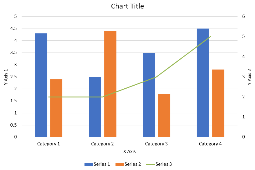
以下 Python 程式碼示範如何在 PowerPoint 簡報中建立上述組合圖表:
import jpype
import asposeslides

if not jpype.isJVMStarted():
    jpype.startJVM()

from asposeslides.api import AxisPositionType, ChartType, CrossesType, FillType, LegendPositionType, NullableBool, Presentation, SaveFormat

Color = jpype.JClass("java.awt.Color")

def create_combo_chart():
    presentation = Presentation()
    slide = presentation.getSlides().get_Item(0)
    try:
        chart = create_chart_with_first_series(slide)

        add_second_series_to_chart(chart)
        add_third_series_to_chart(chart)

        set_primary_axes_format(chart)
        set_secondary_axes_format(chart)

        presentation.save("combo-chart.pptx", SaveFormat.Pptx)
    finally:
        presentation.dispose()

def create_chart_with_first_series(slide):
    chart = slide.getShapes().addChart(ChartType.ClusteredColumn, 50, 50, 600, 400)

    # 設定圖表標題。
    chart.setTitle(True)
    chart.getChartTitle().addTextFrameForOverriding("Chart Title")
    chart.getChartTitle().setOverlay(False)
    title_paragraph = chart.getChartTitle().getTextFrameForOverriding().getParagraphs().get_Item(0)
    title_format = title_paragraph.getParagraphFormat().getDefaultPortionFormat()
    title_format.setFontBold(NullableBool.False_)
    title_format.setFontHeight(18.0)

    # 設定圖表圖例。
    chart.getLegend().setPosition(LegendPositionType.Bottom)
    chart.getLegend().getTextFormat().getPortionFormat().setFontHeight(12.0)

    # 刪除預設產生的系列與類別。
    chart.getChartData().getSeries().clear()
    chart.getChartData().getCategories().clear()

    worksheet_index = 0
    workbook = chart.getChartData().getChartDataWorkbook()

    # 新增類別。
    cell = workbook.getCell(worksheet_index, 1, 0, "Category 1")
    chart.getChartData().getCategories().add(cell)
    cell = workbook.getCell(worksheet_index, 2, 0, "Category 2")
    chart.getChartData().getCategories().add(cell)
    cell = workbook.getCell(worksheet_index, 3, 0, "Category 3")
    chart.getChartData().getCategories().add(cell)
    cell = workbook.getCell(worksheet_index, 4, 0, "Category 4")
    chart.getChartData().getCategories().add(cell)

    # 新增第一個系列。
    series_name_cell = workbook.getCell(worksheet_index, 0, 1, "Series 1")
    series = chart.getChartData().getSeries().add(series_name_cell, chart.getType())

    series.getParentSeriesGroup().setOverlap(jpype.JByte(-25))
    series.getParentSeriesGroup().setGapWidth(220)

    cell = workbook.getCell(worksheet_index, 1, 1, 4.3)
    series.getDataPoints().addDataPointForBarSeries(cell)
    cell = workbook.getCell(worksheet_index, 2, 1, 2.5)
    series.getDataPoints().addDataPointForBarSeries(cell)
    cell = workbook.getCell(worksheet_index, 3, 1, 3.5)
    series.getDataPoints().addDataPointForBarSeries(cell)
    cell = workbook.getCell(worksheet_index, 4, 1, 4.5)
    series.getDataPoints().addDataPointForBarSeries(cell)

    return chart

def add_second_series_to_chart(chart):
    workbook = chart.getChartData().getChartDataWorkbook()
    worksheet_index = 0

    series_name_cell = workbook.getCell(worksheet_index, 0, 2, "Series 2")
    series = chart.getChartData().getSeries().add(series_name_cell, ChartType.ClusteredColumn)

    series.getParentSeriesGroup().setOverlap(jpype.JByte(-25))
    series.getParentSeriesGroup().setGapWidth(220)

    cell = workbook.getCell(worksheet_index, 1, 2, 2.4)
    series.getDataPoints().addDataPointForBarSeries(cell)
    cell = workbook.getCell(worksheet_index, 2, 2, 4.4)
    series.getDataPoints().addDataPointForBarSeries(cell)
    cell = workbook.getCell(worksheet_index, 3, 2, 1.8)
    series.getDataPoints().addDataPointForBarSeries(cell)
    cell = workbook.getCell(worksheet_index, 4, 2, 2.8)
    series.getDataPoints().addDataPointForBarSeries(cell)

def add_third_series_to_chart(chart):
    workbook = chart.getChartData().getChartDataWorkbook()
    worksheet_index = 0

    series_name_cell = workbook.getCell(worksheet_index, 0, 3, "Series 3")
    series = chart.getChartData().getSeries().add(series_name_cell, ChartType.Line)

    cell = workbook.getCell(worksheet_index, 1, 3, 2.0)
    series.getDataPoints().addDataPointForLineSeries(cell)
    cell = workbook.getCell(worksheet_index, 2, 3, 2.0)
    series.getDataPoints().addDataPointForLineSeries(cell)
    cell = workbook.getCell(worksheet_index, 3, 3, 3.0)
    series.getDataPoints().addDataPointForLineSeries(cell)
    cell = workbook.getCell(worksheet_index, 4, 3, 5.0)
    series.getDataPoints().addDataPointForLineSeries(cell)

    series.setPlotOnSecondAxis(True)

def set_primary_axes_format(chart):
    # 設定水平軸。
    horizontal_axis = chart.getAxes().getHorizontalAxis()
    horizontal_axis.getTextFormat().getPortionFormat().setFontHeight(12.0)
    horizontal_axis.getFormat().getLine().getFillFormat().setFillType(FillType.NoFill)

    set_axis_title(horizontal_axis, "X Axis")

    # 設定垂直軸。
    vertical_axis = chart.getAxes().getVerticalAxis()
    vertical_axis.getTextFormat().getPortionFormat().setFontHeight(12.0)
    vertical_axis.getFormat().getLine().getFillFormat().setFillType(FillType.NoFill)

    set_axis_title(vertical_axis, "Y Axis 1")

    # 設定垂直主要格線顏色。
    major_grid_lines_format = vertical_axis.getMajorGridLinesFormat().getLine().getFillFormat()
    major_grid_lines_format.setFillType(FillType.Solid)
    color = Color(217, 217, 217)
    major_grid_lines_format.getSolidFillColor().setColor(color)

def set_secondary_axes_format(chart):
    # 設定次要水平軸。
    secondary_horizontal_axis = chart.getAxes().getSecondaryHorizontalAxis()
    secondary_horizontal_axis.setPosition(AxisPositionType.Bottom)
    secondary_horizontal_axis.setCrossType(CrossesType.Maximum)
    secondary_horizontal_axis.setVisible(False)
    secondary_horizontal_axis.getMajorGridLinesFormat().getLine().getFillFormat().setFillType(FillType.NoFill)
    secondary_horizontal_axis.getMinorGridLinesFormat().getLine().getFillFormat().setFillType(FillType.NoFill)

    # 設定次要垂直軸。
    secondary_vertical_axis = chart.getAxes().getSecondaryVerticalAxis()
    secondary_vertical_axis.setPosition(AxisPositionType.Right)
    secondary_vertical_axis.getTextFormat().getPortionFormat().setFontHeight(12.0)
    secondary_vertical_axis.getFormat().getLine().getFillFormat().setFillType(FillType.NoFill)
    secondary_vertical_axis.getMajorGridLinesFormat().getLine().getFillFormat().setFillType(FillType.NoFill)
    secondary_vertical_axis.getMinorGridLinesFormat().getLine().getFillFormat().setFillType(FillType.NoFill)

    set_axis_title(secondary_vertical_axis, "Y Axis 2")

def set_axis_title(axis, axis_title):
    axis.setTitle(True)
    axis.getTitle().setOverlay(False)
    title_paragraph = axis.getTitle().addTextFrameForOverriding(axis_title).getParagraphs().get_Item(0)
    title_format = title_paragraph.getParagraphFormat().getDefaultPortionFormat()
    title_format.setFontBold(NullableBool.False_)
    title_format.setFontHeight(12.0)

create_combo_chart()
更新圖表
- 建立代表包含欲更新圖表之簡報的 Presentation 類別實例。
- 使用索引取得投影片的參考。
- 逐一檢閱所有圖形以找到目標圖表。
- 存取圖表的資料工作表。
- 透過變更系列值來修改圖表資料系列。
- 新增系列並填入資料。
- 將修改後的簡報儲存為 PPTX 檔案。
import jpype
import asposeslides

if not jpype.isJVMStarted():
    jpype.startJVM()

from asposeslides.api import ChartType, Presentation, SaveFormat

# 開啟包含要更新圖表的簡報
presentation = Presentation("ExistingChart.pptx")
try:
    # 取得第一張投影片
    slide = presentation.getSlides().get_Item(0)

    # 從投影片取得圖表
    chart = slide.getShapes().get_Item(0)

    # 設定圖表資料工作表的索引
    default_worksheet_index = 0

    # 取得圖表資料工作表
    workbook = chart.getChartData().getChartDataWorkbook()

    # 變更圖表類別名稱
    workbook.getCell(default_worksheet_index, 1, 0, "Modified Category 1")
    workbook.getCell(default_worksheet_index, 2, 0, "Modified Category 2")

    # 取得第一個圖表系列
    series = chart.getChartData().getSeries().get_Item(0)

    # 現在更新系列資料
    workbook.getCell(default_worksheet_index, 0, 1, "New_Series1")# 修改系列名稱
    series.getDataPoints().get_Item(0).getValue().setData(90)
    series.getDataPoints().get_Item(1).getValue().setData(123)
    series.getDataPoints().get_Item(2).getValue().setData(44)

    # 取得第二個圖表系列
    series = chart.getChartData().getSeries().get_Item(1)

    # 現在更新系列資料
    workbook.getCell(default_worksheet_index, 0, 2, "New_Series2")# 修改系列名稱
    series.getDataPoints().get_Item(0).getValue().setData(23)
    series.getDataPoints().get_Item(1).getValue().setData(67)
    series.getDataPoints().get_Item(2).getValue().setData(99)

    # 現在,新增一個系列
    cell = workbook.getCell(default_worksheet_index, 0, 3, "Series 3")
    chart.getChartData().getSeries().add(cell, chart.getType())

    # 取得第三個圖表系列
    series = chart.getChartData().getSeries().get_Item(2)

    # 現在填入系列資料
    cell = workbook.getCell(default_worksheet_index, 1, 3, 20)
    series.getDataPoints().addDataPointForBarSeries(cell)
    cell = workbook.getCell(default_worksheet_index, 2, 3, 50)
    series.getDataPoints().addDataPointForBarSeries(cell)
    cell = workbook.getCell(default_worksheet_index, 3, 3, 30)
    series.getDataPoints().addDataPointForBarSeries(cell)

    chart.setType(ChartType.ClusteredCylinder)

    # 儲存包含圖表的簡報
    presentation.save("AsposeChartModified_out.pptx", SaveFormat.Pptx)
finally:
    presentation.dispose()
設定圖表的資料範圍
設定圖表的資料範圍,請依照以下步驟:
- 建立代表包含圖表之簡報的 Presentation 類別實例。
- 使用索引取得投影片的參考。
- 逐一檢閱所有圖形以找到目標圖表。
- 存取圖表資料並設定範圍。
- 將修改後的簡報儲存為 PPTX 檔案。
import jpype
import asposeslides

if not jpype.isJVMStarted():
    jpype.startJVM()

from asposeslides.api import Presentation, SaveFormat

# 開啟包含圖表的簡報
presentation = Presentation("ExistingChart.pptx")
try:
    slide = presentation.getSlides().get_Item(0)
    chart = slide.getShapes().get_Item(0)

    chart.getChartData().setRange("Sheet1!A1:B4")

    presentation.save("SetDataRange_out.pptx", SaveFormat.Pptx)
finally:
    presentation.dispose()
在圖表中使用預設標記
使用預設標記時,每個圖表系列會自動取得不同的標記符號。
import jpype
import asposeslides

if not jpype.isJVMStarted():
    jpype.startJVM()

from asposeslides.api import ChartType, Presentation, SaveFormat

presentation = Presentation()
try:
    slide = presentation.getSlides().get_Item(0)
    chart = slide.getShapes().addChart(ChartType.LineWithMarkers, 10, 10, 400, 400)

    chart.getChartData().getSeries().clear()
    chart.getChartData().getCategories().clear()

    workbook = chart.getChartData().getChartDataWorkbook()
    cell = workbook.getCell(0, 0, 1, "Series 1")
    chart.getChartData().getSeries().add(cell, chart.getType())
    series = chart.getChartData().getSeries().get_Item(0)

    cell = workbook.getCell(0, 1, 0, "C1")
    chart.getChartData().getCategories().add(cell)
    cell = workbook.getCell(0, 1, 1, 24)
    series.getDataPoints().addDataPointForLineSeries(cell)
    cell = workbook.getCell(0, 2, 0, "C2")
    chart.getChartData().getCategories().add(cell)
    cell = workbook.getCell(0, 2, 1, 23)
    series.getDataPoints().addDataPointForLineSeries(cell)
    cell = workbook.getCell(0, 3, 0, "C3")
    chart.getChartData().getCategories().add(cell)
    cell = workbook.getCell(0, 3, 1, -10)
    series.getDataPoints().addDataPointForLineSeries(cell)
    cell = workbook.getCell(0, 4, 0, "C4")
    chart.getChartData().getCategories().add(cell)
    cell = workbook.getCell(0, 4, 1, None)
    series.getDataPoints().addDataPointForLineSeries(cell)

    cell = workbook.getCell(0, 0, 2, "Series 2")
    chart.getChartData().getSeries().add(cell, chart.getType())
    # 取得第二個圖表系列
    second_series = chart.getChartData().getSeries().get_Item(1)

    # 現在填入系列資料
    cell = workbook.getCell(0, 1, 2, 30)
    second_series.getDataPoints().addDataPointForLineSeries(cell)
    cell = workbook.getCell(0, 2, 2, 10)
    second_series.getDataPoints().addDataPointForLineSeries(cell)
    cell = workbook.getCell(0, 3, 2, 60)
    second_series.getDataPoints().addDataPointForLineSeries(cell)
    cell = workbook.getCell(0, 4, 2, 40)
    second_series.getDataPoints().addDataPointForLineSeries(cell)

    chart.setLegend(True)
    chart.getLegend().setOverlay(False)

    presentation.save("DefaultMarkersInChart.pptx", SaveFormat.Pptx)
finally:
    presentation.dispose()
常見問題
Aspose.Slides 支援哪些圖表類型?
Aspose.Slides 支援廣泛的 chart types,包括條狀圖、折線圖、圓餅圖、面積圖、散佈圖、直方圖、雷達圖等。此彈性讓您能依資料視覺化需求選擇最適合的圖表類型。
如何將新圖表新增至投影片?
首先建立 Presentation 類別的實例,使用索引取得目標投影片,然後呼叫加入圖表的方法,指定圖表類型與初始資料。此流程可直接將圖表整合至簡報中。
如何更新圖表中顯示的資料?
您可以透過存取圖表的資料工作簿 (ChartDataWorkbook),清除預設的系列與類別,然後加入自訂資料,進而刷新圖表以顯示最新資料。
是否可以自訂圖表的外觀?
是的,Aspose.Slides 提供豐富的自訂選項。您可以修改顏色、字型、標籤、圖例以及其他 formatting elements,以符合特定的設計需求。