
Python で PowerPoint プレゼンテーションのチャートを作成または更新する
概要
本記事では、Aspose.Slides を使用してチャートを作成およびカスタマイズするための包括的なガイドを提供します。スライドにプログラムでチャートを追加し、データを入力し、特定のデザイン要件に合わせてさまざまな書式設定オプションを適用する方法を学びます。記事全体で、プレゼンテーションとチャートオブジェクトの初期化から、シリーズ、軸、凡例の構成まで、各ステップを示す詳細なコード例が示されています。このガイドに従うことで、動的なチャート生成をアプリケーションに統合し、データ主導のプレゼンテーション作成プロセスを効率化する方法をしっかりと理解できるようになります。
チャートの作成
チャートは、データをすばやく可視化し、表やスプレッドシートからはすぐには分からない洞察を得るのに役立ちます。
チャートを作成する理由
チャートを使用すると、次のことが可能です。
- 大量のデータをプレゼンテーションの単一スライドに集約、要約、または凝縮できる
- データのパターンやトレンドを明らかにできる
- 時間の経過や特定の測定単位に対するデータの方向性と勢いを推測できる
- 外れ値、異常、偏差、エラー、意味のないデータなどを発見できる
- 複雑なデータを伝達または提示できる
PowerPoint では、Insert 機能を使って多くの種類のチャートテンプレートからチャートを作成できます。Aspose.Slides を使用すると、一般的なチャートタイプに基づく通常のチャートとカスタムチャートの両方を作成できます。
Note
チャートを作成するには、ChartType クラスを使用します。このクラスのフィールドはさまざまなチャートタイプに対応しています。クラスター化縦棒グラフの作成
このセクションでは、Aspose.Slides を使用してクラスター化縦棒グラフを作成する方法を説明します。プレゼンテーションの初期化、チャートの追加、タイトル、データ、シリーズ、カテゴリ、スタイリングなどの要素のカスタマイズ方法を学びます。以下の手順に従って、標準的なクラスター化縦棒グラフがどのように生成されるかをご確認ください。
- Presentation クラスのインスタンスを作成します。
- インデックスを使用してスライドへの参照を取得します。
- データを指定し、
ChartType.ClusteredColumnタイプでチャートを追加します。 - チャートにタイトルを追加します。
- チャートのデータ ワークシートにアクセスします。
- 既定のシリーズとカテゴリをすべてクリアします。
- 新しいシリーズとカテゴリを追加します。
- チャートシリーズ向けに新しいデータを追加します。
- チャートシリーズに塗りつぶし色を適用します。
- チャートシリーズにラベルを追加します。
- 変更後のプレゼンテーションを PPTX ファイルとして保存します。
この C# コードは、クラスター化縦棒グラフの作成方法を示しています:
import jpype
import asposeslides

if not jpype.isJVMStarted():
    jpype.startJVM()

from asposeslides.api import ChartType, FillType, NullableBool, Presentation, SaveFormat

Color = jpype.JClass("java.awt.Color")

# PPTX ファイルを表すプレゼンテーション クラスのインスタンスを作成します。
presentation = Presentation()
try:
    # 最初のスライドにアクセスします
    slide = presentation.getSlides().get_Item(0)

    # デフォルト データでチャートを追加します
    chart = slide.getShapes().addChart(ChartType.ClusteredColumn, 0, 0, 500, 500)

    # チャート タイトルを設定します
    chart.getChartTitle().addTextFrameForOverriding("Sample Title")
    chart.getChartTitle().getTextFrameForOverriding().getTextFrameFormat().setCenterText(NullableBool.True_)
    chart.getChartTitle().setHeight(20)
    chart.setTitle(True)

    # チャート データシートのインデックスを設定します
    default_worksheet_index = 0

    # チャート データ ワークシートを取得します
    workbook = chart.getChartData().getChartDataWorkbook()

    # 既定の生成されたシリーズとカテゴリを削除します
    chart.getChartData().getSeries().clear()
    chart.getChartData().getCategories().clear()

    # 新しいシリーズを追加します
    cell = workbook.getCell(default_worksheet_index, 0, 1, "Series 1")
    chart.getChartData().getSeries().add(cell,chart.getType())
    cell = workbook.getCell(default_worksheet_index, 0, 2, "Series 2")
    chart.getChartData().getSeries().add(cell,chart.getType())

    # 新しいカテゴリを追加します
    cell = workbook.getCell(default_worksheet_index, 1, 0, "Category 1")
    chart.getChartData().getCategories().add(cell)
    cell = workbook.getCell(default_worksheet_index, 2, 0, "Category 2")
    chart.getChartData().getCategories().add(cell)
    cell = workbook.getCell(default_worksheet_index, 3, 0, "Category 3")
    chart.getChartData().getCategories().add(cell)

    # 最初のチャートシリーズを取得します
    series = chart.getChartData().getSeries().get_Item(0)

    # シリーズ データを現在入力します
    cell = workbook.getCell(default_worksheet_index, 1, 1, 20)
    series.getDataPoints().addDataPointForBarSeries(cell)
    cell = workbook.getCell(default_worksheet_index, 2, 1, 50)
    series.getDataPoints().addDataPointForBarSeries(cell)
    cell = workbook.getCell(default_worksheet_index, 3, 1, 30)
    series.getDataPoints().addDataPointForBarSeries(cell)

    # シリーズの塗りつぶし色を設定します
    series.getFormat().getFill().setFillType(FillType.Solid)
    series.getFormat().getFill().getSolidFillColor().setColor(Color.RED)

    # 2 番目のチャートシリーズを取得します
    series = chart.getChartData().getSeries().get_Item(1)

    # シリーズ データを入力します
    cell = workbook.getCell(default_worksheet_index, 1, 2, 30)
    series.getDataPoints().addDataPointForBarSeries(cell)
    cell = workbook.getCell(default_worksheet_index, 2, 2, 10)
    series.getDataPoints().addDataPointForBarSeries(cell)
    cell = workbook.getCell(default_worksheet_index, 3, 2, 60)
    series.getDataPoints().addDataPointForBarSeries(cell)

    # シリーズの塗りつぶし色を設定します
    series.getFormat().getFill().setFillType(FillType.Solid)
    series.getFormat().getFill().getSolidFillColor().setColor(Color.GREEN)

    #新しいシリーズの各カテゴリ用にカスタムラベルを作成します
    # 最初のラベルにカテゴリ名を表示するよう設定します
    label = series.getDataPoints().get_Item(0).getLabel()
    label.getDataLabelFormat().setShowCategoryName(True)

    label = series.getDataPoints().get_Item(1).getLabel()
    label.getDataLabelFormat().setShowSeriesName(True)

    # 3 番目のラベルに値を表示します
    label = series.getDataPoints().get_Item(2).getLabel()
    label.getDataLabelFormat().setShowValue(True)
    label.getDataLabelFormat().setShowSeriesName(True)
    label.getDataLabelFormat().setSeparator("/")

    # プレゼンテーションをチャート付きで保存します
    presentation.save("output.pptx", SaveFormat.Pptx)
finally:
    presentation.dispose()
散布図の作成
散布図(スキャッタープロットまたは X‑Y グラフとも呼ばれる)は、2 つの変数間のパターンや相関関係を確認する際によく使用されます。
散布図を使用する場面:
- 対になった数値データがあるとき
- 2 つの変数が相互に関係付けられるとき
- 変数間の関連性を判断したいとき
- 従属変数が独立変数の複数の値に対応しているとき
- クラスター化縦棒グラフの作成 の手順に従います。
- 3 番目の手順で、データを指定し、次のいずれかのチャートタイプでチャートを追加します:
- ChartType.ScatterWithMarkers - 散布図を表します。
- ChartType.ScatterWithSmoothLinesAndMarkers - 曲線で接続された散布図(データ マーカー付き)を表します。
- ChartType.ScatterWithSmoothLines - 曲線で接続された散布図(データ マーカーなし)を表します。
- ChartType.ScatterWithStraightLinesAndMarkers - 直線で接続された散布図(データ マーカー付き)を表します。
- ChartType.ScatterWithStraightLines - 直線で接続された散布図(データ マーカーなし)を表します。
この Python コードは、シリーズごとに異なるマーカーを持つ散布図の作成方法を示しています:
import jpype
import asposeslides

if not jpype.isJVMStarted():
    jpype.startJVM()

from asposeslides.api import ChartType, MarkerStyleType, Presentation, SaveFormat

# PPTX ファイルを表すプレゼンテーション クラスのインスタンスを作成します。
presentation = Presentation()
try:
    # 最初のスライドにアクセスします
    slide = presentation.getSlides().get_Item(0)

    # デフォルトのチャートを作成します
    chart = slide.getShapes().addChart(ChartType.ScatterWithSmoothLines, 0, 0, 400, 400)

    # デフォルトのチャート データ ワークシート インデックスを取得します
    default_worksheet_index = 0

    # チャート データ ワークシートを取得します
    workbook = chart.getChartData().getChartDataWorkbook()

    # デモシリーズを削除します
    chart.getChartData().getSeries().clear()

    # 新しいシリーズを追加します
    cell = workbook.getCell(default_worksheet_index, 1, 1, "Series 1")
    chart.getChartData().getSeries().add(cell, chart.getType())
    cell = workbook.getCell(default_worksheet_index, 1, 3, "Series 2")
    chart.getChartData().getSeries().add(cell, chart.getType())

    # 最初のチャートシリーズを取得します
    series = chart.getChartData().getSeries().get_Item(0)

    # シリーズに新しいポイント (1:3) を追加します
    x_cell = workbook.getCell(default_worksheet_index, 2, 1, 1)
    y_cell = workbook.getCell(default_worksheet_index, 2, 2, 3)
    series.getDataPoints().addDataPointForScatterSeries(x_cell, y_cell)

    # 新しいポイント (2:10) を追加します
    x_cell = workbook.getCell(default_worksheet_index, 3, 1, 2)
    y_cell = workbook.getCell(default_worksheet_index, 3, 2, 10)
    series.getDataPoints().addDataPointForScatterSeries(x_cell, y_cell)

    # シリーズのタイプを変更します
    series.setType(ChartType.ScatterWithStraightLinesAndMarkers)

    # チャートシリーズのマーカーを変更します
    series.getMarker().setSize(10)
    series.getMarker().setSymbol(MarkerStyleType.Star)

    # 2 番目のチャートシリーズを取得します
    series = chart.getChartData().getSeries().get_Item(1)

    # そこに新しいポイント (5:2) を追加します
    x_cell = workbook.getCell(default_worksheet_index, 2, 3, 5)
    y_cell = workbook.getCell(default_worksheet_index, 2, 4, 2)
    series.getDataPoints().addDataPointForScatterSeries(x_cell, y_cell)

    # 新しいポイント (3:1) を追加します
    x_cell = workbook.getCell(default_worksheet_index, 3, 3, 3)
    y_cell = workbook.getCell(default_worksheet_index, 3, 4, 1)
    series.getDataPoints().addDataPointForScatterSeries(x_cell, y_cell)

    # 新しいポイント (2:2) を追加します
    x_cell = workbook.getCell(default_worksheet_index, 4, 3, 2)
    y_cell = workbook.getCell(default_worksheet_index, 4, 4, 2)
    series.getDataPoints().addDataPointForScatterSeries(x_cell, y_cell)

    # 新しいポイント (5:1) を追加します
    x_cell = workbook.getCell(default_worksheet_index, 5, 3, 5)
    y_cell = workbook.getCell(default_worksheet_index, 5, 4, 1)
    series.getDataPoints().addDataPointForScatterSeries(x_cell, y_cell)

    # チャートシリーズのマーカーを変更します
    series.getMarker().setSize(10)
    series.getMarker().setSymbol(MarkerStyleType.Circle)

    presentation.save("AsposeChart_out.pptx", SaveFormat.Pptx)
finally:
    presentation.dispose()
円グラフの作成
円グラフは、特にカテゴリ ラベルに数値が付随するデータの全体に対する部分割合を示すのに最適です。ただし、項目やラベルが多数ある場合は、棒グラフの使用を検討してください。
- Presentation クラスのインスタンスを作成します。
- インデックスを使用してスライドへの参照を取得します。
- デフォルト データでチャートを追加し、ChartType.Pie タイプを指定します。
- チャート データ ワークブック ChartDataWorkbook にアクセスします。
- 既定のシリーズとカテゴリをクリアします。
- 新しいシリーズとカテゴリを追加します。
- チャートシリーズ向けに新しいデータを追加します。
- 円グラフのセクタにカスタムカラーを適用しながら新しいポイントを追加します。
- シリーズのラベルを設定します。
- ラベル用のリーダー線を有効にします。
- 円グラフセクタの回転角度を設定します。
- 変更後のプレゼンテーションを PPTX ファイルとして保存します。
この Python コードは、円グラフの作成方法を示しています:
import jpype
import asposeslides

if not jpype.isJVMStarted():
    jpype.startJVM()

from asposeslides.api import ChartType, FillType, LineDashStyle, LineStyle, NullableBool, Presentation, SaveFormat

Color = jpype.JClass("java.awt.Color")

# PPTX ファイルを表すプレゼンテーション クラスのインスタンスを作成します。
presentation = Presentation()
try:
    # 最初のスライドにアクセスします
    slide = presentation.getSlides().get_Item(0)

    # デフォルト データでチャートを追加します
    chart = slide.getShapes().addChart(ChartType.Pie, 100, 100, 400, 400)

    # チャート タイトルを設定します
    chart.getChartTitle().addTextFrameForOverriding("Sample Title")
    chart.getChartTitle().getTextFrameForOverriding().getTextFrameFormat().setCenterText(NullableBool.True_)
    chart.getChartTitle().setHeight(20)
    chart.setTitle(True)

    # チャート データ シートのインデックスを設定します
    default_worksheet_index = 0

    # チャート データ ワークシートを取得します
    workbook = chart.getChartData().getChartDataWorkbook()

    # デフォルトで生成されたシリーズとカテゴリを削除します
    chart.getChartData().getSeries().clear()
    chart.getChartData().getCategories().clear()

    # 新しいカテゴリを追加します
    cell = workbook.getCell(0, 1, 0, "First Qtr")
    chart.getChartData().getCategories().add(cell)
    cell = workbook.getCell(0, 2, 0, "2nd Qtr")
    chart.getChartData().getCategories().add(cell)
    cell = workbook.getCell(0, 3, 0, "3rd Qtr")
    chart.getChartData().getCategories().add(cell)

    # 新しいシリーズを追加します
    cell = workbook.getCell(0, 0, 1, "Series 1")
    series = chart.getChartData().getSeries().add(cell, chart.getType())

    #シリーズ データを入力します
    cell = workbook.getCell(default_worksheet_index, 1, 1, 20)
    series.getDataPoints().addDataPointForPieSeries(cell)
    cell = workbook.getCell(default_worksheet_index, 2, 1, 50)
    series.getDataPoints().addDataPointForPieSeries(cell)
    cell = workbook.getCell(default_worksheet_index, 3, 1, 30)
    series.getDataPoints().addDataPointForPieSeries(cell)

    # 新しいポイントを追加し、セクタの色を設定します
    chart.getChartData().getSeriesGroups().get_Item(0).setColorVaried(True)

    point = series.getDataPoints().get_Item(0)
    point.getFormat().getFill().setFillType(FillType.Solid)
    point.getFormat().getFill().getSolidFillColor().setColor(Color.CYAN)

    # セクタの枠線を設定します
    point.getFormat().getLine().getFillFormat().setFillType(FillType.Solid)
    point.getFormat().getLine().getFillFormat().getSolidFillColor().setColor(Color.GRAY)
    point.getFormat().getLine().setWidth(3.0)
    point.getFormat().getLine().setStyle(LineStyle.ThinThick)
    point.getFormat().getLine().setDashStyle(LineDashStyle.DashDot)

    second_point = series.getDataPoints().get_Item(1)
    second_point.getFormat().getFill().setFillType(FillType.Solid)
    second_point.getFormat().getFill().getSolidFillColor().setColor(Color.ORANGE)

    # セクタの枠線を設定します
    second_point.getFormat().getLine().getFillFormat().setFillType(FillType.Solid)
    second_point.getFormat().getLine().getFillFormat().getSolidFillColor().setColor(Color.BLUE)
    second_point.getFormat().getLine().setWidth(3.0)
    second_point.getFormat().getLine().setStyle(LineStyle.Single)
    second_point.getFormat().getLine().setDashStyle(LineDashStyle.LargeDashDot)

    third_point = series.getDataPoints().get_Item(2)
    third_point.getFormat().getFill().setFillType(FillType.Solid)
    third_point.getFormat().getFill().getSolidFillColor().setColor(Color.YELLOW)

    # セクタの枠線を設定します
    third_point.getFormat().getLine().getFillFormat().setFillType(FillType.Solid)
    third_point.getFormat().getLine().getFillFormat().getSolidFillColor().setColor(Color.RED)
    third_point.getFormat().getLine().setWidth(2.0)
    third_point.getFormat().getLine().setStyle(LineStyle.ThinThin)
    third_point.getFormat().getLine().setDashStyle(LineDashStyle.LargeDashDotDot)

    # 新しいシリーズの各カテゴリにカスタムラベルを作成します
    first_label = series.getDataPoints().get_Item(0).getLabel()

    first_label.getDataLabelFormat().setShowValue(True)

    second_label = series.getDataPoints().get_Item(1).getLabel()
    second_label.getDataLabelFormat().setShowValue(True)
    second_label.getDataLabelFormat().setShowLegendKey(True)
    second_label.getDataLabelFormat().setShowPercentage(True)

    third_label = series.getDataPoints().get_Item(2).getLabel()
    third_label.getDataLabelFormat().setShowSeriesName(True)
    third_label.getDataLabelFormat().setShowPercentage(True)

    # チャートにリーダーラインを表示します
    series.getLabels().getDefaultDataLabelFormat().setShowLeaderLines(True)

    # 円グラフのセクタの回転角度を設定します
    chart.getChartData().getSeriesGroups().get_Item(0).setFirstSliceAngle(180)

    # チャート付きでプレゼンテーションを保存します
    presentation.save("PieChart_out.pptx", SaveFormat.Pptx)
finally:
    presentation.dispose()
折れ線グラフの作成
折れ線グラフ(ライン グラフ)は、時間経過による値の変化を示すのに最適です。折れ線グラフを使用すると、大量のデータを一度に比較し、時間に伴う変化やトレンドを追跡し、データ系列の異常を強調表示することができます。
- Presentation クラスのインスタンスを作成します。
- インデックスを使用してスライドへの参照を取得します。
- デフォルト データでチャートを追加し、ChartType.Line タイプを指定します。
- 変更後のプレゼンテーションを PPTX ファイルとして保存します。
この Python コードは、折れ線グラフの作成方法を示しています:
import jpype
import asposeslides

if not jpype.isJVMStarted():
    jpype.startJVM()

from asposeslides.api import ChartType, Presentation, SaveFormat

presentation = Presentation()
try:
    line_chart = presentation.getSlides().get_Item(0).getShapes().addChart(ChartType.Line, 10, 50, 600, 350)

    presentation.save("line_chart.pptx", SaveFormat.Pptx)
finally:
    presentation.dispose()
デフォルトでは、折れ線グラフのポイントは直線で連結されます。破線で結びたい場合は、以下のように希望する破線タイプを指定できます:
import jpype
import asposeslides

if not jpype.isJVMStarted():
    jpype.startJVM()

from asposeslides.api import ChartType, LineDashStyle, Presentation, SaveFormat

presentation = Presentation()
try:
    line_chart = presentation.getSlides().get_Item(0).getShapes().addChart(ChartType.Line, 10, 50, 600, 350)

    for series in line_chart.getChartData().getSeries():
        series.getFormat().getLine().setDashStyle(LineDashStyle.Dash)

    presentation.save("line_chart.pptx", SaveFormat.Pptx)
finally:
    presentation.dispose()
ツリーマップ グラフの作成
ツリーマップ グラフは、売上データでカテゴリ別の相対サイズを示し、各カテゴリ内で大きく寄与している項目に注目させたいときに最適です。
- Presentation クラスのインスタンスを作成します。
- インデックスを使用してスライドへの参照を取得します。
- デフォルト データでチャートを追加し、ChartType.Treemap タイプを指定します。
- チャート データ ワークブック ChartDataWorkbook にアクセスします。
- 既定のシリーズとカテゴリをクリアします。
- 新しいシリーズとカテゴリを追加します。
- チャートシリーズ向けに新しいデータを追加します。
- 変更後のプレゼンテーションを PPTX ファイルとして保存します。
この Python コードは、ツリーマップ グラフの作成方法を示しています:
import jpype
import asposeslides

if not jpype.isJVMStarted():
    jpipe.startJVM()

from asposeslides.api import ChartType, ParentLabelLayoutType, Presentation, SaveFormat

presentation = Presentation()
try:
    chart = presentation.getSlides().get_Item(0).getShapes().addChart(ChartType.Treemap, 50, 50, 500, 400)
    chart.getChartData().getCategories().clear()
    chart.getChartData().getSeries().clear()

    workbook = chart.getChartData().getChartDataWorkbook()
    workbook.clear(0)

    #ブランチ 1
    cell = workbook.getCell(0, "C1", "Leaf1")
    leaf = chart.getChartData().getCategories().add(cell)
    leaf.getGroupingLevels().setGroupingItem(1, "Stem1")
    leaf.getGroupingLevels().setGroupingItem(2, "Branch1")

    cell = workbook.getCell(0, "C2", "Leaf2")
    chart.getChartData().getCategories().add(cell)

    cell = workbook.getCell(0, "C3", "Leaf3")
    leaf = chart.getChartData().getCategories().add(cell)
    leaf.getGroupingLevels().setGroupingItem(1, "Stem2")

    cell = workbook.getCell(0, "C4", "Leaf4")
    chart.getChartData().getCategories().add(cell)

    #ブランチ 2
    cell = workbook.getCell(0, "C5", "Leaf5")
    leaf = chart.getChartData().getCategories().add(cell)
    leaf.getGroupingLevels().setGroupingItem(1, "Stem3")
    leaf.getGroupingLevels().setGroupingItem(2, "Branch2")

    cell = workbook.getCell(0, "C6", "Leaf6")
    chart.getChartData().getCategories().add(cell)

    cell = workbook.getCell(0, "C7", "Leaf7")
    leaf = chart.getChartData().getCategories().add(cell)
    leaf.getGroupingLevels().setGroupingItem(1, "Stem4")

    cell = workbook.getCell(0, "C8", "Leaf8")
    chart.getChartData().getCategories().add(cell)

    series = chart.getChartData().getSeries().add(ChartType.Treemap)
    series.getLabels().getDefaultDataLabelFormat().setShowCategoryName(True)
    cell = workbook.getCell(0, "D1", 4)
    series.getDataPoints().addDataPointForTreemapSeries(cell)
    cell = workbook.getCell(0, "D2", 5)
    series.getDataPoints().addDataPointForTreemapSeries(cell)
    cell = workbook.getCell(0, "D3", 3)
    series.getDataPoints().addDataPointForTreemapSeries(cell)
    cell = workbook.getCell(0, "D4", 6)
    series.getDataPoints().addDataPointForTreemapSeries(cell)
    cell = workbook.getCell(0, "D5", 9)
    series.getDataPoints().addDataPointForTreemapSeries(cell)
    cell = workbook.getCell(0, "D6", 9)
    series.getDataPoints().addDataPointForTreemapSeries(cell)
    cell = workbook.getCell(0, "D7", 4)
    series.getDataPoints().addDataPointForTreemapSeries(cell)
    cell = workbook.getCell(0, "D8", 3)
    series.getDataPoints().addDataPointForTreemapSeries(cell)

    series.setParentLabelLayout(ParentLabelLayoutType.Overlapping)

    presentation.save("Treemap.pptx", SaveFormat.Pptx)
finally:
    presentation.dispose()
株価チャートの作成
- Presentation クラスのインスタンスを作成します。
- インデックスを使用してスライドへの参照を取得します。
- デフォルト データでチャートを追加し、ChartType.OpenHighLowClose タイプを指定します。
- チャート データ ワークブック ChartDataWorkbook にアクセスします。
- 既定のシリーズとカテゴリをクリアします。
- 新しいシリーズとカテゴリを追加します。
- チャートシリーズ向けに新しいデータを追加します。
- 高低線の書式を指定します。
- 変更後のプレゼンテーションを PPTX ファイルとして保存します。
この Python コードは、株価チャートの作成方法を示しています:
import jpype
import asposeslides

if not jpype.isJVMStarted():
    jpype.startJVM()

from asposeslides.api import ChartType, FillType, Presentation, SaveFormat

presentation = Presentation()
try:
    chart = presentation.getSlides().get_Item(0).getShapes().addChart(ChartType.OpenHighLowClose, 50, 50, 600, 400, False)

    chart.getChartData().getSeries().clear()
    chart.getChartData().getCategories().clear()

    workbook = chart.getChartData().getChartDataWorkbook()

    cell = workbook.getCell(0, 1, 0, "A")
    chart.getChartData().getCategories().add(cell)
    cell = workbook.getCell(0, 2, 0, "B")
    chart.getChartData().getCategories().add(cell)
    cell = workbook.getCell(0, 3, 0, "C")
    chart.getChartData().getCategories().add(cell)

    cell = workbook.getCell(0, 0, 1, "Open")
    chart.getChartData().getSeries().add(cell, chart.getType())
    cell = workbook.getCell(0, 0, 2, "High")
    chart.getChartData().getSeries().add(cell, chart.getType())
    cell = workbook.getCell(0, 0, 3, "Low")
    chart.getChartData().getSeries().add(cell, chart.getType())
    cell = workbook.getCell(0, 0, 4, "Close")
    chart.getChartData().getSeries().add(cell, chart.getType())

    series = chart.getChartData().getSeries().get_Item(0)

    cell = workbook.getCell(0, 1, 1, 72)
    series.getDataPoints().addDataPointForStockSeries(cell)
    cell = workbook.getCell(0, 2, 1, 25)
    series.getDataPoints().addDataPointForStockSeries(cell)
    cell = workbook.getCell(0, 3, 1, 38)
    series.getDataPoints().addDataPointForStockSeries(cell)

    series = chart.getChartData().getSeries().get_Item(1)
    cell = workbook.getCell(0, 1, 2, 172)
    series.getDataPoints().addDataPointForStockSeries(cell)
    cell = workbook.getCell(0, 2, 2, 57)
    series.getDataPoints().addDataPointForStockSeries(cell)
    cell = workbook.getCell(0, 3, 2, 57)
    series.getDataPoints().addDataPointForStockSeries(cell)

    series = chart.getChartData().getSeries().get_Item(2)
    cell = workbook.getCell(0, 1, 3, 12)
    series.getDataPoints().addDataPointForStockSeries(cell)
    cell = workbook.getCell(0, 2, 3, 12)
    series.getDataPoints().addDataPointForStockSeries(cell)
    cell = workbook.getCell(0, 3, 3, 13)
    series.getDataPoints().addDataPointForStockSeries(cell)

    series = chart.getChartData().getSeries().get_Item(3)
    cell = workbook.getCell(0, 1, 4, 25)
    series.getDataPoints().addDataPointForStockSeries(cell)
    cell = workbook.getCell(0, 2, 4, 38)
    series.getDataPoints().addDataPointForStockSeries(cell)
    cell = workbook.getCell(0, 3, 4, 50)
    series.getDataPoints().addDataPointForStockSeries(cell)

    chart.getChartData().getSeriesGroups().get_Item(0).getUpDownBars().setUpDownBars(True)
    chart.getChartData().getSeriesGroups().get_Item(0).getHiLowLinesFormat().getLine().getFillFormat().setFillType(FillType.Solid)

    for series in chart.getChartData().getSeries():
        series.getFormat().getLine().getFillFormat().setFillType(FillType.NoFill)

    presentation.save("output.pptx", SaveFormat.Pptx)
finally:
    presentation.dispose()
箱ひげ図の作成
- Presentation クラスのインスタンスを作成します。
- インデックスを使用してスライドへの参照を取得します。
- デフォルト データでチャートを追加し、ChartType.BoxAndWhisker タイプを指定します。
- チャート データ ワークブック ChartDataWorkbook にアクセスします。
- 既定のシリーズとカテゴリをクリアします。
- 新しいシリーズとカテゴリを追加します。
- チャートシリーズ向けに新しいデータを追加します。
- 変更後のプレゼンテーションを PPTX ファイルとして保存します。
この Python コードは、箱ひげ図の作成方法を示しています:
import jpype
import asposeslides

if not jpype.isJVMStarted():
    jpype.startJVM()

from asposeslides.api import ChartType, Presentation, QuartileMethodType, SaveFormat

presentation = Presentation()
try:
    chart = presentation.getSlides().get_Item(0).getShapes().addChart(ChartType.BoxAndWhisker, 50, 50, 500, 400)
    chart.getChartData().getCategories().clear()
    chart.getChartData().getSeries().clear()

    workbook = chart.getChartData().getChartDataWorkbook()
    workbook.clear(0)

    cell = workbook.getCell(0, "A1", "Category 1")
    chart.getChartData().getCategories().add(cell)
    cell = workbook.getCell(0, "A2", "Category 1")
    chart.getChartData().getCategories().add(cell)
    cell = workbook.getCell(0, "A3", "Category 1")
    chart.getChartData().getCategories().add(cell)
    cell = workbook.getCell(0, "A4", "Category 1")
    chart.getChartData().getCategories().add(cell)
    cell = workbook.getCell(0, "A5", "Category 1")
    chart.getChartData().getCategories().add(cell)
    cell = workbook.getCell(0, "A6", "Category 1")
    chart.getChartData().getCategories().add(cell)

    series = chart.getChartData().getSeries().add(ChartType.BoxAndWhisker)

    series.setQuartileMethod(QuartileMethodType.Exclusive)
    series.setShowMeanLine(True)
    series.setShowMeanMarkers(True)
    series.setShowInnerPoints(True)
    series.setShowOutlierPoints(True)

    cell = workbook.getCell(0, "B1", 15)
    series.getDataPoints().addDataPointForBoxAndWhiskerSeries(cell)
    cell = workbook.getCell(0, "B2", 41)
    series.getDataPoints().addDataPointForBoxAndWhiskerSeries(cell)
    cell = workbook.getCell(0, "B3", 16)
    series.getDataPoints().addDataPointForBoxAndWhiskerSeries(cell)
    cell = workbook.getCell(0, "B4", 10)
    series.getDataPoints().addDataPointForBoxAndWhiskerSeries(cell)
    cell = workbook.getCell(0, "B5", 23)
    series.getDataPoints().addDataPointForBoxAndWhiskerSeries(cell)
    cell = workbook.getCell(0, "B6", 16)
    series.getDataPoints().addDataPointForBoxAndWhiskerSeries(cell)

    presentation.save("BoxAndWhisker.pptx", SaveFormat.Pptx)
finally:
    presentation.dispose()
ファンネル チャートの作成
- Presentation クラスのインスタンスを作成します。
- インデックスを使用してスライドへの参照を取得します。
- デフォルト データでチャートを追加し、ChartType.Funnel タイプを指定します。
- 変更後のプレゼンテーションを PPTX ファイルとして保存します。
この Python コードは、ファンネル チャートの作成方法を示しています:
import jpype
import asposeslides

if not jpype.isJVMStarted():
    jpype.startJVM()

from asposeslides.api import ChartType, Presentation, SaveFormat

presentation = Presentation()
try:
    chart = presentation.getSlides().get_Item(0).getShapes().addChart(ChartType.Funnel, 50, 50, 500, 400)
    chart.getChartData().getCategories().clear()
    chart.getChartData().getSeries().clear()

    workbook = chart.getChartData().getChartDataWorkbook()

    workbook.clear(0)

    cell = workbook.getCell(0, "A1", "Category 1")
    chart.getChartData().getCategories().add(cell)
    cell = workbook.getCell(0, "A2", "Category 2")
    chart.getChartData().getCategories().add(cell)
    cell = workbook.getCell(0, "A3", "Category 3")
    chart.getChartData().getCategories().add(cell)
    cell = workbook.getCell(0, "A4", "Category 4")
    chart.getChartData().getCategories().add(cell)
    cell = workbook.getCell(0, "A5", "Category 5")
    chart.getChartData().getCategories().add(cell)
    cell = workbook.getCell(0, "A6", "Category 6")
    chart.getChartData().getCategories().add(cell)

    series = chart.getChartData().getSeries().add(ChartType.Funnel)

    cell = workbook.getCell(0, "B1", 50)
    series.getDataPoints().addDataPointForFunnelSeries(cell)
    cell = workbook.getCell(0, "B2", 100)
    series.getDataPoints().addDataPointForFunnelSeries(cell)
    cell = workbook.getCell(0, "B3", 200)
    series.getDataPoints().addDataPointForFunnelSeries(cell)
    cell = workbook.getCell(0, "B4", 300)
    series.getDataPoints().addDataPointForFunnelSeries(cell)
    cell = workbook.getCell(0, "B5", 400)
    series.getDataPoints().addDataPointForFunnelSeries(cell)
    cell = workbook.getCell(0, "B6", 500)
    series.getDataPoints().addDataPointForFunnelSeries(cell)

    presentation.save("Funnel.pptx", SaveFormat.Pptx)
finally:
    presentation.dispose()
サンバースト チャートの作成
- Presentation クラスのインスタンスを作成します。
- インデックスを使用してスライドへの参照を取得します。
- デフォルト データでチャートを追加し、ChartType.Sunburst タイプを指定します。
- 変更後のプレゼンテーションを PPTX ファイルとして保存します。
この Python コードは、サンバースト チャートの作成方法を示しています:
import jpype
import asposeslides

if not jpype.isJVMStarted():
    jpype.startJVM()

from asposeslides.api import ChartType, Presentation, SaveFormat

presentation = Presentation()
try:
    chart = presentation.getSlides().get_Item(0).getShapes().addChart(ChartType.Sunburst, 50, 50, 500, 400)
    chart.getChartData().getCategories().clear()
    chart.getChartData().getSeries().clear()

    workbook = chart.getChartData().getChartDataWorkbook()
    workbook.clear(0)

    #ブランチ 1
    cell = workbook.getCell(0, "C1", "Leaf1")
    leaf = chart.getChartData().getCategories().add(cell)
    leaf.getGroupingLevels().setGroupingItem(1, "Stem1")
    leaf.getGroupingLevels().setGroupingItem(2, "Branch1")

    cell = workbook.getCell(0, "C2", "Leaf2")
    chart.getChartData().getCategories().add(cell)

    cell = workbook.getCell(0, "C3", "Leaf3")
    leaf = chart.getChartData().getCategories().add(cell)
    leaf.getGroupingLevels().setGroupingItem(1, "Stem2")

    cell = workbook.getCell(0, "C4", "Leaf4")
    chart.getChartData().getCategories().add(cell)

    #ブランチ 2
    cell = workbook.getCell(0, "C5", "Leaf5")
    leaf = chart.getChartData().getCategories().add(cell)
    leaf.getGroupingLevels().setGroupingItem(1, "Stem3")
    leaf.getGroupingLevels().setGroupingItem(2, "Branch2")

    cell = workbook.getCell(0, "C6", "Leaf6")
    chart.getChartData().getCategories().add(cell)

    cell = workbook.getCell(0, "C7", "Leaf7")
    leaf = chart.getChartData().getCategories().add(cell)
    leaf.getGroupingLevels().setGroupingItem(1, "Stem4")

    cell = workbook.getCell(0, "C8", "Leaf8")
    chart.getChartData().getCategories().add(cell)

    series = chart.getChartData().getSeries().add(ChartType.Sunburst)
    series.getLabels().getDefaultDataLabelFormat().setShowCategoryName(True)
    cell = workbook.getCell(0, "D1", 4)
    series.getDataPoints().addDataPointForSunburstSeries(cell)
    cell = workbook.getCell(0, "D2", 5)
    series.getDataPoints().addDataPointForSunburstSeries(cell)
    cell = workbook.getCell(0, "D3", 3)
    series.getDataPoints().addDataPointForSunburstSeries(cell)
    cell = workbook.getCell(0, "D4", 6)
    series.getDataPoints().addDataPointForSunburstSeries(cell)
    cell = workbook.getCell(0, "D5", 9)
    series.getDataPoints().addDataPointForSunburstSeries(cell)
    cell = workbook.getCell(0, "D6", 9)
    series.getDataPoints().addDataPointForSunburstSeries(cell)
    cell = workbook.getCell(0, "D7", 4)
    series.getDataPoints().addDataPointForSunburstSeries(cell)
    cell = workbook.getCell(0, "D8", 3)
    series.getDataPoints().addDataPointForSunburstSeries(cell)

    presentation.save("Sunburst.pptx", SaveFormat.Pptx)
finally:
    presentation.dispose()
ヒストグラム チャートの作成
- Presentation クラスのインスタンスを作成します。
- インデックスを使用してスライドへの参照を取得します。
- デフォルト データでチャートを追加し、ChartType.Histogram タイプを指定します。
- チャート データ ワークブック ChartDataWorkbook にアクセスします。
- 既定のシリーズとカテゴリをクリアします。
- 新しいシリーズとカテゴリを追加します。
- 変更後のプレゼンテーションを PPTX ファイルとして保存します。
この Python コードは、ヒストグラム チャートの作成方法を示しています:
import jpype
import asposeslides

if not jpype.isJVMStarted():
    jpype.startJVM()

from asposeslides.api import AxisAggregationType, ChartType, Presentation, SaveFormat

presentation = Presentation()
try:
    chart = presentation.getSlides().get_Item(0).getShapes().addChart(ChartType.Histogram, 50, 50, 500, 400)
    chart.getChartData().getCategories().clear()
    chart.getChartData().getSeries().clear()

    workbook = chart.getChartData().getChartDataWorkbook()
    workbook.clear(0)

    series = chart.getChartData().getSeries().add(ChartType.Histogram)
    cell = workbook.getCell(0, "A1", 15)
    series.getDataPoints().addDataPointForHistogramSeries(cell)
    cell = workbook.getCell(0, "A2", -41)
    series.getDataPoints().addDataPointForHistogramSeries(cell)
    cell = workbook.getCell(0, "A3", 16)
    series.getDataPoints().addDataPointForHistogramSeries(cell)
    cell = workbook.getCell(0, "A4", 10)
    series.getDataPoints().addDataPointForHistogramSeries(cell)
    cell = workbook.getCell(0, "A5", -23)
    series.getDataPoints().addDataPointForHistogramSeries(cell)
    cell = workbook.getCell(0, "A6", 16)
    series.getDataPoints().addDataPointForHistogramSeries(cell)

    chart.getAxes().getHorizontalAxis().setAggregationType(AxisAggregationType.Automatic)

    presentation.save("Histogram.pptx", SaveFormat.Pptx)
finally:
    presentation.dispose()
レーダー チャートの作成
- Presentation クラスのインスタンスを作成します。
- インデックスを使用してスライドへの参照を取得します。
- データを指定し、ChartType.Radar タイプでチャートを追加します。
- 変更後のプレゼンテーションを PPTX ファイルとして保存します。
この Python コードは、レーダー チャートの作成方法を示しています:
import jpype
import asposeslides

if not jpype.isJVMStarted():
    jpype.startJVM()

from asposeslides.api import ChartType, Presentation, SaveFormat

presentation = Presentation()
try:
    presentation.getSlides().get_Item(0).getShapes().addChart(ChartType.Radar, 20, 20, 400, 300)
    presentation.save("Radar-chart.pptx", SaveFormat.Pptx)
finally:
    presentation.dispose()
マルチカテゴリ チャートの作成
- Presentation クラスのインスタンスを作成します。
- インデックスを使用してスライドへの参照を取得します。
- デフォルト データでチャートを追加し、ChartType.ClusteredColumn タイプを指定します。
- チャート データ ワークブック ChartDataWorkbook にアクセスします。
- 既定のシリーズとカテゴリをクリアします。
- 新しいシリーズとカテゴリを追加します。
- チャートシリーズ向けに新しいデータを追加します。
- 変更後のプレゼンテーションを PPTX ファイルとして保存します。
この Python コードは、マルチカテゴリ チャートの作成方法を示しています:
import jpype
import asposeslides

if not jpype.isJVMStarted():
    jpype.startJVM()

from asposeslides.api import ChartType, Presentation, SaveFormat

presentation = Presentation()
try:
    chart = presentation.getSlides().get_Item(0).getShapes().addChart(ChartType.ClusteredColumn, 100, 100, 600, 450)
    chart.getChartData().getSeries().clear()
    chart.getChartData().getCategories().clear()

    workbook = chart.getChartData().getChartDataWorkbook()
    workbook.clear(0)
    default_worksheet_index = 0

    cell = workbook.getCell(0, "c2", "A")
    category = chart.getChartData().getCategories().add(cell)
    category.getGroupingLevels().setGroupingItem(1, "Group1")
    cell = workbook.getCell(0, "c3", "B")
    category = chart.getChartData().getCategories().add(cell)

    cell = workbook.getCell(0, "c4", "C")
    category = chart.getChartData().getCategories().add(cell)
    category.getGroupingLevels().setGroupingItem(1, "Group2")
    cell = workbook.getCell(0, "c5", "D")
    category = chart.getChartData().getCategories().add(cell)

    cell = workbook.getCell(0, "c6", "E")
    category = chart.getChartData().getCategories().add(cell)
    category.getGroupingLevels().setGroupingItem(1, "Group3")
    cell = workbook.getCell(0, "c7", "F")
    category = chart.getChartData().getCategories().add(cell)

    cell = workbook.getCell(0, "c8", "G")
    category = chart.getChartData().getCategories().add(cell)
    category.getGroupingLevels().setGroupingItem(1, "Group4")
    cell = workbook.getCell(0, "c9", "H")
    category = chart.getChartData().getCategories().add(cell)

    # シリーズを追加
    cell = workbook.getCell(0, "D1", "Series 1")
    series = chart.getChartData().getSeries().add(cell, ChartType.ClusteredColumn)

    cell = workbook.getCell(default_worksheet_index, "D2", 10)
    series.getDataPoints().addDataPointForBarSeries(cell)
    cell = workbook.getCell(default_worksheet_index, "D3", 20)
    series.getDataPoints().addDataPointForBarSeries(cell)
    cell = workbook.getCell(default_worksheet_index, "D4", 30)
    series.getDataPoints().addDataPointForBarSeries(cell)
    cell = workbook.getCell(default_worksheet_index, "D5", 40)
    series.getDataPoints().addDataPointForBarSeries(cell)
    cell = workbook.getCell(default_worksheet_index, "D6", 50)
    series.getDataPoints().addDataPointForBarSeries(cell)
    cell = workbook.getCell(default_worksheet_index, "D7", 60)
    series.getDataPoints().addDataPointForBarSeries(cell)
    cell = workbook.getCell(default_worksheet_index, "D8", 70)
    series.getDataPoints().addDataPointForBarSeries(cell)
    cell = workbook.getCell(default_worksheet_index, "D9", 80)
    series.getDataPoints().addDataPointForBarSeries(cell)

    # チャート付きでプレゼンテーションを保存
    presentation.save("AsposeChart_out.pptx", SaveFormat.Pptx)
finally:
    presentation.dispose()
マップ チャートの作成
マップ チャートは地理データを可視化し、地域別の値を比較するのに役立ちます。
この Python コードは、マップ チャートの作成方法を示しています:
import jpype
import asposeslides

if not jpype.isJVMStarted():
    jpype.startJVM()

from asposeslides.api import ChartType, Presentation, SaveFormat

presentation = Presentation()
try:
    chart = presentation.getSlides().get_Item(0).getShapes().addChart(ChartType.Map, 50, 50, 500, 400)
    presentation.save("mapChart.pptx", SaveFormat.Pptx)
finally:
    presentation.dispose()
コンビネーション チャートの作成
コンビネーション チャート(コンボ チャート)は、単一のグラフ内に 2 つ以上のチャートタイプを組み合わせます。このチャートを使用すると、複数のデータセット間の違いを強調、比較、検証でき、相互関係を把握しやすくなります。
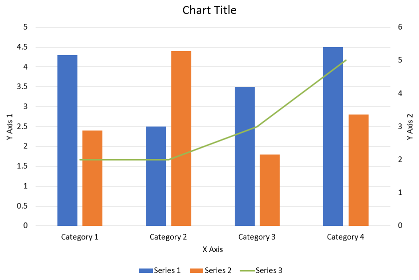
以下の Python コードは、上図のコンビネーション チャートを PowerPoint プレゼンテーションに作成する方法を示しています:
import jpype
import asposeslides

if not jpype.isJVMStarted():
    jpype.startJVM()

from asposeslides.api import AxisPositionType, ChartType, CrossesType, FillType, LegendPositionType, NullableBool, Presentation, SaveFormat

Color = jpype.JClass("java.awt.Color")

def create_combo_chart():
    presentation = Presentation()
    slide = presentation.getSlides().get_Item(0)
    try:
        chart = create_chart_with_first_series(slide)

        add_second_series_to_chart(chart)
        add_third_series_to_chart(chart)

        set_primary_axes_format(chart)
        set_secondary_axes_format(chart)

        presentation.save("combo-chart.pptx", SaveFormat.Pptx)
    finally:
        presentation.dispose()

def create_chart_with_first_series(slide):
    chart = slide.getShapes().addChart(ChartType.ClusteredColumn, 50, 50, 600, 400)

    # チャートのタイトルを設定します。
    chart.setTitle(True)
    chart.getChartTitle().addTextFrameForOverriding("Chart Title")
    chart.getChartTitle().setOverlay(False)
    title_paragraph = chart.getChartTitle().getTextFrameForOverriding().getParagraphs().get_Item(0)
    title_format = title_paragraph.getParagraphFormat().getDefaultPortionFormat()
    title_format.setFontBold(NullableBool.False_)
    title_format.setFontHeight(18.0)

    # チャートの凡例を設定します。
    chart.getLegend().setPosition(LegendPositionType.Bottom)
    chart.getLegend().getTextFormat().getPortionFormat().setFontHeight(12.0)

    # デフォルトで生成されたシリーズとカテゴリを削除します。
    chart.getChartData().getSeries().clear()
    chart.getChartData().getCategories().clear()

    worksheet_index = 0
    workbook = chart.getChartData().getChartDataWorkbook()

    # 新しいカテゴリを追加します。
    cell = workbook.getCell(worksheet_index, 1, 0, "Category 1")
    chart.getChartData().getCategories().add(cell)
    cell = workbook.getCell(worksheet_index, 2, 0, "Category 2")
    chart.getChartData().getCategories().add(cell)
    cell = workbook.getCell(worksheet_index, 3, 0, "Category 3")
    chart.getChartData().getCategories().add(cell)
    cell = workbook.getCell(worksheet_index, 4, 0, "Category 4")
    chart.getChartData().getCategories().add(cell)

    # 最初のシリーズを追加します。
    series_name_cell = workbook.getCell(worksheet_index, 0, 1, "Series 1")
    series = chart.getChartData().getSeries().add(series_name_cell, chart.getType())

    series.getParentSeriesGroup().setOverlap(jpype.JByte(-25))
    series.getParentSeriesGroup().setGapWidth(220)

    cell = workbook.getCell(worksheet_index, 1, 1, 4.3)
    series.getDataPoints().addDataPointForBarSeries(cell)
    cell = workbook.getCell(worksheet_index, 2, 1, 2.5)
    series.getDataPoints().addDataPointForBarSeries(cell)
    cell = workbook.getCell(worksheet_index, 3, 1, 3.5)
    series.getDataPoints().addDataPointForBarSeries(cell)
    cell = workbook.getCell(worksheet_index, 4, 1, 4.5)
    series.getDataPoints().addDataPointForBarSeries(cell)

    return chart

def add_second_series_to_chart(chart):
    workbook = chart.getChartData().getChartDataWorkbook()
    worksheet_index = 0

    series_name_cell = workbook.getCell(worksheet_index, 0, 2, "Series 2")
    series = chart.getChartData().getSeries().add(series_name_cell, ChartType.ClusteredColumn)

    series.getParentSeriesGroup().setOverlap(jpype.JByte(-25))
    series.getParentSeriesGroup().setGapWidth(220)

    cell = workbook.getCell(worksheet_index, 1, 2, 2.4)
    series.getDataPoints().addDataPointForBarSeries(cell)
    cell = workbook.getCell(worksheet_index, 2, 2, 4.4)
    series.getDataPoints().addDataPointForBarSeries(cell)
    cell = workbook.getCell(worksheet_index, 3, 2, 1.8)
    series.getDataPoints().addDataPointForBarSeries(cell)
    cell = workbook.getCell(worksheet_index, 4, 2, 2.8)
    series.getDataPoints().addDataPointForBarSeries(cell)

def add_third_series_to_chart(chart):
    workbook = chart.getChartData().getChartDataWorkbook()
    worksheet_index = 0

    series_name_cell = workbook.getCell(worksheet_index, 0, 3, "Series 3")
    series = chart.getChartData().getSeries().add(series_name_cell, ChartType.Line)

    cell = workbook.getCell(worksheet_index, 1, 3, 2.0)
    series.getDataPoints().addDataPointForLineSeries(cell)
    cell = workbook.getCell(worksheet_index, 2, 3, 2.0)
    series.getDataPoints().addDataPointForLineSeries(cell)
    cell = workbook.getCell(worksheet_index, 3, 3, 3.0)
    series.getDataPoints().addDataPointForLineSeries(cell)
    cell = workbook.getCell(worksheet_index, 4, 3, 5.0)
    series.getDataPoints().addDataPointForLineSeries(cell)

    series.setPlotOnSecondAxis(True)

def set_primary_axes_format(chart):
    # 水平軸を設定します。
    horizontal_axis = chart.getAxes().getHorizontalAxis()
    horizontal_axis.getTextFormat().getPortionFormat().setFontHeight(12.0)
    horizontal_axis.getFormat().getLine().getFillFormat().setFillType(FillType.NoFill)

    set_axis_title(horizontal_axis, "X Axis")

    # 垂直軸を設定します。
    vertical_axis = chart.getAxes().getVerticalAxis()
    vertical_axis.getTextFormat().getPortionFormat().setFontHeight(12.0)
    vertical_axis.getFormat().getLine().getFillFormat().setFillType(FillType.NoFill)

    set_axis_title(vertical_axis, "Y Axis 1")

    # 垂直の主要グリッドラインの色を設定します。
    major_grid_lines_format = vertical_axis.getMajorGridLinesFormat().getLine().getFillFormat()
    major_grid_lines_format.setFillType(FillType.Solid)
    color = Color(217, 217, 217)
    major_grid_lines_format.getSolidFillColor().setColor(color)

def set_secondary_axes_format(chart):
    # セカンダリ水平軸を設定します。
    secondary_horizontal_axis = chart.getAxes().getSecondaryHorizontalAxis()
    secondary_horizontal_axis.setPosition(AxisPositionType.Bottom)
    secondary_horizontal_axis.setCrossType(CrossesType.Maximum)
    secondary_horizontal_axis.setVisible(False)
    secondary_horizontal_axis.getMajorGridLinesFormat().getLine().getFillFormat().setFillType(FillType.NoFill)
    secondary_horizontal_axis.getMinorGridLinesFormat().getLine().getFillFormat().setFillType(FillType.NoFill)

    # セカンダリ垂直軸を設定します。
    secondary_vertical_axis = chart.getAxes().getSecondaryVerticalAxis()
    secondary_vertical_axis.setPosition(AxisPositionType.Right)
    secondary_vertical_axis.getTextFormat().getPortionFormat().setFontHeight(12.0)
    secondary_vertical_axis.getFormat().getLine().getFillFormat().setFillType(FillType.NoFill)
    secondary_vertical_axis.getMajorGridLinesFormat().getLine().getFillFormat().setFillType(FillType.NoFill)
    secondary_vertical_axis.getMinorGridLinesFormat().getLine().getFillFormat().setFillType(FillType.NoFill)

    set_axis_title(secondary_vertical_axis, "Y Axis 2")

def set_axis_title(axis, axis_title):
    axis.setTitle(True)
    axis.getTitle().setOverlay(False)
    title_paragraph = axis.getTitle().addTextFrameForOverriding(axis_title).getParagraphs().get_Item(0)
    title_format = title_paragraph.getParagraphFormat().getDefaultPortionFormat()
    title_format.setFontBold(NullableBool.False_)
    title_format.setFontHeight(12.0)

create_combo_chart()
チャートの更新
- 更新対象のチャートが含まれるプレゼンテーションを表す Presentation クラスのインスタンスを作成します。
- インデックスを使用してスライドへの参照を取得します。
- すべてのシェイプを走査し、目的のチャートを見つけます。
- チャートのデータ ワークシートにアクセスします。
- シリーズの値を変更してチャート データ シリーズを修正します。
- 新しいシリーズを追加し、データを入力します。
- 変更後のプレゼンテーションを PPTX ファイルとして保存します。
この Python コードは、チャートの更新方法を示しています:
import jpype
import asposeslides

if not jpype.isJVMStarted():
    jpime.startJVM()

from asposeslides.api import ChartType, Presentation, SaveFormat

# 更新するチャートが含まれるプレゼンテーションを開く
presentation = Presentation("ExistingChart.pptx")
try:
    # 最初のスライドにアクセス
    slide = presentation.getSlides().get_Item(0)

    # スライドからチャートを取得
    chart = slide.getShapes().get_Item(0)

    # チャート データシートのインデックスを設定
    default_worksheet_index = 0

    # チャート データ ワークシートを取得
    workbook = chart.getChartData().getChartDataWorkbook()

    # チャートのカテゴリ名を変更
    workbook.getCell(default_worksheet_index, 1, 0, "Modified Category 1")
    workbook.getCell(default_worksheet_index, 2, 0, "Modified Category 2")

    # 最初のチャートシリーズを取得
    series = chart.getChartData().getSeries().get_Item(0)

    # ここでシリーズデータを更新
    workbook.getCell(default_worksheet_index, 0, 1, "New_Series1")# シリーズ名を変更
    series.getDataPoints().get_Item(0).getValue().setData(90)
    series.getDataPoints().get_Item(1).getValue().setData(123)
    series.getDataPoints().get_Item(2).getValue().setData(44)

    # 2番目のチャートシリーズを取得
    series = chart.getChartData().getSeries().get_Item(1)

    # ここでシリーズデータを更新
    workbook.getCell(default_worksheet_index, 0, 2, "New_Series2")# シリーズ名を変更
    series.getDataPoints().get_Item(0).getValue().setData(23)
    series.getDataPoints().get_Item(1).getValue().setData(67)
    series.getDataPoints().get_Item(2).getValue().setData(99)

    # ここで新しいシリーズを追加
    cell = workbook.getCell(default_worksheet_index, 0, 3, "Series 3")
    chart.getChartData().getSeries().add(cell, chart.getType())

    # 3番目のチャートシリーズを取得
    series = chart.getChartData().getSeries().get_Item(2)

    # ここでシリーズデータを設定
    cell = workbook.getCell(default_worksheet_index, 1, 3, 20)
    series.getDataPoints().addDataPointForBarSeries(cell)
    cell = workbook.getCell(default_worksheet_index, 2, 3, 50)
    series.getDataPoints().addDataPointForBarSeries(cell)
    cell = workbook.getCell(default_worksheet_index, 3, 3, 30)
    series.getDataPoints().addDataPointForBarSeries(cell)

    chart.setType(ChartType.ClusteredCylinder)

    # チャート付きでプレゼンテーションを保存
    presentation.save("AsposeChartModified_out.pptx", SaveFormat.Pptx)
finally:
    presentation.dispose()
チャートのデータ範囲の設定
チャートのデータ範囲を設定する手順は次のとおりです。
- 対象チャートが含まれるプレゼンテーションを表す Presentation クラスのインスタンスを作成します。
- インデックスを使用してスライドへの参照を取得します。
- すべてのシェイプを走査し、目的のチャートを見つけます。
- チャート データにアクセスし、範囲を設定します。
- 変更後のプレゼンテーションを PPTX ファイルとして保存します。
この Python コードは、チャートのデータ範囲設定方法を示しています:
import jpype
import asposeslides

if not jpype.isJVMStarted():
    jpype.startJVM()

from asposeslides.api import Presentation, SaveFormat

# チャートが含まれるプレゼンテーションを開く
presentation = Presentation("ExistingChart.pptx")
try:
    slide = presentation.getSlides().get_Item(0)
    chart = slide.getShapes().get_Item(0)

    chart.getChartData().setRange("Sheet1!A1:B4")

    presentation.save("SetDataRange_out.pptx", SaveFormat.Pptx)
finally:
    presentation.dispose()
チャートでデフォルト マーカーを使用する
チャートでデフォルト マーカーを使用すると、各シリーズに自動的に異なるマーカー記号が割り当てられます。
この Python コードは、チャートシリーズのマーカーを自動設定する方法を示しています:
import jpype
import asposeslides

if not jpype.isJVMStarted():
    jpype.startJVM()

from asposeslides.api import ChartType, Presentation, SaveFormat

presentation = Presentation()
try:
    slide = presentation.getSlides().get_Item(0)
    chart = slide.getShapes().addChart(ChartType.LineWithMarkers, 10, 10, 400, 400)

    chart.getChartData().getSeries().clear()
    chart.getChartData().getCategories().clear()

    workbook = chart.getChartData().getChartDataWorkbook()
    cell = workbook.getCell(0, 0, 1, "Series 1")
    chart.getChartData().getSeries().add(cell, chart.getType())
    series = chart.getChartData().getSeries().get_Item(0)

    cell = workbook.getCell(0, 1, 0, "C1")
    chart.getChartData().getCategories().add(cell)
    cell = workbook.getCell(0, 1, 1, 24)
    series.getDataPoints().addDataPointForLineSeries(cell)
    cell = workbook.getCell(0, 2, 0, "C2")
    chart.getChartData().getCategories().add(cell)
    cell = workbook.getCell(0, 2, 1, 23)
    series.getDataPoints().addDataPointForLineSeries(cell)
    cell = workbook.getCell(0, 3, 0, "C3")
    chart.getChartData().getCategories().add(cell)
    cell = workbook.getCell(0, 3, 1, -10)
    series.getDataPoints().addDataPointForLineSeries(cell)
    cell = workbook.getCell(0, 4, 0, "C4")
    chart.getChartData().getCategories().add(cell)
    cell = workbook.getCell(0, 4, 1, None)
    series.getDataPoints().addDataPointForLineSeries(cell)

    cell = workbook.getCell(0, 0, 2, "Series 2")
    chart.getChartData().getSeries().add(cell, chart.getType())
    # 2 番目のチャートシリーズを取得します
    second_series = chart.getChartData().getSeries().get_Item(1)

    # シリーズ データを入力します
    cell = workbook.getCell(0, 1, 2, 30)
    second_series.getDataPoints().addDataPointForLineSeries(cell)
    cell = workbook.getCell(0, 2, 2, 10)
    second_series.getDataPoints().addDataPointForLineSeries(cell)
    cell = workbook.getCell(0, 3, 2, 60)
    second_series.getDataPoints().addDataPointForLineSeries(cell)
    cell = workbook.getCell(0, 4, 2, 40)
    second_series.getDataPoints().addDataPointForLineSeries(cell)

    chart.setLegend(True)
    chart.getLegend().setOverlay(False)

    presentation.save("DefaultMarkersInChart.pptx", SaveFormat.Pptx)
finally:
    presentation.dispose()
FAQ
Aspose.Slides がサポートするチャートタイプは何ですか?
Aspose.Slides は、棒、折れ線、円、面、散布図、ヒストグラム、レーダーなど、幅広い chart types をサポートしています。この柔軟性により、データ可視化の要件に最適なチャートタイプを選択できます。
スライドに新しいチャートを追加するにはどうすればよいですか?
チャートを追加するには、まず Presentation クラスのインスタンスを作成し、インデックスで目的のスライドを取得し、チャートタイプと初期データを指定してチャート追加メソッドを呼び出します。このプロセスにより、チャートが直接プレゼンテーションに統合されます。
チャートに表示されるデータを更新するにはどうすればよいですか?
チャートのデータ ワークブック (ChartDataWorkbook) にアクセスし、既定のシリーズとカテゴリをクリアした上で、独自のデータを追加することで、チャートのデータを更新できます。これにより、最新データを反映させたチャートにリフレッシュできます。
チャートの外観をカスタマイズすることは可能ですか?
はい、Aspose.Slides は豊富なカスタマイズ オプションを提供します。色、フォント、ラベル、凡例、その他の formatting elements を変更して、特定のデザイン要件に合わせてチャートの外観を調整できます。