
Python में PowerPoint प्रस्तुति चार्ट बनाएं या अपडेट करें
अवलोकन
यह लेख Aspose.Slides का उपयोग करके चार्ट बनाने और कस्टमाइज़ करने के बारे में एक व्यापक मार्गदर्शिका प्रदान करता है। आप सीखेंगे कि प्रोग्रामेटिक रूप से स्लाइड में चार्ट कैसे जोड़ा जाए, उसे डेटा से कैसे भरें, और विभिन्न फ़ॉर्मेटिंग विकल्पों को कैसे लागू करके अपने विशिष्ट डिजाइन आवश्यकताओं के अनुरूप बनायें। लेख के दौरान, विस्तृत कोड उदाहरण प्रत्येक चरण को दर्शाते हैं, प्रस्तुति और चार्ट ऑब्जेक्ट को इनिशियलाइज़ करने से लेकर सीरीज़, एक्सिस और लेजेंड को कॉन्फ़िगर करने तक। इस मार्गदर्शिका का पालन करके, आप अपने अनुप्रयोगों में डायनेमिक चार्ट जेनरेशन को एकीकृत करने की ठोस समझ प्राप्त करेंगे, जिससे डेटा‑ड्रिवन प्रस्तुतियों को बनाने की प्रक्रिया सहज हो जाएगी।
चार्ट बनाना
चार्ट लोगों को डेटा को शीघ्रता से विज़ुअलाइज़ करने और ऐसे अंतर्दृष्टि प्राप्त करने में मदद करते हैं जो टेबल या स्प्रेडशीट से तुरंत स्पष्ट नहीं होते।
चार्ट क्यों बनाएं?
- एक प्रस्तुति में एक ही स्लाइड पर बड़ी मात्रा में डेटा को संक्षिप्त, संकुचित या सारांशित करना
- डेटा में पैटर्न और रुझान उजागर करना
- समय के साथ या किसी विशिष्ट माप इकाई के संदर्भ में डेटा की दिशा और प्रवाह का अनुमान लगाना
- आउटलायर, विचलन, त्रुटियों, बेतुके डेटा आदि की पहचान करना
- जटिल डेटा को संप्रेषित या प्रस्तुत करना
PowerPoint में, आप Insert फ़ंक्शन के माध्यम से चार्ट बना सकते हैं, जो कई प्रकार के चार्ट डिजाइन करने के लिए टेम्पलेट प्रदान करता है। Aspose.Slides का उपयोग करके, आप सामान्य चार्ट (प्रसिद्ध चार्ट प्रकारों पर आधारित) और कस्टम चार्ट दोनों बना सकते हैं।
ध्यान दें
चार्ट बनाने के लिए, ChartType क्लास का उपयोग करें। इस क्लास के फील्ड विभिन्न चार्ट प्रकारों के अनुरूप होते हैं।क्लस्टर्ड कॉलम चार्ट बनाएं
यह अनुभाग Aspose.Slides का उपयोग करके क्लस्टर्ड कॉलम चार्ट बनाने की विधि समझाता है। आप प्रस्तुति को इनिशियलाइज़ करना, चार्ट जोड़ना, और उसके तत्वों जैसे शीर्षक, डेटा, श्रृंखला, श्रेणियां और स्टाइल को कस्टमाइज़ करना सीखेंगे। नीचे दिए गए चरणों का पालन करके देखें कि एक सामान्य क्लस्टर्ड कॉलम चार्ट कैसे जेनरेट किया जाता है:
- Presentation क्लास का एक उदाहरण बनाएं।
- इंडेक्स का उपयोग करके स्लाइड का रेफ़रेंस प्राप्त करें।
- कुछ डेटा के साथ एक चार्ट जोड़ें और
ChartType.ClusteredColumnप्रकार निर्दिष्ट करें। - चार्ट में एक शीर्षक जोड़ें।
- चार्ट के डेटा वर्कशीट तक पहुंचें।
- सभी डिफ़ॉल्ट श्रृंखला और श्रेणियां साफ़ करें।
- नई श्रृंखला और श्रेणियां जोड़ें।
- चार्ट श्रृंखला के लिए नया चार्ट डेटा जोड़ें।
- चार्ट श्रृंखला पर फ़िल रंग लागू करें।
- चार्ट श्रृंखला में लेबल जोड़ें।
- संशोधित प्रस्तुति को PPTX फ़ाइल के रूप में सहेजें।
import jpype
import asposeslides

if not jpype.isJVMStarted():
    jpype.startJVM()

from asposeslides.api import ChartType, FillType, NullableBool, Presentation, SaveFormat

Color = jpype.JClass("java.awt.Color")

    # PPTX फ़ाइल का प्रतिनिधित्व करने वाली प्रस्तुति क्लास का इंस्टैंस बनाता है।
    presentation = Presentation()
    try:
        # पहली स्लाइड तक पहुँचता है
        slide = presentation.getSlides().get_Item(0)

        # डिफ़ॉल्ट डेटा के साथ एक चार्ट जोड़ता है
        chart = slide.getShapes().addChart(ChartType.ClusteredColumn, 0, 0, 500, 500)

        # चार्ट शीर्षक सेट करता है
        chart.getChartTitle().addTextFrameForOverriding("Sample Title")
        chart.getChartTitle().getTextFrameForOverriding().getTextFrameFormat().setCenterText(NullableBool.True_)
        chart.getChartTitle().setHeight(20)
        chart.setTitle(True)

        # चार्ट डेटा शीट के लिए इंडेक्स सेट करता है
        default_worksheet_index = 0

        # चार्ट डेटा वर्कशीट प्राप्त करता है
        workbook = chart.getChartData().getChartDataWorkbook()

        # डिफ़ॉल्ट उत्पन्न श्रृंखला और श्रेणियां हटाता है
        chart.getChartData().getSeries().clear()
        chart.getChartData().getCategories().clear()

        # नई श्रृंखला जोड़ता है
        cell = workbook.getCell(default_worksheet_index, 0, 1, "Series 1")
        chart.getChartData().getSeries().add(cell,chart.getType())
        cell = workbook.getCell(default_worksheet_index, 0, 2, "Series 2")
        chart.getChartData().getSeries().add(cell,chart.getType())

        # नई श्रेणियां जोड़ता है
        cell = workbook.getCell(default_worksheet_index, 1, 0, "Category 1")
        chart.getChartData().getCategories().add(cell)
        cell = workbook.getCell(default_worksheet_index, 2, 0, "Category 2")
        chart.getChartData().getCategories().add(cell)
        cell = workbook.getCell(default_worksheet_index, 3, 0, "Category 3")
        chart.getChartData().getCategories().add(cell)

        # पहली चार्ट श्रृंखला लेता है
        series = chart.getChartData().getSeries().get_Item(0)

        # अब श्रृंखला डेटा भरता है
        cell = workbook.getCell(default_worksheet_index, 1, 1, 20)
        series.getDataPoints().addDataPointForBarSeries(cell)
        cell = workbook.getCell(default_worksheet_index, 2, 1, 50)
        series.getDataPoints().addDataPointForBarSeries(cell)
        cell = workbook.getCell(default_worksheet_index, 3, 1, 30)
        series.getDataPoints().addDataPointForBarSeries(cell)

        # श्रृंखला के लिए फ़िल रंग सेट करता है
        series.getFormat().getFill().setFillType(FillType.Solid)
        series.getFormat().getFill().getSolidFillColor().setColor(Color.RED)

        # दूसरी चार्ट श्रृंखला लेता है
        series = chart.getChartData().getSeries().get_Item(1)

        # श्रृंखला डेटा भरता है
        cell = workbook.getCell(default_worksheet_index, 1, 2, 30)
        series.getDataPoints().addDataPointForBarSeries(cell)
        cell = workbook.getCell(default_worksheet_index, 2, 2, 10)
        series.getDataPoints().addDataPointForBarSeries(cell)
        cell = workbook.getCell(default_worksheet_index, 3, 2, 60)
        series.getDataPoints().addDataPointForBarSeries(cell)

        # श्रृंखला के लिए फ़िल रंग सेट करता है
        series.getFormat().getFill().setFillType(FillType.Solid)
        series.getFormat().getFill().getSolidFillColor().setColor(Color.GREEN)

        #नए श्रृंखला के लिए प्रत्येक श्रेणी के लिए कस्टम लेबल बनाता है
        # पहले लेबल को श्रेणी नाम दिखाने के लिए सेट करता है
        label = series.getDataPoints().get_Item(0).getLabel()
        label.getDataLabelFormat().setShowCategoryName(True)

        label = series.getDataPoints().get_Item(1).getLabel()
        label.getDataLabelFormat().setShowSeriesName(True)

        # तीसरे लेबल के लिए मान दिखाता है
        label = series.getDataPoints().get_Item(2).getLabel()
        label.getDataLabelFormat().setShowValue(True)
        label.getDataLabelFormat().setShowSeriesName(True)
        label.getDataLabelFormat().setSeparator("/")

        # Saves the presentation with chart
        presentation.save("output.pptx", SaveFormat.Pptx)
    finally:
        presentation.dispose()
स्कैटर चार्ट बनाएं
स्कैटर चार्ट (जिसे स्कैटर प्लॉट या x‑y ग्राफ़ भी कहा जाता है) अक्सर दो चर के बीच पैटर्न जांचने या सहसम्बंध दिखाने के लिए उपयोग किए जाते हैं।
स्कैटर चार्ट का उपयोग तब करें जब:
- आपके पास युग्मित संख्यात्मक डेटा हो
- दो चर हों जो आपस में अच्छी तरह मेल खाते हों
- आप यह निर्धारित करना चाहते हों कि दो चर संबंधित हैं या नहीं
- आपके पास एक स्वतंत्र चर हो जिसके कई मान हों एक आश्रित चर के लिए
- Create Clustered Column Charts में दिए गए चरणों का पालन करें।
- तीसरे चरण के लिए, कुछ डेटा के साथ एक चार्ट जोड़ें और अपने चार्ट प्रकार को निम्नलिखित में से किसी एक के रूप में निर्दिष्ट करें:
- ChartType.ScatterWithMarkers - एक स्कैटर चार्ट का प्रतिनिधित्व करता है।
- ChartType.ScatterWithSmoothLinesAndMarkers - डेटा मार्कर वाले वक्रों से जुड़े एक स्कैटर चार्ट का प्रतिनिधित्व करता है।
- ChartType.ScatterWithSmoothLines - डेटा मार्कर के बिना वक्रों से जुड़े एक स्कैटर चार्ट का प्रतिनिधित्व करता है।
- ChartType.ScatterWithStraightLinesAndMarkers - डेटा मार्कर वाले रेखाओं से जुड़े एक स्कैटर चार्ट का प्रतिनिधित्व करता है।
- ChartType.ScatterWithStraightLines - डेटा मार्कर के बिना रेखाओं से जुड़े एक स्कैटर चार्ट का प्रतिनिधित्व करता है।
import jpype
import asposeslides

if not jpype.isJVMStarted():
    jpype.startJVM()

from asposeslides.api import ChartType, MarkerStyleType, Presentation, SaveFormat

    # PPTX फ़ाइल का प्रतिनिधित्व करने वाली प्रस्तुति क्लास का इंस्टैंस बनाता है।
    presentation = Presentation()
    try:
        # पहली स्लाइड तक पहुँचता है
        slide = presentation.getSlides().get_Item(0)

        # डिफ़ॉल्ट चार्ट बनाता है
        chart = slide.getShapes().addChart(ChartType.ScatterWithSmoothLines, 0, 0, 400, 400)

        # डिफ़ॉल्ट चार्ट डेटा वर्कशीट इंडेक्स प्राप्त करता है
        default_worksheet_index = 0

        # चार्ट डेटा वर्कशीट प्राप्त करता है
        workbook = chart.getChartData().getChartDataWorkbook()

        # डेमो श्रृंखला हटाता है
        chart.getChartData().getSeries().clear()

        # नई श्रृंखला जोड़ता है
        cell = workbook.getCell(default_worksheet_index, 1, 1, "Series 1")
        chart.getChartData().getSeries().add(cell, chart.getType())
        cell = workbook.getCell(default_worksheet_index, 1, 3, "Series 2")
        chart.getChartData().getSeries().add(cell, chart.getType())

        # पहली चार्ट श्रृंखला लेता है
        series = chart.getChartData().getSeries().get_Item(0)

        # श्रृंखला में नया बिंदु (1:3) जोड़ता है
        x_cell = workbook.getCell(default_worksheet_index, 2, 1, 1)
        y_cell = workbook.getCell(default_worksheet_index, 2, 2, 3)
        series.getDataPoints().addDataPointForScatterSeries(x_cell, y_cell)

        # नया बिंदु (2:10) जोड़ता है
        x_cell = workbook.getCell(default_worksheet_index, 3, 1, 2)
        y_cell = workbook.getCell(default_worksheet_index, 3, 2, 10)
        series.getDataPoints().addDataPointForScatterSeries(x_cell, y_cell)

        # श्रृंखला प्रकार बदलता है
        series.setType(ChartType.ScatterWithStraightLinesAndMarkers)

        # चार्ट श्रृंखला मार्कर बदलता है
        series.getMarker().setSize(10)
        series.getMarker().setSymbol(MarkerStyleType.Star)

        # दूसरी चार्ट श्रृंखला लेता है
        series = chart.getChartData().getSeries().get_Item(1)

        # वहाँ नया बिंदु (5:2) जोड़ता है
        x_cell = workbook.getCell(default_worksheet_index, 2, 3, 5)
        y_cell = workbook.getCell(default_worksheet_index, 2, 4, 2)
        series.getDataPoints().addDataPointForScatterSeries(x_cell, y_cell)

        # नया बिंदु (3:1) जोड़ता है
        x_cell = workbook.getCell(default_worksheet_index, 3, 3, 3)
        y_cell = workbook.getCell(default_worksheet_index, 3, 4, 1)
        series.getDataPoints().addDataPointForScatterSeries(x_cell, y_cell)

        # नया बिंदु (2:2) जोड़ता है
        x_cell = workbook.getCell(default_worksheet_index, 4, 3, 2)
        y_cell = workbook.getCell(default_worksheet_index, 4, 4, 2)
        series.getDataPoints().addDataPointForScatterSeries(x_cell, y_cell)

        # नया बिंदु (5:1) जोड़ता है
        x_cell = workbook.getCell(default_worksheet_index, 5, 3, 5)
        y_cell = workbook.getCell(default_worksheet_index, 5, 4, 1)
        series.getDataPoints().addDataPointForScatterSeries(x_cell, y_cell)

        # चार्ट श्रृंखला मार्कर बदलता है
        series.getMarker().setSize(10)
        series.getMarker().setSymbol(MarkerStyleType.Circle)

        presentation.save("AsposeChart_out.pptx", SaveFormat.Pptx)
    finally:
        presentation.dispose()
पाई चार्ट बनाएं
पाई चार्ट डेटा में भाग‑से‑पूर्ण संबंध दिखाने के लिए सबसे उपयुक्त होते हैं, विशेषकर जब डेटा में श्रेणीबद्ध लेबल और संख्यात्मक मान हों। हालांकि, यदि आपके डेटा में बहुत सारी भागें या लेबल हों, तो आप बार चार्ट का उपयोग करने पर विचार कर सकते हैं।
- Presentation क्लास का एक उदाहरण बनाएं।
- इंडेक्स का उपयोग करके स्लाइड का रेफ़रेंस प्राप्त करें।
- डिफ़ॉल्ट डेटा के साथ एक चार्ट जोड़ें और ChartType.Pie प्रकार निर्दिष्ट करें।
- चार्ट डेटा वर्कबुक ChartDataWorkbook तक पहुंचें।
- डिफ़ॉल्ट श्रृंखला और श्रेणियां साफ़ करें।
- नई श्रृंखला और श्रेणियां जोड़ें।
- चार्ट श्रृंखला के लिए नया चार्ट डेटा जोड़ें।
- पाई चार्ट के सेक्टरों के लिए कस्टम रंग लागू करके नए पॉइंट जोड़ें।
- श्रृंखला के लिए लेबल सेट करें।
- श्रृंखला लेबल के लिए लीडर लाइन्स सक्षम करें।
- पाई चार्ट सेक्टरों के लिए रोटेशन एंगल सेट करें।
- संशोधित प्रस्तुति को PPTX फ़ाइल के रूप में सहेजें।
import jpype
import asposeslides

if not jpype.isJVMStarted():
    jpype.startJVM()

from asposeslides.api import ChartType, FillType, LineDashStyle, LineStyle, NullableBool, Presentation, SaveFormat

Color = jpype.JClass("java.awt.Color")

    # PPTX फ़ाइल का प्रतिनिधित्व करने वाली प्रस्तुति क्लास का इंस्टैंस बनाता है।
    presentation = Presentation()
    try:
        # पहली स्लाइड तक पहुँचता है
        slide = presentation.getSlides().get_Item(0)

        # डिफ़ॉल्ट डेटा के साथ एक चार्ट जोड़ता है
        chart = slide.getShapes().addChart(ChartType.Pie, 100, 100, 400, 400)

        # चार्ट शीर्षक सेट करता है
        chart.getChartTitle().addTextFrameForOverriding("Sample Title")
        chart.getChartTitle().getTextFrameForOverriding().getTextFrameFormat().setCenterText(NullableBool.True_)
        chart.getChartTitle().setHeight(20)
        chart.setTitle(True)

        # चार्ट डेटा शीट के लिए इंडेक्स सेट करता है
        default_worksheet_index = 0

        # चार्ट डेटा वर्कशीट प्राप्त करता है
        workbook = chart.getChartData().getChartDataWorkbook()

        # डिफ़ॉल्ट उत्पन्न श्रृंखला और श्रेणियां हटाता है
        chart.getChartData().getSeries().clear()
        chart.getChartData().getCategories().clear()

        # नई श्रेणियां जोड़ता है
        cell = workbook.getCell(0, 1, 0, "First Qtr")
        chart.getChartData().getCategories().add(cell)
        cell = workbook.getCell(0, 2, 0, "2nd Qtr")
        chart.getChartData().getCategories().add(cell)
        cell = workbook.getCell(0, 3, 0, "3rd Qtr")
        chart.getChartData().getCategories().add(cell)

        # नई श्रृंखला जोड़ता है
        cell = workbook.getCell(0, 0, 1, "Series 1")
        series = chart.getChartData().getSeries().add(cell, chart.getType())

        # सीरीज़ डेटा भरता है
        cell = workbook.getCell(default_worksheet_index, 1, 1, 20)
        series.getDataPoints().addDataPointForPieSeries(cell)
        cell = workbook.getCell(default_worksheet_index, 2, 1, 50)
        series.getDataPoints().addDataPointForPieSeries(cell)
        cell = workbook.getCell(default_worksheet_index, 3, 1, 30)
        series.getDataPoints().addDataPointForPieSeries(cell)

        # नए पॉइंट जोड़ता है और सेक्टर रंग सेट करता है
        chart.getChartData().getSeriesGroups().get_Item(0).setColorVaried(True)

        point = series.getDataPoints().get_Item(0)
        point.getFormat().getFill().setFillType(FillType.Solid)
        point.getFormat().getFill().getSolidFillColor().setColor(Color.CYAN)

        # सेक्टर बॉर्डर सेट करता है
        point.getFormat().getLine().getFillFormat().setFillType(FillType.Solid)
        point.getFormat().getLine().getFillFormat().getSolidFillColor().setColor(Color.GRAY)
        point.getFormat().getLine().setWidth(3.0)
        point.getFormat().getLine().setStyle(LineStyle.ThinThick)
        point.getFormat().getLine().setDashStyle(LineDashStyle.DashDot)

        second_point = series.getDataPoints().get_Item(1)
        second_point.getFormat().getFill().setFillType(FillType.Solid)
        second_point.getFormat().getFill().getSolidFillColor().setColor(Color.ORANGE)

        # सेक्टर बॉर्डर सेट करता है
        second_point.getFormat().getLine().getFillFormat().setFillType(FillType.Solid)
        second_point.getFormat().getLine().getFillFormat().getSolidFillColor().setColor(Color.BLUE)
        second_point.getFormat().getLine().setWidth(3.0)
        second_point.getFormat().getLine().setStyle(LineStyle.Single)
        second_point.getFormat().getLine().setDashStyle(LineDashStyle.LargeDashDot)

        third_point = series.getDataPoints().get_Item(2)
        third_point.getFormat().getFill().setFillType(FillType.Solid)
        third_point.getFormat().getFill().getSolidFillColor().setColor(Color.YELLOW)

        # सेक्टर बॉर्डर सेट करता है
        third_point.getFormat().getLine().getFillFormat().setFillType(FillType.Solid)
        third_point.getFormat().getLine().getFillFormat().getSolidFillColor().setColor(Color.RED)
        third_point.getFormat().getLine().setWidth(2.0)
        third_point.getFormat().getLine().setStyle(LineStyle.ThinThin)
        third_point.getFormat().getLine().setDashStyle(LineDashStyle.LargeDashDotDot)

        # नई श्रृंखला के प्रत्येक श्रेणी के लिए कस्टम लेबल बनाता है
        first_label = series.getDataPoints().get_Item(0).getLabel()
        first_label.getDataLabelFormat().setShowValue(True)

        second_label = series.getDataPoints().get_Item(1).getLabel()
        second_label.getDataLabelFormat().setShowValue(True)
        second_label.getDataLabelFormat().setShowLegendKey(True)
        second_label.getDataLabelFormat().setShowPercentage(True)

        third_label = series.getDataPoints().get_Item(2).getLabel()
        third_label.getDataLabelFormat().setShowSeriesName(True)
        third_label.getDataLabelFormat().setShowPercentage(True)

        # चार्ट के लिए लीडर लाइन्स दिखाता है
        series.getLabels().getDefaultDataLabelFormat().setShowLeaderLines(True)

        # पाई चार्ट सेक्टरों के लिए रोटेशन एंगल सेट करता है
        chart.getChartData().getSeriesGroups().get_Item(0).setFirstSliceAngle(180)

        # चार्ट के साथ प्रस्तुति को सहेजता है
        presentation.save("PieChart_out.pptx", SaveFormat.Pptx)
    finally:
        presentation.dispose()
लाइन चार्ट बनाएं
लाइन चार्ट (जिसे लाइन ग्राफ़ भी कहा जाता है) उन स्थितियों में सबसे उपयुक्त होते हैं जहाँ आप समय के साथ मान में परिवर्तन दिखाना चाहते हैं। लाइन चार्ट का उपयोग करके आप बड़ी मात्रा में डेटा की तुलना एक साथ कर सकते हैं, समय के साथ परिवर्तन और रुझान ट्रैक कर सकते हैं, डेटा श्रृंखला में विसंगतियों को हाइलाइट कर सकते हैं, आदि।
- Presentation क्लास का एक उदाहरण बनाएं।
- इंडेक्स का उपयोग करके स्लाइड का रेफ़रेंस प्राप्त करें।
- डिफ़ॉल्ट डेटा के साथ एक चार्ट जोड़ें और ChartType.Line प्रकार निर्दिष्ट करें।
- संशोधित प्रस्तुति को PPTX फ़ाइल के रूप में सहेजें।
import jpype
import asposeslides

if not jpype.isJVMStarted():
    jpype.startJVM()

from asposeslides.api import ChartType, Presentation, SaveFormat

presentation = Presentation()
try:
    line_chart = presentation.getSlides().get_Item(0).getShapes().addChart(ChartType.Line, 10, 50, 600, 350)

    presentation.save("line_chart.pptx", SaveFormat.Pptx)
finally:
    presentation.dispose()
डिफ़ॉल्ट रूप से, लाइन चार्ट में पॉइंट्स को सीधी सतत रेखाओं से जोड़ा जाता है। यदि आप पॉइंट्स को डैश्ड रेखा से जोड़ना चाहते हैं, तो आप अपनी पसंदीदा डैश टाइप इस प्रकार निर्दिष्ट कर सकते हैं:
import jpype
import asposeslides

if not jpype.isJVMStarted():
    jpype.startJVM()

from asposeslides.api import ChartType, LineDashStyle, Presentation, SaveFormat

presentation = Presentation()
try:
    line_chart = presentation.getSlides().get_Item(0).getShapes().addChart(ChartType.Line, 10, 50, 600, 350)

    for series in line_chart.getChartData().getSeries():
        series.getFormat().getLine().setDashStyle(LineDashStyle.Dash)

    presentation.save("line_chart.pptx", SaveFormat.Pptx)
finally:
    presentation.dispose()
ट्री मैप चार्ट बनाएं
ट्री मैप चार्ट बिक्री डेटा के लिए सबसे उपयुक्त होते हैं जब आप डेटा श्रेणियों के सापेक्ष आकार दिखाना चाहते हैं और प्रत्येक श्रेणी में बड़े योगदानकर्ता आइटमों पर जल्दी से ध्यान आकर्षित करना चाहते हैं।
- Presentation क्लास का एक उदाहरण बनाएं।
- इंडेक्स का उपयोग करके स्लाइड का रेफ़रेंस प्राप्त करें।
- डिफ़ॉल्ट डेटा के साथ एक चार्ट जोड़ें और ChartType.Treemap प्रकार निर्दिष्ट करें।
- चार्ट डेटा वर्कबुक ChartDataWorkbook तक पहुंचें।
- डिफ़ॉल्ट श्रृंखला और श्रेणियां साफ़ करें।
- नई श्रृंखला और श्रेणियां जोड़ें।
- चार्ट श्रृंखला के लिए नया चार्ट डेटा जोड़ें।
- संशोधित प्रस्तुति को PPTX फ़ाइल के रूप में सहेजें।
import jpype
import asposeslides

if not jpype.isJVMStarted():
    jpype.startJVM()

from asposeslides.api import ChartType, ParentLabelLayoutType, Presentation, SaveFormat

presentation = Presentation()
try:
    chart = presentation.getSlides().get_Item(0).getShapes().addChart(ChartType.Treemap, 50, 50, 500, 400)
    chart.getChartData().getCategories().clear()
    chart.getChartData().getSeries().clear()

    workbook = chart.getChartData().getChartDataWorkbook()
    workbook.clear(0)

    #शाखा 1
    cell = workbook.getCell(0, "C1", "Leaf1")
    leaf = chart.getChartData().getCategories().add(cell)
    leaf.getGroupingLevels().setGroupingItem(1, "Stem1")
    leaf.getGroupingLevels().setGroupingItem(2, "Branch1")

    cell = workbook.getCell(0, "C2", "Leaf2")
    chart.getChartData().getCategories().add(cell)

    cell = workbook.getCell(0, "C3", "Leaf3")
    leaf = chart.getChartData().getCategories().add(cell)
    leaf.getGroupingLevels().setGroupingItem(1, "Stem2")

    cell = workbook.getCell(0, "C4", "Leaf4")
    chart.getChartData().getCategories().add(cell)

    #शाखा 2
    cell = workbook.getCell(0, "C5", "Leaf5")
    leaf = chart.getChartData().getCategories().add(cell)
    leaf.getGroupingLevels().setGroupingItem(1, "Stem3")
    leaf.getGroupingLevels().setGroupingItem(2, "Branch2")

    cell = workbook.getCell(0, "C6", "Leaf6")
    chart.getChartData().getCategories().add(cell)

    cell = workbook.getCell(0, "C7", "Leaf7")
    leaf = chart.getChartData().getCategories().add(cell)
    leaf.getGroupingLevels().setGroupingItem(1, "Stem4")

    cell = workbook.getCell(0, "C8", "Leaf8")
    chart.getChartData().getCategories().add(cell)

    series = chart.getChartData().getSeries().add(ChartType.Treemap)
    series.getLabels().getDefaultDataLabelFormat().setShowCategoryName(True)
    cell = workbook.getCell(0, "D1", 4)
    series.getDataPoints().addDataPointForTreemapSeries(cell)
    cell = workbook.getCell(0, "D2", 5)
    series.getDataPoints().addDataPointForTreemapSeries(cell)
    cell = workbook.getCell(0, "D3", 3)
    series.getDataPoints().addDataPointForTreemapSeries(cell)
    cell = workbook.getCell(0, "D4", 6)
    series.getDataPoints().addDataPointForTreemapSeries(cell)
    cell = workbook.getCell(0, "D5", 9)
    series.getDataPoints().addDataPointForTreemapSeries(cell)
    cell = workbook.getCell(0, "D6", 9)
    series.getDataPoints().addDataPointForTreemapSeries(cell)
    cell = workbook.getCell(0, "D7", 4)
    series.getDataPoints().addDataPointForTreemapSeries(cell)
    cell = workbook.getCell(0, "D8", 3)
    series.getDataPoints().addDataPointForTreemapSeries(cell)

    series.setParentLabelLayout(ParentLabelLayoutType.Overlapping)

    presentation.save("Treemap.pptx", SaveFormat.Pptx)
finally:
    presentation.dispose()
स्टॉक चार्ट बनाएं
- Presentation क्लास का एक उदाहरण बनाएं।
- इंडेक्स का उपयोग करके स्लाइड का रेफ़रेंस प्राप्त करें।
- डिफ़ॉल्ट डेटा के साथ एक चार्ट जोड़ें और ChartType.OpenHighLowClose प्रकार निर्दिष्ट करें।
- चार्ट डेटा वर्कबुक ChartDataWorkbook तक पहुंचें।
- डिफ़ॉल्ट श्रृंखला और श्रेणियां साफ़ करें।
- नई श्रृंखला और श्रेणियां जोड़ें।
- चार्ट श्रृंखला के लिए नया चार्ट डेटा जोड़ें।
- हाई‑लो लाइनों के फ़ॉर्मेट को निर्दिष्ट करें।
- संशोधित प्रस्तुति को PPTX फ़ाइल के रूप में सहेजें।
import jpype
import asposeslides

if not jpype.isJVMStarted():
    jpype.startJVM()

from asposeslides.api import ChartType, FillType, Presentation, SaveFormat

presentation = Presentation()
try:
    chart = presentation.getSlides().get_Item(0).getShapes().addChart(ChartType.OpenHighLowClose, 50, 50, 600, 400, False)

    chart.getChartData().getSeries().clear()
    chart.getChartData().getCategories().clear()

    workbook = chart.getChartData().getChartDataWorkbook()

    cell = workbook.getCell(0, 1, 0, "A")
    chart.getChartData().getCategories().add(cell)
    cell = workbook.getCell(0, 2, 0, "B")
    chart.getChartData().getCategories().add(cell)
    cell = workbook.getCell(0, 3, 0, "C")
    chart.getChartData().getCategories().add(cell)

    cell = workbook.getCell(0, 0, 1, "Open")
    chart.getChartData().getSeries().add(cell, chart.getType())
    cell = workbook.getCell(0, 0, 2, "High")
    chart.getChartData().getSeries().add(cell, chart.getType())
    cell = workbook.getCell(0, 0, 3, "Low")
    chart.getChartData().getSeries().add(cell, chart.getType())
    cell = workbook.getCell(0, 0, 4, "Close")
    chart.getChartData().getSeries().add(cell, chart.getType())

    series = chart.getChartData().getSeries().get_Item(0)

    cell = workbook.getCell(0, 1, 1, 72)
    series.getDataPoints().addDataPointForStockSeries(cell)
    cell = workbook.getCell(0, 2, 1, 25)
    series.getDataPoints().addDataPointForStockSeries(cell)
    cell = workbook.getCell(0, 3, 1, 38)
    series.getDataPoints().addDataPointForStockSeries(cell)

    series = chart.getChartData().getSeries().get_Item(1)
    cell = workbook.getCell(0, 1, 2, 172)
    series.getDataPoints().addDataPointForStockSeries(cell)
    cell = workbook.getCell(0, 2, 2, 57)
    series.getDataPoints().addDataPointForStockSeries(cell)
    cell = workbook.getCell(0, 3, 2, 57)
    series.getDataPoints().addDataPointForStockSeries(cell)

    series = chart.getChartData().getSeries().get_Item(2)
    cell = workbook.getCell(0, 1, 3, 12)
    series.getDataPoints().addDataPointForStockSeries(cell)
    cell = workbook.getCell(0, 2, 3, 12)
    series.getDataPoints().addDataPointForStockSeries(cell)
    cell = workbook.getCell(0, 3, 3, 13)
    series.getDataPoints().addDataPointForStockSeries(cell)

    series = chart.getChartData().getSeries().get_Item(3)
    cell = workbook.getCell(0, 1, 4, 25)
    series.getDataPoints().addDataPointForStockSeries(cell)
    cell = workbook.getCell(0, 2, 4, 38)
    series.getDataPoints().addDataPointForStockSeries(cell)
    cell = workbook.getCell(0, 3, 4, 50)
    series.getDataPoints().addDataPointForStockSeries(cell)

    chart.getChartData().getSeriesGroups().get_Item(0).getUpDownBars().setUpDownBars(True)
    chart.getChartData().getSeriesGroups().get_Item(0).getHiLowLinesFormat().getLine().getFillFormat().setFillType(FillType.Solid)

    for series in chart.getChartData().getSeries():
        series.getFormat().getLine().getFillFormat().setFillType(FillType.NoFill)

    presentation.save("output.pptx", SaveFormat.Pptx)
finally:
    presentation.dispose()
बॉक्स एंड विस्कर चार्ट बनाएं
- Presentation क्लास का एक उदाहरण बनाएं।
- इंडेक्स का उपयोग करके स्लाइड का रेफ़रेंस प्राप्त करें।
- डिफ़ॉल्ट डेटा के साथ एक चार्ट जोड़ें और ChartType.BoxAndWhisker प्रकार निर्दिष्ट करें।
- चार्ट डेटा वर्कबुक ChartDataWorkbook तक पहुंचें।
- डिफ़ॉल्ट श्रृंखला और श्रेणियां साफ़ करें।
- नई श्रृंखला और श्रेणियां जोड़ें।
- चार्ट श्रृंखला के लिए नया चार्ट डेटा जोड़ें।
- संशोधित प्रस्तुति को PPTX फ़ाइल के रूप में सहेजें।
import jpype
import asposeslides

if not jpype.isJVMStarted():
    jpype.startJVM()

from asposeslides.api import ChartType, Presentation, QuartileMethodType, SaveFormat

presentation = Presentation()
try:
    chart = presentation.getSlides().get_Item(0).getShapes().addChart(ChartType.BoxAndWhisker, 50, 50, 500, 400)
    chart.getChartData().getCategories().clear()
    chart.getChartData().getSeries().clear()

    workbook = chart.getChartData().getChartDataWorkbook()
    workbook.clear(0)

    cell = workbook.getCell(0, "A1", "Category 1")
    chart.getChartData().getCategories().add(cell)
    cell = workbook.getCell(0, "A2", "Category 1")
    chart.getChartData().getCategories().add(cell)
    cell = workbook.getCell(0, "A3", "Category 1")
    chart.getChartData().getCategories().add(cell)
    cell = workbook.getCell(0, "A4", "Category 1")
    chart.getChartData().getCategories().add(cell)
    cell = workbook.getCell(0, "A5", "Category 1")
    chart.getChartData().getCategories().add(cell)
    cell = workbook.getCell(0, "A6", "Category 1")
    chart.getChartData().getCategories().add(cell)

    series = chart.getChartData().getSeries().add(ChartType.BoxAndWhisker)

    series.setQuartileMethod(QuartileMethodType.Exclusive)
    series.setShowMeanLine(True)
    series.setShowMeanMarkers(True)
    series.setShowInnerPoints(True)
    series.setShowOutlierPoints(True)

    cell = workbook.getCell(0, "B1", 15)
    series.getDataPoints().addDataPointForBoxAndWhiskerSeries(cell)
    cell = workbook.getCell(0, "B2", 41)
    series.getDataPoints().addDataPointForBoxAndWhiskerSeries(cell)
    cell = workbook.getCell(0, "B3", 16)
    series.getDataPoints().addDataPointForBoxAndWhiskerSeries(cell)
    cell = workbook.getCell(0, "B4", 10)
    series.getDataPoints().addDataPointForBoxAndWhiskerSeries(cell)
    cell = workbook.getCell(0, "B5", 23)
    series.getDataPoints().addDataPointForBoxAndWhiskerSeries(cell)
    cell = workbook.getCell(0, "B6", 16)
    series.getDataPoints().addDataPointForBoxAndWhiskerSeries(cell)

    presentation.save("BoxAndWhisker.pptx", SaveFormat.Pptx)
finally:
    presentation.dispose()
फनल चार्ट बनाएं
- Presentation क्लास का एक उदाहरण बनाएं।
- इंडेक्स का उपयोग करके स्लाइड का रेफ़रेंस प्राप्त करें।
- डिफ़ॉल्ट डेटा के साथ एक चार्ट जोड़ें और ChartType.Funnel प्रकार निर्दिष्ट करें।
- संशोधित प्रस्तुति को PPTX फ़ाइल के रूप में सहेजें।
import jpype
import asposeslides

if not jpype.isJVMStarted():
    jpype.startJVM()

from asposeslides.api import ChartType, Presentation, SaveFormat

presentation = Presentation()
try:
    chart = presentation.getSlides().get_Item(0).getShapes().addChart(ChartType.Funnel, 50, 50, 500, 400)
    chart.getChartData().getCategories().clear()
    chart.getChartData().getSeries().clear()

    workbook = chart.getChartData().getChartDataWorkbook()

    workbook.clear(0)

    cell = workbook.getCell(0, "A1", "Category 1")
    chart.getChartData().getCategories().add(cell)
    cell = workbook.getCell(0, "A2", "Category 2")
    chart.getChartData().getCategories().add(cell)
    cell = workbook.getCell(0, "A3", "Category 3")
    chart.getChartData().getCategories().add(cell)
    cell = workbook.getCell(0, "A4", "Category 4")
    chart.getChartData().getCategories().add(cell)
    cell = workbook.getCell(0, "A5", "Category 5")
    chart.getChartData().getCategories().add(cell)
    cell = workbook.getCell(0, "A6", "Category 6")
    chart.getChartData().getCategories().add(cell)

    series = chart.getChartData().getSeries().add(ChartType.Funnel)

    cell = workbook.getCell(0, "B1", 50)
    series.getDataPoints().addDataPointForFunnelSeries(cell)
    cell = workbook.getCell(0, "B2", 100)
    series.getDataPoints().addDataPointForFunnelSeries(cell)
    cell = workbook.getCell(0, "B3", 200)
    series.getDataPoints().addDataPointForFunnelSeries(cell)
    cell = workbook.getCell(0, "B4", 300)
    series.getDataPoints().addDataPointForFunnelSeries(cell)
    cell = workbook.getCell(0, "B5", 400)
    series.getDataPoints().addDataPointForFunnelSeries(cell)
    cell = workbook.getCell(0, "B6", 500)
    series.getDataPoints().addDataPointForFunnelSeries(cell)

    presentation.save("Funnel.pptx", SaveFormat.Pptx)
finally:
    presentation.dispose()
सनबर्स्ट चार्ट बनाएं
- Presentation क्लास का एक उदाहरण बनाएं।
- इंडेक्स का उपयोग करके स्लाइड का रेफ़रेंस प्राप्त करें।
- डिफ़ॉल्ट डेटा के साथ एक चार्ट जोड़ें और ChartType.Sunburst प्रकार निर्दिष्ट करें।
- संशोधित प्रस्तुति को PPTX फ़ाइल के रूप में सहेजें।
import jpype
import asposeslides

if not jpype.isJVMStarted():
    jpype.startJVM()

from asposeslides.api import ChartType, Presentation, SaveFormat

presentation = Presentation()
try:
    chart = presentation.getSlides().get_Item(0).getShapes().addChart(ChartType.Sunburst, 50, 50, 500, 400)
    chart.getChartData().getCategories().clear()
    chart.getChartData().getSeries().clear()

    workbook = chart.getChartData().getChartDataWorkbook()
    workbook.clear(0)

    #शाखा 1
    cell = workbook.getCell(0, "C1", "Leaf1")
    leaf = chart.getChartData().getCategories().add(cell)
    leaf.getGroupingLevels().setGroupingItem(1, "Stem1")
    leaf.getGroupingLevels().setGroupingItem(2, "Branch1")

    cell = workbook.getCell(0, "C2", "Leaf2")
    chart.getChartData().getCategories().add(cell)

    cell = workbook.getCell(0, "C3", "Leaf3")
    leaf = chart.getChartData().getCategories().add(cell)
    leaf.getGroupingLevels().setGroupingItem(1, "Stem2")

    cell = workbook.getCell(0, "C4", "Leaf4")
    chart.getChartData().getCategories().add(cell)

    #शाखा 2
    cell = workbook.getCell(0, "C5", "Leaf5")
    leaf = chart.getChartData().getCategories().add(cell)
    leaf.getGroupingLevels().setGroupingItem(1, "Stem3")
    leaf.getGroupingLevels().setGroupingItem(2, "Branch2")

    cell = workbook.getCell(0, "C6", "Leaf6")
    chart.getChartData().getCategories().add(cell)

    cell = workbook.getCell(0, "C7", "Leaf7")
    leaf = chart.getChartData().getCategories().add(cell)
    leaf.getGroupingLevels().setGroupingItem(1, "Stem4")

    cell = workbook.getCell(0, "C8", "Leaf8")
    chart.getChartData().getCategories().add(cell)

    series = chart.getChartData().getSeries().add(ChartType.Sunburst)
    series.getLabels().getDefaultDataLabelFormat().setShowCategoryName(True)
    cell = workbook.getCell(0, "D1", 4)
    series.getDataPoints().addDataPointForSunburstSeries(cell)
    cell = workbook.getCell(0, "D2", 5)
    series.getDataPoints().addDataPointForSunburstSeries(cell)
    cell = workbook.getCell(0, "D3", 3)
    series.getDataPoints().addDataPointForSunburstSeries(cell)
    cell = workbook.getCell(0, "D4", 6)
    series.getDataPoints().addDataPointForSunburstSeries(cell)
    cell = workbook.getCell(0, "D5", 9)
    series.getDataPoints().addDataPointForSunburstSeries(cell)
    cell = workbook.getCell(0, "D6", 9)
    series.getDataPoints().addDataPointForSunburstSeries(cell)
    cell = workbook.getCell(0, "D7", 4)
    series.getDataPoints().addDataPointForSunburstSeries(cell)
    cell = workbook.getCell(0, "D8", 3)
    series.getDataPoints().addDataPointForSunburstSeries(cell)

    presentation.save("Sunburst.pptx", SaveFormat.Pptx)
finally:
    presentation.dispose()
हिस्टोग्रॅम चार्ट बनाएं
- Presentation क्लास का एक उदाहरण बनाएं।
- इंडेक्स का उपयोग करके स्लाइड का रेफ़रेंस प्राप्त करें।
- डिफ़ॉल्ट डेटा के साथ एक चार्ट जोड़ें और ChartType.Histogram प्रकार निर्दिष्ट करें।
- चार्ट डेटा वर्कबुक ChartDataWorkbook तक पहुंचें।
- डिफ़ॉल्ट श्रृंखला और श्रेणियां साफ़ करें।
- नई श्रृंखला और श्रेणियां जोड़ें।
- संशोधित प्रस्तुति को PPTX फ़ाइल के रूप में सहेजें।
import jpile
import asposeslides

if not jpile.isJVMStarted():
    jpile.startJVM()

from asposeslides.api import AxisAggregationType, ChartType, Presentation, SaveFormat

presentation = Presentation()
try:
    chart = presentation.getSlides().get_Item(0).getShapes().addChart(ChartType.Histogram, 50, 50, 500, 400)
    chart.getChartData().getCategories().clear()
    chart.getChartData().getSeries().clear()

    workbook = chart.getChartData().getChartDataWorkbook()
    workbook.clear(0)

    series = chart.getChartData().getSeries().add(ChartType.Histogram)
    cell = workbook.getCell(0, "A1", 15)
    series.getDataPoints().addDataPointForHistogramSeries(cell)
    cell = workbook.getCell(0, "A2", -41)
    series.getDataPoints().addDataPointForHistogramSeries(cell)
    cell = workbook.getCell(0, "A3", 16)
    series.getDataPoints().addDataPointForHistogramSeries(cell)
    cell = workbook.getCell(0, "A4", 10)
    series.getDataPoints().addDataPointForHistogramSeries(cell)
    cell = workbook.getCell(0, "A5", -23)
    series.getDataPoints().addDataPointForHistogramSeries(cell)
    cell = workbook.getCell(0, "A6", 16)
    series.getDataPoints().addDataPointForHistogramSeries(cell)

    chart.getAxes().getHorizontalAxis().setAggregationType(AxisAggregationType.Automatic)

    presentation.save("Histogram.pptx", SaveFormat.Pptx)
finally:
    presentation.dispose()
रडार चार्ट बनाएं
- Presentation क्लास का एक उदाहरण बनाएं।
- इंडेक्स का उपयोग करके स्लाइड का रेफ़रेंस प्राप्त करें।
- कुछ डेटा के साथ एक चार्ट जोड़ें और इस मामले में अपनी पसंदीदा चार्ट प्रकार के रूप में ChartType.Radar निर्दिष्ट करें।
- संशोधित प्रस्तुति को PPTX फ़ाइल के रूप में सहेजें।
import jpype
import asposeslides

if not jpype.isJVMStarted():
    jpype.startJVM()

from asposeslides.api import ChartType, Presentation, SaveFormat

presentation = Presentation()
try:
    presentation.getSlides().get_Item(0).getShapes().addChart(ChartType.Radar, 20, 20, 400, 300)
    presentation.save("Radar-chart.pptx", SaveFormat.Pptx)
finally:
    presentation.dispose()
बहु‑श्रेणी चार्ट बनाएं
- Presentation क्लास का एक उदाहरण बनाएं।
- इंडेक्स का उपयोग करके स्लाइड का रेफ़रेंस प्राप्त करें।
- डिफ़ॉल्ट डेटा के साथ एक चार्ट जोड़ें और ChartType.ClusteredColumn प्रकार निर्दिष्ट करें।
- चार्ट डेटा वर्कबुक ChartDataWorkbook तक पहुंचें।
- डिफ़ॉल्ट श्रृंखला और श्रेणियां साफ़ करें।
- नई श्रृंखला और श्रेणियां जोड़ें।
- चार्ट श्रृंखला के लिए नया चार्ट डेटा जोड़ें।
- संशोधित प्रस्तुति को PPTX फ़ाइल के रूप में सहेजें।
import jpype
import asposeslides

if not jpype.isJVMStarted():
    jpype.startJVM()

from asposeslides.api import ChartType, Presentation, SaveFormat

presentation = Presentation()
try:
    chart = presentation.getSlides().get_Item(0).getShapes().addChart(ChartType.ClusteredColumn, 100, 100, 600, 450)
    chart.getChartData().getSeries().clear()
    chart.getChartData().getCategories().clear()

    workbook = chart.getChartData().getChartDataWorkbook()
    workbook.clear(0)
    default_worksheet_index = 0

    cell = workbook.getCell(0, "c2", "A")
    category = chart.getChartData().getCategories().add(cell)
    category.getGroupingLevels().setGroupingItem(1, "Group1")
    cell = workbook.getCell(0, "c3", "B")
    category = chart.getChartData().getCategories().add(cell)

    cell = workbook.getCell(0, "c4", "C")
    category = chart.getChartData().getCategories().add(cell)
    category.getGroupingLevels().setGroupingItem(1, "Group2")
    cell = workbook.getCell(0, "c5", "D")
    category = chart.getChartData().getCategories().add(cell)

    cell = workbook.getCell(0, "c6", "E")
    category = chart.getChartData().getCategories().add(cell)
    category.getGroupingLevels().setGroupingItem(1, "Group3")
    cell = workbook.getCell(0, "c7", "F")
    category = chart.getChartData().getCategories().add(cell)

    cell = workbook.getCell(0, "c8", "G")
    category = chart.getChartData().getCategories().add(cell)
    category.getGroupingLevels().setGroupingItem(1, "Group4")
    cell = workbook.getCell(0, "c9", "H")
    category = chart.getChartData().getCategories().add(cell)

    # श्रृंखला जोड़ना
    cell = workbook.getCell(0, "D1", "Series 1")
    series = chart.getChartData().getSeries().add(cell, ChartType.ClusteredColumn)

    cell = workbook.getCell(default_worksheet_index, "D2", 10)
    series.getDataPoints().addDataPointForBarSeries(cell)
    cell = workbook.getCell(default_worksheet_index, "D3", 20)
    series.getDataPoints().addDataPointForBarSeries(cell)
    cell = workbook.getCell(default_worksheet_index, "D4", 30)
    series.getDataPoints().addDataPointForBarSeries(cell)
    cell = workbook.getCell(default_worksheet_index, "D5", 40)
    series.getDataPoints().addDataPointForBarSeries(cell)
    cell = workbook.getCell(default_worksheet_index, "D6", 50)
    series.getDataPoints().addDataPointForBarSeries(cell)
    cell = workbook.getCell(default_worksheet_index, "D7", 60)
    series.getDataPoints().addDataPointForBarSeries(cell)
    cell = workbook.getCell(default_worksheet_index, "D8", 70)
    series.getDataPoints().addDataPointForBarSeries(cell)
    cell = workbook.getCell(default_worksheet_index, "D9", 80)
    series.getDataPoints().addDataPointForBarSeries(cell)

    # चार्ट के साथ प्रस्तुति सहेजें
    presentation.save("AsposeChart_out.pptx", SaveFormat.Pptx)
finally:
    presentation.dispose()
मैप चार्ट बनाएं
मैप चार्ट भौगोलिक डेटा को विज़ुअलाइज़ करते हैं और क्षेत्रों के बीच मानों की तुलना करने में मदद करते हैं।
import jpype
import asposeslides

if not jpype.isJVMStarted():
    jpype.startJVM()

from asposeslides.api import ChartType, Presentation, SaveFormat

presentation = Presentation()
try:
    chart = presentation.getSlides().get_Item(0).getShapes().addChart(ChartType.Map, 50, 50, 500, 400)
    presentation.save("mapChart.pptx", SaveFormat.Pptx)
finally:
    presentation.dispose()
संयोजन चार्ट बनाएं
एक संयोजन चार्ट (या कॉम्बो चार्ट) एक ही ग्राफ़ में दो या अधिक चार्ट प्रकारों को मिलाता है। यह चार्ट आपको दो या अधिक डेटा सेटों की तुलना, हाइलाइट या अंतर का परीक्षण करने की अनुमति देता है, जिससे आप उनके बीच के संबंधों की पहचान कर सकते हैं।
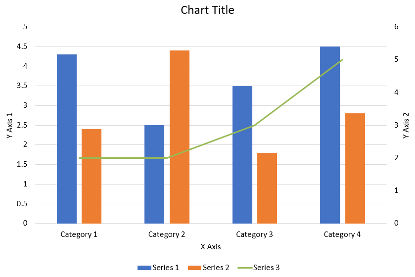
नीचे दिया गया Python कोड ऊपर दिखाए गए संयोजन चार्ट को PowerPoint प्रस्तुति में बनाने का तरीका दिखाता है:
import jpype
import asposeslides

if not jpype.isJVMStarted():
    jpype.startJVM()

from asposeslides.api import AxisPositionType, ChartType, CrossesType, FillType, LegendPositionType, NullableBool, Presentation, SaveFormat

Color = jpype.JClass("java.awt.Color")

def create_combo_chart():
    presentation = Presentation()
    slide = presentation.getSlides().get_Item(0)
    try:
        chart = create_chart_with_first_series(slide)

        add_second_series_to_chart(chart)
        add_third_series_to_chart(chart)

        set_primary_axes_format(chart)
        set_secondary_axes_format(chart)

        presentation.save("combo-chart.pptx", SaveFormat.Pptx)
    finally:
        presentation.dispose()

def create_chart_with_first_series(slide):
    chart = slide.getShapes().addChart(ChartType.ClusteredColumn, 50, 50, 600, 400)

    # चार्ट शीर्षक सेट करें।
    chart.setTitle(True)
    chart.getChartTitle().addTextFrameForOverriding("Chart Title")
    chart.getChartTitle().setOverlay(False)
    title_paragraph = chart.getChartTitle().getTextFrameForOverriding().getParagraphs().get_Item(0)
    title_format = title_paragraph.getParagraphFormat().getDefaultPortionFormat()
    title_format.setFontBold(NullableBool.False_)
    title_format.setFontHeight(18.0)

    # चार्ट लेजेंड सेट करें।
    chart.getLegend().setPosition(LegendPositionType.Bottom)
    chart.getLegend().getTextFormat().getPortionFormat().setFontHeight(12.0)

    # डिफ़ॉल्ट उत्पन्न श्रृंखला और श्रेणियों को हटाएँ।
    chart.getChartData().getSeries().clear()
    chart.getChartData().getCategories().clear()

    worksheet_index = 0
    workbook = chart.getChartData().getChartDataWorkbook()

    # नई श्रेणियाँ जोड़ें।
    cell = workbook.getCell(worksheet_index, 1, 0, "Category 1")
    chart.getChartData().getCategories().add(cell)
    cell = workbook.getCell(worksheet_index, 2, 0, "Category 2")
    chart.getChartData().getCategories().add(cell)
    cell = workbook.getCell(worksheet_index, 3, 0, "Category 3")
    chart.getChartData().getCategories().add(cell)
    cell = workbook.getCell(worksheet_index, 4, 0, "Category 4")
    chart.getChartData().getCategories().add(cell)

    # पहली श्रृंखला जोड़ें।
    series_name_cell = workbook.getCell(worksheet_index, 0, 1, "Series 1")
    series = chart.getChartData().getSeries().add(series_name_cell, chart.getType())

    series.getParentSeriesGroup().setOverlap(jpype.JByte(-25))
    series.getParentSeriesGroup().setGapWidth(220)

    cell = workbook.getCell(worksheet_index, 1, 1, 4.3)
    series.getDataPoints().addDataPointForBarSeries(cell)
    cell = workbook.getCell(worksheet_index, 2, 1, 2.5)
    series.getDataPoints().addDataPointForBarSeries(cell)
    cell = workbook.getCell(worksheet_index, 3, 1, 3.5)
    series.getDataPoints().addDataPointForBarSeries(cell)
    cell = workbook.getCell(worksheet_index, 4, 1, 4.5)
    series.getDataPoints().addDataPointForBarSeries(cell)

    return chart

def add_second_series_to_chart(chart):
    workbook = chart.getChartData().getChartDataWorkbook()
    worksheet_index = 0

    series_name_cell = workbook.getCell(worksheet_index, 0, 2, "Series 2")
    series = chart.getChartData().getSeries().add(series_name_cell, ChartType.ClusteredColumn)

    series.getParentSeriesGroup().setOverlap(jpype.JByte(-25))
    series.getParentSeriesGroup().setGapWidth(220)

    cell = workbook.getCell(worksheet_index, 1, 2, 2.4)
    series.getDataPoints().addDataPointForBarSeries(cell)
    cell = workbook.getCell(worksheet_index, 2, 2, 4.4)
    series.getDataPoints().addDataPointForBarSeries(cell)
    cell = workbook.getCell(worksheet_index, 3, 2, 1.8)
    series.getDataPoints().addDataPointForBarSeries(cell)
    cell = workbook.getCell(worksheet_index, 4, 2, 2.8)
    series.getDataPoints().addDataPointForBarSeries(cell)

def add_third_series_to_chart(chart):
    workbook = chart.getChartData().getChartDataWorkbook()
    worksheet_index = 0

    series_name_cell = workbook.getCell(worksheet_index, 0, 3, "Series 3")
    series = chart.getChartData().getSeries().add(series_name_cell, ChartType.Line)

    cell = workbook.getCell(worksheet_index, 1, 3, 2.0)
    series.getDataPoints().addDataPointForLineSeries(cell)
    cell = workbook.getCell(worksheet_index, 2, 3, 2.0)
    series.getDataPoints().addDataPointForLineSeries(cell)
    cell = workbook.getCell(worksheet_index, 3, 3, 3.0)
    series.getDataPoints().addDataPointForLineSeries(cell)
    cell = workbook.getCell(worksheet_index, 4, 3, 5.0)
    series.getDataPoints().addDataPointForLineSeries(cell)

    series.setPlotOnSecondAxis(True)

def set_primary_axes_format(chart):
    # क्षैतिज एक्सिस सेट करें।
    horizontal_axis = chart.getAxes().getHorizontalAxis()
    horizontal_axis.getTextFormat().getPortionFormat().setFontHeight(12.0)
    horizontal_axis.getFormat().getLine().getFillFormat().setFillType(FillType.NoFill)

    set_axis_title(horizontal_axis, "X Axis")

    # लंबवत एक्सिस सेट करें।
    vertical_axis = chart.getAxes().getVerticalAxis()
    vertical_axis.getTextFormat().getPortionFormat().setFontHeight(12.0)
    vertical_axis.getFormat().getLine().getFillFormat().setFillType(FillType.NoFill)

    set_axis_title(vertical_axis, "Y Axis 1")

    # लंबवत प्रमुख ग्रिडलाइन का रंग सेट करें।
    major_grid_lines_format = vertical_axis.getMajorGridLinesFormat().getLine().getFillFormat()
    major_grid_lines_format.setFillType(FillType.Solid)
    color = Color(217, 217, 217)
    major_grid_lines_format.getSolidFillColor().setColor(color)

def set_secondary_axes_format(chart):
    # द्वितीयक क्षैतिज एक्सिस सेट करें।
    secondary_horizontal_axis = chart.getAxes().getSecondaryHorizontalAxis()
    secondary_horizontal_axis.setPosition(AxisPositionType.Bottom)
    secondary_horizontal_axis.setCrossType(CrossesType.Maximum)
    secondary_horizontal_axis.setVisible(False)
    secondary_horizontal_axis.getMajorGridLinesFormat().getLine().getFillFormat().setFillType(FillType.NoFill)
    secondary_horizontal_axis.getMinorGridLinesFormat().getLine().getFillFormat().setFillType(FillType.NoFill)

    # द्वितीयक लंबवत एक्सिस सेट करें।
    secondary_vertical_axis = chart.getAxes().getSecondaryVerticalAxis()
    secondary_vertical_axis.setPosition(AxisPositionType.Right)
    secondary_vertical_axis.getTextFormat().getPortionFormat().setFontHeight(12.0)
    secondary_vertical_axis.getFormat().getLine().getFillFormat().setFillType(FillType.NoFill)
    secondary_vertical_axis.getMajorGridLinesFormat().getLine().getFillFormat().setFillType(FillType.NoFill)
    secondary_vertical_axis.getMinorGridLinesFormat().getLine().getFillFormat().setFillType(FillType.NoFill)

    set_axis_title(secondary_vertical_axis, "Y Axis 2")

def set_axis_title(axis, axis_title):
    axis.setTitle(True)
    axis.getTitle().setOverlay(False)
    title_paragraph = axis.getTitle().addTextFrameForOverriding(axis_title).getParagraphs().get_Item(0)
    title_format = title_paragraph.getParagraphFormat().getDefaultPortionFormat()
    title_format.setFontBold(NullableBool.False_)
    title_format.setFontHeight(12.0)

create_combo_chart()
चार्ट अपडेट करें
- उस Presentation क्लास का एक उदाहरण बनाएं जो वह प्रस्तुति प्रतिनिधित्व करता है जिसमें वह चार्ट है जिसे आप अपडेट करना चाहते हैं।
- इंडेक्स का उपयोग करके स्लाइड का रेफ़रेंस प्राप्त करें।
- सभी शेप्स के माध्यम से चलें ताकि वांछित चार्ट मिल सके।
- चार्ट डेटा वर्कशीट तक पहुंचें।
- श्रृंखला मान बदलकर चार्ट डेटा श्रृंखला को संशोधित करें।
- एक नई श्रृंखला जोड़ें और उसका डेटा भरें।
- संशोधित प्रस्तुति को PPTX फ़ाइल के रूप में सहेजें।
import jpype
import asposeslides

if not jpype.isJVMStarted():
    jpype.startJVM()

from asposeslides.api import ChartType, Presentation, SaveFormat

# चार्ट को अपडेट करने वाले प्रस्तुति को खोलता है
presentation = Presentation("ExistingChart.pptx")
try:
    # पहली स्लाइड तक पहुँचें
    slide = presentation.getSlides().get_Item(0)

    # स्लाइड से चार्ट प्राप्त करें
    chart = slide.getShapes().get_Item(0)

    # चार्ट डेटा शीट का इंडेक्स सेट कर रहा है
    default_worksheet_index = 0

    # चार्ट डेटा वर्कशीट प्राप्त कर रहा है
    workbook = chart.getChartData().getChartDataWorkbook()

    # चार्ट कैटेगरी नाम बदल रहा है
    workbook.getCell(default_worksheet_index, 1, 0, "Modified Category 1")
    workbook.getCell(default_worksheet_index, 2, 0, "Modified Category 2")

    # पहली चार्ट श्रृंखला लें
    series = chart.getChartData().getSeries().get_Item(0)

    # अब श्रृंखला डेटा अपडेट कर रहा है
    workbook.getCell(default_worksheet_index, 0, 1, "New_Series1")# श्रृंखला नाम बदल रहा है
    series.getDataPoints().get_Item(0).getValue().setData(90)
    series.getDataPoints().get_Item(1).getValue().setData(123)
    series.getDataPoints().get_Item(2).getValue().setData(44)

    # दूसरी चार्ट श्रृंखला लें
    series = chart.getChartData().getSeries().get_Item(1)

    # अब श्रृक्ति डेटा अपडेट कर रहा है
    workbook.getCell(default_worksheet_index, 0, 2, "New_Series2")# श्रृंखला नाम बदल रहा है
    series.getDataPoints().get_Item(0).getValue().setData(23)
    series.getDataPoints().get_Item(1).getValue().setData(67)
    series.getDataPoints().get_Item(2).getValue().setData(99)

    # अब, नई श्रृंखला जोड़ रहे हैं
    cell = workbook.getCell(default_worksheet_index, 0, 3, "Series 3")
    chart.getChartData().getSeries().add(cell, chart.getType())

    # तीसरी चार्ट श्रृंखला लें
    series = chart.getChartData().getSeries().get_Item(2)

    # अब श्रृंखला डेटा भर रहा है
    cell = workbook.getCell(default_worksheet_index, 1, 3, 20)
    series.getDataPoints().addDataPointForBarSeries(cell)
    cell = workbook.getCell(default_worksheet_index, 2, 3, 50)
    series.getDataPoints().addDataPointForBarSeries(cell)
    cell = workbook.getCell(default_worksheet_index, 3, 3, 30)
    series.getDataPoints().addDataPointForBarSeries(cell)

    chart.setType(ChartType.ClusteredCylinder)

    # चार्ट के साथ प्रस्तुति सहेजें
    presentation.save("AsposeChartModified_out.pptx", SaveFormat.Pptx)
finally:
    presentation.dispose()
चार्ट के लिए डेटा रेंज सेट करें
चार्ट के लिए डेटा रेंज सेट करने के लिए, निम्न करें:
- उस Presentation क्लास का एक उदाहरण बनाएं जो वह प्रस्तुति प्रतिनिधित्व करता है जिसमें चार्ट है।
- इंडेक्स का उपयोग करके स्लाइड का रेफ़रेंस प्राप्त करें।
- सभी शेप्स के माध्यम से चलें ताकि वांछित चार्ट मिल सके।
- चार्ट डेटा तक पहुंचें और रेंज सेट करें।
- संशोधित प्रस्तुति को PPTX फ़ाइल के रूप में सहेजें।
import jpype
import asposeslides

if not jpype.isJVMStarted():
    jpype.startJVM()

from asposeslides.api import Presentation, SaveFormat

# वह प्रस्तुति खोलता है जिसमें चार्ट है
presentation = Presentation("ExistingChart.pptx")
try:
    slide = presentation.getSlides().get_Item(0)
    chart = slide.getShapes().get_Item(0)

    chart.getChartData().setRange("Sheet1!A1:B4")

    presentation.save("SetDataRange_out.pptx", SaveFormat.Pptx)
finally:
    presentation.dispose()
चार्ट में डिफ़ॉल्ट मार्कर उपयोग करें
जब आप चार्ट में डिफ़ॉल्ट मार्कर उपयोग करते हैं, तो प्रत्येक चार्ट श्रृंखला को स्वचालित रूप से एक अलग मार्कर सिंबल मिलता है।
import jpype
import asposeslides

if not jpype.isJVMStarted():
    jpype.startJVM()

from asposeslides.api import ChartType, Presentation, SaveFormat

presentation = Presentation()
try:
    slide = presentation.getSlides().get_Item(0)
    chart = slide.getShapes().addChart(ChartType.LineWithMarkers, 10, 10, 400, 400)

    chart.getChartData().getSeries().clear()
    chart.getChartData().getCategories().clear()

    workbook = chart.getChartData().getChartDataWorkbook()
    cell = workbook.getCell(0, 0, 1, "Series 1")
    chart.getChartData().getSeries().add(cell, chart.getType())
    series = chart.getChartData().getSeries().get_Item(0)

    cell = workbook.getCell(0, 1, 0, "C1")
    chart.getChartData().getCategories().add(cell)
    cell = workbook.getCell(0, 1, 1, 24)
    series.getDataPoints().addDataPointForLineSeries(cell)
    cell = workbook.getCell(0, 2, 0, "C2")
    chart.getChartData().getCategories().add(cell)
    cell = workbook.getCell(0, 2, 1, 23)
    series.getDataPoints().addDataPointForLineSeries(cell)
    cell = workbook.getCell(0, 3, 0, "C3")
    chart.getChartData().getCategories().add(cell)
    cell = workbook.getCell(0, 3, 1, -10)
    series.getDataPoints().addDataPointForLineSeries(cell)
    cell = workbook.getCell(0, 4, 0, "C4")
    chart.getChartData().getCategories().add(cell)
    cell = workbook.getCell(0, 4, 1, None)
    series.getDataPoints().addDataPointForLineSeries(cell)

    cell = workbook.getCell(0, 0, 2, "Series 2")
    chart.getChartData().getSeries().add(cell, chart.getType())
    # दूसरी चार्ट श्रृंखला लें
    second_series = chart.getChartData().getSeries().get_Item(1)

    # अब श्रृंखला डेटा भर रहे हैं
    cell = workbook.getCell(0, 1, 2, 30)
    second_series.getDataPoints().addDataPointForLineSeries(cell)
    cell = workbook.getCell(0, 2, 2, 10)
    second_series.getDataPoints().addDataPointForLineSeries(cell)
    cell = workbook.getCell(0, 3, 2, 60)
    second_series.getDataPoints().addDataPointForLineSeries(cell)
    cell = workbook.getCell(0, 4, 2, 40)
    second_series.getDataPoints().addDataPointForLineSeries(cell)

    chart.setLegend(True)
    chart.getLegend().setOverlay(False)

    presentation.save("DefaultMarkersInChart.pptx", SaveFormat.Pptx)
finally:
    presentation.dispose()
FAQ
Aspose.Slides द्वारा समर्थन किए जाने वाले चार्ट प्रकार कौन से हैं?
Aspose.Slides विभिन्न chart types का समर्थन करता है, जिसमें बार, लाइन, पाई, एरिया, स्कैटर, हिस्टोग्रॅम, रडार और कई अन्य शामिल हैं। यह लचीलापन आपको अपने डेटा विज़ुअलाइज़ेशन आवश्यकताओं के लिए सबसे उपयुक्त चार्ट प्रकार चुनने की अनुमति देता है।
मैं स्लाइड में नया चार्ट कैसे जोड़ूं?
एक चार्ट जोड़ने के लिए, पहले आप Presentation क्लास का एक उदाहरण बनाते हैं, इच्छित स्लाइड को उसके इंडेक्स से प्राप्त करते हैं, और फिर चार्ट जोड़ने के मेथड को कॉल करते हैं, जिसमें चार्ट प्रकार और प्रारंभिक डेटा निर्दिष्ट किया जाता है। यह प्रक्रिया सीधे आपके प्रस्तुति में चार्ट को एकीकृत करती है।
मैं चार्ट में प्रदर्शित डेटा कैसे अपडेट कर सकता हूँ?
आप चार्ट डेटा को उसके डेटा वर्कबुक (ChartDataWorkbook) तक पहुंचकर, डिफ़ॉल्ट श्रृंखला और श्रेणियां साफ़ करके, और अपना कस्टम डेटा जोड़कर अपडेट कर सकते हैं। यह आपको चार्ट को नवीनतम डेटा के अनुसार रीफ़्रेश करने की अनुमति देता है।
क्या चार्ट की उपस्थिति को कस्टमाइज़ करना संभव है?
हाँ, Aspose.Slides व्यापक कस्टमाइज़ेशन विकल्प प्रदान करता है। आप रंग, फ़ॉन्ट, लेबल, लेजेंड और अन्य formatting elements को संशोधित करके चार्ट की उपस्थिति को अपनी विशिष्ट डिजाइन आवश्यकताओं के अनुसार अनुकूलित कर सकते हैं।