
مدیریت برچسبهای داده نمودار در ارائهها با استفاده از Python
معرفی
برچسبهای داده اطلاعاتی دربارهٔ سریهای نمودار و نقاط داده جداگانه را نمایش میدهند و به خوانندگان کمک میکنند مقادیر را شناسایی کرده و نمودار را درک کنند. این مقاله توضیح میدهد که چگونه مقادیر را قالببندی کنید، درصدها را نمایش دهید، متن برچسب را بخوانید، برچسبها را فراتر از حداکثر محور کنترل کنید، فاصله برچسبهای محور دستهبندی را تنظیم کنید و موقعیت برچسبهای نمودار دایرهای را تعیین کنید.
تنظیم دقت دادهها در برچسبهای داده نمودار
از setNumberFormatOfValues برای قالببندی مقادیر سری استفاده کنید. این مثال یک نمودار خطی با دادههای پیشفرض ایجاد میکند، جدول دادههای آن را نمایش میدهد و برچسبهای مقدار را برای اولین سری فعال میکند. قالب #,##0.00 جداکننده هزارگان و دو رقم اعشار را بدون تغییر مقادیر پایهای نمایش میدهد.
import jpype
import asposeslides

if not jpype.isJVMStarted():
    jpype.startJVM()

from asposeslides.api import ChartType, Presentation, SaveFormat

presentation = Presentation()
try:
    slide = presentation.getSlides().get_Item(0)

    chart = slide.getShapes().addChart(ChartType.Line, 50, 50, 450, 300)
    chart.setDataTable(True)

    series = chart.getChartData().getSeries().get_Item(0)
    series.setNumberFormatOfValues("#,##0.00")
    series.getLabels().getDefaultDataLabelFormat().setShowValue(True)

    presentation.save("PrecisionOfDatalabels_out.pptx", SaveFormat.Pptx)
finally:
    presentation.dispose()
نمایش درصد به عنوان برچسبها
برای یک نمودار ستونی انباشته، هر مقدار را به عنوان درصدی از مجموع دستهٔ مربوطه محاسبه کنید و متن را به فریم متنی که توسط getTextFrameForOverriding برگردانده میشود اختصاص دهید. این مثال از دادههای پیشفرض نمودار استفاده میکند و درصدها را با دو رقم اعشار در قلم ۸ پوینت نمایش میدهد. دستههایی که مجموعشان صفر است برای جلوگیری از تقسیم بر صفر نادیده گرفته میشوند. اگر دادههای نمودار تغییر کنند متن برچسب سفارشی را دوباره محاسبه کنید.
import jpype
import asposeslides

if not jpype.isJVMStarted():
    jpype.startJVM()

from asposeslides.api import ChartType, Portion, Presentation, SaveFormat

presentation = Presentation()
try:
    slide = presentation.getSlides().get_Item(0)

    chart = slide.getShapes().addChart(ChartType.StackedColumn, 20, 20, 400, 400)

    chart_series = chart.getChartData().getSeries()
    category_totals = [0.0] * chart.getChartData().getCategories().size()
    for category_index in range(len(category_totals)):
        for series_index in range(chart_series.size()):
            data_point = chart_series.get_Item(series_index).getDataPoints().get_Item(category_index)
            category_totals[category_index] += float(data_point.getValue().getData())

    for series_index in range(chart_series.size()):
        series = chart_series.get_Item(series_index)
        series.getLabels().getDefaultDataLabelFormat().setShowLegendKey(False)

        for point_index in range(series.getDataPoints().size()):
            data_point = series.getDataPoints().get_Item(point_index)
            label = data_point.getLabel()
            if category_totals[point_index] == 0:
                print(f"Cannot calculate a percentage for category {point_index}: the total is zero.")
                continue
            point_percentage = float(data_point.getValue().getData()) / category_totals[point_index] * 100

            portion = Portion()
            portion.setText(f"{point_percentage:.2f} %")
            portion.getPortionFormat().setFontHeight(8)
            label.getTextFrameForOverriding().setText("")
            paragraph = label.getTextFrameForOverriding().getParagraphs().get_Item(0)
            paragraph.getPortions().add(portion)

            label_format = label.getDataLabelFormat()
            label_format.setShowValue(True)
            label_format.setShowSeriesName(False)
            label_format.setShowPercentage(False)
            label_format.setShowLegendKey(False)
            label_format.setShowCategoryName(False)
            label_format.setShowBubbleSize(False)

    presentation.save("DisplayPercentageAsLabels_out.pptx", SaveFormat.Pptx)
finally:
    presentation.dispose()
تنظیم علامت درصد با برچسبهای داده نمودار
وقتی مقادیر به صورت کسر ذخیره میشوند، از setNumberFormat برای نمایش درصدها استفاده کنید. برای اعمال قالب برچسب مستقل از سلولهای منبع، False را به setNumberFormatLinkedToSource پاس دهید.
این مثال یک نمودار ستونی ۱۰۰٪ انباشته با سریهای قرمز و آبی در چهار دسته ایجاد میکند. هر جفت مقدار مجموعاً برابر با ۱ است. قالب برچسب 0.0% مقدار 0.30 را به صورت 30.0% نمایش میدهد، در حالی که محور عمودی از دو رقم اعشار استفاده میکند. هر دو سری از متن برچسب سفید با اندازه ۱۰ پوینت استفاده میکنند.
import jpype
import asposeslides

if not jpype.isJVMStarted():
    jpype.startJVM()

from asposeslides.api import ChartType, FillType, Presentation, SaveFormat

Color = jpype.JClass("java.awt.Color")

presentation = Presentation()
try:
    slide = presentation.getSlides().get_Item(0)

    chart = slide.getShapes().addChart(ChartType.PercentsStackedColumn, 20, 20, 500, 400)

    chart.getAxes().getVerticalAxis().setNumberFormatLinkedToSource(False)
    chart.getAxes().getVerticalAxis().setNumberFormat("0.00%")

    chart.getChartData().getSeries().clear()
    chart.getChartData().getCategories().clear()

    workbook = chart.getChartData().getChartDataWorkbook()
    worksheet_index = 0
    for i in range(4):
        category_cell = workbook.getCell(worksheet_index, i + 1, 0, f"Category {i + 1}")
        chart.getChartData().getCategories().add(category_cell)

    series_names = ["Reds", "Blues"]
    series_colors = [Color.RED, Color.BLUE]
    values = [[0.30, 0.50, 0.80, 0.65], [0.70, 0.50, 0.20, 0.35]]

    for i, series_name in enumerate(series_names):
        series_cell = workbook.getCell(worksheet_index, 0, i + 1, series_name)
        series = chart.getChartData().getSeries().add(series_cell, chart.getType())
        for j, value in enumerate(values[i]):
            value_cell = workbook.getCell(worksheet_index, j + 1, i + 1, jpype.JDouble(value))
            series.getDataPoints().addDataPointForBarSeries(value_cell)

        series.getFormat().getFill().setFillType(FillType.Solid)
        series.getFormat().getFill().getSolidFillColor().setColor(series_colors[i])

        label_format = series.getLabels().getDefaultDataLabelFormat()
        label_format.setShowValue(True)
        label_format.setNumberFormatLinkedToSource(False)
        label_format.setNumberFormat("0.0%")
        portion_format = label_format.getTextFormat().getPortionFormat()
        portion_format.setFontHeight(10)
        portion_format.getFillFormat().setFillType(FillType.Solid)
        portion_format.getFillFormat().getSolidFillColor().setColor(Color.WHITE)

    presentation.save("SetDataLabelsPercentageSign_out.pptx", SaveFormat.Pptx)
finally:
    presentation.dispose()
خواندن متن واقعی برچسبهای داده
از getActualLabelText برای بازیابی متنی که توسط تنظیمات یک برچسب داده تولید شده استفاده کنید. این مورد زمانی مفید است که بخواهید برچسبها را برای گزارشها استخراج کنید، محتوای ارائه را جستجو کنید یا نمودارهای تولیدشده را اعتبارسنجی کنید. در مثال زیر، قالب پیشفرض data label format نام هر دسته، نام سری و مقدار را ترکیب میکند. یک نقطه مقدار خود را به صورت درصد قالببندی میکند و نقطهٔ دیگر از متن سفارشی که از getTextFrameForOverriding دریافت میکند استفاده میکند.
import jpype
import asposeslides

if not jpype.isJVMStarted():
    jpype.startJVM()

from asposeslides.api import ChartType, Presentation

presentation = Presentation()
try:
    slide = presentation.getSlides().get_Item(0)

    chart = slide.getShapes().addChart(ChartType.ClusteredColumn, 20, 20, 500, 300)

    chart.getChartData().getSeries().clear()
    chart.getChartData().getCategories().clear()

    workbook = chart.getChartData().getChartDataWorkbook()
    first_category_cell = workbook.getCell(0, 1, 0, "Q1")
    chart.getChartData().getCategories().add(first_category_cell)
    second_category_cell = workbook.getCell(0, 2, 0, "Q2")
    chart.getChartData().getCategories().add(second_category_cell)

    north_series_cell = workbook.getCell(0, 0, 1, "North")
    north = chart.getChartData().getSeries().add(north_series_cell, chart.getType())
    north_first_value_cell = workbook.getCell(0, 1, 1, jpype.JDouble(0.25))
    north.getDataPoints().addDataPointForBarSeries(north_first_value_cell)
    north_second_value_cell = workbook.getCell(0, 2, 1, jpype.JDouble(0.75))
    north.getDataPoints().addDataPointForBarSeries(north_second_value_cell)

    south_series_cell = workbook.getCell(0, 0, 2, "South")
    south = chart.getChartData().getSeries().add(south_series_cell, chart.getType())
    south_first_value_cell = workbook.getCell(0, 1, 2, jpype.JDouble(0.40))
    south.getDataPoints().addDataPointForBarSeries(south_first_value_cell)
    south_second_value_cell = workbook.getCell(0, 2, 2, jpype.JDouble(0.60))
    south.getDataPoints().addDataPointForBarSeries(south_second_value_cell)

    for series in chart.getChartData().getSeries():
        label_format = series.getLabels().getDefaultDataLabelFormat()
        label_format.setShowCategoryName(True)
        label_format.setShowSeriesName(True)
        label_format.setShowValue(True)

    north.getLabels().get_Item(1).getDataLabelFormat().setNumberFormatLinkedToSource(False)
    north.getLabels().get_Item(1).getDataLabelFormat().setNumberFormat("0%")
    south.getLabels().get_Item(0).getTextFrameForOverriding().setText("Reviewed")

    for series in chart.getChartData().getSeries():
        for point in series.getDataPoints():
            label = point.getLabel()
            if not label.isVisible():
                continue

            print(f"Value: {point.getValue().getData()}; label: {label.getActualLabelText()}")
finally:
    presentation.dispose()
عدد ذخیرهشده در یک نقطه داده همان 0.75 میماند، حتی زمانی که برچسب آن 75% را همراه با نامهای دسته و سری نشان میدهد. متن سفارشی جایگزین متن تولیدشده برچسب میشود. getActualLabelText در هر دو حالت رشتهٔ برچسب نتیجه را برمیگرداند. همانطور که در بالا نشان داده شد، برای استخراج فقط برچسبهای قابل مشاهده، بهصورت جداگانه از isVisible استفاده کنید.
کنترل برچسبهای داده فراتر از حداکثر محور
وقتی محدودهٔ محور را بهصورت دستی محدود میکنید، برخی نقاط داده ممکن است از حداکثر آن فراتر بروند. از setShowDataLabelsOverMaximum برای کنترل نمایش برچسبهای دادهٔ آنها استفاده کنید. این تنظیم تنها نمایش برچسب را تغییر میدهد؛ محدودهٔ محور یا مقادیر دادهٔ زیرین را تغییر نمیدهد.
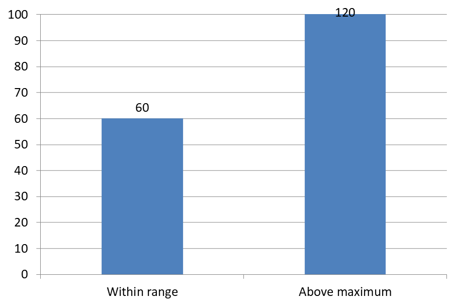
مثال زیر یک نمودار ستونی خوشهای ۲D با مقادیر ۶۰ و ۱۲۰ ایجاد میکند. False به setAutomaticMaxValue پاس داده میشود و حداکثر محور عمودی با setMaxValue به ۱۰۰ تنظیم میشود. اسلاید اول اجازه میدهد برچسبها فراتر از حداکثر باشند؛ نسخهٔ کپی آن اسلاید این قابلیت را غیرفعال میکند. هر دو اسلاید در DataLabelsOverMaximum.pptx ذخیره میشوند.
با setShowValue برچسبهای مقدار فعال میشوند. تنظیم در سطح نمودار بهتنهایی نمایش مقدار را فعال نمیکند و نمیتواند غیرفعالسازی نمایش مقدار یک برچسب منفرد را بازنویسی کند. این مثال مقادیر را برای کل سری فعال میکند و با استفاده از setPosition برچسبها را در انتهای بیرونی هر ستون قرار میدهد.
import jpype
import asposeslides

if not jpype.isJVMStarted():
    jpype.startJVM()

from asposeslides.api import ChartType, LegendDataLabelPosition, Presentation, SaveFormat

presentation = Presentation()
try:
    slide = presentation.getSlides().get_Item(0)

    chart = slide.getShapes().addChart(ChartType.ClusteredColumn, 50, 50, 600, 400)
    chart.setLegend(False)

    chart.getChartData().getSeries().clear()
    chart.getChartData().getCategories().clear()

    workbook = chart.getChartData().getChartDataWorkbook()

    first_category = workbook.getCell(0, 1, 0, "Within range")
    second_category = workbook.getCell(0, 2, 0, "Above maximum")

    chart.getChartData().getCategories().add(first_category)
    chart.getChartData().getCategories().add(second_category)

    series_name = workbook.getCell(0, 0, 1, "Values")
    series = chart.getChartData().getSeries().add(series_name, chart.getType())

    first_value = workbook.getCell(0, 1, 1, jpype.JDouble(60))
    second_value = workbook.getCell(0, 2, 1, jpype.JDouble(120))

    series.getDataPoints().addDataPointForBarSeries(first_value)
    series.getDataPoints().addDataPointForBarSeries(second_value)

    series.getLabels().getDefaultDataLabelFormat().setShowValue(True)
    series.getLabels().getDefaultDataLabelFormat().setPosition(LegendDataLabelPosition.OutsideEnd)

    chart.getAxes().getVerticalAxis().setAutomaticMaxValue(False)
    chart.getAxes().getVerticalAxis().setMaxValue(100)
    chart.setShowDataLabelsOverMaximum(True)

    second_slide = presentation.getSlides().addClone(slide)
    second_chart = second_slide.getShapes().get_Item(0)
    second_chart.setShowDataLabelsOverMaximum(False)

    presentation.save("DataLabelsOverMaximum.pptx", SaveFormat.Pptx)
finally:
    presentation.dispose()
تصاویر زیر اسلایدهای ذخیرهشده را که توسط Microsoft PowerPoint رندر شدهاند نشان میدهند. با True، برچسب 120 در حدمیانه بالایی قابل مشاهده است؛ با False پنهان میشود. برچسب 60 همچنان قابل مشاهده است، حداکثر محور در 100 باقی میماند و نقطهٔ دادهٔ دوم در هر دو حالت 120 است.
| setShowDataLabelsOverMaximum(True) | setShowDataLabelsOverMaximum(False) |
|---|---|
 |
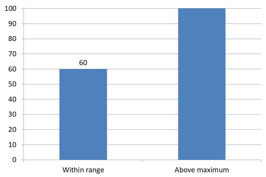 |
Chart Type
این مثال از یک نمودار ستونی ۲D با محور مقدار استفاده میکند. نمودارهایی بدون محور مقدار، مانند نمودارهای دایرهای و دونات، حداکثر محور برای محدود کردن به این روش ندارند.تنظیم فاصله برچسب از محور
از setLabelOffset برای کنترل فاصله بین برچسبهای محور دستهبندی و محور استفاده کنید. مقدار بر حسب درصد حداکثر اندازه قلم برچسبهای محور است. این مثال یک نمودار ستونی خوشهای ایجاد کرده و فاصلهٔ برچسب محور افقی را به ۵۰۰ تنظیم میکند. این تنظیم برچسبهای محور دستهبندی را تحت تاثیر قرار میدهد نه برچسبهای متصل به نقاط دادهٔ جداگانه.
import jpype
import asposeslides

if not jpype.isJVMStarted():
    jpype.startJVM()

from asposeslides.api import ChartType, Presentation, SaveFormat

presentation = Presentation()
try:
    slide = presentation.getSlides().get_Item(0)

    chart = slide.getShapes().addChart(ChartType.ClusteredColumn, 20, 20, 500, 300)
    chart.getAxes().getHorizontalAxis().setLabelOffset(500)

    presentation.save("SetCategoryAxisLabelDistance_out.pptx", SaveFormat.Pptx)
finally:
    presentation.dispose()
تنظیم مکان برچسب
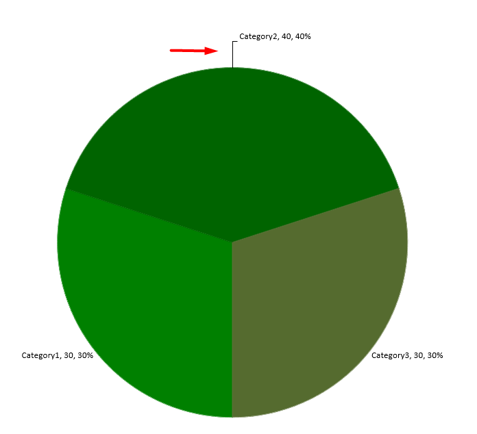
در یک نمودار دایرهای، موقعیت برچسبهای داده را تنظیم کنید تا فاصله بهبود یابد و فضای کافی برای خطوط رهنما ایجاد شود.
این مثال مقدار اولین نقطه داده را نمایش میدهد، برچسب آن را خارج از برش قرار میدهد و افستهای افقی و عمودی آن را با استفاده از setX و setY تنظیم میکند. این افستها به ترتیب نسبت به عرض و ارتفاع نمودار محاسبه میشوند.
import jpype
import asposeslides

if not jpype.isJVMStarted():
    jpype.startJVM()

from asposeslides.api import ChartType, LegendDataLabelPosition, Presentation, SaveFormat

presentation = Presentation()
try:
    slide = presentation.getSlides().get_Item(0)

    chart = slide.getShapes().addChart(ChartType.Pie, 50, 50, 200, 200)
    series = chart.getChartData().getSeries()

    label = series.get_Item(0).getLabels().get_Item(0)
    label.getDataLabelFormat().setShowValue(True)
    label.getDataLabelFormat().setPosition(LegendDataLabelPosition.OutsideEnd)
    label.setX(0.71)
    label.setY(0.04)

    presentation.save("presentation.pptx", SaveFormat.Pptx)
finally:
    presentation.dispose()
سوالات متداول
چگونه میتوانم از همپوشانی برچسبهای داده در نمودارهای پرتراکم جلوگیری کنم؟
استفاده ترکیبی از قرارگیری خودکار برچسب، خطوط رهنما و کاهش اندازه قلم؛ در صورت لزوم برخی فیلدها (مثلاً دسته) مخفی شوند یا تنها برچسبهای مقادیر افراطی یا نقاط کلیدی نمایش داده شوند.
چگونه میتوانم برچسبها را تنها برای مقادیر صفر، منفی یا خالی غیرفعال کنم؟
قبل از فعالسازی برچسبها، نقاط داده را فیلتر کنید و نمایش برای مقادیر ۰، مقادیر منفی یا مقادیر گمشده را بر اساس یک قانون تعریفشده غیرفعال کنید.
چگونه میتوانم سبک برچسب را هنگام خروجی به PDF/تصویرها یکنواخت نگه دارم؟
قلم خانواده و اندازه را بهصورت صریح تنظیم کنید و اطمینان حاصل کنید که قلم در محیط رندر موجود است تا از جایگزینی ناخواسته جلوگیری شود.