
จัดการชุดข้อมูลแผนภูมิในพรีเซนเทชันด้วย Python
ภาพรวม
แผนภูมิจะเก็บข้อมูลที่แสดงผลไว้ในสมุดงานข้อมูลแผนภูมิ. A ChartSeries แสดงชุดค่าเกี่ยวข้องหนึ่งชุด, และแต่ละ ChartDataPoint ในชุดนั้นอ้างอิงถึงหนึ่งหรือหลายเซลล์ในสมุดงาน. วัตถุ ChartCategory ให้ป้ายหรือค่ากลุ่มที่ใช้ร่วมกันโดยชุดข้อมูล. ชื่อชุด, หมวด, และค่าจุดจึงเชื่อมต่อกับวัตถุ ChartDataCell แทนที่จะเก็บเป็นเพียงข้อความที่แสดงเท่านั้น.
สำหรับแผนภูมิด้านหมวดทั่วไป, สมุดงานเริ่มต้นใช้แถว 0 สำหรับชื่อชุด, คอลัมน์ 0 สำหรับชื่อหมวด, และเซลล์ที่เหลือสำหรับค่าชุด. ดัชนี worksheet, แถว, และคอลัมน์ที่ส่งให้ ChartDataWorkbook.getCell นับจากศูนย์. การจัดวางนี้เป็นประโยชน์เมื่อคุณสร้างแผนภูมิกับข้อมูลเริ่มต้น, แต่ไม่ควรสมมติว่าแผนภูมิที่มีอยู่ทุกแผนภูมิใช้รูปแบบนี้. สำหรับการนำเข้าพรีเซนเทชันที่โหลดมา, ตรวจสอบเซลล์ที่อ้างอิงโดยชุด, หมวด, และจุดข้อมูลก่อนที่จะแก้ไขค่าของสมุดงาน.
การตั้งค่าแผนภูมิมีสามระดับขอบเขตที่แตกต่างกัน:
- การตั้งค่าในระดับชุด, เช่น ChartSeries.getFormat, ให้ลักษณะเริ่มต้นสำหรับทุกจุดในชุดเดียว.
- การตั้งค่าในระดับจุด, เช่น ChartDataPoint.getFormat, เขียนทับลักษณะของชุดสำหรับจุดนั้น.
- การตั้งค่าในระดับกลุ่มใช้กับชุดที่เข้ากันได้ซึ่งอยู่ใน ChartSeriesGroup. เข้าถึงกลุ่มผ่าน ChartSeries.getParentSeriesGroup เมื่อคุณต้องการตั้งค่าต่างๆ เช่น การทับซ้อนหรือความกว้างช่องว่าง.
เมื่อไม่มีการตั้งค่าสีเติมของจุดหรือชุดอย่างชัดเจน, สไตล์และธีมของแผนภูมิกำหนดลักษณะที่อัตโนมัติ. เมื่อทั้งแบบชุดและแบบจุดมีการกำหนด, การกำหนดของจุดจะมีลำดับความสำคัญสำหรับจุดนั้น.
ตั้งค่าการทับซ้อนของชุดข้อมูลในแผนภูมิ
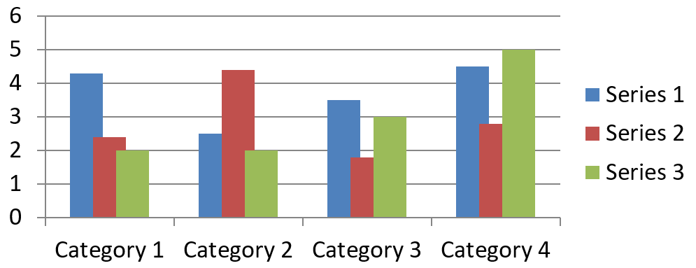
ChartSeries.getOverlap รายงานว่าบาร์หรือคอลัมน์ทับซ้อนกันเท่าใดในแผนภูมิ 2 มิติ, ตั้งแต่ -100 ถึง 100 เปอร์เซ็นต์. มันเป็นการฉายภาพแบบอ่านอย่างเดียวของการตั้งค่าในกลุ่มชุดแม่. ใช้ ChartSeriesGroup.setOverlap เพื่ออัปเดตทุกชุดที่เข้ากันได้ในกลุ่มนั้น. ตัวเลือกนี้ใช้กับประเภทแผนภูมิที่แสดงบาร์หรือคอลัมน์จัดกลุ่ม; ไม่ส่งผลต่อกลุ่มชุดที่ไม่เกี่ยวข้องในแผนภูมิแบบรวม.
ตัวอย่างต่อไปนี้ตั้งค่าการทับซ้อนสำหรับกลุ่มที่มีชุดแรก:
import jpype
import asposeslides

if not jpype.isJVMStarted():
    jpype.startJVM()

from asposeslides.api import ChartType, Presentation, SaveFormat

first_slide_index = 0
first_series_index = 0
overlap_percent = 30

presentation = Presentation()
try:
    slide = presentation.getSlides().get_Item(first_slide_index)

    # แผนภูมิใหม่ประกอบด้วยชุดตัวอย่าง, หมวดหมู่, และค่า.
    chart = slide.getShapes().addChart(ChartType.ClusteredColumn, 20, 20, 500, 200)

    series = chart.getChartData().getSeries().get_Item(first_series_index)
    series.getParentSeriesGroup().setOverlap(overlap_percent)

    presentation.save("series_overlap.pptx", SaveFormat.Pptx)
finally:
    presentation.dispose()
ผลลัพธ์:
เปลี่ยนสีเติมของชุดข้อมูล
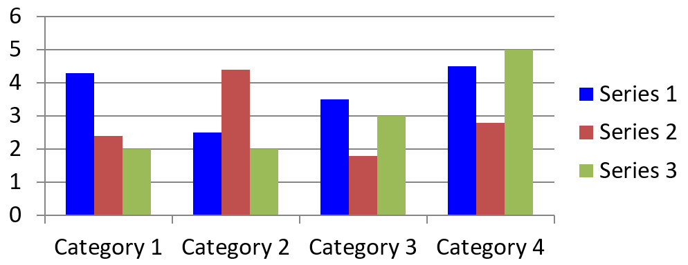
ใช้ ChartSeries.getFormat เพื่อกำหนดสีเติมเริ่มต้นสำหรับชุดทั้งหมด. หากจุดมีการกำหนดสีเติมอย่างชัดเจนแล้ว, การตั้งค่า ChartDataPoint.getFormat จะเขียนทับสีเติมของชุดสำหรับจุดนั้น.
ตัวอย่างต่อไปนี้ใส่สีเติมแบบทึบสีฟ้าเข้มให้กับชุดแรก:
import jpype
import asposeslides

if not jpype.isJVMStarted():
    jpype.startJVM()

from asposeslides.api import ChartType, FillType, Presentation, SaveFormat

Color = jpype.JClass("java.awt.Color")

first_slide_index = 0
first_series_index = 0

presentation = Presentation()
try:
    slide = presentation.getSlides().get_Item(first_slide_index)

    chart = slide.getShapes().addChart(ChartType.ClusteredColumn, 20, 20, 500, 200)

    series = chart.getChartData().getSeries().get_Item(first_series_index)
    series.getFormat().getFill().setFillType(FillType.Solid)
    series.getFormat().getFill().getSolidFillColor().setColor(Color.BLUE)

    presentation.save("series_color.pptx", SaveFormat.Pptx)
finally:
    presentation.dispose()
ผลลัพธ์:
เปลี่ยนชื่อชุดข้อมูล
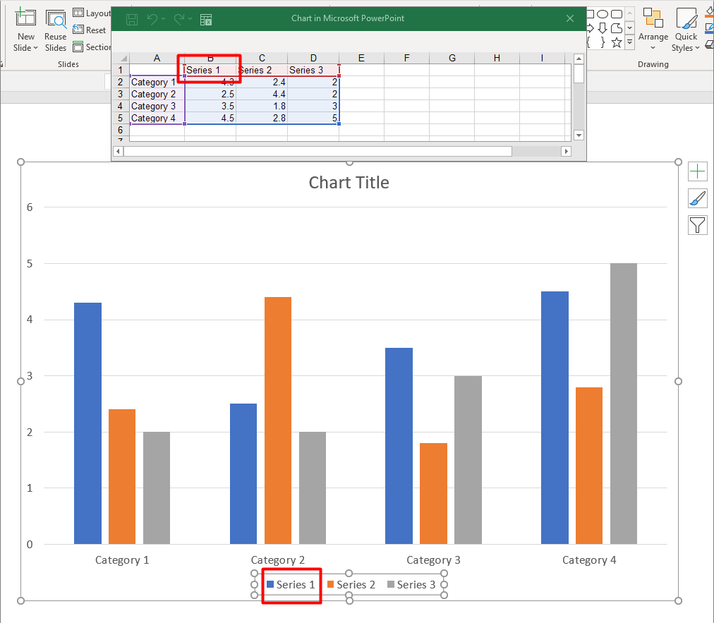
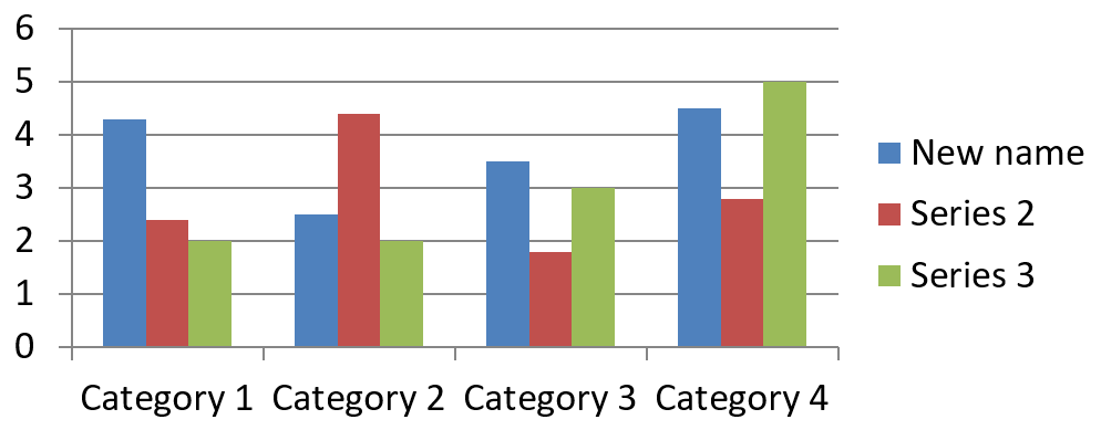
ชื่อชุดถูกเก็บในสมุดงานข้อมูลแผนภูมิและโดยปกติจะแสดงในคำอธิบาย. ในสมุดงานเริ่มต้นที่สร้างสำหรับแผนภูมิคอลัมน์แบบคลัสเตอร์, เซลล์ B1 อยู่ที่แถว 0, คอลัมน์ 1 และบรรจุชื่อของชุดแรก. ตัวแปรที่ตั้งชื่อในตัวอย่างต่อไปนี้ทำให้โครงสร้างนี้ชัดเจน:
import jpype
import asposeslides

if not jpype.isJVMStarted():
    jpype.startJVM()

from asposeslides.api import ChartType, Presentation, SaveFormat

first_slide_index = 0
worksheet_index = 0
series_name_row_index = 0
first_series_column_index = 1

presentation = Presentation()
try:
    slide = presentation.getSlides().get_Item(first_slide_index)

    chart = slide.getShapes().addChart(ChartType.ClusteredColumn, 20, 20, 500, 200)

    workbook = chart.getChartData().getChartDataWorkbook()
    series_name_cell = workbook.getCell(worksheet_index, series_name_row_index, first_series_column_index)
    series_name_cell.setValue("Revenue")

    presentation.save("series_name.pptx", SaveFormat.Pptx)
finally:
    presentation.dispose()
คุณสามารถอัปเดตเซลล์ที่อ้างอิงโดย ChartSeries.getName ได้เช่นกัน. วิธีนี้หลีกเลี่ยงการสมมติแถวและคอลัมน์เฉพาะในแผนภูมิที่มีอยู่:
import jpype
import asposeslides

if not jpype.isJVMStarted():
    jpype.startJVM()

from asposeslides.api import ChartType, Presentation, SaveFormat

first_slide_index = 0
first_series_index = 0
first_name_cell_index = 0

presentation = Presentation()
try:
    slide = presentation.getSlides().get_Item(first_slide_index)

    chart = slide.getShapes().addChart(ChartType.ClusteredColumn, 20, 20, 500, 200)

    series = chart.getChartData().getSeries().get_Item(first_series_index)
    series_name_cell = series.getName().getAsCells().get_Item(first_name_cell_index)
    series_name_cell.setValue("Revenue")

    presentation.save("series_name.pptx", SaveFormat.Pptx)
finally:
    presentation.dispose()
ผลลัพธ์:
รับสีเติมอัตโนมัติของชุดข้อมูล
ChartSeries.getAutomaticSeriesColor คืนค่าสีที่คำนวณจากดัชนีชุดและสไตล์ของแผนภูมิ. นี่คือสีที่ใช้เมื่อสีเติมของชุดไม่ได้ถูกกำหนดอย่างชัดเจน. การเรียกเมธอดนี้อ่านค่าสีที่คำนวณ; ไม่ได้กำหนดสีเติมใหม่.
ตัวอย่างต่อไปนี้พิมพ์สีอัตโนมัติของแต่ละชุดเริ่มต้น:
import jpype
import asposeslides

if not jpype.isJVMStarted():
    jpype.startJVM()

from asposeslides.api import ChartType, Presentation

first_slide_index = 0

presentation = Presentation()
try:
    slide = presentation.getSlides().get_Item(first_slide_index)

    chart = slide.getShapes().addChart(ChartType.ClusteredColumn, 20, 20, 500, 200)

    series_count = chart.getChartData().getSeries().size()
    for series_index in range(series_count):
        series = chart.getChartData().getSeries().get_Item(series_index)
        automatic_color = series.getAutomaticSeriesColor()
        print(f"Series {series_index}: {automatic_color}")
finally:
    presentation.dispose()
ตัวอย่างผลลัพธ์สำหรับสไตล์แผนภูมิเบื้องต้น:
Series 0: java.awt.Color[r=79,g=129,b=189]
Series 1: java.awt.Color[r=192,g=80,b=77]
Series 2: java.awt.Color[r=155,g=187,b=89]
สีที่ได้ขึ้นอยู่กับสไตล์และธีมของแผนภูมิ.
ตั้งค่าสีเติมกลับสำหรับชุดข้อมูลในแผนภูมิ
สำหรับชุดบาร์, คอลัมน์, และบับเบิ้ล, ChartSeries.setInvertIfNegative สามารถแสดงค่าลบด้วยสีเติมที่แตกต่าง. ตั้งค่าสีเติมของชุดเป็นแบบทึบ, เปิดการกลับสี, แล้วกำหนดสีค่าลบผ่าน ChartSeries.getInvertedSolidFillColor. ตัวเลขลบจะไม่เปลี่ยนในสมุดงาน; มีเพียงสีที่แสดงเปลี่ยนเท่านั้น.
ตัวอย่างต่อไปนี้แทนที่ข้อมูลแผนภูมิเริ่มต้นด้วยชุดเดียว. แถว 0 ของ worksheet มีชื่อชุด, คอลัมน์ 0 มีชื่อหมวด, และคอลัมน์ 1 มีค่า:
import jpype
import asposeslides

if not jpype.isJVMStarted():
    jpype.startJVM()

from asposeslides.api import ChartType, FillType, Presentation, SaveFormat

Color = jpype.JClass("java.awt.Color")

first_slide_index = 0
worksheet_index = 0
header_row_index = 0
category_column_index = 0
first_series_column_index = 1
first_data_row_index = 1

category_names = ["Category 1", "Category 2", "Category 3"]
series_values = [-20, 50, -30]

presentation = Presentation()
try:
    slide = presentation.getSlides().get_Item(first_slide_index)

    chart = slide.getShapes().addChart(ChartType.ClusteredColumn, 20, 20, 500, 200)
    chart_data = chart.getChartData()
    workbook = chart_data.getChartDataWorkbook()

    chart_data.getSeries().clear()
    chart_data.getCategories().clear()

    series_name_cell = workbook.getCell(worksheet_index, header_row_index, first_series_column_index, "Series 1")
    chart_type = chart.getType()
    series = chart_data.getSeries().add(series_name_cell, chart_type)

    for category_index in range(len(category_names)):
        data_row_index = first_data_row_index + category_index
        category_name = category_names[category_index]
        series_value = series_values[category_index]

        category_cell = workbook.getCell(worksheet_index, data_row_index, category_column_index, category_name)
        chart_data.getCategories().add(category_cell)

        value_cell = workbook.getCell(worksheet_index, data_row_index, first_series_column_index, series_value)
        series.getDataPoints().addDataPointForBarSeries(value_cell)

    automatic_series_color = series.getAutomaticSeriesColor()
    series.getFormat().getFill().setFillType(FillType.Solid)
    series.getFormat().getFill().getSolidFillColor().setColor(automatic_series_color)
    series.setInvertIfNegative(True)
    series.getInvertedSolidFillColor().setColor(Color.RED)

    presentation.save("inverted_solid_fill_color.pptx", SaveFormat.Pptx)
finally:
    presentation.dispose()
ผลลัพธ์:
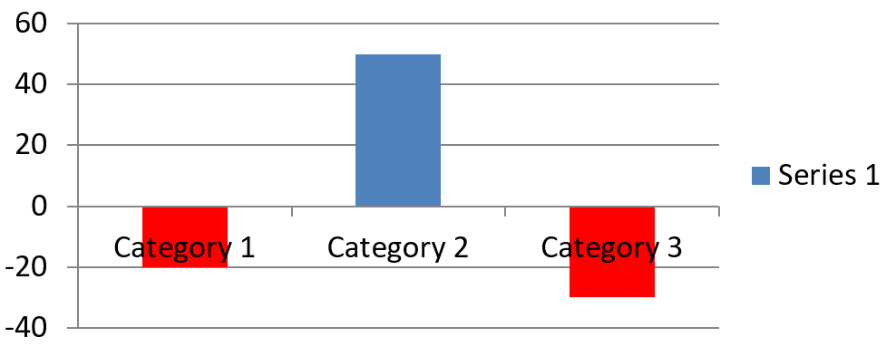
คุณสามารถเปิดการกลับสีสำหรับจุดหนึ่งโดยใช้ ChartDataPoint.setInvertIfNegative. ในตัวอย่างต่อไปนี้ การกลับสีถูกปิดสำหรับชุดและเปิดเฉพาะจุดที่เลือก. จุดนั้นยังได้รับค่าติดลบเพื่อให้เห็นผล:
import jpype
import asposeslides

if not jpype.isJVMStarted():
    jpype.startJVM()

from asposeslides.api import ChartType, FillType, Presentation, SaveFormat

Color = jpype.JClass("java.awt.Color")

first_slide_index = 0
first_series_index = 0
target_data_point_index = 2
negative_value = -30

presentation = Presentation()
try:
    slide = presentation.getSlides().get_Item(first_slide_index)

    chart = slide.getShapes().addChart(ChartType.ClusteredColumn, 20, 20, 500, 200)

    series = chart.getChartData().getSeries().get_Item(first_series_index)
    automatic_series_color = series.getAutomaticSeriesColor()
    series.getFormat().getFill().setFillType(FillType.Solid)
    series.getFormat().getFill().getSolidFillColor().setColor(automatic_series_color)
    series.getInvertedSolidFillColor().setColor(Color.RED)
    series.setInvertIfNegative(False)

    data_point = series.getDataPoints().get_Item(target_data_point_index)
    data_point.getValue().getAsCell().setValue(negative_value)
    data_point.setInvertIfNegative(True)

    presentation.save("data_point_invert_color_if_negative.pptx", SaveFormat.Pptx)
finally:
    presentation.dispose()
ลบค่าจุดข้อมูลเฉพาะ
เพื่อทำให้จุดหนึ่งว่างเปล่าโดยไม่ลบจุดอื่น, ตั้งค่าเซลล์สนับสนุนของมันเป็น None. สำหรับแผนภูมิคอลัมน์, ค่าที่ถูกพล็อตสามารถเข้าถึงได้ผ่าน ChartDataPoint.getValue. จุดข้อมูลจะยังคงอยู่ในตำแหน่งหมวดเดียวกัน, แต่แผนภูมิจะแสดงค่าของมันเป็นค่าว่างตามการตั้งค่าค่าว่างของแผนภูมิ.
ตัวอย่างต่อไปนี้ลบเฉพาะจุดที่สองในชุดแรก:
import jpype
import asposeslides

if not jpype.isJVMStarted():
    jpype.startJVM()

from asposeslides.api import ChartType, Presentation, SaveFormat

first_slide_index = 0
first_series_index = 0
target_data_point_index = 1

presentation = Presentation()
try:
    slide = presentation.getSlides().get_Item(first_slide_index)

    chart = slide.getShapes().addChart(ChartType.ClusteredColumn, 20, 20, 500, 200)

    series = chart.getChartData().getSeries().get_Item(first_series_index)
    data_point = series.getDataPoints().get_Item(target_data_point_index)
    data_point.getValue().getAsCell().setValue(None)

    presentation.save("clear_data_point_value.pptx", SaveFormat.Pptx)
finally:
    presentation.dispose()
แผนภูมิกระจาย (scatter) ใช้เซลล์ X และ Y แยกกัน, และแผนภูมิบับเบิลยังใช้เซลล์ขนาด. ให้ลบเฉพาะเซลล์ที่เป็นค่าที่คุณต้องการลบ. อย่าเรียก ChartDataPointCollection.clear เมื่อคุณต้องการเก็บจุดอื่นไว้, เพราะเมธอดนั้นจะลบทุกจุดจากคอลเลกชัน.
ควบคุมการแสดงเซลล์ว่าง
เซลล์ที่ซ่อนอยู่ซึ่งมีค่าเป็นกรณีพิเศษจากเซลล์ว่าง. เพื่อรวมหรือไม่รวมข้อมูลจากแถวและคอลัมน์ที่ซ่อนอยู่ใน worksheet, ดูที่ รวมข้อมูลจากแถวและคอลัมน์ที่ซ่อนอยู่.
เซลล์ว่างในสมุดงานแทนข้อมูลที่หายไป; เซลล์ที่มีค่า 0 แทนค่าตัวเลขที่ทราบ. เรียก ChartDataCell.setValue ด้วย None เพื่อทำให้เซลล์เป็นค่าว่าง. ค่าศูนย์เชิงตัวเลขจะคงเป็นศูนย์ไม่ว่าการตั้งค่าค่าว่างจะเป็นอย่างไร.
ใช้ Chart.setDisplayBlanksAs เพื่อเลือกวิธีที่แผนภูมิแสดงเซลล์ว่าง. การตั้งค่านี้ใช้กับแผนภูมิกิจทั้งหมด. มันเปลี่ยนวิธีการพล็อตค่าว่างโดยไม่เติมค่า 0 หรือค่าที่ประมวลผลในเซลล์ว่างของสมุดงาน.
ตัวอย่างต่อไปนี้สร้างแผนภูมิเส้นที่มีชุดเดียว, ลบค่าของวัน 3, และบันทึกแผนภูมิเดียวกันกับแต่ละโหมด. ไม่ต้องใช้ไฟล์อินพุต. ChartDataWorkbook ใช้ worksheet 0, คอลัมน์ 0 สำหรับป้ายหมวด, และคอลัมน์ 1 สำหรับค่า; แถว 0 เก็บชื่อชุด. ข้อมูลสุดท้ายคือ 10, 20, empty, 30, 40.
import jpype
import asposeslides

if not jpype.isJVMStarted():
    jpype.startJVM()

from asposeslides.api import ChartType, DisplayBlanksAsType, Presentation, SaveFormat

presentation = Presentation()
try:
    slide = presentation.getSlides().get_Item(0)

    chart = slide.getShapes().addChart(ChartType.LineWithMarkers, 40, 40, 640, 400)
    chart_data = chart.getChartData()
    workbook = chart_data.getChartDataWorkbook()

    chart_data.getSeries().clear()
    chart_data.getCategories().clear()

    series_name_cell = workbook.getCell(0, 0, 1, "Measurements")
    series = chart_data.getSeries().add(series_name_cell, chart.getType())
    values = [10, 20, 25, 30, 40]

    for i, value in enumerate(values):
        category_cell = workbook.getCell(0, i + 1, 0, f"Day {i + 1}")
        chart_data.getCategories().add(category_cell)
        value_cell = workbook.getCell(0, i + 1, 1, jpype.JInt(value))
        series.getDataPoints().addDataPointForLineSeries(value_cell)

    # ปล่อยให้วัน 3 เป็นค่าว่างอย่างแท้จริง ขณะยังคงหมวดและจุดข้อมูลไว้
    workbook.getCell(0, 3, 1).setValue(None)

    modes = [DisplayBlanksAsType.Gap, DisplayBlanksAsType.Zero, DisplayBlanksAsType.Span]
    mode_names = ["Gap", "Zero", "Span"]
    for mode, mode_name in zip(modes, mode_names):
        chart.setDisplayBlanksAs(mode)
        presentation.save(f"empty_cells_{mode_name}.pptx", SaveFormat.Pptx)
finally:
    presentation.dispose()
ไฟล์ผลลัพธ์แต่ละไฟล์จะบันทึกโหมดที่ตั้งไว้ก่อนบันทึก: empty_cells_Gap.pptx, empty_cells_Zero.pptx, และ empty_cells_Span.pptx. หากต้องการบันทึกเพียงเวอร์ชันเดียว, ตั้งค่าโหมดที่ต้องการและบันทึกพรีเซนเทชันเพียงครั้งเดียวแทนการวนลูปหลายโหมด.
การเปรียบเทียบด้านล่างแสดงข้อมูลเดียวกันในทุกไฟล์. วัน 3 เป็นค่าว่างในสมุดงานในทุกกรณี:
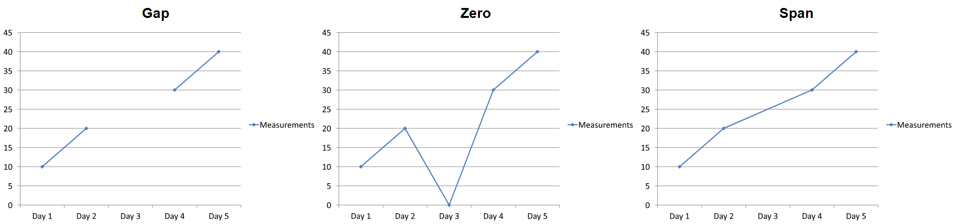
ผลลัพธ์ที่มองเห็นขึ้นอยู่กับประเภทแผนภูมิ. แผนภูมิเส้นทำให้สามโหมดเปรียบเทียบได้ง่าย. แผนภูมิแท่งและคอลัมน์ไม่มีเส้นเชื่อมข้ามหมวดที่หายไป, ดังนั้น Span ไม่สามารถสร้างส่วนเชื่อมที่แสดงด้านบน; คอลัมน์ที่หายไปและคอลัมน์ที่สูงเป็นศูนย์อาจดูคล้ายกัน. เช่นเดียวกับแผนภูมิกระจายที่มีเฉพาะเครื่องหมายก็ไม่มีเส้นเชื่อม. อย่าคาดหวังผลลัพธ์ที่แตกต่างกันสามแบบสำหรับทุกประเภทแผนภูมิ; ตรวจสอบผลลัพธ์สำหรับประเภทที่คุณใช้.
ตั้งค่าความกว้างช่องว่างของชุดข้อมูล
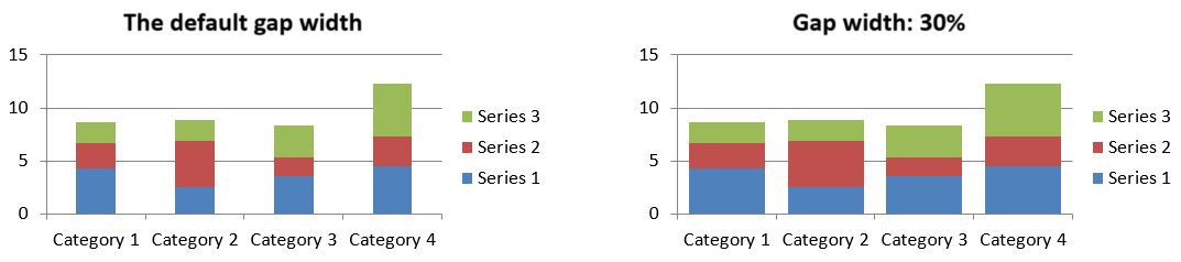
ความกว้างช่องว่างคือระยะห่างระหว่างกลุ่มบาร์หรือคอลัมน์ที่อยู่ติดกัน, แสดงเป็นเปอร์เซ็นต์ของความกว้างบาร์หรือคอลัมน์. เช่นเดียวกับการทับซ้อน, มันเป็นของกลุ่มชุดแม่ไม่ใช่ของแต่ละชุด. เรียก ChartSeriesGroup.setGapWidth ครั้งเดียวสำหรับกลุ่ม. ค่าที่มากจะเพิ่มระยะห่างระหว่างกลุ่ม; ค่าที่น้อยจะทำให้กลุ่มแน่นขึ้น.
ตัวอย่างต่อไปนี้เปลี่ยนความกว้างช่องว่างและบันทึกพรีเซนเทชันสุดท้ายเท่านั้น:
import jpype
import asposeslides

if not jpype.isJVMStarted():
    jpype.startJVM()

from asposeslides.api import ChartType, Presentation, SaveFormat

first_slide_index = 0
first_series_index = 0
gap_width_percent = 30

presentation = Presentation()
try:
    slide = presentation.getSlides().get_Item(first_slide_index)

    chart = slide.getShapes().addChart(ChartType.StackedColumn, 20, 20, 500, 200)

    series = chart.getChartData().getSeries().get_Item(first_series_index)
    series.getParentSeriesGroup().setGapWidth(gap_width_percent)

    presentation.save("gap_width_30.pptx", SaveFormat.Pptx)
finally:
    presentation.dispose()
ผลลัพธ์:
คำถามที่พบบ่อย
ชนิดแผนภูมิใดที่รองรับชุดข้อมูล?
ประเภทแผนภูมิทั้งหมดที่แสดงโดยการอธิบายชนิด ChartType ใช้ข้อมูลแผนภูมิ, แต่ชุดของพวกมันไม่ได้มีโครงสร้างค่าหรือการตั้งค่าเดียวกัน. ตัวอย่างเช่น แผนภูมิด้านหมวดใช้หมวดและค่า, แผนภูมิกระจายใช้ค่า X และ Y, และแผนภูมิบับเบิลเพิ่มขนาดบับเบิล. ใช้วิธีการสร้างจุดข้อมูลที่ตรงกับประเภทชุด. ตัวเลือกเช่นการทับซ้อนและความกว้างช่องว่างใช้ได้เฉพาะกับกลุ่มบาร์หรือคอลัมน์ที่เข้ากันได้.
กลุ่มชุดข้อมูลของแผนภูคืออะไร?
ChartSeriesGroup ประกอบด้วยชุดที่เข้ากันได้ซึ่งแชร์การตั้งค่าการพล็อตระดับกลุ่ม. แผนภูมิแบบผสานอาจมีมากกว่าหนึ่งกลุ่ม, ดังนั้นการเปลี่ยนกลุ่มผ่านชุดหนึ่งไม่ได้หมายความว่าจะเปลี่ยนทุกชุดในแผนภูมิ.
แผนภูมิที่สร้างใหม่มีข้อมูลค่าเริ่มต้นหรือไม่?
ใช่. โดยค่าเริ่มต้น, ShapeCollection.addChart สร้างชุดตัวอย่าง, หมวด, และค่า. คุณสามารถแก้ไขเซลล์เหล่านั้นหรือเคลียร์คอลเลกชันของชุดและหมวดก่อนที่จะเพิ่มชุดข้อมูลที่กำหนดเองอย่างเต็มที่. อีกหนึ่ง overload ยังสามารถสร้างแผนภูมิที่ไม่มีข้อมูลเริ่มต้นได้.
วัตถุแผนภูมิเชื่อมต่อกับเซลล์ในสมุดงานอย่างไร?
ชื่อชุด, ป้ายหมวด, และค่าจุดข้อมูลอ้างอิงเซลล์ใน ChartDataWorkbook. การเปลี่ยนเซลล์ที่อ้างอิงจะอัปเดตองค์ประกอบแผนภูมิที่สอดคล้อง. เมื่อคุณสร้างข้อมูลแบบกำหนดเอง, ให้รักษาแถวหมวดและแถวค่าชุดให้สอดคล้องกันเพื่อให้แต่ละจุดถูกพล็อตภายใต้หมวดที่ตั้งใจ.
ฉันจะลบจุดเดียวแทนการลบชุดทั้งหมดได้อย่างไร?
ตั้งค่าเซลล์ค่าที่เกี่ยวข้องเป็น None เพื่อรักษาตำแหน่งหมวดของจุดนั้นเป็นจุดว่าง. ใช้ ChartDataPointCollection.clear เฉพาะเมื่อคุณต้องการลบจุดทั้งหมดจากชุดนั้น. หากคุณลบหมวดด้วย, ต้องอัปเดตทุกชุดให้ค่าของพวกมันยังคงสอดคล้องกับคอลเลกชันหมวด.
จุดว่างแสดงอย่างไร?
ผลลัพธ์ขึ้นอยู่กับประเภทแผนภูมิและค่าที่กำหนดผ่าน Chart.setDisplayBlanksAs. แผนภูมิที่รองรับสามารถแสดงค่าว่างเป็นช่องว่าง, เป็นค่าสิศูนย์, หรือโดยเชื่อมจุดใกล้เคียงกัน. เลือกการตั้งค่าที่สอดคล้องกับความหมายของข้อมูลที่หายไปในพรีเซนเทชันของคุณ. ดูที่ ควบคุมการแสดงเซลล์ว่าง สำหรับตัวอย่างเต็มและการเปรียบเทียบภาพ.
ค่าติดลบถูกจัดรูปแบบอย่างไร?
สำหรับชุดบาร์, คอลัมน์, และบับเบิ้ลที่รองรับ, เรียก ChartSeries.setInvertIfNegative แล้วตั้งค่าสีที่ได้จาก ChartSeries.getInvertedSolidFillColor. คุณสามารถเขียนทับพฤติกรรมสำหรับจุดเฉพาะด้วย ChartDataPoint.setInvertIfNegative. วิธีเหล่านี้ส่งผลต่อการจัดรูปแบบ, ไม่ใช่ค่าตัวเลขที่เก็บไว้.
การจัดรูปแบบใดที่มีลำดับความสำคัญเมื่อชุดและจุดทั้งสองถูกจัดรูปแบบ?
การจัดรูปแบบจุดโดยเฉพาะจะมีลำดับความสำคัญสำหรับจุดนั้น. จุดอื่น ๆ จะยังคงใช้รูปแบบชุดที่กำหนดไว้หรือ, หากชุดไม่มีการกำหนดรูปแบบ, จะใช้สไตล์และธีมของแผนภูมิโดยอัตโนมัติ. การตั้งค่าในระดับกลุ่มเช่นการทับซ้อนและความกว้างช่องว่างควบคุมการจัดวางและไม่ใช่การเขียนทับระดับจุด.
มีขีดจำกัดจำนวนชุดข้อมูลที่แผนภูมิสามารถมีได้หรือไม่?
Aspose.Slides ไม่ได้กำหนดขีดจำกัดจำนวนชุดข้อมูลแบบแยก. แต่ข้อจำกัดของไฟล์พรีเซนเทชัน, หน่วยความจำที่ใช้ได้, เวลาเรนเดอร์, และความอ่านง่ายของแผนภูมิจะกำหนดขีดจำกัดที่เป็นประโยชน์.
ควรปรับอะไรเมื่อคอลัมน์ใกล้กันเกินไปหรือห่างกันเกินไป?
เรียก ChartSeriesGroup.setGapWidth บนกลุ่มชุดแม่ที่เหมาะสม. เพิ่มค่าจะทำให้ช่องว่างระหว่างกลุ่มกว้างขึ้น, ลดค่าจะทำให้กลุ่มเข้าใกล้กันมากขึ้น.