
Python में PowerPoint प्रस्तुति चार्ट बनाएँ या अपडेट करें
अवलोकन
यह लेख Aspose.Slides for Python via .NET का उपयोग करके चार्ट बनाने और अनुकूलित करने के तरीकों को समझाता है। आप सीखेंगे कि स्लाइड में चार्ट कैसे जोड़ें, उसे डेटा से भरें, और अपने डिजाइन आवश्यकताओं के अनुसार फ़ॉर्मेट करें। कोड उदाहरण प्रस्तुतियों और चार्ट बनाने, श्रृंखला, अक्ष और लीजेंड को कॉन्फ़िगर करने, और आपके अनुप्रयोगों में चार्ट जेनरेशन को एकीकृत करने को कवर करते हैं।
चार्ट बनाएं
चार्ट लोगों को डेटा को जल्दी से दृश्य रूप में प्रस्तुत करने और ऐसे अंतर्दृष्टि प्राप्त करने में मदद करते हैं जो तालिका या स्प्रेडशीट से तुरंत स्पष्ट नहीं होते।
चार्ट क्यों बनाएं?
चार्ट का उपयोग करके आप:
- एक ही स्लाइड में बड़ी मात्रा में डेटा को संक्षिप्त या सारांश रूप में प्रस्तुत कर सकते हैं;
- डेटा में पैटर्न और रुझान उजागर कर सकते हैं;
- समय के साथ या किसी विशिष्ट माप इकाई के संबंध में डेटा की दिशा और गति निर्धारित कर सकते हैं;
- अपवर्तक, असामान्य, विचलन, त्रुटियाँ और असंगत डेटा की पहचान कर सकते हैं;
- जटिल डेटा को प्रभावी रूप से संप्रेषित या प्रस्तुत कर सकते हैं।
PowerPoint में आप Insert फ़ंक्शन के माध्यम से कई प्रकार के चार्ट टेम्पलेट चुनकर चार्ट बना सकते हैं। Aspose.Slides का उपयोग करके आप सामान्य चार्ट (लोकप्रिय चार्ट प्रकारों पर आधारित) और कस्टम चार्ट दोनों बना सकते हैं।
Note
Use the ChartType enumeration under the Aspose.Slides.Charts namespace. The values in this enumeration correspond to different chart types.क्लस्टर्ड कॉलम चार्ट बनाएं
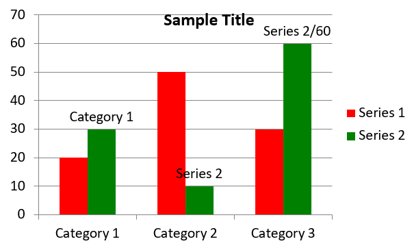
यह अनुभाग Aspose.Slides for Python via .NET का उपयोग करके क्लस्टर्ड कॉलम चार्ट बनाने के चरणों को बताता है। आप प्रस्तुति को प्रारंभ करना, चार्ट जोड़ना और उसके शीर्षक, डेटा, श्रृंखला, श्रेणियाँ और स्टाइलिंग को अनुकूलित करना सीखेंगे। नीचे दिए गए चरणों का पालन करें ताकि एक मानक क्लस्टर्ड कॉलम चार्ट उत्पन्न हो सके:
- Create an instance of the Presentation class.
- Get a reference to a slide using its index.
- Add a chart with some data and specify the
ChartType.CLUSTERED_COLUMNtype. - Add a title to the chart.
- Access the chart’s data worksheet.
- Clear all the default series and categories.
- Add new series and categories.
- Add new chart data for the chart series.
- Apply a fill color to the chart series.
- Add labels to the chart series.
- Save the modified presentation as a PPTX file.
यह Python कोड क्लस्टर्ड कॉलम चार्ट बनाने को प्रदर्शित करता है:
import aspose.slides.charts as charts
import aspose.slides as slides
import aspose.pydrawing as draw

# PPTX फ़ाइल को दर्शाने वाली Presentation क्लास का उदाहरण बनाएं।
with slides.Presentation() as presentation:

    # पहली स्लाइड तक पहुँचें।
    slide = presentation.slides[0]

    # डिफ़ॉल्ट डेटा के साथ क्लस्टर्ड कॉलम चार्ट जोड़ें।
    chart = slide.shapes.add_chart(charts.ChartType.CLUSTERED_COLUMN, 20, 20, 500, 300)

    # चार्ट शीर्षक सेट करें।
    chart.chart_title.add_text_frame_for_overriding("Sample Title")
    chart.chart_title.text_frame_for_overriding.text_frame_format.center_text = slides.NullableBool.TRUE
    chart.chart_title.height = 20
    chart.has_title = True

    # चार्ट डेटा शीट का सूचकांक सेट करें।
    worksheet_index = 0

    # चार्ट डेटा वर्कबुक प्राप्त करें।
    workbook = chart.chart_data.chart_data_workbook

    # डिफ़ॉल्ट जेनरेटेड श्रृंखला और श्रेणियों को हटाएँ।
    chart.chart_data.series.clear()
    chart.chart_data.categories.clear()

    # नई श्रृंखला जोड़ें।
    chart.chart_data.series.add(workbook.get_cell(worksheet_index, 0, 1, "Series 1"), chart.type)
    chart.chart_data.series.add(workbook.get_cell(worksheet_index, 0, 2, "Series 2"), chart.type)

    # नई श्रेणियाँ जोड़ें।
    chart.chart_data.categories.add(workbook.get_cell(worksheet_index, 1, 0, "Category 1"))
    chart.chart_data.categories.add(workbook.get_cell(worksheet_index, 2, 0, "Category 2"))
    chart.chart_data.categories.add(workbook.get_cell(worksheet_index, 3, 0, "Category 3"))

    # पहली चार्ट श्रृंखला प्राप्त करें।
    series = chart.chart_data.series[0]

    # श्रृंखला डेटा भरें।
    series.data_points.add_data_point_for_bar_series(workbook.get_cell(worksheet_index, 1, 1, 20))
    series.data_points.add_data_point_for_bar_series(workbook.get_cell(worksheet_index, 2, 1, 50))
    series.data_points.add_data_point_for_bar_series(workbook.get_cell(worksheet_index, 3, 1, 30))

    # श्रृंखला के लिए फ़िल रंग सेट करें।
    series.format.fill.fill_type = slides.FillType.SOLID
    series.format.fill.solid_fill_color.color = draw.Color.red

    # दूसरी चार्ट श्रृंखला प्राप्त करें।
    series = chart.chart_data.series[1]

    # श्रृंखला डेटा भरें।
    series.data_points.add_data_point_for_bar_series(workbook.get_cell(worksheet_index, 1, 2, 30))
    series.data_points.add_data_point_for_bar_series(workbook.get_cell(worksheet_index, 2, 2, 10))
    series.data_points.add_data_point_for_bar_series(workbook.get_cell(worksheet_index, 3, 2, 60))

    # श्रृंखला के लिए फ़िल रंग सेट करें।
    series.format.fill.fill_type = slides.FillType.SOLID
    series.format.fill.solid_fill_color.color = draw.Color.green

    # पहली लेबल को श्रेणी नाम दिखाने के लिए सेट करें।
    label = series.data_points[0].label
    label.data_label_format.show_category_name = True

    label = series.data_points[1].label
    label.data_label_format.show_series_name = True

    # तीसरी लेबल के लिए मान दिखाने हेतु श्रृंखला सेट करें।
    label = series.data_points[2].label
    label.data_label_format.show_value = True
    label.data_label_format.show_series_name = True
    label.data_label_format.separator = "/"

    # प्रस्तुति को डिस्क पर PPTX फ़ाइल के रूप में सहेजें।
    presentation.save("ClusteredColumnChart.pptx", slides.export.SaveFormat.PPTX)
परिणाम:
स्कैटर चार्ट बनाएं
स्कैटर चार्ट (जिसे स्कैटर प्लॉट या X‑Y ग्राफ़ भी कहा जाता है) अक्सर दो चरों के बीच पैटर्न या सहसंबंध की जाँच के लिए उपयोग होते हैं।
स्कैटर चार्ट का उपयोग करें जब:
- आपके पास युग्मित संख्यात्मक डेटा हो।
- दो चरों का आपस में अच्छा संबंध हो।
- आप यह निर्धारित करना चाहते हों कि दो चर संबंधित हैं या नहीं।
- आपके पास एक स्वतंत्र चर हो जिसके कई मान निर्भरशील चर के लिए हों।
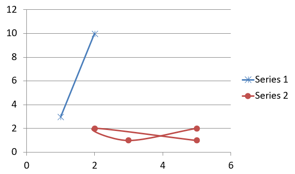
यह Python कोड प्रत्येक श्रृंखला के लिए अलग‑अलग मार्कर के साथ स्कैटर चार्ट बनाने को दर्शाता है:
import aspose.slides.charts as charts
import aspose.slides as slides
import aspose.pydrawing as draw

# Presentation क्लास का उदाहरण बनाएं।
with slides.Presentation() as presentation:

    # पहली स्लाइड तक पहुँचें।
    slide = presentation.slides[0]

    # डिफ़ॉल्ट स्कैटर चार्ट बनाएं।
    chart = slide.shapes.add_chart(charts.ChartType.SCATTER_WITH_SMOOTH_LINES, 20, 20, 500, 300)

    # चार्ट डेटा शीट का सूचकांक सेट करें।
    worksheet_index = 0

    # चार्ट डेटा वर्कबुक प्राप्त करें।
    workbook = chart.chart_data.chart_data_workbook

    # डिफ़ॉल्ट श्रृंखला को हटाएँ।
    chart.chart_data.series.clear()

    # नई श्रृंखला जोड़ें।
    chart.chart_data.series.add(workbook.get_cell(worksheet_index, 1, 1, "Series 1"), chart.type)
    chart.chart_data.series.add(workbook.get_cell(worksheet_index, 1, 3, "Series 2"), chart.type)

    # पहली चार्ट श्रृंखला प्राप्त करें।
    series = chart.chart_data.series[0]

    # श्रृंखला में नया बिंदु (1:3) जोड़ें।
    series.data_points.add_data_point_for_scatter_series(workbook.get_cell(worksheet_index, 2, 1, 1), workbook.get_cell(worksheet_index, 2, 2, 3))

    # नया बिंदु (2:10) जोड़ें।
    series.data_points.add_data_point_for_scatter_series(workbook.get_cell(worksheet_index, 3, 1, 2), workbook.get_cell(worksheet_index, 3, 2, 10))

    # श्रृंखला प्रकार बदलें।
    series.type = charts.ChartType.SCATTER_WITH_STRAIGHT_LINES_AND_MARKERS

    # चार्ट श्रृंखला मार्कर बदलें।
    series.marker.size = 10
    series.marker.symbol = charts.MarkerStyleType.STAR

    # दूसरी चार्ट श्रृंखला प्राप्त करें।
    series = chart.chart_data.series[1]

    # चार्ट श्रृंखला में नया बिंदु (5:2) जोड़ें।
    series.data_points.add_data_point_for_scatter_series(workbook.get_cell(worksheet_index, 2, 3, 5), workbook.get_cell(worksheet_index, 2, 4, 2))

    # नया बिंदु (3:1) जोड़ें।
    series.data_points.add_data_point_for_scatter_series(workbook.get_cell(worksheet_index, 3, 3, 3), workbook.get_cell(worksheet_index, 3, 4, 1))

    # नया बिंदु (2:2) जोड़ें।
    series.data_points.add_data_point_for_scatter_series(workbook.get_cell(worksheet_index, 4, 3, 2), workbook.get_cell(worksheet_index, 4, 4, 2))

    # नया बिंदु (5:1) जोड़ें।
    series.data_points.add_data_point_for_scatter_series(workbook.get_cell(worksheet_index, 5, 3, 5), workbook.get_cell(worksheet_index, 5, 4, 1))

    # चार्ट श्रृंखला मार्कर बदलें।
    series.marker.size = 10
    series.marker.symbol = charts.MarkerStyleType.CIRCLE

    presentation.save("ScatterChart.pptx", slides.export.SaveFormat.PPTX)
परिणाम:
पाई चार्ट बनाएं
पाई चार्ट डेटा में भाग‑से‑समग्र संबंध दिखाने के लिए सबसे उपयुक्त होते हैं, विशेषकर जब डेटा में श्रेणीबद्ध लेबल और संख्यात्मक मान हों। हालांकि, यदि आपके डेटा में कई भाग या लेबल हों, तो आप बार चार्ट का उपयोग करने पर विचार कर सकते हैं।
- Create an instance of the Presentation class.
- Get a reference to a slide using its index.
- Add a chart with default data and specify the
ChartType.PIEtype. - Access the chart’s data workbook (ChartDataWorkbook).
- Clear the default series and categories.
- Add new series and categories.
- Add new chart data for the chart series.
- Add new points for the chart and apply custom colors to the pie chart’s sectors.
- Set labels for the series.
- Enable leader lines for the series labels.
- Set the rotation angle for the pie chart.
- Save the modified presentation as a PPTX file.
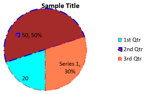
यह Python कोड पाई चार्ट बनाने को दर्शाता है:
import aspose.slides.charts as charts
import aspose.slides as slides
import aspose.pydrawing as draw

# PPTX फ़ाइल का प्रतिनिधित्व करने वाली Presentation क्लास का उदाहरण बनाएं।
with slides.Presentation() as presentation:

    # पहली स्लाइड तक पहुँचें।
    slide = presentation.slides[0]

    # डिफ़ॉल्ट डेटा के साथ चार्ट जोड़ें।
    chart = slide.shapes.add_chart(charts.ChartType.PIE, 20, 20, 500, 300)

    # चार्ट शीर्षक सेट करें।
    chart.chart_title.add_text_frame_for_overriding("Sample Title")
    chart.chart_title.text_frame_for_overriding.text_frame_format.center_text = slides.NullableBool.TRUE
    chart.chart_title.height = 20
    chart.has_title = True

    # चार्ट डेटा शीट का सूचकांक सेट करें।
    worksheet_index = 0

    # चार्ट डेटा वर्कबुक प्राप्त करें।
    workbook = chart.chart_data.chart_data_workbook

    # डिफ़ॉल्ट जेनरेटेड श्रृंखला और श्रेणियों को हटाएँ।
    chart.chart_data.series.clear()
    chart.chart_data.categories.clear()

    # नई श्रेणियाँ जोड़ें।
    chart.chart_data.categories.add(workbook.get_cell(0, 1, 0, "First Qtr"))
    chart.chart_data.categories.add(workbook.get_cell(0, 2, 0, "2nd Qtr"))
    chart.chart_data.categories.add(workbook.get_cell(0, 3, 0, "3rd Qtr"))

    # नई श्रृंखला जोड़ें।
    series = chart.chart_data.series.add(workbook.get_cell(0, 0, 1, "Series 1"), chart.type)

    # श्रृंखला डेटा भरें।
    series.data_points.add_data_point_for_pie_series(workbook.get_cell(worksheet_index, 1, 1, 20))
    series.data_points.add_data_point_for_pie_series(workbook.get_cell(worksheet_index, 2, 1, 50))
    series.data_points.add_data_point_for_pie_series(workbook.get_cell(worksheet_index, 3, 1, 30))

    # सेक्टर का रंग सेट करें।
    chart.chart_data.series_groups[0].is_color_varied = True

    point = series.data_points[0]
    point.format.fill.fill_type = slides.FillType.SOLID
    point.format.fill.solid_fill_color.color = draw.Color.cyan

    # सेक्टर की सीमा सेट करें।
    point.format.line.fill_format.fill_type = slides.FillType.SOLID
    point.format.line.fill_format.solid_fill_color.color = draw.Color.gray
    point.format.line.width = 3.0
    point.format.line.style = slides.LineStyle.THIN_THICK
    point.format.line.dash_style = slides.LineDashStyle.DASH_DOT

    point1 = series.data_points[1]
    point1.format.fill.fill_type = slides.FillType.SOLID
    point1.format.fill.solid_fill_color.color = draw.Color.brown

    # सेक्टर की सीमा सेट करें।
    point1.format.line.fill_format.fill_type = slides.FillType.SOLID
    point1.format.line.fill_format.solid_fill_color.color = draw.Color.blue
    point1.format.line.width = 3.0
    point1.format.line.style = slides.LineStyle.SINGLE
    point1.format.line.dash_style = slides.LineDashStyle.LARGE_DASH_DOT

    point2 = series.data_points[2]
    point2.format.fill.fill_type = slides.FillType.SOLID
    point2.format.fill.solid_fill_color.color = draw.Color.coral

    # सेक्टर की सीमा सेट करें।
    point2.format.line.fill_format.fill_type = slides.FillType.SOLID
    point2.format.line.fill_format.solid_fill_color.color = draw.Color.red
    point2.format.line.width = 2.0
    point2.format.line.style = slides.LineStyle.THIN_THIN
    point2.format.line.dash_style = slides.LineDashStyle.LARGE_DASH_DOT_DOT

    # नई श्रृंखला में प्रत्येक श्रेणी के लिए कस्टम लेबल बनाएं।
    label1 = series.data_points[0].label

    label1.data_label_format.show_value = True

    label2 = series.data_points[1].label
    label2.data_label_format.show_value = True
    label2.data_label_format.show_legend_key = True
    label2.data_label_format.show_percentage = True

    label3 = series.data_points[2].label
    label3.data_label_format.show_series_name = True
    label3.data_label_format.show_percentage = True

    # चार्ट के लिए लीडर लाइन्स दिखाने हेतु श्रृंखला सेट करें।
    series.labels.default_data_label_format.show_leader_lines = True

    # पाई चार्ट सेक्टर के लिए घूमाव कोण सेट करें।
    chart.chart_data.series_groups[0].first_slice_angle = 180

    # प्रस्तुति को डिस्क पर PPTX फ़ाइल के रूप में सहेजें।
    presentation.save("PieChart.pptx", slides.export.SaveFormat.PPTX)
परिणाम:
लाइन चार्ट बनाएं
लाइन चार्ट (जिसे लाइन ग्राफ़ भी कहा जाता है) उन स्थितियों में सबसे उपयुक्त होते हैं जहाँ आप समय के साथ मूल्य में बदलाव दिखाना चाहते हैं। लाइन चार्ट का उपयोग करके आप बड़ी मात्रा में डेटा की एक साथ तुलना, समय के साथ परिवर्तन और रुझान को ट्रैक, डेटा श्रृंखला में विसंगतियों को उजागर आदि कर सकते हैं।
- Create an instance of the Presentation class.
- Get a reference to a slide using its index.
- Add a chart with default data and specify the
ChartType.LINEtype. - Save the modified presentation as a PPTX file.
यह Python कोड लाइन चार्ट बनाने को दर्शाता है:
import aspose.slides as slides

with slides.Presentation() as presentation:
    line_chart = presentation.slides[0].shapes.add_chart(slides.charts.ChartType.LINE, 20, 20, 500, 300)

    presentation.save("LineChart.pptx", slides.export.SaveFormat.PPTX)
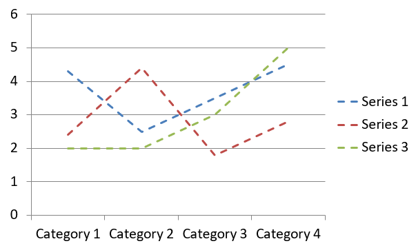
डिफ़ॉल्ट रूप से, लाइन चार्ट में बिंदुओं को सीधी निरंतर रेखाओं द्वारा जोड़ा जाता है। यदि आप बिंदुओं को डैश द्वारा जोड़ना चाहते हैं, तो आप नीचे दिखाए अनुसार डैश प्रकार निर्दिष्ट कर सकते हैं:
import aspose.slides as slides

with slides.Presentation() as presentation:
    line_chart = presentation.slides[0].shapes.add_chart(slides.charts.ChartType.LINE, 10, 50, 600, 350)

    for series in line_chart.chart_data.series:
        series.format.line.dash_style = slides.LineDashStyle.DASH

    presentation.save("LineChart.pptx", slides.export.SaveFormat.PPTX)
परिणाम:
ट्री मैप चार्ट बनाएं
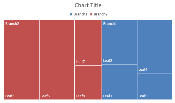
ट्री मैप चार्ट उन स्थितियों में सबसे उपयुक्त होते हैं जहाँ आप बिक्री डेटा का विश्लेषण करना चाहते हैं और डेटा वर्गों के सापेक्ष आकार दिखाना चाहते हैं, तथा प्रत्येक वर्ग में बड़े योगदानकर्ताओं पर जल्दी ध्यान केंद्रित करना चाहते हैं।
- Create an instance of the Presentation class.
- Get a reference to a slide using its index.
- Add a chart with default data and specify the
ChartType.TREEMAPtype. - Access the chart’s data workbook (ChartDataWorkbook).
- Clear the default series and categories.
- Add new series and categories.
- Add new chart data for the chart series.
- Save the modified presentation as a PPTX file.
यह Python कोड ट्री मैप चार्ट बनाने को दर्शाता है:
import aspose.slides.charts as charts
import aspose.slides as slides
import aspose.pydrawing as draw

with slides.Presentation() as presentation:
    chart = presentation.slides[0].shapes.add_chart(charts.ChartType.TREEMAP, 20, 20, 500, 300)
    chart.chart_data.categories.clear()
    chart.chart_data.series.clear()

    workbook = chart.chart_data.chart_data_workbook
    workbook.clear(0)

    # शाखा 1
    leaf = chart.chart_data.categories.add(workbook.get_cell(0, "C1", "Leaf1"))
    leaf.grouping_levels.set_grouping_item(1, "Stem1")
    leaf.grouping_levels.set_grouping_item(2, "Branch1")

    chart.chart_data.categories.add(workbook.get_cell(0, "C2", "Leaf2"))

    leaf = chart.chart_data.categories.add(workbook.get_cell(0, "C3", "Leaf3"))
    leaf.grouping_levels.set_grouping_item(1, "Stem2")

    chart.chart_data.categories.add(workbook.get_cell(0, "C4", "Leaf4"))

    # शाखा 2
    leaf = chart.chart_data.categories.add(workbook.get_cell(0, "C5", "Leaf5"))
    leaf.grouping_levels.set_grouping_item(1, "Stem3")
    leaf.grouping_levels.set_grouping_item(2, "Branch2")

    chart.chart_data.categories.add(workbook.get_cell(0, "C6", "Leaf6"))

    leaf = chart.chart_data.categories.add(workbook.get_cell(0, "C7", "Leaf7"))
    leaf.grouping_levels.set_grouping_item(1, "Stem4")

    chart.chart_data.categories.add(workbook.get_cell(0, "C8", "Leaf8"))

    series = chart.chart_data.series.add(charts.ChartType.TREEMAP)
    series.labels.default_data_label_format.show_category_name = True
    series.data_points.add_data_point_for_treemap_series(workbook.get_cell(0, "D1", 4))
    series.data_points.add_data_point_for_treemap_series(workbook.get_cell(0, "D2", 5))
    series.data_points.add_data_point_for_treemap_series(workbook.get_cell(0, "D3", 3))
    series.data_points.add_data_point_for_treemap_series(workbook.get_cell(0, "D4", 6))
    series.data_points.add_data_point_for_treemap_series(workbook.get_cell(0, "D5", 9))
    series.data_points.add_data_point_for_treemap_series(workbook.get_cell(0, "D6", 9))
    series.data_points.add_data_point_for_treemap_series(workbook.get_cell(0, "D7", 4))
    series.data_points.add_data_point_for_treemap_series(workbook.get_cell(0, "D8", 3))

    series.parent_label_layout = charts.ParentLabelLayoutType.OVERLAPPING

    presentation.save("TreeMap.pptx", slides.export.SaveFormat.PPTX)
परिणाम:
स्टॉक चार्ट बनाएं
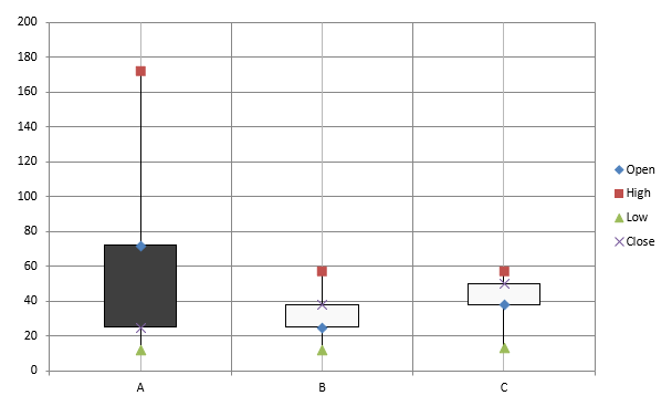
स्टॉक चार्ट वित्तीय डेटा जैसे ओपन, हाई, लो और क्लोज़ मूल्यों को प्रदर्शित करने के लिए उपयोग होते हैं, जिससे बाजार रुझान और अस्थिरता का विश्लेषण किया जा सके। ये स्टॉक प्रदर्शन के बारे में महत्वपूर्ण अंतर्दृष्टि प्रदान करते हैं, जिससे निवेशकों और विश्लेषकों को सूचित निर्णय लेने में मदद मिलती है।
- Create an instance of the Presentation class.
- Get a reference to a slide using its index.
- Add a chart with default data and specify the
ChartType.OPEN_HIGH_LOW_CLOSEtype. - Access the chart’s data workbook (ChartDataWorkbook).
- Clear the default series and categories.
- Add new series and categories.
- Add new chart data for the chart series.
- Specify the high‑low lines format.
- Save the modified presentation as a PPTX file.
यह Python कोड स्टॉक चार्ट बनाने को दर्शाता है:
import aspose.slides.charts as charts
import aspose.slides as slides
import aspose.pydrawing as draw

with slides.Presentation() as presentation:
    chart = presentation.slides[0].shapes.add_chart(charts.ChartType.OPEN_HIGH_LOW_CLOSE, 20, 20, 500, 300, False)

    chart.chart_data.series.clear()
    chart.chart_data.categories.clear()

    workbook = chart.chart_data.chart_data_workbook

    chart.chart_data.categories.add(workbook.get_cell(0, 1, 0, "A"))
    chart.chart_data.categories.add(workbook.get_cell(0, 2, 0, "B"))
    chart.chart_data.categories.add(workbook.get_cell(0, 3, 0, "C"))

    chart.chart_data.series.add(workbook.get_cell(0, 0, 1, "Open"), chart.type)
    chart.chart_data.series.add(workbook.get_cell(0, 0, 2, "High"), chart.type)
    chart.chart_data.series.add(workbook.get_cell(0, 0, 3, "Low"), chart.type)
    chart.chart_data.series.add(workbook.get_cell(0, 0, 4, "Close"), chart.type)

    series = chart.chart_data.series[0]

    series.data_points.add_data_point_for_stock_series(workbook.get_cell(0, 1, 1, 72))
    series.data_points.add_data_point_for_stock_series(workbook.get_cell(0, 2, 1, 25))
    series.data_points.add_data_point_for_stock_series(workbook.get_cell(0, 3, 1, 38))

    series = chart.chart_data.series[1]
    series.data_points.add_data_point_for_stock_series(workbook.get_cell(0, 1, 2, 172))
    series.data_points.add_data_point_for_stock_series(workbook.get_cell(0, 2, 2, 57))
    series.data_points.add_data_point_for_stock_series(workbook.get_cell(0, 3, 2, 57))

    series = chart.chart_data.series[2]
    series.data_points.add_data_point_for_stock_series(workbook.get_cell(0, 1, 3, 12))
    series.data_points.add_data_point_for_stock_series(workbook.get_cell(0, 2, 3, 12))
    series.data_points.add_data_point_for_stock_series(workbook.get_cell(0, 3, 3, 13))

    series = chart.chart_data.series[3]
    series.data_points.add_data_point_for_stock_series(workbook.get_cell(0, 1, 4, 25))
    series.data_points.add_data_point_for_stock_series(workbook.get_cell(0, 2, 4, 38))
    series.data_points.add_data_point_for_stock_series(workbook.get_cell(0, 3, 4, 50))

    chart.chart_data.series_groups[0].up_down_bars.has_up_down_bars = True
    chart.chart_data.series_groups[0].hi_low_lines_format.line.fill_format.fill_type = slides.FillType.SOLID

    for ser in chart.chart_data.series:
        ser.format.line.fill_format.fill_type = slides.FillType.NO_FILL

    presentation.save("StockChart.pptx", slides.export.SaveFormat.PPTX)
परिणाम:
बॉक्स एंड व्हिस्कर चार्ट बनाएं
बॉक्स एंड व्हिस्कर चार्ट डेटा वितरण को मध्यिका, क्वारटाइल और संभावित अपवर्तक जैसे मुख्य सांख्यिकीय मापों को सारांशित करके प्रदर्शित करते हैं। ये खोजपरक डेटा विश्लेषण और सांख्यिकीय अध्ययन में डेटा परिवर्तनशीलता को जल्दी समझने और किसी भी विसंगति की पहचान करने में सहायक होते हैं।
- Create an instance of the Presentation class.
- Get a reference to a slide using its index.
- Add a chart with default data and specify the
ChartType.BOX_AND_WHISKERtype. - Access the chart’s data workbook (ChartDataWorkbook).
- Clear the default series and categories.
- Add new series and categories.
- Add new chart data for the chart series.
- Save the modified presentation as a PPTX file.
यह Python कोड बॉक्स एंड व्हिस्कर चार्ट बनाने को दर्शाता है:
import aspose.slides.charts as charts
import aspose.slides as slides
import aspose.pydrawing as draw

with slides.Presentation() as presentation:
    chart = presentation.slides[0].shapes.add_chart(charts.ChartType.BOX_AND_WHISKER, 20, 20, 500, 300)
    chart.chart_data.categories.clear()
    chart.chart_data.series.clear()

    workbook = chart.chart_data.chart_data_workbook
    workbook.clear(0)

    chart.chart_data.categories.add(workbook.get_cell(0, "A1", "Category 1"))
    chart.chart_data.categories.add(workbook.get_cell(0, "A2", "Category 1"))
    chart.chart_data.categories.add(workbook.get_cell(0, "A3", "Category 1"))
    chart.chart_data.categories.add(workbook.get_cell(0, "A4", "Category 1"))
    chart.chart_data.categories.add(workbook.get_cell(0, "A5", "Category 1"))
    chart.chart_data.categories.add(workbook.get_cell(0, "A6", "Category 1"))

    series = chart.chart_data.series.add(charts.ChartType.BOX_AND_WHISKER)

    series.quartile_method = charts.QuartileMethodType.EXCLUSIVE
    series.show_mean_line = True
    series.show_mean_markers = True
    series.show_inner_points = True
    series.show_outlier_points = True

    series.data_points.add_data_point_for_box_and_whisker_series(workbook.get_cell(0, "B1", 15))
    series.data_points.add_data_point_for_box_and_whisker_series(workbook.get_cell(0, "B2", 41))
    series.data_points.add_data_point_for_box_and_whisker_series(workbook.get_cell(0, "B3", 16))
    series.data_points.add_data_point_for_box_and_whisker_series(workbook.get_cell(0, "B4", 10))
    series.data_points.add_data_point_for_box_and_whisker_series(workbook.get_cell(0, "B5", 23))
    series.data_points.add_data_point_for_box_and_whisker_series(workbook.get_cell(0, "B6", 16))

    presentation.save("BoxAndWhiskerChart.pptx", slides.export.SaveFormat.PPTX)
फ़नल चार्ट बनाएं
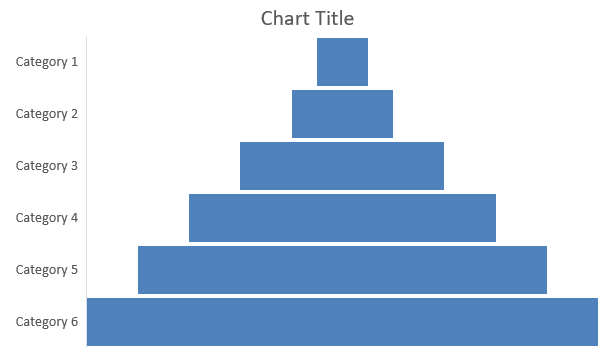
फ़नल चार्ट उन प्रक्रियाओं को दृश्य रूप में प्रस्तुत करने के लिए उपयोग होते हैं जो क्रमिक चरणों में विभाजित होती हैं, जहाँ डेटा की मात्रा प्रत्येक चरण के साथ घटती जाती है। ये रूपांतरण दरों का विश्लेषण, बाधाओं की पहचान, और बिक्री या मार्केटिंग प्रक्रियाओं की कार्यक्षमता को ट्रैक करने में विशेष रूप से सहायक होते हैं।
- Create an instance of the Presentation class.
- Get a reference to a slide using its index.
- Add a chart with default data and specify the
ChartType.FUNNELtype. - Save the modified presentation as a PPTX file.
यह Python कोड फ़नल चार्ट बनाने को दर्शाता है:
import aspose.slides.charts as charts
import aspose.slides as slides
import aspose.pydrawing as draw

with slides.Presentation() as presentation:
    chart = presentation.slides[0].shapes.add_chart(charts.ChartType.FUNNEL, 50, 50, 500, 400)
    chart.chart_data.categories.clear()
    chart.chart_data.series.clear()

    workbook = chart.chart_data.chart_data_workbook
    workbook.clear(0)

    chart.chart_data.categories.add(workbook.get_cell(0, "A1", "Category 1"))
    chart.chart_data.categories.add(workbook.get_cell(0, "A2", "Category 2"))
    chart.chart_data.categories.add(workbook.get_cell(0, "A3", "Category 3"))
    chart.chart_data.categories.add(workbook.get_cell(0, "A4", "Category 4"))
    chart.chart_data.categories.add(workbook.get_cell(0, "A5", "Category 5"))
    chart.chart_data.categories.add(workbook.get_cell(0, "A6", "Category 6"))

    series = chart.chart_data.series.add(charts.ChartType.FUNNEL)

    series.data_points.add_data_point_for_funnel_series(workbook.get_cell(0, "B1", 50))
    series.data_points.add_data_point_for_funnel_series(workbook.get_cell(0, "B2", 100))
    series.data_points.add_data_point_for_funnel_series(workbook.get_cell(0, "B3", 200))
    series.data_points.add_data_point_for_funnel_series(workbook.get_cell(0, "B4", 300))
    series.data_points.add_data_point_for_funnel_series(workbook.get_cell(0, "B5", 400))
    series.data_points.add_data_point_for_funnel_series(workbook.get_cell(0, "B6", 500))

    presentation.save("FunnelChart.pptx", slides.export.SaveFormat.PPTX)
परिणाम:
सनबर्स्ट चार्ट बनाएं
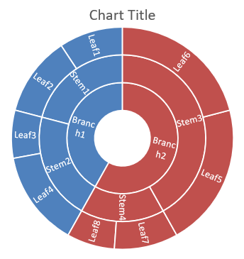
सनबर्स्ट चार्ट पदानुक्रमित डेटा को दृश्य रूप में प्रस्तुत करने के लिए उपयोग होते हैं, जहाँ स्तरों को कँधीलाकार रिंग्स के रूप में दिखाया जाता है। ये भाग‑से‑समग्र संबंध को स्पष्ट रूप से दिखाते हैं और नेस्टेड श्रेणियों एवं उप‑श्रेणियों को संक्षिप्त रूप में प्रस्तुत करने में आदर्श हैं।
- Create an instance of the Presentation class.
- Get a reference to a slide using its index.
- Add a chart with default data and specify the
ChartType.SUNBURSTtype. - Save the modified presentation as a PPTX file.
यह Python कोड सनबर्स्ट चार्ट बनाने को दर्शाता है:
import aspose.slides.charts as charts
import aspose.slides as slides
import aspose.pydrawing as draw

with slides.Presentation() as presentation:
    chart = presentation.slides[0].shapes.add_chart(charts.ChartType.SUNBURST, 20, 20, 500, 300)
    chart.chart_data.categories.clear()
    chart.chart_data.series.clear()

    workbook = chart.chart_data.chart_data_workbook
    workbook.clear(0)

    # शाखा 1
    leaf = chart.chart_data.categories.add(workbook.get_cell(0, "C1", "Leaf1"))
    leaf.grouping_levels.set_grouping_item(1, "Stem1")
    leaf.grouping_levels.set_grouping_item(2, "Branch1")

    chart.chart_data.categories.add(workbook.get_cell(0, "C2", "Leaf2"))

    leaf = chart.chart_data.categories.add(workbook.get_cell(0, "C3", "Leaf3"))
    leaf.grouping_levels.set_grouping_item(1, "Stem2")

    chart.chart_data.categories.add(workbook.get_cell(0, "C4", "Leaf4"))

    # शाखा 2
    leaf = chart.chart_data.categories.add(workbook.get_cell(0, "C5", "Leaf5"))
    leaf.grouping_levels.set_grouping_item(1, "Stem3")
    leaf.grouping_levels.set_grouping_item(2, "Branch2")

    chart.chart_data.categories.add(workbook.get_cell(0, "C6", "Leaf6"))

    leaf = chart.chart_data.categories.add(workbook.get_cell(0, "C7", "Leaf7"))
    leaf.grouping_levels.set_grouping_item(1, "Stem4")

    chart.chart_data.categories.add(workbook.get_cell(0, "C8", "Leaf8"))

    series = chart.chart_data.series.add(charts.ChartType.SUNBURST)
    series.labels.default_data_label_format.show_category_name = True
    series.data_points.add_data_point_for_sunburst_series(workbook.get_cell(0, "D1", 4))
    series.data_points.add_data_point_for_sunburst_series(workbook.get_cell(0, "D2", 5))
    series.data_points.add_data_point_for_sunburst_series(workbook.get_cell(0, "D3", 3))
    series.data_points.add_data_point_for_sunburst_series(workbook.get_cell(0, "D4", 6))
    series.data_points.add_data_point_for_sunburst_series(workbook.get_cell(0, "D5", 9))
    series.data_points.add_data_point_for_sunburst_series(workbook.get_cell(0, "D6", 9))
    series.data_points.add_data_point_for_sunburst_series(workbook.get_cell(0, "D7", 4))
    series.data_points.add_data_point_for_sunburst_series(workbook.get_cell(0, "D8", 3))

    presentation.save("SunburstChart.pptx", slides.export.SaveFormat.PPTX)
परिणाम:
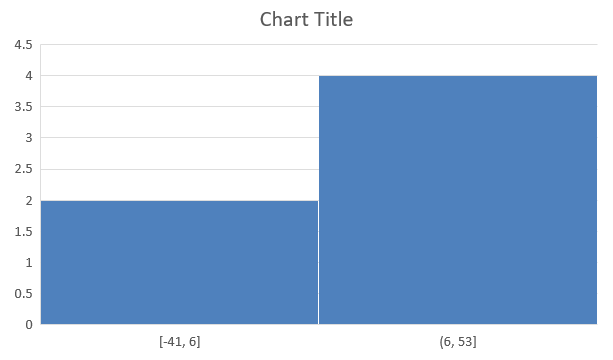
हिस्टोग्राम चार्ट बनाएं
हिस्टोग्राम चार्ट संख्यात्मक डेटा के वितरण को विभिन्न रेंज या बिन में समूहित करके दर्शाते हैं। ये आवृत्ति, विकृति और प्रसार जैसे पैटर्न की पहचान, तथा डेटासेट में अपवर्तकों का पता लगाने में विशेष रूप से उपयोगी होते हैं।
- Create an instance of the Presentation class.
- Get a reference to a slide using its index.
- Add a chart with some data and specify the
ChartType.HISTOGRAMtype. - Access the chart data workbook (ChartDataWorkbook).
- Clear the default series and categories.
- Add a new series and populate it with data points. A histogram has no categories; the bins are calculated from the values.
- Save the modified presentation as a PPTX file.
यह Python कोड हिस्टोग्राम चार्ट बनाने को दर्शाता है:
import aspose.slides.charts as charts
import aspose.slides as slides
import aspose.pydrawing as draw

with slides.Presentation() as presentation:
    chart = presentation.slides[0].shapes.add_chart(charts.ChartType.HISTOGRAM, 20, 20, 500, 300)
    chart.chart_data.categories.clear()
    chart.chart_data.series.clear()

    workbook = chart.chart_data.chart_data_workbook
    workbook.clear(0)

    series = chart.chart_data.series.add(charts.ChartType.HISTOGRAM)
    series.data_points.add_data_point_for_histogram_series(workbook.get_cell(0, "A1", 15))
    series.data_points.add_data_point_for_histogram_series(workbook.get_cell(0, "A2", -41))
    series.data_points.add_data_point_for_histogram_series(workbook.get_cell(0, "A3", 16))
    series.data_points.add_data_point_for_histogram_series(workbook.get_cell(0, "A4", 10))
    series.data_points.add_data_point_for_histogram_series(workbook.get_cell(0, "A5", -23))
    series.data_points.add_data_point_for_histogram_series(workbook.get_cell(0, "A6", 16))

    chart.axes.horizontal_axis.aggregation_type = charts.AxisAggregationType.AUTOMATIC

    presentation.save("HistogramChart.pptx", slides.export.SaveFormat.PPTX)
परिणाम:
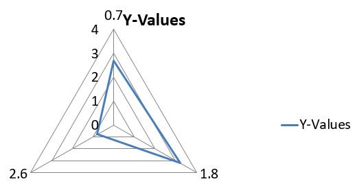
रेडार चार्ट बनाएं
रेडार चार्ट बहुचर डेटा को दो‑आयामी रूप में प्रदर्शित करते हैं, जिससे कई चर को एक साथ आसानी से तुलना की जा सके। ये कई प्रदर्शन मीट्रिक या गुणों में पैटर्न, ताकत और कमजोरियों की पहचान में विशेष रूप से उपयोगी होते हैं।
- Create an instance of the Presentation class.
- Get a reference to a slide using its index.
- Add a chart with some data and specify the
ChartType.RADARtype. - Save the modified presentation as a PPTX file.
यह Python कोड रेडार चार्ट बनाने को दर्शाता है:
import aspose.slides as slides

with slides.Presentation() as presentation:
    presentation.slides[0].shapes.add_chart(slides.charts.ChartType.RADAR, 20, 20, 500, 300)
    presentation.save("RadarChart.pptx", slides.export.SaveFormat.PPTX)
परिणाम:
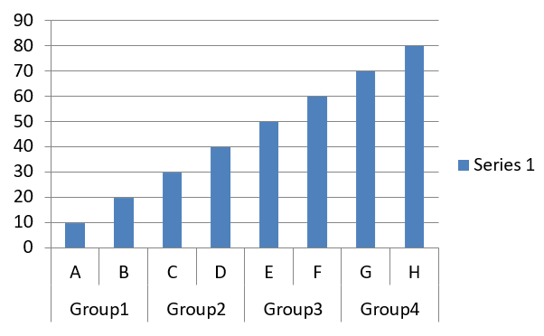
मल्टी‑कैटेगरी चार्ट बनाएं
मल्टी‑कैटेगरी चार्ट ऐसे डेटा को प्रदर्शित करने के लिए उपयोग होते हैं जहाँ एक से अधिक श्रेणीगत समूह शामिल होते हैं, जिससे आप कई आयामों में मानों की एक साथ तुलना कर सकते हैं। ये जटिल, बहु‑परत डेटा सेट में रुझान और संबंधों का विश्लेषण करने में विशेष रूप से सहायक होते हैं।
- Create an instance of the Presentation class.
- Get a reference to a slide using its index.
- Add a chart with default data and specify the
ChartType.CLUSTERED_COLUMNtype. - Access the chart’s data workbook (ChartDataWorkbook).
- Clear the default series and categories.
- Add new series and categories.
- Add new chart data for the chart series.
- Save the modified presentation as a PPTX file.
यह Python कोड मल्टी‑कैटेगरी चार्ट बनाने को दर्शाता है:
import aspose.slides.charts as charts
import aspose.slides as slides
import aspose.pydrawing as draw

with slides.Presentation() as presentation:
    slide = presentation.slides[0]

    chart = presentation.slides[0].shapes.add_chart(charts.ChartType.CLUSTERED_COLUMN, 20, 20, 500, 300)
    chart.chart_data.series.clear()
    chart.chart_data.categories.clear()

    workbook = chart.chart_data.chart_data_workbook
    workbook.clear(0)

    worksheet_index = 0

    category = chart.chart_data.categories.add(workbook.get_cell(0, "c2", "A"))
    category.grouping_levels.set_grouping_item(1, "Group1")
    category = chart.chart_data.categories.add(workbook.get_cell(0, "c3", "B"))

    category = chart.chart_data.categories.add(workbook.get_cell(0, "c4", "C"))
    category.grouping_levels.set_grouping_item(1, "Group2")
    category = chart.chart_data.categories.add(workbook.get_cell(0, "c5", "D"))

    category = chart.chart_data.categories.add(workbook.get_cell(0, "c6", "E"))
    category.grouping_levels.set_grouping_item(1, "Group3")
    category = chart.chart_data.categories.add(workbook.get_cell(0, "c7", "F"))

    category = chart.chart_data.categories.add(workbook.get_cell(0, "c8", "G"))
    category.grouping_levels.set_grouping_item(1, "Group4")
    category = chart.chart_data.categories.add(workbook.get_cell(0, "c9", "H"))

    # एक श्रृंखला जोड़ें.
    series = chart.chart_data.series.add(workbook.get_cell(0, "D1", "Series 1"), charts.ChartType.CLUSTERED_COLUMN)

    series.data_points.add_data_point_for_bar_series(workbook.get_cell(worksheet_index, "D2", 10))
    series.data_points.add_data_point_for_bar_series(workbook.get_cell(worksheet_index, "D3", 20))
    series.data_points.add_data_point_for_bar_series(workbook.get_cell(worksheet_index, "D4", 30))
    series.data_points.add_data_point_for_bar_series(workbook.get_cell(worksheet_index, "D5", 40))
    series.data_points.add_data_point_for_bar_series(workbook.get_cell(worksheet_index, "D6", 50))
    series.data_points.add_data_point_for_bar_series(workbook.get_cell(worksheet_index, "D7", 60))
    series.data_points.add_data_point_for_bar_series(workbook.get_cell(worksheet_index, "D8", 70))
    series.data_points.add_data_point_for_bar_series(workbook.get_cell(worksheet_index, "D9", 80))

    # चार्ट के साथ प्रस्तुति सहेजें.
    presentation.save("MultiCategoryChart.pptx", slides.export.SaveFormat.PPTX)
परिणाम:
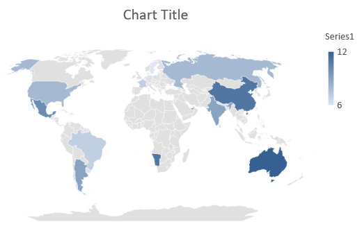
मैप चार्ट बनाएं
मैप चार्ट भौगोलिक डेटा को विशिष्ट स्थानों जैसे देशों, राज्यों या शहरों के साथ मानचित्रित करके दृश्य रूप में प्रस्तुत करते हैं। ये क्षेत्रीय रुझानों, जनसांख्यिकीय डेटा और स्थानिक वितरण का विश्लेषण स्पष्ट और आकर्षक तरीके से करने में विशेष रूप से उपयोगी होते हैं।
यह Python कोड मैप चार्ट बनाने को दर्शाता है:
import aspose.slides as slides

with slides.Presentation() as presentation:
    chart = presentation.slides[0].shapes.add_chart(slides.charts.ChartType.MAP, 20, 20, 500, 300)
    presentation.save("mapChart.pptx", slides.export.SaveFormat.PPTX)
परिणाम:
कॉम्बिनेशन चार्ट बनाएं
एक कॉम्बिनेशन चार्ट (या कॉम्बो चार्ट) एक ही ग्राफ़ में दो या अधिक चार्ट प्रकारों को मिलाता है। यह चार्ट आपको दो या अधिक डेटा सेट के बीच अंतर को उजागर, तुलना या जाँचने की अनुमति देता है, जिससे उनके बीच के संबंधों की पहचान आसान हो जाती है।
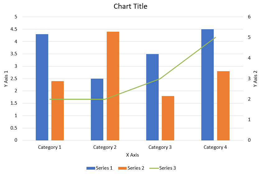
ऊपर दिखाए गए कॉम्बिनेशन चार्ट को PowerPoint प्रस्तुति में बनाने के लिए निम्नलिखित Python कोड उपयोग करें:
import aspose.slides.charts as charts
import aspose.pydrawing as draw
import aspose.slides as slides

def create_combo_chart():
    with slides.Presentation() as presentation:
        chart = create_chart_with_first_series(presentation.slides[0])

        add_second_series_to_chart(chart)
        add_third_series_to_chart(chart)

        set_primary_axes_format(chart)
        set_secondary_axes_format(chart)

        presentation.save("combo-chart.pptx", slides.export.SaveFormat.PPTX)


def create_chart_with_first_series(slide):
    chart = slide.shapes.add_chart(charts.ChartType.CLUSTERED_COLUMN, 50, 50, 600, 400)

    # चार्ट शीर्षक सेट करें।
    chart.has_title = True
    chart.chart_title.add_text_frame_for_overriding("Chart Title")
    chart.chart_title.overlay = False
    title_paragraph = chart.chart_title.text_frame_for_overriding.paragraphs[0]
    title_format = title_paragraph.paragraph_format.default_portion_format

    title_format.font_bold = slides.NullableBool.FALSE
    title_format.font_height = 18

    # चार्ट लेजेंड सेट करें।
    chart.legend.position = charts.LegendPositionType.BOTTOM
    chart.legend.text_format.portion_format.font_height = 12

    # डिफ़ॉल्ट जेनरेटेड श्रृंखला और श्रेणियों को हटाएँ।
    chart.chart_data.series.clear()
    chart.chart_data.categories.clear()

    worksheet_index = 0
    workbook = chart.chart_data.chart_data_workbook

    # नई श्रेणियाँ जोड़ें।
    chart.chart_data.categories.add(workbook.get_cell(worksheet_index, 1, 0, "Category 1"))
    chart.chart_data.categories.add(workbook.get_cell(worksheet_index, 2, 0, "Category 2"))
    chart.chart_data.categories.add(workbook.get_cell(worksheet_index, 3, 0, "Category 3"))
    chart.chart_data.categories.add(workbook.get_cell(worksheet_index, 4, 0, "Category 4"))

    # पहली श्रृंखला जोड़ें।
    series_name_cell = workbook.get_cell(worksheet_index, 0, 1, "Series 1")
    series = chart.chart_data.series.add(series_name_cell, chart.type)

    series.parent_series_group.overlap = -25
    series.parent_series_group.gap_width = 220

    series.data_points.add_data_point_for_bar_series(workbook.get_cell(worksheet_index, 1, 1, 4.3))
    series.data_points.add_data_point_for_bar_series(workbook.get_cell(worksheet_index, 2, 1, 2.5))
    series.data_points.add_data_point_for_bar_series(workbook.get_cell(worksheet_index, 3, 1, 3.5))
    series.data_points.add_data_point_for_bar_series(workbook.get_cell(worksheet_index, 4, 1, 4.5))

    return chart


def add_second_series_to_chart(chart):
    workbook = chart.chart_data.chart_data_workbook
    worksheet_index = 0

    series_name_cell = workbook.get_cell(worksheet_index, 0, 2, "Series 2")
    series = chart.chart_data.series.add(series_name_cell, charts.ChartType.CLUSTERED_COLUMN)

    series.parent_series_group.overlap = -25
    series.parent_series_group.gap_width = 220

    series.data_points.add_data_point_for_bar_series(workbook.get_cell(worksheet_index, 1, 2, 2.4))
    series.data_points.add_data_point_for_bar_series(workbook.get_cell(worksheet_index, 2, 2, 4.4))
    series.data_points.add_data_point_for_bar_series(workbook.get_cell(worksheet_index, 3, 2, 1.8))
    series.data_points.add_data_point_for_bar_series(workbook.get_cell(worksheet_index, 4, 2, 2.8))


def add_third_series_to_chart(chart):
    workbook = chart.chart_data.chart_data_workbook
    worksheet_index = 0

    series_name_cell = workbook.get_cell(worksheet_index, 0, 3, "Series 3")
    series = chart.chart_data.series.add(series_name_cell, charts.ChartType.LINE)

    series.data_points.add_data_point_for_line_series(workbook.get_cell(worksheet_index, 1, 3, 2.0))
    series.data_points.add_data_point_for_line_series(workbook.get_cell(worksheet_index, 2, 3, 2.0))
    series.data_points.add_data_point_for_line_series(workbook.get_cell(worksheet_index, 3, 3, 3.0))
    series.data_points.add_data_point_for_line_series(workbook.get_cell(worksheet_index, 4, 3, 5.0))

    series.plot_on_second_axis = True


def set_primary_axes_format(chart):
    # क्षैतिज अक्ष सेट करें।
    horizontal_axis = chart.axes.horizontal_axis
    horizontal_axis.text_format.portion_format.font_height = 12.0
    horizontal_axis.format.line.fill_format.fill_type = slides.FillType.NO_FILL

    set_axis_title(horizontal_axis, "X Axis")

    # लंबवत अक्ष सेट करें।
    vertical_axis = chart.axes.vertical_axis
    vertical_axis.text_format.portion_format.font_height = 12.0
    vertical_axis.format.line.fill_format.fill_type = slides.FillType.NO_FILL

    set_axis_title(vertical_axis, "Y Axis 1")

    # लंबवत प्रमुख ग्रिडलाइन का रंग सेट करें।
    major_grid_lines_format = vertical_axis.major_grid_lines_format.line.fill_format
    major_grid_lines_format.fill_type = slides.FillType.SOLID
    major_grid_lines_format.solid_fill_color.color = draw.Color.from_argb(217, 217, 217)


def set_secondary_axes_format(chart):
    # द्वितीयक क्षैतिज अक्ष सेट करें।
    secondary_horizontal_axis = chart.axes.secondary_horizontal_axis
    secondary_horizontal_axis.position = charts.AxisPositionType.BOTTOM
    secondary_horizontal_axis.cross_type = charts.CrossesType.MAXIMUM
    secondary_horizontal_axis.is_visible = False
    secondary_horizontal_axis.major_grid_lines_format.line.fill_format.fill_type = slides.FillType.NO_FILL
    secondary_horizontal_axis.minor_grid_lines_format.line.fill_format.fill_type = slides.FillType.NO_FILL

    # द्वितीयक लंबवत अक्ष सेट करें।
    secondary_vertical_axis = chart.axes.secondary_vertical_axis
    secondary_vertical_axis.position = charts.AxisPositionType.RIGHT
    secondary_vertical_axis.text_format.portion_format.font_height = 12.0
    secondary_vertical_axis.format.line.fill_format.fill_type = slides.FillType.NO_FILL
    secondary_vertical_axis.major_grid_lines_format.line.fill_format.fill_type = slides.FillType.NO_FILL
    secondary_vertical_axis.minor_grid_lines_format.line.fill_format.fill_type = slides.FillType.NO_FILL

    set_axis_title(secondary_vertical_axis, "Y Axis 2")


def set_axis_title(axis, axis_title):
    axis.has_title = True
    axis.title.overlay = False
    title_portion_format = axis.title.add_text_frame_for_overriding(axis_title).paragraphs[0].paragraph_format.default_portion_format
    title_portion_format.font_bold = slides.NullableBool.FALSE
    title_portion_format.font_height = 12.0
चार्ट अपडेट करें
Aspose.Slides for Python via .NET आपको चार्ट डेटा, फ़ॉर्मेटिंग और स्टाइलिंग को अपडेट करने की सुविधा देता है ताकि आपके PowerPoint प्रस्तुति अद्यतन रहें।
- Create an instance of the Presentation class to open the presentation containing the chart.
- Get a reference to a slide using its index.
- Traverse through all shapes to find the chart.
- Access the chart’s data worksheet.
- Modify the chart data series by changing the series values.
- Add a new series and populate its data.
- Save the modified presentation as a PPTX file.
यह Python कोड चार्ट को अपडेट करने को दर्शाता है:
import aspose.slides.charts as charts
import aspose.slides as slides
import aspose.pydrawing as draw

chart_name = "My chart"

# PPTX फ़ाइल का प्रतिनिधित्व करने वाली Presentation क्लास का उदाहरण बनाएं।
with slides.Presentation("ExistingChart.pptx") as presentation:

    # पहली स्लाइड तक पहुँचें।
    slide = presentation.slides[0]

    for shape in slide.shapes:
        if isinstance(shape, charts.Chart) and shape.name == chart_name:
            chart = shape

            # चार्ट डेटा शीट का सूचकांक सेट करें।
            worksheet_index = 0

            # चार्ट डेटा वर्कबुक प्राप्त करें।
            workbook = chart.chart_data.chart_data_workbook

            # चार्ट श्रेणी नाम बदलें।
            workbook.get_cell(worksheet_index, 1, 0, "Modified Category 1")
            workbook.get_cell(worksheet_index, 2, 0, "Modified Category 2")

            # पहली चार्ट श्रृंखला प्राप्त करें।
            series = chart.chart_data.series[0]

            # श्रृंखला डेटा अपडेट करें।
            workbook.get_cell(worksheet_index, 0, 1, "New_Series1")  # श्रृंखला नाम संशोधित कर रहा है।
            series.data_points[0].value.data = 90
            series.data_points[1].value.data = 123
            series.data_points[2].value.data = 44

            # दूसरी चार्ट श्रृंखला प्राप्त करें।
            series = chart.chart_data.series[1]

            # श्रृंखला डेटा अपडेट करें।
            workbook.get_cell(worksheet_index, 0, 2, "New_Series2")  # श्रृंखला नाम संशोधित कर रहा है।
            series.data_points[0].value.data = 23
            series.data_points[1].value.data = 67
            series.data_points[2].value.data = 99

            # नई श्रृंखला जोड़ें।
            series = chart.chart_data.series.add(workbook.get_cell(worksheet_index, 0, 3, "Series 3"), chart.type)

            # श्रृंखला डेटा भरें।
            series.data_points.add_data_point_for_bar_series(workbook.get_cell(worksheet_index, 1, 3, 20))
            series.data_points.add_data_point_for_bar_series(workbook.get_cell(worksheet_index, 2, 3, 50))
            series.data_points.add_data_point_for_bar_series(workbook.get_cell(worksheet_index, 3, 3, 30))

            chart.type = charts.ChartType.CLUSTERED_CYLINDER

            # चार्ट के साथ प्रस्तुति सहेजें।
            presentation.save("ModifiedChart.pptx", slides.export.SaveFormat.PPTX)
एक चार्ट के लिए डेटा रेंज सेट करें
किसी मौजूदा चार्ट द्वारा पहले उपयोग की गई रेंज की जाँच करने के लिए देखें एक चार्ट की डेटा रेंज प्राप्त करें।
Aspose.Slides for Python via .NET आपको चार्ट के डेटा स्रोत के रूप में एक विशिष्ट वर्कशीट रेंज का उपयोग करने की अनुमति देता है। यह नियंत्रित करता है कि कौन‑से कोशिकाएँ चार्ट की श्रृंखला और श्रेणियों को प्रदान करती हैं और आपको वर्कशीट में बदलाव के अनुसार चार्ट को अपडेट करने देता है।
- Create an instance of the Presentation class to open the presentation containing the chart.
- Get a reference to a slide using its index.
- Traverse through all shapes to find the chart.
- Access the chart data and set the range.
- Save the modified presentation as a PPTX file.
यह Python कोड चार्ट के लिए डेटा रेंज सेट करने को दर्शाता है:
import aspose.slides.charts as charts
import aspose.slides as slides
import aspose.pydrawing as draw

chart_name = "My chart"

# PPTX फ़ाइल का प्रतिनिधित्व करने वाली Presentation क्लास का उदाहरण बनाएं.
with slides.Presentation("ExistingChart.pptx") as presentation:

    # पहली स्लाइड तक पहुँचें.
    slide = presentation.slides[0]

    for shape in slide.shapes:
        if isinstance(shape, charts.Chart) and shape.name == chart_name:
            chart = shape
            chart.chart_data.set_range("Sheet1!A1:B4")

    presentation.save("DataRange.pptx", slides.export.SaveFormat.PPTX)
चार्ट में डिफ़ॉल्ट मार्कर का उपयोग करें
जब आप चार्ट में डिफ़ॉल्ट मार्कर का उपयोग करते हैं, तो प्रत्येक चार्ट श्रृंखला को स्वचालित रूप से एक अलग मार्कर प्रतीक मिल जाता है।
यह Python कोड स्वचालित रूप से चार्ट श्रृंखला मार्कर सेट करने को दर्शाता है:
import aspose.slides.charts as charts
import aspose.slides as slides
import aspose.pydrawing as draw

with slides.Presentation() as presentation:
    slide = presentation.slides[0]
    chart = slide.shapes.add_chart(charts.ChartType.LINE_WITH_MARKERS, 10, 10, 400, 400)

    chart.chart_data.series.clear()
    chart.chart_data.categories.clear()

    workbook = chart.chart_data.chart_data_workbook

    series = chart.chart_data.series.add(workbook.get_cell(0, 0, 1, "Series 1"), chart.type)

    chart.chart_data.categories.add(workbook.get_cell(0, 1, 0, "C1"))
    series.data_points.add_data_point_for_line_series(workbook.get_cell(0, 1, 1, 24))

    chart.chart_data.categories.add(workbook.get_cell(0, 2, 0, "C2"))
    series.data_points.add_data_point_for_line_series(workbook.get_cell(0, 2, 1, 23))

    chart.chart_data.categories.add(workbook.get_cell(0, 3, 0, "C3"))
    series.data_points.add_data_point_for_line_series(workbook.get_cell(0, 3, 1, -10))

    chart.chart_data.categories.add(workbook.get_cell(0, 4, 0, "C4"))
    series.data_points.add_data_point_for_line_series(workbook.get_cell(0, 4, 1, None))

    series2 = chart.chart_data.series.add(workbook.get_cell(0, 0, 2, "Series 2"), chart.type)

    # श्रृंखला डेटा भरें.
    series2.data_points.add_data_point_for_line_series(workbook.get_cell(0, 1, 2, 30))
    series2.data_points.add_data_point_for_line_series(workbook.get_cell(0, 2, 2, 10))
    series2.data_points.add_data_point_for_line_series(workbook.get_cell(0, 3, 2, 60))
    series2.data_points.add_data_point_for_line_series(workbook.get_cell(0, 4, 2, 40))

    chart.has_legend = True
    chart.legend.overlay = False

    presentation.save("DefaultMarkersInChart.pptx", slides.export.SaveFormat.PPTX)
अक्सर पूछे जाने वाले प्रश्न
Aspose.Slides for Python via .NET द्वारा समर्थित चार्ट प्रकार कौन‑से हैं?
Aspose.Slides for Python via .NET बार, लाइन, पाई, एरिया, स्कैटर, हिस्टोग्राम, रेडार और कई अन्य सहित व्यापक श्रेणी के चार्ट प्रकारों का समर्थन करता है। यह लचीलेपन आपको अपने डेटा विज़ुअलाइज़ेशन आवश्यकताओं के लिए सबसे उपयुक्त चार्ट प्रकार चुनने की अनुमति देता है।
मैं स्लाइड में नया चार्ट कैसे जोड़ूँ?
एक नया चार्ट जोड़ने के लिए, पहले आप Presentation क्लास का इंस्टेंस बनाते हैं, इच्छित स्लाइड को उसके सूचकांक से प्राप्त करते हैं, और फिर चार्ट जोड़ने की विधि को कॉल करके चार्ट प्रकार और प्रारंभिक डेटा निर्दिष्ट करते हैं। यह प्रक्रिया चार्ट को सीधे आपकी प्रस्तुति में एकीकृत करती है।
मैं चार्ट में प्रदर्शित डेटा को कैसे अपडेट करूँ?
आप चार्ट के डेटा वर्कबुक (ChartDataWorkbook) को एक्सेस करके, डिफ़ॉल्ट श्रृंखला और श्रेणियों को साफ़ करके, और फिर अपनी कस्टम डेटा जोड़कर चार्ट का डेटा अपडेट कर सकते हैं। यह आपको प्रोग्रामेटिक रूप से चार्ट को नवीनतम डेटा के अनुसार रिफ़्रेश करने देता है।
क्या मैं चार्ट की उपस्थिति को अनुकूलित कर सकता हूँ?
हाँ, Aspose.Slides for Python via .NET व्यापक अनुकूलन विकल्प प्रदान करता है। आप रंग, फ़ॉन्ट, लेबल, लीजेंड और अन्य फ़ॉर्मेटिंग तत्वों को अपने विशिष्ट डिजाइन आवश्यकताओं के अनुसार बदल सकते हैं।