
สร้างหรืออัปเดตแผนภูมิการนำเสนอ PowerPoint ใน Python
ภาพรวม
บทความนี้อธิบายวิธีการสร้างและปรับแต่งแผนภูมิด้วย Aspose.Slides for Python via .NET คุณจะได้เรียนรู้วิธีการเพิ่มแผนภูมิในสไลด์, เติมข้อมูลให้แผนภูมิ, และจัดรูปแบบให้ตรงกับข้อกำหนดการออกแบบของคุณ ตัวอย่างโค้ดครอบคลุมการสร้างงานนำเสนอและแผนภูมิ, การกำหนดค่าซีรีส์, แกน, และคำอธิบาย, รวมถึงการรวมการสร้างแผนภูมิเข้าสู่แอปพลิเคชันของคุณ
สร้างแผนภูมิ
แผนภูมิช่วยให้ผู้ใช้มองเห็นข้อมูลได้อย่างรวดเร็วและสังเกตข้อสรุปที่อาจไม่ชัดเจนจากตารางหรือสเปรดชีต
ทำไมต้องสร้างแผนภูมิ?
โดยใช้แผนภูมิคุณสามารถ:
- รวม, ย่อ, หรือสรุปข้อมูลจำนวนมากบนสไลด์เดียวในงานนำเสนอ;
- เปิดเผยรูปแบบและแนวโน้มของข้อมูล;
- สรุปทิศทางและโมเมนตัมของข้อมูลตามเวลา หรือเทียบกับหน่วยวัดเฉพาะ;
- ค้นหาค่าผิดปกติ, ความเบี่ยงเบน, ข้อผิดพลาด, และข้อมูลที่ไม่มีความหมาย;
- สื่อสารหรือแสดงข้อมูลที่ซับซ้อน
ใน PowerPoint คุณสามารถสร้างแผนภูมิผ่านฟังก์ชัน Insert ซึ่งมีแม่แบบสำหรับออกแบบแผนภูมิมากมาย การใช้ Aspose.Slides คุณสามารถสร้างแผนภูมิปกติ (ตามประเภทแผนภูมิยอดนิยม) และแผนภูมิที่กำหนดเองได้
หมายเหตุ
ใช้ enumeration ChartType ภายใต้ namespace Aspose.Slides.Charts ค่าต่าง ๆ ใน enumeration นี้สอดคล้องกับประเภทแผนภูมิต่าง ๆสร้างแผนภูมิคอลัมน์แบบกลุ่ม
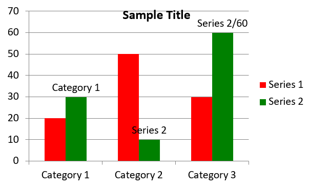
ส่วนนี้อธิบายวิธีการสร้างแผนภูมิคอลัมน์แบบกลุ่มด้วย Aspose.Slides for Python via .NET คุณจะได้เรียนรู้การเริ่มต้นงานนำเสนอ, เพิ่มแผนภูมิ, และปรับแต่งองค์ประกอบต่าง ๆ เช่น ชื่อ, ข้อมูล, ซีรีส์, หมวดหมู่, และสไตล์ ทำตามขั้นตอนด้านล่างเพื่อดูการสร้างแผนภูมิคอลัมน์แบบกลุ่มมาตรฐาน:
- สร้างอินสแตนซ์ของคลาส Presentation
- รับอ้างอิงสไลด์โดยใช้ดัชนีของมัน
- เพิ่มแผนภูมิพร้อมข้อมูลบางส่วนและกำหนดประเภท
ChartType.CLUSTERED_COLUMN - เพิ่มชื่อให้กับแผนภูมิ
- เข้าถึงเวิร์กชีตข้อมูลของแผนภูมิ
- ลบซีรีส์และหมวดหมู่เริ่มต้นทั้งหมด
- เพิ่มซีรีส์และหมวดหมู่ใหม่
- เพิ่มข้อมูลแผนภูมิใหม่สำหรับซีรีส์
- กำหนดสีเติมให้กับซีรีส์ของแผนภูมิ
- เพิ่มป้ายชื่อให้กับซีรีส์ของแผนภูมิ
- บันทึกงานนำเสนอที่แก้ไขเป็นไฟล์ PPTX
โค้ด Python นี้แสดงวิธีสร้างแผนภูมิคอลัมน์แบบกลุ่ม:
import aspose.slides.charts as charts
import aspose.slides as slides
import aspose.pydrawing as draw

# สร้างอินสแตนซ์ของคลาส Presentation ที่แสดงไฟล์ PPTX.
with slides.Presentation() as presentation:

    # เข้าถึงสไลด์แรก.
    slide = presentation.slides[0]

    # เพิ่มแผนภูมิคอลัมน์แบบกลุ่มพร้อมข้อมูลเริ่มต้น.
    chart = slide.shapes.add_chart(charts.ChartType.CLUSTERED_COLUMN, 20, 20, 500, 300)

    # ตั้งค่าชื่อแผนภูมิ.
    chart.chart_title.add_text_frame_for_overriding("Sample Title")
    chart.chart_title.text_frame_for_overriding.text_frame_format.center_text = slides.NullableBool.TRUE
    chart.chart_title.height = 20
    chart.has_title = True

    # กำหนดดัชนีของแผ่นข้อมูลแผนภูมิ.
    worksheet_index = 0

    # รับเวิร์กบุ๊กข้อมูลของแผนภูมิ.
    workbook = chart.chart_data.chart_data_workbook

    # ลบซีรีส์และหมวดหมู่ที่สร้างโดยค่าเริ่มต้น.
    chart.chart_data.series.clear()
    chart.chart_data.categories.clear()

    # เพิ่มซีรีส์ใหม่.
    chart.chart_data.series.add(workbook.get_cell(worksheet_index, 0, 1, "Series 1"), chart.type)
    chart.chart_data.series.add(workbook.get_cell(worksheet_index, 0, 2, "Series 2"), chart.type)

    # เพิ่มหมวดหมู่ใหม่.
    chart.chart_data.categories.add(workbook.get_cell(worksheet_index, 1, 0, "Category 1"))
    chart.chart_data.categories.add(workbook.get_cell(worksheet_index, 2, 0, "Category 2"))
    chart.chart_data.categories.add(workbook.get_cell(worksheet_index, 3, 0, "Category 3"))

    # รับซีรีส์แผนภูม้อันดับแรก.
    series = chart.chart_data.series[0]

    # เติมข้อมูลให้ซีรีส์.
    series.data_points.add_data_point_for_bar_series(workbook.get_cell(worksheet_index, 1, 1, 20))
    series.data_points.add_data_point_for_bar_series(workbook.get_cell(worksheet_index, 2, 1, 50))
    series.data_points.add_data_point_for_bar_series(workbook.get_cell(worksheet_index, 3, 1, 30))

    # กำหนดสีเติมให้กับซีรีส์.
    series.format.fill.fill_type = slides.FillType.SOLID
    series.format.fill.solid_fill_color.color = draw.Color.red

    # รับซีรีส์แผนภูมิที่สอง.
    series = chart.chart_data.series[1]

    # เติมข้อมูลให้ซีรีส์.
    series.data_points.add_data_point_for_bar_series(workbook.get_cell(worksheet_index, 1, 2, 30))
    series.data_points.add_data_point_for_bar_series(workbook.get_cell(worksheet_index, 2, 2, 10))
    series.data_points.add_data_point_for_bar_series(workbook.get_cell(worksheet_index, 3, 2, 60))

    # กำหนดสีเติมให้กับซีรีส์.
    series.format.fill.fill_type = slides.FillType.SOLID
    series.format.fill.solid_fill_color.color = draw.Color.green

    # ตั้งค่าป้ายกำกับแรกให้แสดงชื่อหมวดหมู่.
    label = series.data_points[0].label
    label.data_label_format.show_category_name = True

    label = series.data_points[1].label
    label.data_label_format.show_series_name = True

    # ตั้งค่าซีรีส์ให้แสดงค่าของป้ายกำกับที่สาม.
    label = series.data_points[2].label
    label.data_label_format.show_value = True
    label.data_label_format.show_series_name = True
    label.data_label_format.separator = "/"

    # บันทึกการนำเสนอเป็นไฟล์ PPTX บนดิสก์.
    presentation.save("ClusteredColumnChart.pptx", slides.export.SaveFormat.PPTX)
ผลลัพธ์:
สร้างแผนภูมิกระจาย
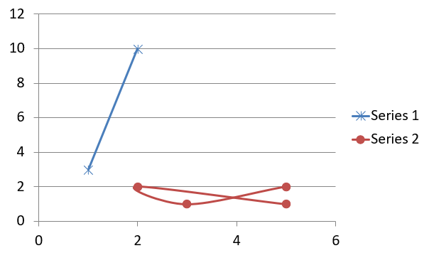
แผนภูมิกระจาย (หรือ scatter plot, กราฟ x‑y) มักใช้เพื่อค้นหารูปแบบหรือแสดงความสัมพันธ์ระหว่างสองตัวแปร
ใช้แผนภูมิกระจายเมื่อ:
- คุณมีข้อมูลตัวเลขที่จับคู่กัน
- คุณมีสองตัวแปรที่สัมพันธ์กันอย่างดี
- คุณต้องการตรวจสอบว่าตัวแปรทั้งสองเกี่ยวข้องกันหรือไม่
- คุณมีตัวแปรอิสระที่มีค่าหลายค่าสำหรับตัวแปรตาม
โค้ด Python นี้แสดงวิธีสร้างแผนภูมิกระจายโดยใช้เครื่องหมายต่าง ๆ สำหรับแต่ละซีรีส์:
import aspose.slides.charts as charts
import aspose.slides as slides
import aspose.pydrawing as draw

# สร้างอินสแตนซ์ของคลาส Presentation.
with slides.Presentation() as presentation:

    # เข้าถึงสไลด์แรก.
    slide = presentation.slides[0]

    # สร้างแผนภูมิ scatter เริ่มต้น.
    chart = slide.shapes.add_chart(charts.ChartType.SCATTER_WITH_SMOOTH_LINES, 20, 20, 500, 300)

    # กำหนดดัชนีของแผ่นข้อมูลแผนภูมิ.
    worksheet_index = 0

    # รับเวิร์กบุ๊กข้อมูลของแผนภูมิ.
    workbook = chart.chart_data.chart_data_workbook

    # ลบซีรีส์เริ่มต้น.
    chart.chart_data.series.clear()

    # เพิ่มซีรีส์ใหม่.
    chart.chart_data.series.add(workbook.get_cell(worksheet_index, 1, 1, "Series 1"), chart.type)
    chart.chart_data.series.add(workbook.get_cell(worksheet_index, 1, 3, "Series 2"), chart.type)

    # รับซีรีส์แผนภูม้อันดับแรก.
    series = chart.chart_data.series[0]

    # เพิ่มจุดใหม่ (1:3) ให้กับซีรีส์.
    series.data_points.add_data_point_for_scatter_series(workbook.get_cell(worksheet_index, 2, 1, 1), workbook.get_cell(worksheet_index, 2, 2, 3))

    # เพิ่มจุดใหม่ (2:10).
    series.data_points.add_data_point_for_scatter_series(workbook.get_cell(worksheet_index, 3, 1, 2), workbook.get_cell(worksheet_index, 3, 2, 10))

    # เปลี่ยนประเภทของซีรีส์.
    series.type = charts.ChartType.SCATTER_WITH_STRAIGHT_LINES_AND_MARKERS

    # เปลี่ยนเครื่องหมายของซีรีส์แผนภูมิ.
    series.marker.size = 10
    series.marker.symbol = charts.MarkerStyleType.STAR

    # รับซีรีส์แผนภูมิที่สอง.
    series = chart.chart_data.series[1]

    # เพิ่มจุดใหม่ (5:2) ให้กับซีรีส์แผนภูมิ.
    series.data_points.add_data_point_for_scatter_series(workbook.get_cell(worksheet_index, 2, 3, 5), workbook.get_cell(worksheet_index, 2, 4, 2))

    # เพิ่มจุดใหม่ (3:1).
    series.data_points.add_data_point_for_scatter_series(workbook.get_cell(worksheet_index, 3, 3, 3), workbook.get_cell(worksheet_index, 3, 4, 1))

    # เพิ่มจุดใหม่ (2:2).
    series.data_points.add_data_point_for_scatter_series(workbook.get_cell(worksheet_index, 4, 3, 2), workbook.get_cell(worksheet_index, 4, 4, 2))

    # เพิ่มจุดใหม่ (5:1).
    series.data_points.add_data_point_for_scatter_series(workbook.get_cell(worksheet_index, 5, 3, 5), workbook.get_cell(worksheet_index, 5, 4, 1))

    # เปลี่ยนเครื่องหมายของซีรีส์แผนภูมิ.
    series.marker.size = 10
    series.marker.symbol = charts.MarkerStyleType.CIRCLE

    presentation.save("ScatterChart.pptx", slides.export.SaveFormat.PPTX)
ผลลัพธ์:
สร้างแผนภูมิวงกลม
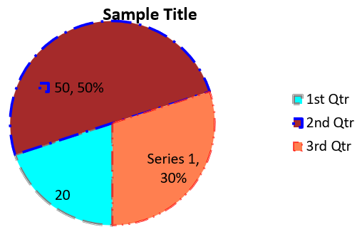
แผนภูมิวงกลมเหมาะกับการแสดงความสัมพันธ์ส่วนต่อส่วนของข้อมูล โดยเฉพาะเมื่อข้อมูลมีป้ายชื่อแบบหมวดหมู่พร้อมค่าตัวเลข อย่างไรก็ตาม หากข้อมูลของคุณมีหลายส่วนหรือหลายป้ายชื่อ คุณอาจพิจารณาใช้แผนภูมิบาร์แทน
- สร้างอินสแตนซ์ของคลาส Presentation
- รับอ้างอิงสไลด์โดยใช้ดัชนีของมัน
- เพิ่มแผนภูมิพร้อมข้อมูลเริ่มต้นและกำหนดประเภท
ChartType.PIE - เข้าถึงเวิร์กบุ๊กข้อมูลของแผนภูมิ (ChartDataWorkbook)
- ลบซีรีส์และหมวดหมู่เริ่มต้น
- เพิ่มซีรีส์และหมวดหมู่ใหม่
- เพิ่มข้อมูลแผนภูมิใหม่สำหรับซีรีส์
- เพิ่มจุดใหม่สำหรับแผนภูมิและกำหนดสีที่กำหนดเองให้กับส่วนของแผนภูมิวงกลม
- ตั้งค่าป้ายชื่อสำหรับซีรีส์
- เปิดใช้เส้นนำสำหรับป้ายชื่อซีรีส์
- ตั้งค่ามุมการหมุนของแผนภูมิวงกลม
- บันทึกงานนำเสนอที่แก้ไขเป็นไฟล์ PPTX
โค้ด Python นี้แสดงวิธีสร้างแผนภูมิวงกลม:
import aspose.slides.charts as charts
import aspose.slides as slides
import aspose.pydrawing as draw

# สร้างอินสแตนซ์ของคลาส Presentation ที่แสดงไฟล์ PPTX.
with slides.Presentation() as presentation:

    # เข้าถึงสไลด์แรก.
    slide = presentation.slides[0]

    # เพิ่มแผนภูมิกับข้อมูลเริ่มต้น.
    chart = slide.shapes.add_chart(charts.ChartType.PIE, 20, 20, 500, 300)

    # ตั้งค่าชื่อแผนภูมิ.
    chart.chart_title.add_text_frame_for_overriding("Sample Title")
    chart.chart_title.text_frame_for_overriding.text_frame_format.center_text = slides.NullableBool.TRUE
    chart.chart_title.height = 20
    chart.has_title = True

    # ตั้งค่าดัชนีของแผ่นข้อมูลแผนภูมิ.
    worksheet_index = 0

    # รับเวิร์กบุ๊กข้อมูลของแผนภูมิ.
    workbook = chart.chart_data.chart_data_workbook

    # ลบซีรีส์และหมวดหมู่ที่สร้างโดยค่าเริ่มต้น.
    chart.chart_data.series.clear()
    chart.chart_data.categories.clear()

    # เพิ่มหมวดหมู่ใหม่.
    chart.chart_data.categories.add(workbook.get_cell(0, 1, 0, "First Qtr"))
    chart.chart_data.categories.add(workbook.get_cell(0, 2, 0, "2nd Qtr"))
    chart.chart_data.categories.add(workbook.get_cell(0, 3, 0, "3rd Qtr"))

    # เพิ่มซีรีส์ใหม่.
    series = chart.chart_data.series.add(workbook.get_cell(0, 0, 1, "Series 1"), chart.type)

    # เติมข้อมูลให้ซีรีส์.
    series.data_points.add_data_point_for_pie_series(workbook.get_cell(worksheet_index, 1, 1, 20))
    series.data_points.add_data_point_for_pie_series(workbook.get_cell(worksheet_index, 2, 1, 50))
    series.data_points.add_data_point_for_pie_series(workbook.get_cell(worksheet_index, 3, 1, 30))

    # ตั้งค่าสีของส่วน.
    chart.chart_data.series_groups[0].is_color_varied = True

    point = series.data_points[0]
    point.format.fill.fill_type = slides.FillType.SOLID
    point.format.fill.solid_fill_color.color = draw.Color.cyan

    # ตั้งค่าขอบของส่วน.
    point.format.line.fill_format.fill_type = slides.FillType.SOLID
    point.format.line.fill_format.solid_fill_color.color = draw.Color.gray
    point.format.line.width = 3.0
    point.format.line.style = slides.LineStyle.THIN_THICK
    point.format.line.dash_style = slides.LineDashStyle.DASH_DOT

    point1 = series.data_points[1]
    point1.format.fill.fill_type = slides.FillType.SOLID
    point1.format.fill.solid_fill_color.color = draw.Color.brown

    # ตั้งค่าขอบของส่วน.
    point1.format.line.fill_format.fill_type = slides.FillType.SOLID
    point1.format.line.fill_format.solid_fill_color.color = draw.Color.blue
    point1.format.line.width = 3.0
    point1.format.line.style = slides.LineStyle.SINGLE
    point1.format.line.dash_style = slides.LineDashStyle.LARGE_DASH_DOT

    point2 = series.data_points[2]
    point2.format.fill.fill_type = slides.FillType.SOLID
    point2.format.fill.solid_fill_color.color = draw.Color.coral

    # ตั้งค่าขอบของส่วน.
    point2.format.line.fill_format.fill_type = slides.FillType.SOLID
    point2.format.line.fill_format.solid_fill_color.color = draw.Color.red
    point2.format.line.width = 2.0
    point2.format.line.style = slides.LineStyle.THIN_THIN
    point2.format.line.dash_style = slides.LineDashStyle.LARGE_DASH_DOT_DOT

    # สร้างป้ายกำกับแบบกำหนดเองสำหรับแต่ละหมวดหมู่ในซีรีส์ใหม่.
    label1 = series.data_points[0].label

    label1.data_label_format.show_value = True

    label2 = series.data_points[1].label
    label2.data_label_format.show_value = True
    label2.data_label_format.show_legend_key = True
    label2.data_label_format.show_percentage = True

    label3 = series.data_points[2].label
    label3.data_label_format.show_series_name = True
    label3.data_label_format.show_percentage = True

    # ตั้งค่าให้ซีรีส์แสดงเส้นเชื่อมสำหรับแผนภูมิ.
    series.labels.default_data_label_format.show_leader_lines = True

    # ตั้งค่ามุมการหมุนของส่วนแผนภูมิวงกลม.
    chart.chart_data.series_groups[0].first_slice_angle = 180

    # บันทึกการนำเสนอเป็นไฟล์ PPTX บนดิสก์.
    presentation.save("PieChart.pptx", slides.export.SaveFormat.PPTX)
ผลลัพธ์:
สร้างแผนภูมิเส้น
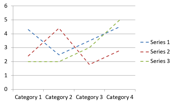
แผนภูมิเส้น (หรือ line graph) เหมาะกับการแสดงการเปลี่ยนแปลงของค่าตามเวลา ด้วยแผนภูมิเส้นคุณสามารถเปรียบเทียบข้อมูลจำนวนมากพร้อมกัน, ติดตามการเปลี่ยนแปลงและแนวโน้มตามเวลา, ไฮไลท์ความผิดปกติในซีรีส์ข้อมูล, ฯลฯ
- สร้างอินสแตนซ์ของคลาส Presentation
- รับอ้างอิงสไลด์โดยใช้ดัชนีของมัน
- เพิ่มแผนภูมิพร้อมข้อมูลเริ่มต้นและกำหนดประเภท
ChartType.LINE - บันทึกงานนำเสนอที่แก้ไขเป็นไฟล์ PPTX
โค้ด Python นี้แสดงวิธีสร้างแผนภูมิเส้น:
import aspose.slides as slides

with slides.Presentation() as presentation:
    line_chart = presentation.slides[0].shapes.add_chart(slides.charts.ChartType.LINE, 20, 20, 500, 300)

    presentation.save("LineChart.pptx", slides.export.SaveFormat.PPTX)
โดยค่าเริ่มต้น จุดบนแผนภูมิเส้นจะเชื่อมต่อด้วยเส้นตรงต่อเนื่อง หากต้องการให้จุดเชื่อมด้วยเส้นประ สามารถกำหนดประเภทเส้นประที่ต้องการได้ดังนี้:
import aspose.slides as slides

with slides.Presentation() as presentation:
    line_chart = presentation.slides[0].shapes.add_chart(slides.charts.ChartType.LINE, 10, 50, 600, 350)

    for series in line_chart.chart_data.series:
        series.format.line.dash_style = slides.LineDashStyle.DASH

    presentation.save("LineChart.pptx", slides.export.SaveFormat.PPTX)
ผลลัพธ์:
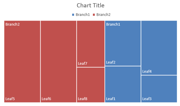
สร้างแผนภูมิ Tree Map
แผนภูมิ Tree Map เหมาะกับข้อมูลการขายเมื่อคุณต้องการแสดงขนาดสัมพันธ์ของหมวดหมู่ข้อมูลและดึงความสนใจไปยังรายการที่มีส่วนร่วมมากในแต่ละหมวดหมู่
- สร้างอินสแตนซ์ของคลาส Presentation
- รับอ้างอิงสไลด์โดยใช้ดัชนีของมัน
- เพิ่มแผนภูมิพร้อมข้อมูลเริ่มต้นและกำหนดประเภท
ChartType.TREEMAP - เข้าถึงเวิร์กบุ๊กข้อมูลของแผนภูมิ (ChartDataWorkbook)
- ลบซีรีส์และหมวดหมู่เริ่มต้น
- เพิ่มซีรีส์และหมวดหมู่ใหม่
- เพิ่มข้อมูลแผนภูมิใหม่สำหรับซีรีส์
- บันทึกงานนำเสนอที่แก้ไขเป็นไฟล์ PPTX
โค้ด Python นี้แสดงวิธีสร้างแผนภูมิ Tree Map:
import aspose.slides.charts as charts
import aspose.slides as slides
import aspose.pydrawing as draw

with slides.Presentation() as presentation:
    chart = presentation.slides[0].shapes.add_chart(charts.ChartType.TREEMAP, 20, 20, 500, 300)
    chart.chart_data.categories.clear()
    chart.chart_data.series.clear()

    workbook = chart.chart_data.chart_data_workbook
    workbook.clear(0)

    # สาขา 1
    leaf = chart.chart_data.categories.add(workbook.get_cell(0, "C1", "Leaf1"))
    leaf.grouping_levels.set_grouping_item(1, "Stem1")
    leaf.grouping_levels.set_grouping_item(2, "Branch1")

    chart.chart_data.categories.add(workbook.get_cell(0, "C2", "Leaf2"))

    leaf = chart.chart_data.categories.add(workbook.get_cell(0, "C3", "Leaf3"))
    leaf.grouping_levels.set_grouping_item(1, "Stem2")

    chart.chart_data.categories.add(workbook.get_cell(0, "C4", "Leaf4"))

    # สาขา 2
    leaf = chart.chart_data.categories.add(workbook.get_cell(0, "C5", "Leaf5"))
    leaf.grouping_levels.set_grouping_item(1, "Stem3")
    leaf.grouping_levels.set_grouping_item(2, "Branch2")

    chart.chart_data.categories.add(workbook.get_cell(0, "C6", "Leaf6"))

    leaf = chart.chart_data.categories.add(workbook.get_cell(0, "C7", "Leaf7"))
    leaf.grouping_levels.set_grouping_item(1, "Stem4")

    chart.chart_data.categories.add(workbook.get_cell(0, "C8", "Leaf8"))

    series = chart.chart_data.series.add(charts.ChartType.TREEMAP)
    series.labels.default_data_label_format.show_category_name = True
    series.data_points.add_data_point_for_treemap_series(workbook.get_cell(0, "D1", 4))
    series.data_points.add_data_point_for_treemap_series(workbook.get_cell(0, "D2", 5))
    series.data_points.add_data_point_for_treemap_series(workbook.get_cell(0, "D3", 3))
    series.data_points.add_data_point_for_treemap_series(workbook.get_cell(0, "D4", 6))
    series.data_points.add_data_point_for_treemap_series(workbook.get_cell(0, "D5", 9))
    series.data_points.add_data_point_for_treemap_series(workbook.get_cell(0, "D6", 9))
    series.data_points.add_data_point_for_treemap_series(workbook.get_cell(0, "D7", 4))
    series.data_points.add_data_point_for_treemap_series(workbook.get_cell(0, "D8", 3))

    series.parent_label_layout = charts.ParentLabelLayoutType.OVERLAPPING

    presentation.save("TreeMap.pptx", slides.export.SaveFormat.PPTX)
ผลลัพธ์:
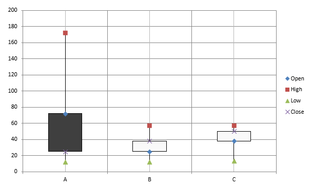
สร้างแผนภูมิ Stock
แผนภูมิสต็อกใช้แสดงข้อมูลทางการเงิน เช่น ราคาเปิด, สูง, ต่ำ, ปิด เพื่อช่วยวิเคราะห์แนวโน้มและความผันผวนของตลาด แผนภูมิเหล่านี้ให้ข้อมูลเชิงลึกสำคัญเกี่ยวกับการแสดงผลของหุ้น ช่วยนักลงทุนและนักวิเคราะห์ตัดสินใจอย่างมีข้อมูล
- สร้างอินสแตนซ์ของคลาส Presentation
- รับอ้างอิงสไลด์โดยใช้ดัชนีของมัน
- เพิ่มแผนภูมิพร้อมข้อมูลเริ่มต้นและกำหนดประเภท
ChartType.OPEN_HIGH_LOW_CLOSE - เข้าถึงเวิร์กบุ๊กข้อมูลของแผนภูมิ (ChartDataWorkbook)
- ลบซีรีส์และหมวดหมู่เริ่มต้น
- เพิ่มซีรีส์และหมวดหมู่ใหม่
- เพิ่มข้อมูลแผนภูมิใหม่สำหรับซีรีส์
- กำหนดรูปแบบของเส้น high‑low
- บันทึกงานนำเสนอที่แก้ไขเป็นไฟล์ PPTX
โค้ด Python นี้แสดงวิธีสร้างแผนภูมิสต็อก:
import aspose.slides.charts as charts
import aspose.slides as slides
import aspose.pydrawing as draw

with slides.Presentation() as presentation:
    chart = presentation.slides[0].shapes.add_chart(charts.ChartType.OPEN_HIGH_LOW_CLOSE, 20, 20, 500, 300, False)

    chart.chart_data.series.clear()
    chart.chart_data.categories.clear()

    workbook = chart.chart_data.chart_data_workbook

    chart.chart_data.categories.add(workbook.get_cell(0, 1, 0, "A"))
    chart.chart_data.categories.add(workbook.get_cell(0, 2, 0, "B"))
    chart.chart_data.categories.add(workbook.get_cell(0, 3, 0, "C"))

    chart.chart_data.series.add(workbook.get_cell(0, 0, 1, "Open"), chart.type)
    chart.chart_data.series.add(workbook.get_cell(0, 0, 2, "High"), chart.type)
    chart.chart_data.series.add(workbook.get_cell(0, 0, 3, "Low"), chart.type)
    chart.chart_data.series.add(workbook.get_cell(0, 0, 4, "Close"), chart.type)

    series = chart.chart_data.series[0]

    series.data_points.add_data_point_for_stock_series(workbook.get_cell(0, 1, 1, 72))
    series.data_points.add_data_point_for_stock_series(workbook.get_cell(0, 2, 1, 25))
    series.data_points.add_data_point_for_stock_series(workbook.get_cell(0, 3, 1, 38))

    series = chart.chart_data.series[1]
    series.data_points.add_data_point_for_stock_series(workbook.get_cell(0, 1, 2, 172))
    series.data_points.add_data_point_for_stock_series(workbook.get_cell(0, 2, 2, 57))
    series.data_points.add_data_point_for_stock_series(workbook.get_cell(0, 3, 2, 57))

    series = chart.chart_data.series[2]
    series.data_points.add_data_point_for_stock_series(workbook.get_cell(0, 1, 3, 12))
    series.data_points.add_data_point_for_stock_series(workbook.get_cell(0, 2, 3, 12))
    series.data_points.add_data_point_for_stock_series(workbook.get_cell(0, 3, 3, 13))

    series = chart.chart_data.series[3]
    series.data_points.add_data_point_for_stock_series(workbook.get_cell(0, 1, 4, 25))
    series.data_points.add_data_point_for_stock_series(workbook.get_cell(0, 2, 4, 38))
    series.data_points.add_data_point_for_stock_series(workbook.get_cell(0, 3, 4, 50))

    chart.chart_data.series_groups[0].up_down_bars.has_up_down_bars = True
    chart.chart_data.series_groups[0].hi_low_lines_format.line.fill_format.fill_type = slides.FillType.SOLID

    for ser in chart.chart_data.series:
        ser.format.line.fill_format.fill_type = slides.FillType.NO_FILL

    presentation.save("StockChart.pptx", slides.export.SaveFormat.PPTX)
ผลลัพธ์:
สร้างแผนภูมิ Box and Whisker
แผนภูมิ Box and Whisker แสดงการกระจายของข้อมูลโดยสรุปมาตรการสถิติหลัก เช่น มัธยฐาน, ควอร์ไทล์, และค่าผิดปกติ ใช้ในการวิเคราะห์ข้อมูลสำรวจและการศึกษาสถิติ เพื่อเข้าใจความแปรปรวนของข้อมูลและระบุความผิดปกติอย่างรวดเร็ว
- สร้างอินสแตนซ์ของคลาส Presentation
- รับอ้างอิงสไลด์โดยใช้ดัชนีของมัน
- เพิ่มแผนภูมิพร้อมข้อมูลเริ่มต้นและกำหนดประเภท
ChartType.BOX_AND_WHISKER - เข้าถึงเวิร์กบุ๊กข้อมูลของแผนภูมิ (ChartDataWorkbook)
- ลบซีรีส์และหมวดหมู่เริ่มต้น
- เพิ่มซีรีส์และหมวดหมู่ใหม่
- เพิ่มข้อมูลแผนภูมิใหม่สำหรับซีรีส์
- บันทึกงานนำเสนอที่แก้ไขเป็นไฟล์ PPTX
โค้ด Python นี้แสดงวิธีสร้างแผนภูมิ Box and Whisker:
import aspose.slides.charts as charts
import aspose.slides as slides
import aspose.pydrawing as draw

with slides.Presentation() as presentation:
    chart = presentation.slides[0].shapes.add_chart(charts.ChartType.BOX_AND_WHISKER, 20, 20, 500, 300)
    chart.chart_data.categories.clear()
    chart.chart_data.series.clear()

    workbook = chart.chart_data.chart_data_workbook
    workbook.clear(0)

    chart.chart_data.categories.add(workbook.get_cell(0, "A1", "Category 1"))
    chart.chart_data.categories.add(workbook.get_cell(0, "A2", "Category 1"))
    chart.chart_data.categories.add(workbook.get_cell(0, "A3", "Category 1"))
    chart.chart_data.categories.add(workbook.get_cell(0, "A4", "Category 1"))
    chart.chart_data.categories.add(workbook.get_cell(0, "A5", "Category 1"))
    chart.chart_data.categories.add(workbook.get_cell(0, "A6", "Category 1"))

    series = chart.chart_data.series.add(charts.ChartType.BOX_AND_WHISKER)

    series.quartile_method = charts.QuartileMethodType.EXCLUSIVE
    series.show_mean_line = True
    series.show_mean_markers = True
    series.show_inner_points = True
    series.show_outlier_points = True

    series.data_points.add_data_point_for_box_and_whisker_series(workbook.get_cell(0, "B1", 15))
    series.data_points.add_data_point_for_box_and_whisker_series(workbook.get_cell(0, "B2", 41))
    series.data_points.add_data_point_for_box_and_whisker_series(workbook.get_cell(0, "B3", 16))
    series.data_points.add_data_point_for_box_and_whisker_series(workbook.get_cell(0, "B4", 10))
    series.data_points.add_data_point_for_box_and_whisker_series(workbook.get_cell(0, "B5", 23))
    series.data_points.add_data_point_for_box_and_whisker_series(workbook.get_cell(0, "B6", 16))

    presentation.save("BoxAndWhiskerChart.pptx", slides.export.SaveFormat.PPTX)
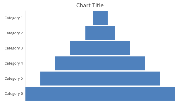
สร้างแผนภูมิ Funnel
แผนภูมิ Funnel ใช้แสดงกระบวนการที่มีขั้นตอนต่อเนื่อง ซึ่งปริมาณข้อมูลจะลดลงเมื่อเคลื่อนจากขั้นตอนหนึ่งไปยังขั้นตอนถัดไป เหมาะสำหรับวิเคราะห์อัตราการเปลี่ยนแปลง, ระบุจุดคอ, และติดตามประสิทธิภาพของกระบวนการขายหรือการตลาด
- สร้างอินสแตนซ์ของคลาส Presentation
- รับอ้างอิงสไลด์โดยใช้ดัชนีของมัน
- เพิ่มแผนภูมิพร้อมข้อมูลเริ่มต้นและกำหนดประเภท
ChartType.FUNNEL - บันทึกงานนำเสนอที่แก้ไขเป็นไฟล์ PPTX
โค้ด Python นี้แสดงวิธีสร้างแผนภูมิ Funnel:
import aspose.slides.charts as charts
import aspose.slides as slides
import aspose.pydrawing as draw

with slides.Presentation() as presentation:
    chart = presentation.slides[0].shapes.add_chart(charts.ChartType.FUNNEL, 50, 50, 500, 400)
    chart.chart_data.categories.clear()
    chart.chart_data.series.clear()

    workbook = chart.chart_data.chart_data_workbook
    workbook.clear(0)

    chart.chart_data.categories.add(workbook.get_cell(0, "A1", "Category 1"))
    chart.chart_data.categories.add(workbook.get_cell(0, "A2", "Category 2"))
    chart.chart_data.categories.add(workbook.get_cell(0, "A3", "Category 3"))
    chart.chart_data.categories.add(workbook.get_cell(0, "A4", "Category 4"))
    chart.chart_data.categories.add(workbook.get_cell(0, "A5", "Category 5"))
    chart.chart_data.categories.add(workbook.get_cell(0, "A6", "Category 6"))

    series = chart.chart_data.series.add(charts.ChartType.FUNNEL)

    series.data_points.add_data_point_for_funnel_series(workbook.get_cell(0, "B1", 50))
    series.data_points.add_data_point_for_funnel_series(workbook.get_cell(0, "B2", 100))
    series.data_points.add_data_point_for_funnel_series(workbook.get_cell(0, "B3", 200))
    series.data_points.add_data_point_for_funnel_series(workbook.get_cell(0, "B4", 300))
    series.data_points.add_data_point_for_funnel_series(workbook.get_cell(0, "B5", 400))
    series.data_points.add_data_point_for_funnel_series(workbook.get_cell(0, "B6", 500))

    presentation.save("FunnelChart.pptx", slides.export.SaveFormat.PPTX)
ผลลัพธ์:
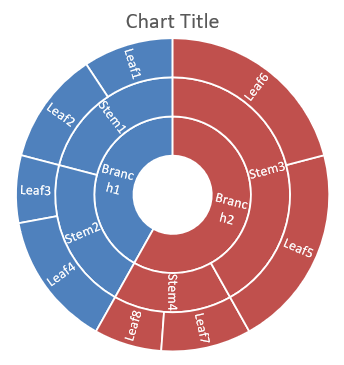
สร้างแผนภูมิ Sunburst
แผนภูมิ Sunburst ใช้เพื่อแสดงข้อมูลเชิงลำดับขั้น โดยระดับต่าง ๆ ปรากฏเป็นวงกลมโค้งสันดาน ช่วยบรรยายความสัมพันธ์ส่วนต่อส่วนและเหมาะกับการแสดงหมวดหมู่ย่อยและหมวดหมู่ย่อยต่อเนื่องในรูปแบบที่กระชับและชัดเจน
- สร้างอินสแตนซ์ของคลาส Presentation
- รับอ้างอิงสไลด์โดยใช้ดัชนีของมัน
- เพิ่มแผนภูมิพร้อมข้อมูลเริ่มต้นและกำหนดประเภท
ChartType.SUNBURST - บันทึกงานนำเสนอที่แก้ไขเป็นไฟล์ PPTX
โค้ด Python นี้แสดงวิธีสร้างแผนภูมิ Sunburst:
import aspose.slides.charts as charts
import aspose.slides as slides
import aspose.pydrawing as draw

with slides.Presentation() as presentation:
    chart = presentation.slides[0].shapes.add_chart(charts.ChartType.SUNBURST, 20, 20, 500, 300)
    chart.chart_data.categories.clear()
    chart.chart_data.series.clear()

    workbook = chart.chart_data.chart_data_workbook
    workbook.clear(0)

    # สาขา 1
    leaf = chart.chart_data.categories.add(workbook.get_cell(0, "C1", "Leaf1"))
    leaf.grouping_levels.set_grouping_item(1, "Stem1")
    leaf.grouping_levels.set_grouping_item(2, "Branch1")

    chart.chart_data.categories.add(workbook.get_cell(0, "C2", "Leaf2"))

    leaf = chart.chart_data.categories.add(workbook.get_cell(0, "C3", "Leaf3"))
    leaf.grouping_levels.set_grouping_item(1, "Stem2")

    chart.chart_data.categories.add(workbook.get_cell(0, "C4", "Leaf4"))

    # สาขา 2
    leaf = chart.chart_data.categories.add(workbook.get_cell(0, "C5", "Leaf5"))
    leaf.grouping_levels.set_grouping_item(1, "Stem3")
    leaf.grouping_levels.set_grouping_item(2, "Branch2")

    chart.chart_data.categories.add(workbook.get_cell(0, "C6", "Leaf6"))

    leaf = chart.chart_data.categories.add(workbook.get_cell(0, "C7", "Leaf7"))
    leaf.grouping_levels.set_grouping_item(1, "Stem4")

    chart.chart_data.categories.add(workbook.get_cell(0, "C8", "Leaf8"))

    series = chart.chart_data.series.add(charts.ChartType.SUNBURST)
    series.labels.default_data_label_format.show_category_name = True
    series.data_points.add_data_point_for_sunburst_series(workbook.get_cell(0, "D1", 4))
    series.data_points.add_data_point_for_sunburst_series(workbook.get_cell(0, "D2", 5))
    series.data_points.add_data_point_for_sunburst_series(workbook.get_cell(0, "D3", 3))
    series.data_points.add_data_point_for_sunburst_series(workbook.get_cell(0, "D4", 6))
    series.data_points.add_data_point_for_sunburst_series(workbook.get_cell(0, "D5", 9))
    series.data_points.add_data_point_for_sunburst_series(workbook.get_cell(0, "D6", 9))
    series.data_points.add_data_point_for_sunburst_series(workbook.get_cell(0, "D7", 4))
    series.data_points.add_data_point_for_sunburst_series(workbook.get_cell(0, "D8", 3))

    presentation.save("SunburstChart.pptx", slides.export.SaveFormat.PPTX)
ผลลัพธ์:
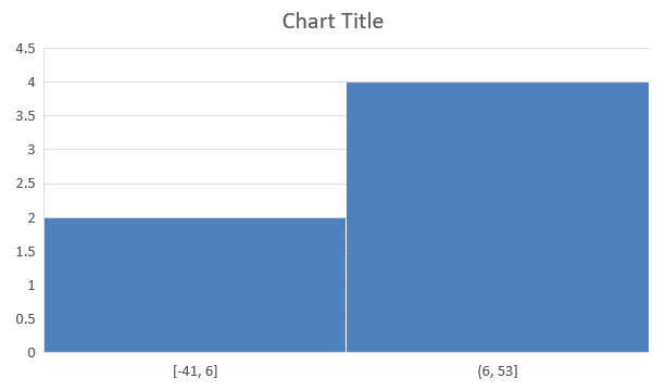
สร้างแผนภูมิ Histogram
แผนภูมิ Histogram แสดงการกระจายของข้อมูลตัวเลขโดยจัดกลุ่มค่าเป็นช่วงหรือบิกส์ ใช้เพื่อระบุรูปแบบเช่น ความถี่, ความเอน, การกระจาย, และการตรวจจับค่าผิดปกติในชุดข้อมูล
- สร้างอินสแตนซ์ของคลาส Presentation
- รับอ้างอิงสไลด์โดยใช้ดัชนีของมัน
- เพิ่มแผนภูมิพร้อมข้อมูลบางส่วนและกำหนดประเภท
ChartType.HISTOGRAM - เข้าถึงเวิร์กบุ๊กข้อมูลของแผนภูมิ (ChartDataWorkbook)
- ลบซีรีส์และหมวดหมู่เริ่มต้น
- เพิ่มซีรีส์ใหม่และเติมข้อมูลจุด รายการ Histogram ไม่มีหมวดหมู่; บินจะคำนวณจากค่าที่ให้
- บันทึกงานนำเสนอที่แก้ไขเป็นไฟล์ PPTX
โค้ด Python นี้แสดงวิธีสร้างแผนภูมิ Histogram:
import aspose.slides.charts as charts
import aspose.slides as slides
import aspose.pydrawing as draw

with slides.Presentation() as presentation:
    chart = presentation.slides[0].shapes.add_chart(charts.ChartType.HISTOGRAM, 20, 20, 500, 300)
    chart.chart_data.categories.clear()
    chart.chart_data.series.clear()

    workbook = chart.chart_data.chart_data_workbook
    workbook.clear(0)

    series = chart.chart_data.series.add(charts.ChartType.HISTOGRAM)
    series.data_points.add_data_point_for_histogram_series(workbook.get_cell(0, "A1", 15))
    series.data_points.add_data_point_for_histogram_series(workbook.get_cell(0, "A2", -41))
    series.data_points.add_data_point_for_histogram_series(workbook.get_cell(0, "A3", 16))
    series.data_points.add_data_point_for_histogram_series(workbook.get_cell(0, "A4", 10))
    series.data_points.add_data_point_for_histogram_series(workbook.get_cell(0, "A5", -23))
    series.data_points.add_data_point_for_histogram_series(workbook.get_cell(0, "A6", 16))

    chart.axes.horizontal_axis.aggregation_type = charts.AxisAggregationType.AUTOMATIC

    presentation.save("HistogramChart.pptx", slides.export.SaveFormat.PPTX)
ผลลัพธ์:
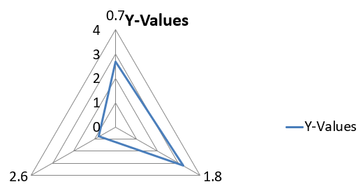
สร้างแผนภูมิ Radar
แผนภูมิ Radar แสดงข้อมูลหลายมิติในรูปแบบสองมิติ ช่วยเปรียบเทียบหลายตัวแปรพร้อมกัน เหมาะกับการสังเกตรูปแบบ, จุดแข็ง, จุดอ่อนในหลายเมตริกหรือคุณลักษณะ
- สร้างอินสแตนซ์ของคลาส Presentation
- รับอ้างอิงสไลด์โดยใช้ดัชนีของมัน
- เพิ่มแผนภูมิพร้อมข้อมูลบางส่วนและกำหนดประเภท
ChartType.RADAR - บันทึกงานนำเสนอที่แก้ไขเป็นไฟล์ PPTX
โค้ด Python นี้แสดงวิธีสร้างแผนภูมิ Radar:
import aspose.slides as slides

with slides.Presentation() as presentation:
    presentation.slides[0].shapes.add_chart(slides.charts.ChartType.RADAR, 20, 20, 500, 300)
    presentation.save("RadarChart.pptx", slides.export.SaveFormat.PPTX)
ผลลัพธ์:
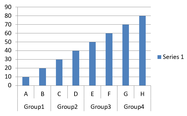
สร้างแผนภูมิหลายหมวดหมู่
แผนภูมิหลายหมวดหมู่ใช้แสดงข้อมูลที่มีการจัดกลุ่มหลายระดับ ช่วยเปรียบเทียบค่าในหลายมิติพร้อมกัน มีประโยชน์เมื่อจำเป็นต้องวิเคราะห์แนวโน้มและความสัมพันธ์ในชุดข้อมูลที่ซับซ้อนหลายชั้น
- สร้างอินสแตนซ์ของคลาส Presentation
- รับอ้างอิงสไลด์โดยใช้ดัชนีของมัน
- เพิ่มแผนภูมิพร้อมข้อมูลเริ่มต้นและกำหนดประเภท
ChartType.CLUSTERED_COLUMN - เข้าถึงเวิร์กบุ๊กข้อมูลของแผนภูมิ (ChartDataWorkbook)
- ลบซีรีส์และหมวดหมู่เริ่มต้น
- เพิ่มซีรีส์และหมวดหมู่ใหม่
- เพิ่มข้อมูลแผนภูมิใหม่สำหรับซีรีส์
- บันทึกงานนำเสนอที่แก้ไขเป็นไฟล์ PPTX
โค้ด Python นี้แสดงวิธีสร้างแผนภูมิหลายหมวดหมู่:
import aspose.slides.charts as charts
import aspose.slides as slides
import aspose.pydrawing as draw

with slides.Presentation() as presentation:
    slide = presentation.slides[0]

    chart = presentation.slides[0].shapes.add_chart(charts.ChartType.CLUSTERED_COLUMN, 20, 20, 500, 300)
    chart.chart_data.series.clear()
    chart.chart_data.categories.clear()

    workbook = chart.chart_data.chart_data_workbook
    workbook.clear(0)

    worksheet_index = 0

    category = chart.chart_data.categories.add(workbook.get_cell(0, "c2", "A"))
    category.grouping_levels.set_grouping_item(1, "Group1")
    category = chart.chart_data.categories.add(workbook.get_cell(0, "c3", "B"))

    category = chart.chart_data.categories.add(workbook.get_cell(0, "c4", "C"))
    category.grouping_levels.set_grouping_item(1, "Group2")
    category = chart.chart_data.categories.add(workbook.get_cell(0, "c5", "D"))

    category = chart.chart_data.categories.add(workbook.get_cell(0, "c6", "E"))
    category.grouping_levels.set_grouping_item(1, "Group3")
    category = chart.chart_data.categories.add(workbook.get_cell(0, "c7", "F"))

    category = chart.chart_data.categories.add(workbook.get_cell(0, "c8", "G"))
    category.grouping_levels.set_grouping_item(1, "Group4")
    category = chart.chart_data.categories.add(workbook.get_cell(0, "c9", "H"))

    # เพิ่มซีรีส์.
    series = chart.chart_data.series.add(workbook.get_cell(0, "D1", "Series 1"), charts.ChartType.CLUSTERED_COLUMN)

    series.data_points.add_data_point_for_bar_series(workbook.get_cell(worksheet_index, "D2", 10))
    series.data_points.add_data_point_for_bar_series(workbook.get_cell(worksheet_index, "D3", 20))
    series.data_points.add_data_point_for_bar_series(workbook.get_cell(worksheet_index, "D4", 30))
    series.data_points.add_data_point_for_bar_series(workbook.get_cell(worksheet_index, "D5", 40))
    series.data_points.add_data_point_for_bar_series(workbook.get_cell(worksheet_index, "D6", 50))
    series.data_points.add_data_point_for_bar_series(workbook.get_cell(worksheet_index, "D7", 60))
    series.data_points.add_data_point_for_bar_series(workbook.get_cell(worksheet_index, "D8", 70))
    series.data_points.add_data_point_for_bar_series(workbook.get_cell(worksheet_index, "D9", 80))

    # บันทึกการนำเสนอพร้อมแผนภูมิ.
    presentation.save("MultiCategoryChart.pptx", slides.export.SaveFormat.PPTX)
ผลลัพธ์:
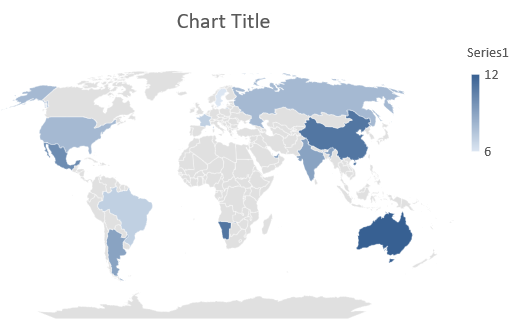
สร้างแผนภูมิแผนที่
แผนภูมิแผนที่ใช้แสดงข้อมูลภูมิศาสตร์โดยแมปข้อมูลไปยังตำแหน่งเฉพาะ เช่น ประเทศ, รัฐ, หรือเมือง เหมาะกับการวิเคราะห์แนวโน้มภูมิภาค, ข้อมูลประชากร, และการกระจายเชิงพื้นที่ในรูปแบบที่ชัดเจนและดึงดูดสายตา
โค้ด Python นี้แสดงวิธีสร้างแผนภูมิแผนที่:
import aspose.slides as slides

with slides.Presentation() as presentation:
    chart = presentation.slides[0].shapes.add_chart(slides.charts.ChartType.MAP, 20, 20, 500, 300)
    presentation.save("mapChart.pptx", slides.export.SaveFormat.PPTX)
ผลลัพธ์:
สร้างแผนภูมิผสม
แผนภูมิผสม (หรือ combo chart) รวมสองประเภทแผนภูมิหรือมากกว่าภายในกราฟเดียวกัน ช่วยให้คุณเน้น, เปรียบเทียบ, หรือสังเกตความแตกต่างระหว่างชุดข้อมูลหลายชุด เพื่อระบุความสัมพันธ์ระหว่างข้อมูลเหล่านั้น
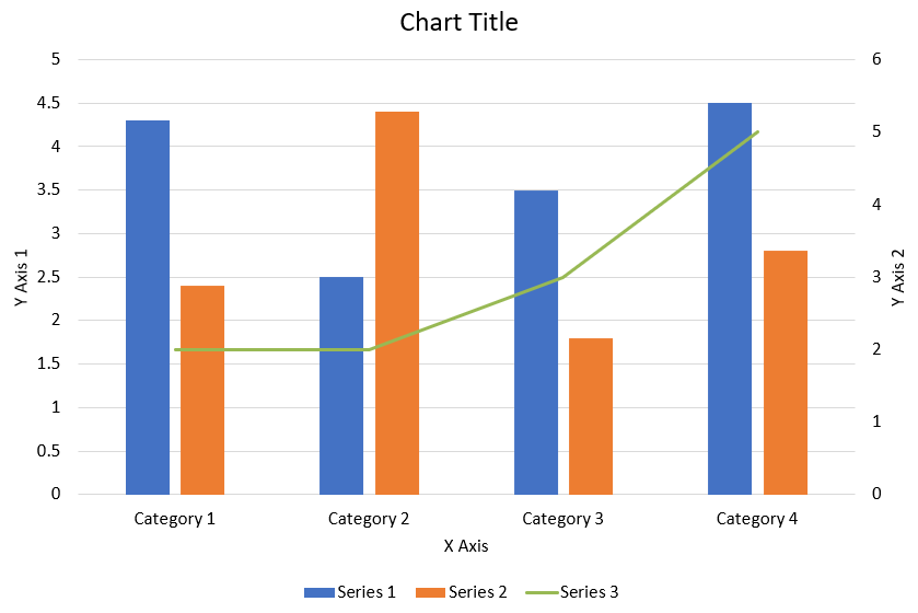
โค้ด Python ต่อไปนี้แสดงวิธีสร้างแผนภูมิผสมที่แสดงด้านบนในงานนำเสนอ PowerPoint:
import aspose.slides.charts as charts
import aspose.pydrawing as draw
import aspose.slides as slides

def create_combo_chart():
    with slides.Presentation() as presentation:
        chart = create_chart_with_first_series(presentation.slides[0])

        add_second_series_to_chart(chart)
        add_third_series_to_chart(chart)

        set_primary_axes_format(chart)
        set_secondary_axes_format(chart)

        presentation.save("combo-chart.pptx", slides.export.SaveFormat.PPTX)


def create_chart_with_first_series(slide):
    chart = slide.shapes.add_chart(charts.ChartType.CLUSTERED_COLUMN, 50, 50, 600, 400)

    # ตั้งค่าชื่อแผนภูมิ.
    chart.has_title = True
    chart.chart_title.add_text_frame_for_overriding("Chart Title")
    chart.chart_title.overlay = False
    title_paragraph = chart.chart_title.text_frame_for_overriding.paragraphs[0]
    title_format = title_paragraph.paragraph_format.default_portion_format

    title_format.font_bold = slides.NullableBool.FALSE
    title_format.font_height = 18

    # ตั้งค่าตำนานแผนภูมิ.
    chart.legend.position = charts.LegendPositionType.BOTTOM
    chart.legend.text_format.portion_format.font_height = 12

    # ลบซีรีส์และหมวดหมู่ที่สร้างโดยค่าเริ่มต้น.
    chart.chart_data.series.clear()
    chart.chart_data.categories.clear()

    worksheet_index = 0
    workbook = chart.chart_data.chart_data_workbook

    # เพิ่มหมวดหมู่ใหม่.
    chart.chart_data.categories.add(workbook.get_cell(worksheet_index, 1, 0, "Category 1"))
    chart.chart_data.categories.add(workbook.get_cell(worksheet_index, 2, 0, "Category 2"))
    chart.chart_data.categories.add(workbook.get_cell(worksheet_index, 3, 0, "Category 3"))
    chart.chart_data.categories.add(workbook.get_cell(worksheet_index, 4, 0, "Category 4"))

    # เพิ่มซีรีส์แรก.
    series_name_cell = workbook.get_cell(worksheet_index, 0, 1, "Series 1")
    series = chart.chart_data.series.add(series_name_cell, chart.type)

    series.parent_series_group.overlap = -25
    series.parent_series_group.gap_width = 220

    series.data_points.add_data_point_for_bar_series(workbook.get_cell(worksheet_index, 1, 1, 4.3))
    series.data_points.add_data_point_for_bar_series(workbook.get_cell(worksheet_index, 2, 1, 2.5))
    series.data_points.add_data_point_for_bar_series(workbook.get_cell(worksheet_index, 3, 1, 3.5))
    series.data_points.add_data_point_for_bar_series(workbook.get_cell(worksheet_index, 4, 1, 4.5))

    return chart


def add_second_series_to_chart(chart):
    workbook = chart.chart_data.chart_data_workbook
    worksheet_index = 0

    series_name_cell = workbook.get_cell(worksheet_index, 0, 2, "Series 2")
    series = chart.chart_data.series.add(series_name_cell, charts.ChartType.CLUSTERED_COLUMN)

    series.parent_series_group.overlap = -25
    series.parent_series_group.gap_width = 220

    series.data_points.add_data_point_for_bar_series(workbook.get_cell(worksheet_index, 1, 2, 2.4))
    series.data_points.add_data_point_for_bar_series(workbook.get_cell(worksheet_index, 2, 2, 4.4))
    series.data_points.add_data_point_for_bar_series(workbook.get_cell(worksheet_index, 3, 2, 1.8))
    series.data_points.add_data_point_for_bar_series(workbook.get_cell(worksheet_index, 4, 2, 2.8))


def add_third_series_to_chart(chart):
    workbook = chart.chart_data.chart_data_workbook
    worksheet_index = 0

    series_name_cell = workbook.get_cell(worksheet_index, 0, 3, "Series 3")
    series = chart.chart_data.series.add(series_name_cell, charts.ChartType.LINE)

    series.data_points.add_data_point_for_line_series(workbook.get_cell(worksheet_index, 1, 3, 2.0))
    series.data_points.add_data_point_for_line_series(workbook.get_cell(worksheet_index, 2, 3, 2.0))
    series.data_points.add_data_point_for_line_series(workbook.get_cell(worksheet_index, 3, 3, 3.0))
    series.data_points.add_data_point_for_line_series(workbook.get_cell(worksheet_index, 4, 3, 5.0))

    series.plot_on_second_axis = True


def set_primary_axes_format(chart):
    # ตั้งค่าแกนอแนวนอน.
    horizontal_axis = chart.axes.horizontal_axis
    horizontal_axis.text_format.portion_format.font_height = 12.0
    horizontal_axis.format.line.fill_format.fill_type = slides.FillType.NO_FILL

    set_axis_title(horizontal_axis, "X Axis")

    # ตั้งค่าแกนแนวตั้ง.
    vertical_axis = chart.axes.vertical_axis
    vertical_axis.text_format.portion_format.font_height = 12.0
    vertical_axis.format.line.fill_format.fill_type = slides.FillType.NO_FILL

    set_axis_title(vertical_axis, "Y Axis 1")

    # ตั้งค่าสีเส้นกริดหลักแนวตั้ง.
    major_grid_lines_format = vertical_axis.major_grid_lines_format.line.fill_format
    major_grid_lines_format.fill_type = slides.FillType.SOLID
    major_grid_lines_format.solid_fill_color.color = draw.Color.from_argb(217, 217, 217)


def set_secondary_axes_format(chart):
    # ตั้งค่าแกนอแนวนอนรอง.
    secondary_horizontal_axis = chart.axes.secondary_horizontal_axis
    secondary_horizontal_axis.position = charts.AxisPositionType.BOTTOM
    secondary_horizontal_axis.cross_type = charts.CrossesType.MAXIMUM
    secondary_horizontal_axis.is_visible = False
    secondary_horizontal_axis.major_grid_lines_format.line.fill_format.fill_type = slides.FillType.NO_FILL
    secondary_horizontal_axis.minor_grid_lines_format.line.fill_format.fill_type = slides.FillType.NO_FILL

    # ตั้งค่าแกนแนวตั้งรอง.
    secondary_vertical_axis = chart.axes.secondary_vertical_axis
    secondary_vertical_axis.position = charts.AxisPositionType.RIGHT
    secondary_vertical_axis.text_format.portion_format.font_height = 12.0
    secondary_vertical_axis.format.line.fill_format.fill_type = slides.FillType.NO_FILL
    secondary_vertical_axis.major_grid_lines_format.line.fill_format.fill_type = slides.FillType.NO_FILL
    secondary_vertical_axis.minor_grid_lines_format.line.fill_format.fill_type = slides.FillType.NO_FILL

    set_axis_title(secondary_vertical_axis, "Y Axis 2")


def set_axis_title(axis, axis_title):
    axis.has_title = True
    axis.title.overlay = False
    title_portion_format = axis.title.add_text_frame_for_overriding(axis_title).paragraphs[0].paragraph_format.default_portion_format
    title_portion_format.font_bold = slides.NullableBool.FALSE
    title_portion_format.font_height = 12.0
อัปเดตแผนภูมิ
Aspose.Slides for Python via .NET ช่วยให้คุณอัปเดตข้อมูลแผนภูมิ, การจัดรูปแบบ, และสไตล์ เพื่อให้การนำเสนอ PowerPoint ของคุณเป็นปัจจุบันอยู่เสมอ
- สร้างอินสแตนซ์ของคลาส Presentation เพื่อเปิดงานนำเสนอที่มีแผนภูมิ
- รับอ้างอิงสไลด์โดยใช้ดัชนีของมัน
- วนลูปผ่านรูปทรงทั้งหมดเพื่อค้นหาแผนภูมิ
- เข้าถึงเวิร์กชีตข้อมูลของแผนภูมิ
- แก้ไขซีรีส์ข้อมูลของแผนภูมิโดยเปลี่ยนค่าซีรีส์
- เพิ่มซีรีส์ใหม่และเติมข้อมูลของมัน
- บันทึกงานนำเสนอที่แก้ไขเป็นไฟล์ PPTX
โค้ด Python นี้แสดงวิธีอัปเดตแผนภูมิ:
import aspose.slides.charts as charts
import aspose.slides as slides
import aspose.pydrawing as draw

chart_name = "My chart"

# สร้างอินสแตนซ์ของคลาส Presentation ที่แสดงไฟล์ PPTX.
with slides.Presentation("ExistingChart.pptx") as presentation:

    # เข้าถึงสไลด์แรก.
    slide = presentation.slides[0]

    for shape in slide.shapes:
        if isinstance(shape, charts.Chart) and shape.name == chart_name:
            chart = shape

            # ตั้งค่าดัชนีของแผ่นข้อมูลแผนภูมิ.
            worksheet_index = 0

            # รับเวิร์กบุ๊กข้อมูลของแผนภูมิ.
            workbook = chart.chart_data.chart_data_workbook

            # แก้ไขชื่่อหมวดหมู่ของแผนภูมิ.
            workbook.get_cell(worksheet_index, 1, 0, "Modified Category 1")
            workbook.get_cell(worksheet_index, 2, 0, "Modified Category 2")

            # รับซีรีส์แผนภูม้อันดับแรก.
            series = chart.chart_data.series[0]

            # อัปเดตข้อมูลของซีรีส์.
            workbook.get_cell(worksheet_index, 0, 1, "New_Series1")  # แก้ไขชื่อซีรีส์.
            series.data_points[0].value.data = 90
            series.data_points[1].value.data = 123
            series.data_points[2].value.data = 44

            # รับซีรีส์แผนภูมิที่สอง.
            series = chart.chart_data.series[1]

            # อัปเดตข้อมูลของซีรีส์.
            workbook.get_cell(worksheet_index, 0, 2, "New_Series2")  # แก้ไขชื่อซีรีส์.
            series.data_points[0].value.data = 23
            series.data_points[1].value.data = 67
            series.data_points[2].value.data = 99

            # เพิ่มซีรีส์ใหม่.
            series = chart.chart_data.series.add(workbook.get_cell(worksheet_index, 0, 3, "Series 3"), chart.type)

            # เติมข้อมูลให้ซีรีส์.
            series.data_points.add_data_point_for_bar_series(workbook.get_cell(worksheet_index, 1, 3, 20))
            series.data_points.add_data_point_for_bar_series(workbook.get_cell(worksheet_index, 2, 3, 50))
            series.data_points.add_data_point_for_bar_series(workbook.get_cell(worksheet_index, 3, 3, 30))

            chart.type = charts.ChartType.CLUSTERED_CYLINDER

            # บันทึกการนำเสนอพร้อมแผนภูมิ.
            presentation.save("ModifiedChart.pptx", slides.export.SaveFormat.PPTX)
ตั้งช่วงข้อมูลสำหรับแผนภูมิ
Aspose.Slides for Python via .NET ให้คุณใช้ช่วงเวิร์กชีตเฉพาะเป็นแหล่งข้อมูลสำหรับแผนภูมิ ควบคุมว่าตารางใดเป็นแหล่งของซีรีส์และหมวดหมู่ของแผนภูมิ และทำให้คุณอัปเดตแผนภูมิตามการเปลี่ยนแปลงของเวิร์กชีตได้
- สร้างอินสแตนซ์ของคลาส Presentation เพื่อเปิดงานนำเสนอที่มีแผนภูมิ
- รับอ้างอิงสไลด์โดยใช้ดัชนีของมัน
- วนลูปผ่านรูปทรงทั้งหมดเพื่อค้นหาแผนภูมิ
- เข้าถึงข้อมูลแผนภูมิและตั้งค่าช่วง
- บันทึกงานนำเสนอที่แก้ไขเป็นไฟล์ PPTX
โค้ด Python นี้แสดงวิธีตั้งค่าช่วงข้อมูลสำหรับแผนภูมิ:
import aspose.slides.charts as charts
import aspose.slides as slides
import aspose.pydrawing as draw

chart_name = "My chart"

# สร้างอินสแตนซ์ของคลาส Presentation ที่แสดงไฟล์ PPTX.
with slides.Presentation("ExistingChart.pptx") as presentation:

    # เข้าถึงสไลด์แรก.
    slide = presentation.slides[0]

    for shape in slide.shapes:
        if isinstance(shape, charts.Chart) and shape.name == chart_name:
            chart = shape
            chart.chart_data.set_range("Sheet1!A1:B4")

    presentation.save("DataRange.pptx", slides.export.SaveFormat.PPTX)
ใช้ตัวบ่งชี้เริ่มต้นในแผนภูมิ
เมื่อคุณใช้ตัวบ่งชี้เริ่มต้นในแผนภูมิแต่ละซีรีส์จะได้รับสัญลักษณ์ตัวบ่งชี้ที่แตกต่างโดยอัตโนมัติ
โค้ด Python นี้แสดงวิธีตั้งค่าตัวบ่งชี้ของซีรีส์ในแผนภูมิโดยอัตโนมัติ:
import aspose.slides.charts as charts
import aspose.slides as slides
import aspose.pydrawing as draw

with slides.Presentation() as presentation:
    slide = presentation.slides[0]
    chart = slide.shapes.add_chart(charts.ChartType.LINE_WITH_MARKERS, 10, 10, 400, 400)

    chart.chart_data.series.clear()
    chart.chart_data.categories.clear()

    workbook = chart.chart_data.chart_data_workbook

    series = chart.chart_data.series.add(workbook.get_cell(0, 0, 1, "Series 1"), chart.type)

    chart.chart_data.categories.add(workbook.get_cell(0, 1, 0, "C1"))
    series.data_points.add_data_point_for_line_series(workbook.get_cell(0, 1, 1, 24))

    chart.chart_data.categories.add(workbook.get_cell(0, 2, 0, "C2"))
    series.data_points.add_data_point_for_line_series(workbook.get_cell(0, 2, 1, 23))

    chart.chart_data.categories.add(workbook.get_cell(0, 3, 0, "C3"))
    series.data_points.add_data_point_for_line_series(workbook.get_cell(0, 3, 1, -10))

    chart.chart_data.categories.add(workbook.get_cell(0, 4, 0, "C4"))
    series.data_points.add_data_point_for_line_series(workbook.get_cell(0, 4, 1, None))

    series2 = chart.chart_data.series.add(workbook.get_cell(0, 0, 2, "Series 2"), chart.type)

    # เติมข้อมูลให้ซีรีส์.
    series2.data_points.add_data_point_for_line_series(workbook.get_cell(0, 1, 2, 30))
    series2.data_points.add_data_point_for_line_series(workbook.get_cell(0, 2, 2, 10))
    series2.data_points.add_data_point_for_line_series(workbook.get_cell(0, 3, 2, 60))
    series2.data_points.add_data_point_for_line_series(workbook.get_cell(0, 4, 2, 40))

    chart.has_legend = True
    chart.legend.overlay = False

    presentation.save("DefaultMarkersInChart.pptx", slides.export.SaveFormat.PPTX)
คำถามที่พบบ่อย
Aspose.Slides for Python via .NET รองรับประเภทแผนภูมิใดบ้าง?
Aspose.Slides for Python via .NET รองรับแผนภูมิหลากหลายประเภท รวมถึงบาร์, เส้น, วงกลม, พื้นที่, กระจาย, histogram, radar, และอื่น ๆ อีกมาก ความยืดหยุ่นนี้ทำให้คุณเลือกประเภทแผนภูมิที่เหมาะสมกับการแสดงผลข้อมูลของคุณได้
ฉันจะเพิ่มแผนภูมิใหม่ลงในสไลด์ได้อย่างไร?
เพื่อเพิ่มแผนภูมิ คุณต้องสร้างอินสแตนซ์ของคลาส Presentation, ดึงสไลด์ที่ต้องการโดยใช้ดัชนี, จากนั้นเรียกเมธอดเพื่อเพิ่มแผนภูมิโดยระบุประเภทแผนภูมิและข้อมูลเริ่มต้น กระบวนการนี้จะฝังแผนภูมิเข้าสู่การนำเสนอของคุณโดยตรง
ฉันสามารถอัปเดตข้อมูลที่แสดงในแผนภูมิได้หรือไม่?
คุณสามารถอัปเดตข้อมูลของแผนภูมิได้โดยเข้าถึงเวิร์กบุ๊กข้อมูลของแผนภูมิ (ChartDataWorkbook), ลบซีรีส์และหมวดหมู่เริ่มต้น, แล้วเพิ่มข้อมูลที่กำหนดเองของคุณ วิธีนี้ทำให้คุณรีเฟรชแผนภูมิให้แสดงข้อมูลล่าสุดได้แบบอัตโนมัติ
สามารถปรับแต่งลักษณะของแผนภูมิได้หรือไม่?
ได้ Aspose.Slides for Python via .NET มีตัวเลือกการปรับแต่งอย่างกว้างขวาง คุณสามารถเปลี่ยนสี, ฟอนต์, ป้ายชื่อ, คำอธิบาย, และองค์ประกอบการจัดรูปแบบอื่น ๆ เพื่อให้แผนภูมิตรงกับข้อกำหนดการออกแบบของคุณอย่างเต็มที่