
Quản lý Nhãn Dữ liệu Biểu đồ trong Bản trình chiếu bằng Python
Giới thiệu
Nhãn dữ liệu hiển thị thông tin về các chuỗi biểu đồ và các điểm dữ liệu riêng lẻ, giúp người đọc xác định giá trị và hiểu biểu đồ. Bài viết này giải thích cách định dạng giá trị, hiển thị phần trăm, đọc văn bản nhãn, kiểm soát nhãn vượt quá mức tối đa của trục, điều chỉnh khoảng cách nhãn trục danh mục và vị trí nhãn biểu đồ tròn.
Đặt độ chính xác dữ liệu trong nhãn dữ liệu biểu đồ
Sử dụng number_format_of_values để định dạng giá trị của chuỗi. Ví dụ này tạo một biểu đồ đường với dữ liệu mặc định, hiển thị bảng dữ liệu của nó và bật nhãn giá trị cho chuỗi đầu tiên. Định dạng #,##0.00 hiển thị dấu phân cách hàng nghìn và hai chữ số thập phân mà không thay đổi giá trị gốc.
import aspose.slides as slides
import aspose.slides.charts as charts

with slides.Presentation() as presentation:
    slide = presentation.slides[0]

    chart = slide.shapes.add_chart(charts.ChartType.LINE, 50, 50, 450, 300)
    chart.has_data_table = True

    series = chart.chart_data.series[0]
    series.number_format_of_values = "#,##0.00"
    series.labels.default_data_label_format.show_value = True

    presentation.save("PrecisionOfDatalabels_out.pptx", slides.export.SaveFormat.PPTX)
Hiển thị phần trăm dưới dạng nhãn
Đối với biểu đồ cột chồng, tính mỗi giá trị dưới dạng phần trăm của tổng danh mục và gán văn bản vào text_frame_for_overriding. Ví dụ này sử dụng dữ liệu biểu đồ mặc định và hiển thị phần trăm với hai chữ số thập phân trong phông chữ 8 pt. Các danh mục có tổng bằng không sẽ bị bỏ qua để tránh chia cho 0. Tính lại văn bản nhãn tùy chỉnh nếu dữ liệu biểu đồ thay đổi.
import aspose.slides as slides
import aspose.slides.charts as charts

with slides.Presentation() as presentation:
    slide = presentation.slides[0]

    chart = slide.shapes.add_chart(charts.ChartType.STACKED_COLUMN, 20, 20, 400, 400)

    category_totals = [0.0] * len(chart.chart_data.categories)
    for k in range(len(chart.chart_data.categories)):
        for series in chart.chart_data.series:
            point_value = float(series.data_points[k].value.data)
            category_totals[k] += point_value

    for series in chart.chart_data.series:
        series.labels.default_data_label_format.show_legend_key = False

        for j in range(len(series.data_points)):
            label = series.data_points[j].label
            if category_totals[j] == 0:
                continue

            point_value = float(series.data_points[j].value.data)
            data_point_percent = point_value / category_totals[j] * 100

            portion = slides.Portion()
            portion.text = f"{data_point_percent:.2f} %"
            portion.portion_format.font_height = 8

            label.text_frame_for_overriding.text = ""

            paragraph = label.text_frame_for_overriding.paragraphs[0]
            paragraph.portions.add(portion)

            label.data_label_format.show_value = True
            label.data_label_format.show_series_name = False
            label.data_label_format.show_percentage = False
            label.data_label_format.show_legend_key = False
            label.data_label_format.show_category_name = False
            label.data_label_format.show_bubble_size = False

    presentation.save("DisplayPercentageAsLabels_out.pptx", slides.export.SaveFormat.PPTX)
Đặt ký hiệu phần trăm cho nhãn dữ liệu biểu đồ
Khi các giá trị được lưu dưới dạng phân số, sử dụng number_format để hiển thị phần trăm. Đặt is_number_format_linked_to_source thành False để áp dụng định dạng nhãn một cách độc lập với các ô nguồn.
Ví dụ này tạo một biểu đồ cột chồng 100% với các chuỗi màu đỏ và xanh dương trên bốn danh mục. Mỗi cặp giá trị cộng lại thành 1. Định dạng nhãn 0.0% hiển thị 0.30 thành 30.0%, trong khi trục tung sử dụng hai chữ số thập phân. Cả hai chuỗi đều sử dụng văn bản nhãn màu trắng, kích thước 10 pt.
import aspose.slides as slides
import aspose.slides.charts as charts
import aspose.pydrawing as drawing

with slides.Presentation() as presentation:
    slide = presentation.slides[0]

    chart = slide.shapes.add_chart(charts.ChartType.PERCENTS_STACKED_COLUMN, 20, 20, 500, 400)

    chart.axes.vertical_axis.is_number_format_linked_to_source = False
    chart.axes.vertical_axis.number_format = "0.00%"

    chart.chart_data.series.clear()
    chart.chart_data.categories.clear()

    workbook = chart.chart_data.chart_data_workbook
    worksheet_index = 0
    for i in range(4):
        category_cell = workbook.get_cell(worksheet_index, i + 1, 0, f"Category {i + 1}")
        chart.chart_data.categories.add(category_cell)

    series_names = ["Reds", "Blues"]
    series_colors = [drawing.Color.red, drawing.Color.blue]
    values = [[0.30, 0.50, 0.80, 0.65], [0.70, 0.50, 0.20, 0.35]]

    for i in range(len(series_names)):
        series_cell = workbook.get_cell(worksheet_index, 0, i + 1, series_names[i])
        series = chart.chart_data.series.add(series_cell, chart.type)
        for j in range(4):
            value_cell = workbook.get_cell(worksheet_index, j + 1, i + 1, values[i][j])
            series.data_points.add_data_point_for_bar_series(value_cell)

        series.format.fill.fill_type = slides.FillType.SOLID
        series.format.fill.solid_fill_color.color = series_colors[i]

        label_format = series.labels.default_data_label_format
        label_format.show_value = True
        label_format.is_number_format_linked_to_source = False
        label_format.number_format = "0.0%"
        label_format.text_format.portion_format.font_height = 10
        label_format.text_format.portion_format.fill_format.fill_type = slides.FillType.SOLID
        label_format.text_format.portion_format.fill_format.solid_fill_color.color = drawing.Color.white

    presentation.save("SetDataLabelsPercentageSign_out.pptx", slides.export.SaveFormat.PPTX)
Đọc văn bản thực tế của nhãn dữ liệu
Sử dụng get_actual_label_text để lấy văn bản được tạo ra bởi cài đặt của một nhãn dữ liệu. Điều này hữu ích khi trích xuất nhãn cho báo cáo, tìm kiếm nội dung bản trình chiếu hoặc xác thực các biểu đồ đã tạo. Trong ví dụ dưới đây, định dạng nhãn dữ liệu mặc định kết hợp tên mỗi danh mục, tên chuỗi và giá trị. Một điểm định dạng giá trị của nó dưới dạng phần trăm, và một điểm khác sử dụng văn bản tùy chỉnh từ text_frame_for_overriding.
import aspose.slides as slides
import aspose.slides.charts as charts

with slides.Presentation() as presentation:
    slide = presentation.slides[0]

    chart = slide.shapes.add_chart(charts.ChartType.CLUSTERED_COLUMN, 20, 20, 500, 300)

    chart.chart_data.series.clear()
    chart.chart_data.categories.clear()

    workbook = chart.chart_data.chart_data_workbook
    for i, category_name in enumerate(["Q1", "Q2"]):
        category_cell = workbook.get_cell(0, i + 1, 0, category_name)
        chart.chart_data.categories.add(category_cell)

    north_cell = workbook.get_cell(0, 0, 1, "North")
    north = chart.chart_data.series.add(north_cell, chart.type)
    for i, value in enumerate([0.25, 0.75]):
        value_cell = workbook.get_cell(0, i + 1, 1, value)
        north.data_points.add_data_point_for_bar_series(value_cell)

    south_cell = workbook.get_cell(0, 0, 2, "South")
    south = chart.chart_data.series.add(south_cell, chart.type)
    for i, value in enumerate([0.40, 0.60]):
        value_cell = workbook.get_cell(0, i + 1, 2, value)
        south.data_points.add_data_point_for_bar_series(value_cell)

    for series in chart.chart_data.series:
        label_format = series.labels.default_data_label_format
        label_format.show_category_name = True
        label_format.show_series_name = True
        label_format.show_value = True

    north.labels[1].data_label_format.is_number_format_linked_to_source = False
    north.labels[1].data_label_format.number_format = "0%"
    south.labels[0].text_frame_for_overriding.text = "Reviewed"

    for series in chart.chart_data.series:
        for point in series.data_points:
            label = point.label
            if not label.is_visible:
                continue

            label_text = label.get_actual_label_text()
            print(f"Value: {point.value.data}; label: {label_text}")
Số được lưu trong một điểm dữ liệu vẫn là 0.75, ngay cả khi nhãn của nó hiển thị 75% cùng với tên danh mục và chuỗi. Văn bản tùy chỉnh thay thế văn bản nhãn được tạo ra. get_actual_label_text trả về chuỗi nhãn kết quả trong cả hai trường hợp. Kiểm tra is_visible riêng biệt, như đã chỉ ra ở trên, khi bạn muốn chỉ trích xuất các nhãn hiển thị.
Kiểm soát nhãn dữ liệu vượt quá mức tối đa của trục
Khi bạn giới hạn phạm vi trục thủ công, một số điểm dữ liệu có thể vượt quá mức tối đa của nó. Sử dụng show_data_labels_over_maximum để điều khiển việc hiển thị nhãn dữ liệu của chúng. Cài đặt này thay đổi tính hiển thị của nhãn; nó không thay đổi phạm vi trục hoặc các giá trị dữ liệu gốc.
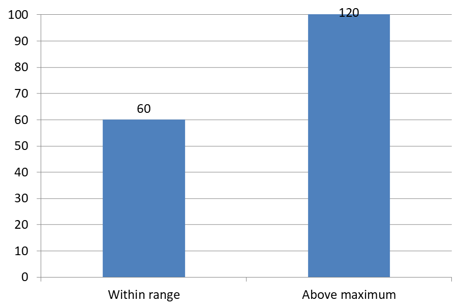
Ví dụ dưới đây tạo một biểu đồ cột cụm 2D với các giá trị 60 và 120. Nó đặt is_automatic_max_value thành False và max_value thành 100 trên trục tung. Slide đầu tiên cho phép nhãn vượt quá mức tối đa; bản sao của slide đó tắt chúng. Cả hai slide đều được lưu trong DataLabelsOverMaximum.pptx.
Bật nhãn giá trị bằng show_value. Cài đặt ở mức biểu đồ không tự động bật hiển thị giá trị hoặc ghi đè việc ẩn hiển thị giá trị của một nhãn riêng lẻ. Ví dụ này bật giá trị cho toàn bộ chuỗi và sử dụng position để đặt nhãn ở cuối ngoài của mỗi cột.
import aspose.slides as slides
import aspose.slides.charts as charts

with slides.Presentation() as presentation:
    slide = presentation.slides[0]

    chart = slide.shapes.add_chart(charts.ChartType.CLUSTERED_COLUMN, 50, 50, 600, 400)
    chart.has_legend = False

    chart.chart_data.series.clear()
    chart.chart_data.categories.clear()

    workbook = chart.chart_data.chart_data_workbook

    first_category = workbook.get_cell(0, 1, 0, "Within range")
    second_category = workbook.get_cell(0, 2, 0, "Above maximum")

    chart.chart_data.categories.add(first_category)
    chart.chart_data.categories.add(second_category)

    series_name = workbook.get_cell(0, 0, 1, "Values")
    series = chart.chart_data.series.add(series_name, chart.type)

    first_value = workbook.get_cell(0, 1, 1, 60)
    second_value = workbook.get_cell(0, 2, 1, 120)

    series.data_points.add_data_point_for_bar_series(first_value)
    series.data_points.add_data_point_for_bar_series(second_value)

    series.labels.default_data_label_format.show_value = True
    series.labels.default_data_label_format.position = charts.LegendDataLabelPosition.OUTSIDE_END

    chart.axes.vertical_axis.is_automatic_max_value = False
    chart.axes.vertical_axis.max_value = 100
    chart.show_data_labels_over_maximum = True

    second_slide = presentation.slides.add_clone(slide)
    second_chart = second_slide.shapes[0]
    second_chart.show_data_labels_over_maximum = False

    presentation.save("DataLabelsOverMaximum.pptx", slides.export.SaveFormat.PPTX)
Các hình ảnh dưới đây hiển thị các slide đã lưu được Microsoft PowerPoint render. Với True, nhãn 120 hiển thị ở giới hạn trên; với False, nó bị ẩn. Nhãn 60 vẫn hiển thị, mức tối đa của trục vẫn ở 100, và điểm dữ liệu thứ hai vẫn là 120 trong cả hai trường hợp.
| show_data_labels_over_maximum = True | show_data_labels_over_maximum = False |
|---|---|
 |
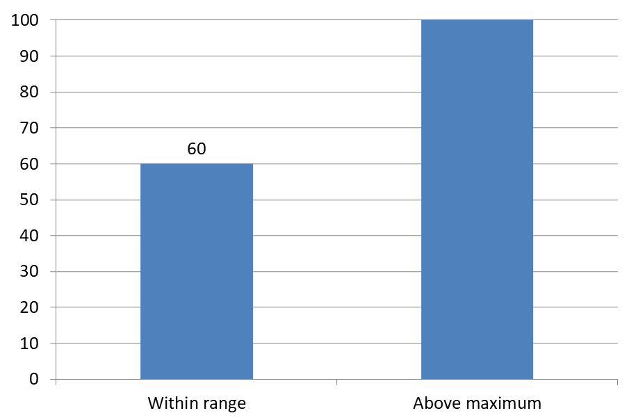 |
Chart Type
Ví dụ này sử dụng biểu đồ cột 2D với trục giá trị. Các biểu đồ không có trục giá trị, như biểu đồ tròn và vòng donut, không có mức tối đa của trục để giới hạn theo cách này.Đặt khoảng cách nhãn so với trục
Sử dụng label_offset để điều khiển khoảng cách giữa nhãn trục danh mục và trục. Giá trị là phần trăm của kích thước phông chữ tối đa của các nhãn trục. Ví dụ này tạo một biểu đồ cột cụm và đặt độ dịch nhãn trục ngang thành 500. Cài đặt này ảnh hưởng đến nhãn trục danh mục hơn là các nhãn gắn vào từng điểm dữ liệu.
import aspose.slides as slides
import aspose.slides.charts as charts

with slides.Presentation() as presentation:
    slide = presentation.slides[0]

    chart = slide.shapes.add_chart(charts.ChartType.CLUSTERED_COLUMN, 20, 20, 500, 300)
    chart.axes.horizontal_axis.label_offset = 500

    presentation.save("SetCategoryAxisLabelDistance_out.pptx", slides.export.SaveFormat.PPTX)
Điều chỉnh vị trí nhãn
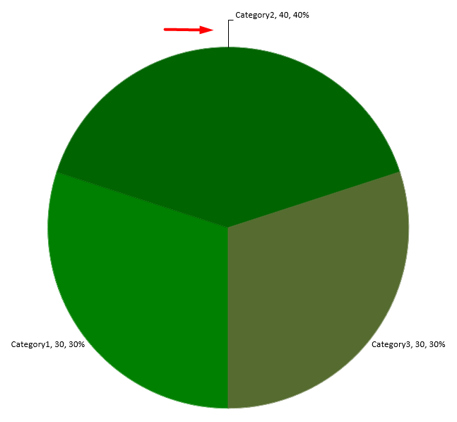
Trong biểu đồ tròn, điều chỉnh vị trí nhãn dữ liệu để cải thiện khoảng cách và tạo không gian cho các đường dẫn.
Ví dụ này hiển thị giá trị của điểm dữ liệu đầu tiên, đặt nhãn của nó bên ngoài phần bánh và điều chỉnh độ dịch x và y. Các độ dịch này tương ứng với chiều rộng và chiều cao của biểu đồ.
import aspose.slides as slides
import aspose.slides.charts as charts

with slides.Presentation() as presentation:
    slide = presentation.slides[0]

    chart = slide.shapes.add_chart(charts.ChartType.PIE, 50, 50, 200, 200)
    series = chart.chart_data.series

    label = series[0].labels[0]
    label.data_label_format.show_value = True
    label.data_label_format.position = charts.LegendDataLabelPosition.OUTSIDE_END
    label.x = 0.71
    label.y = 0.04

    presentation.save("presentation.pptx", slides.export.SaveFormat.PPTX)
Câu hỏi thường gặp
Làm thế nào để ngăn nhãn dữ liệu chồng lấn trên các biểu đồ dày đặc?
Kết hợp việc đặt nhãn tự động, các đường dẫn và giảm kích thước phông chữ; nếu cần, ẩn một số trường (ví dụ, danh mục) hoặc chỉ hiển thị nhãn cho các giá trị cực đoan hoặc các điểm chính.
Làm thế nào để tắt nhãn chỉ cho các giá trị bằng 0, âm hoặc rỗng?
Lọc các điểm dữ liệu trước khi bật nhãn và tắt hiển thị cho các giá trị bằng 0, giá trị âm hoặc giá trị thiếu theo quy tắc đã định.
Làm thế nào để đảm bảo kiểu nhãn nhất quán khi xuất ra PDF/hình ảnh?
Thiết lập rõ ràng họ phông chữ và kích thước, đồng thời xác minh phông chữ có sẵn trong môi trường render để tránh việc thay thế.