
Customize Chart Data Tables in Presentations in Python
Overview
Aspose.Slides for Python via .NET lets you display a chart’s data table and customize its text formatting, borders, and legend keys. This article explains how to enable the table, format its text, control each type of border, and show or hide legend keys. The examples save the configured charts in PPTX files.
Set Font Properties
To display a chart’s data table, set has_data_table to True. Use chart_data_table to access the table and configure its text formatting.
- Load the presentation using the Presentation class.
- Add a clustered column chart to the first slide.
- Enable the chart’s data table.
- Enable bold text with font_bold and set font_height to
20for 20-point text. - Save the modified presentation.
The following example requires test.pptx in the working directory with at least one slide. It adds a chart with default data at position (50, 50), with a width of 600 points and a height of 400 points. The saved output.pptx contains the chart with its data table enabled and the specified font settings applied.
import aspose.slides as slides
import aspose.slides.charts as charts

with slides.Presentation("test.pptx") as presentation:
    slide = presentation.slides[0]

    chart = slide.shapes.add_chart(charts.ChartType.CLUSTERED_COLUMN, 50, 50, 600, 400)
    chart.has_data_table = True

    portion_format = chart.chart_data_table.text_format.portion_format
    portion_format.font_bold = slides.NullableBool.TRUE
    portion_format.font_height = 20

    presentation.save("output.pptx", slides.export.SaveFormat.PPTX)
Customize Data Table Borders
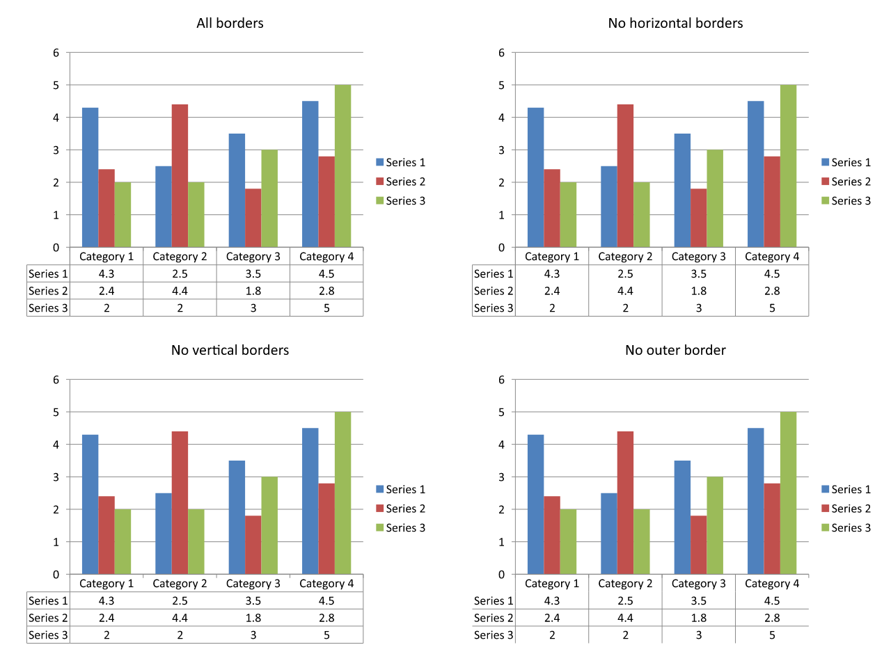
Enable the table with Chart.has_data_table and access it through Chart.chart_data_table. You can control three types of borders independently:
- has_border_horizontal controls horizontal cell borders.
- has_border_vertical controls vertical cell borders.
- has_border_outline controls the outer border of the table.
Set each property to True to display its borders or False to hide them. The following example creates a clustered column chart with default data, displays horizontal borders and the outer border, and hides vertical borders. It requires no input file. The chart’s position and size are specified in points.
import aspose.slides as slides
import aspose.slides.charts as charts

with slides.Presentation() as presentation:
    slide = presentation.slides[0]

    chart = slide.shapes.add_chart(charts.ChartType.CLUSTERED_COLUMN, 50, 50, 600, 400)
    chart.has_data_table = True

    data_table = chart.chart_data_table
    data_table.has_border_horizontal = True
    data_table.has_border_vertical = False
    data_table.has_border_outline = True

    presentation.save("data-table-borders.pptx", slides.export.SaveFormat.PPTX)
The comparison below uses the same chart data and legend key setting in all four cases. Starting with all borders enabled, each remaining variant disables just one border property. The lower-left variant matches the border settings in the example.
Show or Hide Legend Keys
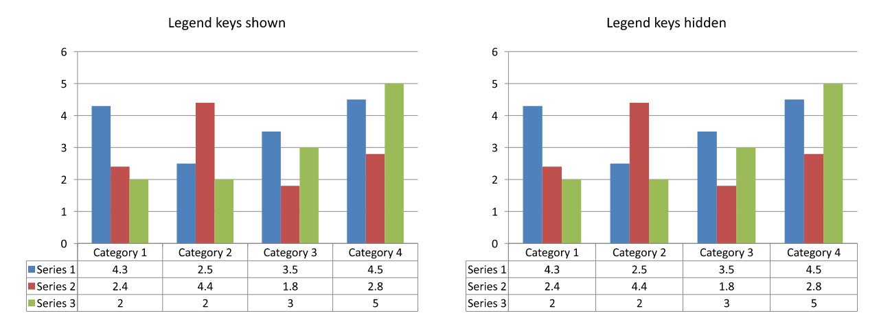
Legend keys are small colored markers beside the series names in the data table. They help readers match each table row to a chart series. Set show_legend_key to True to show these markers or False to hide them.
The chart’s separate legend is controlled by Chart.has_legend. These settings are independent: hiding the separate legend does not hide the keys inside the data table, and hiding the table’s keys does not hide the separate legend.
The following example creates a chart with default data, enables its data table, and shows legend keys inside it while hiding the separate legend. All table borders are explicitly enabled. No input presentation is required. To hide only the table’s keys, change data_table.show_legend_key to False.
import aspose.slides as slides
import aspose.slides.charts as charts

with slides.Presentation() as presentation:
    slide = presentation.slides[0]

    chart = slide.shapes.add_chart(charts.ChartType.CLUSTERED_COLUMN, 50, 50, 600, 400)
    chart.has_data_table = True
    chart.has_legend = False

    data_table = chart.chart_data_table
    data_table.has_border_horizontal = True
    data_table.has_border_vertical = True
    data_table.has_border_outline = True
    data_table.show_legend_key = True

    presentation.save("data-table-legend-keys.pptx", slides.export.SaveFormat.PPTX)
The comparison below shows the same table with legend keys enabled and disabled. All borders remain enabled, and the separate chart legend is hidden in both cases.
FAQ
Can I show legend keys in a chart’s data table?
Yes. Set show_legend_key to True to display legend keys or to False to hide them.
Will the data table be preserved when exporting the presentation to PDF, HTML, or images?
Yes. Aspose.Slides renders the chart and its displayed data table as part of the slide when exporting to PDF, HTML, or images.
Can I work with data tables in charts loaded from a template?
Yes. For a chart loaded from an existing presentation or template, use has_data_table to check or change whether its data table is displayed.
How can I find charts that have a data table enabled?
Iterate through the shapes on each slide, identify the charts, and check their has_data_table property. A value of True indicates that the data table is enabled.